What benefits does SAST have? What’s the difference between SAST and DAST? What’s IAST? What do all these words mean?! Let’s talk about this and more in the overview of the main types of Application Security Testing (AST).
Informational Security
Before we start deciphering these terms, let’s figure out why we need security testing at all. In modern world, software integrates into automation processes almost everywhere, the number of code lines in applications is increasing. As a result, the number of possible vulnerabilities and errors is increasing as well. This creates the need for effective checking and testing of the source code.
https://ankaa-pmo.com/wp-content/uploads/2022/08/what-is-the-difference-between-sast-dast-and-iast.jpg375600Service comm.https://ankaa-pmo.com/wp-content/uploads/2017/04/Logo-Ankaa-engineering.pngService comm.2022-08-05 04:09:422022-08-05 04:09:42What Is the Difference Between SAST, DAST, and IAST?
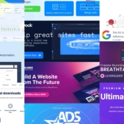
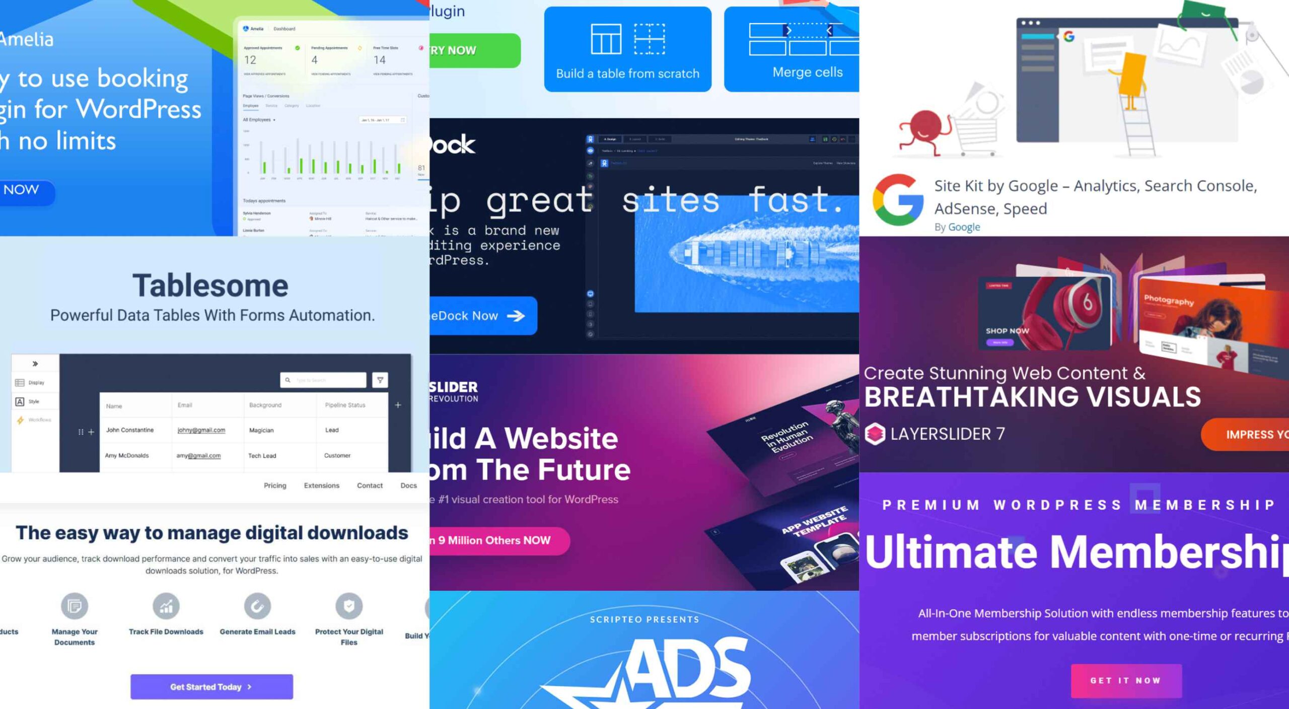
Having the right WordPress plugins on hand can do wonders for your business or online presence. WordPress offers a vast collection to choose from.
There are so many of them. However, finding those that get the best reviews and can do the most for you can be a challenge.
A plugin can give you additional functionality. It could otherwise be difficult or overly expensive to realize with your website by itself. A glance at the 10 top WordPress plugins described below can provide a powerful case in point.
Your website’s purpose or niche will usually dictate the types of essential WordPress plugins you would do well to invest in. The right ones can make your website a genuine powerhouse and, by extension, your business as well.
1. Amelia
Amelia is an excellent choice for beauty, healthcare, fitness, consulting, and businesses that might be saddled down with a manual or semi-manual booking system by saving them and their clients time while eliminating booking mistakes that often occur in those manual systems.
Clients can book appointments online 24/7, change or cancel their appointments, and receive reminders of upcoming appointments and other notifications via SMS or email.
Amelia enables business owners or department managers to track and manage employee schedules and time off.
Amelia can manage bookings for appointments, book tickets for events, and manage group bookings, all at multiple locations. There are no limits on the number of appointments that can be managed.
Booking forms can be customized to best serve a business’s needs and match its brand.
Amelia fully supports WooCommerce with PayPal, Stripe, Mollie, and RazorPay payments. Click on the banner to learn more about this time and money-saving plugin.
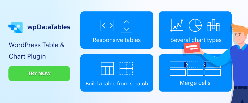
2. wpDataTables
wpDataTables is a premier WordPress table and chart building plugin that features virtually everything you are apt to need to build any table or chart you want.
Creating a table that is by any definition complex often requires tools that may not necessarily be easy to come by. wpDataTables uses four chart-building engines, one or more of which should suit you perfectly.
They are:
Google Charts
Highcharts
Charts.js
Apex Charts
For both table and chart building, wpDataTables can connect you to multiple database sources, including –
MySQL
MS SQL
PostgreSQL
wpDataTables can process data that exists in the commonly used formats and features various sorting and filtering options that allow you to create a host of different table types.
Both tables and charts are editable and responsive and, thanks to the wpDataTables conditional formatting feature, can highlight and color-code critical information.
Click to learn more.
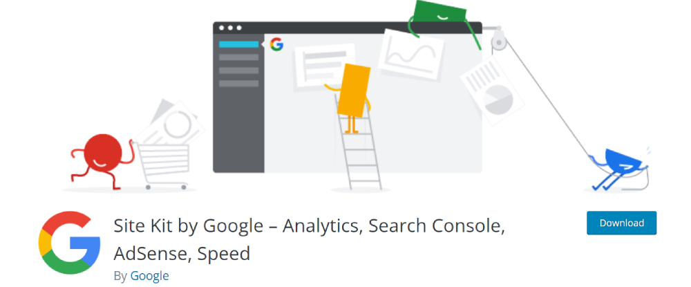
3. Site Kit by Google
While your website’s performance might exceed your wildest dreams, it is more likely that there are areas that need improvement before your wishes can be met.
Determining those areas can be a challenge, but Site Kit offers a one-stop solution to deploy, manage, and get insights from critical Google tools to make your site a success by making those critical tools available to WordPress.
They provide:
stats displayed on your WordPress dashboard from multiple Google tools
quick Google tool setup without your having to edit your site’s source code
key metrics and insights for your entire site and individual posts, and
easy-to-manage, granular permissions across WordPress and different Google products
Site Kit shows you how many people have found your site, how users navigate it, etc.
Click on the banner to learn more about what Site Kit could do for you.
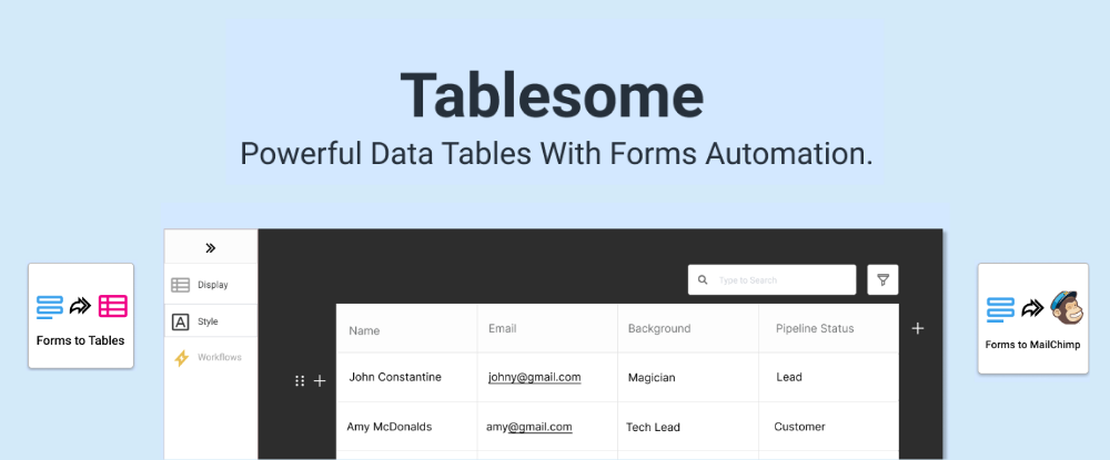
4. Tablesome – WordPress Table Plugin With Form Automation
Tablesome is a WordPress form database and form automation plugin that you can use to store entries from WordPress forms to a database. It can be integrated with popular forms – Contact Form 7 DB, WPForms entries, Forminator database, Elementor Form submissions, etc.
After saving, you can:
Edit, auto-delete, and export entries to tools such as MailChimp, Google Sheets, Salesforce, etc.,
Display WordPress form entries on frontend pages
Automatically export contact data using the Mailchimp WordPress Integration
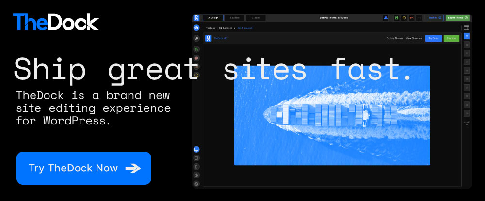
5. TheDock
TheDock eliminates the need to search for just the right WordPress theme by enabling you to create your own – which can be more fun anyway.
Among TheDock’s many features, a few key ones include –
A comprehensive, option-rich Design System
A responsive design system that ensures your site looks great on all screens.
Designer, developer, and editing collaboration support.
Clean, readable code.
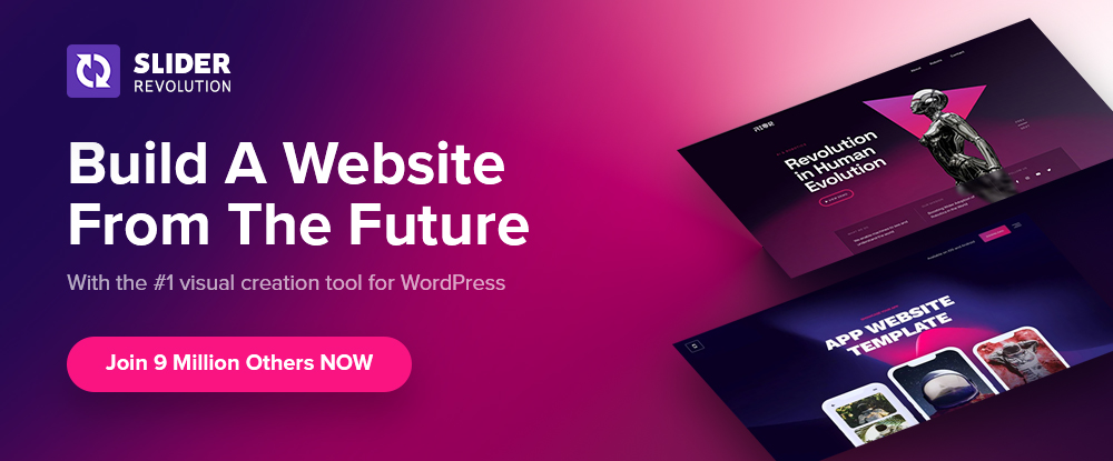
6. Slider Revolution
Beginners and mid-level designers can sometimes have difficulty finding ways to WOW their clients with professional-level visuals.
Slider Revolution changes all that by bridging the gap between what clients want and what you can provide with its –
200 designed-to-impress website and slider templates
25+ powerful addons and brand new WebGL slide animations
ability to import dynamic content from WooCommerce and social media outlets.
7. LayerSlider
More than a simple slider-builder, LayerSlider is an animation and website-building tool you can use to improve any website’s look and feel through eye-catching animations, contemporary graphics, and interactive features.
This is made possible in part through the use of –
160+ website, slider, and popup templates
LayerSlider’s modern and intuitive editing interface
Plus, you can count on professional one-on-one customer support.
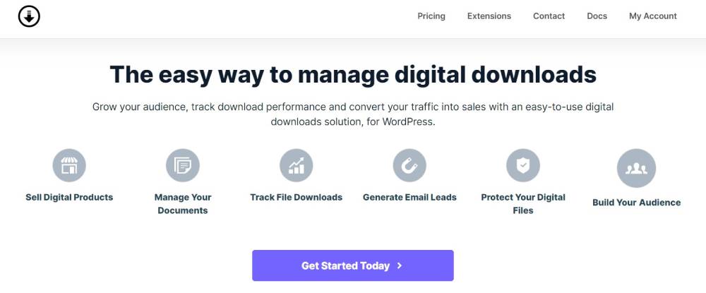
8. Download Monitor
The Download Monitor plugin helps you sell your digital products by offering a ready solution for tracking file downloads, gating content to generate leads, build your audience, and ask users for personal information in exchange for valuable content.
Download Monitor lets you –
add any type of file you need to your website
link a page to all your channels and promote your social media networks
place ads – and more.
9. Ads Pro – Multi-Purpose WordPress Ad Manager
The biggest ad manager for WordPress, Ads Pro gives you everything necessary to manage and sell ads.
Ads Pro’s admin panel makes managing ads straightforward for you and your users.
Key ad features include 25+ ad templates and 20+ ad display options.
CPC, CPM, CPD billing and PayPal, Stripe, and bank transfer payment methods are built-in.
Geo-Targeting lets you show/hide ad spaces based on countries, provinces, cities, and Zip Codes.
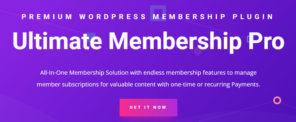
10. Ultimate Membership Pro
If selling content is your objective, Ultimate Membership Pro is the tool you’ll want to take your website and convert it into a powerful content selling platform.
The Ultimate Membership Pro plugin enables you to –
Create unlimited subscription levels, including free, trial, and paid member subscriptions
Control customer access to content based on their subscriptions
Send emails to welcome new members and send notifications and reminders to regular subscribers.
The WordPress plugin directory is already stuffed with almost 60,000 plugins. This guide has been published to narrow things down to 10 top WordPress plugins for your use.
We consulted with experts to create this list of excellent plugins for WordPress. It can help you with content strategy, SEO, site security, and even social media marketing.
Installing plugins and getting the functionality they provide can add immense value to your use of WordPress.
[- This is a sponsored post on behalf of BAW Media -]
https://ankaa-pmo.com/wp-content/uploads/2022/05/10-terrific-wordpress-plugins-you-should-be-using-in-2022.jpg14082560Service comm.https://ankaa-pmo.com/wp-content/uploads/2017/04/Logo-Ankaa-engineering.pngService comm.2022-05-24 18:30:232022-05-24 18:30:2310 Terrific WordPress Plugins You Should Be Using in 2022
Vulnerabilities produce enormous reputational and financial risks. As a result, many companies are fascinated by security and desire to build a secure development life cycle (SSDLC). So, today we’re going to discuss SAST — one of the SSDLC components.
SAST (static application security testing) searches for security defects in application source code. SAST examines the code for potential vulnerabilities — possible SQL injections, XSS, SSRF, data encryption issues, etc. These vulnerabilities are included in OWASP Top 10, CWE Top 25, and other lists.
https://ankaa-pmo.com/wp-content/uploads/2022/04/sast-in-secure-sdlc-3-reasons-to-integrate-it-in-a-devsecops-pipeline.jpg375600Service comm.https://ankaa-pmo.com/wp-content/uploads/2017/04/Logo-Ankaa-engineering.pngService comm.2022-04-29 16:06:232022-04-29 16:06:23SAST in Secure SDLC: 3 Reasons to Integrate It in a DevSecOps Pipeline
Every day design fans submit incredible industry stories to our sister-site, Webdesigner News. Our colleagues sift through it, selecting the very best stories from the design, UX, tech, and development worlds and posting them live on the site.
The best way to keep up with the most important stories for web professionals is to subscribe to Webdesigner News or check out the site regularly. However, in case you missed a day this week, here’s a handy compilation of the top curated stories from the last seven days. Enjoy!”
https://ankaa-pmo.com/wp-content/uploads/2022/04/popular-design-news-of-the-week-april-18-2022-april-24-2022.jpg14082560Service comm.https://ankaa-pmo.com/wp-content/uploads/2017/04/Logo-Ankaa-engineering.pngService comm.2022-04-24 16:45:122022-04-24 16:45:12Popular Design News of the Week: April 18, 2022 – April 24, 2022
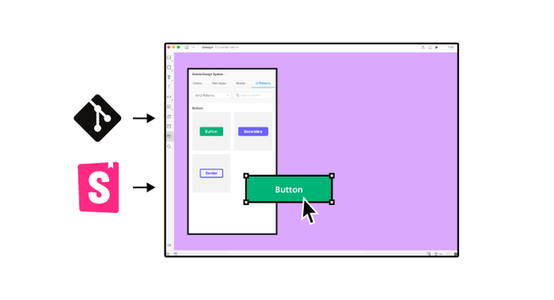
It’s something every design team dreams about – a better design process and handoff procedure. Your design team is not alone if you are looking for a better solution.
Imagine what your workflow would look like if you could forgo the struggles of image-based technology, design and handoff with accurate components that have interactive features. Projects in the design phase will look more like final products and, most importantly, interact like final products.
Let’s imagine a new design process together.
Challenges of an Image-Based Design Process
Here’s what we all know – image-based design tools provide pictures of components in the visual form but lack the interactivity and conditions that exist in the end-product. There’s not a high level of functional fidelity there, and it can cause confusion among design teams and rework.
These tools require you to redraw the fundamental components and design with boxes and rectangles, which takes too much time and can create a disconnect between the design and development teams.
Further, you don’t fully maximize the potential of a design system because of inconsistencies between code-powered systems that developers use and these image-based systems for designers. There’s an innate gap between maintaining the environments and creating consistency in components.
The final and maybe most difficult challenge with an image-based design process is in usability testing. You just can’t test an image the way you can working components. If the prototype is not interactive enough, you lose valuable feedback in the testing process. Functional fidelity is a must-have design and development tool in 2022.
Iress, market-leading financial software, had many of these same problems in its design system process. You can probably relate to its story, which includes a designer and engineer who aren’t entirely on the same page, hit the deadline and have to deliver, and then get customer feedback. The result was a lot of extra headaches and work.
But there is a better way: Import all user interface components into a code-powered design system in sync with a design tool so that your team can work in harmony to build, scale, and handoff projects with ease.
Scale Design With Accurate Components
Here’s what most design and development teams want en route to building products: Accurate components with built-in interactivity, states, and conditions. No redrawing boxes and rectangles; no trying to figure out what states and interaction should be.
And if you can do it with ten times the speed and agility? Now you’re really in business.
“It used to take us two to three months just to do the design. Now, with UXPin Merge, teams can design, test, and deliver products in the same timeframe,” said Erica Rider, Senior Manager for UX at PayPal. “Faster time to market is one of the most significant changes we’ve experienced using Merge.”
The time and workflow savings come from the ability to maintain only one environment as a product team. Rather than image-based tools, a code-powered design system that will push updates to components as the design evolves is the modern way to work. This workflow can also eliminate duplicate documentation so that your team has a single source of truth for whole product teams.
Now you can be more agile in the design process and scale. And as Rider hinted at, there is a solution already available in UXPin Merge.
Scalability with accurate design components has other benefits as well.
Teams can onboard people faster because the design system is in the design tool. There’s less searching for answers with drag and drop-ready building blocks. New team members will find more success and be more valuable to the team quicker due to fewer inconsistencies and errors.
Testing also gets a boost as you scale with a single source of truth. You can actually create better usability tests with a high-fidelity, functional version of the prototype, allowing users to leave more valuable and detailed feedback that can improve your product in the early stages.
Better Handoffs Start Here
As you imagine a better design process, take it one step further. Better handoffs are a goal for most teams.
An interactive component-based design tool can eliminate the need for multiple iterations of the same meeting to explain how a prototype works. Everyone can see and interact with it for themselves with accurate, true components that ensure the prototype works the same as the product.
Designers will feel more like their vision is making it into the final product, and developers have a better idea of how to work. Everyone has the exact same components written in code. Thanks to the single source of truth, devs can speed up as they build the product because they start with components that include production-ready code.
A typical design to developer handoff might have multiple steps: Create vector design elements, create a model for interactions, and then send the prototype with documentation. Not to mention the meetings that are required to make sure everyone is on the same page.
In a model with interactive component elements, the developer handoff is fast and easy; they create a prototype with true components and all the built-in properties. The developer copies the JSX code and pastes it into his tool to build the final product. All the component properties and their coded interactions already exist in the source code. This is possible because the source of truth is the code itself, the source code.
Productivity hack, anyone?
Enter the spec mode & copy the production-ready code with a click of a button. Definitely a time saver for devs!
This solution to this common challenge is not somewhere in the future; it’s already here.
UXPin, a code-based design tool, has Merge technology, which allows you to bring all interactive components into UXPin. Then you can use your own, or the open-source library with the ready-made building blocks to get products ready faster.
Here are just a few of the things you can do with Merge by UXPin:
Integrate your developer’s storybook to use it as a single source of truth (works for all frameworks)
Import design system components from a dev’s Git repository, such as GitHub, Bitbucket, GitLab, or others (works with React)
Work with the built-in MUI library
Add the npm component package to UXPin on your own (no developer required)
Design with the confidence that your work can be ideally reflected by developers
Create and share a library of interactive components
Summary
Say bye-bye to redrawing rectangles – build more accurate prototypes easier and end-products faster with Merge by UXPin.
Now is the time to solve one of your biggest design challenges while upgrading and scaling the design process and improving handoffs.
Merge by UXPin is user-friendly and made for scalable projects of almost any size. The line between design and development blurs with quicker product release and a fully-interactive solution. Request access today.
https://ankaa-pmo.com/wp-content/uploads/2022/03/how-to-scale-your-design-process-and-improve-handoff.png15292780Service comm.https://ankaa-pmo.com/wp-content/uploads/2017/04/Logo-Ankaa-engineering.pngService comm.2022-03-16 17:45:402022-03-16 17:45:40How to Scale Your Design Process and Improve Handoff
One of the most talked-about digital elements of the new year leads our roundup of tools and resources this month – NFTs. The NFT landscape seems to be exploding right now and that includes tools for designers to get in on the game as well.
Here’s what is new for designers this month…
Zero Code NFT
Zero Code NFT offers an advanced no-code tool to simplify the smart contract development and deployment process, allowing you to launch your NFTs with no previous coding experience. It includes a smart contract wizard that supports Ethereum, Polygon, Fantom, and Avalanche, with Solana and others underway. The tool has a waitlist if you are interested.
54nft
54nft is a tool to create a customized NFT store. It is a complete commerce platform that lets you start, grow, and manage an NFT business. Create and customize a store, publish and mint assets on available blockchains, and sell. The tool is free but charges a transaction fee on sales.
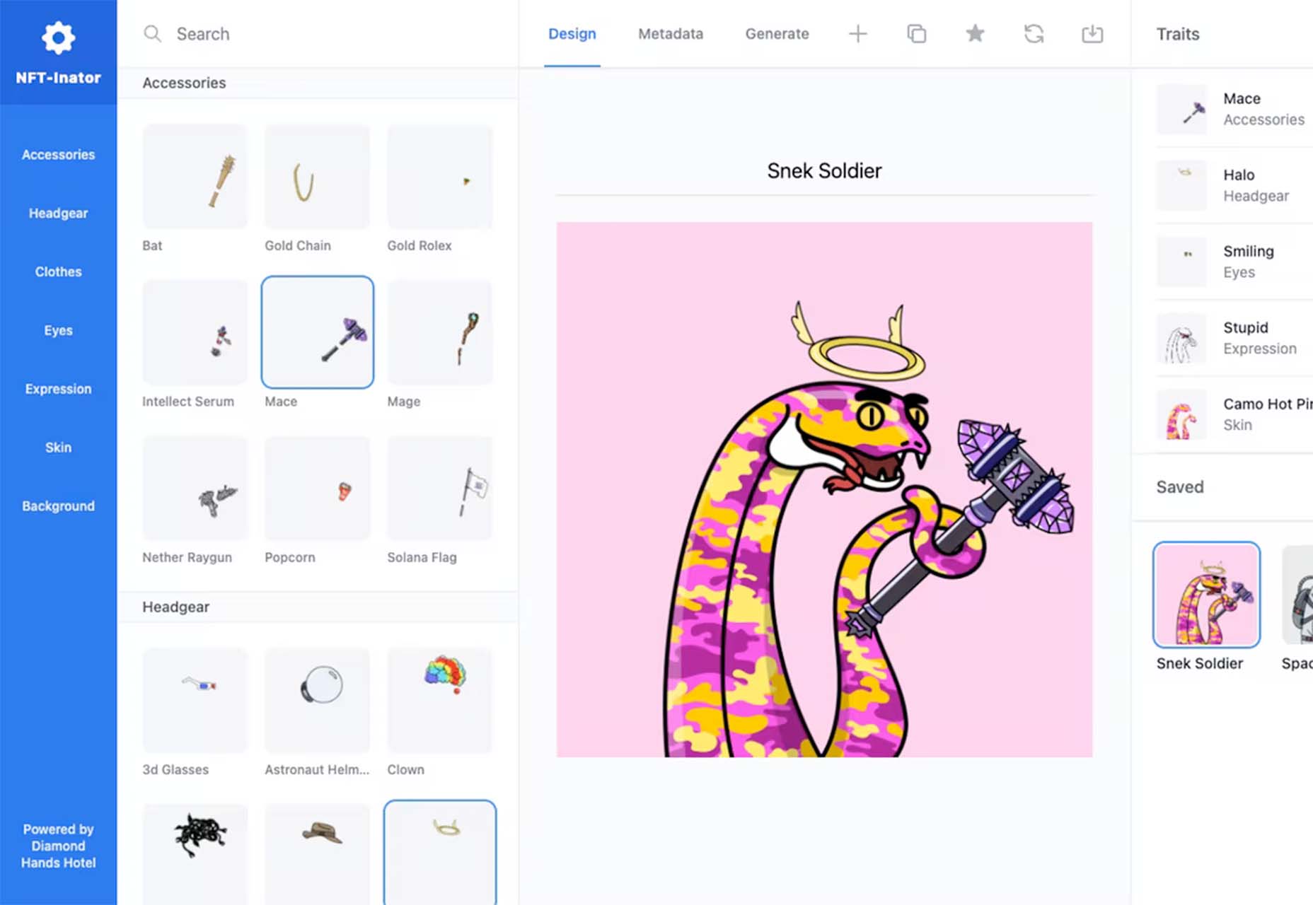
NFT-Inator
NFT-Inator is a free toolkit to accelerate the design and development of procedurally generated NFT projects. Create custom and randomized designs, test layer combinations, and export images and metadata for Solana, Ethereum, and Polygon.
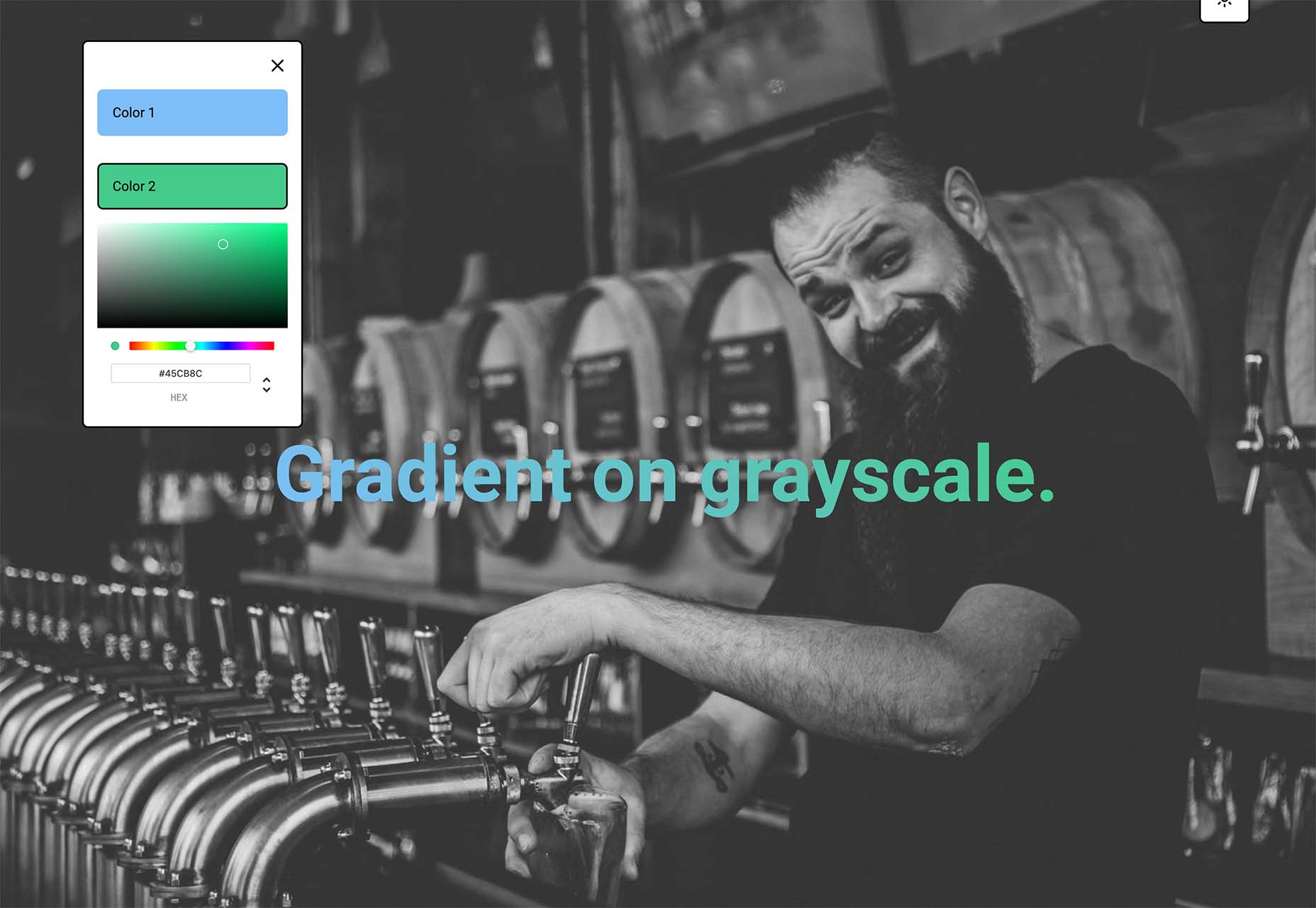
Gradientos
Gradientos makes finding gradients that work with your design easy. Pick your colors and see the gradient live on a demo website with common UI elements.
Web Almanac
Web Almanac is an annual state of the web report from HTTP Archive. It is a comprehensive report on the state of the web, backed by real data and trusted web experts. The 2021 edition is comprised of 24 chapters spanning aspects of page content, user experience, publishing, and distribution.
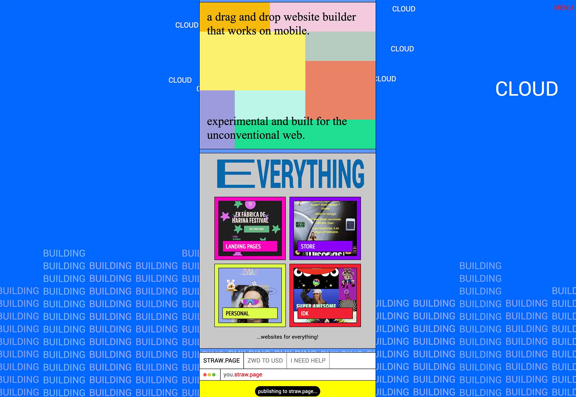
Straw.Page
Straw.Page is a new take on website builders. It is a super simple builder that you can use to create websites from your phone. It’s a drag and drop builder that’s highly experimental and allows you to connect via a subdomain or with a custom domain.
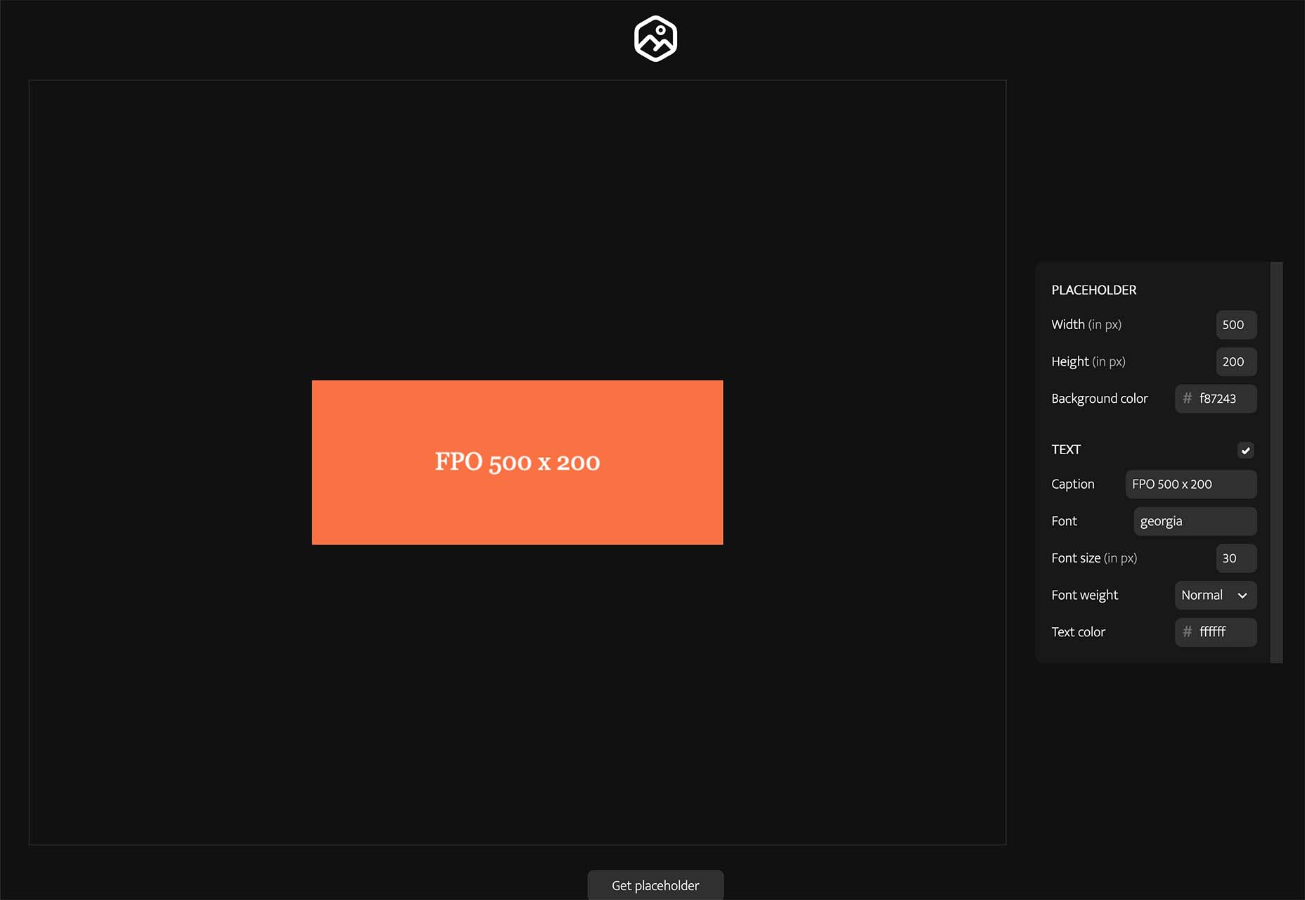
Placy
Placy is a simple placeholder generator. Set the size, color, and fonts and you’ll get a usable data URL to include on your website. Available and JPG, PNG, or SVG.
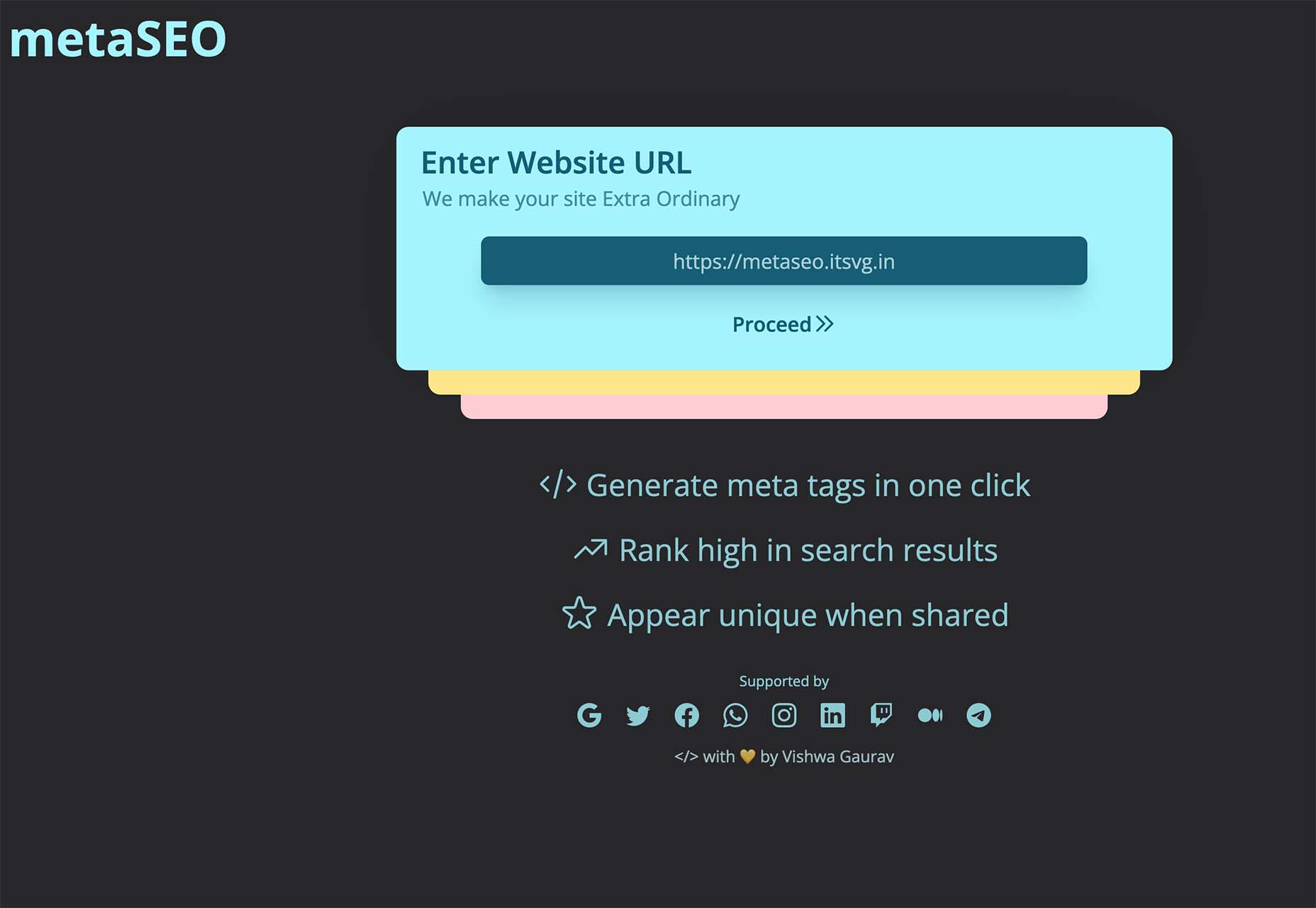
MetaSEO
MetaSEO is a tool to generate meta tags in one click for the best SEO of your website, rank high in search results, and appear unique when someone shares your link. It’s a no-brainer SEO tool for web designers and developers that aren’t as versed in search engine optimization.
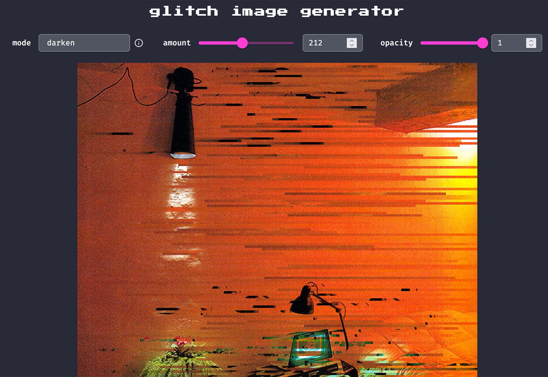
Glitch Image Generator
Glitch Image Generator is a tool to create a trend effect of the same name. Upload an image, pick a color mode, set glitch preferences, and save it as a PNG for projects. It’s that easy.
Smoothly Reverting CSS Animations
Smoothly Reverting CSS Animations is a simple and easy-to-understand tutorial that will walk you through how to create a keyframe animation that moves smoothly. Pragmatic Pineapple explains the steps with code snippets to help you understand how to make this animated element work for you.
Alternate Column Scroll Animation
Alternate Column Scroll Animation is a nifty little tutorial and demo (with downloadable source code) from Codrops. The result is a grid layout with columns that scroll in opposite directions and a content preview animation.
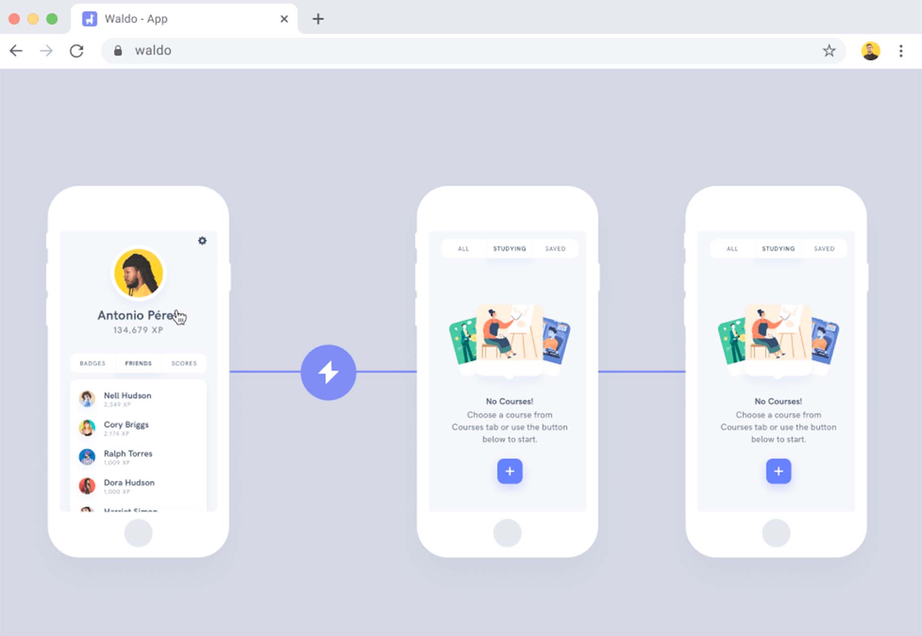
Waldo
Waldo is a premium tool that can help you ship mobile apps faster with fewer bugs (that’s a win-win). The no-code testing platform allows you to upload your app to the platform, run tests, and fix any issues that might arise to help you provide a better experience when it is time to make your app live.
Monad
Monad offers an efficient and simple way to share and discover code snippets. Create an account to easily find snippets relevant to you using tags or browse and create snippets anonymously. One of the best features is the ability to work collaboratively or privately.
Doodle CSS
Doodle CSS is a simple hand-drawn HTML/CSS theme that you can snag from GitHub. It’s fun and whimsical. Practical application for a look like this is up to your style and imagination.
Pixel Patterns
Pixel Patterns is a concept pattern set that implements a function to create patterns with minimal syntax. They are in a pixel style with code snippets that you can play with.
Protodeo
Protodeo is a tool to make 3D video website templates to help show off new products or services. Just upload a few images, customize your settings, and the tool will give you a Bootstrap template with video mockups in less than a day.
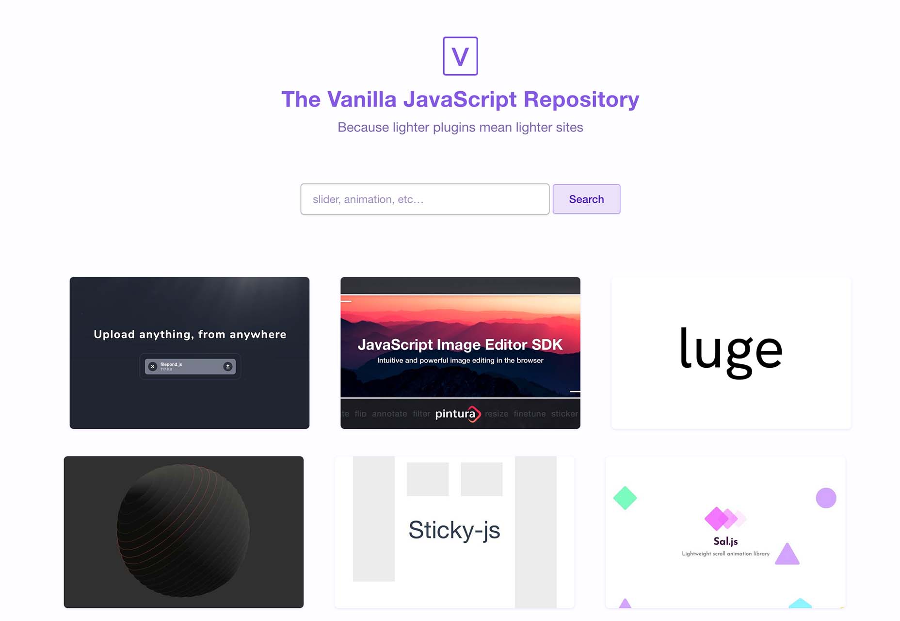
VanillaList
VanillaList is a repository of handpicked JavaScript plugins and resources to save time as a developer and create high-performance web apps. And as the name implies, they are all vanilla.
The Mouse Mover
The Mouse Mover is a fun little tool with questionable ethics – it simulates real mouse movements on your PC. Plus you get the source code and won’t have to worry about going to sleep or triggering a logged-off status.
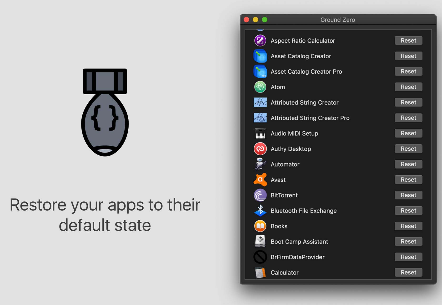
Ground Zero
Ground Zero returns Mac apps to the state they were in when first installed, without deleting the app. Fix issues and get back the default settings, or simply re-claim disk space by cleaning up data that would normally be left behind when uninstalling an app.
Alonzo
Alonzo is a premium typeface family in a modern style with high contrast stroke weights. The family includes 24 styles and with an almost condensed style fits nicely in tight spaces.
ContaneText
ContaneText is the more readable text version of the Contane typeface family. It’s a solid serif with 20 styles including Romans and matching italics. Stronger hairlines, solid serifs, and slightly more comfortable proportions make it appropriate for bold headlines, as well as for small text sizes.
Plinc Flourish
Plinc Flourish completes our roundup this month with an interesting, premium typeface that’s beautiful and functional. Part italic, part roman, this iconoclastic font is all style. It includes formal pen strokes in a taut upright framework to create a typeface that looks defiantly forward.
https://ankaa-pmo.com/wp-content/uploads/2022/02/exciting-new-tools-for-designers-february-2022.jpg14082560Service comm.https://ankaa-pmo.com/wp-content/uploads/2017/04/Logo-Ankaa-engineering.pngService comm.2022-01-31 15:45:572022-01-31 15:45:57Exciting New Tools For Designers, February 2022
Ever since the Python programming language was born, its core philosophy has always been to maximize the readability and simplicity of code. In fact, the reach for readability and simplicity is so deep within Python’s root that, if you type import this in a Python console, it will recite a little poem:
Beautiful is better than ugly. Explicit is better than implicit. Simple is better than complex. The complex is better than complicated. The flat is better than nested. Sparse is better than dense. Readability counts…
Simple is better than complex. Readability counts. No doubt, Python has indeed been quite successful at achieving these goals: it is by far the most friendly language to learn, and an average Python program is often 5 to 10 times shorter than equivalent C++ code. Unfortunately, there is a catch: Python’s simplicity comes at the cost of reduced performance. In fact, it is almost never surprising for a Python program to be 10 to 100 times slower than its C++ counterpart. It thus appears that there is a perpetual trade-off between speed and simplicity, and no programming language shall ever possess both.
But, don’t you worry, all hope is not lost.
Taichi: Best of Both Worlds
The Taichi Programming Language is an attempt to extend the Python programming language with constructs that enable general-purpose, high-performance computing. It is seamlessly embedded in Python, yet can summon every ounce of computing power in a machine — the multi-core CPU, and more importantly, the GPU.
We’ll show an example program written using taichi. The program uses the GPU to run a real-time physical simulation of a piece of cloth falling onto a sphere and simultaneously renders the result.
Writing a real-time GPU physics simulator is rarely an easy task, but the Taichi source code behind this program is surprisingly simple. The remainder of this article will walk you through the entire implementation, so you can get a taste of the functionalities that taichi provides, and just how powerful and friendly they are.
Before we begin, take a guess of how many lines of code this program consists of. You will find the answer at the end of the article.
Algorithmic Overview
Our program will model the piece of cloth as a mass-spring system. More specifically, we will represent the piece of cloth as an N by N grid of point-masses, where adjacent points are linked by springs. The following image, provided by Matthew Fisher, illustrates this structure:
The motion of this mass-spring system is affected by 4 factors:
Gravity
Internal forces of the springs
Damping
Collision with the red ball in the middle
For the simplicity of this blog, we ignore the self-collisions of the cloth. Our program begins at the time t = 0. Then, at each step of the simulation, it advances time by a small constant dt. The program estimates what happens to the system in this small period of time by evaluating the effect of each of the 4 factors above, and updates the position and velocity of each mass point at the end of the timestep. The updated positions of mass points are then used to update the image rendered on the screen.
Getting Started
Although Taichi is a programming language in its own right, it exists in the form of a Python package and can be installed by simply running pip install taichi.
To start using Taichi in a python program, import it under the alias ti:
import taichi as ti
The performance of a Taichi program is maximized if your machine has a CUDA-enabled Nvidia GPU. If this is the case, add the following line of code after the import: ti.init(arch=ti.cuda)
If you don’t have a CUDA GPU, Taichi can still interact with your GPU via other graphics APIs, such as ti.metal, ti.vulkan, and ti.opengl. However, Taichi’s support for these APIs is not as complete as its CUDA support, so, for now, use the CPU backend: ti.init(arch=ti.cpu)And don’t worry, Taichi is blazing fast even if it only runs on the CPU. Having initialized Taichi, we can start declaring the data structures used to describe the mass-spring cloth. We add the following lines of code:
Python
N = 128 x = ti.Vector.field(3, float, (N, N)) v = ti.Vector.field(3, float, (N, N))
Today, we discuss C# code quality and a variety of errors by the example of CMS DotNetNuke. We’re going to dig into its source code. You’re going to need a cup of coffee…
DotNetNuke
DotNetNuke is an open-source content management system (CMS) written mainly in C#. The source code is available on GitHub. The project is part of the .NET Foundation.
Rather than spring cleaning, do some spring “shopping” for tools that will make your design life easier. Packed with free options this month, this list is crammed full of tools and elements that you can use in your work every day.
Here’s what new for designers this month:
April’s Top Picks
Charts.css
Charts.css makes creating beautiful online charts that much easier. It’s a modern CSS framework that uses CSS utility classes to style HTML elements as charts. It’s accessible, customizable, responsive, and open source. There’s a quick start option and available source code to work with.
Haikei SVG Generator
Haikei is a web app that helps you generate SVG shapes, backgrounds, and patterns in all types of shapes to use in projects. Everything can be exported into the tools you are already using for easy integration, and every element is customizable. The tool is free right now – no credit card needed – and you get access to 15 generators and can export in SVG and PNG format. A premium option is on the way, and you can sign up to get notified for access.
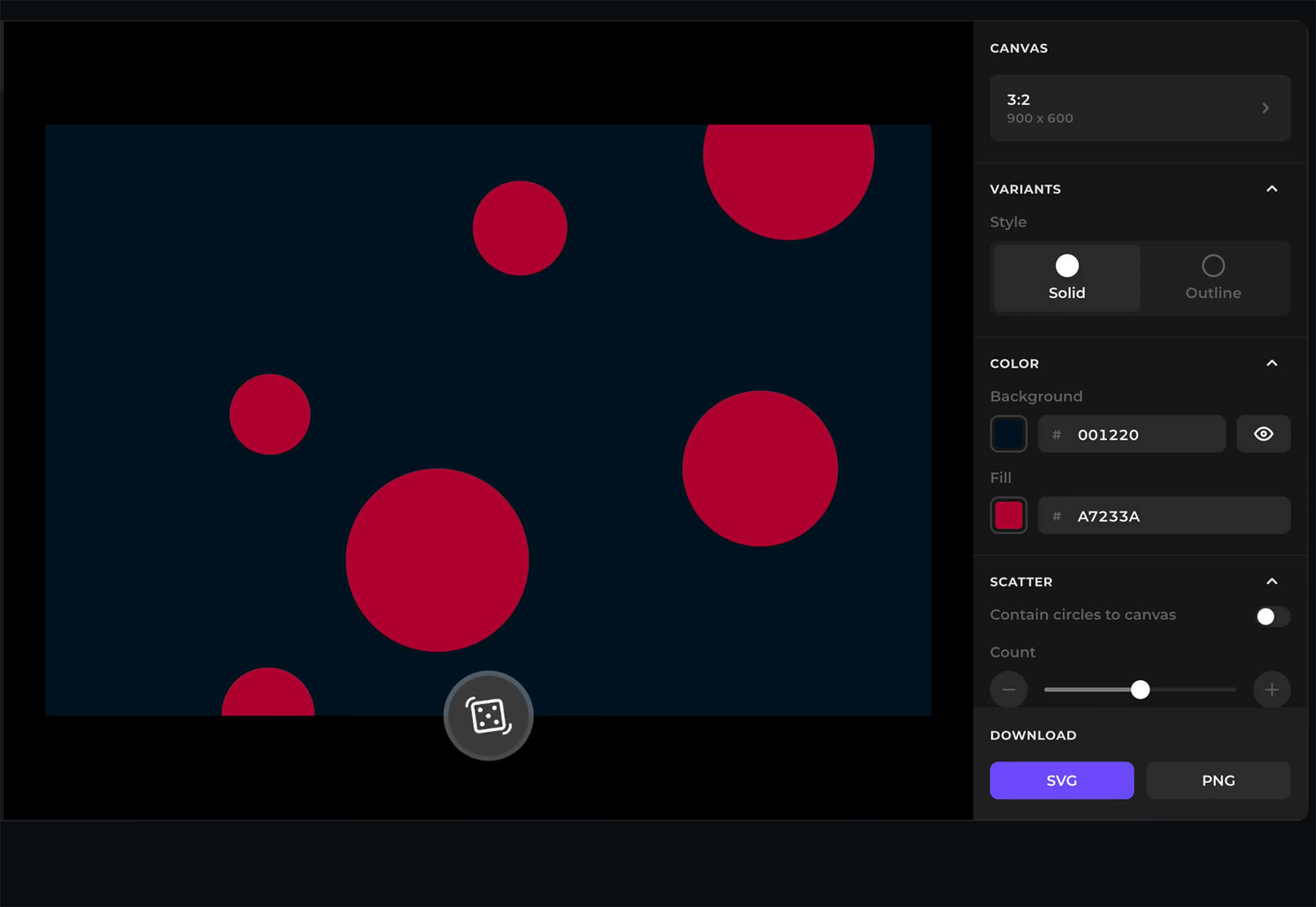
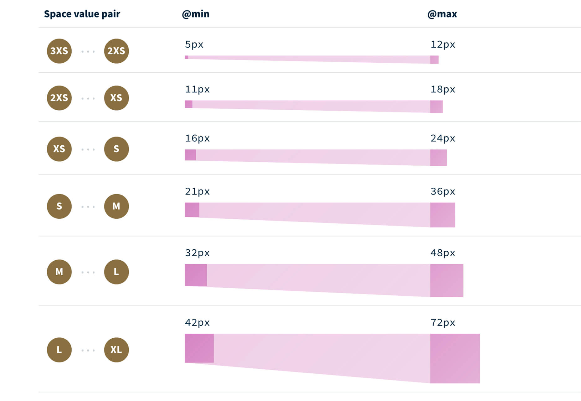
Fluid Space Calculator
Fluid Space Calculator helps you create a related space system and export the CSS to implement it. The calculator allows you to add space value pairs and multipliers and see the impact on the screen before snagging the related code. It’s great for determining how things will look in different viewports and for creating custom space pairs.
Night Eye WordPress Plugin
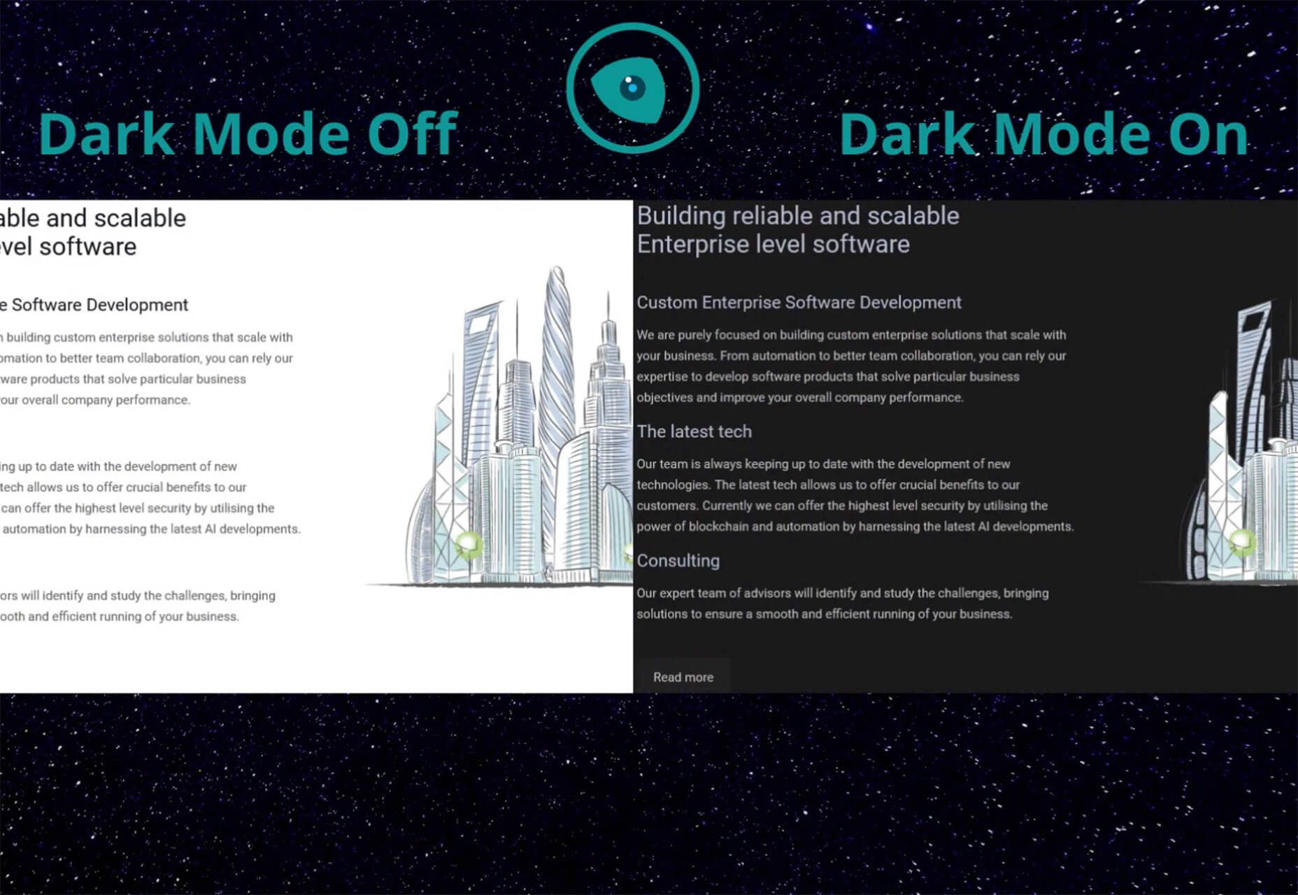
Night Eye WordPress Plugin helps you create a dark mode option for your WordPress website with ease. It’s completely customizable, schedulable, and one of those things that users are starting to expect. The plugin has free and paid versions – the only difference is a link to credit the developer.
3 Productivity Boosters
Macro
Macro is a supercharged checklist app for recurring processes. It’s designed to help teams document, assign, track, and automate for maximum efficiency. Now is the time to test this tool because it is free in public beta.
Writex.io
Writex.io is a free writing app that uses AI and smart features to help you write more efficiently. It can check readability as you write, make suggestions, check spelling, and allows you to work with versioning. All the settings are customizable, so you can get help and suggestions when you want them and avoid things you don’t want.
Taloflow
Taloflow, which is in beta, is a tool that helps you find the top cloud and dev tools for your use case. This is designed to be a time-saving solution to finding the right infrastructure and API products for your work.
8 Kits with Illustrations and User Interface Elements
Skribbl
Skribbl is a collection of free, hand-drawn illustrations in a light and fun style. The black and white sketches are friendly, and the collection keeps growing. Plus, the illustrators are allowing them to be used free for any use.
Mobile Chat Kit
Mobile Chat Kit is a free starter kit for building apps in Figma, Sketch, and Adobe XD. It includes more than 50 screen options with mapped-out flows for a quick-start project.
Flowchart.fun
Flowchart.fun is exactly what the name implies. The app allows you to type, create nodes, and link elements to develop simple flow charts quickly. Then you can alter shape and size with drag and drop. Export it for use as an SVG, JPG, or PNG.
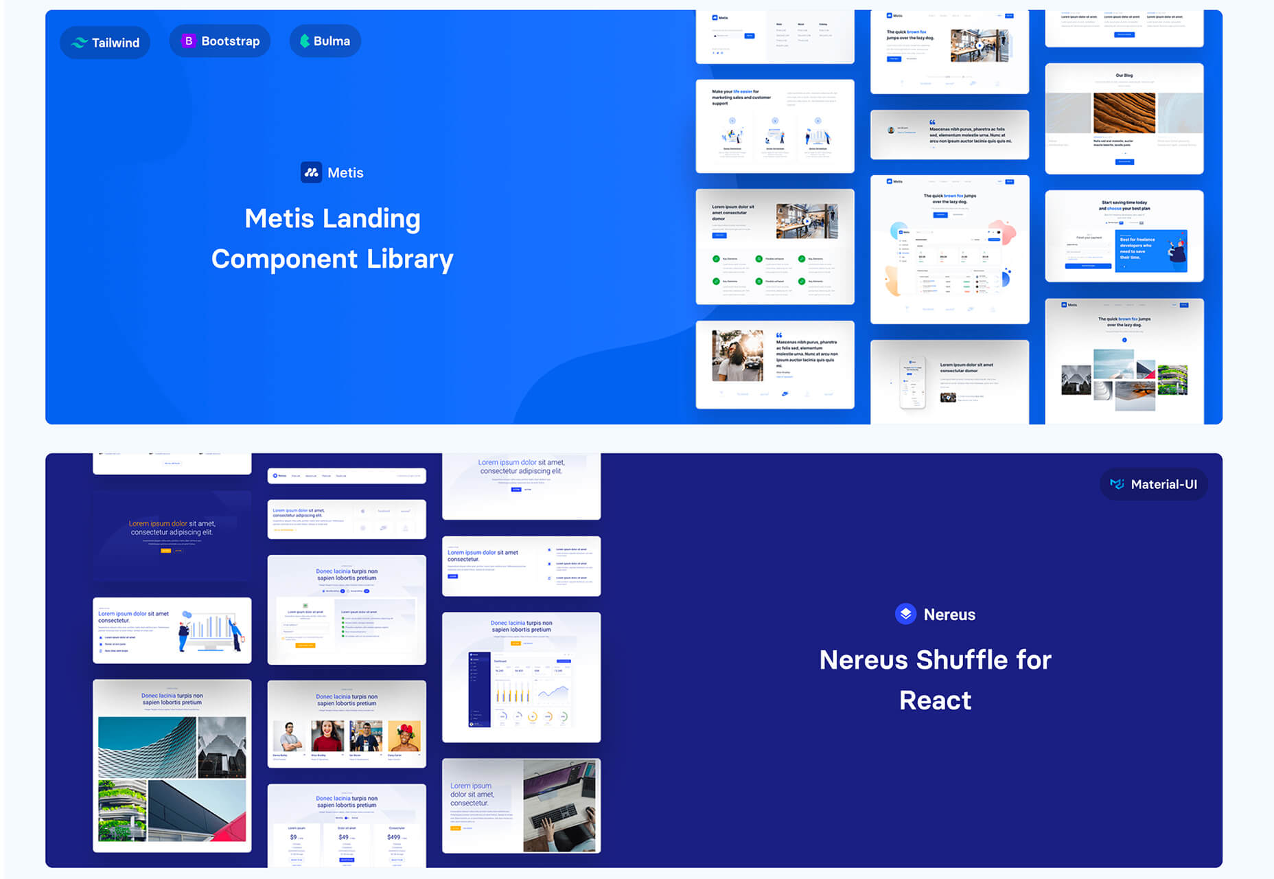
Shuffle
Shuffle is a marketplace packed with UI libraries to help you with a variety of digital projects. There are more than 1,500 pre-built components to choose from with professional designs. This premium tool comes with a monthly subscription or lifetime license.
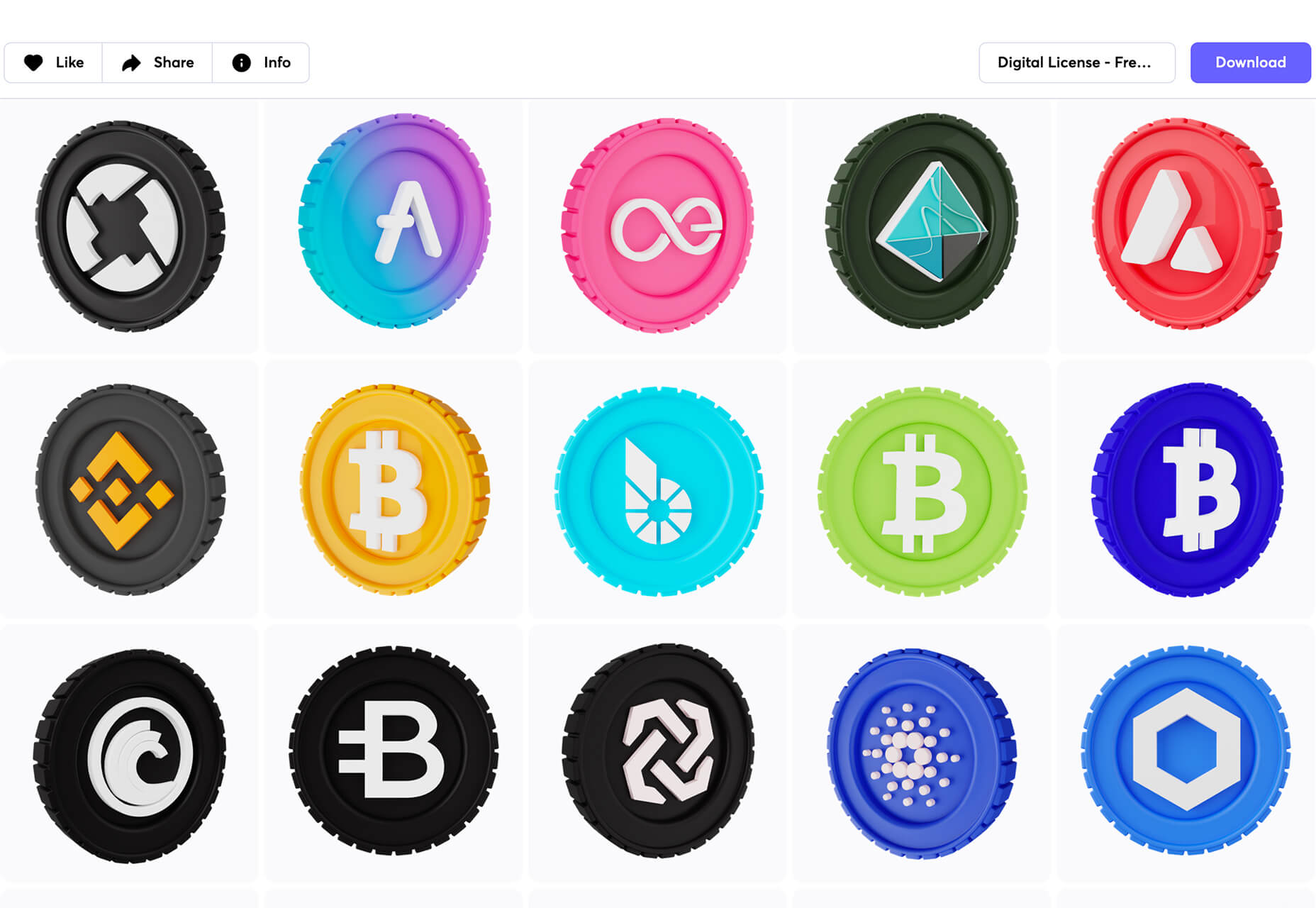
Cryptocurrency 3D Pack
Cryptocurrency 3D Pack is a set of icons with fun colors in three-dimensional shapes that you can use to represent different crypto elements. The pack includes 55 #D icons in PNG and BLEND formats.
Stratum UI Kit for Figma
Stratum UI Kit for Figma includes nine free screens that are ready to use. Options include API documentation, Kanban, document, data dashboard, ecommerce product list, ecommerce product options, payments spreadsheet, cloud storage, and newsfeed.
Conic.css
Conic.css is a collection of simple gradients that you can browse and then click to copy the code into your CSS to use them in projects. It’s quick and easy while using trendy color options.
Artify Illustrations
Artify Illustrations is a Figma plugin that allows you to access more than 5,000 SVG and PNG illustrations within the app. It’s got a built-in search feature, everything is high-resolution, and the huge library includes various styles.
2 Tutorials
A Complete Guide to Accessible Front-End Components
A Complete Guide to Accessible Front-End Components is an amazingly comprehensive guide from Smashing Magazine with everything you need to know about accessible components. From tabs to tables to toggles to tooltips, you’ll find it all here and learn how to use it the right way.
Grid CheatSheet in 2021
Grid CheatSheet in 2021 is a useful guide of everything you can do with CSS Grid. Plus, it has plenty of fun illustrations and an accompanying video.
8 Fresh and Fun Fonts
Athina
Athina is a modern display serif with beautiful connector strokes. The free version is a demo, and there’s a full family that you can buy.
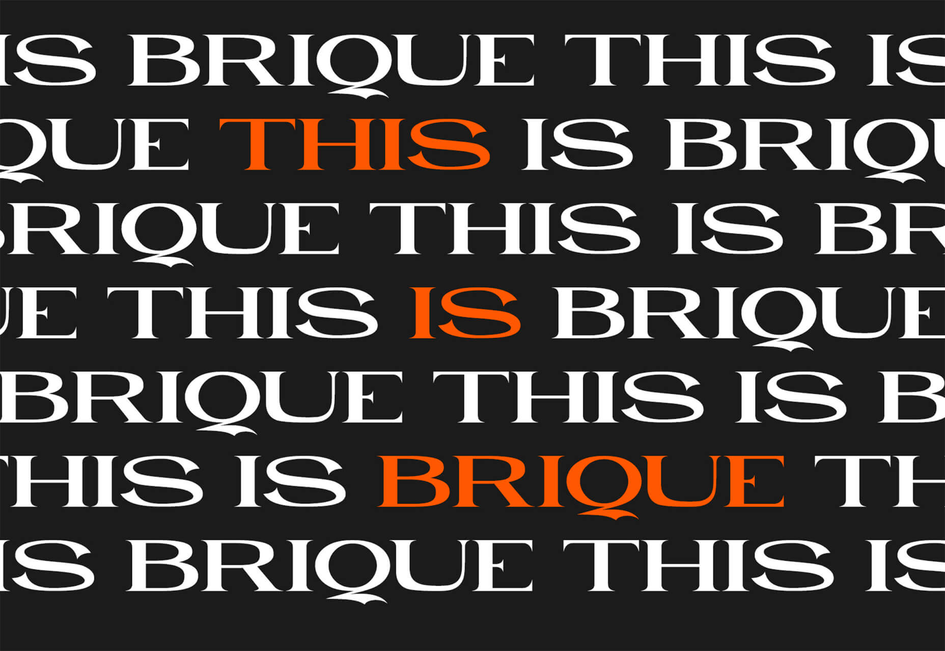
Brique
Brique is a free (personal and commercial) display font with a wide stance and uppercase character set. The letters have a lot of personality and a readable configuration.
Code Next
Code Next is a great geometric sans serif with a full family of styles. Including two variable fonts. It’s highly readable and would work for almost any application.
Inter
Inter is a simple and functional sense serif family with everything from extra light to heavy weights. The extra character personality makes this a fun and functional font option.
Nothing Clean
Nothing Clean is a fun grunge-type option. It’s an all uppercase character set with alternates.
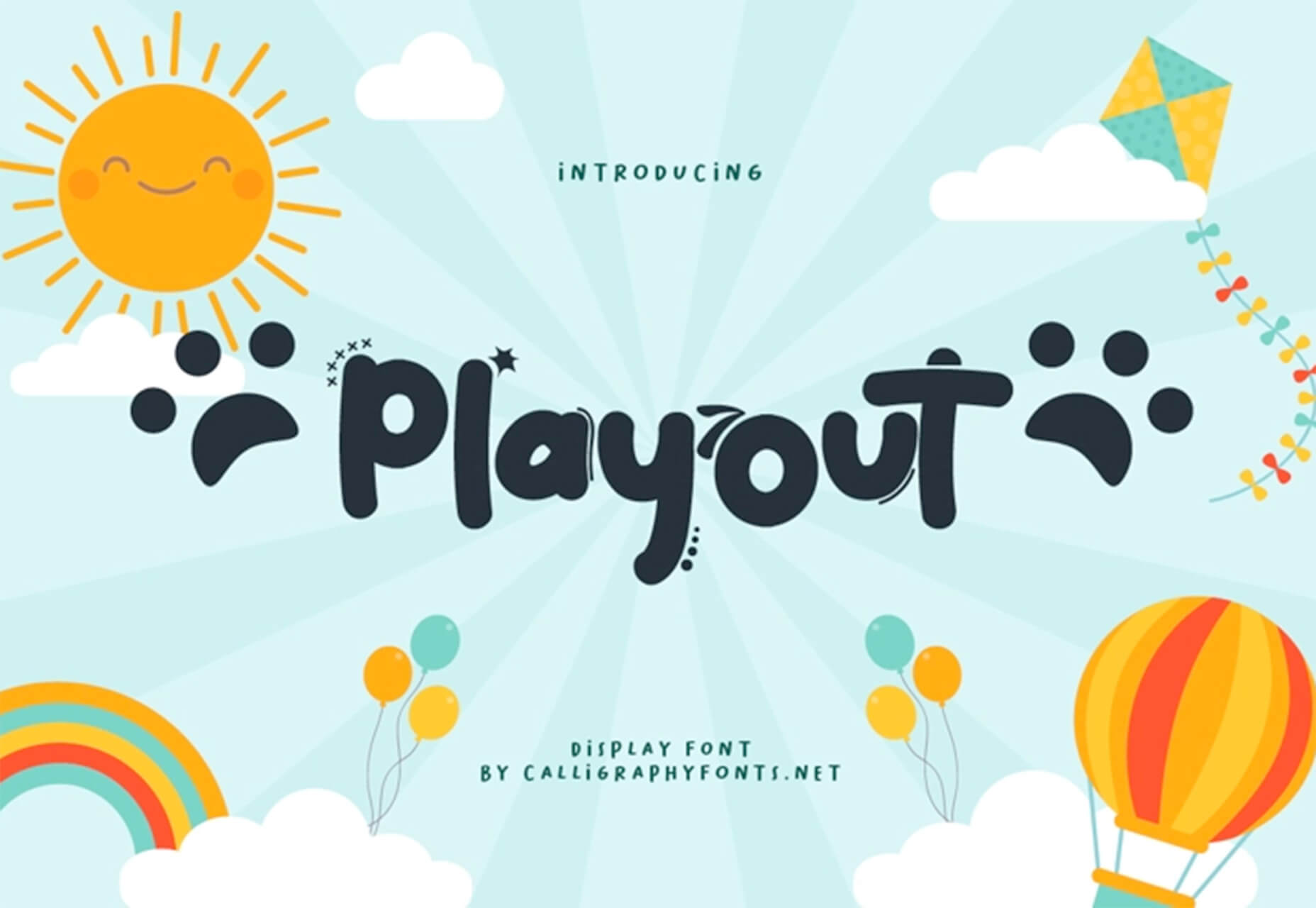
Playout
Playout is a fun, hand-drawn style typeface with interesting glyphs and alternate characters. The most fun feature might be the pawprint characters in the demo set.
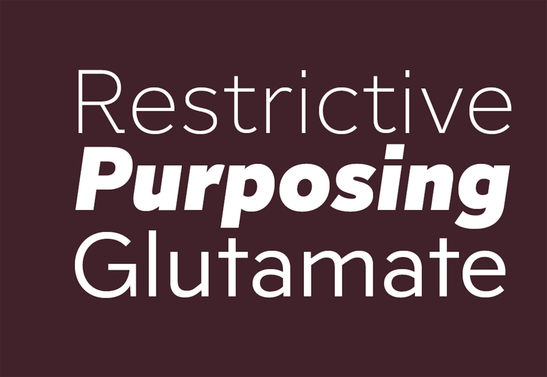
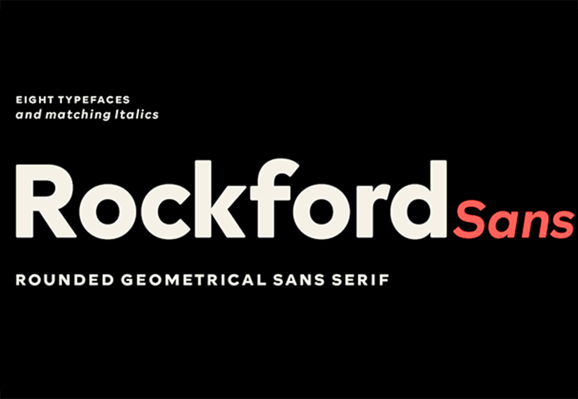
Rockford Sans
Rockford Sans is a geometric typeface with subtly rounded edges. It has eight weights and italics. With its large x-height and round features, it’s legible and friendly. It’s suited to cover a wide variety of tasks from editorial to brand design and advertising.
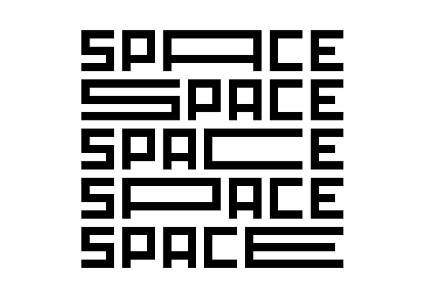
SpaceType
SpaceType is a fun and funky typeface in regular and expanded styles. The stretched letterforms make interesting alternates for display purposes.
https://ankaa-pmo.com/wp-content/uploads/2021/04/25-exciting-new-tools-for-designers-april-2021.jpg14082560Service comm.https://ankaa-pmo.com/wp-content/uploads/2017/04/Logo-Ankaa-engineering.pngService comm.2021-04-19 16:45:302021-04-19 16:45:3025 Exciting New Tools For Designers, April 2021
Have you ever lied to your stakeholders? I must confess that I did once (unintentionally)… I drew a very nice picture of boxes and arrows and I presented it to them as the « logical view » of the architecture of the software product they were in charge of. However, those logical boxes, which were supposed to be groups of classes with a specific purpose, were not represented in code. Source code was a real mess, basically just spaghetti code. There were dependencies everywhere without any defined rules or without any architectural rule. There was a clear gap between my picture and the source code.
If you have read my previous post, Coding your Architecture Structure, you know that one of the structures to architect a software system is created using syntactical constructions. Usually those constructions are packages, namespaces, or modules. So, with this idea we create an application using the Hexagonal Architecture Style, where each logical group of classes that this style suggests is represented as a package in the picture below.
https://ankaa-pmo.com/wp-content/uploads/2021/01/logical-separation-in-the-hexagonal-architecture.jpg375600Service comm.https://ankaa-pmo.com/wp-content/uploads/2017/04/Logo-Ankaa-engineering.pngService comm.2021-01-26 02:32:542021-01-26 02:32:54Logical Separation in the Hexagonal Architecture
Paramètres des cookies et politique de confidentialité
Comment nous utilisons les cookies
Nous utilisons les cookies pour nous faire savoir quand vous visitez nos sites Web, comment vous interagissez avec nous, pour enrichir votre expérience utilisateur et pour personnaliser votre relation avec notre site Web.
Cliquez sur les différents titres de catégories pour en savoir plus. Vous pouvez également modifier certaines de vos préférences. Notez que le blocage de certains types de cookies peut avoir un impact sur votre expérience sur nos sites Web et les services que nous sommes en mesure d'offrir.
Cookies essentiels sur ce site
These cookies are strictly necessary to provide you with services available through our website and to use some of its features.
Because these cookies are strictly necessary to deliver the website, you cannot refuse them without impacting how our site functions. You can block or delete them by changing your browser settings and force blocking all cookies on this website.
Cookies Google Analytics
Ces cookies recueillent des renseignements qui sont utilisés sous forme agrégée pour nous aider à comprendre comment notre site Web est utilisé ou l'efficacité de nos campagnes de marketing, ou pour nous aider à personnaliser notre site Web et notre application pour vous afin d'améliorer votre expérience.
Si vous ne voulez pas que nous suivions votre visite sur notre site, vous pouvez désactiver le suivi dans votre navigateur ici :
Autres services
Nous utilisons également différents services externes comme Google Webfonts, Google Maps et les fournisseurs externes de vidéo. Comme ces fournisseurs peuvent collecter des données personnelles comme votre adresse IP, nous vous permettons de les bloquer ici. Veuillez noter que cela pourrait réduire considérablement la fonctionnalité et l'apparence de notre site. Les changements prendront effet une fois que vous aurez rechargé la page.
.
Paramètres de Google Webfont Settings :
Google Map :
Vimeo et Youtube :
Politique de confidentialité
Vous pouvez lire nos cookies et nos paramètres de confidentialité en détail sur la page suivante

 Having the right WordPress plugins on hand can do wonders for your business or online presence. WordPress offers a vast collection to choose from.
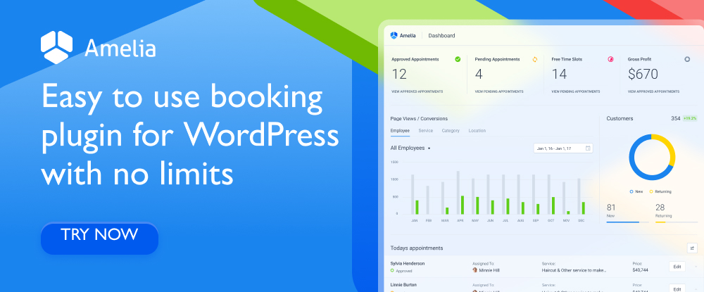


 Every day design fans submit incredible industry stories to our sister-site,


 It’s something every design team dreams about – a better design process and handoff procedure. Your design team is not alone if you are looking for a better solution.


 One of the most talked-about digital elements of the new year leads our roundup of tools and resources this month – NFTs. The NFT landscape seems to be exploding right now and that includes tools for designers to get in on the game as well.


 Rather than spring cleaning, do some spring “shopping” for tools that will make your design life easier. Packed with free options this month, this list is crammed full of tools and elements that you can use in your work every day.