Articles

As a web designer, you’re responsible for a lot of things. Your client is relying on you to ensure that their website is user-friendly, accessible, eye-catching, and even good enough on the back-end to capture the attention of the search engines. 

However, what many business leaders and clients don’t realize is that they also have a part to play in ensuring that they get the right results from their site; there’s more to the client and contractor relationship than an exchange of funds. 

Today, we’re going to examine some of the most common mistakes that clients make when they begin working with a website designer for the first time. After all, when a client makes a mistake, it’s up to you to show them how to get back on track. 

Client Mistake 1: Providing Minimal Insight

Creativity, for the most part, is the responsibility of the designer in any web-building project. You know best what you can do for a client. 

When you’re discussing an upcoming project with a business owner, you can walk them through concepts like dark mode design or strategies for digital accessibility. However, you’re still reliant on your client to let you know if there’s anything specific they need. 

An insufficient brief in a web design project usually means that you waste time on a project because you have to go back and forth multiple times, making updates and edits. Getting a brief ironed out properly from day one can reduce misunderstandings and mistakes. 

To get your client started, ask them to share some details like:

  • Who’s the target audience? Do they have a user persona they can share?
  • What specific features does the site need? Landing pages, forms, widgets, etc.?
  • Competitor sites they like: What do they appreciate about those designs?
  • Brand colors and assets: What kind of hues and shades should you use?
  • Technical feature requirements: Does the site need to have its own app, integrate with APIs, or have a checkout solution, for instance?

Client Mistake 2: Underestimating The Workload

Perhaps one of the most common mistakes that clients make when seeking help from a designer is that they have no idea how much work it will take to create the kind of site they want. If they haven’t provided a great brief in the first place, they might not have had a chance to see all the work they’re asking for written down. Walking your client through the brief process can help here. 

On the other hand, if your client has already provided a brief, along with an unrealistic deadline for completion, you might need to have a discussion with them about what you need to do. Walking your client through some of the processes involved in creating their website could give them an insight into how long it will realistically take to bring their ideas to life. 

Additionally, ensuring that your customers fully understand the amount of work you’re taking on could also mean that they can better grasp why you’re charging a certain price for your services. That brings us neatly to the next mistake…

Client Mistake 3: Not Having The Right Budget

Pricing your design services can be a complicated process for web designers. You need to make sure that you’re charging enough to cover the cost of things like essential software and hardware for your company. At the same time, with so many other designers out there, you also need to ensure that your costs are competitive. 

After you’ve gone through the hard work of figuring out what your pricing structure should be, you also need to be capable of justifying that expense to your client. It’s common for many customers to go into their work with a web designer expecting that they’ll be able to get an entire website, blog, and app for less than a couple of hundred dollars. 

Make sure that your client is aware of your pricing immediately to avoid any confusion. If possible, have a pricing page on your website or portfolio which highlights the cost of different packages and precisely what your clients are going to get. 

If your customers can see the value in your services and even equate to an hourly workload or skillset, they might be better equipped to set the proper budget. 

Client Mistake 4: Making Too Many Technology Decisions

You’ll find that you work with many different types of client during your time as a web designer. Sometimes, you’ll have people who come to you not really knowing what they want or need. This means that you may need to spend some time speaking to them about their expectations and discussing what’s possible. 

On the other hand, there’s always a chance that you could work with a client who thinks that they should be making all of the decisions themselves. While it’s true that your client should have some control over things like the style of their website and what features it has, it’s up to you to make technical decisions like what kind of tools you’re going to use. 

If your client tries to dictate everything you do and how you’re going to do it, this could make it difficult for you to deliver your best work. Explain your processes to your customer in advance and find out why they want you to use specific technology. 

For instance, if your client wants to use a specific kind of website builder because they’ve heard it’s “the best,” you can explain what you like most about the product you’re already using. 

Client Mistake 5: Being Too Attached To An Idea

This is a problem that happens in a lot of creative industries. A client goes out and finds something that they like on another website. It might be an attractive landing page or a specific checkout process. They’re so excited by what they see there that they refuse to compromise on that idea when working with their designer – even if the concept isn’t suitable. 

For instance, your client might come to you wanting a website that’s full of dynamic animations and videos. However, if they only have a limited amount of bandwidth from their hosting provider, this could mean that they end up with a slow site that aggravates their customers. 

The best thing you can do when this happens is to present the issue to your client in a way that they can understand. For instance, if you’re worried something will slow down their website, talk to them about how speed is essential to good customer experience. You could even share some page speed stats like: if a page takes more than 3 seconds to load, over half of all visitors will abandon it. 

Seeing the stats for themselves could mean that your clients are more likely to change their minds. 

Client Mistake 6: Working With The Wrong Designer

Finally, one of the biggest mistakes any client can make is working with the wrong website designer. There are a lot of professionals out there, each with their unique skills to offer in things like UX design, ecommerce page creation, and so much more. However, it’s not always easy to know what you need as a business owner getting online for the first time. 

The good news for web design clients is that there’s a lot of information out there that you can use to get informed fast. The bad news for designers is that this means you’re going to need to work at keeping your skills on the cutting edge if you want to attract the widest selection of customers. 

To ensure that you’re more likely to be the right designer for your customers, stay up to date with the latest web design standards, and check out what’s trending in your industry. Webinars, articles, and even TED talks can be an excellent way to brush up your knowledge and make your portfolio much more appealing. 

Strengthen Your Client/Designer Relationships 

Succeeding as a web designer isn’t just about building a robust portfolio full of excellent websites where you can showcase your skills. While it’s true that you need to stay on the cutting edge with your design talents, you also need to make sure that you can create positive relationships with every client that comes to you. 

Like designers, clients can make mistakes too, but not knowing what they want, trying to take too much control, or simply failing to understand the scope of a product. Rather than letting those mistakes hold you back, prove your mettle as a designer by helping your clients navigate these issues. The result will be more streamlined project experiences, happier customers, and better reviews for your company. 


Featured image via Unsplash.

Source

The post Protect Your Design Clients From These 6 Easy Mistakes first appeared on Webdesigner Depot.


Source de l’article sur Webdesignerdepot

1, 2, 3 – That’s exactly how long it takes you to start losing visitors if you have a slow-loading website.
Hold on! Surely, the only thing that matters to users is that your website works flawlessly and looks great… right? Wrong!

The fact of the matter is that we’ve all become accustomed to instant access to information and content. The average internet user today places a lot of value on speed, and the bar is continually being raised.

If you are like most people, you probably feel an immediate sense of dread at the thought of optimizing your website. Where do you start? How can you make the most impactful improvements? What makes your website slow in the first place?

Have no fear, as we’ll be answering all of your questions below as well as putting you on your way to a website that loads with blazing speed.

Why Should You Be Worried About A Slow-Loading Website?

Good question!

As many as 53% of visitors abandon a site that takes more than 3 seconds to load. Even worse, 1 in 3 shoppers will leave a website if it takes longer than 5 seconds to load.

So, performance plays a huge role in the user experience of your website and whether your visitors will stay on your website or be converted into customers.

For some time, Google has been keenly aware of this fact. As a search engine, Google knows that it’s counterproductive to recommend content to users if they won’t stick around to consume it.

That’s why they’ve continually been increasing the role performance plays when ranking websites for their SERPs (search engine results pages).

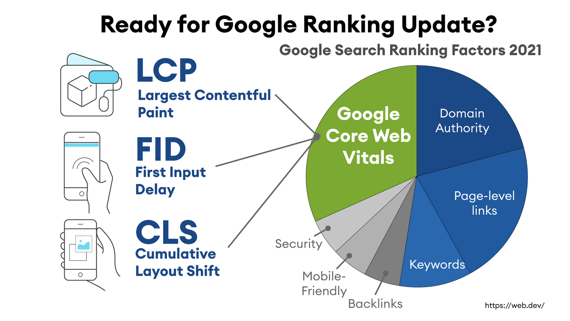
In recent years, Google has introduced core web vitals. These are metrics they hope will help quantify how performance affects the user experience. In general, they measure how fast, stable, and interactive a page is while loading. This will be more important than ever after Google announced its Page Experience update, which started its global rollout in June 2021.

As you may know, ranking highly for Google is vital for your website’s visibility. For one, 68% of online experiences begin with a search engine, of which Google has a 92.7% market share. Even if you manage to land on the coveted first page of Google, the first five results get over 70% of all clicks (28% to the first result alone).

So, to recap why a fast loading website is so desirable:

  • It directly affects your ability to keep, satisfy, and even convert visitors to your website.
  • It impacts your search engine rankings which impacts your “findability” and organic traffic.

8 Reasons Your Site Is Slow + How to Fix Them

O.K., so now that we’re all on the same page regarding the importance of your website performance, let’s look at common issues slowing down your website + how to fix them.

1. You’re Using A Sub-Par Hosting Service

As the party responsible for making your website available to the outside world, your hosting service can be a make-or-break factor. Not only should you pick a host that has a good track record when it comes to uptime a performance, but also one that’s suitable according to your needs.

Even if you take all the steps below to optimize your website’s performance, it may still load slowly if traffic to your website is overwhelming your available bandwidth or your host’s server capacity. If that happens, some users may experience extremely slow loading times, broken features, or even complete unavailability.

For most personal, blog, or local/small business sites, a respectable hosting provider like Bluehost or GoDaddy should be good enough. However, if you plan on running any type of large-scale, high-traffic webstore, business portal, or other type of website, you’ll want premium hosting, such as WPEngine (for WordPress), VPS hosting, or even a dedicated server.

2. You’re Not Optimizing Your Media Assets

As you probably know, media like images and videos take up significantly more space than most other types of content, such as text, code, stylesheets, or other static files. Even a single image has the potential of consisting of more data than dozens of website pages containing nothing but the underlying HTML and text.

In a Speed Essentials presentation, the Google team identified images as the largest contributor to page weight. In fact, they have the potential to consume a website’s entire performance budget if left unoptimized. Images can also directly impact all three of Google’s core web vitals – key metrics Google uses to measure the performance of a website.

However, the use of images and video is likely to continue growing, heightening the importance of finding a sustainable solution. According to HTTPArchive, images have increased by 19.3% on desktop and 42.7% on mobile.

For now and the foreseeable future, optimizing your images carries the greatest potential for improving performance.

The problem is that optimizing image assets requires multiple steps. Most importantly:

  • Using the appropriate next-gen formats which can differ depending on the user’s device, OS, or browser.
  • Appropriately compressing the size and quality of images to reduce payload without affecting visual quality too badly.
  • Using the optimal display size and density based on the accessing device to reduce payloads further.
  • Using lazy loading to only load images as needed.

As you can see, manually going through these steps for every single image on your website can be extremely labor-intensive. This is especially true if you consider that you somehow need to create the optimal variants for different users based on what device, OS, or browser they are using.

In-code strategies, like a JS plugin, responsive images, or CSS media queries tend to bloat your code and lead to other performance issues we’ll discuss below.

Luckily, there are plenty of CDN services available designed specifically for providing some degree of automated image optimization. These platforms analyze the context (i.e., a specific mobile device model, OS version, and browser version) of the user trying to load one of your images and try to serve them a version of the image that’s ideally optimized for them.

However, any media optimization platforms still require installing a small JavaScript plugin to dramatically improve the image and video optimization capabilities. 

The one exception here is ImageEngine. ImageEngine uses WURFL device-detection to pick up every possible detail of the user’s device. The logic is built into their device-aware edge servers and doesn’t rely on you adding any additional code or markup to your website pages.

So, not only does it reduce your image payloads by up to 80% and serve them via a global CDN, but it doesn’t leave a footprint in your website’s code. As a bonus, it also happens to support the widest range of image/video formats, including animated GIFs, as well as client hints and save-data mode.

3. Render-Blocking JavaScript And CSS Is Delaying Page Loads

JavaScript is the de facto programming language for adding interactivity and advanced features to websites today. Likewise, CSS is the standard for adding styling. Both are critical components for almost any modern website.

However, nothing good comes free, and both may impact the performance of your website, particularly when used carelessly. 

The following are some steps you can take to minimize the impact of these assets on your website performance:

  • Minify your JavaScript and CSS files.
  • Combine a large number of JS/CSS files into fewer files.
  • Replace some of your external JS and CSS files with inline JS/CSS. (Don’t overdo this! Inline JS and CSS is only suitable for small code snippets).
  • Defer loading JavaScript until after all your content is loaded and use media queries for CSS files.

Because media can have a more significant impact on your page weight, this leads some to believe that adding more JavaScript is the lesser of two evils. 

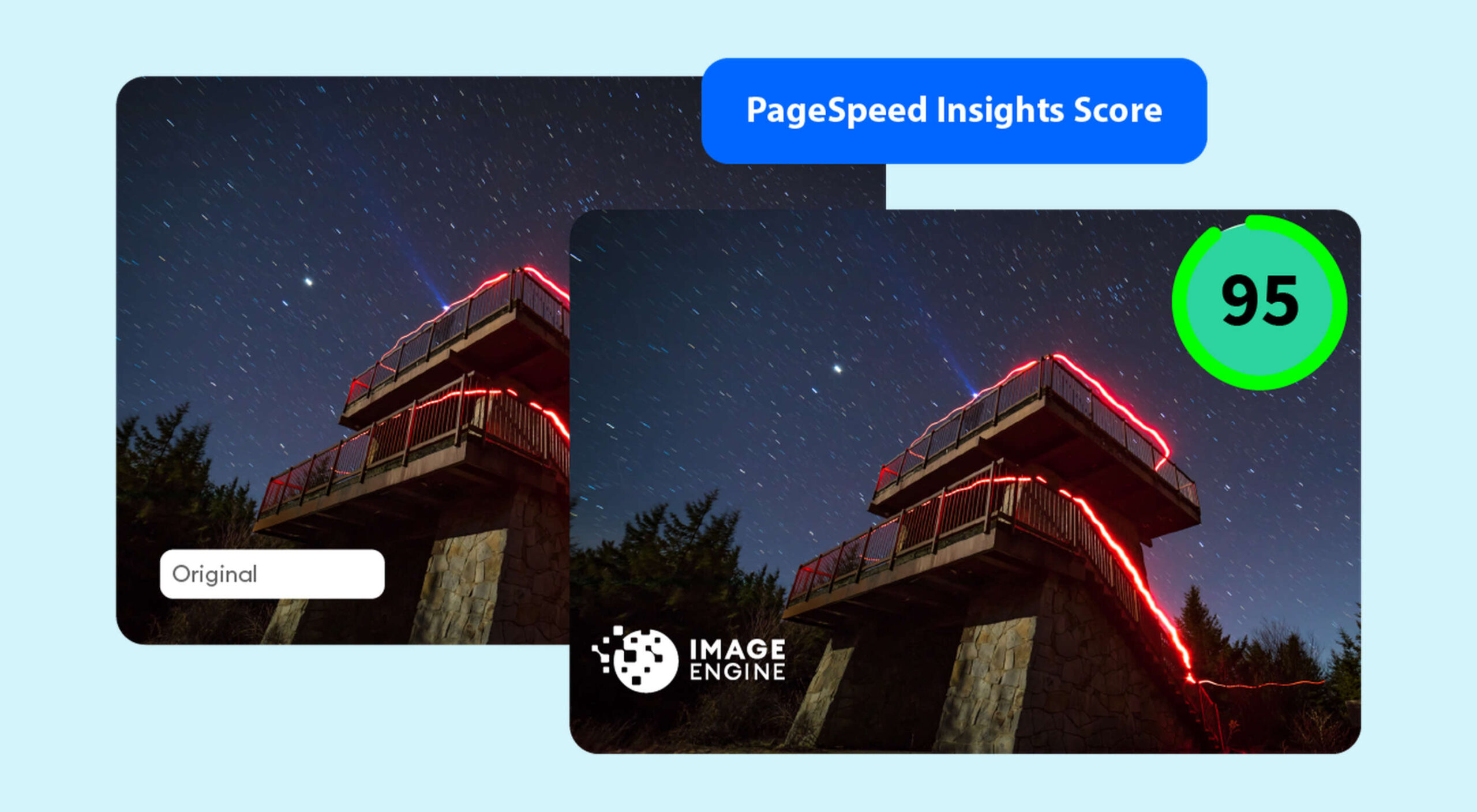
However, depending on whether you already have render-blocking JS, Google might flag this as a completely new issue. Regardless, it will negatively impact your performance score in tools like PageSpeed Insights:

You can avoid it altogether by using an optimization engine like ImageEngine that doesn’t require any JavaScript.

4. You’re Not Using A Content Delivery Network (CDN)

A CDN is a network of servers spread across various regions all over the globe. What it basically does is store a copy of your website on each of these servers. When an internet user visits your site, the CDN automatically serves your website from the nearest server to that user.

What this does is allow your website to load faster, no matter where in the world people are visiting it from. If your website was only hosted on a single server, say somewhere in the U.S., then it could take much longer to load for a visitor located in Asia than one in the U.S.

While they all basically do the same thing, different CDNs are better at handling different types of content. Cloudflare, Fastly, and Akamai are just some of the most popular general-purpose CDNs around. Image CDNs like ImageEngine are purpose-built to not only serve image and video assets but to also optimize them using compression, formatting, etc.

So, the two main factors to consider are the type of content you want to deliver via the CDN and its global coverage. However, it’s usually possible to use multiple CDNs in tandem to cover different types of content and reach a wider area.

5. There’s Excessive Overhead In Your Database

If you have a website with any type of complexity, you probably have a corresponding database. In fact, all WordPress websites require a database to function.

Over the years, a lot of information moves in and out of the database. Sometimes, the data can get lost along the way or become obsolete. If you don’t regularly spring-clean your database, then this can really start to add up. Not only will it bloat the storage size of your database, but it will start to impact the speed of database queries and requests.

CMS users are especially prone to racking up these kinds of artifacts from plugins and themes that have been installed and removed over the years.

Unfortunately, there aren’t many easy fixes for this issue available. With most hosting providers, you’ll probably need to use phpMyAdmin to manually check and scrub your data. If you have a managed hosting solution, the host’s support team might be able to help you out. In the event that you have a locally installed database, there are some tools you can use, although they’re not 100% effective.

The best way to avoid any issues is to make database maintenance part of your routine and to learn the basics of how databases work.

6. You Have Too Many Plugins Or Themes Installed

For CMS users, plugins or themes offer near-limitless potential to spruce up the design and functionality of their website. However, each plugin or theme comes with additional code and content that add to the overall complexity and size of your website.

If you have a hand-coded website, the same goes for any additional applets or libraries you want to add to your site. 

The best way to combat this is to be conscientious when adding any extras to your website. Only install what you really need or want, and make sure to uninstall and properly remove them if you don’t need them anymore.

As mentioned, they might leave various transients or artifacts behind, so you should keep an eye out for them throughout your website files (not just the database) whenever you do some spring cleaning.

7. You Aren’t Utilizing Caching

Caching is often one of the most effective yet ignored techniques for improving website performance. Caching stores your website content in fast-access memory in the user’s browser, allowing it to be loaded near-instantaneously by users. This can include everything from text to stylesheets to images to JavaScript files.

Without caching, a user will need to redownload everything when they navigate to or reload a page — whether or not anything has changed.

However, not properly configuring caching on your website can lead to issues, such as users only loading out-of-date content. Most high-quality caching tools have built-in features that automatically clear the cache when you make changes to a specific website page or content. So, users will only reload content once it has been modified.

Some hosts offer out-of-the-box caching tools with their hosting service. CMS can also usually find plugins for this, such as WPRocket for WordPress.

8. Ads Are Dragging You Down

In the end, ads are just another form of media that increases the overall weight of your website pages. While they are typically small and lightweight, multiple ad placements can really start to add up.

What aggravates the issue is that ads are loaded from external sources. This means they’ll take longer to render, generate more requests, and may mess with how stable your pages load — affecting your core web vitals.

Depending on how important ads are to your revenue stream, you’ll want to carefully consider how many ads you use on your site, where to position them, and when they load. If possible, avoid loading ads at the same time as the rest of your page, especially interstitials.

Conclusion

As you can see, website performance is a multi-faceted subject. Although some may be worse than others, you can’t just address one area and expect your website to suddenly be performant.

However, some general principles apply:

  • Keep HTTP requests low by limiting the number of files required for each of your website pages.
  • Maintain proper code hygiene and spring clean transients and leftover artifacts.
  • Invest in proper hosting infrastructure as well as a CDN for your website.
  • Optimize your media assets to significantly bring down payloads without sacrificing engagement.

The final point deserves another shoutout. As we’ve pointed out, finding an optimization solution for your media, particularly images, is probably the best thing you can do to improve your website performance. From purely a performance perspective, there is no service quite as effective as ImageEngine. It’s also the one that requires the least amount of technical expertise and ongoing maintenance.

Regardless, you’ll want to run some tests using tools like PageSpeed Insights so you can gather data on what issues your website is facing. From there, you can prioritize fixes to make your website more competitive.


[– This is a sponsored post on behalf of ImageEngine –]

Source

The post 8 Reasons Your Site Is Slow + How To Fix Them first appeared on Webdesigner Depot.


Source de l’article sur Webdesignerdepot

Tilda website builder combines everything we liked so much about constructors when we were kids – you can experiment, test out and build myriads of new creative ideas out of ready-to-use blocks. Tilda is that type of constructor that allows you to own your creative process and create pretty much any website: landing page, business website, online store, online course with members area, blog, portfolio, or event promo page.

Founded seven years ago, Tilda is a website builder that completely revamped the way we create websites. Tilda has been the first website builder to introduce block mechanics that allows users to create websites out of pre-designed pieces. This breakthrough technology allowed all users – not only designers – to create professional-looking websites. Just like in kid constructors, you can drag-and-drop and mix-and-match blocks on Tilda to let your creativity flow and build a dazzling website, at extraordinary speed. 

When you ask designers why they love Tilda, they usually say it’s because the platform provides the ultimate balance between choosing from templates and being able to fully customize and create from scratch to bring any creative idea to life. Here’s what else they say:

Tilda has been a game-changer for us. It allows our team to quickly spin up new web pages, make edits, and ship new programs. We left WordPress for Tilda and after being with Tilda for 2 years, I don’t ever want to go back.

~ Andy Page, Executive Director, Forge.

I built my first website in 2001. Since then I’ve used countless platforms and website builders for customer websites and my own business. Tilda is the perfect combination of ease of use with powerful features at an unbeatable value.

~ Robby Fowler, Branding and Marketing Strategist, robbyf.com & The Brand ED Podcast.

Let’s dive deeper into core functionalities you can leverage on Tilda. 

#1 Cut Corners With 550+ Pre-Designed Blocks And 210+ Ready-Made Templates

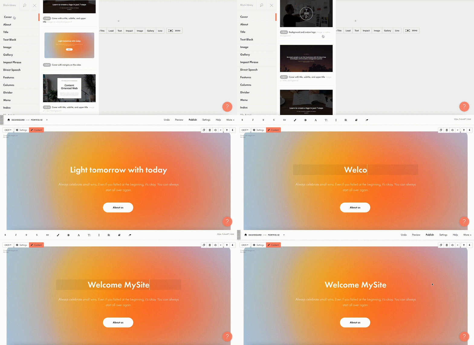
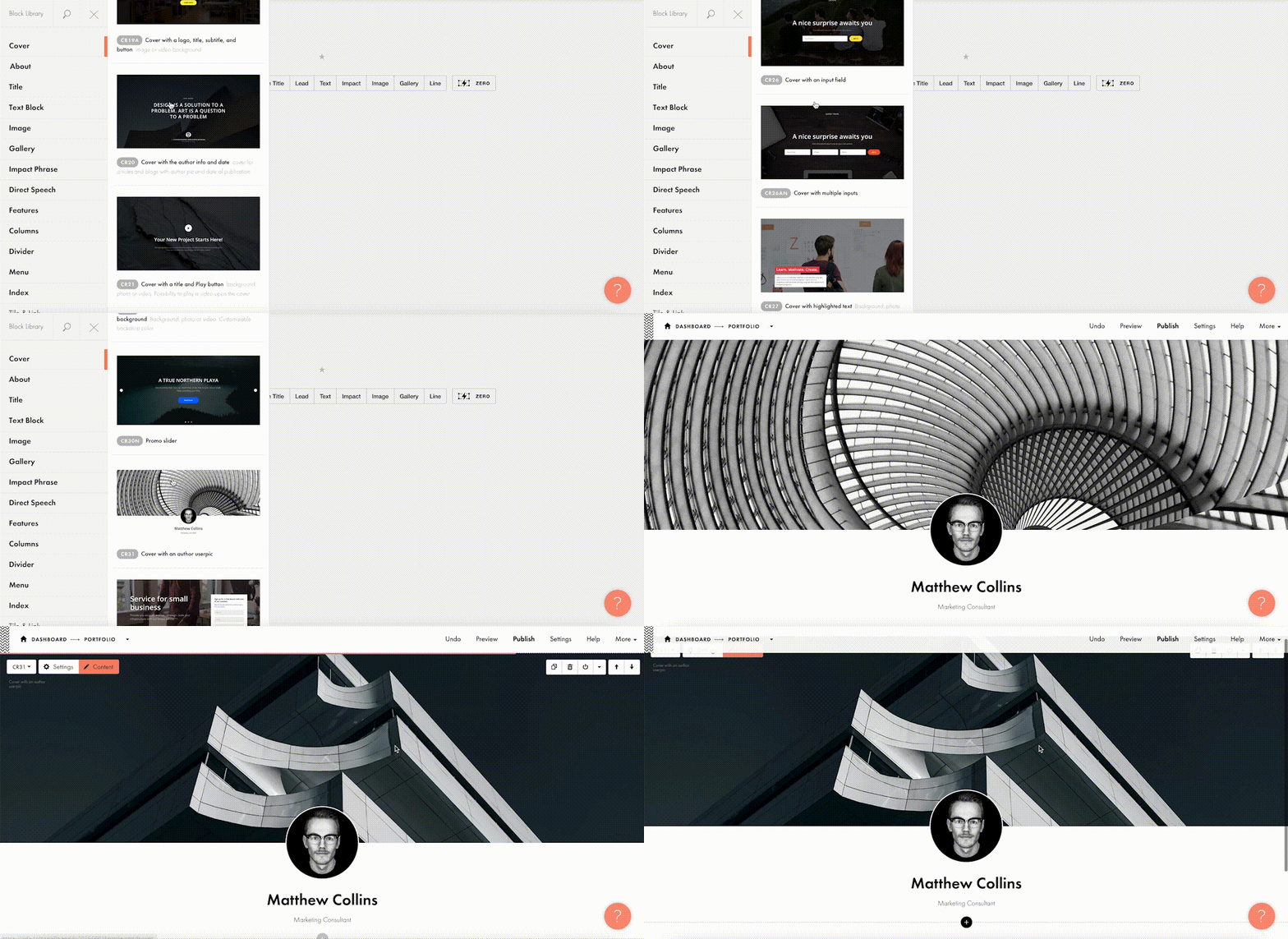
The beauty of Tilda is that it provides 550+ blocks in the ever-growing Block Library designed by professional designers. Thus, you can quickly build a website out of pre-designed blocks that encompass virtually all elements you might need for your website: menu, about us page, features, contact, pricing, etc. 

Customizing each block is a breeze with Tilda: You can drag-and-drop images, edit text right in the layout, alter block height, background color, padding, select the style of buttons, use custom fonts, and assign ready-made animation effects to specific parts of it. Also, Tilda provides a built-in free image library with 600K+ images, so you can find images that are just right for you without leaving Tilda, add them to your website with just one click, and use them for free.

Finally, all blocks fit together so well that it’s almost impossible to create a bad design on Tilda – even if you are a stranger to website building.

For a quick take-off, you can use 210+ ready-made templates for different kinds of websites and projects: online stores, landing pages, webinar promo pages, multimedia articles, blogs, and more. Each template is a sample of modern web design and consists of blocks. It means that templates don’t limit your creativity: you can modify them to your liking by playing with settings, adding extra or removing existing blocks, and embedding images and text. 

Each of the templates and blocks covers over 90% of use cases you’ll ever require and is mobile-ready, meaning that your website will look great on desktop computers, tablets, and smartphones by default.

#2 Jazz Up Your Site With Zero Block: Professional Editor For Web Designers 

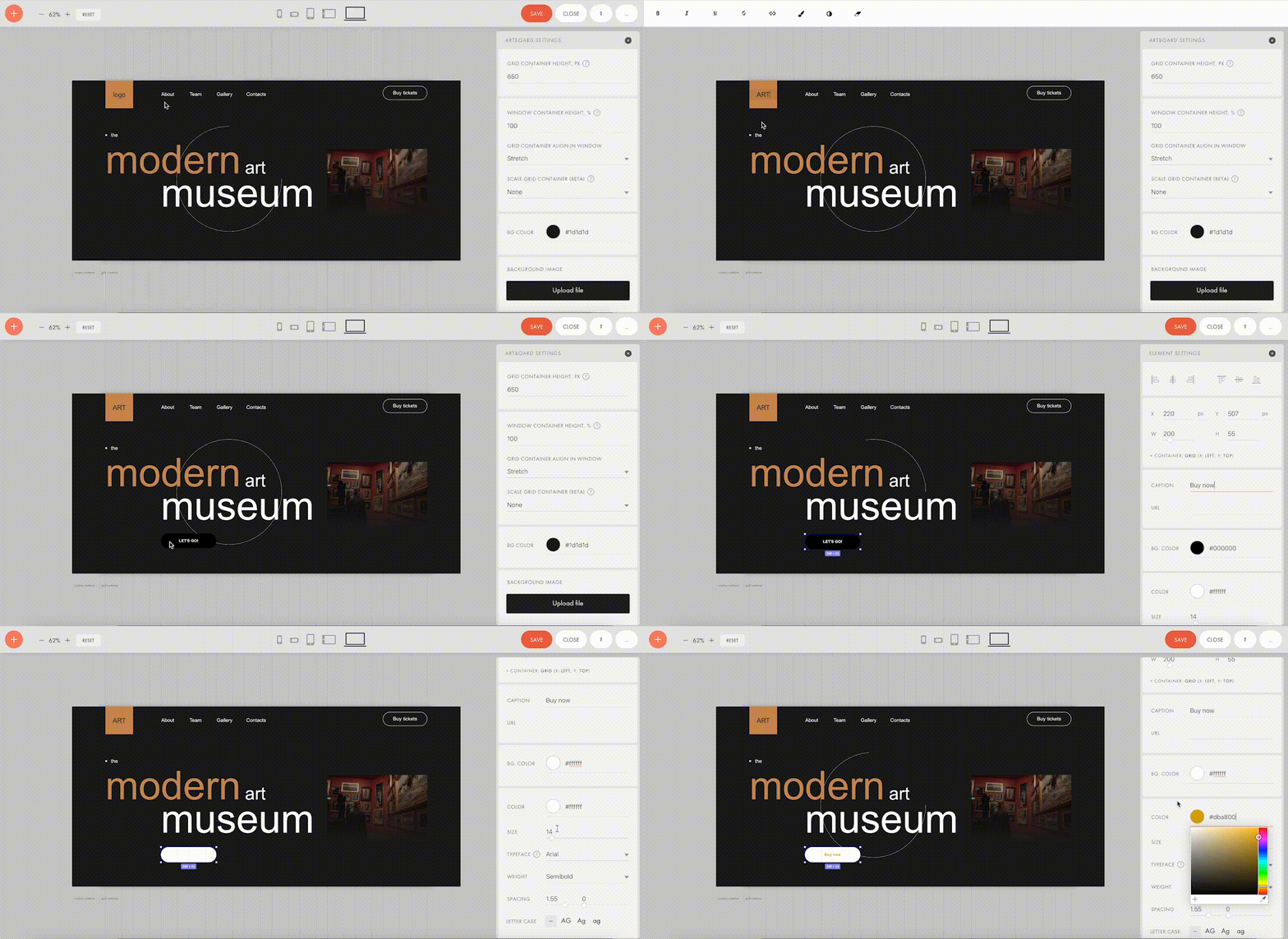
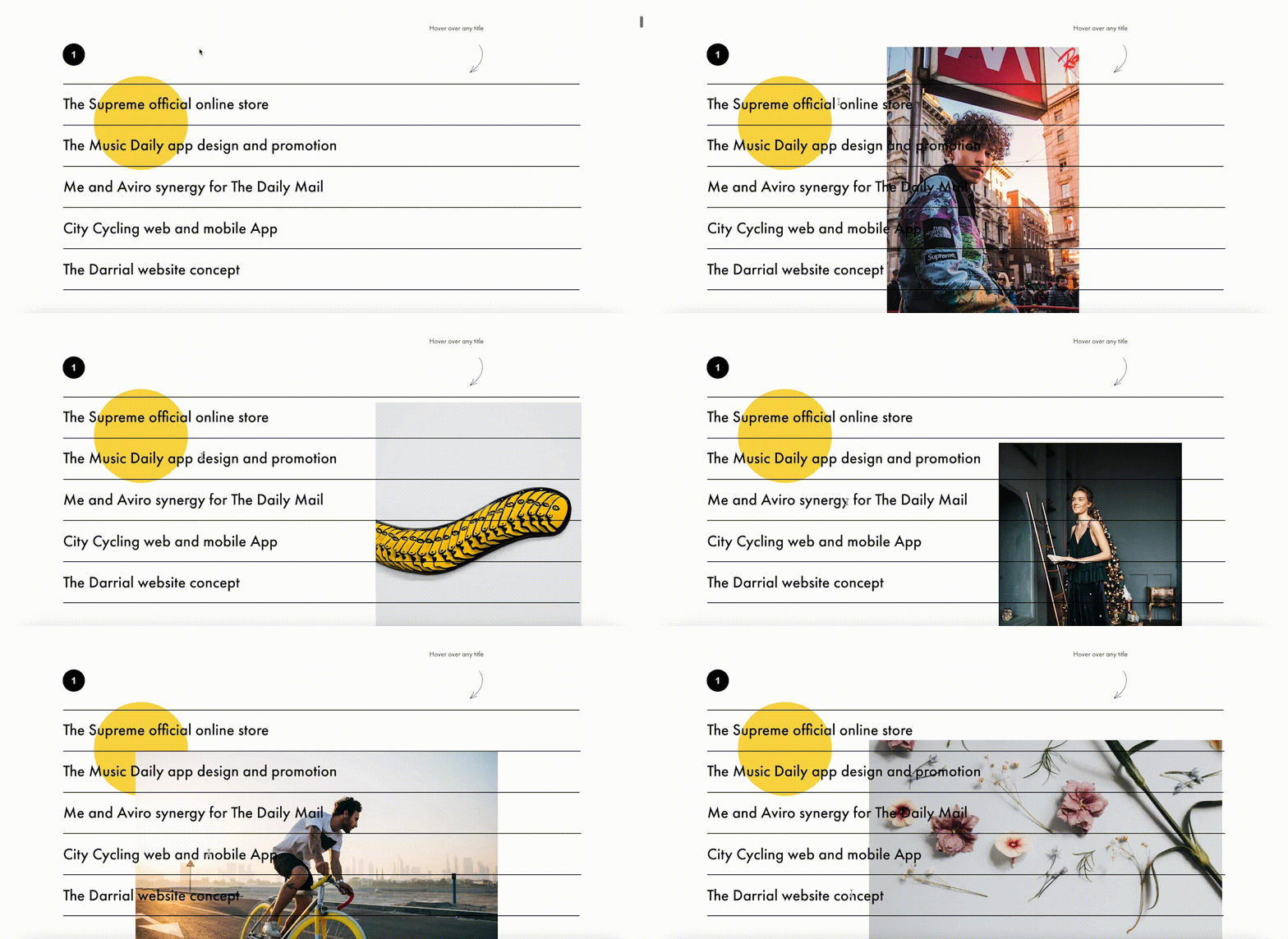
To better meet the demands of a creative brief and unleash your creativity, you can use Tilda’s secret weapon called Zero Block. It is a tool for creating uniquely designed blocks on Tilda.

You can control each element of the block, including text, image, button, or background, and decide on their position, size, and screen resolution on which they’ll appear. For example, you can work with layers to create depth with overlay and opacity techniques or set a transparency level on any element and shadow effects below them. Additionally, you can also insert HTML code to add more complex elements, such as calendars, paywall, comments, social media posts, and so much more.  

Finally, Zero Block allows you to fool around with basic and more advanced step-by-step animation for a more individual look. Here’re some animation examples that you can make on Tilda:

Animation on scroll (position of elements is changing on scroll).

Trigger animation (animation is triggered when pointing at or clicking on an object).

Infinite scrolling text.

#3 Import Designs From Figma To Tilda In Minutes

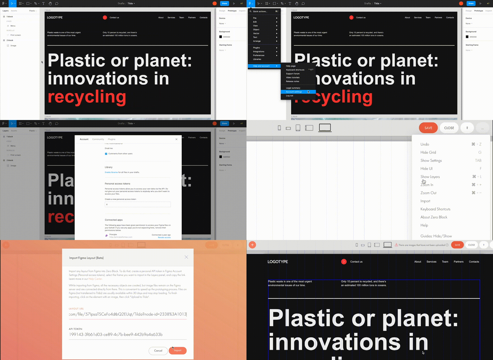
Creators love using Figma for prototyping, but when you have to transfer every element and rebuild your website design from scratch – that’s what’s killing the party. With Tilda, you can easily turn your static designs into an interactive website in no time. 

All it takes is to prepare your Figma design for import with a few easy steps, paste the Figma API token and your layout URL to Tilda, click import and let the magic happen. Once your design is imported, you can bring your project online just by clicking publish.

#4. Make Search Engines Love Your Website With Built-In SEO Optimization

Thanks to the consecutive positioning of blocks on the page, websites designed on Tilda are automatically indexed well by search engines. There is also a set of SEO parameters you can fine-tune right inside the platform to ensure that your web pages rank high even if you don’t have an SEO specialist in-house. These parameters include the title tag, description and keywords meta tags, reader-friendly URLs, H1, H2, and H3 header tags, alt text for images, and easily customizable social media snippets. 

As an additional value, Tilda provides an SEO Assistant that will show you what errors are affecting the indexing of your website and will help test the website for compliance with the search engines’ main recommendations.

#5. Turn Visitors Into Clients

Tilda gives you the power to set up data capture forms and integrate them with 20+ data capture services, such as Google Sheets, Trello, Notion, Salesforce, Monday.com, etc., to ensure seamless lead generation.

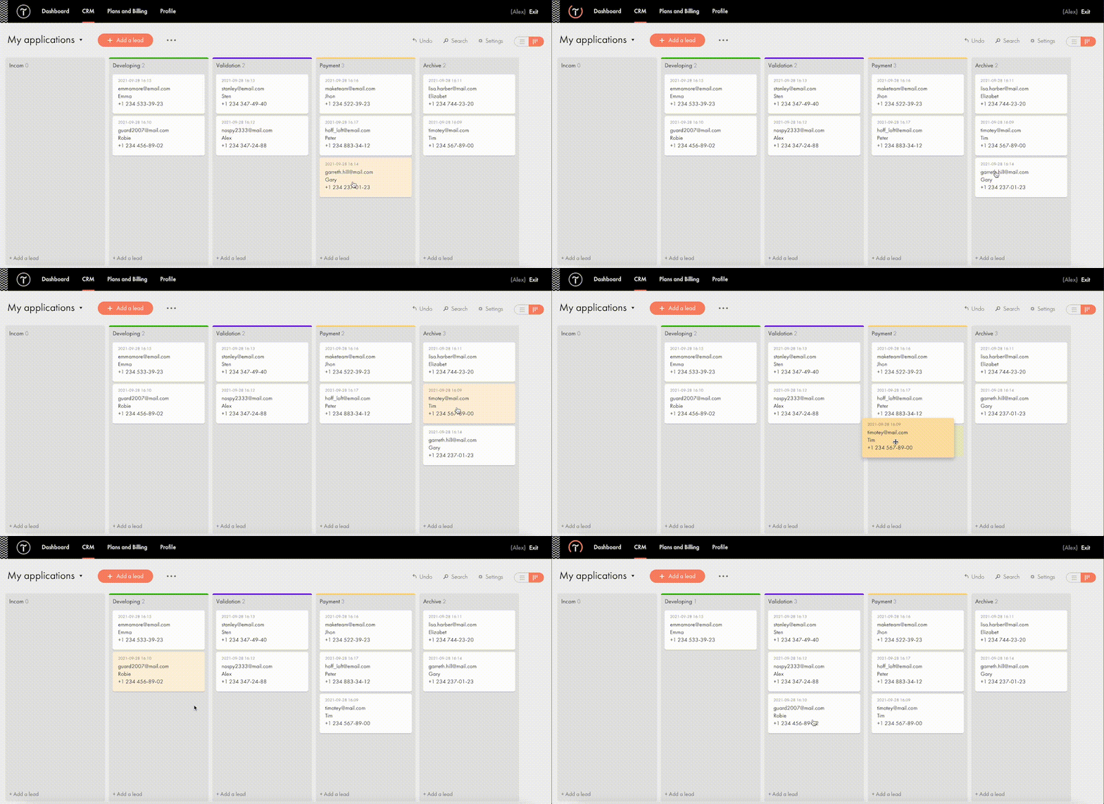
For more fun, Tilda developed its CRM to manage your leads better and keep your business organized right inside of a website builder. This is a very easy-to-use tool that automatically adds leads from forms and allows you to manually add leads you captured outside of the website. There is a kanban board that gives you an overall view of how leads are moving through your sales funnel and allows you to move leads between stages easily.

#6. Build A Powerful Online Store In One Day

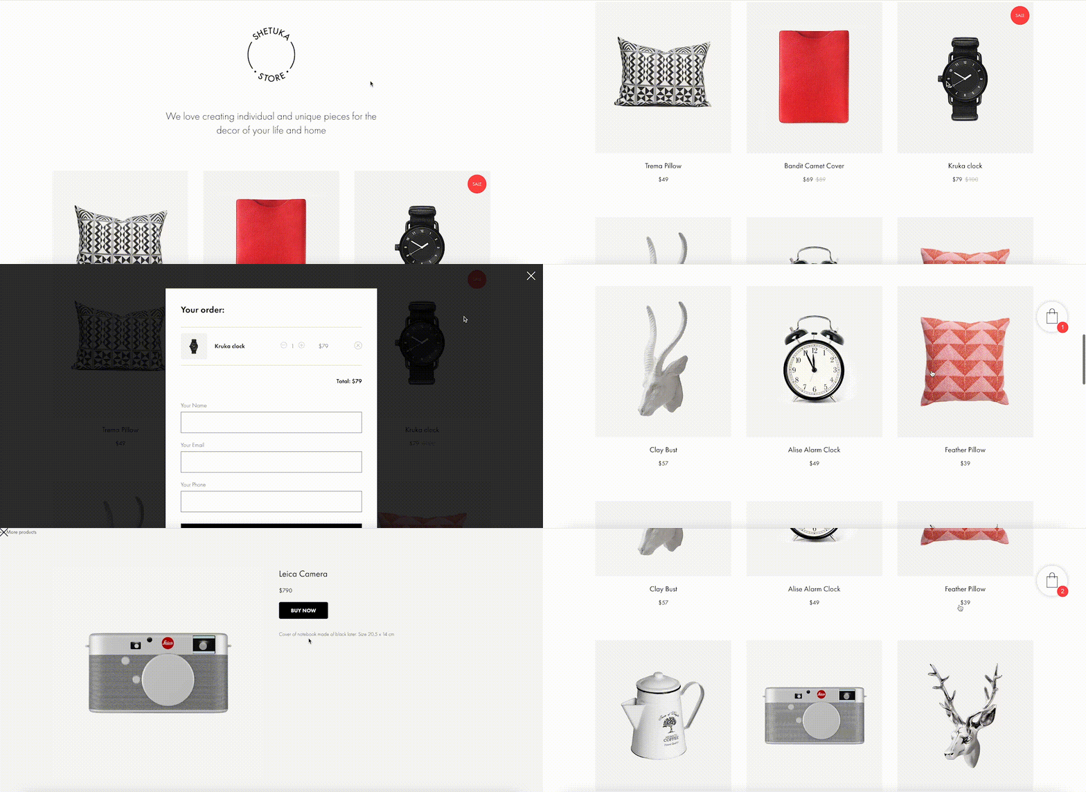
Tilda provides a set of convenient features to create a remarkable online shopping experience. The platform gives you the power to sell online using ready-made templates or build an online store completely from scratch, add a shopping cart and connect a payment system of choice — Stripe, PayPal, 2Checkout, etc. — to accept online payments in any currency.

If you are looking to run a large ecommerce business, you should also consider Tilda. Thanks to the built-in Product Catalog, you can add up to 5000 items, import and export products in CSV files, easily manage stock, orders, and keep track of store stats.

And thanks to adaptive design, your store will look good across all devices, including tablets and smartphones. 

#7. Bring Your Project Online For Free

Tilda offers three subscription plans: Free, Personal ($10/month with annual subscription), and Business ($20/month with annual subscription). When you sign up for Tilda, you get a lifetime free account. It allows you to publish a website with a free subdomain and gives you access to a selection of blocks and a limited number of features that offer enough to create an impressive website. 

Personal and Business tariffs allow more advanced options, such as connecting custom domains, adding HTML code, receiving payments, and embedding data collection forms. The business plan also allows users to export their website and create five websites (while personal and free plans allow one website per account). 

To discover all features and templates on Tilda, activate a two-week free trial – no credit card required.

Source

The post Tilda – The Website Builder That Disrupted The Way We Create Websites first appeared on Webdesigner Depot.


Source de l’article sur Webdesignerdepot

Many markets are saturated with competition; it’s no surprise that customers are expecting top-of-the-line experiences. Businesses must keep up with these ever-changing demands to remain competitive and drive forward.

One way to ensure customers have positive experiences is to take a look at your website. Your website is like your digital headquarters, where customers can browse through products or services, have frequently asked questions answered, and be able to reach you if they need direct support.

Making a site user-friendly and customer-centric will assist businesses while they work to build a loyal customer base. Customer happiness is more important now than ever and has the potential to make or break your business. We all know that happier customers spend more, and delighted customers will always come back for more.

Let’s explore some ways you can level up the customer experience on your website to foster customer loyalty and retention, as well as garner brand advocates for your business.

How Important Is CX?

As a site manager, your goal should be to meet customers’ needs. Creating a website is no simple task but can transform CX (customer experience).

Suppose a customer visits your site only to see a buffering symbol or a lag on their desktop or mobile device. This wouldn’t make for a positive experience, would it?

When customers have to spend extra time navigating your website to find what they’re looking for, it can directly lead to site abandonment, where customers leave the site before browsing. It’s vital to consistently monitor your website metrics to see if abandonment rates impact your overall traffic.

Customers who have enjoyable experiences browsing through your site are more likely to appreciate your brand and strongly consider purchasing whatever offerings you have.

Additionally, positive customer reviews can help your business gain new customers — word-of-mouth marketing is still relevant in 2021’s digital marketing landscape. Earning those 5-star reviews can help other potential customers see that they too could have a positive experience with your brand.

As you can see, CX is just as important as the products or services you offer, so keep that in mind as you set out on the journey to improve your website to advocate for your customer base.

Below, we’ll cover some of the most important elements and features of a strong business site so you can implement them.

Valuable Features to Include on Your Website

The features of your website are the foundation of your business. One of the best parts of building a killer website is that you can get as creative as you’d like with all of the features at your disposal.

Whether you use WordPress or another platform to host your website, you can always explore other paid services or offerings online to bring your site to the next level.

For example, the WooCommerce WordPress extension allows e-commerce sites to improve the overall appearance of their site, add customizations and, generally speaking, create a high-quality e-commerce store.

Below are some examples of elements you should consider incorporating into your web design. Offering these features will surely keep your site visible, relevant, and attractive to all types of customers.

1. Add Personalization

Every type of customer can benefit from a personalized experience, and it helps you turn them into loyal customers.

Personalization is becoming more prevalent in web design, whether it’s including past products they’ve viewed on your landing page or making it simple for them to log in to their account.

Maybe you allow your customers to create a wishlist, just as Amazon does. You could also make personalized deals or recommendations for your customers based on their past purchases or search history. When customers see this level of personalization, it may influence their purchasing decisions and make it simpler for them to order products.

2. Include Compelling and Unique Content

Every professional in the digital marketing space knows that content is king. The companies that include the most compelling content garner the most attention and increase the number of customers who make up their customer base. Here are some examples of what your content should look like:

  • Comprehensive
  • Useful
  • Accurate
  • Visually appealing
  • Helpful
  • A direct answer to a search engine query

By following these descriptions, your content will improve. Whether it’s a blog post or a photo or video, quality content is a driving factor in your user engagement. It helps to support your SEO strategy and will undoubtedly keep customers coming back.

3. Prioritize Speed and Usability

Because technology is an integral part of most people’s lives, customers expect to visit a fast, reliable website. No longer will customers wait patiently for a site to load. The dreaded buffering symbol is a clear indicator that your business is not taking customer experience into account.

It’s critical to create a website that loads quickly and is easy to use. Avoid organizing any tabs in a confusing way. Ensure that your website is visually attractive without overwhelming color schemes or photos that take up too much space.

Go for a more modern, contemporary look that’s easy on the eyes. Customers will appreciate this and will likely spend more time browsing your various website pages.

4. Focus on Navigation

Users should be able to access any page on your website with ease. They shouldn’t have to search for the right drop-down menu or type into the search bar unless they’re searching for a specific product or service.

The majority of users on a site, 70% to be exact, spend most of their time navigating freely without using the search bar. This should tell you how vital good navigation is to your business website. Placing menus on the top of your site is common practice — if you would rather place your drop-down menu somewhere else, make sure you’re putting it in a section where it’s easy to find.

Put yourself in your customers’ shoes. See what types of designs you can incorporate into your site to elevate UX and make browsing simple.

5. Make Sharing Simple

One of the best ways to grow your customer advocates is by leveraging your existing customers. Your customers should be able to easily send your product or service descriptions to their friends and family.

Rather than copying a link, include a share feature. If something on your site is worth sharing with other potential customers, make it easy for them to send it.

Social sharing plays a significant role in digital marketing — it helps to garner organic traffic to your website. You can reach a larger number of people than originally intended, which is the most important benefit to reap by making it easy to share links from your site.

6. Incorporate Chatbots

Offering customer support by using chatbots is something major companies are incorporating into their website designs.

Suppose your customer is trying to complete a purchase but runs into a problem with a coupon they’d like to use. Rather than wait on hold on the phone or for an email in their inbox a few days later, an automated chatbot can step in and assist them.

Chatbots are on the rise, and it’ll be critical for your business to include them on your site. Proactive web actions can increase your site’s conversion rates and improve the overall customer experience.

7. Allow Customer Feedback

It shouldn’t come as a surprise that allowing your customers to share their experience with your brand can help you better understand them and the solutions they’re looking for from you.

Did you know that brands with superior customer service can generate 5.7 times more revenue than their competitors? When you’re in touch with your audience, you’re better able to include features they want and need to have a positive experience. By taking advantage of customer feedback, you can make necessary changes to your site to better serve your customers.

Advocate for Your Customer Base

All of the examples listed above can help elevate your site and improve the overall experience for existing and potential customers. Isn’t that the goal of any business, regardless of industry?

To serve your customers effectively means they’ll feel valued and come back for more. Whether that’s ordering more products or requesting more services, you’ll see the benefits of including the elements we’ve covered in this post.

As a recap, here are some steps you can take to advocate for your loyal customers:

  1. Add personalization
  2. Include unique content
  3. Make your site fast and usable
  4. Provide easy navigation
  5. Allow for easy sharing
  6. Leverage chatbots
  7. Be open to feedback

Overall, customer experience will become more important in the future as customer expectations change. Standing out from your competitors is no longer an option but a necessity. So many markets are struggling to do just that — so if you’re able to offer unique features on your site, it could potentially draw more customers in and drive them to purchase.


Featured image via Unsplash.

Source

The post 7 Simple Ways to Boost Your Website’s CX first appeared on Webdesigner Depot.


Source de l’article sur Webdesignerdepot

PageSpeed Insights is a free performance measurement tool provided by Google. It analyzes the contents of a web page for desktop and mobile devices. It provides a single number score (from 1 to 100) that summarizes several underlying metrics that measure performance. If you have not run PageSpeed Insights on your website, then you should stop and do it now. It’s an important indicator of how Google scores and ranks your site.

If your PageSpeed Insights score is below 80, don’t panic. You are not alone. Many websites are not optimized for performance. The good news is that you can take steps that should immediately improve your score.

You will notice that PageSpeed Insights highlights issues that cause slow page loading. However, you might need more guidance to resolve these issues. Below, we walk you through how to resolve four common issues related to images. We also show you how ImageEngine, an image CDN, can simplify, automate, and deliver the best image optimization solution possible.

Performance Drives Google SEO Rankings

Why does the PageSpeed Insights score and performance matter? Isn’t SEO ranking all about content relevance, backlinks, and domain authority? Yes, but now performance matters more than it did a year ago. Starting in 2021, Google added performance metrics to the factors that impact search engine rankings. In a market where websites are constantly jockeying to match their competition’s pages (for content relevance, keywords, and other SEO issues), performance is making a difference in keyword search engine rankings.

What Are Core Web Vitals Metrics?

PageSpeed Insights relies on a set of performance metrics called Core Web Vitals. These metrics are:

Largest Contentful Paint (LCP): Measures the render time (in seconds) of the largest image or text block visible within the viewport, relative to when the page first started loading. Typically, the largest image is the hero image at the top of pages.

First Input Delay (FID): Measures the time from when a user first interacts with a page (i.e. when they click a link, tap on a button, or use a custom JavaScript-powered control) to the time when the browser is actually able to begin processing event handlers in response to that interaction.

Cumulative Layout Shift (CLS): Measures the layout shift that occurs any time a visible element changes its position from one rendered frame to the next.

Images and JavaScript are the Main Culprits

PageSpeed Insights breaks down problems into categories based upon how they impact these Core Web Vitals metrics. The top two reasons why you might have a low score are driven by JavaScript and images.

JavaScript issues are usually related to code that either blocks or delays page loading. For example, lazy-loading images might involve JavaScript that blocks loading. As a rule of thumb, do not use a third-party JavaScript library to manage image loading. These libraries frequently break the browser’s built-in image loading features. Lazy-loading may make above-the-fold images load slower (longer LCP) because the browser starts the download later and because the browser first has to execute the JavaScript.

Another JavaScript issue involves code that is large or unnecessary for the page. In other words, code bloat. There are good resources for resolving these issues on the web. However, in this blog, we will focus on image problems.

Images are a major contributor to poor performance. The average website payload is 2MB in 2021, and 50% of that is images. Frequently, images are larger than they need to be and can be optimized for size with no impact on quality…if you do it right.

Four Image Issues Highlighted by PageSpeed Insights

Largest Contentful Paint is the primary metric impacted by images. PageSpeed Insights frequently recommends the following four pieces of advice:

  1. Serve images in next-gen formats.
  2. Efficiently encode images.
  3. Properly size images.
  4. Avoid enormous network payloads.

That advice seems straightforward. Google provides some great advice on how to deal with images in its dev community. It can be summarized in the following steps:

  • Select the appropriate file format.
  • Apply the appropriate image compression.
  • Apply the right display size.
  • Render the image.
  • Write responsive image code to select the right variant of the image.

We call Google’s process the “Build-Time Responsive Syntax” approach. If you have a relatively static website where you don’t generate new pages or switch out images frequently, then you can probably live with this approach. However, if you have a large and dynamic site with many images, then you will quickly feel the pain of this approach. Google itself stresses that developers should seek to automate this image process. Why? Because the process has some serious workflow drawbacks:

  • Adds storage requirements due to a large increase in image variants.
  • Increases code bloat and introduces more code complexity.
  • Requires developers’ time and effort to create variants and implement responsiveness.
  • Requires logic to account for different browser’s support for next-gen image formats.
  • Doesn’t adapt to different contexts. It relies on best-guess (breakpoints) of what device visits the web page.
  • Needs a separate CDN to further increase delivery speeds.
  • Requires ongoing maintenance to adapt to new devices, breakpoints, image formats, markets, and practices.

Key Steps to Achieving High-Performance Images

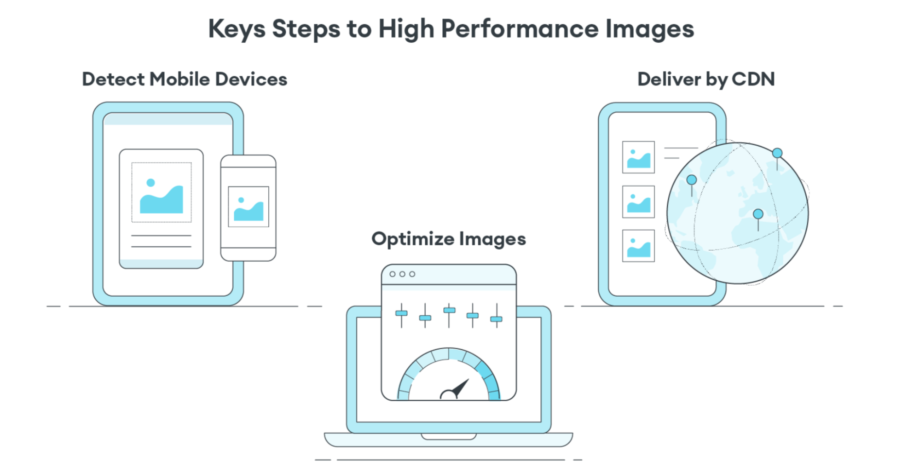
Instead of using the Build-Time Responsive Syntax approach, an automated image CDN solution can address all of the image issues raised by PageSpeed Insights. The key steps of an image CDN that you should look for are:

  1. Detect Mobile Devices: Detection of a website visitor’s device model and its technical capabilities. These include: OS version, browser version, screen pixel density, screen resolution width and height, support for next-gen image and video formats. This is where ImageEngine is unique in the market. ImageEngine uses true mobile device detection to further improve image optimization. It has a huge impact on the effectiveness of the image optimization process.
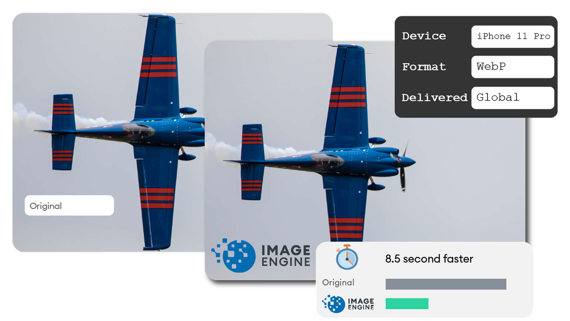
  2. Optimize Images: An image CDN will leverage the device’s parameters to automatically resize, compress and convert large original images into optimized images with next-generation file formats, like WebP and AVIF. Frequently, an image CDN like ImageEngine will reduce the image payload by up to 80%.
  3. Deliver by CDN: Image CDNs like ImageEngine have edge servers strategically positioned around the globe. By pushing optimized images closer to requesting customers and delivering them immediately from the cache, it often provides a 50% faster web page download time than traditional CDNs.

Easy Integration Process for Image CDN

After signing up for an ImageEngine account and free trial, you will receive a Delivery Address. After adjusting your <img /> elements to include the Delivery Address, ImageEngine will start to pull the original images from your website (no need to move or upload them), automatically optimize them, and deliver them.

You can automate the addition of the Delivery Address to the img src tag by using plug-ins for WordPress and Magento. Developers can also use ImageEngine’s React, Vue, or Angular JavaScript frameworks to simplify the process.

Additionally, there are many ways to simplify implementation via adjustments to templates for many CMS and eCommerce platforms.

Results: Improved Performance, Better SEO

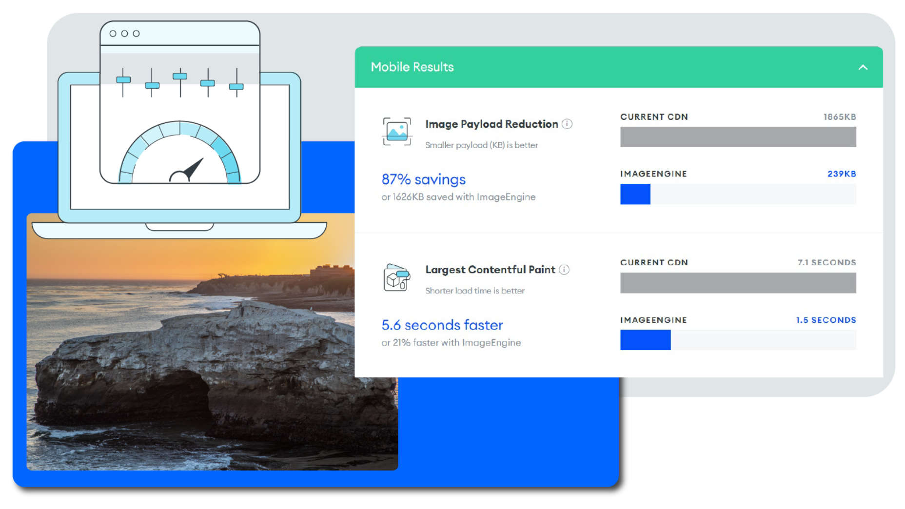
Most ImageEngine users see a huge improvement in LCP metrics, and consequently, a big improvement in the overall PageSpeed Insights score. ImageEngine provides a free demo analysis of your images before and after image optimization. In many cases, developers see improvements of many seconds on their LCP and Speed Index.

In summary, performance drives higher search rankings, and better UX, and increases website conversions for eCommerce. The steps you take to improve your image performance will pay for themselves in more sales and conversions, streamlined workflow, and lower CDN delivery costs.

Source

The post 4 Steps to Improve PageSpeed Insights Score and SEO first appeared on Webdesigner Depot.


Source de l’article sur Webdesignerdepot

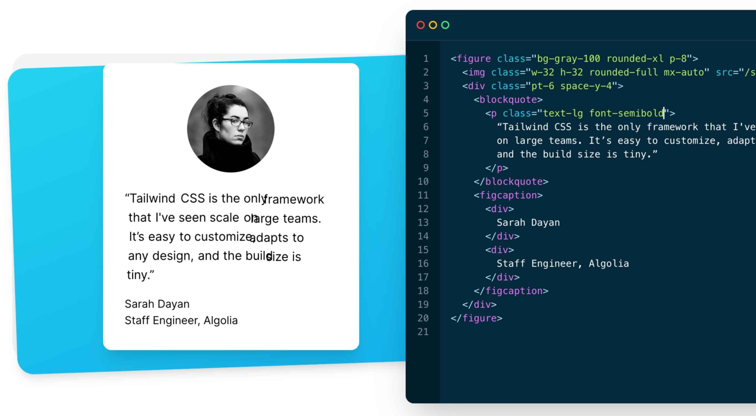
As a utility-first CSS framework, Tailwind has rapidly become popular among developers. With its fast styling process and the freedom it offers when designing a website, it’s really no wonder why.

But how can you make sure this is the right CSS framework for your upcoming development projects? In this blog post, you’ll learn what Tailwind is, and how it differs from other frameworks like Bootstrap, or Foundation.

In addition, we will highlight the main advantages and disadvantages of the framework. By the end, you will be able to make an honest and objective assessment as to whether Tailwind is the right framework for you. So without further ado, let us dive deeper into it. 

What is Tailwind CSS?

First released in May 2019, Tailwind CSS is a front-end CSS framework. It is currently at version 2.2. Since its release, Tailwind has created quite a following. More than 260k developers have used it to enhance their design systems.

Stats like these make Tailwind one of the most popular CSS frameworks on the market, and all in less than two years. There are many reasons for this. Primarily, because its features make it the ideal choice for a wide variety of projects. Tellingly, most developers prefer it to create React projects.

The main difference between Tailwind and its competitors is that it gives developers complete control over the styling of a web application. So, is it the right CSS framework for you? To answer this question, let us take a look at Tailwind’s advantages and disadvantages.

Tailwind CSS: Pros and Cons

Tailwind CSS: Advantages

1. Control Over Styling

Tailwind is a unique CSS framework when it comes to styling web applications, meaning that Tailwind does not have a default theme that you have to use like other CSS frameworks.

For example, you can give each project a different look even if you use the same elements (color palette, size, etc.). Therefore, it’s one of the few CSS frameworks that is not opinionated on how you should style your project. 

2. Faster CSS Styling Process

There is no faster framework than Tailwind when it comes to styling HTML. As a result, you can easily create good-looking layouts by styling elements directly. This is possible because Tailwind offers thousands of built-in classes that do not require you to create designs from scratch.

Therefore, you do not have to write CSS rules yourself. These CSS classes are the main reason why building and styling with Tailwind is so fast. 

3. Responsiveness and Security 

With Tailwind’s pre-built classes, you can design the layout directly in an HTML file. This makes it a very responsive, mobile-friendly CSS framework. Apart from that, Tailwind has proven to be a stable framework since its initial release.

The framework was developed by top-notch engineers, which is why bugs and breaks are rare. 

4. Additional Features 

Tailwind CSS works in the front end of a website. For this reason, it is reasonable for developers to demand ultimate responsiveness. Well, Tailwind provides the ability to create responsive themes for your web applications and remove all unused CSS classes. With PurgeCSS, Tailwind helps you keep your final CSS as small as possible.

Tailwind CSS: Disadvantages

1. Styling and HTML are Mixed

Because you do not have to write CSS rules yourself, Tailwind works differently than most CSS frameworks. While this is great for those unfamiliar with CSS, it also means that Tailwind mixes style rules in with your HTML files.

This goes against the principle of the “separation of concerns.” Many developers prefer to separate page structure and style, claiming that classes make the Tailwind markup process verbose. 

2. It Takes Time to Learn 

Because of the built-in classes, Tailwind CSS is quite learning-intensive. Even for experienced developers, it can be a challenge to learn how to use and fully utilize the pre-built classes. But, of course, as with any other development task, practice makes perfect.

However, if you are confident and quick when it comes to writing CSS classes, Tailwind may not be the best choice for you. Even if that’s true, Tailwind generally makes CSS styling faster in the long run.  

3.  Lack of Important Components

Unlike Bulma and Bootstrap, Tailwind does not have many significant styling components. Unfortunately, this means you have to manually add features like headers, buttons, and navigation bars for web apps.

This is not a significant drawback, as experienced developers can implement these features quickly. However, you will need to spend some time doing so. 

4. Documentation 

Although Tailwind CSS has made great strides when it comes to adding guides and video tutorials, it still lags behind competitors like Bootstrap. Of course, you can always contact the developers if you have a problem.

However, keep in mind that this may take some time. For this reason, you may need to customize the framework to your needs manually.

Is Tailwind Worth Trying?

In a few words, working with Tailwind is quite different from other CSS frameworks. We have identified its main advantages and disadvantages. Based on these features, we can easily say that Tailwind is:

  • An excellent solution for developers familiar with CSS who want to speed up the creation and design process in the long run.
  • Not such a good idea if you are not familiar with CSS or do not want to spend time learning a new CSS framework. 

It becomes clear that it all depends on your personal needs and preferences. However, if saving time on CSS styling is a priority for you, you should definitely give Tailwind a try.

Regardless of whether you choose to use Tailwind or not, it’s evident that many developers use it for good reasons. Since it offers a faster styling process and is a responsive and stable framework, it’s here to stay.

Tailwind can help you save time and change the way you design websites, and so taking the time to test it out is worthwhile.

Source

The post The Pros and Cons of Tailwind CSS first appeared on Webdesigner Depot.


Source de l’article sur Webdesignerdepot

The WordPress themes and plugins you choose for your clients’ sites don’t just impact how the interface looks or how well it works. They also impact your ability to build them.
The point in using WordPress themes and plugins is to make your life easier, not to create more work for yourself or limit what you’re able to do. If you’ve struggled to find WordPress tools you can rely on from job to job, BeTheme might just be the total package you’ve been looking for.

BeTheme has it all:

  • A backend builder
  • A frontend builder
  • A WooCommerce builder
  • 600+ pre-built websites

There’s nothing extra to pay with BeTheme. One fee gets you all the tools you need to easily build professional-grade websites for your clients.

Get to Know BeTheme’s All-In-One WordPress Solution

Want to see how the BeTheme powerhouse works? Check it out:

1. Build and Manage the Backend With Muffin Builder 3

Let’s be honest, WordPress page builder plugins leave something to be desired. While they all have their strengths, it’s hard to find one that offers different tools for how you want to work.

Many of them offer a visual drag-and-drop builder, leaving designers with little flexibility in how they build websites. With BeTheme, you don’t have to compromise.

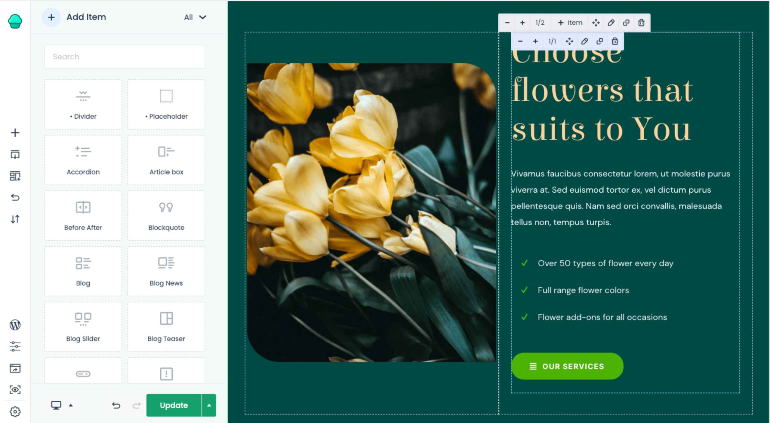
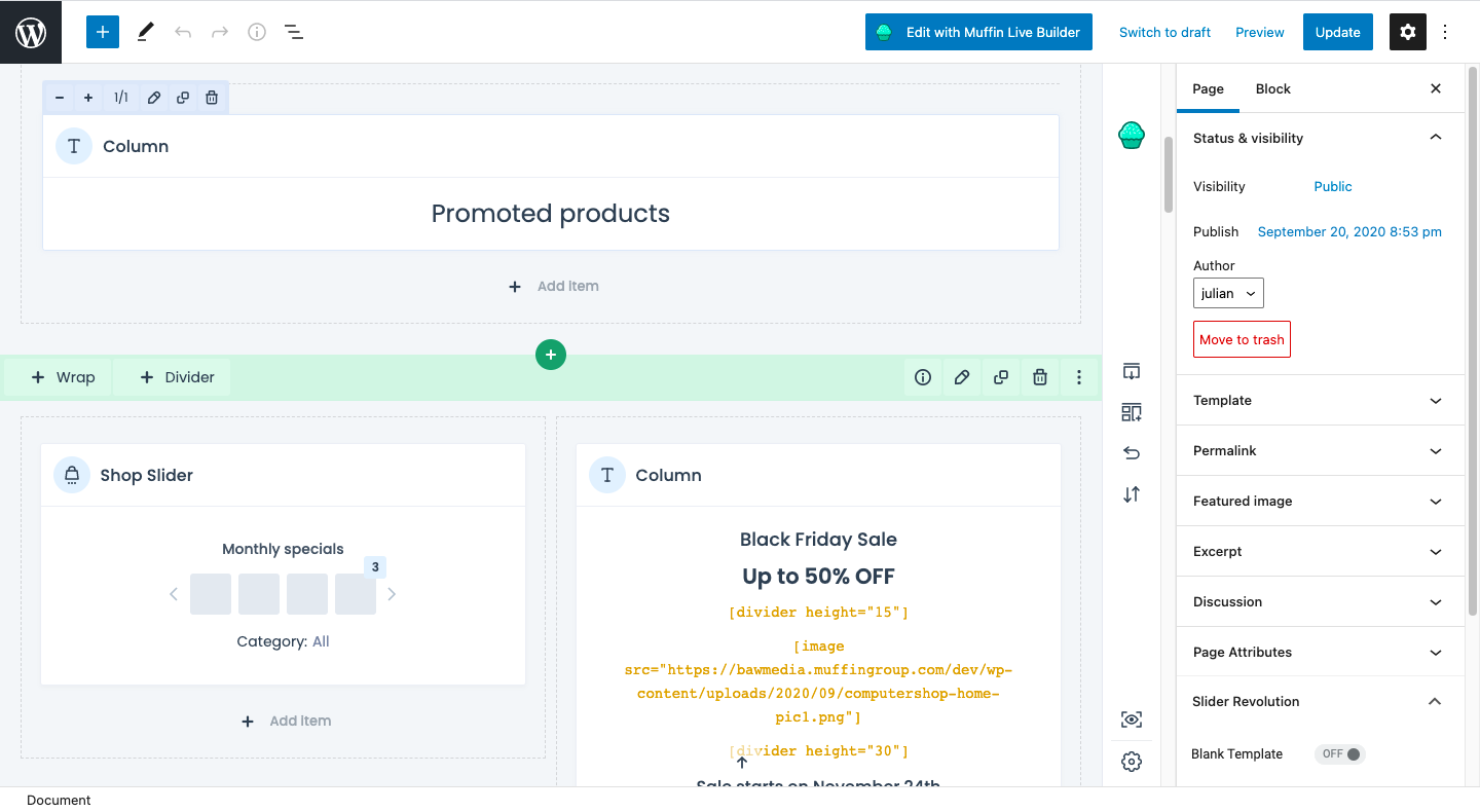
Muffin Builder 3 is the intuitive backend editor that gives you full control. And if you want to code it all by hand? You can. If you’d prefer to tap into BeTheme’s wide array of templates, pre-built sections, and predefined settings? You can do that as well.

What’s more, the backend builder makes it easy to add sliders to your website, optimize your pages for search, and more.

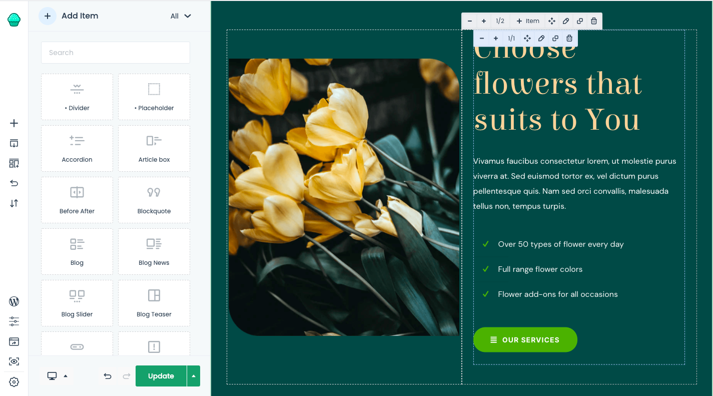
2. Design and Perfect Your Site on the Frontend with Muffin Live Builder

One of the reasons why drag-and-drop website builders have become so popular in recent years is because they empower everyone — from the DIY business owner to the professional web designer — to build websites visually. There’s just one problem:

While it’s great that developers both inside and outside of the WordPress ecosystem are creating these intuitive builders, they sometimes come at a cost.

One thing that tends to get sacrificed is speed. Because they take the editing out of the WordPress dashboard and onto the frontend of the website, many of them can take a while to load. (Some of them are known for stalling out on occasion, too.)

Another thing that gets sacrificed is how much you’re allowed to customize. You either have to design your website with the features and settings available from your page builder plugin or you have to do all the work inside of WordPress.

Muffin Live Builder doesn’t suffer from these issues.

For starters, the visual builder is lightweight, so it won’t keep you waiting around for pages to load or changes to reflect on the frontend.

Also, you don’t have to choose which builder you want to use. If you want to primarily build sites with the backend editor and then perfect the designs on the frontend, you can. With BeTheme, you don’t have to pick-and-choose which editor you want to use.

3. Create Great Looking Monetized Sites with the Muffin Woo Builder

Many page builders are built for one purpose: To help WordPress users visually design websites so they can see their work reflected on the site in real-time.

That said, many page builder plugins haven’t accounted for the ecommerce piece.

Users can design and customize the regular pages on their websites with the visual builder, like the Home, About, and Contact pages. However, their ecommerce pages — Shop, Products, Cart, Checkout, and more — have to be managed through WooCommerce’s interface.

WooCommerce is a great ecommerce plugin. However, it’s not ideal having to design different parts of your site with different tools.

Be now has a solution for this: Muffin Woo Builder.

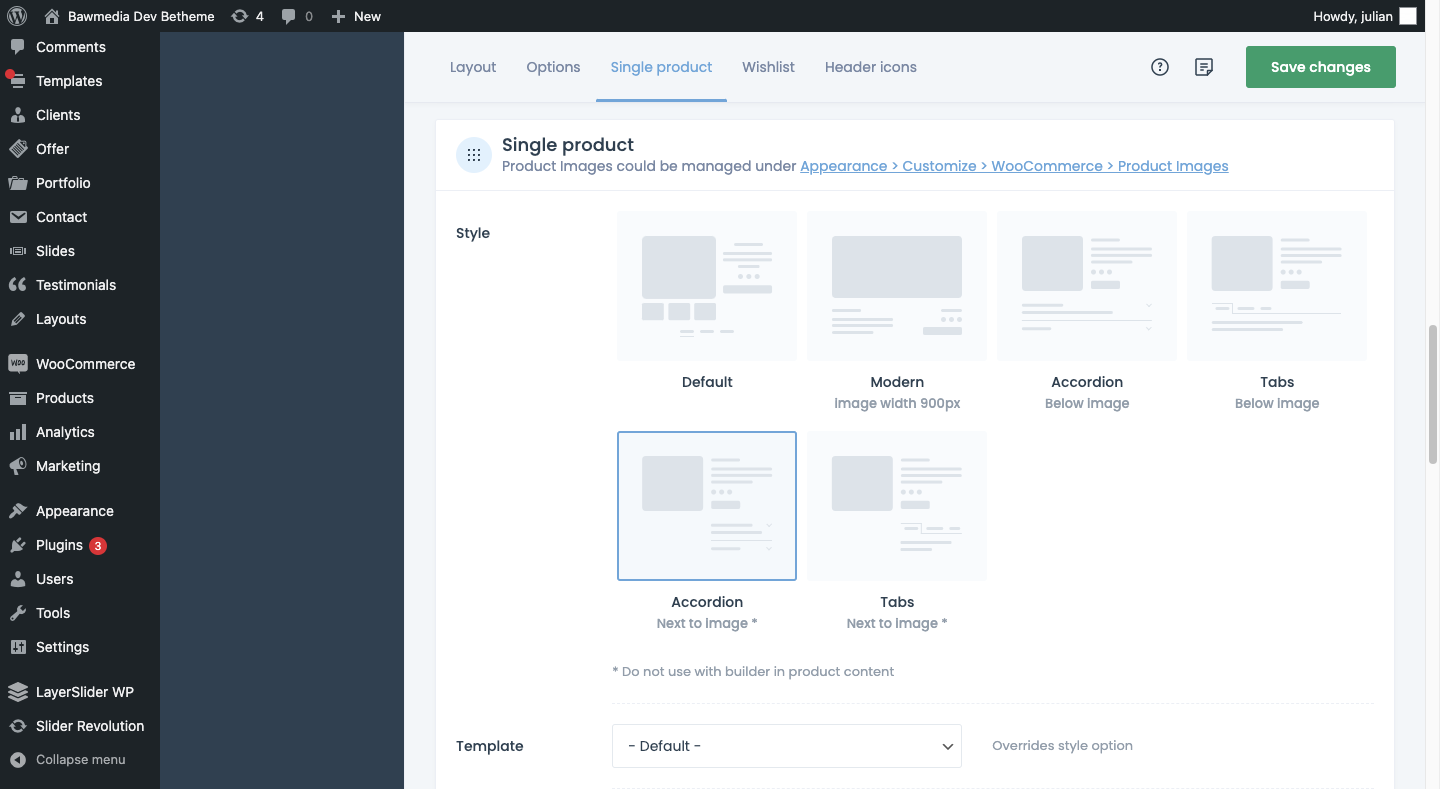
The Muffin Woo Builder allows designers to build their own single product and shop templates instead of just customizing the default ones provided by WooCommerce or the theme.

It also gives you design editing capabilities that no other page builder plugin can. For example:

  • Create design rules for your ecommerce pages
  • Choose from 11 product gallery styles
  • Switch between Shop and Catalogue mode
  • Set custom variation swatches
  • Show or hide the cart button
  • Add a sidebar
  • Configure settings for how product images render
  • Enable a Wishlist
  • Pick and choose which icons appear in the header

If you want this level of control over the layout and look of your ecommerce pages, you have to install other plugins or custom-code those changes into the backend. So, this is definitely a unique feature amongst page builders.

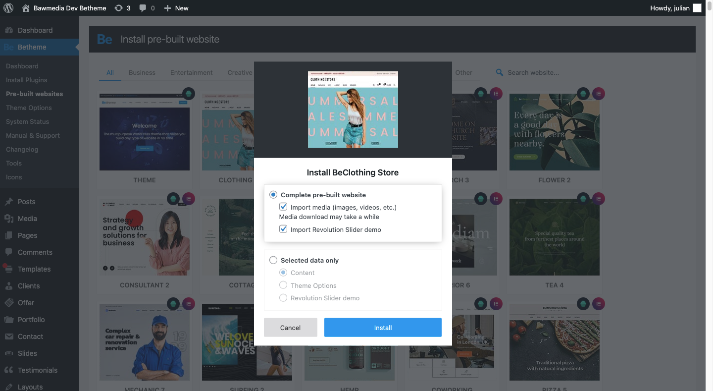
4. Instantly Design an Attractive Website With One of 600+ Pre-Built Sites

BeTheme isn’t just the fastest WordPress builder because it’s lightweight or because there are various builder options that allow you to work the way that’s best for you.

BeTheme also comes jam-packed with 600+ pre-built websites, with new ones released every week.

When you install a pre-built site, BeTheme is going to do a number of things for you:

  • Install all the specific plugins you need for the site
  • Load a fully designed and fully functioning website into your WordPress installation
  • Add placeholder content and imagery throughout so you can easily swap in your own

That’s going to save you a lot of time. Think about the cost savings, too. You get access to more than 600 pre-built websites without having to pay anything extra for them.

Is BeTheme the total design package? You bet it is!

It can’t be overstated what a game-changer BeTheme is for WordPress designers. Two page builders, one WooCommerce builder, and 600+ pre-built sites all rolled into one?

Everything you need to design high-quality websites is baked in.

That’s something you rarely see in any product or service, let alone in WordPress.

If you’re ready to say “Goodbye!” to page builder plugins and transform the way you work, get the BeTheme powerhouse now.

Source

The post Design Faster & Smarter with BeTheme’s 3 Builders & 600+ Pre-Built Sites first appeared on Webdesigner Depot.


Source de l’article sur Webdesignerdepot

According to a research and market report « Cloud Services Market by Service Type, Cloud Type, Enterprise Size and Industry Vertical: Global Opportunity Analysis and Industry Forecast, 2020-2027 », the cloud service is valued at $264.8 billion in 2019 and is expected to increase to $927.51 billion by 2027. Certainly, businesses big and small are increasingly becoming aware of the importance of SaaS software development or cloud solutions in bestowing speed and accuracy to their operations. But more than everything, the key driver of the sector is the cost it saves, amounting to approximately 35% of the total expenses of businesses. 

The Reason Behind the Growing Cloud Computing Trend

Source de l’article sur DZONE

In the tech world, DevOps is a word frequently tossed around to describe the blending of development and operations teams. It’s a melting pot where engineers work in tandem across the application lifecycle, revamping the typical « silo » framework. Adopting this model requires a necessary change of antiquated company culture to dismantle and reorganize the traditional structure, ultimately reducing operational inefficiencies. Once optimized, these DevOps teams produce benefits like increased speed and reliability, rapid delivery and scaling ability, and improved collaboration and security. 

Typically, this philosophy is hailed as a superior organizational approach; however, Uri Zaidenwerg voices a different opinion in his article « Why DevOps Will Cease to Exist. » In his article, Uri, a DevOps engineer himself, begins by briefly summarizing what the path to becoming a DevOps engineer looks like. Following this career outline, he identifies what he sees as « signs of the end » for DevOps engineers before forecasting his prophecy.

Source de l’article sur DZONE

One of the most challenging stages of a design project is laboriously producing all those assets that bring it to life.

Whether you’re a web designer in need of icons, or a brand designer looking for mockups, it’s a smart move to fall back on stock assets to speed up your turnaround, reduce costs, and enliven your designs.

With so many stock sites to choose from, which should you opt for? Today we’re going to take a look at DesignBundles.net and ask if it’s the right choice for your project.

What is Design Bundles?

Design Bundles is exactly what it sounds like: sets of design assets that you can download for free or at huge reductions on RRP.

Launched five years ago, Design Bundles is brought to you by the same team that delivers Font Bundles.

Over two million customers are already enjoying the benefits of Design Bundles’ weekly updates.

What Can You Download From Design Bundles?

There are currently over 800,000 products listed on Design Bundles, and the collection is growing all the time.

The files have been produced by 6,500 of the world’s leading independent designs. Because the products are top-quality, you can really make them work: scale them, flip them, distort them, recolor them; just about anything is possible when you’re using high-quality raw ingredients.

What’s really impressive is the range of products that are in the collection. You’ll find backgrounds, logos, icons, textures, patterns, and clip art. For product designers, there are mockups and web elements. Print designers will love the huge range of cards, invites, flyers, posters, and brochures. And if you’re looking for standard stock images, you’ll find a gargantuan range under popular themes such as technology, architecture, travel, and business.

Because Design Bundles is relatively new, you won’t find its collection padded out with out-of-date Gifs. In fact, Design Bundles is one of our favorite places for free SVGs, the best format for graphics on the web.

All the products are royalty-free and licensed for personal and commercial use, so you can relax knowing that you’re fully covered.

What Makes Design Bundles Different?

There are a lot of design bundles services online, so what makes Design Bundles different? Well, firstly, the quality; Design Bundles has a consistently high level of designs. We love the freebies. They make a huge difference and are great for trying out ideas you might not be ready to invest in.

Design Bundles differs from other stock sites because it offers curated bundles of complementary assets — you don’t just download a vector file; you download a set of vector files. This innovative approach means you don’t have to go hunting for matching images; once you’ve found the right download for your project, you have a whole range to enjoy.

The whole process of using Design Bundles is simple, from browsing through the available assets to choosing a design and through to the fast, simple checkout process. It’s all designed to make including design assets into your projects as simple as possible.

The website is user-friendly, and in the unlikely event that you’ll need them, the support team is friendly, helpful, and prompt to handle queries.

Is Design Bundles Good Value?

We’d be lying if we said that cost wasn’t a big bonus of using Design Bundles. Design Bundles offer up to 96% discounts on regular prices, meaning that you can get the same incredible assets that top design agencies use at a fraction of the price.

In terms of time-saved, inspiration-delivered, and graphics-acquired, your Design Bundles subscription will more than pay for itself.

Alongside the daily and weekly deals, you’ll find products you can try for free. For example, design Bundles provide a whole heap of free SVGs. And not just sample files. There are thousands of files to download and use in projects. You can’t get better value than free!

There are new freebies every week, so it’s worth subscribing just to ensure you don’t miss anything.

For freelancers, the licensing model is particularly attractive. Because there’s no limit on the places you can download design resources once you’ve bought them, you can download files at home, in the office, or at a client’s workspace — whatever is convenient. Meaning you carry a huge library of resources with you wherever you go.

Oh, and if you want to make the most of your new Design Bundles assets, don’t forget to check out its YouTube channel, where you can learn tons about how to create effects, edit images, and complete creative projects.

Should Designers Use Design Bundles?

When you’re designing a project, whether you’re a digital artist, a web developer, or a crafter, the result relies on the quality of its component parts.

Design Bundles offers you the chance to work with high-quality assets from some of the web’s top designers at a fraction of the price of creating them yourself.

We’re confident that if you give Design Bundles a go, you’ll quickly see the benefits for yourself. But if you’re still not sure, why not sign up for its newsletter and check out some of the daily and weekly deals and the freebies that are available to you.

Design Bundles is a recipe for success that you’ll be happy you discovered.


[— This is a sponsored post on behalf of Design Bundles —]

Source

The post Review: Should Designers Use Design Bundles? first appeared on Webdesigner Depot.


Source de l’article sur Webdesignerdepot