Developers are working with new applications every day using Apache Kafka as the backbone to implement an event-driven architecture (EDA) to support distributed systems. However, this adds new challenges when sharing across teams, even within the same organization. What endpoints are available? What is the structure of the message? That’s why payload examples became critical to speed up development. For this reason, having a reliable and enterprise-grade service to mock Apache Kafka should be an item in your EDA checklist. This post will do a quick review of the Microcks General Availability (GA) version and their support to Kafka.
Articles
 User experience design is something that most of us associate with websites. But why isn’t it something we extend beyond the website?
Here’s why I ask this:
As a consumer, it’s so rare that your only interaction with a brand is through its website. Take an ecommerce site, for example. You buy a product from it, and then what happens?
- You get a confirmation email;
- You get another email when the package ships;
- You might get another email or SMS notification when the package is delivered;
- You retrieve the package and open it;
- You open up your purchase and use it.
These are all an extension of that initial user experience on the site. If there’s just one hiccup along the way, it could easily erode the trust and happiness you felt after quickly finding and buying what you needed on the site.
So, what I’d like to do today is look at 10 areas where UX design should extend beyond the website to ensure that the frictionless experience started there remains untarnished.
Extending UX Design Beyond the Website
As a web designer, you might be thinking that this part of the user experience doesn’t fall under the umbrella of your responsibilities. And you may be right about that.
For brands to truly be successful and profitable, someone needs to carefully examine the bigger picture and ensure that the user experience is flawless no matter how far away from the site it is. At the very least, you should share the UX research and strategy you do for a client’s site so their team can ensure it carries over to other areas of the business.
Here are some things to think about:
1. Mobile App
It’s not uncommon for websites to have mobile app counterparts these days. The layout doesn’t need to be identical since mobile users tend to behave differently than those on desktop.
That said, an app shouldn’t force users accustomed to the desktop experience to re-learn how to navigate or engage with the brand. So, the branding, UI design, speed, security, and navigation all need to be on par with what’s already been established in terms of usability.
2. Email
Most websites have a direct connection to email. For example, blog newsletters, purchase confirmation emails, and lead generation follow-ups all start on the website.
Consumers are well aware that when they hand over their email address, they will receive an email in return. In many cases, those emails are welcomed when they’re done right. But if something feels off, that bridge could easily burn between brand and consumer.
To preserve the UX, emails should come with the following:
- The same branding and visual style as the website;
- A personalized subject line, greeting, or offer;
- Consistent messaging as the site, especially when it comes to the CTA.
Another thing to remember is that email isn’t the time to inject dark patterns into the experience. So, the “Unsubscribe” option should be in an easy-to-spot area and a sharply contrasting font color.
3. Social Media
Social media is another channel that’s commonly connected to a website. While you can’t control the aesthetics of social media websites themselves, the visuals and messaging in posts need to be on-brand.
That means that things like memes and emojis — which are popular means of communication on social — should only be used if they’re normally part of the brand identity. If not, you’ll need to find other ways to communicate engagingly.
Another part of the user experience to think about is customer support. Social media is a lot like going into a store. If someone has an issue with what they bought or the service they received, there will be many people around to witness the complaint. Social media only amplifies that — so the quality of customer care needs to be consistent with how the brand handles it everywhere else.
4. SMS
Not every brand will need to be connected to customers via text messaging. eCommerce companies, news sites, and personal services providers likely will, though.
However a brand uses SMS, the same UX guidelines apply here as they do across all other channels:
- Keep messages concise;
- Make sure they’re relevant and valuable;
- Use branded messaging and design;
- Don’t abuse the privilege and send too many;
- Make it easy to opt out.
Basically, if you can’t make it a valuable extension of the brand’s offering, don’t use it.
5. Phone
Any website that publishes its phone number should expect to receive calls from prospects and customers. While there’s nothing to design here visually, the experience of getting on the phone with a company should be consistent with what they experience elsewhere.
One way to do this is to design an easy-to-follow routing system. It should be simple for callers to figure out which number to choose. What’s more, there should be no endless loops. If a caller has exhausted the options, they should be immediately directed to a representative.
Another way to ensure consistency is to adhere to a script — that goes for call centers for enterprises as well as the local lawyer’s office. Every caller should be greeted with the same tone and handled in the same manner (depending on the situation, of course).
6. Ads
There are a lot of places where brands can advertise these days:
- Google search;
- Social media;
- Ad networks;
- TV;
- Radio;
- Podcasts;
- Blogs;
- Billboards;
- Direct mail.
When designing an ad campaign, there should be consistent messaging, aesthetics (when relevant), and CTAs presented. If branding isn’t consistent from ad to ad, there may be a delay in consumers recognizing the brand or its offer. Or, worse, not recognizing it at all.
7. Packaging
For brands that sell products, you have to think about how the packaging will impact the user experience. There are two types of packages to consider, too.
The first is the product’s own packaging. Branding should be clear as day and consistent with the site they bought it from.
It should also be easy to open. There’s nothing more frustrating than finally getting your purchase, only to realize you need tools to get it out of the packaging.
You also have to think about packaging for products that get shipped.
The product should fit well within the packaging. A too-roomy package will feel downright wasteful. So will excessive bubble wrap and paper filler.
Having a shipping label present in the package is also important. If the website makes it easy to make a purchase, the package should offer a convenient way to return the product if they’re not happy.
8. Product
The product itself has to align with the expectations set by the website.
Take the example of a SaaS. You’ve built an awesome landing page and mobile app store page to promote it. It looks great, it loads fast, and it’s easy to get around. But if the SaaS itself is ugly, disorganized, slow, or otherwise just clunky, all of the work you did to market it will end up being just false advertising.
So, make sure the expectations set before and during purchase naturally carry over to the experience with the product.
9. Business Exterior
For brick-and-mortar companies, the business’s exterior matters just as much as what happens inside it.
The most obvious thing to focus on is the aesthetics of the building. Does it look attractive? Is it in a safe area? Is there clear signage around it? Is it easy to find?
But you also have to think about user experiences that take place outside of the building. For example, there’s now a rise in curbside pickup. There are tons of things that can affect how happy the customer is with the experience — like if the pickup area is hard to find, there are never enough spots or the associates who deliver the orders always seem to be in a foul mood.
The business’s exterior should always set a good impression for what takes place inside.
10. Business Interior
Here are some things to think about when it comes to “designing” business interiors for a good UX:
- Decor;
- Layout;
- Signage;
- Furnishings;
- Product discoverability;
- Availability (of products or people);
- Quality of customer service;
- Checkout process.
It doesn’t matter what the company does — whether it’s a large retailer like Walmart or your own freelance design business. If a business’s establishment doesn’t look good, operate flawlessly, or provide a good person-to-person experience, it’s going to be very hard to get people to return.
So, all those things you do to design a streamlined website journey should be applied to a bricks-and-mortar business’s interior.
Wrapping Up
Depending on the types of companies you build sites for, some of the channels and suggestions above might not be relevant. Hopefully, this has got you thinking about other ways you (and your clients) can extend the UX design and strategy from the website.
If you can maintain the high-quality user experience from channel to channel, your clients’ brands will get more business, grow their profitability, and see a rise in loyalty, too.
Featured image via Pexels.
The post UX Design Doesn’t End With Your Website first appeared on Webdesigner Depot.
 From dev tools to productivity to a little bit of fun with sudoku, this month’s collection of new tools is packed with something for everyone.
Here’s what new for designers this month.
May’s Top Picks
Am I FLoCed?
Am I FLoCed? Is a tool to see if you are part of a Google Chrome origin trial. It tests a new tracking feature called Federated Learning of Cohorts (FLoC). According to Google, the trial currently affects 0.5% of users in selected regions, including Australia, Brazil, Canada, India, Indonesia, Japan, Mexico, New Zealand, the Philippines, and the United States. The page will try to detect whether you’ve been made a guinea pig in Google’s ad-tech experiment.
According to the designers of Am I FloCed: “FLoC runs in your browser. It uses your browsing history from the past week to assign you to a group with other ‘similar’ people around the world. Each group receives a label, called a FLoC ID, which is supposed to capture meaningful information about your habits and interests. FLoC then displays this label to everyone you interact with on the web. This makes it easier to identify you with browser fingerprinting, and it gives trackers a head start on profiling you.”
Uncut
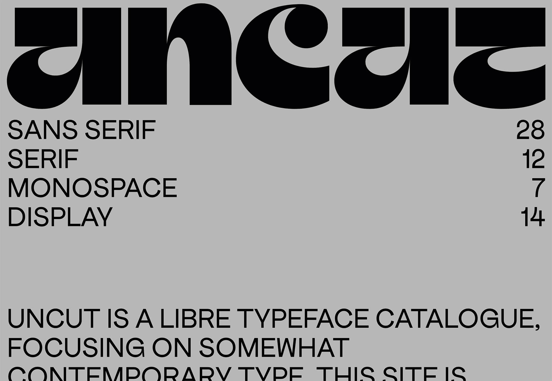
Uncut is a Libre typeface catalog that just got started in April. It features contemporary typefaces and styles and is set to be updated regularly. Sort by sans serif, serif, monospace, or display typefaces. Plus, you can submit a typeface for inclusion.
Dashblock
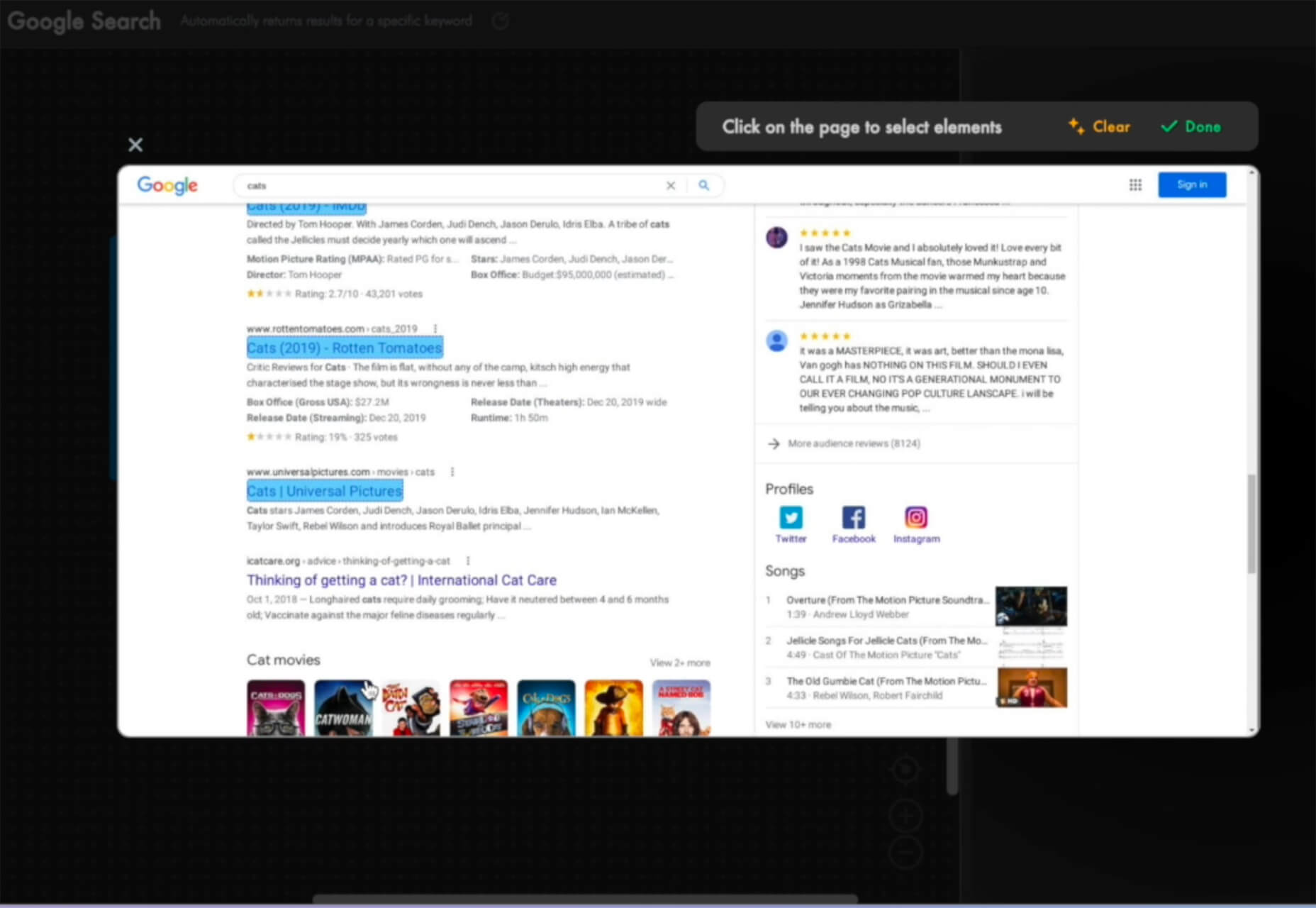
Dashblock allows you to build automations without coding. Use it to create visual automations, or turn blocks into use-cases. (It is a premium tool, but comes with a 14-day free trial to test it out.)
Instant
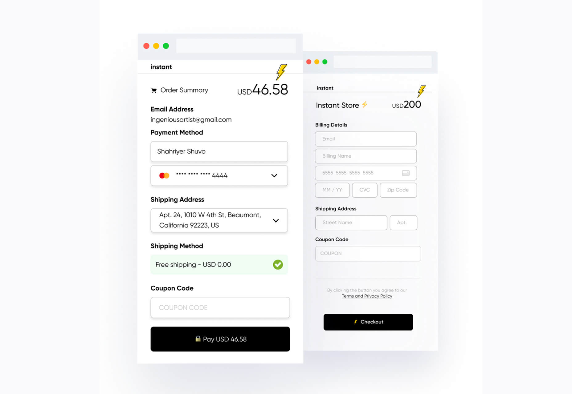
Instant is a fast and secure one-click checkout tool that works with WooCommerce. Users fill out a short form the first time they shop and then join the network to enable instant, frictionless, 1-click checkouts without passwords. It makes shopping easier and cuts abandoned carts.
5 Image Tools
Triangula
Triangula uses a modified genetic algorithm to triangulate images. It works best with images smaller than 3000px and with fewer than 3000 points, typically producing an optimal result within a couple of minutes. The result is a nifty-looking image.
Content-Aware Image Resizing in Javascript
Content-Aware Image Resizing in Javascript solves that problem with images where you have a photo but it just doesn’t quite fit. A crop doesn’t work because you lose important information. The carver slices and cuts photos to give you the image elements you want in the size you want them. It’s probably a good idea to read through the tutorial before jumping into the open-source code on GitHub.
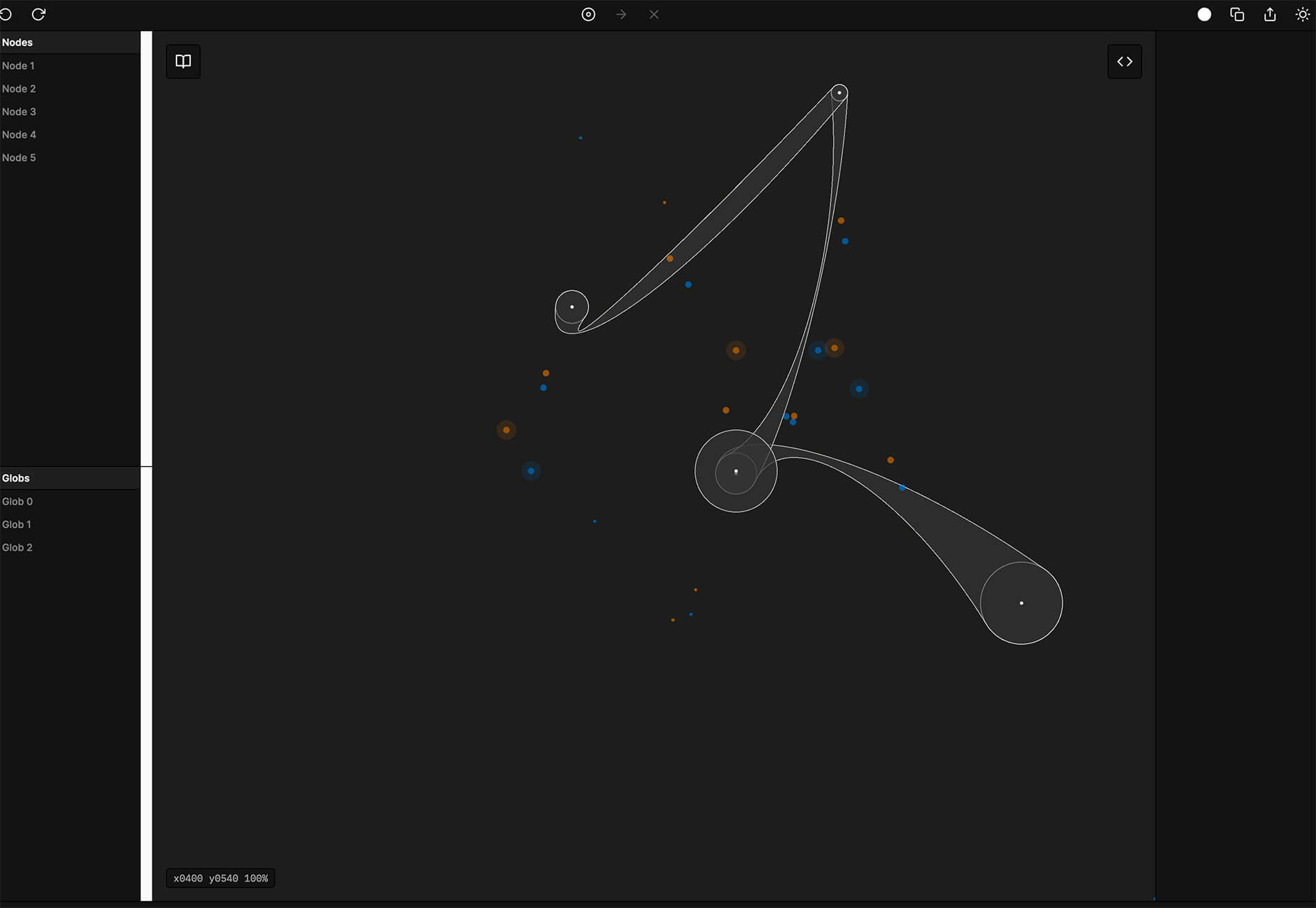
Globs Design
Globs Design uses toggles and drag and drop to help you create funky shapes and fills that you can save in SVG format for projects.
Root Illustrations
Root Illustrations is a stylish set of people-based illustrations that you can customize to create scenes for your projects. Construct a scene and then snag your set of vector graphics that also work with Sketch and Figma. The set includes 24 characters, more than 100 details, and the ability to change colors and styles.
Make Your Photo 16×9
Make Your Photo 16×9 is as simple as it sounds. It is a cropping tool that allows you to upload any shape of photo – even vertical – and pick options to fill the space to make it fit the standard 16×9 aspect ratio.
6 Dev Tools
Devbook
Devbook is a search engine for developers that helps them to find the resources they need and answer their questions faster. Fast, accessible right from a code editor, and fully controllable with just a keyboard.
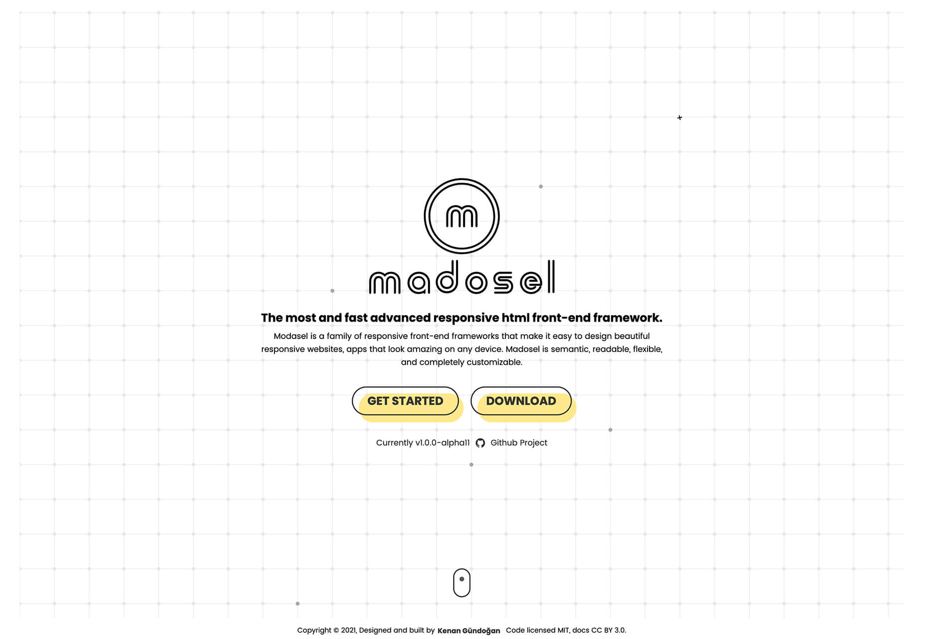
Madosel
Madosel is a fast, advanced responsive HTML front-end framework that’s in an alpha version. The open-source tool is made to create websites and apps that look great on any device. Plus, it is semantic, readable, flexible, and customizable.
Say Hello to CSS Container Queries
Say Hello to CSS Container Queries helps solve a problem with media queries and smart stacking of elements. CSS Container Queries allow you to make a fluid component that adjusts based on the parent element and everything is independent of viewport width. This post takes you through everything you need to do to implement this yourself.
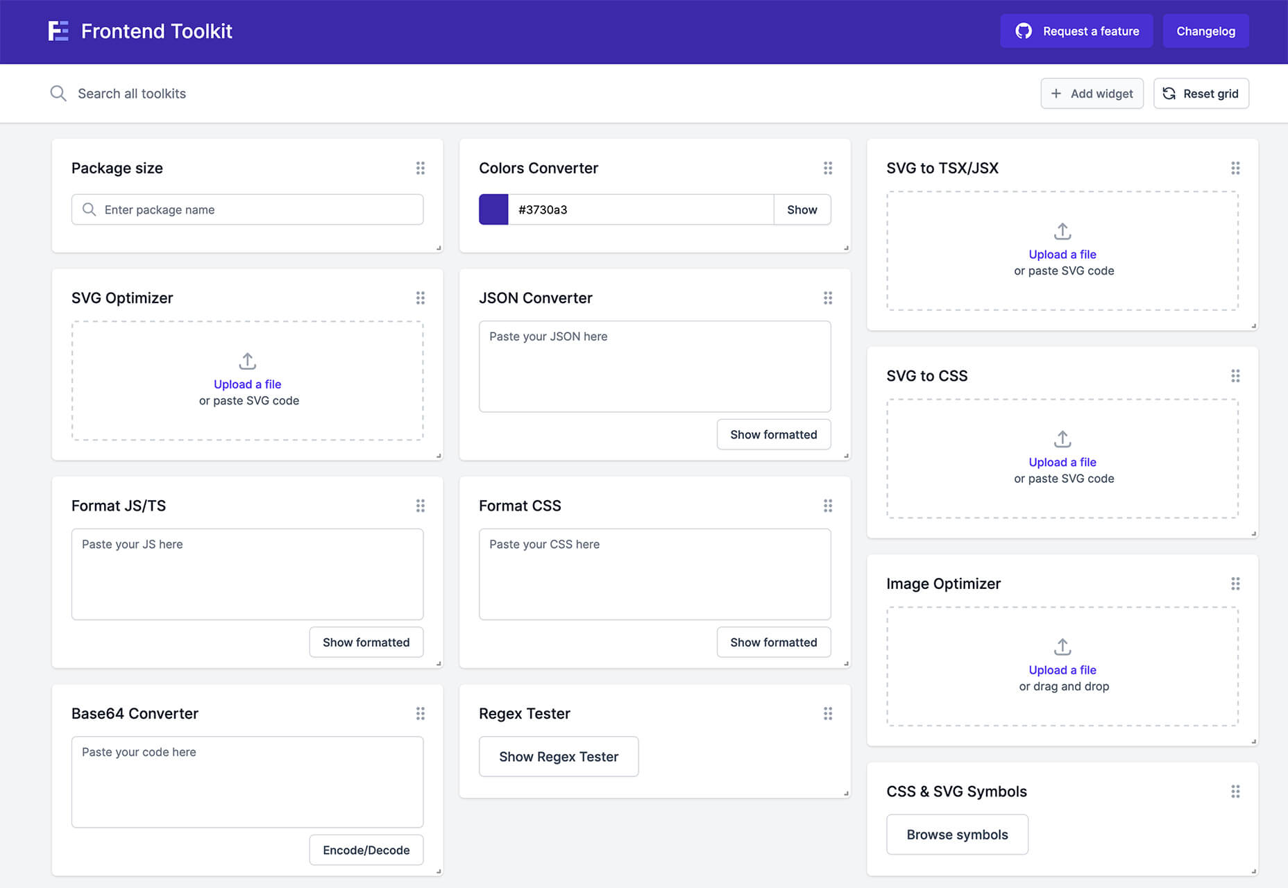
Frontend Toolkit
Frontend Toolkit is a customizable dashboard that you can use to keep up with recurring tasks. It’s one of those little tools that can speed up workflows.
Flatfile
Flatfile is a production-ready importer for SaaS applications. It allows you to auto-format customer spreadsheets without manual cleaning of data and you can do it all without a CSV parser. The tool also includes an elegant UI component to guide users through the process.
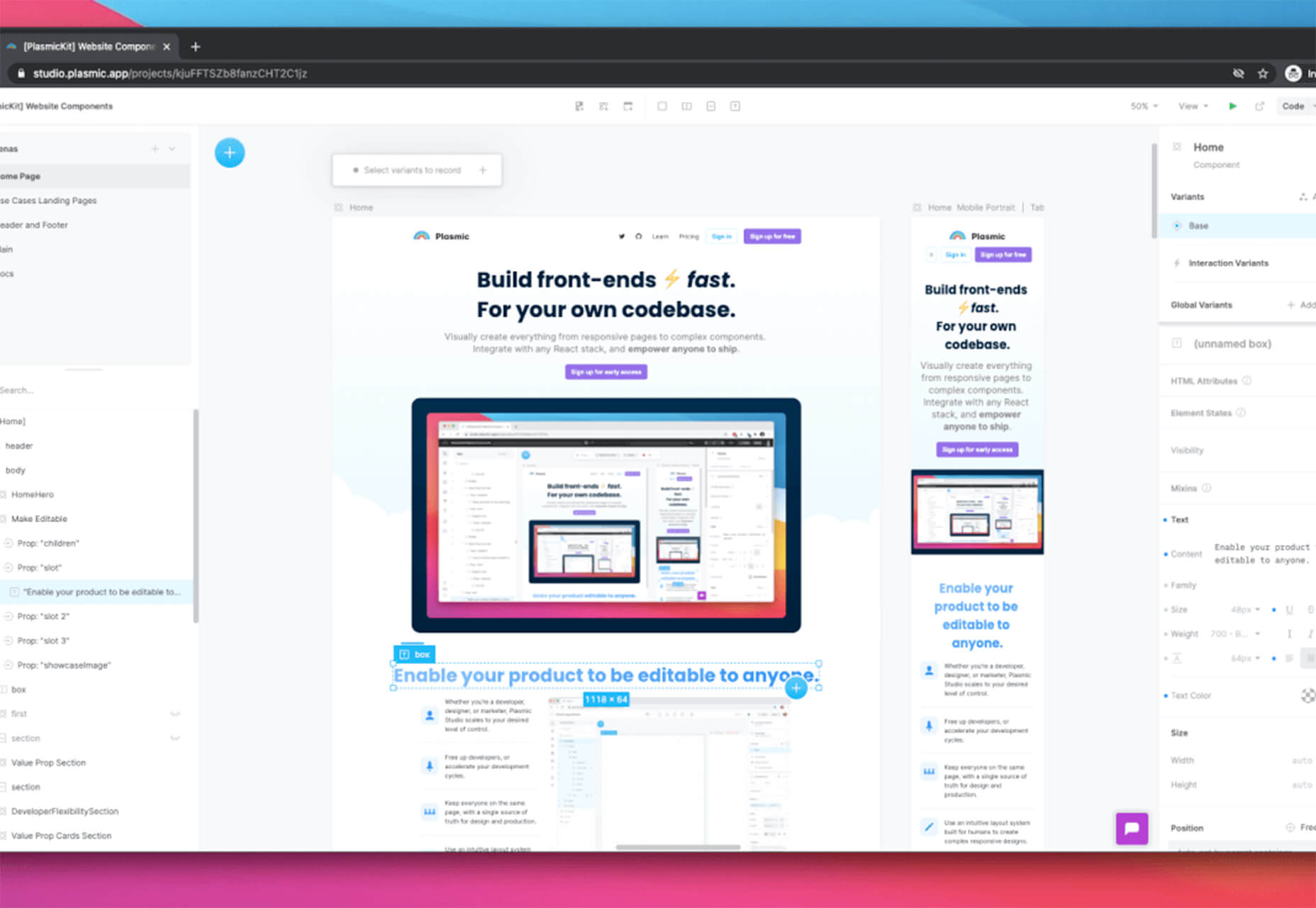
Plasmic
Plasmic is a visual website builder that works with your codebase. It’s designed to speed up development with developers focusing on code (not pixel pushing) and allows non-developers to publish pages and content. The premium tool works with any hosting, CMS, or framework and you can adapt it by the component, section, or page.
2 Productivity Tools
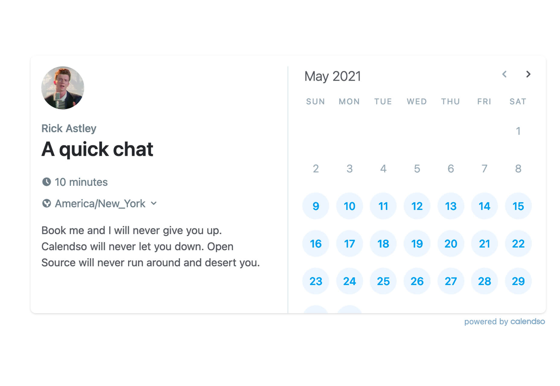
Calendso
Calendso is an open-source calendar scheduling tool. It’s flexible with the ability to host it yourself or with the makers of the calendar. It is API-driven and allows you to control events and information. The interface is simple and sleek and can integrate into your website.
Slidev
Slidev is a set of presentation slides for developers. What’s different about this presentation deck is that you can write slides in a single markdown file with themes, code blocks, and interactive components.
4 Icons and UI Kits
Iconic
Iconic is a set of pixel-perfect icons that gets updated each week. The collection of 24×24 px elements in SVG format contains 160 icons and counting. The simple style is easy to implement and you can search for just what you need by category.
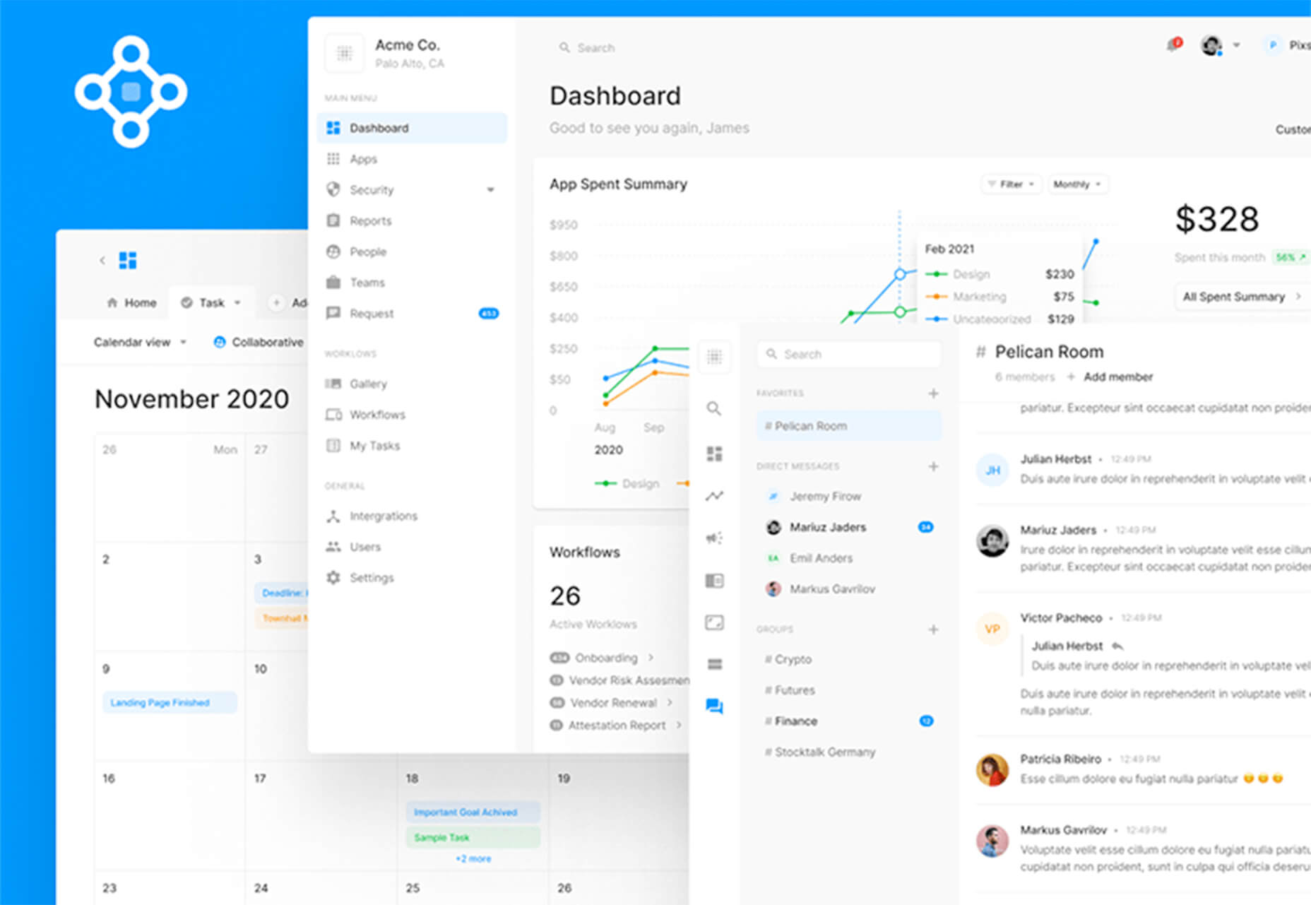
5 Dashboard Templates for Figma
5 Dashboard Templates for Figma is a set of free ready-made screens with light and dark modes for each that you can use with components such as calendars, charts, tables, and more. The free elements are a preview of a larger premium Figma set if you like how they look and work.
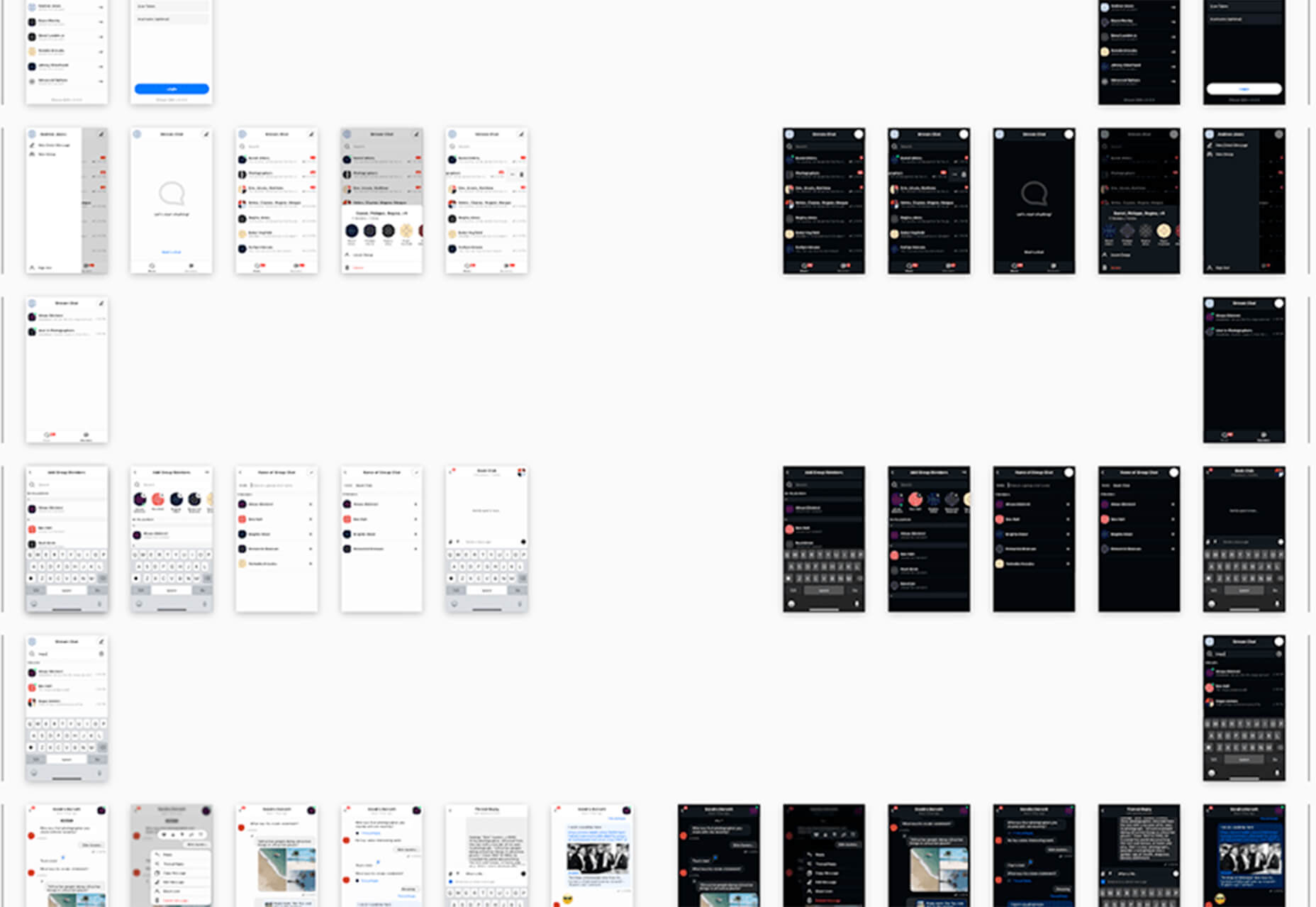
Free Mobile Chat UI Kit
Free Mobile Chat UI Kit is a tool of components for Sketch, Figma, and Adobe XD that includes more than 50 messaging screens with light and dark modes.
Stratum UI Design Kit
Stratum UI Design Kit is a collection of more than 9,000 consistent elements for Figma. It’s packed with elements and tools that make this premium UI kit a tool that gets projects moving quickly.
4 Type Tools and Fresh Fonts
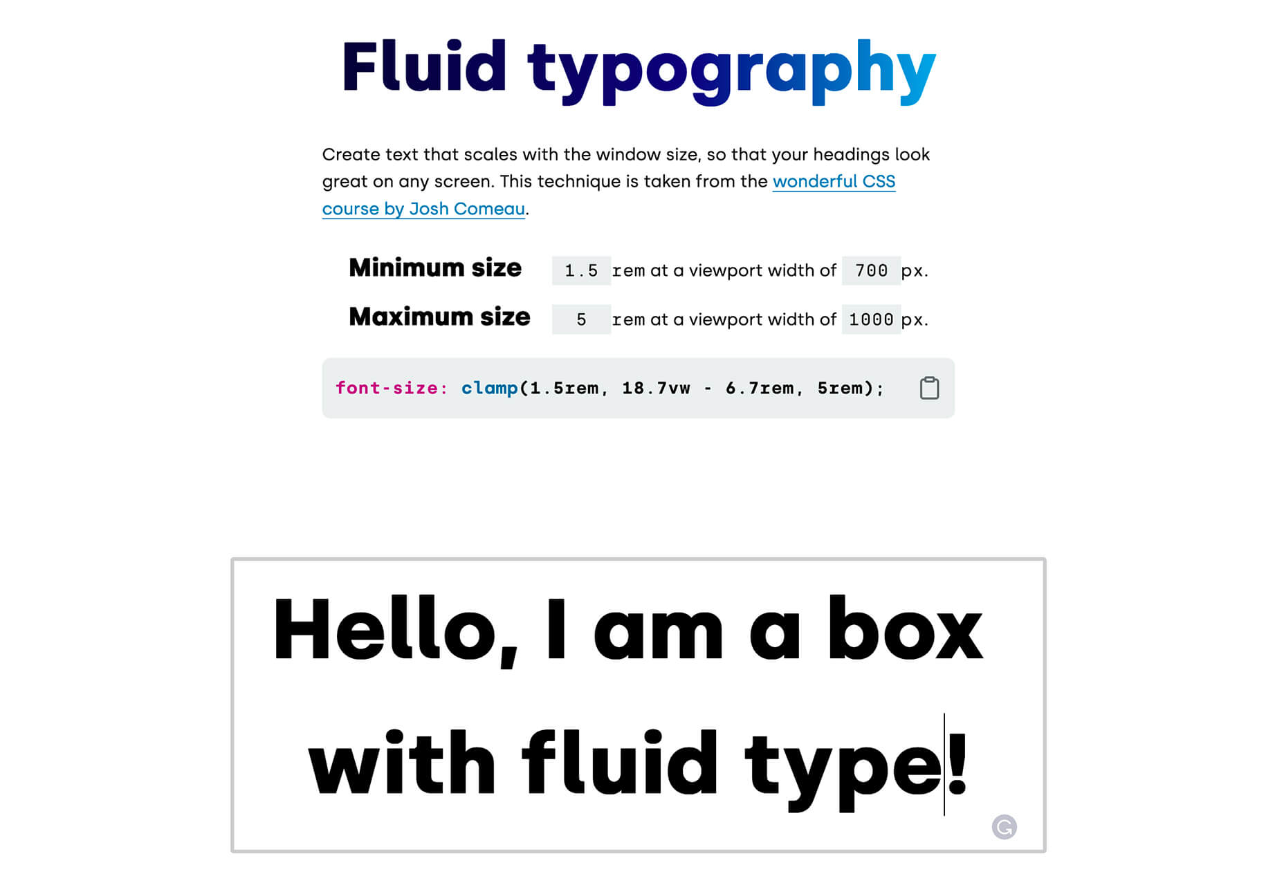
Fluid Typography
Fluid Typography is a nifty tool that allows you to test headings in any size at different viewports to ensure it looks great everywhere. Then you can copy the CSS and use it in your projects.
Eighty-Eight
Eighty-Eight is a funky block-style typeface for display use.
Harmonique
Harmonique is a robust typeface family with lovely serifs and alternates. It’s a type family of two styles that work in harmony together to add distinction and personality to your own typographic compositions. Harmonique’s low contrast forms have the appeal of a humanist sans serif typeface.
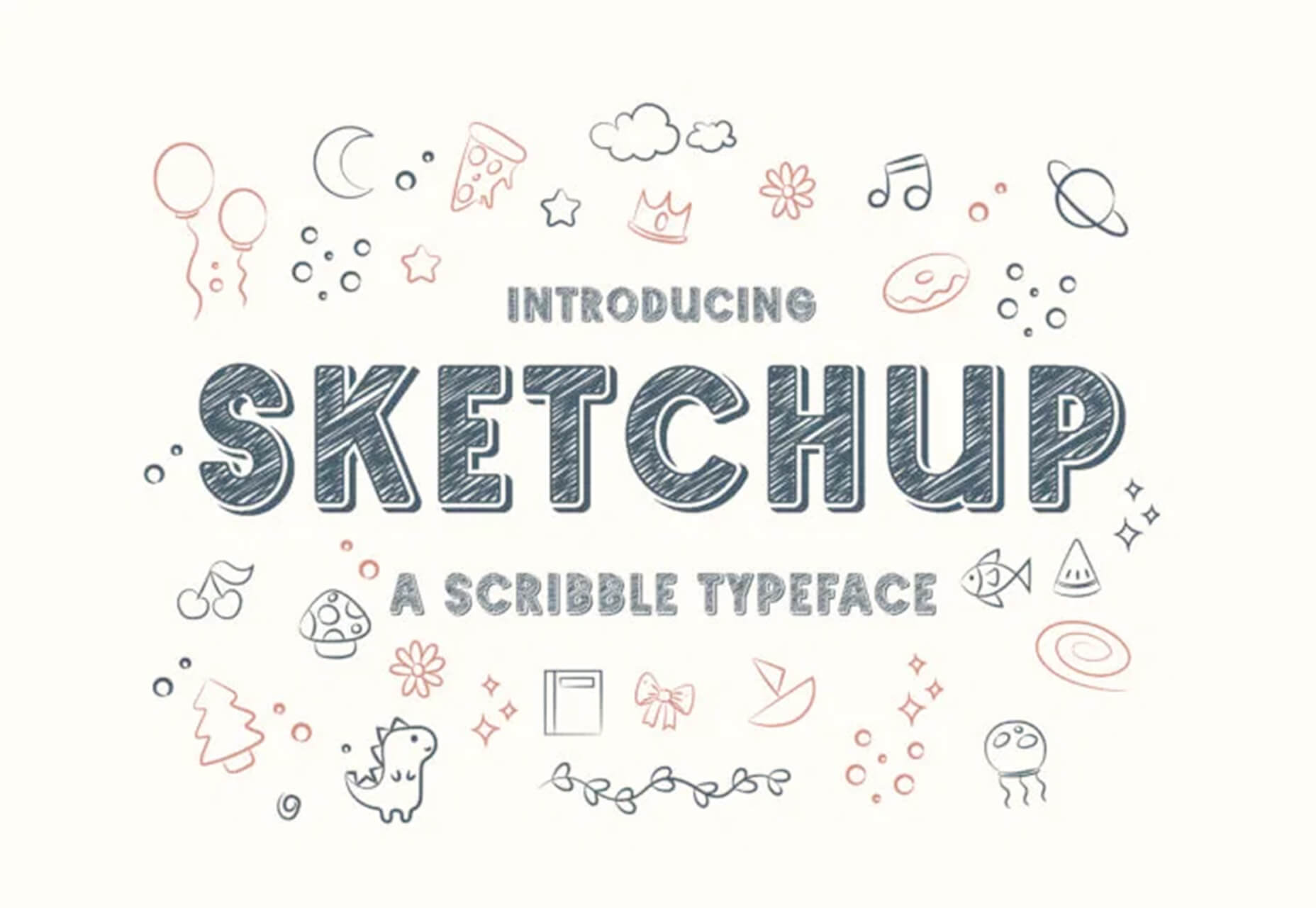
Sketchup
Sketchup is a charming display typeface that has a nice pen style. The free version has a limited character set.
Just for Fun
Generating and Solving Sudokus in CSS
Generating and Solving Sudokus in CSS by Lee Meyer for CSS-Tricks is a fun deep dive into using CSS for something you might not expect. It’s a complicated – but fun – look at some of the things CSS can do with plenty of code snippets. The final result is a solvable puzzle with 16 squares.
The post 26 Exciting New Tools For Designers, May 2021 first appeared on Webdesigner Depot.
In the last decade, advances in processing power and speed have allowed us to move from tedious and time-consuming manual practices to fast and easy automated data analysis. The more complex the data sets collected, the greater the potential to uncover relevant information. Retailers, banks, manufacturers, healthcare companies, etc., are using data mining to uncover the relationships between everything from price optimization, promotions, and demographics to how economics, risk, competition, and online presence affect their business models, revenues, operations, and customer relationships. Today, data scientists have become indispensable to organizations around the world as companies seek to achieve bigger goals than ever before with data science. In this article, you will learn about the main use cases of data mining and how it has opened up a world of possibilities for businesses.
Today, organizations have access to more data than ever before. However, making sense of the huge volumes of structured and unstructured data to implement improvements across the organization can be extremely difficult due to the sheer volume of information.
 WordPress powers nearly 40% of all websites, thanks to its commitment to making publication possible for everyone, for free. Combined with premium plugins and themes, it’s possibly the ultimate tool for building attractive, unique, and feature-rich websites without any coding or design experience.
However, you do pay the price for this experience, with WordPress and its third-party products not always being built for performance – whether it’s page loading times or SEO.
Image optimization is a particularly big concern. Images are one, if not the largest, contributors to page weight, and it’s growing significantly by the year. So, while images are crucial for beautifying your website pages, they are also one of the biggest factors slowing it down.
In terms of image optimization, WordPress+Elementor brings very little to the table. WordPress core now comes with both responsive syntax and lazy-loading. Elementor itself also only comes with responsive syntax out-of-the-box. However, these are baseline techniques for image optimization that will deliver the bare minimum of improvements.
This means that, while Elementor makes it easy to design sweet-looking WordPress pages (with tonnes of creatively utilized images), you will probably pay the price when it comes to performance. But don’t worry. We will show you how to dramatically improve web performance by over 30 points on scoring tools like Google’s PageSpeed Insight.
Why Optimize Your Elementor Images with ImageEngine?
In general, image CDNs use various techniques to get image payloads as small as possible and deliver image content faster, all while minimizing the visual impact. ImageEngine is no different in that regard.
Firstly, ImageEngine, when used in auto mode, will apply all of the following optimizations that web performance tools like Google’s PageSpeed Insight recommend. For example:
- Properly size images – ImageEngine automatically resizes images for optimal size-to-quality ratios depending on the screen size of the user device. ImageEngine supports Retina devices.
- Efficiently encode images – Applies different rates of compression depending on the PPI of the user devices. For example, ImageEngine adapts and more aggressively compresses on higher PPI devices without losing visual quality.
- Next-gen format conversion – Automatically converts images to the optimal next-gen format according to the browser, device, or OS. ImageEngine can convert images to WebP or JPEG-2000 as well as GIFs to MP4 or WebP. AVIF is also available in a manual directive mode.
- Strip unnecessary metadata
While these features are standard for most image CDNs, ImageEngine is unique for its use of WURFL device detection. This gives ImageEngine much deeper insight into the user device accessing a website page and, by extension, its images. Using the screen size, resolution, PPI, etc., ImageEngine can make more intelligent decisions regarding how to reduce image payloads while maintaining visual quality.
This is why ImageEngine brands itself as an “intelligent, device-aware” image CDN and why it can reduce image payloads by as much as 80% (if not more).
ImageEngine also provides a proprietary CDN service to accelerate image delivery. The CDN consists of 20 globally positioned PoPs with the device-aware logic built-in. This allows you to deliver image content faster in different regions while also serving images straight from the cache with a ~98% hit ratio.
ImageEngine also supports Chrome’s save data setting. If someone has a slow connection or has activated this setting, ImageEngine will automatically compress image payloads even more, to provide a better user experience on slower connections.
How to Use ImageEngine with WordPress and Elementor
If you’re using WordPress and Elementor, then chances are you want to spend as little time on development and other technicalities as possible. Luckily, ImageEngine is a highly streamlined tool that requires little to no effort to integrate or maintain with a WordPress site.
Assuming you already have a WordPress website with Elementor, here are the step-by-step instructions to use ImageEngine:
- Go to ImageEngine.io and sign up for a 30-day free trial.
- Provide ImageEngine with the URL of the website you want to optimize.
- Create an account (or sign up with your existing Google, GitHub, or ScientiaMobile account).
- Provide ImageEngine with the current origin where your images are served from. If you upload images to your WordPress website as usual, then that means providing your WordPress website address again.
- Finally, ImageEngine will generate an ImageEngine delivery address for you from where your optimized images will be served. This typically takes the form of: {randomstring}.cdn.imgeng.in. You can change the delivery address to something more meaningful from the dashboard, such as myimages.cdn.imgeng.in.
Now, to set up ImageEngine on your WordPress website:
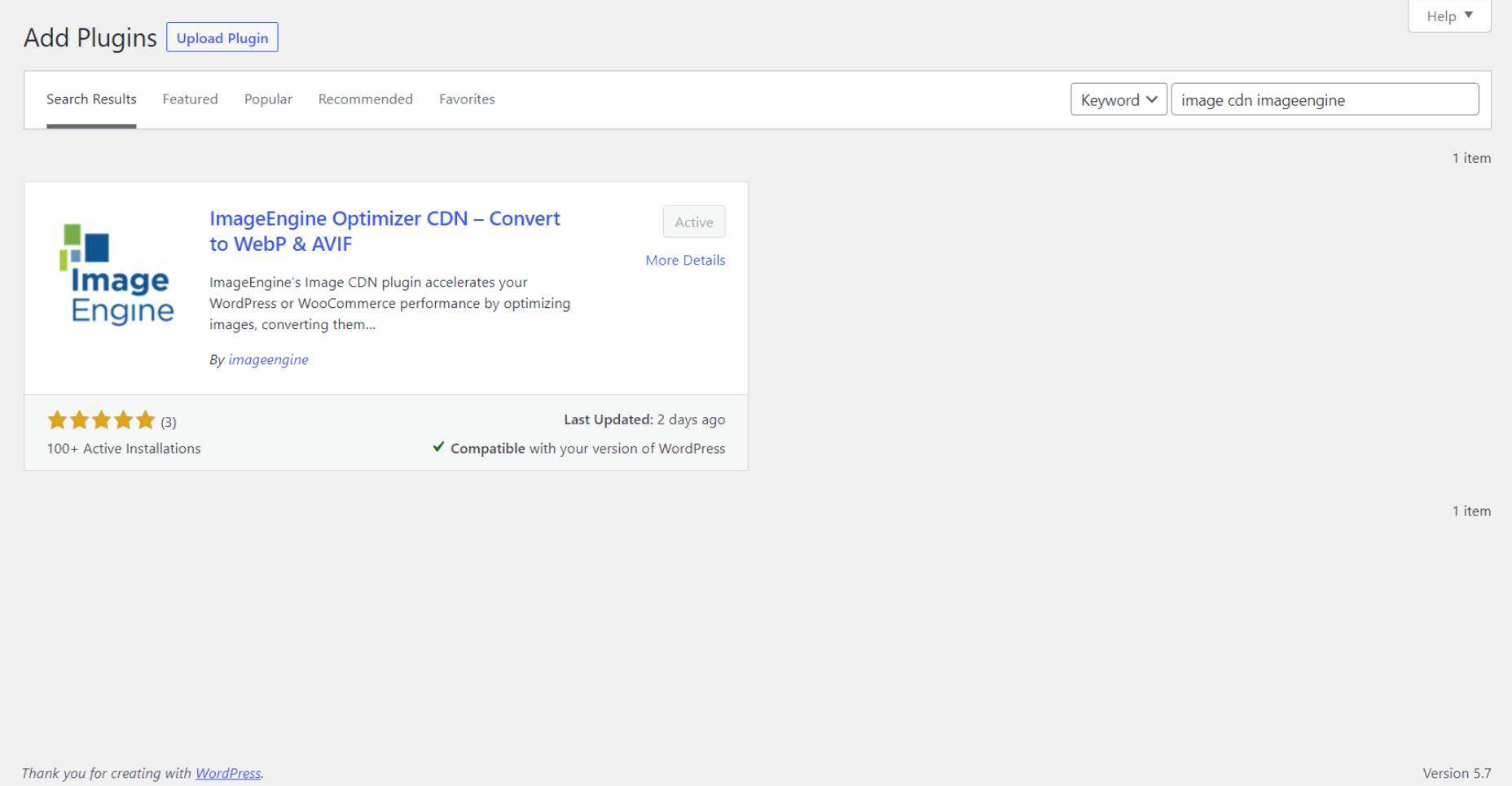
- Go to the WordPress dashboard and head to Plugins -> Add New.
- Search for the “Image CDN” plugin by ImageEngine. When you find it, install and activate the plugin.
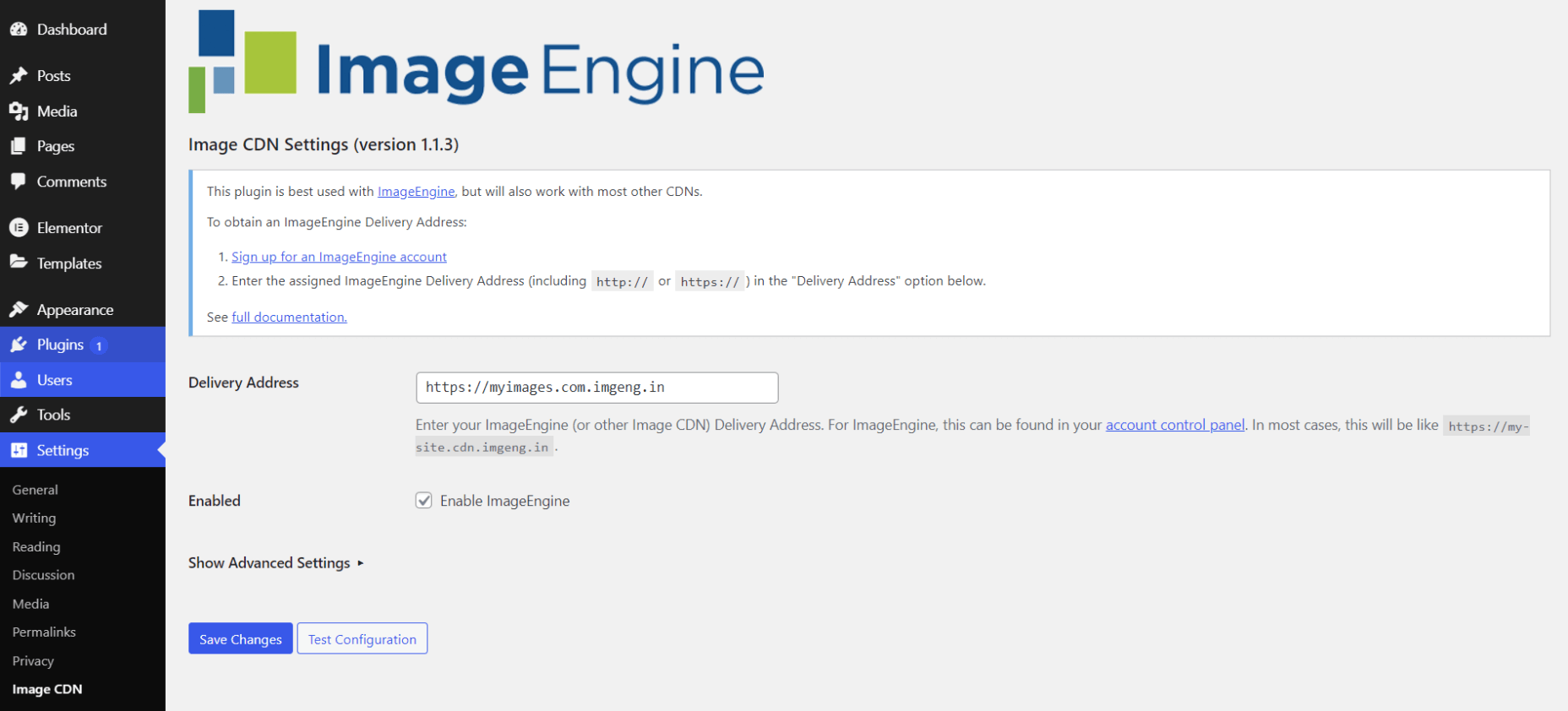
- Go to Settings -> Image CDN. OK, so this is the ImageEngine plugin dashboard. To configure it, all you need to do is:
a. Copy the delivery address you got from ImageEngine above and paste it in the “Delivery Address” field.
b. Tick the “Enable ImageEngine” box.
That’s literally it. All images that you use on your WordPress/Elementor pages should now be served via the ImageEngine CDN already optimized.
ImageEngine is largely a “set-it-and-forget-it” tool. It will provide the best results in auto mode with no user input. However, you can override some of ImageEngine’s settings from the dashboard or by using URL directives to manipulate images.
For example, you can resize an image to 300 px width and convert it to WebP by changing the src attribute like this:
<img src="https://myimages.cdn.imgeng.in/wp-content/uploads/2021/03/banner-logo.png?imgeng=/w_300/f_webp">
However, use this only when necessary, as doing so will limit ImageEngine’s adaptability under different conditions.
What Improvement Can You Expect?
Let’s see what results you can expect from using an image CDN to improve your page loading times.
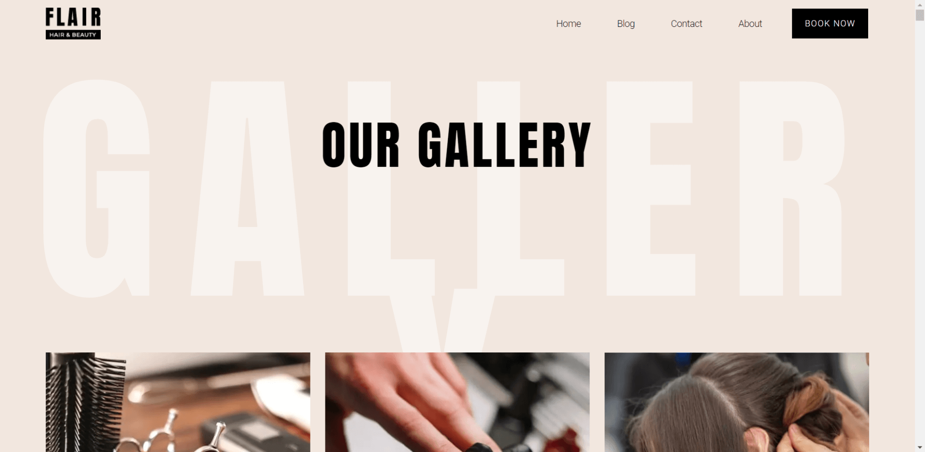
For this, I created two identical WordPress pages using the Elementor theme. The one page purely relied on WordPress and Elementor, while I installed and set up ImageEngine for the other. The page had some galleries as well as full-size images:
The pages used many high-quality images, as you might expect to find on a professional photography gallery, photography blog, stock photo website, large e-commerce site, etc. I then ran page performance tests using Chrome’s built-in Lighthouse audit tool, choosing scores representing the average results I got for each page.
For thoroughness, I tested both the mobile and desktop performance. However, I focused on the mobile results as these showcase more of the image CDN’s responsive capabilities. Mobile traffic also accounts for the majority share of internet traffic and seems to be the focus for search engines going forward.
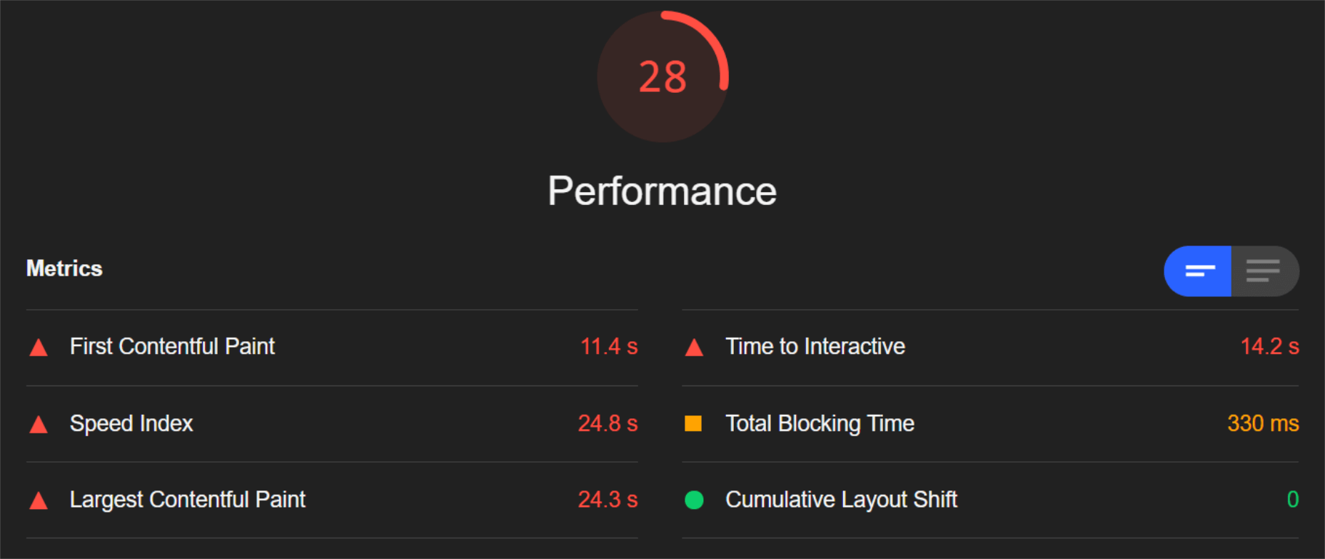
So, first of all, let’s see the mobile score for the page without ImageEngine:
As you can see, there was definitely a struggle to deliver the huge amount of image content. Google has shown that 53% of mobile users abandon a page that takes more than 3s to load. So, clearly, this page has major concerns when it comes to user experience and retaining traffic.
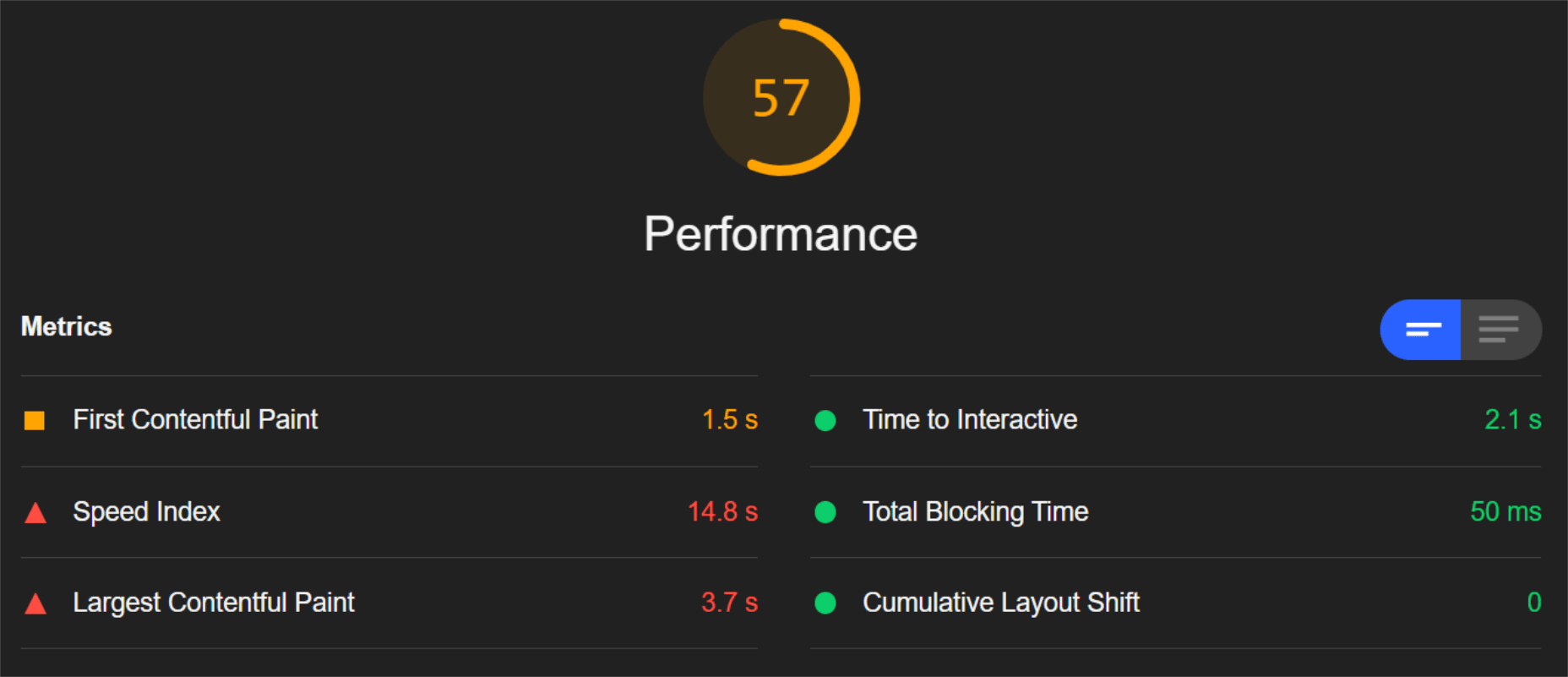
The desktop version fared much better, although it still left much to be desired:
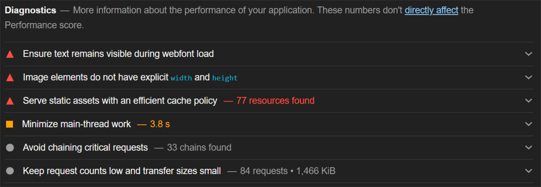
When digging into the reasons behind the slowdown, we can identify the following problems:
Most of the issues related somehow to the size and weight of the images. As you can see, Lighthouse identified a 3.8 MB payload while the total image payload of the entire page was close to 40 MB.
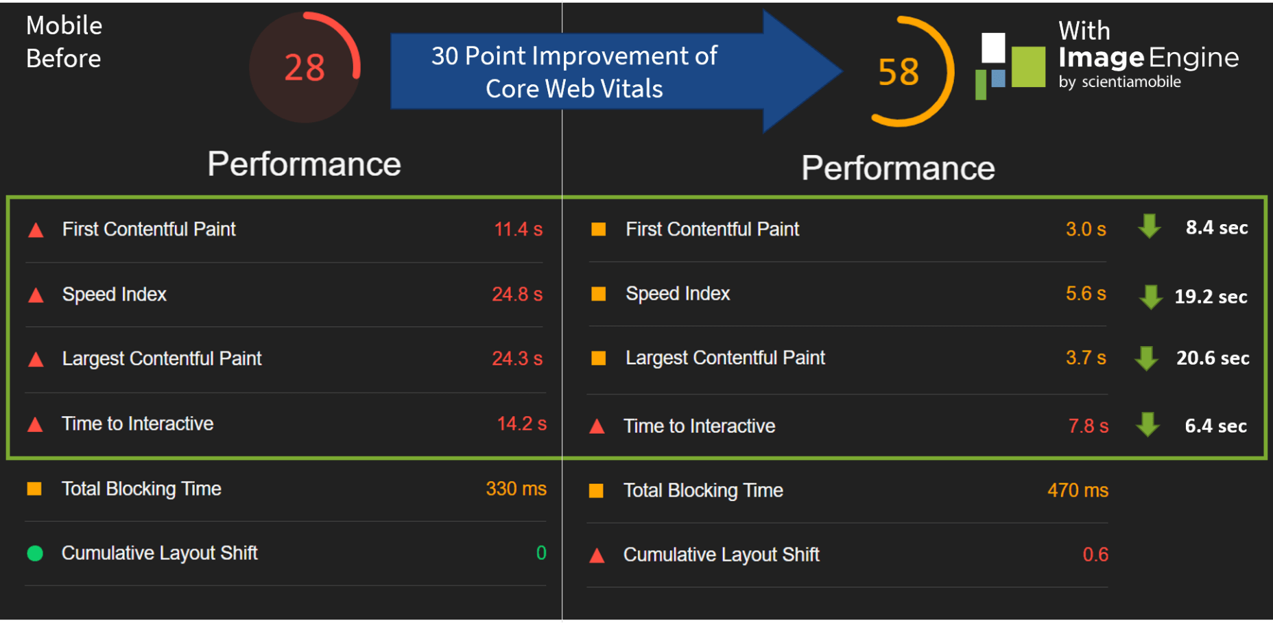
Now, let’s see what kind of improvement ImageEngine can make to these issues by looking at the mobile score first:
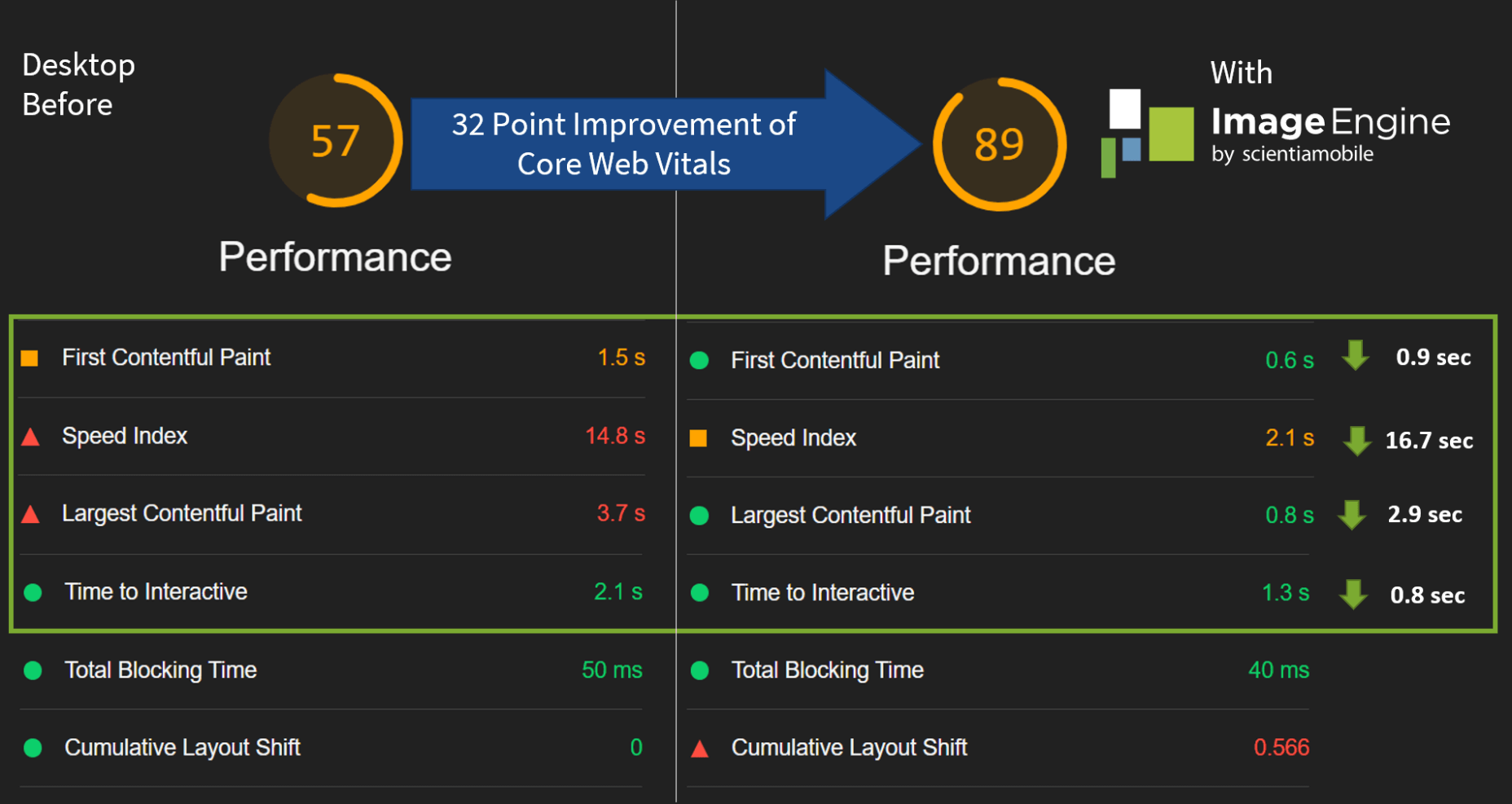
So, as you can see, a major improvement of 30 points over the standard WordPress/Elementor page. The time to load images was cut down by roughly 80% across the key core web vital metrics, such as FCP, LCP, and the overall Speed Index.
In fact, we just reached that critical 3s milestone for the FCP (the largest element on the visible area of the page when it initially loads), which creates the impression that the page has finished loading and will help you retain a lot of mobile traffic.
The desktop score was also much higher, and there was further improvement across the key performance metrics.
If we look at the performance problems still present, we see that images are almost completely removed as a concern. We also managed to bring down the initial 3.8 MB payload to around 1.46 MB, which is a ~62% reduction:
An unfortunate side effect of using WordPress and WordPress plugins is that you will almost inevitably face a performance hit due to all the additional JavaScript and CSS. This is part of the reason why we didn’t see even larger improvements. That’s the price you pay for the convenience of using these tools.
That being said, the more images you have on your pages, and the larger their sizes, the more significant the improvement will be.
It’s also worth noting that lazy-loaded images were loaded markedly faster with ImageEngine if you quickly scroll down the page, again making for an improved user experience.
Thanks to its intelligent image compression, there was also no visible loss in image quality, as you can see from this comparison:
Conclusion
So, as you can see, we can achieve significant performance improvements on image-heavy websites by using the ImageEngine image CDN, despite inherent performance issues using a CMS. This will translate to happier users, better search engine rankings, and an overall more successful website.
The best part is that ImageEngine stays true to the key principles of WordPress. You don’t have to worry about any of the nuts and bolts on the inside. And, ImageEngine will automatically adjust automation strategies as needed, future-proofing you against having to occasionally rework images for optimization.
The post Create Beautiful WordPress Pages with Optimized Images Using Elementor and ImageEngine first appeared on Webdesigner Depot.
Critical system-of-record data must be compartmentalized and accessed by the right people and applications, at the right time.
Since the turn of the millennium, the art of cryptography has continuously evolved to meet the data security and privacy needs of doing business at Internet speed, by taking advantage of the ready processing horsepower of mainframe platforms for data encryption and decryption workloads.
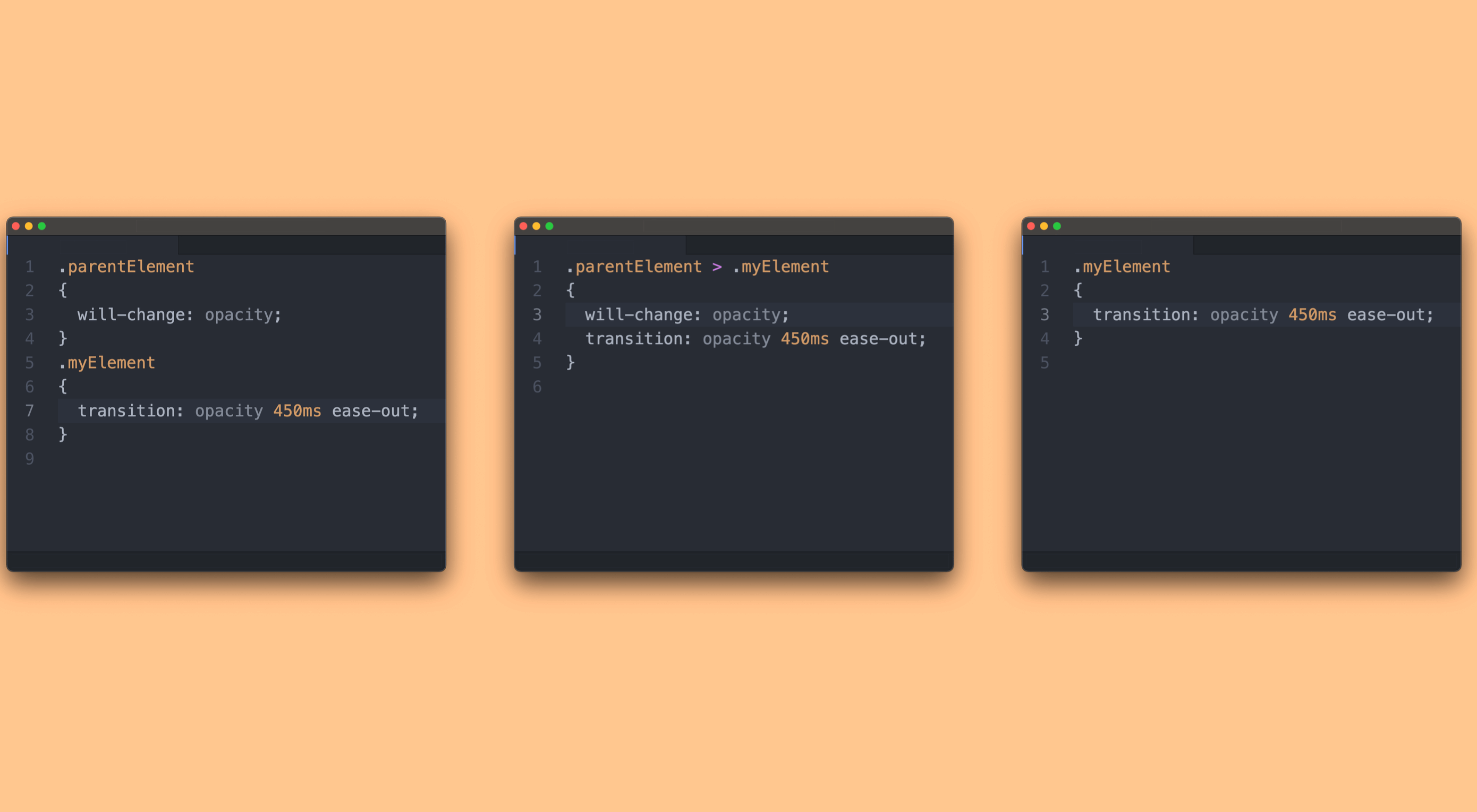 CSS is an awesome tool for styling websites. It’s small, fast, and easy to learn. But like all code, there’s a right way, and a wrong way to write it. Badly written CSS renders slowly, impacting on the perceived speed of your site, and even damaging your SEO.
Writing fast CSS is about knowing your CSS selectors, knowing your shorthand, and understanding how properties are best applied. What better way to spend the final Friday in April, than on a CSS pop-quiz. Have fun!
The post Quiz: Which CSS Snippet Is The Fastest? first appeared on Webdesigner Depot.
 At the dawn of the web-era, there was much focus on how environmentally friendly websites were: we’d chop down fewer trees, ship fewer products, and travel less for business.
And because the web was small, any negative impact it had was relatively small. But the Internet’s no longer small, and neither is the impact it has on the environment. The average website uses 211,000g of CO2 per year, watching a video online outputs an estimated 0.2g of CO2 per second, and a single email can cost 50g of CO2.
In the next four years, the tech industry as a whole may use up to 20% of the world’s electricity and be responsible for 5.5% of global CO2 emissions.
The good news is that because websites are viewed many times, even small improvements can multiply into real change.
1. Reduce Energy Consumption
Through electricity use, the Internet generates around the same CO2 as most major countries. That carbon comes from two sources: the devices we use to access the Internet and the servers that host our data.
Computers heat up, and when they heat up, they slow down. Servers are especially vulnerable and use extraordinary amounts of energy to keep cool and functional, which is why Microsoft keeps throwing servers into the sea.
Make It Faster
The faster your site, the less data is used to serve it, and the less carbon it’s outputting; it’s that simple.
Reduce the Number of Resources Used
Everything you load on your site has an impact. You might think that a tiny PNG is too small to really impact your carbon footprint, but over thousands of page loads, its impact is multiplied. Anything you can do to reduce the number of actual files requested will reduce your carbon output. You can use sites like Ecograder to estimate your own site’s CO2 output.
Optimize Images
If there’s one thing you can do to reduce the size of your site, the amount of data that needs to be sent over the Internet to serve your site, and the resulting speed, it’s optimizing your images.
Nothing reduces a site’s footprint like optimizing images. It’s easy and free to reduce the size of JPGs and PNGs with a service like TinyPNG. Offer WebP to any browser that will accept them; it will boost your Lighthouse score and improve your CO2 usage.
Lazy Load Images
Lazy loading images means images are loaded as they are required; images at the top of a page always load, images further down only load when the user scrolls to them; if the user doesn’t scroll to the bottom of the page, they don’t load, saving you CO2.
Reduce The Amount Of JavaScript You Use
Yes, JavaScript is awesome. Yes, it can be hugely beneficial to UX. And yes, it munches on energy like it’s candy.
When a web page loads, it’s done, the total cost is in. If JavaScript keeps running in the background, redrawing the screen based on user interaction — as is the case with a parallax site — the web page keeps using up energy on the device.
Choose a Sustainable Hosting Company
You can reduce the power needs of a site, but you can’t eliminate them. One simple step is to opt for a hosting company that gets its electricity from sustainable sources such as wind power or solar.
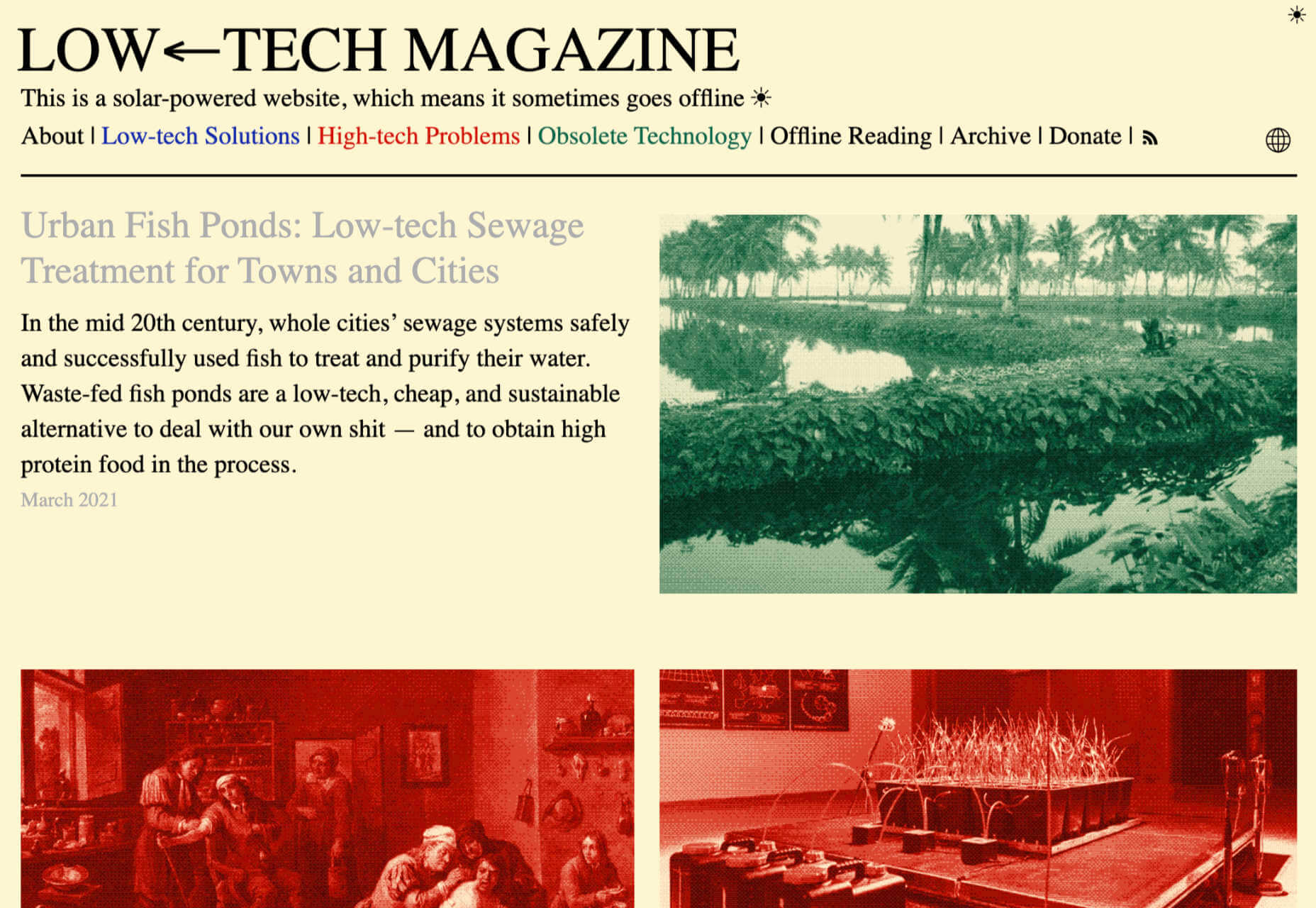
Low←Tech Magazine is powered by a server that runs on solar energy and carries a warning that it may go offline. But it’s possible to host both reliably and sustainably. Many web hosts outsource their actual server management, so they have no control over how those servers are powered, but there are plenty of exceptions that guarantee green web hosting. Google Cloud aims to be the cleanest in the cloud industry. For green web hosting, I always recommend the all-round superb Kualo.
2. Be Inclusive
One of the biggest issues with the EV (Electric Vehicle) movement is that we’re replacing cars earlier than we normally would in a rush to move to “clean” driving.
A new EV certainly outputs less than a gas-powered vehicle when driven the same distance. Combine increased use — because owners think they are driving cleanly — with the fact that a new EV has to be manufactured, the minerals for batteries have to be mined (in horrific conditions), and it then needs to be shipped to you, and EVs are not as friendly as they appear — so go ahead, buy that vintage Porsche it’s probably better for the environment than a Tesla.
Support Legacy Devices
The same issue that applies to cars applies to devices. Every time we rush ahead to support the latest iPhone, we leave older generations behind. A device can and should last longer than two years.
This is not to say that you shouldn’t embrace modern web standards. Technologies like CSS Grid are excellent at reducing markup size and speeding up sites. CSS Grid has been well supported for over four years, and even “legacy” devices can handle it. If you can keep a phone for an extra six months, the environmental cost of that phone is reduced by 20%.
3. Help Users Make Good Choices
More and more people are trying to make good choices. We’re eating a healthier, balanced diet. We’re recycling clothes. We’re traveling by bike, and on foot, instead of by car. People want to do the right thing, and they seek out companies that aid them.
Improve Navigation
Anything that you can do to make your content more findable will mean fewer page loads and therefore consume fewer resources.
By improving your information architecture, improving your search accuracy, and improving on-page signposts like bread crumbs and link text, you help users find content faster.
Feelgood Feedback
When the environmental impact of a user’s actions are quantifiable, let them know. Users who care will appreciate it, and users who don’t will ignore it.
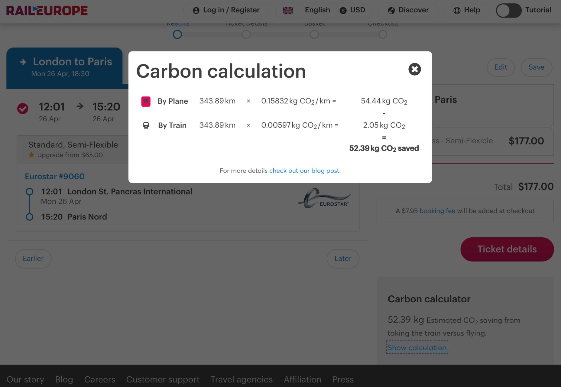
Raileurope.com adds a note to any quotation letting you know how much carbon you’ve saved by traveling by train instead of flying.
Don’t Remove the Shipping Rate
Many ecommerce sites offer free shipping, especially above a certain order value; it’s a good way to encourage higher sales. But absorbing the shipping cost implies that there is no shipping. By highlighting the shipping costs, even if they’re not passed on to the customer, you remind them that there is an environmental cost and a financial cost.
You can absorb the shipping rate without implying there is no cost by adding the shipping and then explicitly deducting it as a discount.
Sustainable Web Design Is Good For Business
The fundamentals of good web design are the fundamentals of sustainable web design.
Make it fast and usable, and you’ll also be making it energy efficient. Make it inclusive, and you’ll help the industry slow the ever-growing tendency to consume. Make it transparent, and you’ll help your users make good choices of their own. All of these things are not only good for the environment, but they also result in improved UX and SEO.
Featured image via Pexels.
The post 3 Effective Ways To Improve Your Site’s Carbon Footprint first appeared on Webdesigner Depot.
 Google has been talking about the Core Web Vitals tool and the Page Experience Update for about a year now.
With the update scheduled to roll out in May 2021, now is the time to make sure your websites are prepared for it. It’s taking a lot of the best practices Google has recommended over the years and making them an official part of the search algorithm, so not taking this seriously could negatively impact your sites’ rankings.
Today, we’re going to look at everything Google has told us about the update and how to use the Core Web Vitals tool to ensure your site rankings don’t drop once it rolls out.
What We Know About the Google Page Experience Update
Google first told us about the page experience update back in May 2020. Here’s what we know about the upcoming update:
Google’s Search Algorithm Will Change in May 2021
Although there’s no specific day given, we do know that the page experience update will go live sometime in May 2021.
The Goal is to Reduce Friction on the Web
It’s not as though user experience is something that designers and developers overlook when building websites. Heck, there’s an entire disciple of UX design dedicated to it.
That said, Google hasn’t taken too hard line of an approach in enforcing its page experience suggestions, like mobile-first design, removing intrusive pop-ups, or improving page speed. With this update, though, Google is now telling every site owner that performance, accessibility, technical best practices, and SEO must be built into their websites.
Of course, the goal isn’t to create more work on your side of things. Google believes that by encouraging developers to build better web experiences that consumers will experience less friction and businesses will be more profitable as a result.
The Update Will Include Older Signals
According to Google, the page experience update is going to combine a bunch of older signals with the new Core Web Vitals:
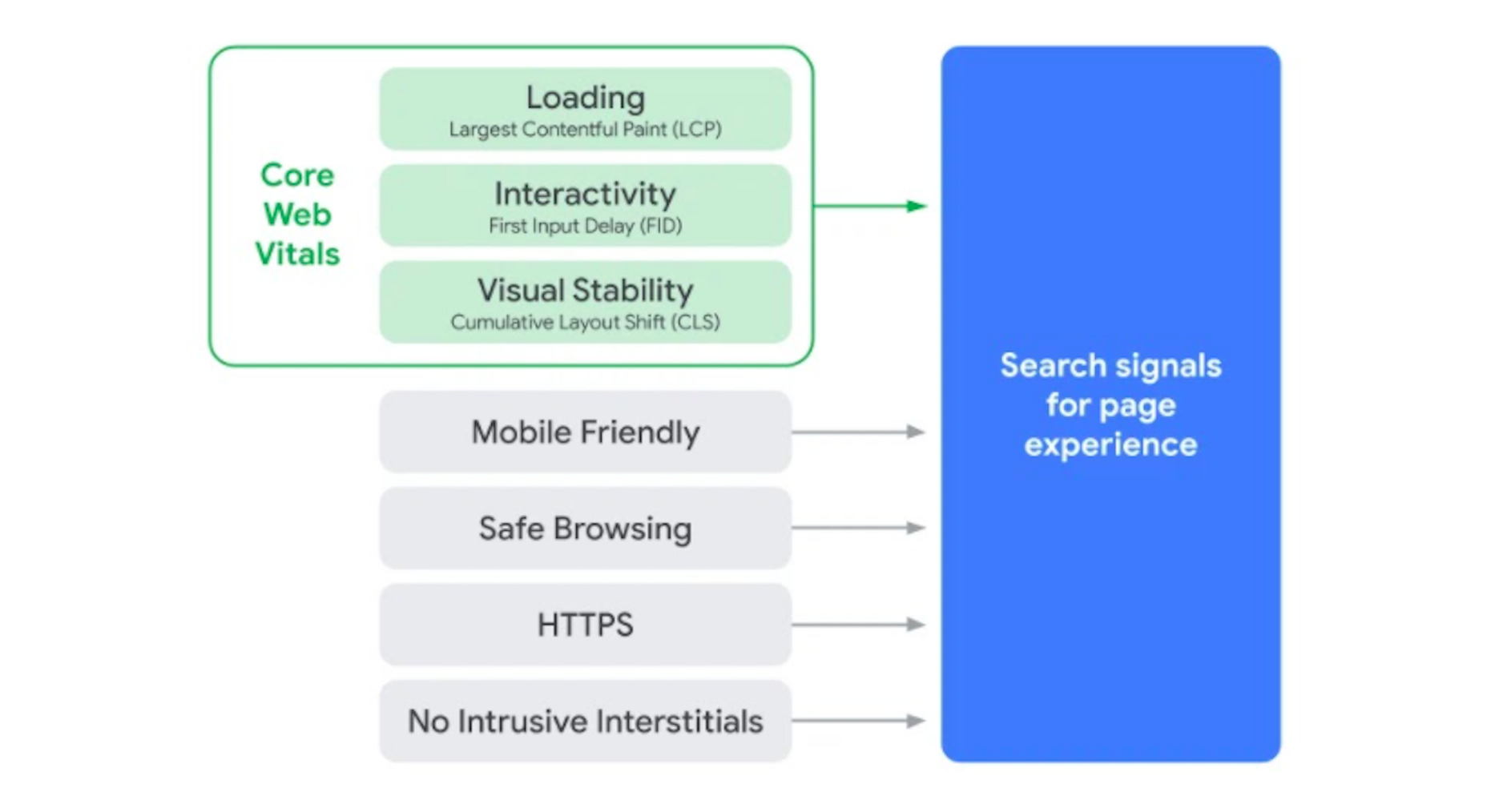
The Core Web Vitals tool will now merge all of that data we once had to gather from various Google apps. That’ll make it more convenient for designers and developers to improve the on-page experience across a variety of areas.
The Page Experience Algorithm Will Change Over Time
Per Google:
Because we continue to work on identifying and measuring aspects of page experience, we plan to incorporate more page experience signals on a yearly basis to both further align with evolving user expectations and increase the aspects of user experience that we can measure.
So, don’t expect this to be a one-and-done thing. You’ll have to rely on the Core Web Vitals tool, and pay close attention to updates out of Google, to ensure your sites are keeping up with Google’s page experience standards.
Your Other Google Apps Have Already Been Updated with Core Web Vitals
If you hadn’t noticed, Google has already updated its other apps in anticipation of the page experience update.
Google PageSpeed Insights, Search Console, and Lighthouse all have Core Web Vitals data in them.
Here’s an example of how Lighthouse’s report on the Amazon website now looks:
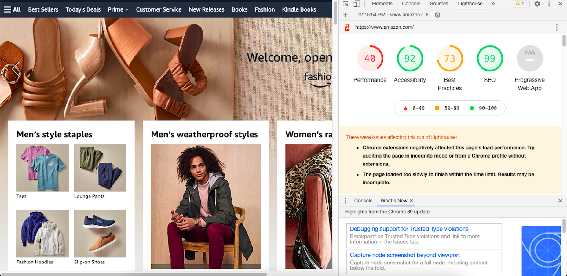
By including these metrics within the tools you’re already using, you don’t necessarily have to add the Core Web Vitals tool to your growing toolbox. That said, there are some really valuable reports in there, so I’ll show you why you may want to add it anyway.
Google’s Top Stories Will Be Affected
In the past when someone did a news-related search on Google, they’d see “Top Stories” results like this one:

Until now, the only pages shown here were AMP-enabled ones.
Once the page experience update goes live, though, the AMP requirement is going away. So long as a page meets the page experience criteria along with Google News content policies, it can now rank in this section.
Google Search Results May Show a Page Experience Indicator
In the Top Stories example above, notice the AMP indicator I highlighted in yellow. Google is thinking about adding something similar to any search result that fulfills its page experience criteria.
While I think a small, eye-catching icon might draw a little more attention from Google users, I’m not sure if it’ll be that big of a deal to them. People working in this industry certainly know what that lightning bolt means, and we’ll also be the ones who recognize the page experience indicator, but I’m not convinced it’ll matter to users.
That said, this is something Google is thinking about rolling about, so it’s something to be aware of. At the very least, you can consider it a badge of honor when showing your websites to clients and prospects who want to see what you can do for them.
Content Is Still More Important Than Page Experience
Even if a website checks off all the page experience boxes, there’s no guarantee that it’ll start to rank better than websites that haven’t. The quality and value of the content on the page still matters greatly.
Using Core Web Vitals to Measure Page Experience
Alright, so let’s take a look at this Core Web Vitals tool. Here’s what the tool looks like when you enter the “Measure” tab:
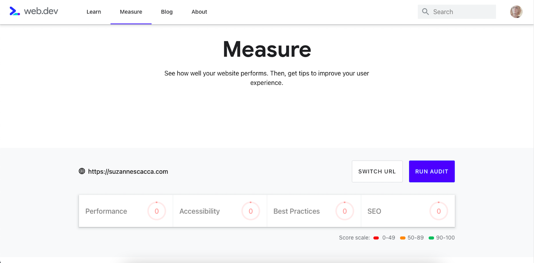
It’s like most other Google analyzer tools. You enter the URL you want to audit and let the tool run. The results then spit out something that looks like this:
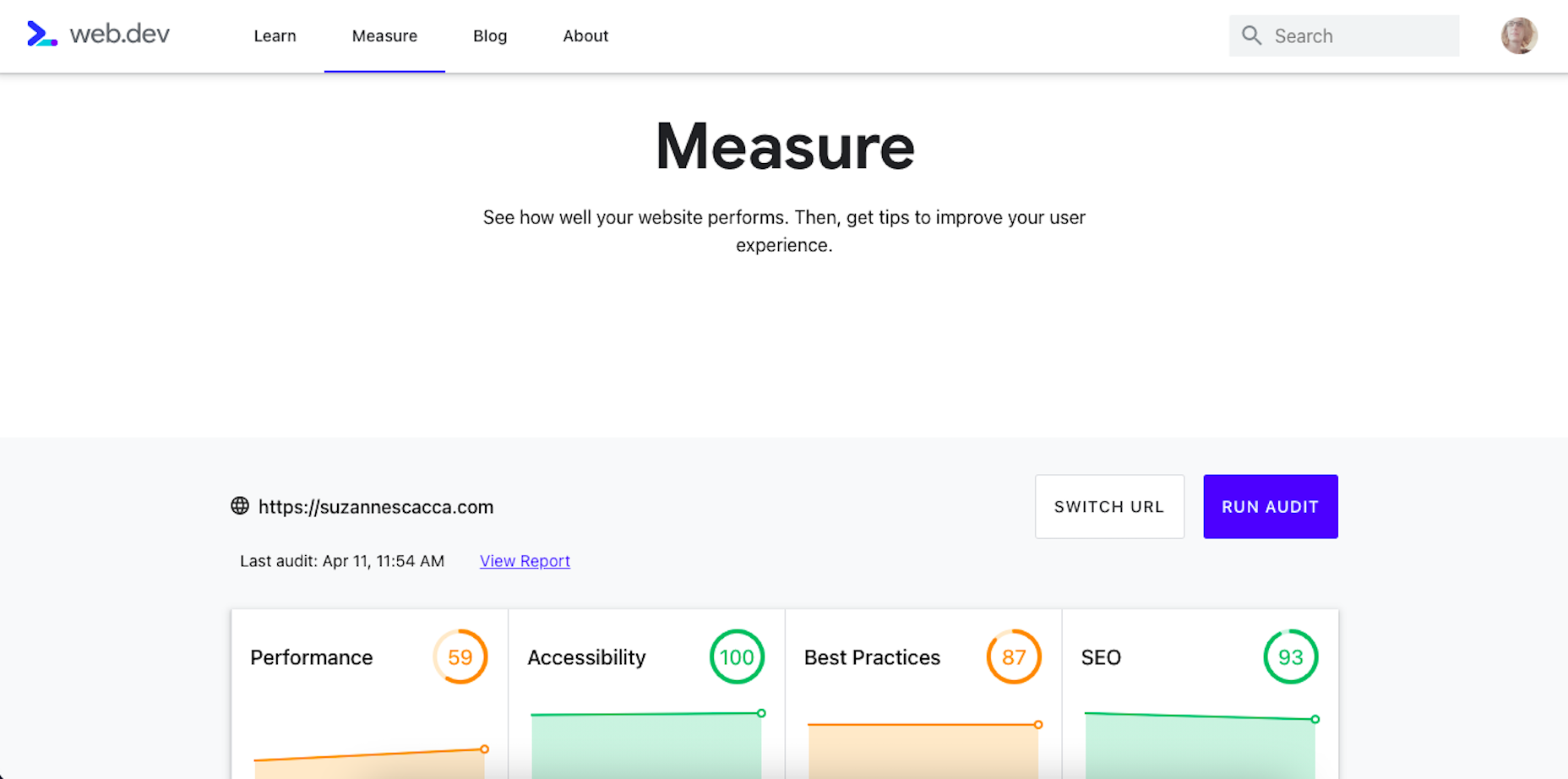
Core Web Vitals are graded on four categories:
- Performance measures the loading speed, interactivity, and stability of the page.
- Best Practices focus on the technical aspects of the page, including things like having an SSL certificate and making sure images fit within the parameters of the mobile screen.
- SEO checks on the typical SEO signals like metadata, structured data, and so on.
- Accessibility reports any issues with visitors not being able to see or access parts of the page.
If you scroll down just a little bit on the page, there’s more data available. It mainly has to deal with the technical stuff, like page speeds and unoptimized code:
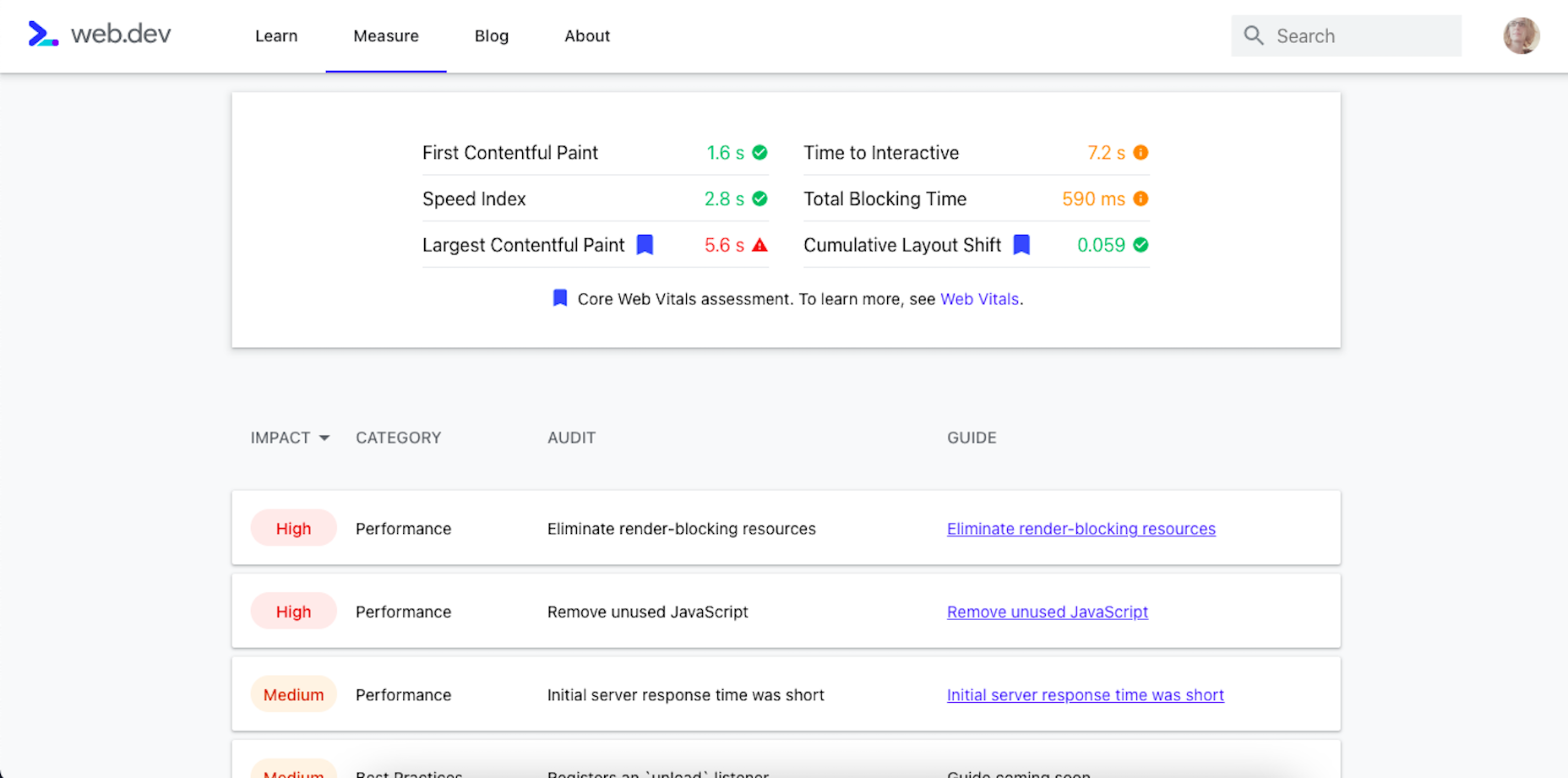
Now, this isn’t really anything new. We can get this data about load time, interactivity, and content stability from Google’s other apps.
The real value is in the report, which you can access up top next to the date of your audit.
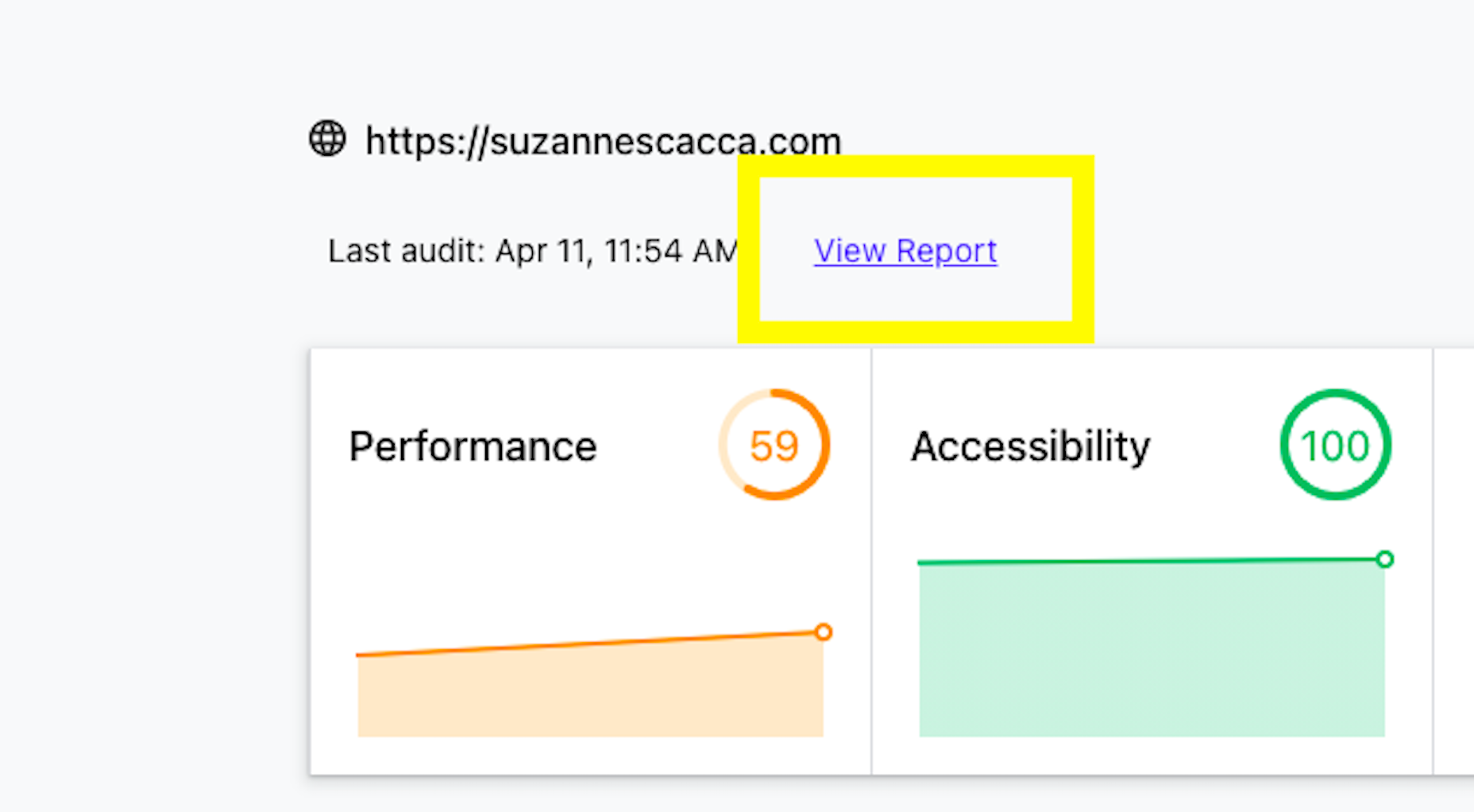
Open the report and you’ll find specific suggestions and pro tips to optimize each part of the page experience, like this SEO report:
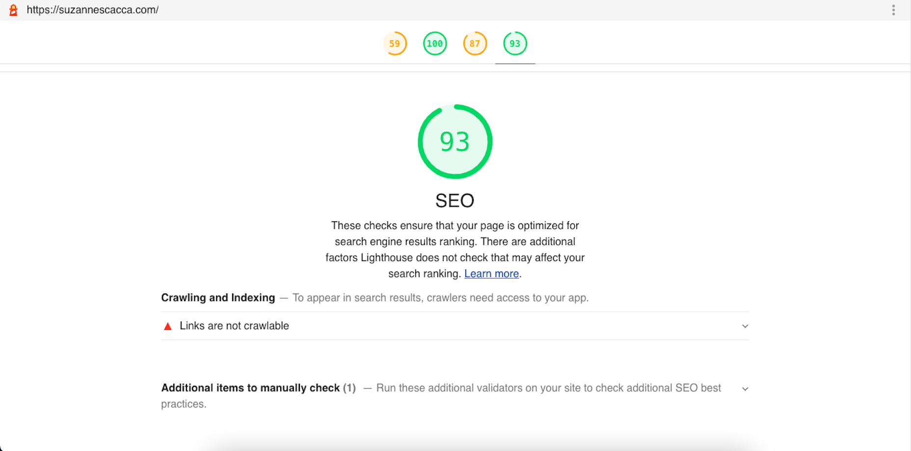
Just like other Google tools, this one can teach you a lot about what makes one site more rankable than another. So, make sure you update your web design strategy going forward to integrate all of these ranking signals.
While you’ll have to do annual audits on your sites to see how much Google has changed the page experience signals, you’ll create less work for yourself if this baseline set of criteria are met with every site you build.
The post Get Ready For Next Month’s Google Shakeup first appeared on Webdesigner Depot.
 This week Google announced further details of its plan to remove cookies from ad tracking. The strategy, which the ad giant expects to be fully implemented by 2022, has come about due to increasingly stringent privacy laws in a growing number of territories around the globe.
Google’s first step was the announcement in January of FLoC (Federated Learning of Cohorts). Google itself is still testing and fine-tuning the system, but in essence, Google will replace 3rd-party cookies in Chrome with groups of anonymized users.
Critics of the plan have questioned whether users will be genuinely anonymous or whether Google will be tracking individuals to group them properly. The answer came earlier this week in a low-key announcement of KaST.
What is KaST?
KaST (Key and Surface Tracking) is the first iteration of Google’s new tracking technology. It works entirely without cookies and is fully device-agnostic.
The technology behind KaST is surprisingly old. It was first trialed in 1987 as a simple process for auditing the input of stenographers. Although the latest version of the technology draws heavily on voice recognition software algorithms, the original version of KaST — software named TAAA (Typist Account Accuracy Audit) — predates modern voice recognition by at least two years.
KaST uses…biomechanical and cognitive patterns, identifying individual users based on their keystrokes.
Just as your voice has a unique, identifiable modulation — anyone who uses telephone banking will be familiar with speaking their password — so too does your biomechanical input.
When you type on a keyboard or a touchscreen, the force, speed, and accuracy with which you hit characters are dependent on two things: your cognitive process and the unique biomechanics of your hands (the bones, ligaments, and muscles).
For example, when I type WordPress, I almost always type it as WordPRess (with a capitalized R). That is one facet of my combined biomechanical and cognitive process.
KaST uses keyboards and touch screens to track combined biomechanical and cognitive patterns, identifying individual users based on their keystrokes.
Mobile Approaches to KaST
KaST is heavily reliant on BMaC (Bio-Mechanical and Cognitive) input. Although Google hasn’t released any data to support the accuracy of KaST, BMaC is known to be surprisingly accurate.
Reports suggest that the KaST algorithm is 89.7% effective for character strings of 12 characters or more, leaping to 97.6% for 19 characters or more on a single device. That makes it too inaccurate for high-end processes like security but well within the necessary margin of error for a non-critical process like serving ads.
Google will be able to identify you on any machine, on any device, in any context, as soon as you type 19 characters or more
When switching to a touch-screen device, the accuracy plummets to just 87.8%. This may be one reason Google has been low-key in its trumpeting of the new technology so far.
According to TechBeat, initial trials of the tri-axis position of a device (X, Y, and Z rotation) were abandoned as inaccurate. Still, even without those additional tracking signals, Google claims KaST on mobile will achieve ~94% accuracy by the 1st quarter of 2022.
What Does KaST Mean for Users?
Much like many of the algorithms that govern our daily lives, KaST will be largely invisible to most of us. Unlike cookies that can be legislated for and removed from a local machine, your BMaC is as inescapable as your DNA.
Where privacy concerns really grow is that your BMaC follows you from device to device. How you type at home is identical to how you type at work. Your personal and professional profiles are now instantly connectable; Google will be able to identify you on any machine, on any device, in any context, as soon as you type 19 characters or more.
KaST Prompts Pre-M1 MacBook Rush
Within 24 hours of KaST’s announcement, Apple stores were reporting rush orders of pre-M1 MacBook Pros. With some stores reportedly selling out late on Wednesday.
The rush came in the wake of a Reddit post — that has since been removed — that claimed that the notoriously bad butterfly keyboard on pre-M1 MacBook Pros circumvented KaST because the inaccuracy of the keystrokes, and the tendency of the keys to stick introduced a random element that disguised the end-user from the KaST algorithm.
Although the Reddit post is unsubstantiated, it transpires that M1 Mac owners may not be the lucky ones after all.
Should You Worry About KaST?
Advocates maintain that KaST — and Google’s wider FLoC strategy — are beneficial to users and the web as a whole. They claim that identifying users without 3rd party cookies does more to protect privacy than hinder it.
Opponents argue that in a digital world rife with user tracking, privacy compromises of this magnitude cannot be contemplated simply to enable more sophisticated ad-serving.
Despite KaST’s early stages of development, privacy concerns are mounting, and a campaign has been launched to regulate Google’s use of the technology.
The post Key and Surface Tracking Comes to Chrome first appeared on Webdesigner Depot.


