Articles

Looking to give your homepage a well-needed design update in late 2021 or 2022? Not a bad idea; first impressions are crucial when it comes to business websites. But, fixing your homepage and website design is no easy feat.

Web design trends are evolving faster. Blame the ever-decreasing user’s attention span. The average visitor now spends just 0.5 seconds scanning your homepage to form an opinion about your brand and decide whether to click through or bounce.

Increased user expectations and uncertainty in the user’s response, which is highly impacted by the site’s first impression, are other reasons to consider. This is why the designs which were trending in 2019 are no longer viable in 2021 or 2022.

We have curated the ten best examples of homepage designs to inspire your business in 2022, including a rundown of the best strategies and tips.

Let’s start by highlighting why homepage optimization is necessary for 2022:

Why Your Homepage Will Be So Important in 2022

Your website — especially your homepage — is your brand’s first chance to attract, build trust with, and connect with visitors.

According to recent statistics on why website design is important:

  1. 38% of visitors will stop interacting with a website if they think the layout isn’t visually appealing or intuitive. This creates a higher bounce rate and fewer conversions.
  2. 94% of a visitor’s first impression is based on website design (including colors, fonts, layout, navigation menus, etc.).
  3. 46% of people base a business’s credibility on the aesthetics of its website. Brands with less-than-stellar homepage designs are seen as less trustworthy than companies investing in the visitor experience.

Think of it the same way as walking into a brick-and-mortar store. Visitors are more enticed by a carefully curated ambiance of neatly stocked shelves and welcoming employees than a store that’s dark, messy, or seemingly unfriendly.

Using this logic, your homepage’s above-the-fold section is where you’ll greet visitors and reel them in for more.

10 Homepage Design Comparisons (2019 vs. 2021) To Inspire Your Business Website Design in 2022

Homepage design has come a long way since 2019. In this section, you will explore how.

These homepage designs crush it above the fold. Take just a few of these tips to heart, and your website will be poised to attract leads and conversions — no matter which industry you’re in.

1. Netflix – Crafting The Perfect Call To Action That Reduces Friction With An Additional FAQs Section

Most businesses make the mistake of adding a CTA button that first persuades the user to click on it and then asks for the visitor’s email address.

Netflix also did the same in its 2019 design.

However, Netflix combined both steps in its 2021 homepage design.

The new, improved 2021 homepage design asks for the user email address right up front along with the CTA button.

Here is a good comparison of both the designs:

2019 homepage design

vs.

2021 homepage design

Key Takeaways:

  • The design encourages visitors to enter their email address right when they land on the homepage. As a result, form submission is much easier when the user has started the process. Hence, Netflix makes it easier for visitors to move along their conversion funnel nicely by reducing the friction.
  • The 2021 design also has a nice FAQ section that provides quick information about the company’s services and improves the overall user experience.
  • FAQs also help increase the organic presence of the website in the search engines because Google presents snippets from the FAQ section in the form of an answer box in the search results.

2. Spotify – Revamped Color Combinations For Improved CTA Visibility And Using The ‘Rule of Three’ For Heading Text

The older 2019 Spotify homepage design used light pink and orange colors in its home page main area. The CTA color was green, but if you look closely, the CTA lacks visibility.

The new 2021 design uses blue and green colors with a much larger font size for the main heading. The colors are attractive, and the CTA is visible clearly.

Here is the comparison of the Spotify homepage 2019 design vs. 2020 design:

2019 homepage design

Vs.

2021 homepage design

Key Takeaways:

  • Blue is the most versatile color, and green is the perfect choice for the CTA button. Spotify used universally accepted color combinations to redesign its homepage and made the CTA more visible.
  • The main heading is also made larger than it was in the 2019 design, and it follows the rule of three in writing which is effective and satisfying. It uses just three words in the main heading to allow the human brain to process information as a pattern that is more memorable.

3. Hulu – Give Priority To Your Brand Name And Hide Pricing

If you compare the Hulu 2019 vs. 2021 Hulu homepage, the brand name has been prioritized and shown as the main heading.

Moreover, the older homepage had pricing information everywhere, which has been reduced intelligently in the new design.

2019 homepage design

vs.

2021 homepage design

Key Takeaways:

  • The brand name ‘Hulu’ is displayed as the main heading of the homepage, which helps to build audience trust.
  • The older design persuaded the users to pick a paid plan even though they had a free trial option—this discouraged users from trying their service. The new 2021 design encourages users to try the platform for free. In addition, the packages have prominent CTAs that mention “try for $0”. This design move improves conversions on the website.
  • The new design makes it easier for the visitors to select a viewing plan with easy comparison of the three available plans. The best part is, customers can start all the plans for $0. It’s a win-win situation for the users, and they can quickly pick a plan to start watching Hulu.

4. Nextiva – Reduce Visual Noise And Add Pictures In Menu To Improve UX

Nextiva realized the importance of reducing visual noise in its newly designed 2021 homepage. Visual noise happens when you use too many colors to attract user attention. Different colors compete with each other resulting in diluted customer observation.

In the old 2019 homepage, Nextiva used orange, blue, and green as the primary colors, while in the 2021 revamped design, they have used blue as the main color.

Here is a comparison of the two designs:

2019 homepage design

vs.

2021 homepage design

Moreover, the older homepage didn’t have an image in the product menu, but the new 2021 homepage improves the UX further.

Below is a comparison:

2019 homepage design

vs.

2021 homepage design

Key Takeaways:

  • Nextiva used blue as their base color for the homepage design and removed orange and green colors to reduce visual complexity. This is an excellent change to keep the user’s attention focused. Notice the green colored bar at the top of the homepage in the 2019 version now replaced with blue.
  • The 2021 design has a clean look compared to the 2019 design, which looks scattered with too many different elements, including CTAs that confuse the users.
  • The product menu does an excellent job of linking intelligently to service pages such as phone systems and video meetings. The image of a smiling lady attracts users to click on Nextiva’s products to learn more about them. Improving UX is an impressive way to reduce bounce rates and increase time on site.

5. GoToMeeting – Avoid Lengthy Sign Up Form, Educate Users About Your Products, and Add Images That Depict The Current Needs of The Audience

GoToMeeting does a great job educating the users about their product by adding more content on the homepage that comprehensively explains their product features.

Moreover, they have replaced the older hero image with a new picture that portrays the changing needs of their audiences. Nowadays, there is a rise in work from home culture due to Covid-19. Hence, the photo and the heading text clearly target the needs of their users.

Here is a comparison of the 2019 vs. 2020 homepage of GoToMeeting:

2019 homepage design

vs.

2021 homepage design

Key Takeaways:

  • The 2019 homepage design had a sign-up form on the homepage, which GoToMeeting removed in the 2021 design. People hate to fill in so much information right when they land on the home page. Hence, GoToMeeting did the right thing by removing the signup form from their homepage.
  • The hero image steals the show of the 2021 redesign because the picture of a working mom with her kid playing studying in front of her is a great way to portray the current needs of the society when over 60% of the employees are working from home. Audiences can quickly relate their working environment with the hero image leading to more sign-ups.
  • The older 2019 design was confusing, and it made little effort to help the users understand the different features of the product. The new 2021 homepage design has a product features section that explains the different features of the software. When users are educated about the product, they earn the confidence to try the product.

6. Zillow – Apply Hick’s Law To Allow Visitors To Take Faster Decisions

Zillow does an impressive job of applying Hick’s Law in allowing visitors to make faster decisions. Hick’s law states that the more options you present to the users, the faster they will decide. Therefore, it is a major factor in improving website usability.

The old 2019 homepage design of Zillow offered too many options to the users, like they want to buy, rent, or sell a property. The users first select either one of the three options and then enter the zip code to start their search.

The new 2021 homepage design changed that. Now, Zillow offers users a single option. They only need to enter the zip code to get started.

By reducing the number of actions that users need to take to just one, the homepage design eases the overall decision-making process of the site visitors.

2019 homepage design

vs.

2021 homepage design

Key Takeaways:

  • The new homepage design has a simple search bar that persuades visitors to take prompt action.
  • The Hero image is placed smartly behind the search bar to depict the needs of the users accurately.
  • The homepage does have three different panels for buying, renting, or selling a home when the users scroll below. The old design is missing that. The new design removed so many options above the fold and kept just a single option for the users to encourage more users to search properties on the site.

7. Plex – Placement of Prominent Calls-to-Action On Homepage

The CTA is a key element of every website. It helps the users decide on their next action and helps to convert the visitors into leads.

Plex lacked an optimized CTA placement in its 2019 home page design. Hence, the 2021 design received an uplift to better place the CTA for increased visitor engagement.

Take a look at the home page designs of Plex from two different years. If you compare the two home pages of 2019 vs. 2021, the primary difference that will grab your attention is the CTA.

2019 homepage design

vs.

2021 homepage design

Key Takeaways:

  • The call-to-action buttons are more prominent and have actionable texts.
  • The number of CTA buttons is increased to two to encourage users to take action.
  • The additional CTA button is wisely placed at the center to get immediate attention.
  • Note that the color choice for the button is also bright and highly contrasts with the background yet matches the color theme.
  • The old heading text ‘Stream Smarter’ was confusing because it didn’t help the users understand what Plex does. Hence it is now revised to ‘Watch Free Movies and TV on Plex.’ The new text is easy to understand and has the word ‘Free’ to increase the number of visitors clicking on the CTA.

8. Dropbox – More Above The Fold Content And Change of Fonts

Dropbox has significantly worked on its main content, which is clearly visible in the comparison homepage design images of 2019 vs. 2021.

The 2021 homepage is seen fixing faded, minimalistic, and less engaging content in the older homepage.

2019 homepage design

vs.

2021 homepage design

Key Takeaways:

  • Sans serifs, with their clean readability, are included for longer bouts of the homepage.
  • Bold sans text is doing the job of drawing user attention effortlessly.
  • The color contrast of the text with the background is increased, which improves the visibility.
  • The right side image of a laptop is replaced with a screenshot of the software, which intrigues users to know more.

9. Cisco – Moving Blocks To Outsmart Competitor Websites

The homepage design of American technology company Cisco has seen a drastic change in 2021; it deserves to appear on this list. The company website smartly represents an appeal for future development through its killer homepage design.

Here is a comparison of the old 2019 homepage design vs. the new moving block design of 2021:

2019 homepage design

vs.

2021 homepage design

Key Takeaways

  • The home page contains moving blocks with news from the blog. As you hover over the image, it widens up, and a CTA button appears. The blocks represent a design of the future which the competitors might find hard to replicate.
  • Every block has a CTA, which was missing in the 2019 design. Each block represents a specific Cisco service and caters to the different needs of the visitors.
  • The new design is elegant and cleaner with lots of information.

10. Slack – Product Video On Home Page For More Conversions

Slack has made it easier for the users to understand the product well by using a video on the homepage.

The 2019 design has an image, while the 2021 design has a video that helps the visitors understand how the product works.

Here is a comparison of the 2019 design vs. 2021 design:

2019 homepage design

vs.

2021 homepage design

Key Takeaways

  • The inclusion of a product video leaves a great impression in the minds of the visitors and shows them what your product does.
  • Video helps Slack to make its value proposition clear and super fast.
  • Video has a strong correlation to conversions, and they work well as compared to hero images. Slack used a hero image on the homepage in 2019, but they replaced it with a video in 2021.

Final Thoughts on Using These Homepage Designs for Inspiration in 2021

By making it to this point in our guide, you now have plenty of inspiration to run with when upgrading your homepage. You should also have a better understanding of how powerful this tool may become for your brand.

So now it’s time to brainstorm how to use these ideas for your own 2021 homepage design. First, jot down the key points from this guide and honestly assess how your website currently compares.

Accomplish this task, and your brand might see an uptick in website traffic and conversions. It may even earn a spot in a roundup of killer website designs just like this one.

Source

The post 10 Homepage Design Comparisons to Inspire Your Business in 2022 first appeared on Webdesigner Depot.


Source de l’article sur Webdesignerdepot

There’s no shortcut to success when it comes to Google search results. That is unless you count pay-per-click advertising.

While pay-to-play will shoot your site to the top of the SERP immediately, it’s not a sustainable strategy for maintaining your position there. So, you’re going to have to get serious about SEO.

This guide will show you what to do to improve your SEO ranking and start seeing results this year:

  1. Use Google Analytics to track metrics
  2. Get an SSL certificate
  3. Improve mobile page speed
  4. Design a mobile-first UI
  5. Make your site accessible
  6. Optimize your images
  7. Create great content
  8. Structure your content for scannability and readability
  9. Create click-worthy title tags and meta descriptions
  10. Choose one focus keyword per page
  11. Improve your internal link strategy
  12. Use only trustworthy external links
  13. Get your site listed as a featured snippet
  14. Get high-quality backlinks
  15. Create a Google My Business page
  16. Refresh Your Content
  17. Regularly monitor Google Search Console

How to Increase Your Website’s SEO Ranking

If you can improve your SEO ranking — and get your pages closer to, if not on the highly coveted top SERP — you will:

  • Boost your site’s overall visibility as its authority in search grows;
  • Bring high-quality traffic to your pages;
  • Drive-up your conversion rate.

That said, search engine optimization is most effective when it’s an ongoing strategy as opposed to something you set up and forget about. So, some of the suggestions below will only need to be implemented once, while others you’ll have to return to every six months or so to make sure your site is on track.

Let’s get started.

1. Use Google Analytics to Track Metrics

If you haven’t yet begun tracking your website’s activity with Google Analytics, it’s the very first thing you need to do.

While Google Analytics alone can’t tell you how well or poorly your website ranks, there’s valuable data in there about what happens to the traffic that arrives from Google. Or any search engine your visitors use.

You can find this information under Acquisition > Source/Medium:

What you want to see here is that (1) you’re getting lots of visitors from organic search results (as opposed to paid) and (2) that they’re highly engaged. So, that means:

  • Longer times on site;
  • Multiple pages visited;
  • Lower bounce rates.

And if you configure Google Analytics to track different conversions on your site, you can see how well those organic visits convert.

Obviously, there’s a lot more you can track here. But you must understand if your SEO efforts are working in the first place, and that’s where you’ll get your confirmation.

2. Get an SSL Certificate

HTTPS has long been one of Google’s SEO ranking factors. Yet, of the two billion-plus websites that are online today, BuiltWith data shows that only 155 million have an SSL certificate installed:
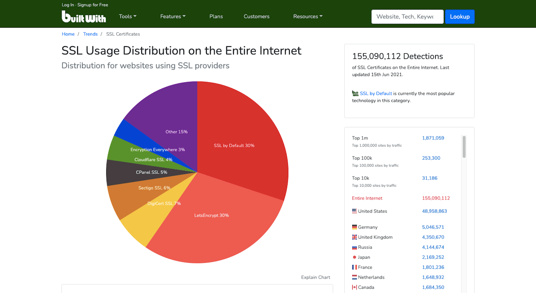
Security and privacy are major concerns for consumers. So if you want to increase their confidence in your website, installing an SSL certificate is an easy thing to do. And it’ll put you in Google’s good graces, too.

If you don’t have one already, get one for free from Zero SSL.

3. Improve Mobile Page Speeds

Mobile loading speeds became a Google ranking signal in July 2018.

It was something we saw coming ever since smartphones overtook the desktop as the primary device people used to access the Internet. Once it became a ranking factor, though, mobile page speed was something we could no longer treat as a “nice to have.” It became a must.

And with Google’s most recent Core Web Vitals algorithm update, there’s no ignoring how big of a role your site’s mobile loading speeds (i.e., performance) play in ranking it.

To ensure that your site meets Google’s expectations for speed, bookmark the Core Web Vitals tool. It’ll tell you how your site performs across all four of the major ranking categories.

You’ll find your speed-related issues at the bottom of the page, along with resources to help you resolve them.

Most of those tips will have to do with optimizing your code. However, there are other things you can do to make your site load quickly:

  • Use well-coded themes and plugins;
  • Remove unused themes, plugins, media, pages, comments, backups, and so on from your database and server;
  • Install a caching plugin that’ll minify, compress, and otherwise make your site lightweight and fast.

It’s also not a bad idea to review your web hosting plan. You might not have the right amount of server power or resources to keep up with your existing activity.

4. Design a Mobile-First UI

On a related note, a mobile-first design can also improve your site’s loading speeds. Rebekah Carter wrote a really helpful guide on how to do this last year.

In addition to speeding things up — since you won’t be trying to jam a bunch of desktop-first design and content into a smartphone screen — it’s going to help your site rank better.

Just be careful when you do this. A mobile-first design doesn’t mean creating a scaled-back version of the larger site for smartphone users.

In fact, Google explicitly tells us not to do that and why:

“If it’s your intention that the mobile page should have less content than the desktop page, you can expect some traffic loss when your site is enabled mobile-first indexing, since Google can’t get as much information from your page as before.”

And if your response is that the content on desktop-only doesn’t matter, then it really shouldn’t be there. Don’t waste your visitors’ time with useless or repetitive content, as it’ll only give them more reason to abandon your site.

5. Make Your Site Accessible

Accessibility has come to the forefront of the SEO discussion thanks to Core Web Vitals.

Now, running your site through the tool will tell you if there are any inaccessibility issues that Google will ping you for. But that doesn’t make your site completely accessible.

Considering the rise in website accessibility-related lawsuits, you’ll want to take this seriously.

Because a bad experience due to inaccessibility won’t just cost you visitors and a lower search ranking, it’ll cost you a lot of money, too.

Here are some things you can do to ensure that your site and all its content is accessible.

6. Optimize Your Images

Technically, image optimization falls under the page speed tip. However, that’s not the only way you should be optimizing your images, which is why I wanted to address this separately.

According to HTTP Archive, the average weight of a mobile web page these days is 1917.5 KB. Images take up a sizable chunk of that weight:

Because of this, bloated image sizes are often to blame for slow pages.

You can do several things to optimize your images for speed, like using lightweight formats, resizing them, and compressing them. You’ll find 6 other image optimization tips here.

While those tips will help you speed up your site and, consequently, improve your SEO ranking, there’s something else you need to do:

Add alt text to your most important images.

One reason to do this is to improve accessibility. Another is so your web page can rank in both the regular Google search results and image results as this search for “WordPress by the numbers” does:

If you can write alt text that perfectly describes your graphic and matches the image searchers’ intent, you can create another ranking opportunity for your page.

7. Create Great Content

There are many technical ranking factors you have to pay attention to if you want to create a good experience for your visitors and rank well as a result. However, none of that will matter if your content sucks.

So, how do you make great content? It really depends.

Think about the difference between a page describing your web design services and a product page for a blender.

Your web design services page would need to:

  • Explain why hiring a web designer is a must;
  • What your design services entail;
  • What they can expect in terms of results;
  • Include some proof in the form of testimonials or portfolio samples;
  • Have information on next steps or how to get in touch.

That would be a comprehensive and useful page. If business owners searched for “hire a web designer near me” or “should I hire a web designer?”, that page would sufficiently answer their query.

A product page, however, would need to:

  • Provide a brief summary of the blender;
  • Show photos of the blender, different angles of it, as well as different variations of the product;
  • Display the price;
  • Allow customers to Add to Cart or Save for later;
  • Include technical specs of the blender;
  • Recommend related products;
  • Display sortable customer testimonials and ratings.

The last thing a shopper would want is to be directed to a product page that reads like one of your services pages.

So, great content not only needs to be well-written and error-free, but it needs to match the searcher’s intent and expectations. If you can do that, your visitors will stay as long as they need to read through everything, which will help strengthen the page’s ranking.

8. Structure Your Content for Scannability and Readability

Including necessary details and in the right format is an important part of making a page’s content valuable to the visitor. The structure is going to help, too.

For starters, you want to make sure every page is human-readable. So, that involves:

  • Shorter sentences and paragraphs;
  • Linkable table of contents for longer pages;
  • Header tags every few hundred words;
  • Descriptive and supportive imagery throughout;
  • Text callouts like blockquotes and bolded phrases.

By making a page less intimidating to read and easier to scan for a quick summary of what it is, you’ll find that more visitors are willing to read it and follow your calls to action.

You can use a tool like Hemingway to improve your page’s readability. Quickly pop the text of each page into the editor and follow the recommended suggestions:

You’re also going to have to think about how well Google’s indexing bots can read your page. They’re smart enough to pick up on cues but not smart enough to sit down and read your article on the benefits of Vitamin D or how to install a new showerhead.

So, you’ll need to use HTML meta tags as well as hierarchical header tags to tell the bots what the page is about.

If you’re building a WordPress site, you can use the Yoast SEO plugin to analyze how scannable and readable each page of your site is (among other things):

9. Create Click-Worthy Title Tags and Meta Descriptions

To get eyeballs on your really great content, the brief preview users see of it in search results needs to be able to lure them in. Get more clicks to your site from search, and Google will take notice.

But they can’t just be superficial clicks. If Google notices that your page is getting a ton of traffic that almost immediately drops off once they see the content on the page, your page will not fare well in search results.

So, your goal is to stay away from clickbait-y title tags and meta descriptions and make them click-worthy.

The first thing to focus on is the length. Google only gives you a certain amount of space to make your pitch.

There are many tools you can use for this, but I prefer Mangools’s SERP Simulator:

It allows you to play around with your URL, title tag, and meta description and to watch in real-time as it fits the allotted space. You can also compare it to the pages that currently rank for the keyword you’re going after, which can be a really useful reference point. After all, if those sites have made it to the first SERP, then they’re doing something right.

Another thing to think about when writing click-worthy titles is how engaging they are.

The tool I recommend for this is CoSchedule’s Headline Studio:

I don’t find this useful so much for basic web pages. You don’t need to get creative with something like your About or Contact pages. But for content marketing? If you want to beat out competing articles for attention in Google, this tool will be very useful.

10. Choose One Focus Keyword Per Page

It’s not as though you can add a keyword tag to your page, and Google will automatically rank your site for it. That’s not what keyword optimization is.

Instead, what you do is select one unique keyword per page and write the content around it. So, it’s really more about creating a clear focus for yourself and then comprehensively unpacking the subject matter on the page.

Keep in mind, though, that if you want to improve your chances of ranking for the keyword, it needs to be relevant to your brand, useful for your audience, and your site needs to actually be able to compete for it.

You can use the Google Keyword Planner to find keywords that fit those criteria:

Ultimately, you should choose a keyword that:

  • Has a decent amount of monthly searches — over 1,000 is what I aim for;
  • Have “Low” to “Medium” amount of competition, but the lower, the better;
  • Matches the user intent. So take that keyword, put it into Google and see what you find. Then, look at the sites on that first page of search results. Do they match what your own page will address? If so, then you’ve found a keyword that aligns with your users’ search intent.

Now, if you’re writing great content that addresses your visitors’ questions and concerns, then optimizing for your focus keywords will happen naturally. The same goes for related keywords you might want to target. As you write the content for each page, the keywords will organically appear.

But remember how I said Google’s indexing bots need certain HTML and header tags to “read” the content on the page? This means you’ll need to include the focus keyword in some of those areas, so there is no question about what the page is about.

Here’s where your focus keyword should show up:

  • Title tag (H1);
  • Meta description;
  • Slug (hyperlink);
  • Within the intro;
  • The first H2 header tag;
  • Alt text for the most important image on the page;
  • Within the conclusion.

It should also appear throughout the page, along with variations of the keyword that people might search for.

You can use the Yoast SEO plugin to analyze this as well.

11. Improve Your Internal Link Strategy

Okay, so here’s where we start to get into SEO strategies that Google might not directly care about, but that can still drastically improve how well your site ranks.

Internal links, in particular, are valuable because they create an interconnected structure for your site. Here’s a basic example of why that’s important:

Let’s say these are the pages on your website. Each of them can be accessed from the home page and main navigation. This structure tells us that each page is related to the overall message and mission of the company, but they are not related to one another. And that doesn’t make sense, right?

When you’re educating visitors on your Web Design services, it’s naturally going to come up that you also happen to specialize in WordPress and eCommerce design. So, those internal links should appear on your Web Design page. And vice versa.

In addition, your Portfolio and Contact Us pages are likely going to be the most common CTAs on the site. Your prospective clients shouldn’t be forced to backtrack to the homepage or scroll up to the navigation to take action. By including these internal links or buttons within the content of the services pages, you’re giving them a quick and direct line to the next steps.

The more intuitive you make the user journey, the easier it will be for them to convert.

This is one reason why websites with a strong internal linking structure perform well in search results. Another reason is that internal links help Google’s bots find all of the content on your site and better understand how they relate to one another.

12. Use Only Trustworthy External Links

Link juice is one of the reasons why business owners are obsessed with getting backlinks. We’ll get to that shortly.

But it’s also something that comes into play when choosing external links to include on your site.

Link juice is the idea that one site can pass its authority to another through a dofollow link. So, by linking out to authoritative and trustworthy sources, your site may raise its own clout with the search engines because of that connection.

However, it works both ways. If you create external links to websites with misinformation that pose a security threat to visitors or are otherwise untrustworthy, that bad reputation can do your website harm.

So, make sure that every external link you use is necessary and reliable. If not, get rid of it.

13. Get Your Site Listed As a Featured Snippet

I said earlier in this post that pay-per-click advertising is the only way to shortcut the SEO process and get on the first page of Google. That’s not entirely true.

We’ve already seen how optimizing your images for Google Images search can shoot your site to the top of results. Another way to get ahead is by optimizing your page using structured data to land a spot as a featured snippet.

Like this page from Bankrate that answers the question “how do you get a loan”:

Remember that structured data alone won’t instantly move your web page into the featured snippet space. The content needs to be the best it can be, and the structured data needs to be well written.

Schema.org was created to help you pick the right category and write the structured data for it:

Use this to write up the relevant microdata for the pages to make the most sense to do so. For instance, an About page probably wouldn’t benefit from having structured data attached to it. However, a lengthy blog post that explains a step-by-step process would.

There are WordPress plugins (Yoast is one of them) that will help you insert this code into your pages if you prefer.

14. Get High-Quality Backlinks

Backlinks pointing to your website are a huge indicator to Google that your site is share-worthy and authoritative.

However, like everything else in SEO, you can’t cheat your way into a bunch of backlinks. They need to come from authoritative sources, and they need to be relevant. That’s why paying or bartering for backlinks isn’t usually effective. If your web page’s backlink doesn’t organically fit within the content on their site, visitors aren’t going to click on it.

There are lots of ways to go about building up a repository of backlinks that do generate authority for you and improve your SEO ranking in the process:

Get active on social media and become an authority there: The rule is generally that 80% of your posts need to be non-promotional. By sharing content from all kinds of sources that are relevant to your audience, you’re going to get more meaningful engagement. And this’ll eventually put the spotlight on your own content and get people to share it on social media, too.

This is something that Google will look at when ranking your site: What sort of social signals are coming from your brand?

Get featured as an expert: You don’t need to become an influencer for people to view you as an expert in your field. It’s all about your reputation.

By leveraging your reputation to get speaking gigs, you’ll grow your authority even more. Just make sure they’re relevant to what you do. So, look for podcasts, webinars, and conferences in your field that are looking for experts.

Become a guest blogger: If public speaking isn’t your forte, that’s okay. Turn your attention instead to lining up guest blogging gigs.

By writing high-quality content for authoritative websites (whether you get paid or not), you’ll bring more attention to your own brand. And Google will pass that authority onto your site.

15. Create a Google My Business Page

Any business can create a Google My Business page. There are a number of SEO-related benefits to doing this.

The first is that local businesses can literally put themselves on the map with Google My Business. Here’s what a Google search for “restaurants near me” looks like:

Even if your site doesn’t appear on the first SERP, the map that sits at the top of search results can give you a front seat anyway.

Another reason to create a My Business page is that you get to control your knowledge graph sidebar, like Ford’s Garage does here:

By including high-quality graphics, pertinent details about the business, and collecting positive customer reviews, this knowledge graph could do your brand’s reputation a lot of good in the eyes of Google and your prospects.

16. Refresh Your Content

This is useful for all of the content on your site, even your most high-performing pages.

If your site is starting to gain traction, take a close look at your Google Analytics data. You may find a few pages that no one seems to be paying attention to or, worse, that they always seem to bounce from.

In Google Analytics, go to Behavior > Site Content to figure out which pages are underperforming.

Then, ask yourself:

  1. Is this page even a necessary part of the user journey? If not, you can probably scrap it and have one less distraction on your site.
  2. If this page is necessary, what do you need to do to make it more valuable and relevant to your audience?

With the most popular pages on your site, it’s not unreasonable to expect that at least part of what you originally wrote will go stale or become irrelevant within a year or two. So, it’s a good idea to refresh these as well.

To do that, it’s simple. Do a search in Google for your focus keyword. Read through the top five results and see what sort of information your post is missing. Then update it accordingly.

Anything outdated or irrelevant should also be stripped out.

17. Regularly Monitor Google Search Console

Last but not least, you should keep your eyes on Google Search Console.

There’s a lot of valuable information in here that will tell you why your site might not be ranking as well as it could. You’ll find issues related to:

  • Indexing
  • Mobile usability
  • Security
  • Core Web Vitals

You’ll also find data on how well your site is ranking in general. You’ll find this under the Performance tab:

Use this to identify:

  • Which keywords you’re ranking for and are driving traffic to your site;
  • Which keywords you’re getting the most impressions from but not getting clicks from;
  • Which keywords you’re getting the most clicks from but not a lot of impressions;
  • Which keywords you rank low for and could stand to improve upon.

You can learn a lot about how strong your SEO strategy is. Just use the Clicks, Impressions, and Position tabs to sort your data so you can better understand what’s going on.

Then, prioritize fixing the pages that can and should be bringing your site highly qualified traffic but aren’t.

Wrap-Up

If you’re wondering how long it’ll take before you see an improvement in your SEO ranking, it depends. If your domain’s current authority is low, it can realistically take about six months to see major changes. That said, if you implement all of the suggestions above, you can certainly expedite that.

Just remember that there are no real shortcuts in SEO. You need to have an authoritative and trustworthy website and brand before anything else. So, take the time to build your credibility online so that these SEO tactics can really work.

Source

The post 17 Things You Can Do To Improve Your SEO Ranking In 2021 first appeared on Webdesigner Depot.


Source de l’article sur Webdesignerdepot

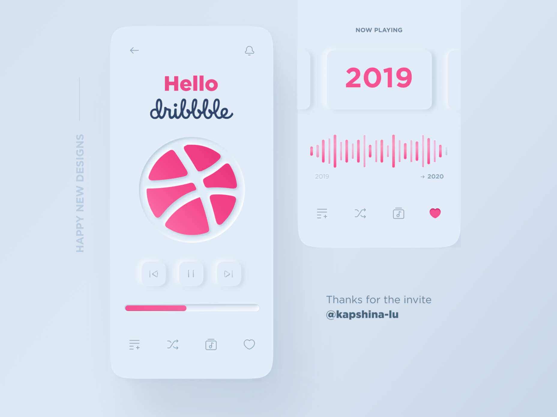
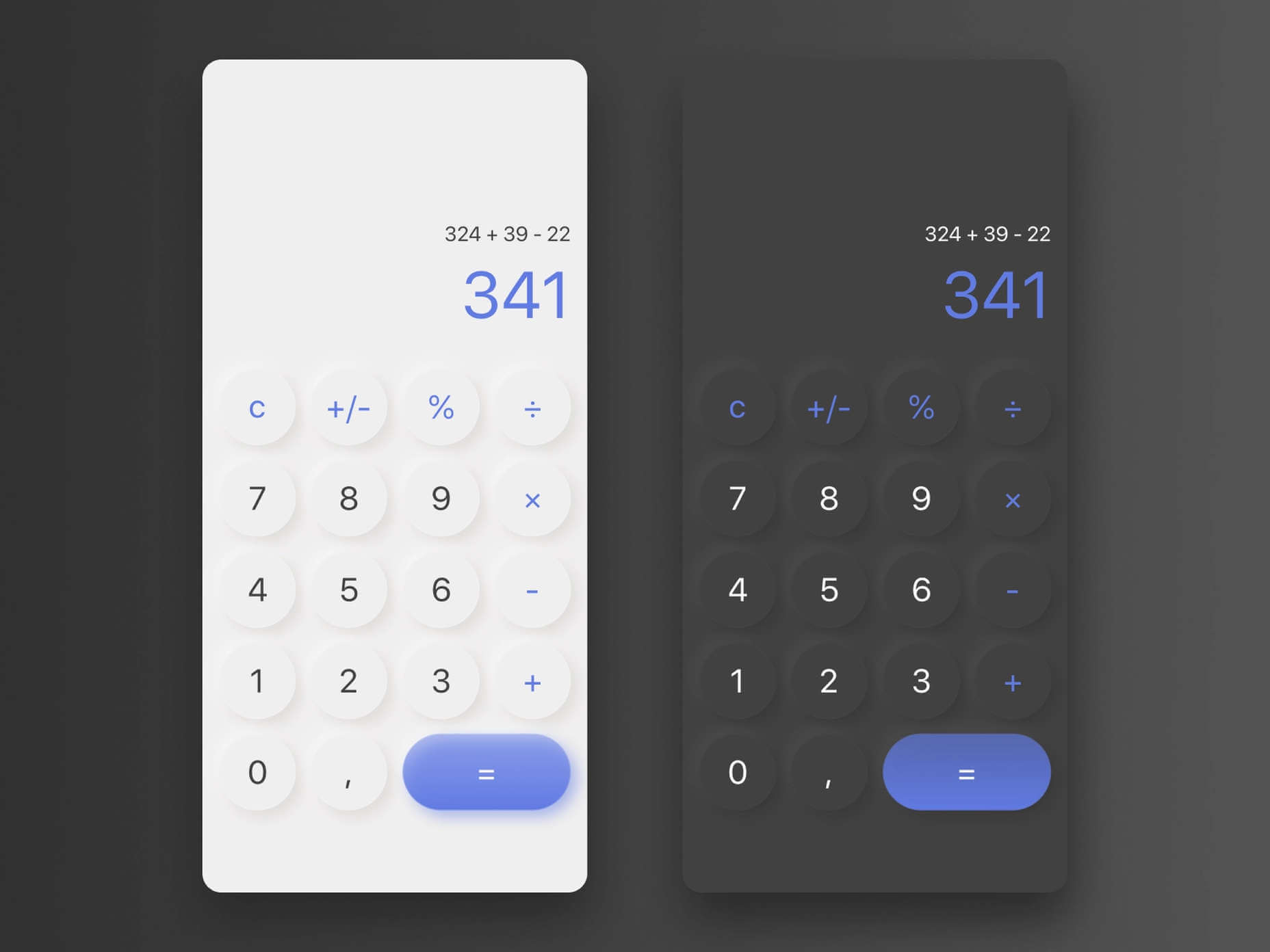
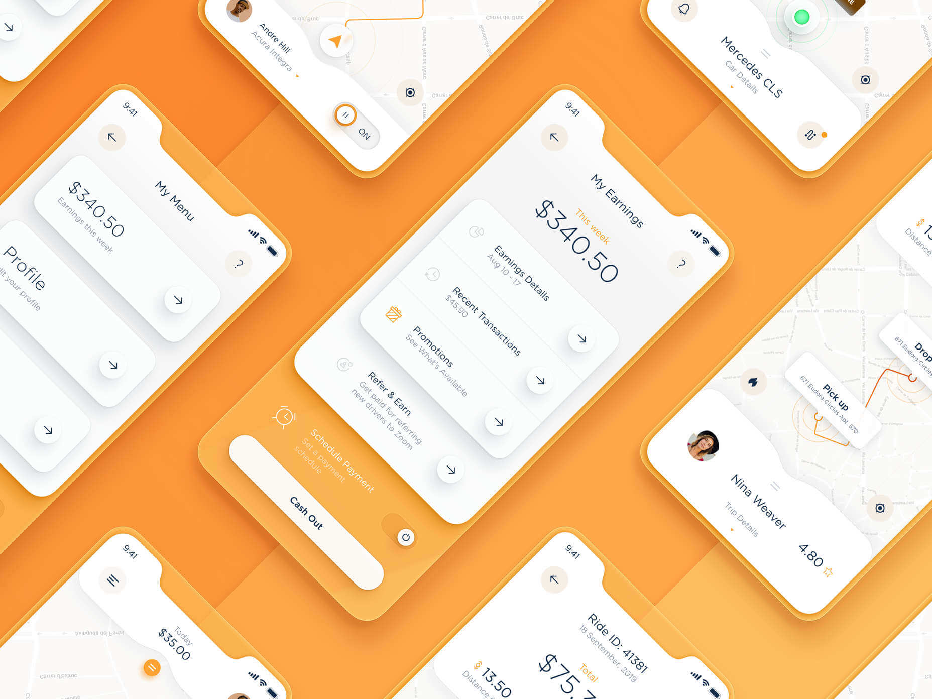
A new design trend has emerged in the last year: Soft UI or Neumorphism is everywhere. 

Even Apple is in on the trend; the company introduced a host of changes in both its mobile and desktop operating systems that use the style. The elements of Soft UI introduced by Apple reflect various aspects of the Microsoft Fluent UI design too. 

So, if soft UI is such a huge concept, what do we need to know about it? How does soft UI work, and what are the pros and cons of using it?

What is Soft UI (Neumorphism)?

Soft UI involves using highlights and shadows in design elements to make them look as though they’re layered on the page. 

The term neumorphism is derived from a previous design style — skeuomorphism, where designers create something as close to its real-life counterpart as possible. If you remember the shift between iOS 6 and 7, you’ll remember the switch between skeuomorphic and flat designs. However, neumorphic design isn’t quite as dramatic. 

Neumorphism doesn’t focus excessively on things like contrast or similarities between real and digital elements. Instead, this “soft UI” practice creates a smoother experience for users. 

With neumorphism, you get the sense that buttons and cards are actually part of the background they’re on. This trend removes the flashier aspects of a typical interface and focuses on a softer style that stays consistent throughout the design. 

The Common Features of Soft UI

Soft UI is all about smoothing out the experience by making everything feel more connected. There’s nothing overly harsh in the aesthetic, hence the term “soft.”

So, what kind of features can you expect?

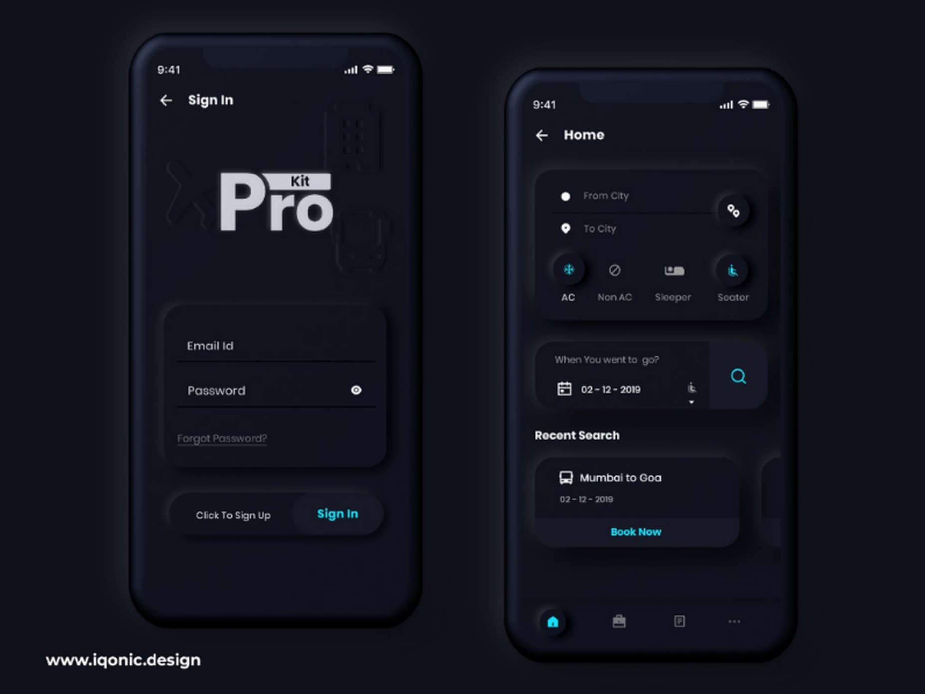
Rounded Corners: Soft UI removes some of the sharper parts of the interface, like the corners on modules and segments. This allows for a more gentle appearance overall. In this experimentation from Iqonic Design, we can see how the round corners tie everything together.

Transparency and Background Blur: Background blur and transparency are more popular today since the infamous iOS 7 solution emerged. Most people hated the appearance of ultra-minimalism, combined with thin fonts. However, the background blur effect was more popular. The blur in soft UI shows that part of the window is connected to the rest of the OS. It seems like parts of the background in the app are pushing through to the surface. 

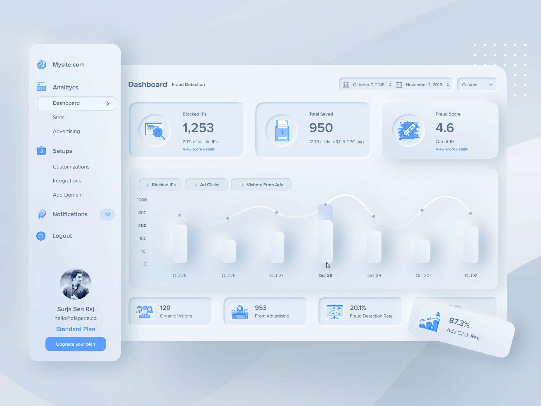
Unified Symbols: Everything needs to fit perfectly in a soft UI design. Anything that doesn’t look like it’s part of the same entity throws off the experience. In this design experiment by Surja Sen Das Raj, you can see how all the colors, shadows, and gradients tie together consistently. Because everything is more uniform, the experience flows perfectly for the end-user. 

Implementing Soft UI Elements in Your Design

So, what does neumorphism look like in your UI design process?

Ultimately, it’s all about subtle contrast and aligned colors. Every part of your interface needs to look like it’s part of the same form. Your element and background need to be the same color so that you can create a feeling of objects protruding from the background. 

With Soft UI, the keys to success are shadows and highlights. 

Let’s take a look at some key steps. 

Achieving the Soft Look

When you’re designing your interface, remember that sharp edges make the interface more serious and formal. Rounded corners are more playful and friendly. 

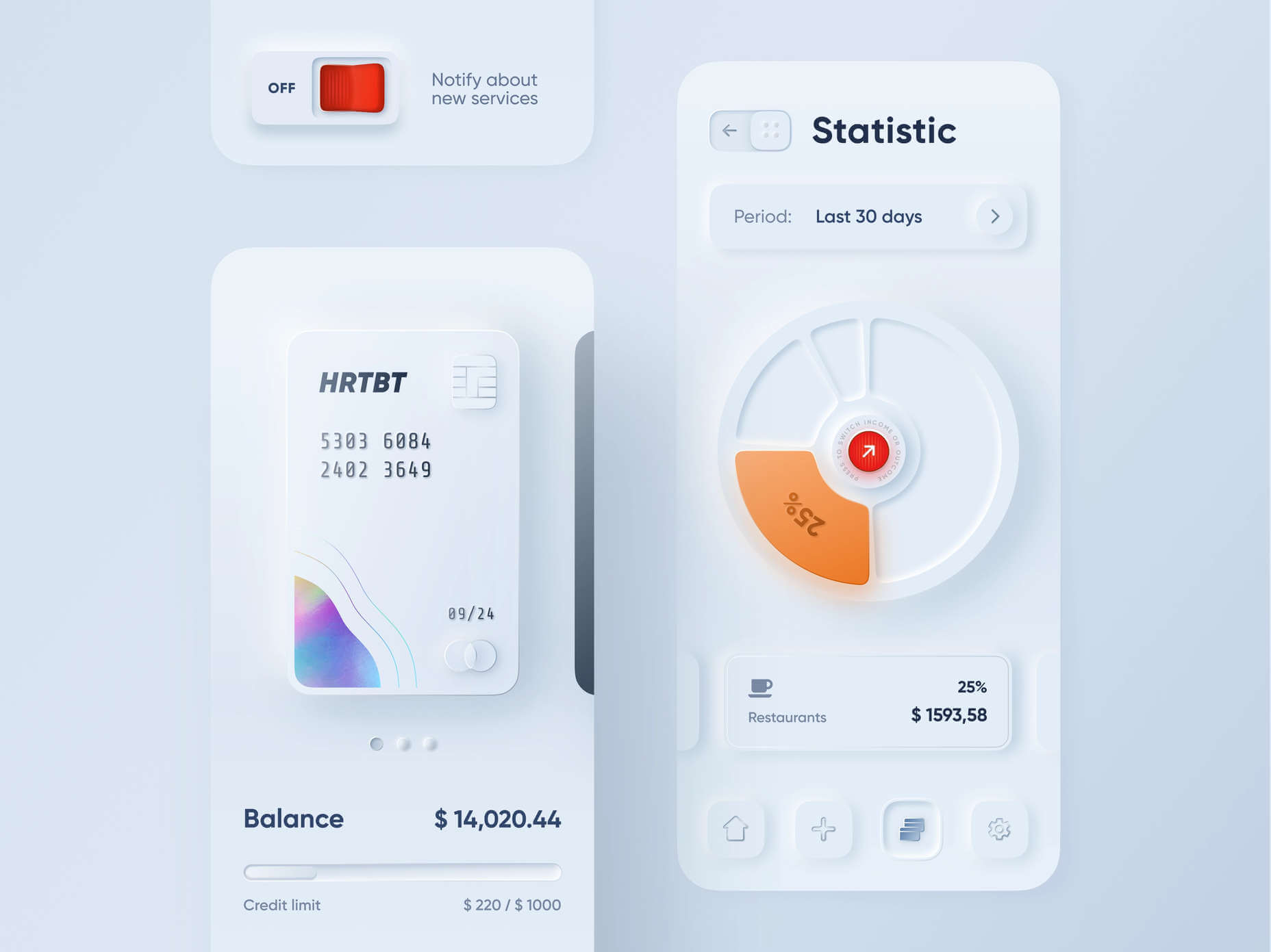
What also makes the design look lightweight and delicate is plenty of deep shadows and highlights. When you add shadows to elements, you create a visual hierarchy. The items that cast a larger, deeper shadow are the ones closest to you. That’s why only a few elements need to cast an intense shadow. Everything else should work in the background. 

Take a look at this design by Alexander Plyuto, for instance.

Creating Smooth and Delicate Gradients

Gradients are part of the shadow and highlighting process in Soft UI design. Ideally, you’ll need to choose colors from the same palette, just toned down or brightened, depending on your needs. The gradient needs to be barely visible, but just enough to make the elements stand out. 

For white gradients, like highlights, use a very delicate color somewhere between white and your background shade. For instance, consider this design from Marina Tericheva.

Consider the Little Details

Finally, remember that the neumorphism design principle is all about little details. 

Choosing a font that visually matches the background is an excellent choice. However, you can also choose something more contrasting, as this will help information stand out

Adding a little bit of the background into your fonts might be suitable too. For instance, if you have a green font and a grey background, add a little grey into the mix. 

Extra elements in your design, like allowing a button to shift into a more recessed state after being clicked, are a great way to make the soft UI more engaging. Everything your end-user interacts with needs to feel smooth and perfectly unified. 

The Problems with Soft UI Design

Just because a design process is trending – doesn’t mean it won’t have its issues. 

Neumorphism is a fun way to make apps, operating systems, and websites feel more friendly and informal. However, this softer approach has a weak spot too. 

When you’re dealing with a small margin of contrast and color where neumorphism works well, it’s hard to get the effect right every time. For instance, this all-yellow design for Dtail Studio may be overwhelming for some.

A slight deviation in saturation or a problem with your shadowing could render the entire effect of Neumorphism completely pointless. 

Another major issue is accessibility. The soft UI design looks great for people who have a full visual range. However, visually impaired users might not see the same benefits. Anyone without perfect vision may see crucial objects disappearing into the background.

Your users don’t necessarily need significant vision problems to struggle with neumorphism, either. The design is all about softness that causes elements to almost blend together. People with low-quality screens that don’t have as many pixels to work with won’t see these elements. 

Issues With Buttons and CTAs

Another major issue of neumorphism is that its subtlety can lead to problems with attracting clicks and conversions. Usability is the most important consideration of any UI design. 

Unfortunately, when you focus on subtle elements throughout your entire interface, usability sometimes takes a hit. 

Let’s consider buttons, for instance – they’re essential to any interface. To simplify the customer journey, these buttons need to be noticeable, and they need to shift into different states when your customers interact with them. 

For the button experience to be excellent, users need to notice the design instantly. However, the heart of neumorphism revolves around the idea that nothing stands out too much. 

This isn’t just an accessibility issue; it’s a problem for conversions too. 

Neumorphism is soft on the eyes, with minimal color contrast and few color pops. This means that CTA buttons don’t stand out as much as they should. Buttons almost blend into the background, and the website struggles to pull attention to the areas that demand it most. 

How to Experiment With Soft UI (Free Kits)

The key to unlocking the benefits of soft UI interfaces without getting lost in the negative points – is proper experimentation. Like any new design trends, professionals and artists will need to learn how to merge the elements of soft UI together in a way that doesn’t compromise usability. 

Trends in UI design can’t focus exclusively on aesthetics, as a customer’s comfort will always be an essential part of the process. 

If you want to start exploring, here are some of the best kits and freebies to get you started:

Closing Thoughts on Soft UI

The world of design and the trends that we use are constantly changing. Companies are always searching for the best ways to connect with their users. Often, this means focusing on an interface that really connects with your target audience and delivers the best possible results. 

The soft UI design trend has its benefits and its downsides. On the one hand, the smooth appearance of every element on a combined screen can deliver a delightful aesthetic. Buttons feel less imposing, and elements are friendlier and easier to interact with. 

On the other hand, neumorphism also makes it difficult to truly capture your audience’s attention in the places where it matters most. It suffers from accessibility issues and requires plenty of care and practice.

Source

The post Soft UI: Making Sense of the Latest Design Trend first appeared on Webdesigner Depot.


Source de l’article sur Webdesignerdepot

Illustration is a big trend in 2021. Every designer should have some ability to illustrate, whether that’s producing icons, creating lettering, mocking up layouts, or crafting full-blown illustrations.

Designers’ workflows are as varied as their work, and one designer’s favorite tool is a frustrating mess to the next designer. Most design apps have a free trial, so it’s worth trying out a few before committing.

Counting down to the best illustration app for designers in 2021, all of the apps on this list are worthy of at least a second glance:

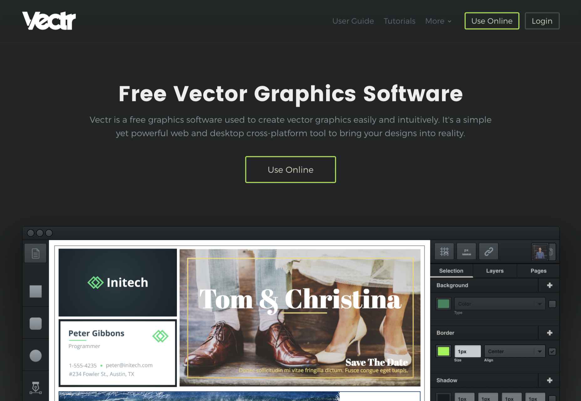
10. Vectr

Vectr is a simple vector design tool. It is heavily geared towards layout and even product design. It’s difficult to use it for many illustration jobs, but simple icon and UI creation are possible. It scrapes into our top ten thanks to the fact that it’s free to use.

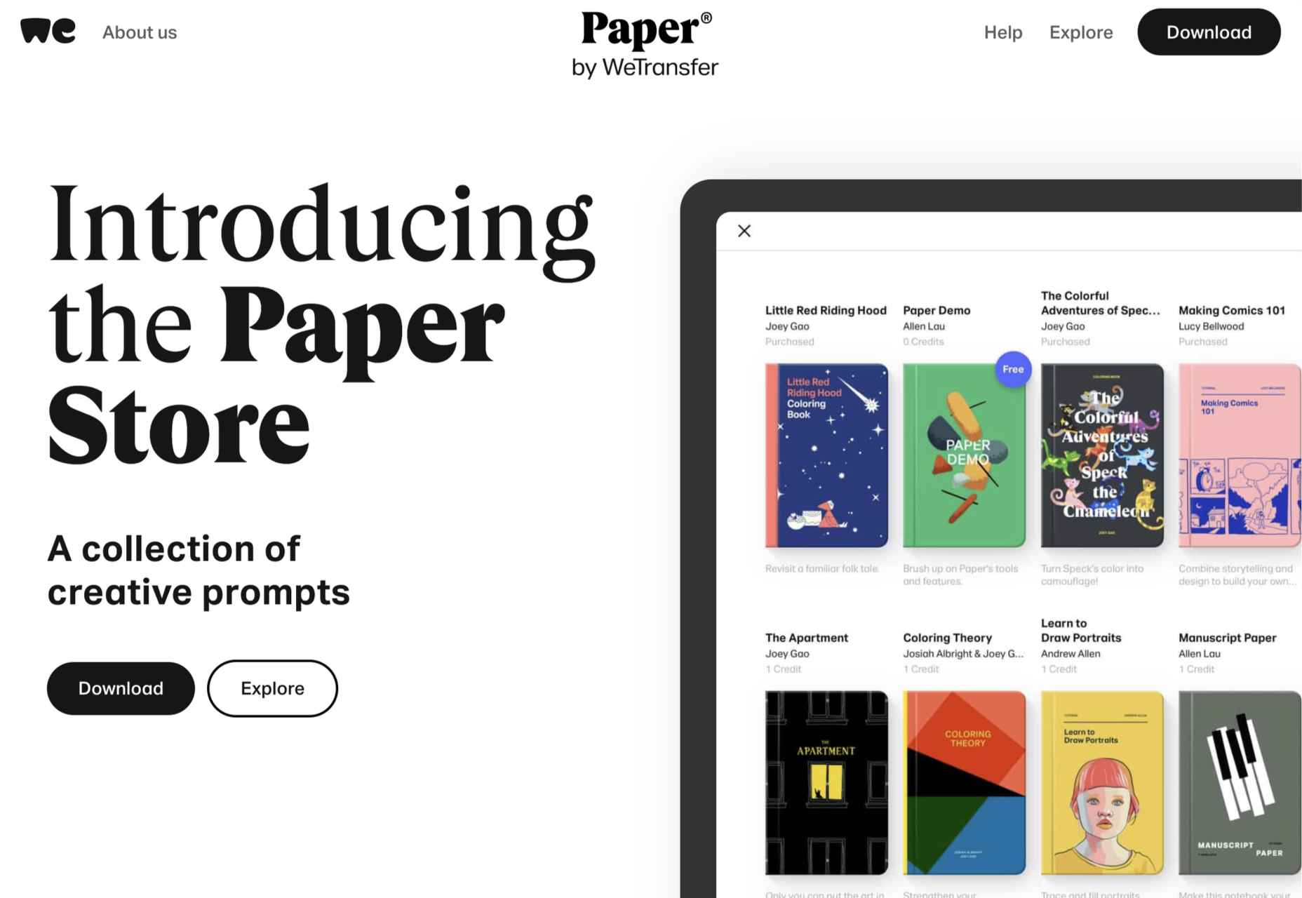
9. Paper

Paper is a sketching app developed by WeTransfer. It grabs number nine in our top ten thanks to its simplified interface that is perfect for generating ideas. It may not be the most flexible app, but it’s free to download, making illustration accessible to anyone with an iOS device.

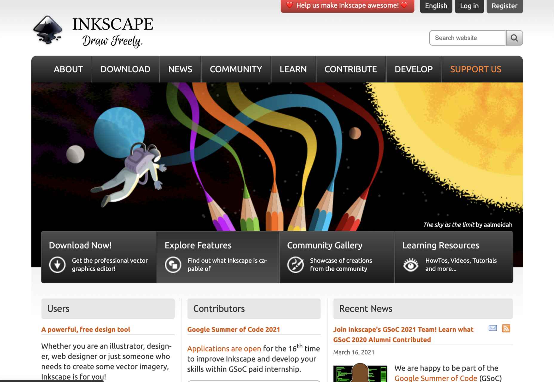
8. Inkscape

We love the fact that there’s someone out there producing a professional-grade artwork app for free. Inkscape is available for GNU/Linux, Windows, and macOS. If you’re interested in exploring this design area without signing up for a subscription or buying an iPad, Inkscape is a great place to start.

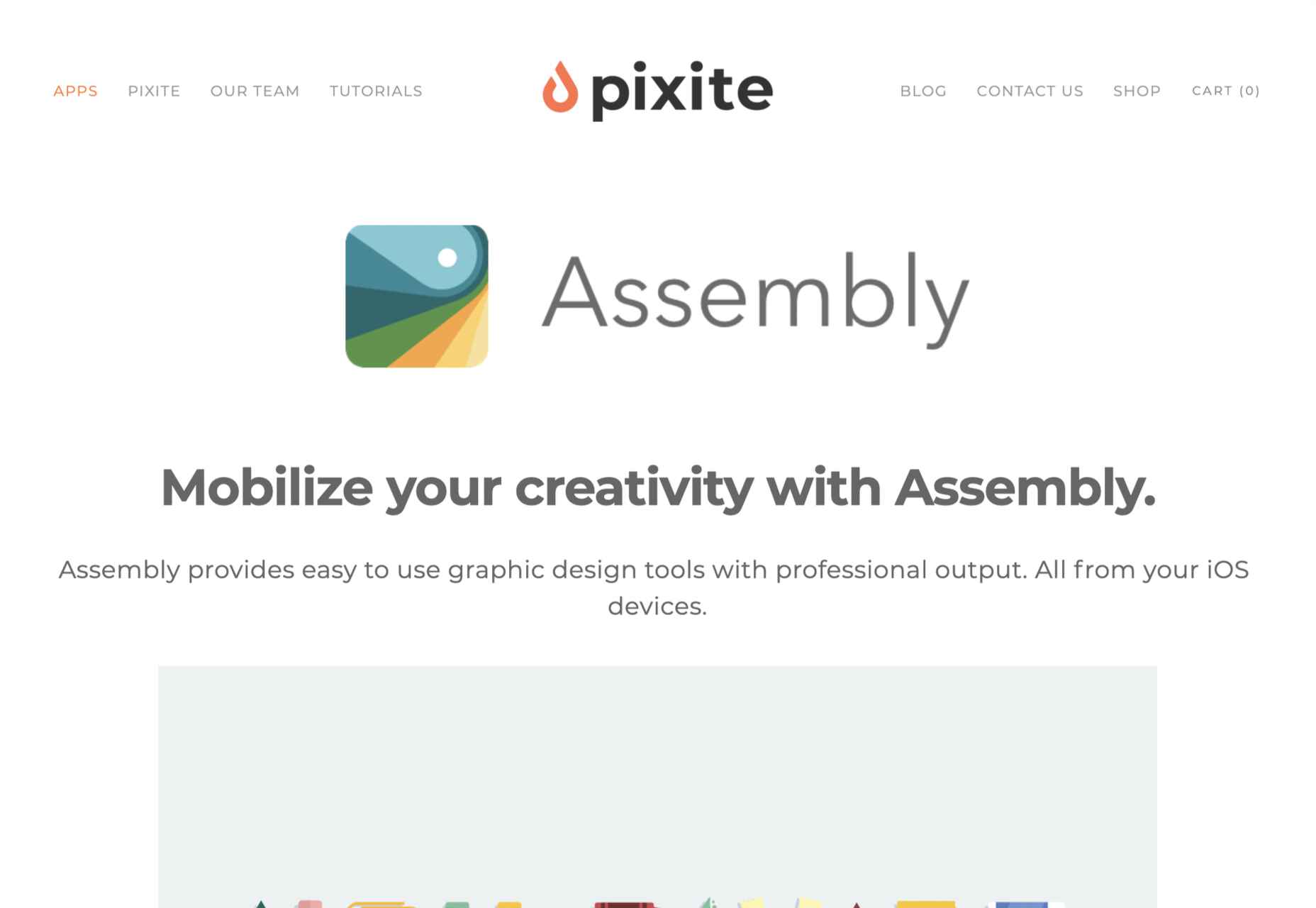
7. Assembly

Assembly is another app that’s dependent on the transition of illustrators from desktop machines to mobile devices and is available for iOS. Assembly does things a little differently; instead of manipulating boolean curves, Assembly builds illustrations out of shapes. If you’re someone who thinks they can’t draw (spoiler alert: everyone can draw), this is the app for you.

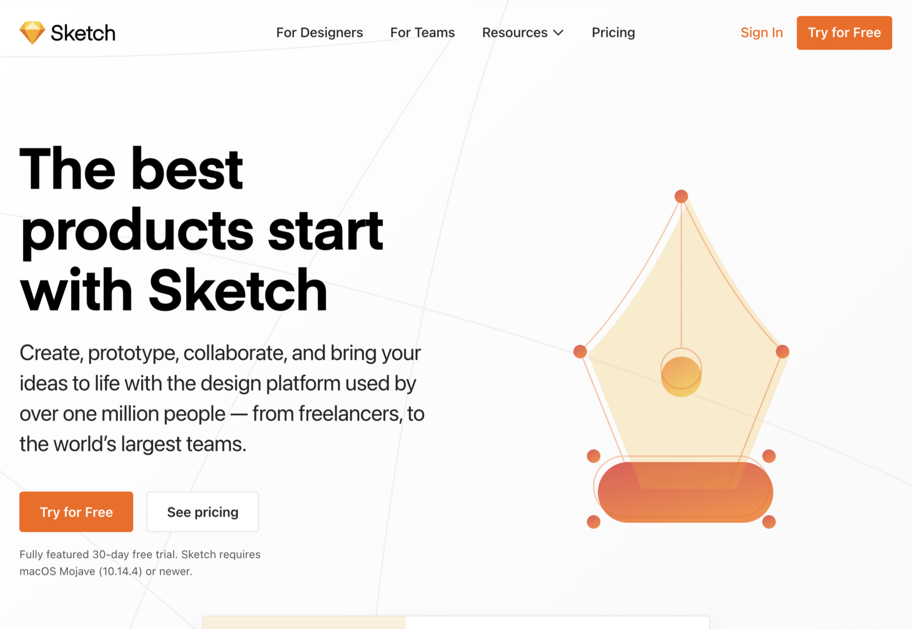
6. Sketch

It’s a shock low-rating for Sketch, the highly popular product design app doesn’t make it out of the bottom half of our list. The reason for the lower ranking? Sketch is an incredible design app, but its greater investment in prototyping features has come at the cost of drawing innovation. It’s still a great choice for crisp icon design, but it’s not flexible enough to take a higher spot in our list.

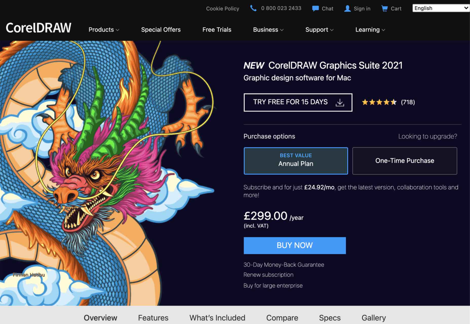
5. CorelDRAW

If you’re getting the impression that design apps are mostly for macOS or iOS, then you’d not be alone. CorelDRAW Graphics Suite is one of the few that began its life on Windows before being rebuilt for Mac. CorelDRAW is a premium option, but like Adobe’s offering, it is a suite of tools that cover everything you’ll need to create any form of design work you could ever need.

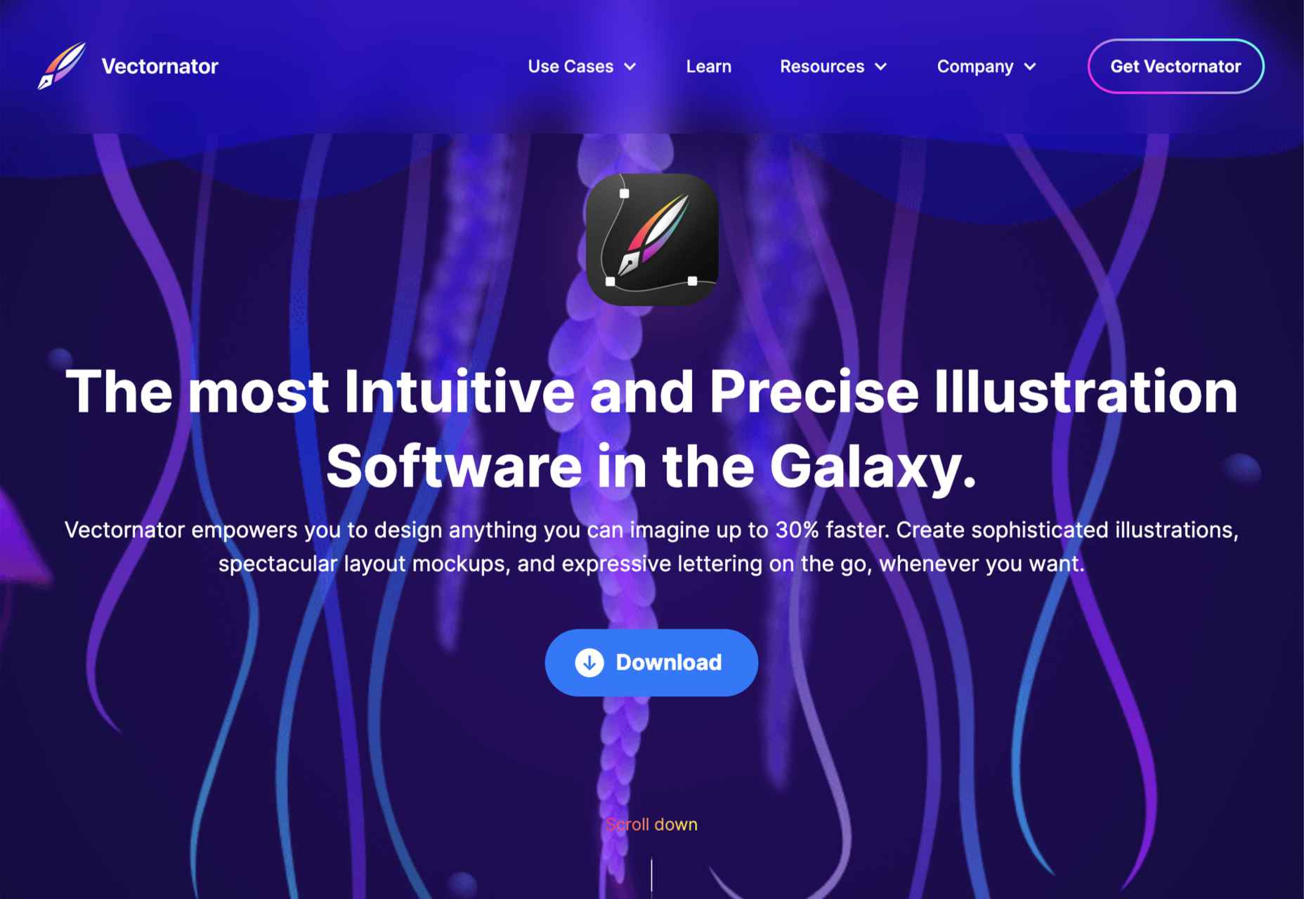
4. Vectornator

Moving closer to the top spot, Vectornator is an up-and-coming tool. Like many other apps further up our chart, Vectornator does a lot more than simply illustration. Its underlying tools provide a solid foundation for a flexible set of tools that you can use for any artwork. Vectornator does an awful lot, awfully well. 

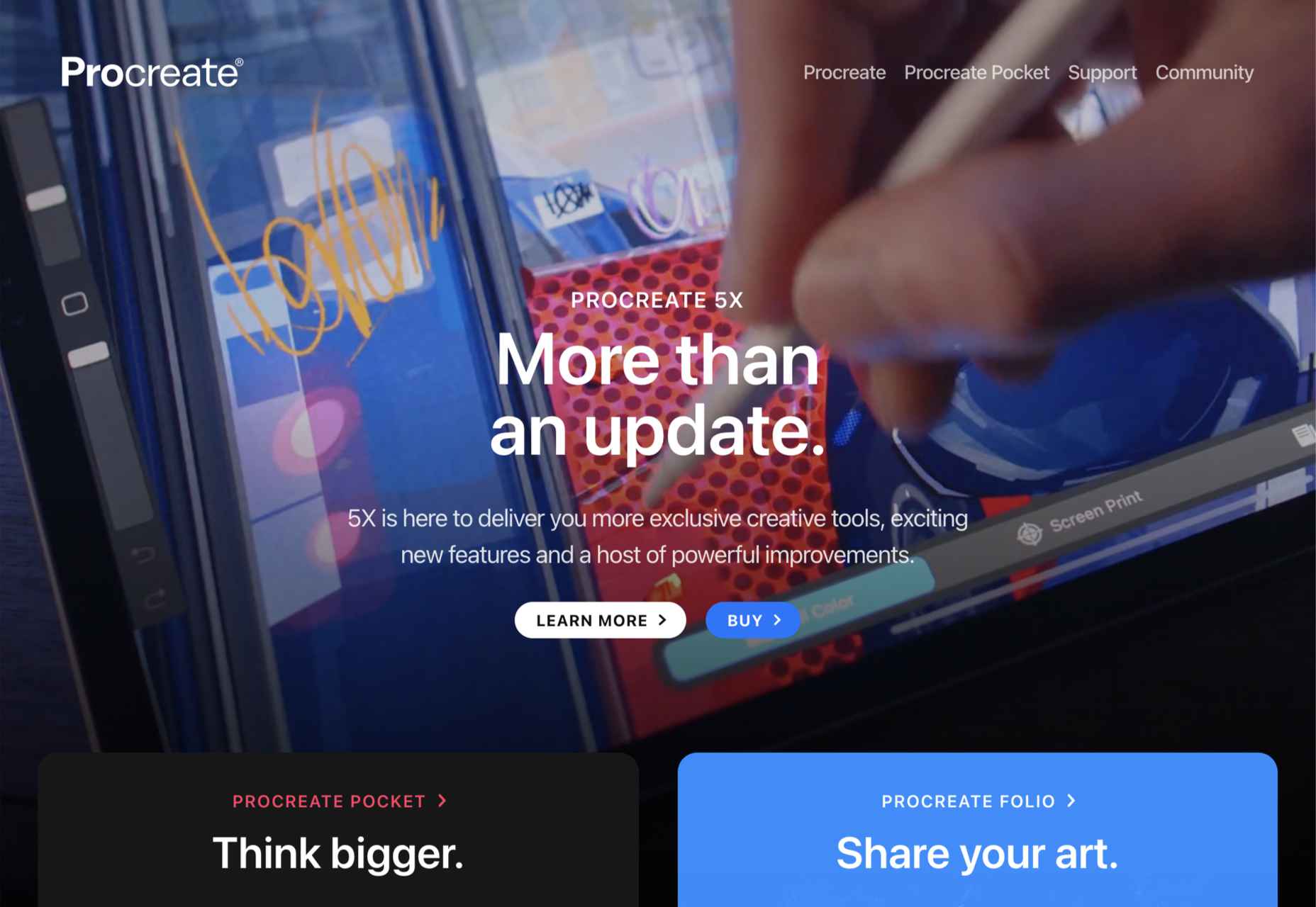
3. Procreate

Procreate is one of the finest apps on this list, thanks in main to its incredible brush studio; being able to edit the marks you make is essential for any expressive artwork. Procreate enables expressive illustration, typography, and simple sketches. The only downside to this app is that it’s iOS only; if available on more platforms, it might have been even further up the list.

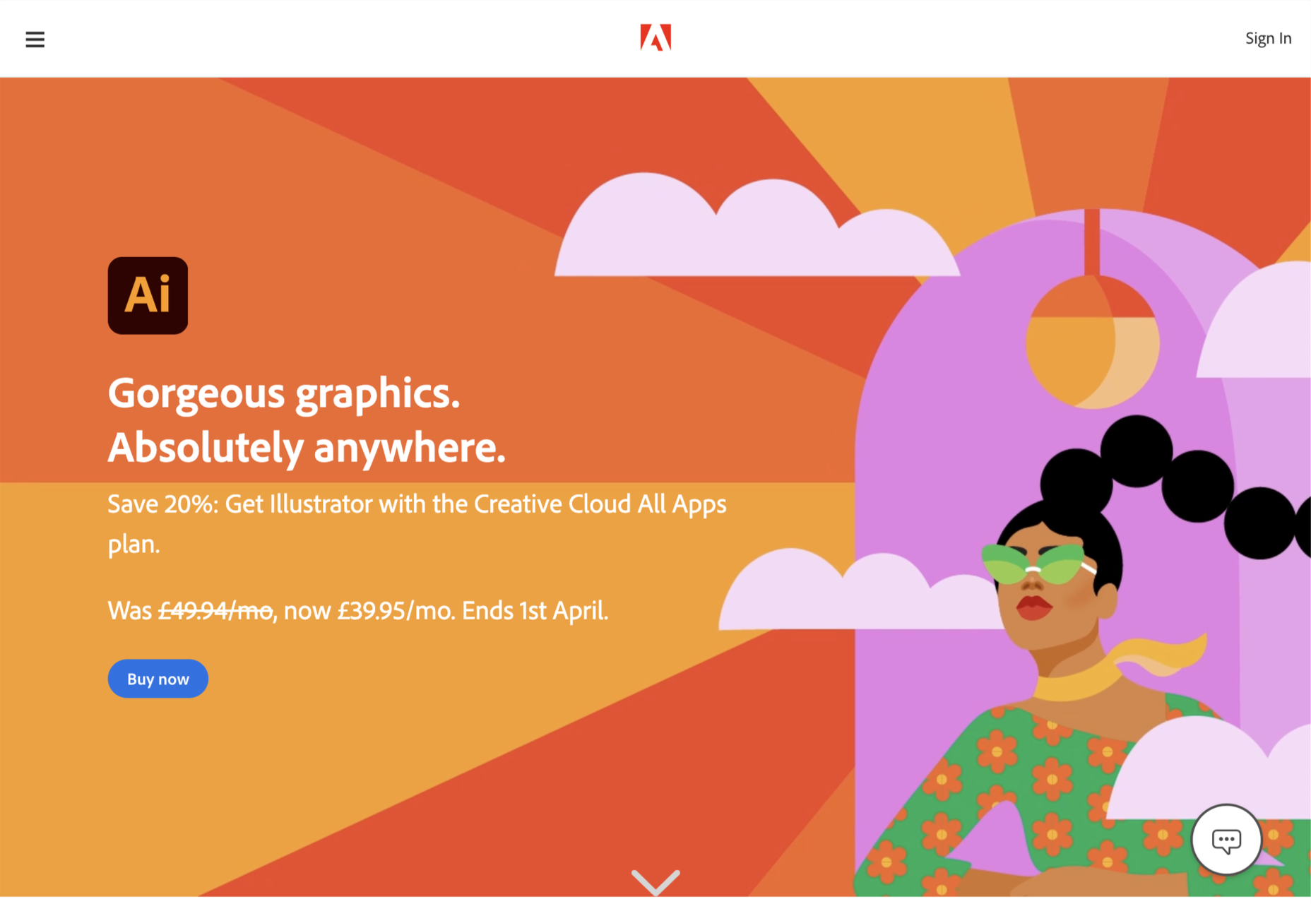
2. Adobe Illustrator

That’s right; we don’t think design giant Adobe’s illustration app Illustrator is worthy of the number one spot.

Illustrator is an excellent tool and arguably deserves to be considered Adobe’s flagship product. Since Adobe relented and allowed individual app subscriptions, it is also reasonably priced. It does everything you could want in an illustration app, from designing icons to creating original artwork.

So why not the top spot? It wasn’t so much that Illustrator fell down anywhere, as a different app pipped it to the post…

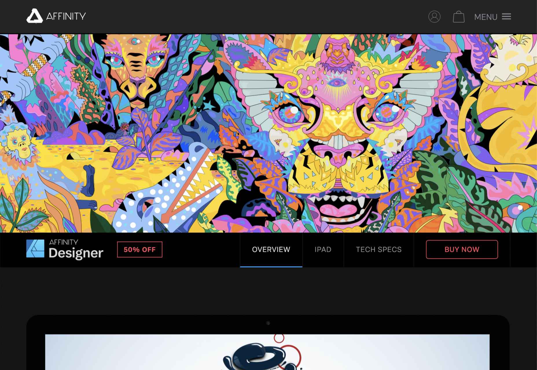
1. Affinity Designer

The best app for illustration in 2021 is Affinity Designer. We’ve been fans since its first beta version, and we’ve watched it go from underdog to champion.

On top of being an excellent vector app, Designer is comfortable with raster graphics. Although it certainly can’t compete with Photoshop (Affinity built Photo for that), Designer is more than adequate for many image tasks, making it a great all-around design app. Designer was also the first design app to support macOS’ new M1 chip natively.

The knockout blow is that Affinity Designer is available as a desktop app and an iOS app; the two apps have minor differences in their interfaces; what matters is that both apps use the exact same file format. You can seamlessly switch between desktop, iPad, and back to desktop, taking advantage of the precision of a mouse and the expression of a stylus.

It’s this kind of flexibility that bends Affinity Designer to your workflow instead of the other way around, and that’s why it’s top of our list.

Source

The post Ranked: Top 10 Illustration Apps in 2021 first appeared on Webdesigner Depot.


Source de l’article sur Webdesignerdepot
It’s Friday, and we wanted to have a little fun with a design test that might make you go cross-eyed.

Here are ten images, each with a dot in the middle of another shape — a square, a circle, or maybe something trickier. Can you tell with a glance if the dot is in the exact center of the shape? See how many you can get right; pathetically easy or fiendishly difficult? You decide!

Source

The post Quiz: Can You Spot The Center Of These Shapes? first appeared on Webdesigner Depot.


Source de l’article sur Webdesignerdepot
A domain name is an essential element of every project, product, and company. It’s central to a brand and has a disproportionately large impact on user experience. Not only that, but it also impacts SEO and ultimately revenue.

Domain names are also one of the most commonly retailed elements in web technology, with most designers hoarding a small empire’s worth of domain names “just in case” the right side-project comes along.

Because so much of the information and advice on domain names is provided by companies selling domain names and is therefore not impartial, we wanted to bust some of the myths you’ll encounter.

Myth 1: Anyone Can Own a Domain Name

In fact, almost no one can own a domain name. As demonstrated by the (probably) annual renewal notices you receive, you are merely renting a domain name.

You pay a registrar, who registers the domain with ICANN (The Internet Corporation for Assigned Names and Numbers) — or an entity to whom ICANN has delegated the responsibility for a particular TLD.

Even when renting a domain, you do not have the right to use it; thousands of UK-based businesses have had .eu domains stripped from them as a result of being removed from the EU.

Myth 2: There’s a Perfect Domain For Every Project

Domains do not have inherent value; they acquire value over time.

25 years ago, if you were building a search engine, the ‘perfect’ domain might have been search.com, find.com, or perhaps look.com — the particularly cynical might have opted for webads.com. You almost certainly wouldn’t have registered google.com because it says nothing about search.

Any domain name can acquire value through longevity, SEO, and branding

google.com acquired its value through a simple, relentless branding strategy and a generous dollop of luck.

Any domain name can acquire value through longevity, SEO, and branding.

Myth 3: Your Domain Name Should Contain Keywords

If you’re at the point of registering a domain name, either your business is new, or your digital strategy is. In either case, you have hopefully carried out keyword research, but without a live site, your keyword research hasn’t been validated. In other words, you don’t know what your keywords are.

Even if you’re confident that you know exactly what your keywords should be at this time, your keywords may change. The pandemic has required most businesses to pivot to some degree. eatoutny.com isn’t much use if legal restrictions have forced you to switch to a delivery business — unless you’ve also registered eatinny.com.

Furthermore, in the area of ecommerce, customers tend to view keyword-heavy domain names as budget options because they are like generic-brand goods. It may be that your business will only ever be a budget option, but it’s not a wise business decision to restrict your options.

There is an SEO benefit to keywords in a domain, but it is minimal and will almost certainly vanish in the next few years — even for EMD (Exact Match Domains) — because it is too close to gaming the system.

Myth 4: You Don’t Need a .com

As frustrating as it may be to seek out a .com you’re happy with, nothing says “late to the party” like a .biz domain.

A .co extension is slightly better in some regions because the .co.** format is commonly used; .co.jp for example. However, .co tends to be typed as .com by users accustomed to the more common format.

nothing says “late to the party” like a .biz domain

It’s possible to opt for pun-based names using regionally specific TLDs like buy.it, or join.in. This kind of strategy will play havoc with your local search strategy because computers don’t understand puns; you’ll potentially do quite well in Italy or India, though.

If you’re registering a domain for a non-profit, then .org is perfectly acceptable. However, carefully consider whether a domain is worth the lost traffic if you can’t also register the .com (because people will type .com).

The one exception is industry-specific TLDs that communicate something about the domain’s contents to a target demographic. For example, .design is a great extension for designers, and .io is fine for an app if it targets developers (i.e., people who understand the joke). You should also register the .com if you can, and if you can’t, carefully consider whom you’re likely to be competing with for SERPs.

This is not to say that anything other than a .com is worthless, just worth less than the .com.

Myth 5: A Trademark Entitles You to Register a Domain

Trademark registration and domain registration are two entirely different processes, and one does not entitle you to the other. This has been legally challenged a few times and fails far more often than it succeeds.

Trademarks are rarely blanket registrations, which means the trademark owner needs to declare the industry in which it will operate; there was no enmity between Apple Inc. and Apple Corp Ltd. until the former moved into music publishing and no one could download the White Album onto their iPod.

There is, however, a limited value in registering a domain that has been trademarked elsewhere. Not least because you will be competing against their SEO, and if they’re big enough to trademark a name, they’ve probably grabbed the .com.

Myth 6: Premium Domains Are a Good Investment

Premium domains are domains that have been speculatively registered in the hope of attracting a huge resale fee. The process is commonly referred to as ‘domain squatting.’

Domain squatters bulk-register domains in the hope that one of them will be valuable to someone. As a result, they are forced to charge exorbitant fees to cover their losses; a premium domain will cost anything from 1000–100,000% of the actual registration cost.

Setting aside the cost — which would be better spent on marketing — premium domains often come with legacy issues, such as a troubled search engine history, that you do not want to inherit.

Myth 7: A Matching Handle Must be Available on Social Media

The business value of a social media account varies from company to company and from platform to platform. Even if it is valuable to you, numerous marketing strategies will accommodate a domain name: prepending with ‘use,’ or ‘get,’ or appending with ‘hq,’ for example.

More importantly, it’s unwise to allow a third-party to define your long-term brand identity; sure, Facebook is huge now, but then so was the T-Rex.

Myth 8: You Need a Domain Name

A domain name is an alias, nothing more. You don’t actually need a domain name — what you need is an IP address, which a domain name makes human-friendly.

Think of domain names as an accessibility issue; humans are less able to read IP addresses than computers, and domains bridge the gap. (See how helpful accessibility is?)

While a domain name is beneficial, question whether a sub-domain or even an IP address would do. Registering a domain is an exciting stage of a project that many people never get past, leaving themselves with a huge collection of domains that they pay an annual fee for, and never actually develop.

What Makes a Good Domain Name

Now we’ve dispelled some of the myths surrounding domain names, let’s look at the key characteristics shared by good domain names:

A Good Domain Name is Brandable

A brandable domain is non-generic. It’s the difference between a sticky-plaster and a band-aid. Unique is good, rare is acceptable, generic is a waste of money.

A Good Domain Name is Flexible

Keep it flexible. Don’t tie yourself to one market or one demographic. Your domain name needs to work now and fifty years in the future.

A Good Domain Name is Musical

Six to 12 characters and two to three syllables is the sweet spot. Names in that range have a musical rhythm our brains find it easier to retain and recall.

A Good Domain Name is Phonetic

There are 44 word sounds in the English language. Other languages have similar totals. If you use a domain name that is pronounced phonetically, it will be easy to communicate.

Source

The post 8 Domain Name Myths Every Web Designer Should Know first appeared on Webdesigner Depot.


Source de l’article sur Webdesignerdepot