Articles

When creating a website, it’s vital to remember that not only does it need to work and look great on the device you are creating it on, but on all the other devices, it might be used on too.

Mobile and tablet optimization is important not only for the user journey but from an SEO point of view too, and badly created mobile sites just don’t cut it anymore.

With more and more devices entering the market, you need to check any website you create is compatible across the board. One bad experience and users are likely to leave and not come back again, which can be catastrophic for a business, particularly if it is just starting out.

It’s vital to check how a site looks and behaves when browsed differently from how you would use it. A common mistake is to assume users only browse websites on mobile devices in portrait mode; they don’t; landscape browsing is common, especially if the user is used to watching video.

Here are some of our top tools for testing websites on devices without the need for an entire device library:

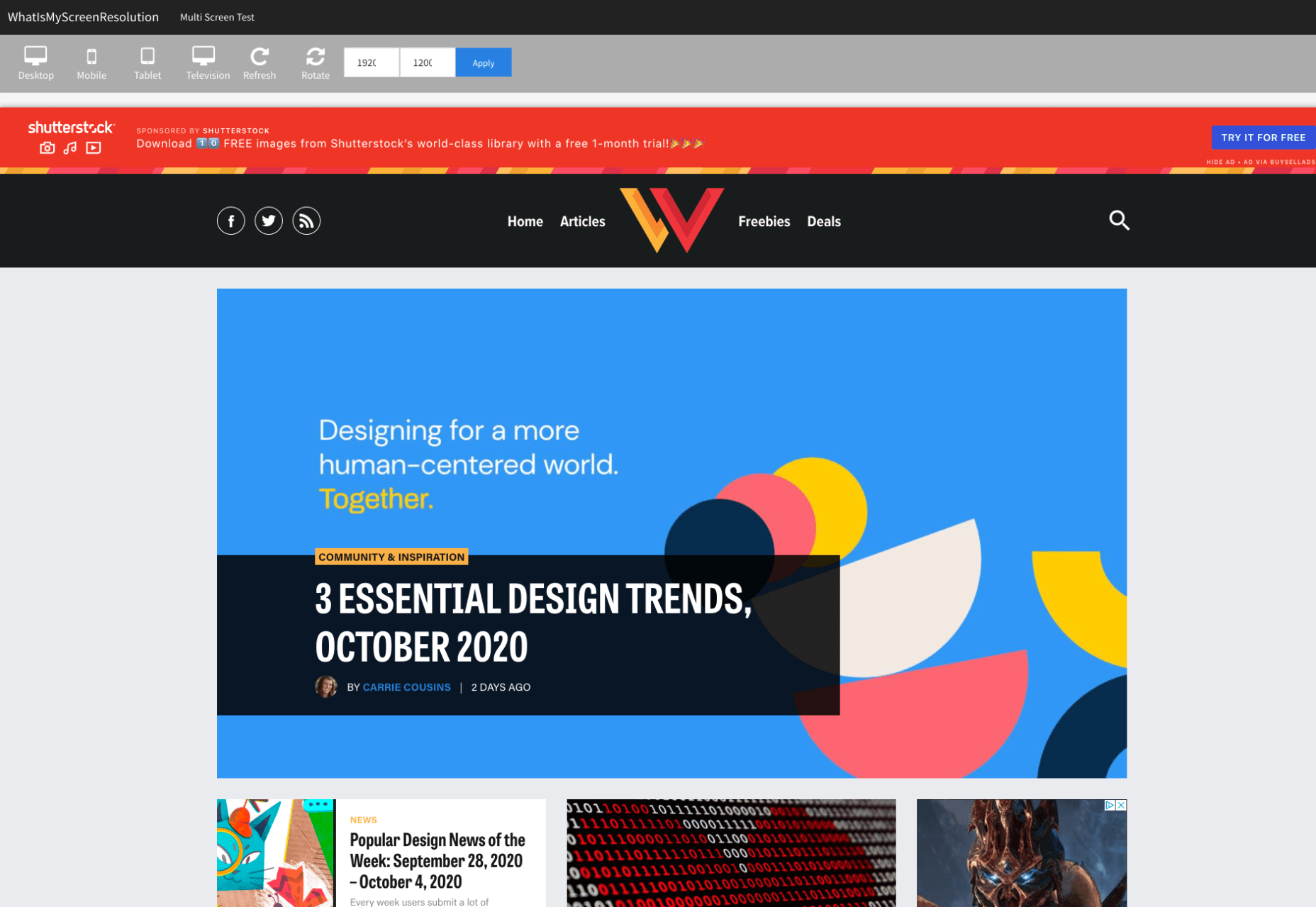
1. Multi-Screen Test

WhatIsMyScreenResolution offers a great little tool to test how your site will look on different devices easily, and it costs absolutely nothing. You put the URL and choose between desktop, mobile, tablet, and television and then the orientation. Each device can also be broken down into different sizes and resolutions (or you can enter your own), making it easier than ever to test what a site will look like on different devices.
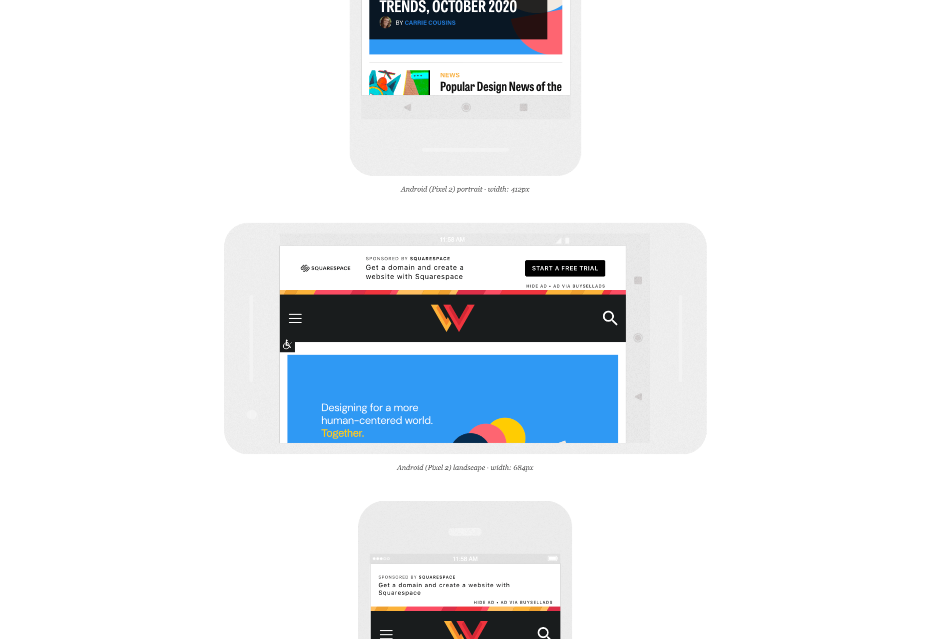
2. Responsinator

Responsinator is another great tool to test how a site looks on other devices without dipping into your wallet. Put your URL in the top bar, and it will instantly show you what it looks like on generic devices. This is a great, easy to use tool, and you can click through any links on your site to check the usability of multiple pages. This site is free, but if you want to “create your own” template, you need to sign up.
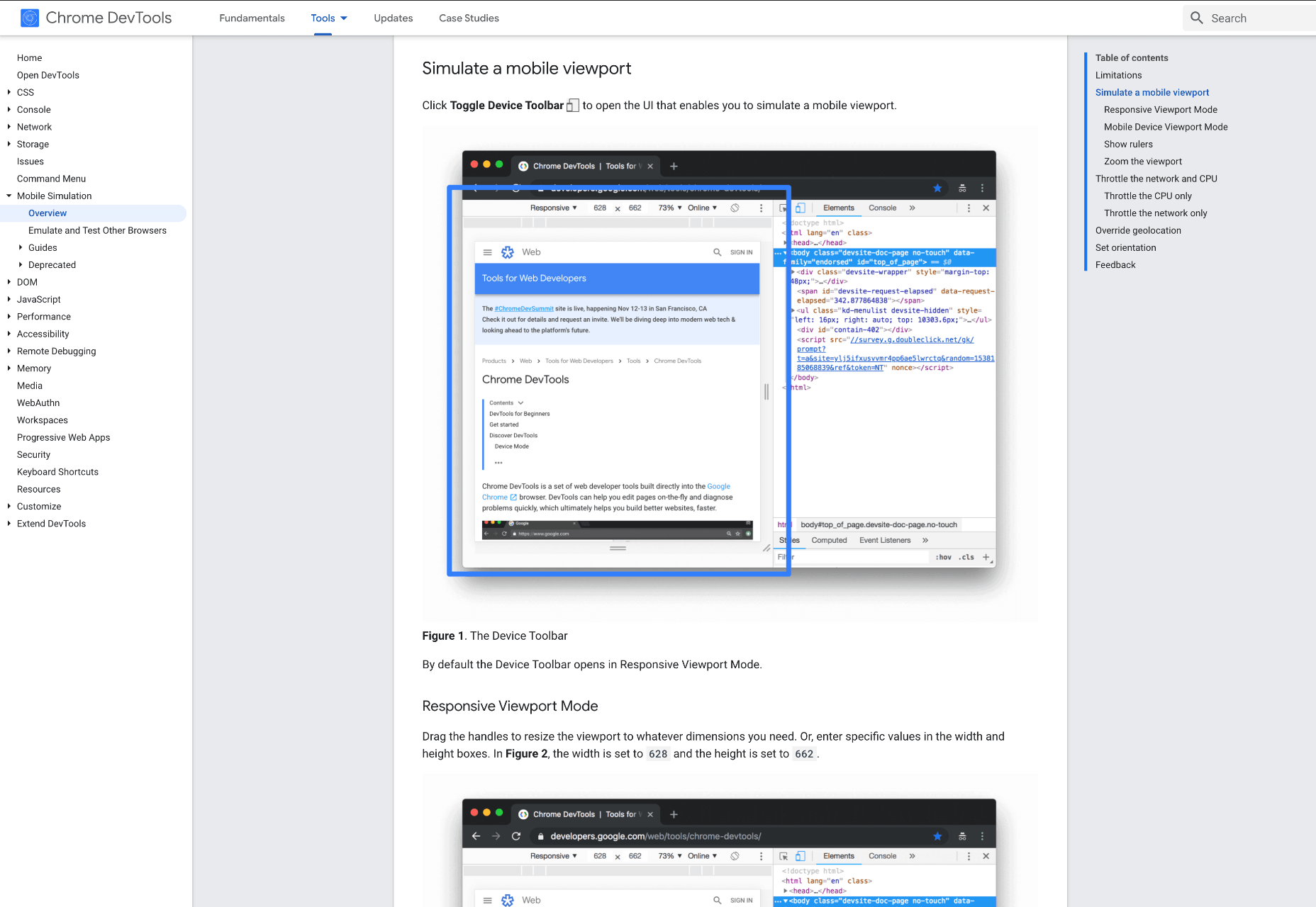
3. Google Dev Tools

Google Dev Tools is one of the most commonly used free tools. Add it to Chrome, and you can see how your site looks in a multitude of different screen sizes and resolutions. You can simulate touch inputs, device orientation, and geolocation to test how they work. It’s great to easily spot problems using their remote debugging tool to view, change, debug and profile a page’s code directly from your laptop or computer while viewing it on your mobile device.
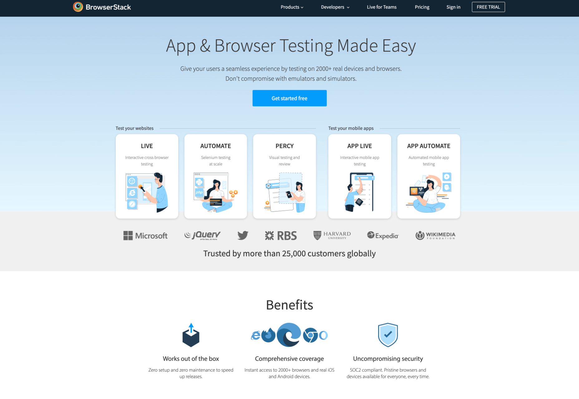
4. Browser Stack

Browser Stack allows you to test your site on over 2,000 real devices and browsers, enabling you to see in real-time how your site looks. It is no hassle to set up, and it can be seamlessly integrated into your setup. As it tests on real browsers on real machines, you know the results are more reliable and accurate. It also enables you to debug in real-time using their pre-installed developer tools for ease of editing. The tests are all run securely on tamper-proof physical devices and are wiped clean of all data after each session, so you don’t need to worry about security being compromised.

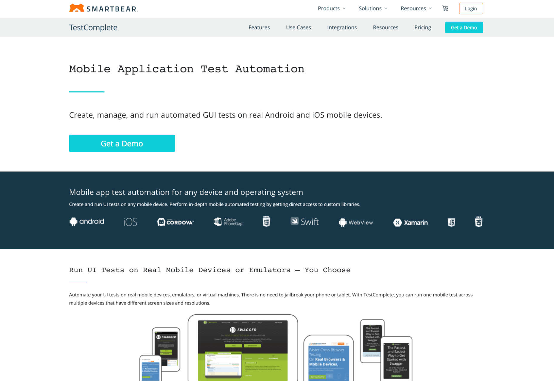
5. TestComplete Mobile

TestComplete Mobile allows you to create and run UI tests across real mobile devices, virtual machines, and emulators. You can test both mobile device layouts and apps with script-free record and replay actions. This can help you to edit and fix any potential issues that may arise during the tests. Due to them being conducted on real devices, you know it is less likely to have errors in the system than a simulated device. This is free for 30 days then can get pricier, so make sure you take advantage of the trial and try the service before committing to it.
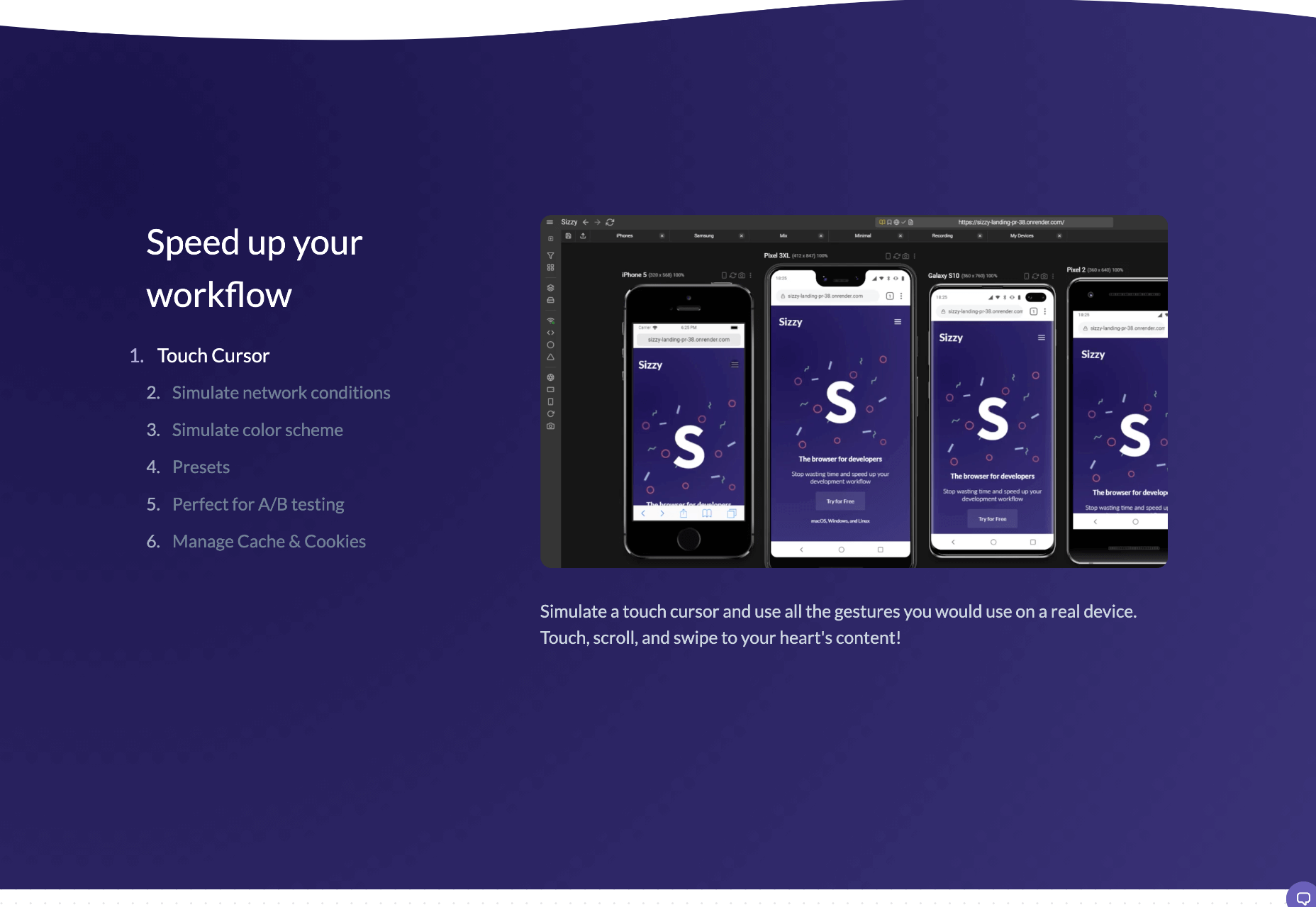
6. Sizzy

Sizzy is a great tool for checking sites, and it has a host of features to assist you. You can rotate the screen between portrait and landscape, filter by OS and device type, switch themes, and take screenshots. These little things mean it’s a super easy to use and convenient tool. It claims to simulate each device’s viewport and user agent, meaning the results are the same as what you would actually see on that phone/ tablet, etc. It can’t simulate different browser rendering engines however, so there’s a chance there might be some minor differences compared to the actual thing. Sizzy offers a free trial or has different price packages starting at $5 per month.


Featured image via Unsplash

Source

The post 6 Tools for Rapid Cross-Device Website Testing first appeared on Webdesigner Depot.


Source de l’article sur Webdesignerdepot

As we turn the corner into the final part of the year, many of the new websites and redesigns that we see during much of the rest of the year tend to slow down. Many businesses are focusing on fourth quarter and holiday sales.

With that being said, there are plenty of holiday flourishes already showing up on many websites. But there are still a few trends that don’t have a holiday theme.

Here’s what’s trending in design this month.

1. Beautiful Connectivity

Web elements that merge and flow into one another can be difficult to design but the payoff is totally worthwhile. This website design trend exemplifies connected elements in a way that’s beautiful and mesmerizing.

You can accomplish it with static elements or interactivity; the common theme is that design parts enter the space of one another and merge in ways that are seamless and visually interesting.

The thing that makes it exceptionally tricky is responsiveness. To ensure that pieces work well at all sizes when they overlap or encroach on the space of one another takes a lot of planning and testing.

Here are a few examples of projects that do it well – and each one does it in a different way.

Kirk Whayman’s website uses a floating ice cube over simple lettering. The interactivity is spot on here with hover actions that allow you to move the block with the letters refracting in an expected manner. (It would be easy to play with it all day.) But the coolest interaction happens when you “break it” (click on the cube). The elements continue to merge and interact in a new and different way.

Kikk Festival uses animations and giant scrollable illustrations and plenty of elements that overlap within the space. What’s neat is that everything on this canvas seems to touch everything else. The staircase design encourages scrolling and lettering and smaller animated elements all connect to the steps in the sky motif.

Multi Options Nursing takes a totally different approach. It uses a static split screen with a photo on the right side that merges into a round graphic element. It takes two not-s-interesting images and makes something out of them. The design carries this theme below the scroll as well and this style of image presentation carries a nice visual weight without feeling heavy.

2. Almost Brutalism

Brutalism just seems to keep coming back around. For those that love this trend, it keeps evolving as well.

The latest styles of brutalism are a little less mono but still pretty sharp with harsh lines, questionable type readability, and a lot going on in a compressed space. These projects also seem to be embracing color and alternative font choices more readily.

Fledge uses a split screen – still a dominant trend two years running – with a blue that’s almost too bright with an almost white offset color. The text is big and smooshed into the space tightly. Depending on the breakpoint, you might not even get the whole phrase on the left side. The design challenge is what are you supposed to do here? There are some hover animation cues, but they aren’t very direct.

Loeven Morcel’s design has hints of brutalism and elements of elegance. What makes this design skew toward the brutal side is use of space and typography. Like the previous example, it falls into the territory of “what should I do here” with some concerns about readability. Most of these issues are resolved on the scroll if you move beyond the homepage.

Szymon Michalczyl’s site is another that is close to brutal in style but has an element of sleekness that doesn’t quite carry it over the edge. The simple framework has that brutalist feel but the use of simple, clean fonts with plenty of space pulls it back into a more mainstream design scheme.

3. Beige Everything

Is a shade of beige the color of the year for 2020? Or is it just how we all feel?

Beige backgrounds are everywhere, making this one of those design trends that you can’t miss. The good news is that designers are playing with different shades of beige as well as warm and cool variations. Beige on its own can take on some of the color from accent hues and imagery, so that’s important to keep in mind when using this in the background.

The other variable is how saturated to make beige coloring. Most designs are using some of the more muted options while mostly playing with the levels of green and red. But darker beiges are also an option.

Simon Daufresne uses a beige that is the color that comes to mind when you think beige. It’s simple, a hint reddish, and is used with black only to maintain true color.

Discovered Wildfoods uses a more neutral feeling beige with a more green undertone (or is that color feel coming from other design elements). The neutral and natural color fits the brand and association this website is trying to create.

Aebele Interiors also uses a more traditional beige but with a bold mustard accent that makes the color feel exceptionally warm. What’s nice about this color combination is that in small sizes the mustard colored-type almost falls into the beige background, but at larger sizes seems to almost jump off the screen. It’s an interesting color juxtaposition.

Conclusion

Personally, this month’s trends are a mixed bag. I love the lines and interactivity of the beautifully connected examples. It shows that elements can cross and work together well.

On the flip side, brutalism and beige just aren’t my style. But apparently, they appeal to a lot of people based on the number of projects using these styles. What do you think? I’d love to know how you feel about these trends. Let me know on Twitter.

Source


Source de l’article sur Webdesignerdepot

EclipseCon Community Day is on Monday, October 19 14:00 to 18:00 CET (the day before the start of the main EclipseCon conference). Community Day at EclipseCon has always been a great event for Eclipse working groups and project teams. This year both EclipseCon and Community Day is virtual and free. Space for Community Day is limited, so please register and save your spot soon.

We have a packed agenda centered on the Jakarta EE, MicroProfile and Cloud Native Java communities. If there is a set of very focused sessions you should attend on these topics, the agenda offers the one place this year to do so. The sessions are intended not only for learning, but also for the community to actively engage with some key leaders. Note, after you register for EclipseCon, you will need to reserve your spot for Community Day through the Swapcard platform (let me know if you run into any issues).

Source de l’article sur DZONE

And it does this 24 hours a day, 7 days a week, 52 weeks a year without ever asking for a pay raise.

But this is true only if your website landing page is designed well, maintained, and optimized to the gills. The art and science of a flawless landing page is beyond the scope of a single article, but we can start with helping you spot seven of the most common – and damaging – trouble spots.

1. Unclear Value Statement

Typically, new visitors to your page will only stay on it 3 to 15 seconds before they get distracted. In that span of time, you must offer a clear and visible reason to stick around and interact with the page.

That reason is your value statement. What value do your readers get in exchange for the time you ask them to spend? High-quality content is a must (and hopefully a given), but you also need to pull them in so they experience that content.

Does your landing page do that? If yes, great! If no, you should fix that. If you’re not sure, ask yourself:

  • Is there a compelling, visible headline that expresses the end benefits clearly and succinctly?
  • Is there a subheadline explaining your offering in more detail?
  • Are there supporting graphics that pull the eye toward your headline and subheadline?

If there aren’t, add them now.

2. Poor Signposting

Your landing page isn’t just there to be pretty. It’s meant to convince people to take action. If you don’t make it easy to find your call to action, most viewers won’t look for it.

deliver enough value to make it worth the hassle

You must make it clear — in as succinct and efficient terms as possible — why the action you want a reader to take will deliver enough value to make it worth the hassle. Tell them, in words that stand out from the rest of the page, what you want them to do next and what they’ll receive for doing so.

Improving your signposting stats by asking yourself the following questions:

  • Do you have a clear understanding of what the next step in a visitor’s customer journey should be?
  • Is it easy to find and take that step on your website?
  • Does your copy make a clear and compelling argument in favor of taking that step?

If you can answer yes to all three questions, your signposting is likely good (or at least good enough for now). If not, now you know what you have to do to improve it.

3. Slow Loading Time

Remember that 3 to 15-second maximum time limit we mentioned earlier? That span includes time spent waiting for your landing page to load, and every microsecond of that wait increases a reader’s likelihood of bailing on the whole thing. You must get your loading time to be as quick as possible.

Viewers who exit your landing page early – including while still waiting for it to load – increase your site’s bounce rate. Higher bounce rates reduce your rankings on Google and other search engines, meaning a page that loads too slowly not only impresses fewer viewers, but it also gets fewer viewers overall.

Improving your loading time is usually a job for your tech team or whoever in the office is responsible for overseeing your hosting service. That said, here are a few of the most important ways to optimize this important factor:

  • Optimize image size, file format, and compression;
  • Clean up your database by deleting saved drafts, old revisions, unused plugins, and similar virtual detritus;
  • Confirm that your WordPress theme (if applicable) is optimized for quick loading;
  • Use a content distribution network for file storage;
  • Analyze server response time with your hosting service, and work with them to reduce it;
  • Install tools that leverage browser caching;
  • Fix all your broken links;
  • Remove all render-blocking from JavaScript;
  • Reduce the number of redirects necessary to reach your page;
  • Optimize your code, especially in CSS, JavaScript, and HTML;
  • Enable file compression — except for on images;
  • Replace all PHP content with HTML wherever possible.

This is technical, detailed work, but it’s important. If you don’t have team members up to these tasks, it can be worth hiring an outside consulting company to do it for you.

4. Only One Landing Page

You have a good idea of your ideal customer’s hopes, fears, pain points, demographics, likes and dislikes, and other important information. If you have several different types of customers, you can’t use the same landing page for each of your customer groups. Each group has different characteristics that will prompt them to follow your call to action, so you don’t want to offer just one landing page.

Similarly, you also probably have more than one product or set of content and offerings to generate sales. Having only one landing page can lose leads because the page is only optimized for one of those products or content sets.

Ideally, you should have a unique landing page with a tailored offer for each of your customer models that would send those individuals to each of the products and content sets. An ad for professionals in their 30s making over $50,000 a year would lead to a landing page built for them, while an ad for heads of households working from home would lead to a landing page built for them.

Yes, that means a company with three profiles and four content sets would need 12 landing pages. And yes, it’s worth that kind of effort.

5. Insufficient Visuals

“A picture is worth 1,000 words” is ancient wisdom, but it’s far from true in the internet world – it’s actually worth more. A quick look at social media and blog performance will tell you many people will look at, enjoy, and share a photo or video, but not many will read an entire 1,000-word post on the same topic.

How well your landing page performs depends on the images you use and how you present them. Does your page’s layout conform to the best practices of visual web design:

  • Including images that emotionally reinforce the value expressions of your product’s core benefits;
  • Containing sufficient white space to not be intimidating;
  • Providing data images to indicate the worth of what you do;
  • Using visual design cues to lead the eye toward your conversion points;
  • Applying color gradients to highlight offers and your call to action;
  • Using infographics to replace the dreaded “wall of text”.

If you can say yes for half of these things, carry on. If not, this point may be among the better places to start with a landing page redesign.

6. Asking For Too Much, Too Soon

Craft a custom calls to action that meet all levels of interest, need, and desire

Not every landing page visitor is created equal. Some are hardcore fans and experts in what you do, ready for a 10,000-word white paper that dives deeply into the research supporting your use case. Others might have heard about your industry on an Instagram page and want to know the basics of what you do.

There’s nothing worse than going to a website and being asked for all of your personal information right away. If your call to action requires too much knowledge, too deep a commitment, or even too much personal information, consider scaling back. Otherwise, you risk turning away potential customers.

Better yet, go back to No. 5 above and build a new landing page for beginners and early-stage leads. Craft a custom calls to action that meet all levels of interest, need, and desire.

7. No Trust Elements

Offering some type of authentic customer referral or testimonial is important. It all boils down to the same thing: telling those who read your landing page that other people already like what you do and how you do it.

Examples of effective modern trust elements include:

  • Quotes from positive reviews next to a photo of the reviewer;
  • Screenshots of social media posts praising your company or product;
  • Short video interviews of happy clients;
  • Blurbs for industry thought leaders approving of you;
  • Images portraying business credentials and certifications;
  • Links to positive press coverage;
  • Logos of known business customers who buy and trust your brand.

Final Thought: What’s Next?

There isn’t one guaranteed way to turn a landing page from something full of holes into something perfect. But first, run an audit of your landing page using this list as a guide. Note which errors are there. Next, sort them in order of what takes the least time to fix to what takes the most time to fix.

Then, fix them in that order. We find that getting the quick fixes done builds excitement and momentum, whereas starting with a harder fix can mire down the whole process.

If none of these errors exist on your landing page, congratulations. There’s still lots of work to do on your website and content marketing, but it’s not among these rookie mistakes.


Featured image via Pexels.

Source


Source de l’article sur Webdesignerdepot

To understand why user onboarding is such an indispensable tool, we need to empathize with the people using our products; we all come from different backgrounds and cultures, we make different assumptions, and we see the world differently.

User onboarding helps mitigate these differences by making your product’s learning curve less steep.

However, companies often make unfortunate mistakes that hinder user experience and cause frustration. In today’s article, we’ll take a look at eight ways companies ruin their products’ onboarding process.

Let’s dive right in, shall we?

1. No User Onboarding at all

As a part of the team that created a product, you’ve probably spent hundreds of hours going over its features and the most minute detail. Naturally, you know the product like the back of your hand. The user does not.

Naturally, you know the product like the back of your hand. The user does not

We may believe that the app we’ve worked on is straightforward and that user onboarding is probably overkill — but that’s almost never the case. Guiding our users through a product will help with retention, conversion, and their overall satisfaction.

However, there are very rare cases when you can do without user onboarding, here are a few:

  • Your product is too straightforward to cause any confusion;
  • Your product has a formulaic structure, similar to that of other products’ in your category, i.e., social media or e-commerce;
  • Your product relies heavily on Google or iOS design guidelines with common design patterns;
  • Your product is too complex (enterprise or business-oriented) — in such cases, users need special training, rather than just an onboarding;

2. Assuming That Users “Get It”

 One of the vital UX mottos we should always be mindful of is that “we are not our users.” When onboarding them, we always need to assume that they’re at square one. We should communicate with them as if they have no prior knowledge of our product, its terminology, and the way it works.

Providing freshly-registered users with highly contextual information will most likely confuse them. As a result, this will render your attempts to create a helpful onboarding process useless.  

3. Onboarding Users on a Single Touchpoint

it’s tempting to brainstorm which features should make it into the onboarding, then design and code them; that’s a very bad idea

The main problem with the previous point is that it’s too contextual for new users. However, providing no context altogether can be problematic as well. This is commonly found in onboarding processes that focus on a single touchpoint while leaving out the rest of the product.

By choosing to inform users of our product’s features, we force them to detour from their “normal” course of action. This comes at the cost of the user’s frustration.

Since we’re asking people to pay this price, it’s best to provide them with information that will also help them navigate the entire product. As a result, this will decrease the number of times we’ll have to distract them from their ordinary flow.

4. Forcing Users Through Onboarding

We’ve previously mentioned that we mustn’t assume that users have any background knowledge about our products.

The opposite argument can be made — experienced users don’t need a basic onboarding process. It will most likely frustrate them, and it won’t provide them with any real value. Also, forcing users through this process will most likely take the onboarding frustration to a whole other level.

This is why it’s essential that we allow them to skip the parts they don’t find useful. This way, we’ll address the knowledge gaps of the people who really want it and need it.

5. Onboarding Based Purely on Assumptions

This is yet another point that’s implicit in “we are not our users”. Oftentimes, it’s tempting to brainstorm which features should make it into the onboarding, then design and code them; that’s a very bad idea.

Here’s what every designer should do instead:

  • Do user interviews: You should conduct these before having anything designed; user interviews will help you shortlist and prioritize features in terms of their significance, so that the onboarding is focused around the features that matter most.
  • Do usability testing: Once you have a good idea of what features your users consider most important, design onboarding that reflects that; having completed your design, make sure to conduct at least 5 usability testing sessions with users, so that you can make sure that your design works.

6. Just Letting Users Quit

While we shouldn’t force people to go through onboarding, it doesn’t mean we shouldn’t nudge them in the right direction.

find that sweet spot between being front of mind and annoying

People choose not to onboard for many reasons, but showing them around will benefit both parties. Therefore, it’s never wrong to remind them that they can always resume onboarding via email or push notifications (unless you’re too pushy). Make sure to find that sweet spot between being front of mind and annoying. 

Similarly, these two mediums are a great way to deliver valuable information as well.

Here’s a great example of an onboarding email from InVision:

And here’s a clever notification from TripPlanner:

Source: clevertap.com

7. Asking For Too Much Information

We need to always be mindful of the fact that the product’s spokesperson should act as a guide during onboarding. Its goal at the very beginning is to build trust.

We can ask for small favors when we’ve built a solid and lasting relationship

Not only is asking for too much information from the get-go unproductive, but it will also undermine the trust that the user already gave us.

It’s best to abstain from asking freshly-registered users for their credit card information. Nearly 100% of businesses care about profits — and there’s no shame in it. However, today’s most successful companies make money by providing users with value. So it’s best to stimulate users to share their financial data in subtler ways while focusing on customer experience.

The same can be said about subjecting the people using your service to extensive questionnaires. At the first steps of our interaction, it’s all about giving and gaining trust. We can ask for small favors when we’ve built a solid and lasting relationship.

8. Onboarding for the Sake of Onboarding

While there are dozens of reasons why you should guide your users through your product, it needs to be done well. A pointless onboarding process that doesn’t provide users with value is more frustrating than the lack thereof.

Onboarding can be a bit frustrating at times. Pointless onboarding will just raise eyebrows. It will slow users down and disengage them, which is exactly the opposite of what we want.

Conclusion

The process of introducing your users to your product is one of the factors that will define its success.

A critical aspect of user onboarding that we need to always take into account is value. Is this detour from our user’s ordinary course of action valuable to them? Will this improve their experience with the product?

Onboarding demands careful and continuous tailoring. Once perfected, this process will help you win new users’ hearts and help you build brand loyalty.


Featured image via Unsplash.

Source


Source de l’article sur Webdesignerdepot

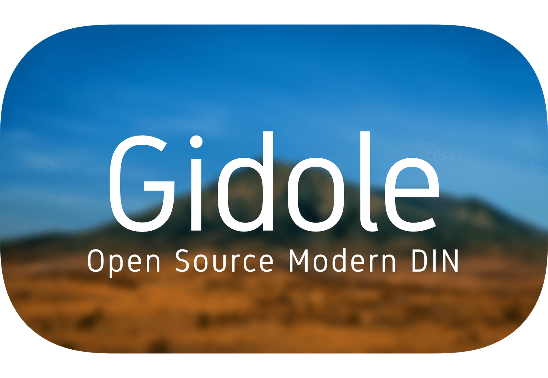
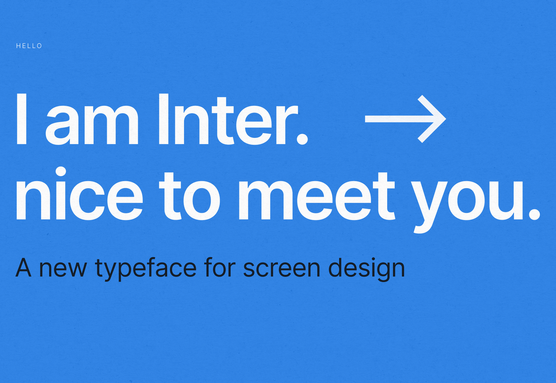
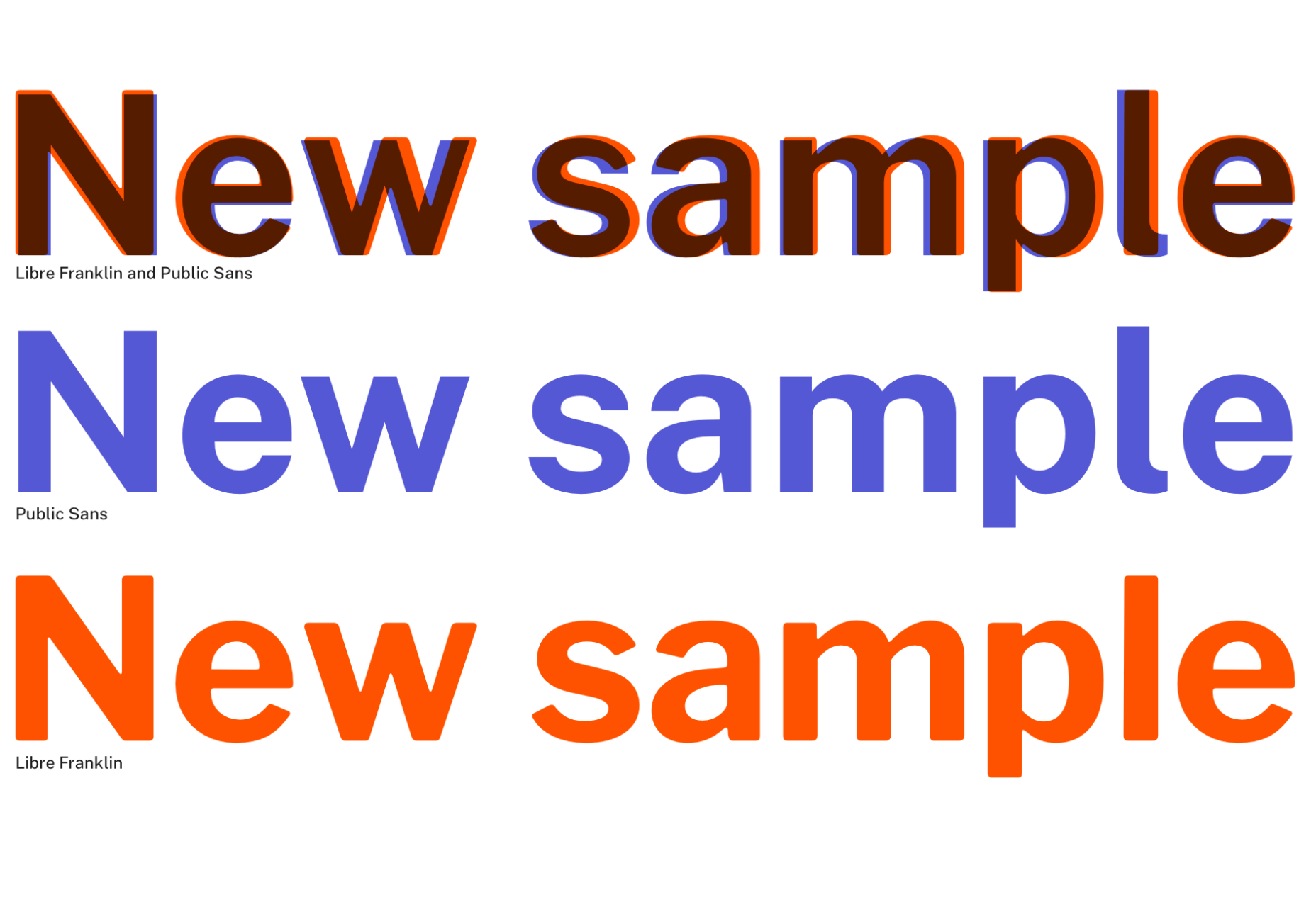
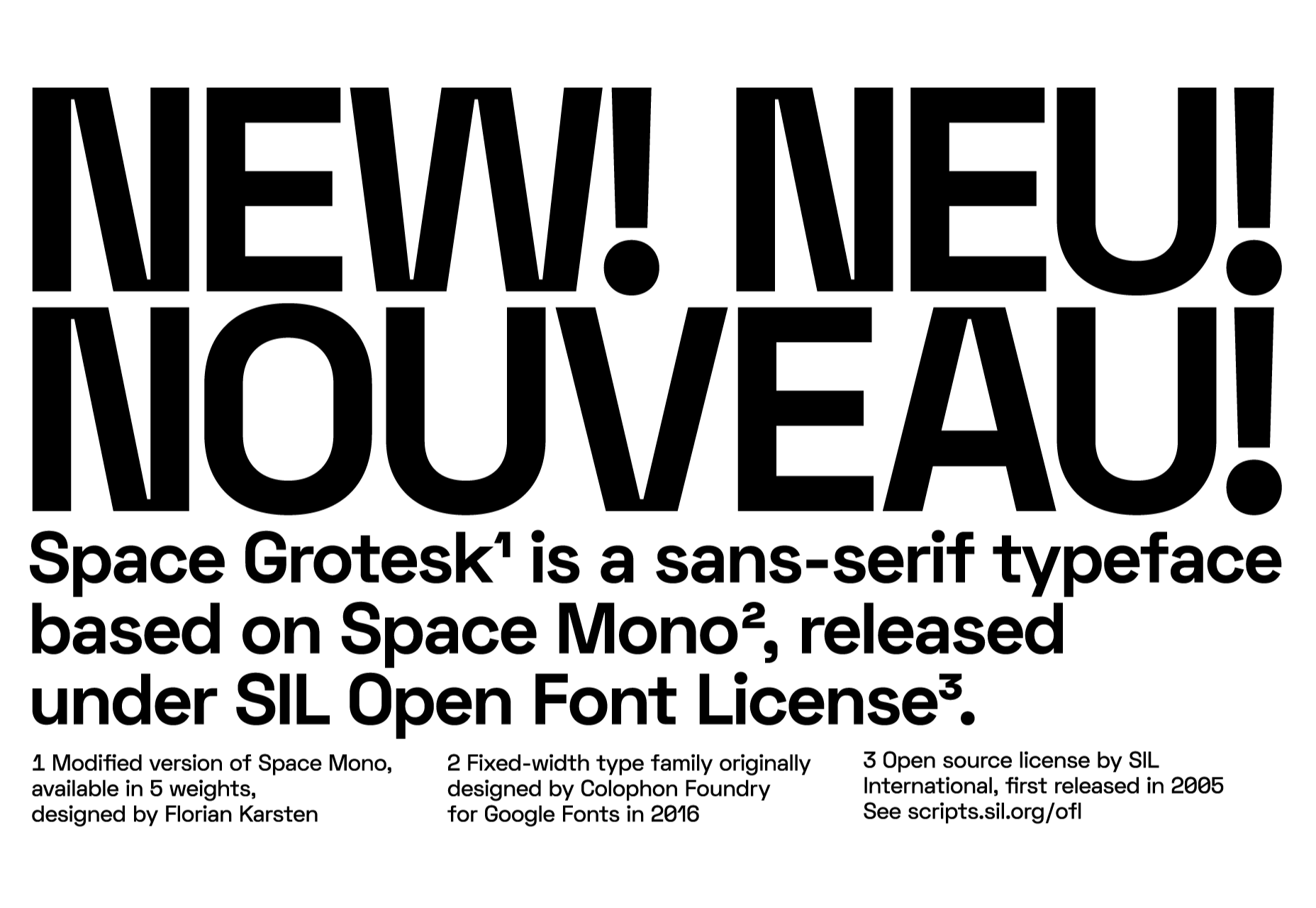
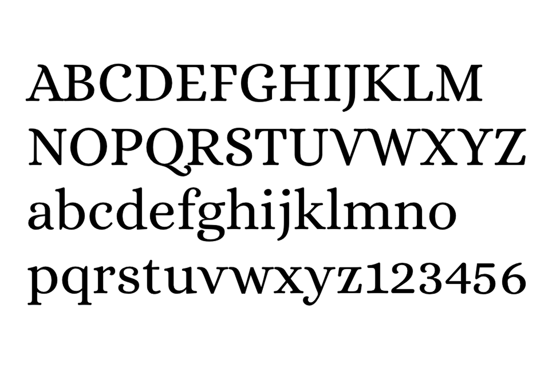
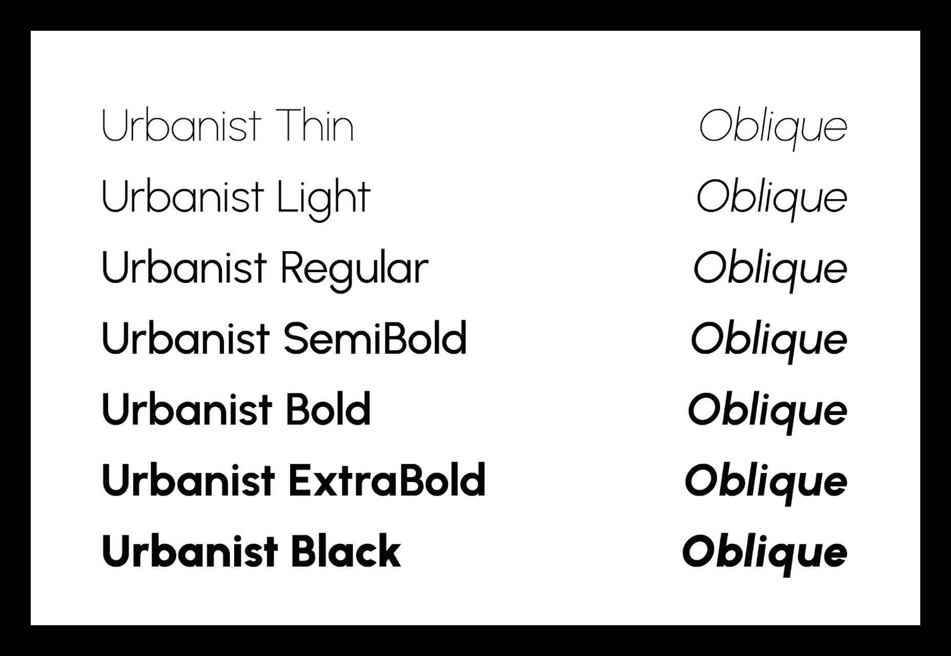
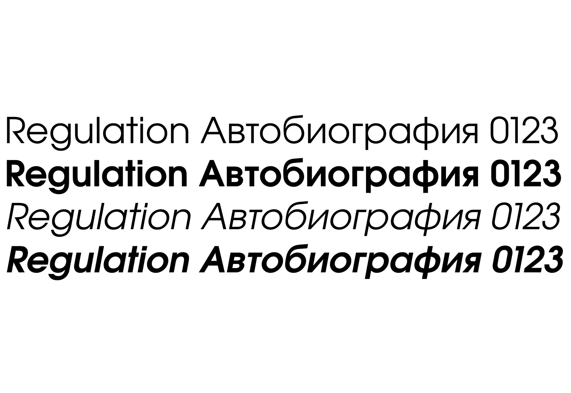
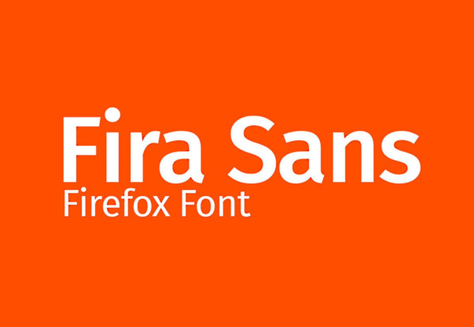
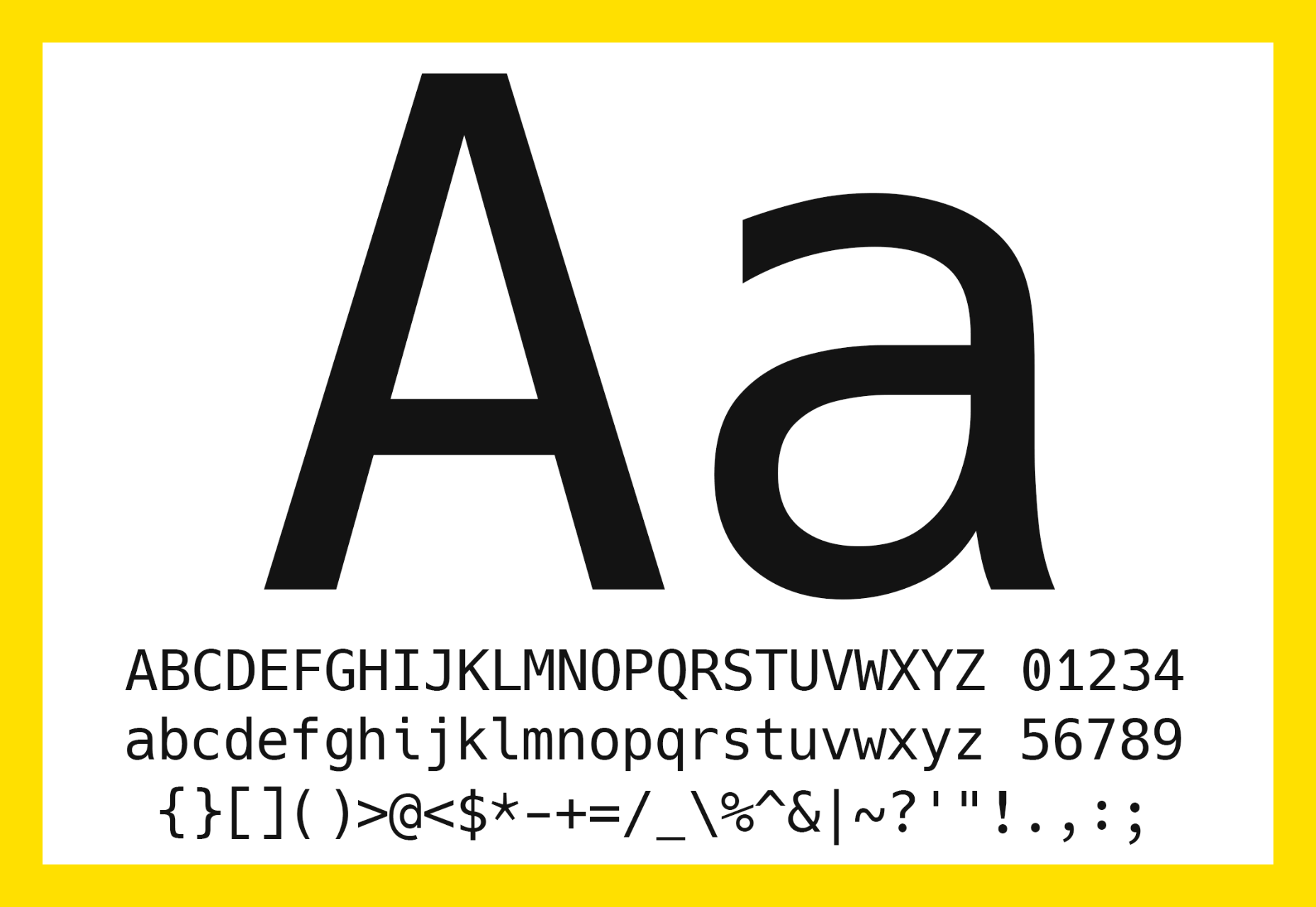
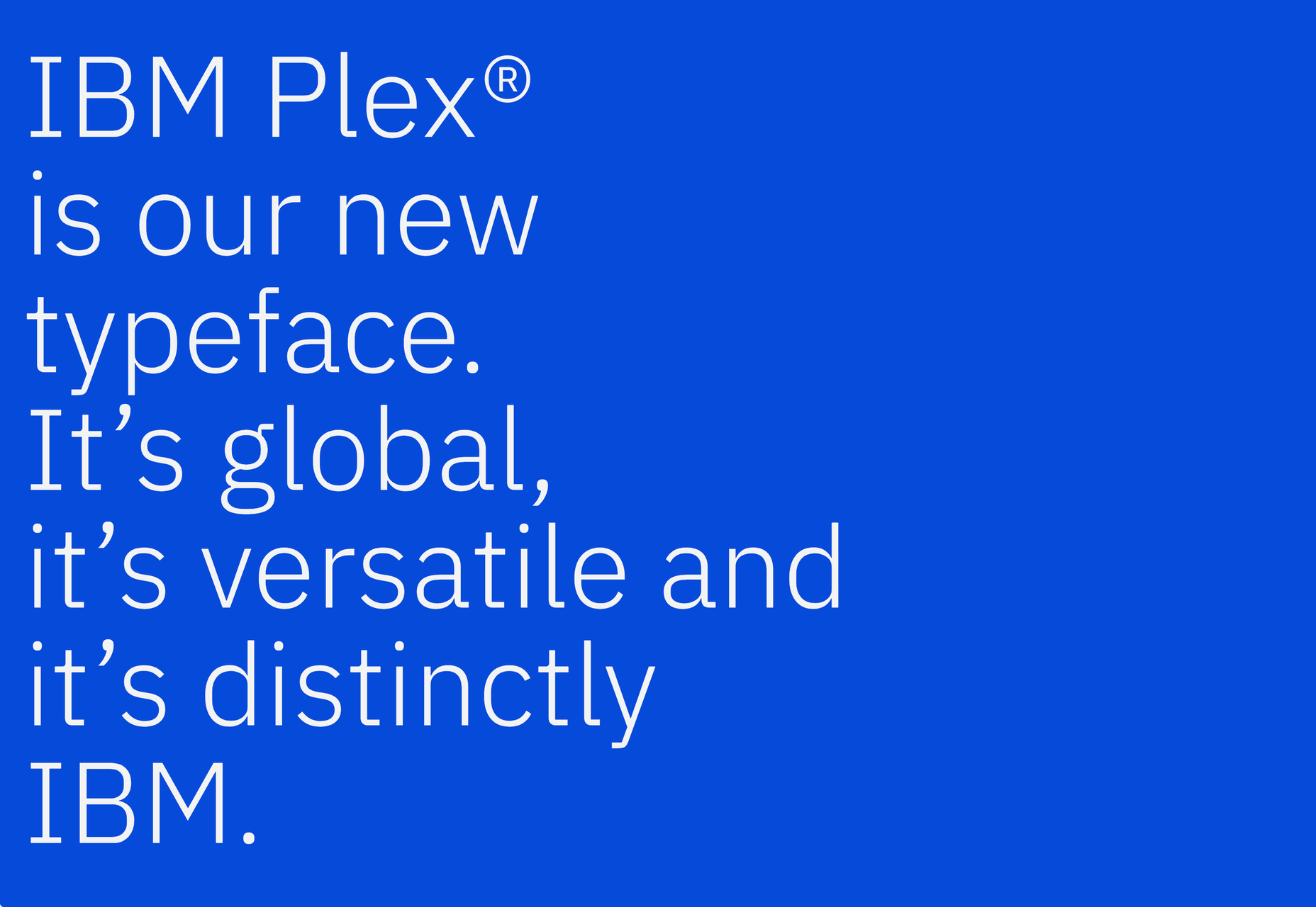
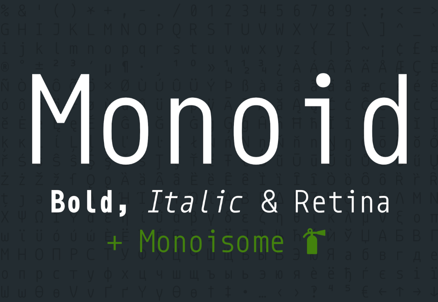
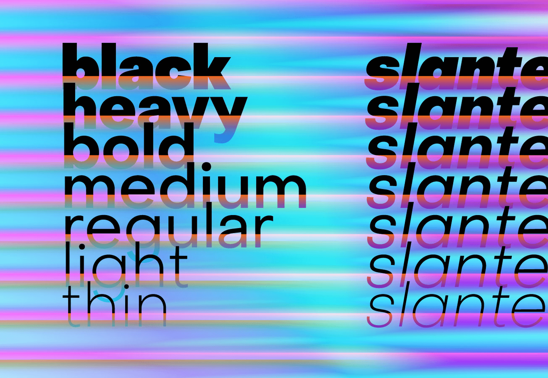
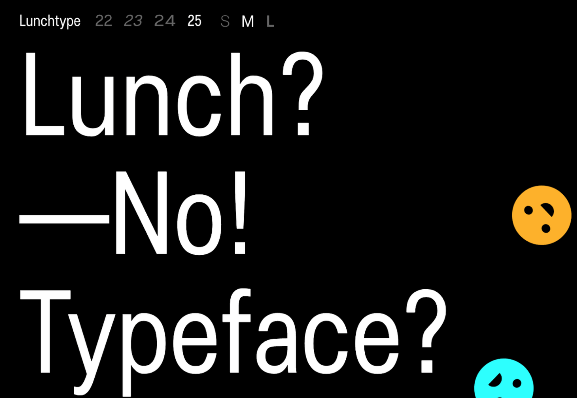
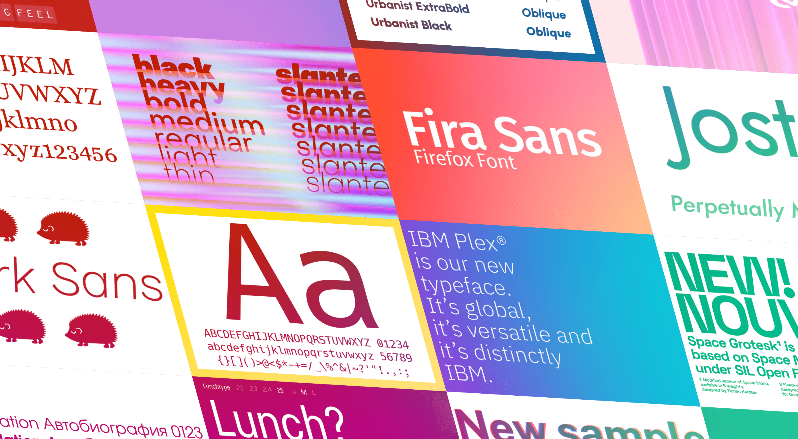
The right typeface can make or break your website. As designers, we will always be naturally drawn towards the premium fonts such as Circular, DIN, or Maison Neue; Before you know it, your website is racking up a font bill larger than your hosting bill.

We’ve put together a list of open-source fonts that will rival your fancy fonts, and might even persuade you to switch them out. All the fonts listed here are completely open-source, which means they’re free to use on both personal and commercial projects.

Manrope

Manrope has sprung onto the font circuit in style, with a website better than most early startups. It’s a variable font, which means you have a flexible range of font weights to choose from in a single font file. Manrope is a personal favorite of mine, it has every ligature you could want, and is fully multi-lingual. It’s a lovely bit of everything as it states on the website: it is semi-condensed, semi-rounded, semi-geometric, semi-din, semi-grotesque.

Gidole

DIN – the font we all love, the font that looks great at every size, and the font that costs quite a bit, especially with a large amount of traffic. Gidole is here to save the day, it’s an open-source version of our favorite – DIN. It’s extremely close to DIN, but designers with a keen eye will spot very few minor differences. Overall, if you’re looking to use DIN, try Gidole out before going live. (There is also a very passionate community around the font on Github)

Inter

Inter is now extremely popular, but we wanted to include it as it’s become a staple in the open-source font world — excellent releases, constant updates, and great communication. If you’re looking for something a bit fancier than Helvetica and something more stable than San Francisco, then Inter is a great choice. The font has now even landed on Google Fonts, making it even easier to install. As of today: 2500+ Glyphs, Multilingual, 18 Styles, and 33 Features… do we need to say more?

Overpass

Overpass was created by Delvefonts and sponsored by Redhat, it was designed to be an alternative to the popular fonts Interstate and Highway Gothic. It’s recently cropped up on large ecommerce sites and is growing in popularity due to its large style set and ligature library. Did we mention it also has a monospace version? Overpass is available via Google Fonts, KeyCDN, and Font Library.

Public Sans

Public Sans is a project of the United States Government, it’s used widely on their own department websites and is part of their design system. The font is based on the popular open-source font Libre Franklin. Public Sans has great qualities such as multilingual support, a wide range of weights, and tabular figures. The font is also available in variable format but this is currently in the experimental phase of development.

Space Grotesk

Space Grotesk isn’t widely known yet, but this quirky font should be at the forefront of your mind if you’re looking for something “less boring” than good old Helvetica. Space Grotesk has all the goodies you can expect from a commercial font such as multiple stylistic sets, tabular figures, accented characters, and multilingual support.

Alice

Alice is a quirky serif font usually described as eclectic and quaint, old-fashioned — perfect if you’re looking to build a website that needs a bit of sophistication. Unfortunately, it only has one weight, but it is available on Google Fonts.

Urbanist

Urbanist is an open-source variable, geometric sans serif inspired by Modernist typography. Designed from elementary shapes, Urbanist carries intentional neutrality that grants its versatility across a variety of print and digital mediums. If you’re looking to replace the premium Sofia font, then Urbanist is your best bet.

Evolventa

Evolventa is a Cyrillic extension of the open-source URW Gothic L font family. It has a familiar geometric sans-serif design and includes four faces. Evolventa is a small font family, generally used across the web for headlines and bold titles.

Fira Sans

Fira Sans is a huge open source project, brought to you, and opened sourced by the same team that makes Firefox. It’s Firefox’s default browser font and the font they use on their website. The font is optimized for legibility on screens. (And it’s on Google Fonts!)

Hack

Building a development website, or need a great code font to style those pesky code-blocks? Then Hack is the font for you. Super lightweight and numerous symbols and ligatures. The whole font was designed for source code and even has a handy Windows installer.

IBM Plex

IBM needs no introduction. Plex is IBM’s default website font and is widely used around the web in its numerous formats Mono, Sans, Serif, Sans-Serif, and Condensed – it has everything you’d need from a full font-family. The whole font family is multi-lingual, perfect for multi-national website designs. (It’s fully open-source!)

Monoid

Another great coding font, Monoid is a favorite of mine for anything code. The clever thing about Monoid is that it has font-awesome built into it, which they call Monoisome. This means when writing code, you can pop a few icons in there easily. Monoid looks just as great when you’re after highly readable website body text.

Object Sans

Object Sans (formally known as Objectivity) is a beautiful geometric font family that can be used in place of quite a few premium fonts out there. The font brings together the top qualities of both Swiss neo-grotesks and geometric fonts. The font works beautifully as large headings but can be used for body content as well.

Lunchtype

Lunchtype has a very interesting back-story, originally designed during the creator’s daily lunchtime during a 100-day project. If you’re looking for something a bit “jazzier” than the typical Helvetica for your project, then Lunchtype is a perfect choice. The family comes with numerous weights as well as a condensed version — enough to fill any lunchbox.

Jost

Inspired by the early 1920’s German sans-serif’s, Jost is a firm favorite in the open-source font world. Jost brings a twist to its closest web designer favorite Futura. When you want a change from the typical Futura, then Jost is a great option with its variable weighting as well as multilingual support.

Work Sans

Work Sans is a beautiful grotesk sans with numerous little eccentricities that may delight or annoy some designers. The font has variable weighting, multilingual support and is optimized for on-screen text use but works perfectly well for print also.

Source


Source de l’article sur Webdesignerdepot

Pour soutenir sa croissance, Ankaa Engineering® lance un plan de communication important à la rentrée avec une campagne de publicité télé sur BFM Business et BFMTV.COM.
Média dédié à l’économie et au business BtoB, BFM s’est naturellement imposé comme partenaire de communication pour la diffusion de cette campagne publicitaire.

bfmbusiness
bfmtv

Le plan média est constitué de 88 diffusions du spot publicitaire sur la période du 09 au 27 septembre.
Vous pourrez en complément retrouver notre séquence publicitaire sur le site BFMTV.COM.

Présent aujourd’hui sur les régions ALPES, NORMANDIE, PACA, RHONE, la SUISSE et le MAROC, Ankaa Engineering® poursuit ainsi son développement et envisage de nouvelles ouvertures en 2014 avec un objectif de couverture nationale à 3 ans.

Notre credo : Redonner du sens à la performance dans le monde des services IT auprès des entreprises et collectivités.
– En centrant les compétences des managers d’activité internes Ankaa Engineering®, chargés de votre suivi dès les premiers contacts commerciaux, sur l’organisation, le pilotage et le suivi Qualité de vos projets.
– En restant objectifs dans le conseil car détachés de tout partenariat constructeur et/ou éditeur.
– En sollicitant de façon flexible et dynamique notre équipe d’experts métiers, fonctionnels ou techniques constituée exclusivement de consultants externes accrédités, gage de vous fournir le meilleur niveau d’expertise sur les projets.

Notre organisation est ainsi totalement établie sur l’écoute de vos besoins et l’élaboration de réponse les plus adaptées à vos challenges pour vous permettre d’apporter une réelle valeur ajoutée à vos processus et projets d’entreprise.

Le business-model atypique Ankaa Engineering® interpelle et intéresse…

Vous êtes porteur de projet en amélioration de processus métier ou avez des besoins d’expertise dans le secteur des technologies de l’information ?
Contactez nous au +33 954 577 688 pour une présentation personnalisée de notre valeur ajoutée et de nos différences.