Articles

Explorer la domination de Terraform dans l'Infrastructure as Code

Explorer la domination de Terraform dans l’Infrastructure as Code : découvrez comment Terraform peut simplifier et automatiser la gestion et le déploiement de votre infrastructure !

Infrastructure en tant que code (IaC) : une introduction pour les débutants

Infrastructure as Code : Une introduction

L’Infrastructure as Code (IaC) est devenue une pratique essentielle dans le développement logiciel moderne, permettant aux équipes de gérer efficacement et de manière cohérente les ressources d’infrastructure à travers un code. Cette analyse fournit un aperçu de l’Infrastructure as Code et de sa signification dans le cloud computing et DevOps.

Au cours des dernières années, Terraform a dominé le domaine de l’Infrastructure as Code, soutenu par sa prise en charge multi-cloud, sa syntaxe déclarative, ses fournisseurs de ressources robustes et ses capacités de gestion d’état et de communauté actives. Les organisations sont encouragées à tirer parti des forces de Terraform tout en restant conscientes des solutions IaC émergentes adaptées à leurs exigences et préférences spécifiques en matière de cloud.

Les avantages de l’Infrastructure as Code

L’utilisation de l’Infrastructure as Code offre plusieurs avantages aux organisations. Tout d’abord, le code peut être stocké dans un système de contrôle de version, ce qui permet aux équipes de gérer facilement les modifications apportées à l’infrastructure et de les réutiliser à l’avenir. De plus, le code peut être automatisé et intégré à des outils DevOps tels que Jenkins ou Ansible, ce qui permet aux équipes de déployer des mises à jour plus rapidement et plus efficacement. Enfin, le code peut être partagé entre les différentes équipes, ce qui permet aux organisations d’améliorer la collaboration et la cohésion entre les différents services.

Les données au cœur du processus

Les données sont au cœur du processus d’Infrastructure as Code. Les données peuvent être utilisées pour définir les ressources à déployer, leurs caractéristiques et leurs propriétés. Les données peuvent également être utilisées pour définir des variables qui peuvent être utilisées pour configurer les ressources et leurs propriétés. Enfin, les données peuvent être utilisées pour définir des conditions qui peuvent être utilisées pour contrôler le déploiement des ressources et leurs propriétés.

En conclusion, l’Infrastructure as Code est une pratique essentielle pour les organisations modernes. Il permet aux équipes de gérer efficacement et de manière cohérente les ressources d’infrastructure à travers un code. Les données sont au cœur du processus et peuvent être utilisées pour définir les ressources à déployer, leurs caractéristiques et leurs propriétés. Les organisations sont encouragées à tirer parti des forces de Terraform tout en restant conscientes des solutions IaC émergentes adaptées à leurs exigences et préférences spécifiques en matière de cloud.

Source de l’article sur DZONE

Création de code de transaction de compensation pour Saga Participant

La création d’un code de transaction de compensation pour les participants à Saga est une étape importante pour assurer une expérience de jeu équitable et sécurisée.

La saga Pattern est utilisée pour fournir une intégrité des données entre plusieurs services et le faire pour des transactions potentiellement à long terme. Il existe de nombreux blogs, superficiels car ils tendent à l’être, sur les sagas et les transactions à long terme. Dans cet article, je ne rentrerai pas dans les détails en comparant les avantages et les inconvénients des sagas avec le protocole XA deux phases (2PC), le verrouillage distribué, etc., et je dirai simplement que XA et 2PC nécessitent des verrous distribués (inconvénient) qui gèrent les propriétés ACID de sorte que l’utilisateur puisse simplement exécuter un rollback ou un commit (avantage) alors que les sagas n’utilisent que des transactions locales et n’ont donc pas besoin de verrous distribués (avantage) mais nécessitent que l’utilisateur implémente la logique de compensation, etc. (inconvénient). Comme l’a dit Teddy Roosevelt, «Rien de bon ne vient facilement».

Ce que je ferai, c’est montrer un exemple de code complet d’une application microservices impliquant une saga, y compris la logique de compensation des participants, qui peut être trouvée dans ce dépôt.

La saga pattern est utilisée pour assurer l’intégrité des données entre plusieurs services et pour effectuer des transactions de longue durée. Il existe de nombreux blogs, superficiels, sur les sagas et les transactions de longue durée. Dans cet article, je ne vais pas entrer dans les détails en comparant les avantages et les inconvénients des sagas avec le protocole XA à deux phases (2PC), le verrouillage distribué, etc., et je dirai simplement que XA et 2PC nécessitent des verrous distribués (inconvénient) qui gèrent les propriétés ACID de sorte que l’utilisateur puisse simplement exécuter un rollback ou un commit (avantage), alors que les sagas n’utilisent que des transactions locales et ne nécessitent donc pas de verrous distribués (avantage) mais nécessitent que l’utilisateur implémente la logique de compensation, etc. (inconvénient). Comme l’a dit Teddy Roosevelt : «Rien de bien ne vient facilement».

Ce que je vais faire, c’est montrer un exemple de code complet d’une application microservices impliquant une saga, y compris la logique de compensation des participants, qui peut être trouvée dans ce dépôt.

L’utilisation des sagas pour gérer les transactions de longue durée est une pratique courante dans le développement d’applications microservices. Les sagas sont un moyen efficace de garantir l’intégrité des données entre plusieurs services et de gérer les transactions à long terme. Les sagas sont une bonne alternative aux protocoles XA à deux phases (2PC) et au verrouillage distribué car elles n’utilisent que des transactions locales et ne nécessitent pas de verrous distribués. Cependant, elles nécessitent que l’utilisateur implémente la logique de compensation, etc., ce qui peut être complexe et prendre du temps.

Les sagas sont une excellente solution pour gérer les transactions à long terme car elles offrent une grande flexibilité et une bonne gestion des données. Les sagas sont particulièrement utiles pour les applications qui impliquent plusieurs services car elles peuvent garantir la cohérence des données entre ces services. De plus, les sagas peuvent être facilement mises en œuvre dans un environnement microservices car elles peuvent être facilement intégrées aux services existants. Enfin, les sagas peuvent être facilement mises à jour pour prendre en charge les changements dans le système et ainsi garantir la cohérence des données.

Les sagas sont un outil puissant pour garantir l’intégrité des données entre plusieurs services et pour gérer les transactions à long terme. Bien qu’elles nécessitent une implémentation complexe et prennent du temps, elles offrent une grande flexibilité et une bonne gestion des données. Elles peuvent également être facilement intégrées aux services existants et mises à jour pour prendre en charge les changements dans le système. Les sagas sont donc un excellent outil pour garantir la cohérence des données entre plusieurs services et pour gérer les transactions à long terme.

Source de l’article sur DZONE

Concevoir et réaliser des tests numériques pour applications mobiles

Je suis passionné par la conception et la réalisation de tests numériques pour les applications mobiles. Je vais partager mes connaissances et mes techniques pour vous aider à améliorer vos tests.

H2: L’écosystème des expériences numériques à venir est propulsé par le mobile

Avec l’environnement numérique de plus en plus complexe, les marques doivent s’adapter aux besoins de leurs clients à travers divers appareils, plateformes et canaux. Cependant, avec des ressources limitées, les marques ont tendance à choisir des emplacements établis pour servir leurs clients. Selon une enquête de Forrester, les dirigeants développent des expériences personnalisées pour les appareils les plus populaires des consommateurs, donnant la priorité aux canaux plus établis tels que les sites Web et les applications mobiles. Les marques optimisent également leurs sites Web pour une utilisation mobile, tandis que les applications mobiles offrent une occasion d’engagement plus fréquente avec les clients. Malgré la disponibilité de nombreux produits numériques, les entreprises mettent toujours l’accent sur les expériences numériques Web et mobiles. Pour offrir une expérience mobile supérieure et bien servir vos clients mobiles, il est nécessaire de procéder à des tests numériques pour les applications mobiles. Dans ce blog, nous expliquerons pourquoi les tests numériques sont essentiels pour les applications mobiles, comment ils diffèrent des applications Web et comment concevoir et effectuer des tests numériques pour les applications mobiles.

Le mobile est le moteur de l’avenir des écosystèmes d’expérience numérique

Les appareils mobiles sont devenus un élément familier de la vie quotidienne pour des millions de personnes. Dans le monde entier, des appareils dotés d’une connexion Web tels que les smartphones et les tablettes sont devenus des outils essentiels pour la communication, l’information et le divertissement. Selon Statista, en 2022, le nombre d’utilisateurs uniques d’Internet mobile était de cinq milliards, ce qui indique que plus de 60 % de la population mondiale d’Internet utilise un appareil mobile pour se connecter en ligne. La possession et l’utilisation d’Internet mobile sont prévues pour continuer à croître dans le futur car les technologies mobiles deviennent plus abordables et accessibles que jamais. Cette tendance à la hausse de l’adoption d’Internet mobile est évidente dans les marchés numériques en développement où les réseaux mobiles sont le principal moyen d’accès à Internet. Le trafic Internet mobile représente environ 60 % du trafic Web. En revanche, dans les marchés axés sur le mobile comme l’Asie et l’Afrique, les connexions mobiles représentent une part encore plus importante des pages Web consultées.

L’architecture mobile est essentielle pour fournir une expérience numérique optimale

L’architecture mobile est essentielle pour fournir une expérience numérique optimale. Les entreprises doivent comprendre comment leurs clients interagissent avec leurs produits et services à travers leurs appareils mobiles et comment ces interactions peuvent être améliorées. Les marques doivent s’assurer que leurs applications mobiles sont conçues pour fonctionner correctement sur différents appareils et systèmes d’exploitation. Une architecture mobile réussie implique une stratégie de conception cohérente et cohérente qui tient compte des différents facteurs tels que la taille de l’appareil, la résolution, la connectivité et la plate-forme cible. Les entreprises doivent également prendre en compte la vitesse et la fiabilité du réseau lorsqu’elles développent des applications mobiles afin de garantir une

Source de l’article sur DZONE

Utiliser GPT-3 dans nos applications.

GPT-3 est une technologie révolutionnaire qui peut être intégrée dans nos applications pour améliorer leurs performances et leur fonctionnalité. Découvrons comment l’utiliser !

Bienvenue à un nouvel épisode sur l’intelligence artificielle. Comme je l’ai expliqué dans mon précédent article, GPT-3 (Generative Pretrained Transformer 3) est un modèle de traitement du langage de pointe développé par OpenAI. Il a été entraîné sur une grande quantité de données et peut générer du texte similaire à celui des humains sur une large gamme de sujets. L’une des façons d’accéder aux capacités de GPT-3 est via son API, qui permet aux développeurs d’intégrer facilement GPT-3 dans leurs applications.

Dans cet article, nous fournirons un guide détaillé sur la façon d’utiliser l’API GPT-3, y compris comment configurer votre clé API, générer des réponses et accéder au texte généré. À la fin de cet article, nous aurons une base pour savoir comment utiliser GPT-3 dans nos propres projets et applications.

## Guide détaillé pour utiliser l’API GPT-3

Bienvenue dans un nouvel article sur l’intelligence artificielle. Comme je l’ai expliqué dans mon précédent article, GPT-3 (Generative Pretrained Transformer 3) est un modèle de traitement du langage de pointe développé par OpenAI. Il a été entraîné sur une grande quantité de données et peut générer du texte similaire à celui des humains sur une large gamme de sujets. L’une des façons d’accéder aux capacités de GPT-3 est via son API, qui permet aux développeurs d’intégrer facilement GPT-3 dans leurs applications.

Dans cet article, nous fournirons un guide détaillé sur la façon d’utiliser l’API GPT-3, y compris comment configurer votre clé API, générer des réponses et accéder au texte généré. À la fin de cet article, nous aurons une base pour savoir comment utiliser GPT-3 dans nos propres projets et applications.

En tant qu’informaticien enthousiaste, je voudrais partager mon expérience avec l’API GPT-3. Pour commencer, vous devez créer un compte OpenAI et obtenir votre clé API. Une fois que vous avez votre clé API, vous pouvez l’utiliser pour accéder à l’API GPT-3 et générer des réponses à partir de données textuelles. Vous pouvez également spécifier des paramètres supplémentaires pour contrôler le type de réponse que vous souhaitez obtenir. Par exemple, vous pouvez spécifier le nombre de mots que vous souhaitez générer, le type de langage à utiliser et le type de contenu que vous souhaitez obtenir.

Une fois que vous avez généré des réponses à partir de l’API GPT-3, vous pouvez les afficher dans votre application ou les enregistrer dans un fichier pour une utilisation ultérieure. Vous pouvez également utiliser ces réponses pour entraîner un modèle personnalisé qui peut être utilisé pour générer des réponses plus spécifiques à des questions spécifiques. Enfin, vous pouvez également utiliser ces réponses pour créer des applications plus intelligentes qui peuvent comprendre et répondre aux questions des utilisateurs.

En conclusion, l’API GPT-3 est un outil puissant qui peut être utilisé pour créer des applications plus intelligentes et plus interactives. Il offre aux développeurs une façon simple et rapide d’accéder aux capacités de GPT-3 et de générer des réponses à partir de données textuelles. En utilisant cette API, les développeurs peuvent créer des applications plus intelligentes et plus interactives qui peuvent comprendre et répondre aux questions des utilisateurs.

Source de l’article sur DZONE

Value Stream Management (VSM) is about empowering delivery organizations to measure, mitigate, and monitor complexity. Simply put, it aims at improving the flow of value in your organization. The VSM Consortium recently released their highly anticipated report on The State of Value Stream Management Report 2022.  

In this article, we recap some of the findings and look at it specifically from a software engineering and DevOps point of view. Can we capture some key lessons that lead to healthier and more productive engineering teams? What has worked and what has not? Can we simplify and adapt ideas of organizational change to create a thriving engineering organization?

Source de l’article sur DZONE

In this tutorial, we’ll go over how to use and understand React Hooks. This article is an extension of article how-to-manage-state-with-hooks-on-react-components. It has been expanded with other Hooks and logic and Lessons Learned.

Here we create a simple product page with a shopping cart (see image 2). The shopping cart represents the memory (or the ‘state’) of the product page. The state generally refers to application data that must be tracked.

Source de l’article sur DZONE

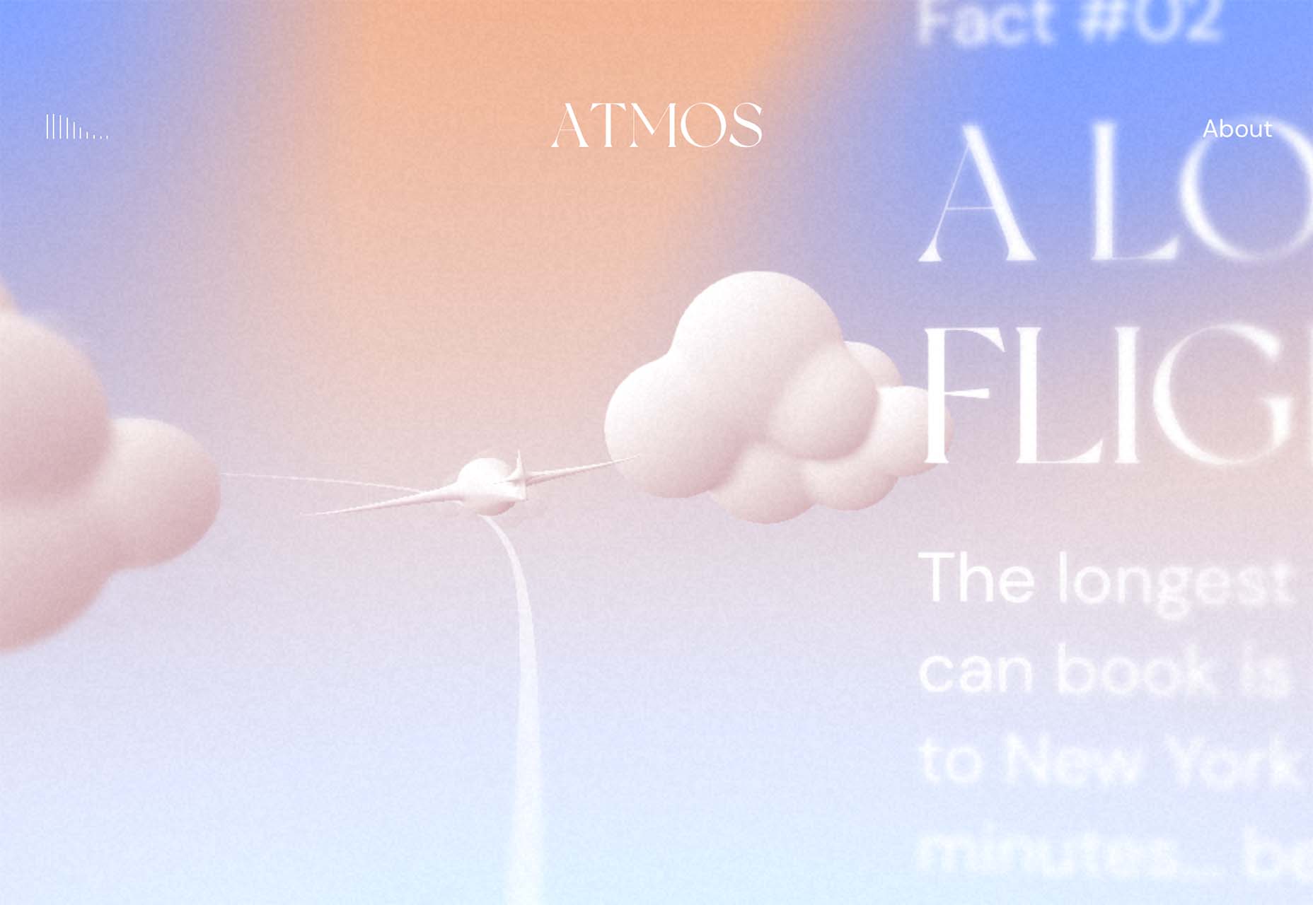
The design world fluctuates back and forth, swerving between love and hate for different design trends. Sometimes we see a wide range of approaches, and sometimes designers all hop on the same idea.

This month, the web is dominated by animation. Designers are cramming in motion in unexpected ways. And it’s fun to explore. Here are 20 of the best new sites on the web this month. Enjoy!

Bannach

Bannach is a German furniture brand. Its products are colorful and geometric, so it makes sense that when you scroll down to the collection, the thumbnails begin as pixel blocks and animate into product photography.

Fornasetti Profumi

Fornasetti Profumi takes a different approach to motion. It uses video to emphasize stillness to promote the calming qualities of its candle products.

The Other Side of Truth

The Other Side of Truth is a superb exercise in utilizing the web for a cause. It presents facts on the Russia-Ukraine war, but the standout feature is the toggle switch that, instead of light mode-dark mode, toggles facts and Russian state propaganda.

Glasfurd & Walker

Glasfurd & Walker is a portfolio site for a design agency. So far, so standard. However, it sets itself apart because it’s slightly bigger than the browser and swerves left and right with your mouse movement.

Sirup 5th Anniversary

Sirup is a Japanese singer-songwriter, and to celebrate the fifth anniversary of his first hit single, his record company has put together this awesome maximalist micro-site that uses type, motion, and art direction to capture his style.

Fitzjohn’s

Fitzjohn’s is a slick site for a new apartment complex in the Hampstead area of London. It uses a refreshing modern color palette and calming animation to take the edge off the frankly ludicrous price tag.

Persepolis Reimagined

Persepolis Reimagined is an awe-inspiring WebGL tour through one of the most important cities in ancient Iran. Make sure you tour it on a large screen. It’s hard not to be wide-eyed with wonder.

JaM Cellars

JaM Cellars is a Californian wine brand that’s pitching to bachelorette parties. With names like Butter, and Sugar, it’s not the most sophisticated tipple, but yellow, we love a yellow site.

Danielle Levitt

This portfolio site for film director and photographer Danielle Levitt features samples of her best work scrolling past the viewport. There’s a clever switch of thumbnail and background color when you scroll down to the contact details.

Propel

From total color energy to Apple-levels of minimalism: Propel is a slick, animate-on-scroll site for a marine motor brand selling an outboard and inboard motor. The animated masks on the images are a nice subtle touch.

Standards

Standards is a site for a SaaS that helps organizations create, maintain, and share brand guidelines. It uses subtle animation, video of its UI, and compelling copy to sell its approach.

Chris Carruthers

The portfolio site for Chris Carruthers is deliberately self-indulgent with scrolling text, clipped images, and scroll-jacking, but it’s also delightful to peruse.

Theodore Ellison Designs

We don’t often see colored glass in real life, but the play of light on stained glass is beautiful. This site for Theodore Ellison Designs uses video to bring the effect to the web.

Owomaniya!

The Owomaniya report for 2022 uncovers the state of gender diversity in the Indian entertainment industry. Presented in the style of infographics, the information is brought to life by animation.

Meetings

Meetings is a French events company. Its site uses an animated collage approach to showcase its services, and animated text to pull you into its content.

Blakeney

Blakeney invests in African companies on behalf of institutional investors. Its site is typical of the financial industry, but it uses animation to lift it to a higher level of interest.

Becklyn

Becklyn is a digital design agency. Its portfolio site uses animated text, expanding image masks, and video to guide us through its site and app design approach.

Cabi

Cabi is a brand of Japanese condiments with a typically Japanese feeling site. Bright colors, a slowly scrolling slideshow of dishes, and editorial to pack shot hover effects are a great introduction to the brand.

Slantis

Slantis provides building information modeling to architecture and infrastructure providers. Its site uses animation to showcase the types of content it produces for clients.

July Fund

July Fund is a venture capital project. It takes an entirely different approach than its competitors by adopting a chaotic but enjoyable card-based design.

Source

The post 20 Best New Websites, October 2022 first appeared on Webdesigner Depot.

Source de l’article sur Webdesignerdepot

People often experience network or internet connectivity issues while traveling, most often when they are on a subway. But not only in this particular case — one can encounter such issues anywhere where the network connectivity is poor. Browsing a mobile application in those situations can lead to a poor and frustrating user experience if it doesn’t possess the ability to work in the offline state. This is where the role of offline-first apps comes into play.

Users carry a strong negative emotion for apps that are not optimized for low connectivity. And do you know latency is the number one reason why people in the U.S. decide to bounce from mobile pages? Though the stats don’t reveal whether it is when they are stuck in a low network area or it is the application’s slow nature despite a good network, the point that we want to put stress on is that a mobile app’s inability to load quickly can leave users highly dissatisfied and compel them to abandon the application. This, along with an increase in churn rate, can result in revenue loss as well. This has pushed « appreneurs » toward adopting an offline-first approach or building offline-first apps to tackle limited connectivity issues.

Source de l’article sur DZONE

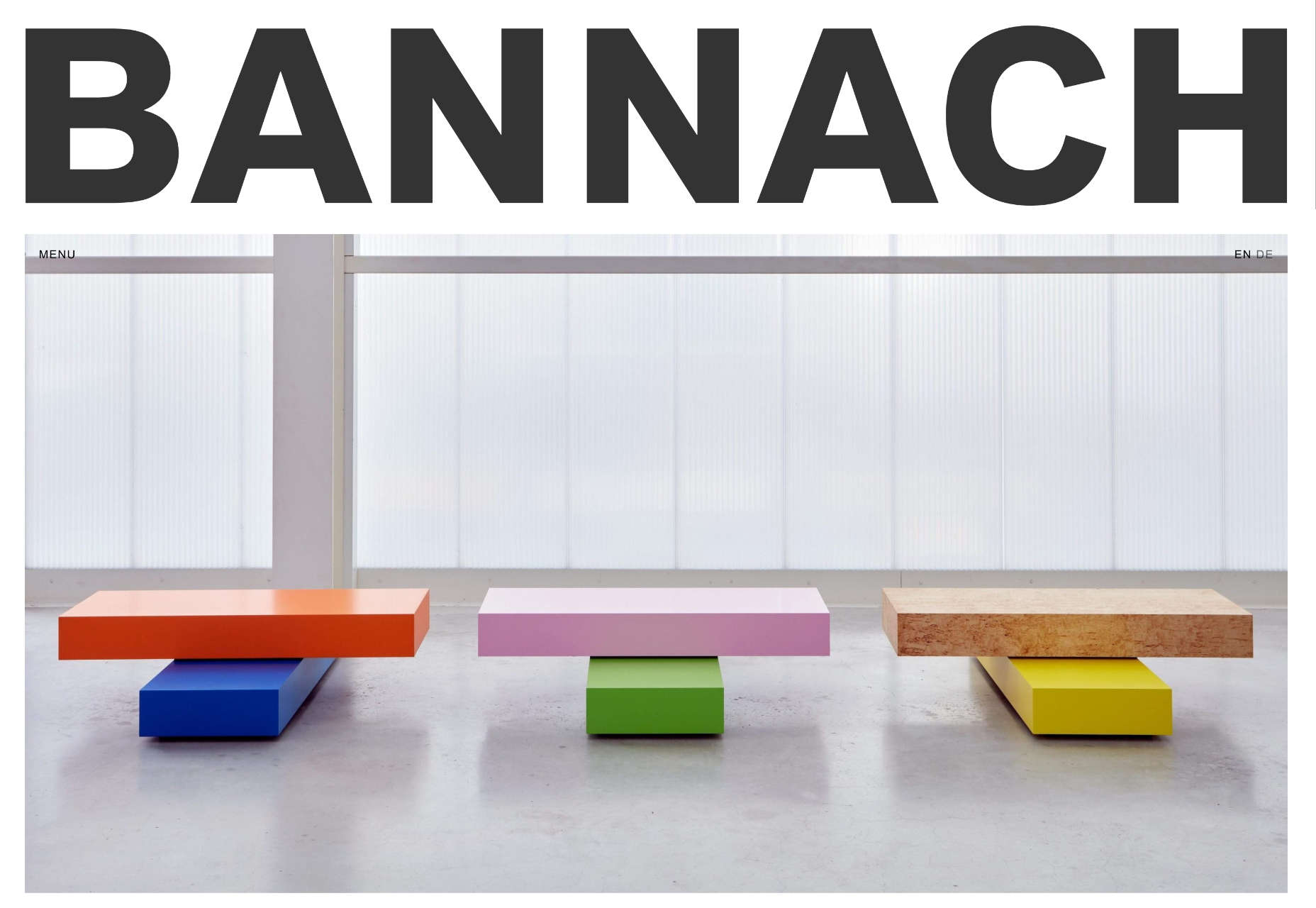
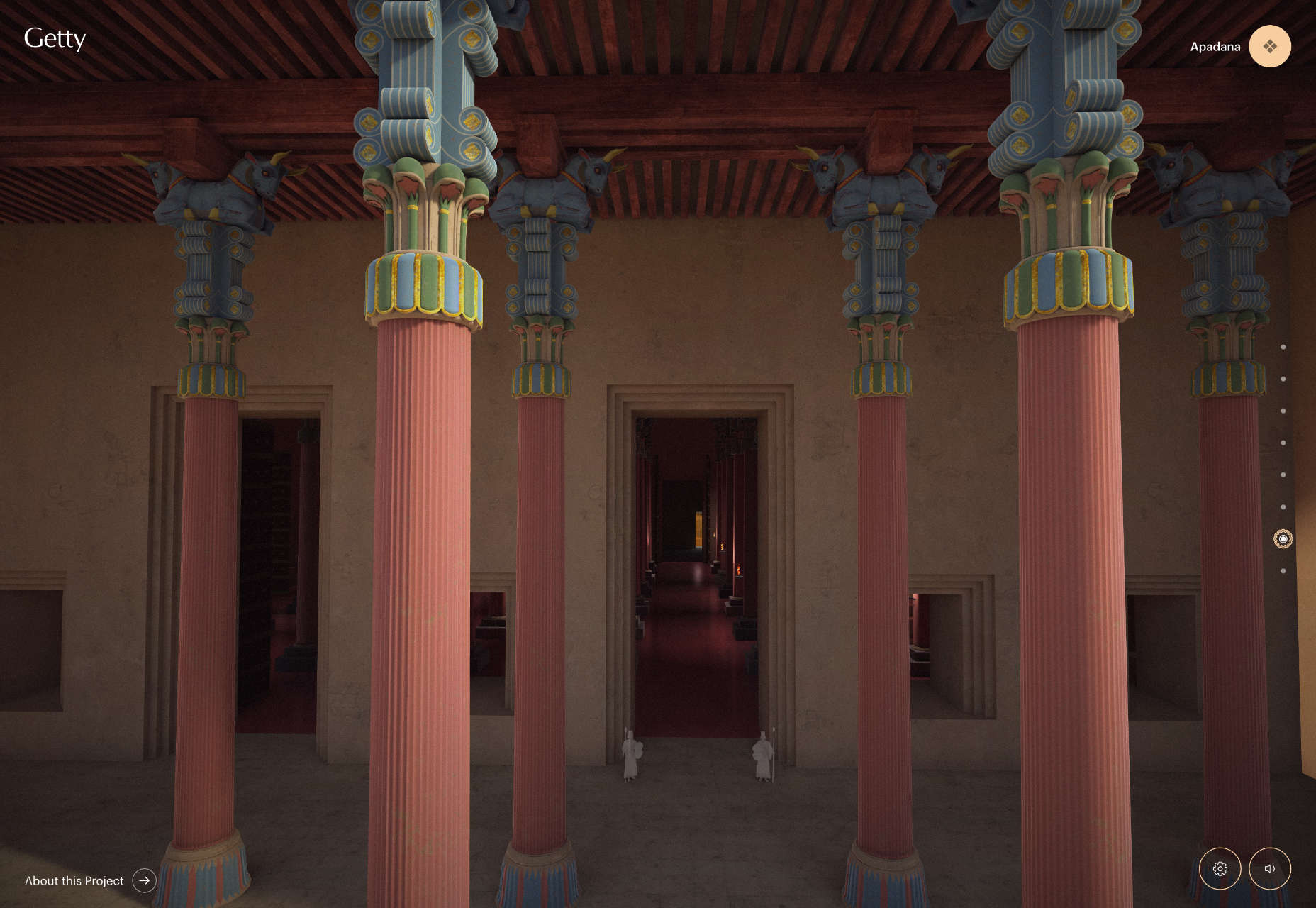
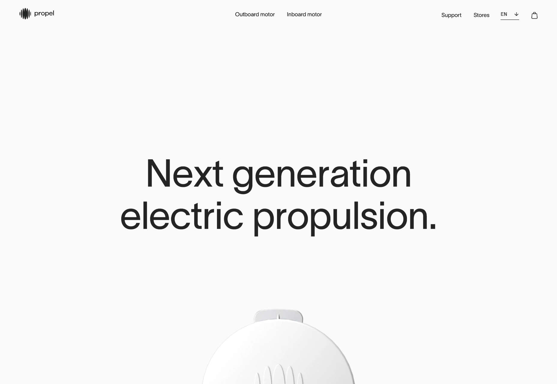
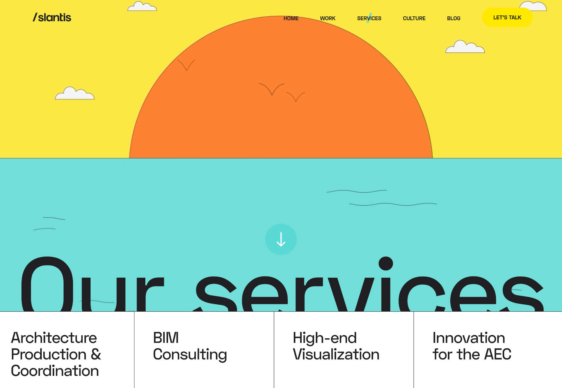
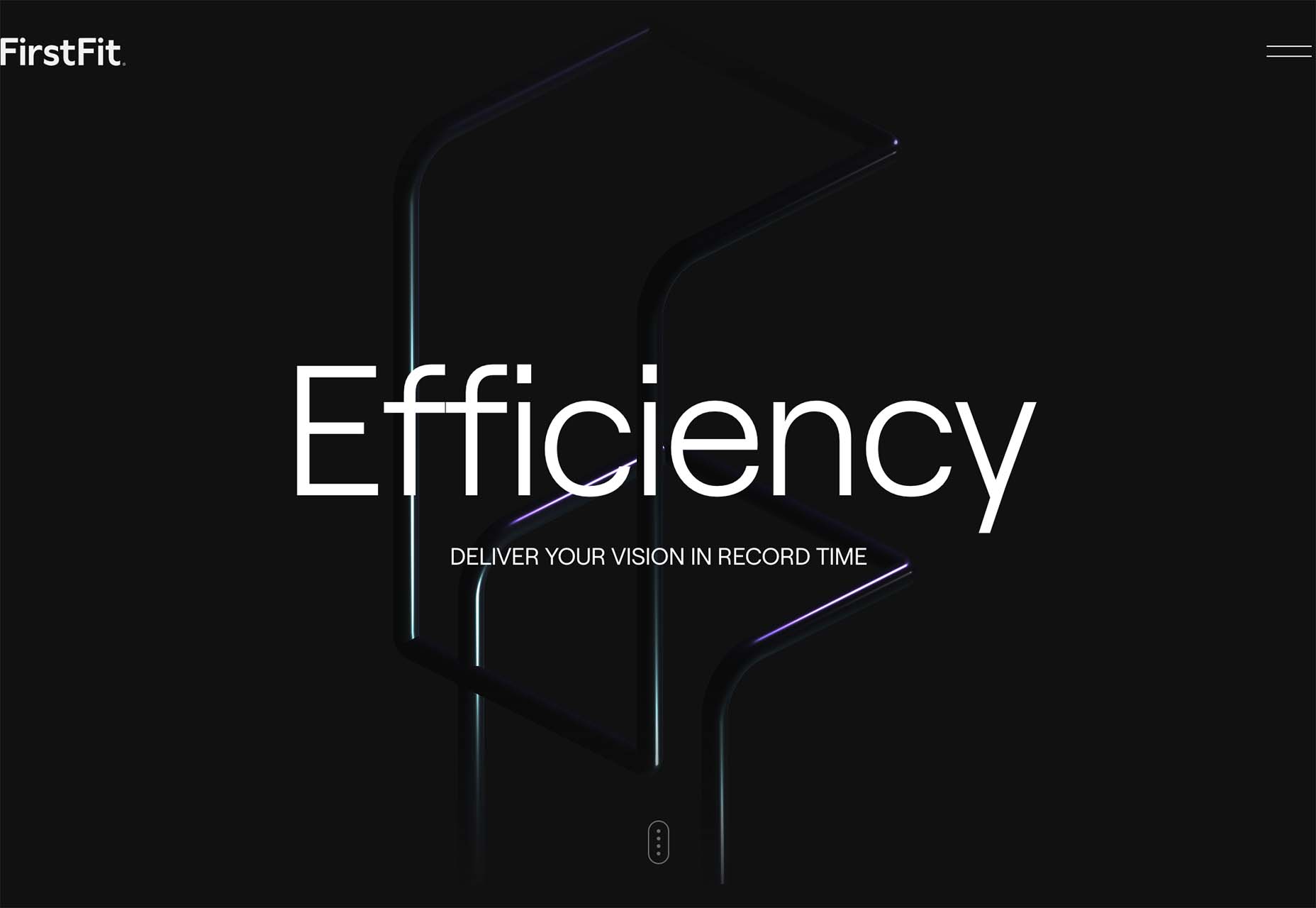
There are a lot of dark, retro vibes trending in website design right now. Although there are still some light projects popping up – including a pastel trend below – a lot of what we are seeing has a quite moody feel.

Here’s what’s trending in design this month.

Pastel Color Palettes

Let’s start with the trend with a lighter feel – pastel color palettes. While much of the web is trending toward dark aesthetics, there’s a segment that’s going in the exact opposite direction. Those sites feature soft, pastel color palettes that serve as a balance to all the super dark websites out there.

One thing about this website design trend is that it jumps out because of the stark contrast with all of the dark color palettes out there.

Each of these designs seems to use a pastel color palette as the basis for a background. A blur effect is paired with the colors to use pastels in a way that has a natural feel without appearing too feminine or light.

Robust uses blue and earth tones for a pastel background that feels modern and strong when paired with the hard-edged headline font.

Atmos uses a light pastel theme that takes you through the clouds with blues, and pinks, and purples. The pastel color scheme works well with the content which is airline-themed and makes you feel like you are flying through the sky. The colors are also soft enough to provide an easy reading experience.

Klezma is another design with the same pastel background with graduated color. The peach tones are fairly neutral and give plenty of room to the content.

Fonts with a Distinct Retro Look

Every one of these websites uses a typeface with a similar look and feel. This retro headline style is trending in a major way.

The best way to use this design element is for short words. This typeface design isn’t meant for a lot of words or when readability is a high priority.

This style is all about creating a specific kind of vibe for your website. The typefaces in this trend have a quite retro look and feel with an almost 1960s or ’70s feel to them. The rest of the design mimics this feel as well with colors and surrounding elements that contribute to the overall look.

A couple of common elements here include the use of all capitals font sets and letterforms that include odd shapes and lines.

Sretks not only uses a retro typeface but bends and twists it a bit too to add to the old-school feel. The background color helps add to the groovy vibe.

Barge 166 uses a retro typeface with the same design feel as the other examples but with a sharper, more serif-style edge. It’s easier to read but still carries a retro look and feel. Use a typeface similar to this if you want to capture that retro font style for a trending look while maintaining as much readability as possible. This option works best for multiple lines of words in a large size.

Picky Joe uses a retro typeface with rounded letters and a bit of a tilt to the characters to create a distinct feel. This is definitely a style that has to be used sparingly but can be a fun option, depending on the content of your website design.

Dark “Product” Sites

Dark mode design is probably the biggest design trend of 2022. Everywhere you look, websites are using dark color palettes and styles. Designers are creating more projects with a dark/light toggle so users can control their experience.

This visual concept is carried over to website designs that feature products as well. This is one of the last places the dark aesthetic had not touched. It’s been a bit of an unwritten rule that product images should be on white or light backgrounds to help make them easy to see and inspect digitally.

This design trend bucks that idea and features products on dark backgrounds – some with so little contrast that you almost have a hard time seeing the products. (Maybe these brands are banking on the idea that you already know them or are selling a lifestyle product.)

HQBC sells bike accessories such as glasses and helmets and the site has a sleek look and feel. You know it is cool from the second you land on it. The question though – is there enough visual information with the dark background to help you make a purchase? This design probably works because it only encourages you to find a physical location to make a purchase rather than buy online.

Doggystyle Shop also banks on the idea of you knowing the shopping experience or brand when you arrive. What the design does do though is put products on white backgrounds after you have clicked through far enough to make a commitment to buy. This helps you see the product well one final time before making a purchase. (The challenge is that it is three to four clicks in for the most part.)

FirstFit uses the design trend in a way that’s similar to the first example. They are showing a product, but not actually trying to convert sales on the website. Other links take you to more product information and content – using a lighter background and color scheme – and the dark background with the product serves mostly as a highly visual landing page that will help entice users to learn more. When it comes to dark mode and products, this seems to be the best option for most website designs.

Conclusion

The state of the world around us and our emotions can play hard into websites and other design projects. Some of the darker elements that are popular now may be a reflection of that or it could be more of a lean into dark mode schemes.

Either way, the web has a pretty dark feel right now.

Source

The post 3 Essential Design Trends, July 2022 first appeared on Webdesigner Depot.

Source de l’article sur Webdesignerdepot

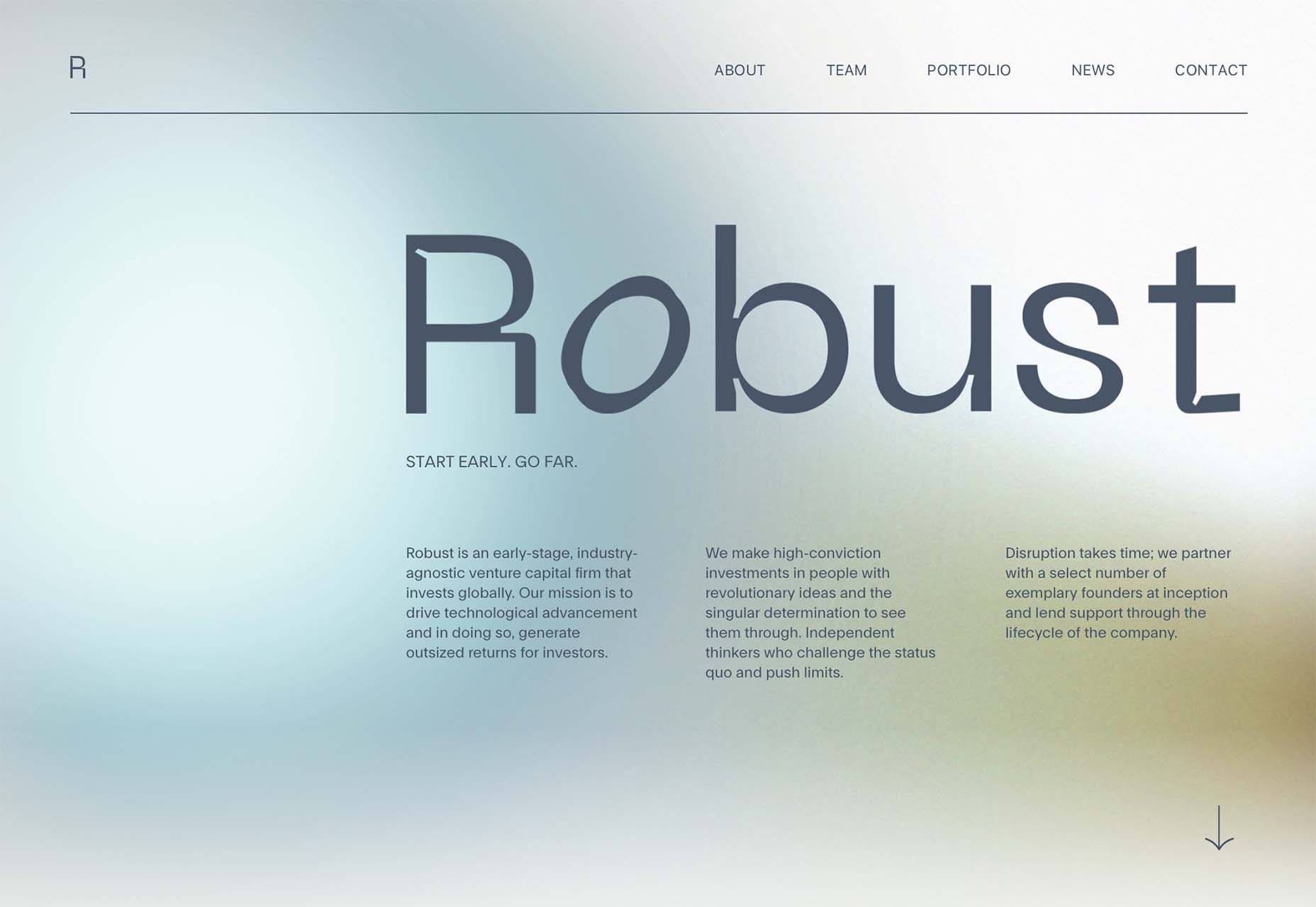
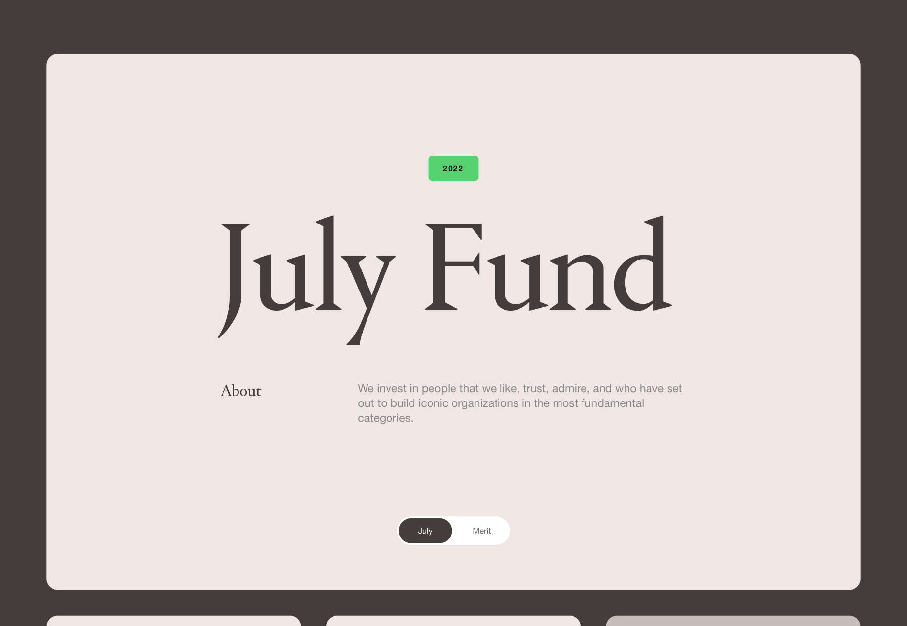
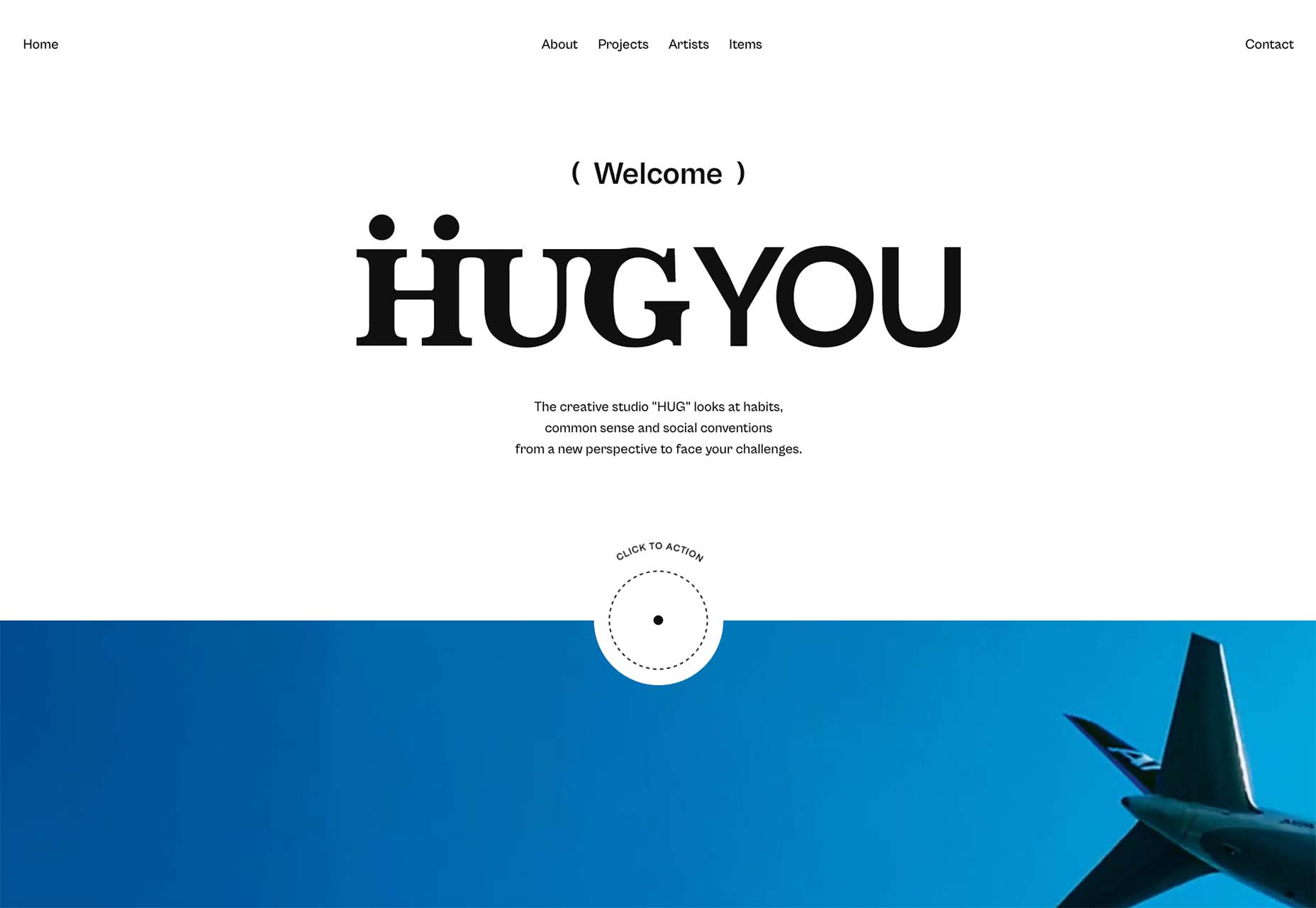
Are you bored with some of your current design projects? This month’s collection of website design trends can help break you out of that rut with some fun and funky alternatives.

And all of these options are anything but boring. From visual display to technique, these trends present a different set of challenges.

Here’s what’s trending in design this month.

1. Layers on Layers

These website designs have so many layers of information that you almost don’t know where to look or where the design elements start and stop.

This can be a complex technique to make work because of the number of elements competing for the same attention in the design.

What you are likely to see with this design tend includes an image or video background with some motion but not anything that truly demands attention. Then add on a few still images in smaller frames throughout the design. Layer on text as well for a three-deep effect.

If you interact with these designs, you’ll find that they are not flat either. They all include animated elements, hover states, and interactions that help direct you through the layers of what can be a somewhat complex design.

Western National Parks Association uses a background image, middle images with animations, and multiple text layers (some on the pictures and some on the background). There’s also scroll animation to help build the design. A lot is going on, but it does not feel too busy.

WIP Architects is another design with layers that interact with each other and include motion. With a lot of scroll animation and layers that go in front of and behind other elements, engagement helps this site work.

The Shipwreck Survey uses the same basic layer outline with a little more overlap between elements and less overall animation. The primary animated effect on the homepage is the scroll bar.


2. Directed Click Actions

This interesting website design trend can be incredibly useful or a wasted element – directed click actions. These are buttons, icons, and animations that tell you to click somewhere in the design to move to the next stage of interaction.

The direct approach ensures that users see and have the best possible chance of doing what the design is intended for. On the other hand, if you need this much instruction, is the design too complicated? Or is there a middle ground where this trend looks great and is usable?

In each of the examples below, these directed click actions are a bit different.

HUG Co has a big circle to click in the bottom third of the screen. It’s almost designed like a bullseye, and you can’t miss it. The thing that is interesting here is that most of the video falls below the scroll. The click action also has two emojis to denote action – a smiling face or pointer when you are ready to click. (The click extends the video to full screen.)

ThinkOvery also uses a similar circular click icon. It also takes you to the next screen in a single movement so that you can continue to explore the design.

Living with OCD has a different approach with scroll and back-to-top icons paired in the bottom right corner. The scroll option includes words to help create direction and instruction. It consists of a small animation and an interactive hover state when you get close to the interactive element. The interesting thing here is that it is not actually a button, and you use a traditional scroll to interact.


3. Word Breaks

If you are a stickler for readability, this design trend might make you cringe.

In each of these designs, words are broken across lines – some with and some without hyphens. For the most part, there’s not much confusion about what the words are, but it does make you pause and think during the page experience.

Why would this be a design trend?

It’s a combination of using large typography, long words, and figuring out a solution to create a common experience between large and small screens. Many of these words would not fit on mobile screens, for example, with the same weight, scale, and impact as the desktop counterparts.

Hence, the word break solution. It creates a consistent user experience across devices.

This technique should be used only if you think your audience is savvy enough to understand what you are trying to communicate with the word break. It can be a tricky proposition!

Plantarium breaks at “plant” with a word that’s made up. But with the imagery and supporting terms, you still know immediately what the design is about.

Michelle Beatty takes a common word and breaks it. Because “photog” and “rapher” are the only letters on the screen, it’s pretty easy to figure out. What’s interesting is that the word break is not on the syllable, but the letters do stack nicely with this break visually.

Wreel Collective breaks a word with a hyphen in giant letters – something we rarely see in website design. Hyphens are not often used in this medium. Because of this, it gets your attention and makes you think about the words and the design.


Conclusion

There are a lot of rule-breaking trends in this month’s collection. They are interesting, fun, and require a certain level of risk to execute.

Could you see yourself (or your clients) opting for a design that features one of these trends? Time will tell if these visual compositions grow in popularity or begin to fade fast.

Source

The post 3 Essential Design Trends, June 2022 first appeared on Webdesigner Depot.

Source de l’article sur Webdesignerdepot