 When you need a website, you have two options, you can hire someone who’s an expert in website building to design it for you, or you can make it yourself.
Hiring someone with experience building a website means you’ll get a more professional result, and you should achieve a good return on your investment. However, hiring a freelancer or a design agency has plenty of pitfalls. Budgets can spiral, timescales get stretched, and the end result might not meet your expectations.
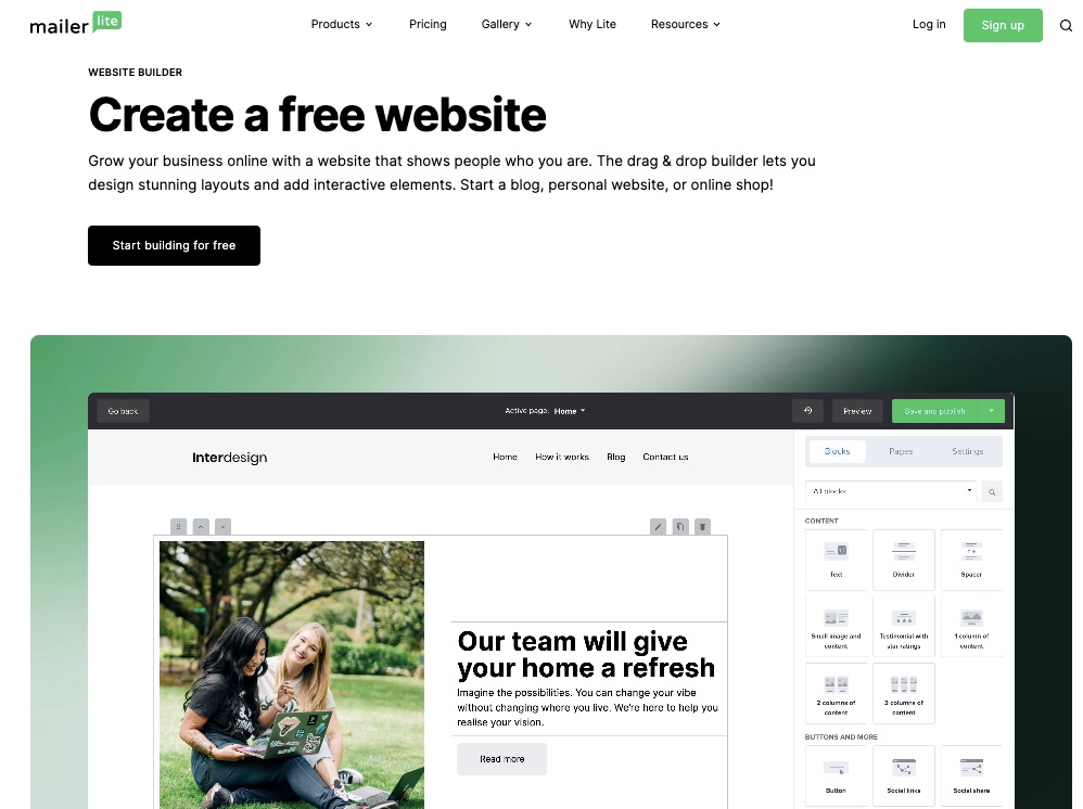
The answer might be to build your own website using a website builder. And the best site builders are designed to help you do just that — most don’t require any design or coding knowledge.
Creating a website with a website builder is usually cheaper than outsourcing the job, and the results can be almost as good as a bespoke website. There are even some free website builders out there.
The key is to choose the right website builder that ticks all your boxes and delivers what you want without paying through the nose for bells and whistles you don’t need.
We’ve tested the best website builders on the market. We’ve quizzed professionals and first-time users. We’ve poked around in the dark corners of UIs. All to bring you this guide to the top website builders on the web. This comprehensive guide to the best website builders for 2023 contains everything you need to know when selecting a site builder.
What To Look For in a Website Builder
The most significant obstacle people face when using website builders is you don’t know what you don’t know. There’s so much information online that it’s hard to know where to start.
That’s why we put together this guide to the best website builders, so small businesses everywhere can make an informed decision about website building.
Choose a Site Builder With High-Quality Code
The first thing you need to look for is production-ready code. That means source code that is modern, robust, and hack-free. (All of the website builders on this list meet those criteria.)
Identify What A Successful Website Looks Like To You
Professional designers start by identifying a website’s purpose. Websites perform best when they have a clear purpose.
If you’re a wedding photographer, you will want to showcase your portfolio and generate new leads. You’ll want to sell products online if you own a clothing store. If you’re a community group, you want to raise awareness and encourage public interest.
Whatever your goal, a website builder listed below will help you achieve it. And choosing the best option for you will be a more straightforward process if you’re clear about that goal to start with.
Think About Design Flexibility
One of the defining characteristics of any website builder is how flexible its designs are. Some of the best website builders give you complete control over every detail of your design. Other website builders limit you to choosing from a selection of pre-designed blocks.
If you’re prepared to compromise on your design, you will have more options. On the other hand, if you want to achieve a specific look, you may need to opt for a more flexible website builder.
Be Honest With Yourself
Next, consider your own level of experience and the amount of time you have to invest in learning to use a tool and build a website. Some website builders will get you online fast, but even some of the best website builders take a little time to learn.
Some people can spare 3–4 hours every weeknight to learn how to leverage a complex website builder — that helps a lot when building a complex site like an online store. Other people have family commitments or social engagements and just need to get something done fast.
There’s no right or wrong answer. You don’t need prior experience, and you don’t need to commit to an evening course to get online. If you want to put a website online in 15 minutes and then forget about it, that’s fine. Make sure you choose a website builder that can help you do that.
Check Out the Support Options
Speaking of your experience, we don’t want to put a damper on things, but what will you do if something goes wrong?
Websites experience problems from which website builders are not exempt. Most of the best website builders use a CDN (Content Delivery Network) for web hosting. But CDNs aren’t infallible.
Some site builders offer a free domain, and all of the best website builders allow you to use a custom domain name and free SSL certificate. What happens if there’s a problem with it? Does the site builder’s support extend to domains?
Happily, most website builders offer an excellent level of customer support. So before you start, check what help you’re entitled to and how to get assistance should a problem arise.
Make Full Use of Any Free Trial
Most of the best website builders offer a free trial or even a free-forever package. The free trial is your opportunity to try out the UI (User Interface) and get a feel for the product.
All the website builders we’ve listed below specialize in a particular type of site. Most cater to small business owners. Each has pros and cons and can help you achieve your online goals. However, in the end, the success of your site comes down to you; you can use a free web builder and still succeed if you’re willing to put in the work.
Trust your instincts: if you find a particular site builder intuitive, then the chances are you’ll be able to create a great website with it.
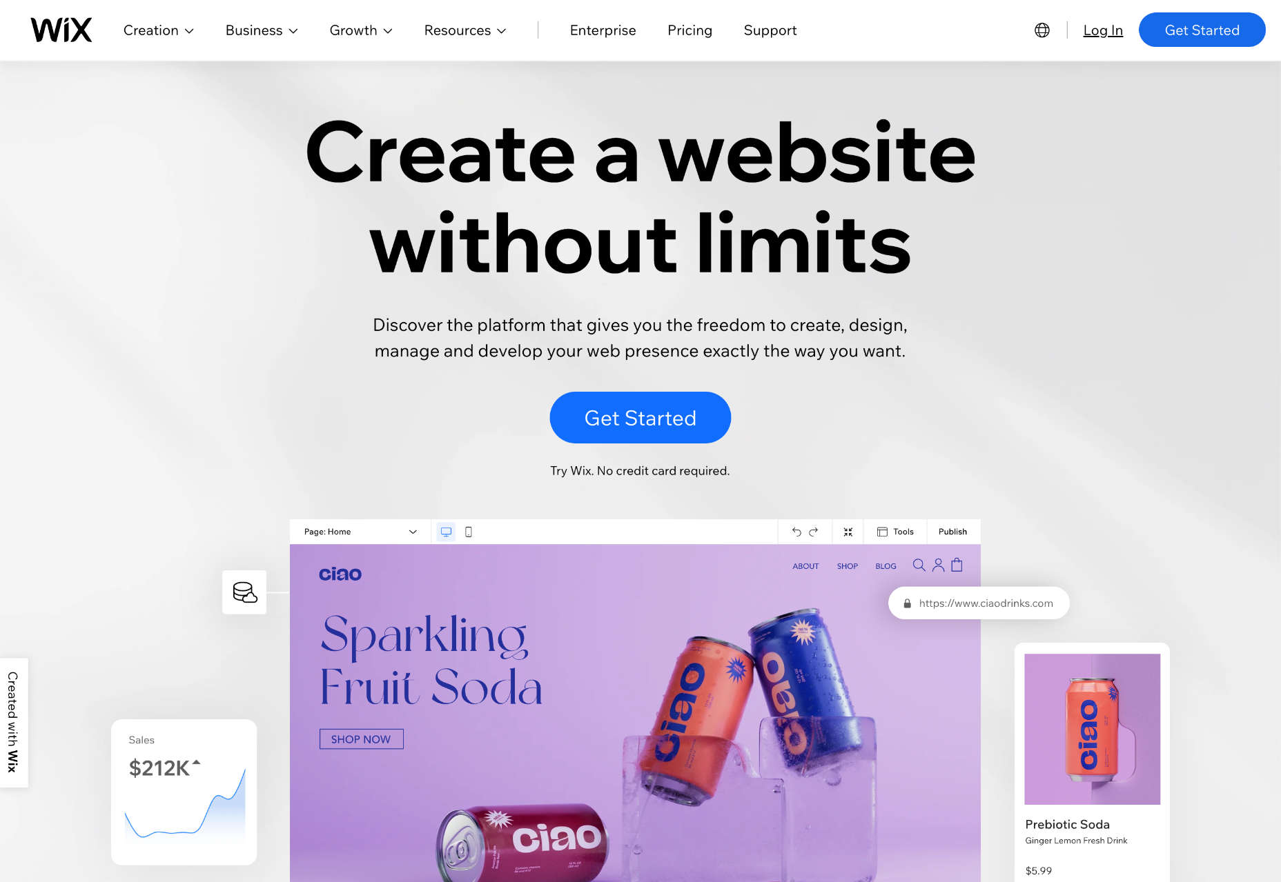
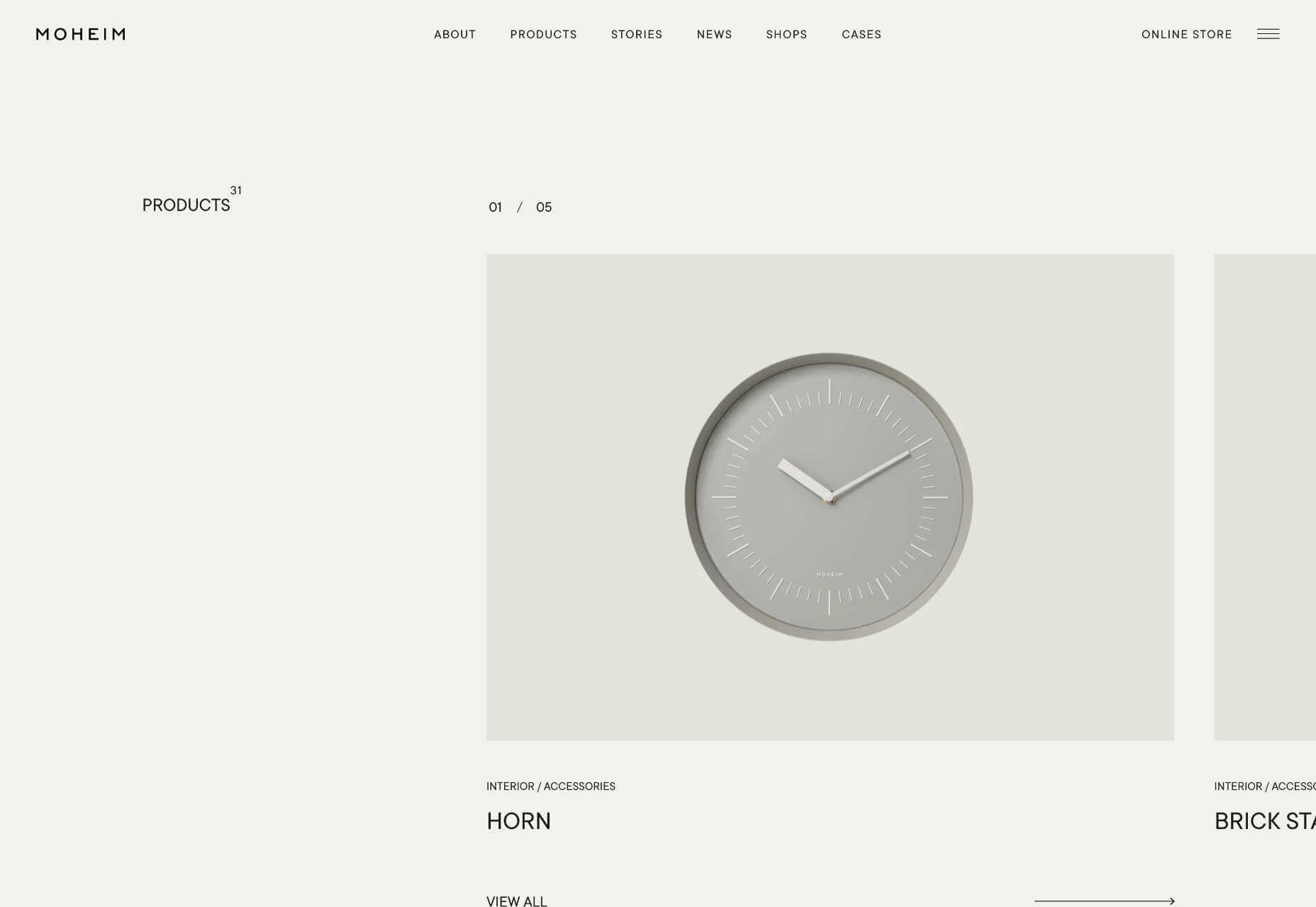
Wix: Best Website Builder for Small Business Owners
Wix is widely considered to be one of the best website builders of 2022, and a quick glance at its extensive list of features will tell you why we expect it to still be the top website builder platform in 2023.
First up is a vast number of templates giving you more selection than almost any rival. There’s so much choice that you’ll probably spend longer choosing your template than actually building your site!
Wix’s editor uses an intuitive drag-and-drop editor that enables anyone to create just about any design. It’s not the most straightforward editor on the market. Still, Wix has extensive documentation, so if you have the time to tackle a modest learning curve, you should quickly get to grips with the UI.
Of course, Wix also includes core features like custom domain names and free SSL certificates.
On top of these features, Wix provides various marketing tools to help your site grow toward profitability.
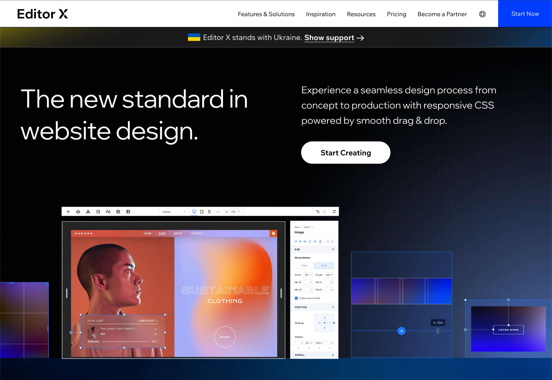
Finally, for freelancers and web design agencies, Wix provides Editor X, a professional solution for creating multiple websites for clients. Editor X is an excellent addition to Wix’s lineup. However, it’s not the best option for design agencies (keep reading to find out which tool we think tops Editor X).
Wix Features
Wix is the biggest website builder in the world and includes hundreds of features that make building a website simple. Here are just some of the highlights.
Huge Range of Templates
Wix boasts a huge range of 800+ customizable templates for every kind of business, from online stores to simple marketing sites.
Intuitive Drag and Drop Editor
Wix’s intuitive drag-and-drop editor makes it a simple task to achieve almost any design with little to no design experience.
There are a couple of downsides to this approach. Firstly, many small business owners opt for a website builder because they need a guided design process — unlimited options can actually make things harder. Secondly, the highly flexible design system Wix offers can introduce unexpected bugs at different device sizes.
Editor X
Editor X is Wix’s solution for freelance designers and web design agencies. It allows you to build client sites with dedicated tools for professionals.
App Market
Wix’s AppMarket is a dedicated app store with hundreds of plugins that enable you to expand your website’s capabilities quickly and easily. You’ll find everything from table reservation apps for restaurants to social media integrations.
Velo
Velo is Wix’s open development platform for building web applications. This is an ambitious project that aims to move web builders into areas in which they typically cannot compete: complex web apps.
For most businesses, Velo is far beyond what you need; for most app developers, it isn’t enough yet. But it’s great to know this opportunity is on the horizon.
Ecommerce
Wix has a range of tools to help your ecommerce business grow. There are coupons, discounts, bookings, and shipping tools.
Ascend
Ascend is Wix’s built-in marketing suite. It includes a CRM (Customer Relationship Manager) which is excellent for fostering long-term business relationships and eliminates the need for a third-party app.
Email Marketing Tools
Email is still the most effective way of staying in touch with your customers. Wix’s built-in email marketing tools make it easier to manage email campaigns, all from your Wix dashboard.
Free Domain
Wix will even give you a free domain for a year on everything except its basic package.
Pros
- Relatively intuitive design process
- Excellent documentation and quick-start guides
- Reliable and secure system
- Huge range of tools
- Extensive plugin market
Cons
- Sites are less responsive than some rivals
- SEO (Search Engine Optimization) options are limited
- Difficult to change templates once you’ve selected one
- Image and video-heavy sites perform poorly on mobile devices
- Design flexibility can introduce unexpected bugs
Pricing
Wix has multiple tiers of pricing depending on the features you require.
Note that the availability of some Wix plans varies depending on your location.
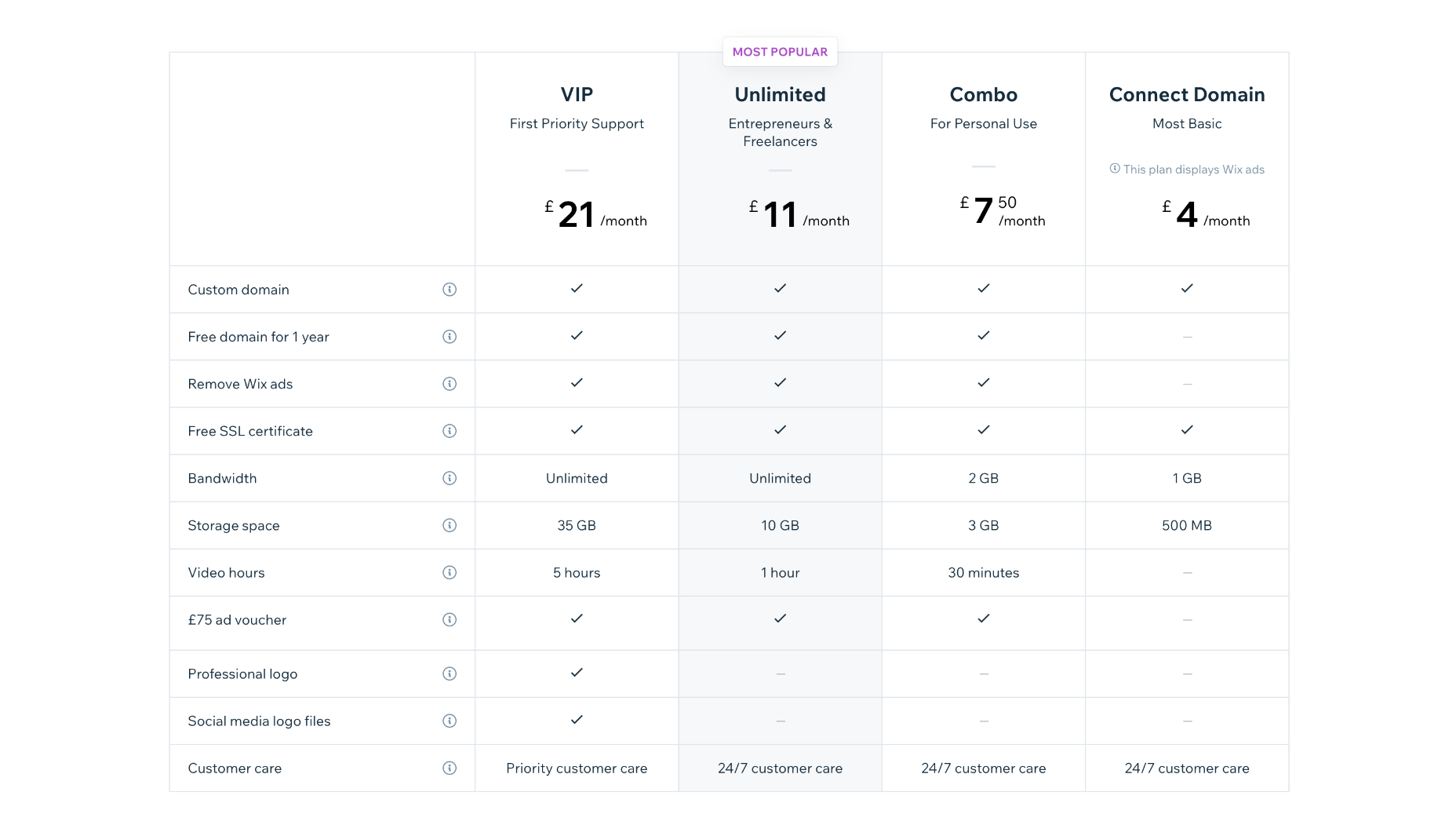
Website Plans
Website Plans are aimed at those users creating an individual site.
Combo: $16 per month — 2 Gb bandwidth and 3 Gb of storage, plus 30 minutes of video streaming.
Unlimited: $22 per month — Unlimited bandwidth, 5Gb storage, 1 hour of video streaming, and access to marketing tools.
Pro: $27 per month — Unlimited bandwidth, 50Gb storage, 2 hours of video, marketing tools, social media tools and priority support,
VIP: $45 per month — Unlimited bandwidth, 100Gb storage, 5 hours of video, marketing tools, social media tools, and priority support.
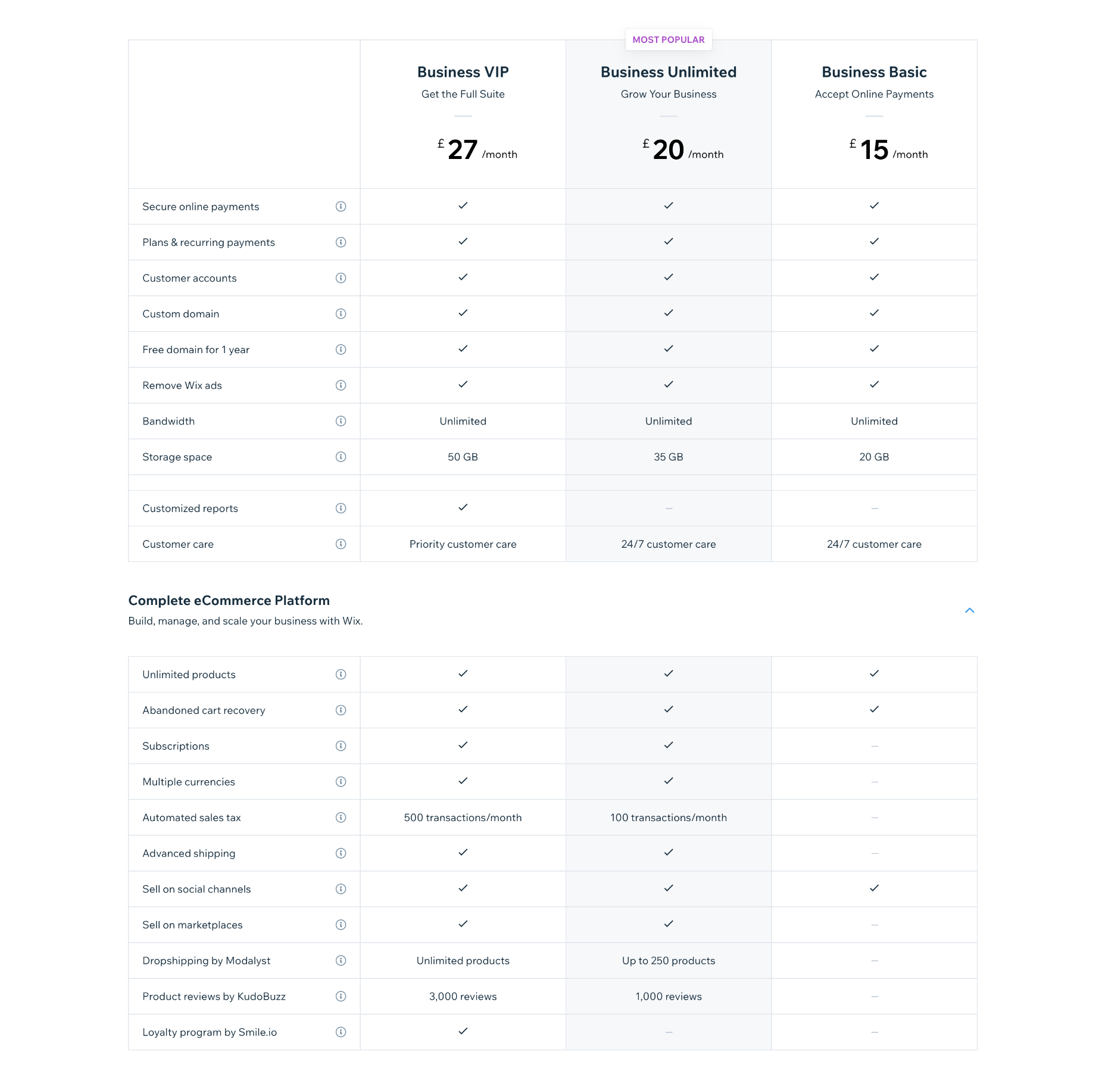
Business & Ecommerce Plans
If you want to accept payments online with Wix, you’ll need a business plan.
Business Basic: $27 per month — 20Gb storage space, 5 hours of video, online payments
Business Unlimited: $32 per month — 35 Gb of storage, 10 hours of video, multiple currencies, multi-channel selling, dropshipping, product reviews
Business VIP: $59 per month — 50Gb of storage, unlimited video, marketing, and sales tools, dropshipping, product reviews, and a loyalty program
Enterprise Plans
Wix provides custom solutions for enterprise customers. If you have a large site with complex needs, then Wix can design a complete solution for your brand. Contact Wix directly for pricing.
Bottom Line
Wix is one of the best website builders available for creating your own website. Its flexibility, massive range of features, and ability to scale are ideal for many new and established businesses. But, if anything, Wix’s vast range of options can be a hindrance and make its learning curve a little steeper than necessary.
Wix is a great allrounder, but it’s not the easiest, cheapest, or fastest website builder. So keep reading to discover the best alternatives to Wix.
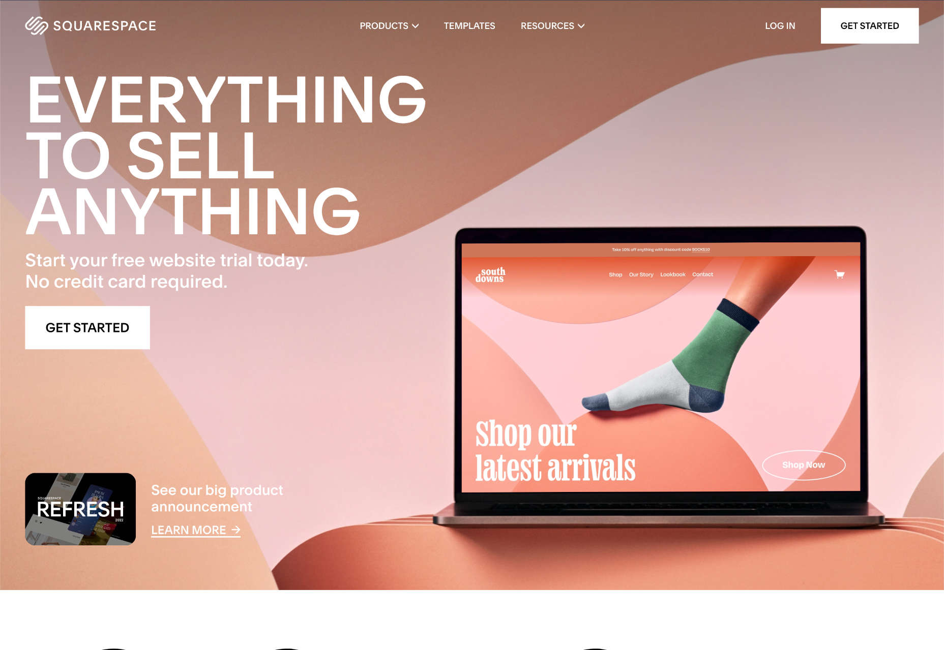
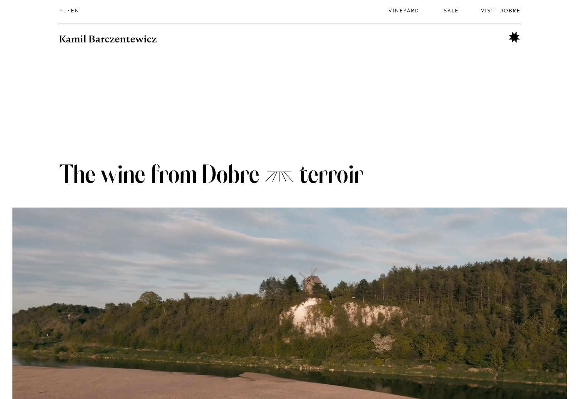
Squarespace: Best Website Builder for Creatives
Squarespace is the ideal website builder for anyone for whom aesthetics are a primary concern; it boasts the most beautiful templates of any website builder.
On its higher tier packages, Squarespace allows ecommerce sites to host their own checkout. This is radically different from some website builders further down this list and ensures a consistent customer experience while maintaining a secure checkout.
For professional designers, Squarespace offers Circle, an invite-only program for professionals creating multiple sites in Squarespace. To qualify, you must build at least three websites on the Squarespace platform.
Squarespace Features
Beautiful Templates
Squarespace has hundreds of templates, widely considered to be amongst the most beautiful designs of any website builder.
Additionally, you can purchase Squarespace templates at a number of different design marketplaces, giving you even more options.
Powerful Ecommerce Features
Squarespace has everything you need to power an online store, from selling an individual item to a huge product range. You can even sell online classes.
Integrated Marketing Tools
Squarespace includes integrated marketing tools like email campaigns that carry your branding from your site to your customers’ inboxes.
Squarespace also includes a very capable blogging app with all the features you need to start publishing content that will engage your users and boost your position on SERPs (Search Engine Ranking Pages).
Circle
Circle is Squarespace’s partner program for professional web designers. You will need to build at least three Squarespace websites to qualify.
Members of Circle get free educational content to keep their skills up to date and access to product betas.
Pros
- Award-winning templates
- Incredible customer support
- Seamless integrations
- Simple but powerful ecommerce features
- Create a stunning site in 15 minutes
Cons
- Steeper learning curve
- Limitations on navigation
- Slower than average page speed
- Premium-priced plugins
- No free domain
- Custom CSS restricted to the business plans
Pricing
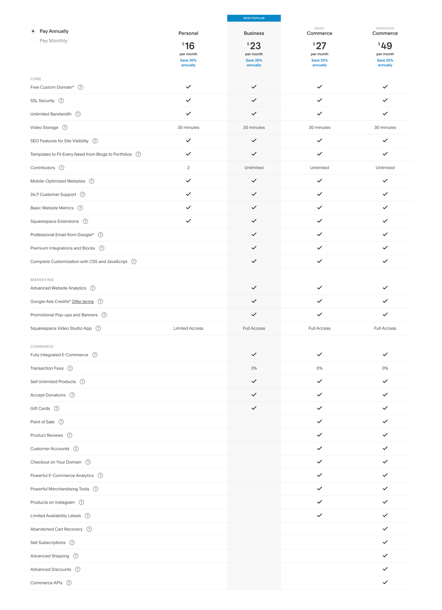
Squarespace offers four simple pricing plans. Additionally, you can save up to 30% by opting to pay annually instead of monthly.
Personal: $23 per month — 2 contributors, curated templates, simple analytics, mobile version of sites
Business: $33 per month — unlimited contributors, business tools, advanced analytics, ecommerce with 3% transaction fees
Basic Commerce: $36 per month — unlimited contributors, business tools, ecommerce analytics, merchandising tools, 0% transaction fees.
Advanced Commerce: $65 per month — Everything in the basic commerce package plus abandoned cart recovery, subscriptions, advanced shipping options, and discounts, as well as APIs for third-party integrations.
Bottom Line
Squarespace offers undeniably beautiful sites. Its editing experience takes a little getting used to but is far from complex. Its simple, transparent pricing means your costs are predictable, and there is genuine value in its 30% discount for paying annually.
Due to its shallower navigation, it’s best suited to smaller online stores with dozens rather than hundreds of products. However, artists and craftspeople will love selling their work on Squarespace.
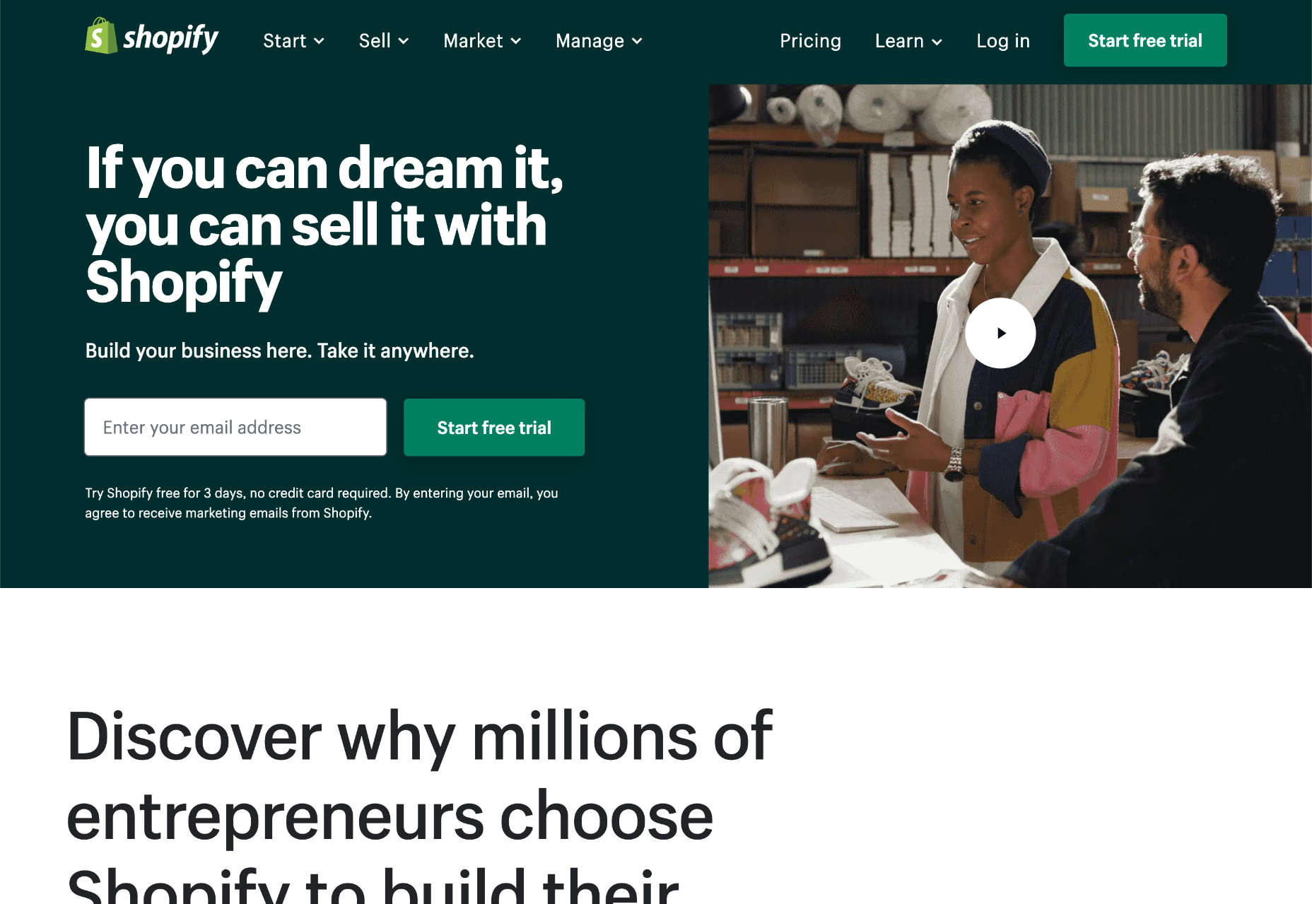
Shopify: Best Website Builder for Online Stores
Shopify is the best-known website builder for creating an online store, and for a good reason. Few website builders manage to handle online sales with the grace of Shopify’s ecommerce features.
That does not mean it’s without its failings. The biggest issue for most Shopify users is the restriction on the number of product variants, which is capped at 100, and always seems to be reached too quickly. Another common gripe is the styling restrictions placed on the cart in the name of security, which prevent anything but basic styling from being applied to your checkout process.
Shopify is one of the best online website builders, but it eschews the usual drag-and-drop interface approach and instead uses templates and editable code.
Templates typically come with styling options, and there is a WYSIWYG (What You See Is What You Get) style editor for adding content. However, you’ll need to hire a developer or learn basic coding to customize your template significantly.
The upside of this approach is that there’s a vast Shopify ecosystem, with thousands of templates and plugins available in the dedicated store and on third-party marketplaces.
Shopify Features
Vast Number of Templates to Choose From
Shopify has a huge number of templates, there are hundreds of native templates, and there are thousands more available from third-party marketplaces.
Extensive Plugin Store
Shopify has an extensive plugin store with 6500+ add-ons, from apps to improve your UX to helpers to simplify third-party integrations with SaaS (Software as a Service) like Mailchimp and AliExpress.
Social Media Integration
Shopify isn’t just an online store; it makes selling products across multiple channels, like Facebook, Twitter, Instagram, and even email, a simple process.
Industry-Leading Education
Shopify has a plethora of resources to help you create an online store and maximize your sales. It provides online courses and community resources and a dedicated and knowledgeable customer support team.
Pros
- Highly optimized checkout
- Recognized and trusted platform
- Sell across multiple channels like Etsy and Facebook
- Huge app store
- Manage large inventories easily
- Fast customer support
Cons
- Checkout has limited styling options
- Coding knowledge is needed to fully extend Shopify
- No simple drag-and-drop editor
- Additional costs if buying a template or plugins
- Steep learning curve compared to other website builders
- Limits on the number of variations per product
Pricing
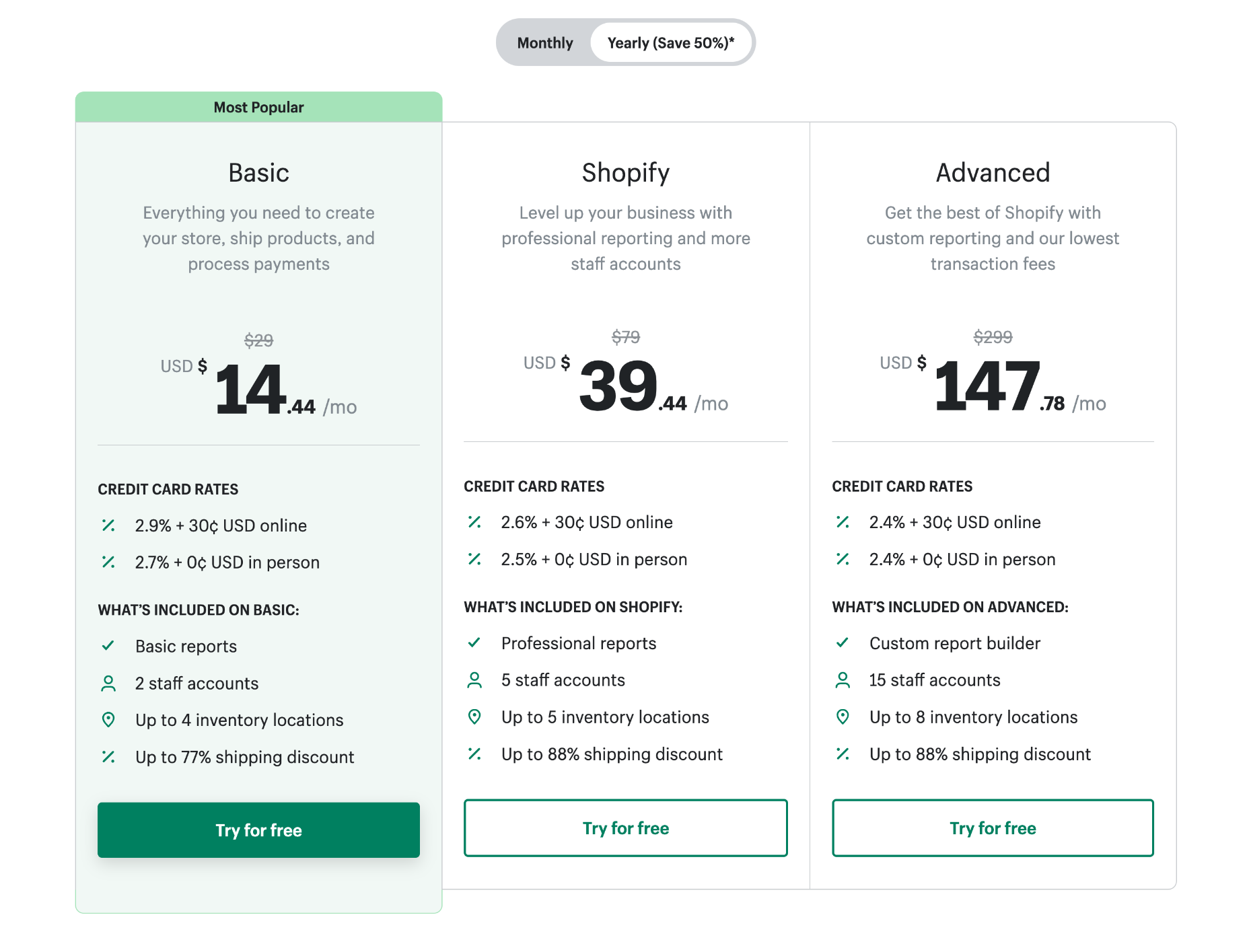
Shopify offers three website plans. You can save 50% if you pay annually instead of monthly.
Note: in addition to your plan, Shopify charges a per-sale percentage plus $0.30 for online transactions.
Basic: $29 per month — Basic reports, 2 staff accounts, 4 inventory locations, up to 77% shipping discount, 2.9% + $0.30 fee per transaction
Shopify: $79 per month — Professional reports, 5 staff accounts, 5 inventory locations, up to 88% shipping discount, 2.6% + $0.30 fee per transaction
Advanced: $299 per month — Custom reports, 15 staff accounts, 8 inventory locations, up to 88% shipping discount, 2.4% + $0.30 fee per transaction
Shopify is aimed at small businesses but also provides ShopifyPlus, an enterprise-grade solution for high-volume businesses that starts at $2,000 per month.
Bottom Line
Shopify sets the bar for ecommerce solutions. When it comes to selling online, it’s the first choice for many businesses.
Shopify occupies the middle ground between website builders and custom solutions. As such, making changes is difficult. Once you’ve chosen your template and exhausted the built-in features of the template, your only recourse for further changes is to hire a developer (or learn to code).
Shopify is laser-focused on ecommerce, so it’s a poor choice for anything but ecommerce. However, if you’re aiming to quickly establish an online store with scope to grow, Shopify is impossible to beat.
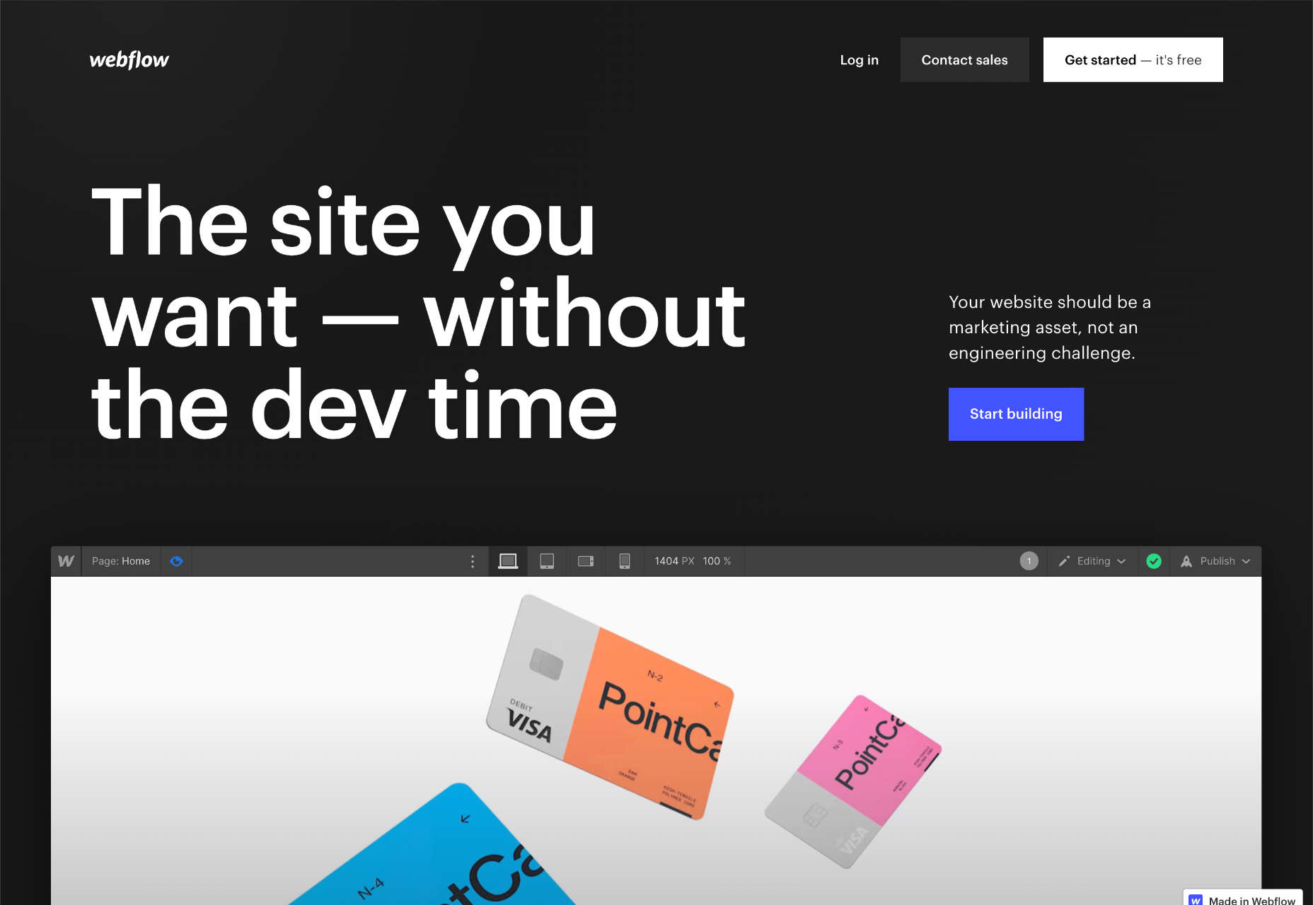
Webflow: Best Website Builder for Design Agencies
Webflow is a website builder geared solidly towards freelancers and design agencies concerned with building a website for their clients.
For professional website designers who possess at least a passing understanding of HTML & CSS, Webflow is an ideal way to create a website.
With its white labeling and a complete CMS (Content Management System), Webflow allows you to serve sites to clients as custom builds. Clients can then edit content in a simplified dashboard called Editor; this lessens the learning curve for clients and avoids the risk of them fiddling with site-breaking settings.
Webflow Features
Full CMS
Webflow employs a full CMS (Content Management System) to separate design and content and allow you to use data to create a website rapidly. In this respect it’s like a the best elements of Wix and WordPress combined.
Powerful Design Process
With Webflow you have the option to fully customize almost every aspect of your design, without code.
Start with a blank canvas, or a template, then use the drag-and-drop editor to add HTML elements onto your page. Create reusable symbols to speed up your site creation.
White Labeling
White labeling means teams can create client sites in Webflow without the client knowing how the site is built — design agencies don’t have to worry about clients cutting out the middleman and going straight to Webflow to save money.
Webflow Enterprise
Most website builders are out of their depth when it comes to enterprise-grade sites with high volumes of traffic. Not so Webflow, which delivers advanced security, traffic scaling, and guaranteed uptime for its enterprise customers.
Pros
- Comprehensive SEO tools
- Extensive customization options
- Industry-leading documentation
- Excellent for client work
- Fast customer support
- Awesome free plan
Cons
- Not beginner-friendly
- No plugin store
- HTML & CSS knowledge advisable
- Membership sites are only in beta
- Complicated pricing
- Eye-wateringly expensive
Pricing
Webflow offers a multitude of pricing options depending on whether you’re an individual, a reseller, or an online store.
If you’re running an individual site you’ll need either a website plan or an ecommerce plan. If you’re an agency planning to resell Webflow to your clients you’ll need a workspace plan for your team in addition to a website or ecommerce plan for every client site you publish.
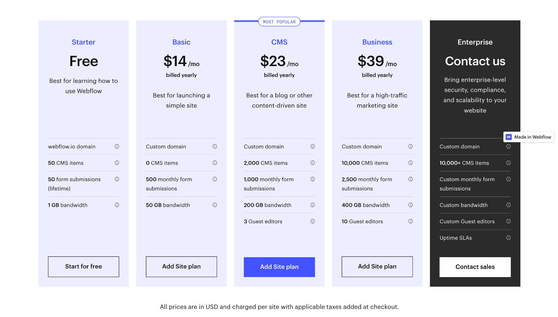
Website Plans
If you’re an individual, Webflow provides three plans to choose from. You can save up to 22% by opting to pay annually instead of monthly.
Basic: $18 per month — 0 CMS items, 500 form submissions per month, 50Gb bandwidth.
CMS: $29 per month — 2,000 CMS items, 1,000 for submissions per month, 200Gb bandwidth, and up to 3 guest editors
Business: $49 per month — 10,000 CMS items, 2,500 form submissions per month, 400Gb bandwidth, up to 10 guest editors
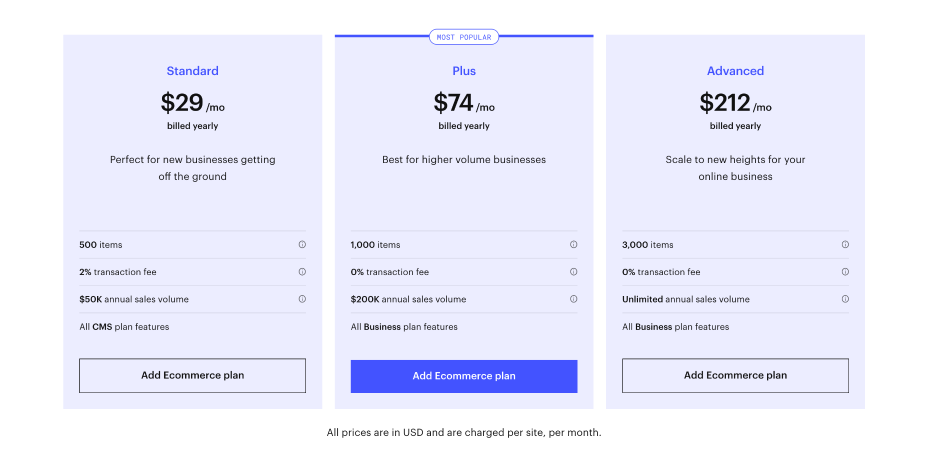
Ecommerce Plans
To unlock features specifically designed for online selling, you need to opt for one of Webflow’s ecommerce plans. You can save up to 30% by opting to pay annually instead of monthly.
Standard: $42 per month — includes everything in the individual CMS plan, plus 500 products, 2% transaction fee, and a maximum of $50,000 in annual sales
Plus: $84 per month — includes everything in the individual business plan, plus 1,000 products, 0% transaction fee and a maximum of $200,000 in annual sales
Advanced: $235 per month — includes everything in the individual business plan, plus 3,000 products, 0% transaction fee, and unlimited annual sales
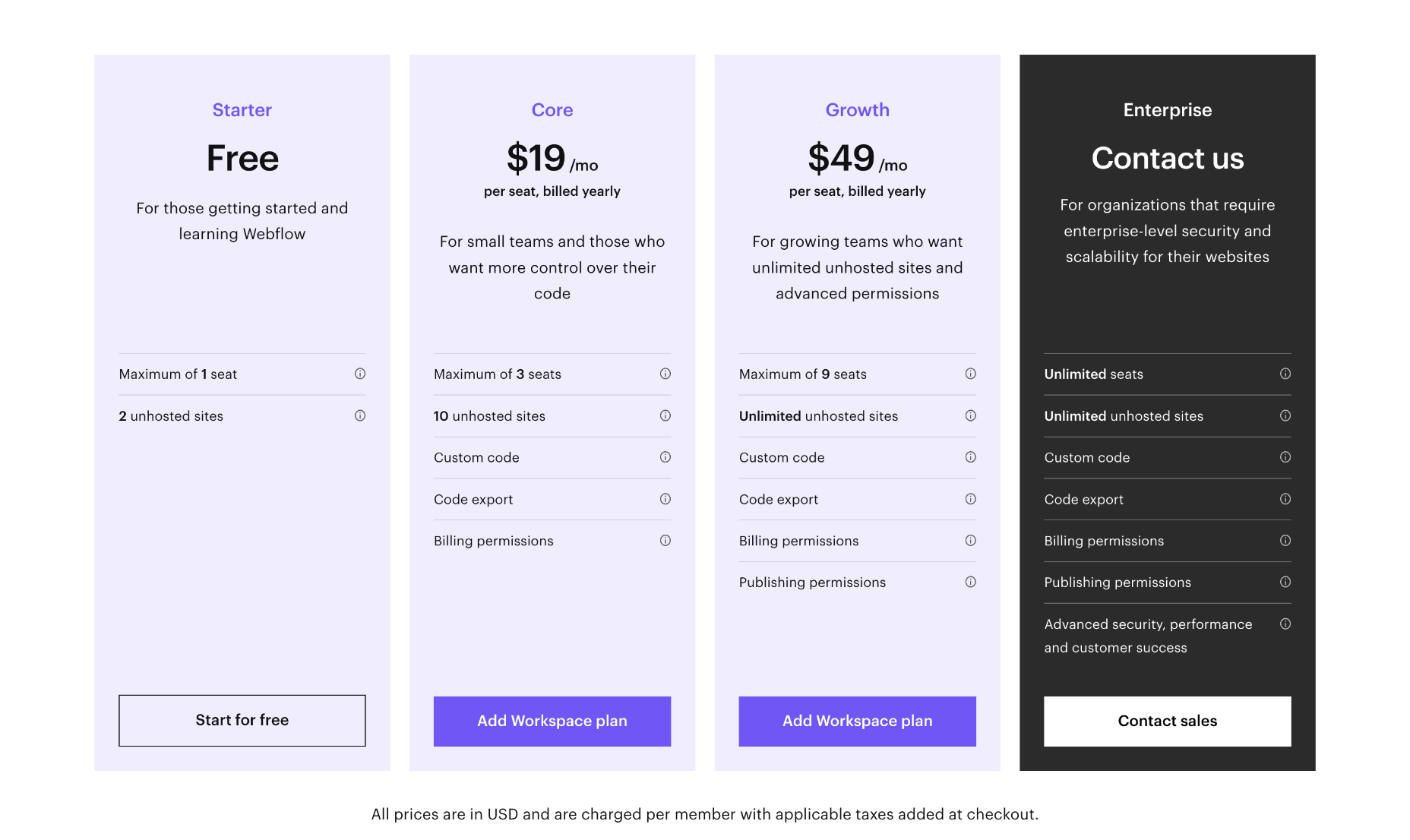
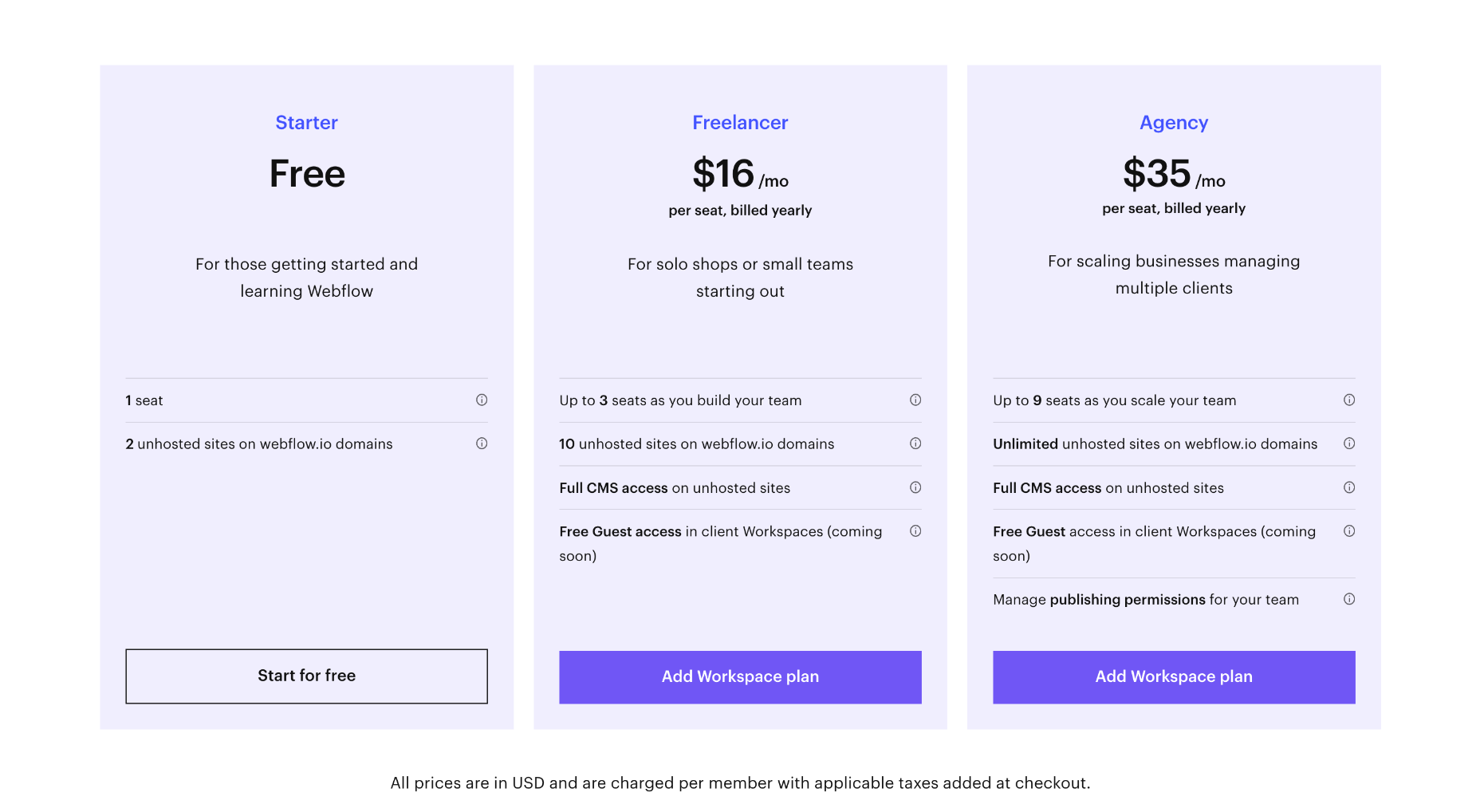
Team Plans
For teams, Webflow offers workspace plans in addition to website and ecommerce plans. There is a free plan while you learn Webflow, and you can save up to 33% by paying annually.
Note that team plans are charged per seat, so for example, the cost for four designers of the Growth package is $240 per month (not $60 per month).
Core: $28 / seat per month — for small in-house teams, up to 3 seats, a maximum of 10 unhosted sites, custom code and code export.
Growth: $60 / seat per month — for growing in-house teams, up to 9 seats, unlimited hosted sites, custom code, custom export.
Freelancer: $24 / seat per month — for freelancers or small agencies, up to 3 seats, full CMS access on unhosted sites
Agency: $42 / seat per month — for agencies, up to 9 seats, full CMS access on unhosted sites
Large teams with more than 9 team members will need to contact Webflow for its enterprise plan, which promises unlimited seats.
Bottom Line
Webflow is aimed at design agencies and freelancers who need a web host for client work and is one of the best website builders for managing multiple sites.
Due to its advanced feature set, Webflow is relatively complex to use. However, it is far simpler than a bespoke site, and anyone with a cursory understanding of web technologies should master it in a short space of time. Additionally, its Editor feature simplifies it for clients.
Unfortunately, Webflow’s ecommerce plans are expensive and ecommerce features are limited. Anyone looking to sell online might want to consider other site builders instead.
If you’re a design agency building multiple client sites, Webflow is an excellent platform to adopt…if you can afford the team plans.
Duda: Best Website Builder for SEO
Duda website builder has been outperforming its rivals since 2021, when Google introduced Core Web Vitals and, in the process, made SEO all about speed.
Duda produces blazing-fast, reliable sites and, in doing so, ticks all of Google’s boxes for a quality site that it wants to rank highly.
On top of this, Duda provides a white-label option, allowing design agencies to build sites for clients on the platform. In fact, this is what Duda was initially created for.
Duda offers beautiful design in a simple-to-use package. As such, it produces some of the best no-code websites.
Duda Features
Simple Editor
Duda offers a Simple Editor option that allows you to provide your clients with a simple website builder of their own. Predesign elements that work together, then let your clients combine them in whatever way they please.
Clients will feel empowered, and you get a website project out the door with less work and fewer revisions.
White Labeling
Duda is aimed squarely at freelancers and design agencies that want to foster an ongoing relationship with their clients.
Team Libraries
Build your own library of widgets, templates, and sections. Share across your entire team, so client projects are created with your in-house approach.
Omni-Channel Ecommerce
Duda enables ecommerce sales across the web and social media, with your inventory synced everywhere you sell, from Facebook to eBay and Amazon.
Managing a store is simple with store management apps for iOS and Android.
Pros
- Extremely fast page speed
- Beautiful templates
- Award-winning customer support
- Intuitive drag-n-drop interface
Cons
- Relatively expensive
- Limited plugin store
Pricing
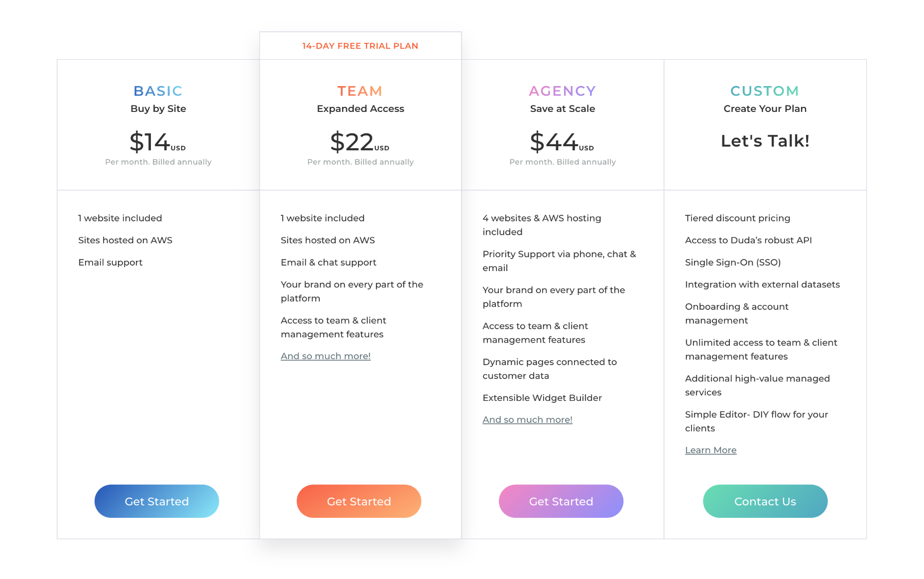
Website Plans
Duda offers three pricing plans for websites, and you can save up to 33% by paying annually instead of monthly.
Basic: $19 per month — 1 website, email customer support only, no team or client collaboration
Team: $29 per month — 1 website, email chat and phone customer support, up to four team members, white label client access
Agency: $59 per month — 4 websites, priority email chat and phone customer support, up to ten team members, white label client access, widget builder, export control
Duda also offers custom plans for clients with enterprise-grade sites; contact them directly for pricing.
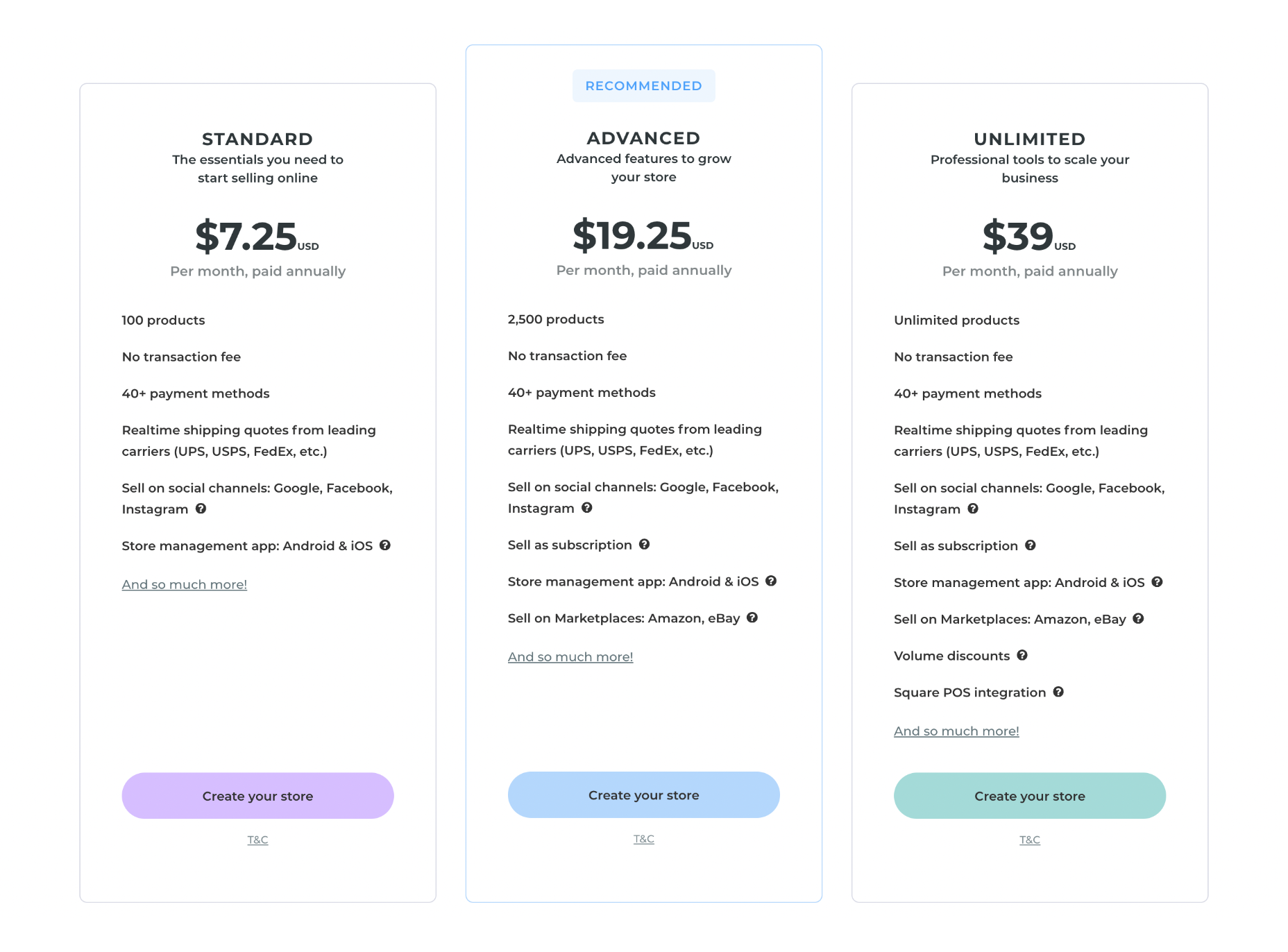
Ecommerce Plans
Duda provides ecommerce features as an add-on, which means if you want to use Duda to create an online store, you need to sign up for one of their website plans as well as one of their ecommerce plans.
Note: you can pair any of the ecommerce plans with any of the website plans; they don’t need to scale together.
You can save up to 25% on Duda’s ecommerce plans by paying annually instead of monthly.
Standard: $8 per month — Up to 100 products
Advanced: $22 per month — Up to 2,500 products, sell subscriptions
Unlimited: $49 per month — Unlimited products, sell subscriptions, Square PoS integration
Bottom Line
SEO is a complex subject, and many factors feed your ranking on Google, Bing, and other search engines.
What is universally accepted is that fast pages translate into a better ranking.
If you’re looking for a blazing-fast website builder to help you establish a strong online presence, Duda must be near the top of your shortlist.
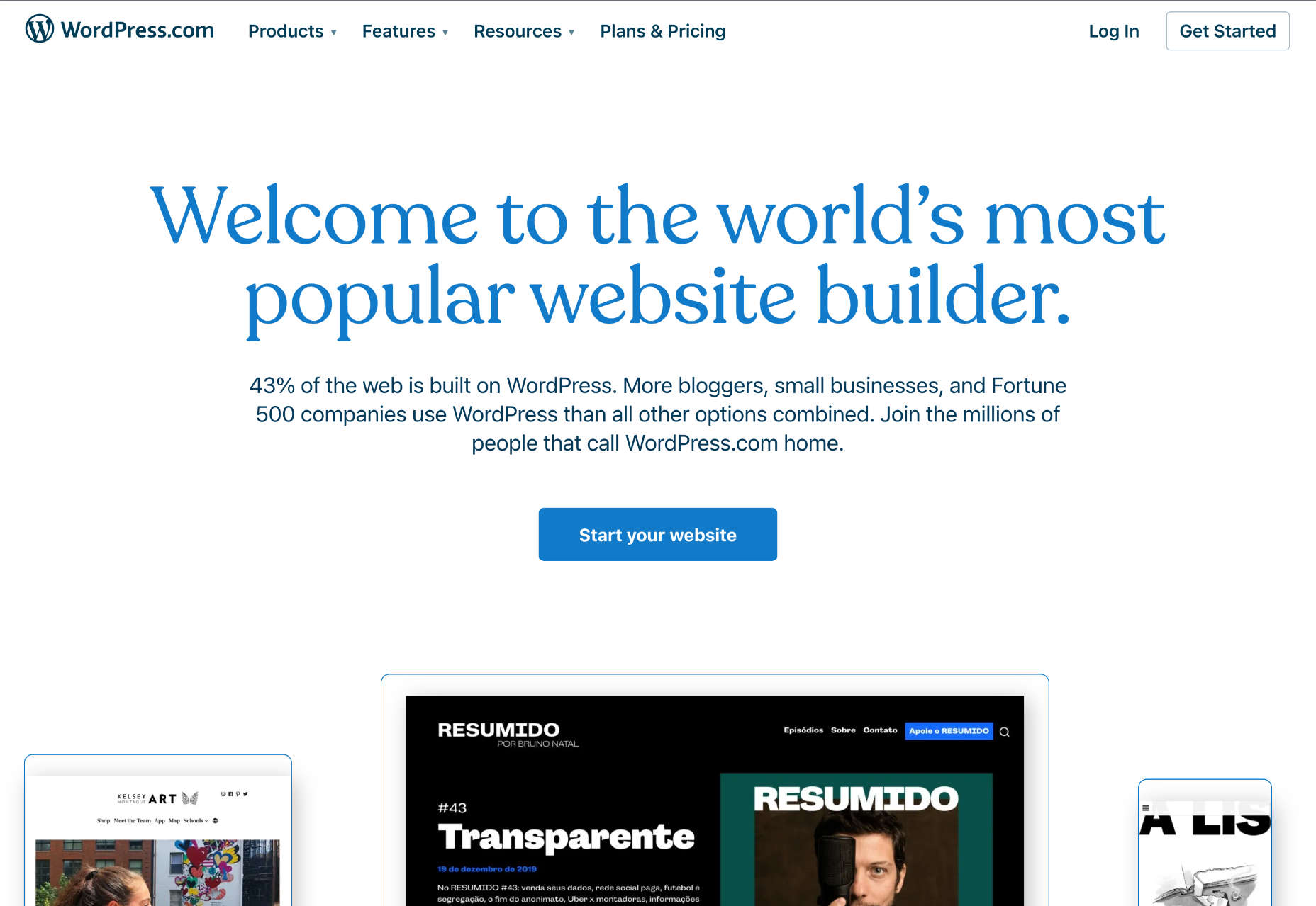
WordPress.com: Best WordPress Website Builder
WordPress is a juggernaut of an app; its rise has been unstoppable, and 43% of the web is made up of WordPress sites. Furthermore, WordPress.com — not to be confused with WordPress.org — is a WordPress site builder. That means all you need to do is log in and have all the power and flexibility of WordPress at your fingertips.
The downside to all this power is that WordPress.com is a big step up in complexity from most of the site builders on this list. It’s not as complex as its self-hosted sibling, but you’ll still need to spend some time getting acquainted with the advanced features.
You’ve probably heard that WordPress is insecure. We’re sorry to say that’s true. WordPress’ main vulnerability is its third-party themes and plugins — the commonality of a WordPress site means criminals consider it worth exploiting. WordPress.com web hosting is considerably more secure than self-hosted WordPress.org, but hey, it’s still WordPress.
But if you decide the security risk is acceptable, WordPress.com offers an ecosystem of themes and plugins unparalleled for its range and variety.
WordPress.com Features
Huge Ecosystem
WordPress has a vast ecosystem, perhaps the largest of any design software. There are thousands of professionally designed themes, and over 50,000 plugins, providing enormous scope for customization.
When vulnerabilities are found, more often than not, it’s the result of a flaw in a plugin update. So if you install a lot of plugins, you are exposing yourself to increasing security risks.
Unfortunately, in order to take advantage of the WordPress ecosystem, you need to be on one of WordPress.com’s higher-priced plans.
Secure Web Hosting Service
WordPress sites are notoriously insecure, but WordPress.com solves most of the issues thanks to a dedicated security team.
Drag-and-Drop Editor
The whole WordPress community has been working on evolving the design process from coded templates to a drag-and-drop editor called Gutenberg. Gutenberg started out small, but it gets better all the time and now offers a good level of design control without overwhelming beginners with too many options.
Pros
- Generous free plan
- Intuitive drag-and-drop editor
- No installation required
- Great live chat support
- Ideal for blogging
- 50,000+ plugins
- Vast number of templates
- Secure web hosting service
Cons
- Unintuitive
- Slow page-load times
- Persistent security concerns
- Premium templates and plugins are restricted to more expensive plans.
- SEO locked behind more expensive plans
Pricing
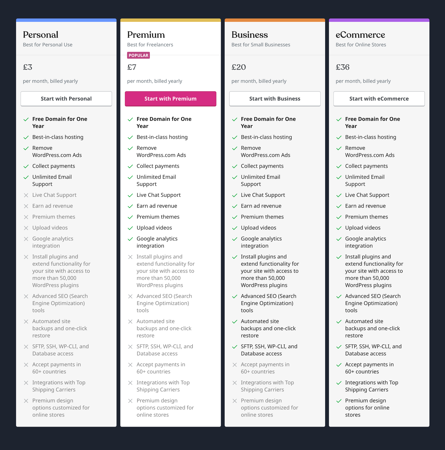
There is a generous free plan that is ideal for getting started. Beyond that WordPress.com offer four price tiers. You can save up to 50% by paying annually instead of monthly.
Note: many of WordPress.com’s best plugins are not free; make sure you budget for the cost of any plugins you intend to use.
Personal: $4 per month — Remove WordPress.com ads, collect payments
Premium: $8 per month — Remove WordPress.com ads, collect payments, earn ad revenue, install premium themes, Google Analytics integration
Business: $25 per month — Remove WordPress.com ads, collect payments, earn ad revenue, Google Analytics integration, install plugins, automated site backups.
eCommerce: $45 per month — Remove WordPress.com ads, collect payments, earn ad revenue, Google Analytics integration, install plugins, automated site backups, accept payments in 60+ countries, top shipping carrier integration, premium design options.
WordPress.com also provides WordPress VIP, an enterprise-grade package that starts at $25,000 per year.
Bottom Line
Opting to use WordPress.com boils down to one thing: building a website with the WordPress ecosystem. That means you must select at least the Premium price tier (to install premium themes) or the Business price tier (to install plugins). As a result, WordPress.com, on the lower packages, has limited appeal.
WordPress.com is one of the better choices on this list for blogging. If you hope to attract a lot of organic traffic from search engines, then WordPress.com’s blogging heritage will serve you well.
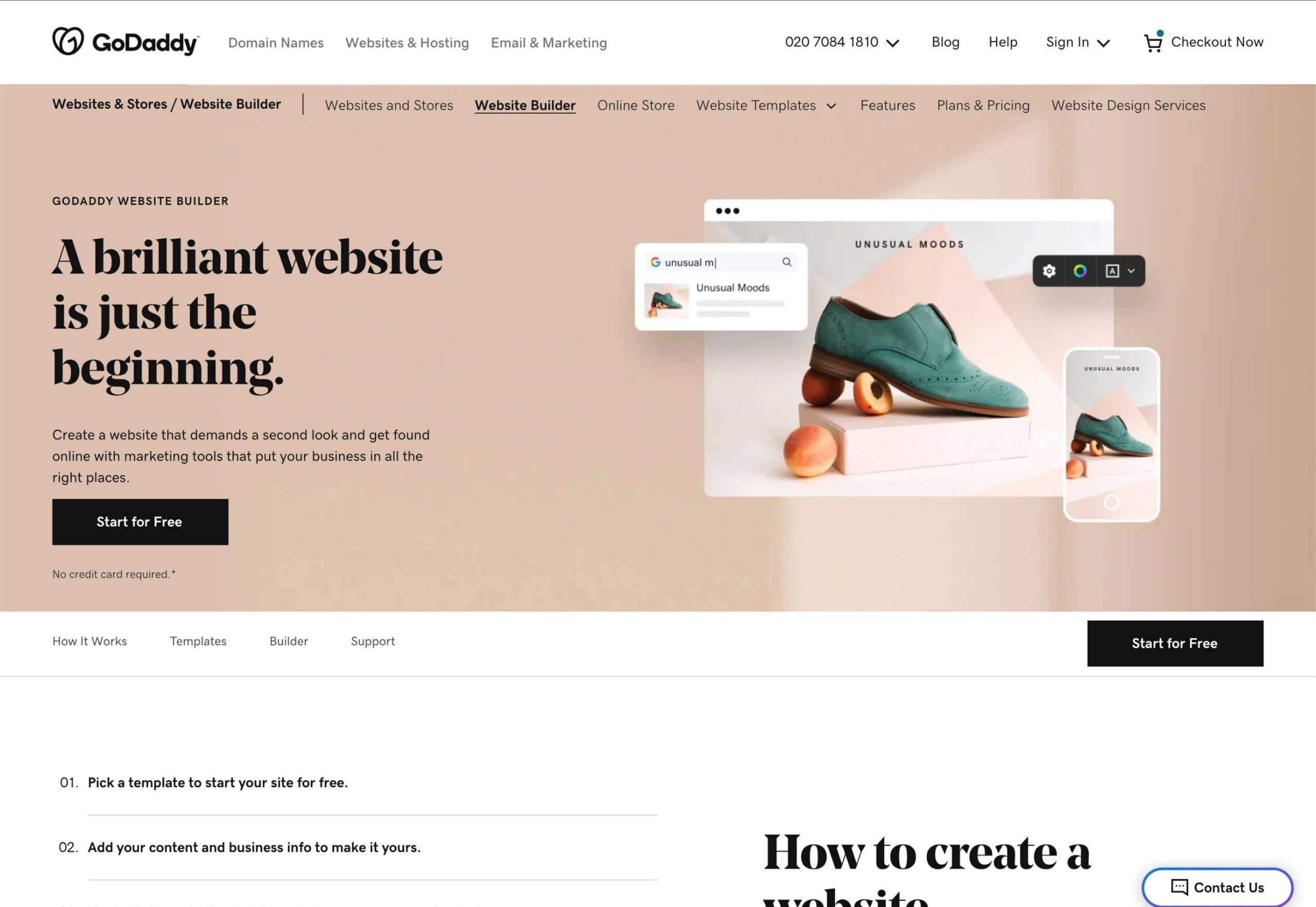
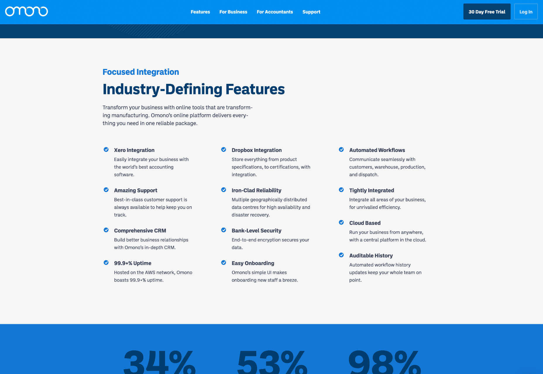
GoDaddy: Best Website Builder for Marketing
GoDaddy is best known for website hosting but does not have the best reputation regarding reliable software; however, its web builder dispels that myth by producing good quality code and decent page speed.
Unfortunately, it achieves its performance by limiting your design options. For example, you can’t add individual elements to your site; you must add whole sections and customize them. However, suppose you don’t feel particularly confident with design. In that case, having someone else make those decisions for you can be a real bonus.
A big flaw with GoDaddy’s ecommerce features is that the checkout isn’t hosted under your domain name; it’s hosted on a third-party website. Consumers are increasingly concerned about scams, and the site URL changing this way can feel like a real red flag.
GoDaddy website builder has a version control system built in. This helpful feature allows you to revert back to an older version of your site. So if you make a change, undoing it is just a couple of clicks. That’s great for websites that want to make temporary, seasonal changes to their website and then revert back to the everyday design.
GoDaddy Features
AI-Powered Advice
GoDaddy uses a surprisingly effective AI to offer advice, helping you to establish an online presence and boost your business.
Integrated Marketing Features
GoDaddy has some of the most comprehensive marketing tools of any website builder. SEO, social media, and email marketing can all be employed to connect with and retain customers.
Hundreds of Themes
GoDaddy offers hundreds of customizable themes that you can edit with no technical skill or experience.
Free Image Library
Lots of businesses struggle with images when they first start out. GoDaddy has a built-in library of professional images that you can use until you have your own.
Pros
- Award-winning 24/7 support
- Very simple to use
- Quick build process
- Add-on tools
Cons
- No plugin store
- Limited SEO, especially on lower plans
- Limited styling options
- Ecommerce checkout hosted elsewhere
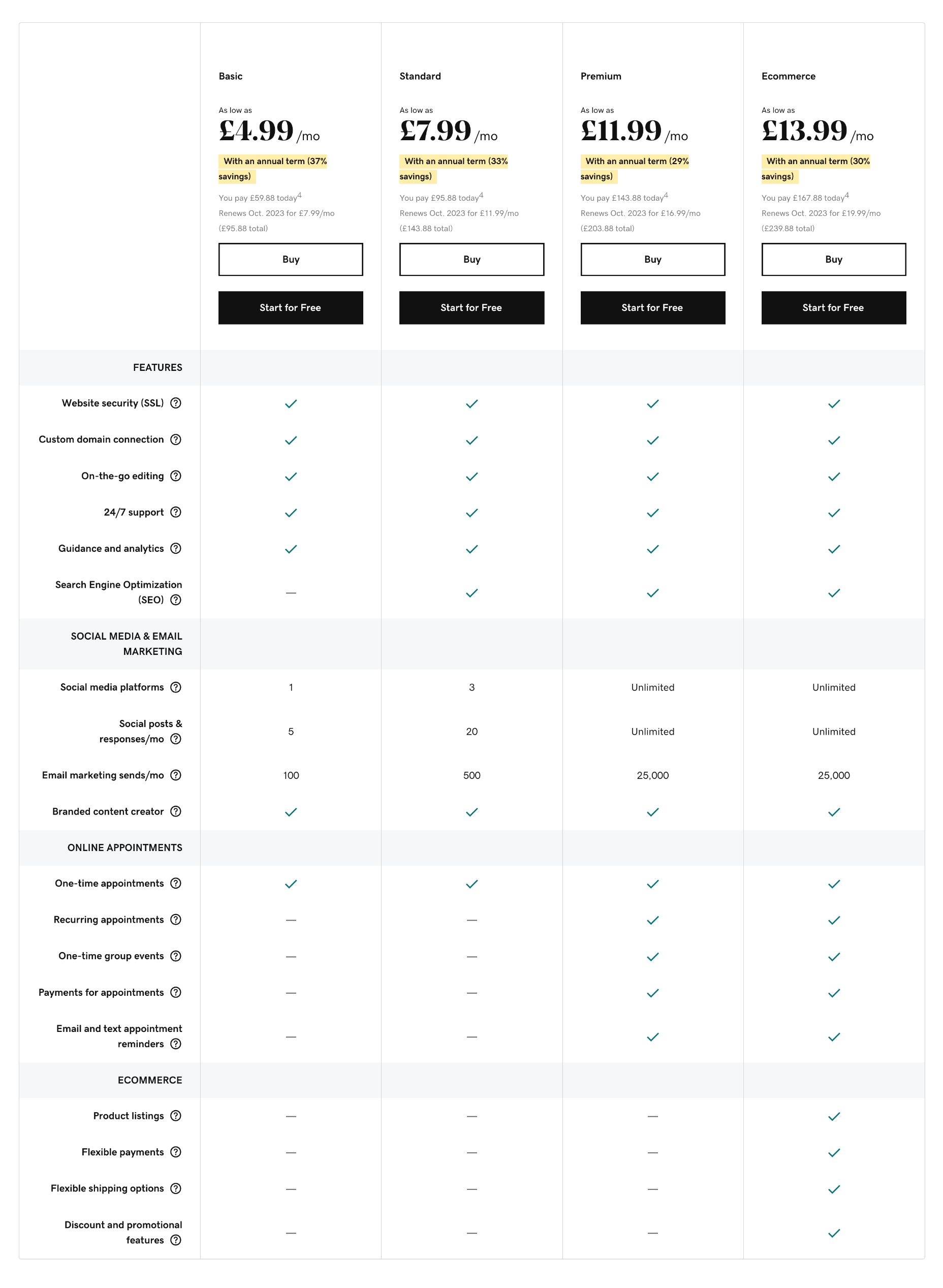
Pricing
GoDaddy offers four simple pricing tiers. You can save up to 37% by paying annually instead of monthly.
Note: The availability of GoDaddy Plans varies depending on your territory.
Basic: $9.99 per month — 1 social media platform, 5 social posts per month, 100 email marketing sends per month
Premium: $14.99 per month — Unlimited social media, 25,000 email marketing sends per month, SEO tools, group events, paid appointments
Ecommerce: $16.99 per month — Unlimited social media, 25,000 email marketing sends per month, SEO tools, group events, paid appointments, product listings, flexible payments, promotional features
Bottom Line
GoDaddy isn’t the best overall website builder, and neither is it the cheapest website builder. But it is a good, solid, middle-of-the-road choice for small businesses.
Where GoDaddy website builder does excel is in the business tools that come with its site builder platform. Its marketing tools are excellent, and its new AI-powered hints are a great way of guiding you toward a profitable site.
Wrap all of this up at a competitive price, and GoDaddy is worth a look if you want to do all your web design and promotion in one place.
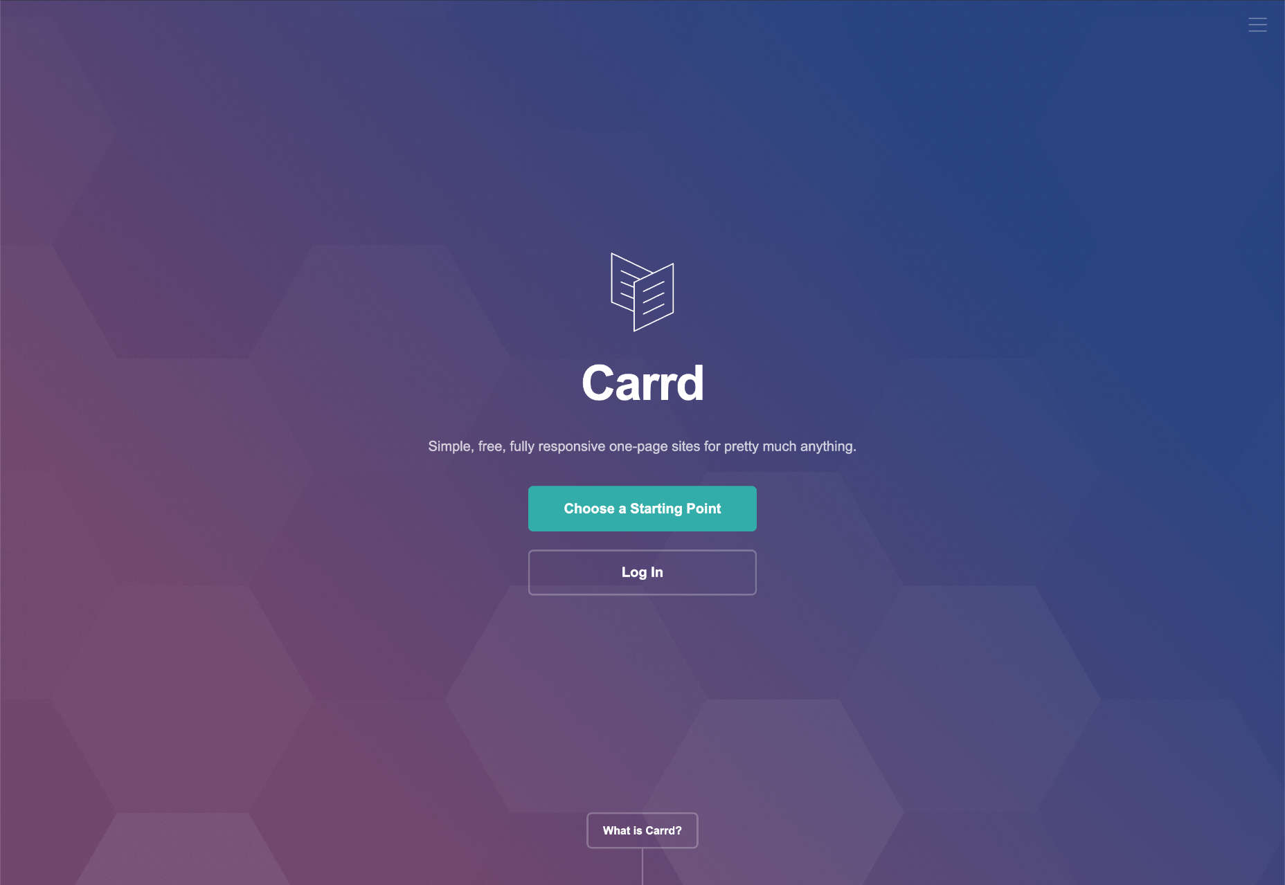
Carrd: Best Website Builder for One-Pagers
Carrd is website builder software for anyone building a one-page site. One-page sites are ideal for product microsites, event sites, small companies, time-limited promotions, contact forms, and many other websites.
One of the most complicated tasks when a software company sets out to create a website builder is navigation. Carrd circumvents that problem by eliminating the need for navigation, which results in a more straightforward UI, compact code, and faster page speeds.
There is a bit of a learning curve with Carrd. For example, it helps if you understand the basic principles of CSS. But if you don’t, the documentation will help. And getting to the nuts and bolts under the hood of your site can give you a real sense of ownership.
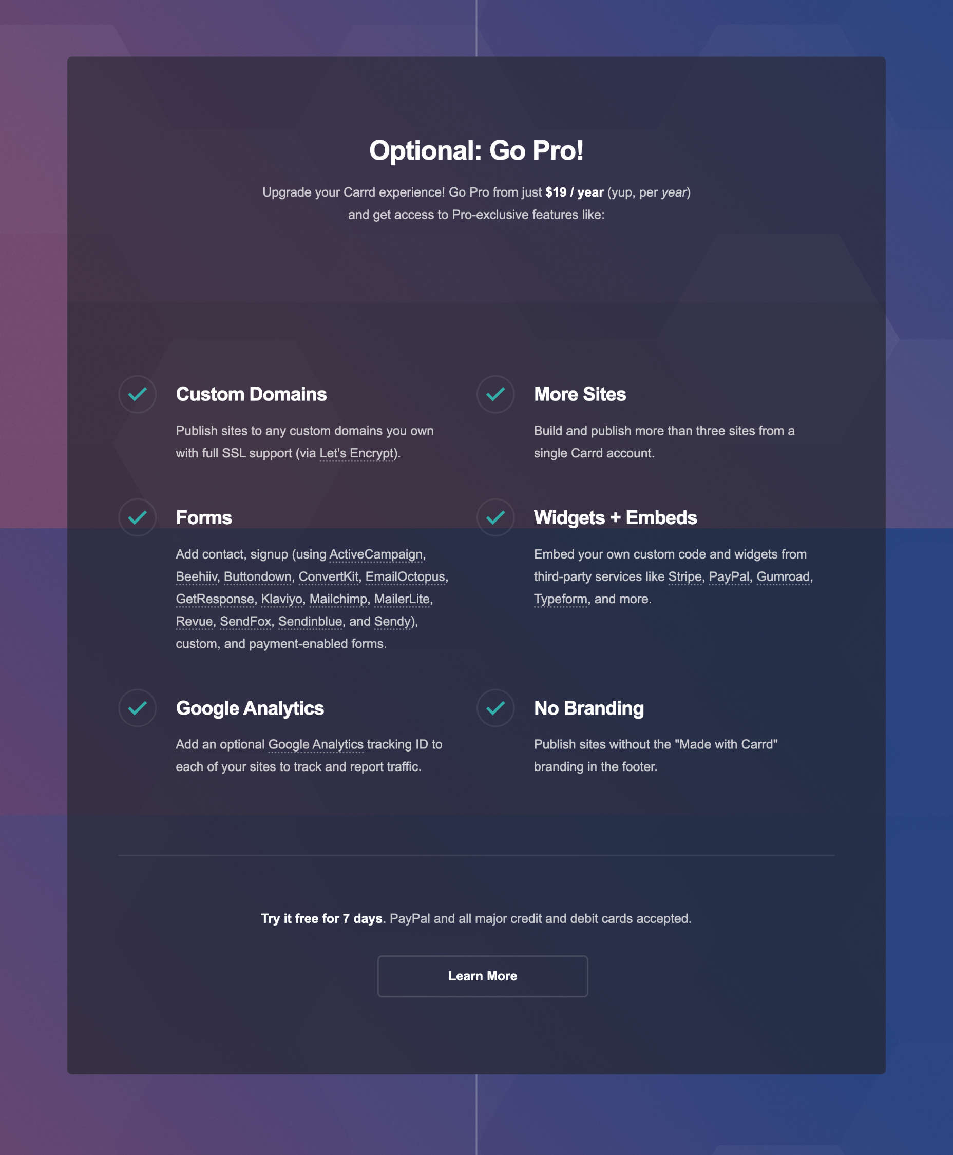
Carrd allows you to build and publish three sites for free. But if you want to publish more than three and use pro features like custom domains, it will charge you $19 per year — that’s just $1.58 per month.
Carrd Features
Sensational Value
Carrd is one of the cheapest website builders around. At just $19 for an entire year, you normally struggle to find plain web hosting this cheaply.
The price reflects the limited feature set — Carrd lacks the marketing and SEO tools that the top website builders have — but for many small businesses who just want to establish an online presence quickly, a one-page site is exactly what they need.
Custom Code
Unlike many of the premium website builders on this list, Carrd allows you to use custom code on its sites.
Custom code requires a little more knowledge than the average site builder, and many people prefer a drag-and-drop interface. However, adding custom code to Carrd is far easier than adding it to Shopify, for example.
Widgets
Carrd refers to its plugins as widgets. It doesn’t have a full app market or ecommerce features, but you can add widgets from services like Stripe and PayPal to expand the capabilities of your Carrd site.
Pros
- Very low cost
- Perfect for one-page sites
Cons
- Steeper than expected learning curve
- Limited to one-page sites
- No free domain or free SSL certificate
Pricing
Carrd allows you to publish three branded sites for free. It only has one paid plan, which is billed per year. Carrd also provides a free seven-day trial.
Note: Carrd’s Pro plan allows you to build multiple sites.
Carrd Pro: $1.58 per month (billed annually at $19) — build more than three sites, custom domains, signup forms, payment forms, Google Analytics, widgets, custom code
Bottom Line
Carrd is an excellent website builder that outputs solid production code. If you need to get a one-page site online fast, then Carrd is a perfect choice.
At just $19 for a whole year, Carrd is one of the best-value website builders on this list.
Unfortunately, one-page sites typically have a limited lifespan, and sooner or later, you’ll want to expand. At this point, Carrd will cease to be a viable option and you’ll have to look at other website builders.
But at this price, you could have a one-pager up in the next 15 minutes. That’s hard to knock.
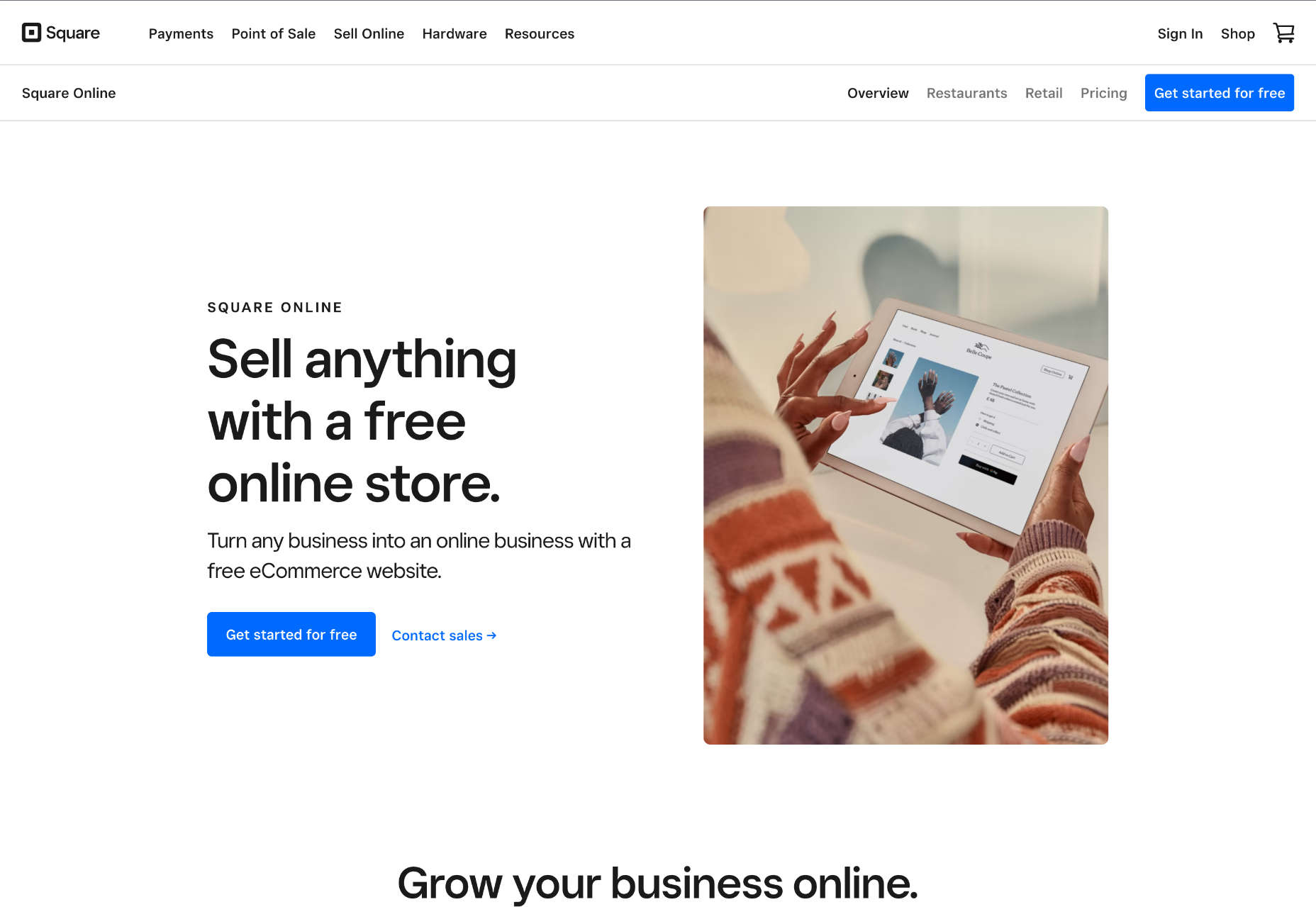
Square Online: Best Website Builder for IRL Businesses
Square Online is part of the Square product range that includes one of the most popular PoS (Point of Sale) solutions. Square Online is an excellent option for brick-and-mortar businesses that exist IRL (In Real Life). It’s also one of the few entries on this list that qualifies as a free website builder.
Square acquired the Weebly website builder in 2018 and redeployed staff to develop Square Online. Although Weebly continues to exist, all development seems channeled into making Square Online’s ecommerce features the best option for building an online store.
Square Online is more straightforward than Shopify for building an online store and offers a range of tools to integrate online and offline business.
Square Online is perfect for businesses that need an online store but feel website building is too technical. Its broader ecosystem of business tools means you can do everything digital in one place, with a consistent set of UIs and workflows, which makes things easier.
Square Online Features
POS Migration
If you’re already a customer of Square’s PoS (Point of Sale) products, then you can export your inventory from your PoS device and import it into your online store, saving yourself hours while ensuring that your products are synced.
Multichannel Sales
Square Online is just part of the Square group of products. Consequently, your sales aren’t limited to your website. As well as the obvious PoS option, Google, Instagram, and Facebook integrations are available.
Restaurant Tools
Square is particularly well-suited to restaurants, bars, and cafes. It provides scheduling software, team management, and loyalty cards, all of which make running a service business online a cinch.
Pros
- Simple e-commerce features
- Intuitive UI
- Integration with the Square ecosystem
- Generous free plan
Cons
- Limited design options
- Lengthy website building process
Pricing
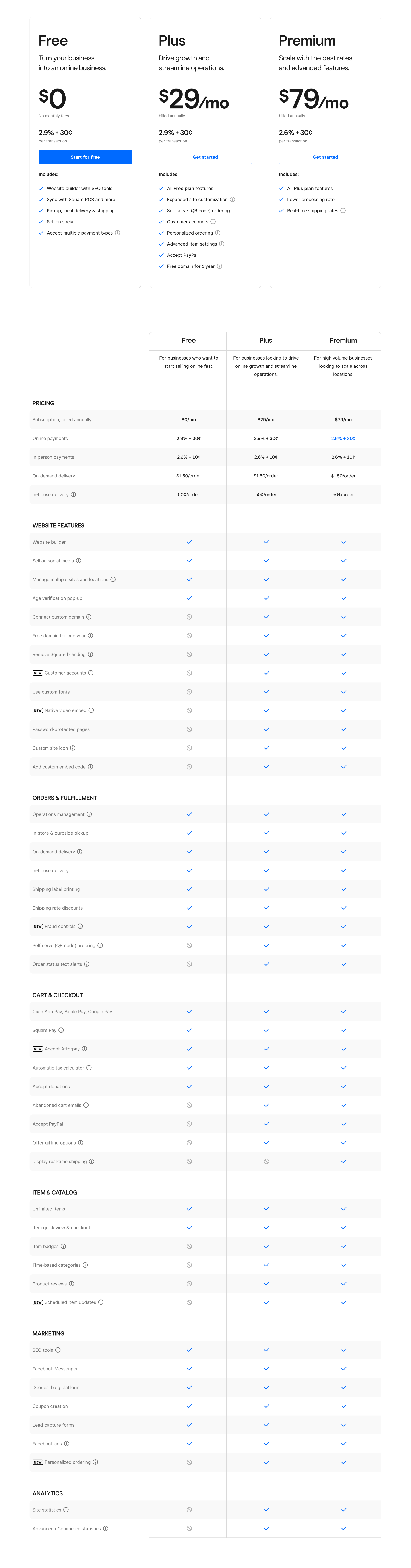
Square Online offers three price plans, all of which are priced monthly but billed annually. Its lowest-priced tier is free, except for card processing fees.
Note: different pricing plans are available in different territories.
Free: $0 per month — Unlimited products, sell on social media, SEO tools
Plus: $?? per month (billed annually) — Free tier features, Advanced item settings, Accept PayPal
Premium: $?? per month (billed annually) — Plus tier features, reduced processing rate, real-time shipping rates
In addition, Square Online offers an enterprise solution for high-volume, multi-location businesses. Contact Square directly for pricing.
Bottom Line
With the financial backing of its parent company Square Online has the resources to evolve into a world-leading website builder; it just hasn’t gotten there yet.
Like a couple of other website builders on this list, Square Online is aimed directly at anyone who wants to build an online store — or, in fact, commerce in general. So you should look elsewhere if selling online isn’t central to your site.
But suppose you’re already invested in the Square ecosystem with PoS devices in physical locations. In that case, using Square Online is a no-brainer.
And if you’re willing to look past some of the design restrictions in favor of good customer service and the potential of a growing platform, then Square Online is a solid choice too.
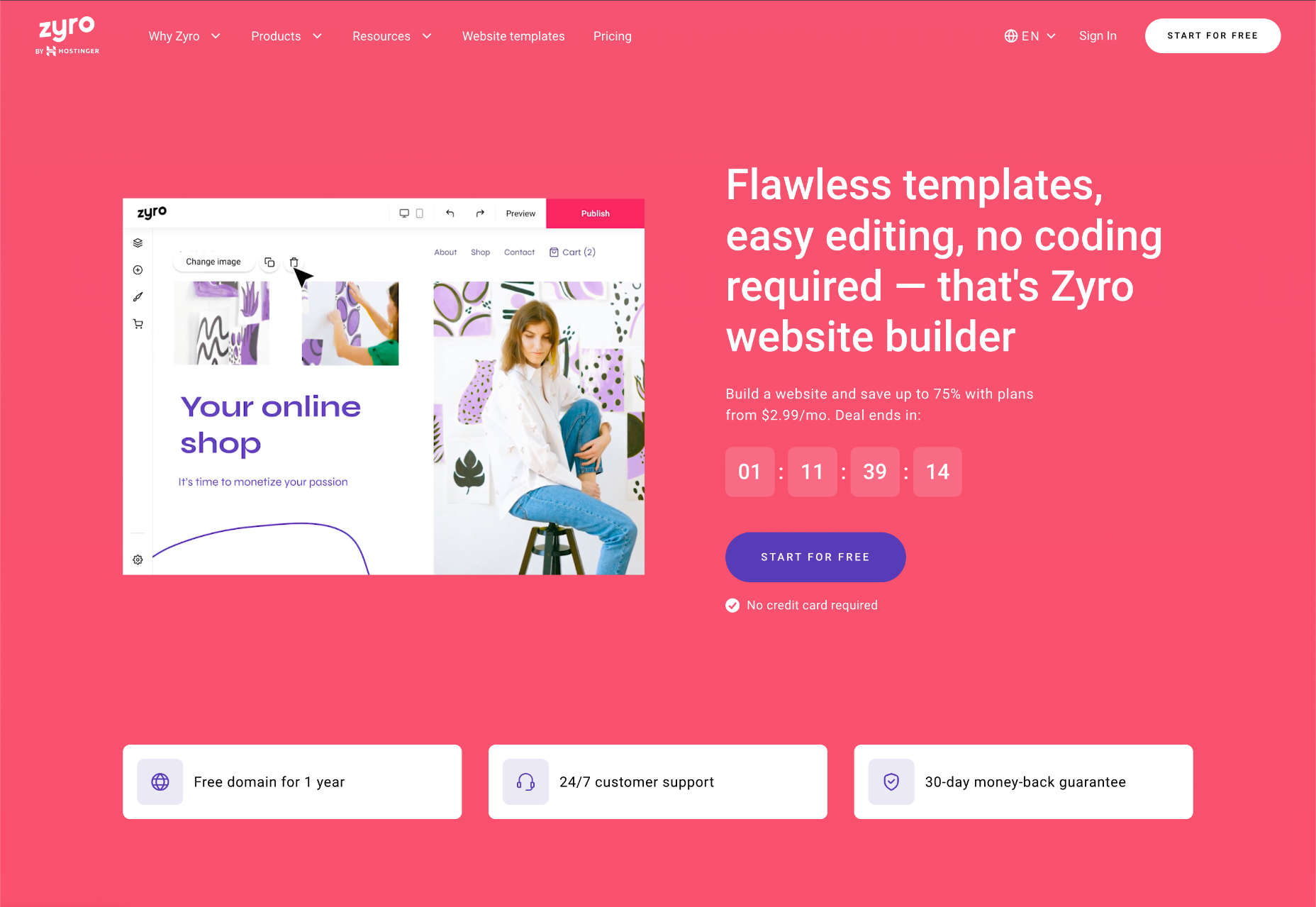
Zyro: Best Budget Website Builder
Zyro is exceptionally cheap, especially for building an online store. But don’t let that fool you into thinking Zyro website builder is low on quality. On the contrary, hidden behind the low-ball sales pitch is a competent website builder with many features.
Zyro gives you complete control over the placement of your content, something that only Wix can rival.
Zyro offers an outstanding balance of powerful customization but not too many tools, so you won’t be overwhelmed by all the options.
Zyro doesn’t have a built-in app store like some rivals, which means you have limited options to expand the functionality of your site. However, it does offer some third-party integrations to services, so you’re not entirely without options.
Zyro Features
Intuitive Editor
Zyro does a tremendous job of getting new businesses online because you don’t need any experience to use this very simple site builder.
Unlimited Storage & Bandwidth
Many website builders usually scrimp on the extras and claw back a little money by charging extra for hosting. Not so Zyro, which provides unlimited storage and bandwidth.
Branding Tools
Zyro includes a logo maker, so if you’re starting from scratch, you can get give yourself some professional gloss with a shiny new logo.
Pros
- Affordable
- Great value ecommerce
- Responsive templates
- High-level control of design elements
- Live chat support
- Drag-and-drop editor
Cons
- Basic blog options
- Only basic SEO tools
- No built-in app market
Pricing
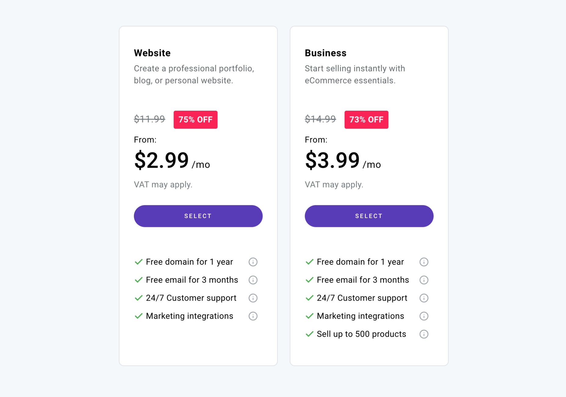
Zyro offers two price plans, one for simple small business websites and one for ecommerce.
Note: Zyro offers regular discounts of up to 75% off its packages. These discounts are time-limited, but once they expire, they reset. So you won’t miss out if you decide to think it over.
Website: $2.99 / month — free domain, free email for 3 months, marketing integration, logo maker
Business: $3.99 / month — All of the features of the Website tier, plus sell up to 500 products
Bottom Line
With its AI-powered logo maker, fast build times, and simple options, Zyro is committed to getting you online fast.
We really didn’t like the deception of placing a fake countdown on the price discount. And hiding the increased renewal price in small print isn’t a good look for Zyro either. That type of blackhat UX doesn’t have a place on the modern web.
However, the prices beat almost everything except free website builder plans. In addition, Zyro’s ecommerce package is one of the most affordable options on the market, with an equally generous 1% transaction processing fee.
If you want to set up a side business over a weekend or even over your lunch hour, then Zyro is an excellent choice.
Website Builder FAQs
What is a website builder?
A website builder, or site builder, is a service for creating a website without any design or coding skills. The most popular website builders are designed to democratize the web by helping anyone build a website quickly and easily.
It sometimes helps to have some design ideas, and some website builders will allow you to add custom code if you want to, but neither is required.
With a website builder, all you need is the desire to create a website.
Are websites built with website builders as good as professionally built bespoke websites?
Because website builders are created with many potential uses in mind, they use generic source code. Unfortunately, this means that their code is typically less streamlined than a bespoke site.
However, over the past few years, the code quality that website builders generate has improved enormously. Now, many professional design agencies use website builders instead of coding their own websites.
If you have a very specialized site in mind, like a SaaS (Software as a Service, then even the best website builder won’t be able to create it. But for marketing websites and online stores, website builders are an ideal way to build a website.
How much do website builders cost?
The cost of a website builder varies from product to product. There are free website builders available, but many of the top website builders charge a monthly fee.
For one of the best website builders, you can expect to pay a subscription based on the features you require. Expect to pay more for e-commerce features, marketing features, and a flexible drag-and-drop interface.
There are sometimes hidden costs, such as a card processing fee for online sales.
If you opt for a website builder that uses templates or plugins, you may need to pay for those in addition to the subscription.
You don’t need to pay for web hosting services; web hosting should be included.
Most website builders offer a limited free plan or a free trial, so you can test out features before opening your wallet.
Is a website builder suitable for a small business?
It depends on the nature of your business. For example, suppose you’re setting up an online store or a professional service like plumbing or landscaping. In that case, a website builder or perhaps a specialist e-commerce website builder could be ideal for you.
On the other hand, if you’re running a business like a car dealership or a travel agency — where you need lots of individual listings — that is a little beyond what website builders can do. In that case, you’ll probably need a complete CMS (Content Management System).
If you are building a complex app or SaaS, then sorry, but website builders can’t manage that; you’ll need to hire a professional developer or improve your coding knowledge.
How hard is it to use a website builder?
You don’t need web design experience to use a website builder; they are designed to get new businesses online without professional assistance.
Some website builders are more complicated than others. Typically, the more features there are, the more time you’ll need to familiarize yourself with the user interface. A website can be created quickly with a drag-and-drop editor, but you may find you need to put in a little more work if you’re creating an online store.
As a guide, if you can use email, a web browser, or a document processor like Word or Pages, you’ll be able to use a website builder to build a website.
Can you use a custom domain name with a website builder?
Custom domains, like myawesomewebsite.com, can usually be used with website builders.
Be aware that some website builders charge more for this option. But equally, you may be offered free domain name registration, at least for the first year.
Do I need web hosting services to use a website builder?
You don’t need to worry about a web host; that’s part of what you’re paying the website builder to provide.
Many website builders even host your site on CDNs (Content Delivery Networks), making your site faster for a global audience.
Depending on your package, most website builders restrict the storage space you can use (the total size of all of your files combined). Some website builders also limit the bandwidth you can use (the total size of all the files users access on your site combined).
Do website builders perform well on search engines?
Getting your site to page one on Google is the primary aim for most businesses.
Many professional techniques boost your site up search engine rankings, but they all boil down to publishing good content and fast page load times.
You’ll find plenty of blog posts online claiming that website builders output low-quality and slow code. This used to be true, but in recent years the code website builders’ output has improved significantly.
A good website builder (like the ones on this list) won’t guarantee good search engine ranking, but the top website builders include marketing features that will help.
How long does it take to build a website with a website builder?
Some website builders can get you online in under five minutes. Others require hours of build time.
Typically, the more complex a site is, the longer it will take. Ecommerce, for example, will take longer than a simple résumé webpage.
Additionally, websites are not a once-and-done task. You will need to update your site, change information, and add features throughout its life.
But you’ll find that most website builders make this easy by taking away the hard work. As a result, most first-time website builders discover that they enjoy making websites, and some even decide to become professional website designers!
What is a drag-and-drop editor?
A drag-and-drop editor is exactly what it sounds like. You drag an element into position by clicking on it, and you drop it into place by releasing the mouse button when it’s positioned as you want it.
A drag-and-drop editor is considered a premium feature of the best website builders, but some people do prefer to make changes with code or via a simple form interface.
Which is the best website builder?
There isn’t a catch-all approach to building a website. The right website builder for you might not be the right website builder for someone else.
As you can see from the list above, Wix is a solid all-rounder, whereas Shopify is excellent for creating an online store. However, there are many occasions when other website builders would be a better choice.
Sometimes it comes down to something as simple as feeling an affinity with the website builder’s philosophy. If you find a website builder intuitive and it provides all the features you need, it’s the right website builder for you.
Featured image by upklyak on Freepik
Source
The post 10 Best Website Builders for 2023 first appeared on Webdesigner Depot.
Source de l’article sur Webdesignerdepot

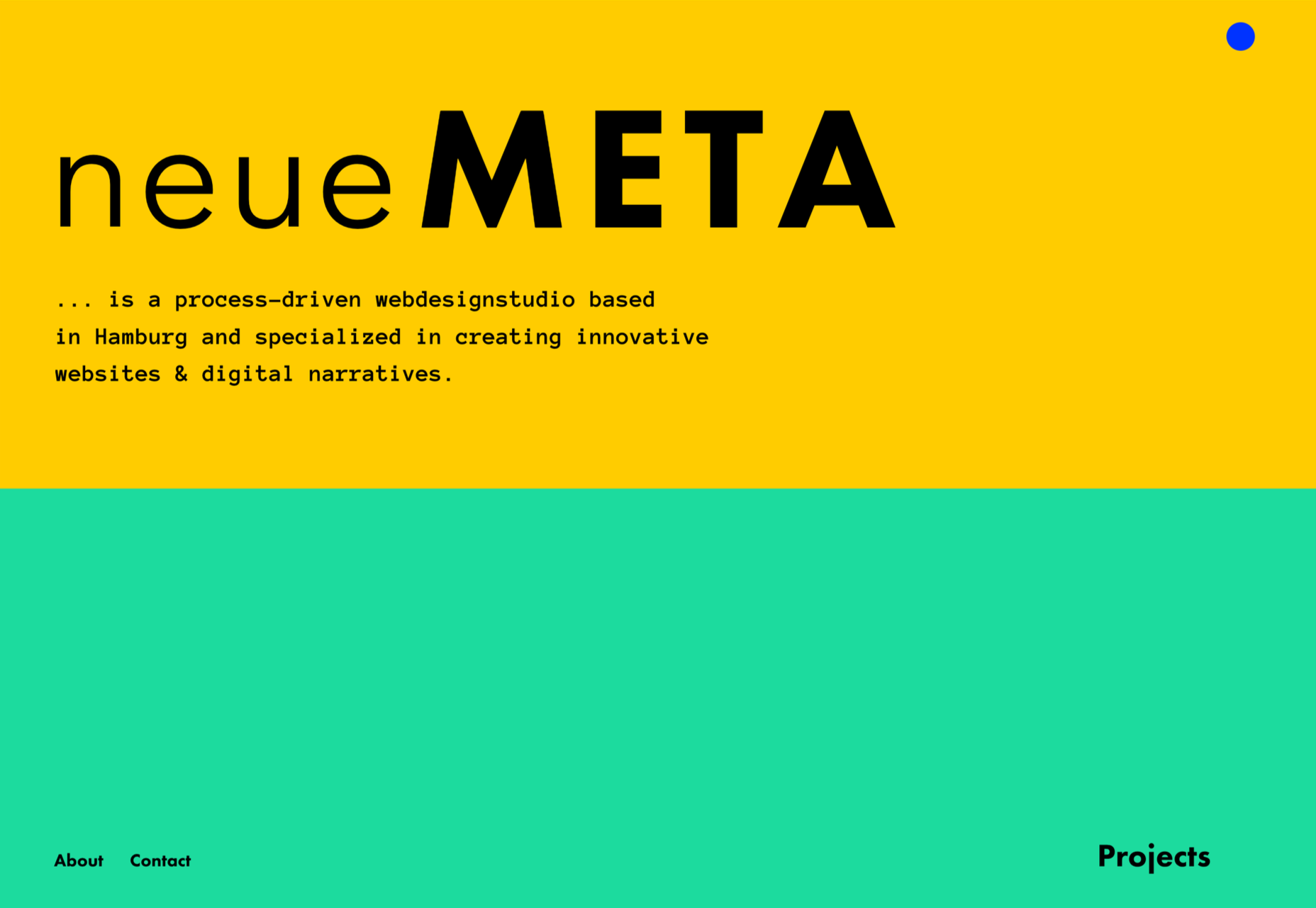
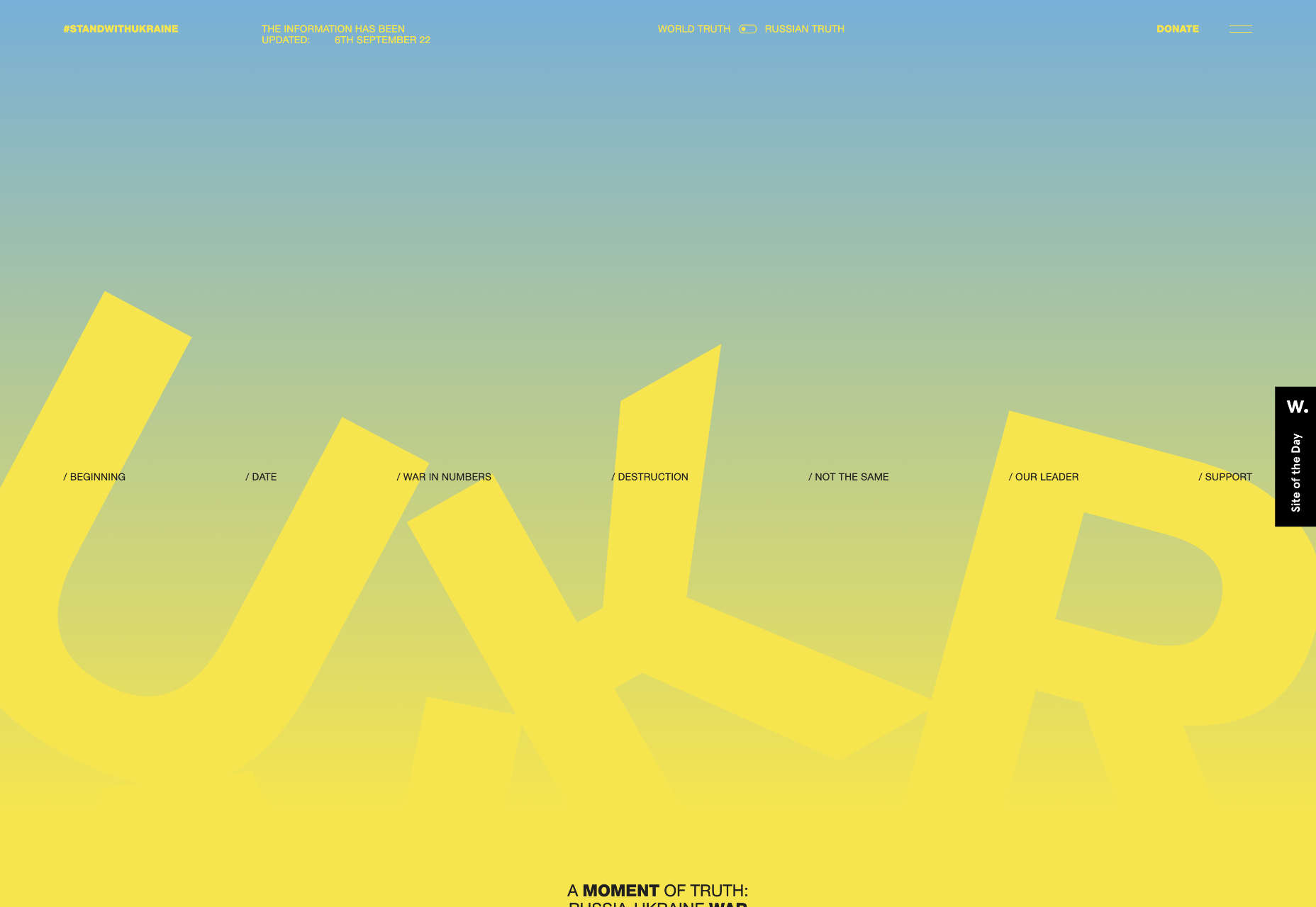
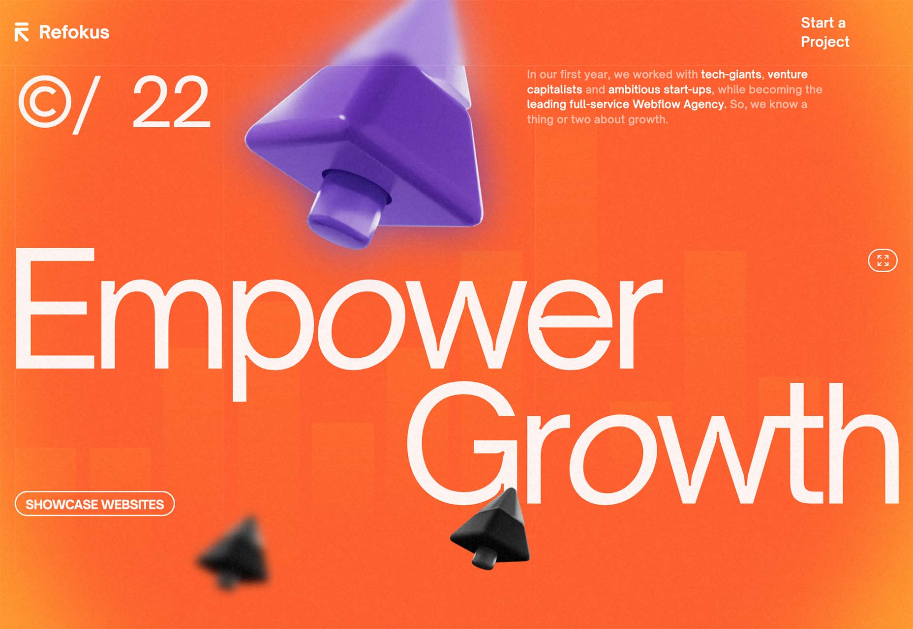
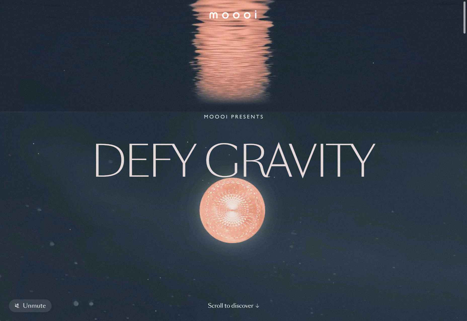
 We’ve seen some incredible websites in 2022. There have been more than the usual number of sites with a political mission, and plenty that made us want to travel. The big design trends were brutalism, huge typography, and bold positive color. We’re looking forward to what the web will bring in 2023, but in the meantime, take a look back at the best 50 websites of 2022. Enjoy!

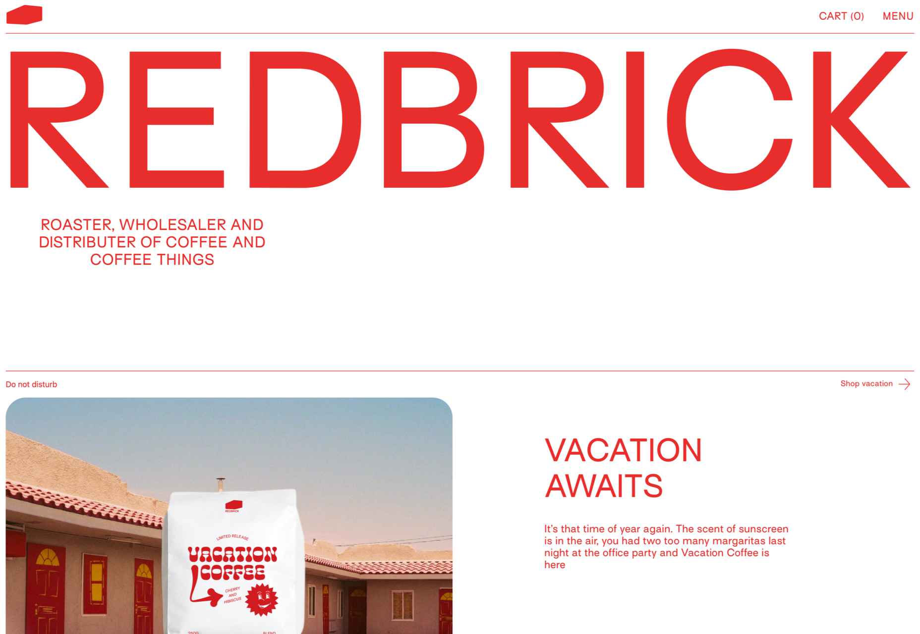


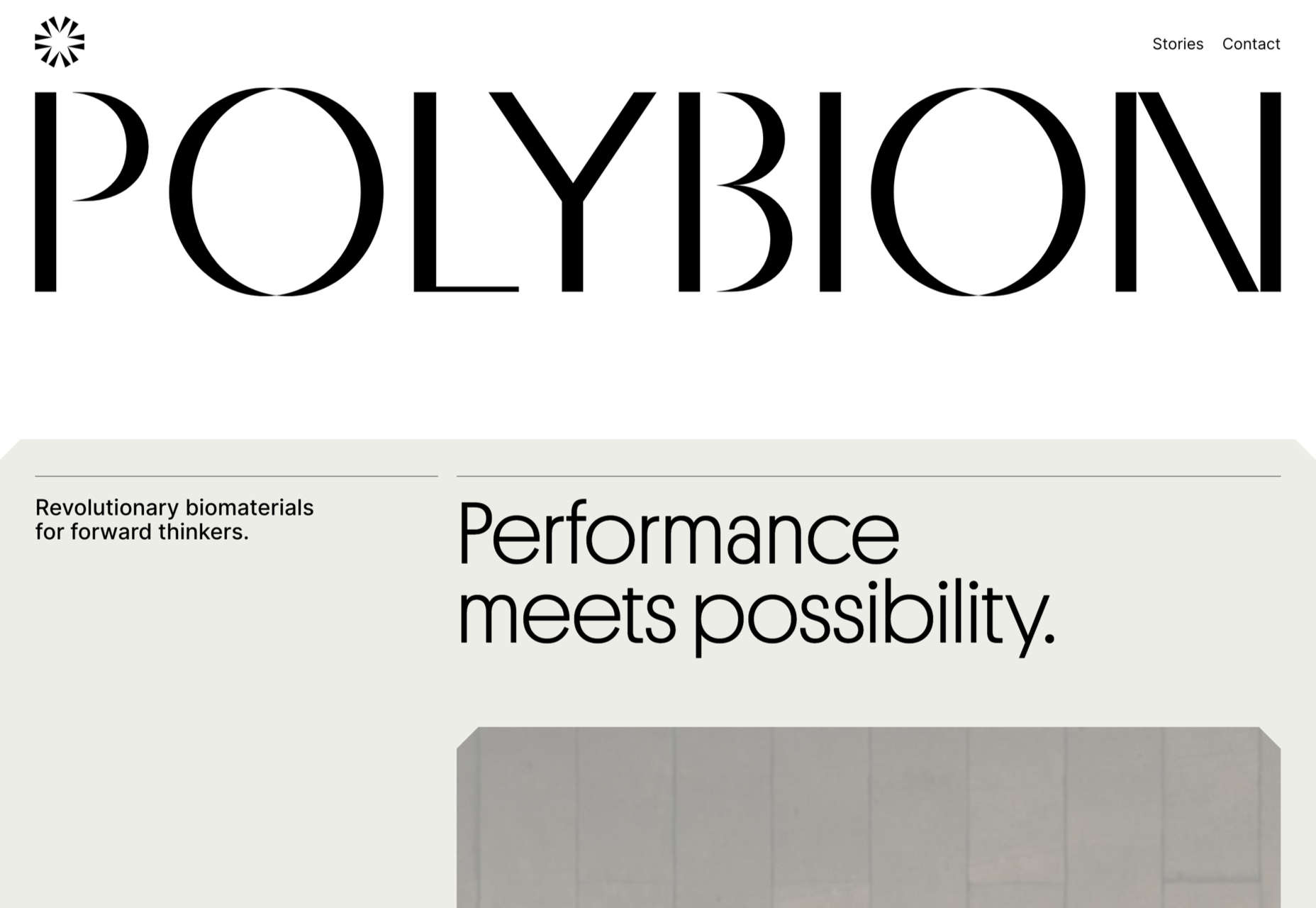
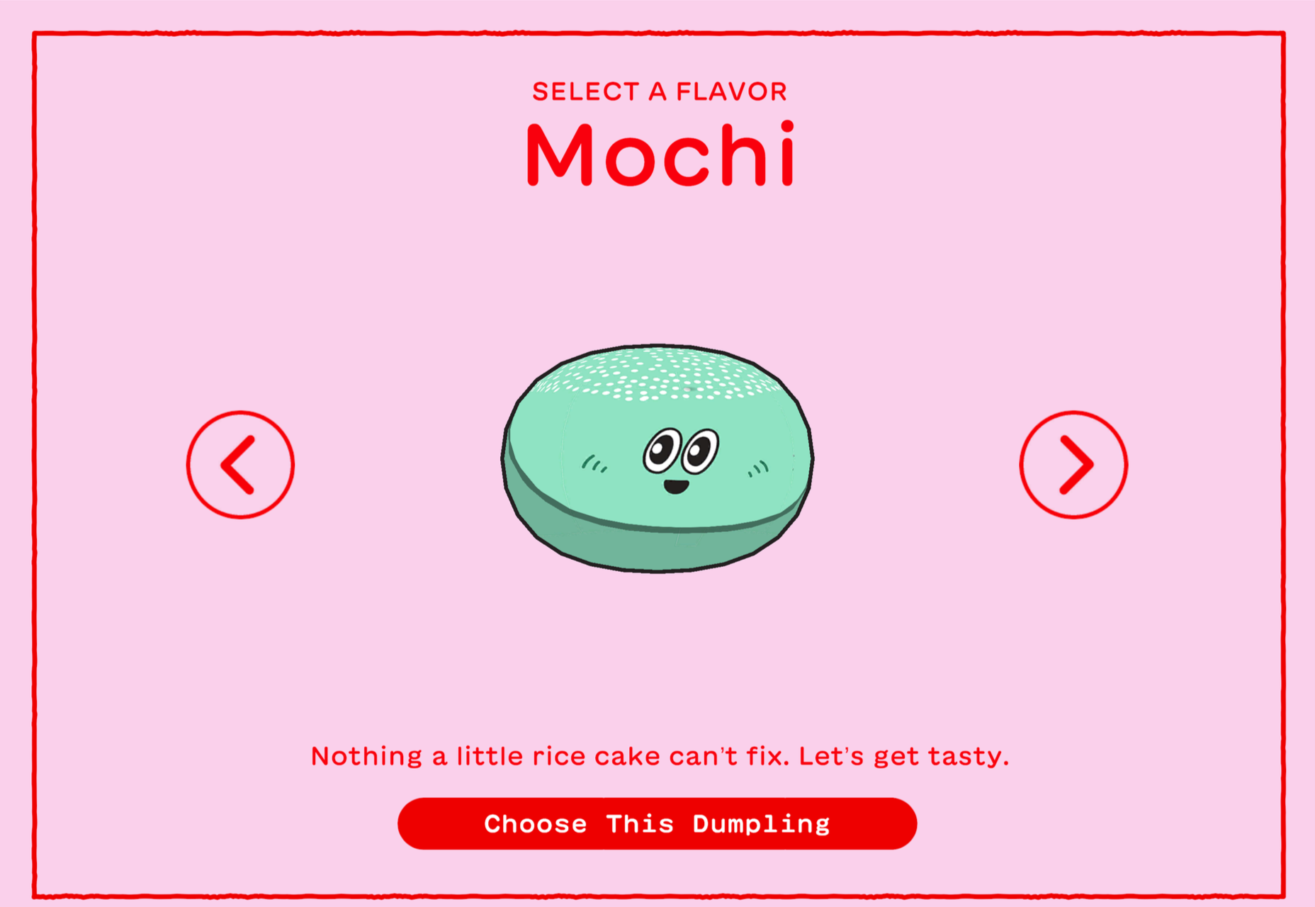


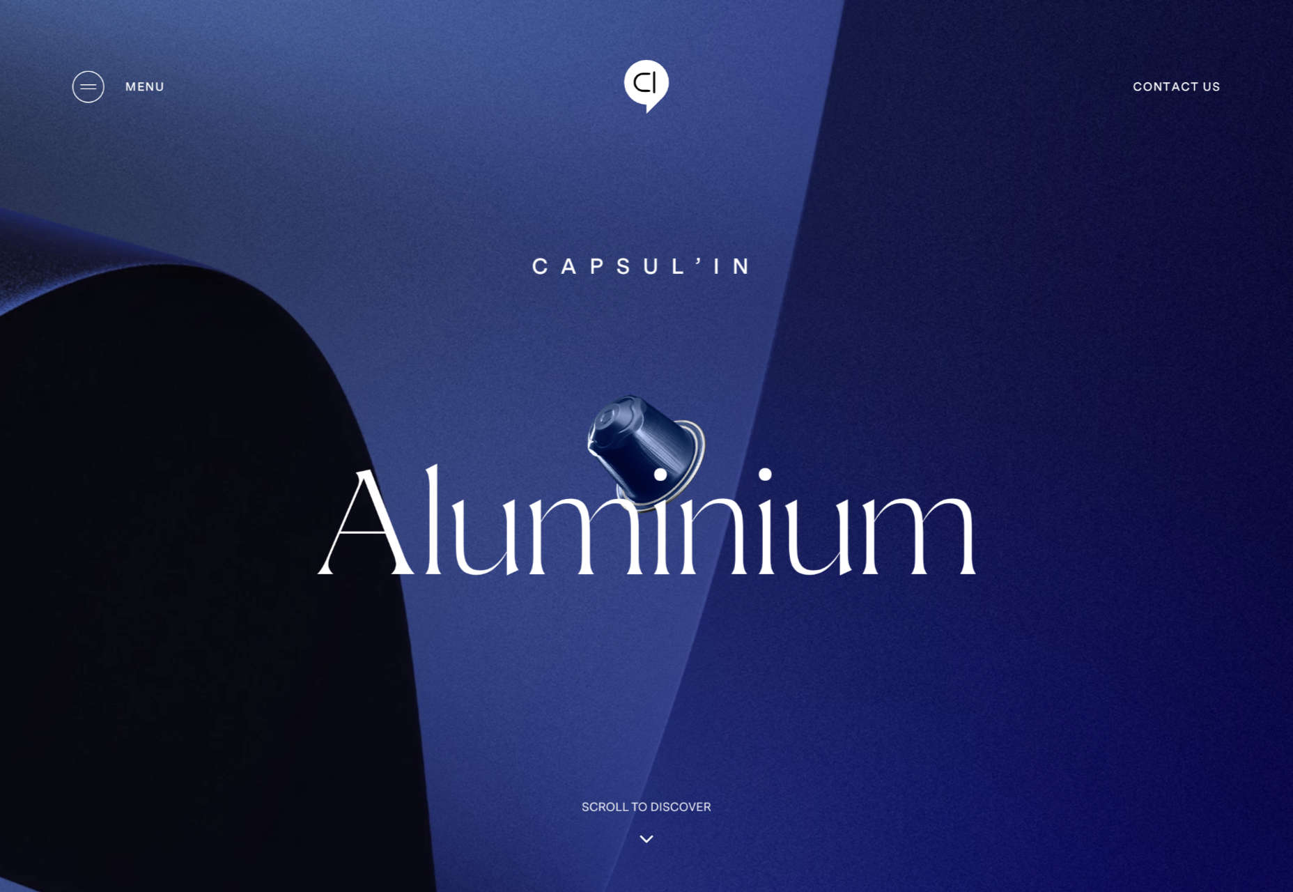
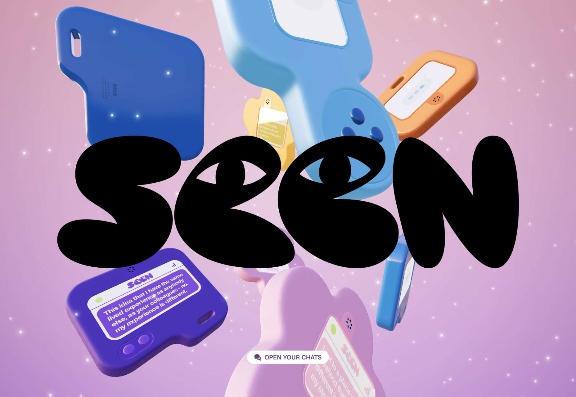


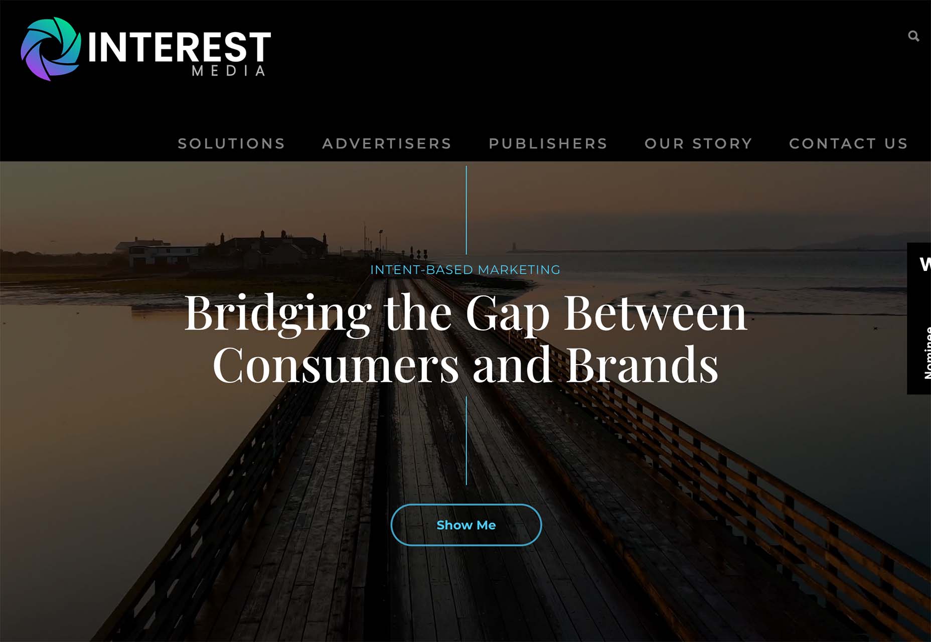
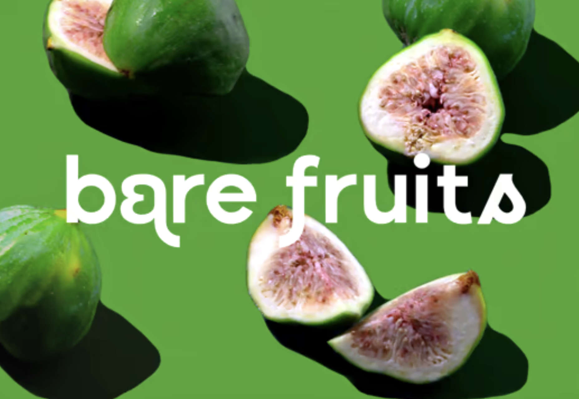
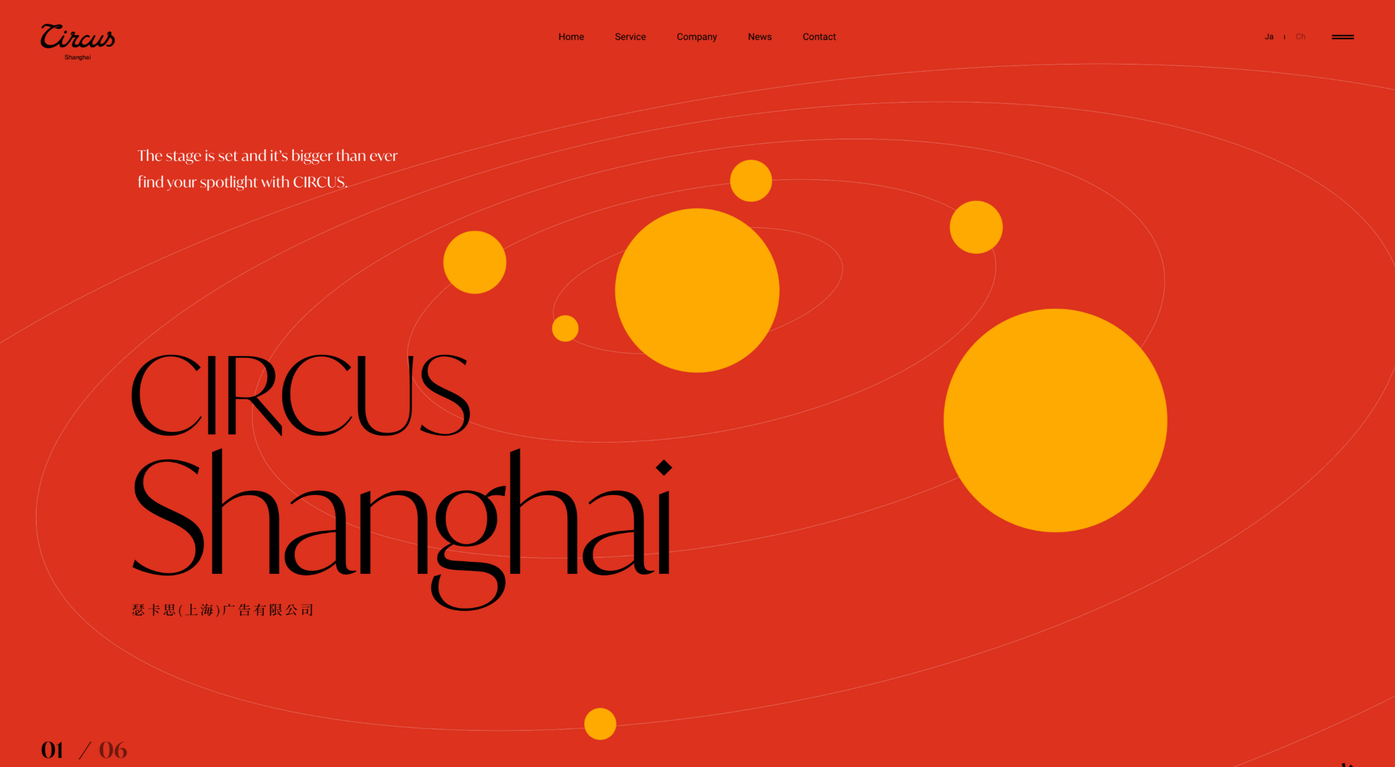
 Color and depth are key themes this month as we look at what design trends are happening across websites. Red is the primary color of choice, and you can see it almost everywhere; the new thing is that it’s being used in backgrounds and as more than an accent color. Additionally, 3D elements and depth of field are making significant impressions.
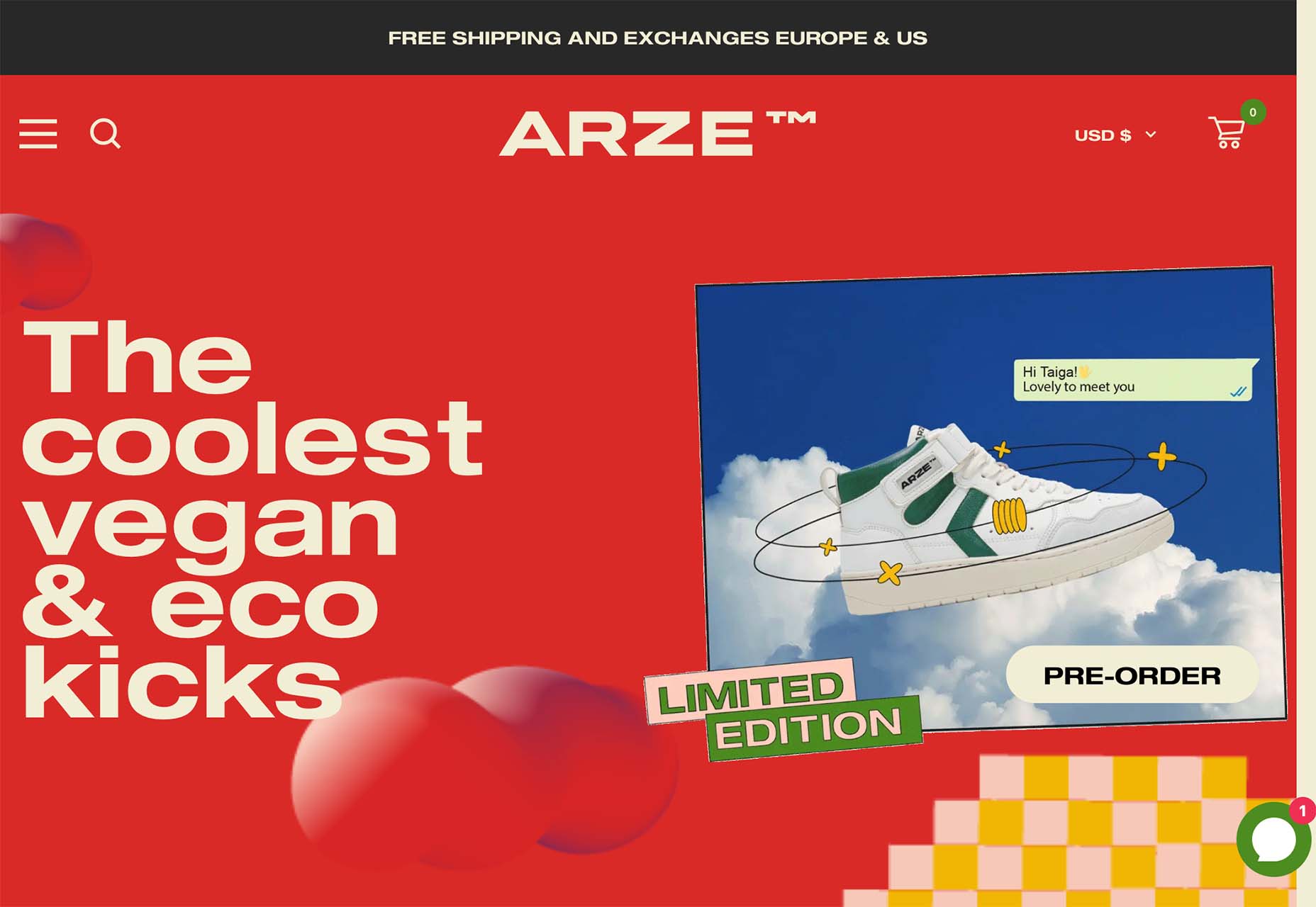


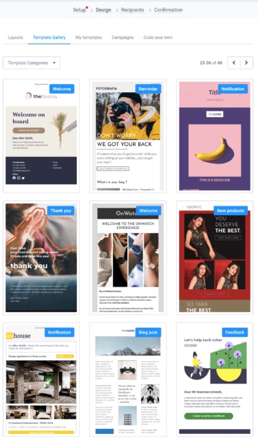
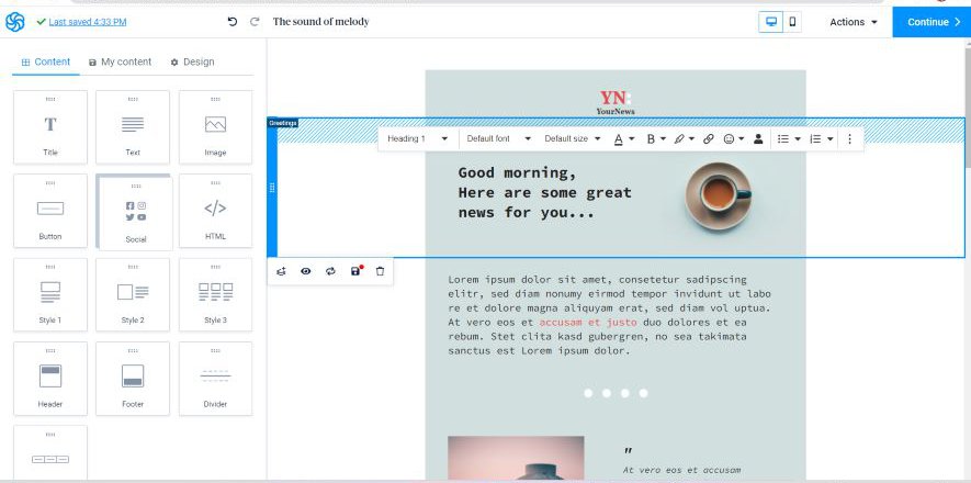
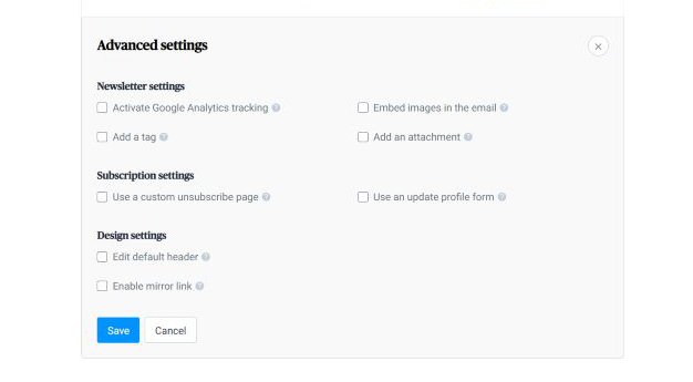
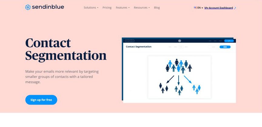
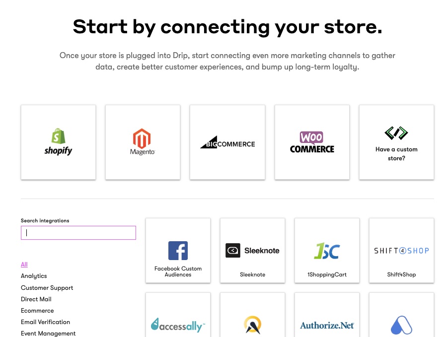
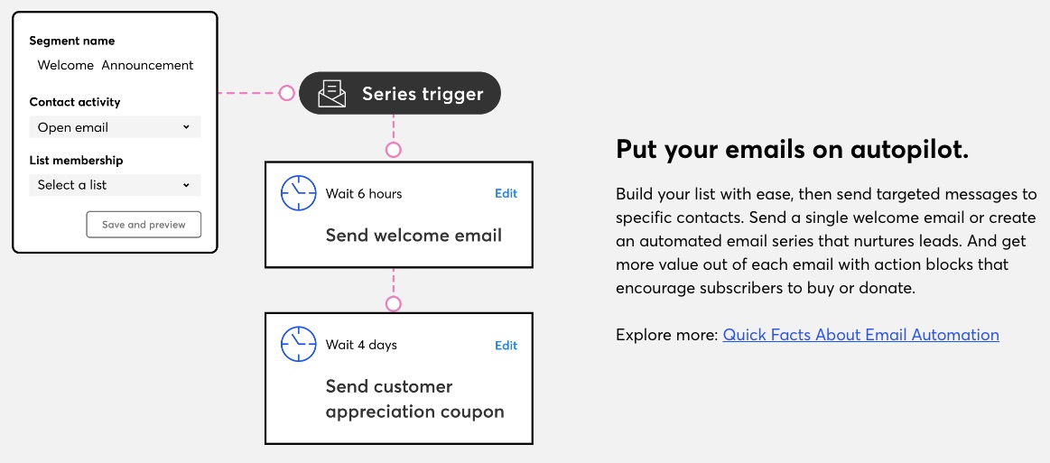
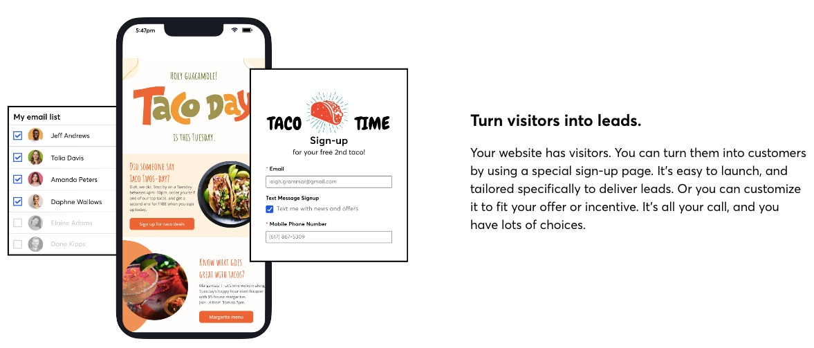
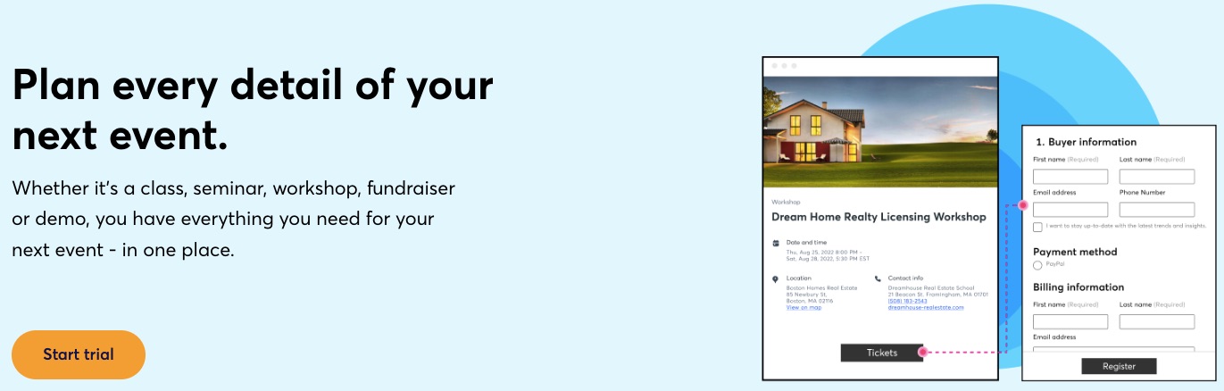
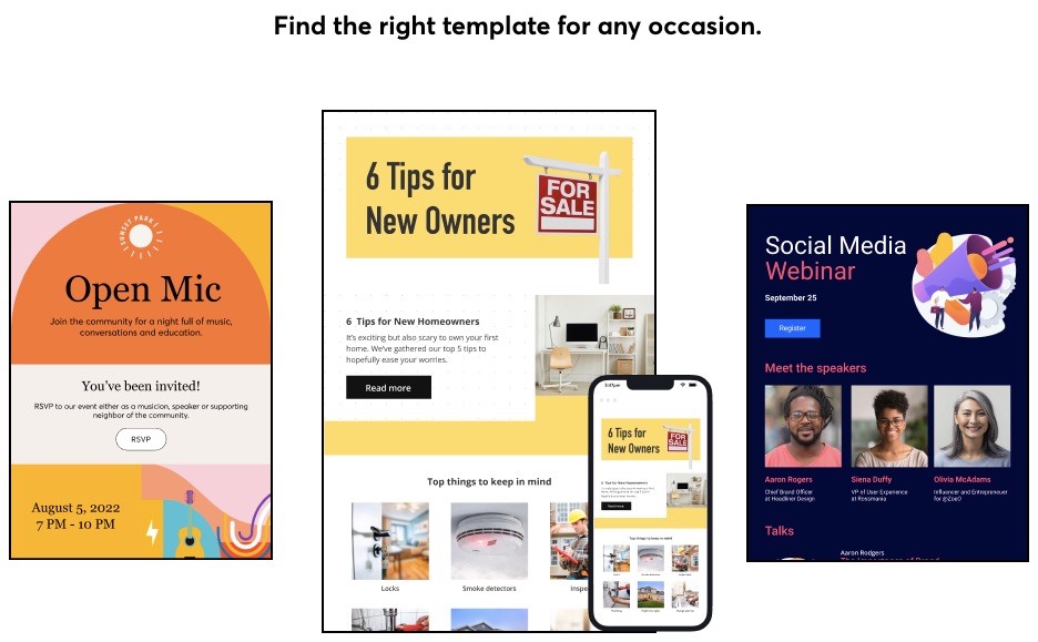
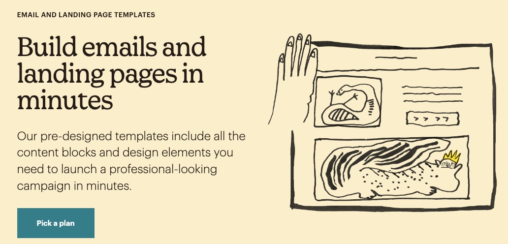
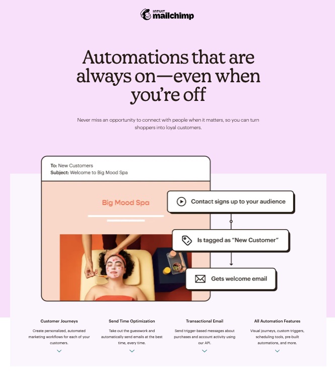
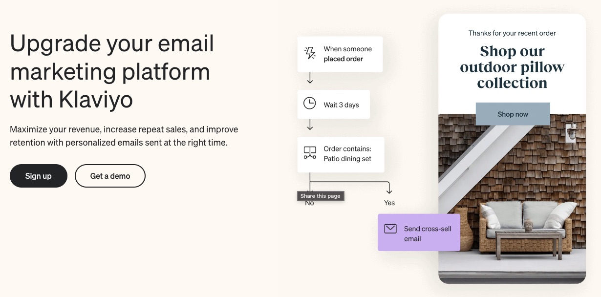
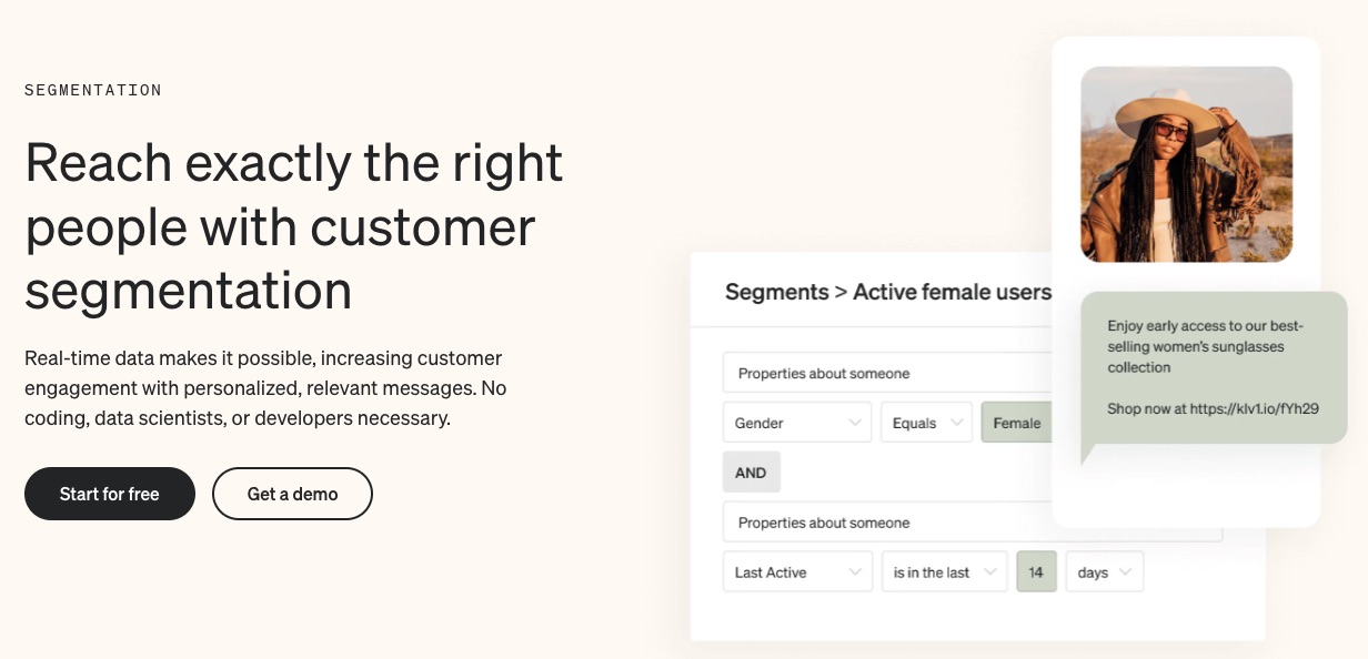
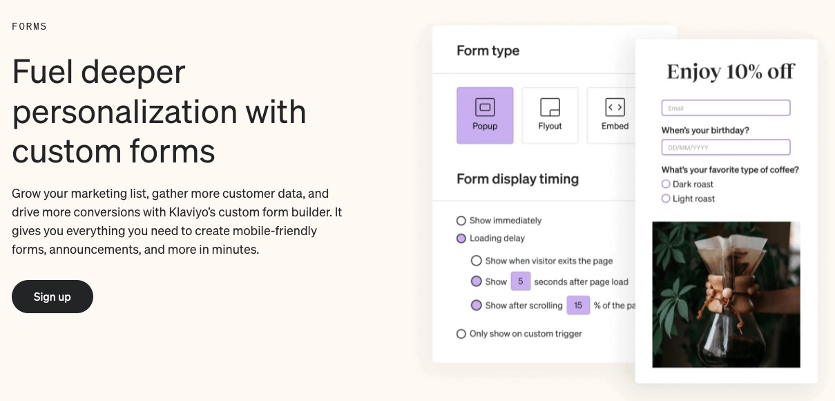
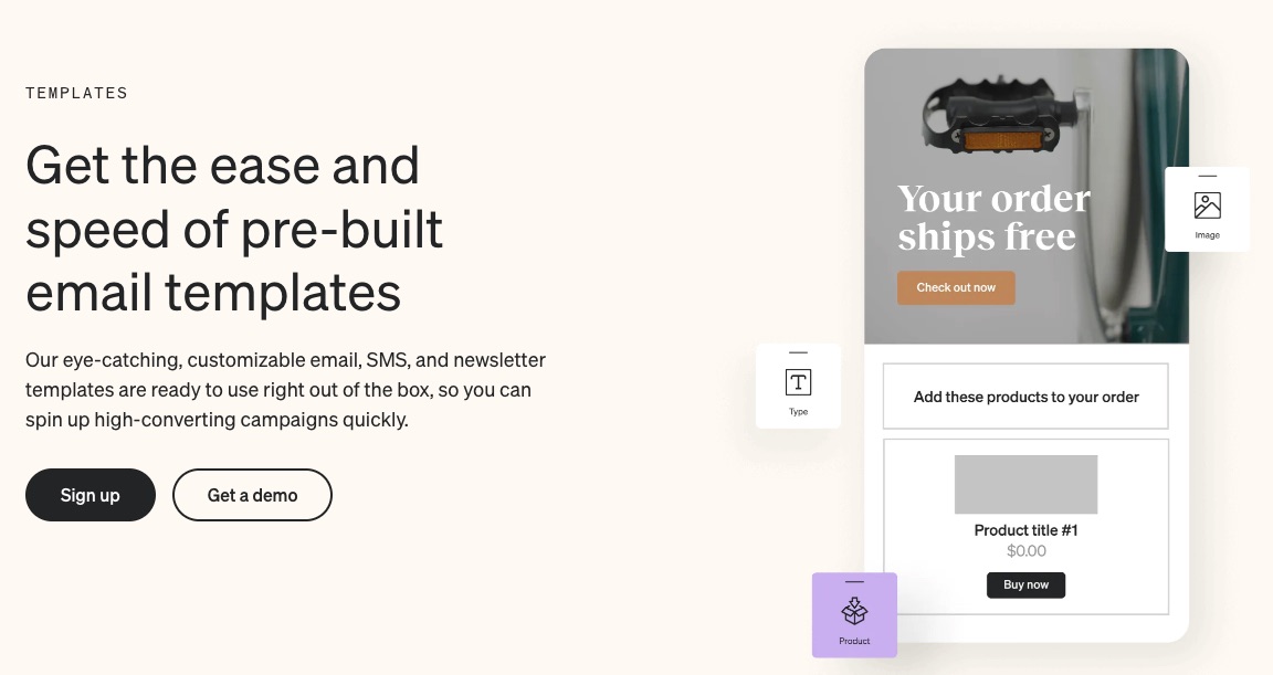
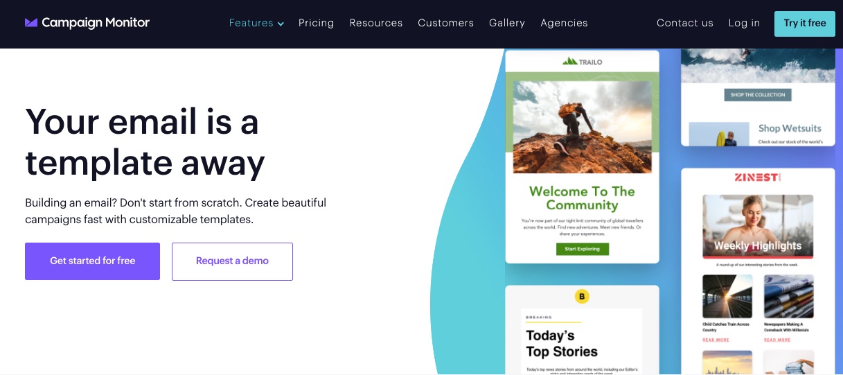
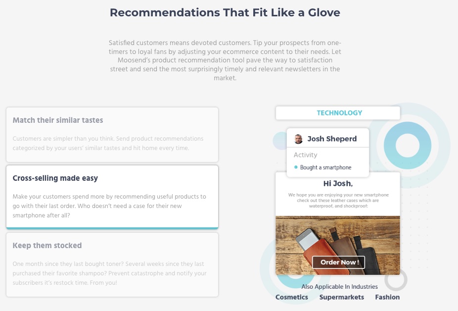
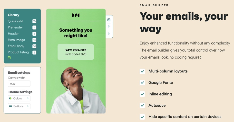
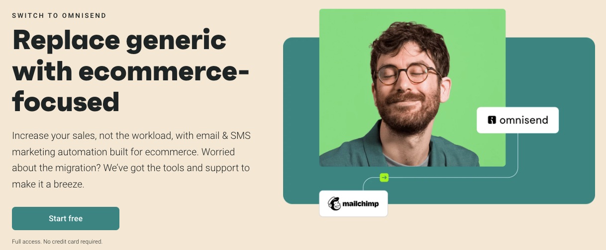
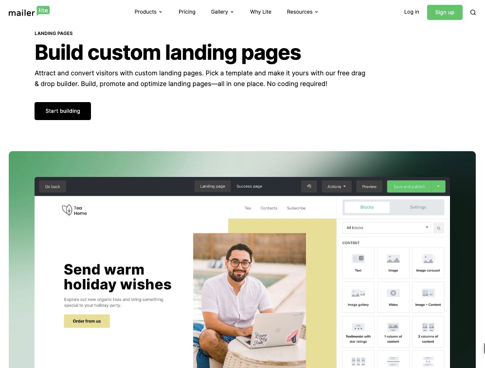
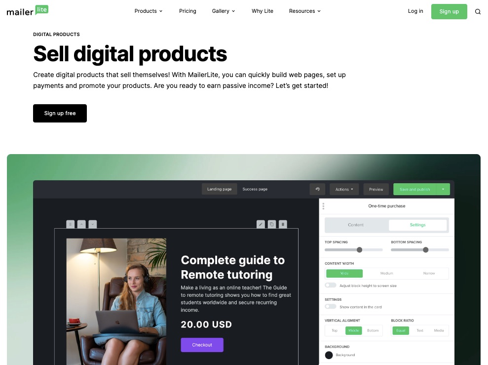
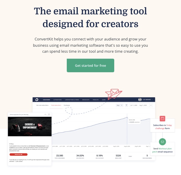
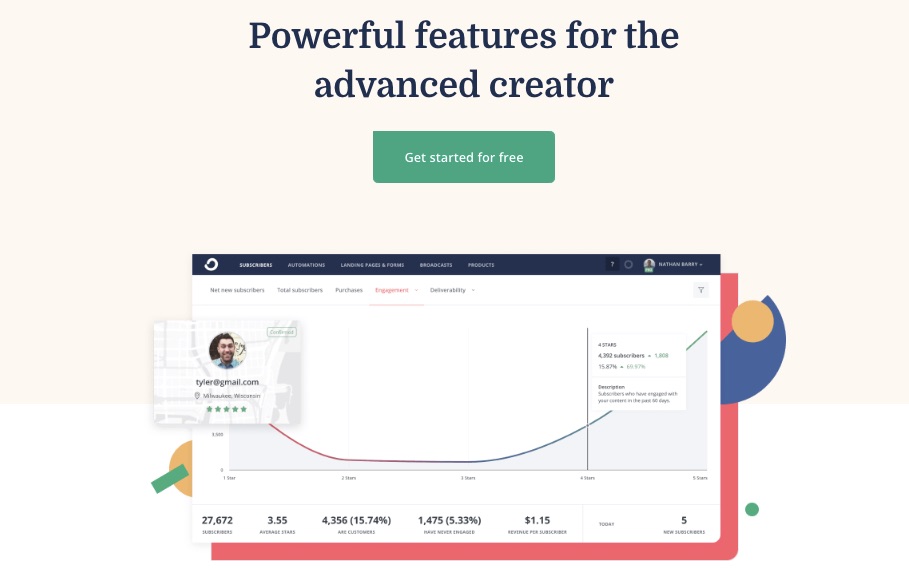
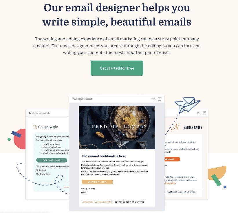
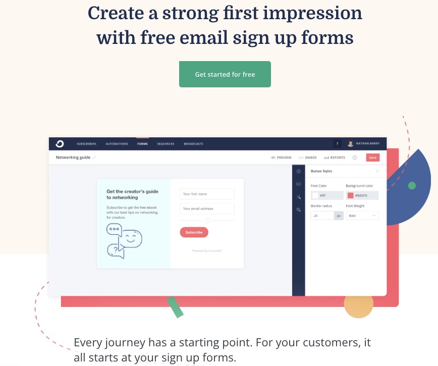
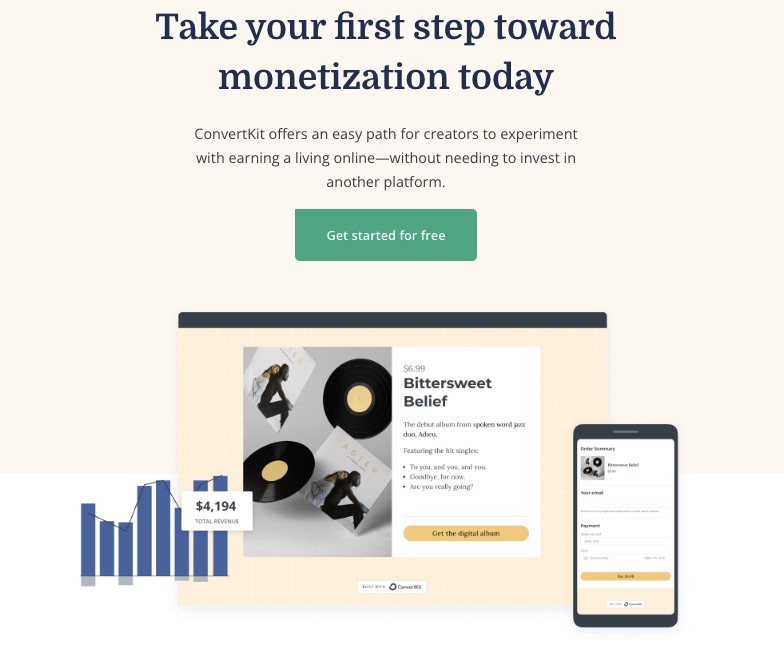
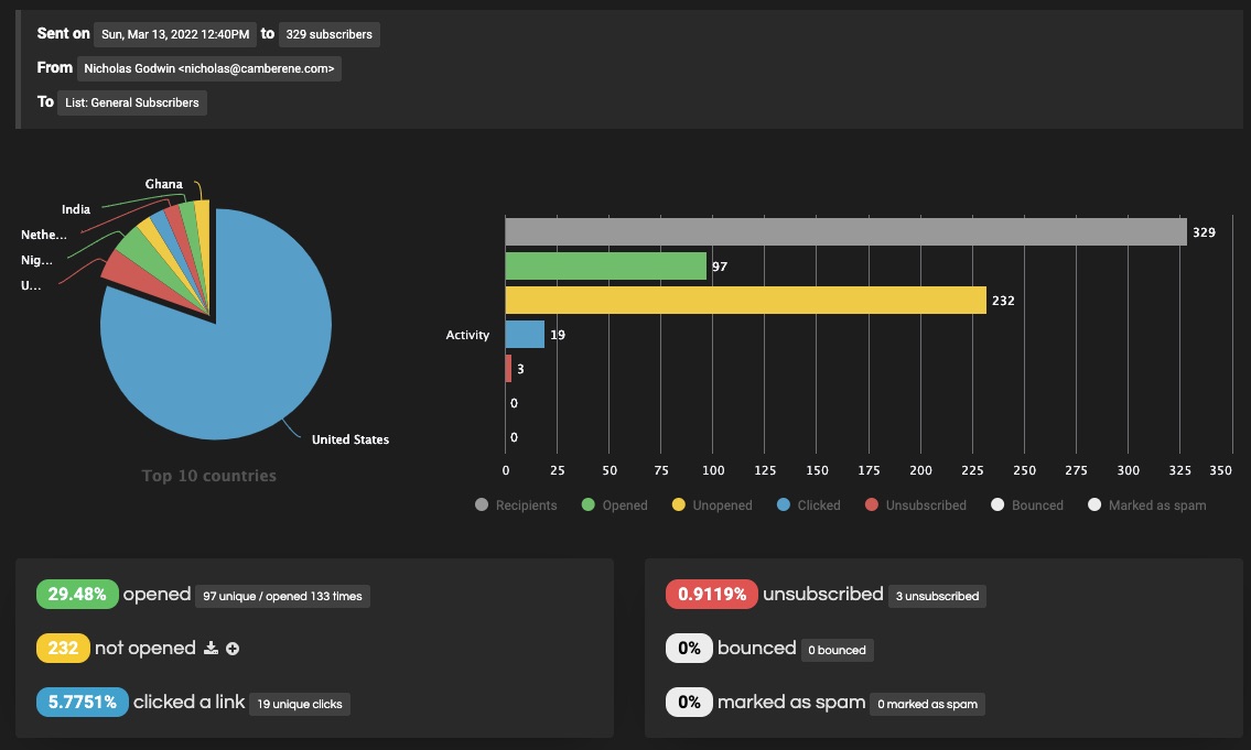
 A robust email marketing strategy is a great way to reach your target audience directly.


 Jakob Nielsen’s
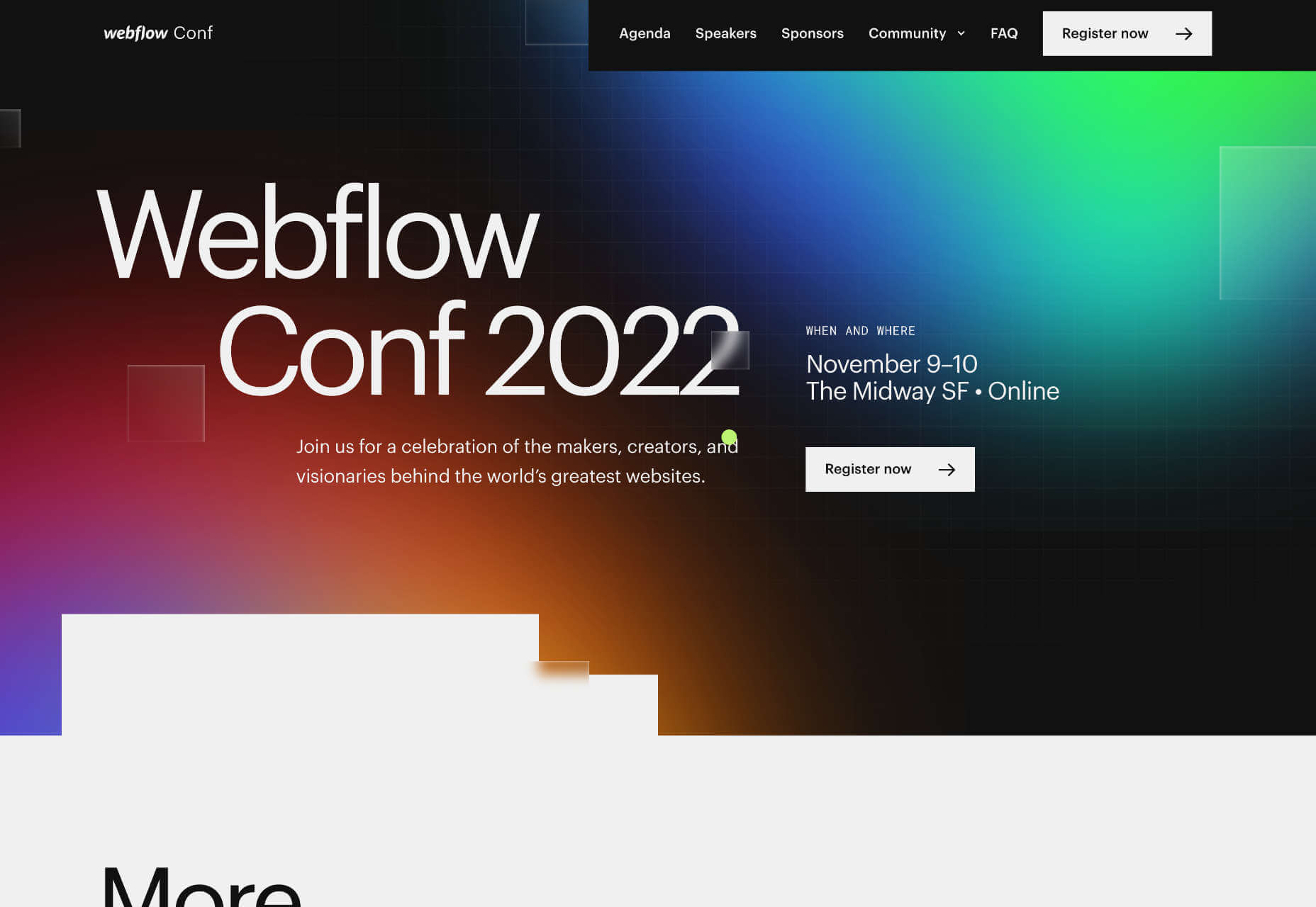


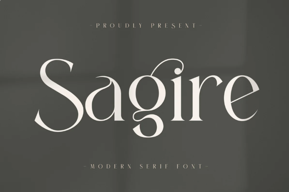
 Typefaces give expression to text, communicating personality in a way that no other design element can. And so, we put together this collection of the best new fonts we’ve seen on the web each month.
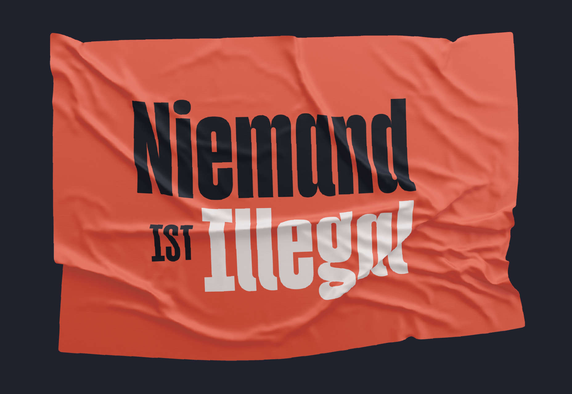


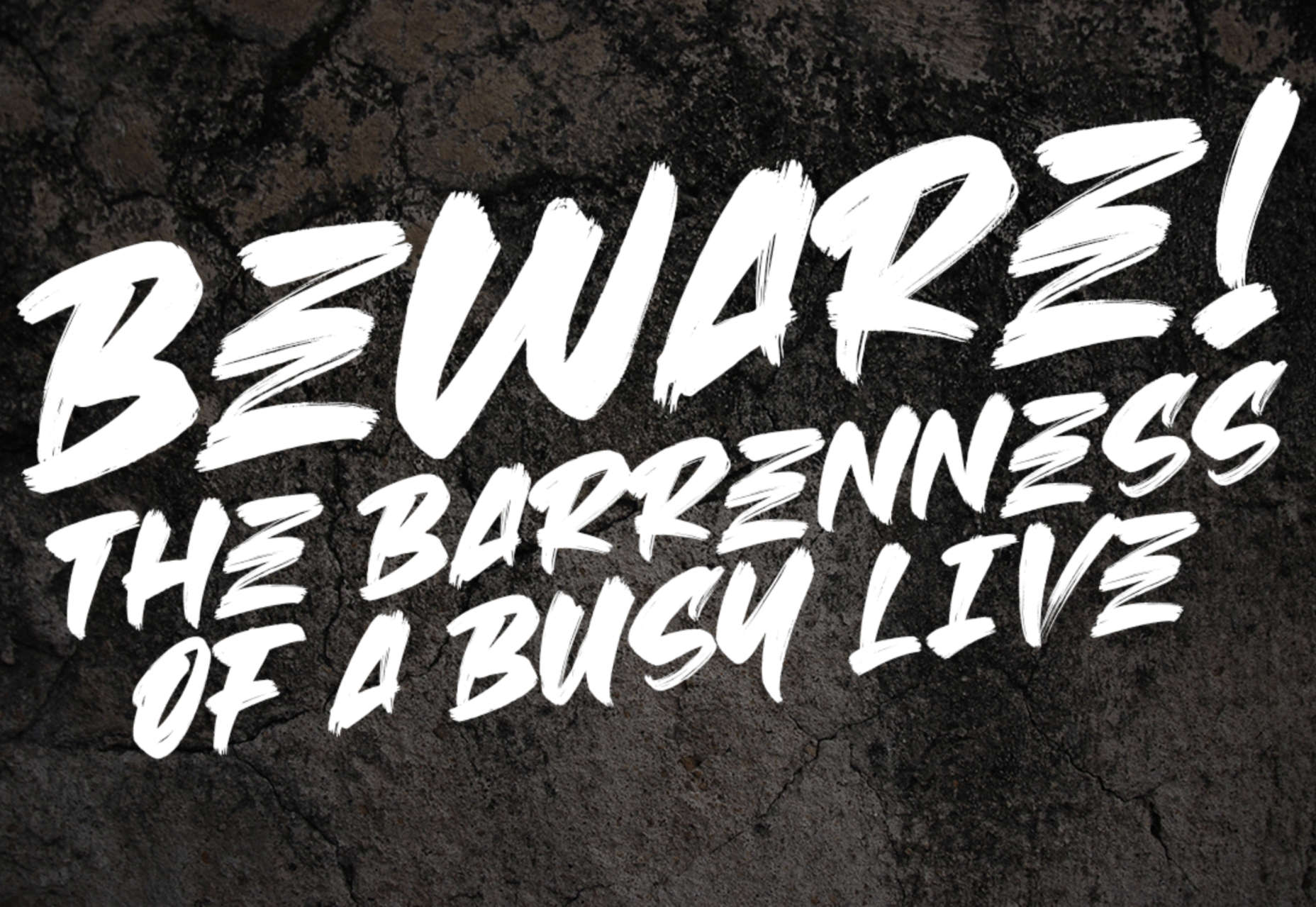


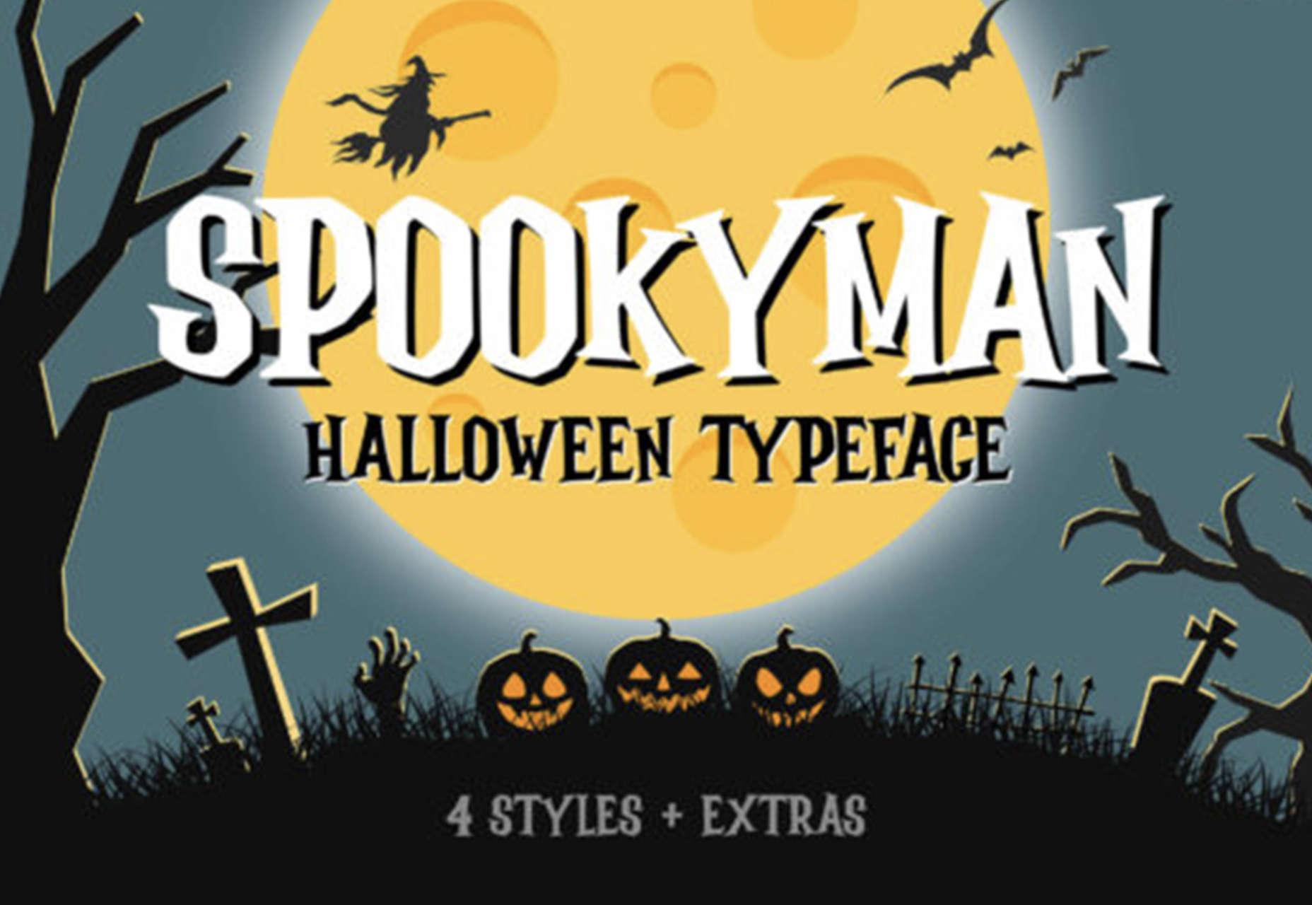
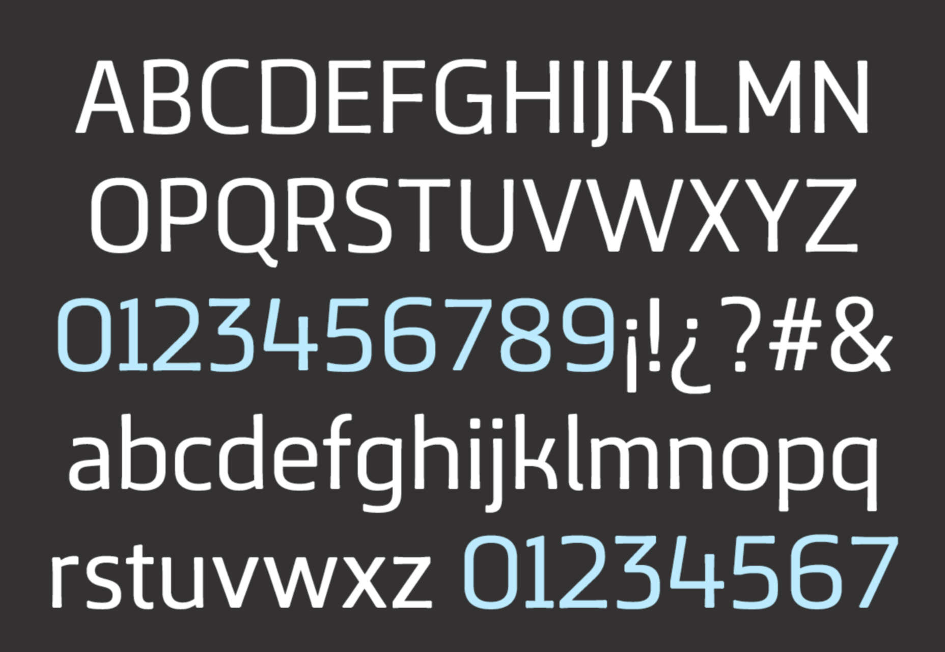


 While we’ve featured a lot of script fonts in previous months, this newest batch of the best new fonts is going to extremes. If you’re looking to have a bit more fun with typography in the coming months — especially for modern tech brands — you’ll find something here worth trying out here.


 Every day design fans submit incredible industry stories to our sister-site, Webdesigner News. Our colleagues sift through it, selecting the very best stories from the design, UX, tech, and development worlds and posting them live on the site.


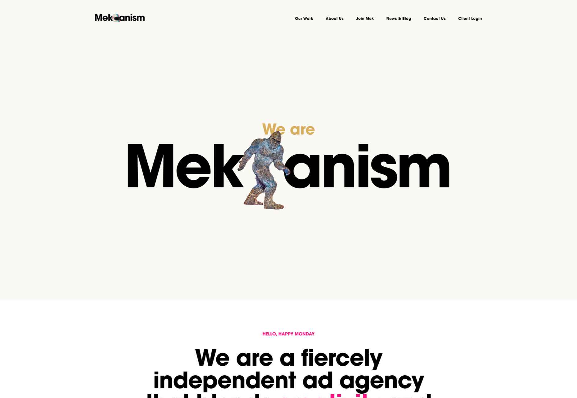
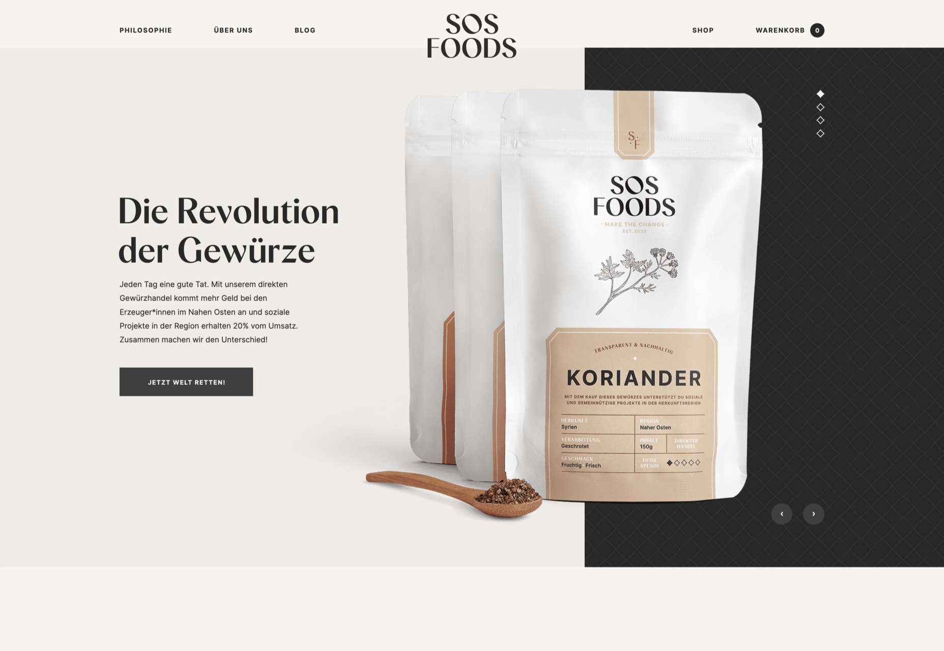
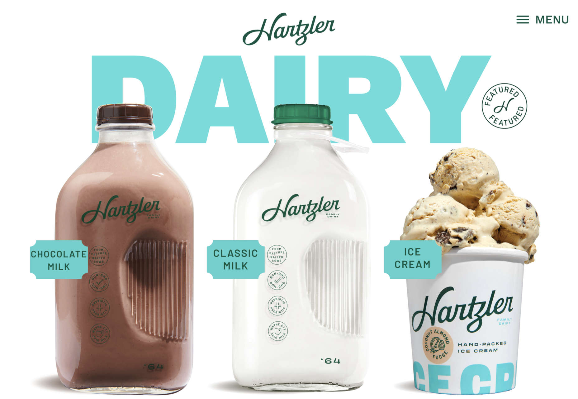
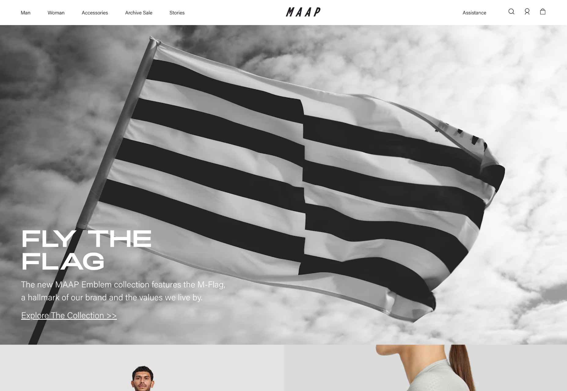
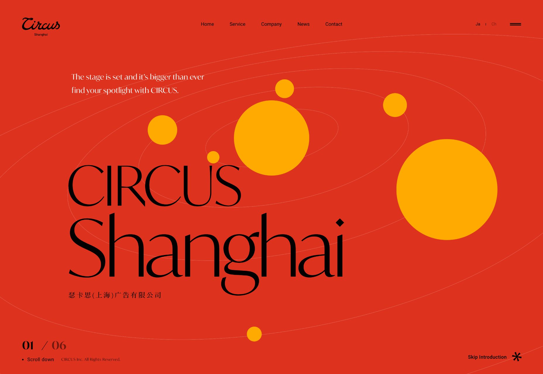
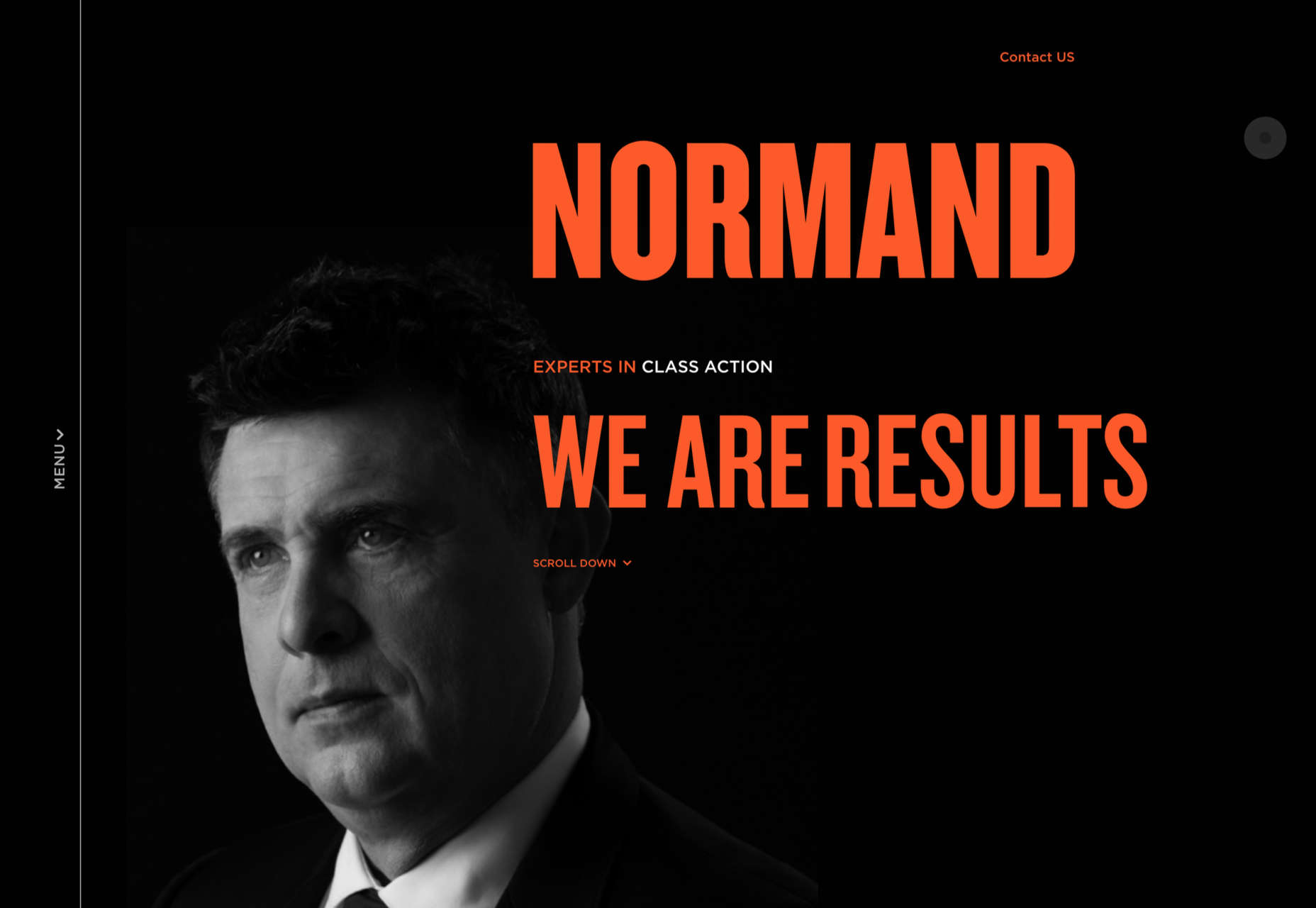
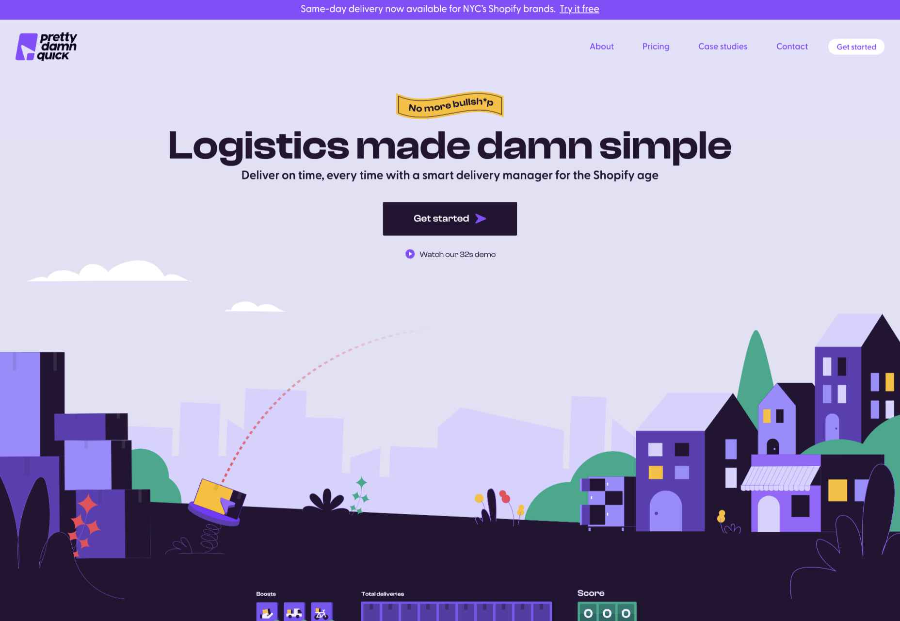
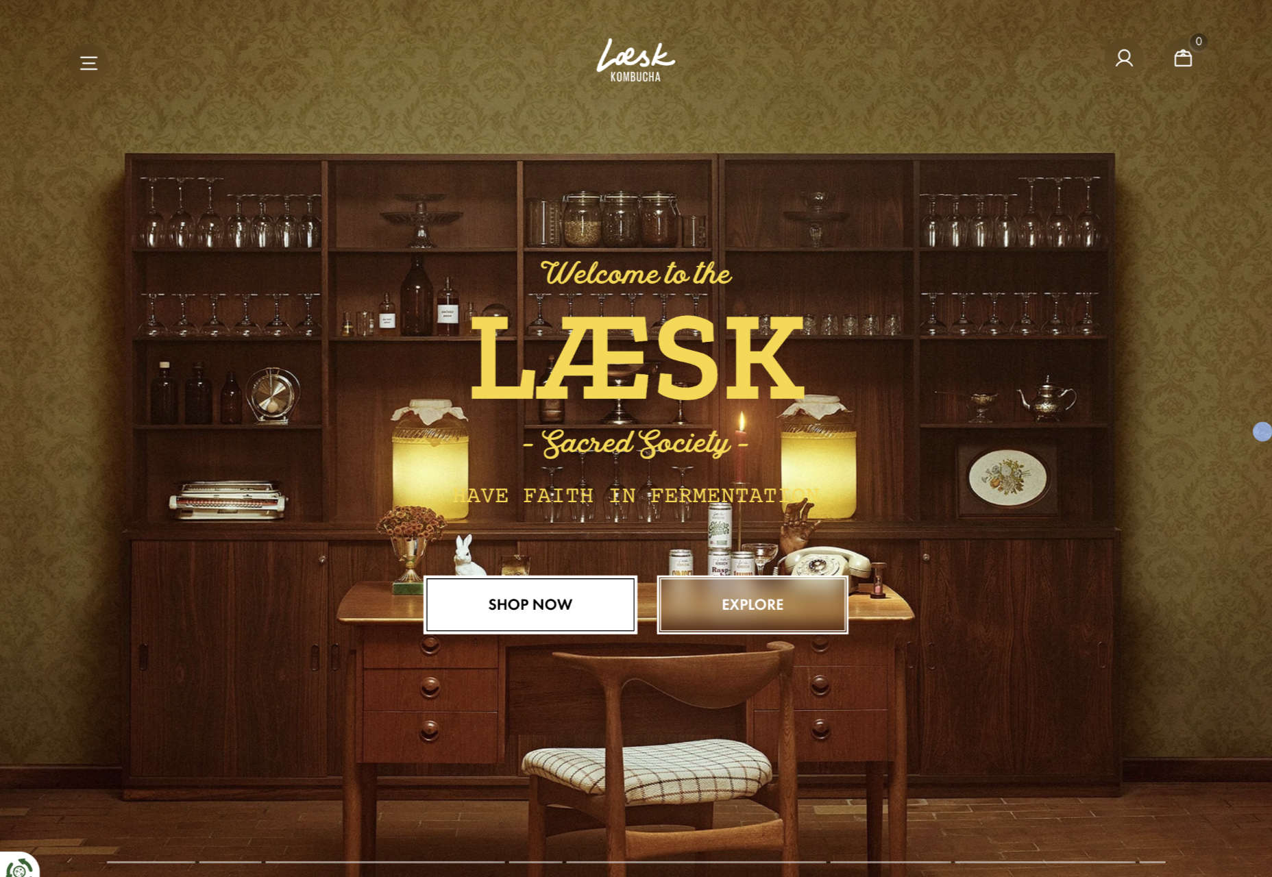
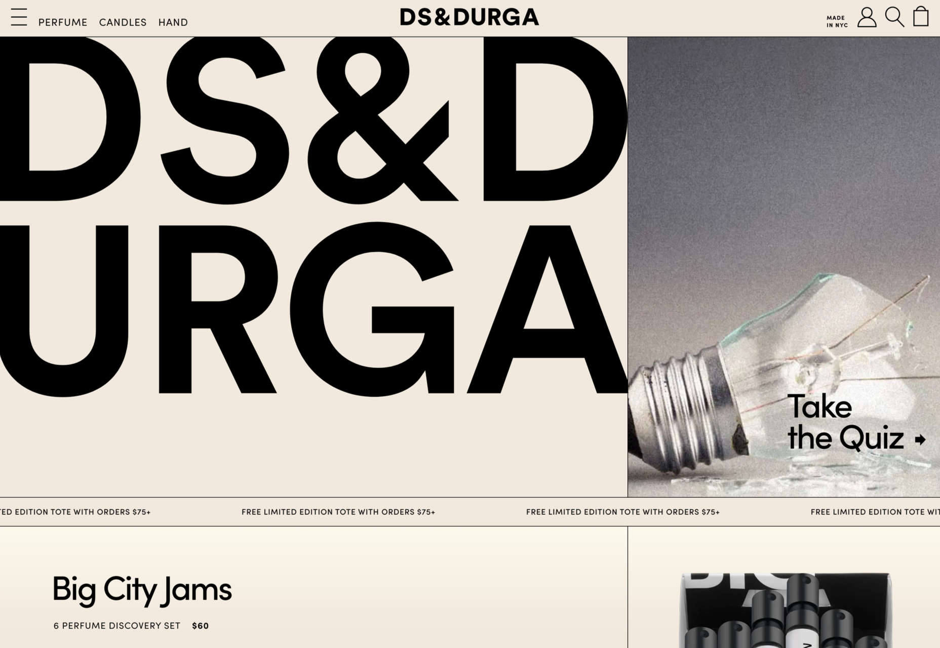
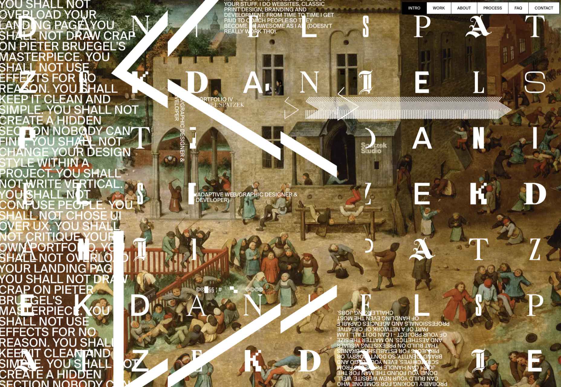
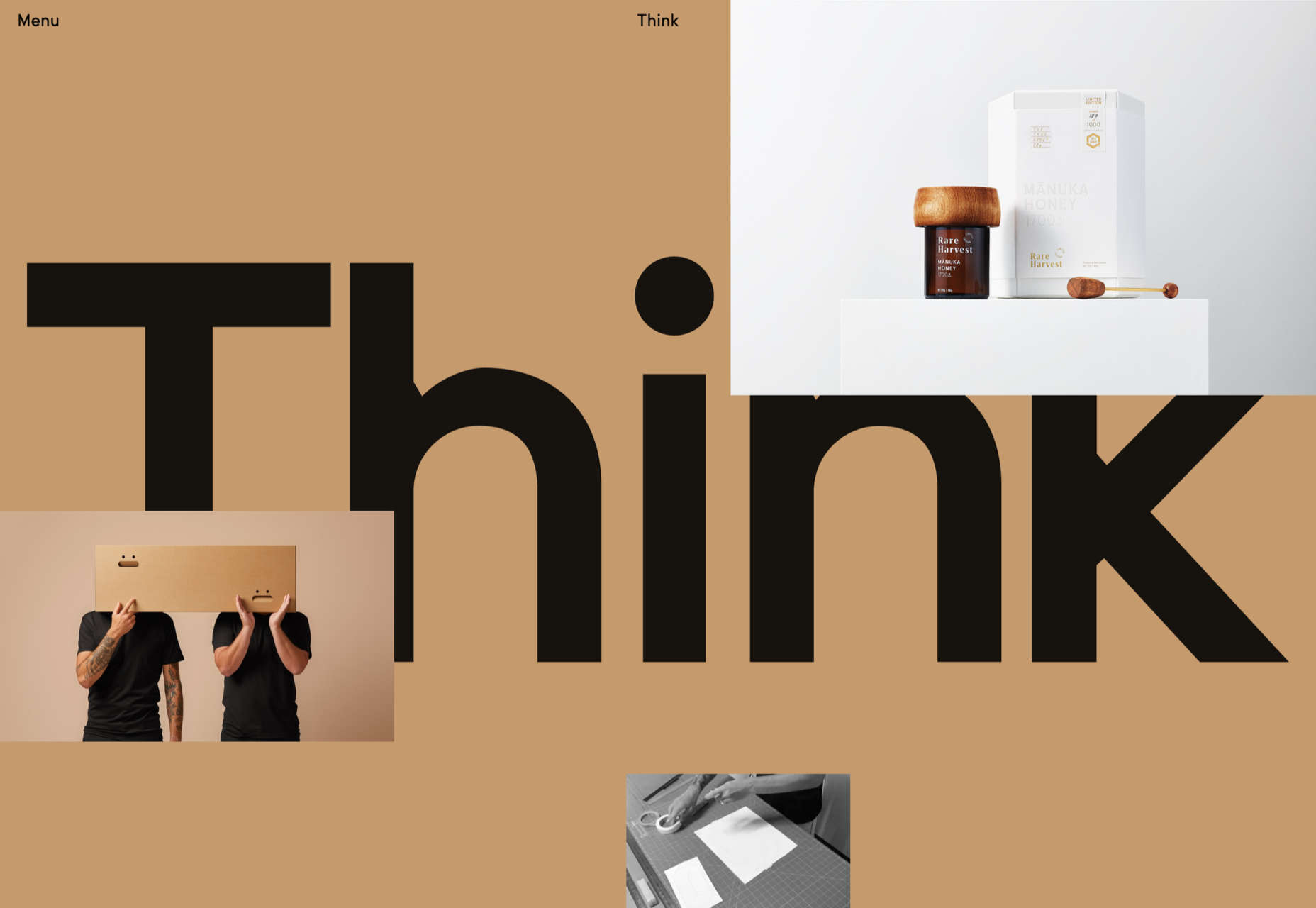
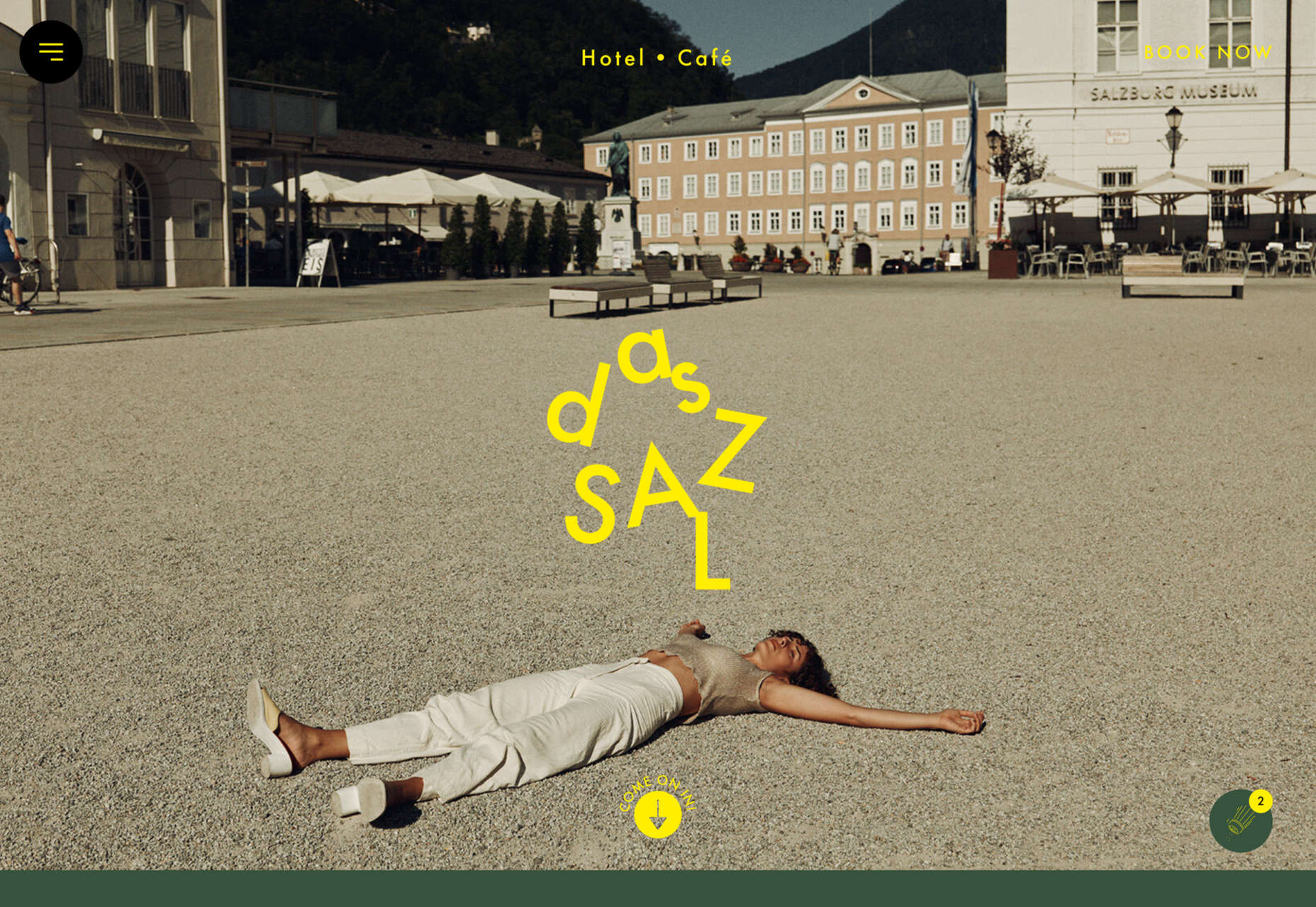
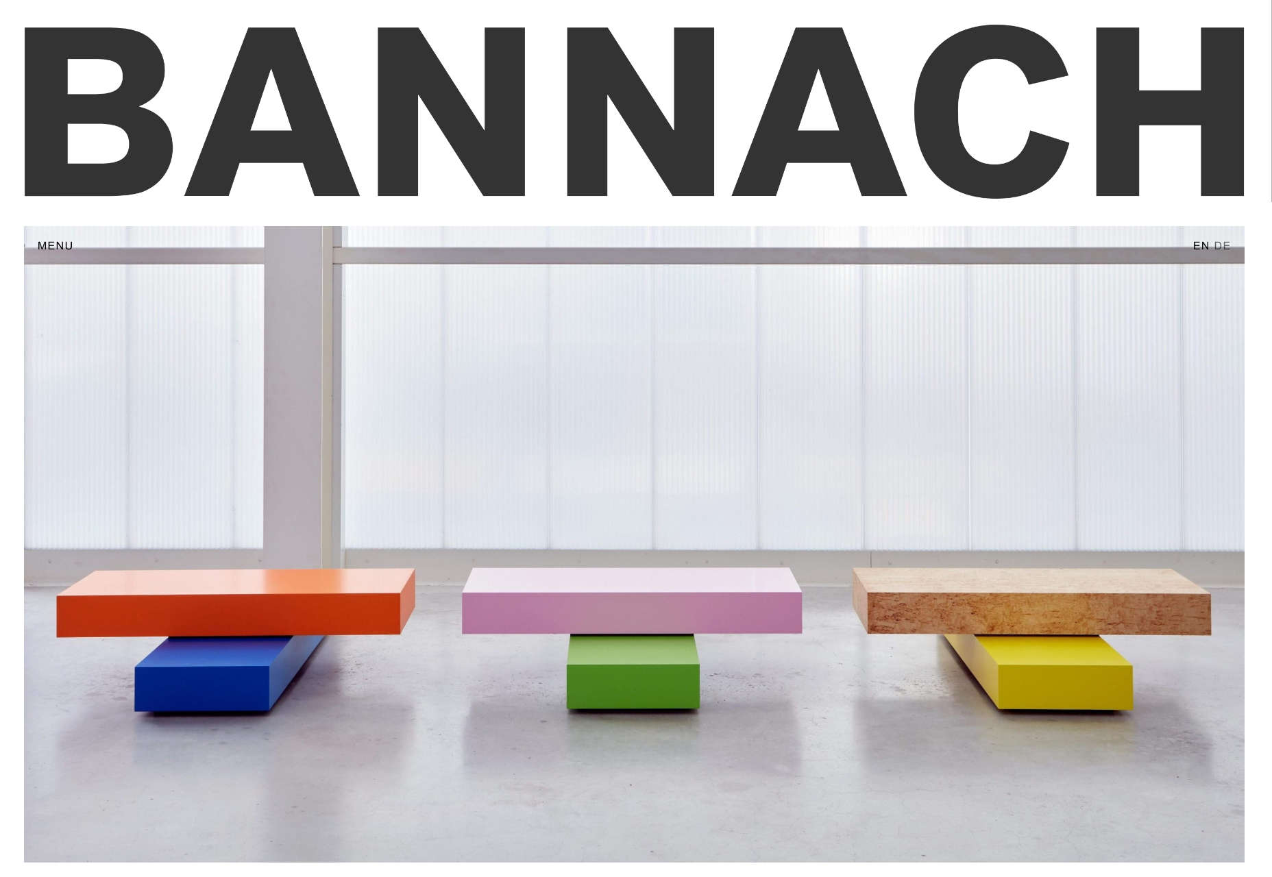
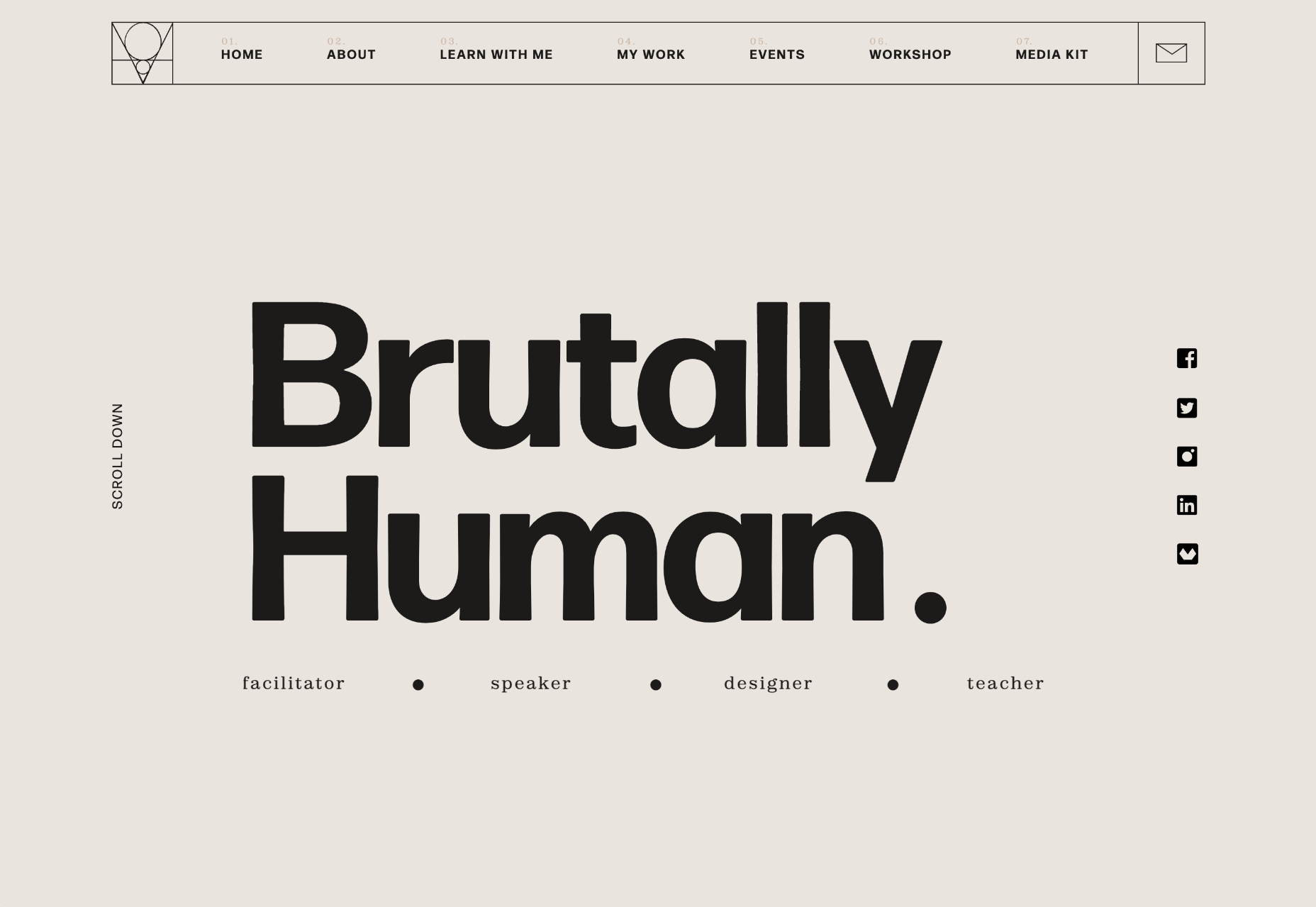
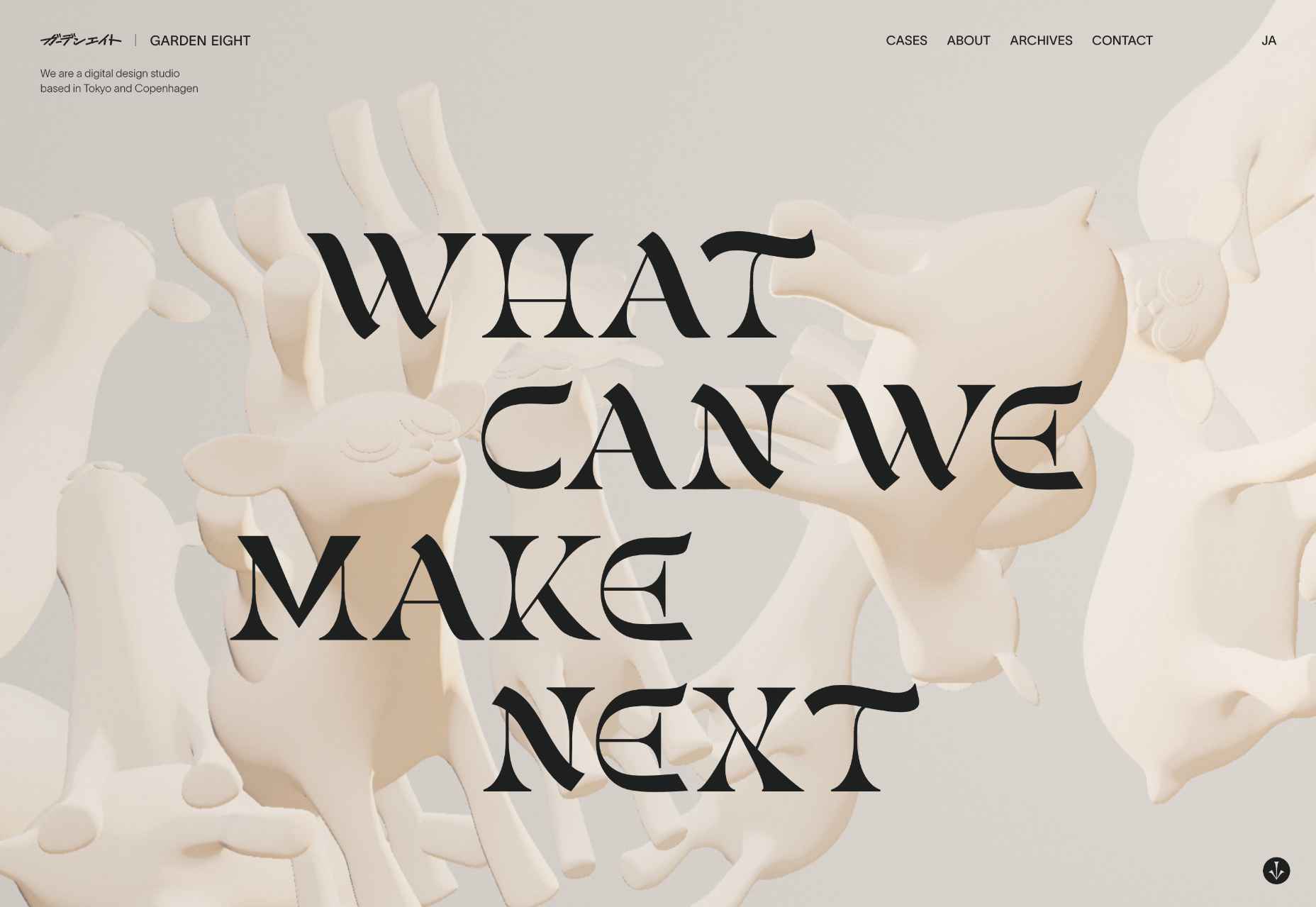
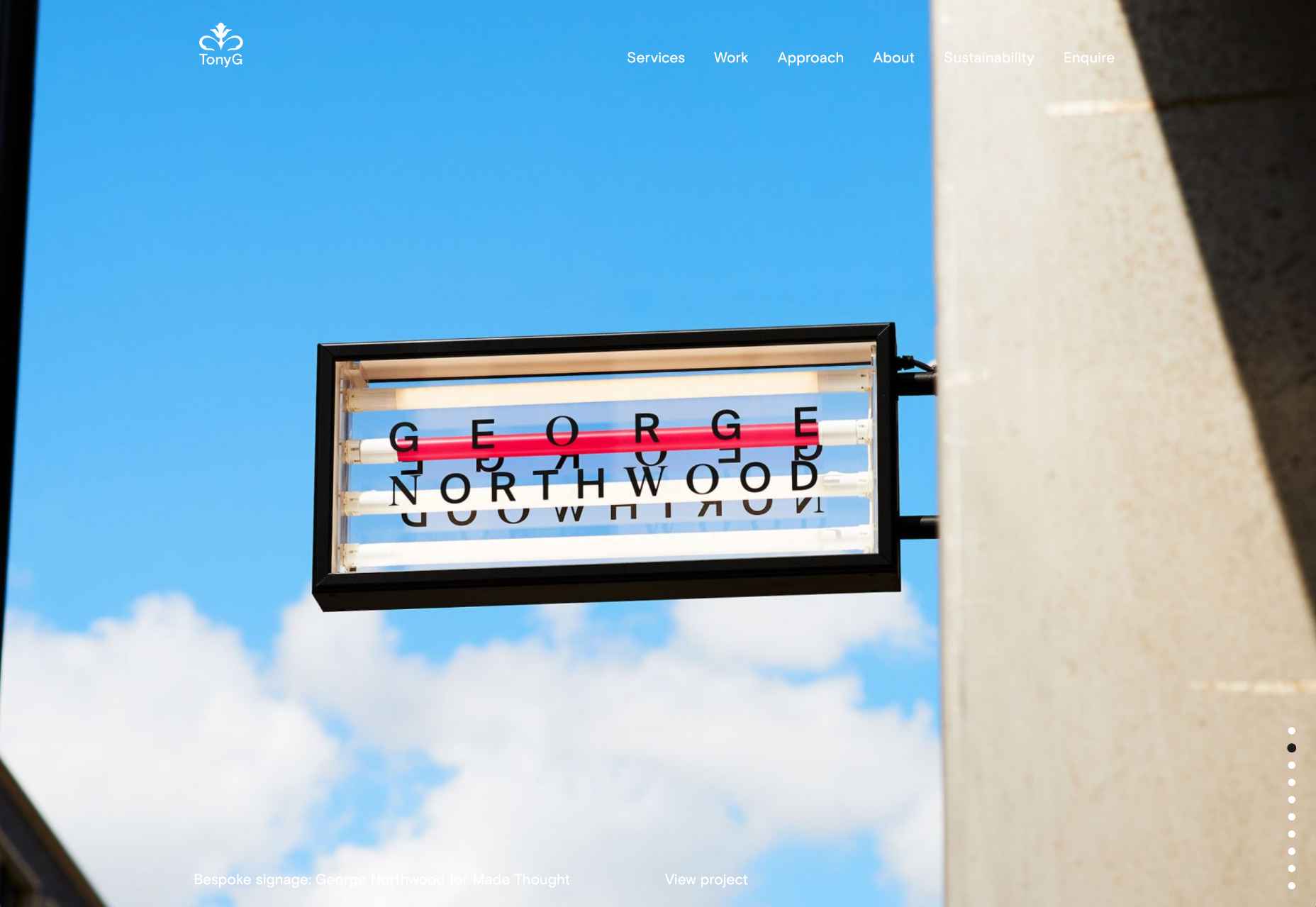
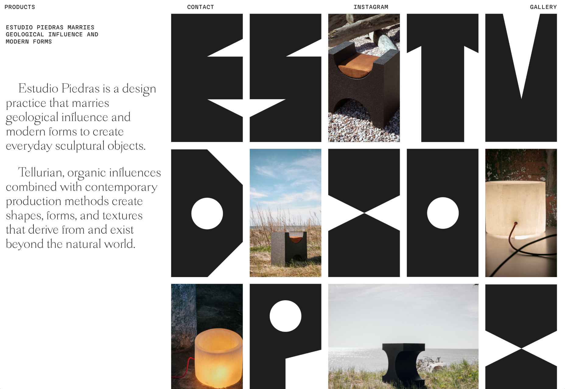
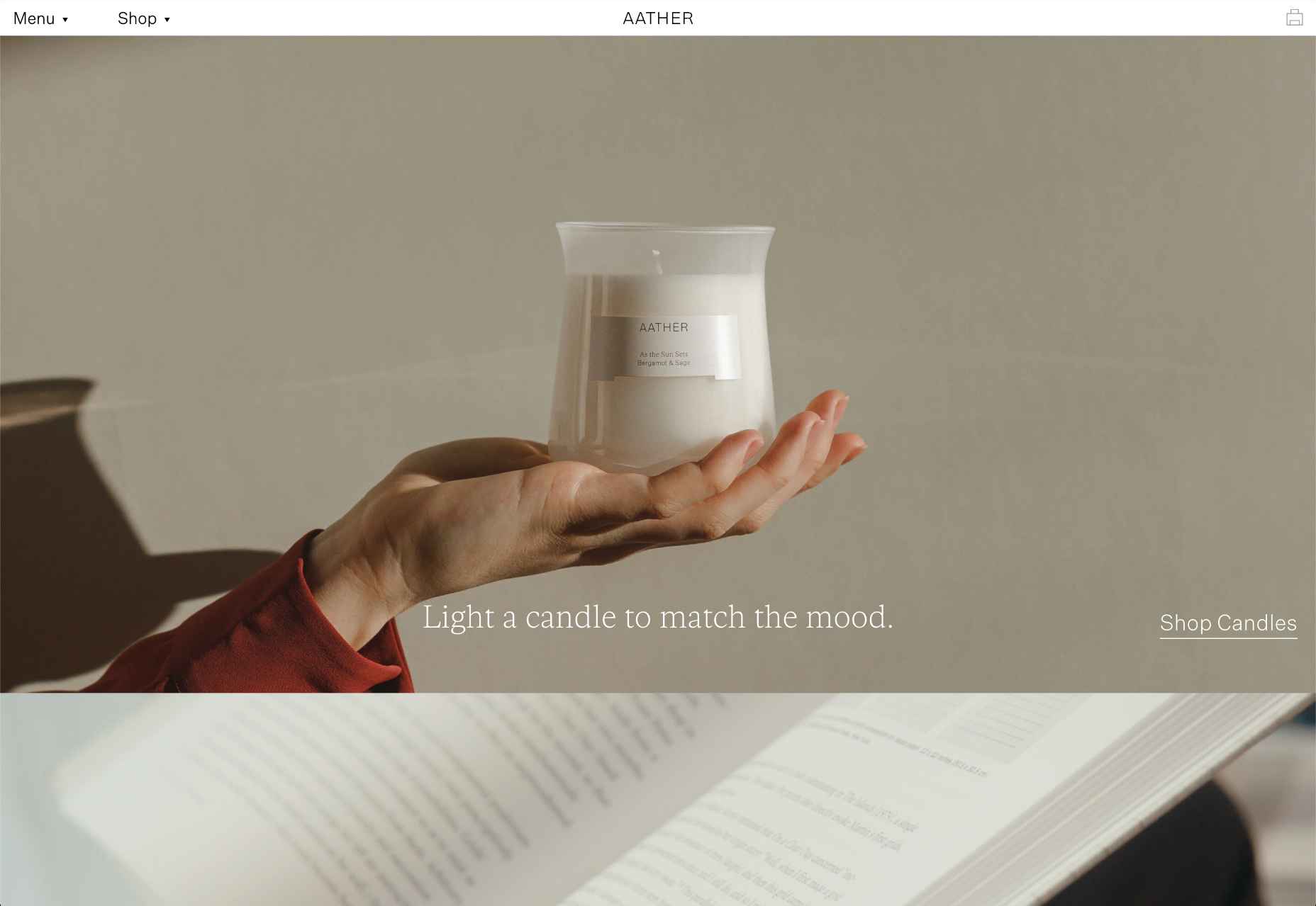
 This month’s collection of the best new sites released in the previous four weeks might seem like a mixed bag, but if you look carefully you’ll see distinct themes emerging. Full-page images and videos are back with a vengeance, and designers are embracing large-scale 20th century-inspired typography from Art Nouveau to ’80s corporate.


