Articles

At the dawn of the web-era, there was much focus on how environmentally friendly websites were: we’d chop down fewer trees, ship fewer products, and travel less for business.

And because the web was small, any negative impact it had was relatively small. But the Internet’s no longer small, and neither is the impact it has on the environment. The average website uses 211,000g of CO2 per year, watching a video online outputs an estimated 0.2g of CO2 per second, and a single email can cost 50g of CO2.

In the next four years, the tech industry as a whole may use up to 20% of the world’s electricity and be responsible for 5.5% of global CO2 emissions.

The good news is that because websites are viewed many times, even small improvements can multiply into real change.

1. Reduce Energy Consumption

Through electricity use, the Internet generates around the same CO2 as most major countries. That carbon comes from two sources: the devices we use to access the Internet and the servers that host our data.

Computers heat up, and when they heat up, they slow down. Servers are especially vulnerable and use extraordinary amounts of energy to keep cool and functional, which is why Microsoft keeps throwing servers into the sea.

Make It Faster

The faster your site, the less data is used to serve it, and the less carbon it’s outputting; it’s that simple.

Reduce the Number of Resources Used

Everything you load on your site has an impact. You might think that a tiny PNG is too small to really impact your carbon footprint, but over thousands of page loads, its impact is multiplied. Anything you can do to reduce the number of actual files requested will reduce your carbon output. You can use sites like Ecograder to estimate your own site’s CO2 output.

Optimize Images

If there’s one thing you can do to reduce the size of your site, the amount of data that needs to be sent over the Internet to serve your site, and the resulting speed, it’s optimizing your images.

Nothing reduces a site’s footprint like optimizing images. It’s easy and free to reduce the size of JPGs and PNGs with a service like TinyPNG. Offer WebP to any browser that will accept them; it will boost your Lighthouse score and improve your CO2 usage.

Lazy Load Images

Lazy loading images means images are loaded as they are required; images at the top of a page always load, images further down only load when the user scrolls to them; if the user doesn’t scroll to the bottom of the page, they don’t load, saving you CO2.

Reduce The Amount Of JavaScript You Use

Yes, JavaScript is awesome. Yes, it can be hugely beneficial to UX. And yes, it munches on energy like it’s candy.

When a web page loads, it’s done, the total cost is in. If JavaScript keeps running in the background, redrawing the screen based on user interaction — as is the case with a parallax site — the web page keeps using up energy on the device.

Choose a Sustainable Hosting Company

You can reduce the power needs of a site, but you can’t eliminate them. One simple step is to opt for a hosting company that gets its electricity from sustainable sources such as wind power or solar.

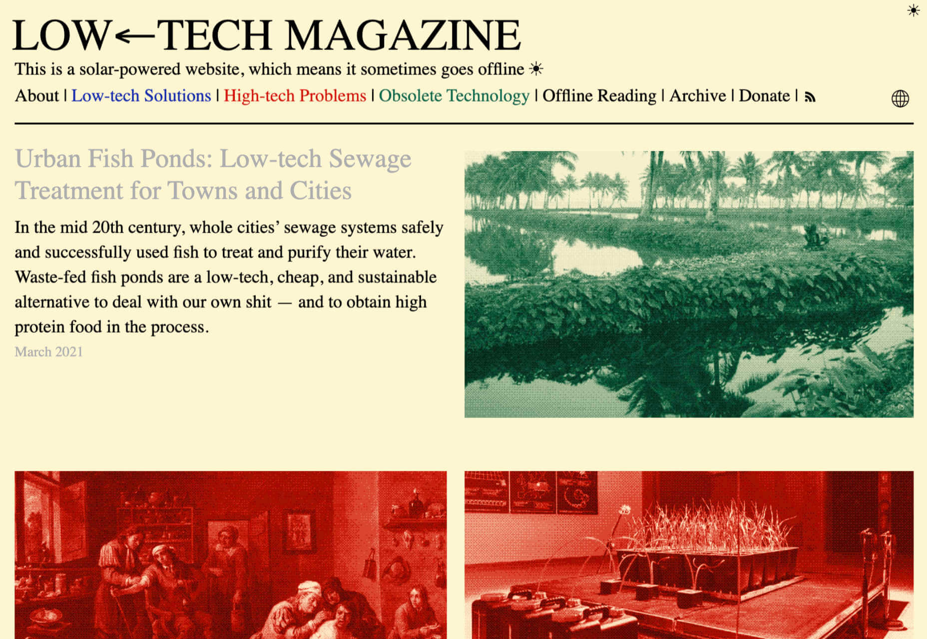
Low←Tech Magazine is powered by a server that runs on solar energy and carries a warning that it may go offline. But it’s possible to host both reliably and sustainably. Many web hosts outsource their actual server management, so they have no control over how those servers are powered, but there are plenty of exceptions that guarantee green web hosting. Google Cloud aims to be the cleanest in the cloud industry. For green web hosting, I always recommend the all-round superb Kualo.

2. Be Inclusive

One of the biggest issues with the EV (Electric Vehicle) movement is that we’re replacing cars earlier than we normally would in a rush to move to “clean” driving.

A new EV certainly outputs less than a gas-powered vehicle when driven the same distance. Combine increased use — because owners think they are driving cleanly — with the fact that a new EV has to be manufactured, the minerals for batteries have to be mined (in horrific conditions), and it then needs to be shipped to you, and EVs are not as friendly as they appear — so go ahead, buy that vintage Porsche it’s probably better for the environment than a Tesla.

Support Legacy Devices

The same issue that applies to cars applies to devices. Every time we rush ahead to support the latest iPhone, we leave older generations behind. A device can and should last longer than two years.

This is not to say that you shouldn’t embrace modern web standards. Technologies like CSS Grid are excellent at reducing markup size and speeding up sites. CSS Grid has been well supported for over four years, and even “legacy” devices can handle it. If you can keep a phone for an extra six months, the environmental cost of that phone is reduced by 20%.

3. Help Users Make Good Choices

More and more people are trying to make good choices. We’re eating a healthier, balanced diet. We’re recycling clothes. We’re traveling by bike, and on foot, instead of by car. People want to do the right thing, and they seek out companies that aid them.

Improve Navigation

Anything that you can do to make your content more findable will mean fewer page loads and therefore consume fewer resources.

By improving your information architecture, improving your search accuracy, and improving on-page signposts like bread crumbs and link text, you help users find content faster.

Feelgood Feedback

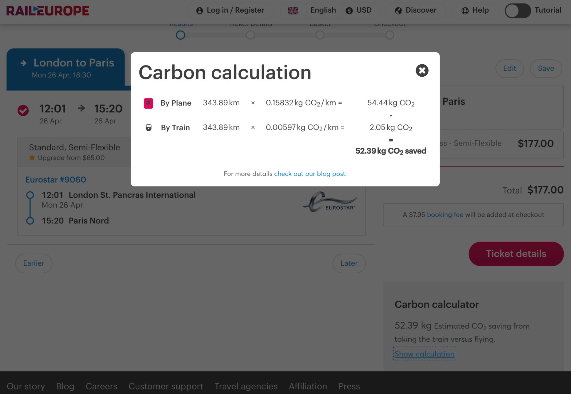
When the environmental impact of a user’s actions are quantifiable, let them know. Users who care will appreciate it, and users who don’t will ignore it.

Raileurope.com adds a note to any quotation letting you know how much carbon you’ve saved by traveling by train instead of flying.

Don’t Remove the Shipping Rate

Many ecommerce sites offer free shipping, especially above a certain order value; it’s a good way to encourage higher sales. But absorbing the shipping cost implies that there is no shipping. By highlighting the shipping costs, even if they’re not passed on to the customer, you remind them that there is an environmental cost and a financial cost.

You can absorb the shipping rate without implying there is no cost by adding the shipping and then explicitly deducting it as a discount.

Sustainable Web Design Is Good For Business

The fundamentals of good web design are the fundamentals of sustainable web design.

Make it fast and usable, and you’ll also be making it energy efficient. Make it inclusive, and you’ll help the industry slow the ever-growing tendency to consume. Make it transparent, and you’ll help your users make good choices of their own. All of these things are not only good for the environment, but they also result in improved UX and SEO.


Featured image via Pexels.

Source

The post 3 Effective Ways To Improve Your Site’s Carbon Footprint first appeared on Webdesigner Depot.


Source de l’article sur Webdesignerdepot

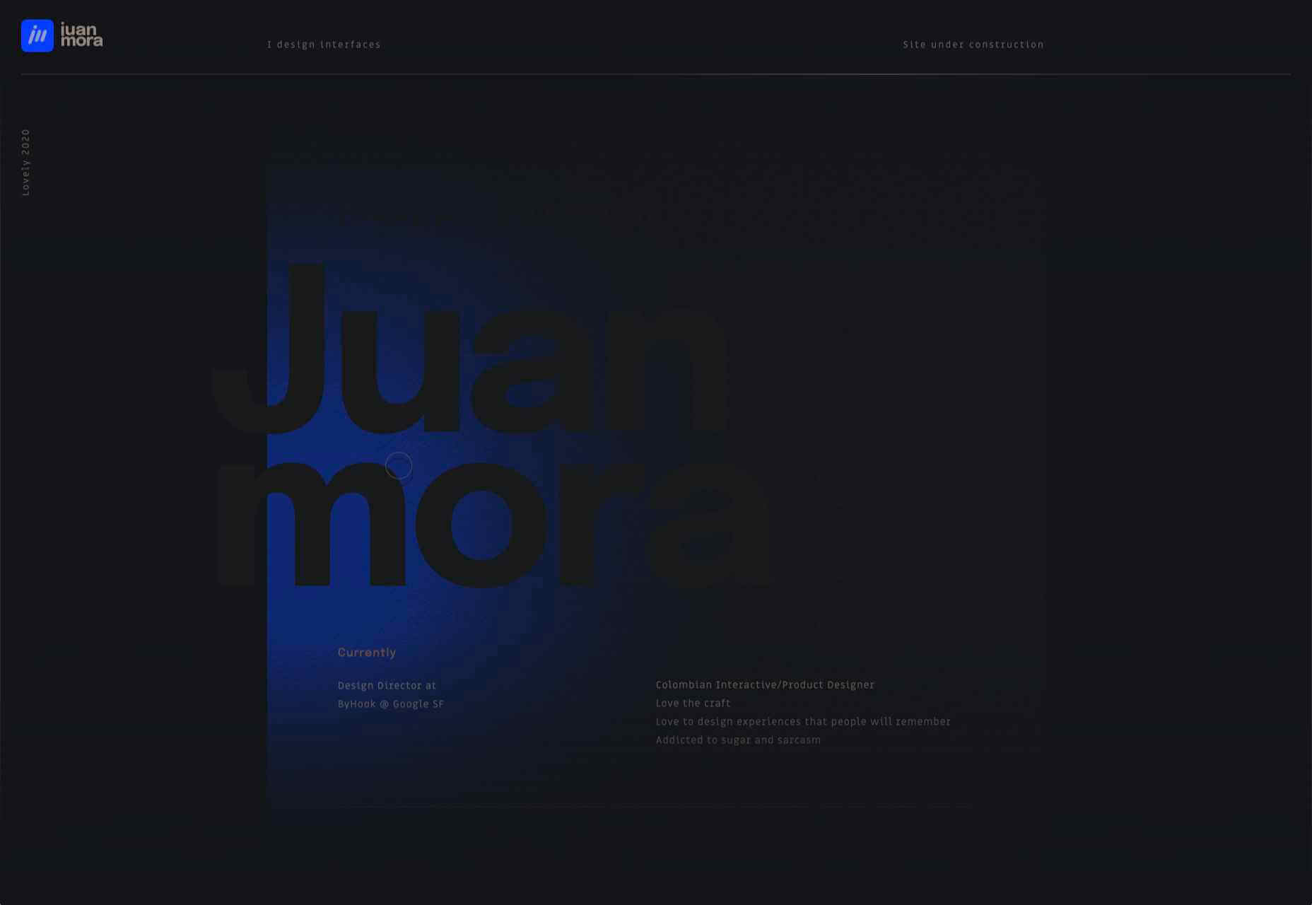
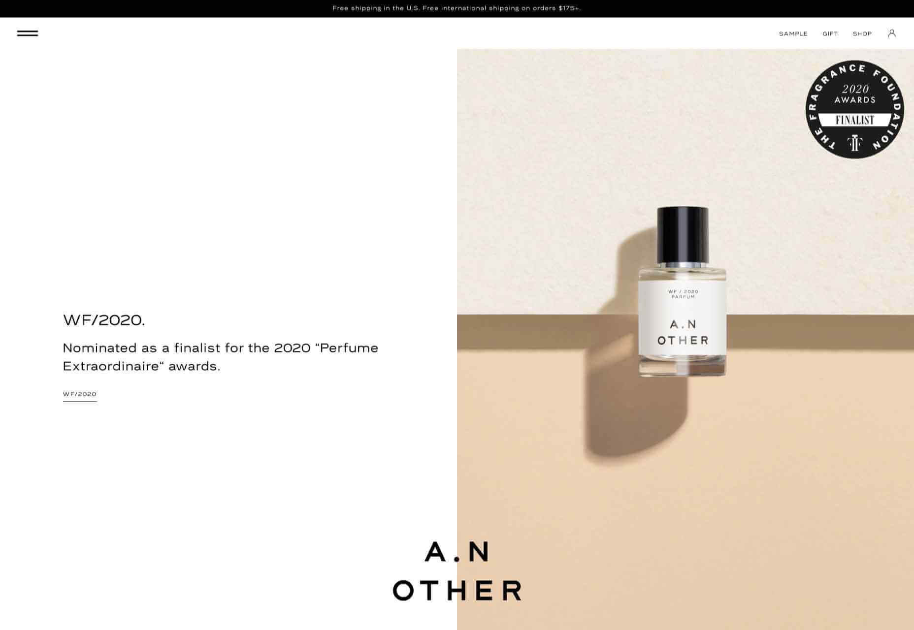
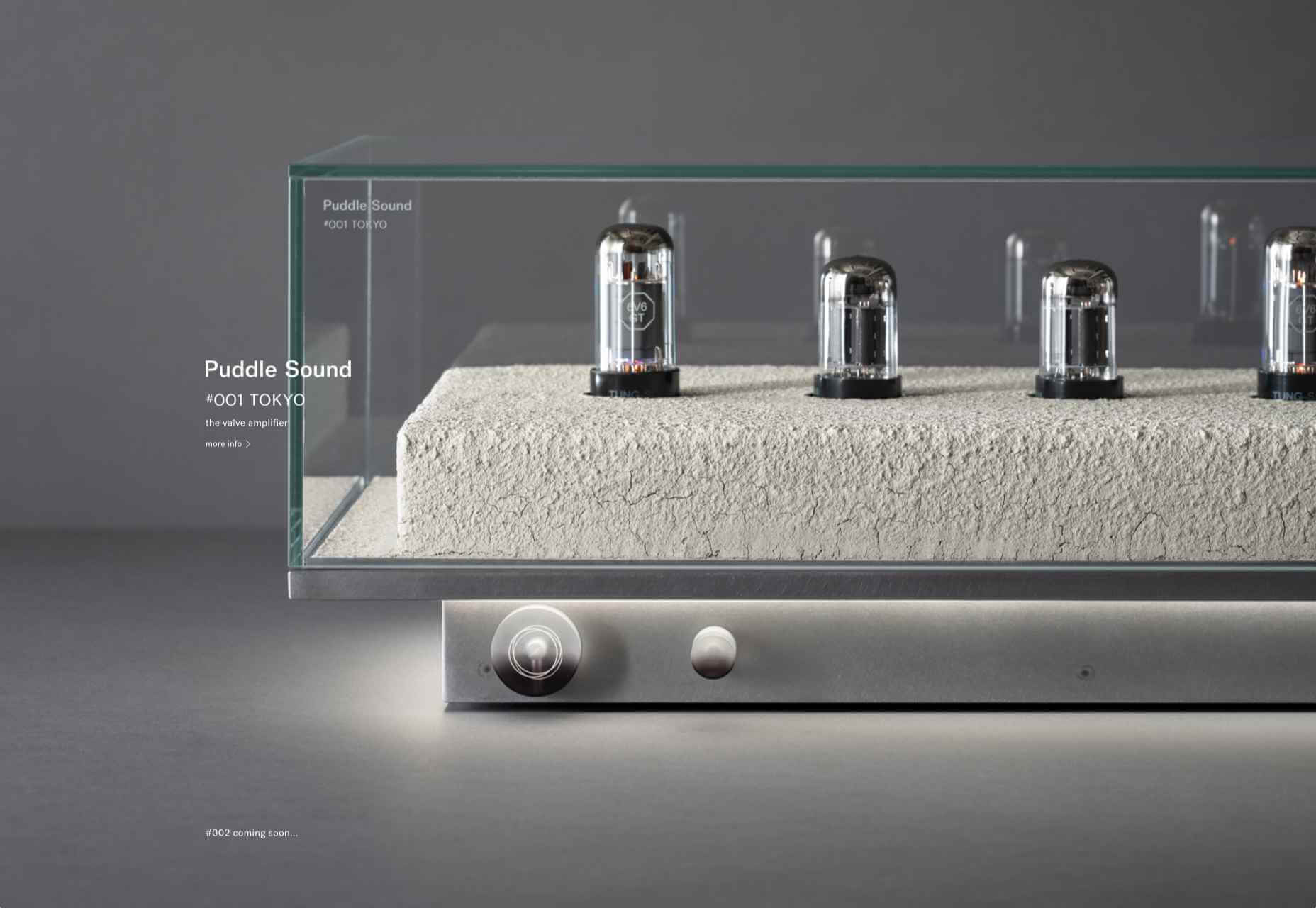
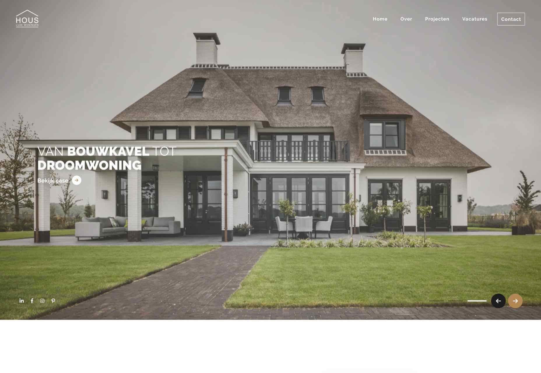
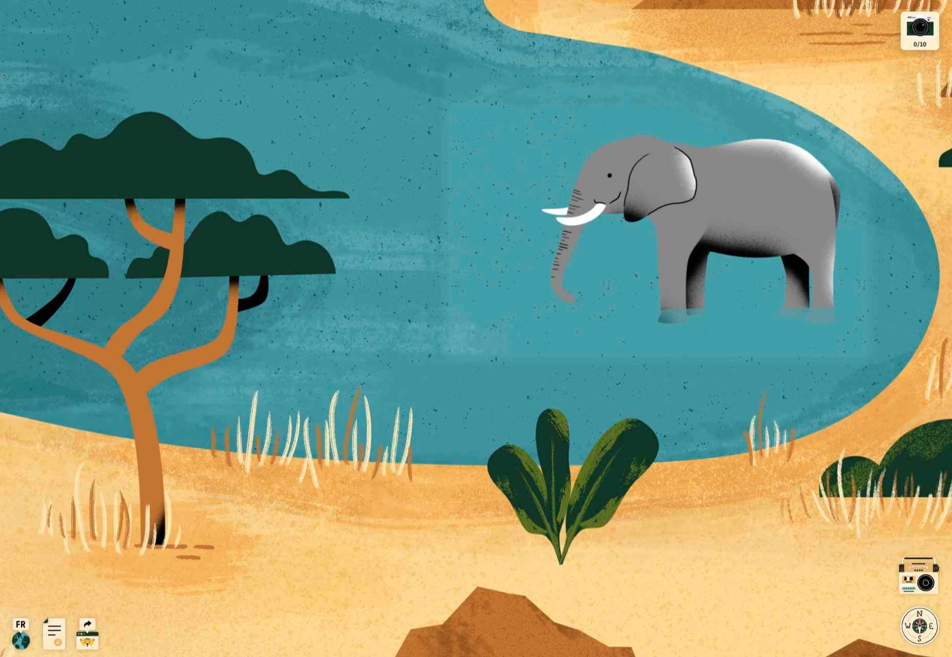
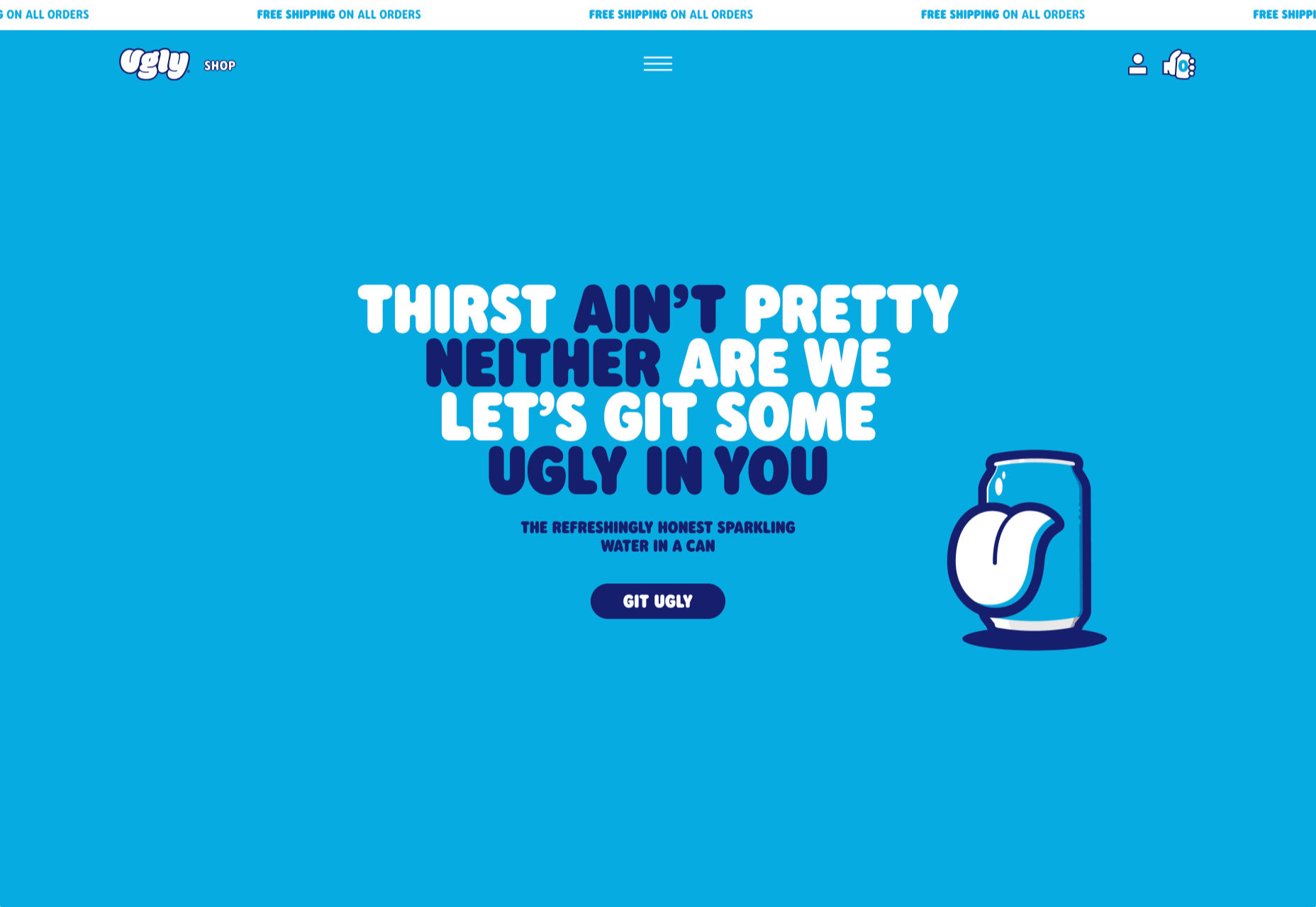
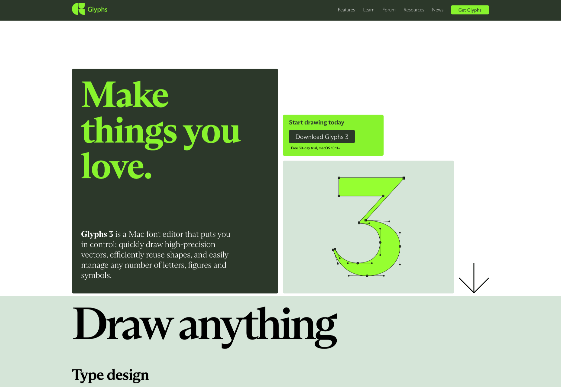
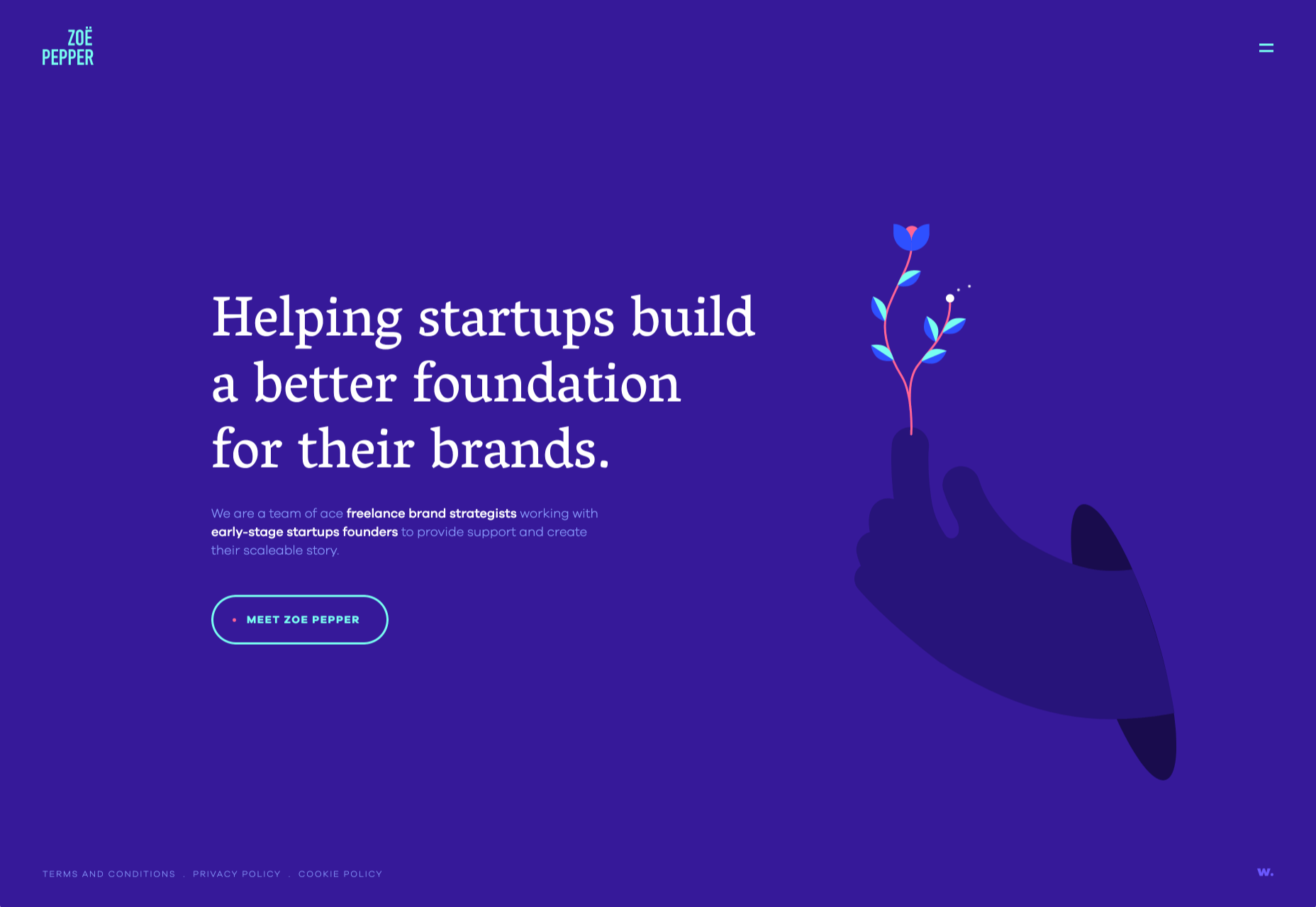
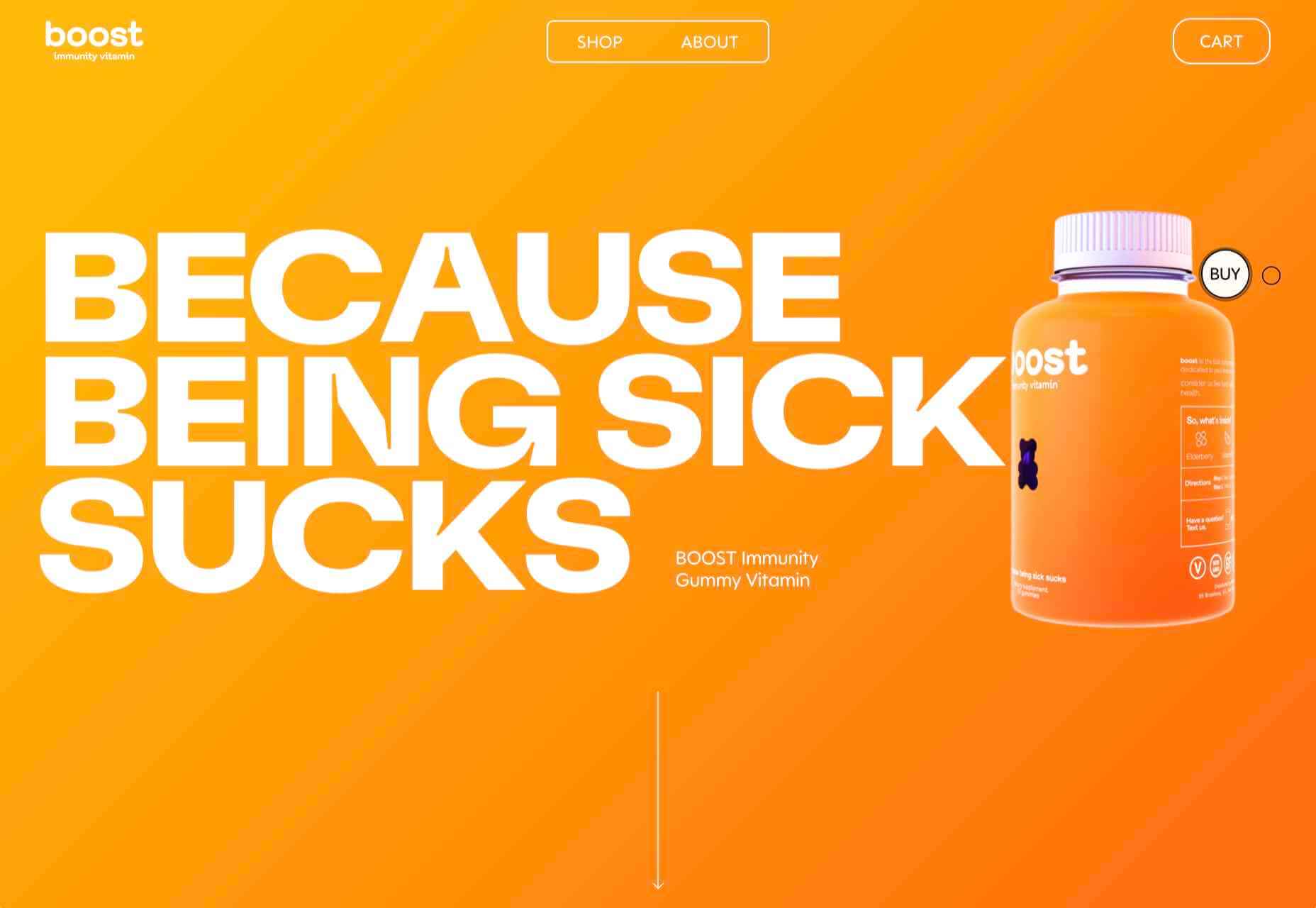
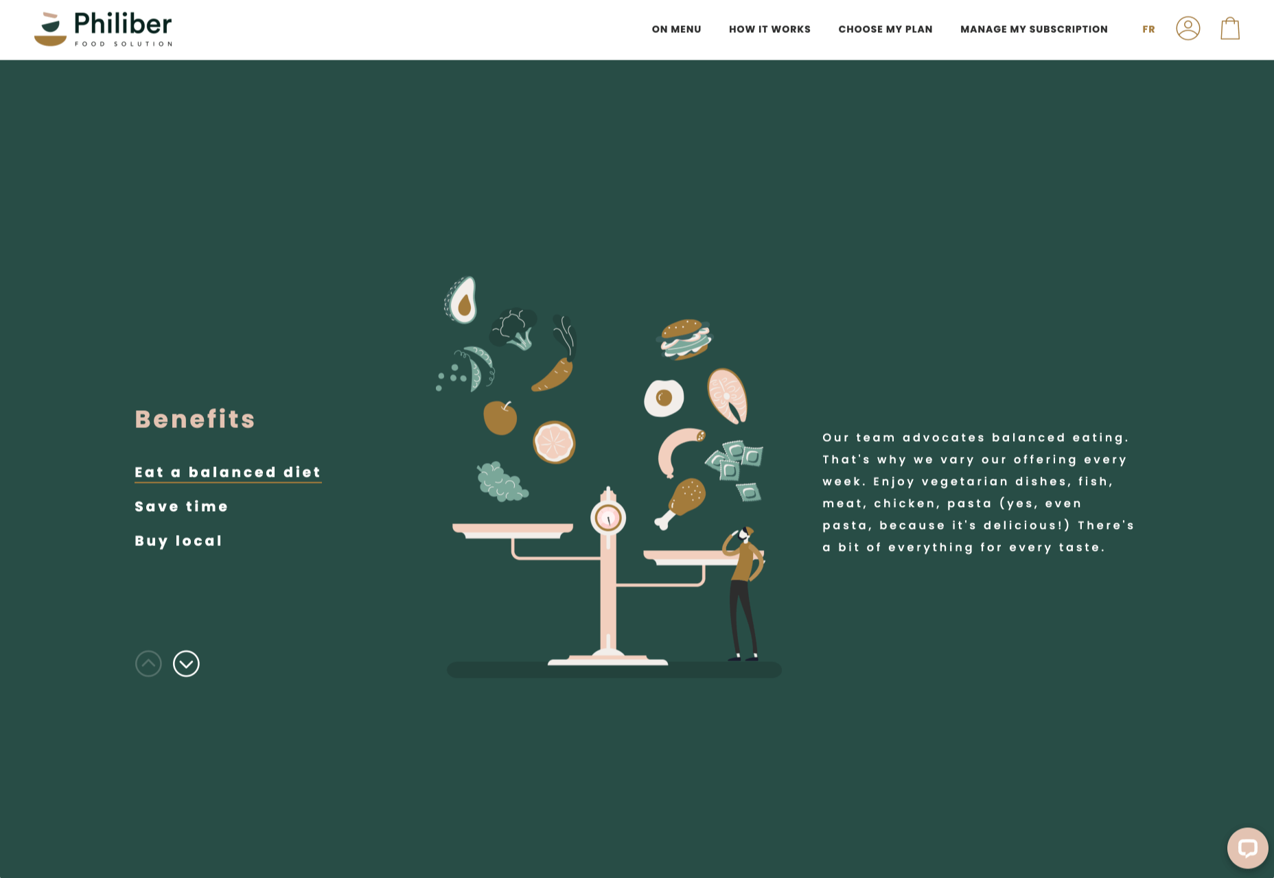
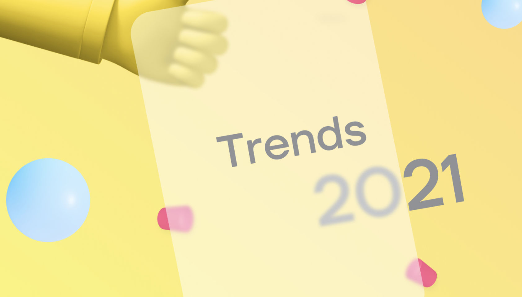
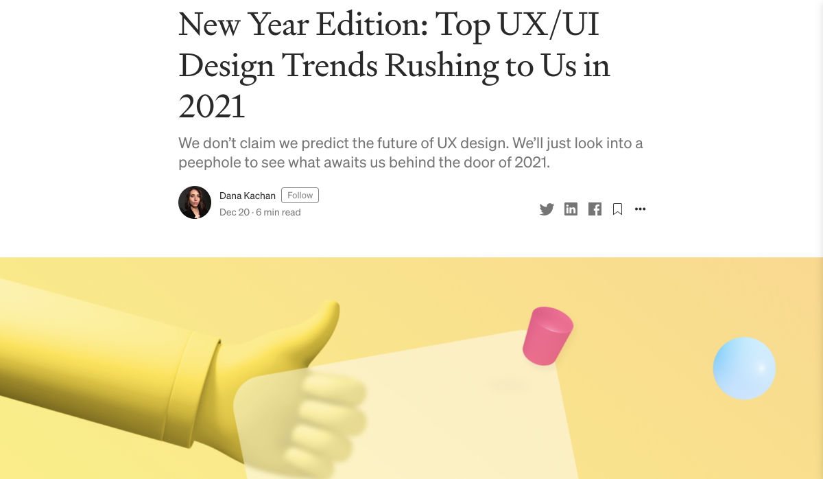
The start of the year is always a good time to reassess priorities and consider new approaches, but 2021 is more of a reset than we expected this time last year. 2020 is unlikely to go down in anyone’s autobiography as the best year of their life, but it has done something positive: it’s prepared the ground for rapid change in the next 12 months.

More than any other year in our lifetimes, 2021 is set to be revolutionary, with emerging trends that will last well into the new decade. Here’s what we think you can look forward to around the next corner.

1. The End of Minimalism

Minimalism has been the de facto approach to web design for the last decade because it works.

But design reflects the zeitgeist. Where minimalism once felt clean and fresh, it’s starting to feel dull and uninspired. There have been a few false-starts breaking out of the long-term trend, but thanks to the pandemic, 2021 will be the year minimalism finally folds — at least for a while.

Prior to coronavirus-mandated lockdowns worldwide, there were already signs of a more vibrant, more decorative, more joyful approach to design. Simple typefaces have been replaced with more decorative examples — faces that use ink-traps to fake 3D effects are surprisingly popular.

trends are cyclical, and the wheel always turns

One of the biggest aspects of this blossoming trend is the move away from Material Design-style flat color not just to gradients but to multi-color gradients and even animated gradients. Even Apple, the last bastion of the clean white-box approach, jumped on the gradient bandwagon with its Big Sur branding.

One of the few things COVID-19 hasn’t slowed is the adoption of new web technology, and CSS, in particular, has had some major developments in the last year. CSS Grid is now a practical technology, and our ability to code standards-compliant designs that aren’t dependent on hierarchical boxes is greatly enhanced.

After more than a year of pretty grim news for most people, much of the world will be vaccinated over the next twelve months, and life will rapidly return to normal. The last global crisis on this scale was the 1918 influenza pandemic, and it led directly to the decade known as the Roaring Twenties.

Minimalism was already dipping in popularity — trends are cyclical, and the wheel always turns — but lockdown, or perhaps more precisely the end of lockdown, is the catalyst for significant change.

2. The Decline of WordPress

In Autumn 2020, something entirely unexpected happened: The W3C announced the platform its new web presence would be built on, and WordPress — the previous choice of the web’s steering committee — didn’t even make the list of finalists.

Due to accessibility concerns, the W3C development team opted to migrate away from WordPress to Craft CMS. The decision was met with a mixture of glee and outrage. But whether you agree with the decision or not, it’s hard to see it as anything other than yet another symptom of WordPress’ decline.

WordPress faces a triple threat: there are web builders that do an adequate job for low-end web projects; there are newer rivals like Craft that outperform WordPress as a CMS; there’s a growing interest in alternate approaches, like Jamstack.

So will it all be over for WordPress in 2021? Not even close. There are myriad reasons WordPress will continue to be the choice of designers and developers for years to come. Tens of thousands of professionals worldwide have invested their whole careers in WordPress; there are millions of themes, plugins, templates, and build processes that are tightly woven into the WordPress ecosystem. What’s more, there are millions of sites with substantial content archives powered by WordPress [WebDesignerDepot is one such site].

WordPress reportedly powers approximately 37% of the web, and it will still be the dominant CMS in 2022. But it’s unlikely to grow beyond that 37%, and by 2030 its market share will be in rapid contraction.

2020 was the high-tide mark for WordPress

But for all its faults — and it’s undeniable that WordPress is full of faults — WordPress is the best of the web; it has given a voice to millions of people, launched countless careers, and empowered entrepreneurship worldwide.

2020 was the high-tide mark for WordPress, but it’s not an extinction-level event — even the much-maligned Flash, which was killed dead in a matter of months by the first generation iPhone, limped on until a few weeks ago.

WordPress will have to find a niche and accept a smaller market share; in doing so, it will address the single biggest complaint that anyone has about WordPress: that it’s trying to do too much.

WordPress is one of the great success stories of the web. In a decade, it may have to settle for powering just 10% of the web — a level of failure most of its rivals can only dream of.

3. The Digital Currency Explosion

2021 is undoubtedly the year that cryptocurrency goes mainstream. In 2020 Bitcoin grew by almost 400%; currently valued at around $35k, conservative predictions for a December 2021 valuation are $100k, with five-year predictions as high as $1m. And Bitcoin isn’t the only cryptocurrency; the value of developer-friendly Ether has jumped by more than 50% in the first few weeks of 2021.

In the US, the incoming Biden administration is preparing a multi-trillion dollar relief package, which many believe young Americans will invest in cryptocurrency. Perhaps more importantly, large investment banks are now pumping hundreds of millions in digital currencies. PayPal and Visa are both in the advanced stages of adopting blockchain technology.

The biggest threat to the new digital economy is the volatility of cryptocurrency. You cannot price services in XRP if XRP’s dollar price could crash at any time — as it did a few weeks ago.

And so there are two routes in which this trend will unfold for ecommerce. Either pricing will remain in dollars, and the equivalent price in various cryptocurrencies will be calculated in real-time. Or, transactions will make use of stablecoins like Tether that are tied to the value of the US dollar.

Cryptocurrency is the latest gold-rush, and whether you think it’s the chance of a lifetime or yet another Ponzi scheme, it will become increasingly high-profile in ecommerce throughout 2021.

4. No More Video Calls and also More Video Calls

2020 was the year of Zoom. Its growth from bit-player to overtaking Skype is a material lesson for entrepreneurs that every obstacle is an opportunity.

every obstacle is an opportunity

Over the last year, we’ve discovered two things: meetings are more creative in person, and office costs are significantly reduced when staff work remotely.

There’s going to be a shift in the business landscape this year. Remote working will continue to be normal for years to come as businesses enjoy rent savings. Video calls will still be common for quick update meetings. But expect to travel to physical meeting places periodically for in-depth strategic planning.

Expect to see major cities with deserted office buildings and a rapid expansion of co-working spaces, especially those with meeting spaces — if WeWork can hold on a little longer, there may be light at the end of the tunnel.

As a web professional, you’re in a unique position to thrive in the new business world, even more so if you’re a freelancer. Remember, if you’re working onsite, be mindful of your physical health, and if you’re working remotely, be mindful of your mental health.

What Do You Think?

No one saw 2020 coming. Sometimes world events are outwith our control, and we have to hang on and hope it gets better. It’s been a tough 12 months, and the truth is we’re not through it yet.

But the 2020 coronavirus pandemic is the first pandemic in human history that we’ve had the technology to shorten.

2021 offers the opportunity for enormous change. Will designers look for new, more decorative approaches? Will we replace our technology stack? Will you be billing clients in Ether this year? Will you suffer the misery of a packed evening commute ever again?


Featured image via Unsplash

Source

The post 4 Predictions for the Web in 2021 first appeared on Webdesigner Depot.


Source de l’article sur Webdesignerdepot

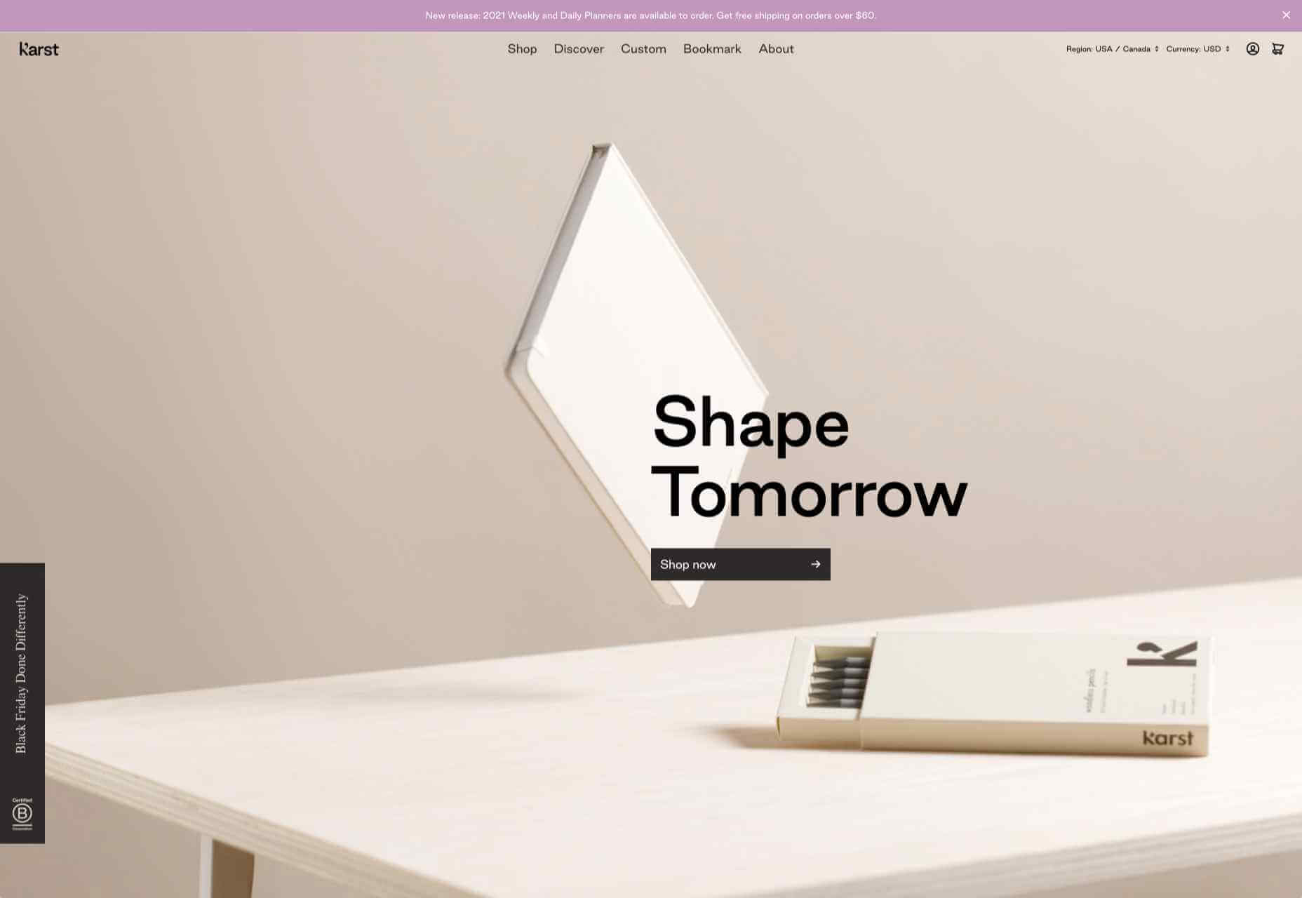
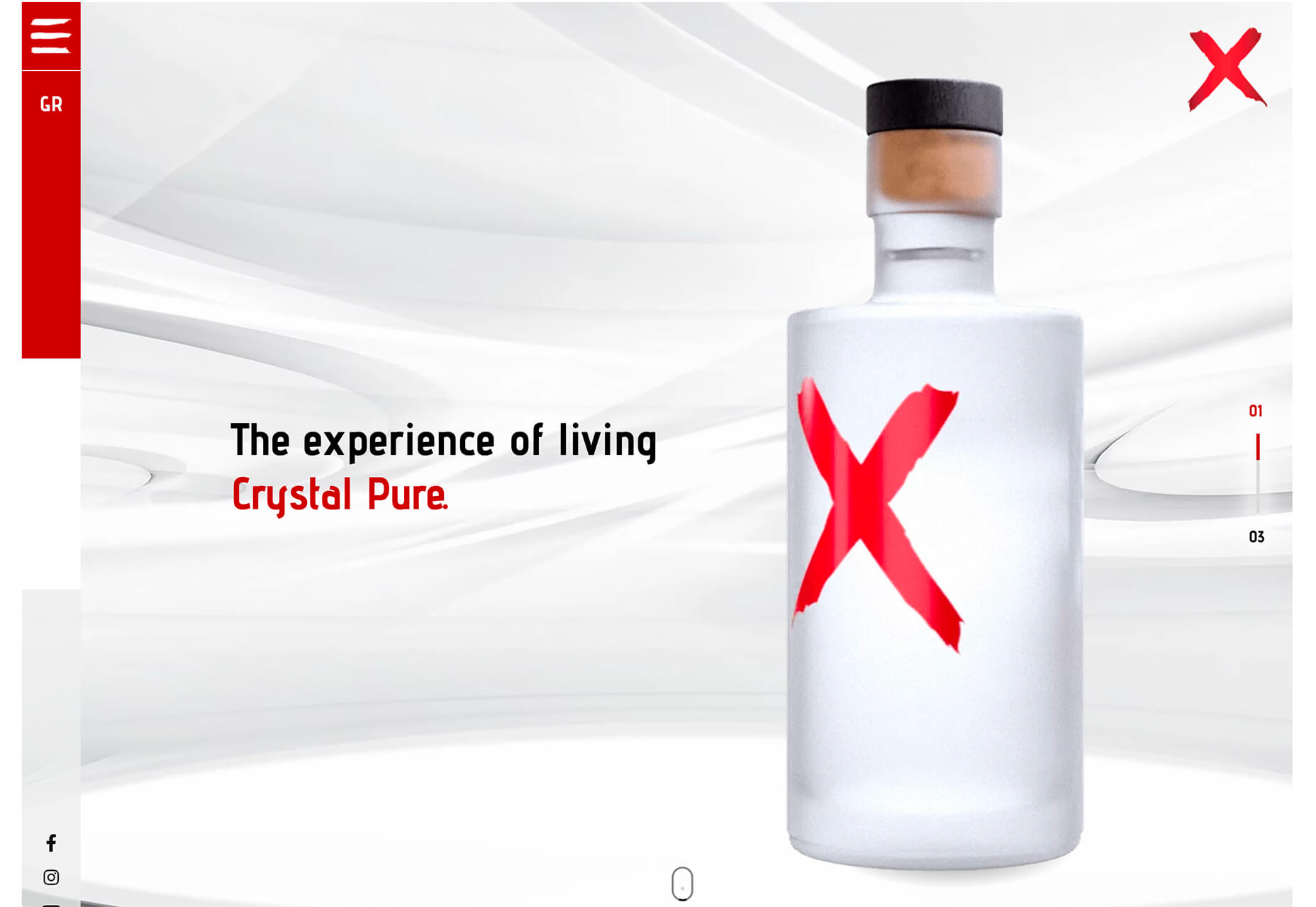
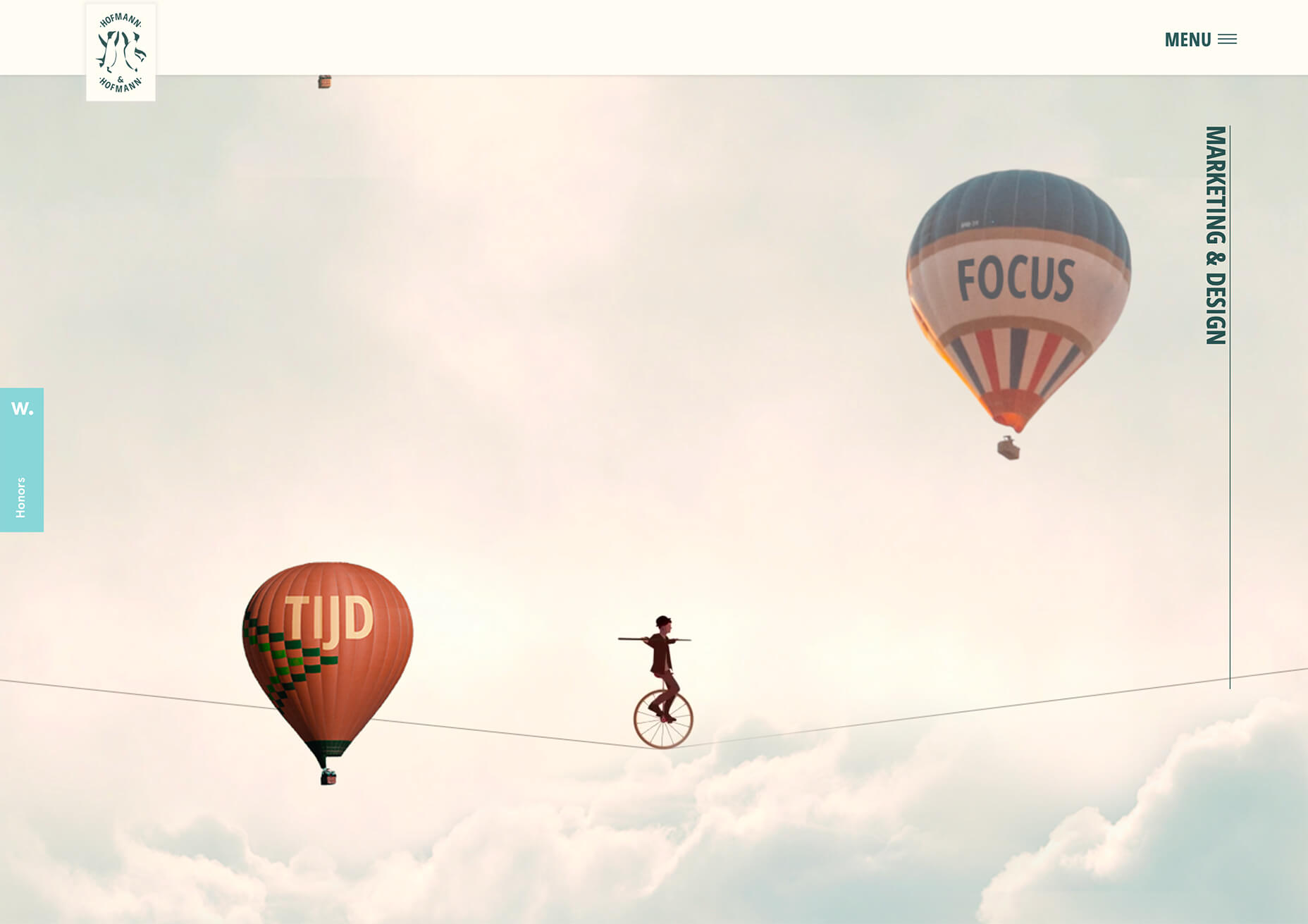
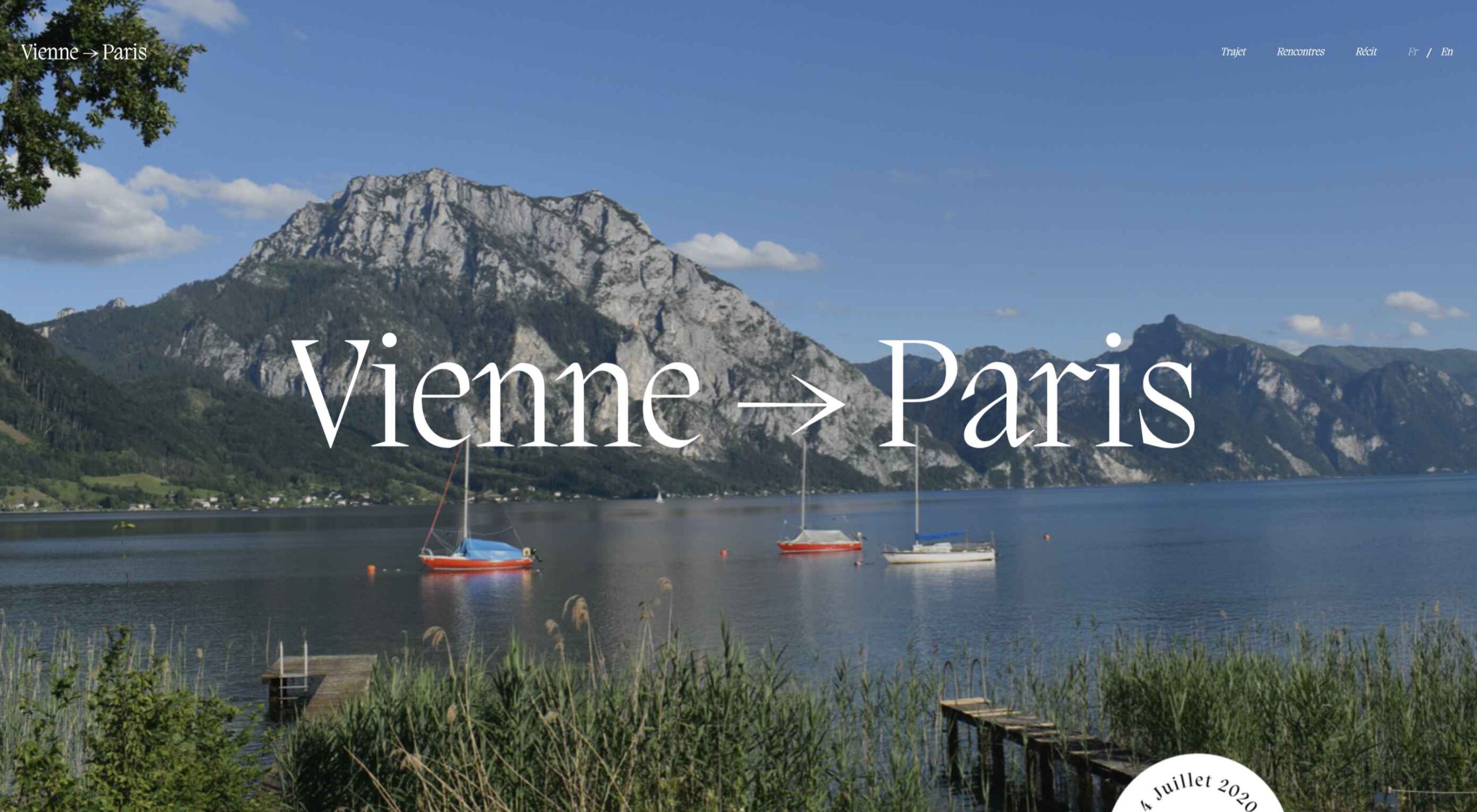
Don’t drop the ball on these website design trends for the new year. All of the trends featured here this month are visual in nature – not as many user interface elements as previous months, but all just as stunning and usable.

Here’s what’s trending in design this month.

1. 3D Scenes on White (Light)

Three-dimensional scenes are not just a trend this month but are likely to be one of the biggest website design trends that you see all year.

They offer a great way to show off product imagery, design something with illustrations or animation for visual impact, and provide usability and understandability cues for users.

It’s a versatile technique that can work with real or created images and are also “COVID-friendly,” something designers have had to think a lot about in the past few months. (Appropriate imagery in design is a real concern, as is trying to design projects without the ability to produce traditional photoshoots.)

What’s neat about all of these projects – and plenty of others – is that they root the design in white or light backgrounds. The light effect creates an easier visual mood that’s clean and emphasizes the imagery.

This website design trend solves a lot of those problems and looks good doing it.

Google’s Cloud design uses 3D illustrated animation on a white background with plenty of depth elements. The primary color palette of illustrated objects pulls it all together and guides the eye through each of the callout labels.

The red words on the screen Crystal Pure fit perfectly with the white-on-white 3D imagery of this design. Red accents pull you into different places on the screen, and it all has a clean feel.

Hofmann & Hofmann uses the same concept with a slightly different approach. The background is still light with a realistic feel and 3D objects, but it is a lot less stark and white. The feel is a little warmer and more inviting than a flat white aesthetic.


2. So Many Stacked Capitals

If you don’t have great artwork or imagery, make your own with typography.

This trend seems like it might be yelling at you just a little, but it still works for the most part — well, as long as you don’t land on too many of these website designs in a row!

What’s interesting about this trend is that many of the designs feature all caps type and serifs. These styles have been making a bit of a comeback, but this use is interesting for many reasons.

The hardest part when using all caps is maintaining readability. That’s why you see some variances in regular, italics, and bold weights, as well as the use of multiple typefaces. The goal is to create a good reading flow with a stunning visual presence.

This trend works best when you have “easy” words on the screen to facilitate scanning. Too many long or complicated letter combinations can get challenging quickly.

Make sure to look for the Easter eggs in each of these projects:

Emotion Agency has tiny “waving” illustrations next to each word (which doubles as the navigation) when you hover over them.

Mill3 Studio has a few animations, from the text flying in and out on load and scroll to subtle movements in the emojis.

Bizarro has this fun little cat video with a tiny warning not to hover over it, but you definitely should.


3. Empty Places

The final trend in this roundup is a stark reminder of current times. Each of the website design features empty places or locations.

This style of imagery would have been avoided pre-pandemic because tourism locations would want visitors to feel like a part of a bustling environment. Not today. If you travel, chances are you may feel safer or want to be in a more secluded environment.

All of the images and videos from these locations show just that.

Designers are doing this with new stark imagery that stands alone for the design or inserting a few empty place frames into video clips or among images that show more populated times. Even scenes that contain people show very few people and focus on more solitary activities.

Paragon Oak does this by showing a beautifully lit location at night. Note that using a nighttime photo eliminates questions about where the people are or what they are doing. (This is a clever option when showing imagery of an empty place.)

Vienne to Paris shows boats on the water with a beautiful background. While you assume there are people on the water vessels; you don’t see them and get the feeling that everyone is separated in their own “pod,” a pandemic-friendly option for travel.

The Maryculter House shows various images without people – the resort’s location on beautiful grounds; empty, but immaculate rooms, and a few images of a person alone on the grounds. Again, the empty nature of the place feels more appropriately welcome for the time we live in.


Conclusion

One of the things that we’ve seen with design trends in the past year is pandemic-related. The composition of images to the way elements are arranged on the screen influences every aspect of our lives.

While the empty place image and video trend is big now, it may fade post-pandemic. Although, it could still be relevant for quite some time. It will be interesting to see what happens as the year progresses with this trend – will it hold on or fade away?

These trends might continue to hold well into 2021.

Source


Source de l’article sur Webdesignerdepot

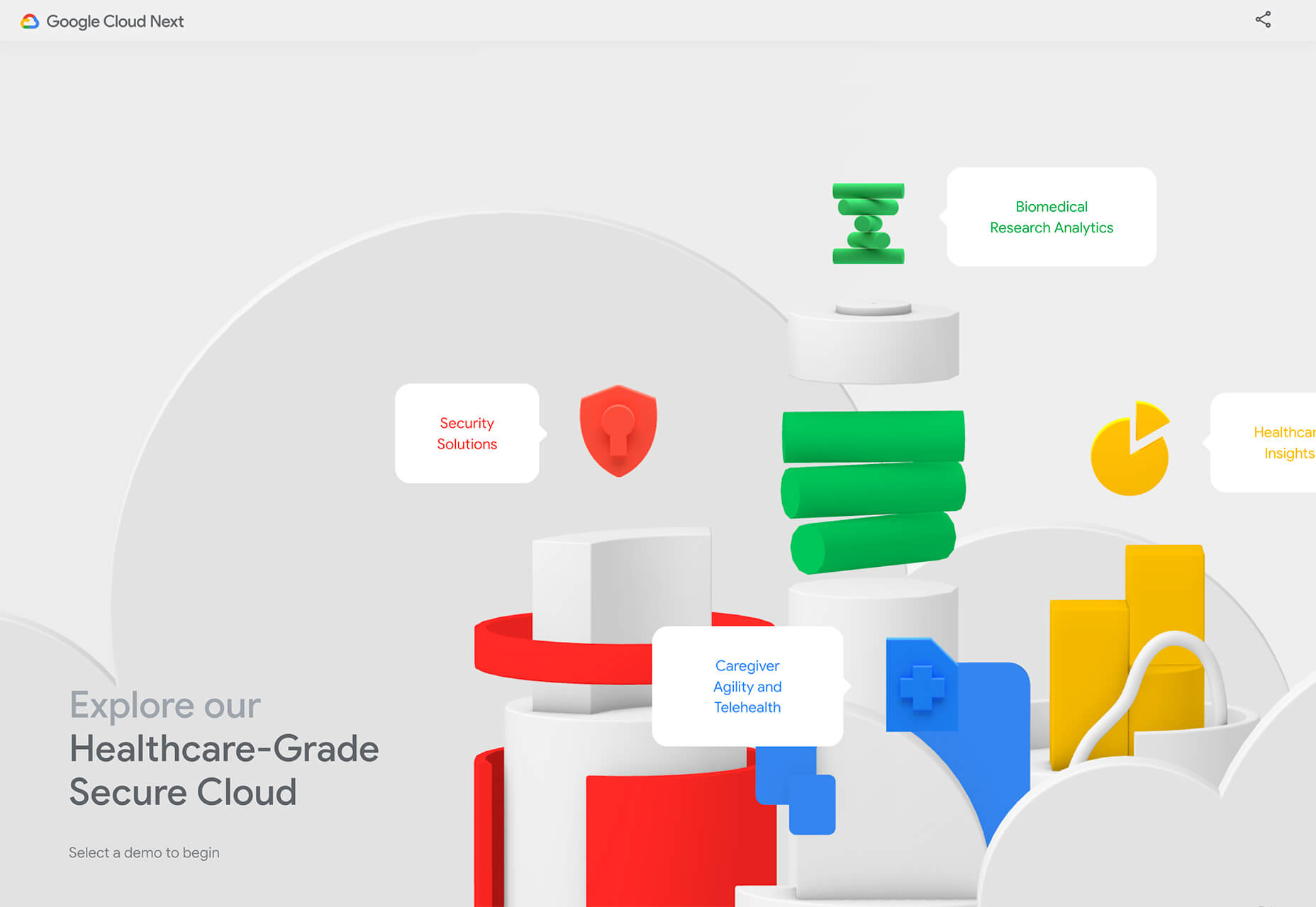
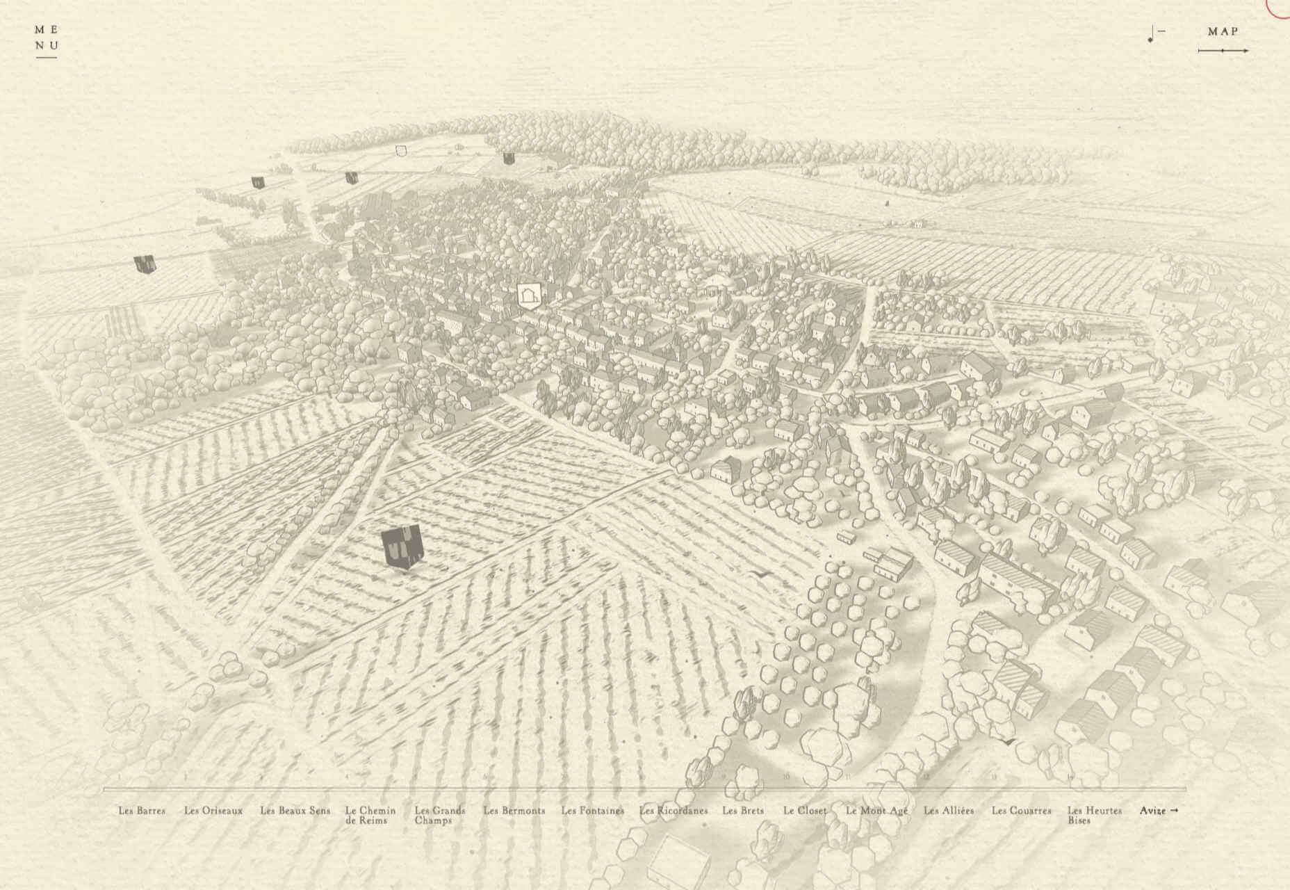
Every week users submit a lot of interesting stuff on our sister site Webdesigner News, highlighting great content from around the web that can be of interest to web designers.

The best way to keep track of all the great stories and news being posted is simply to check out the Webdesigner News site, however, in case you missed some here’s a quick and useful compilation of the most popular designer news that we curated from the past week.

Minimal CSS Loader Collection


Webdesign Toolbox: Find the Perfect Web Development Tools


Facebook: Free as in Bullsh*t


New Year Edition: Top UX/UI Design Trends Rushing to Us In 2021


Our 50 Favorite CSS Libraries, Frameworks and Tools from 2020


404 Page Inspiration – The Best 404 Pages from Around the Web


7 Best Instagram Tools for Designers in 2021


HTML New Tab for Chrome – Design your own New Tab Page


48 Incredible Ways Designers Responded to COVID-19


QR.New – Make a New QR Code with Text


Hotwire – HTML Over the Wire


Entry.dev – Entry-level Developer Jobs


The Dribbble Shots that Defined 2020


Convert Web Pages into PDFs with Puppeteer and NodeJS


Best Practices for Building Offline Apps


Axel – Powerful Rituals to Drive your Team to Success


Sorry, but We are not all Designers


Zecoda – The Easiest Way to Build Websites Without Code


Nebula – A Fully Featured Particle System Designer for the Web


Write Code. Not Too Much. Mostly Functions


How to Favicon in 2021: Six Files that Fit Most Needs


5 Years of Design – Time Travel Through Handpicked, Beautiful Designs


How the Web is Really Built


How to Be a 10x Developer


Why this Forgotten Punctuation Mark Should Be Revived for 2021


Want more? No problem! Keep track of top design news from around the web with Webdesigner News.

Source


Source de l’article sur Webdesignerdepot

As someone who became a Salesforce developer by accident 10 years ago and parlayed that into a career and business, I’m fully aware of the dividends that investing in continuous learning and brushing up on the latest in my industry can yield.  Even after years of working in the Salesforce ecosystem, earning 11 certifications, and going through several hundred different projects, I’ve found it’s difficult to make the time to keep up with all the new tools and features of modern development (and usually I have the TrailheaDX and Dreamforce conferences each year to get caught up!).  

Due to the COVID-19 travel restrictions, in-person conferences are canceled. However, a new video series piqued my interest. In particular, two Salesforce Developer Advocates, Mohith Shrivastava and Julián Duque, are doing a series on Modern App Development on Heroku/Salesforce.

Source de l’article sur DZONE

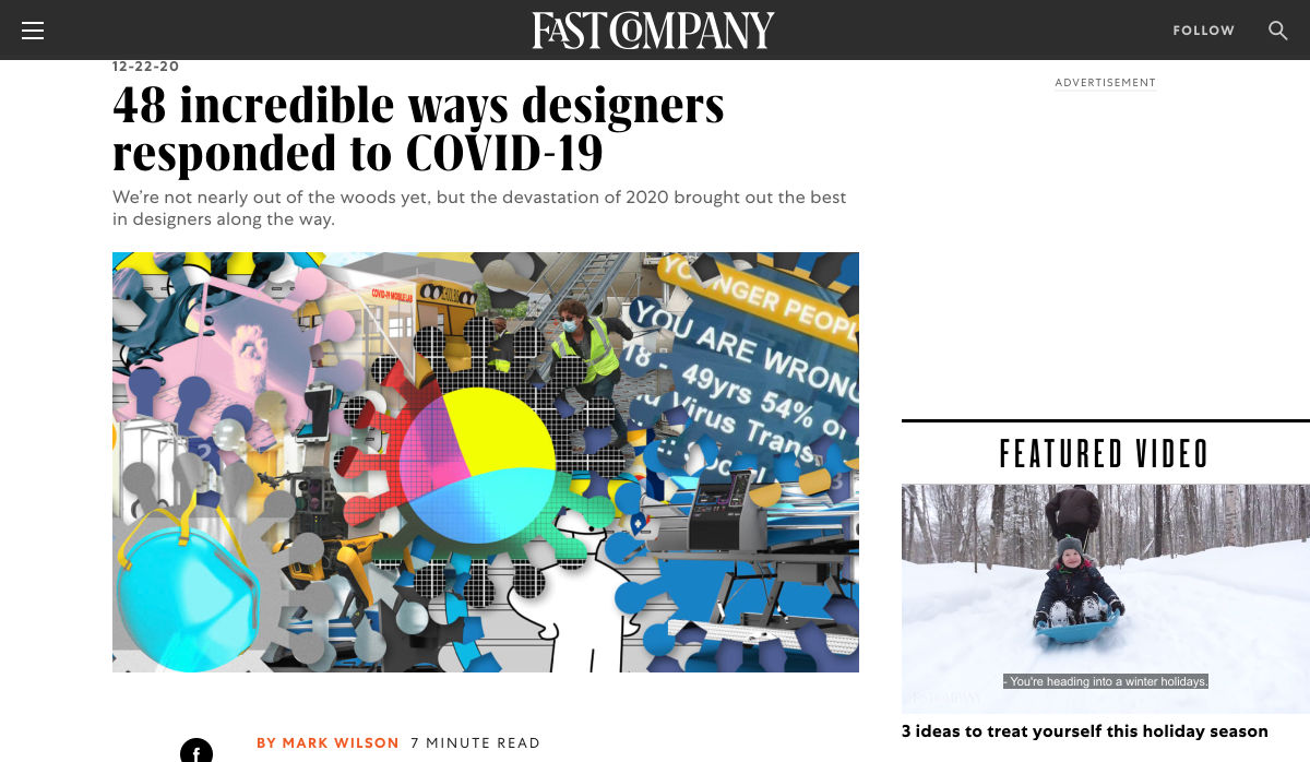
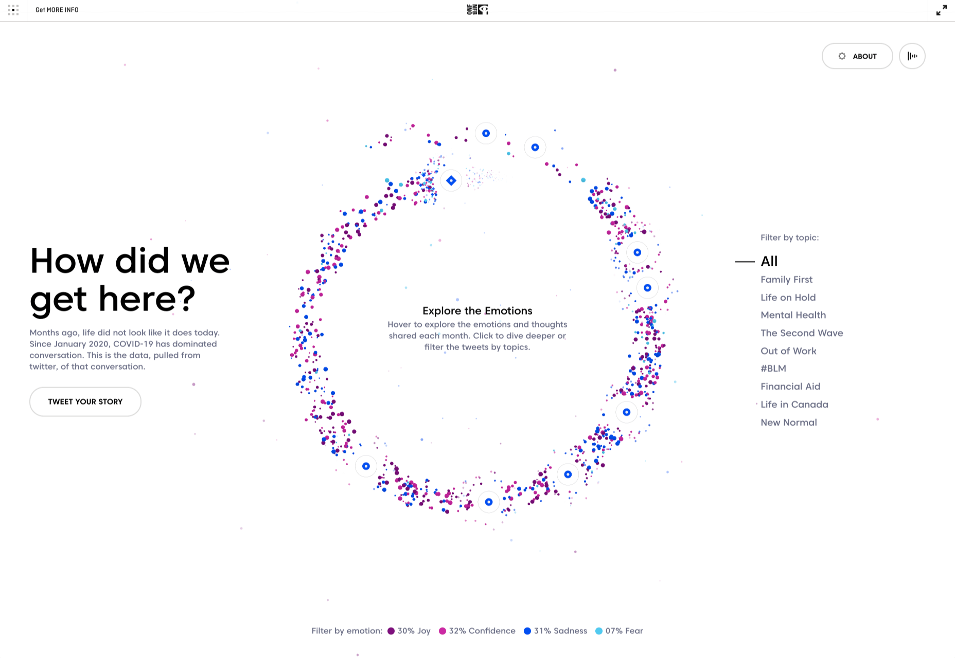
As we approach our first winter holiday season since the pandemic set in, the world could feel like a very scary place; there is a great deal of uncertainty about the future for businesses, for young people in education, for jobs, for travel. Celebrations are certainly going to be a lot quieter this year.

And yet, the web is far from showing doom and gloom. We’re seeing confidence and positivity in designs across the board. As businesses and people adapt to the demands of social distancing and WFH, we’re seeing a focus on simplifying, appreciating quality over quantity, taking better care of ourselves and our world, and making the most of our time. And this is reflected through design in a variety of ways: visually minimal style, pared down content, fresh colors, statement type, great photography, illustration.

There is confidence in abundance on the web. Enjoy…

Mammut Expedition Baikal

Mammut make outdoor clothing and equipment, and this microsite is for its Eiger Extreme collection. Stunning photographs of Swiss speed climber Dani Arnold climbing at Lake Baikal in Siberia are cleverly interspersed with details of the company’s products he can be seen wearing, along with links to buy. It feels natural, rather than forced.

Wavering Stripes

This a beautifully made site highlighting the experiences of people held in immigration detention centers in the US. The illustrations belie the grimness of the stories told — on the landing page there is a warning as to the nature of the content.

Juan Mora

Proof that holding pages don’t have to be boring, this ‘under construction’ site for interface designer Juan Mora is a far cry from the warning-barrier and stick-figures-at-work gifs of the web’s early days.

Cafecrema

Cafecrema’s simple, one page site creates the atmosphere of 1950s coffee shops through its illustration style, a jazz soundtrack, and a very mid-century modern color palette.

A N Other

Perfume brand A. N Other prioritises quality ingredients and materials, simplicity, craftsmanship, and the environment. Its website captures this perfectly, and invokes a sense of luxury as the result.

Puddle Sound

Puddle is an architectural and interior design company, who also do product and furniture design. For a Tokyo hotel project they created a vacuum tube amplifier, that is the subject of this site. It is as simple as can be with only the barest essential information, and with all attention focused on the product shots.

Hous

Hous Luxe Woningen are a Dutch company who build luxury homes. The high quality images, muted color scheme and generous use of white space in its website reflects this sense of luxury perfectly.

Who Cares?

Who Cares? is an interactive game designed to raise public awareness of endangered animal species. The illustration style is very pleasing, and there are some lovely little details in the animation and sound.

Ugly

This site for sparkling water company Ugly, uses bold, cartoonish typography and illustrated characters to add a lot of character to, well, water.

Glyphs

Glyphs font editor version 3 was released on 16th November. The accompanying site has a fresh feel, mainly due to its striking color scheme. The on scroll animation showcasing variable fonts is a nice touch.

Ruler Agency

Ruler Digital Agency uses color only in the images of work on its own site. Everything else is grayscale, even the images, which can be a really effective technique when it is used well, as it is here.

Zoë Pepper

Zoë Pepper is a collective of freelance brand strategists who work with early stage startups. The site is minimal without feeling empty, and utilises quirky illustration and scrolling animation to good effect.

Karst

Karst make notebooks using paper made from stone, and woodless pencils. Its site has a simple, clean feel with a muted, neutral color scheme that complements the colors of its notebook covers.

London Alley

London Alley is a production company who concentrate on music videos and advertising. Its site is simple and striking with plenty of video, and effective use of split screen.

LoveSeen

LoveSeen makes false eyelashes, and nothing else. The site has a fun, inclusive feel — more girl(and boy)friends together than glossy, high fashion magazine. It’s appealing and persuasive.

Chartogne-Taillet

This site for wine-growers Chartogne-Taillet uses illustration and an animated, ‘hand’ drawn map to create a sense of heritage, appropriate for a family with a long history of making wine in the Champagne region. It is reminiscent of a label on a good bottle of wine.

Refusi Studio

Refusi Studio is a design agency from Italy. This portfolio site is simple, with strong colors and big, statement typography. And a giant cartoon eye.

Yesterday, Today, Tomorrow

Yesterday, Today, Tomorrow is an interactive project from the National Film Board of Canada. It uses tweets to trace emotional ‘waves’ throughout the Covid-19 pandemic.

Boost

Boost is a gummy (chew) vitamin supplement for the immune system. Big type, big graphics and lots of orange and purple — the colors associated with vitamin C and antioxidants — make vitamins cool.

Philiber

Philiber is a meal delivery subscription service, available in urban centers in Quebec. The site is clean and modern, with a comforting color scheme and a nice mix of photography and flat style illustrations.

Source


Source de l’article sur Webdesignerdepot