Articles

Maps are a fascinating method for delivering content. At their best, they can create an intuitive way of presenting information and interacting with it. This is the advantage that digital maps, through mobile apps and websites, have over print maps and images where no interactivity is possible.

But it’s important to understand that more data ≠ better experiences. We all now have so much data available to us through multiple services that, arguably, the greatest challenge isn’t sourcing information but filtering it out. We can only handle so much information input before we become overloaded. This issue risks being omnipresent with maps. There are so many potential points of interest on a map that it’s essential to be clear about what needs to be exposed to users.

Also, UX design, map design, and user interface are all critical. While maps can be a powerful way of drawing people in, if end-users feel that you didn’t even consider the visual design, they’ll ‘bounce off’ your site or app in moments.

Common Use Cases

When are maps useful, and what problems do they solve? Let’s dive right into the most common use cases for maps used in web design.

Navigation and Direction

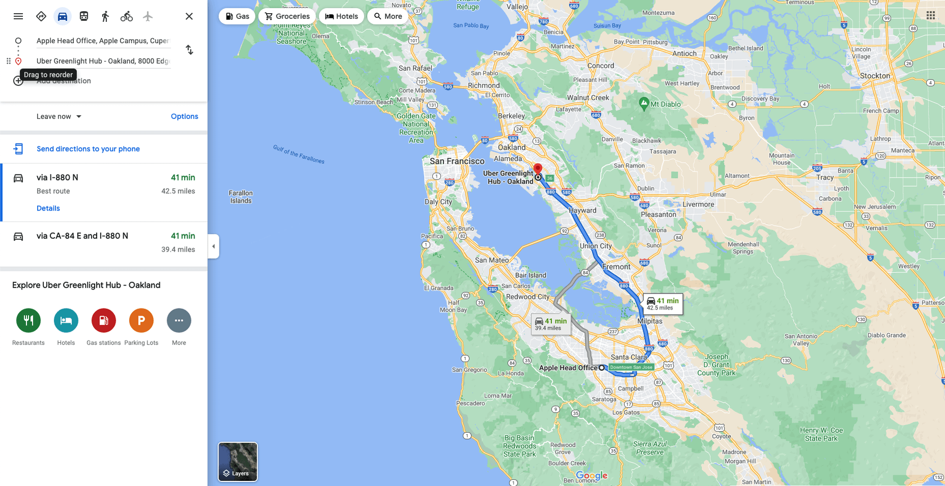
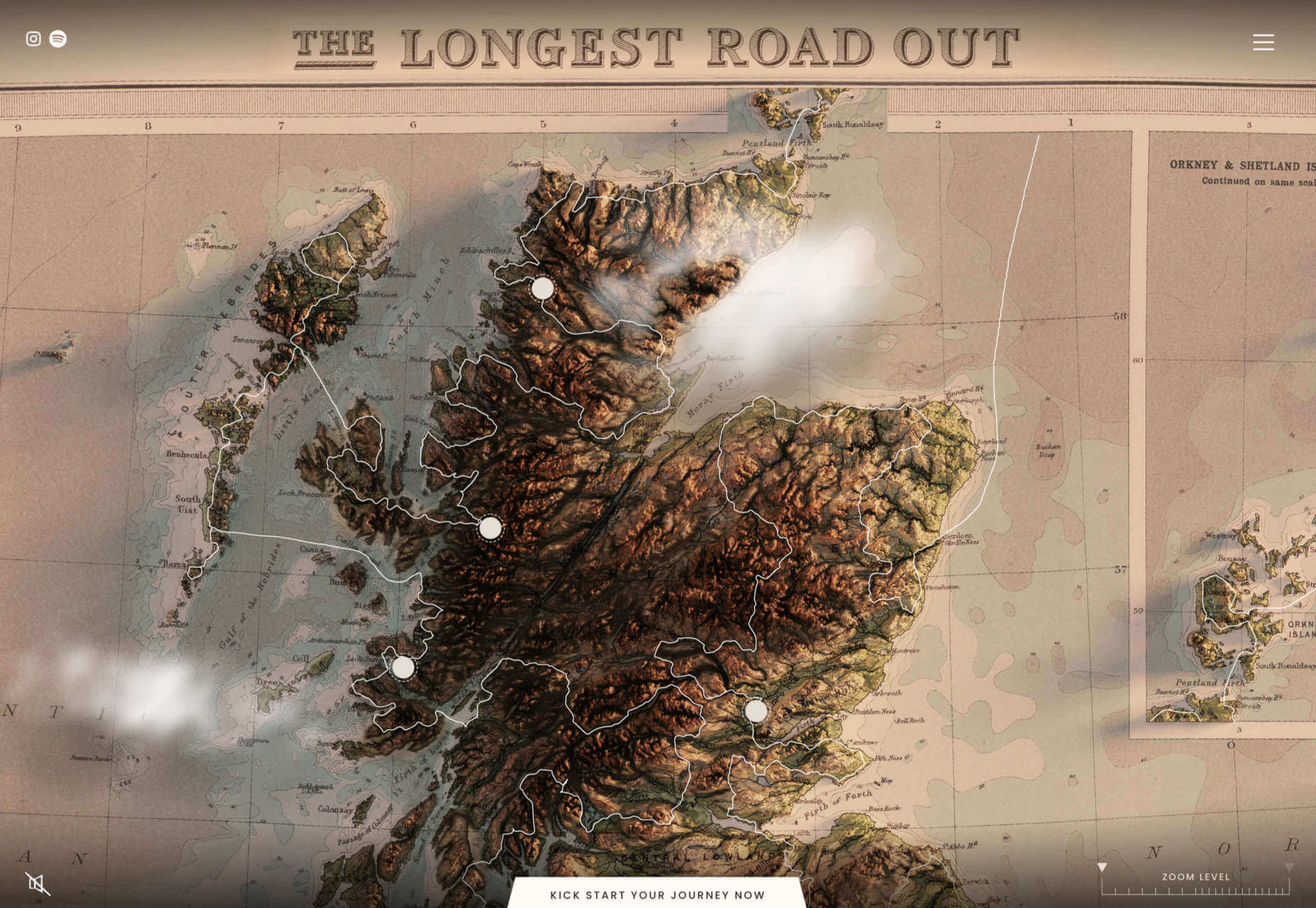
Like Google Maps shows, navigation and direction are arguably the classic case study for interactive maps. You are in one place and need to get to another. You can enter your destination, your current location, and the map will present suggestions for getting there. You can select the method of travel and adjust desired departure or arrival times. But you need to understand first what functionality your users need. How these options are exposed to users is a critical piece of UX design.

Also, if users are searching for options such as somewhere to eat, it’s not so straightforward. Then, how your map handles panning in real-time as users swipe around a city is going to be a big issue.

Showing Relationships and Trends Geographically

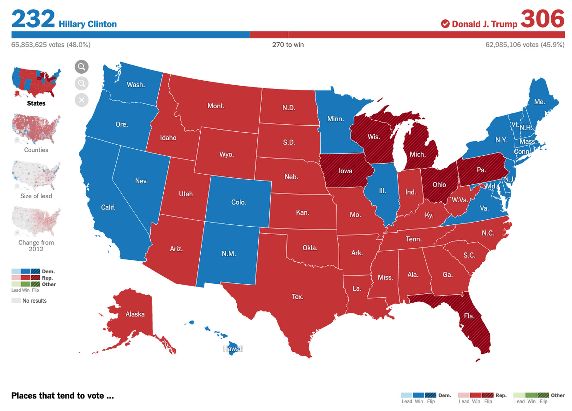
This is something that you’ll see in every election in any western country. We’re all used to seeing maps that give us a state-of-play for which state or seat is held by which party. Then, we might see projections based on voter intentions and projected voting swings deriving from that. Then, exit poll data can be projected with the map updated on an ongoing basis until the final result is confirmed.

The capability to do this is essential because if a static map were used, it’d be out of date any time a new poll was released. Also, voting intentions can change over a campaign, so such maps need to be dynamic. Of course, such maps are only as accurate as the available data, as the US 2016 election map showed.

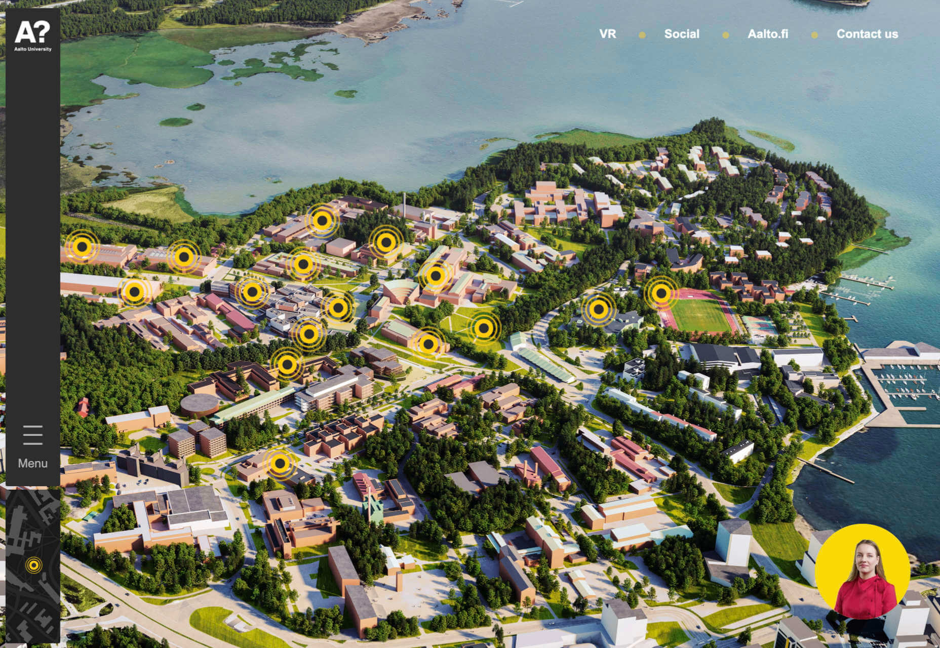
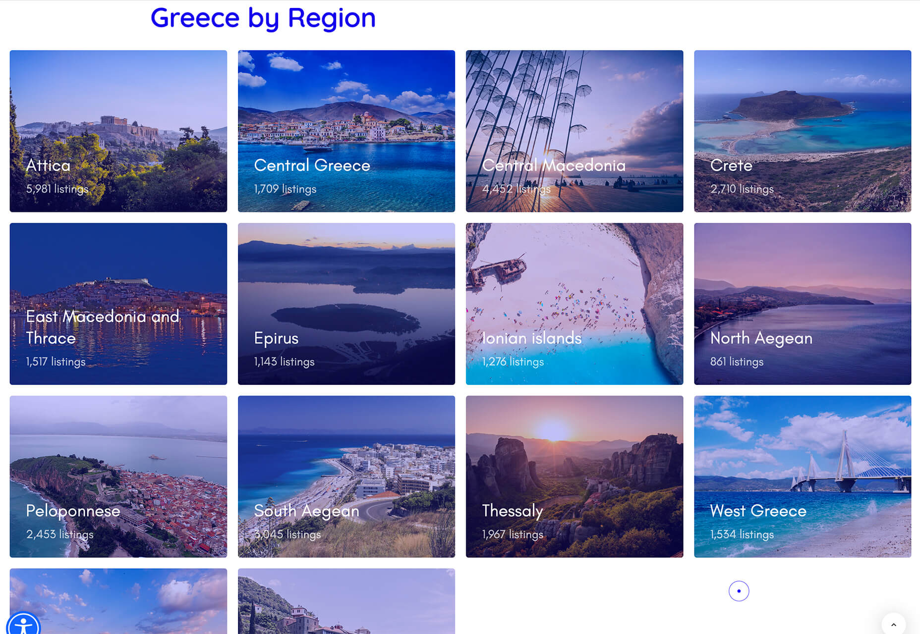
Show Points of Interest

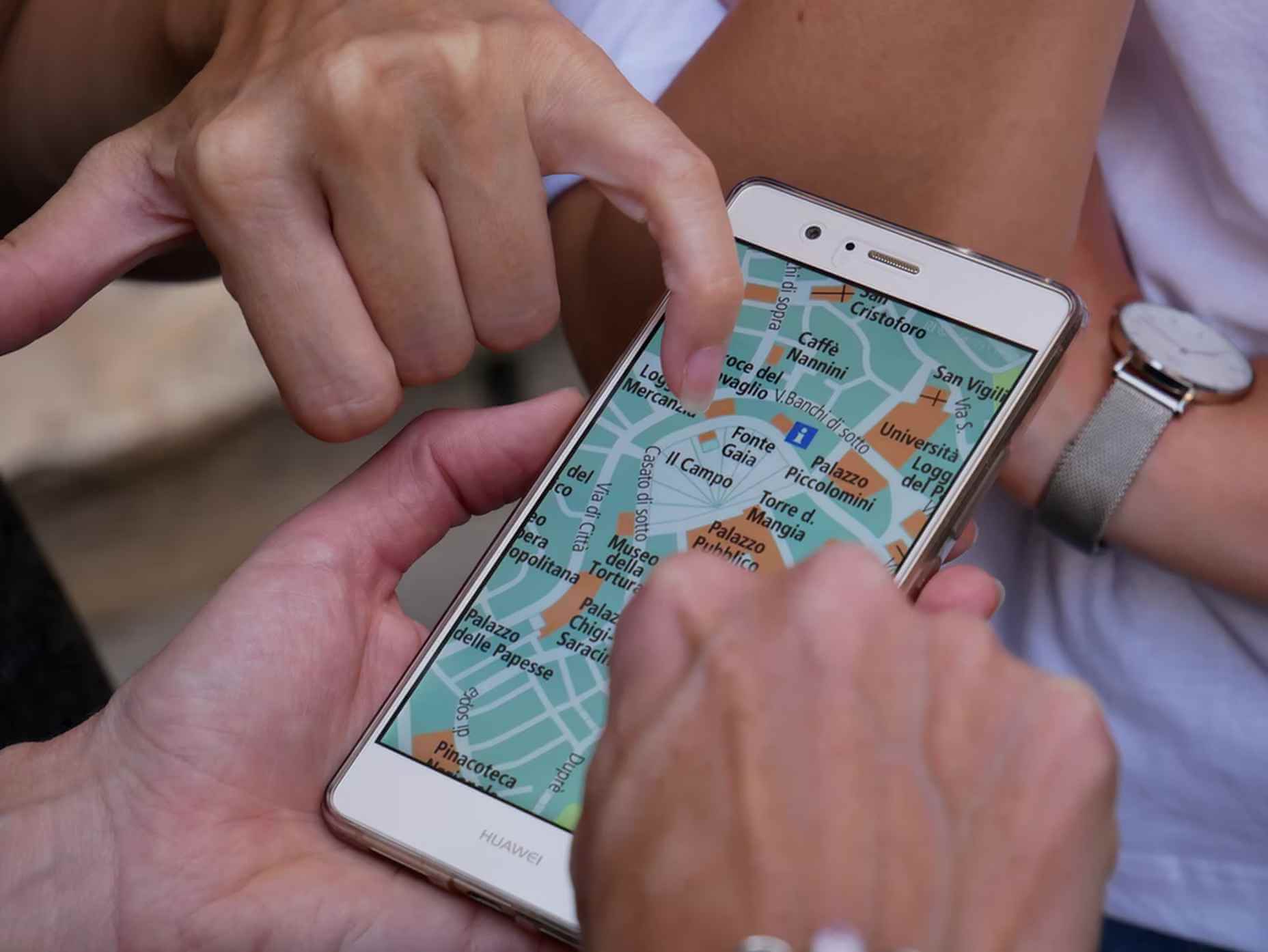
As mentioned previously, there’s a lot of data that can be exposed to map users. However, that doesn’t automatically mean that it should be. Usability is key. For example, when you look at a map, you’ll typically first see key points of interest. Which points of interest are going to be presented to you can vary.

One variant is zoom level. If your map is currently showing an entire city, the level of detail the map presents is deliberately limited. You’ll see districts, large roads, or geographic features such as rivers. If more detailed information were presented, users on mobile devices, in particular, would be overwhelmed. Even at this level, you’ll notice typography differences. These can include the city name being in bold or the names of different areas in capital letters. So the level of detail is coupled with the scale of the map. Zooming in a few notches will expose significant points of interest, such as museums. Zooming in to specific districts will reveal restaurants, coffee shops, and universities. This visual hierarchy is a critical way of managing the exposed level of information.

But information is still being abstracted away. It’s not until you tap on the museum that you’ll see information on opening hours and busy times. This is also typically presented with user photos and reviews. Context is also taken into account, so you’ll start to see local hotels and restaurants. So it’s not just individual points of interest that are important, but the connections between them.

6 Tips For Improving Interactive Maps

What are the challenges of creating effective maps, and how do people address the data overload problem? We’ll answer this question and go over the must-know aspects of map creation.

1. Ensure Security and Brand Trust

GDPR or General Data Protection Regulation. This is a critically important European law that extends a wide range of legal protection to European citizens regarding personal data. It’s not possible here to cover the full extent of the law, but here are some quick key points:

  • Consent is required for the processing of personal data; it cannot be assumed
  • You need to have a retention policy for information that’s capable of identifying people

Be aware that the latter doesn’t just cover commercial purposes. Research students have to submit GDPR forms that address what kind of data they’re sourcing and how they’ll be retaining it.

But the most crucial context is commercial. If a business suffers a data breach, it can be fined up to 20 million euros or 4% of annual worldwide turnover in the preceding financial year, whichever is greater. Therefore, any business storing data that could identify their customers will need to assess risk and compliance. Remember: it’s 4% of worldwide turnover, not EU turnover.

Also, anything of your business that you expose to your customers or users is an extension of your brand. Therefore, you need to assess your maps for brand compliance too. If you have primary brand colors and your map doesn’t abide by them, that’s a very poor look. Source the color hex codes directly from your brand team and involve them in design.

2. Use the Appropriate Type of Map

It’s also important to consider what type of map is most appropriate for your use case. Think carefully about what your users need, what you’re trying to communicate, what information you need to present, and how best to present it.

For example, points of interest style maps in a tourist app will be way more helpful than heat maps: people want to know where something is, key data like opening hours, and how to get there. A heat map showing the number of visitors to each attraction or area of a city is unlikely to be useful to tourists. However, it could be useful to the attractions themselves to map their visitors by heat map over time. This could help larger museums chart which exhibits are most popular.

Transport for London is charting passenger movement on the London Underground by detecting when a device with Wi-Fi comes into range and then passes out of range. They’re using this to understand overall user journeys and movements within individual stations to better manage disruptions.

3. Avoid Pop-Ups

It should go without saying by now that auto pop-ups are despised. It doesn’t matter what they’re doing or what they’re offering; an unwanted pop-up can only get in the way. The level of impact is even greater on a phone where pop-ups take up even more screen space.

Given this, many users close them without even reading them. So if you’re using pop-ups, don’t kid yourself. You’re likely just irritating users and increasing the likelihood that they’ll ‘bounce off’ or uninstall.

4. Avoid Auto-Geolocation

Auto-geolocation sounds incredibly convenient but can result in some real problems. For example, if there are any bugs with auto-geolocation, you could get false results. If someone connects through public building Wi-Fi, you could get false results. If they’re connecting through a VPN then, unless you get the user’s IP address and check if it’s the exit portal of a VPN, you could get false results.

The problem is most significant with mobile maps. If a map user is looking at a points of interest map, they likely have a specific and immediate use. This means it’s in their best to get the most accurate results possible. So why not just ask them?

Precision and Accuracy

These terms have specific meanings in geolocation. ‘Precision’ is the exactness of the data. ‘Accuracy’ is how closely the information on a map matches the real world. So you want precision and accuracy to be spot on, or data risks losing value. This applies not just to the gathering of data but to the representation of it. For example, if you have street-level data but your maps don’t present individual streets, then any representation of data on that map is likely to have poor accuracy. That map might succeed in abstracting irrelevant information but presenting an imprecise and inaccurate view.

5. Avoid Map Legends as Much as Possible

In many cases, primarily points-of-interest maps, they’re just not needed anymore. An essential part of user experience design isn’t just visual hierarchy but information hierarchy. You can mouse over on a desktop or laptop to get the essentials of a location, e.g., the museum’s name and its opening hours. On a mobile device, you can tap on that location to get the essentials, and you can tap on another location to move on; you don’t even have to press back. Given that, a legend would get in the way. So this simple piece of information design solves information overload issues.

As with all rules, there are exceptions. A good one is a heat map where a density of what’s being measured needs to be communicated. It doesn’t matter what the data is; it just needs to be something where mapping provides greater insight, especially if it informs decision-making. Sales is an excellent example for a national or multinational company. Of course, weather forecasting can make use of literal heat maps.

6. Accessibility Compliance

Not everyone has perfect eyesight. Even if someone has excellent vision, they could still be colorblind (8% of men and 0.5% of women are). Given that, take the W3C’s accessibility standards into account and treat them as a baseline or minimum barrier to entry for compliance. You shouldn’t feel good about the possibility of excluding 8% of your potential audience or customers. Ensure you keep your UX designers involved and don’t shy away from creating senior-friendly web designs.

Put simply: imagine if you could appeal to a new demographic that’s not catered to. If your competitors ignore them, you could give them a real reason to choose you instead by taking some straightforward steps. If your competitors are catering to them, you also need to. If you don’t, you’re just giving potential customers a big reason to ignore you.

Conclusions

The key takeaway is that there’s far more to creating good maps than just good cartography. That can be critical, too, though this may vary depending on the use case.

This will be a team effort because your map will involve data sets, design decisions, and, yes, cartography. You’re going to need to involve brand and IT too. So think about design principles and development methodologies.

First and foremost, what are your users’ needs? If you haven’t done any user research or taken the time to understand the customer journey, are you adding anything or getting in the way? It’s easy to see the department that requested the map as stakeholders, but you should probably view your users as stakeholders too.

This sounds complex, but as you hopefully now appreciate, a map is probably more complicated than you thought.


Featured image via Pexels.

Source

The post The UX of Maps in Web Design first appeared on Webdesigner Depot.

Source de l’article sur Webdesignerdepot

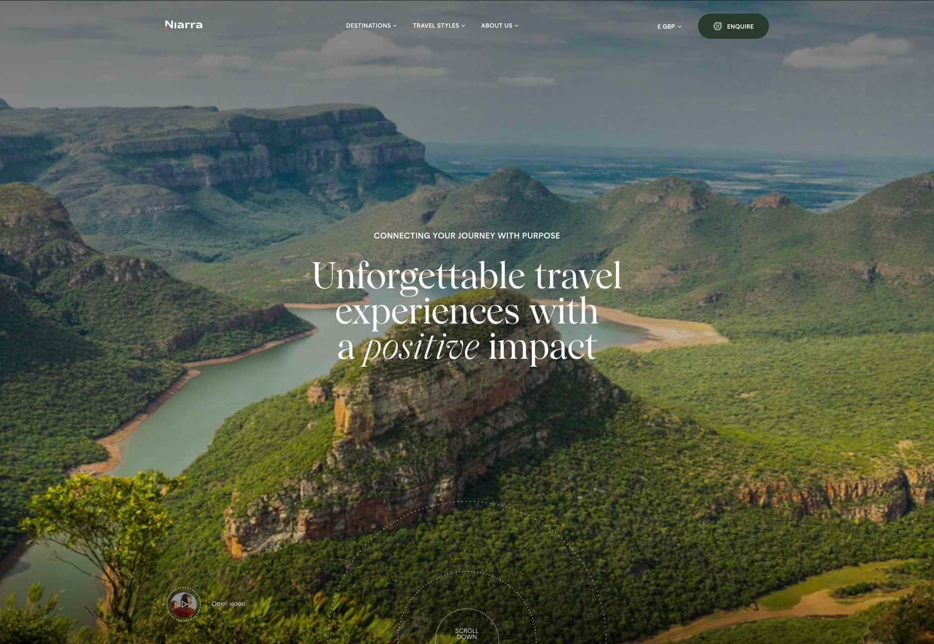
2021 has been both memorable and instantly forgettable. Pop stars were freed from modern-day servitude, some people tried to overthrow democracy, and we all vacationed at home.

Despite the weirdness of the times, the web kept growing, kept changing, and kept on pushing boundaries. We saw a wealth of new sites launch or relaunch with significant updates.

Here are the 50 best sites launched on the web this year. Enjoy!

Crusta C

In April, seafood company Crusta C cleverly used the simple logomark ‘C’ to apply a cutout video effect.

Slow

Slow is a collective of creatives aiming to implement slow movement principles. Its site reflects those aims, creating a sense of calm and deliberation.

hnst

2021 saw tons of brutalist-inspired design. hnst’s take on the style works thanks to the bright red in place of the standard black.

Marram

This site for boutique hotel Marram uses a soft color palette to create an impression of soft golden light and calm.

Levitate

In July, we loved this site for running-blade brand Levitate. The site is clean and light, with a sense of inherent motion in the photography.

Niarra Travel

There’s some beautiful photography on this site for eco-conscious, bespoke travel agency Niarra Travel.

Plunt.co

The core of this site for Plúnt is a combination chooser which feels pleasingly reminiscent of an animal flipbook.

Moth Drinks

Moth makes classic cocktails in a can. The striking black and white graphics and masking effects for its holding page stunned us back in March.

Seed

Selling supplements is hard; people are understandably skeptical. So this site for Seed packs in research and scientific information and avoids the hard-sell.

Wavemaker

Another excellent portfolio site in 2021, this time for creative media agency Wavemaker. The site is uber-confident while still being playful.

Wild Souls

Wild Souls makes nut butters, tahini, and other Greek delicacies. Its site is colorful and warm, and the site typography is soft and appealing.

JUST Egg

JUST Egg produces egg-like food from plant material. The huge photography and bold typography do a great job of making a new concept appealing.

Aalto University

One of the most popular designs of 2021 was Aalto University’s site with its in-depth campus tour. The simple navigation inspired several imitators.

Wisr

Scroll interactions were big in 2021, and Wisr features a Heath Robinson-style machine that ‘runs’ as the user scrolls down the page.

Cevitxef

This site for Cevitxef ceviche restaurant in Bilbao does a great job of making us hungry. Drama is created by oversized text, heavily-styled photography, and lots of movement.

On

The best digital agencies keep their own sites simple, like this site for On digital technology studio that uses black on light blue and adds infinite scrolling.

Acayaba + Rosenberg

We found Acayaba + Rosenberg’s use of architectural photography and subtle scrolling a pleasing browsing experience.

Madre

This site for home linen company Madre uses extraordinary fine-art style still-life photography to enrich a very simple site.

Hyperframe

“Show, don’t tell” is a well-worn mantra. Hyperframe’s site implements it by demonstrating the product’s major selling point on scroll.

Gemini

This exceptional WebGL experiment was built to show what’s possible in the technology. Have a play with the car; it’s a ground-breaking demo.

Felt

In 2021, collaborative mapping tool Felt launched in private beta. Its excellent site does a great job of creating interest while doubling as a recruitment notice.

imNativ

Not every project is exciting, but this excellent site for imNativ uses macro photography to great effect to promote upholstery fabric.

Websmith Studio

Excellently named Websmith Studio uses color to highlight, and the noise effect applied to the background adds subtle interest.

Singita

High-quality photography and a terracotta-based color scheme create an inviting ambiance for Singita, an African eco-tourism and conservation brand.

Fluff

A fullscreen background behind a mobile view for desktop? It sounds like a horrible idea, but this site for cosmetics brand Fluff pulls it off.

Chiwawa

This great site for Chiwawa cantina features wrestling masks, skeletons, and tone-on-tone color to create a lively and distinctly Mexican site.

Nothing

This site for Nothing’s ear(1) earbuds is packed with confidence. Appropriately, it looks even better on mobile.

Chérie Healey

Lots of experts have tried to tell us how to live our lives in the last couple of years, but Chérie Healey’s site manages to stay on the right side of positive without slipping into clichés.

Wayfinder

Wayfinder, a game about our connection to nature using generative code, AI, machine learning, and data mining, could not have been more 2021 if it tried.

Green Angel Syndicate

Not too many investment groups are thought of as ethical, but Green Angel Syndicate specializes in funding companies fighting climate change.

Tether

As the days got darker in the Northern hemisphere, we were wowed by this site for Tether, a cycle safety system using video and illustration to explain its clever approach to bike safety.

Patricia Urquiola

Back in January, we loved the new site for Patricia Urquiola design studio, thanks to its bright, bold colors that we thought inspired confidence.

Headup

Headup’s businesslike approach is created thanks to a pleasing color palette and geometric graphics.

Redwood Empire

For Earth Day on April 22nd, Redwood Empire Whiskey created a microsite promoting a competition styled to match their bottle labels.

GT Super

The one-pager for GT Super has a certain drama in keeping with the font itself and allows you to play around with the size, weight, and style.

Planet of Lana

Due for release in 2022, Planet of Lana is a game from Wishfully Studios, and its teaser page launched back in June has kept us intrigued ever since.

The Longest Road Out

This charming site for The Longest Road Out is a travel map and journal based on the creators’ road trip around Britain, Ireland, and the outlying islands.

Made Thought

Made Thought has a bold aesthetic and approach that explains its outstanding client list.

Miti Navi

Miti Navi makes extraordinary sailing boats. We were attracted to how its site presented a luxury product in an original way.

La Nouvelle

Another powerful digital design agency site was La Nouvelle’s, which used a combination of contrasting and complementary color combinations to catch the eye.

Caleño

Caleño makes non-alcoholic distilled spirits. They relaunched their website in March with bright, joyful colors that reflect the character of the brand.

Capsul’in — Aluminium

This demo site for a coffee pod manufacturer isn’t a site as such, but it demonstrates that even in 2022, there’s room for parallax scrolling.

How Many Plants

Everyone needs a few more houseplants, and How Many Plants is a great guide to how to own and look after them. The illustration style is friendly but efficient.

How & How

One of the most approachable design agency sites of 2021 was How & How’s. It keeps things light and clean, and effective.

The Hiring Chain

Part of a campaign encouraging businesses to employ talented people with Down Syndrome, The Hiring Chain website dispels myths with clearly presented facts.

Virgile Guinard

Back in February, we couldn’t get enough of photographer Virgile Guinard’s portfolio site. Blocks of color pulled from each image hide the image allowing you to focus on one image at a time.

Studio Nanna Lagerman

Studio Nanna Lagermann’s site excels at creating a sense of space and calm. The color palette is soft and neutral. The type is large but clean and sophisticated.

GOOD Meat

Veganism is a growing trend, and one of the sites promoting it with gorgeous colors is this site for lab ‘grown’ meat.

Mama Joyce Peppa Sauce

This one-page site for Mama Joyce Peppa Sauce is big and bold. Click almost anywhere, and two bottles of sauce go into your cart.

Ebb Dunedin

The site bucks the trend for luxury hotel design and instead is styled to complement its interiors. We could have done with time at this boutique hotel in 2021, maybe next year…

Source

The post 50 Best Websites of 2021 first appeared on Webdesigner Depot.

Source de l’article sur Webdesignerdepot

Many websites today use some type of traditional Content Delivery Network (CDN), which means improvements in website load times, decreases in bandwidth, and better redundancy and security. But not everything is optimized, specifically when it comes to images, and image CDNs can help with that! 
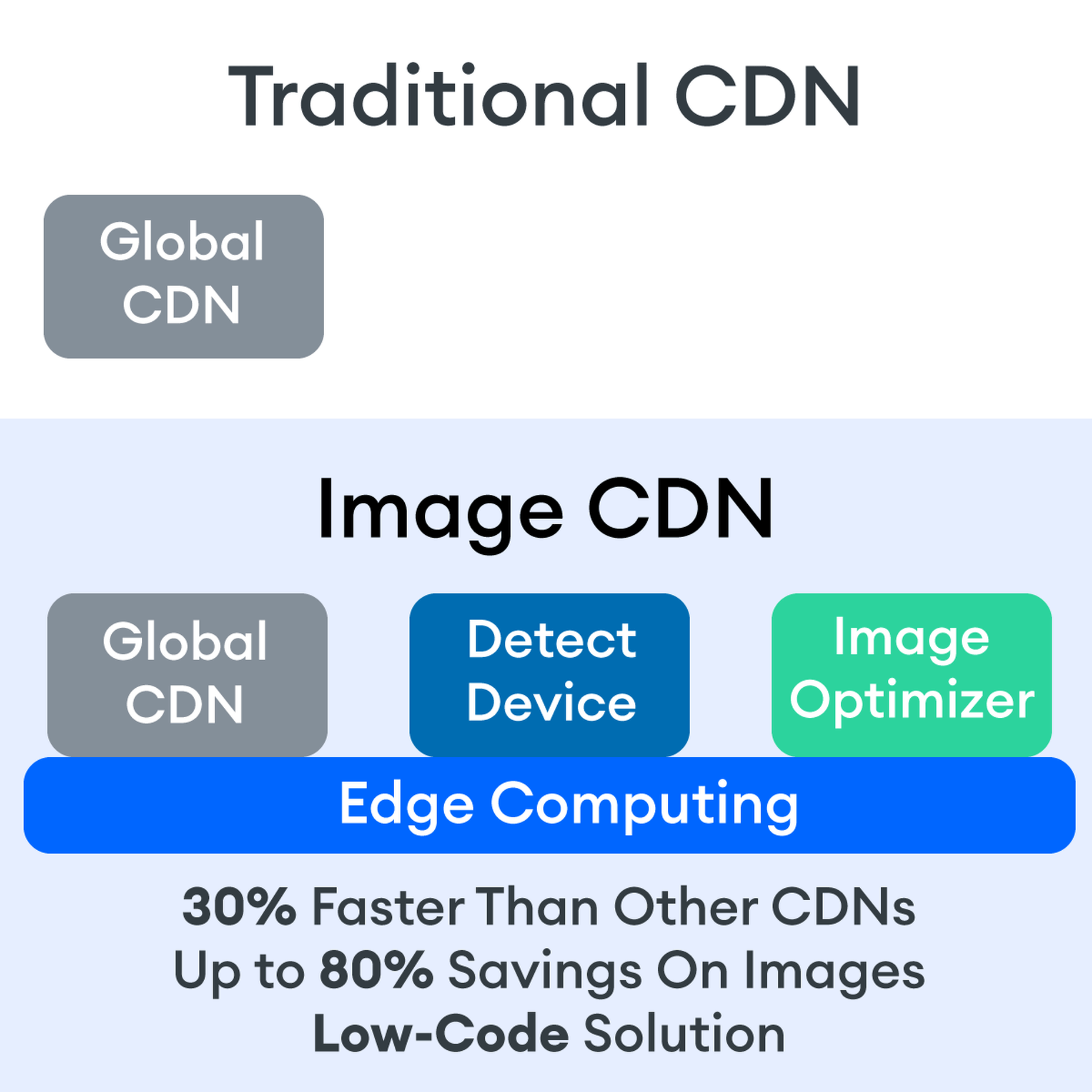
Traditional vs. Image CDNs

A traditional CDN treats images as static. If you want to tailor images to better match various mobile device types, then you need to create many variants of each image and upload them to your web server. It also means you must develop responsive code that will tell the server and CDN which image variant to deliver. This is clunky, time-consuming, and inefficient. For a large website, the amount of code needed can be astronomical. Using this static image model, there’s just no realistic way for each image to be effectively sized and compressed for every possible device model – at this point, there are thousands of them. The combination of these two unfortunate factors leads to potentially slow load times and poor UX caused by oversized images delivered to mobile devices.

So what is an image CDN? An image CDN builds on the traditional CDN model with the addition of device detection and image optimization. Instant detection of the device model and browser requesting the images is done right at the device-aware edge server (true edge computing!) Additional information, including screen resolution and dimension, pixels per inch, and support for next-gen image formats (such as WebP, JPEG 2000/JP2, and AVIF), provides even more details crucial for superior image optimization. Using this information derived from device-aware edge servers, the image CDN optimizes each image and serves the perfect version for each device and resolution, meaning users get the finest webpage experience faster.

A Bit About the Edge (Whoa, Living on the Edge?)

With a single server website, a web request would have to travel from the requestor, back to the origin server (wherever that was geographically located), be processed, and then travel back to the requestor. Depending on the physical distance between the requestor and the origin server, this could introduce a great deal of latency, which means lag time on page loads. 

A traditional content delivery network (CDN) is a global network of servers that optimizes web performance by using the node geographically closest to the user for faster delivery of assets. It takes static content like images and stores them on the edge. But usually, these edge servers are relatively simple in terms of their role in business processes. They mostly index, cache, and deliver content. And traditional CDNs like to keep edge servers simple because of concerns over CPU usage, storage, and scalability.

But what if these edge servers could also provide computing power that enhances performance and business processes? This is called edge computing. Slowly, CDNs are starting to open their edge servers to allow enterprises to deploy apps/services on the edge. Likewise, Cloud computing networks (e.g., AWS, Azure, Google Cloud) provide virtualized server capacity around the world for those who want to use geographically distributed servers. In a sense, Edge Computing is a marriage of the CDN (where edge servers synchronize/work with each other) and Cloud computing (where servers are open to applications). 

Edge computing is a fascinating concept, but what is the killer app that will enhance business processes and improve website performance? The addition of device detection to edge computing provides the ability to transform from delivery of static images to a new model where images are dynamic and tailored exactly to devices. 

Edge computing is computing that is done in a geographically distributed space, with many servers located at or near the source of the web request. This reduction in bandwidth and latency leads to fast processing times, increased site speed, and improved customer experience. And edge computing doesn’t require new infrastructure — it leverages the networks of existing providers to create Points of Presence (POP) around the globe. 

The Edge Servers are…Aware?

Device-aware edge servers, like those used by the ImageEngine image CDN, take edge computing to a new level. Device detection is actually one of the use cases where edge computing really shines. Normally, the edge server would have to send a Javascript query to the device to figure out any information about a requesting device’s model, browser, operating system. But with a device-aware edge server, the User Agent string is captured and decoded. This contains all of the information necessary for device detection without the need for any back and forth – a definite speed improvement. So you’re starting ahead of the game! 

Each time a new request comes to the device-aware edge server, the image is processed by that server (meaning optimized for that specific device parameters) and stored right there in cache, primed for future use. This is done in three stages: changing image size based on device resolution, compressing the image using an image optimization tool, and selecting the most efficient file format for the device. 

If the device-aware edge server has already processed a request from a similar device model before, then it can serve the device-optimized image from its edge cache, leading to a lightning-fast server response — and ImageEngine’s device-aware edge servers can serve up cached images 98% of the time! Not only is there geographical proximity because of the distributed global POP network, but the smaller size of the optimized image compared to the full-sized original cuts up to 80% off the image payload. This can cut up to several seconds off page load times. When almost 70% of people say that page speed influences their likelihood of making a purchase, every single second counts! 

Some image CDNs detect the device information and group the devices into “buckets” of similar types and serve an image based on that type. While this is certainly an advancement over a traditional CDN, and works passably well for some common devices, it still isn’t a truly optimal solution. There are so many variants of browser, screen size,  resolution, etc., even among very similar devices, that images are still often oversized (too large payloads) and lead to poor load speed. A true image CDN, such as ImageEngine, serves the perfect image for every device, every time.

So Now You Want To Get Started (Don’t Worry, It’s Really Simple)

One of the best things about the ImageEngine image CDN is the ease of integration – and it can integrate into any platform that supports a 3rd-party CDN. All you need is to sign up for an account and receive a delivery address during your two (yes, 2!) minute signup process. This delivery address is used to redirect image traffic for optimization and superior delivery performance. Next, you’ll have to make some slight adjustments to img tags on your website, but that’s really all the work you’ll need to do. There are no DNS changes during a standard (generic delivery address) integration. You read that right, none at all. Contrast that to a traditional CDN integration, where there is just no way around some messing around in the DNS – in fact, usually some fairly extensive DNS changes. 

This low-code, virtually no code, integration saves you time. It saves you money. It saves you the hassle of putting multiple team members on a new project. And it means that you can be up and running in about 15 minutes with a standard install. You can be serving optimized images to your site visitors at blazing fast speeds before lunch! And don’t worry, ImageEngine has an experienced integration support team available to answer any questions you might have. 

There’s also no issue with adding the ImageEngine image CDN on top of an existing CDN. Traditional CDNs may have security features that you may prefer to keep for your site. It requires slightly more integration but provides the same benefits of a solo ImageEngine implementation — screaming fast image load times and perfectly optimized images from device-aware edge servers. All that is recommended is that the ImageEngine image CDN actually serve the images directly, not simply process them, to get maximum benefits.

Adopt an Image CDN and See The Benefits

We’ve learned that image CDNs bring numerous benefits to your site AND your business. Using device-aware edge servers, image CDNs provide measurably better UX to your visitors. Pages load potentially seconds faster with perfectly optimized images, meaning your customers get to the heart of your message right away, and you don’t lose potential sales. 

Image CDNs are actually 30%+ faster than most traditional CDNs, improving site speed accordingly. From an SEO perspective, that’s huge! And your SEO gets an additional boost from the improvement to your Largest Contentful Paint scores (which can help you gain valuable rank on Google’s SERPs). Implementation is simple and fast. You get all this, plus cost savings: since you have smaller payloads because of the fully optimized images, you’re delivering fewer gigabytes of data.

Source

The post Image CDNs: How Edge Computing Provides a Faster Low Code Image Solution first appeared on Webdesigner Depot.

Source de l’article sur Webdesignerdepot

Imaginez:

… Vous êtes tranquillement installé à bord d’un Paris-Lyon et une classe de neige débarque dans votre wagon…

… Vous avez pris le dernier train pour prolonger au maximum votre weekend et rien dans le frigo à la maison quand vous rentrez à 23h

Ces expériences, nous les avons tous vécues et cela ne nous encourage pas toujours à voyager davantage en train. A l’occasion de l’année européenne du Ferroviaire et alors que la transition écologique devient plus que jamais une nécessité, SAP France a mené une étude auprès des 15-25 ans avec le média JAM pour mieux comprendre leurs attentes et besoins en termes d’expérience et de services.

En effet, cette Génération Z façonne les comportements de demain et apparaît particulièrement sensible aux enjeux d’une mobilité raisonnée pour lutter contre les effets du changement climatique.

Quelles sont les attentes des 12-25 ans pour les voyages en train ?

Click the button below to load the content from YouTube.

Quelles sont les attentes des 12-25 ans pour les voyages en train ?

FOCUS #1: 79% des jeunes interrogés seraient prêts à rallonger leur temps de trajet pour réduire leurs émissions de CO2.

Cette tendance rejoint l’étude SAP EMEA South menée auprès de consommateurs espagnols et italiens. Plus intéressant encore 23% seraient prêts à le faire mais sous l’exigence d’avoir le confort nécessaire pour passer du temps utile.

Et dans cette lignée, ils sont prêts de 2 jeunes sur 3 à trouver le principe d’éco-fidélité ”carrément” intéressant et 96% à y voir de l’intérêt. Cumuler des points échangeables contre réduction et cartes cadeaux « éthiques » pour chaque trajet effectué en train, scooter ou voiture électrique, vélo en libre service, à pied, … semble répondre à une attente de gamification mais aussi de mesure tangible de son impact environnemental.

FOCUS #2: 66% des 15-25 ans interrogés déclarent mettre à profit le temps utile pendant leur voyage en train

Parce qu’adopter le train ce n’est pas seulement réduire son empreinte carbone mais c’est aussi avoir du temps « utile » – lire, regarder une série, travailler – nous avons exploré l’impact de cette dimension pour les 15-25 ans.

Le reste déclare ne pas le faire vraiment mais seulement 7% d’entre eux ne le font pas du tout.

Ce qui peut laisser entendre qu’avec davantage de connectivité et de services, les jeunes profitant du #tempsutile seraient plus nombreux. A l’heure du slow travel, c’est un différentiateur fort du train par rapport aux autres modes de transport. C’est un nouveau champ des possibles à explorer sous l’angle des services connectés et en temps réel.

FOCUS #3: 60% des jeunes interrogés seraient prêts à payer pour avoir accès à des services de voyage connecté comme l’upgrade en 1ère ou davantage de services #TempsUtile

L’option la plus populaire est la possibilité de payer un prix fixe auquel on agrège des options selon les trajets : une opportunité pour générer de nouveaux revenus tout en améliorant le confort et l’expérience des passagers !

Retrouvez prochainement l’analyse de nos experts SAP pour décrypter les nouveaux leviers à actionner pour répondre à ces attentes des 15-25 ans et plus largement du marché passager en France !

Contactez-moi directement sur LinkedIn pour échanger et avoir accès aux vidéos en avant-première

Méthodologie de l’étude

Etude menée auprès de 1000 jeunes représentatifs de la population des 15-25 ans en France selon les quotas de l’INSEE (juillet à septembre 2021) avec le média JAM

Voilà à quoi elle ressemblait :

Étude SAP et Jam sur Messenger

Click the button below to load the content from YouTube.

Étude SAP et Jam sur Messenger


The post Quelles sont les attentes des 15-25 ans pour leurs déplacements en train ? appeared first on SAP France News.

Source de l’article sur sap.com

Landing pages are crucial for conversions. User-friendly landing pages rank higher in the search engines and generate the maximum leads.

Interestingly, user behavior changes every year, and new website design trends should be kept in mind to continue acquiring sales from your existing landing pages.

If your high-performing landing pages in 2019 have suddenly started underperforming in 2021, then it is a clear indication that your landing pages need a strategic revamp to record higher conversions.

Landing page revisions are necessary for reduced bounce rate, more visitor time on the page, and better user actions.

This article will discuss some of the top web design trends of 2021 that brands have adopted to revamp their landing page designs. You can learn from the trends and apply your own custom design intelligence to redesign your landing pages for 2022 and convert the maximum number of visitors.

Let’s begin…

Why Landing Page Design Is Crucial For Conversions

Landing pages are the first stop on your consumers’ online buying journey and the first chance to put an impression.

People on the internet are becoming less patient. It takes only about 50 milliseconds for a visitor to form an opinion about a brand and decide whether they want to stay or leave the website.

Convincing modern customers to buy products or fill up query forms on a landing page is not easy with traditional website elements.

In 2021, it is now harder to impress visitors landing on your website than in 2019. Keeping in mind the audience of 2021 and beyond, an ideal landing page should be user-friendly, engaging, innovative and should encourage users to take action.

Here are some of the top reasons why landing page design is so crucial for conversions:

  • You get barely 7 seconds to create a strong impression. It is a time span in which visitors roughly scan the page and make their decisions.
  • Publishing 40+ effective landing pages at regular intervals can generate 12X more leads.
  • The average conversion rate from the landing page across all industries is only 2.35%.
  • Using the right types of targeting and testing can boost landing page conversion rates by up to 300%.

Considering the above stats, it can be easily said that a landing page has to be impressive and quick enough to impact the visitors positively.

7 High Converting Landing Pages & Lessons You Can Learn From Each

Below are some of the best high-converting landing pages, which were just updated recently in 2021. For each page, we list a lesson you can learn to inspire your next design revision in 2021 and ahead:

Example #1 – Replace Boring Customer Info Forms With An Interactive Quiz

Landing Page: Nextiva’s Unified Communications Readiness Quiz Landing Page

Industry: Voice Over IP software

Conversion Measured By: Leads fill out a form if they are interested

Redesign focus: Improve the quantity and quality of leads

Solution: Substitute online form with an interactive quiz

In 2019 and even 2020, many businesses were practicing the trend of including a customer form on their landing pages as a call to action to initiate a quick customer action.

The customer information form was useful for businesses because it helped them generate quick leads. However, at the same time, there was no real reason pushing the customer to fill in the lead forms especially if it consisted of more than 2-3 fields.

Nextiva used its creativity to replace boring lead forms with interactive quizzes. In its 2021 page design, the company added a quiz for visitors to participate in.

The aim is to have interactive pages to keep visitors engaged and persuade them to stay on the page.

Here are the comparisons of both the designs:

2019

2021

Key Takeaways:

  • The 2021 landing page now has a free Unified Communications Readiness Quiz that allows business owners to fill the form interactively. Adding a quiz with the number of pages mentioned at the top tells the user how many steps are left to complete the quiz, making their waiting time easier.
  • The background image is replaced with communication icons to simplify the message of the kind of services they offer.
  • The page looks neater and appears to be easier to scan at a glance.

Example #2 – Emphasize Strong Visuals and Copy that Stresses on Product Details

Landing Page: Western Rise Homepage Variation

Industry: Ecommerce

Conversion Measured By: Apparel purchase

Major redesign focus: Improve the number of leads

Solution: Improve the copy and visuals

Western Rise, a clothing eCommerce company, realized the importance of having impressive images and detailed product information on its landing page.

The 2021 page replaced ordinary product images with strong visuals of the models wearing Western Rise clothing. Also, the product image includes extensive product details, which were missing on the older page.

Here is a clear comparison of the 2019 vs. 2021 landing pages of Western Rise:

2019

2021

Key Takeaways:

  • The new landing page has a powerful headline – Performance Clothing for Travel, Work, and Play. In just a couple of words, the brand tells everything about itself. ‘Performance Clothing’ is their unique selling proposition (USP) that tells the customers that their product is durable. Besides, the caption ‘Travel, Work, and Play’ tells what the product is about. Modern customers like products that fulfill a particular need, and Western Rise made it easier for the users to realize the importance of their products which fulfilled their specific needs.
  • The bold visuals in the new page capture contemporary shots of the models that put a strong impression on the audience. Every image is clicked mindfully to explain the style and quality of the Western Rise clothing line.
  • The products displayed on the new page include every minor detail and feature that often other clothing brands ignore, such as the specialty of the product, occasions to wear, and weight other than colors, fabric, fitting, etc.

Example #3 – Use Strong Social Proof To Increase Conversions

Page: Aura Save 50% Landing Page

Industry: Identity Theft Software

Conversion Measured By: Online registration or an inbound call

Major redesign focus: Improve the number of signups

Solution: Add strong social proof

It is a known fact that social proof on sales pages is essential for increased conversions. But in 2021, the importance of social proof has gone too far.

Aura is an identity theft protection service that aims to build trust with its prospective customers when they first browse their landing page. Take a look at how Aura displays customer reviews above the fold to catch user’s attention.

Unlike others, Aura combined the rating stars and the review to prove customer satisfaction and emphasize their expertise in the field.

BONUS:

Another example of using strong social proof is the Exploding Topics newsletter landing page.

Exploding Topics is a newsletter with a pro subscription for content marketers and anyone interested in trending topics about any topic. It’s an excellent example that uses a lot of social proof on landing pages that give something away for free, like a weekly newsletter or an eBook.

If you could notice, the latest landing page below has multiple forms of social proof on a single page. First, they feature a list of brands that trust Exploding Topics. Secondly, they quote Wired Magazine founder Kevin Kelly’s feedback, followed by the logos and tweets praising the newsletter.

Key Takeaways:

  • Exploding Topics uses several different types of social proof that appeal to different demographics.
  • Their “trusted by” logos of world-renowned companies stand out to potential B2B subscribers.
  • Kevin Kelly’s quote is catching the attention of tech-savvy readers.
  • Despite packing the page with social proof, the opt-in form is still well above the fold. It is the best landing page practice that applies to nearly all pages.
  • The landing page uses actually embedded tweets (not screenshots), which help demonstrate that the tweets are legit.

While Exploding Topics have smartly used social proof on its page, the ideas of leveraging social proof are not limited to this only.

Example #4 – Focus On Visually Appealing Above the Fold Content

Landing Page: Perfect Keto Homepage Variation

Industry: Supplements

Conversion Measured By: Online purchase

Major redesign focus: Improve the number of purchases

Solution: Improve Above The Fold Content

Above the fold content greatly impacts customer’s decision-making. Perfect Keto lacked that appeal on its 2019 landing page design.

Hence, the 2021 design was revamped with better visuals and more professional looks.

The 2021 page received major changes in above-the-fold content, such as the top menu bar with the brand name not losing the user’s attention anymore and an additional menu bar giving a quick overview of what the brand offers.

The older page did have many social proofs, but those were limited to customers only. The 2021 design also highlighted the publications where the brand appeared, which proved exceptional in building customer trust.

Take a look at the two landing pages of Perfect Keto in 2019 and 2021:

2019

2021

Key Takeaways:

  • The 2021 landing page heading is more compelling because it clearly conveys what their product is all about. The older page was missing the actual purpose of the product.
  • An additional section on the new page to educate customers about the Keto diet and how to start it helps visitors understand the product even better.
  • The inclusion of a product image above the fold attracts user attention and makes the product trustworthy. People now know what they will be buying right at first sight of the page.
  • The new page proudly displays the products featured in the publications, such as Women’s Health, Healthline, Reader’s Digest, and Popsugar, which again helped customers trust the brand.
  • The page also features a video of the Perfect Keto founder that is brilliantly working in gaining visitor’s attention and faith.

Example #5 – Make The Call to Action More Compelling

Landing Page: Zendesk HelpDesk Softwage Landing Page

Industry: SaaS

Conversion Measured By: Online registration

Major redesign focus: Improve the number of registrations through the website

Solution: Make The CTA More Compelling

Zendesk did a clever job by replacing the sign-up form with a single button. On the older page, it was unclear to the user if the company has a trial option for free unless they move to linked pages. Such confusions often resulted in traffic bounces.

Adding the start free trial button on the 2021 page makes it easier for the users to understand that the product comes with a free trial. At the time, it helps the user take quick action.

Similarly, the ‘Get started’ button at the top was replaced with ‘Free trial’ with the same intention.

Moreover, chat support was added to guide users at any stage of the buyer journey. Live chats are vital to help visitors better understand the product and move a step ahead in the customer journey.

Take a look at below two images:

2019

2021

Key Takeaways

  • The CTA buttons have more actionable text and look more prominent.
  • The color choice for the button is in contrast with the background but matches the page theme.
  • The older page missed sales support, which is included in the new page for a better customer experience.
  • The tabs in the menu bar were reduced to four to make the page simple to use for users.

Example #6 – Use Contrast To Highlight Specific Copy On The Page

Landing Page: GetResponse Website Building Landing Page

Industry: Online Software

Conversion Measured By: Online signup

Major redesign focus: Improve the number of signups

Solution: Use contrast around important copy on the page

GetResponse focuses on attracting visitors’ attention towards the offerings from their business. Starting from above the fold section, the landing page highlights the texts that are important and need the visitors’ attention.

The infographic on the landing page is the next thing that promises to grab user attention while beautifully describing how this website builder works and is useful to the user.

Key Takeaways:

  • The text highlighted on the landing page draws the user’s attention towards what the business has to offer or unique selling points.
  • The infographics briefly explain the working of the tool in an easy-to-understand manner.
  • The Yellow color is used prominently on the landing page to attract user attention and persuades users to try the tool by listing its advantages.

Summary

Landing pages provide the first opportunity to create an impression in the minds of the consumers. A well-structured and mindfully designed page sets the right tone for your brand message and encourages users to choose your business.

However, the strategy for landing pages needs innovations from time to time for better results. The examples and tips shared above prove how landing pages in 2019 have seen significant improvement in 2021.

In the coming year, use these ideas to create landing pages that influence customer decisions and encourage them to take quick actions.

Source

The post 7 Landing Pages Comparisons To Improve Your Conversions in 2022 first appeared on Webdesigner Depot.


Source de l’article sur Webdesignerdepot

The rise of data in motion in the insurance industry is visible across all lines of business, including life, healthcare, travel, vehicle, and others. Apache Kafka changes how enterprises rethink data. This blog post explores use cases and architectures for event streaming. Real-world examples from Generali, Centene, Humana, and Tesla show innovative insurance-related data integration and stream processing in real-time.

Digital Transformation in the Insurance Industry

Most insurance companies have similar challenges:

Source de l’article sur DZONE

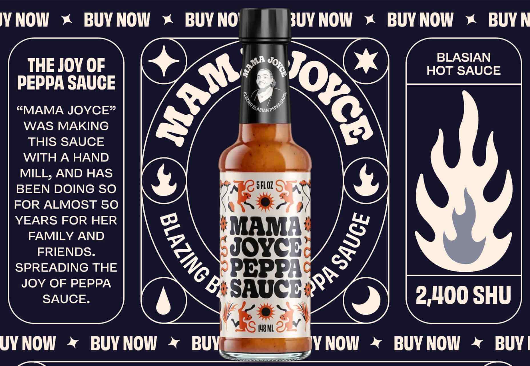
One of the most challenging stages of a design project is laboriously producing all those assets that bring it to life.

Whether you’re a web designer in need of icons, or a brand designer looking for mockups, it’s a smart move to fall back on stock assets to speed up your turnaround, reduce costs, and enliven your designs.

With so many stock sites to choose from, which should you opt for? Today we’re going to take a look at DesignBundles.net and ask if it’s the right choice for your project.

What is Design Bundles?

Design Bundles is exactly what it sounds like: sets of design assets that you can download for free or at huge reductions on RRP.

Launched five years ago, Design Bundles is brought to you by the same team that delivers Font Bundles.

Over two million customers are already enjoying the benefits of Design Bundles’ weekly updates.

What Can You Download From Design Bundles?

There are currently over 800,000 products listed on Design Bundles, and the collection is growing all the time.

The files have been produced by 6,500 of the world’s leading independent designs. Because the products are top-quality, you can really make them work: scale them, flip them, distort them, recolor them; just about anything is possible when you’re using high-quality raw ingredients.

What’s really impressive is the range of products that are in the collection. You’ll find backgrounds, logos, icons, textures, patterns, and clip art. For product designers, there are mockups and web elements. Print designers will love the huge range of cards, invites, flyers, posters, and brochures. And if you’re looking for standard stock images, you’ll find a gargantuan range under popular themes such as technology, architecture, travel, and business.

Because Design Bundles is relatively new, you won’t find its collection padded out with out-of-date Gifs. In fact, Design Bundles is one of our favorite places for free SVGs, the best format for graphics on the web.

All the products are royalty-free and licensed for personal and commercial use, so you can relax knowing that you’re fully covered.

What Makes Design Bundles Different?

There are a lot of design bundles services online, so what makes Design Bundles different? Well, firstly, the quality; Design Bundles has a consistently high level of designs. We love the freebies. They make a huge difference and are great for trying out ideas you might not be ready to invest in.

Design Bundles differs from other stock sites because it offers curated bundles of complementary assets — you don’t just download a vector file; you download a set of vector files. This innovative approach means you don’t have to go hunting for matching images; once you’ve found the right download for your project, you have a whole range to enjoy.

The whole process of using Design Bundles is simple, from browsing through the available assets to choosing a design and through to the fast, simple checkout process. It’s all designed to make including design assets into your projects as simple as possible.

The website is user-friendly, and in the unlikely event that you’ll need them, the support team is friendly, helpful, and prompt to handle queries.

Is Design Bundles Good Value?

We’d be lying if we said that cost wasn’t a big bonus of using Design Bundles. Design Bundles offer up to 96% discounts on regular prices, meaning that you can get the same incredible assets that top design agencies use at a fraction of the price.

In terms of time-saved, inspiration-delivered, and graphics-acquired, your Design Bundles subscription will more than pay for itself.

Alongside the daily and weekly deals, you’ll find products you can try for free. For example, design Bundles provide a whole heap of free SVGs. And not just sample files. There are thousands of files to download and use in projects. You can’t get better value than free!

There are new freebies every week, so it’s worth subscribing just to ensure you don’t miss anything.

For freelancers, the licensing model is particularly attractive. Because there’s no limit on the places you can download design resources once you’ve bought them, you can download files at home, in the office, or at a client’s workspace — whatever is convenient. Meaning you carry a huge library of resources with you wherever you go.

Oh, and if you want to make the most of your new Design Bundles assets, don’t forget to check out its YouTube channel, where you can learn tons about how to create effects, edit images, and complete creative projects.

Should Designers Use Design Bundles?

When you’re designing a project, whether you’re a digital artist, a web developer, or a crafter, the result relies on the quality of its component parts.

Design Bundles offers you the chance to work with high-quality assets from some of the web’s top designers at a fraction of the price of creating them yourself.

We’re confident that if you give Design Bundles a go, you’ll quickly see the benefits for yourself. But if you’re still not sure, why not sign up for its newsletter and check out some of the daily and weekly deals and the freebies that are available to you.

Design Bundles is a recipe for success that you’ll be happy you discovered.


[— This is a sponsored post on behalf of Design Bundles —]

Source

The post Review: Should Designers Use Design Bundles? first appeared on Webdesigner Depot.


Source de l’article sur Webdesignerdepot

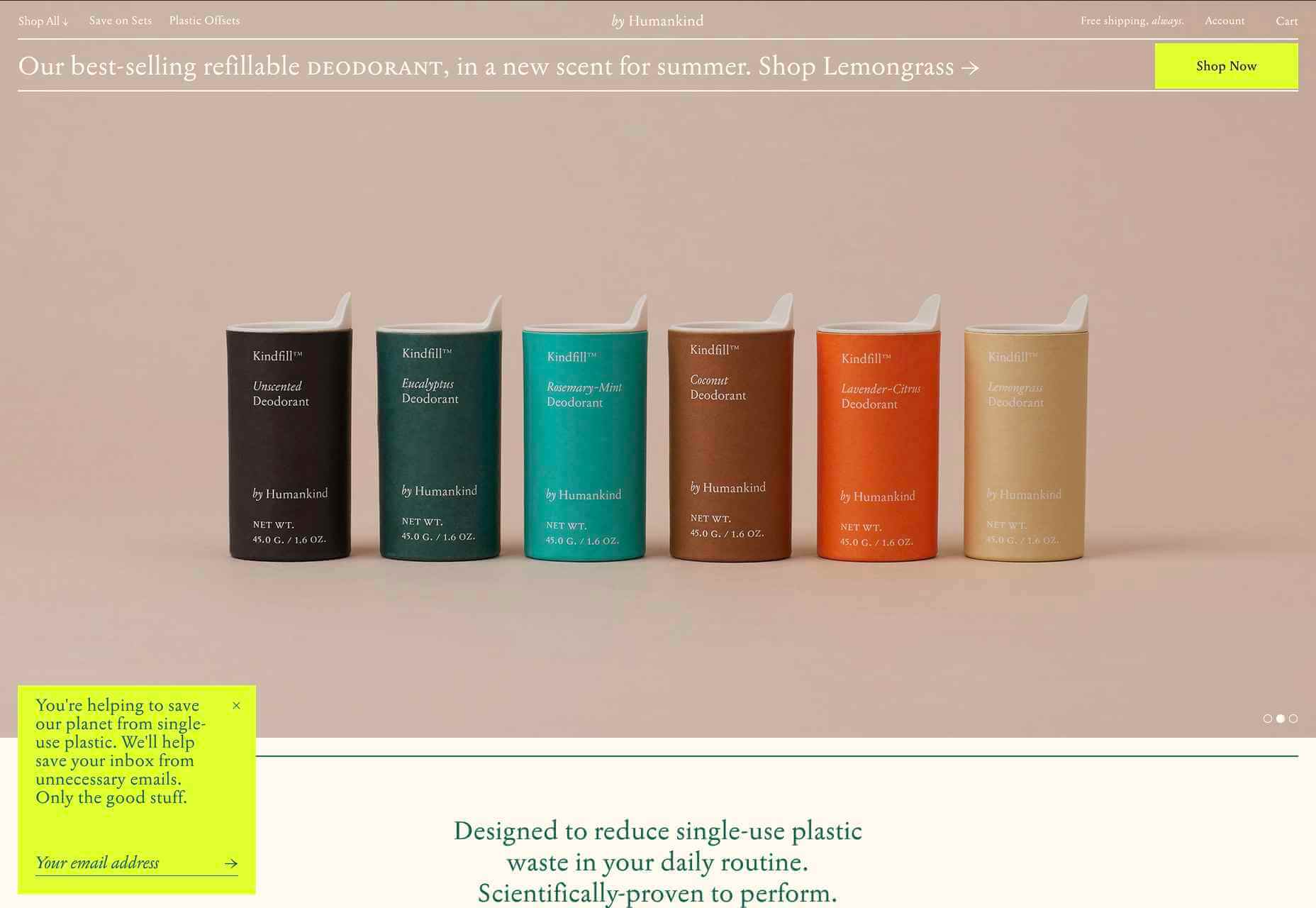
Ever since online stores first emerged they’ve faced one big challenge compared to their real world rivals; yes, it’s convenient to shop wherever, whenever you want, and delivery options permitting, buy from anyone anywhere in the world. But it’s a minimal experience compared to the fuller sensory experience of shopping in the real world.

Online stores can only access our sight and hearing, whereas physical shops can engage all our senses. How can a website compete with the experience created by walking into a physical space where lighting, layout, decor, and background audio are all carefully designed to create an appropriate atmosphere; where you can touch fabrics to check how they feel, try clothes or shoes on without having to buy them first? How do you sell scented products without allowing them to be smelled?

In this month’s round-up, we see a few different approaches to solving this dilemma, sites that focus the copy, visual, and auditory, to work on the imagination.

Go Love Yourself

This microsite to advertise The Body Shop body butters, uses sensuous imagery and video to create an atmosphere of indulgence while also offering comprehensive product information.

Niarra Travel

Sustainable, bespoke travel agency Niarra Travel makes good use of some beautiful photography. The background color scheme of earthy greens and neutrals fits both the luxury and eco-conscious aspects of the company.

by Humankind

by Humankind is a personal care brand making toiletries from natural ingredients. The focus of their pitch is reducing plastic waste. The site is appropriately sparse, with simple product shots and mostly warm neutral colors.

Mama Joyce Peppa Sauce

This one-page site for Mama Joyce Peppa Sauce is big and bold. Lots of scrolling type and vintage style illustration. You don’t need to look for a ‘buy now’ because the cursor itself is it. Click almost anywhere, and two bottles of sauce go into your cart.

Eadem

Eadem is a beauty company for women of color — their flagship product is a serum that fades dark spots without bleaching. Pinks and dark golds contrasted with fresher oranges and pale greens create a color scheme that feels rich but not heavy.

Pact Media

Pact Media is a full-service digital design agency whose work mainly focuses on agencies, businesses, and organizations involved in conservation. Large type and greyscale with red accents create a strong feel, while color on image rollover adds extra impact.

hueLe Museum

hueLe Museum is a collection of clothing brands. The philosophy behind it equates choosing clothes to choosing flowers, and there are some beautiful flower images. There is a sense of tranquility to the site, and it is even better on mobile.

Marnie Hawson

Photographer Marnie Hawson’s portfolio site is clean and simple, with a warm green (again) background and an engaging asymmetrical grid layout.

Kōpiko

Kōpiko is a micro-bakery that offers a sourdough delivery subscription service to its local area. It makes and sells only two products, and the single-page site is suitably simple. Putting the subscription form above the product and company information gets to the point without seeming pushy.

Banila Studio

Banila Studio is a branding and design studio in Basque Country. This is a nice example of sideways scrolling, and the alternate color scheme option is a fun touch.

Big Green Egg

Big Green Eggs are high-end barbecue/outdoor ovens. Lots of high-quality food photography is the key here, along with a clear build-your-own setup process.

Pawzzles

Pawzzles is a puzzle feeder toy for cats, and yes, there is a cat video. This has a fun feel, with some rather sweet illustrations and lots of silly puns. By cat lovers, for cat lovers.

Melopeion Organic Thyme Honey

The choice of display type on this site — crucially one that works well for both the latin and greek alphabets — emphasizes the Cretan origin of Melopeion honey. The illustrations are appealing, and the shopping basket icon is an especially nice detail.

Brendel Wines

This site for Brendel Wines is all about photography, large background photographs, and video, as well as product shots. More specifically, the lighting in the images creates an atmosphere, a sense of warm summer evenings.

imNativ

imNativ is an upholstery fabric: not the most exciting product to present enticingly. Some good, close-up photographs and well-styled images of the fabrics in use make them desirable.

Thursday Studio

Thursday design studio has produced a very pleasing, clean site for their own portfolio. The split-screen scrolling that changes to sideways scrolling on mobile is especially nice.

HALEYS Beauty

HALEYS Beauty uses a soft, powdery color palette and a clear, well-spaced grid, which gives it a modern, feminine feel.

Wookmama

The Wookmama app is a color visualizer which displays palettes and applies those palettes to real-world images. Colour is, as one would hope, used well here, along with plenty of screen mock-ups.

Planet of Lana

Planet of Lana is the first game from Wishfully Studios, due for release in 2022. This teaser web page really allows the game illustrations to do the talking.

The Future of Office

The Future of Office is a sales site for office space to rent. It has a fresh, airy feel which reflects the open, minimal aesthetic of the spaces on offer.

Source

The post 20 Best New Sites, June 2021 first appeared on Webdesigner Depot.


Source de l’article sur Webdesignerdepot

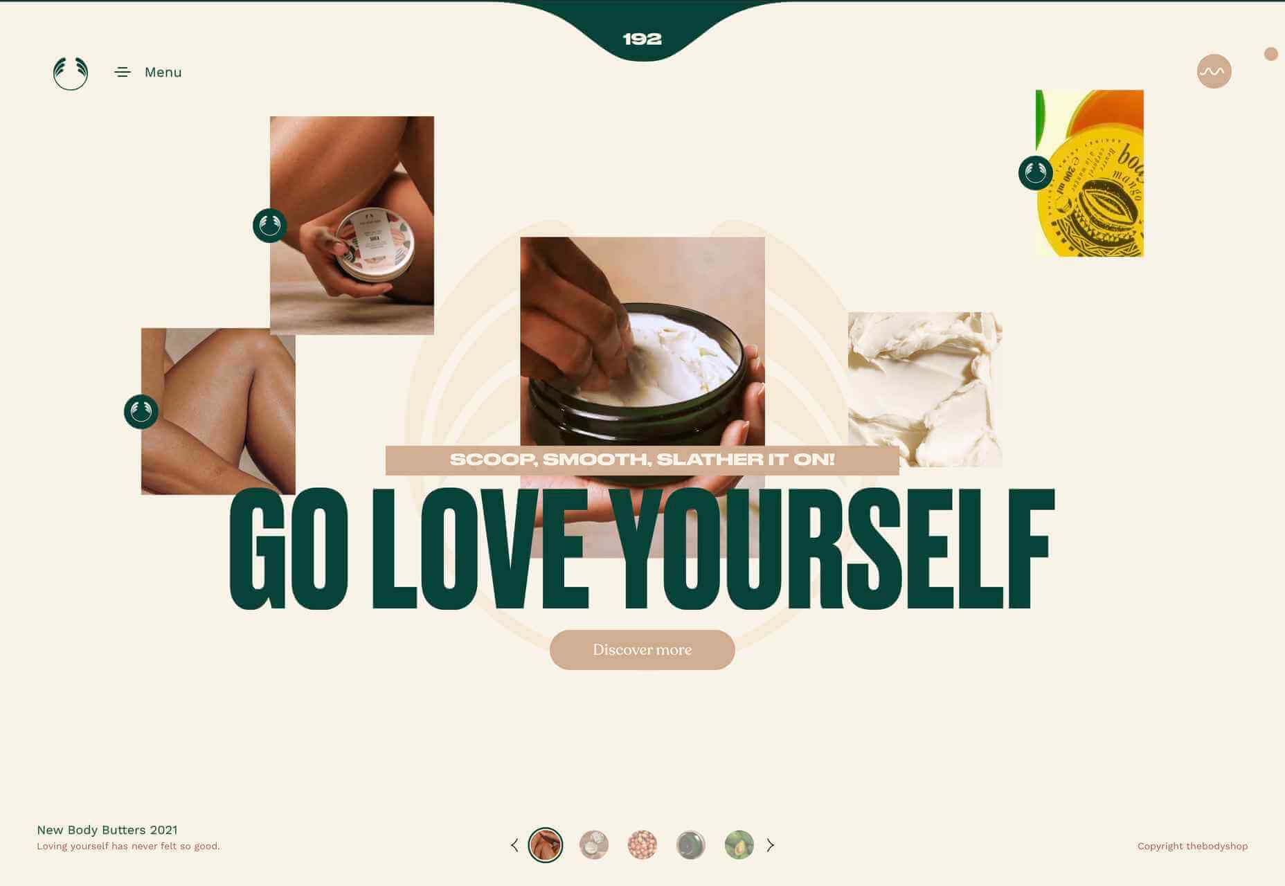
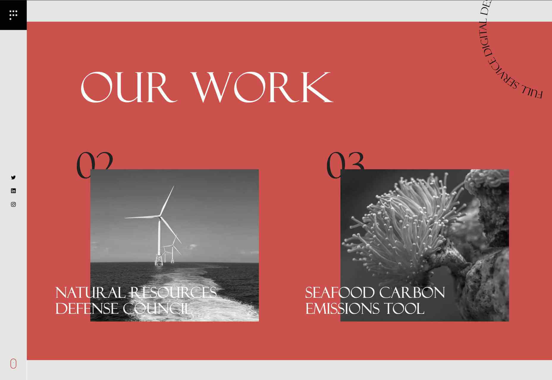
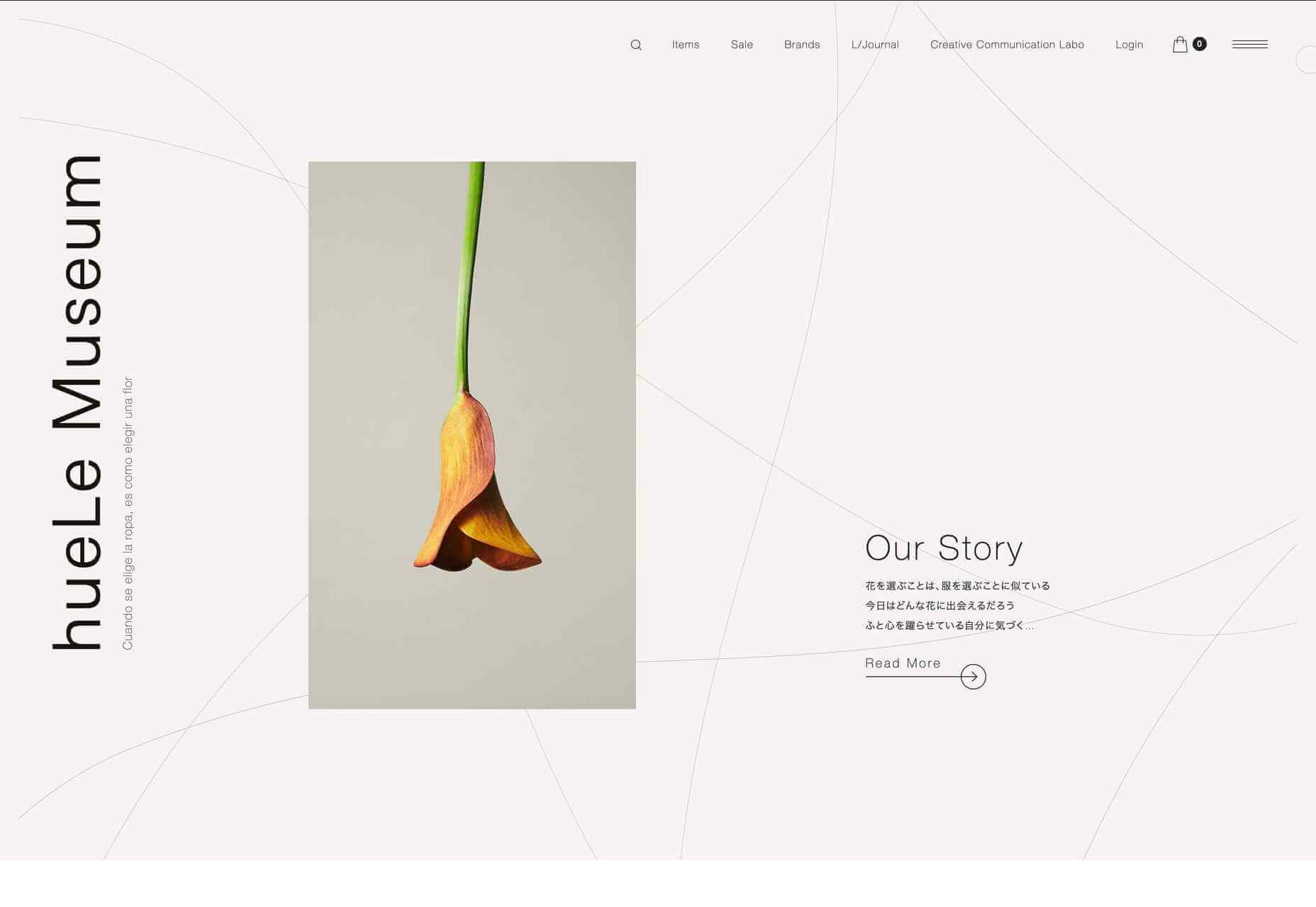
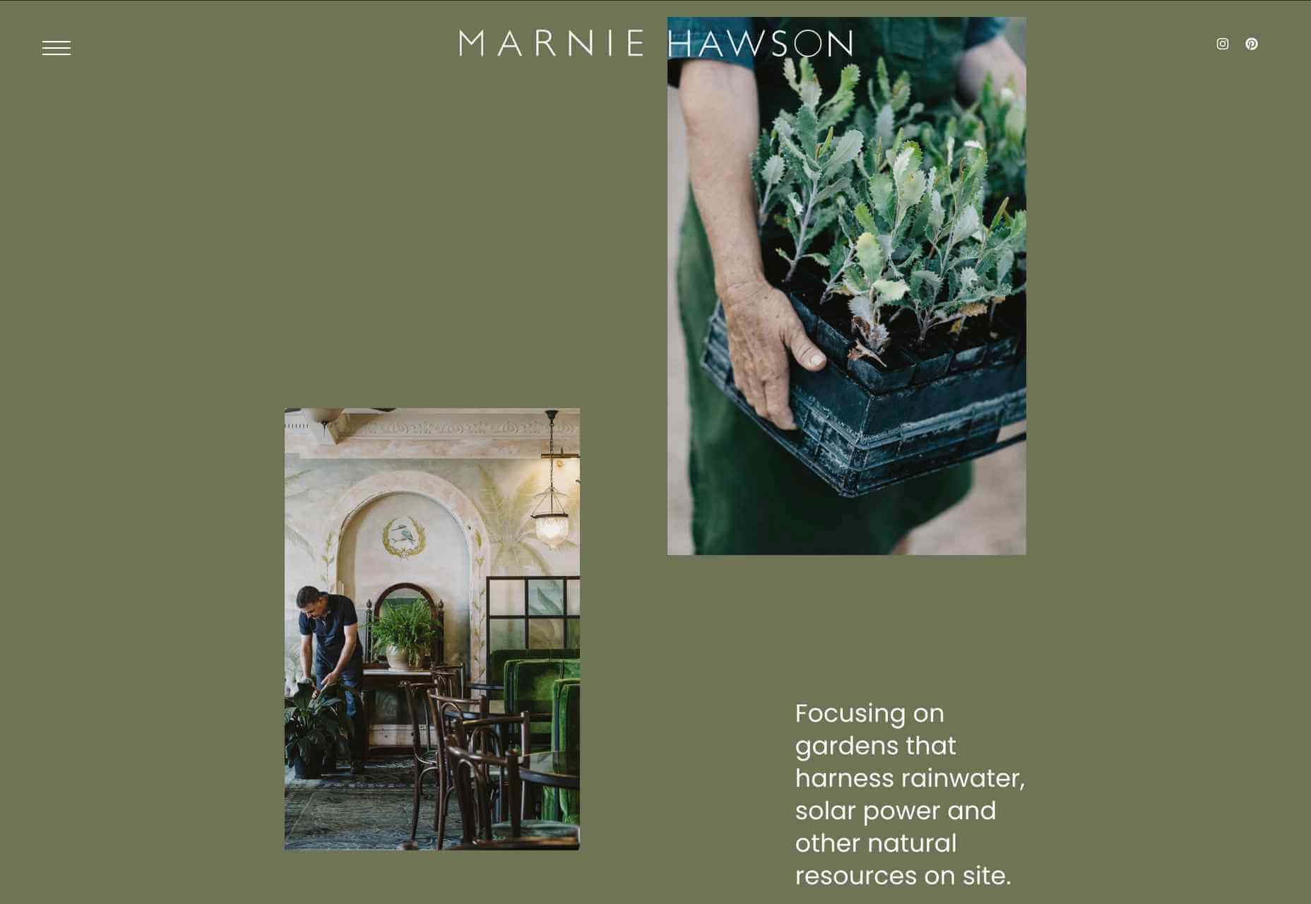
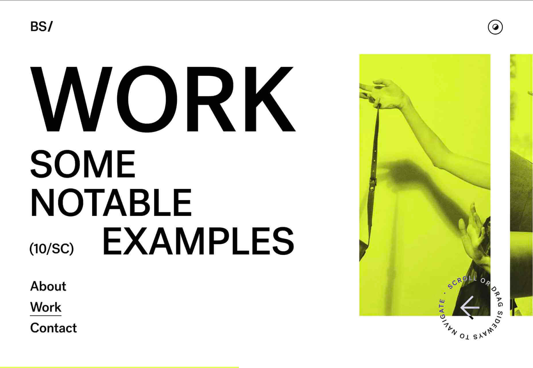
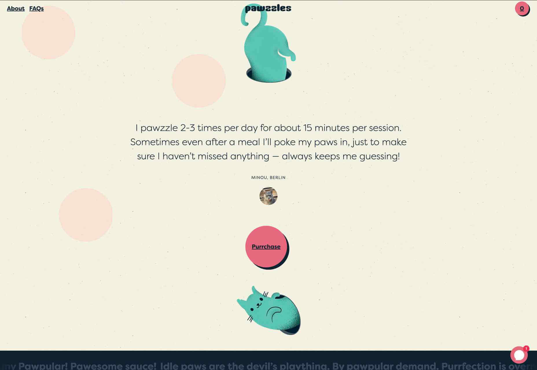
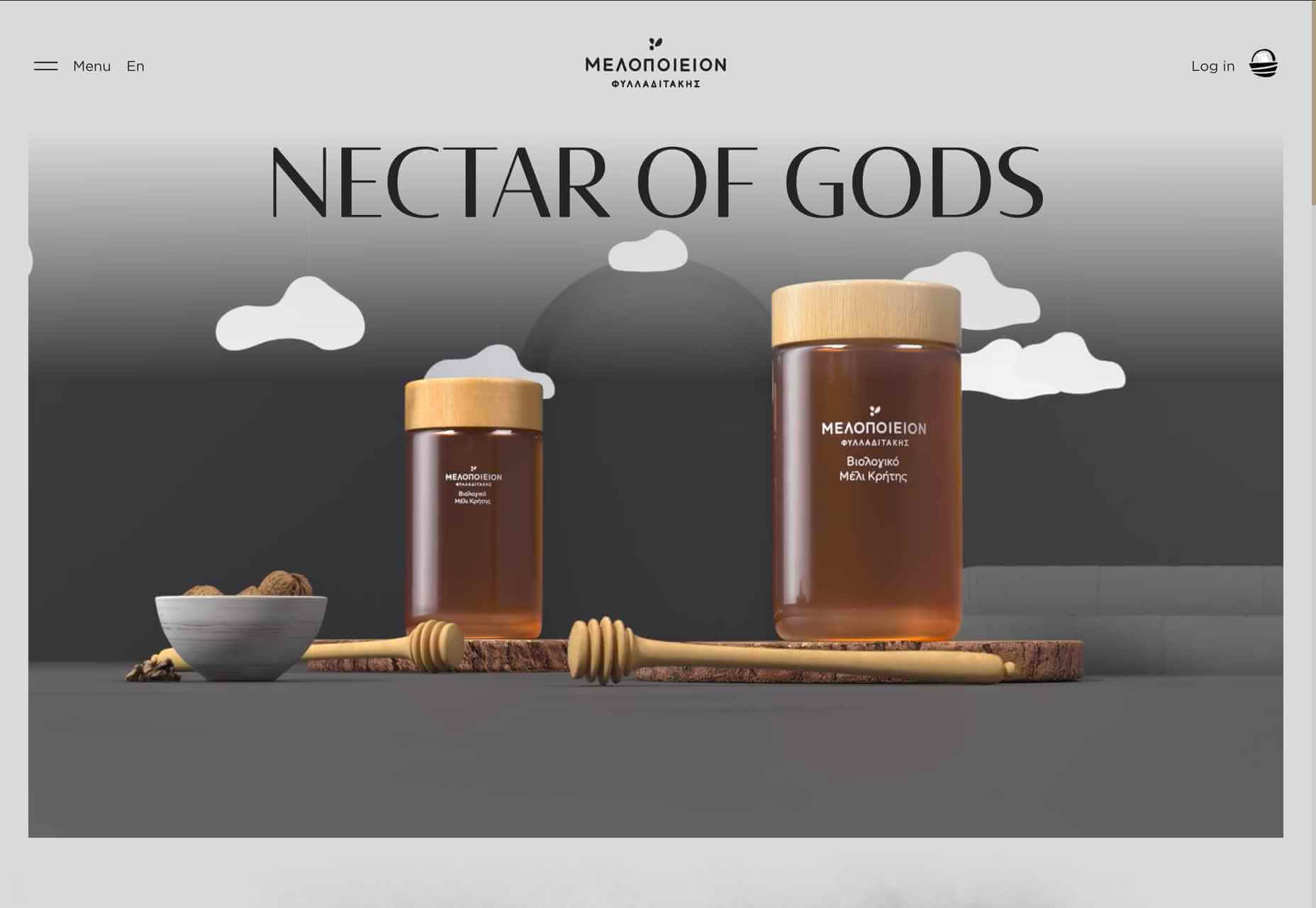
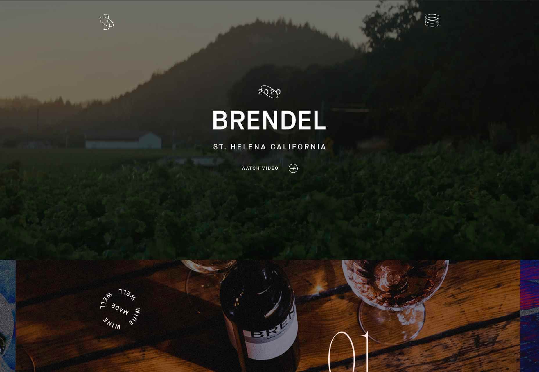
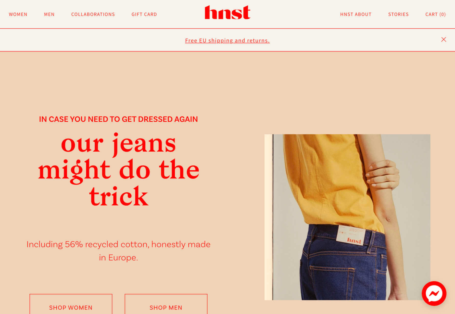
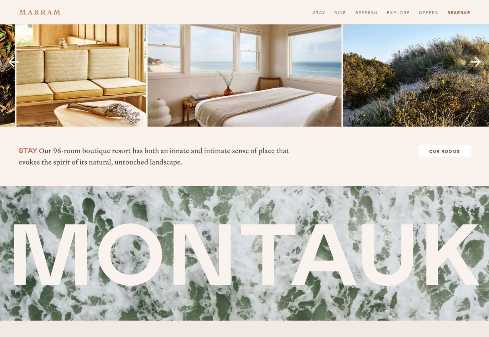
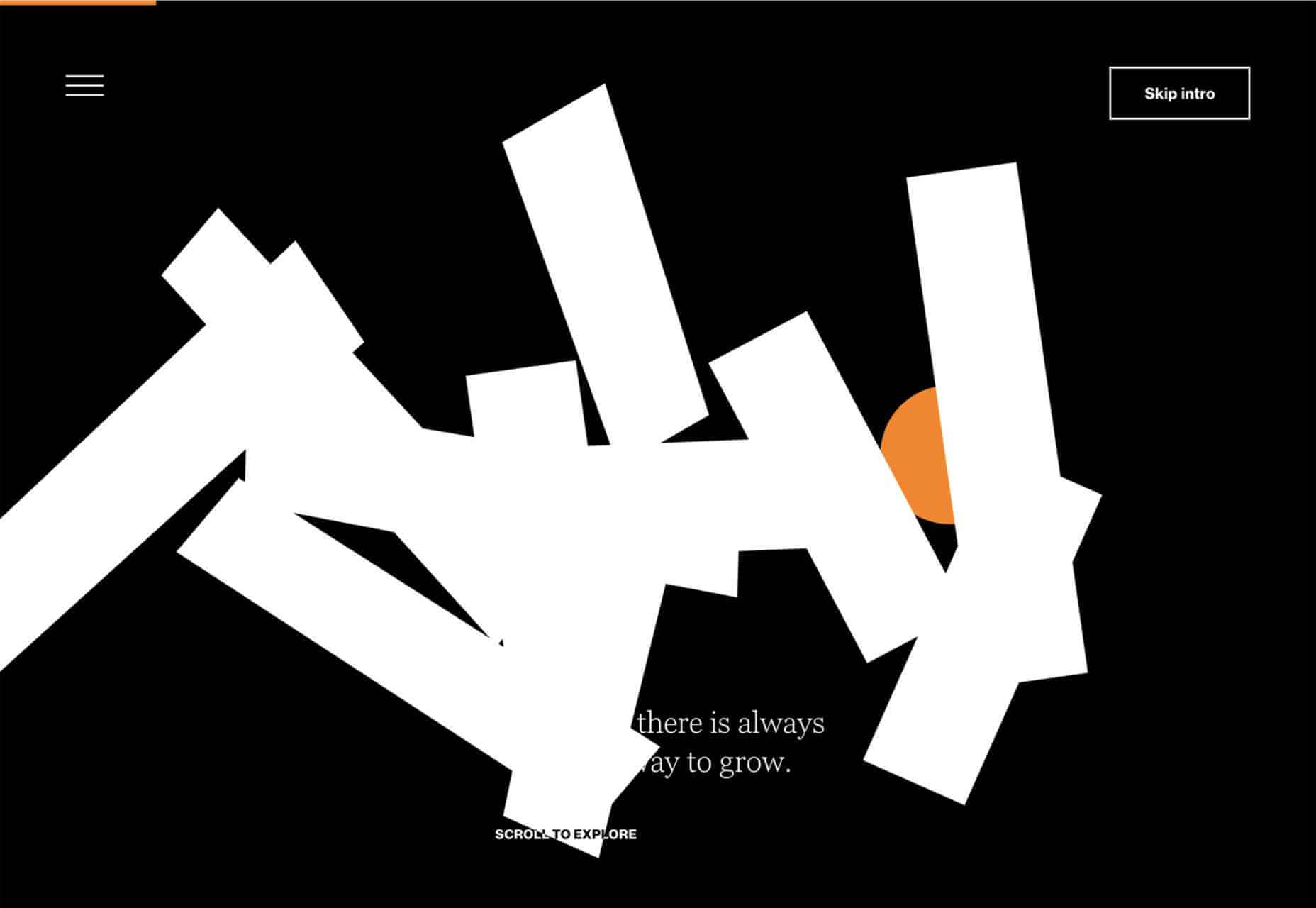
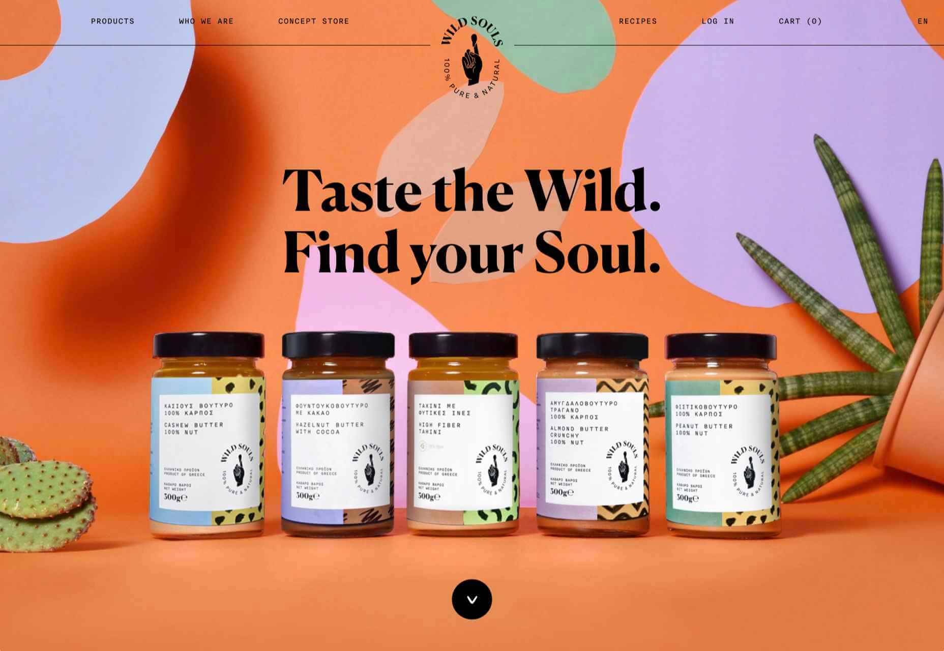
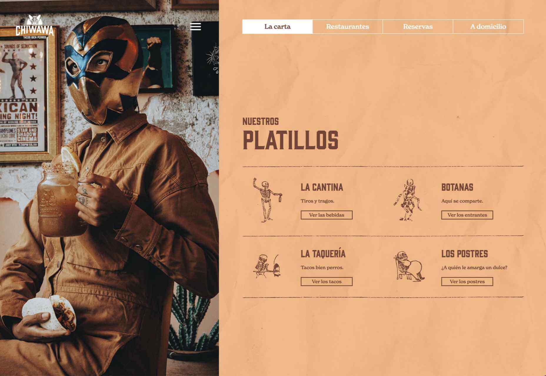
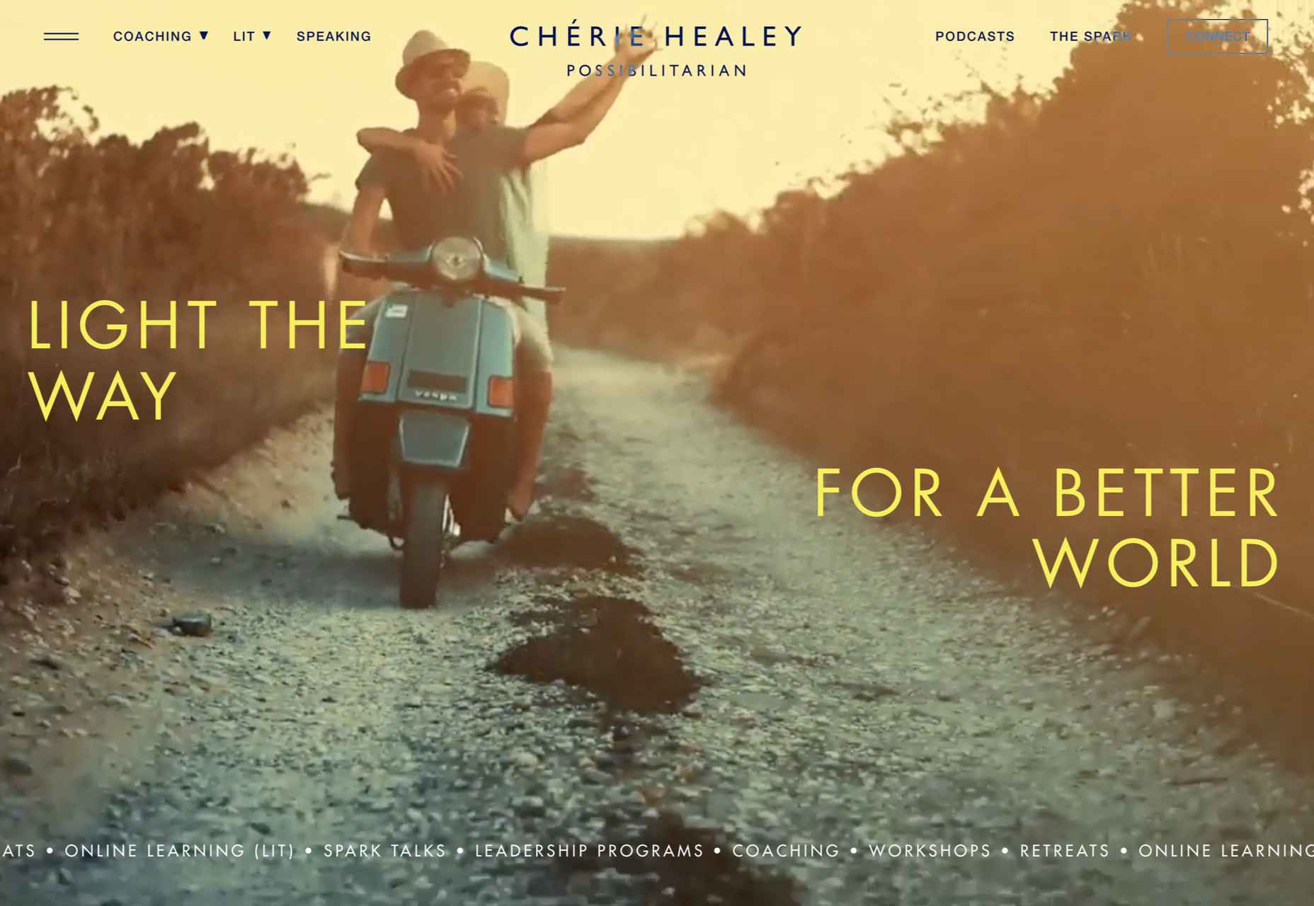
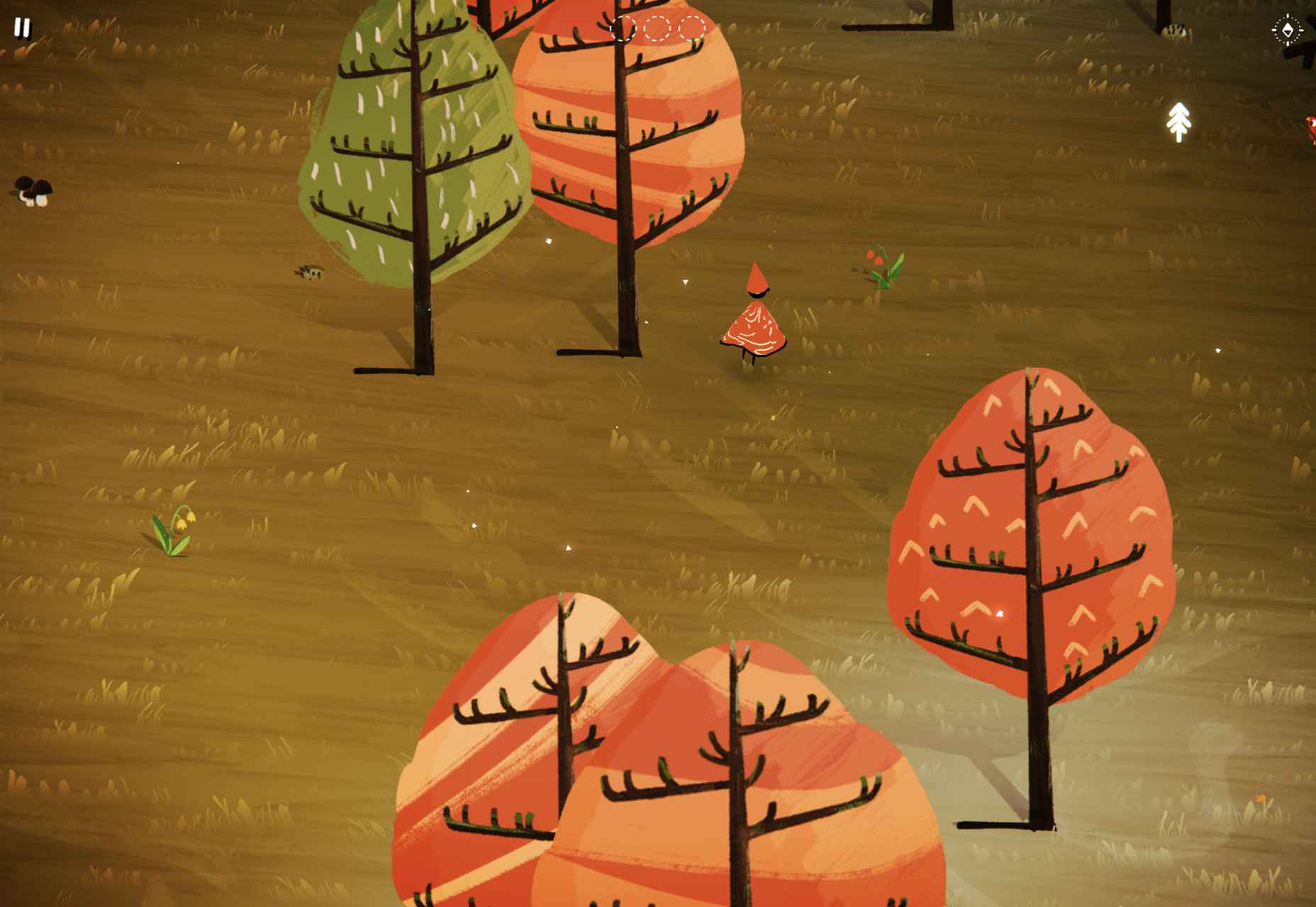
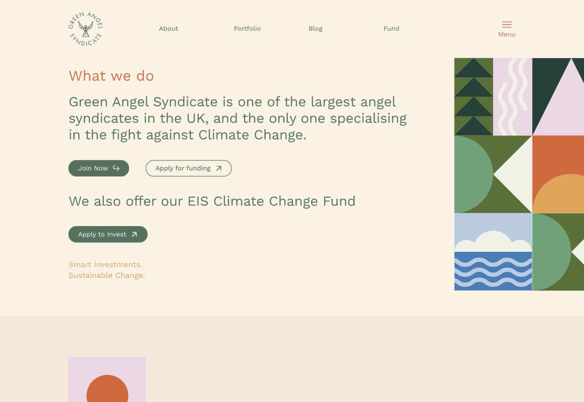
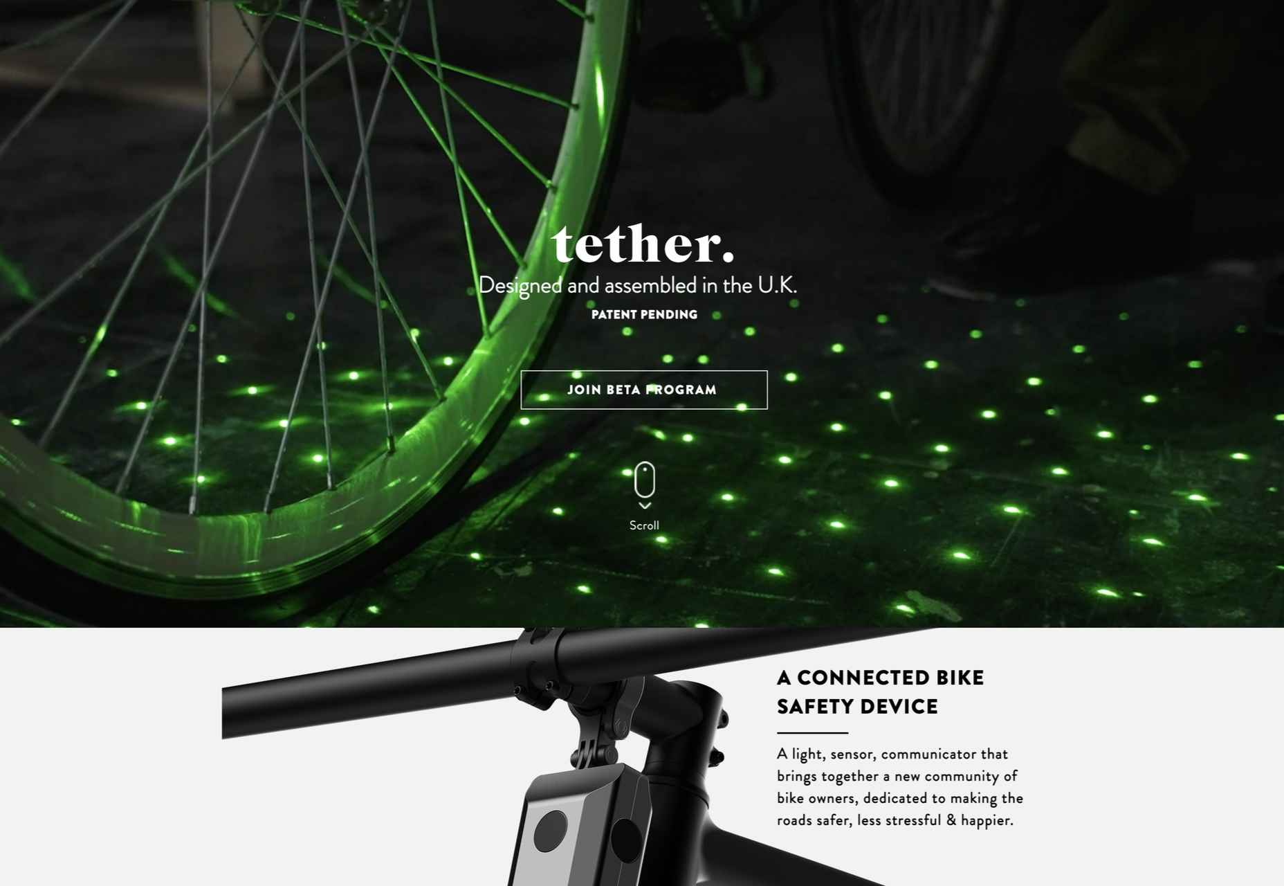
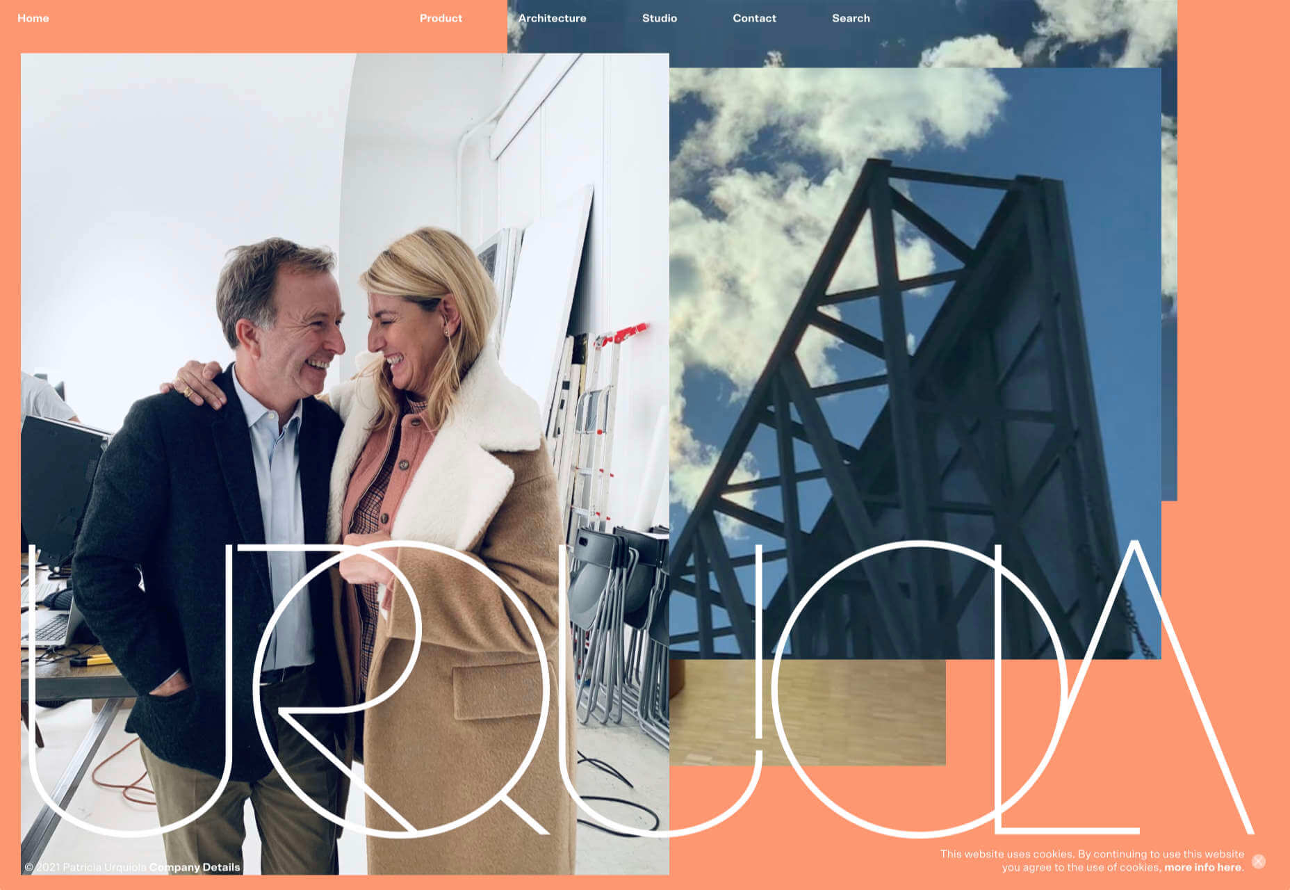
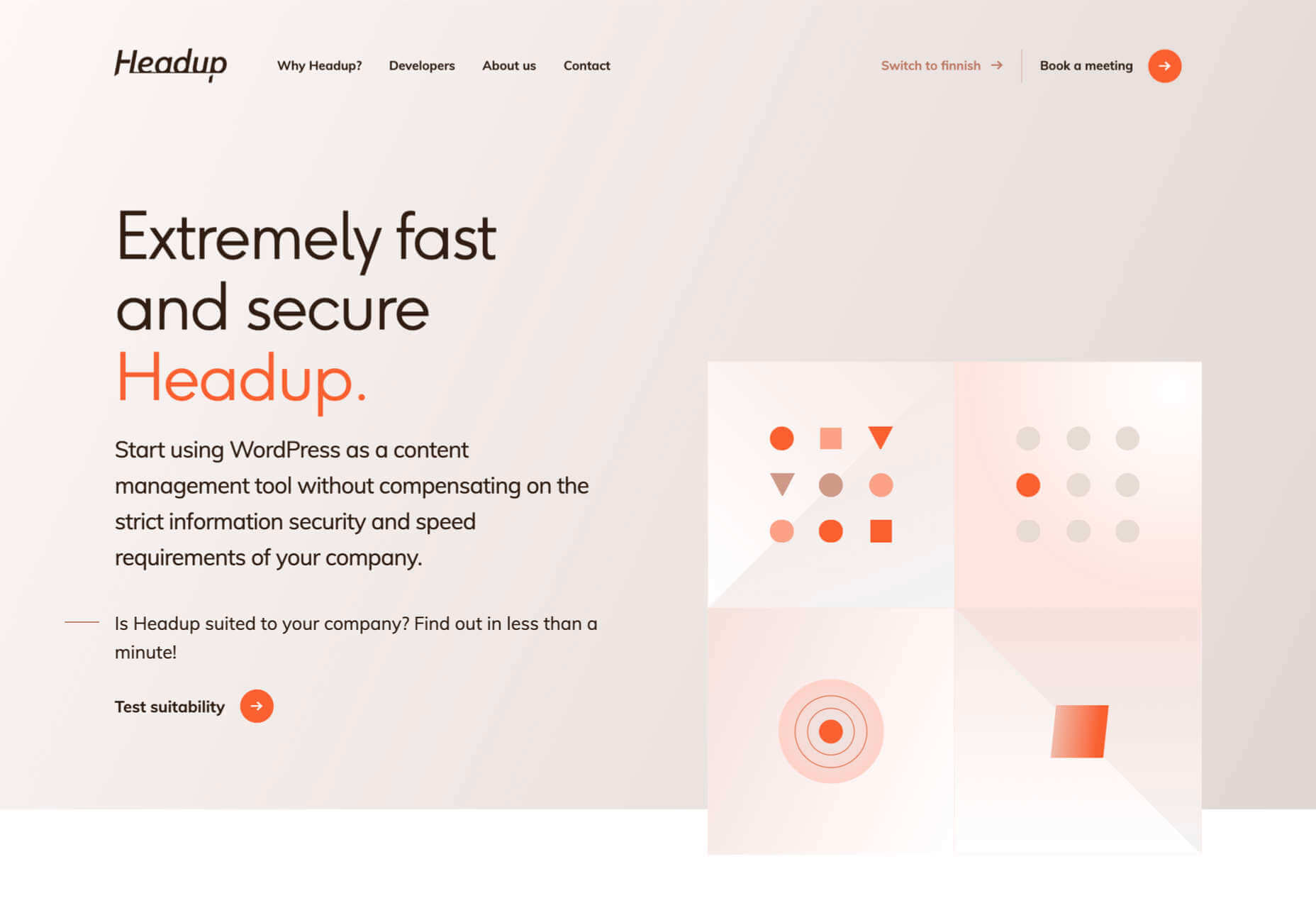
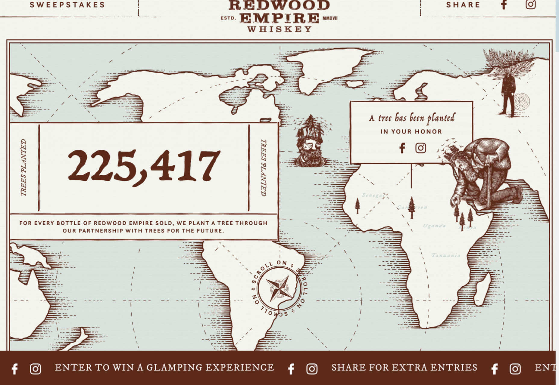
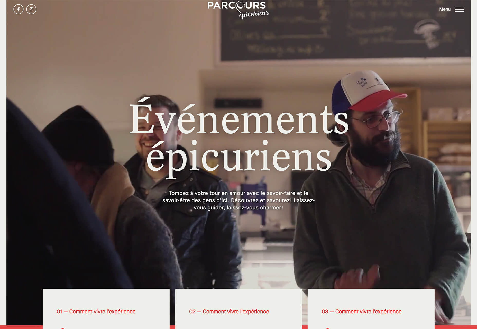
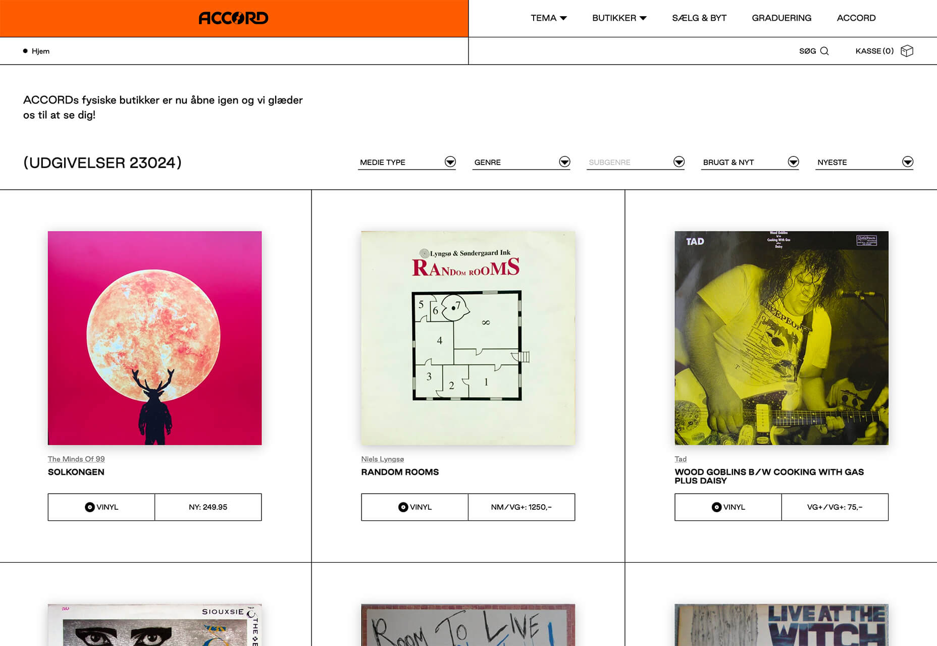
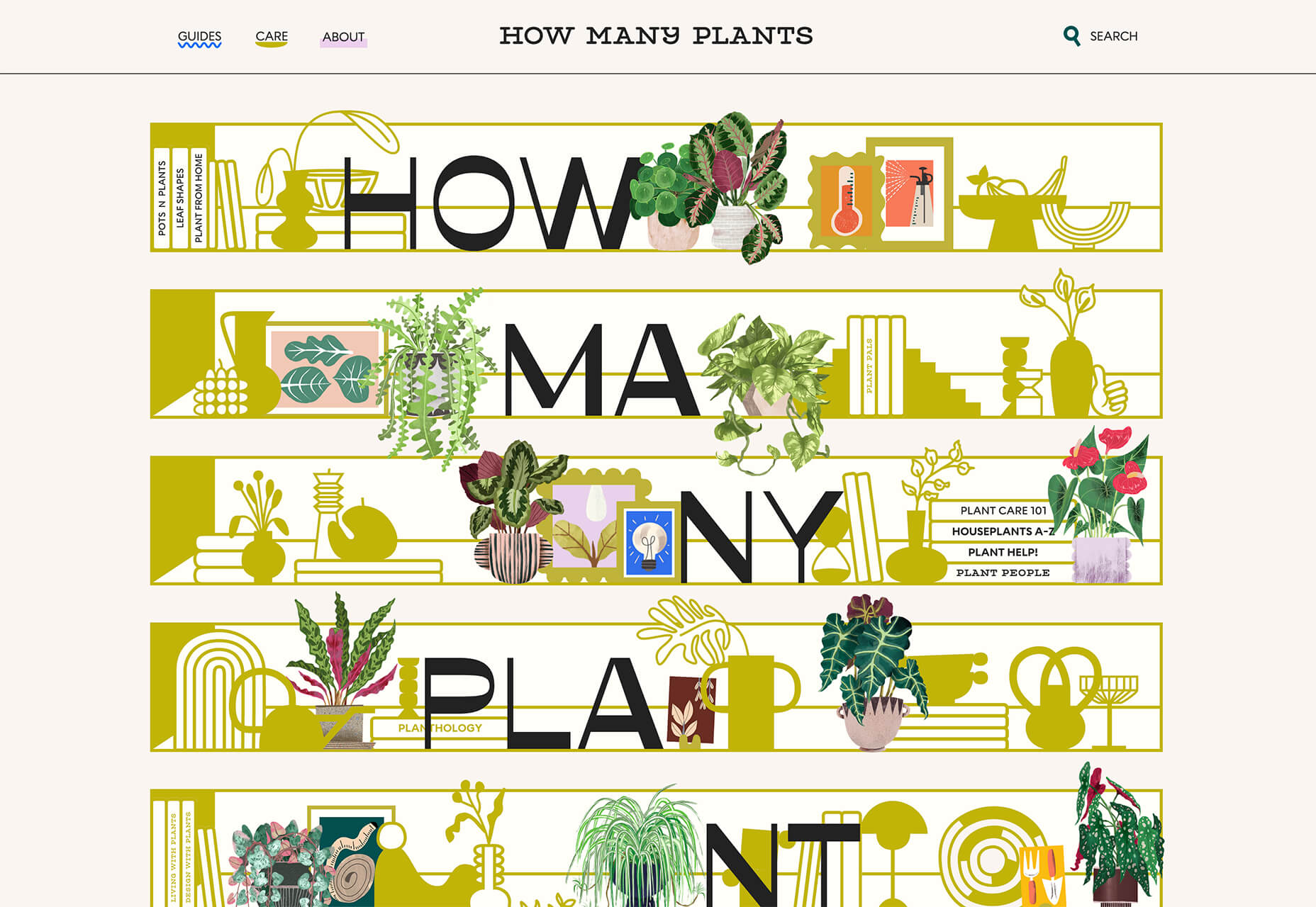
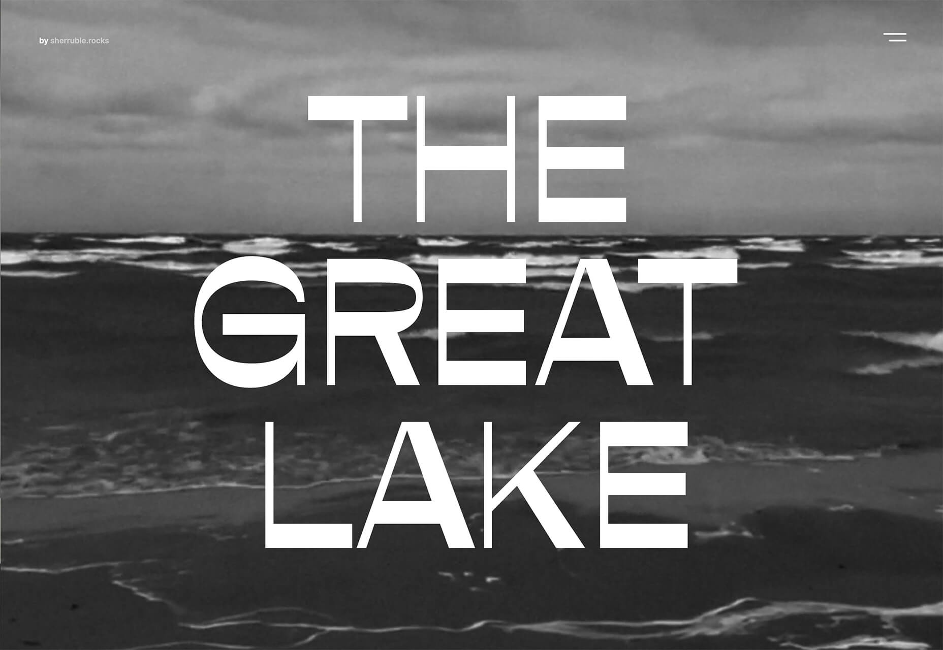
Spring and fresh designs are in the air. This month, it’s obvious that designers are feeling creative with new and interesting concepts that range from a new style for cards, homepage experimentation with multiple entry points or calls to action, and risky typography options.
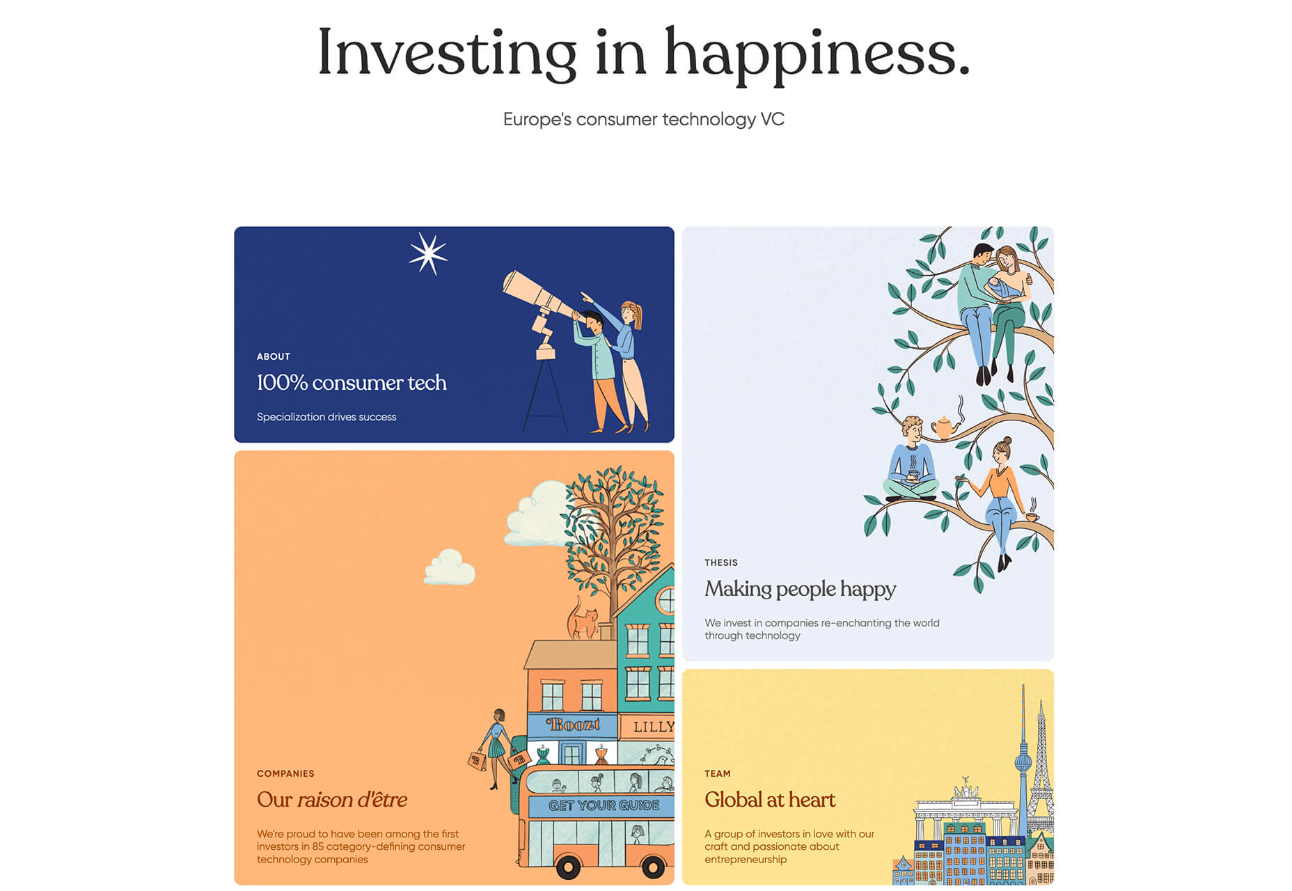
Here’s what’s trending in design this month.

1. “Flat” Cards

Card-style design elements that allow users to click through to other content aren’t new, but the design of these cards is fresh and interesting.

Rather than more heavily designed cards with shadows and layers of content, flat styles are trending. Expect this trend to explode thanks to usage by Google for a shopping experience page.

The Google example below is interesting because Google’s Material Design guidelines are what helped card-style elements grow in popularity previously. However, those cards did include more layers, color options, buttons inside the cards, and shadows.

Today’s trending cards are completely flat. And beautiful.

Each of these websites does it in a slightly different way.

Heartcore, a consumer technology VC company, uses a series of flat cards as a navigation element to help users find their way through the website. Each features a bright color background with an illustration and a simple text block.

Each card has a nice hover state where only the illustration zooms inside the card frame. This is an interesting effect because it is exactly the opposite of the previous iteration of cards, which zoomed the entire card as a hover state.

Google Shopping uses that whole card bounce hover state (plus a not-so-flat shadow) for each card. The initial design is sleek with the pairing of white and image cards with simple text in each. You are enticed to click around to see what happens.

Click on Greece is a travel website design that uses simple cards with a minimal color and text overlay. The consistency of these cards makes the design pop and the beauty of the images draw you in. Each card also has a hover state with a darker color mask to guide navigation and make text elements easier to read.

2. Multiple Homepage Entry Points

For a long time, designers have been working off the philosophy that the homepage should have one direct entry point, creating a direct funnel for the user experience.

These designs throw that idea out the window, with multiple entry points and click elements.

You can think of it as the “create your own adventure” option for these designs.

It can be a risky concept if you are diving into analytics to pay attention to user paths. You want to make sure you know what choices users are making so that you can help them on the journey to the content and information that you want them to get from the visit.

But this type of design scheme does feel somewhat personalized, putting the user in more control.

Parcouse Epicuriens uses three flat card-style elements to help users pick what they want to see from the home page. There’s no other button or direct call to action, which is somewhat uncommon in today’s website design landscape. Users have to pick from one of the cards, scroll, or enter using the hamburger menu icon.

Tasty Find uses search options to help users start their journey. What’s interesting here are the choices – search for the food you want, pick something random, or (in the small print) find even more options. Users get three choices to begin their journey with the website.

What’s interesting is how simple this complex user journey looks. The design is easy to digest, but so many options could overwhelm users. This is one of those situations where you have to watch return search data and information and weigh the risk versus the reward of so much choice. It’ll be interesting to watch this design over time and see if the options decrease in number.

Accord also has several levels of user engagement opportunity. Option 1: Every block contains a click element. Option 2: Use the search at the top to narrow choices. This is an interesting configuration as the homepage for an e-commerce website because they get right to product selection and shopping without a softer sell or introduction.

3. Risky Typography

Typographic risk has been an ongoing theme for a little while. Designers are embracing experimental and novelty typefaces to stand out in the cluttered website space. Sometimes it works beautifully, and other times, it can fall short.

Here, each of these trending website designs uses a risky typography treatment. The risks are a little different for each design, from readability to comprehension to font delivery.

How Many Plants has duel typography risks: A funky typeface paired with odd word breaks. Interestingly enough, readability isn’t as big of a concern as you might think. This is likely because there aren’t many words, and they are short. Plus, the imagery ties in nicely.

Do you notice a similarity between How Many Plants and The Great Lake? The typography has the same style with a blocky, slab, sans serif with alternating thick and thin strokes. (It’s the same font.)

The risk in the typography design for The Great Lake isn’t in the homepage display, although you might wonder what the design is about. It is carrying this font throughout the design. While it looks great large and with only a few words, it gets a little more difficult the more you see it. This type of mental reading weight can be difficult for visitors over time, creating an element of risk.

Zmaslo uses an interesting typeface with a liquid effect on top of an unusual word. That combination of text elements makes you think hard to read the homepage, despite its neat looks. The risk here is weighing visual interest against comprehension. Depending on the audience, this risk can be worth the chance.

Conclusion

Spring always seems to be that time of year where designers start thinking about new, fresh design elements. That might explain some of the “riskier” design choices and experimentation here.

Regardless of the motivation, it is always fun to see the creative stretch happen. It can be even more interesting to see what elements from these trends continue to grow in the coming months.

Source

The post 3 Essential Design Trends, May 2021 first appeared on Webdesigner Depot.


Source de l’article sur Webdesignerdepot