Articles

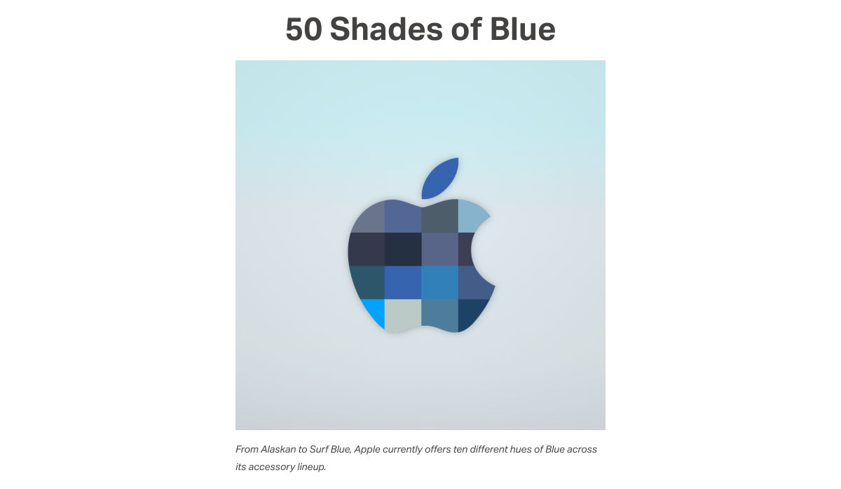
As we turn the corner into the final part of the year, many of the new websites and redesigns that we see during much of the rest of the year tend to slow down. Many businesses are focusing on fourth quarter and holiday sales.

With that being said, there are plenty of holiday flourishes already showing up on many websites. But there are still a few trends that don’t have a holiday theme.

Here’s what’s trending in design this month.

1. Beautiful Connectivity

Web elements that merge and flow into one another can be difficult to design but the payoff is totally worthwhile. This website design trend exemplifies connected elements in a way that’s beautiful and mesmerizing.

You can accomplish it with static elements or interactivity; the common theme is that design parts enter the space of one another and merge in ways that are seamless and visually interesting.

The thing that makes it exceptionally tricky is responsiveness. To ensure that pieces work well at all sizes when they overlap or encroach on the space of one another takes a lot of planning and testing.

Here are a few examples of projects that do it well – and each one does it in a different way.

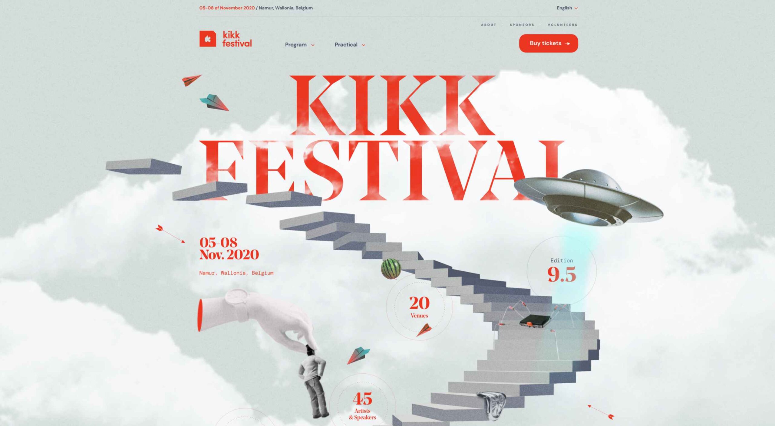
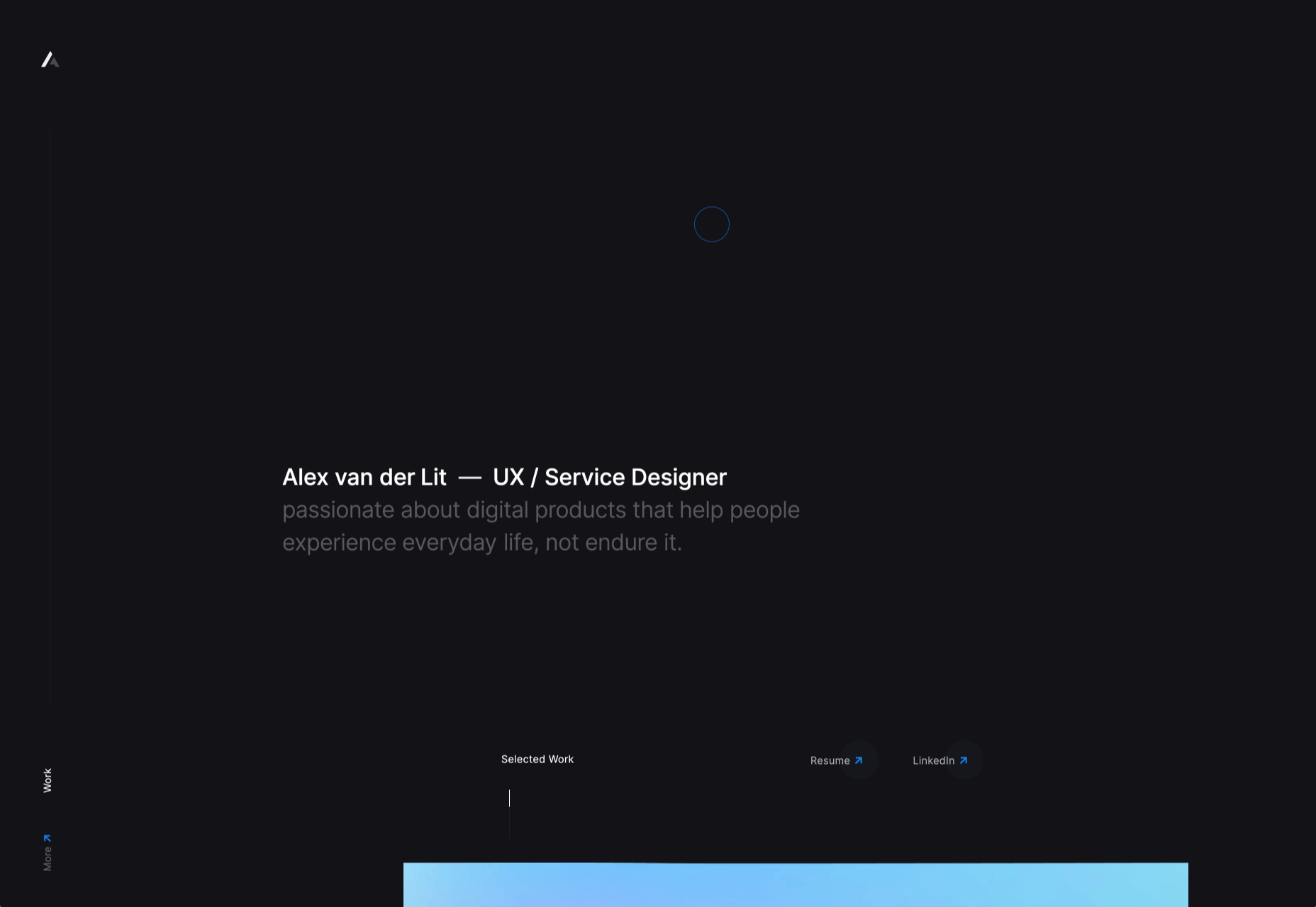
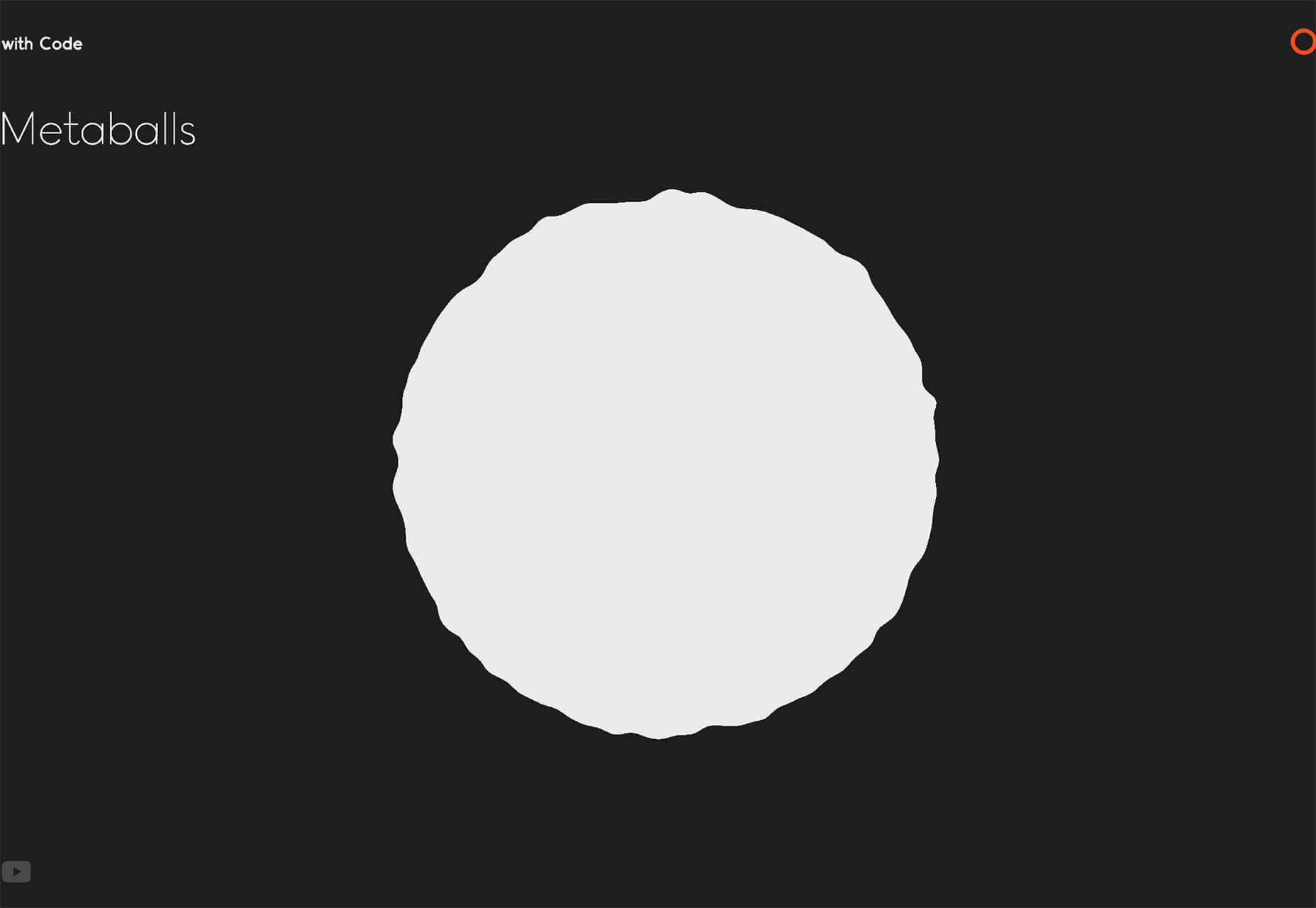
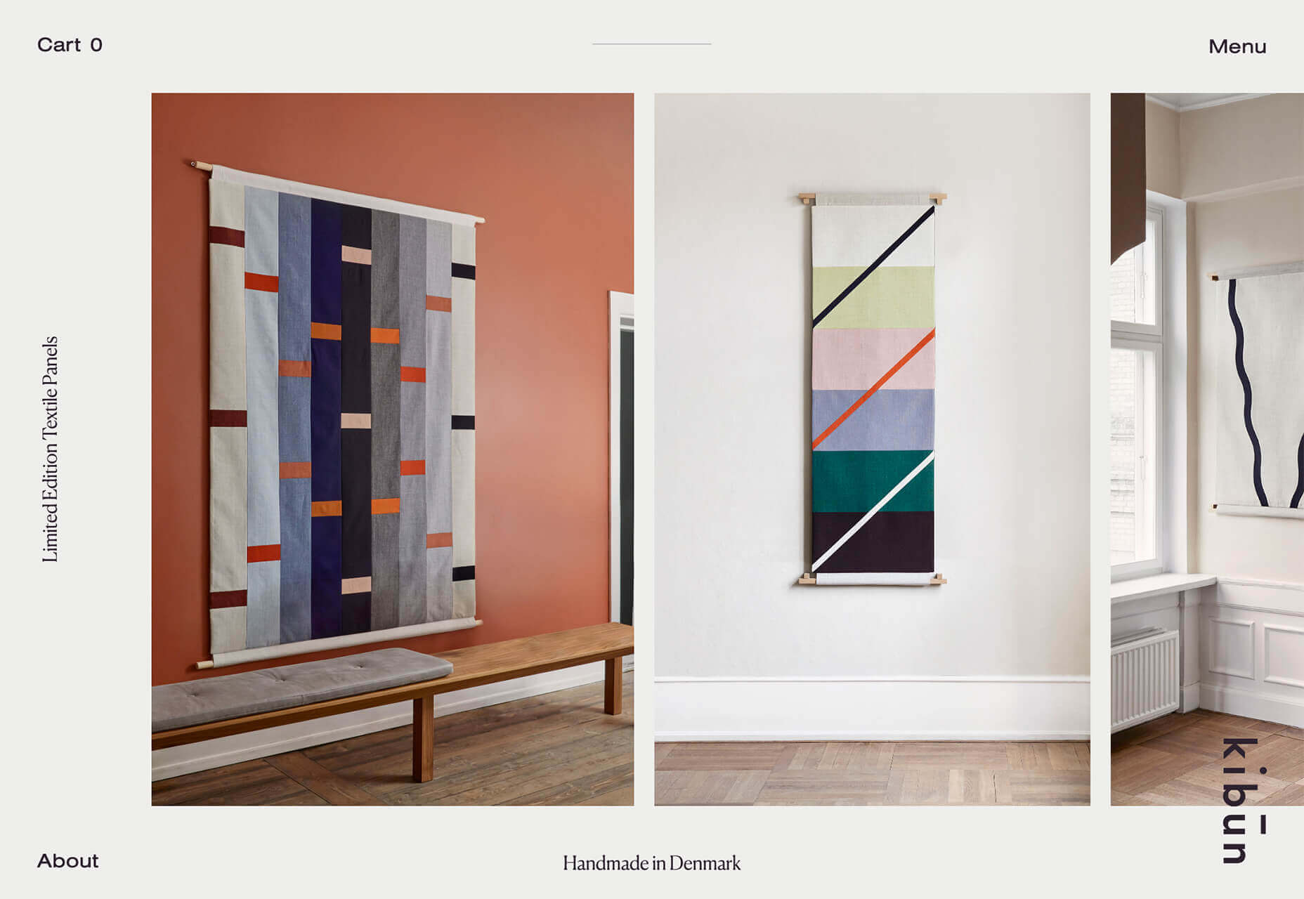
Kirk Whayman’s website uses a floating ice cube over simple lettering. The interactivity is spot on here with hover actions that allow you to move the block with the letters refracting in an expected manner. (It would be easy to play with it all day.) But the coolest interaction happens when you “break it” (click on the cube). The elements continue to merge and interact in a new and different way.

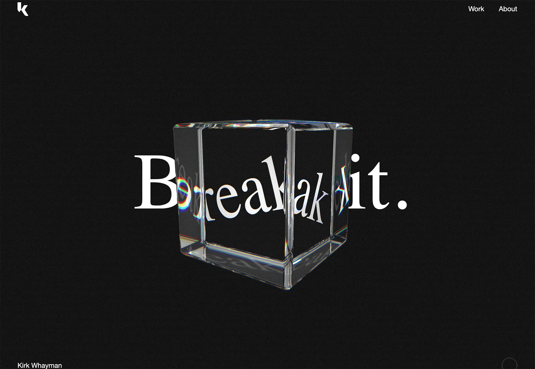
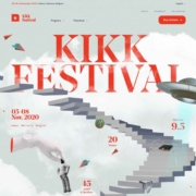
Kikk Festival uses animations and giant scrollable illustrations and plenty of elements that overlap within the space. What’s neat is that everything on this canvas seems to touch everything else. The staircase design encourages scrolling and lettering and smaller animated elements all connect to the steps in the sky motif.

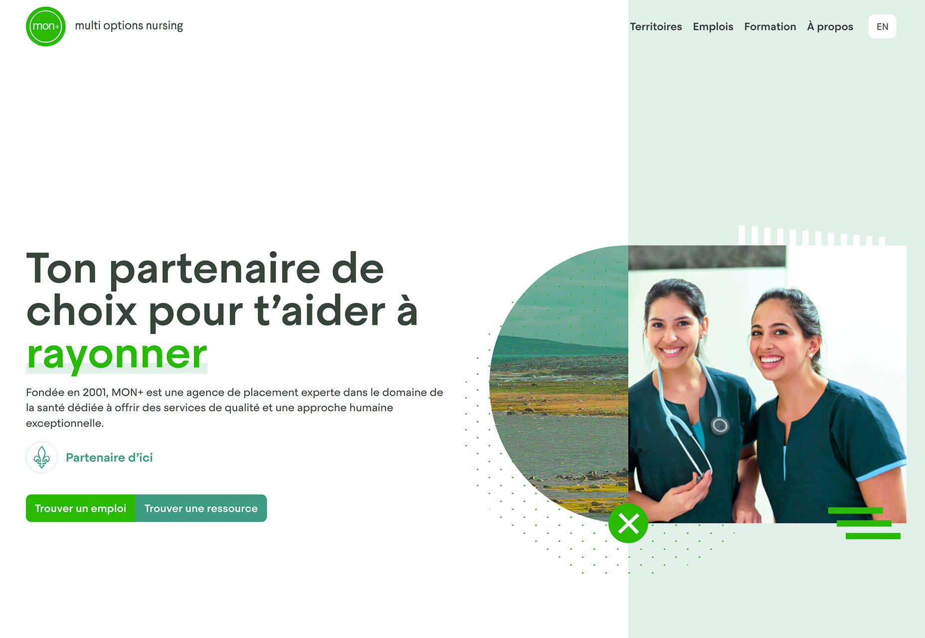
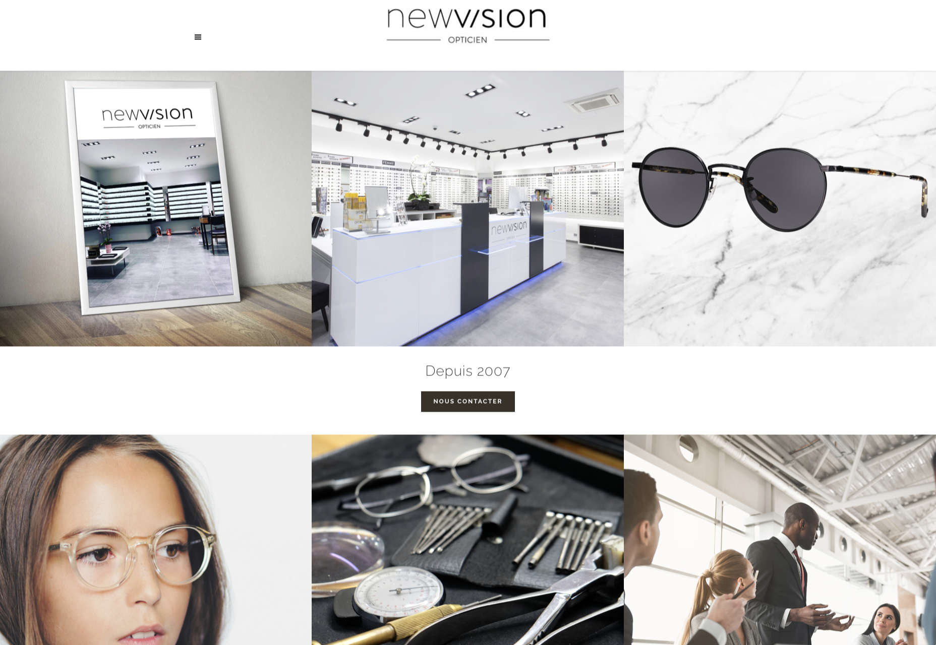
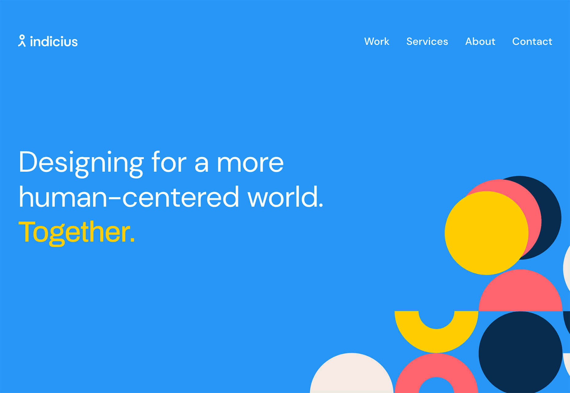
Multi Options Nursing takes a totally different approach. It uses a static split screen with a photo on the right side that merges into a round graphic element. It takes two not-s-interesting images and makes something out of them. The design carries this theme below the scroll as well and this style of image presentation carries a nice visual weight without feeling heavy.

2. Almost Brutalism

Brutalism just seems to keep coming back around. For those that love this trend, it keeps evolving as well.

The latest styles of brutalism are a little less mono but still pretty sharp with harsh lines, questionable type readability, and a lot going on in a compressed space. These projects also seem to be embracing color and alternative font choices more readily.

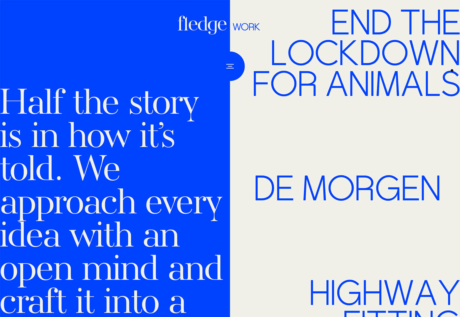
Fledge uses a split screen – still a dominant trend two years running – with a blue that’s almost too bright with an almost white offset color. The text is big and smooshed into the space tightly. Depending on the breakpoint, you might not even get the whole phrase on the left side. The design challenge is what are you supposed to do here? There are some hover animation cues, but they aren’t very direct.

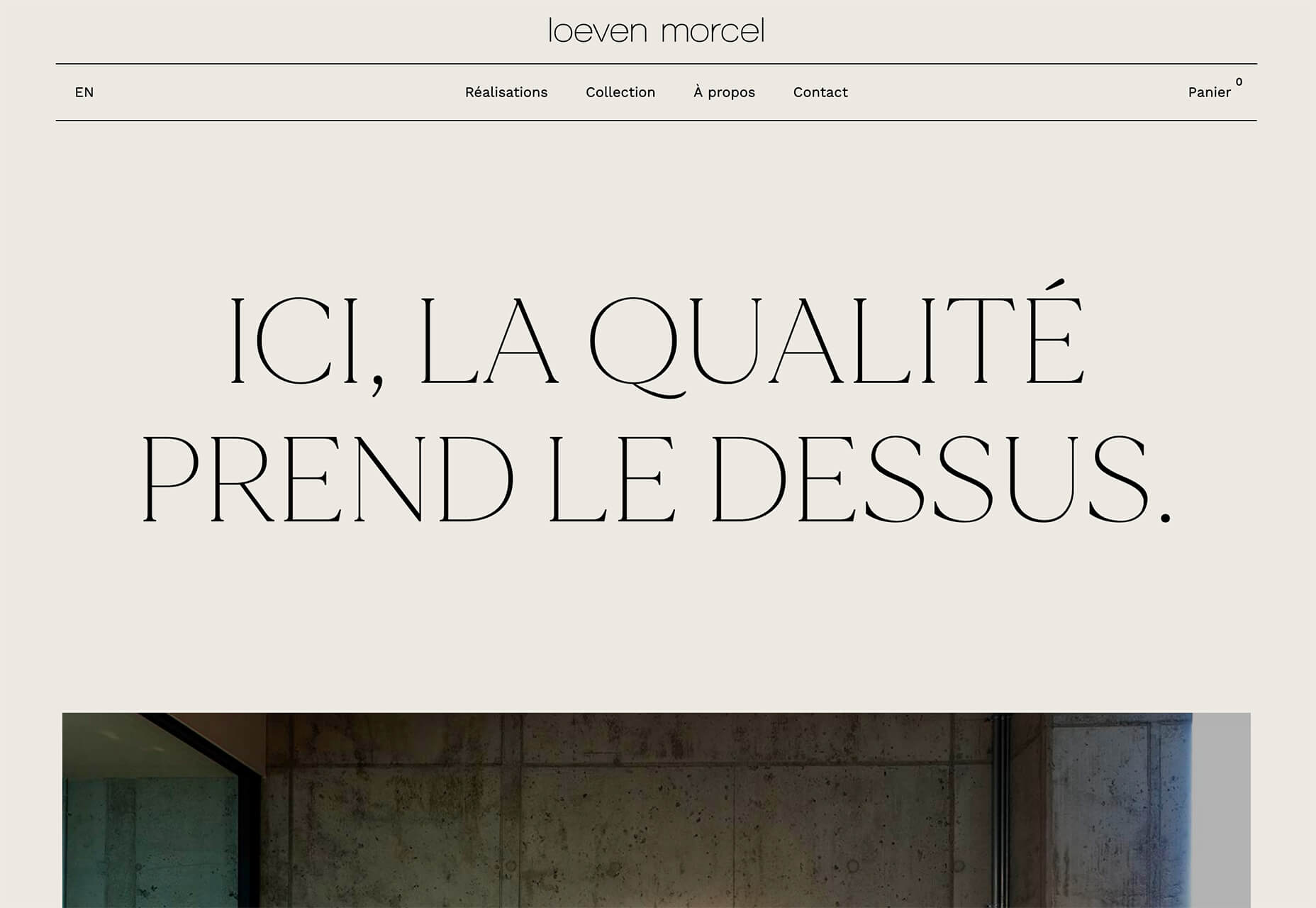
Loeven Morcel’s design has hints of brutalism and elements of elegance. What makes this design skew toward the brutal side is use of space and typography. Like the previous example, it falls into the territory of “what should I do here” with some concerns about readability. Most of these issues are resolved on the scroll if you move beyond the homepage.

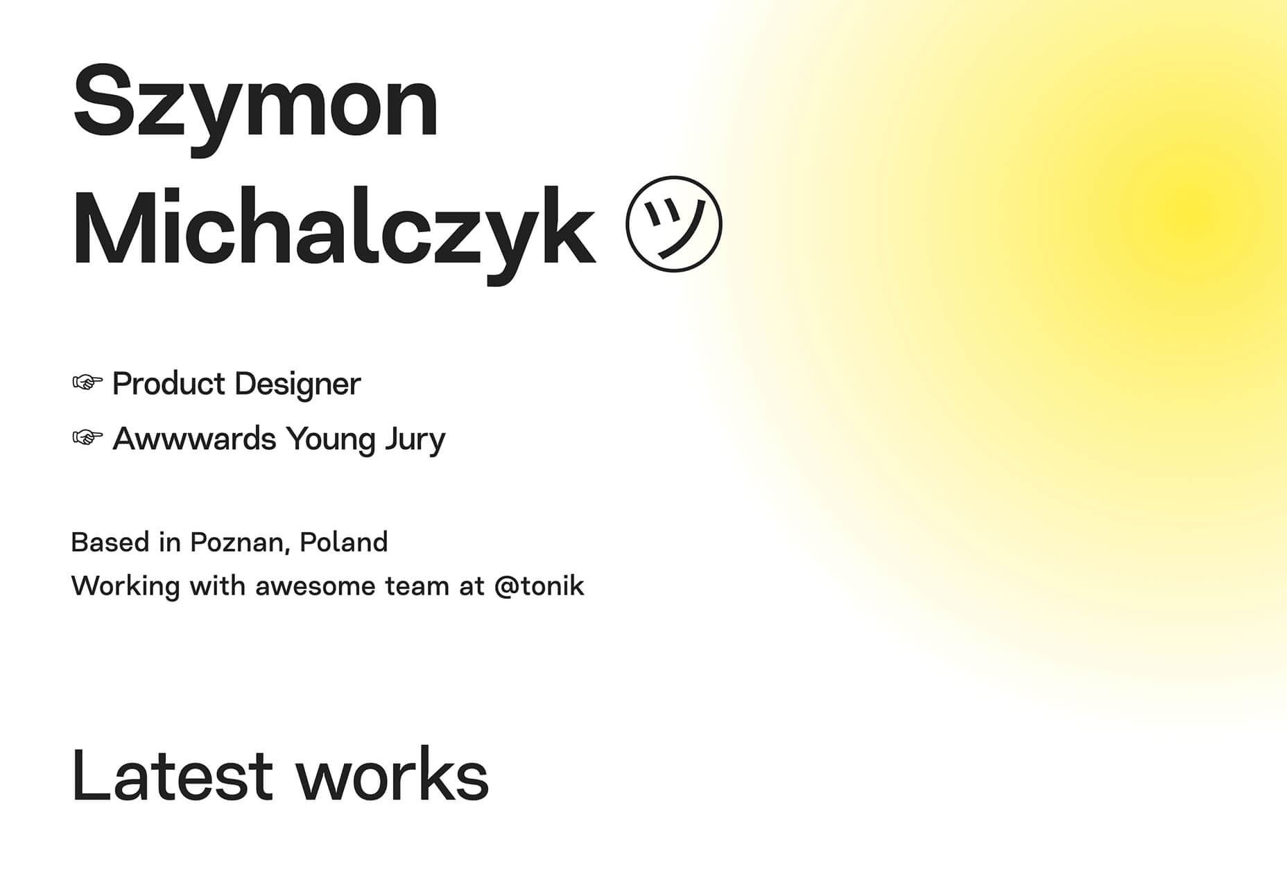
Szymon Michalczyl’s site is another that is close to brutal in style but has an element of sleekness that doesn’t quite carry it over the edge. The simple framework has that brutalist feel but the use of simple, clean fonts with plenty of space pulls it back into a more mainstream design scheme.
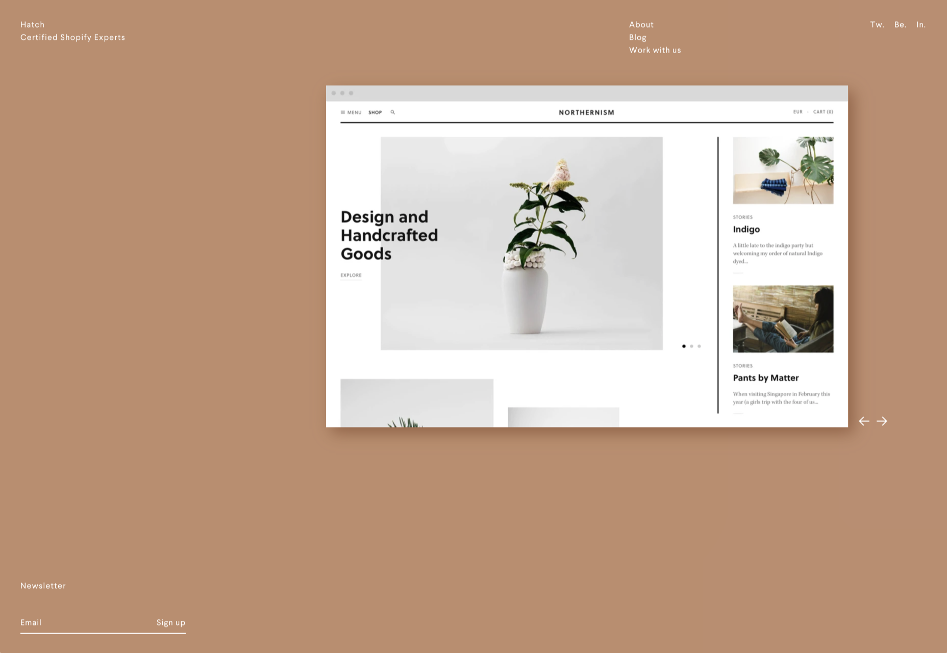
3. Beige Everything

Is a shade of beige the color of the year for 2020? Or is it just how we all feel?

Beige backgrounds are everywhere, making this one of those design trends that you can’t miss. The good news is that designers are playing with different shades of beige as well as warm and cool variations. Beige on its own can take on some of the color from accent hues and imagery, so that’s important to keep in mind when using this in the background.

The other variable is how saturated to make beige coloring. Most designs are using some of the more muted options while mostly playing with the levels of green and red. But darker beiges are also an option.

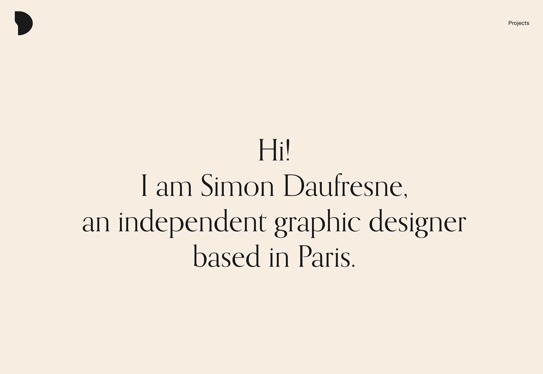
Simon Daufresne uses a beige that is the color that comes to mind when you think beige. It’s simple, a hint reddish, and is used with black only to maintain true color.

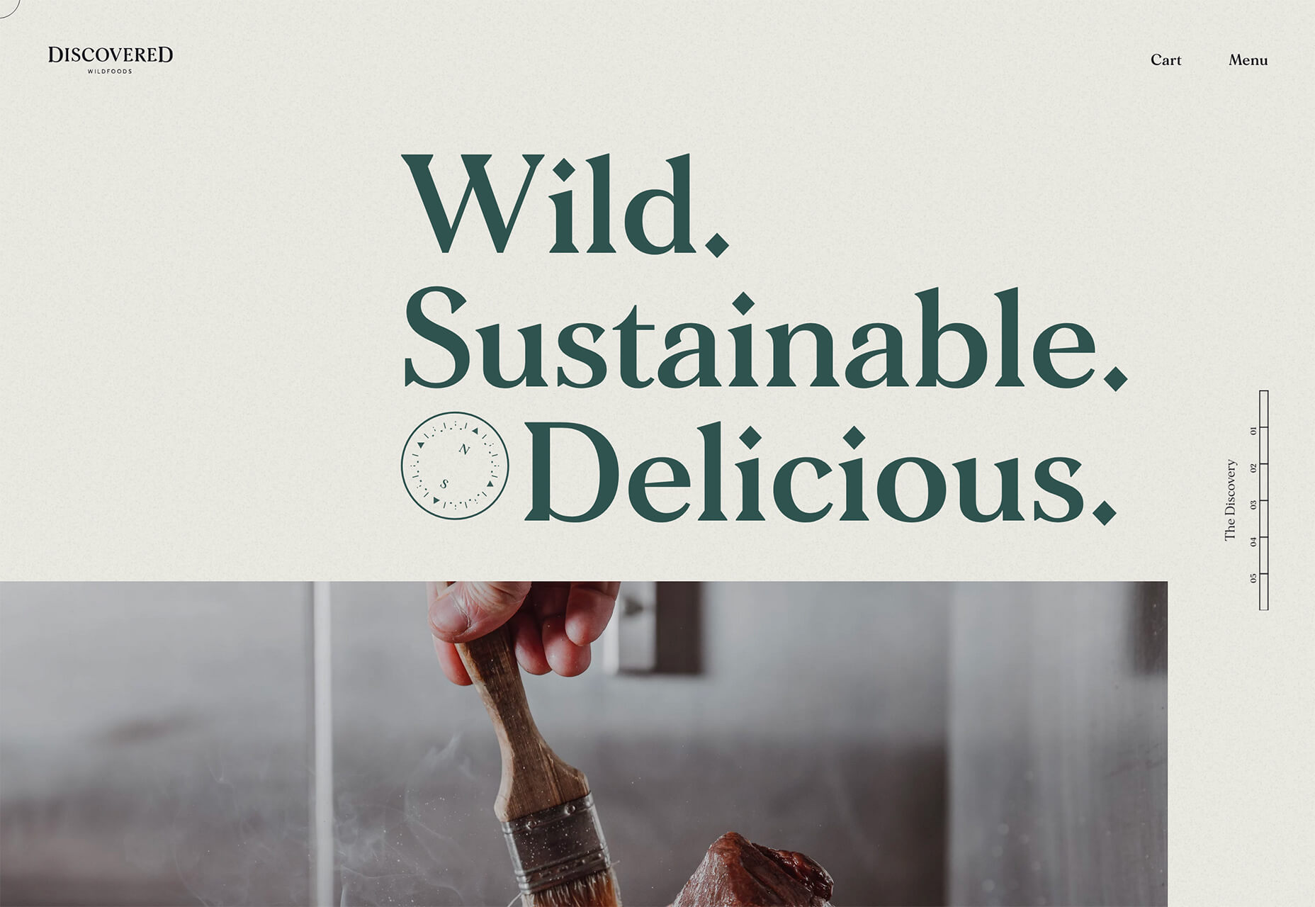
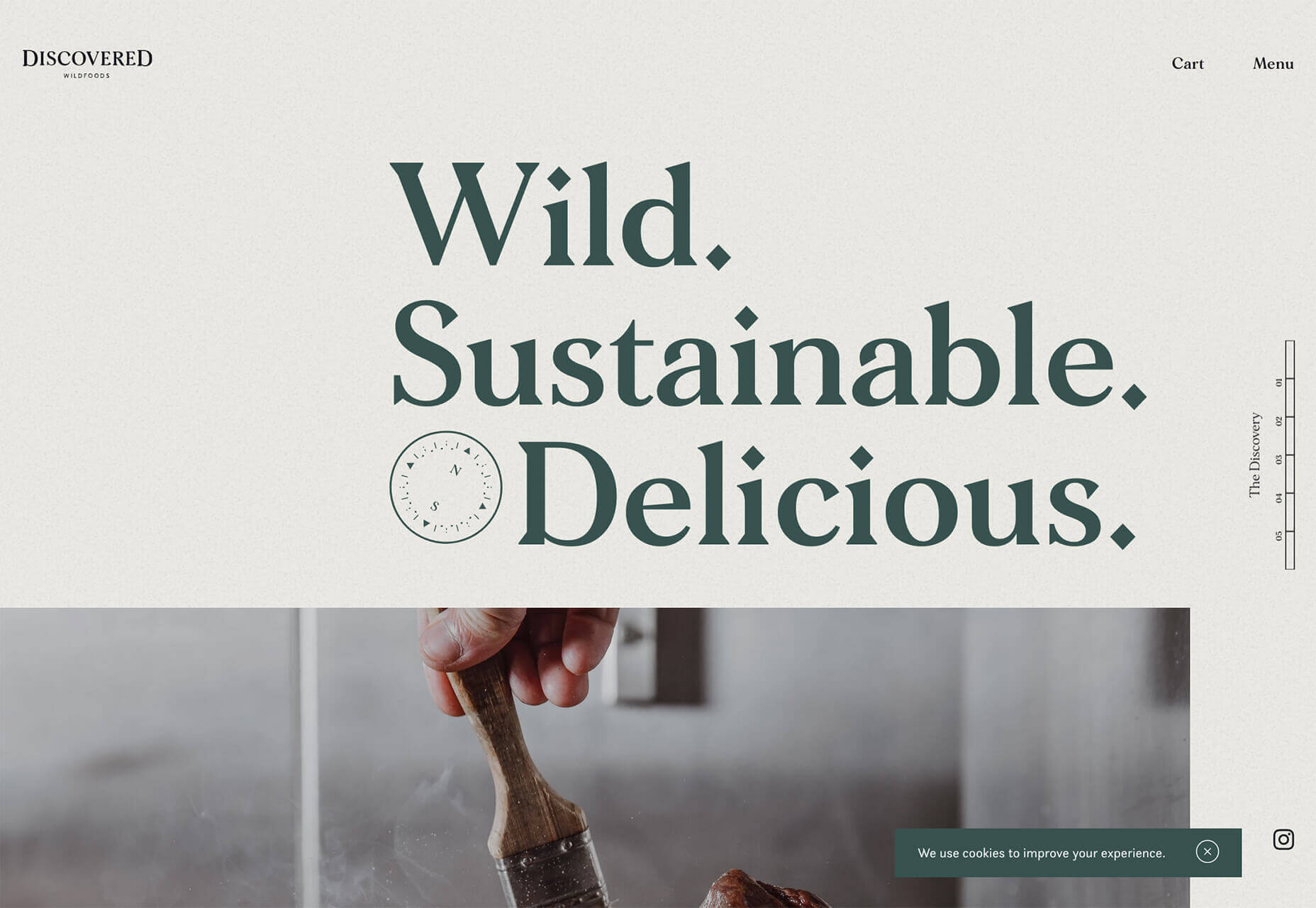
Discovered Wildfoods uses a more neutral feeling beige with a more green undertone (or is that color feel coming from other design elements). The neutral and natural color fits the brand and association this website is trying to create.

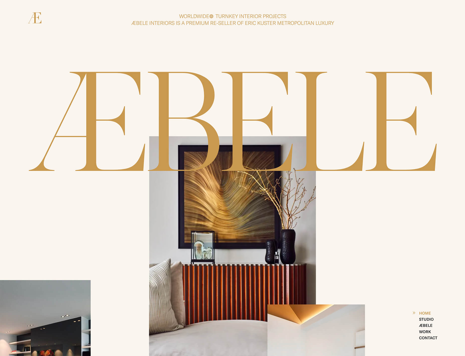
Aebele Interiors also uses a more traditional beige but with a bold mustard accent that makes the color feel exceptionally warm. What’s nice about this color combination is that in small sizes the mustard colored-type almost falls into the beige background, but at larger sizes seems to almost jump off the screen. It’s an interesting color juxtaposition.

Conclusion

Personally, this month’s trends are a mixed bag. I love the lines and interactivity of the beautifully connected examples. It shows that elements can cross and work together well.

On the flip side, brutalism and beige just aren’t my style. But apparently, they appeal to a lot of people based on the number of projects using these styles. What do you think? I’d love to know how you feel about these trends. Let me know on Twitter.

Source


Source de l’article sur Webdesignerdepot

Every week users submit a lot of interesting stuff on our sister site Webdesigner News, highlighting great content from around the web that can be of interest to web designers.

The best way to keep track of all the great stories and news being posted is simply to check out the Webdesigner News site, however, in case you missed some here’s a quick and useful compilation of the most popular designer news that we curated from the past week.

Minimal CSS Frameworks


Responsive Grid Design: Ultimate Guide


The New Facebook Design Sucks


The No-Code Generation is Arriving


15+ Text Typing Effect CSS Animation Examples


AppSheet by Google Workspace – No-code App Building Platform


Ecommerce Development Trends: The 2021 Edition


How Videos Can Boost your Website Ranking Results


5 Small Business Website Essentials You Need for your Site


The Psychology of User Decisions


Overflow for Windows – User Flow Diagramming Tool for Designers


How to Create an AI that Chats like You on WhatsApp


‘50 Shades of Blue’


Here’s Why Developers are in Love with Functional Programming


Apple Building Search Engine to Take on Google, Report Claims


A Faster Way to View Search Results with Less Clicking


Dark Mode in UI Design for Mobile Apps: Beauty Born in the Darkness


EncryptLab – A Collection of Free and Comprehensive Encryption Tools


Part of your World: Why We’re Proud to Build a Truly Native Mac App


Why I will not Call Myself a Junior Designer - and Neither Should You


10 Usability Mistakes Most Designers Make on Checkboxes


People Problems


Practical Guide to Color Theory for UI Designers


Following the 2020 U.S. Election with Google


React Vs Svelte – A Comprehensive Comparison Between Javascript Libraries


Want more? No problem! Keep track of top design news from around the web with Webdesigner News.

Source


Source de l’article sur Webdesignerdepot

In the digital era, Big Data has drastically changed the landscape of business and risk management. With unlimited access to information about potential customers and user behavior, companies are using analytics to improve their risk management practices in more advanced ways than ever before.


Big Data Analytics

Techwave’s Big data analytics consulting services help you maximize revenue options and win loyal and happy customers.

Why Big Data Is Important

Big data has been around a long time, but it has taken a while for organizations to see the usefulness of big data. Big data doesn’t just track the consumer when they are online – it provides a history of behaviors that big data services can analyze and extrapolate from. If the consumer uses smart devices, makes a purchase with credit cards or checks, or visits establishments that use smart devices, they leave a data trail that can be analyzed by big data consulting to determine possible trends. These trends help businesses understand what drives their customers to make certain purchases over others.

Source de l’article sur DZONE

Today, great design isn’t just about conveying the right amount of information in a certain number of pages. 

There’s more to creating the perfect website than experimenting with visuals and sound. Designers need to think carefully about how each element of their site impacts the overall user experience. 

After all, with billions of websites available to explore, it takes something truly immersive to convince your client’s audience that they should stay on their pages. The more convenient and attractive your websites are, the more likely it is that visitors will want to stick around. 

Minimalism, one of the more popular styles of web design from the last few years, can sometimes assist designers in making attractive and effective websites more functional.

The less clutter and confusion there is on a page, the easier it is to navigate. 

So, how do you embrace the benefits of functional minimalism?

Understanding Functional Minimalism

Many webs designers are convinced that minimalism is all about aesthetics. 

They see a website like Hugeinc.com and assume that the minimalist appearance is all about making the website as attractive as possible.

However, the underlying ideas of minimalism in web design go much deeper than this.  The history of minimalist design begins with Japanese culture. Japan has long focused on balancing simplicity and beauty with its architecture, interior design, and even graphic design. In the Western world, minimalism got its day in the sun in the web design environment, after customers endured years of cluttered and complicated web pages with difficult navigation, overwhelming information and clashing graphics. 

Designers began to experiment with the idea that less really could be more — particularly when it came to the digital landscape. 

The Functional Rules of Minimalist Web Design

For a while, minimalism was the most popular style for a website. During 2018, in particular, minimalist web design soared to the top of the designer demand list, as companies fell in love with a combination of white space, simple navigation and bold text. 

While now, there are other design trends stepping into the industry, designers can still benefit from exploring some of the essential rules of functional minimalism. After all, visual complexity has been proven to damage a person’s perception of a website

Additionally, a study conducted by the EyeQuant group found that a clean and simple design can lead to a lower bounce rate. Minimalism gives viewers less to contend with on a page, which can allow for a simpler and more straightforward experience. Additionally, a clean website can also drive additional benefits, including faster loading times, better responsivity between screen sizes and more.

Because you’re only using a few images and well-spaced text, you can even experiment with different strategies, like graphics and dynamic fonts. Look at the Manuel Rueda website, for instance, it’s a great example of how a minimalist design can be brimming with activity.

So, how can any designer use the principles of functional minimalism?

1. Focus on the Essentials

First, just like when designing a landing page, designers need to ensure that they’re concentrating only on the elements in the page that really need to be there.

This means removing anything on the website that doesn’t support the end-goals of the specific page that the viewer is using. Any pictures, background noise, buttons, or even navigation features that aren’t going to support the initial experience that the visitor needs, must go. 

Think about what’s going to distract your visitors from the things that are important and concentrate on giving everything a purpose. For instance, the Plus63.org website instantly introduces the visitors to the purpose of the website, then allows users to scroll down to get more information. The data is spread clearly through the home page, pulling the viewer into a story. 

2. Embrace the Positives of Negative Space

Negative space is one of the fundamental components of good minimalist web design. 

Every part of a good website doesn’t need to be filled with noise to make a difference. White, or negative space can help to give your viewer the room they need to fully understand the experience that they’re getting. 

From a functional perspective, it’s the difference between placing someone in an overflowing storage container and asking them to find what they need or placing them in a room where items are carefully spaced out, labelled, and waiting for discovery. 

The Hatchinc.co website uses negative space to ensure that information is easy to consume. You can find the different pages of the site easily, the social media buttons, and the newsletter subscription tool. Plus, you get a chance to see some of the work behind the site.

3. Make it Obvious

One of the biggest problems that consumers have encountered in recent years, is the concept of “choice overload”. 

Whether you’re in a store, or on a website, you’re never sure what to do first. Do you check out the blog posts on the site to learn more about the authority of the company? Do you visit the “About” page, to see where the brand come from? Do you head to their product pages?

As a designer, functional minimalism can help you to make it obvious what your audience should do next. As soon as you arrive on the AYR.com website, you’re not overwhelmed with choice. You can either head to your bag, “shop now”, or check the menu. 

Since the “Shop Now” CTA is the biggest and most compelling, the chances are that most visitors will click that first, increasing the company’s chance of conversions. 

4. Simplify the Navigation (But Don’t Hide It)

The AYR.com example above brings us to another concept of functional minimalism. 

While minimalism and simplicity aren’t always the same thing, they should go hand-in-hand. When you’re designing for functional minimalism, you should be concentrating on helping visitors to accomplish tasks as quickly and easily as possible, without distraction. 

That means that rather than overwhelming your audience with a huge selection of pages that they can visit at the top or side of the screen, it may be worth looking into simpler navigation options. A single menu icon that expands into a full list of items remains a popular design choice – particularly in the era of mobile web design. 

For instance, look at the simple menu on newvision-opticien.com.

With this basic approach, designers can ensure that visitors are more likely to click through to the pages that their clients want their customers to visit. They can still find what they need in the menu, but it’s not taking up space on the page, or distracting them. 

5. Set Great Expectations with the Top of the Screen

Functional minimalism can also help today’s designers to more quickly capture the attention of their visitors from the moment they click into a website. 

The content that’s visible at the top of the page for your visitors is what will encourage them to take the next step in their online experience. Make sure that you’re providing something that keeps your audience interested and gives them the information they need. 

That way, you’ll lower the risk of high bounce rates for your clients, while also taking advantage of minimalism’s ability to deliver quick access to information for your audience. 

At the top of the page, the Kerem.co website instantly introduces the visitor into what the website is all about, and what they should do next. 

You can even deliver more information in one chunk at the top of the page, without cluttering the environment, by using good UI animation. 

Consider implementing a slideshow of pictures that flip from one image to the next, or a font section that dynamically changes as your audience has chance to read each sentence. 

6. Use Functional Minimalism in the Right Spaces

Remember, functional minimalism isn’t just for home pages. 

Depending on what you want to accomplish for your client, you could also embed the components of minimalism into landing pages, portfolios, and squeeze pages too. 

After all, when there’s less clutter and confusion on a page to distract a potential audience, there’s a greater chance that your visitors will scroll to the bottom of the page and complete a conversion. For instance, look at how simple and attractive the Muzzleapp.com landing page is.

The page provides useful information and tells customers exactly what they need to do next. There’s no confusion, no complexity, and nothing to hold visitors back. 

Just be careful. While functional minimalism can be very useful, it won’t be right for every website. A lack of elements can be harmful to websites that rely heavily on content. That’s because low information density will force your user to scroll excessively for the content that they need. Using functional minimalism correctly requires a careful evaluation of where this technique will be the most suitable. 

Minimalism Can be Functional

A minimalist design isn’t just an aesthetic choice. The right aspects of minimalism can simplify interfaces on the web by eliminating unnecessary elements and reducing content that doesn’t support an end goal. 

The key is to ensure that you’re focusing on a combination of aesthetics and usability when creating the right design. An easy-to-navigate and beautiful website can be a powerful tool for any business.  

Source


Source de l’article sur Webdesignerdepot

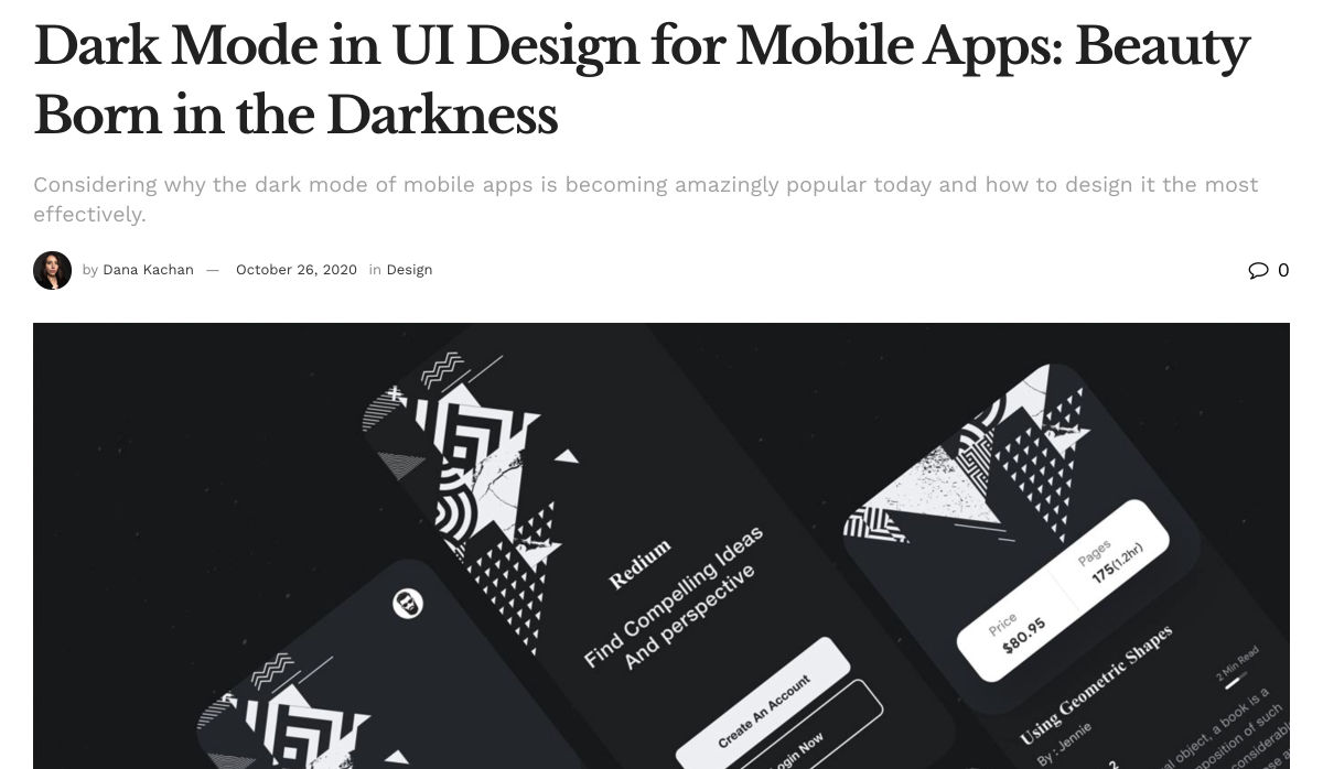
Dark themes are everywhere these days. 

As human beings continue to spend more of their time interacting with technology, dark themes provide a more relaxing way to engage with the digital world. More often than not, these themes are easier on the eyes, more attractive, and perfect for the dedicated user

Throughout 2020, countless leading brands have debuted their own version of the dark theme. Google has a solution for your Drive, while Apple and Android have built dark theme performance right into their operating systems. 

If you haven’t learned how to make the most out of dark mode yet, then you could be missing out on an excellent opportunity to differentiate your design skills, and earn more clients going forward. 

Why Dark Mode?

Before we dive too deeply into the possibilities of creating your own dark theme, let’s examine what dark mode is, and why it’s so effective. 

Ultimately, dark themes are created to reduce the amount of luminance emitted by everything from your desktop and laptop, to your smartphone and smartwatch. Dark themes help to improve the visual ergonomics of design, by reducing eye strain, adjusting brightness to suit current lighting conditions, and more. Additionally, many dark mode offerings are also fantastic at conserving battery life. 

Here are some of the main benefits of adding dark themes to your design portfolio

  • Better user experience: A focus on user experience is one of the most important trends of the digital age. You need to be willing to deliver incredible experiences to everyone who visits your website if you want to stand out today. Dark mode reduces everything from eye strain, to battery power consumption. This helps to keep customers on a website for longer.
  • Innovation and cutting edge appeal: Most companies want to prove that they can stay on the cutting edge of their industry. The ability to offer an opt-in dark mode version of a website theme or appearance can help your clients to stand out from the crowd. As the environment becomes more mobile-focused, more companies will be looking for designers that can provide the best mobile experiences. 
  • Support for universal design: Dark mode isn’t just great for people who have light sensitivity at night. This solution could be more comfortable for visually-impaired users who would struggle with eye strain when visiting your websites otherwise. If you want your content to be more inclusive for a wider range of viewers, then learning how to design for dark mode is a good way to start.

Best Practices When Designing for Dark Mode

Designing for dark mode is easier than you’d think. Most of the time, it involves simply thinking about how you can replace some of the brighter, more overwhelming aspects of your site, with something deeper and darker. 

Here are some useful tips that will get you moving in the right direction. 

1. Experiment with Colors

A big issue for a lot of web designers when it comes to developing a dark mode solution is that they get too caught up with things like pure white text against pure black backgrounds. However, this high-contrast option can be a little much after a while. 

It’s often much easier to use a dark grey as your primary surface color, instead of a true black. Additionally, rather than using bright white, think about slightly off-white alternatives that will be warmer to the eye.

Experiment with surfaces and color combinations that are unlikely to cause too much eye strain. Dark grey foundations often offer a wider range of depth, too, because you can demonstrate shadows on grey. 

Additionally, when you are experimenting with colors, remember that saturated colors often vibrate painfully against very dark surfaces, making them harder to read. Desaturating your colors will help to reduce the contrast and make your websites more welcoming. 

Lighter tones in the 200-50 range will have better readability on dark themes. However, you can always experiment with your choices. Google Material Design recommends using a contrast level of around 15:8:1 between your background and text. 

2. Consider the Emotional Impact

Much of the effort involved with dark mode design is figuring out how certain colors work together. It’s easy to get carried away with stark contrasts, particularly when you’re used to working with a white background. However, you need to remember that you’re designing for a user that’s primarily looking for an easier and more subdued browsing experience.

While you’re working, remember to consider the emotional aspect of the design too. The emotion in colors can make or break a buyer’s journey in any environment. However, an often overlooked-aspect of color psychology, is that people perceive shades differently when they’re on a black background

For instance, think of the color green. On a light background, it conveys nature and even financial wealth. However, on a dark background, the same green could come across as something venomous, toxic, or even sickly. It’s important to think about the kind of impressions end users are going to get when they arrive on your site.

3. Give Users the Freedom to Choose

One of the biggest mistakes you can make when you begin designing for dark mode, is thinking that you should focus entirely on your dark themes, and nothing else. This lines you up for a problem if you interact with users who want the best of both worlds. If you’re designing for apps in particular, you’re going to need web pages that can switch naturally between light and dark themes. 

Learning how to implement both a dark mode and a light mode option into the desks you create will help you to reach a wider selection of customers. Remember, you’ll need to test the performance and impact of your designs in both themes, to check that they deliver the same kind of experience, no matter how your user chooses to browse. 

Although dark mode should offer a different experience to end-users, it still needs to feel as though they’re browsing on the same website. That means that you’re going to need to experiment with the most natural combination of light and dark mode options.

4. Remember the Basics

Remember, although the three tips above will help you to get on the right path for dark mode design, you’ll also need to consider the opportunities and limitations of the platforms that you’re designing for. The kind of dark mode experience you can deliver for Google Chrome websites is going to be very different to what you can create for something running on iOS.

Examining the documentation provided by the system that you’re designing for will help you to develop something with a close insight into what’s actually possible. 

Other top tips for dark mode design include:

  • Focus on your content: Make sure that your content stands out on the page, without being too overwhelming. 
  • Test your design: In both light and dark appearances, you need to make sure everything is working as it should be.
  • Adopt vibrancy for your interfaces: Vibrancy helps to improve the contrast between your background and foreground. 
  • Use semantic colors: Semantic colors adapt to the current appearance of a website automatically. Hard-coded color values that don’t adapt can seem more aggressive. 
  • Desktop tinting: Try experiment with things like transparency and filters to give your websites and apps a slightly warmer tint – ideal for late-night browsing
  • Icons: Use individual glyphs and icons for dark and light modes if necessary. 

Ready to Design for Dark Mode?

Preparing your web development and design portfolio for an era addicted to dark mode can be a complex experience. You need to think carefully about how people are going to browse through your websites and apps when they’re searching for something more subtle, and less visually overwhelming than the websites that we’re used to making. 

The most important thing to remember is that everything on your website or application should look just as beautifully tailor-made in dark mode as it does in light mode. Simply adding a dynamic black background when people want to switch settings in an app isn’t enough. You need to go in-depth with your designs and examine how different fonts, colors, and images work together.

Source


Source de l’article sur Webdesignerdepot

The digital world is a place of constant change. Just as you get used to a new design trend, another one appears, forcing you to rethink the way that you approach each client project. 

As a web designer, it’s up to you to make sure that you have your finger on the pulse on the latest transformations in the industry. However, it can be challenging to know for sure which trends you should be taking seriously, and which you can simply ignore. 

One option to refine and enhance your design journey is to pay attention to influencers. 

Influencers aren’t just there to guide customers into making purchasing decisions. These people are thought-leaders in their field. They spend all of their time tracking down ideas and concepts that really work. That way, they can maintain a successful reputation online.

Sourcing information and motivation from the following UX influencers could help you to create some truly amazing websites in 2020: 

1. Andrew Kucheriavy 

Andrew Kucheriavy is the phenomenal co-founder and CEO of a company named Intechnic. Andrew was one of the first people in the world to be given the “Master in User Experience” award. This means that he’s an excellent person to pay attention to if you want help understanding the ins and outs of user experience design

As one of the leading visionaries in UX, business strategy, and inbound marketing, Andrew has a lot of useful information to offer professionals and learners alike. Andrew is particularly active on Twitter, where he’s constantly sharing insights on design and marketing. You can also find input from Andrew on the Intechnic blog. 

2. Jeff Veen 

Another must-follow for designers who want to learn more about understanding their audience and their position in the marketplace, Jeff Veen is a leader in UX and product design. Veen got his start with the founding team for Wired, before he created the Adaptive Path company for UX consulting. Jeff Veen is also known for being responsible for various aspects of Google Analytics. 

Over the years, Jeff has expanded his knowledge in the design space, and mentored various companies, from WordPress to Medium. He also has a fantastic podcast that you can listen to for guidance when you’re on the go. 

3. Jared Spool 

Jared Spool has been tackling the most common issues of user experience since before the term “UX” was even a thing. Excelling in the design world since 1978, Jared has become one of the biggest and most recognizable names in the user experience environment. He’s the founder of the User Interface Engineering consulting firm. The company concentrates on helping companies to improve their site and product usability. 

Jared offers plenty of handy information to stock up on in his Twitter feed. Additionally, you can find plenty of helpful links to blogs and articles that he has published around the web on Twitter too. He’s followed by Hubgets, PICUS, and many other leading brands. Make sure that you check out his collection of industry-leading talks on UIE. 

4. Jen Romano Bergstrom

An experimental psychologist, User Experience Research coach, and UX specialist, Jen is one of the most impressive women in the web design world. She helped to create the unique experiences that customers can access on Instagram and Facebook. Additionally, she has a specialist knowledge of eye-tracking on the web. You can even check out Jen’s books on eye-tracking and usability testing

When she’s not writing books or researching user experience, Jen is blogging and tweeting about usability and researching new strategies in the web design space. It’s definitely worth keeping up with Jen on Twitter, particularly if you want to be the first to know about her upcoming seminars and learning sessions. 

5. Katie Dill 

Katie Dill is the former Director of Experience for Airbnb, so you know that she knows her way around some unique experiences. With an expertise in working with companies that harness new technologies and UX design, Katie Dill is at the forefront of the user experience landscape. Dill attends various UX conferences throughout the year, and publishes a range of fantastic videos on YouTube. 

You can find blogs and articles from Katie published on the web; however, you’ll be able to get the most input from her by following Katie on her Twitter account. 

6. Khoi Vinh 

Khoi Vinh is one of the most friendly and unique UX bloggers and influencers on the market today. He knows how to talk to people in a way that’s interesting and engaging – even about more complicated topics in UX design. Vinh is a principle designer at Adobe, and he has his own podcast called Wireframe. However, he still finds time to keep his followers engaged on Twitter. 

Over the years, Khoi has worked as a Design Director for Etsy and the New York Times. Vinh also wrote a book called “Ordering Disorder” which examines grid principles in web design. According to Fast Company, he’s one of the most influential designers in America. Additionally, Khoi has a brilliant blog where you can check out all of his latest insights into UX design. 

7. Cory Lebson

Cory Lebson is a veteran in the world of web design and user experience. With more than 2 decades of experience in the landscape, Cory has his own dedicated UX consulting firm named Lebsontech. Lebson and his company concentrate on offering UX training, mentoring, and user experience strategy support to customers. Cory also regularly speaks on topics regarding UX career development, user experience, information architecture and more. 

Cory is an excellent influencer to follow on Twitter, where you’ll find him sharing various UX tricks and tips. You can also check out Cory’s handbook on UX careers, or find him publishing content on the Lebsontech blog too. 

8. Lizzie Dyson

Another amazing woman in the industry of UX, Lizzie Dyson is changing the experience landscape as we know it. Although she’s a relatively new figure in the web design world, she’s recognized world-wide for her amazing insights into the world of web development. Lizzie also helped to create a new group specifically for women that want to get involved in web design. 

The Ladies that UX monthly meet-up welcomes a community of women into the digital landscape, helping them to learn and expand their skills. Lizzie regularly publishes content online as part of Ladies that UX. Additionally, she appears on the Talk UX feed – an annual design and tech conference held for women around the world. 

9. Chris Messina 

Chris Messina is a product designer and a technical master who understands what it takes to avoid disappointing your users. With more than a decade of experience in the UX design landscape, Messina has worked for a variety of big-name brands, including Google and Uber. He is best known as the inventor of the hashtag!

Chris is a highly skilled individual who understands the unique elements that engage customers and keep people coming back for more on a website. You can see Chris speaking at a selection of leading conferences around the world. Check out some of his talks on YouTube or track down his schedule of upcoming talks here. Chris also has a variety of fantastic articles on Medium to read too. 

10. Elizabeth Churchill

Last, but definitely not least, Elizabeth Churchill is a UX leader with an outstanding background in psychology, research science, psychology, artificial intelligence, cognitive science, human interaction with computers and more. She knows her way around everything from cognitive economics, to everyday web design. Churchill also acts as the director of UX for Google Material Design. 

A powerhouse of innovation and information, Churchill has more than 50 patents to her name. She’s also the vice president of the Association for Computing Machinery too. When she’s not sharing information on Twitter, Elizabeth also has a regular column that you can tune into on the ACM Interactions magazine. 

Who Are You Following in 2020?

Whether you’re looking for inspiration, guidance, or information, the right influencers can deliver some excellent insights into the world of web design. There are plenty of thought leaders out there in the realm of user experience that can transform the way that you approach your client projects. You might even discover a new favourite podcast to listen to, or an amazing series of videos that help you to harness new talents. 

Influencers are more than just tools for digital marketing; they’re an excellent source of guidance for growing UX designers too.


Featured image via Pexels.

Source


Source de l’article sur Webdesignerdepot

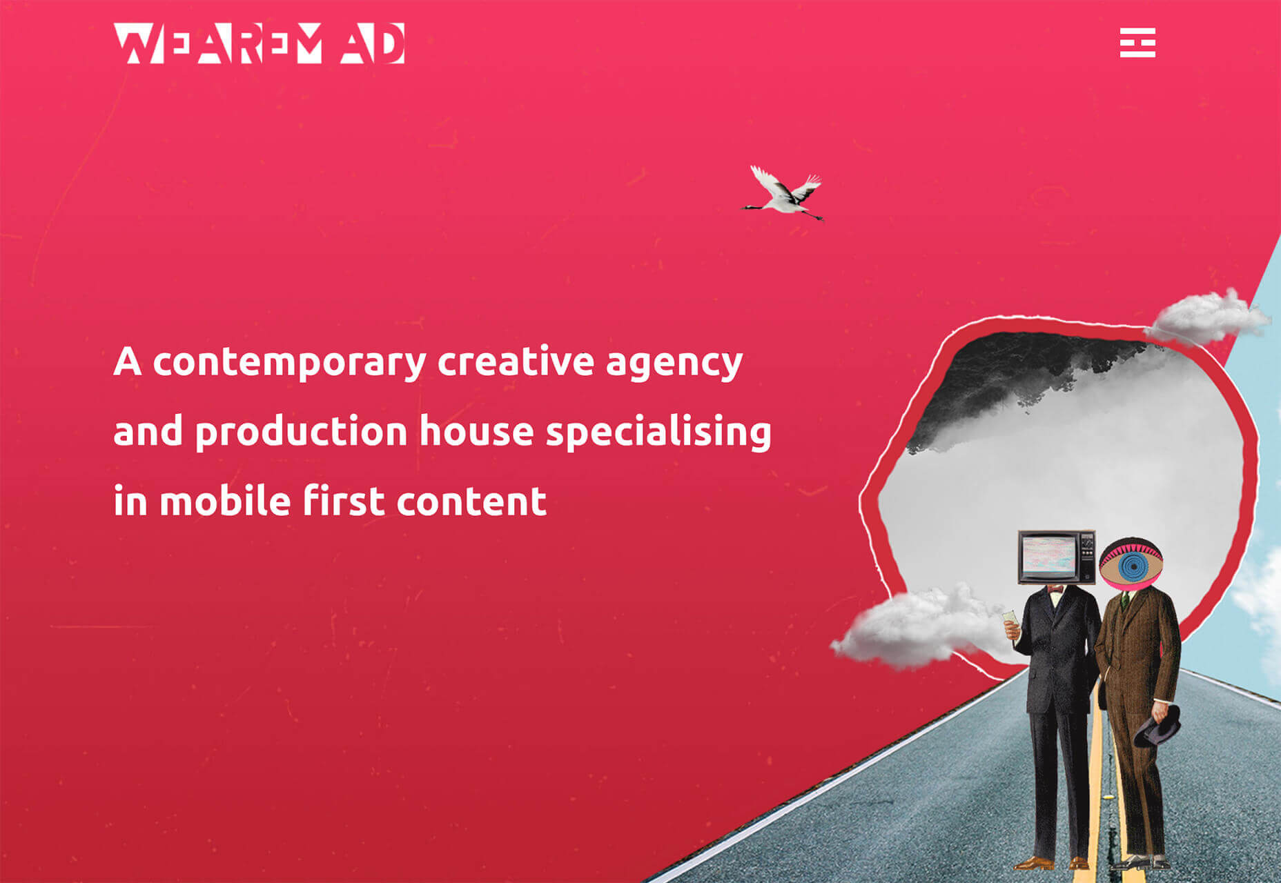
Design can make a statement. It evokes feeling and can encourage thought and conversation. That’s the common theme among the three trends in website design this month.

Each trend is rooted on the time and place where we live and includes elements that provoke thought. Kudos to these designers and design teams for jumpstarting conversations. Here’s what’s trending in design this month.

1. “Taking a Stance” Design

From social to environmental issues, design projects are echoing the sentiments of their audiences and organization in a way that take a stance on an issue.

Once taboo, this is becoming increasingly used as a technique for brands who are no longer worried about turning off a certain segment. The goal is to rally the core audience and people who feel the same way about an issue or cause.

There’s also a secondary thing happening here. Some designs aren’t really position based, but use imagery and language that resonates with a movement to associate with that feeling.

Never Heart uses “Join the Revolution” and a dark image with a heart to tug at your feelings. It can help create an association to a cause that you believe in without stating that cause directly. The design feels strong and inviting while making you feel like part of something.

Skye High uses “powerful” twice in the headline to convey a particular messages to women. The agency is looking to work with “powerful” women. It’s a timely statement and message that could resonate with a lot of business-women at various levels of their careers.

Discovered Wildfoods is a brand that is rooted in sustainability. The corporate model and responsibility of the brand shows through in the website. This type of design helps connect people with mutual feelings to the brand and products.

It’s refreshing to see more websites and brands embracing social causes and issues. It can be tricky for a number of reasons. But for some brands, it pays off.

2. Abstract Art Elements

If you are worried about a lack of images, or not sure how to portray images in an appropriate way due to the worldwide pandemic – groups or not, masked or not – abstract art elements can be the solution.

Widely used for startups and apps, more abstract design elements are everywhere. It’s an easy way to create strong visual interest without photography.

The most common use of abstract art elements is often in the form of geometric shapes with animation. This is something that almost anyone can understand and simple shapes and movement can be quite stunning when done well.

The good news is this aesthetic can work for almost any type of website. Try it for a redesign when you don’t have photography that feels appropriate in the current environment or if you want to create focus for content that drives website visitors to the words or scroll. This works with more abstract concepts when they are simple and help you move quickly from the visual to text.

Here’s how each of the examples handles abstract art elements:

Indicius uses bouncing circles that move toward text and down the screen to drive users to the headline and scroll action.

With Code uses a fun fuzzy circle with different animations to draw you in.

Appimized uses bright color and a monotone scheme with geometric shapes to sell its services.

3. Images That Make You Think

This might be the most visually interesting, and thought-provoking, website design trend we’ve seen in a while. These designs all feature images with a little something different or unusual that make you think.

There are a lot of different ways to do this – marry photographs and illustrations, create imaginary imagery, animations or effects, visual tricks that play on depth perception or create pseudo-3D effects.

The commonality is that the visual is so striking and unusual that website visitors stop and engage with the design. What do the “oddball” visuals mean? What message do they convey? How did they do that?

All of the questions could be associated with this different style of visual representation.

Bling uses a combination of a photo with illustrated animated elements to draw the eye. The yin and yang between reality and fantasy is quickly evident and makes you want to know more. (It doesn’t hurt that the animation uses dollars and lightning.)

Kibun is interesting because the photo choices create an optical illusion of depth. It matches the content of the design well because the website features artistic textile panels with an artistic design. The illusion is in the angles and coloring of photographs and their placements on the screen. The only downside of this design is that it loses the artistic panache on mobile because the images stack.

Oddball images can sell. We Are Mad stands out because it uses a contrived image, but doesn’t go oversized with it. The more subtle placement is ideal and arguably more attention-grabbing.

Conclusion

Website design can be a powerful thing, as these trends and examples show. Don’t discredit the power of choices in color, imagery, animation, and text when creating a digital experience. Design can mean a lot of different things depending on the audience as these examples show.

At the same time, these design trends are powerful and meaningful. They provide context into our world, our time, and our feelings. Don’t be afraid to experiment and make a statement with your design work. Just remember to keep in mind all potential impacts (positive and negative) before taking the project live.

Source


Source de l’article sur Webdesignerdepot

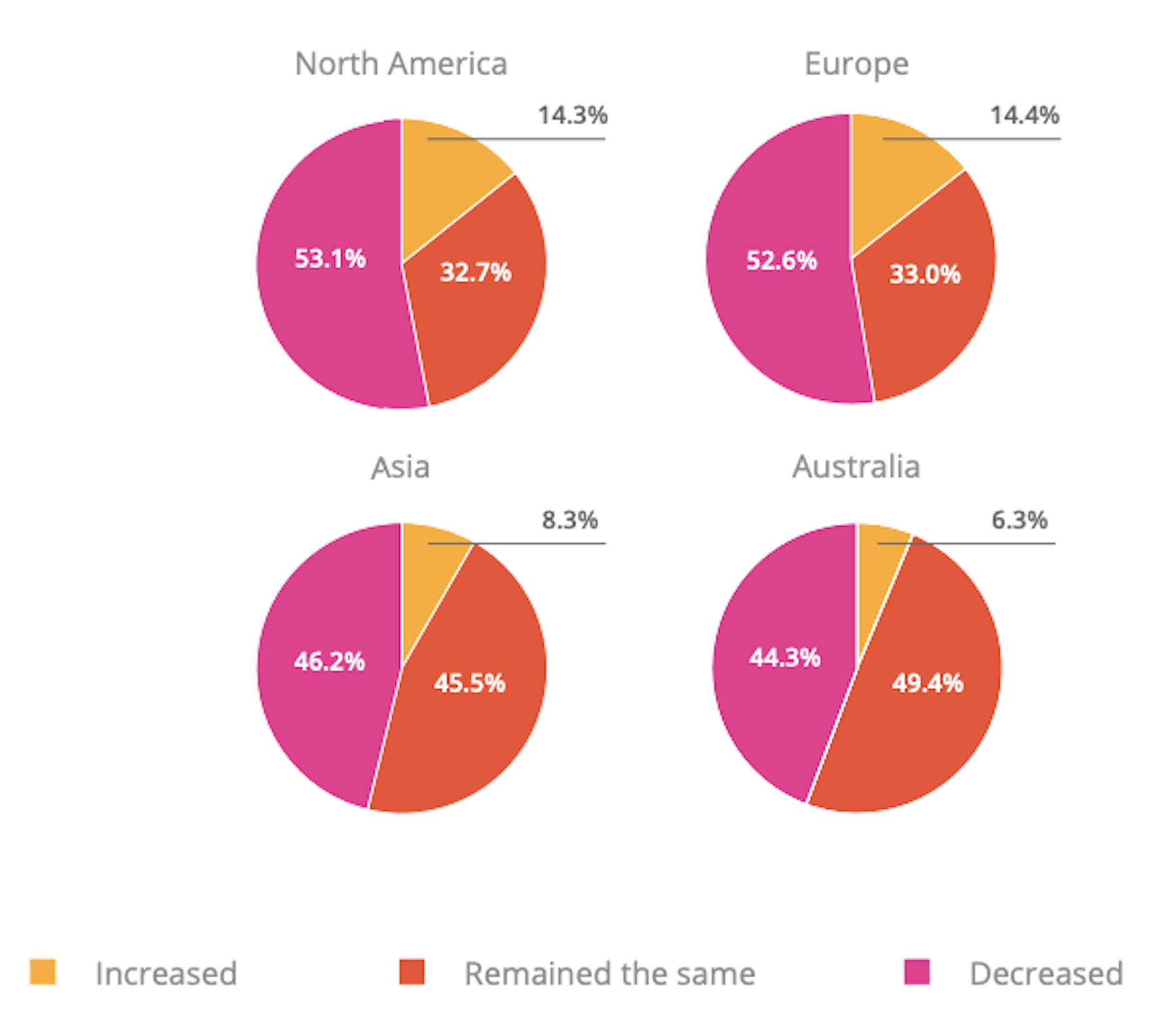
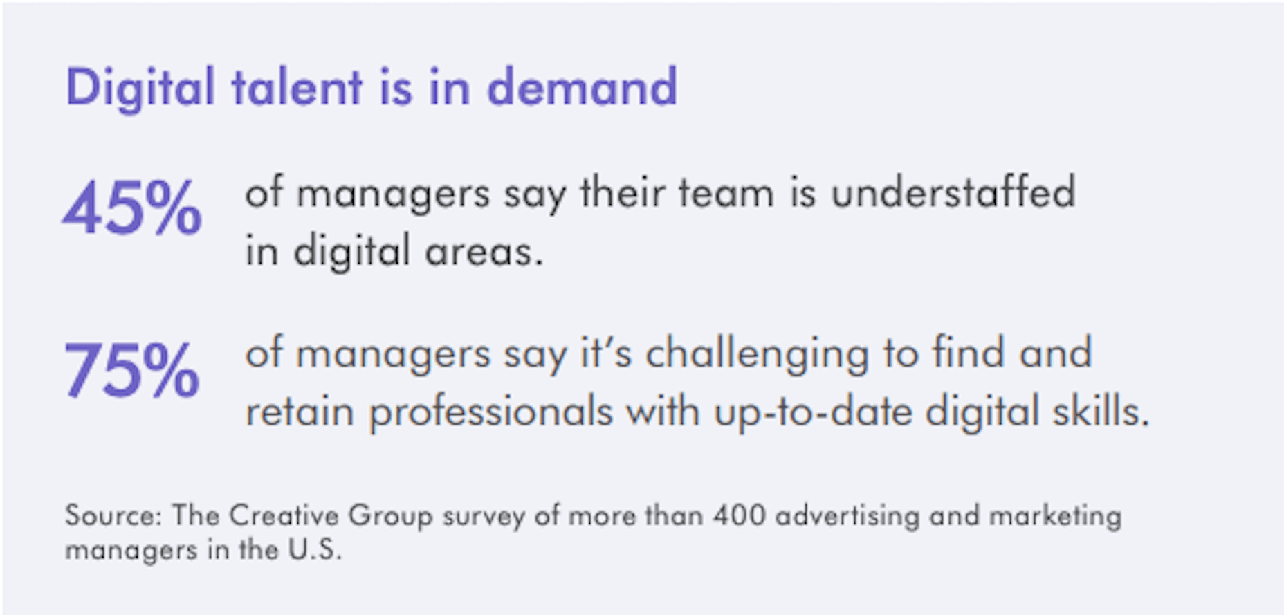
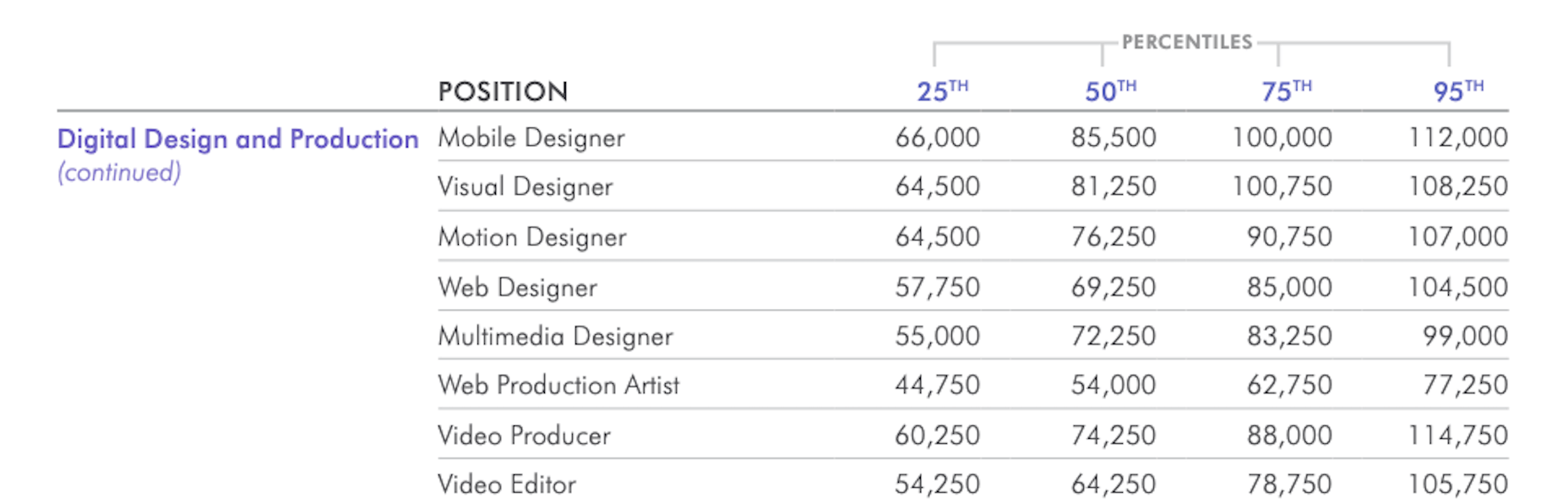
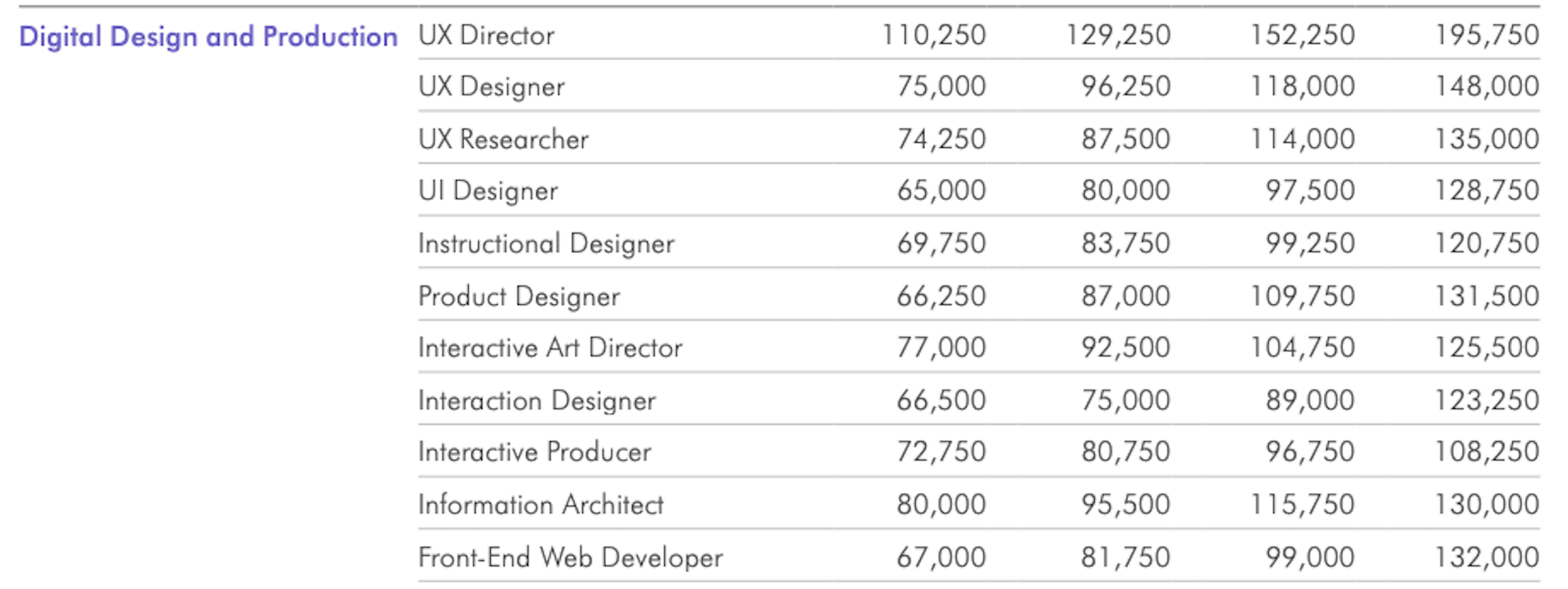
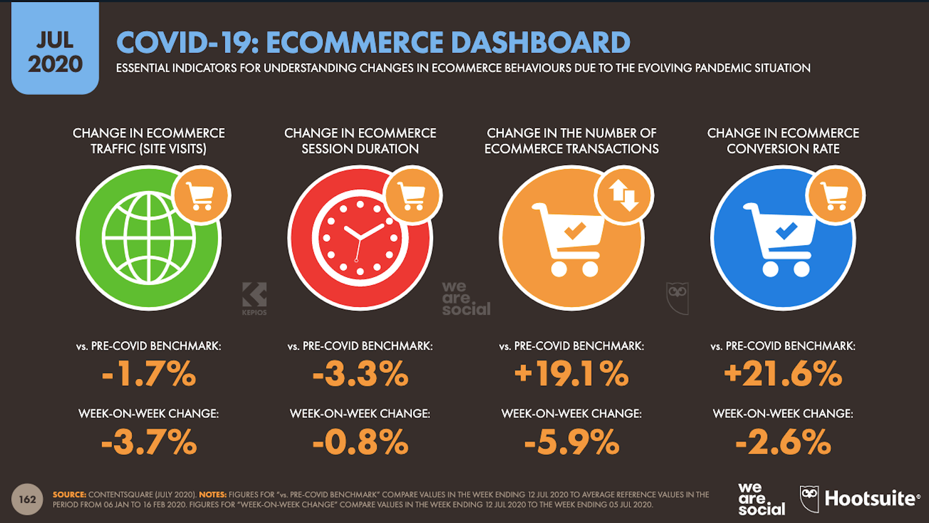
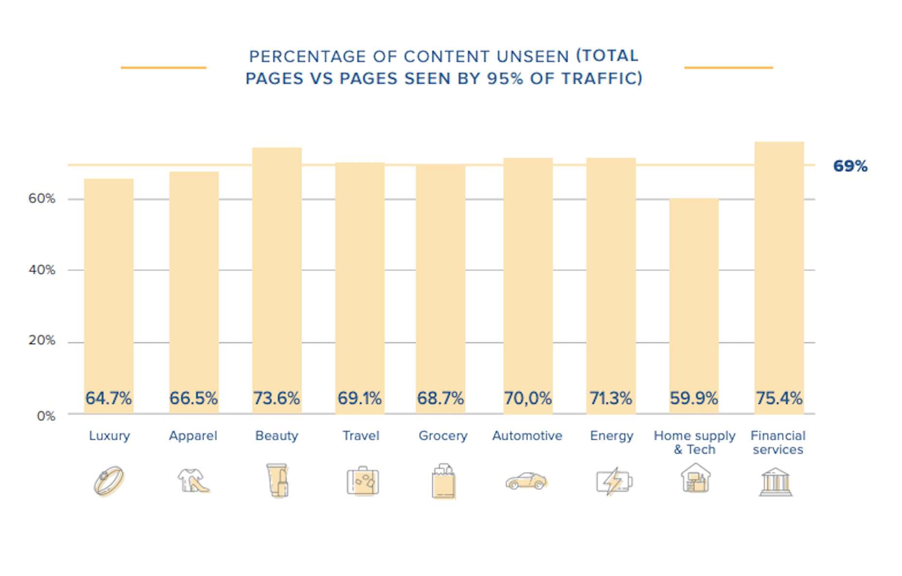
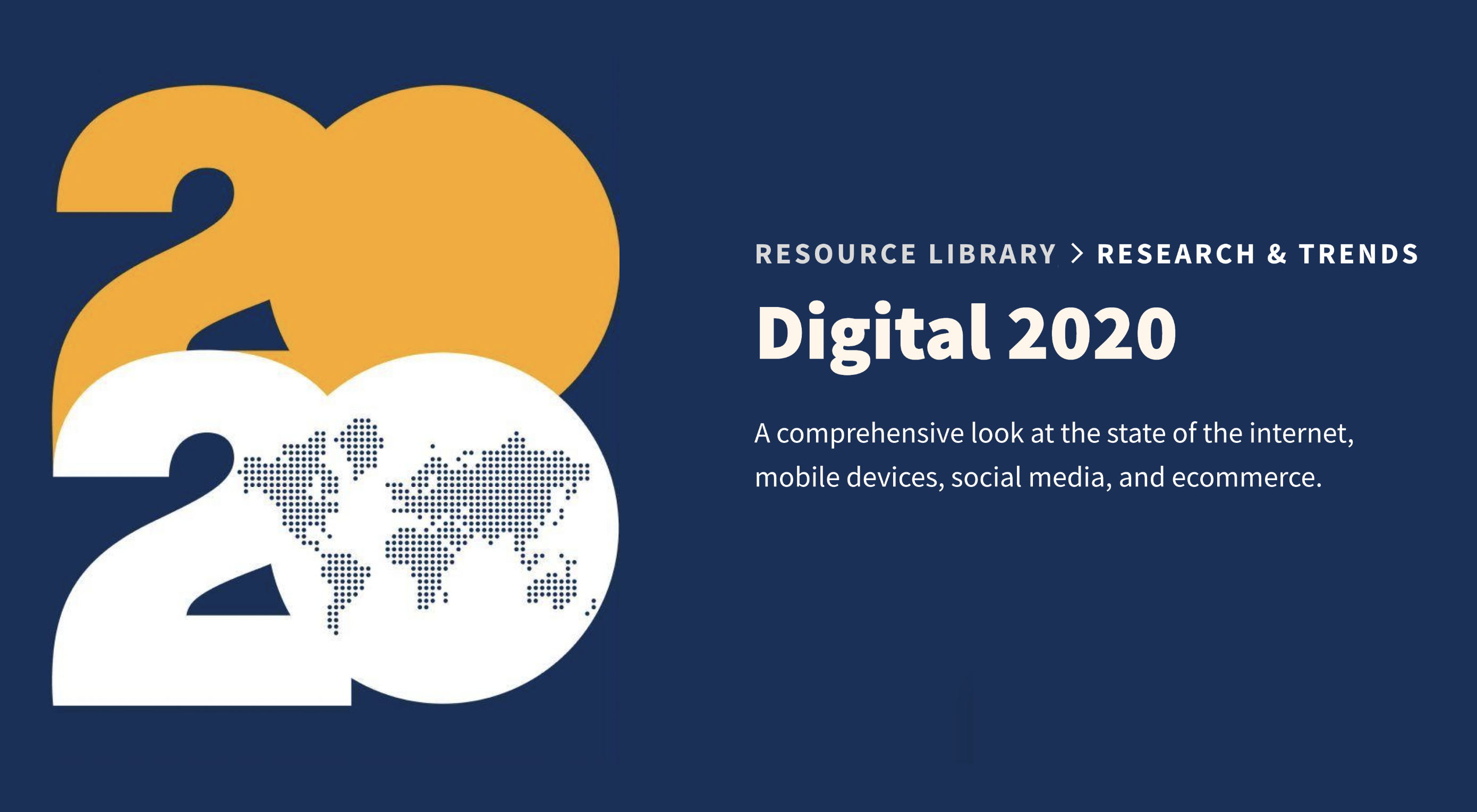
In today’s look at the latest research for web designers, we’re going to look at studies and reports from Payoneer, Robert Half, Hootsuite, and Contentsquare to see what they have to say about things like:

  • Current freelancer demand
  • Web designer earning potential
  • A change in ecommerce shopping trends
  • Unseen content rates

1. There’s Light At the End of the COVID-19 Tunnel for Freelancers

Payoneer’s The State of Freelancing During COVID-19 had to take a different approach to reporting on the freelancer workforce than in years passed.

Here’s why:

When 1000+ freelancers around the globe were asked how demand for their services changed during COVID-19, this was the response:

Less than 17% of freelancers experienced an increase in demand for their services and less than 23% saw demand remain the same.

An overwhelming majority of freelancers experienced a shrink in demand, with nearly 29% saying it slightly decreased while almost 32% said it greatly decreased.

However, the data collected wasn’t just assessed on a global scale. Payoneer also looked at freelancing demand trends in various parts of the world:

Notice the differences between Asia and Australia (who were hit with COVID-19 earlier) and North America and Europe (where the pandemic arrived a little later).

It appears as though Asian and Australian freelancers are, economically speaking, already starting to feel the effects of recovery from the pandemic with demand working in their favor.

So, if you’re feeling like there’s no end to the hardships you’ve faced during COVID-19, and were considering dropping your prices, hold on for just a little bit longer. Freelancers are starting to feel optimistic about demand for their services increasing. If you go devaluing yourself now, it’ll be hard to return to where you were before COVID-19 when things get back to normal.

2. Robert Half’s Salary Guide Breaks Down the Earning Potential for Web Designers

On a related note, let’s talk about demand from the employer’s point of view.

According to Robert Half’s 2020 Salary Guide for creative marketing professionals, there’s big demand for digital talent:

So, that’s number one. We know that almost 50% of hiring managers feel as though their digital teams are inadequately staffed. That’s good news for web designers.

However, these same managers complain about creative marketing professionals’ lack of up-to-date skills as the biggest barrier to hiring or retaining them. Although the report doesn’t say so, I’m going to assume this refers both to employees as well as contractors.

This should be a no-brainer. By keeping up with the latest web design trends and techniques, you can make top-dollar for your services — and hold onto those valuable client relationships for a long time.

According to the report, this is how much you stand to earn working in web design (in the U.S.) today:

If you’re eyeballing those salaries in the 95th percentile, then you know what you need to do. Hiring managers have spoken up about what’s holding them back from hiring.

For those of you who feel as though you’ve gone as far as you can as a web designer, it might be worth exploring a new specialty. Like one of the following:

As you can see, designers in the UI, UX, and interactive space (along with web developers) have the opportunity to make more money, even earlier on in their careers. You may also find that more job opportunities are available as you move into these niches (because of less competition), which might cut down on any demand issues you’ve been experiencing because of COVID-19.

3. Hootsuite’s Digital 2020 Report Reveals an Interesting Trend in Ecommerce

Hootsuite’s Digital 2020 report is always a great resource for learning about social media marketing trends. That said, that’s not why I read it.

It’s for hidden gems like these:

It’s no surprise that we’re seeing changes in retail and ecommerce during COVID-19. What is a surprise, however, is how consumers’ online shopping habits have changed.

Here’s what we’re seeing when we compare 2020 ecommerce data with the pre-COVID benchmarks:

Site visits are 1.7% lower than expected. That would make sense considering how budget-conscious consumers are right now. It likely keeps them from going on unnecessary shopping sprees.

Session durations are 3.3% lower. This could be related to fewer site visits. It might also indicate greater consumer confidence. If they come to a website with a plan for what they need to buy, they’re going to take a straight line to conversion instead of spending time window shopping that prolongs their session.

The number of transactions is 19.1% higher and the conversion rate is 21.6% higher. Considering shoppers aren’t spending as much time with ecommerce websites, this point suggests that there’s a massive shift happening from in-store shopping to online shopping.

If that’s the case (even if consumers are currently spending less money), that means web designers need to set their sights on the ecommerce space. With the holiday shopping season expected to start sooner rather than later this year, now is the time to get in there and make sure these sites provide as streamlined an experience as possible.

4. Contentsquare Studies the Unseen Content Rates By Industry

Contentsquare analyzed more than 7 billion user sessions globally to create the 2020 Digital Experience Benchmarks report.

There’s some interesting data in here about website traffic and conversion trends, but what I find the most valuable is the breakdown by industry.

It was this chart, in particular, that really caught my eye:

According to Contentsquare’s data, between 60% and 75% of a website’s content is unseen. Some industries fare better than others, like home supplies and luxury retailer websites, but the numbers still aren’t flattering.

For example, what does it mean when consumers miss 75% of a financial service provider’s content?

Does this mean that the financial advisory content — which I’m assuming comprises the bulk of the pages on the site — is useless or irrelevant? Or perhaps it’s an issue of discoverability since blog content and other resources often take a backseat to service and product promotion?

What about ecommerce brands in the apparel or beauty space?

If two-thirds of their pages are unseen, does that mean their websites are overrun with obsolete inventory? Or, again, is it an issue of navigability and discoverability around the store?

As a web designer, I’d suggest performing your own unseen content analysis on the websites you’ve built. If over 60% of your pages never get any views, you’re going to have to decide what to do with them:

Option 1: Fix the navigation or search function so people can actually find these unseen pages.

Option 2: Remove them from the site and make room for content your visitors actually find valuable.

Wrap-Up

As you encounter research and reports online — whether it’s written specifically for web designers or other creative professionals — spend some time looking for hidden gems.

As you can see above, there’s a ton of relevant research for web designers out there, even if it’s hiding behind the mask of a larger issue or matter. And it’s this data that will help you get a leg up on the competition since it’ll get you thinking about your business and your approach to design in different ways.

Source


Source de l’article sur Webdesignerdepot

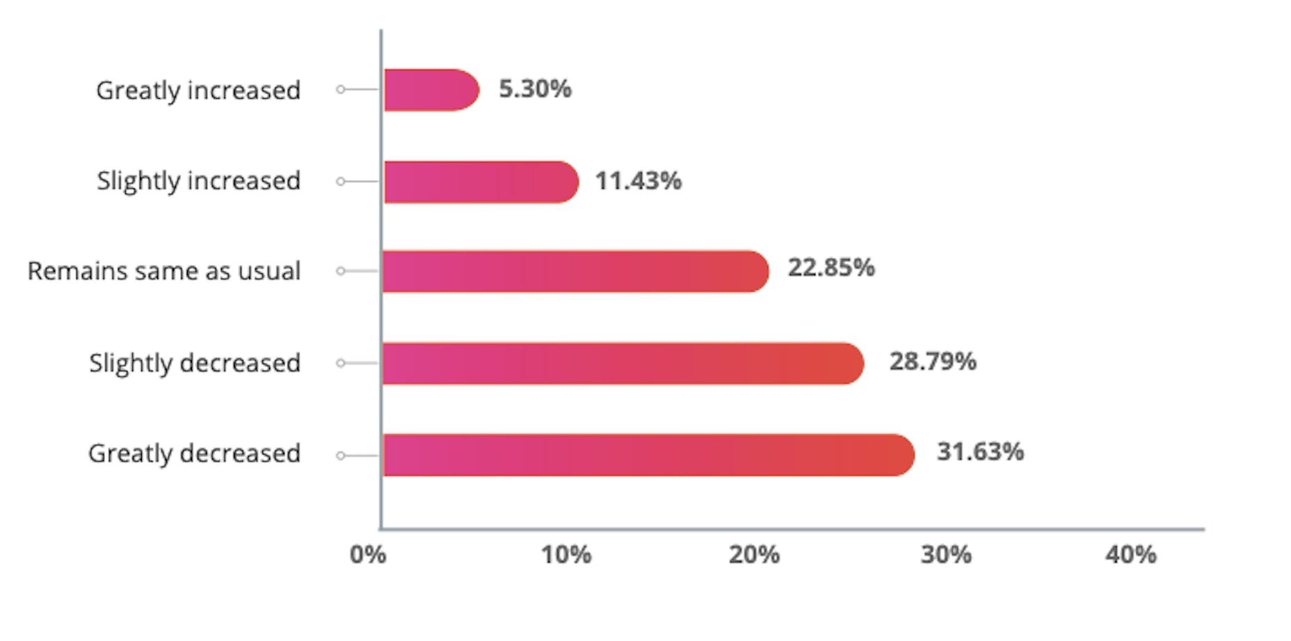
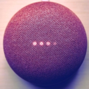
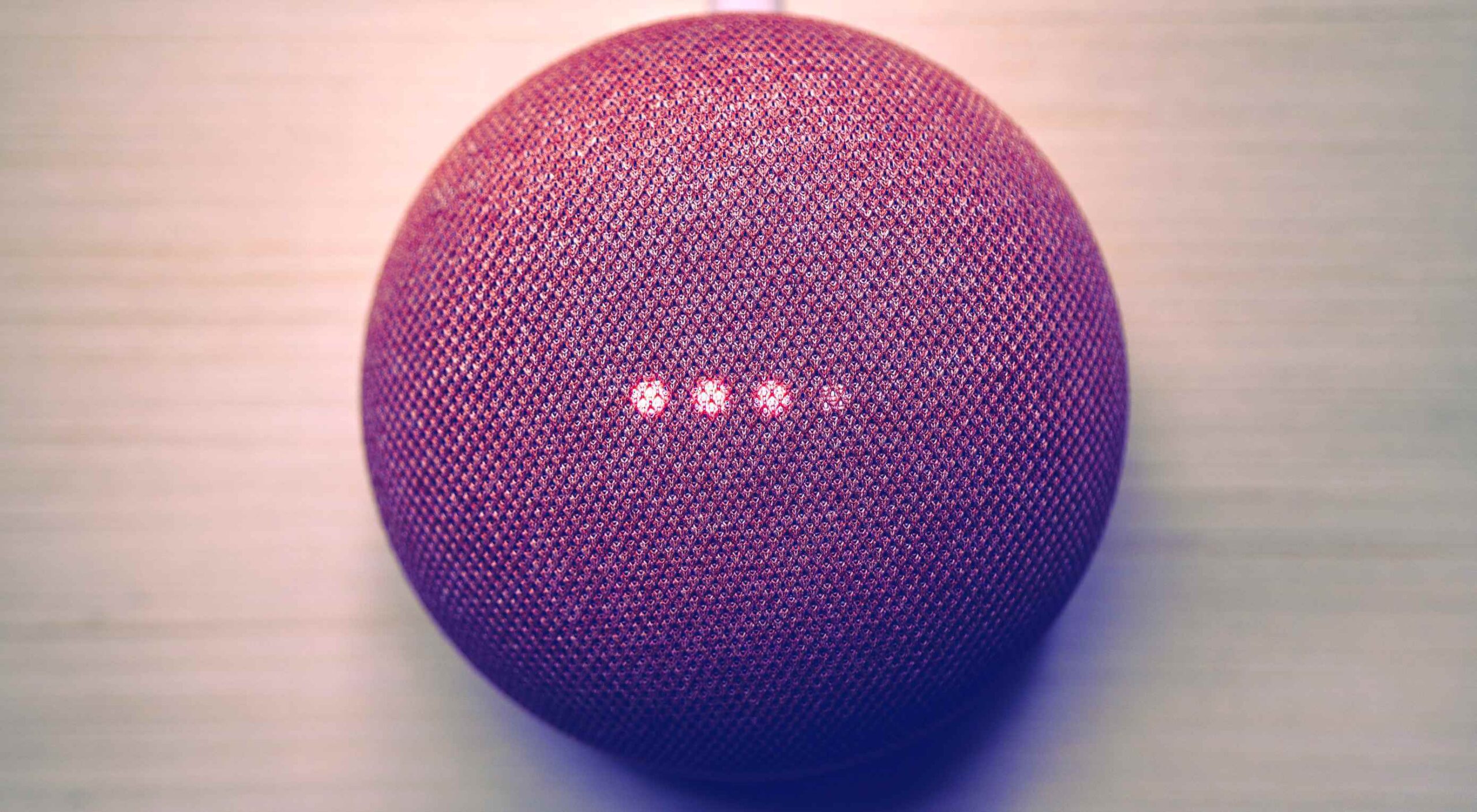
Voice is one aspect of technology that is getting bigger and bigger, and showing little sign of relenting. In fact, 2019 data revealed that 22% of UK households owned a voice-controlled digital home assistant device such as an Amazon Echo or Google home. This is double the figure recorded in 2017 and it is predicted that over the next five years nearly 50% of all homes will have one. Smart home adoption rates are increasing, and it shows how voice control is something we are all becoming more accustomed to.

With these high figures, does it follow that voice should be something web designers build into sites? Or is it merely a gimmick that will die out and render sites with hardware and complex design issues? You only have to look at the failed introduction of Google glass to see that certain technological advancements don’t always have the outcome that might be expected.

Multiple Voices

One of the first issues with voice is establishing whether you want sites to recognise everyone’s voices, or just those who have registered. If you’re using the site in a crowded room will it pick up on snippets of conversation from others and think these are instructions? Google Home has a feature whereby you have to register your voice with its app to use more personalised features such as the shopping list. Is this the sort of thing websites would need?

Accents

The implementation of voice is complex, not only does it need to understand certain languages (such as English), but all the accents and variations too. With 160 English dialects alone, that is a lot that the technology needs to understand – not including mispronunciations, slang, and colloquialisms. Also, if a site is used all over the world (which many are) how many languages will it need to know?

Privacy Issues

if there are clips of your voice out there on the web…it can easily be imitated

If a website involves a feature such as online shopping or other functions which require sensitive details to be input, this could put people off using voice. Users need to know where this saved data is being stored, how it will be used and if it is secure. In 2018, HMRC had signed up about 6.7 million people to its voice ID service and HSBC said over 10,000 were registering each week. This shows many trust the service, but experts say that if there are clips of your voice out there on the web (such as in a podcast) it can easily be imitated. Bringing with it security and privacy issues.

According to futurologist Dr Ian Pearson, who invented the text message back in 1991, it won’t be long until we can complete a financial transaction with just a few words and a gesture. This can be a time-saver for things such as online shopping, but we need to ensure there are the correct security steps in place.

Users Don’t Talk The Way They Type

When speaking we tend to use shortened and more colloquial language as opposed to when we type. The voice function on a website will need to be able to adapt for this. One example is if you are filling in a form or comment box by voice for a website, you will need to tell it what to punctuate, letting it know where to add a comma, exclamation mark etc.

Website Processes Need to be Simpler

With the web as we use it now, we often browse through pages, reading other snippets of information before clicking through to the page we want. With voice recognition it will cut out these middle steps. For example, if you are looking for a recipe of something specific, you will just say the command “Show me the … recipe” and it will take you straight there. This direct access to what we are looking for could lead to a simplification of websites.

Regular Updates

With websites as they are now, they need updates semi-regularly, depending on how they are built, how complex they are, and what features we have built into them. A voice-based site will need updating regularly, whether to add new words or processes or to keep up with the fast-adapting technology. It might end up being quite a complex process.

Mistrust

While there are more of us now than ever using voice control via tech such as Alexa, Google, and Siri, there is still a level of mistrust over it. It’s still not quite clear where data is being stored, if it is being stored, and how easy it could be to abuse.

Larger Storage and Bandwidth

If a site is built for voice, will it utilise a ready-built plugin or will it have its own software built by developers? Will this feature require a greater amount of storage and bandwidth to cope with it? These are further factors to consider when thinking of the future of implementing voice to websites.

We Still Don’t Know Where It Will Go

Voice technology while working in some respects, is still a bit of a grey area when it comes to future use. Will it be the next big thing as many have predicted, or will it simply die down?

Look at Google Glass – highlighted as the big new technology, they soon died down and were eventually discontinued. Smart watches were another thing. You can see their initial downfall by reading an article published in 2017 about smartwatches – how major smartwatch makers such as Apple and Samsung rushed into the market before the technology was ready and they subsequently failed. Motorola exited the smartwatch market, Pebble and Jawbone shut down and Fitbit sold 2.3 million fewer devices than in their previous quarter. It was perceived as being a fad. However, fast forward to 2020 and more people than ever are wearing and using smartwatches. The smartwatch market was valued at shipment volumes of 47.34 million in 2019 and is expected to reach 117.51 by 2025, reaching a growth of 15.4 over the next five years.

Will voice follow a similar trend?

No More Impulse Buying

People enjoy browsing websites and many businesses rely on user’s impulse buying and ask their websites to be designed to reflect this. With voice taking you directly to the page’s users want to find, will they bypass these potential selling traps and just buy what they want – rather than added extras? Will it end up being a negative for businesses and see users not as satisfied for the experience?

Voiceless Still Matters

You will also have to remember that not all devices might work with voice, or people might be browsing somewhere where voice cannot be used. This means in the design process it needs to work both for voice instruction and manual use. It needs to work just as well for both to ensure the customer journey isn’t affected.

There are many ways voice can affect how we design websites in the upcoming future. It’s important to take note of market trends and usage – seeing how people use voice and thinking of the customer journey. It’s vital we don’t forget the end goals of websites – whether it’s to inform or to sell, the implementation of voice needs to assist this process not make it harder.


Featured image via Unsplash.

Source


Source de l’article sur Webdesignerdepot