Articles

As a UX designer, you get to work on creative, rewarding, even life-changing projects. It’s an industry with flexible working and countless opportunities. All this, and you get paid well too.

It doesn’t matter if you’re not a creative prodigy, or a tech grandmaster; you can learn to become a UX designer with the right mindset, a few tools you pick up along the way, and some committed learning.

By the time you’ve finished reading this post, you’ll be well on your way to designing your new career.

You can do this, let’s get started…

What is a Career in UX like?

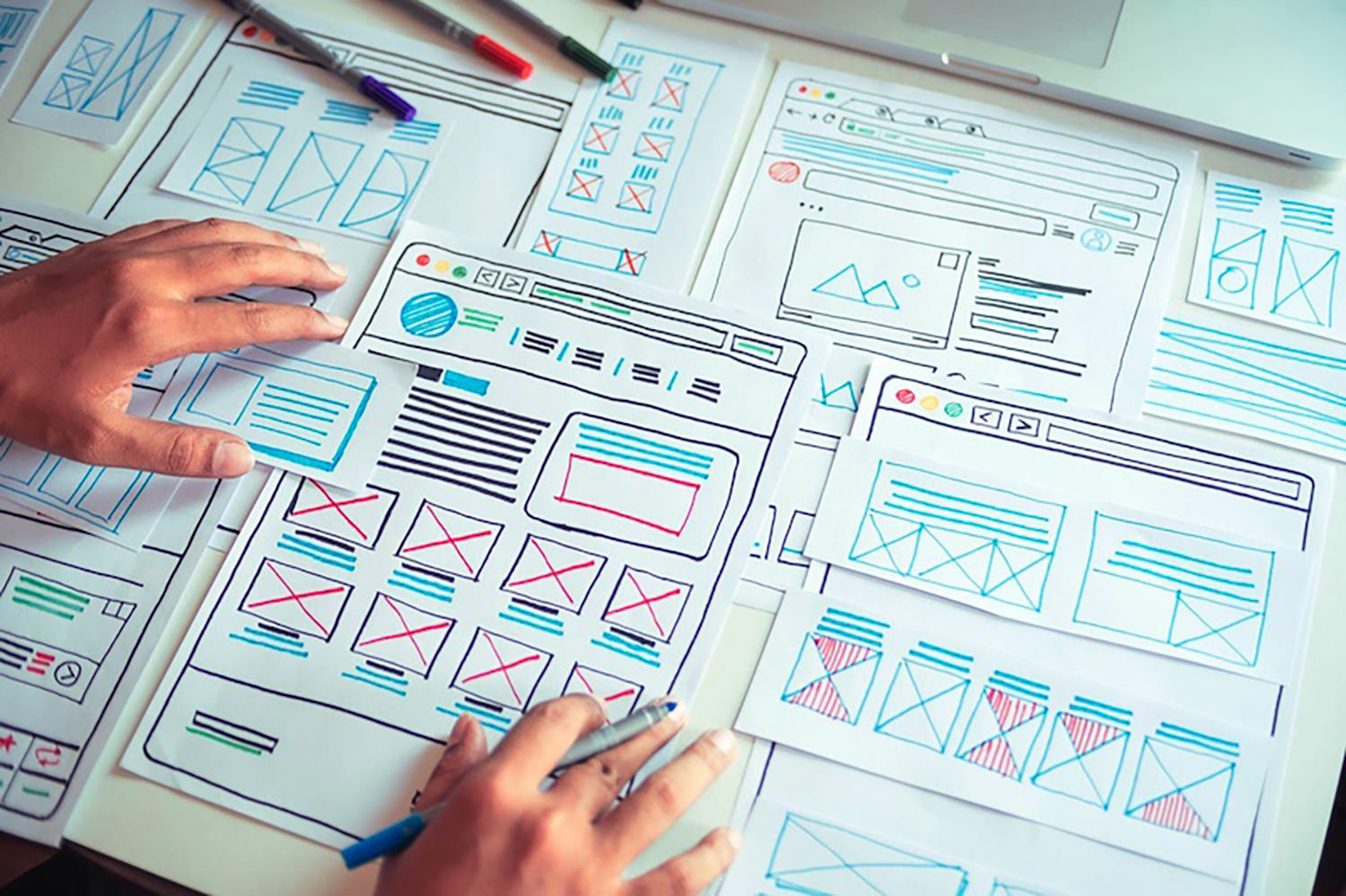
Every career is different, but generally speaking, a UX designer works on making a user’s interaction with a product or service (normally websites) as intuitive as possible.

Just as a golf architect designs the layout of a golf course to flow through greens, tees, and holes, with buggy paths for access, and the odd bunker to add a challenge; so a UX designer creates the optimum experience for a site. A golf architect doesn’t need to reinvent the game of golf, and neither does a UX designer need to reinvent websites.

A golf architect will not design a course with a 360-degree sand bunker surrounding a tee (well, they might, but they really really shouldn’t), or a hole too small for a golf ball. In the same way as a UX designer, you’re not going to design an ecommerce site with a cart in the bottom left, a non-existent search feature, or hidden pricing.

The best thing about being a UX designer is that you don’t need to spend years in formal education to get qualified. The flipside is that if you want to be a great UX designer, it’s not a walk in the park.

Every designer is different, but some of the main traits of successful UX designers are: an enjoyment of problem-solving; good listening skills; curiosity; open-mindedness; attention to detail; creativity; communication skills; process-driven; and adaptability.

Before committing to this career path, check out a few podcasts, and read a few blog posts, to dip your toe in the water.

Still interested? Excellent, the next step is…

Getting Certified as a UX Designer

UX design is a practical skill. It’s all well and good knowing the theory, but without practice putting the theory into action no one will give you a chance to prove what you can do. So how do you get practical experience? You get certified, and there are three popular options: online, in-person training, or self-taught.

A good UX syllabus will include portfolio-building projects, tool mastery, networking opportunities, and even 1-2-1 mentorship. As well as learning the fundamentals of UX, you’ll cover user research and strategy, analysis, UI design, and more.

Option A: Online Course

Online courses tend to be much easier on the bank balance, as well as being flexible, which means you can fit them around your current job. You can work at your own pace, and in many cases choose modules that interest you, once you’ve completed the basic introduction.

There are many online course providers, including Coursera, Udemy, Skillshare, and Career Foundry.

Whatever option you choose, it is a good idea to get as broad a perspective as possible, so consider following more than one course — perhaps mix and match a paid course with a free one.

Option B: In-Person Training

This could be a university course, or a local boot camp where you physically sit in with an instructor and classmates.

This is more expensive, but it provides benefits that nothing else does. Firstly, you’ll have classmates you can bounce ideas off, collaborate with, keep motivated, inspired, and accountable. You can also get real-time, intensive coaching and advice from someone who’s been there, done that, bought the T-shirt (and redesigned it so it fits better).

Seach local boot camps and workshops, check out workshops at local conferences, and ask your local college what courses they offer.

Option C: Self-Taught

Being self-taught is the cheapest of all options. Work at your own pace, where, and when you want to. Watch YouTube videos, read blogs, garner information anywhere you can find it.

This option involves a lot of stumbling around in the dark. The biggest challenge is that you don’t know what it is that you don’t know. For this reason, it can pay to follow the syllabus of a local college course, even if you’re not enrolled and don’t attend lectures.

In reality, all education is self-taught to an extent, even the most prescribed courses need self-motivation.

Some of the most in-demand UX designers in the world are self-taught, so why not? Start exploring UX blogs like Nielsen Norman Group articles, Google Design,  UX Planet, and UX Matters.

Mastering UX Tools

Recruiters and hiring managers will seek your technical ability and your experience using popular tools from user research, to wireframing, to prototyping. When you get your first job in UX, the tools you use will be determined by your project manager, so it’s a good idea to have a passing familiarity with the most popular. These will include Maze, Userzoom, Sketch, XD, Figma, Marvel, and Hotjar.

If you’re following a guided course you should get an introduction to at least a couple of important tools. Once you understand one, you can probably pick the others up quite quickly… because, after all… they should be intuitive.

You do not need to know how to code, but understanding the roles, and restrictions of HTML, CSS, and JavaScript is very beneficial. When you get your first UX job, you’ll need to be able to talk about how technologies fit into the plan.

Building a UX Portfolio

Your portfolio is your résumé. The golden ticket. The silver bullet. Amassing a content-rich portfolio is paramount. You don’t need a real-world job to build your portfolio, and you should already have content to add from your course.

You need to demonstrate knowledge of UX tools and processes (what future employers will look for). Case studies that incorporate research, problem-solving, strategy, imagination, and (if possible) results are the best way to do this.

There are a variety of ways of building a portfolio, but the best is taking a real website, and redesigning it. Don’t worry if your first few projects aren’t the best; as long as you demonstrate improvement and growth, that counts for something.

You can showcase your portfolio on sites such as Behance, Dribbble, or preferably create your website.

Landing Your First Job in UX

Start combing the job boards to see which companies are looking for UX designers. There’s a global shortage of qualified UX designers, so if you can’t find anything you’re looking in the wrong place! Make sure your whole network, from your Mom’s hairdresser to the barista at your favorite coffee place know that you’re looking; you never know where a good lead will come from.

Some companies are looking for UX skills as part of other roles. Others are looking for full-time UXers.

Don’t be disheartened if “Junior UX Designer” positions require 2 years of experience; HR just throws this in as a pre-filter. If you think you can do the job, apply anyway, if your portfolio’s good you might get an interview regardless, and if you get an interview they think you’re worth taking the time to meet.

If you don’t get the job, don’t be downhearted. Remember: every time someone else gets a job, that’s one less person you’re competing with for the next job.

Quick Prep on Some Common UX Interview Questions:

  • What’s your interpretation of a UX Designer?
  • What has inspired you to become a UX Designer?
  • How do you take constructive feedback and non-constructive feedback?
  • Who, or what companies, do you look up to in this industry, and why?
  • What’s your process with a new project?

Good Luck!

So, now you know what it takes to get into the field, it’s time to start applying yourself to this newfound and richly rewarding career. As the great writer Anton Chekov said, “Knowledge is of no value unless you put it into practice.” So get out there and practice, practice, practice. Add and add and add to your portfolio.

To become a UX Designer, enroll in a great course, build your portfolio, network, apply for roles, and always be learning. Always be open to new ideas and suggestions. There’s a lot of leg work, but the juice will be worth the squeeze.

Featured image via Unsplash.

The post How to Kickstart Your UX Career in 2022 first appeared on Webdesigner Depot.

Source de l’article sur Webdesignerdepot

_____________________________________________

Another excellent guide to help people to prepare for job interviews to give them the best possible chances of success and not make some common mistakes can be find here : https://www.ireviews.com/interview-resources/

Every day design fans submit incredible industry stories to our sister-site, Webdesigner News. Our colleagues sift through it, selecting the very best stories from the design, UX, tech, and development worlds and posting them live on the site.

The best way to keep up with the most important stories for web professionals is to subscribe to Webdesigner News or check out the site regularly. However, in case you missed a day this week, here’s a handy compilation of the top curated stories from the last seven days. Enjoy!

Pollen – A Library of CSS Variables Inspired by TailwindCSS

Using the Platform

Why You Should Switch to Code-Based Design

15 Great Chrome Extensions for Web Designers and Developers

Exciting New Tools for Designers, September 2021

24 CSS Javascript Animation Effects

3 Psychological UX Design Principles to Enhance User Experience

UX vs. UI – Which Should You Focus?

Customize TailwindCSS to Give Your Sites a Unique Look

10 Fundamental UI Design Principles You Need to Know

Source

The post Popular Design News of the Week: September 6, 2021 – September 12, 2021 first appeared on Webdesigner Depot.


Source de l’article sur Webdesignerdepot

Material Design is Google’s design language for creating digital experiences.

Initially developed in 2014, Material Design is a subset of flat design, or minimal UI design, while also flirting with skeuomorphism with its rules for surfaces and interaction. The latest iteration of Material Design, Material You was unveiled in May 2021 and is expected to redefine the language significantly.

With so many agencies and in-house teams adopting Material Design, understanding its prescriptive styles has become essential knowledge for web designers.

Source

The post The Mind-Bendingly Difficult Material Design Quiz first appeared on Webdesigner Depot.


Source de l’article sur Webdesignerdepot

Landing pages are crucial for conversions. User-friendly landing pages rank higher in the search engines and generate the maximum leads.

Interestingly, user behavior changes every year, and new website design trends should be kept in mind to continue acquiring sales from your existing landing pages.

If your high-performing landing pages in 2019 have suddenly started underperforming in 2021, then it is a clear indication that your landing pages need a strategic revamp to record higher conversions.

Landing page revisions are necessary for reduced bounce rate, more visitor time on the page, and better user actions.

This article will discuss some of the top web design trends of 2021 that brands have adopted to revamp their landing page designs. You can learn from the trends and apply your own custom design intelligence to redesign your landing pages for 2022 and convert the maximum number of visitors.

Let’s begin…

Why Landing Page Design Is Crucial For Conversions

Landing pages are the first stop on your consumers’ online buying journey and the first chance to put an impression.

People on the internet are becoming less patient. It takes only about 50 milliseconds for a visitor to form an opinion about a brand and decide whether they want to stay or leave the website.

Convincing modern customers to buy products or fill up query forms on a landing page is not easy with traditional website elements.

In 2021, it is now harder to impress visitors landing on your website than in 2019. Keeping in mind the audience of 2021 and beyond, an ideal landing page should be user-friendly, engaging, innovative and should encourage users to take action.

Here are some of the top reasons why landing page design is so crucial for conversions:

  • You get barely 7 seconds to create a strong impression. It is a time span in which visitors roughly scan the page and make their decisions.
  • Publishing 40+ effective landing pages at regular intervals can generate 12X more leads.
  • The average conversion rate from the landing page across all industries is only 2.35%.
  • Using the right types of targeting and testing can boost landing page conversion rates by up to 300%.

Considering the above stats, it can be easily said that a landing page has to be impressive and quick enough to impact the visitors positively.

7 High Converting Landing Pages & Lessons You Can Learn From Each

Below are some of the best high-converting landing pages, which were just updated recently in 2021. For each page, we list a lesson you can learn to inspire your next design revision in 2021 and ahead:

Example #1 – Replace Boring Customer Info Forms With An Interactive Quiz

Landing Page: Nextiva’s Unified Communications Readiness Quiz Landing Page

Industry: Voice Over IP software

Conversion Measured By: Leads fill out a form if they are interested

Redesign focus: Improve the quantity and quality of leads

Solution: Substitute online form with an interactive quiz

In 2019 and even 2020, many businesses were practicing the trend of including a customer form on their landing pages as a call to action to initiate a quick customer action.

The customer information form was useful for businesses because it helped them generate quick leads. However, at the same time, there was no real reason pushing the customer to fill in the lead forms especially if it consisted of more than 2-3 fields.

Nextiva used its creativity to replace boring lead forms with interactive quizzes. In its 2021 page design, the company added a quiz for visitors to participate in.

The aim is to have interactive pages to keep visitors engaged and persuade them to stay on the page.

Here are the comparisons of both the designs:

2019

2021

Key Takeaways:

  • The 2021 landing page now has a free Unified Communications Readiness Quiz that allows business owners to fill the form interactively. Adding a quiz with the number of pages mentioned at the top tells the user how many steps are left to complete the quiz, making their waiting time easier.
  • The background image is replaced with communication icons to simplify the message of the kind of services they offer.
  • The page looks neater and appears to be easier to scan at a glance.

Example #2 – Emphasize Strong Visuals and Copy that Stresses on Product Details

Landing Page: Western Rise Homepage Variation

Industry: Ecommerce

Conversion Measured By: Apparel purchase

Major redesign focus: Improve the number of leads

Solution: Improve the copy and visuals

Western Rise, a clothing eCommerce company, realized the importance of having impressive images and detailed product information on its landing page.

The 2021 page replaced ordinary product images with strong visuals of the models wearing Western Rise clothing. Also, the product image includes extensive product details, which were missing on the older page.

Here is a clear comparison of the 2019 vs. 2021 landing pages of Western Rise:

2019

2021

Key Takeaways:

  • The new landing page has a powerful headline – Performance Clothing for Travel, Work, and Play. In just a couple of words, the brand tells everything about itself. ‘Performance Clothing’ is their unique selling proposition (USP) that tells the customers that their product is durable. Besides, the caption ‘Travel, Work, and Play’ tells what the product is about. Modern customers like products that fulfill a particular need, and Western Rise made it easier for the users to realize the importance of their products which fulfilled their specific needs.
  • The bold visuals in the new page capture contemporary shots of the models that put a strong impression on the audience. Every image is clicked mindfully to explain the style and quality of the Western Rise clothing line.
  • The products displayed on the new page include every minor detail and feature that often other clothing brands ignore, such as the specialty of the product, occasions to wear, and weight other than colors, fabric, fitting, etc.

Example #3 – Use Strong Social Proof To Increase Conversions

Page: Aura Save 50% Landing Page

Industry: Identity Theft Software

Conversion Measured By: Online registration or an inbound call

Major redesign focus: Improve the number of signups

Solution: Add strong social proof

It is a known fact that social proof on sales pages is essential for increased conversions. But in 2021, the importance of social proof has gone too far.

Aura is an identity theft protection service that aims to build trust with its prospective customers when they first browse their landing page. Take a look at how Aura displays customer reviews above the fold to catch user’s attention.

Unlike others, Aura combined the rating stars and the review to prove customer satisfaction and emphasize their expertise in the field.

BONUS:

Another example of using strong social proof is the Exploding Topics newsletter landing page.

Exploding Topics is a newsletter with a pro subscription for content marketers and anyone interested in trending topics about any topic. It’s an excellent example that uses a lot of social proof on landing pages that give something away for free, like a weekly newsletter or an eBook.

If you could notice, the latest landing page below has multiple forms of social proof on a single page. First, they feature a list of brands that trust Exploding Topics. Secondly, they quote Wired Magazine founder Kevin Kelly’s feedback, followed by the logos and tweets praising the newsletter.

Key Takeaways:

  • Exploding Topics uses several different types of social proof that appeal to different demographics.
  • Their “trusted by” logos of world-renowned companies stand out to potential B2B subscribers.
  • Kevin Kelly’s quote is catching the attention of tech-savvy readers.
  • Despite packing the page with social proof, the opt-in form is still well above the fold. It is the best landing page practice that applies to nearly all pages.
  • The landing page uses actually embedded tweets (not screenshots), which help demonstrate that the tweets are legit.

While Exploding Topics have smartly used social proof on its page, the ideas of leveraging social proof are not limited to this only.

Example #4 – Focus On Visually Appealing Above the Fold Content

Landing Page: Perfect Keto Homepage Variation

Industry: Supplements

Conversion Measured By: Online purchase

Major redesign focus: Improve the number of purchases

Solution: Improve Above The Fold Content

Above the fold content greatly impacts customer’s decision-making. Perfect Keto lacked that appeal on its 2019 landing page design.

Hence, the 2021 design was revamped with better visuals and more professional looks.

The 2021 page received major changes in above-the-fold content, such as the top menu bar with the brand name not losing the user’s attention anymore and an additional menu bar giving a quick overview of what the brand offers.

The older page did have many social proofs, but those were limited to customers only. The 2021 design also highlighted the publications where the brand appeared, which proved exceptional in building customer trust.

Take a look at the two landing pages of Perfect Keto in 2019 and 2021:

2019

2021

Key Takeaways:

  • The 2021 landing page heading is more compelling because it clearly conveys what their product is all about. The older page was missing the actual purpose of the product.
  • An additional section on the new page to educate customers about the Keto diet and how to start it helps visitors understand the product even better.
  • The inclusion of a product image above the fold attracts user attention and makes the product trustworthy. People now know what they will be buying right at first sight of the page.
  • The new page proudly displays the products featured in the publications, such as Women’s Health, Healthline, Reader’s Digest, and Popsugar, which again helped customers trust the brand.
  • The page also features a video of the Perfect Keto founder that is brilliantly working in gaining visitor’s attention and faith.

Example #5 – Make The Call to Action More Compelling

Landing Page: Zendesk HelpDesk Softwage Landing Page

Industry: SaaS

Conversion Measured By: Online registration

Major redesign focus: Improve the number of registrations through the website

Solution: Make The CTA More Compelling

Zendesk did a clever job by replacing the sign-up form with a single button. On the older page, it was unclear to the user if the company has a trial option for free unless they move to linked pages. Such confusions often resulted in traffic bounces.

Adding the start free trial button on the 2021 page makes it easier for the users to understand that the product comes with a free trial. At the time, it helps the user take quick action.

Similarly, the ‘Get started’ button at the top was replaced with ‘Free trial’ with the same intention.

Moreover, chat support was added to guide users at any stage of the buyer journey. Live chats are vital to help visitors better understand the product and move a step ahead in the customer journey.

Take a look at below two images:

2019

2021

Key Takeaways

  • The CTA buttons have more actionable text and look more prominent.
  • The color choice for the button is in contrast with the background but matches the page theme.
  • The older page missed sales support, which is included in the new page for a better customer experience.
  • The tabs in the menu bar were reduced to four to make the page simple to use for users.

Example #6 – Use Contrast To Highlight Specific Copy On The Page

Landing Page: GetResponse Website Building Landing Page

Industry: Online Software

Conversion Measured By: Online signup

Major redesign focus: Improve the number of signups

Solution: Use contrast around important copy on the page

GetResponse focuses on attracting visitors’ attention towards the offerings from their business. Starting from above the fold section, the landing page highlights the texts that are important and need the visitors’ attention.

The infographic on the landing page is the next thing that promises to grab user attention while beautifully describing how this website builder works and is useful to the user.

Key Takeaways:

  • The text highlighted on the landing page draws the user’s attention towards what the business has to offer or unique selling points.
  • The infographics briefly explain the working of the tool in an easy-to-understand manner.
  • The Yellow color is used prominently on the landing page to attract user attention and persuades users to try the tool by listing its advantages.

Summary

Landing pages provide the first opportunity to create an impression in the minds of the consumers. A well-structured and mindfully designed page sets the right tone for your brand message and encourages users to choose your business.

However, the strategy for landing pages needs innovations from time to time for better results. The examples and tips shared above prove how landing pages in 2019 have seen significant improvement in 2021.

In the coming year, use these ideas to create landing pages that influence customer decisions and encourage them to take quick actions.

Source

The post 7 Landing Pages Comparisons To Improve Your Conversions in 2022 first appeared on Webdesigner Depot.


Source de l’article sur Webdesignerdepot

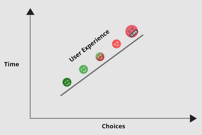
In the information age, time is a valuable commodity and something people don’t want to spend too much of. As a result, the average visitor only reads about 20% of the content of a page

For web designers and developers, that means a few things: first, you need to ensure that the web pages you create are as engaging as possible; secondly, you need to find a way of making the critical information on any page stand out; thirdly, every modern designer needs to create assets that are easy for today’s fast-paced customers to use. 

Making websites more scannable is how you do your part as a designer to ensure that the customers who come to a page get the quick and convenient experiences they need. 

So, how do designers embrace scannability?

Designing for Scannability: An Introduction

At first glance, the concept of creating a website for scannability is strange. 

Most designers start their projects with the aim of making customers stay on a page for as long as possible. So it’s odd to think that you would want to make it simple for end-users to skip from one page to another on a website in a matter of seconds. 

However, scannability isn’t just about delivering information and getting users off a page. When sites are scannable, they make it quicker and easier for customers to slide down the purchasing funnel. A quicker and more convenient customer journey leads to a stronger user experience and more conversions. 

Look at Netflix, for instance. It doesn’t give interested users a ton of information on its homepage. Instead, the key USPs of the product are laid out bright and bold in the middle of the screen, along with one simple call to action: Get Started.

Designing for scannability means making it easy for users on a page to glance at a screen and instantly access all the information they need to take the next step in their buyer journey. 

There’s no needless scrolling or wondering what to do next. 

According to analyst Jacob Nielsen, scannability is essential because people look for specific things on every page they visit. 

Customers don’t read through web pages word by word. Instead, they scan through the content, plucking information out that serves their requirements. 

Questions to Ask When Designing for Scannability

So, how do you know if your web pages are scannable?

Start by asking the following questions:

  • What’s the intent of the people who arrive on this page?
  • What kind of information needs to be conveyed instantly?
  • Can the visitor see the next step in their journey immediately?

For instance, when someone arrives on the Evernote homepage, you can assume that they want to:

  • Find out about Evernote
  • Learn how to sign up
  • Jump to other pages to find out about features, and contact details

That’s why the designer behind the Evernote website placed an immediate piece of useful information at the top of the page: “Tame your work, organize your life” tells customers exactly what the entire product is all about. The brief paragraph of information underneath can provide a few more details if customers need it, then there’s an immediate call to action: Sign up for free. 

Not only does the call to action tell users what to do next, but it tells them the most important information they need straight away: it’s free. 

Scannable pages like this are useful because:

  • They help users complete their tasks quicker: Whether you want to sign up or learn more about the product, everything you need is available instantly, with no scrolling required. 
  • The bounce rate is reduced. Customers don’t get confused and hit the back button. That’s good for your client’s SEO and their bottom line. 
  • The website looks and feels more credible: Because customers get all the answers to their questions immediately, they’re more likely to trust the website. 

So, what are some of the best things you can do to make your sites as scannable as possible?

Use Visual Hierarchy

Visual hierarchy is a way of organizing the content on your website in a way that adheres to how people use the website. For instance, if you land on a blog page, you expect to see the headline first, maybe some information about the writer, and any other essential information, followed by the body content. 

Although it’s tempting for designers to try and surprise users with new visual strategies, the best way to make your content more scannable is to give end-users precisely what they expect. 

If you’re not sure what a page should look like, try checking out the competition. 

One of the most obvious visual hierarchy rules is that the main navigation should always go at the top of the page. 

Customers will expect to look at the top of the page to find navigation. They don’t want to have to scroll through your website, searching for a way to get to another page. If you want to make it as easy as possible for end-users to jump from one page to another, you can pin the navigation bar to the page so that it stays with users as they scroll. 

Maintain Negative Space

White space, negative space, or whatever you call it – is the part of your design that’s left empty. 

White space is crucial because it gives all of the objects on your page some much-needed breathing room. Without enough negative space on your pages, it’s impossible to embrace scannability because there’s too much information for a customer to take in at once. 

For instance, notice how there are big gaps of space between every element on a Forbes website post. A proper amount of negative space on your site ensures that users can quickly take in chunks of information and use that information to decide what to do next. 

To ensure there’s enough negative space on your website pages, ask yourself what the key elements visitors will notice when they come to a website. The essential items should be:

  • A title or header to confirm that the user is in the right place
  • A CTA that shows your user what to do next
  • A navigation header or menu
  • Critical information includes an introduction to what a page is about or an excerpt from the blog post they’re about to read. 
  • A visual component: A picture or image that gives context to the page. 

Anything else can usually be removed. So, for instance, if Forbes wanted to make the page above more scannable, they could easily remove the ads and social media sharing buttons.

Make the Next Step Obvious

Every page on a website exists in a hierarchy within the customer journey. 

A homepage leads customers to product pages, which leads to a checkout page, which connects to a thank-you page that sends the visitor back to another product page, and so on. 

When designing for scannability, it’s crucial to make the next step in the journey as obvious as possible. Usually, this means placing the call to action “above the fold,” where the customer can see it immediately.

Ideally, scannable pages should have just one CTA. This will stop your audience members from being confused or overwhelmed by choice. 

However, if you’ve got multiple CTAs, think about the average customer’s journey and what they’ll want access to first.

If those buttons don’t appeal to the customer, they can scroll a little further and see other “next step” options, like shopping for “self-isolation essentials” or browsing other popular product categories:

Test Every Page

Testing for scannability means examining every page and making sure that it’s as easy as possible for customers to move through the buying process as fast as they want to. 

Visit each page you design in a buyer journey and ask how quickly it would take end-users to get from point A to point B and beyond. Here are some of the common issues that might slow the customer’s journey and harm scannability:

  • Readability: Is the font legible? Is it large enough to read on all screens, including mobile devices? Legibility in the design world measures how quickly and intuitively your users can distinguish what’s going on any page. Remember that the color of the background, the amount of negative space around copy blocks, and even font pairing can impact the readability of the content. Show your pages to multiple people and time how long it takes for them to grasp the message that you’re trying to convey. 
  • Fluff: Fluff and extra features can make your pages more intriguing, but they can also slow users down. For instance, one picture at the top of a blog page can add context to the article. A slideshow of pictures stops the customer from progressing and keeps them stuck at the top of the page for longer. 
  • Words instead of numbers: According to Nielsen, eye-tracking studies show that numerals often stop the wandering eye. Numbers are compact and more regularly associated with statistics and facts, so they’re more likely to grab attention. If you want to get important points across to end users fast, use numbers, not words. 

Creating Scannable Pages

Scannability is becoming an increasingly important concept in today’s busy landscape. 

Now that more customers are browsing websites from their smartphones or checking out products on the move, designers need to think more carefully about adjusting to this agile environment. 

Scannable pages that move visitors along the buying cycle and into the next stage of the funnel will deliver better results for your clients, and therefore better outcomes for you. 

Source

The post Quick Ways to Make a Webpage More Scannable first appeared on Webdesigner Depot.


Source de l’article sur Webdesignerdepot

The world of web design is incredibly dynamic. Every year, new trends and opportunities emerge, primarily driven by the arrival of modern technology. 

In recent years, we’ve seen various updates to the web design landscape, such as the arrival of AR and VR solutions for making mixed media. Video content has increased in quality, while the demand for inclusivity and usability has transformed the way that we build everything from websites to apps. 

Yet, for the most part, web design trends have continued to focus on the visual. 

When we hear the word “interface,” we often think of the graphical user interface – the ultimate way to connect users with sites. However, now we have a new, more natural way for customers to interact with their digital tools… The era of voice is here. 

Designing for the Age of Voice

The technology sector has made incredible progress in the development of things like Automated Speech Recognition and Natural Language Understanding. 

Thanks to updates in the way that machines process and understand human language, voice recognition accuracy is now at 90% and above. More than ever before, users can speak to a smart assistant, speaker, or phone-based application, and get the results that they’re looking for without error. 

The simplicity of communicating with technology via voice means that users have adopted this technology at an incredible pace. Half of all searches will be made with voice by the end of this year.

We’re standing on the edge of a fundamental shift in the way that we interact with computers and critical tools. As designers and developers, we need to be ready to embrace this new medium. 

With that in mind, here’s what designers need to think about when designing for voice UI. 

1. Decide How to Experiment with Voice

There are various steps involved in making a website more “conversational.” One of the first steps for any designer or developer is to think about the kind of voice-based interactions they’re going to enable for an app or website. 

For instance, rather than embedding voice technology into a website, you might decide to create a separate Amazon Alexa “Skill” for devices like the Echo. Companies like Capital One have already invested in this technology so that users can ask their smart speaker about their balance, rather than opening a laptop and logging into the site. 

To determine what kind of voice experiences you should be creating for your client, work with them on a customer journey map. Using this map of interactions that the customer has with your client on a regular basis, you can highlight areas where voice interactions might fit into the user flow. 

For instance, if customers are constantly asking questions about a brand or its service, an FAQ page that’s equipped with a bot that can respond to voice queries could be an excellent choice. 

UI design should always solve problems. Examining the frictions and frustrations that your client’s end-users encounter during their journey will help you to decide which direction to take with your voice UI experience. 

2. Examine the Anatomy of Voice Commands

Before designers can create a dialog flow for their voice UI, they need to understand how voice commands work. The key to success in a successful design for voice is understanding the objective of the interaction. A voice consists of three crucial factors for designers to consider:

  • Intent: Intent represents the subject and context of the voice command. A high utility interaction involves a request for a specific task. For instance, your users might request that your app gives them a list of five-star hotels in a specific area. Designing for these requests is often straightforward because what the voice algorithm needs to do is clear. However, low-utility requests can be harder to decipher, such as “hotels near me,” because there’s less specificity for the bot to work with. 
  • Utterance: Utterance refers to how a user phrases a command. For instance, in the case of looking for five-star hotels in Amsterdam, the customer might say “show me hotels,” or they might ask for “places to stay”. Designers must consider every variation of an utterance for their voice command UI. 
  • Optional variables: This refers to the extra filters that your voice UI needs to be aware of. In the case of five-star hotels in Amsterdam, the descriptor “five stars” is optional. The optional input needs to overwrite default values and bring more detail to the search. 

SideChef, for instance, is a voice-activated recipe app that offers narrated guidance to users and allows customers to search for recipes based on their specific needs. The app comes with a wide range of variables built-in, allowing users to customize their searches according to descriptors like “vegetarian” or “quick” meals. 

3. Learn How to Prototype with Dialog Flows

Learning how to leverage a complex UI strategy like VUI takes time and practice. Prototyping designers will often have to think like scriptwriters, designing various dialog flows to suit the different needs of customers, and the numerous interactions they might face. 

Dialog flows will outline:

  • Keywords that lead to the interaction
  • Branches that represent where the conversation might lead
  • Example dialogs for the user and the voice assistant. 

Practicing your dialog flows with scripts that illustrate the back-and-forth between the voice assistant and user will help designers and developers to understand the various nuances that can appear in a customer to robot interaction. 

Remember, while a crucial part of good voice UI design is keeping the communication conversational and straightforward, you will need to ensure that there is a dialog flow in place for every discussion that may occur between end-users and their apps, website, or digital tools. Users don’t want to feel overloaded and overwhelmed, but they need to ensure that they can complete their tasks too.

Consider the voice-based game RuneScape: One Piercing Note, for instance. 

The developers behind this app allowed players to speak with other in-game characters and use commands like “pull the lever” or “open the chest.” In designing the playable components of the game, the designers needed to think about every possible interaction that a player might have with different parts of the story while ensuring that users didn’t stray off track. 

A Few Tips for Voice UI Design 

Voice UI design can be very complex, mainly if you’ve never created something using voice as your only input before. However, once you get used to creating dialog flows, the whole process starts to feel a lot easier. 

As you’re designing, remember to:

  • Always confirm when a task is complete: When designing a checkout flow for an eCommerce page, one of the most crucial screens for a designer is the confirmation page. It shows the customer that the transaction has successfully been completed and stops them from worrying whether they’ve done the right thing. The same concept applies to Voice UI design. If your client’s end-user asks a voice-activated app to book an appointment with their therapist, for instance, they want to know that the appointment has been successfully booked and added to their calendar. Determine how you’re going to deliver the peace of mind your customers need. 
  • Create a strong strategy for errors: Designers and developers are still in the very early stages of experimentation with voice UI. This means that there’s a good chance that something could go wrong with your applications and tools from time to time. Having a strong error strategy in place is crucial. Always design a dialog flow scenario that allows the assistant to respond if they don’t understand a request, or don’t hear anything at all. You can also implement analytics into these situations to identify misinterpretations and improve usability in the future.  
  • Add extra layers of security: Various Voice UI solutions like Google Assistant and Alexa can now recognize individual voices. This is a kind of biometric security that’s similar to face or touch ID. As voice recognition continues to improve, it’s essential to ensure that you’re adhering to the latest guidelines in security. Additional authentication may be required for some companies. For instance, passwords, face recognition, or fingerprints might be needed for things that require payments and transactions. For instance, the Duer voice assistant uses face recognition to both approve payments, and make meal recommendations based on previous purchases. 

Are You Ready for the Voice UI Revolution?

Voice-based user interfaces are here to stay.

In the years to come, the chances are that developers and designers will need to learn how to use voice more consistently as part of their interface strategies. 

The good news is that although voice takes some getting used to as a design tool, it’s easy enough to make sure that your projects are moving in the right direction. Just like any other kind of design, implementing voice means thinking about whether the interactions and experiences that you’re delivering to end-users are seamless, effective, and valuable. 

Succeeding in voice UI isn’t just about adding the capacity for voice into your designs. It’s a matter of learning how to make user’s lives easier with the power of voice.


Featured image via Unsplash.

Source

The post Designing UI for the Voice Era first appeared on Webdesigner Depot.


Source de l’article sur Webdesignerdepot

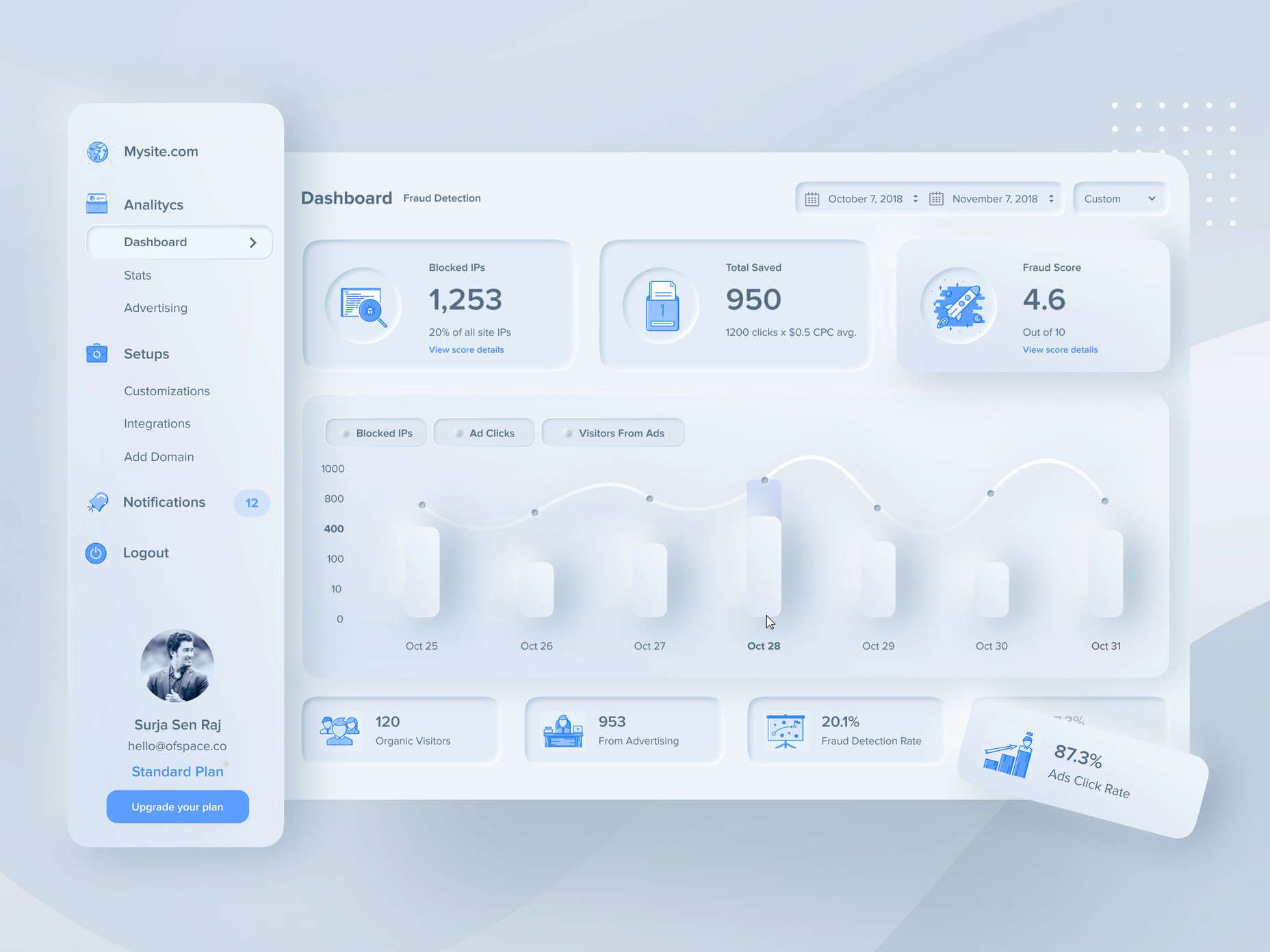
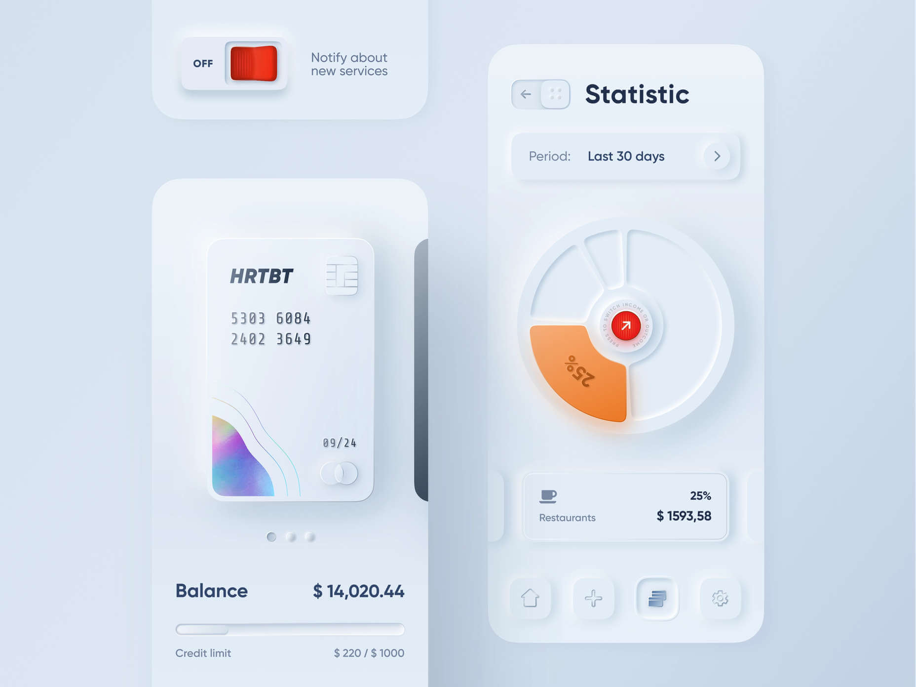
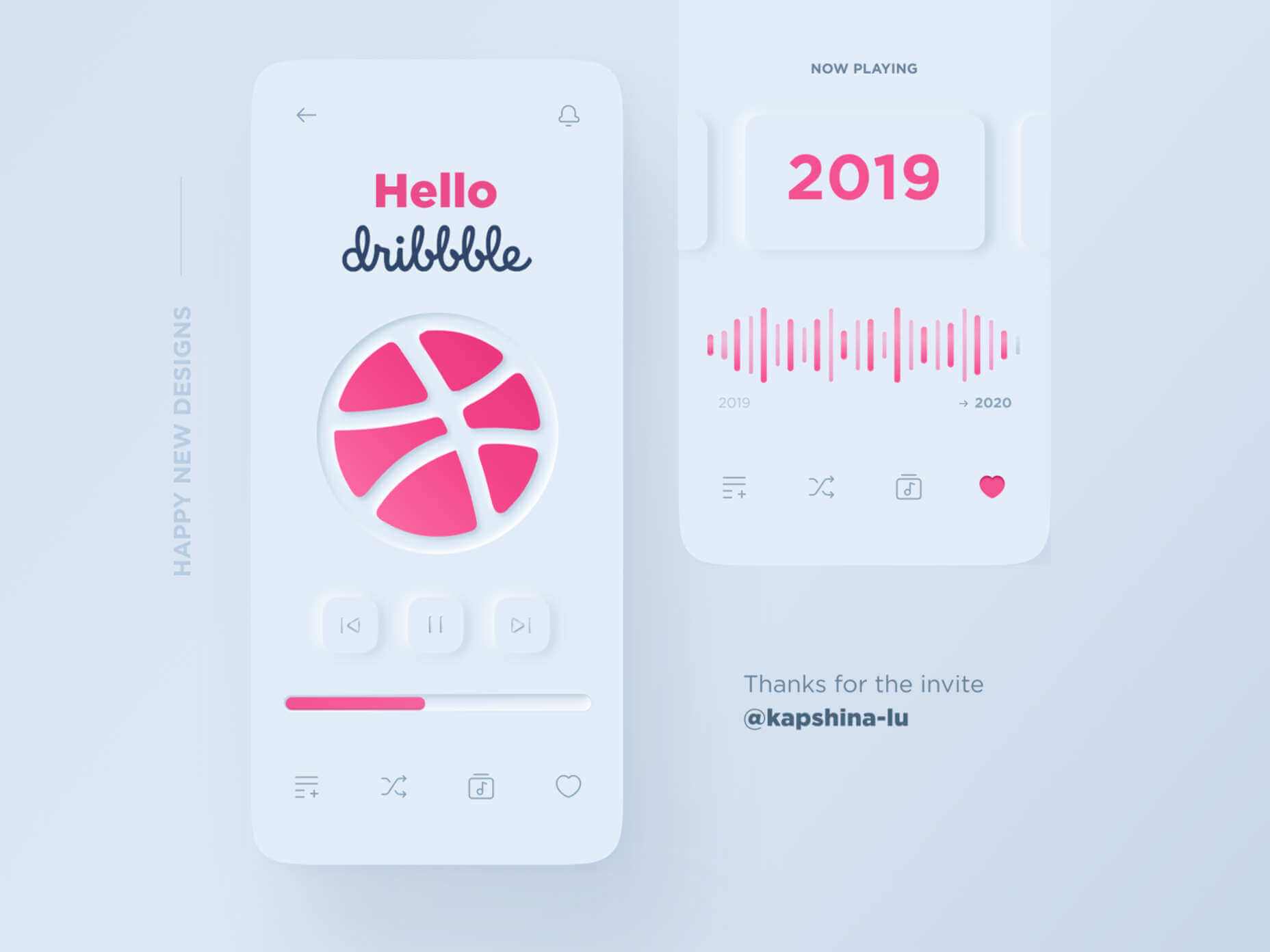
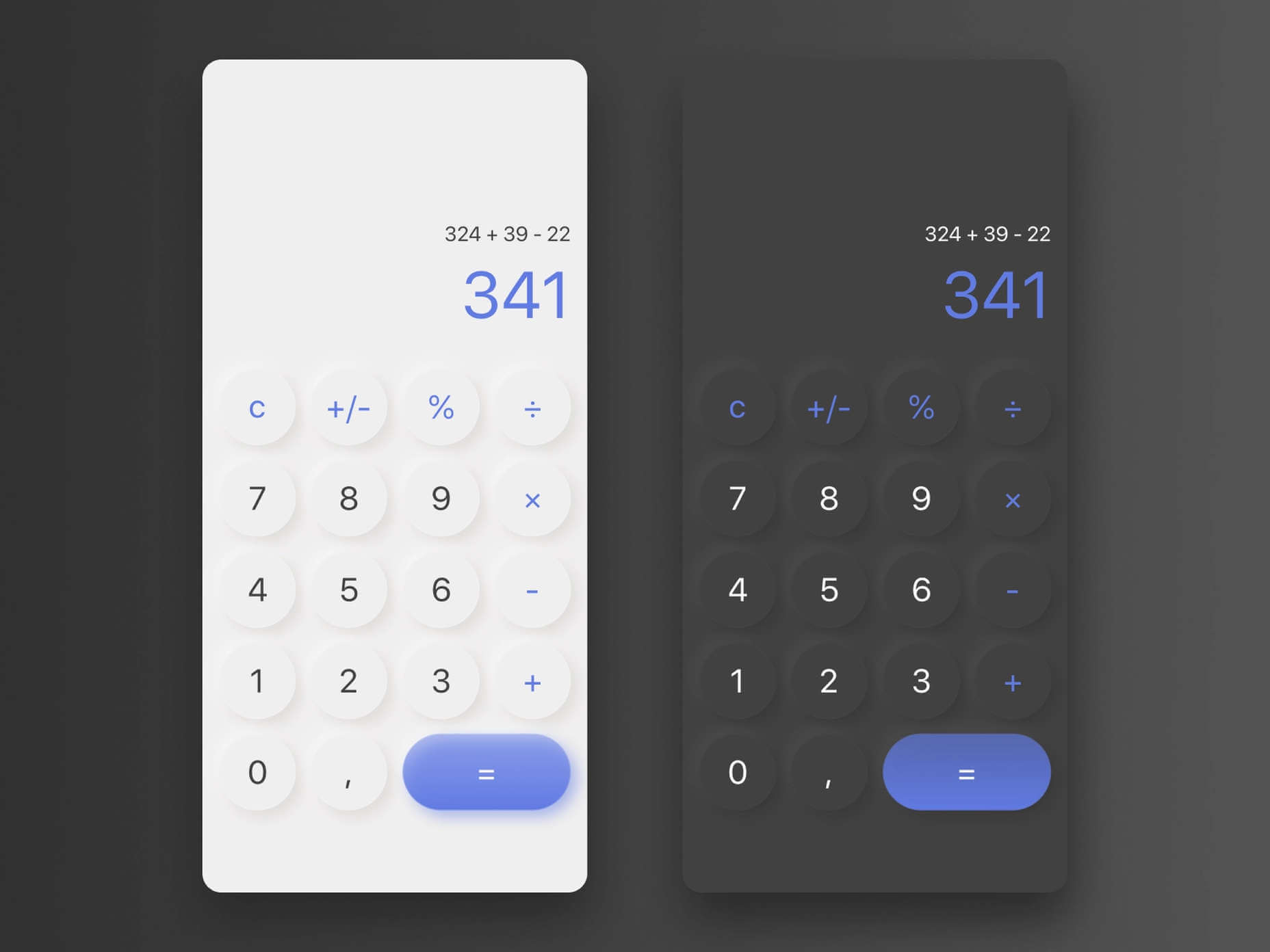
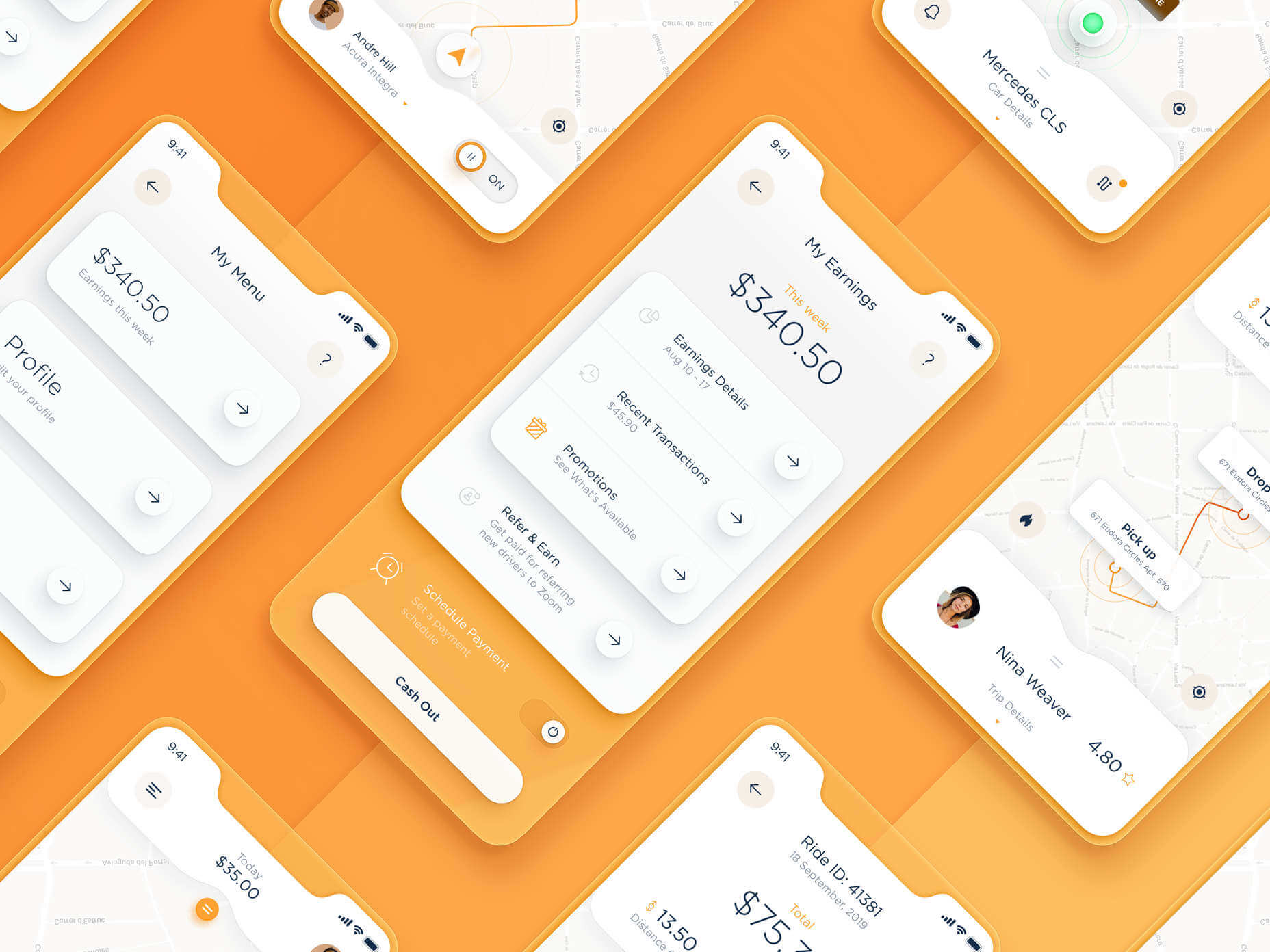
A new design trend has emerged in the last year: Soft UI or Neumorphism is everywhere. 

Even Apple is in on the trend; the company introduced a host of changes in both its mobile and desktop operating systems that use the style. The elements of Soft UI introduced by Apple reflect various aspects of the Microsoft Fluent UI design too. 

So, if soft UI is such a huge concept, what do we need to know about it? How does soft UI work, and what are the pros and cons of using it?

What is Soft UI (Neumorphism)?

Soft UI involves using highlights and shadows in design elements to make them look as though they’re layered on the page. 

The term neumorphism is derived from a previous design style — skeuomorphism, where designers create something as close to its real-life counterpart as possible. If you remember the shift between iOS 6 and 7, you’ll remember the switch between skeuomorphic and flat designs. However, neumorphic design isn’t quite as dramatic. 

Neumorphism doesn’t focus excessively on things like contrast or similarities between real and digital elements. Instead, this “soft UI” practice creates a smoother experience for users. 

With neumorphism, you get the sense that buttons and cards are actually part of the background they’re on. This trend removes the flashier aspects of a typical interface and focuses on a softer style that stays consistent throughout the design. 

The Common Features of Soft UI

Soft UI is all about smoothing out the experience by making everything feel more connected. There’s nothing overly harsh in the aesthetic, hence the term “soft.”

So, what kind of features can you expect?

Rounded Corners: Soft UI removes some of the sharper parts of the interface, like the corners on modules and segments. This allows for a more gentle appearance overall. In this experimentation from Iqonic Design, we can see how the round corners tie everything together.

Transparency and Background Blur: Background blur and transparency are more popular today since the infamous iOS 7 solution emerged. Most people hated the appearance of ultra-minimalism, combined with thin fonts. However, the background blur effect was more popular. The blur in soft UI shows that part of the window is connected to the rest of the OS. It seems like parts of the background in the app are pushing through to the surface. 

Unified Symbols: Everything needs to fit perfectly in a soft UI design. Anything that doesn’t look like it’s part of the same entity throws off the experience. In this design experiment by Surja Sen Das Raj, you can see how all the colors, shadows, and gradients tie together consistently. Because everything is more uniform, the experience flows perfectly for the end-user. 

Implementing Soft UI Elements in Your Design

So, what does neumorphism look like in your UI design process?

Ultimately, it’s all about subtle contrast and aligned colors. Every part of your interface needs to look like it’s part of the same form. Your element and background need to be the same color so that you can create a feeling of objects protruding from the background. 

With Soft UI, the keys to success are shadows and highlights. 

Let’s take a look at some key steps. 

Achieving the Soft Look

When you’re designing your interface, remember that sharp edges make the interface more serious and formal. Rounded corners are more playful and friendly. 

What also makes the design look lightweight and delicate is plenty of deep shadows and highlights. When you add shadows to elements, you create a visual hierarchy. The items that cast a larger, deeper shadow are the ones closest to you. That’s why only a few elements need to cast an intense shadow. Everything else should work in the background. 

Take a look at this design by Alexander Plyuto, for instance.

Creating Smooth and Delicate Gradients

Gradients are part of the shadow and highlighting process in Soft UI design. Ideally, you’ll need to choose colors from the same palette, just toned down or brightened, depending on your needs. The gradient needs to be barely visible, but just enough to make the elements stand out. 

For white gradients, like highlights, use a very delicate color somewhere between white and your background shade. For instance, consider this design from Marina Tericheva.

Consider the Little Details

Finally, remember that the neumorphism design principle is all about little details. 

Choosing a font that visually matches the background is an excellent choice. However, you can also choose something more contrasting, as this will help information stand out

Adding a little bit of the background into your fonts might be suitable too. For instance, if you have a green font and a grey background, add a little grey into the mix. 

Extra elements in your design, like allowing a button to shift into a more recessed state after being clicked, are a great way to make the soft UI more engaging. Everything your end-user interacts with needs to feel smooth and perfectly unified. 

The Problems with Soft UI Design

Just because a design process is trending – doesn’t mean it won’t have its issues. 

Neumorphism is a fun way to make apps, operating systems, and websites feel more friendly and informal. However, this softer approach has a weak spot too. 

When you’re dealing with a small margin of contrast and color where neumorphism works well, it’s hard to get the effect right every time. For instance, this all-yellow design for Dtail Studio may be overwhelming for some.

A slight deviation in saturation or a problem with your shadowing could render the entire effect of Neumorphism completely pointless. 

Another major issue is accessibility. The soft UI design looks great for people who have a full visual range. However, visually impaired users might not see the same benefits. Anyone without perfect vision may see crucial objects disappearing into the background.

Your users don’t necessarily need significant vision problems to struggle with neumorphism, either. The design is all about softness that causes elements to almost blend together. People with low-quality screens that don’t have as many pixels to work with won’t see these elements. 

Issues With Buttons and CTAs

Another major issue of neumorphism is that its subtlety can lead to problems with attracting clicks and conversions. Usability is the most important consideration of any UI design. 

Unfortunately, when you focus on subtle elements throughout your entire interface, usability sometimes takes a hit. 

Let’s consider buttons, for instance – they’re essential to any interface. To simplify the customer journey, these buttons need to be noticeable, and they need to shift into different states when your customers interact with them. 

For the button experience to be excellent, users need to notice the design instantly. However, the heart of neumorphism revolves around the idea that nothing stands out too much. 

This isn’t just an accessibility issue; it’s a problem for conversions too. 

Neumorphism is soft on the eyes, with minimal color contrast and few color pops. This means that CTA buttons don’t stand out as much as they should. Buttons almost blend into the background, and the website struggles to pull attention to the areas that demand it most. 

How to Experiment With Soft UI (Free Kits)

The key to unlocking the benefits of soft UI interfaces without getting lost in the negative points – is proper experimentation. Like any new design trends, professionals and artists will need to learn how to merge the elements of soft UI together in a way that doesn’t compromise usability. 

Trends in UI design can’t focus exclusively on aesthetics, as a customer’s comfort will always be an essential part of the process. 

If you want to start exploring, here are some of the best kits and freebies to get you started:

Closing Thoughts on Soft UI

The world of design and the trends that we use are constantly changing. Companies are always searching for the best ways to connect with their users. Often, this means focusing on an interface that really connects with your target audience and delivers the best possible results. 

The soft UI design trend has its benefits and its downsides. On the one hand, the smooth appearance of every element on a combined screen can deliver a delightful aesthetic. Buttons feel less imposing, and elements are friendlier and easier to interact with. 

On the other hand, neumorphism also makes it difficult to truly capture your audience’s attention in the places where it matters most. It suffers from accessibility issues and requires plenty of care and practice.

Source

The post Soft UI: Making Sense of the Latest Design Trend first appeared on Webdesigner Depot.


Source de l’article sur Webdesignerdepot

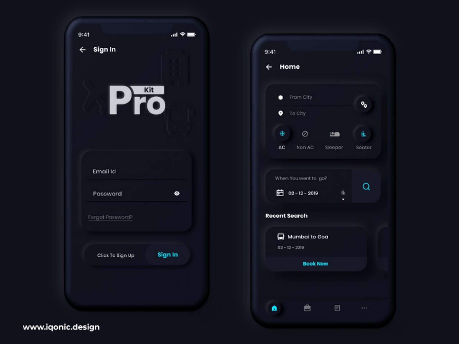
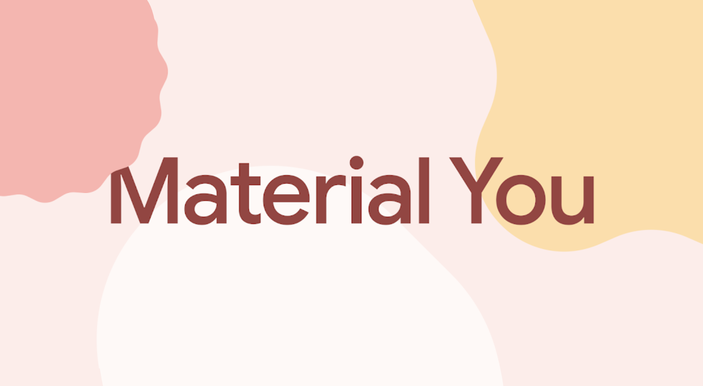
This week at I/O, Google unveiled the latest version of its Material Design design system, Material You.

Initially presented as an upgrade for Android 12, Material You is the biggest revision to Material Design since its launch in 2014 and will be rolling out across all Google products in the coming year.

Material You is an adaptable system that takes the building blocks of Material Design — the spacing and component approach — and skins it to allow a more personal design language, albeit a distinctly Google personal design language.

Google isn’t shy about its intention to define what constitutes good UI design, even if its efforts have so far fallen short of its ambition. Material You potentially leads us back to that undesirable state where every new site looks like a Google clone. The more cynical might suggest that Google actually does perceive all websites as Google products — a view that’s not entirely without merit given the source of most web traffic — so a homogenous approach is warranted.

Material You will certainly make its way into web design. Expect a rash of Material You ‘updates’ to popular themes and site builders that will consist mainly of pastel color palettes.

Hopefully, two major benefits of Material You will not be overlooked: firstly, Material You introduces far more emotion than Material Design allowed; secondly, Material You is flexible enough to ensure accessible design is harder to ignore.

Fundamentally, Material You is still Material Design. The basic approach remains, but it’s less rigidly enforced. Think of it less as a rulebook and more as a disapproving parent who, despite their better judgment, is willing to let you make your own mistakes.

Material Design has looked dated for a few years now, and it’s possible that Material You is just Google hoping to nail down a trend that’s escaping them. But it’s equally possible that Material You is a step closer to what Material Design was meant to be: an invisible design system that feels natural to all seven billion individuals on the planet.

Source

The post Poll: Will You Adopt Google’s Material You? first appeared on Webdesigner Depot.


Source de l’article sur Webdesignerdepot