Articles

Jamstack (JAMstack), is one of the most popular (and rapidly growing) tools for app and website creation. A unique ecosystem of functionality, Jamstack promises developers the support they need to create powerful websites and progressive applications. 

For a while, Jamstack was mostly written off as just another buzzword in the developer space. However, today, it’s growing to become a powerful investment for many business leaders. Even big companies are getting involved, like Cloudflare, with Cloudflare pages, and Microsoft with Azure Static Web Apps. Elsewhere, we’ve seen brands like Shopify, PayPal, and Nike getting involved too.

So, what exactly is Jamstack, and is it time you transitioned over? Let’s find out…

What is Jamstack?

Jamstack, otherwise known as “JAMstack,” is the name of a developer ecosystem made up of JavaScript, APIs, and Markup (hence: JAM). The solution is a web development architecture allowing developers to access static website benefits, such as higher security and better performance, while still unlocking dynamic database-oriented CMS.

The Jamstack solution allows companies and developers to build a dynamic website where real assets are pre-rendered static files in a CDN. The dynamic environment runs on JavaScript client-side, through serverless functions. 

For a better insight, let’s compare Jamstack to the LAMP stack development strategy, which originated from the four open-source components many developers used to build sites: Linux, Apache HTTP, MySQL, and PHP.

With LAMP, each user request for a page forces the server to query a database — unless the page is cached — and combine the result with page markup data and plugins. Jamstack websites serve pre-built optimized assets and markup solutions quickly because the files are already compiled on a CDN. There’s no need to query the database. 

Jamstack workflows dramatically reduce cumbersome issues with development and excess maintenance, making them highly appealing to developers. 

What Are the Benefits of Jamstack?

Jamstack won’t be the ideal development tool for everyone, but it has a lot of benefits to offer. By fetching HTML from a CDN, the system doesn’t have to wait for HTML to be combined and returned to clients. The solution also provides an improved developer experience with static methods. 

Using Jamstack, developers can build fantastic static files ready to serve by request, hosted on a global CDN. Some of the biggest benefits of Jamstack include:

  • Performance: Because you’re serving pre-built static files from a CDN directly, you’ll achieve much faster loading times, unmatched by typical server-side rendering options. Because you’re serving static files, you’re also better equipped to handle any traffic spikes you might encounter, with minimal slowdown.
  • User experience: Better website performance significantly improves user experience and website traffic, as well as SEO efforts. User experience has always been a critical factor in ensuring the success of a website, and it’s essential to keeping your customers around for as long as possible. Websites optimized for performance will always delight users. 
  • Security: With Jamstack, there are no servers or databases to worry about. You use third-party solutions to handle these issues for you. The architecture of Jamstack means the back and front end of your development processes are decoupled, and you can rely on APIs to run server-side processes easily. Jamstack also comes with security benefits other approaches can lack. Clear separation of services is essential here. 
  • Hosting and scaling: Scaling and hosting can often be problematic in the development world, but because you’re serving files from a CDN, you’re less likely to encounter issues. CDNs are almost infinitely scalable, so you get excellent extensibility built into your development environment. CDN hosting for static files is also cheaper than traditional hosting, so you can keep costs low. 
  • Maintenance: Jamstack makes it easy to push your front end to the edge rather than managing infrastructure directly. Ditching plugins, databases, and other hosting services can help you to save more time and money on a significant scale. 
  • Developer experience: From a developer perspective, there are tons of benefits from Jamstack. You get the ease of a Github, CI/CD, CDN flow, and auto previews with simple rollback to reduce the need for backups. Local developer environments and the ability to run and debug cloud functions locally are all fantastic.

Does Jamstack Have any Limitations?

In a lot of ways, Jamstack is an innovative and revolutionary solution for development. It can help you to create a far more engaging website and present your company in an incredible way. Of course, that doesn’t mean there are no limitations to be aware of. 

Jamstack is developer-friendly, for instance, but it’s not beginner-friendly. You will need at least some knowledge of web development to start unlocking the benefits. You’ll need to understand things like Vue or React, but you should develop a tool anyone can use with a bit of work.

There’s also a handful of things you can’t pre-generate, like user-specific and real-time data. So, this means you may not be able to use Jamstack effectively on projects requiring these kinds of data. Building an analytics dashboard, for instance, probably isn’t a good idea with Jamstack. Other issues for some developers may include:

  • API complexity: It can be overwhelming to try and find the right solution for your needs among so many different options. Of course, this could also be something you’d say about the WordPress ecosystem and its huge variety of plugins. An API usually won’t break your production website, at least. 
  • Long building processes: If you have a large number of pages, there’s more likely to be an extensive building process to think about. Whenever you make a change to a single page, even a little one, you’ll need to rebuild your entire website. This is a problem if you run into a website with thousands of pages. There are solutions to this problem available, however.
  • Handling dynamics: Going with Jamstack doesn’t mean abandoning your backend. An important part of the approach is accessing serverless functions, which are becoming more effective over time. These serverless functions can also be executed on the edge. The backend parts of your website will require regular maintenance as they scale.

Best Jamstack Tools to Check Out

Now you know the basics of Jamstack, let’s look at some of the tools you can use to design an incredible website or application within the Jamstack environment. 

The Git Tool Landscape

There are tons of tools within the Git ecosystem common among Jamstack developers. Starting with Git itself. Git represents a powerful free, and open-sourced distributed version control system. With this solution, companies can handle everything from small to enterprise-level projects with efficiency and speed. The solution is extremely easy to use and learn, and outclasses a range of tools like Perforce, ClearCase and Subversion. 

GitHub Pages and GitLab pages are two hosting services for Git repositories with built-in services to host static pages from out of your codebase. This makes the two solutions fantastic for when you’re building a Jamstack website. You can access the functionality for free too. 

GitLab gives you a comprehensive DevOps platform to work with, where you can enjoy a comprehensive CI/CD toolchain out of the box. The comprehensive solution, delivered as a single application, changes the way security, development, and Ops teams integrate and collaborate. Gitlab helps to accelerate software delivery on a massive scale.

AWS Amplify

AWS Amplify, created by Amazon Web Services, is a development platform packed full of useful features for people in the Jamstack environment. The Amplify offering aims to reduce the complexities associated with Amazon Web Services for mobile and web deployment. You get 12 months of hosting for free with new accounts, and you get Storage with Amplify too. 

The Amazon Amplify solution dramatically improves the regular AWS workflow, especially if you’re just a novice user. There’s a huge documentation hub to help you too, which is way more convenient than Amazon’s usual documentation solutions. Amplify is still accessed from a somewhat bloated console, however. 

With AWS Amplify, companies can access features like a comprehensive data store to sync data between the cloud and websites. There’s also easy-to-use interface access across all different categories of cloud operations. The service works well with a range of JavaScript central tools. 

Netlify

Netlify is a pioneering solution in the Jamstack environment, allowing users to go dynamic with their websites and applications on their own terms. You can access a range of add-ons and integration, access your favorite tools, and make your own. The flexible environment enables developers to run websites on a multi-cloud infrastructure designed for speed and scale automation. 

Built to be entirely secure from the ground up, Netlify makes it easy to build a site that’s custom-made for performance and deployed directly. You don’t need to worry about managing, scaling and patching web services, which means you can more quickly implement your Jamstack architecture. 

Unlike other large legacy apps, Jamstack projects are neatly separate from your front-end pages and UI from the backend databases and apps with Netlify. Using this service, the entire front-end can be pre-built with highly optimized static assets and pages, and developers can deliver new web projects faster than ever before.

Next.JS

Inspired by the functionality of PHP, Next.JS is a solution for pre-rendered JavaScript modules. The solution allows developers to easily export the components of their apps and perform individual tests to determine how each element works. You can also access a wide range of components and modules from NPM. The Next offering allows developers to save time, removing the need to use webpack bundles and transform with compilers. 

The full solution is extremely intuitive, ensuring developers can create solutions quickly. What’s more, the technology you build will allow you to load only the bundle needed from your JavaScript workflow, rather than all the JavaScript at once. Pre-fetching, one of the features of Next.JS, also picks up where standard code-splitting leaves off, allowing for optimized bundles of code to load seamlessly. 

Next.JS also supports hot-module replacement. This means instead of reloading an entire application when you change the code, you only recreate the modules you’ve altered.

Angular

Probably the most widely-recognized of all the JavaScript frameworks, Angular, designed by Google engineers, appeared first in 2012, offering developers a new way to create dynamic pages. Before this technology, there were other opportunities for creating dynamic pages, but they were nowhere near as convenient or speedy. 

Angular is probably one of the most essential tools companies can use when building a Jamstack website or environment. The front-end web development tool attracts developers from all over the world. Every version is packed with features and constantly upgraded to ensure you can generate the best results. 

Angular extends HTML file functionality with powerful directives, and it requires very little effort to enable these directives too. All you do is add the ng- prefix to your HTML attributes and you’re ready to go. Angular also allows developers to create widgets leveraging editable data with two-way binding. This means developers don’t have to write code that syncs constantly between the model and view. 

With Angular, developers also get access to things like virtual scrolling, which can help with displaying large lists of elements performantly, rendering on the items that fit on the screen to reduce loading times. 

React

Another must-have tool in the JavaScript world for Jamstack, the React solution was launched first in 2013, and has won thousands of customers across the globe thanks to fantastic functionality. Today, the full landscape is maintained by Facebook, along with all the members of the standard developer community. The solution is used by some of the biggest giants in the tech industry, like Netflix, PayPal, and Apple. 

React is a true pioneer in the Jamstack ecosystem, with its sensational approach to simple and straightforward solutions for JavaScript management. You’ll be able to access batched and virtual DOM updates, which makes it easier to unlock components quickly, and write your components the way you see them. There’s also the added benefit that React is compatible with a lot of tools. 

You can build a comprehensive app or website with the help of React, and you’ll have no trouble accessing some of the top features, particularly with plenty of support available from the React community. 

Gatsby

Created from the ground up to improve user experience on a comprehensive level, Gatsby is a static site generator with heavy focus on things like SEO, performance, and accessibility. The solution offers plenty of out-of-the-box features to help developers deliver the most immersive solution for their users, without unnecessary complexity. 

Gatsby users pre-configuration to develop static websites giving developers faster loading pages, stronger code splitting, and server-side rendering. You can also access features like data prefetching, asset optimization, and quick image loading. Gatsby boasts excellent documentation and starter packs to help you get your site up and running more quickly.

The GraphQL data layer of Gatsby also means the system can collect your data from anywhere, including your CMS, JSON, Markdown, and APIs. More than just your standard site generator, this is a tool built specifically with performance in mind. 

Agility CMS

Developing an effective Jamstack website means having access to the right CMS technology. Agility CMS wasn’t the first CMS solution to support Jamstack, but it is one of the better-known options. As one of the first headless CMS solutions to hit the market, the company has quickly captured the attention of a huge range of developers worldwide.

Agility CMS is a Jamstack pioneer, capable of helping developers to build a foundation for any online ecosystem. The technology is an API-first CMS with support for REST APIs, so developers can connect all the third-party apps and front-end frameworks they like.

The technology also gives developers the freedom to code their solutions their way. You don’t have to follow a specific set of guidelines for how content is created, but templates are available to fast-track development. Agility CMS also hosts and abstracts your database, so you don’t have to worry about connection strings, backups, and maintenance. 

With a strong content architecture to help companies manage digital content and a partnership with Gatsby, Agility is ideal for Jamstack development strategies. 

Building Your Jamstack Website

The Jamstack solution is more than just a buzzword in today’s development world. This unique approach to building incredible development experiences delivers an excellent advantage to both developers and their end-users. Fast, scalable, and full of solutions for customization, Jamstack is a powerful way to bring websites to life with simplicity and speed. 

Every day, more companies take advantage of the Jamstack environment, and we’re constantly seeing a wide selection of new tools, APIs and offerings emerging to help enhance the Jamstack landscape too. This environment is definitely worth consideration for any developer looking to significantly speed up their development strategy.


Featured image via Pexels.

Source

The post Is it Time to Transition to JAMStack? first appeared on Webdesigner Depot.

Source de l’article sur Webdesignerdepot

Wireframes are a powerful tool, especially for UX designers; whether you are developing a new app, a website, or anything else, the initial steps of any project can be tackled with this robust approach.

There are many occasions when we get stuck or overwhelmed for hours in front of a new project. This is where creating wireframes can be beneficial. A wireframe is nothing more than a diagram of your ideas for the flow of a project.

This post will analyze what wireframes are, and why they are so crucial for user mapping. Then, we will reveal the steps you need to follow to create an efficient wireframe. Let’s dive in…

What Is A Wireframe?

In a few words, a wireframe is a drawing created in the early stages of a UX project. Wireframes are a brilliant and effortless way to create a blueprint for the structure of a page.

In such a drawing, you can include valuable information about the UI and UX of the page you want to design.

You can think of wireframing as a process of visualizing the initial ideas you have about a project. It does not matter if you are comfortable with drawing; you can design wireframes on paper or digitally.

In either case, drawing a wireframe is not about your artistic skills. Instead, wireframes are about structuring your project and identifying the fundamental interactions you want to build out.

Why Is Wireframing Important For UX Designers? 

If you are an experienced UX designer, you have already come across concepts like user mapping and user journeys. Mapping the entire user experience is crucial. And that’s the main reason why wireframing is a must for a UX project.

Since you need to provide a top-notch user experience, wireframing is a great way to ensure this from the earliest stages of your design. But what is the process you need to follow when designing wireframes?

And how can you ensure that your wireframes are efficient? Let’s find out…

Creating An Effective Wireframe In 5 Simple Steps

Creating a good wireframe will allow you to construct your project. You will think it through, prioritize some fundamental interactions and consider alternatives.

1. Research

Although this is not a wireframing step per se, it is critical to the efficiency of your wireframes. How can you start drafting without doing user research? Well, you can not. That’s why the first thing you need to do is analyze your project.

All you have to do is seek similar products/services and check them out. Look at what your competitors are doing right and what they are doing wrong. This way, you will be ready for the next step.

2. Create Personas

You have already selected the best practices and ruled out other guidelines you believe will not be effective on this project. Now it’s time to think about user flow: How many screens will you put on a page? Where are users coming from, and where do you want them to go after reading this page?

By mapping your user flow, you can create a user persona. Then all you have to do is figure out what information to include. 

Mapping the information correctly is crucial because it will help you ensure that users do not get frustrated or overwhelmed when they visit your final page.

Once you do that, you are good to go. 

3. Start Sketching

It’s time to reach for your fine pen, pencil, eraser, and paper. Visualizing your ideas needs to be quick and efficient. Try to avoid fine details because this step is not about creating a high-fidelity wireframe on paper. 

All you need to do here is sketch out basic features and formats.

Since most of us designers are perfectionists, you can use a timer. Set the timer to 4-5 minutes and force yourself to finish the wireframe by that time. Repeat this step until you have created a few wireframes with which you are happy.

Finally, expand and polish your favorite mockups for a few minutes and prepare for the hard part.

4. Ask for Feedback

There is nothing more important than feedback when it comes to wireframing. Discuss your project with your colleagues. Just let them know how each mockup helps you with the project and what idea it visualizes.

Try to sincerely listen to what they have to say about your designs. Once you have gathered all the information and advice, start modifying the wireframe accordingly.

5. Add Details and Create Prototypes

It’s been a long road, but you are now at the point where you feel most comfortable as a UX designer: prototyping. Plenty of software (Adobe XD, Framer, Proto.io, etc.) can help you with this step. 

Start by turning your low-fidelity sketch into a high-quality prototype. Once you are happy with the result, test your prototype’s screens and see if the result serves the user flow. Platforms like UsabilityHub and Prott can help you with this.

Valuable Tips to Keep in Mind While Creating a Wireframe

Keep your Wireframes Simple: Creating a wireframe is not about fine details; try to manage the time you spend on it well. All you need is a clear and simple visualization of your page. You will have all the time you need for prototyping.

Don’t Worry About Your Artistic Skills: Anyone can draw. It’s as simple as that. You do not have to be an artist to create a clear wireframe to help you visualize your ideas. Be confident and make sure you include all the information you need.

Always Think of the User Personas You Created: Creating a wireframe is a smart way to ensure that the page you create meets the user’s needs. Therefore, you should always keep in mind what users will do when they open this page and whether it meets their needs and goals.

The Bottom Line

Creating a wireframe is not as difficult as you might think. All you need to do is research, find out what users need from this page, and create a map. By following these simple steps, you’ll ensure that the wireframes you design deliver a top-notch user experience.


Featured image via Pexels.

Source

The post 5 Simple Steps To Effective Wireframing first appeared on Webdesigner Depot.

Source de l’article sur Webdesignerdepot

As the year begins to wind down, there are still plenty of new and evolving website design trends going strong. Much of what you’ll see this month carries over from things we’ve been seeing all year but with fresh touches.
From peek-a-boo designs with neat animated elements to vertical bars to brutalist blocks, there are a lot of highly usable trends to work with.

Here’s what’s trending in design this month.

Peek-a-Boo with Animation

Designers have been experimenting with cut-out and layering elements with animation for some time, which has evolved into full peek-a-boo styles with a lot of visual interest.

How each design comes together is a little different. Some have the animation in the back, others in the front, and some include text as part of the style. There’s almost no set of actual rules to how to make this design trend work.

Each of the examples below does it somewhat differently with varying degrees of success. The commonality here is that it is almost one of those visuals that you either see and love or hate.

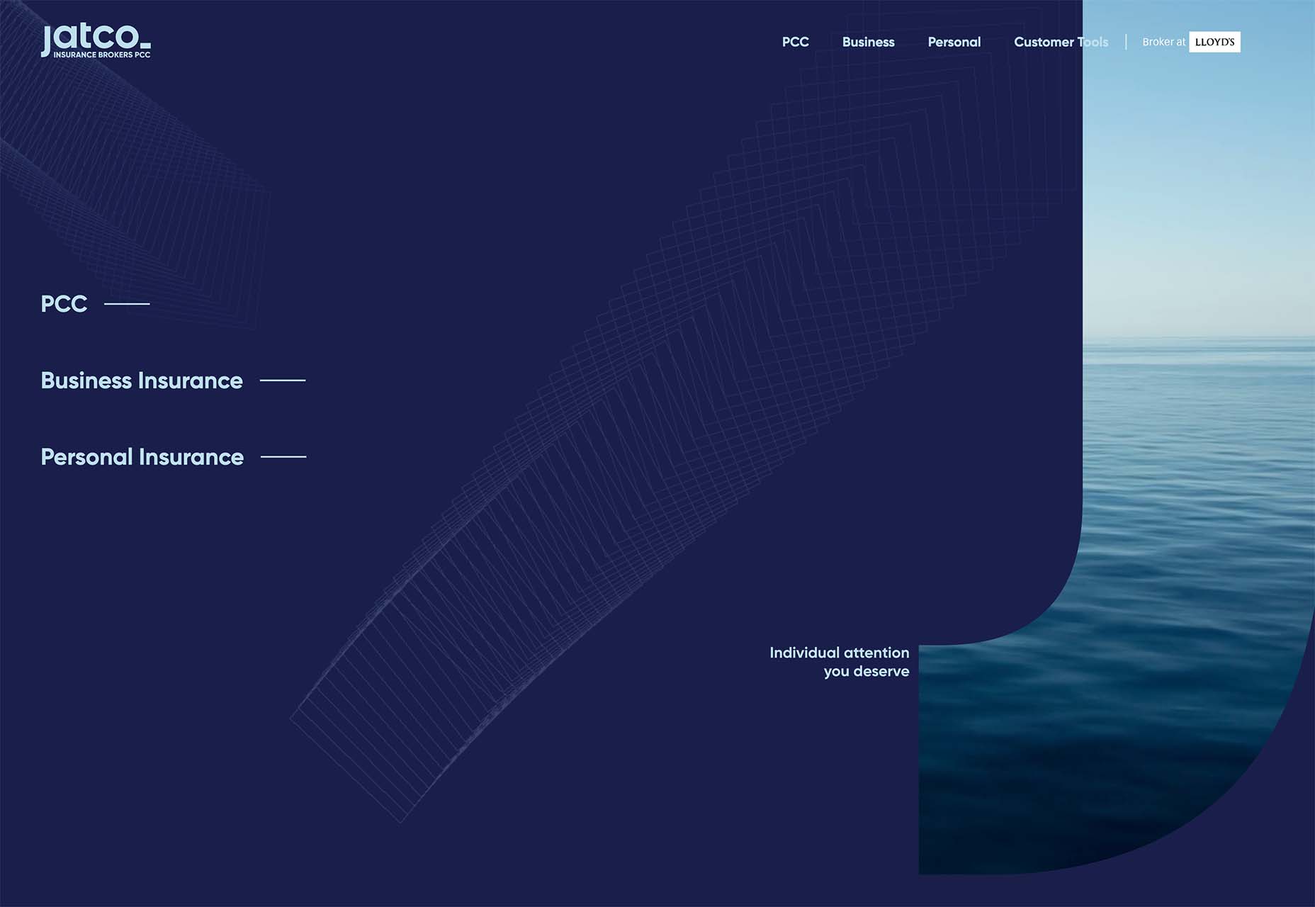
Jatco Insurance is the most stunning example here, with a bold color choice and a peek-a-book element inside the oversized “J.” The overall effect is soothing and interesting and naturally draws the user across the screen from the top left to the background video layer. The small tagline, “Individual attention you deserve,” is perfectly placed.

Liron Moran Interiors takes a different approach with the peek-a-boo concept with the letters peeking out from behind an image. The animation is restricted to a hover and scroll effect that adds a liquid element to the image as well as changes to the image and color background. The challenge here is in readability. More of the words show on wider screens, but is it enough?

Melon Fashion also layers text and animated effects for a neat peek-a-book style that almost seems cut out from the background. The overall look appears to have three layers: background video, middle layer for the yellow color block, and text on top. The opacity of text elements with the peeking video is interesting and well pulled together without sacrificing too much readability.

Vertical Bars

Vertical color bars are a design element that keeps popping up in different ways. Designers can use it as a standalone element or container for content, such as navigation or other click actions.

Vertical elements are helpful because they can help create a more consistent and unified user experience from desktop to mobile screens. This shape can also be somewhat disruptive because you don’t see it featured that often. (Although with this style trending that might become less true over time.)

New Classrooms uses a vertical color bar on the left to help you move through the design. The color actually changes as each slide progresses on the homepage.

Serving uses multiple vertical bars as links to different content entry points. Clickability is emphasized with a change from a red overlay to a full-color image. The navigation is also tucked inside a white bar on the left side of the screen with a hamburger menu therein.

TechnoAlpin goes with a skinny vertical navigation menu on the right side of the screen. The icons with menu elements make navigation highly visual and intuitive. The color, which significantly contrasts with the rest of the design, also helps.

Brutalist Blocks

Not many people thought brutalism would stick around when it started trending. Elements of brutalism keep sneaking in, though, although they are much less stark and harsh than some of those original trending website designs.

This version of brutalism focuses on block elements that contain images or text and often click to other pages in the design. The blocks themselves are essentially the buttons that help you navigate to additional content.

The critical question about this design technique is whether this click action is intuitive enough. Will users interact without buttons?

The answer likely depends on your audience base, but if you opt for a style like this, it is essential to keep a close eye on analytics to ensure that users know and understand how to engage.

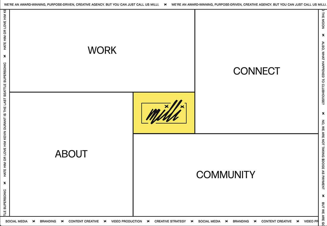
Milli Agency might be the most intuitive example of the brutalist blocks trend. The homepage is essentially a giant navigation menu. Each block changes from white to yellow on hover and expands, further encouraging clicks.

Sick Agency uses brutalist blocks with experimental typefaces and bold color for an in-your-face design. You can’t help but look at all the different things happening here. The biggest question might be, where should you focus and click next? The cursor provides some visual cues, but it’s not quite as intuitive as you might want it to be.

Mawo mixes brutalist blocks with a big blue cursor to help users click through the design to see more clothing options. Even the images here have a rather stark feel, which isn’t typical for e-commerce. Every block element above the scroll on the homepage includes a click action from the navigation blocks across the top to the “Shop Women” and “Shop Men” images. Further, the blue cursor dot helps show where users can click, and text buttons change to blue on hover as well.

Conclusion

Most of the examples here show trends as homepage elements, but you aren’t limited to that application. Try some of these techniques on landing pages or interior pages that you want to add a little something special to.

This can be an excellent way to test the design and see if your users like the style and know-how to interact with it. If it works, then you can extend the aesthetic to more of the design.

Source

The post 3 Essential Design Trends, November 2021 first appeared on Webdesigner Depot.


Source de l’article sur Webdesignerdepot

1, 2, 3 – That’s exactly how long it takes you to start losing visitors if you have a slow-loading website.

Hold on! Surely, the only thing that matters to users is that your website works flawlessly and looks great… right? Wrong!

The fact of the matter is that we’ve all become accustomed to instant access to information and content. The average internet user today places a lot of value on speed, and the bar is continually being raised.

If you are like most people, you probably feel an immediate sense of dread at the thought of optimizing your website. Where do you start? How can you make the most impactful improvements? What makes your website slow in the first place?

Have no fear, as we’ll be answering all of your questions below as well as putting you on your way to a website that loads with blazing speed.

Why Should You Be Worried About A Slow-Loading Website?

Good question!

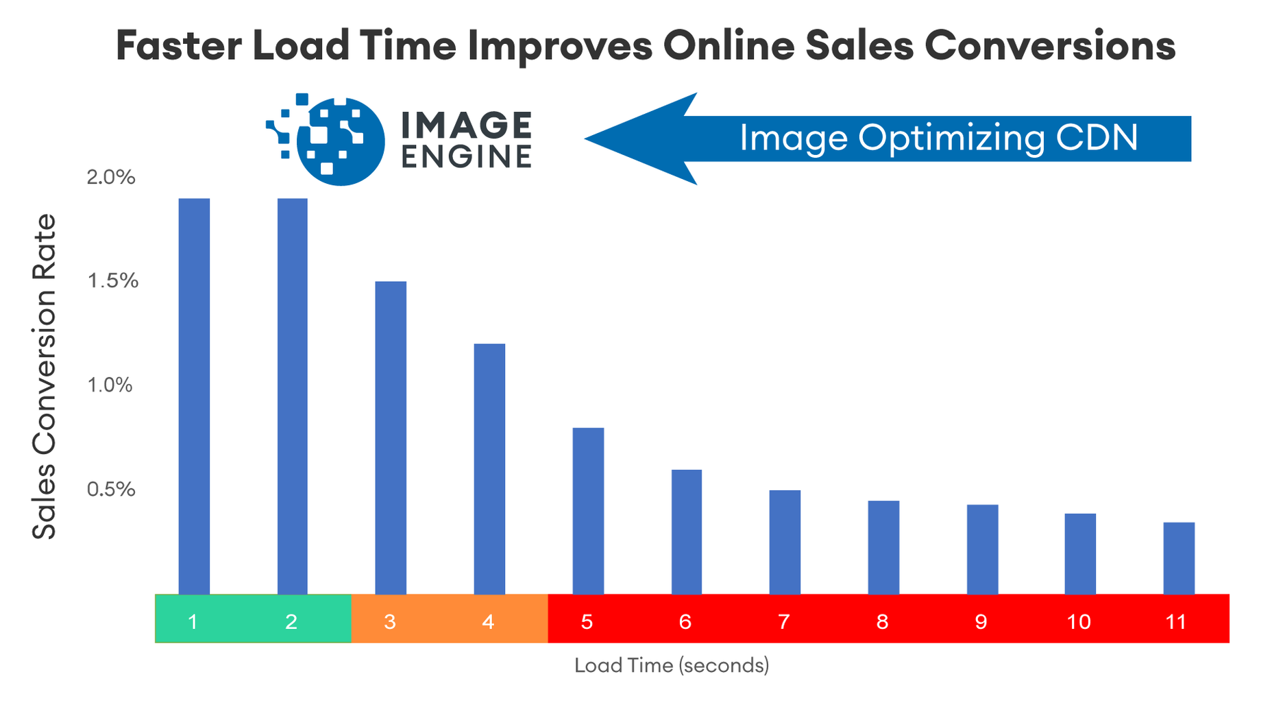
As many as 53% of visitors abandon a site that takes more than 3 seconds to load. Even worse, 1 in 3 shoppers will leave a website if it takes longer than 5 seconds to load.

So, performance plays a huge role in the user experience of your website and whether your visitors will stay on your website or be converted into customers.

For some time, Google has been keenly aware of this fact. As a search engine, Google knows that it’s counterproductive to recommend content to users if they won’t stick around to consume it.

That’s why they’ve continually been increasing the role performance plays when ranking websites for their SERPs (search engine results pages).

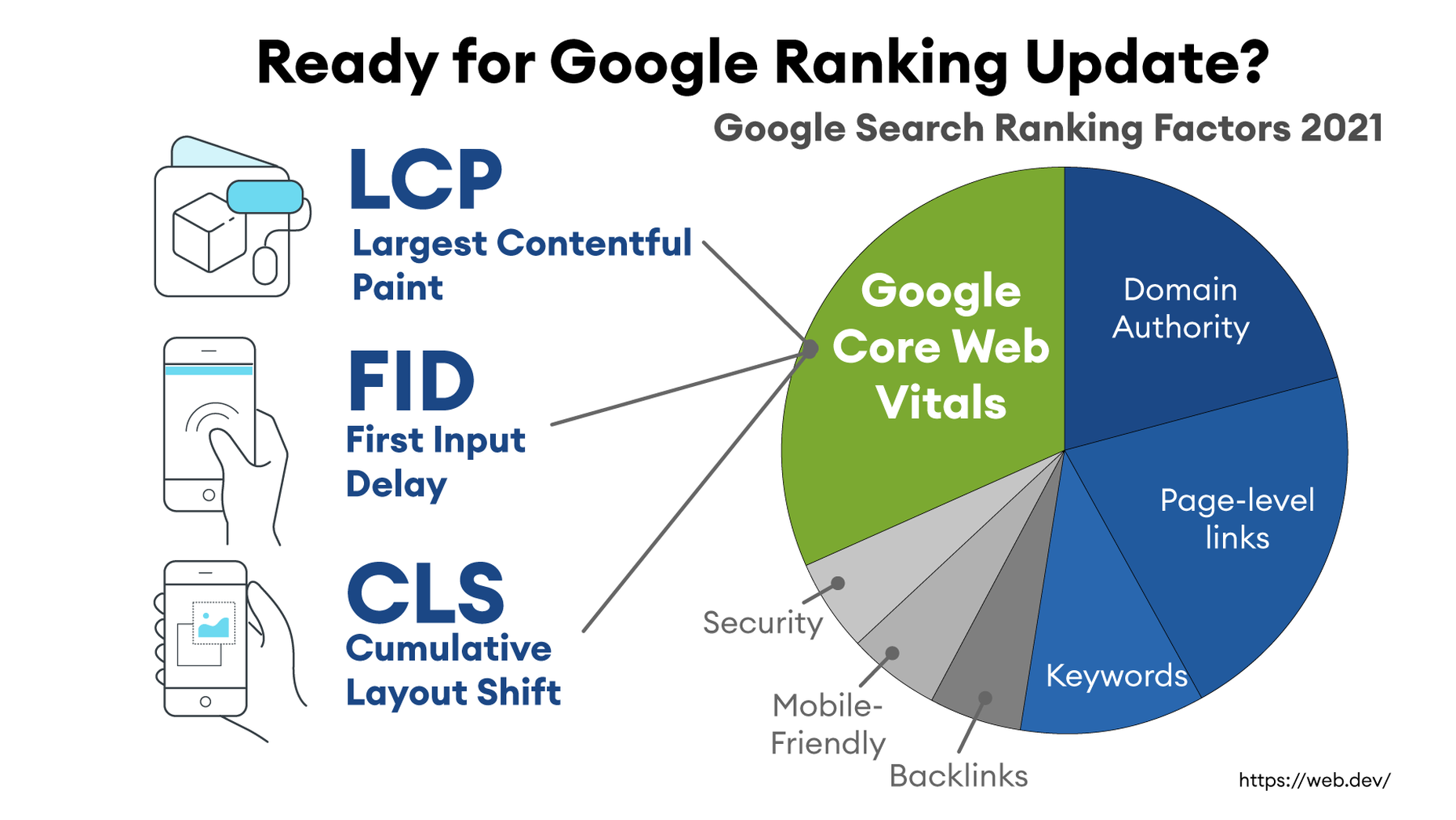
In recent years, Google has introduced core web vitals. These are metrics they hope will help quantify how performance affects the user experience. In general, they measure how fast, stable, and interactive a page is while loading. This will be more important than ever after Google announced its Page Experience update, which started its global rollout in June 2021.

As you may know, ranking highly for Google is vital for your website’s visibility. For one, 68% of online experiences begin with a search engine, of which Google has a 92.7% market share. Even if you manage to land on the coveted first page of Google, the first five results get over 70% of all clicks (28% to the first result alone).

So, to recap why a fast loading website is so desirable:

  • It directly affects your ability to keep, satisfy, and even convert visitors to your website.
  • It impacts your search engine rankings which impacts your “findability” and organic traffic.

8 Reasons Your Site Is Slow + How to Fix Them

O.K., so now that we’re all on the same page regarding the importance of your website performance, let’s look at common issues slowing down your website + how to fix them.

1. You’re Using A Sub-Par Hosting Service

As the party responsible for making your website available to the outside world, your hosting service can be a make-or-break factor. Not only should you pick a host that has a good track record when it comes to uptime a performance, but also one that’s suitable according to your needs.

Even if you take all the steps below to optimize your website’s performance, it may still load slowly if traffic to your website is overwhelming your available bandwidth or your host’s server capacity. If that happens, some users may experience extremely slow loading times, broken features, or even complete unavailability.

For most personal, blog, or local/small business sites, a respectable hosting provider like Bluehost or GoDaddy should be good enough. However, if you plan on running any type of large-scale, high-traffic webstore, business portal, or other type of website, you’ll want premium hosting, such as WPEngine (for WordPress), VPS hosting, or even a dedicated server.

2. You’re Not Optimizing Your Media Assets

As you probably know, media like images and videos take up significantly more space than most other types of content, such as text, code, stylesheets, or other static files. Even a single image has the potential of consisting of more data than dozens of website pages containing nothing but the underlying HTML and text.

In a Speed Essentials presentation, the Google team identified images as the largest contributor to page weight. In fact, they have the potential to consume a website’s entire performance budget if left unoptimized. Images can also directly impact all three of Google’s core web vitals – key metrics Google uses to measure the performance of a website.

However, the use of images and video is likely to continue growing, heightening the importance of finding a sustainable solution. According to HTTPArchive, images have increased by 19.3% on desktop and 42.7% on mobile.

For now and the foreseeable future, optimizing your images carries the greatest potential for improving performance.

The problem is that optimizing image assets requires multiple steps. Most importantly:

  • Using the appropriate next-gen formats which can differ depending on the user’s device, OS, or browser.
  • Appropriately compressing the size and quality of images to reduce payload without affecting visual quality too badly.
  • Using the optimal display size and density based on the accessing device to reduce payloads further.
  • Using lazy loading to only load images as needed.

As you can see, manually going through these steps for every single image on your website can be extremely labor-intensive. This is especially true if you consider that you somehow need to create the optimal variants for different users based on what device, OS, or browser they are using.

In-code strategies, like a JS plugin, responsive images, or CSS media queries tend to bloat your code and lead to other performance issues we’ll discuss below.

Luckily, there are plenty of CDN services available designed specifically for providing some degree of automated image optimization. These platforms analyze the context (i.e., a specific mobile device model, OS version, and browser version) of the user trying to load one of your images and try to serve them a version of the image that’s ideally optimized for them.

However, any media optimization platforms still require installing a small JavaScript plugin to dramatically improve the image and video optimization capabilities. 

The one exception here is ImageEngine. ImageEngine uses WURFL device-detection to pick up every possible detail of the user’s device. The logic is built into their device-aware edge servers and doesn’t rely on you adding any additional code or markup to your website pages.

So, not only does it reduce your image payloads by up to 80% and serve them via a global CDN, but it doesn’t leave a footprint in your website’s code. As a bonus, it also happens to support the widest range of image/video formats, including animated GIFs, as well as client hints and save-data mode.

3. Render-Blocking JavaScript And CSS Is Delaying Page Loads

JavaScript is the de facto programming language for adding interactivity and advanced features to websites today. Likewise, CSS is the standard for adding styling. Both are critical components for almost any modern website.

However, nothing good comes free, and both may impact the performance of your website, particularly when used carelessly. 

The following are some steps you can take to minimize the impact of these assets on your website performance:

  • Minify your JavaScript and CSS files.
  • Combine a large number of JS/CSS files into fewer files.
  • Replace some of your external JS and CSS files with inline JS/CSS. (Don’t overdo this! Inline JS and CSS is only suitable for small code snippets).
  • Defer loading JavaScript until after all your content is loaded and use media queries for CSS files.

Because media can have a more significant impact on your page weight, this leads some to believe that adding more JavaScript is the lesser of two evils. 

However, depending on whether you already have render-blocking JS, Google might flag this as a completely new issue. Regardless, it will negatively impact your performance score in tools like PageSpeed Insights:

You can avoid it altogether by using an optimization engine like ImageEngine that doesn’t require any JavaScript.

4. You’re Not Using A Content Delivery Network (CDN)

A CDN is a network of servers spread across various regions all over the globe. What it basically does is store a copy of your website on each of these servers. When an internet user visits your site, the CDN automatically serves your website from the nearest server to that user.

What this does is allow your website to load faster, no matter where in the world people are visiting it from. If your website was only hosted on a single server, say somewhere in the U.S., then it could take much longer to load for a visitor located in Asia than one in the U.S.

While they all basically do the same thing, different CDNs are better at handling different types of content. Cloudflare, Fastly, and Akamai are just some of the most popular general-purpose CDNs around. Image CDNs like ImageEngine are purpose-built to not only serve image and video assets but to also optimize them using compression, formatting, etc.

So, the two main factors to consider are the type of content you want to deliver via the CDN and its global coverage. However, it’s usually possible to use multiple CDNs in tandem to cover different types of content and reach a wider area.

5. There’s Excessive Overhead In Your Database

If you have a website with any type of complexity, you probably have a corresponding database. In fact, all WordPress websites require a database to function.

Over the years, a lot of information moves in and out of the database. Sometimes, the data can get lost along the way or become obsolete. If you don’t regularly spring-clean your database, then this can really start to add up. Not only will it bloat the storage size of your database, but it will start to impact the speed of database queries and requests.

CMS users are especially prone to racking up these kinds of artifacts from plugins and themes that have been installed and removed over the years.

Unfortunately, there aren’t many easy fixes for this issue available. With most hosting providers, you’ll probably need to use phpMyAdmin to manually check and scrub your data. If you have a managed hosting solution, the host’s support team might be able to help you out. In the event that you have a locally installed database, there are some tools you can use, although they’re not 100% effective.

The best way to avoid any issues is to make database maintenance part of your routine and to learn the basics of how databases work.

6. You Have Too Many Plugins Or Themes Installed

For CMS users, plugins or themes offer near-limitless potential to spruce up the design and functionality of their website. However, each plugin or theme comes with additional code and content that add to the overall complexity and size of your website.

If you have a hand-coded website, the same goes for any additional applets or libraries you want to add to your site. 

The best way to combat this is to be conscientious when adding any extras to your website. Only install what you really need or want, and make sure to uninstall and properly remove them if you don’t need them anymore.

As mentioned, they might leave various transients or artifacts behind, so you should keep an eye out for them throughout your website files (not just the database) whenever you do some spring cleaning.

7. You Aren’t Utilizing Caching

Caching is often one of the most effective yet ignored techniques for improving website performance. Caching stores your website content in fast-access memory in the user’s browser, allowing it to be loaded near-instantaneously by users. This can include everything from text to stylesheets to images to JavaScript files.

Without caching, a user will need to redownload everything when they navigate to or reload a page — whether or not anything has changed.

However, not properly configuring caching on your website can lead to issues, such as users only loading out-of-date content. Most high-quality caching tools have built-in features that automatically clear the cache when you make changes to a specific website page or content. So, users will only reload content once it has been modified.

Some hosts offer out-of-the-box caching tools with their hosting service. CMS can also usually find plugins for this, such as WPRocket for WordPress.

8. Ads Are Dragging You Down

In the end, ads are just another form of media that increases the overall weight of your website pages. While they are typically small and lightweight, multiple ad placements can really start to add up.

What aggravates the issue is that ads are loaded from external sources. This means they’ll take longer to render, generate more requests, and may mess with how stable your pages load — affecting your core web vitals.

Depending on how important ads are to your revenue stream, you’ll want to carefully consider how many ads you use on your site, where to position them, and when they load. If possible, avoid loading ads at the same time as the rest of your page, especially interstitials.

Conclusion

As you can see, website performance is a multi-faceted subject. Although some may be worse than others, you can’t just address one area and expect your website to suddenly be performant.

However, some general principles apply:

  • Keep HTTP requests low by limiting the number of files required for each of your website pages.
  • Maintain proper code hygiene and spring clean transients and leftover artifacts.
  • Invest in proper hosting infrastructure as well as a CDN for your website.
  • Optimize your media assets to significantly bring down payloads without sacrificing engagement.

The final point deserves another shoutout. As we’ve pointed out, finding an optimization solution for your media, particularly images, is probably the best thing you can do to improve your website performance. From purely a performance perspective, there is no service quite as effective as ImageEngine. It’s also the one that requires the least amount of technical expertise and ongoing maintenance.

Regardless, you’ll want to run some tests using tools like PageSpeed Insights so you can gather data on what issues your website is facing. From there, you can prioritize fixes to make your website more competitive.


[– This is a sponsored post on behalf of ImageEngine –]

Source

The post 8 Reasons Your Site Is Slow + How To Fix Them first appeared on Webdesigner Depot.


Source de l’article sur Webdesignerdepot

Every day design fans submit incredible industry stories to our sister-site, Webdesigner News. Our colleagues sift through it, selecting the very best stories from the design, UX, tech, and development worlds and posting them live on the site.

The best way to keep up with the most important stories for web professionals is to subscribe to Webdesigner News or check out the site regularly. However, in case you missed a day this week, here’s a handy compilation of the top curated stories from the last seven days. Enjoy!

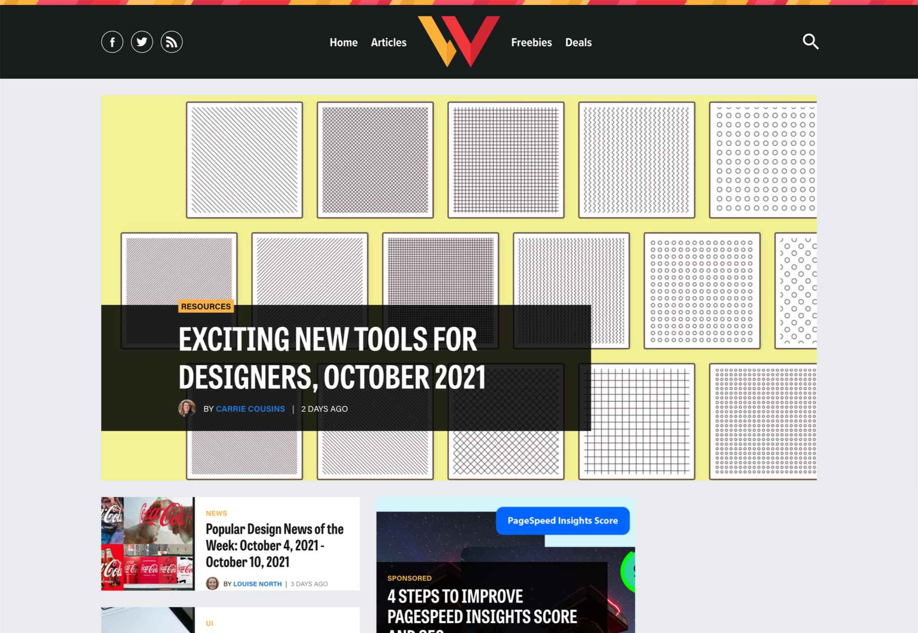
Exciting New Tools for Designers, October 2021

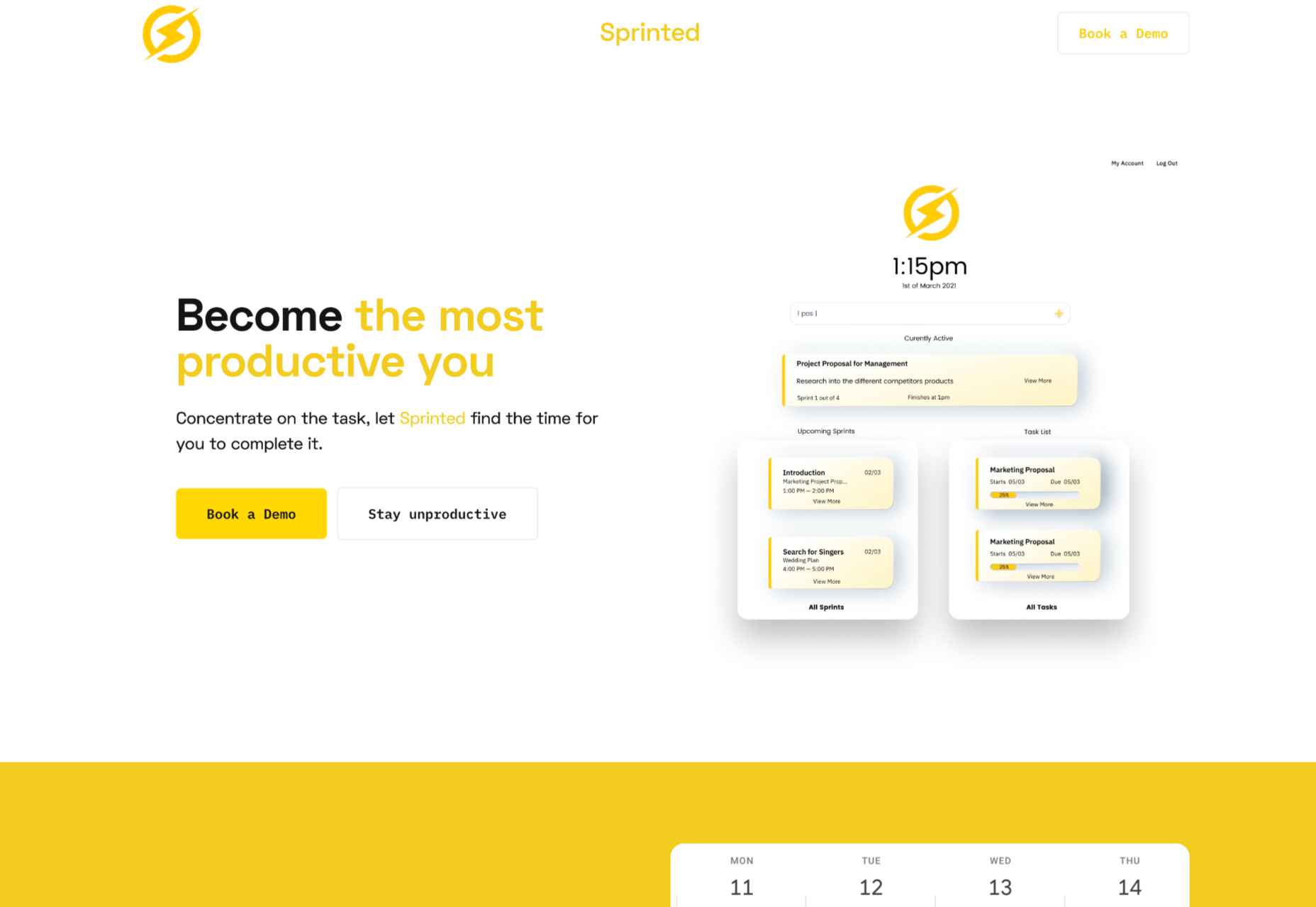
Sprinted – Making You the Most Productive You

11 Must-Follow Web Design Blogs

12 Modern Logos for Inspiration in 2021

Grafix – A Free Online Image Editor

Huetone: Make Colors Accessible

Doom Rendered Via Checkboxes

How to Define a UX Research Approach

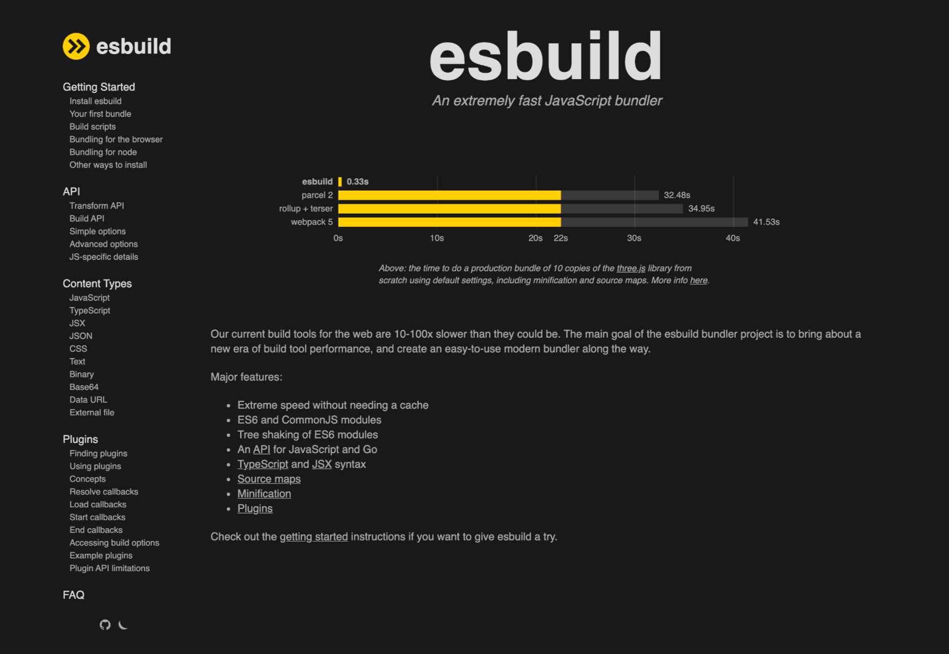
Esbuild – An Extremely Fast JavaScript Bundler

It’s Time for Designers to Shift their Obsession with User Experience to User Safety

Source

The post Popular Design News of the Week: October 11, 2021 – October 17, 2021 first appeared on Webdesigner Depot.


Source de l’article sur Webdesignerdepot

User experience is one of the most important principles of web design. There’s no doubt that you focus on UX with every page you design on the web, whether it’s a portfolio, a profile page, or an entire website. 

Unfortunately, what many experts forget is that UX doesn’t just apply to digital pages. That means that you need to discover the right UX strategies for everything from your website homepages to your email marketing messages and even your listings on Google. 

Today, we’re going to explore ways you can apply UX principles to your client’s image on search engines. 

Why Your Search Engine Listing Matters

Let’s start with the basics…

89% of customers start their purchasing process with a search engine. 

That means that whether you’re creating a portfolio to sell your services or building a website for a client, the first connection a customer has with your design isn’t on the homepage.

Developers and designers know that first impressions count when it comes to succeeding online. However, they assume that those first impressions happen on a social media channel, a landing page, or a home page. 

The truth is that most of the time, you’re driving a specific experience for an end-user before you even realize it. Before you can wow an audience with a beautiful site design or a fantastic CTA offer, you need to convince them to click on your Google link.

Just as UX on a website is all about giving your audience what they need in an informed and strategic manner, UX in search engine results works the same way. 

How to Make Your Search Listing Stand Out with UX

So, how do you begin to apply the principles of UX to your Google Search results?

It’s much easier than you’d think. 

Step 1: Show Immediate Value 

Delivering an excellent experience on a website often means providing end-users with the information they need as quickly as possible. Imagine designing a landing page; you wouldn’t want your audience to scroll forever to find what they need. Instead, you’d make sure that the value of the page was immediately apparent. 

When creating an image for your search engine listing, you’ll need to take the same approach. This often means thinking carefully about two things:

  • Your headline
  • Your meta description

Around 8 out of 10 users say that they’ll click a title if it’s compelling. That means that before you do anything else to improve your SEO strategy, you need to make sure that the title of your web page is going to grab the audience’s attention. 

The best titles deliver instant value.

Immediately, these titles tell the audience exactly what they’re going to get when they click onto the page. The promise drives action, while clarity highlights the informed nature of the brand. 

The great thing about using an excellent title for a page is that it doesn’t matter where you’re ranked on the search results. Whether you’re number 2 or number 5, your customers will click if they find something they want. 

It’s just like using a CTA on a landing page. Make sure your titles are:

  • Informative: Show your audience value immediately
  • Optimized for mobile: Remember, your audience might not see your full title on some screens. That means that you need to make the initial words count.
  • Easy to read: Keep it short, simple, and straightforward. Speak the end-user’s language

Step 2: Build Trust with Your URLs

Trust factors are another essential part of good UX

When designing a website for a new brand, you know that it’s your job to make visitors feel at ease. Even in today’s digital world, many customers won’t feel comfortable giving their money or details to a new company. 

Within the website that you design, you can implement things like trust symbols, reviews, and testimonials to enhance brand credibility. In the search engines, it all starts with your URL. 

Search-friendly URLs that highlight the nature of the page will put your audience’s mind at ease. When they click on a page about “What is SEO” in the SERPs, they want to see an URL that matches, not a bunch of numbers and symbols

Use search-friendly permalink structures to make your listing seem more authoritative. This will increase the chances of your customer clicking through to a page and make them more likely to share the link with friends. 

Once you decide on a link structure, make sure that it stays consistent throughout the entire site. If a link doesn’t appear to match the rest of the URLs that your audience sees for your website, they may think they’re on the wrong page. That increases your bounce rate. 

Step 3: Be Informative with Your Meta Description

To deliver excellent UX on a website, you ensure that your visitor can find all the answers to their most pressing questions as quickly as possible. This includes providing the right information on each page and using the correct navigational structure to support a visitor’s journey. 

In the SERPs, you can deliver that same informative experience with a meta description. Although meta descriptions often get ignored, they can provide a lot of value and help you or your client make the right first impression. 

To master your meta descriptions:

  • Use the full 160 characters: Make the most of your meta description by providing as much useful information as you can within that small space. 
  • Include a CTA: Just as CTAs help guide customers through the pages on a website, they can assist with pulling in clicks on the SERPs. A call to action like “read about the” or “click here” makes sense when you’re boosting your search image. 
  • Focus on value: Concentrate on providing your customers with an insight into what’s in it for them if they click on your listing.

Don’t forget that adding keywords to your meta description is often helpful too. Keywords will boost your chances of a higher ranking, but they’ll also show your audience that they’re looking at the right result. 

Step 4: Draw the Eye with Rich Snippets

You’ve probably noticed that the search engine result pages have changed quite a bit in the last couple of years. As Google strives to make results more relevant and informative, we’ve seen the rise of things like rich snippets. Rich snippets are excellent for telling your audience where to look. 

On a website, you would use design elements, like contrasting colors and animation, to pull your audience’s attention to a specific space. In search engines, rich snippets can drive the same outcomes. The difference is that instead of telling a visitor what to do next on a page, you’re telling them to click on your site, not a competitor’s. 

When Google introduced rich snippets, it wanted to provide administrators with a way of showcasing their best content. Rich snippets are most commonly used today on product and contact pages because they can show off reviews. 

Install a rich snippet plugin into your site if you’re a WordPress user or your client is. When you enter the content that you need into the website, use the drop-down menu in your Rich snippet tool to configure the snippet.

Ideally, you’ll want to aim for the full, rich snippet if you want to stand out at the top of the search results. Most featured snippets have both text and an image. You need to access both of these by writing great content and combining it with a relevant image. 

Step 5: Provide Diversity (Take Up More of the Results)

As a website designer or developer, you’ll know that different people will often be drawn to different things. Some of your visitors might immediately see a set of bullet-points and use them to search for the answer to their question. Other visitors will want pictures or videos to guide them. So, how do you deliver that kind of diversity in the SERPS?

The easiest option is to aim to take up more of the search result pages. Google now delivers a bunch of different ways for customers to get the answers they crave. When you search for “How to use Google my Business” on Google, you’ll see links to blogs, as well as a list of YouTube Videos and the “People Also Ask” section. 

Making sure that you or a client has different content rankings for the same keywords can significantly improve any customer’s experience on the search engines. Often, the process of spreading your image out across the SERPs is as simple as creating some different kinds of content. 

To access the benefits of video, ask your client to create YouTube videos for some of their most commonly asked questions or most covered topics. If you’re helping with SEO marketing for your client, then make sure they have an FAQ page or a way of answering questions quickly and concisely on articles, so they’re more likely to appear in “People Also Ask”.

Step 6: Add Authority with Google My Business

Speaking of Google My Business, that’s another excellent tool for improving UX in the search results. It allows business owners to manage how information appears in the search results. 

With this service, you can manage a company’s position on Google maps, the Knowledge Graph, and any online reviews. Establishing a company’s location is one of the most important things you can do to help audiences find a business quickly. Remember, half of the customers that do a local search on a smartphone end up visiting the store within the same day. 

Start by setting up the Google Business listing for yourself or your client. All you need to do is hit the “Start Now” button and fill out every relevant field offered by Google. The more information you can add to Google My Business, the more your listing will stand out. Make sure you:

  • Choose a category for a business, like “Grocery store.”
  • Load up high-quality and high-resolution images
  • Ensure your information matches on every platform
  • Use a local number for contact
  • Encourage reviews to give your listing a five-star rating

Taking advantage of a Google My Business listing will ensure that your audience has all the information they need to make an informed decision about your company before they click through to the site. This means that you or your client gets more warm leads and fewer people stumbling onto your website that might not want to buy from you. 

Step 7: Use Structured Data Markup to Answer Questions

If you’re already using rich snippets in your Google listings, you should also have a plan for structured schema markup. Schema markup on Google tells the search engines what your data means. This means that you can add extra information to your listings that will more accurately guide your customers to the support they need. 

Providing additional schema markup information to your listings gives them an extra finishing touch to ensure that they stand out from the competition. For example, you might add something like a “product price” to a product page or information about the product’s availability.

Alternatively, you could provide the people who see a search result with other options. This could be an excellent option if you’re concerned that some of the people who might come across your listing might need slightly different information. 

For instance, you can ask Google to list other pages along with your search results that customers can “jump to” if they need additional insights.

Baking structured data into your design process when you’re working on a website does many positive things. First, it makes the search engine’s job easier so that you can ensure that you or your client ranks higher. Additionally, it means that your web listings will be more thorough and valuable.

Since UX is all about giving your audience the best possible experience with a brand, that starts with making sure they get the information they need in the search results. 

Constantly Improve and Experiment

Remember, as you begin to embed elements of UX into your search engine listings, it’s essential to be aware of relevant evolutions. Ultimately, the needs of any audience can change very rapidly. Paying attention to your customers and what kind of links they click on the most will provide you with lots of valuable data. You can use Google analytics to A/B test things like titles, pictures, featured snippets, and other things that may affect UX. 

At the same time, it’s worth noting that the Google search algorithms are constantly changing too. Running split tests on different pages will give you an insight into what your customers want. However, you’ll need to keep an eye on the latest documentation about Google Search if you want to avoid falling behind the competition. 

Like most aspects of exceptional UX, mastering your SERP position isn’t a “set it and forget it” strategy. Instead, you’ll need to work on constantly expanding your knowledge if you want to show clients that you can combine UX and SEO effectively. 

Make sure you have plenty of tools set up to offer reports and insights into the kind of changes that you may need to make to align with search engine expectations. 

Making the Most of UX in the SERPS

It’s easy to forget that there’s more to UX than making your buttons clickable on mobile devices or ensuring that scrolling feels smooth. For a designer or developer to deliver excellent UX for a brand, they need to consider every interaction that a company and customer has. 

This means starting with the way a website appears when it’s listed on the search engines most of the time. Getting your SEO listing right doesn’t just boost your chances of a good ranking. This strategy also improves your reputation with your audience and delivers more meaningful moments in the buyer journey. 

Don’t underestimate the power of UX in SERPs. 


Featured image via Pexels.

Source

The post 7 UX Principles to Boost SERPs first appeared on Webdesigner Depot.


Source de l’article sur Webdesignerdepot

Feedback is one of the most valuable resources for any business. Informative messages from your customers can tell you a lot about your company. They’re a way to check that your service strategies are paying off and a chance to learn which parts of your product need an upgrade.
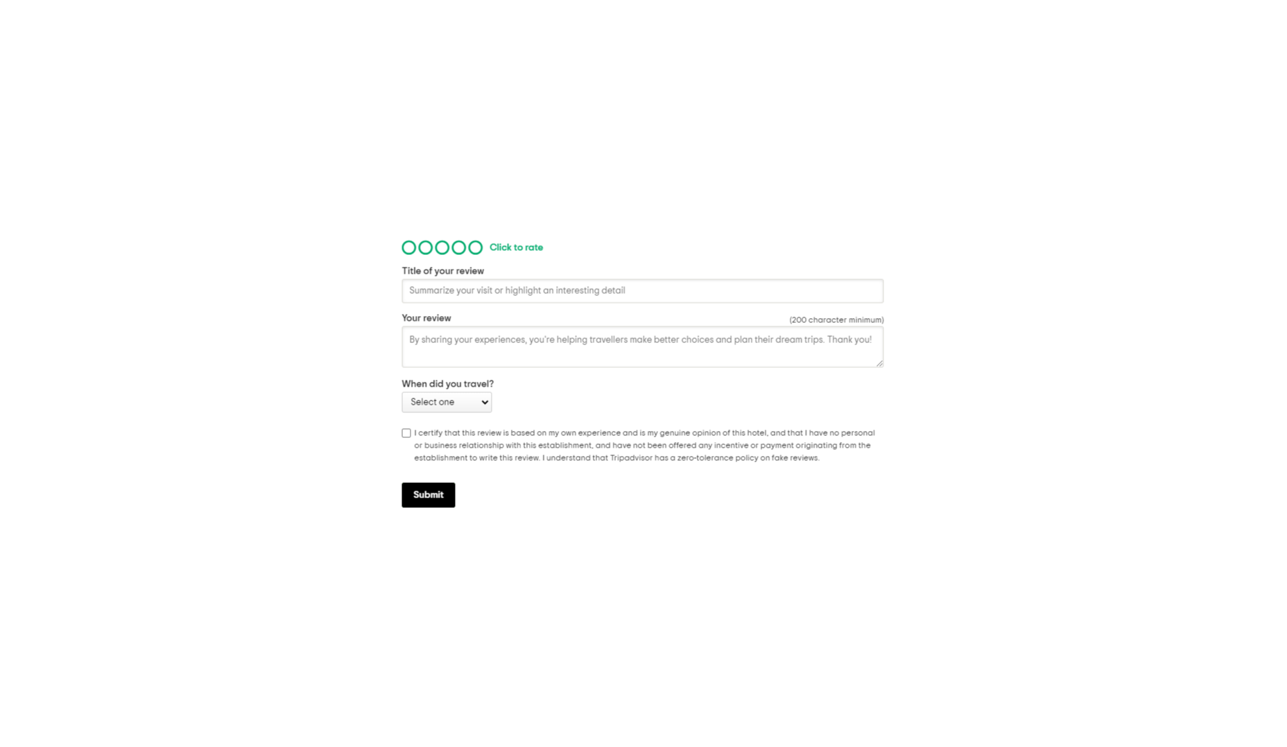
Reviews and testimonials can also help you better understand your audience and the kind of solutions they’re looking for with your brand. 

Solid feedback is also how you improve your chances of gaining more customers in the long term. Brands with superior customer service generate about 5.7 times more revenue than their competitors. 

Of course, before you can begin tackling challenges like pulling trends from feedback or using your reviews to upgrade your business, you have one essential task to consider: How are you going to collect the valuable information your customers have to share?

There are a lot of options to choose from. You can reach out to clients individually with email messages or set up a feedback form on your website. You could even consider working with a review site to give your audience more options. 

Today, we will look at the steps you can take to collect customer feedback the right way.

Unlocking the Benefits of Customer Feedback

Customer feedback is the information and input shared by your community. It provides a behind-the-scenes view of people’s interactions with your team and shows you where you need to focus on beginning driving new opportunities. 

Customer feedback becomes a guiding compass for your organization when used correctly. It shows you what you’re getting right and wrong from your customer’s perspective. Positive feedback can even become part of your marketing campaigns. User-generated content in the form of reviews and testimonials makes for excellent tools to encourage new people to purchase your products. 

Case studies and in-depth reviews from your clients can also help generate trust among potential customers, so you’re more likely to earn crucial sales. 

Only around 3% of customers say that they find marketers and salespeople “trustworthy.” This means that no matter how good your marketing messages might be, you’re only going to be able to accomplish so much with the claims you make about your brand. Ultimately, your clients will turn to other customers like them to determine who they should buy from.

On average, buyers read around seven reviews before they’ll even consider trusting a business. 

The good news is that around two-thirds of customers will share their personal information with a brand. Clients are happy to provide feedback in the right circumstances. It’s your job to ensure that the process is as easy as possible for your customers.

So, how do you get customer reviews?

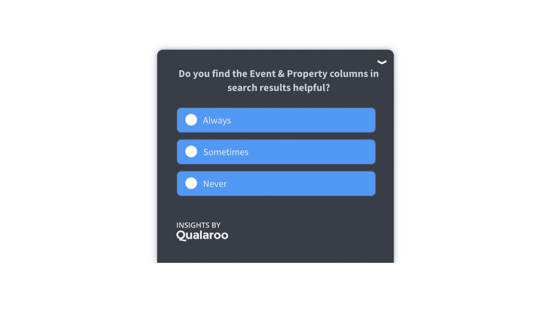
1. Design an Effective Feedback Survey

The most obvious way to encourage feedback from your customers is to ask for it. Unfortunately, designing a good customer survey isn’t always as simple as it seems. 

On the one hand, you’re keen to gather as much information as possible from your customer, which could mean that you want to ask many questions. On the other hand, asking too many questions could easily scare your audience away. 

To improve your audience’s chances of actually sharing information, keep the feedback requests as simple as possible.

One or two questions at a time should be enough to give you some helpful information about customer preferences and expectations. When choosing what to include in your survey, remember:

  • Only ask essential questions: If the answer to a question isn’t going to help you achieve your goals, don’t ask it. You don’t need to know someone’s age if you want to know if they had a good experience with your service reps. Keep it relevant. 
  • Make the questions thoughtful: Yes or no questions are great for collecting quick information. However, if you want more valuable feedback, leave your queries open-ended, and give customers room to explain themselves. 
  • Use rating scales: If your customer doesn’t have time to respond to a question in your survey with a complete answer, a rating scale can give you some helpful insights with minimal effort from the client. 

Ensure none of the questions on your survey are leading or loaded. Customers don’t want to feel like you’re answering questions for them. It might also be worth showing your audience how much you value their data with a quick response. Hilton Hotels always responds to any adverse reactions to surveys within days of receiving the information. 

Customers can even see how their reviews contribute to the overall rating of the business. 

2. Master Your Emails and Customer Contact Forms

Email is one of the easiest and most effective ways to gather customer feedback. Because this is a standard support channel for most businesses, there are plenty of opportunities to generate feedback. 

The first step in using emails for feedback is to send a message thanking your customer for their recent interaction with you. If someone purchased a product from your company, immediately follow up to let them know you appreciate their custom. A couple of days after, when your customer has had a chance to use your product or service, that’s when you follow up with your feedback request. 

Ideally, your email request should be as short and straightforward as possible, with a clear call to action that tells your customer what to do next. This example from Papier keeps things as detailed as possible.

If you want to boost your chances of engagement, you can add elements to your email that might encourage a positive response, for instance:

  • Remind them of what they bought: Remind your customer of the item they purchased with a picture and a bit of information. Highlight the key features and benefits of that product, so they have some inspiration on what to write about in their review. 
  • Offer them a reward: If you want to boost your chances of your customers doing something for you, you need to offer something in return. This could be a discount on their next order, a chance of winning something, or even just free shipping on their next purchase. 
  • Personalize the message: Make your customer feel special by personalizing the message. Use their name and reference their previous interactions with your company. If they’ve been with your business for a while, mention that in the email.  

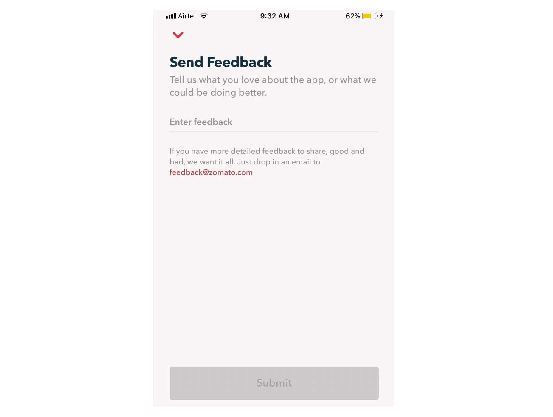
Remember, many of your customers are likely to check their emails on the go. That means that giving feedback should be as simple as possible, regardless of the tech your customer is using. For instance, in this Zomato example, users can choose to drop an email to the company or send feedback straight from the app. 

3. Create App Usability Tests

If you want some in-depth insights into your company, and your business processes, then a usability test could be the best way to generate valuable feedback. If you have your app, ask your customer to submit some information right there and then, after they’ve finished using the service. The great thing about this kind of input is it’s fresh.

Unlike other customer reviews that might come a day or two after your customer has used a product, usability tests allow you to get feedback at the moment. There’s a much better chance that you’re going to get some relevant and detailed responses here. 

For instance, in this Skype lab feedback request, customers can tick boxes for any video or audio issues they had and leave a starred review. 

If there’s extra information to share, the customer can tap on the comment box to elaborate. However, they don’t need to do this part unless they want to. 

With usability tests, it’s a good idea to focus on a few key things that you want to learn about. For instance, Skype’s example above demonstrates that the company wants to check at least five user experience issues for both video and audio. 

Giving your customers options that they can choose from reduces the amount of work they need to put into leaving a review. It also means that you can get actionable information on which parts of your app or site need the most improvement. 

You can get the same kind of instant feedback on your website, too, mainly if you’re using a live chat app for customer service. 

Live chat is quickly becoming an essential part of the customer experience environment because it’s fast, easy to use, and efficient. It’s also highly affordable for most companies, thanks to evolving technology. Set up your Live Chat app to immediately request a review from your customer when the interaction is over.

For instance, SiteGround asks customers to rate their service provider with a picture of the employee they spoke to. The image lets the customer see that they were talking to a real person, which improves the relationship with the company. The statement about feedback improving the customer service and support that SiteGround can offer shows the customer how valuable their reviews are. 

4. Conduct Customer Interviews

Conducting a customer interview is a lot like sending out a survey. The main difference is that you ask the client to engage in a much more in-depth conversation. Usually, these interviews will be the initial research required for a published case study on a B2B website. 

Reaching out to valuable and loyal customers can give you a fantastic source of in-depth information to learn from. You’ll need to make sure that you have a good relationship with the customer in question before you attempt this, however. Most one-time clients won’t want to get involved with a time-consuming interview. 

Look at your CRM technology and find out who your most impressive VIP customers are. Reach out to them with a request for feedback, and make sure you offer something in return. For instance, tell them that you’d like to interview for a case study that you can display on your website. If they’re happy for you to do this, you can reward them with a discount on their next purchase or some gifts. 

You could also follow up with a customer who recently contacted your team for an interview, like Ticket Arena does here. With this message, they promise the customer that their insights will make the customer experience better for future clients:

When requesting long-form qualitative feedback, remember to think through your questions carefully. In-depth stories from customers bring nuance and color to your quantitative data. They could even guide your business to making some crucial future decisions. 

When talking to your customers:

  • Start with an open-ended dialogue: Remember that open-ended questions are crucial to get as much detail as possible from your customers. These queries give your customers more flexibility to cover the details of their experiences.
  • Get more specific as you go: Start with simple questions, then build on them as your conversation evolves. Use the things you learn from your customers to dive into topics that are relevant to them. For instance, if a customer mentions your live chat app, go into a deeper discussion about the channels they prefer to use. 
  • Practice active listening: Make sure that you’re open and receptive to the information you’re given. Actively listen to customers, even if you’re not in the same room, by acknowledging what they say and providing valuable responses. 

5. Use Social Media

Sometimes, people are reluctant to give feedback for your business on your website because they’re not in the frame of mind. When customers come to your site, there’s a good chance they’re looking for information from you or want to check out a new product. 

They’re probably not in the right mood to start sharing their opinions. 

However, if you capture your customers on social media, there’s a good chance they’ll be feeling a lot more talkative. After all, social media platforms are where most customers discuss their issues with companies, talk about purchases with friends, and make their voices heard. 

Simply paying attention to when people talk about your company on social media can give you a lot of helpful feedback. Social listening tools allow you to collect post information every time someone mentions your business name or product. 

Alternatively, you can actively use the tools on social media to gather data from customers. For instance, Instagram has its own “poll” feature on Stories that allows companies to collect opinions. 

If you’re collecting feedback on social media, remember that you shouldn’t be asking any questions that are too complicated. Although people are more willing to share their opinions on social, they’re still looking for a relatively laid-back and casual experience.

Polls, where people can vote for their preferences with a single click, are more likely to garner engagement than a post asking people to tell you about the best purchasing experience they ever had with your brand. 

If you do want to encourage more in-depth feedback, the best option is to promise a reward in return for your follower’s effort. 

Make the experience fun by transforming it into a competition. 

For instance, ask your customers to share their favorite story involving your brand for a chance to win an impressive prize. You can ask each customer to tag their response with a branded hashtag so that relevant answers are easier to find. You could even add users to tag their friends in their posts too, to increase brand reach while you collect feedback:

With gifts and rewards to incentivize them, people will be much more likely to interact with your brand and put effort into the reviews they leave. You could even gather some user-generated content to put into your subsequent ad campaigns. 

6. Create a Dedicated Website Page

Finally, if you want to make it as simple as possible for people to leave feedback on your website and for you to collect all of that information into one space, then create a review page on your website. This can double up as social proof for people who need additional evidence to buy from your brand. 

A review page could be as simple as a page on your website listing the latest comments that your customers have left. You can include a form at the bottom of the page where people can add their thoughts. Just make sure that you carefully review these posts before they’re submitted to your website if you want to prevent spam from getting through. 

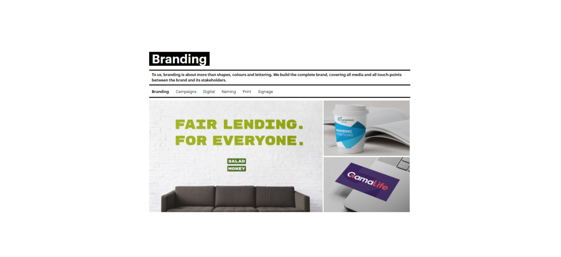
You could also create a case study or portfolio page that showcases the work you’ve done with other companies like Fabrik Brands does here:

At the bottom of each case study, give your customers a unique email address they can reach out to if they want to be featured as your following case study. Or include a contact form where people can get in touch to discuss their own experiences. 

Having a dedicated review, case study, or testimonial page on your website could be enough to inspire more feedback from your customers. It’s also a fantastic way to demonstrate how credible your company is to potential buyers. 

Still, Struggling? Take the Customer Out of the Equation

If, even with all the suggestions above, you still can’t seem to convince your audience to give you some decent feedback, then take them out of the equation. You can learn things about your audience without asking them for information. Google Analytics and other tools will give you valuable insights into which of your blog pages get the most engagement and how many people click on individual buttons throughout your site. 

These fundamental insights might not be as good as valuable, contextual feedback from your audience, but they’re an excellent way to start figuring out how to invest in your future growth. 

Remember, feedback of any kind – even if it’s just statistics and numbers – gives your business the ability to grow and make informed decisions.

Gather as much feedback as you can, and make sure you use it!


Featured image via Pexels.

Source

The post 6 Tips for Collecting Customer Feedback (The Right Way) first appeared on Webdesigner Depot.


Source de l’article sur Webdesignerdepot

Not so long ago, customers only had a couple of ways to interact with brands. 

If you had an issue with a product or service, you could reach out through the customer service phone number or send an email. Occasionally, sites would introduce dedicated forms on their website that allowed consumers to send support tickets straight to the service desk – but that was it.

The problem with this kind of service was all the waiting. 

Send an email or ticket, and you have no idea when the company is going to get back to you. Customers end up refreshing their inbox all day, waiting for a response. Call the company, and 9 times out of 10, you’ll be placed on hold. You can’t exactly do much when you’re stuck listening to hold music, so customers are gradually getting more frustrated as they wait for a response. 

Fortunately, the evolving digital age has introduced a new solution: live chat.

Transforming Your CX With Live Chat

Live chat is a quick and convenient way for your customers to contact your business and get a response immediately. The result is happier clients, better customer satisfaction scores, and even opportunities for bigger sales. 

More than 41% of customers say they expect to see live chat on a site. 

Even if you don’t have an agent on hand to answer a chat message immediately, you can create an automated system that notifies your customer when someone is available. That means they can go and do other things while they’re waiting for a response. Live chat solutions with bots can even allow your customers to fix problems for themselves. That’s pretty convenient!

Widgets equipped with answers to commonly asked questions can automatically deal with customer queries or help them find solutions to their problems before passing them over to an agent. This means that your customer gets a solution faster, and your agents don’t have as much pressure to deal with. It’s a win-win – as long as you get it right. 

Unfortunately, a lot of companies don’t know how to implement live chat experiences correctly. 

Kayako’s study into 400 customers found that 47% couldn’t remember the last time they’d had a positive experience through a live chat tool.  

How to Upgrade Live Chat CX

The evidence shows that customers love the idea of live chat, but the reality of how businesses implement this technology isn’t always ideal. 

However, since 86% of customers say they’re willing to spend more on a better customer experience, it’s worth figuring out what separates a good live chat interaction from a bad one. 

1. Set Expectations Instantly

Setting the right expectations is crucial if you want to generate better satisfaction for your customers at a later date. When customers know what to expect from your live chat strategy, they can also make more informed decisions about which support channels they’re going to use, and whether they want to hang around for someone to answer their messages. 

The first thing you should do is showcase your agent’s availability. In this example from Help Scout, you can see whether the team is active, online, and ready to talk. The company also sets expectations for how quickly you can get an email response if you don’t want to chat.

Other ways to set expectations include:

  • Showing your opening hours: List when team members are usually available to answer questions if you’re not currently online. 
  • Topics: Offer your customers some topics that they can ask about or use the welcome message on your chat tool to direct your customers to an FAQ page. 
  • Restrictions: If there’s anything you can’t deal with over live chat, like changing a customer’s password, let them know in advance so they don’t waste time.

2. Leverage Pre-Chat Forms

Pre-chat forms are some of the most important parts of the live chat experience. They ask your customer to explain their issue to your chatbot so that they can be directed towards the right agent. Using these forms correctly ensures that your agent has all the information they need to solve a problem fast. 

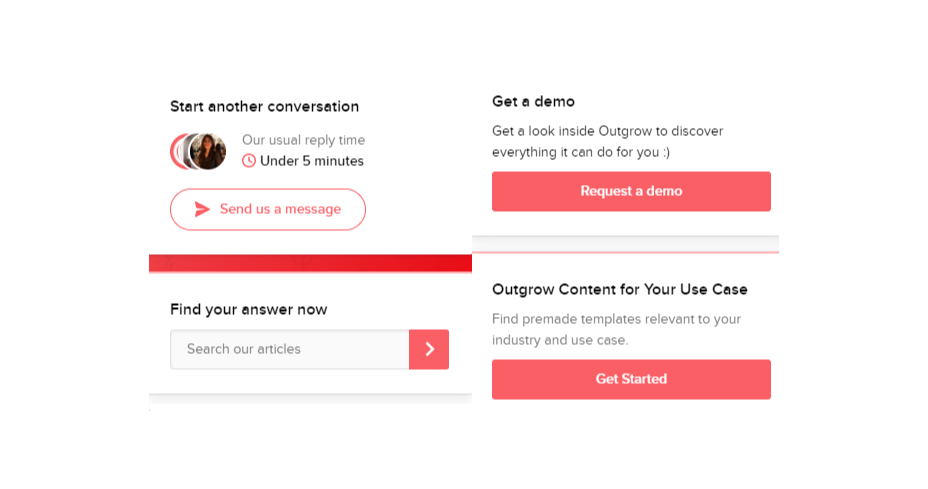
You can even set up automated systems that direct customers to different agents and teams based on their needs. For instance, the live chat app on Outgrow.co gives customers the option to fill out different forms depending on whether they want answers to a question, a demo, or something else.

The button you click on dictates which professional you’ll get through to. Although filling out a form can seem like an extra friction point for your customer at first, it helps to streamline the customer journey. After all, if you can direct the customer to the right agent the first time, there are fewer chances that they’ll need to explain their issue to various different people. 

Here are a few things you can ask for in the live chat form to make it more effective:

  • The customer’s name: This will help to personalize the conversation. It could also be an opportunity to track down any background information you have about an existing customer and the orders that they may want to speak to you about.
  • An email address: Having an email address will allow you to bring up a customer’s record on your CRM. It also means that you can send any information that the customer needs to their email inbox at the end of the conversation.
  • A brief explanation: Ask your customers to share what they’re reaching out to you about and use keywords in their message to assign the chat to the right agent or professional. You could even add a drop-down menu of topics for them to choose from. 

Remember, don’t ask for too much information straight away, or you’ll risk your clients feeling that the service experience is too complicated. 

3. Make Sure It Works Everywhere

We’ve reached the point now where every customer expects a brand’s website to be responsive on any device. Most web-building templates automatically work on mobile tablets and smartphones. Additionally, it’s becoming increasingly easy for companies to transform their website and online store experiences into dedicated apps too. 

However, while most businesses know that their site needs to be responsive, they often forget about the mobile element when it comes to live chat. If your live chat function is only available on the web browser version of your website, then this is going to end up making your mobile customers pretty unhappy. They don’t want to have to stop browsing on their phone just to connect with you. 

Ideally, you’ll want to create a separate component for your mobile app where your customers can easily access the same live chat functions they’d have on your browser-based site.

If you’re just offering live chat through a mobile version of your website, make sure that it’s easy for your customer to click into the chat section and send messages without accidentally ending up on a different tab or page. It might also be worth setting up functions that allow your chat app to send push notifications to your customer’s phone whenever they get a new message. 

Being able to put their smartphone down or switch to another app while they wait for a response will provide a much more intuitive experience for your audience. 

4. Make Sure You Support All the Right Languages

You’d think that this CX tip for live chat would be obvious, but it’s shocking how many companies fail to offer support for all the languages that their customers might use. If you’re selling your products throughout the world, and you know you have customers in China, then it doesn’t make much sense to only offer live chat in English. 

Some of the available live chat apps on the market today come with features that allow you to automatically translate languages when your agents are talking to foreign customers. For instance, LiveChat currently supports 45 languages

If you’re creating your own chat app from scratch, then you’re going to need to work with your developer or designer to make sure that the right languages are supported. Remember, you don’t have to cover everything, but at least make sure that you can connect with the most common groups of customers in your CRM. 

Ensure that if you are using multiple languages, your customers know how to switch to their preferred option too. Usually, the best way to do this is with a drop-down menu. You could also use little flag icons of the countries that you support. 

5. Find Ways to Reduce First Response Time

Speed is probably one of the biggest advantages of live chat, and the main reason that customers like it so much. According to the CMO council, fast response time is the number one thing that a customer looks at when measuring satisfaction. 

While you might not be able to have someone on-hand to answer your customers 24/7, you can improve the way they perceive your load times in a variety of ways. For instance, start by making it clear when your people are online to talk to your customers. Setting expectations on when you’ll be available to immediately respond should help to avoid frustration.

  • Keep all chats in the same place for agents: Having a combined contact center solution on the back-end makes responding to queries much easier for your agents. If they can see all of your brand’s live chat, social, and email conversations in one place, they don’t have to waste time jumping between different platforms and tabs. 
  • Set routing queues: Use an automated system to send every message you get to the most appropriate agent available. You can intelligently route conversations based on the issues that your customers have or the things they want to discuss. It’s also worth ensuring that your system prioritizes routing conversations to the first agent available. 
  • Send notifications: Make sure that you set your live chat system up to send push notifications to agents when a new message is waiting. It’s also with notifying your customer when they have a response, just in case they’ve switched to another tab. 

The notifications you send to your agents could come with access to a customer’s CRM file, so that your agent can go into a conversation with the context they need. Agents that instantly get context on a conversation don’t have to waste as much time tracking down the right information. Giving your agents context also means that they don’t have to ask repetitive questions, which could annoy your customer. 

6. Make the Chat Experience On-Brand

Every company wants to give their customer a slick experience with live chat. The solution you build needs to be easy to use, and responsive across every device. However, it also needs to be something that your customer associates with your brand. 

Companies generally have a lot of options for how a live chat window can look. You can adjust the appearance to suit your brand by picking specific colors, tweaking button shapes, and even changing the available fonts. 

Working the visual elements of your brand into the design of the live chat experience is the best way to make your customers feel comfortable and confident that they’re dealing with your company. For instance, Hubspot uses matching colors, rounded edges on chat bubbles, and even a fun illustration to make their chat experience more “branded.”

Remember, when you’re creating a Live Chat experience that’s “on brand”, it’s also a good idea to think about things like voice and tone. Infusing live chat with the unique personality of your brand will make the experience more memorable. 

If you usually stick with informal language and use a lot of slang, then it makes sense to continue that in live chat – even when you’re sending automated messages. To make sure your brand identity really shines through:

  • Write scripts for your automated messages in your brand’s tone of voice
  • Write guidance scripts for employees that highlight your tone for agents
  • Provide training on brand tone of voice for your support team
  • Encourage support agents to connect with customers on a personal level
  • Remember to set guidelines on how to use things like gifs, slang, and emojis too!

7. Make a Checklist For Security and Tech Issues

One of the most significant things that will affect the experience your customer has with your live chat service, is technical and security issues. Choose the right developer or designer to help with your app, and the risk of problems dwindle. You can also address the issue of having to constantly maintain, check, and update your live chat experience by using a pre-existing solution, like Intercom.

No matter how you choose to approach live chat, these are the things you’ll need to check for most:

  • Page load times: Page load times are crucial for user experience and SEO, so you should be taking them seriously already. Check your web chat software isn’t dragging down the performance of your page or causing unnecessary problems.
  • Cross-channel conversations: If your website has various subdomains, make sure that moving through these in chat won’t mean you lose the session. Customers don’t want to have to repeat themselves!
  • Functionality with browsers: Your chat app needs to work just as well on every browser and operating system – including mobile devices. 
  • Data management: Under things like GDPR, you need to ensure that you’re controlling user information safely. Ensure you have a DPA in place, and make sure that your web channel doesn’t affect any PCI-DSS compliance systems you have in place. Your chat solution may need to automatically mask credit card information, for instance.

Time to Enhance Your Live Chat Strategy

Ultimately, whether you like it or not, your customers love live chat technology, and they’re not going to stop looking for it on your website. Today’s consumers expect you to serve their interests by delivering customer support on the channels that they choose. Unfortunately, most companies just aren’t living up to expectations.

Following the tips above could help you to transform the way that you interact with your clients and improve your chances of better satisfaction overall.

Source

The post 7 Tips for Transforming CX with Live Chat first appeared on Webdesigner Depot.


Source de l’article sur Webdesignerdepot