Articles

Inclusive design is often mistaken for accessibility, or even used as an interchangeable term, which is a good indication that most designers don’t know what it means.

Accessibility is a process that seeks to mitigate issues in a design that is not sufficiently universal; inclusive design increases the universality of the design. In real-world terms, an accessible building may replace its front steps with a ramp; an inclusive building is constructed at the same level as the sidewalk.

Accessibility is concerned with objective, measurable improvements. It’s a UI concern. Inclusive design is subjective, more difficult to measure, and is a UX concern. By designing inclusively, we extend our designs to the widest possible user group and contribute to a better society. Here are three ways to get started.

1. You’re the Edge Case

When designing, it’s normal to assume that we are normal. After all, we are the center of our experience of the world. Everything from our preferences to our empathy stems from our individual place in time and space.

When we use the term “edge case,” what we’re referring to is a minority experience, a way of using our design that is uncommon or distinct from our own expectations.

But what would happen if we treat ourselves as the edge case? What if all of the experiences that we deem to be minority experiences are actually the core, common user experience of our design?

If we start from the position that we are the one out-of-step with the design, that most people will not think or act as we do, then we’re eliminating thousands of biased decisions about how our design should be.

Draw From Life

It has always surprised me that in Europe’s dark ages — ranging from the decline of the Roman empire to the Proto-Renaissance — it didn’t occur to anyone to draw from life. Artists drew things the way they thought they should look, which is why so many Byzantine icons of the infant Jesus look like a middle-aged blonde man that has been shrunk.

It’s important to draw from real life as much as possible. That means abandoning personas — which are by definition under-representative and frequently loaded with bias — and engaging with actual users. Most of all, it means taking a step back and opening your eyes.

2. Stop Making Inclusive Design Part of Your Practice

Inclusive design cannot be a part of your practice; it’s an all-encompassing attitude. Your design practice must be inclusive. At least, it should aspire to be…

As human beings, we are biased—all of us. The reason for that is that bias — be it racism, misogyny, nationalism, homophobia, or anything else — is cultural. And we all exist within society. We’re all bombarded with information that reinforces those biases every day.

Accept that you have biases and that your biases will pull your design work away from the inclusive solution you aspire to. But equally, accept that by acknowledging your biases you’re limiting the influence they have over your decision-making.

Do Not Require Users to Self-Identify

It’s divisive and abusive to partition users into groups, especially when the act of doing so perpetuates bias.

One of the most encouraging developments of the last decade has been the introduction of the answer “prefer not to say” in response to personal questions about race, gender, status, and so forth. But if “prefer not to say” is a valid option, in other words if you don’t actually need to know, then why ask at all?

Beware Occam’s Razor

Occam’s Razor is an often misquoted idea that (to paraphrase) states that when making a decision, the one with the least assumptions is the correct choice.

The problem is that Occam’s Razor implies that there is a ‘correct’ decision. But in fact, inclusive design benefits most from a flexible UI and a high tolerance for deviation.

If you can identify the assumptions in a design decision sufficiently to count them, then you’re best served by testing, not comparing, those assumptions.

3. Design Flexibility Into Everything

There is no such thing as a “natural normal,” but there is “perceived normal.” Much of our behavior is governed by the experiences we’ve had since we were very young. Despite existing somewhere on a scale of ability and preference, most of us have inched towards what we have been told is a “normal” range all our lives.

However, it is a physiological fact that every characteristic exists somewhere on a spectrum. There are no black and whites; it’s all grey.

When we design a site or app, we tend to silo certain characteristics into one. Someone who is visually impaired is treated to the same ‘solution’ as someone who is blind, even though visual impairment can range from screen reflections on a sunny day to someone who was born without optic nerves.

There are people who have lost their sight through degeneration or accident and will be able to make visual connections based on remembered visuals. Other people have never seen anything and their conscious mental process isn’t figurative at all.

To accommodate the full gamut of possible interactions with our design, we need to design to a scale, not with absolute values. This means thinking less about set colors and sizes and more in terms of contrast and scale.

Avoid Communicating in Color

Few areas are more indicative of a spectrum of experiences than color.

Color is instantly problematic for designers because quite apart from color blindness, color has deeply personal associations.

Over the last couple of decades, it’s been repeatedly proven that it is contrast, not hue, that increases engagement. Green does not always mean go; red does not always mean stop.

Color involves so many biases and assumptions that it’s simply better to work with contrast than select the ‘right’ hue.

Bigger Typography (Sometimes)

In the first draft of this article, I wrote that increasing the scale of your typography was always good.

My rationale was that some users will benefit from larger type, and zero users will be hindered by it. But that’s not true. Larger type means fewer lines per viewport, which means more scrolling; not a problem for some users, but potentially an issue for those with motor control issues.

That was one of my biases right there.

Congratulations, You’re Now An Inclusive Designer

Good design is self-aware in origin and unselfconscious in execution.

Inclusive design isn’t about enabling access for everyone; it’s about designing for a user experience that is welcoming and respectful. Every one of your users should feel not just enabled but validated.

Inclusive design isn’t a series of items on a checklist; it’s an ideal, like harmony or beauty, that we may struggle to achieve but that we should strive for nonetheless.


Image via Pexels.

Source

The post 3 Ways to Design More Inclusively first appeared on Webdesigner Depot.


Source de l’article sur Webdesignerdepot

Every designer has their own preferred strategy for collecting resources. Some pluck brushes, fonts, and templates from different “stock photo sites” and public marketplaces. Others collect graphics from swipe files and forums around the web.

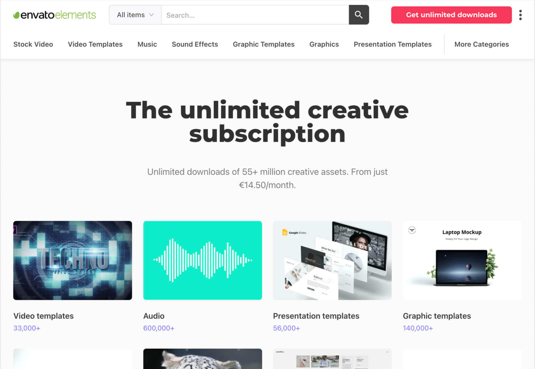
The never-ending desire for themes, visual content, and graphical components has prompted an influx of “design packages” to appear around the web. These all-in-one bundles, ranging from Envato Elements to Elegant Themes, promise a selection of valuable creative content in exchange for a single fee or monthly subscription. 

If you’ve been planning to seek out a few of these high-value subscriptions yourself, you’re in the right place! Today, we’re going to talk about some of the top designer resources available on the market. 

1. Envato Elements

Probably the best-known of all the designer resource marketplaces, Envato Elements advertises itself as the unlimited creative subscription. On this website, you’ll be able to access around 54 million creative assets through a single subscription. There are endless resources to unlock here, ranging from templates for your graphics to video templates, audio, and stock photos. 

Unlike most marketplaces, Envato gives you peace of mind by promising only the highest quality designs and graphics. Your content comes with quality assurance, and there are many PSD elements on the site, too, including stationery and web design templates, mock-ups, and more. Categories for your creative content include:

  • Stock photos
  • Video templates
  • Music
  • Sound effects
  • Graphic templates
  • Graphic designs
  • Presentation templates
  • Fonts
  • Photos
  • Web templates
  • Add-ons
  • CMS templates
  • WordPress resources
  • 3D content

Pricing: Pricing starts at only $16.50 per month, and this gives you unlimited access to everything on the site, including millions of digital assets and stock photos. You’ll also be able to use various courses and tutorials on the website too.

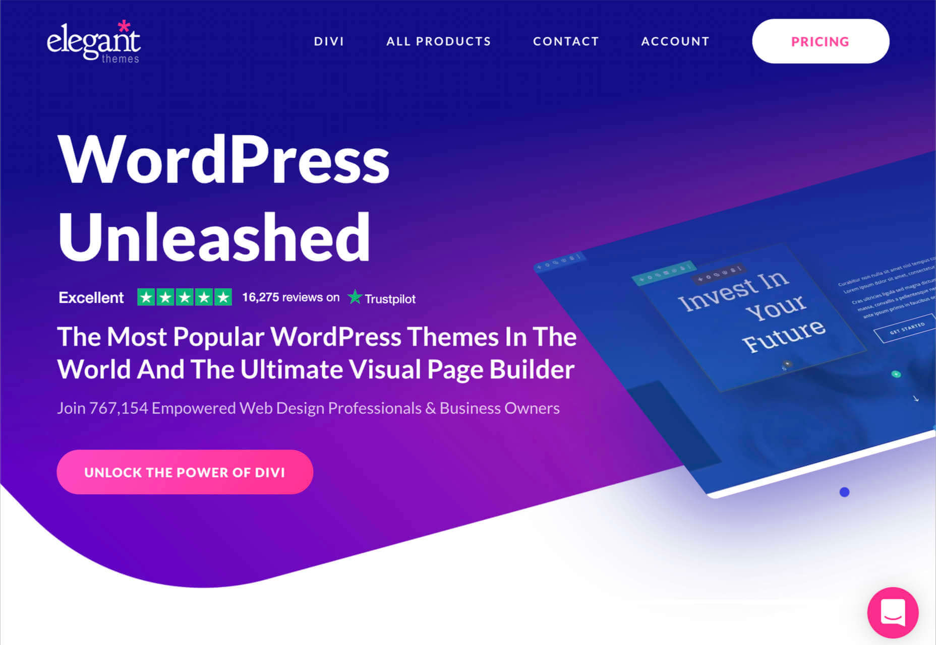
2. Elegant Themes

Elegant Themes is an all-in-one creative resource for website themes. The solution offers you access to some of the most popular WordPress themes worldwide. 

You’ll also get access to a visual page builder as part of the kit. When you sign up for the Elegant Themes subscription, you get access to all of the resources within, including the Divi page builder and WordPress theme, Extra, Monarch, Bloom, and more. If you’re a site builder or work on building pages for clients, this is a must-have subscription. 

Elegant themes are currently the go-to resource for more than 750,000 people. It’s also home to some of the highest-rated themes around. Features include:

  • Divi WordPress page builder
  • Endless WordPress themes
  • Page editing tools
  • Monarch, Bloom, and Extra 
  • Hundreds of website packs
  • Lifetime premium support
  • Unlimited website usage

You can either pay for yearly access with Elegant Themes or pay a one-off price for lifetime access. For most, the lifetime option is likely to be a pretty appealing one. You don’t have to worry about renewing your subscription this way.

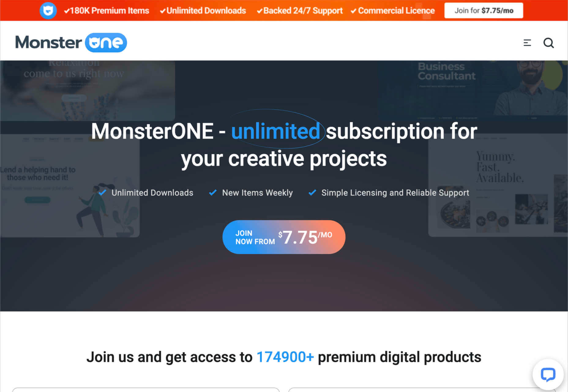
3. Template Monster

Template Monster offers the “ONE” web development membership, perfect for creative professionals. The MonsterONE offering is a complete unlimited subscription for all of your creative needs, with access to unlimited downloads, new weekly items, and simple licensing. You also get plenty of support from the Template Monster Team. 

A goldmine for anyone who needs to upgrade their selection of video and photo assets, graphic templates, HTML templates, or anything else, Template Monster is packed full of amazing resources for any project. You can also find new products from fresh contributors all the time, so the value of your membership is constantly increasing. 

Features include:

  • HTML templates
  • Presentation templates
  • CMS templates
  • Graphic templates
  • Video assets
  • 3D models
  • Audio assets
  • WordPress themes and plugins

Pricing starts at a tiny $6.90 per month, with a slight discount if you pay yearly. The lowest-cost package gives you access to all of your graphic and design assets, but you won’t get any eCommerce or WordPress themes. However, if you upgrade to the all-in-one package at $14.95 per month, you get a more extensive range of resources.

4. Creative Market

Creative Market is another one of those amazing all-in-one environments for creatives and designers. This marketplace is supplied by thousands of independent artists from around the globe, each offering a host of top-quality designs and resources. You’ll find photos, graphics, templates, fonts, web themes, and countless other tools on the Creative Market. 

If you’re looking for sheer size, it’s hard to find another company that competes with the Creative Market package. There are literally millions of ready-to-use products available, including Instagram templates, textures, and procreate brushes. 

You’ll have access to 3D content for your immersive website designs and a host of purchasing products. Although there’s no “subscription model” per-se for this marketplace, you can invest in a credit plan that allows you to set how much you spend on your assets each month. 

Features include:

  • Millions of creative products
  • Huge selection of independent designers
  • Brushes, textures, templates 
  • Fonts and web content available
  • Huge selection of stock photos
  • Convenient credit plan

The individual purchasing plan is likely to appeal more to people just beginning to test Creative Market for the first time. However, if you want a subscription experience, we’d recommend using the credit plan to estimate how many credits you’ll need each month.

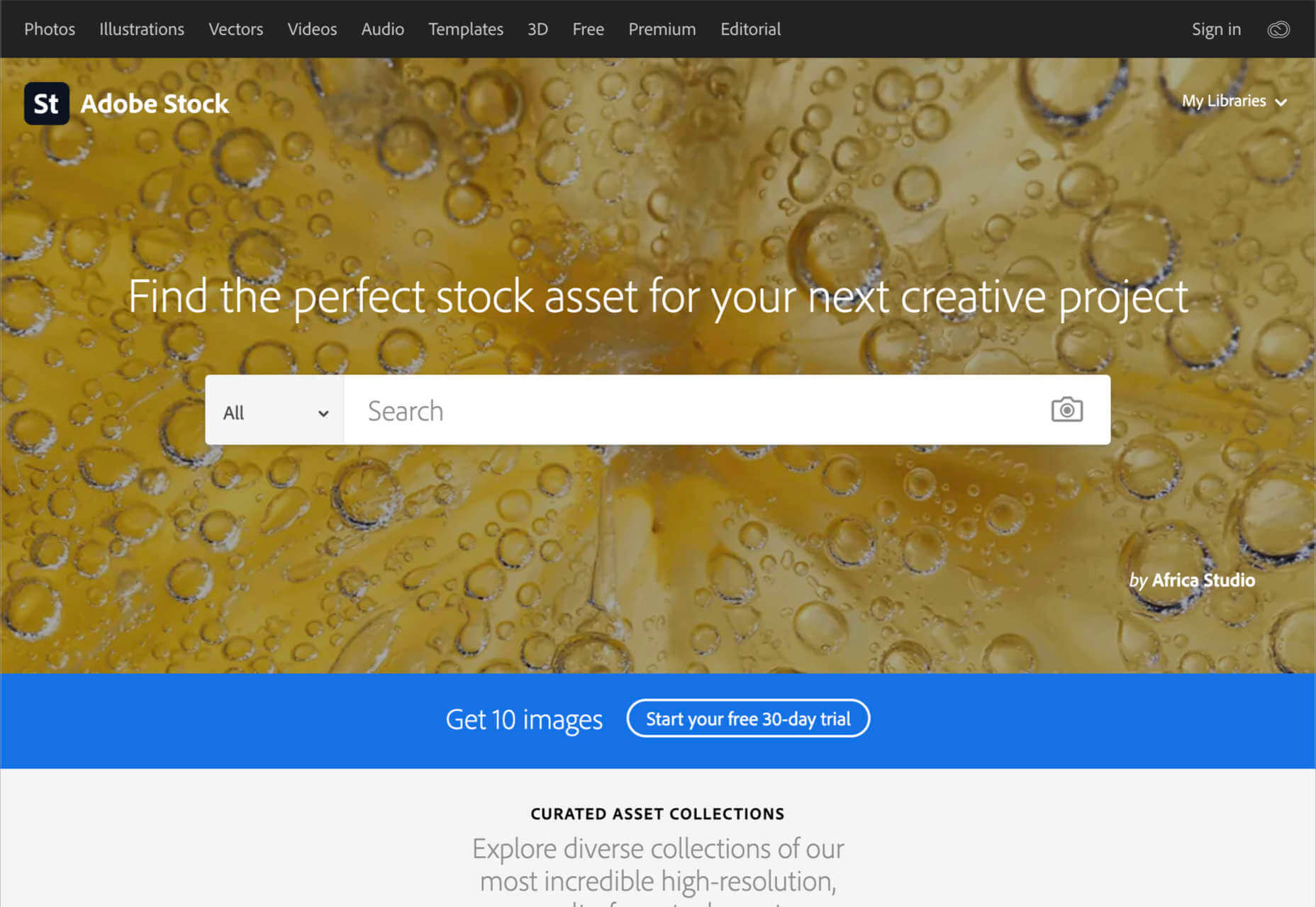
5. Adobe Stock

All web designers know Adobe. The chances are that no matter what kind of creative work you do, you’ve developed a few skills with an Adobe product, from Photoshop to Lightroom. Adobe Stock is also one of the leading platforms for images on any topic. 

Although Adobe Stock doesn’t compete with other marketplaces in terms of versatility, it still stands out as one of the main resources for designers. There are hundreds of millions of stock images, videos, editorial content, and vectors. You can also access a premium collection of custom content and 3D resources too. The great thing about Adobe stock is that you can easily create your own libraries and download content into your Adobe software. Resources include:

  • Stock photos
  • Premium images
  • 3D content
  • Vectors and brushes
  • Stock video footage
  • Royalty-free templates
  • Vector art and illustrations
  • Stock music and audio
  • Integration with Adobe software

Adobe Stock is a little pricier than some of the other marketplaces available today, but it’s still pretty impressive. You’ll pay around $29.99 per month for 10 assets per month, or you can access a full annual plan at $199.99 per month. The amount you pay will depend on the quality of the resources that you want to download.

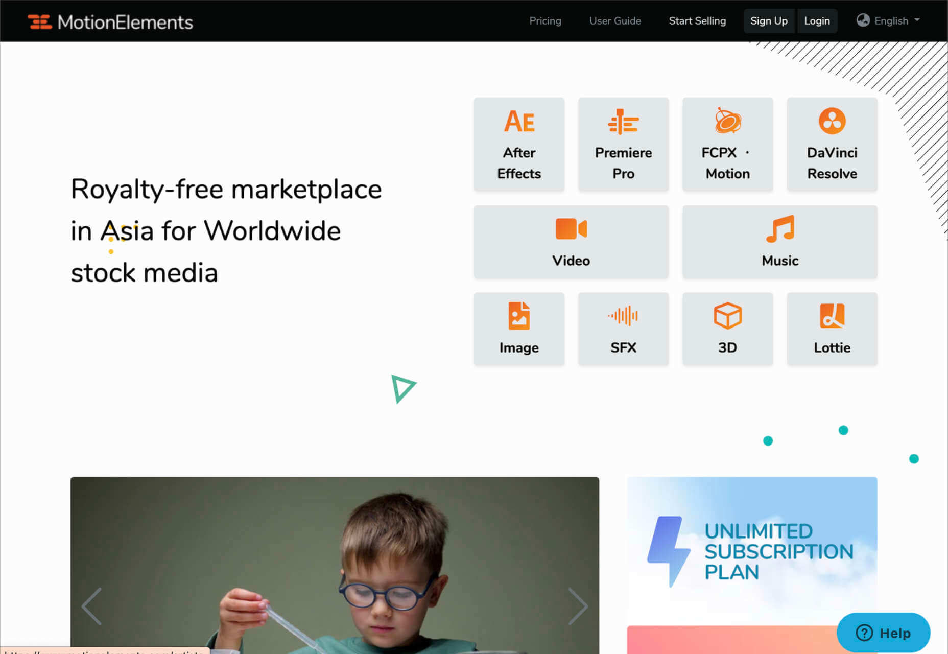
6. Motion Elements

If Elegant Themes is the go-to resource for designers searching for WordPress themes and web design solutions, Motion Elements is the top choice for “motion” content. Here, you’ll find videos, SFX content, images, music, 3D solutions, and so much more. 

Though it’s located in Asia, Motion Elements is available worldwide. The marketplace offers a monthly subscription plan wherever you can download unlimited products to suit your needs. There are tons of resources to choose from here, including After Effects elements, tools for Lottie, Premiere Pro, FCPX motion, DaVinci Resolve, and more. 

Features include:

  • After Effects elements
  • Premier Pro resources
  • FCPX Motion
  • DaVinci Resolve
  • Video and audio content
  • Stock images
  • SFX resources
  • 3D content

Pricing starts at $16.50 per month for an unlimited annual plan. This means that you can download as much as you like without having to pay any more. There is a small discount if you pay for a full year of access in one go.

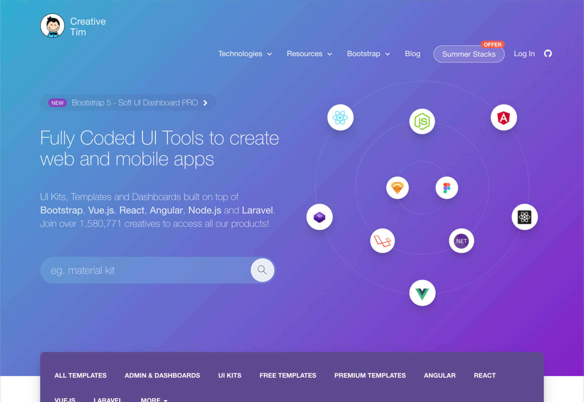
7. Creative Tim

Simple but effective, Creative Tim is an amazing resource for front-end and back-end content bundles. You get fully coded UI tools here that can help you create various mobile and web apps and a huge selection of dashboards and templates. If you’re the kind of designer who likes working on top of things like Bootstrap, React, Angular, Laravel, Node.js, and more, then Creative Tim has you covered. 

This is one of the more technical creative resource packages that we’ve looked at so far, but it has a lot of value to offer. That’s probably why there are already more than 1.5 million people using the service. You can search through administration dashboards, UI kits, premium templates, free content, and design systems. Of course, everything is easy to access too. Features include:

  • Frontend design technologies for endless platforms
  • Soft design, light design, paper design, and more
  • Bootstrap content 
  • Resources and third-party tools
  • Complete design and web kits
  • UI kits and templates
  • Admin and dashboard templates

There’s a free version of Creative Tim available for beginners if you want to keep your costs low, but it’s generally much better to sign up for the premium subscription. You can also purchase kits and templates on a one-off basis if you prefer to start small. However, the best prices generally come from buying the bundles from Creative Tim’s subscription side. 

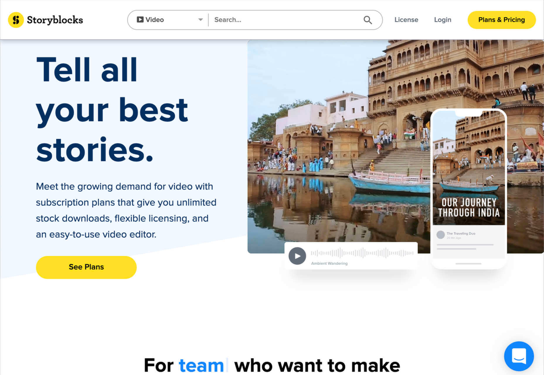
8. Storyblocks

Similar in style to Motion Elements, Storyblocks is a creative design resource for any designer getting involved with the video world. This website is home to some of the best free-to-use videos around, with simple licensing available at a click. Aside from high-quality videos and templates, you also get audio and sound effects as part of your subscription and images or illustrations. 

The unlimited access pass gives you all the resources you might want, from 4K and HD footage to music and sound effects, After Effects templates, and photos, vectors, or illustrations. You can also export a host of your own video projects with access to the Maker video editor, which allows you to make various changes to your custom video content. Features include:

  • HD and 4K video footage
  • After Effects Templates
  • Sound Effects and Music
  • Photos, Illustrations, and Vectors
  • Unlimited video exports
  • Video editor access
  • Licensing support

The standard all-access plan from Storyblocks starts at a very affordable £39 per month for all of the content you might want. In addition, everything you get here is unlimited, so you don’t have to worry about running out of credits. There’s also an enterprise option available if you want to share access to resources with your team.

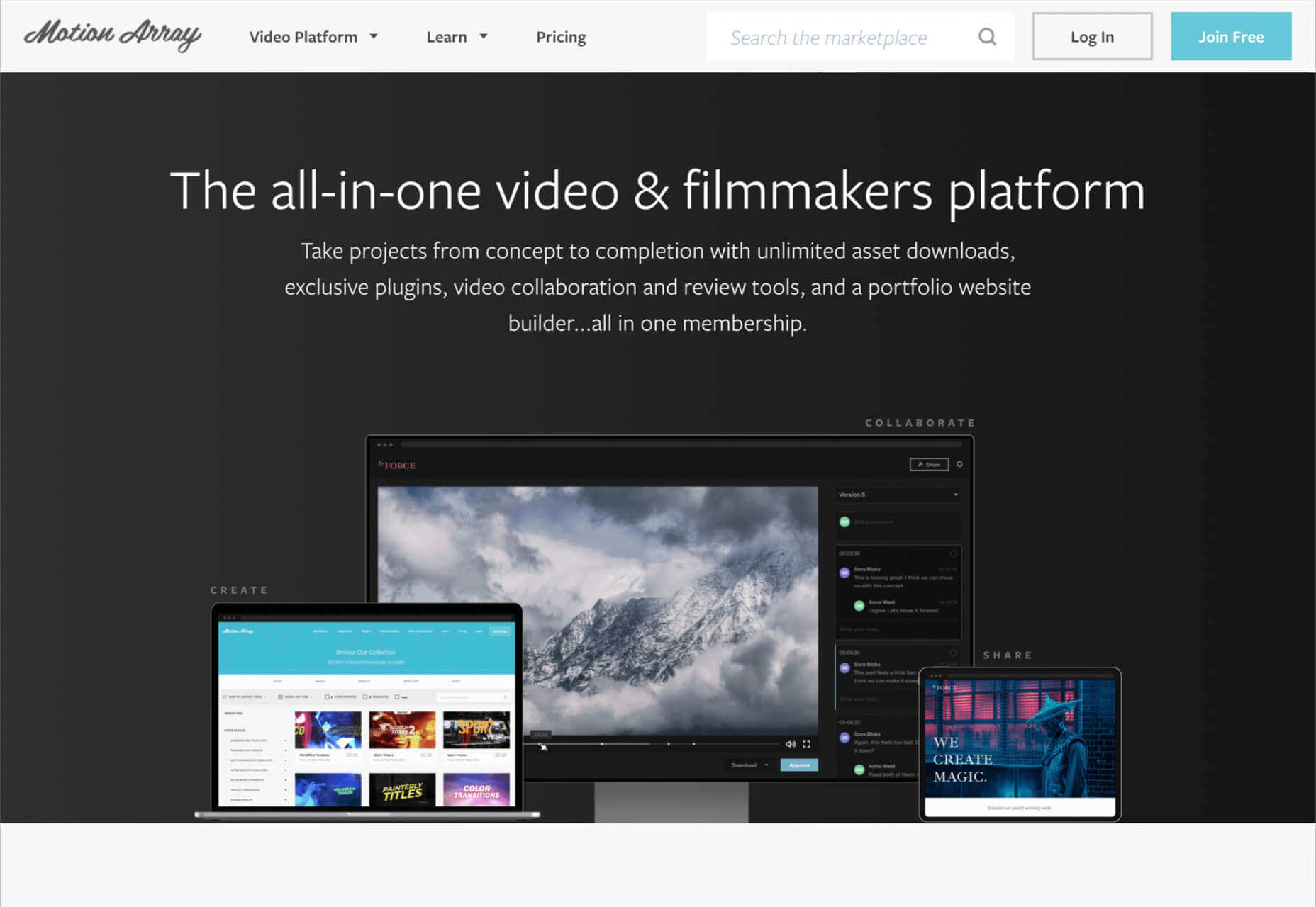
9. Motion Array

Motion Array is an all-in-one video creation platform for those with an eye for visual content. This fantastic resource center is packed full of valuable tools, from Da Vinci Resolve templates to Adobe Premier Pro Content. As part of your subscription payment, you’ll get endless presets, audio effects, plugins, video footage, tutorials, and more. 

Though a little more expensive than some of the other premier subscription services on the market, Motion Array does offer a lot of content that you can’t get anywhere else. There’s an unlimited marketplace constantly updating with access to royalty-free footage, stock photos, music, and sound effects. You also get plugins built for Premiere Pro. Features include:

  • Adobe Exchange elements
  • Final Cut Pro and DaVinci resolve templates
  • Royalty-free music and sound effects
  • Stock footage and video
  • Photos and images
  • Time-saving integrations with your favorite apps
  • Portfolio site builder
  • Stock media requests

There’s a free subscription option for Motion Array, which you won’t find from most alternatives. This only gives you access to some basic stock photos and assets, but it’s a nice way to start. When you are ready to upgrade, you can pay $29.99 per month for the full stock media library, as well as requests for custom media assets and exclusive plugins.

Start Stocking Up on Designer Resources

As a designer or creative professional, keeping a constant stack of resources available is crucial to your ongoing productivity. Fortunately, there are tons of premium marketplaces out there today, making it easier to access everything you need. 

Whether you’re looking for full UI kits and templates, or you want some free-to-use images and videos for the website content you’re creating, there’s something for everyone. With most monthly subscription services available at a highly affordable price, you could even sign up for multiple sites at once. 

Source

The post 9 Amazing Design-Resource Package Sites first appeared on Webdesigner Depot.


Source de l’article sur Webdesignerdepot

HTML is one of the foundational building blocks of the Web. But just as web design best practices and techniques change over time, so does the code we use. As HTML evolves, some of its older markup has been deprecated while other parts have been repurposed.
Does that create more problems for us, though? Would we be better off starting over so we can make sure we’re all working from the same language rather than trying to edit out the bits we don’t want or need?

Problems With Holding Onto Legacy HTML

Let’s take a look at what happens when we amend the rules of HTML over time and how it impacts the Web:

1. It’s Risky to Leave Deprecated HTML Behind

Whether certain features have become outdated and need to go, or browsers have stopped supporting certain tags altogether, deprecated code eventually becomes a problem.

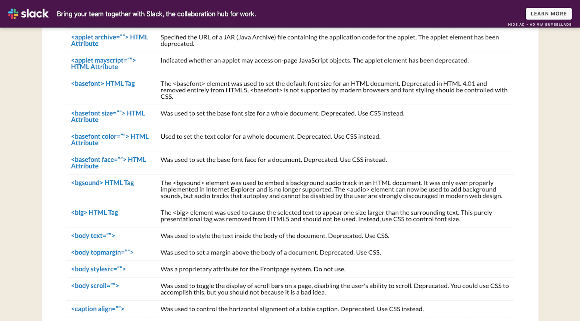
You’ll find a long list of deprecated HTML on the HTML.com website:

For many of these, HTML tags and attributes have been replaced by more efficient CSS styling. There are also examples of HTML deprecation because the features have become outdated (like frames).

Yet, there are still websites out there that contain deprecated HTML.

In some cases, the HTML sits silently on the other side of the website. If there’s enough of this errant code hanging around, though, those extra characters and directives could slow down your server’s processing time and render pages more slowly than usual.

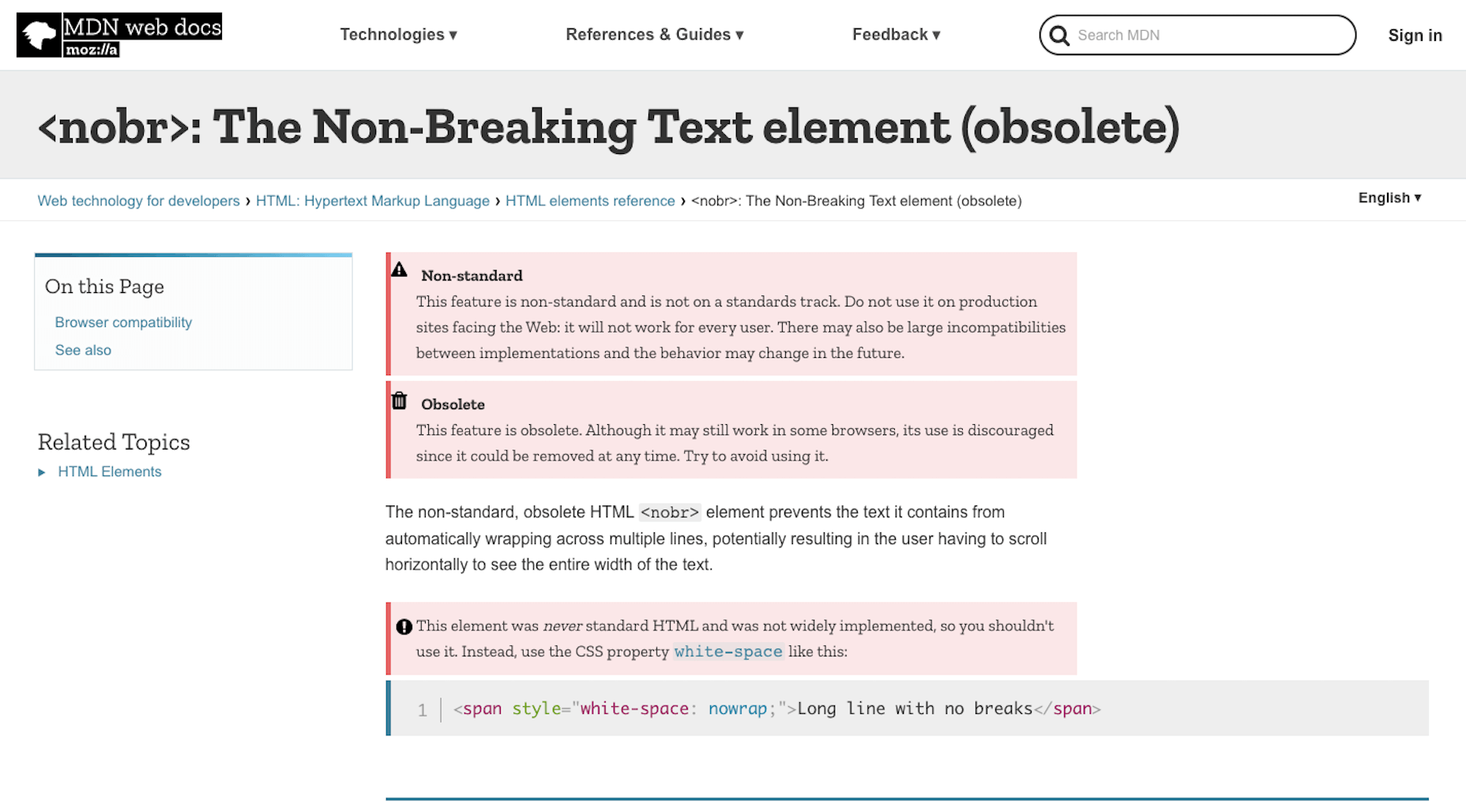
In other cases, the HTML breaks features on the front-end of a website. Take, for instance, this warning from Mozilla regarding the <nobr> tag:

Using deprecated code can create inconsistent and poor experiences on the front-end. And when all browsers finally get on board and decide not to support an HTML tag anymore, all visitors will be left with a broken UI.

So, while it’s great that HTML5 has deprecated legacy HTML that’s no longer useful or necessary, that’s not to stop everyone from using it or leaving it behind on older websites. 

2. Legacy Code Focuses on Style; Not Semantics

As I mentioned, a lot of deprecated HTML has been phased out and replaced by CSS styling. And that’s a good thing.

Let me give you a simple example of this…

My favorite book is <i>The Stand</i> by Stephen King. The first time I read it, I didn’t sleep for <i>three days</i>. Thankfully, when I revisit it every year, I have fewer nightmares and can more greatly appreciate the storytelling aspect of it.

In the above paragraph, I’ve used the <i> tag to italicize several words.

In the early days of HTML,<i> stood for “italics” (the way<b> stood for “bold”). With HTML5, however,<i> will still render as italics, but its semantic meaning isn’t as broad. It’s been repurposed to indicate a stylistic change, which is important for things like book and film names, foreign words, and so on. To express emphasis, we use the <em> tag instead. 

Keeping the legacy <i> and <b> tags can lead to issues, though. 

In the statement above, I’ve italicized the name of the book (The Stand) as well as the number of sleepless nights I had (three days) with<i>. Whether the designer decides today, tomorrow or ten months down the road that they want to change the way literary or cinematic references are styled, my choice of HTML will stand in their way.

Because all of my italic text is indicated by <i>, styles can’t universally be applied to specific content (like book references). Instead, the designer would have to go through and clean up my code so that it looks like this:

My favorite book is <i>The Stand</i> by Stephen King. The first time I read it, I didn’t sleep for <em>three days</em>. Thankfully, when I inevitably revisit it every year, I have fewer nightmares and can more greatly appreciate the storytelling aspect of it.

This would then allow the semantically italicized content to remain intact while the designer or developer adjusts the styles of the book title here and across the site. (Though, really, the first italicized phrase should be surrounded by <cite> as it would be more semantically accurate.)

While it’s great that we’ve created guidelines for using legacy HTML today, keeping old code around can confuse writers, designers, and others who are familiar with the previous way of formatting content. By resetting HTML, throwing out old styles, and creating one language we use consistently across the web, we won’t create more work for ourselves later on.

3. Deprecated Code Hinders Accessibility

Another big reason why repurposed and deprecated HTML is a problem is because of accessibility.

For starters, when you leave deprecated and unsupported code behind, it’s likely to cause issues for screen readers, search engines, and browsers that use HTML for clues about the content.

Header tags (e.g.<h1><h2><h3>), for instance, aren’t just used to visibly break up large chunks of text. Header tags and, more specifically their hierarchy, present important information about the relationship between subjects on a page — and this is the kind of thing that screen readers and search engines pick up on.

That’s why we need to be very careful about the code we leave behind the scenes, even if readers on the front end can’t visibly see it. Let’s look at an example of how this can affect accessibility:

Is there an <i>à la carte</i> menu or is it just <i>prix fixe</i> tonight?

If a screen reader were to read over this sentence, the French phrases would be said with the same emphasis as any other italicized words on the page.

This is why HTML5 encourages semantic coding instead of purely stylistic.

The proper way to write HTML in the line above would be:

Is there an <i lang="fr">à la carte</i> menu or is it just <i lang="fr">prix fixe</i> tonight?

There are two reasons to do this:

  1. To indicate to screen readers that there’s a language change.
  2. To make it easier for designers or developers to create a custom style for foreign phrases.

Semantic coding is essential for designers that work on multilingual websites.

As the World Wide Web Consortium explains, languages like Japanese don’t use italicization or bolding for emphasis — at least not the way English speakers do.

So, to properly translate a page from English, a Japanese designer would need to remove the italics or bolding and add surrounding brackets to the words. However, if everything is coded with <i> and <b>, or there’s a mix of <i> and <em> and<b> and <strong>, it’s going to be really difficult to Find-and-Replace the correct HTML with ease.

So, if accessibility or internationalization are concerns for you at all, getting clear on the HTML you write with is going to be really important.

Wrap-Up

The fact of the matter is, it requires a lot of work to have the rules of HTML rewritten. So while it would be great to reset HTML, I don’t know that it’s all that practical.

All we can really do is stay abreast of what’s happening with the language, edit out legacy code from our websites the second it becomes deprecated, and always use tags and attributes that are supported. By playing around with deprecated or repurposed code, we only put the website visitors’ experience in jeopardy, so it’s best to take the time to clear out the old any chance we get.

If we can all get on the same page about this, problematic legacy HTML will eventually disappear from our websites and memories.


Featured image via Unsplash.

Source

The post Is It Time to Reset HTML? first appeared on Webdesigner Depot.


Source de l’article sur Webdesignerdepot

This week at I/O, Google unveiled the latest version of its Material Design design system, Material You.

Initially presented as an upgrade for Android 12, Material You is the biggest revision to Material Design since its launch in 2014 and will be rolling out across all Google products in the coming year.

Material You is an adaptable system that takes the building blocks of Material Design — the spacing and component approach — and skins it to allow a more personal design language, albeit a distinctly Google personal design language.

Google isn’t shy about its intention to define what constitutes good UI design, even if its efforts have so far fallen short of its ambition. Material You potentially leads us back to that undesirable state where every new site looks like a Google clone. The more cynical might suggest that Google actually does perceive all websites as Google products — a view that’s not entirely without merit given the source of most web traffic — so a homogenous approach is warranted.

Material You will certainly make its way into web design. Expect a rash of Material You ‘updates’ to popular themes and site builders that will consist mainly of pastel color palettes.

Hopefully, two major benefits of Material You will not be overlooked: firstly, Material You introduces far more emotion than Material Design allowed; secondly, Material You is flexible enough to ensure accessible design is harder to ignore.

Fundamentally, Material You is still Material Design. The basic approach remains, but it’s less rigidly enforced. Think of it less as a rulebook and more as a disapproving parent who, despite their better judgment, is willing to let you make your own mistakes.

Material Design has looked dated for a few years now, and it’s possible that Material You is just Google hoping to nail down a trend that’s escaping them. But it’s equally possible that Material You is a step closer to what Material Design was meant to be: an invisible design system that feels natural to all seven billion individuals on the planet.

Source

The post Poll: Will You Adopt Google’s Material You? first appeared on Webdesigner Depot.


Source de l’article sur Webdesignerdepot

Parallax is a term that is applied loosely and frequently in the world of web design. As a trend, it has been popular and unpopular in equal measures for some time. However, it’s still one of the most valuable tools for animation in the digital world.
Parallax creates an illusion of depth when scrolling, a timeless effect that still has lots of value in the web design world.

Sure, parallax has its issues, from problems with usability, to concerns with mobile responsivity — but it’s also an interesting way to make a website stand out when done correctly.

Let’s take a closer look at some of the ways that parallax scrolling still works in 2021…

1. Parallax Tells A Story

Let’s start simple. 

One of the most effective ways to use parallax scrolling in the modern age is to tell a story. Today’s consumers want to have an emotional connection with the brands they buy from – now more than ever. Five years ago, studies showed that around 80% of customers want brands to tell stories, and that trend remains consistent to this day.

In the age of digital consumerism, where people can’t get to know a company in person through face-to-face interactions with its salespeople, companies need new ways to connect with their clients. Telling brand-driven stories is a way to highlight that your company is more than just a faceless entity – it’s something with real soul. 

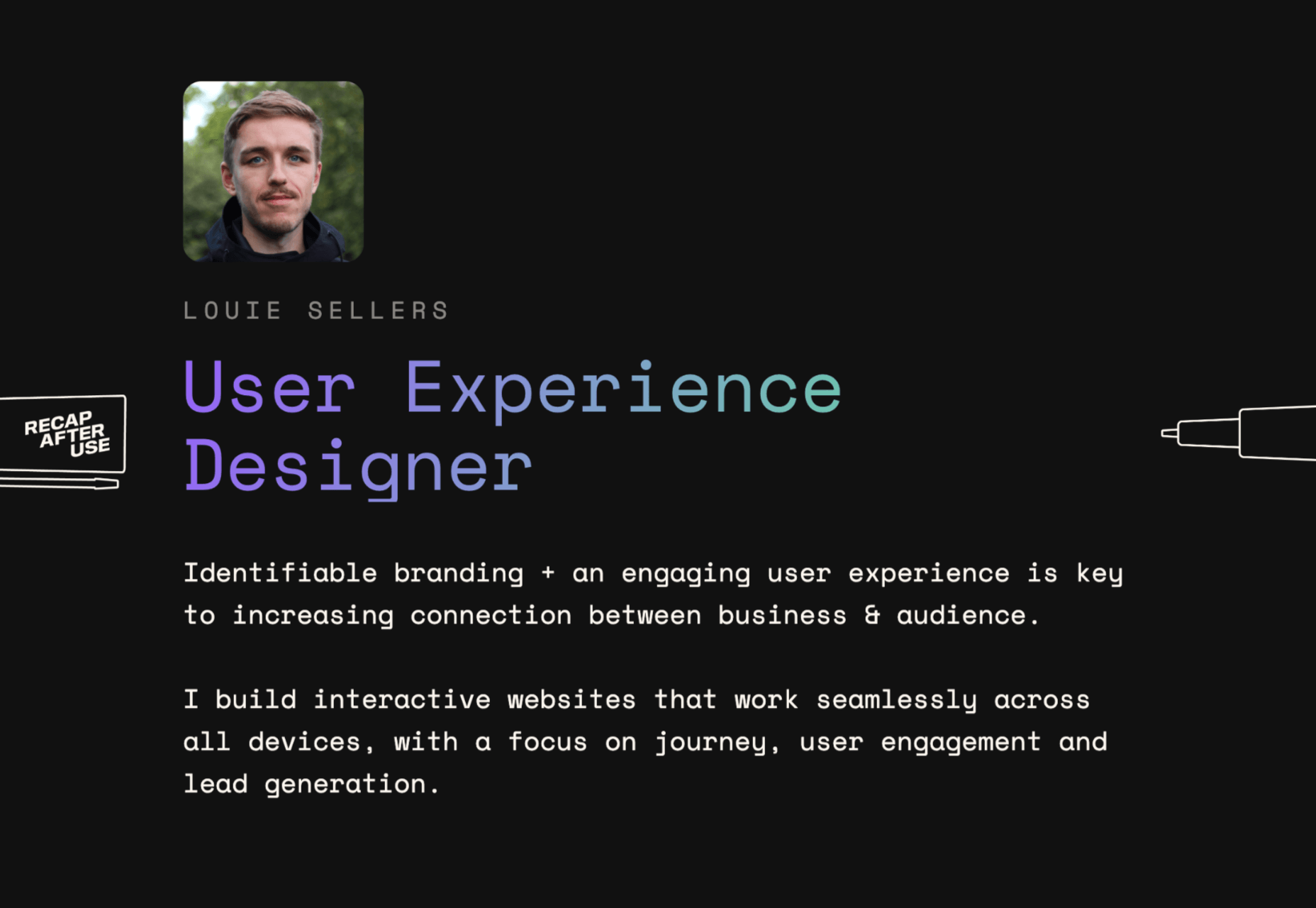
Let’s look at the “Recap After Use” website, a portfolio belonging to the innovative Louie Sellers. This website showcases Louie’s skills with attention-grabbing visuals, including a parallax animation that makes it looks like Louie is drawing the page as you scroll through it.

This is the kind of exceptional animation that makes parallax scrolling more compelling. The animation isn’t there to make a visual difference to the page – it tells you something more about the person behind the website and what they can do.

2. Parallax Increases Website Visit Times

If a website effectively tells a story with parallax animation, you can also bet that’s going to keep customers or readers on a page for longer. Reducing bounce rate by increasing engagement is one of the main goals of any web designer. (Bounce rates, of course, refer to the percentage of site visitors that hit the back button after just seeing the first page of your website.)

While some people argue that parallax websites can hurt your SEO rankings if they slow down your site, there’s also the argument that the lack of a visually engaging page can harm SEO. Bounce rates drag down your ranking and make it harder to get audience attention. 

A parallax animation that tells a story and engages your audience through carefully delivered information is a great way to keep people around – even just for a little longer than usual. For instance, if you check out Alex Dram’s portfolio page here, you’ll see several shapes coming together during the parallax scrolling animation.

The shapes merge to tell a story about the visual experiences that Alex can create for customers. It’s a way to draw the eye and connect with the viewer without just writing about what you do through text. 

3. Parallax Develops Credibility

There’s a reason why both examples of parallax scrolling we’ve looked at so far are from creative portfolios. Parallax scrolling, with its excellent storytelling capabilities, is great for demonstrating your credibility as a digital expert. Basically, it’s a version of “showing” and not “telling” customers about your skills. 

You can tell someone that you know how to use tricky techniques like parallax animation correctly, but they’re less likely to believe you that way. If you can show that you have the skills to create something amazing, that’s more engaging. 

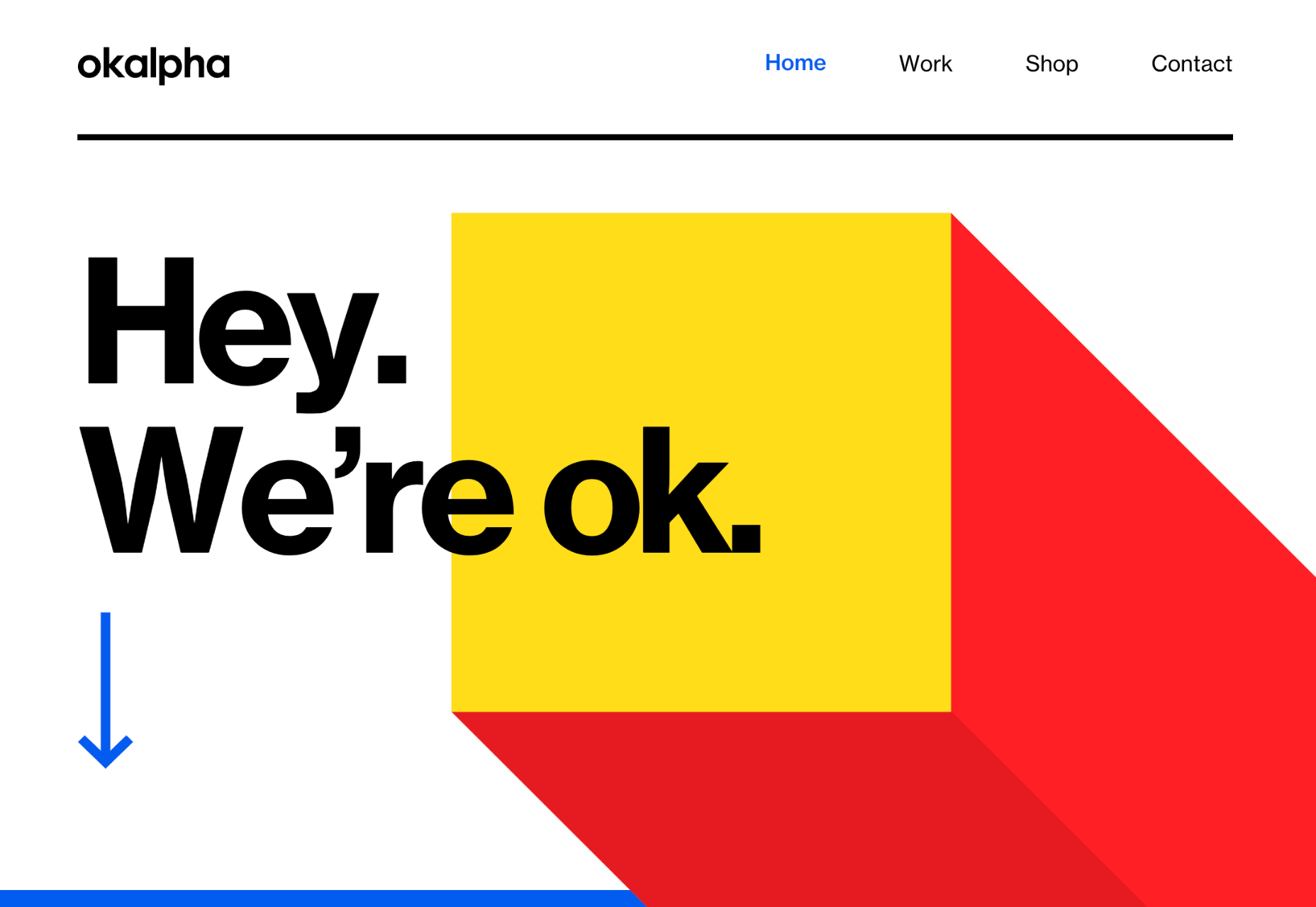
The OK Alpha team is a great company to reference when it comes to sensational design. This company seems to always be on the cutting edge of the latest trends, whether it’s bold typography or bright colors. To add to the impact of their website, the company has combined parallax effects into the mix to make everything more immersive as you scroll. 

This is a beautiful example of how companies in the design landscape can use techniques like parallax scrolling to show what they’re capable of. 

4. Parallax Makes Information More Fun

Most of us are naturally visual learners. We like to consume information in a way that’s refreshingly eye-catching and attractive. That’s why visual content generally earns more social shares and attention than written content. With parallax scrolling, companies that want to deliver valuable information and educational content to their audience can do so effectively.

Rather than just scrolling through a page and seeing lots of text, your customers can see images and graphs come to life alongside the blocks of text they’re reading. It’s like adding video demonstrations next to a textbook to help people better understand what they’re reading about. 

Look at the Web Design and Art History microsite from Webflow as an example. The company wants you to understand how web design and art have evolved over the years, but it doesn’t want to deliver that information in a boring format. The bright graphics and parallax animation work together to give you a more contextual, meaningful experience.

5. Parallax Replicates Another Medium

What if you could remind someone of their experience when reading a book or watching a video while telling them about a video or a novel? Parallax scrolling and animation can help with that. It’s a way of making your website feel like a video presentation or slideshow without the added components of implementing video players into your back end. 

Parallax scrolling also has another slight benefit over a standard video-based website. On a website that uses a video for a background, the video often plays automatically. This means that your visitors can’t control how quickly the video plays. 

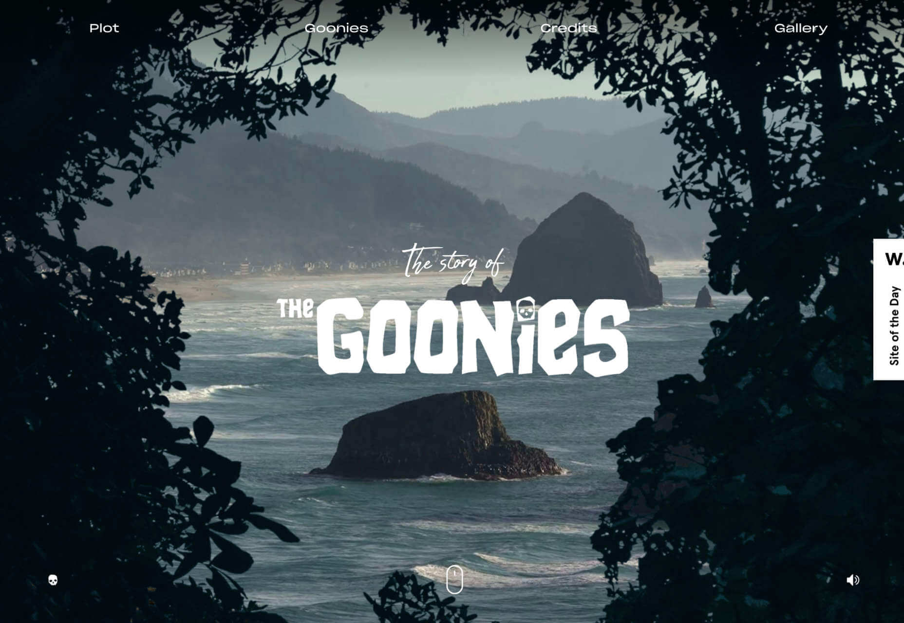
On the other hand, parallax animations driven by scrolling action allow your customer to collect information at a pace that suits them. Take a look at the Story of the Goonies website, for instance. This stunning parallax site introduces you to the details you need to know about the movie in a way that makes it feel like the intro to a film.

The great thing about the parallax on this site is that the slow video-style design also gives you a dose of nostalgia – which ties in perfectly with the movie. 

6. Parallax Is More Memorable

What’s the main reason any designer does anything special to a website? To make it stand out, of course. Web design is all about conveying the unique essence of a brand, business, or entity in a way that’s going to make that client unforgettable. Although parallax isn’t as novel as it once was, it can still be a way to make your site stand out – if it’s used correctly. 

The key to success with parallax scrolling for memorability is making it smart. The layout needs to feel simple and intuitive. Everything needs to work well together, from the lightly shifting font to the various parallax effects that work together to draw the viewer’s eye (and attention). 

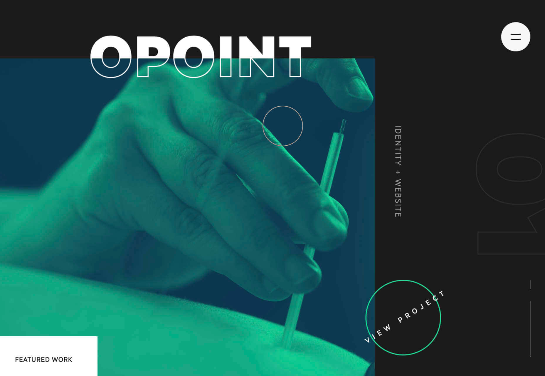
A great example comes from Jomor Design – another designer with a portfolio that really grabs your focus from the first second. The layout is beautifully done, with plenty of mini moments for engagement and interactions throughout. As you scroll through the site, you get a better idea of what the designer is all about. The little moments of animation make the whole experience so much more memorable. 

When your site is more memorable and engaging than that of your competition, you can drive many major benefits for your brand, including an improved bounce rate.

What To Remember When Using Parallax

Parallax is just like any other design technique. There are ways you can do it wonderfully, which engage and delight your audience. However, there are also a lot of areas where you can easily go wrong. When using any design element, the main thing to remember is that the primary focus should always be your users’ experiences. Parallax shouldn’t just be a way to show off your design knowledge. It’s just another feature that you can use to create an amazing website. 

Remember that user experience and visual appeal need to work perfectly together for parallax to work. If scrolling through the page is practically impossible for people on a mobile device, then you’re not going to get the results you want. If it’s difficult to take in the message you’re trying to send because the content is moving too quickly, again, your users will suffer. 

Remember the following tips:

  • Simple is better: Reduce the amount of content and visual elements on your page whenever you can. The less information there is to capture your customer’s attention, the less likely it is that you’re going to end up with a problem. 
  • Compress file sizes: Make sure that you’re not reducing the speed of your website by creating a huge single page with tons of high-quality images. You’re going to need to use the smallest possible file sizes. 
  • Check responsiveness: Make sure that the parallax effect works just as well on your smartphone or tablet as it would on a desktop. As more people move their browsing experiences into their palms, you can’t afford to ignore responsivity. 
  • Find the “wow”: Look at these examples of parallax websites. Every one stands out because it does something special with the scrolling effect. If you’re going to be using this strategy with your website, you need to make sure it’s worth the effort. Don’t just follow the same guidelines as everything else. Find the idea that’s going to make people take notice.

Source

The post 6 Ways Parallax Still Works in 2021  first appeared on Webdesigner Depot.


Source de l’article sur Webdesignerdepot

Every month we feature a set of comics created exclusively for WDD.

The content revolves around web design, blogging and funny situations that we encounter in our daily lives as designers.

These great cartoons are created by Jerry King, an award-winning cartoonist who’s one of the most published, prolific and versatile cartoonists in the world today.

So for a few moments, take a break from your daily routine, have a laugh and enjoy these funny cartoons!

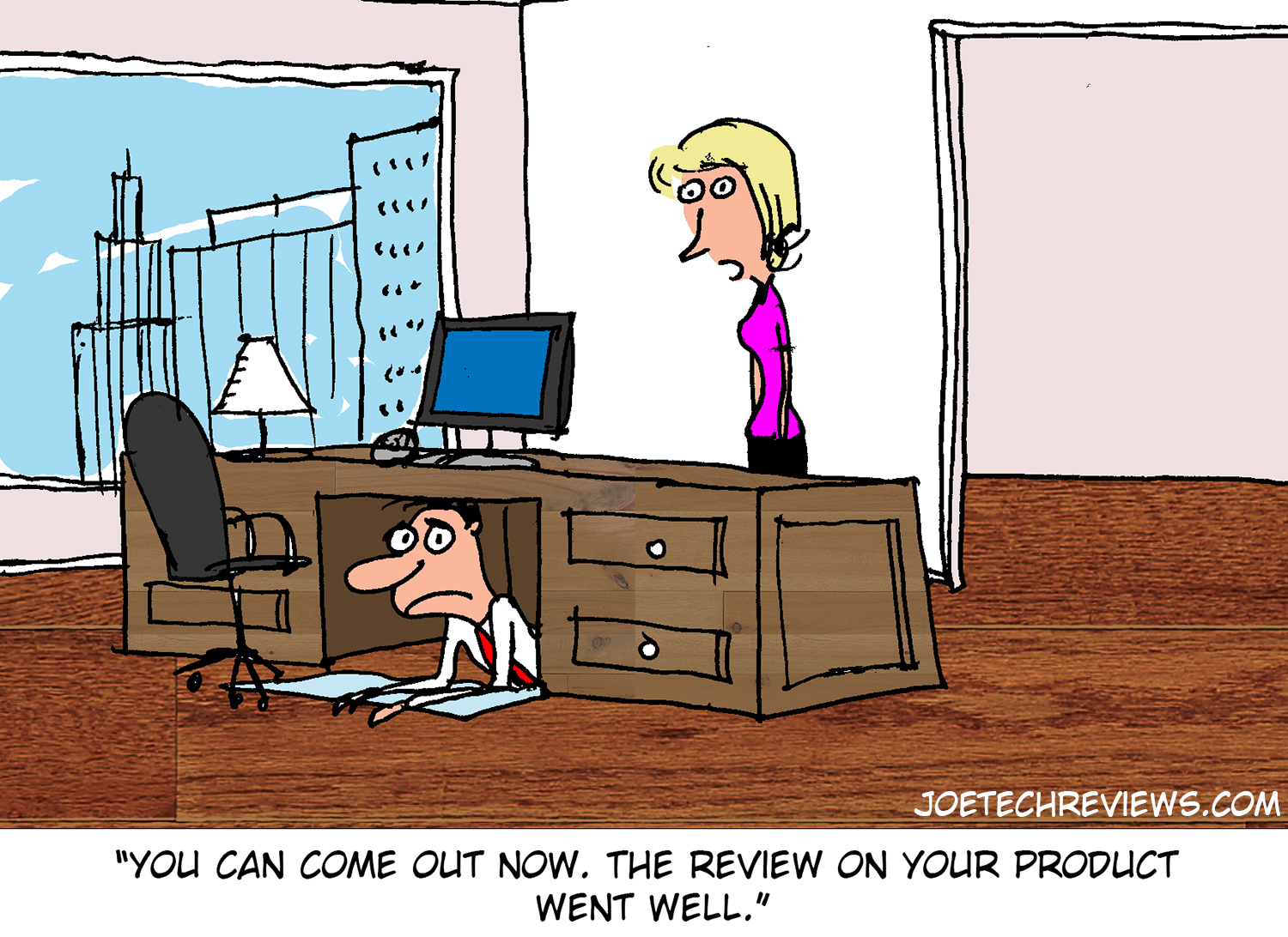
Review fear


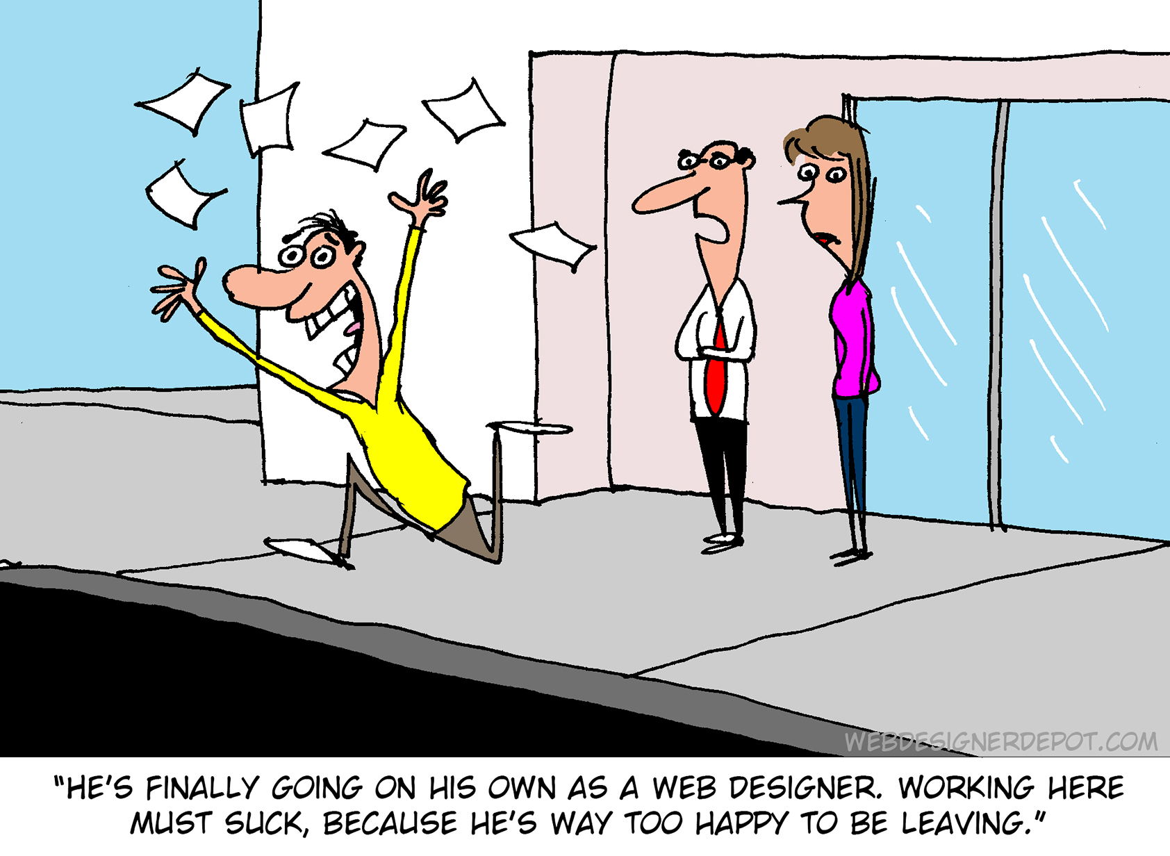
Free at last!


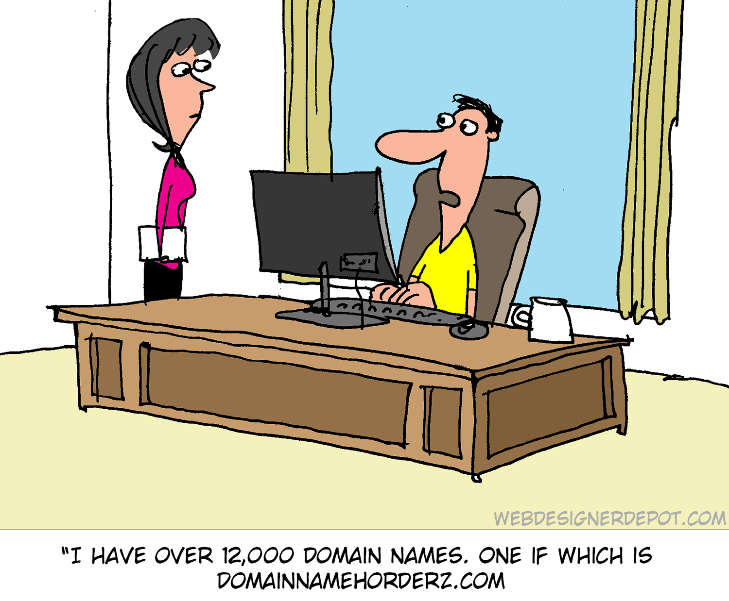
Too many?

Source

The post Comics for Designers #442 first appeared on Webdesigner Depot.


Source de l’article sur Webdesignerdepot

Every day design fans submit incredible industry stories to our sister-site, Webdesigner News. Our colleagues sift through it, selecting the very best stories from the design, UX, tech, and development worlds and posting them live on the site.
The best way to keep up with the most important stories for web professionals is to subscribe to Webdesigner News or check out the site regularly. However, in case you missed a day this week, here’s a handy compilation of the top curated stories from the last seven days. Enjoy!

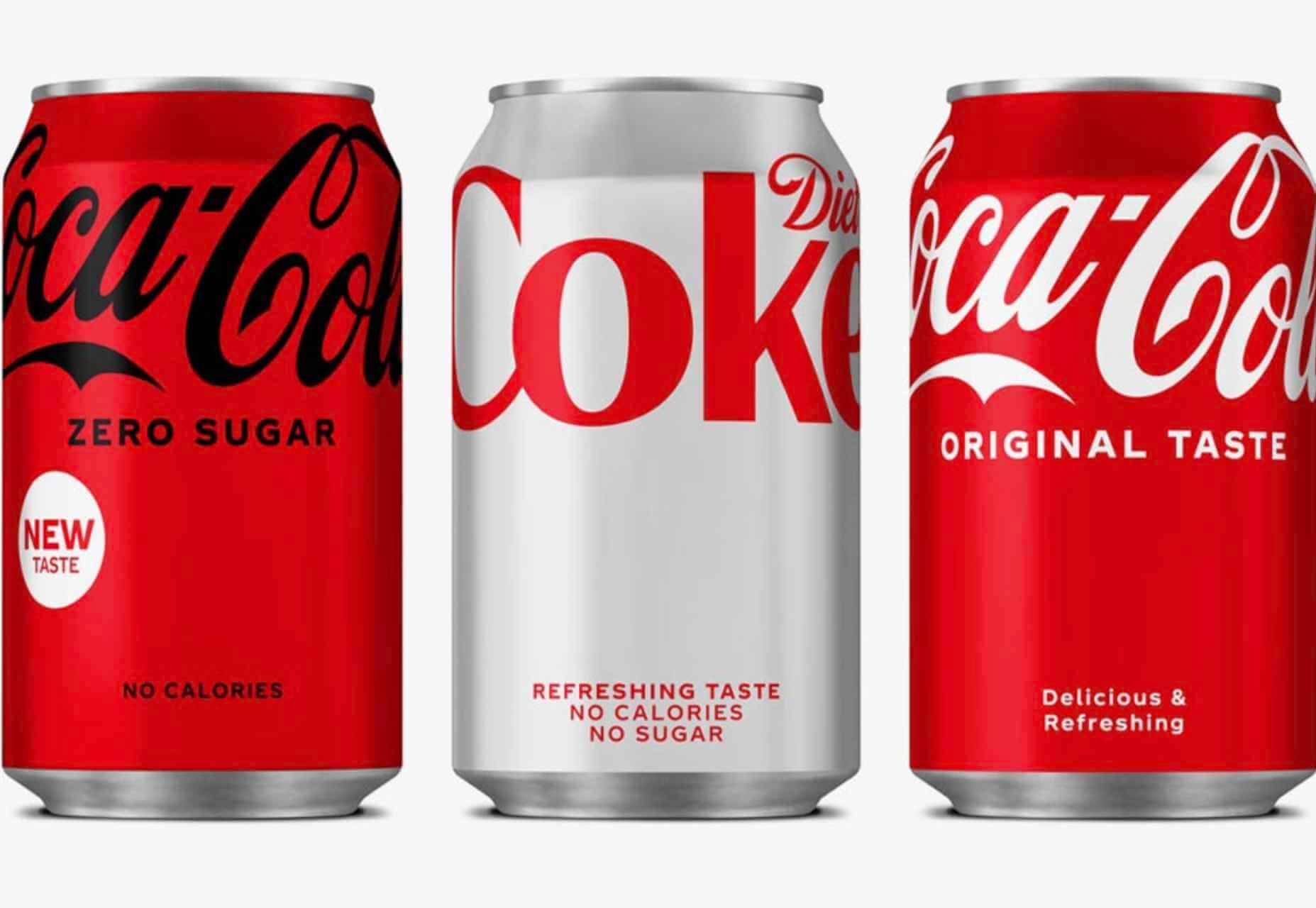
Coca-Cola Presents New Packaging Design

Seven Mistakes To Avoid In Your Technical Interviews

10 Interesting Ways to Plan Web Design Projects

Web Developer’s Guide To AVIF Images


3 Effective Ways To Improve Your Site’s Carbon Footprint

Pure CSS Before & After Image Slider

Blank

25 Exciting New Tools For Designers, April 2021

Text In A Circle Using CSS & JavaScript

A to Z of Adobe XD: Tips & Tricks!

Content-Aware Image Resizing In JavaScript

Remove Distractions and Waste from Your Website

Top 18 Best Practices for Writing Super Readable Code

Atriom

Source

The post Popular Design News Of The Week: April 19, 2021 – April 25, 2021 first appeared on Webdesigner Depot.


Source de l’article sur Webdesignerdepot

At the dawn of the web-era, there was much focus on how environmentally friendly websites were: we’d chop down fewer trees, ship fewer products, and travel less for business.
And because the web was small, any negative impact it had was relatively small. But the Internet’s no longer small, and neither is the impact it has on the environment. The average website uses 211,000g of CO2 per year, watching a video online outputs an estimated 0.2g of CO2 per second, and a single email can cost 50g of CO2.

In the next four years, the tech industry as a whole may use up to 20% of the world’s electricity and be responsible for 5.5% of global CO2 emissions.

The good news is that because websites are viewed many times, even small improvements can multiply into real change.

1. Reduce Energy Consumption

Through electricity use, the Internet generates around the same CO2 as most major countries. That carbon comes from two sources: the devices we use to access the Internet and the servers that host our data.

Computers heat up, and when they heat up, they slow down. Servers are especially vulnerable and use extraordinary amounts of energy to keep cool and functional, which is why Microsoft keeps throwing servers into the sea.

Make It Faster

The faster your site, the less data is used to serve it, and the less carbon it’s outputting; it’s that simple.

Reduce the Number of Resources Used

Everything you load on your site has an impact. You might think that a tiny PNG is too small to really impact your carbon footprint, but over thousands of page loads, its impact is multiplied. Anything you can do to reduce the number of actual files requested will reduce your carbon output. You can use sites like Ecograder to estimate your own site’s CO2 output.

Optimize Images

If there’s one thing you can do to reduce the size of your site, the amount of data that needs to be sent over the Internet to serve your site, and the resulting speed, it’s optimizing your images.

Nothing reduces a site’s footprint like optimizing images. It’s easy and free to reduce the size of JPGs and PNGs with a service like TinyPNG. Offer WebP to any browser that will accept them; it will boost your Lighthouse score and improve your CO2 usage.

Lazy Load Images

Lazy loading images means images are loaded as they are required; images at the top of a page always load, images further down only load when the user scrolls to them; if the user doesn’t scroll to the bottom of the page, they don’t load, saving you CO2.

Reduce The Amount Of JavaScript You Use

Yes, JavaScript is awesome. Yes, it can be hugely beneficial to UX. And yes, it munches on energy like it’s candy.

When a web page loads, it’s done, the total cost is in. If JavaScript keeps running in the background, redrawing the screen based on user interaction — as is the case with a parallax site — the web page keeps using up energy on the device.

Choose a Sustainable Hosting Company

You can reduce the power needs of a site, but you can’t eliminate them. One simple step is to opt for a hosting company that gets its electricity from sustainable sources such as wind power or solar.

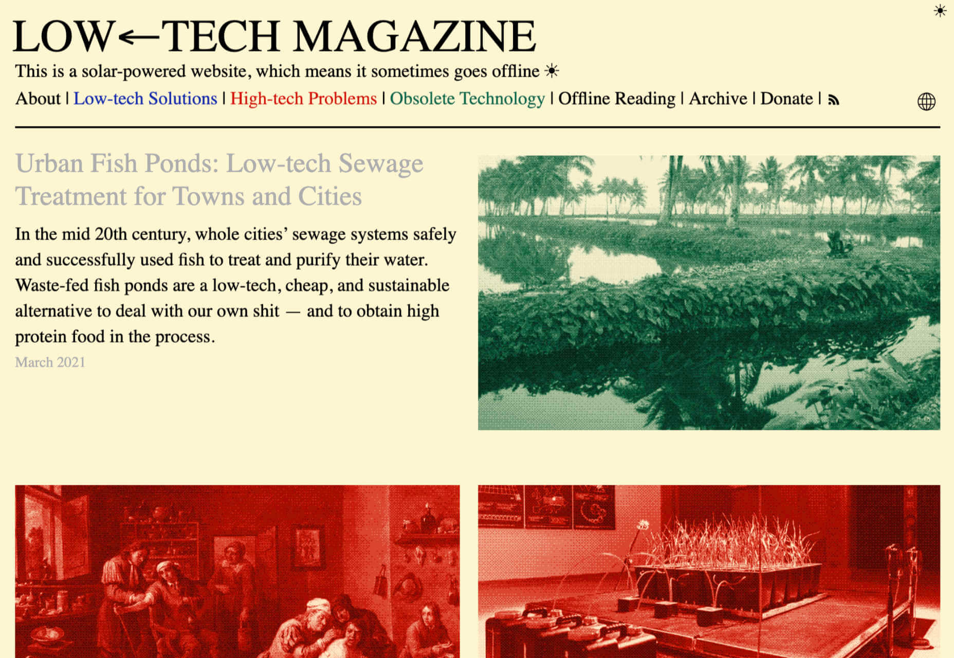
Low←Tech Magazine is powered by a server that runs on solar energy and carries a warning that it may go offline. But it’s possible to host both reliably and sustainably. Many web hosts outsource their actual server management, so they have no control over how those servers are powered, but there are plenty of exceptions that guarantee green web hosting. Google Cloud aims to be the cleanest in the cloud industry. For green web hosting, I always recommend the all-round superb Kualo.

2. Be Inclusive

One of the biggest issues with the EV (Electric Vehicle) movement is that we’re replacing cars earlier than we normally would in a rush to move to “clean” driving.

A new EV certainly outputs less than a gas-powered vehicle when driven the same distance. Combine increased use — because owners think they are driving cleanly — with the fact that a new EV has to be manufactured, the minerals for batteries have to be mined (in horrific conditions), and it then needs to be shipped to you, and EVs are not as friendly as they appear — so go ahead, buy that vintage Porsche it’s probably better for the environment than a Tesla.

Support Legacy Devices

The same issue that applies to cars applies to devices. Every time we rush ahead to support the latest iPhone, we leave older generations behind. A device can and should last longer than two years.

This is not to say that you shouldn’t embrace modern web standards. Technologies like CSS Grid are excellent at reducing markup size and speeding up sites. CSS Grid has been well supported for over four years, and even “legacy” devices can handle it. If you can keep a phone for an extra six months, the environmental cost of that phone is reduced by 20%.

3. Help Users Make Good Choices

More and more people are trying to make good choices. We’re eating a healthier, balanced diet. We’re recycling clothes. We’re traveling by bike, and on foot, instead of by car. People want to do the right thing, and they seek out companies that aid them.

Improve Navigation

Anything that you can do to make your content more findable will mean fewer page loads and therefore consume fewer resources.

By improving your information architecture, improving your search accuracy, and improving on-page signposts like bread crumbs and link text, you help users find content faster.

Feelgood Feedback

When the environmental impact of a user’s actions are quantifiable, let them know. Users who care will appreciate it, and users who don’t will ignore it.

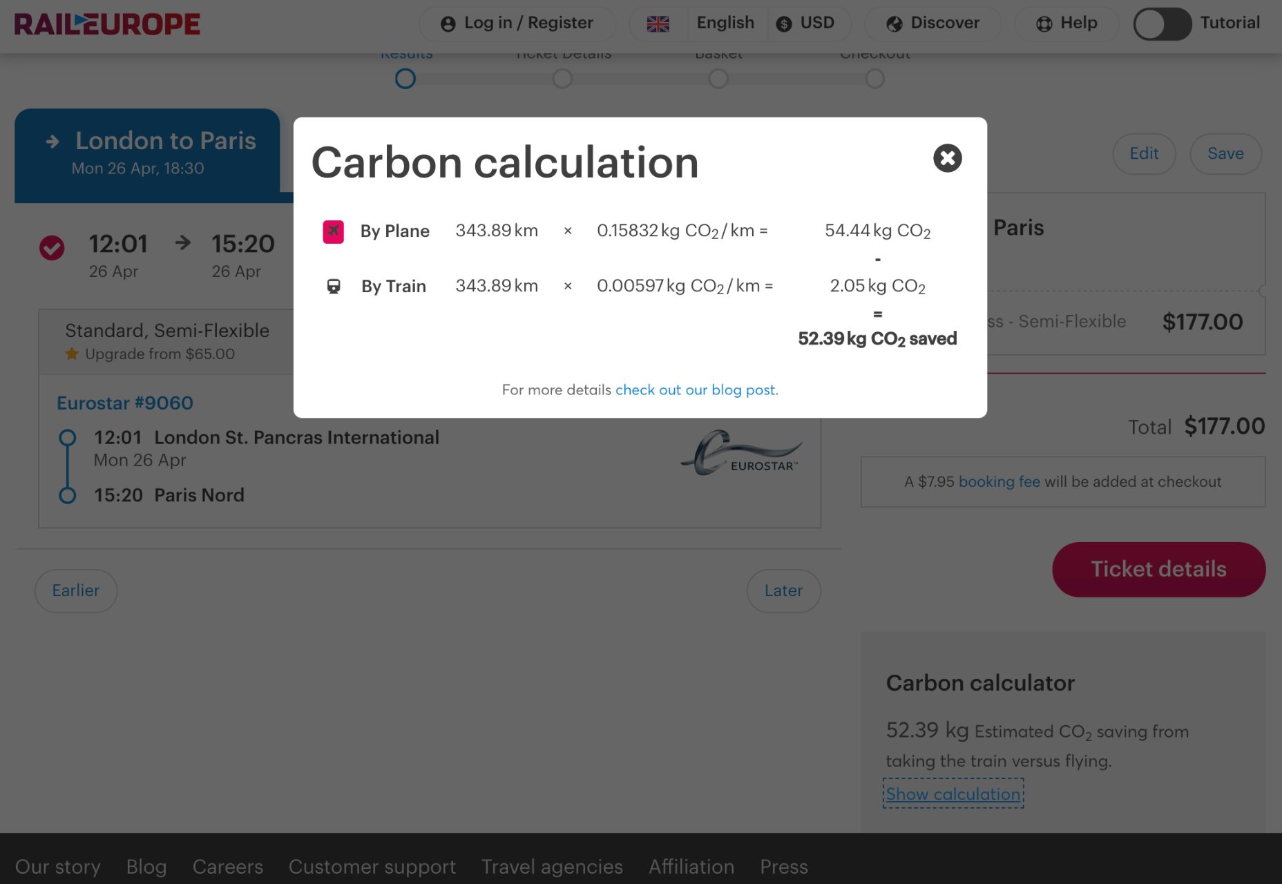
Raileurope.com adds a note to any quotation letting you know how much carbon you’ve saved by traveling by train instead of flying.

Don’t Remove the Shipping Rate

Many ecommerce sites offer free shipping, especially above a certain order value; it’s a good way to encourage higher sales. But absorbing the shipping cost implies that there is no shipping. By highlighting the shipping costs, even if they’re not passed on to the customer, you remind them that there is an environmental cost and a financial cost.

You can absorb the shipping rate without implying there is no cost by adding the shipping and then explicitly deducting it as a discount.

Sustainable Web Design Is Good For Business

The fundamentals of good web design are the fundamentals of sustainable web design.

Make it fast and usable, and you’ll also be making it energy efficient. Make it inclusive, and you’ll help the industry slow the ever-growing tendency to consume. Make it transparent, and you’ll help your users make good choices of their own. All of these things are not only good for the environment, but they also result in improved UX and SEO.


Featured image via Pexels.

Source

The post 3 Effective Ways To Improve Your Site’s Carbon Footprint first appeared on Webdesigner Depot.


Source de l’article sur Webdesignerdepot

Ten years ago, people began talking about the “Independent Web.” Although we don’t commonly use the term anymore, that doesn’t mean that it’s not still as vital a topic of discussion today as it was a decade ago.
Today, I want to look at where the term came from, what it refers to today, and why it’s something that all of us in business, marketing, and web design should be thinking about.

What Is The Independent Web?

The Independent Web is a term that was coined back in 2010 by John Battelle.

In “Identity and The Independent Web,” Battelle broaches the subject of internet users losing control of their data, privacy, and decision-making to the likes of social media and search engines.

“When we’re ‘on’ Facebook, Google, or Twitter, we’re plugged into an infrastructure that locks onto us, serving us content and commerce in an automated but increasingly sophisticated fashion. Sure, we navigate around, in control of our experience, but the fact is, the choices provided to us as we navigate are increasingly driven by algorithms modeled on the service’s understanding of our identity.”

That’s the Dependent Web.

This is how Battelle explains the Independent Web:

“There is another part of the web, one where I can stroll a bit more at my own pace, and discover new territory, rather than have territory matched to a presumed identity. And that is the land of the Independent Web.”

In 2010, this referred to websites, search engines, and apps where users and their activity were not tracked. But a lot has changed since then, and many websites that were once safe to peruse without interference or manipulation are no longer.

What Happens When the Dependent Web Takes Over?

Nothing good.

I take that back. It’s not fair to make a blanket statement about Dependent Web platforms and sites. Users can certainly benefit from sharing some of their data with them.

Take Facebook, for instance. Since its creation, it’s enabled people to connect with long-lost friends, stay in touch with distant relatives, enable freelance professionals like ourselves to find like-minded communities, etc.

The same goes for websites and apps that track and use visitor data. Consumers are more than willing to share relevant data with companies so long as they benefit from the resulting personalized experiences.

But the Dependent Web also has a darker side. There are many ways that the Dependent Web costs consumers and businesses control over important things like:

Behavior

If you’ve seen The Social Dilemma, then you know that platforms like Facebook and Google profit from selling their users to advertisers.

That’s right. They’re not just selling user data. They’re selling users themselves. If the algorithms can change the way users behave, these platforms and their advertisers get to cash in big time.

Many websites and apps are also guilty of using manipulation to force users to behave how they want them to.

Personal Data

This one is well-known thanks to the GDPR in the EU and the CCPA in California. Despite these initiatives to protect user data and privacy, the exploitation of personal data on the web remains a huge public concern in recent years.

Content and Branding

This isn’t relevant to websites so much as it is to social media platforms and Google.

Dependent Web platforms ultimately dictate who sees your content and when. And while they’re more than happy to benefit from the traffic and engagement this content brings to their platforms, they’re just as happy to censor or pull down content as they please, just as Skillshare did in 2019 when it deleted half of its courses without telling its course creators.

What’s more, while social media and search engines have become the place to market our businesses, some of our branding gets lost when entering such oversaturated environments.

Income

When algorithms get updated, many businesses often feel the negative effects almost immediately.

For example, Facebook updated its algorithm in 2018 to prioritize “meaningful content.” This pushed out organic business content and pulled regular user content to the top of the heap.

This, in turn, forced businesses to have to pay-to-play if they wanted to use Facebook as a viable marketing platform.

Access

The Dependent Web doesn’t just impact individuals’ experiences. It can have far-reaching effects when one company provides a critical service to a large portion of the population.

We saw this happen in November when AWS went down.

It wasn’t just Amazon’s servers that went down, though. It took out apps and sites like:

  • 1Password
  • Adobe Spark
  • Capital Gazette
  • Coinbase
  • Glassdoor
  • Roku
  • The Washington Post

And there’s absolutely nothing that these businesses or their users could do but sit around and wait… because Amazon hosts a substantial portion of the web.

Innovation

When consumers and businesses become dependent on platforms that predominantly control the way we live and work, it’s difficult for us to stand up for the little guys trying to carve out innovative pathways.

And that’s exactly what we see happen time and time again with Big Tech’s buy-and-kill tactics.

As a result, we really lose the option to choose what we use to improve our lives and our businesses. And innovative thinkers lose the ability to bring much-needed changes to the world because Big Tech wants to own the vast majority of data and users.

How Can We Take Back Control From The Dependent Web?

Many things are happening right now that are trying to push consumers and businesses towards a more Independent Web:

Consumer Privacy Protection: GDPR and CCPA empower consumers to control where their data goes and what it’s used for.

Big Tech Regulations: The Senate held tech regulation hearings with Facebook’s and Twitters’s CEOs.

Public Awareness Initiatives: Films like The Social Dilemma bring greater awareness to what’s happening on social media.

Ad Blocker Adoption: Adblocker usage is at an all-time high.

Private Search Engine Usage: Although Google dominates search engine market share, people are starting to use private search engines like Duck Duck Go.

Private Browsing Growth: Over 60% of the global population is aware of what private browsing is (i.e., incognito mode), and roughly 35% use it when surfing the web.

Self-hosted and Open Source CMS Popularity: The IndieWeb community encourages people to move away from Dependent platforms and build their own websites and communities. This is something that Matt Mullenweg, the founder of WordPress, talked about back in 2012.

“The Internet needs a strong, independent platform for those of us who don’t want to be at the mercy of someone else’s domain. I like to think that if we didn’t create WordPress something else that looks a lot like it would exist. I think Open Source is kind of like our Bill of Rights. It’s our Constitution. If we’re not true to that, nothing else matters.”

As web designers, this is something that should really speak to you, especially if you’ve ever met a lead or client who didn’t understand why they needed a website when they could just advertise on Facebook or Instagram.

A Decentralized Web: Perhaps the most promising of all these initiatives are Solid and Inrupt, which were launched in 2018 by the creator of the Web, Tim Berners-Lee.

As Berners-Lee explained on the Inrupt blog in 2020:

”The Web was always meant to be a platform for creativity, collaboration, and free invention — but that’s not what we are seeing today. Today, business transformation is hampered by different parts of one’s life being managed by different silos, each of which looks after one vertical slice of life, but where the users and teams can’t get the insight from connecting that data. Meanwhile, that data is exploited by the silo in question, leading to increasing, very reasonable, public skepticism about how personal data is being misused. That in turn has led to increasingly complex data regulations.”

This is something we should all keep a close eye on. Consumers and businesses alike are becoming wary of the Dependent Web.

Who better than the creator of the web to lead us towards the Independent Web where we can protect our data and better control our experience?


Featured Image via Pexels.

Source

The post What Is The Independent Web And Does It Matter In 2021? first appeared on Webdesigner Depot.


Source de l’article sur Webdesignerdepot