 There are many reasons you might be wanting to improve your design skills this year. Perhaps you have extra time on your hands and want to put it to good use. Or maybe you’re new to web design and finding that there’s a lot you still don’t know how to do. It could also be that you recognize that the web is changing, and your skills could use some refreshing to keep up.
Whatever the reason, there are many ways to level up your web design skills in 2021. Here are 12 ideas to get you started:
Tip 1: Niche Down If You Haven’t Already
Jack-of-all-trades designers might be able to say “yes” to everyone. However, they’re going to be stretched very thin as they attempt to strengthen every skill needed to keep up with demand.
It’s much easier to become a trusted designer and to improve your skills if you have a smaller and more specific skill set to develop.
Just keep in mind that niching down doesn’t necessarily mean focusing on a particular industry. For instance, you might choose to be a UX designer instead of a web designer. Or you might specialize in designing ecommerce websites instead of monetized blogs. Just find something that you’re passionate about and will be good at doing, and zero-in on the skills needed for it.
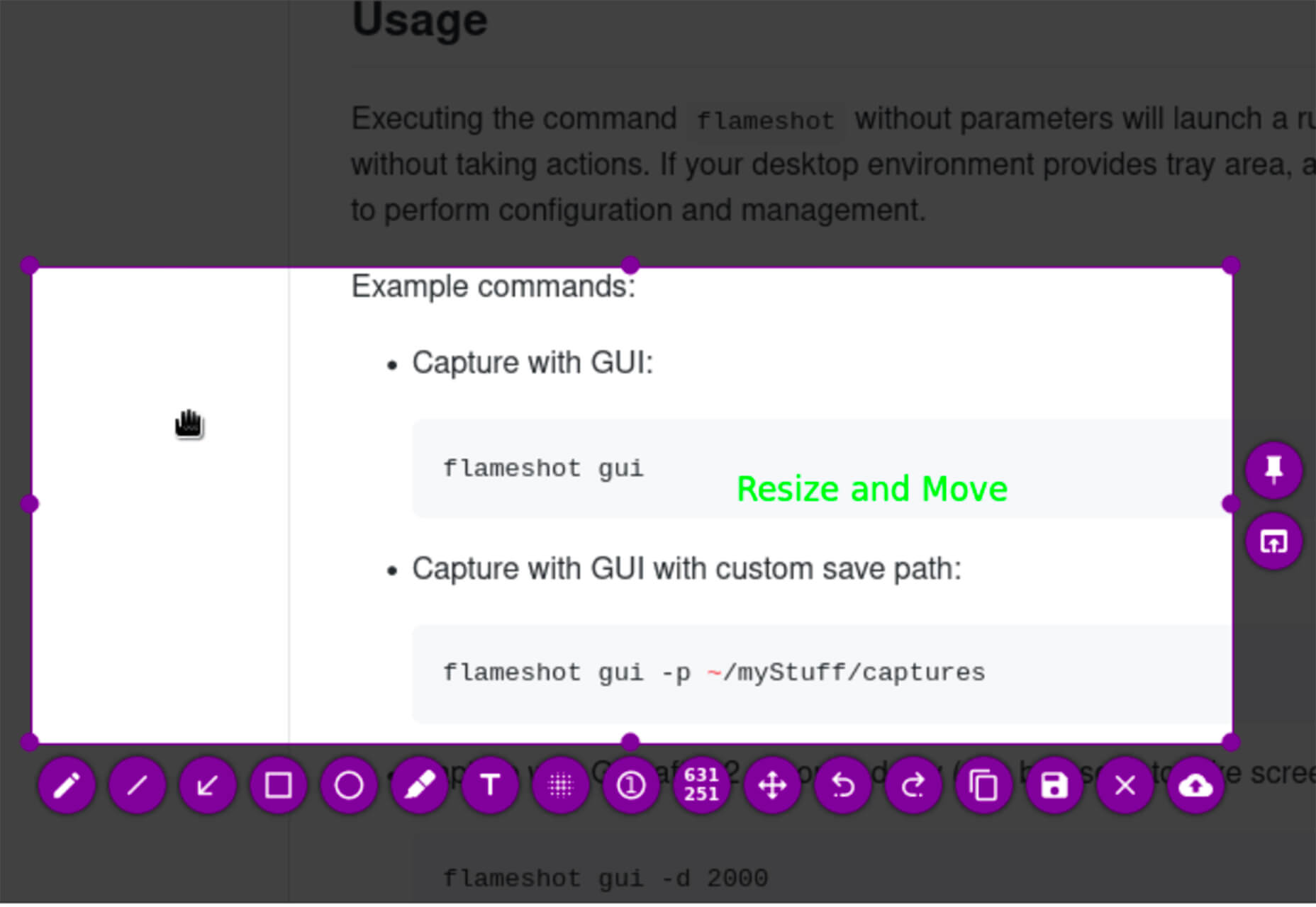
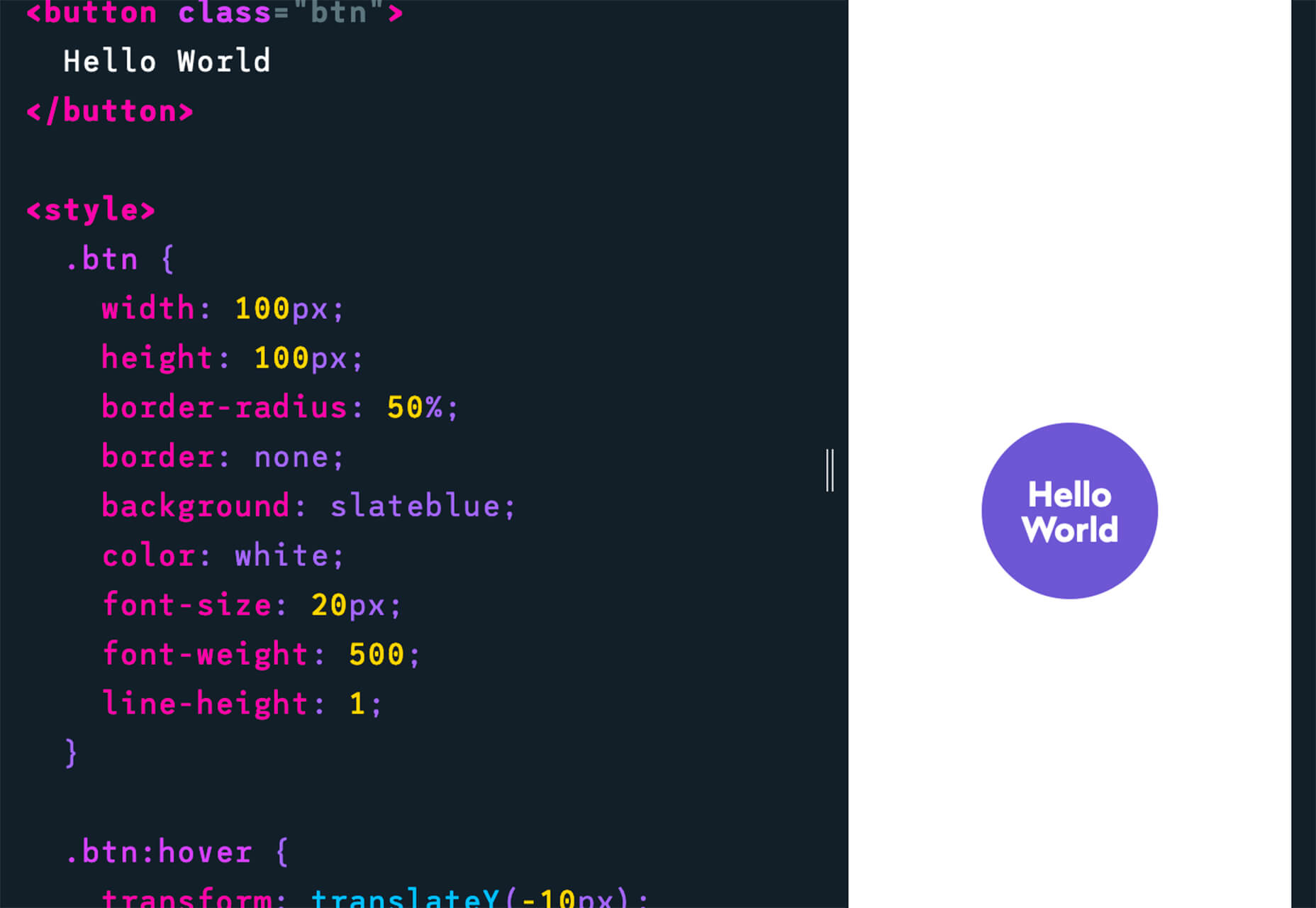
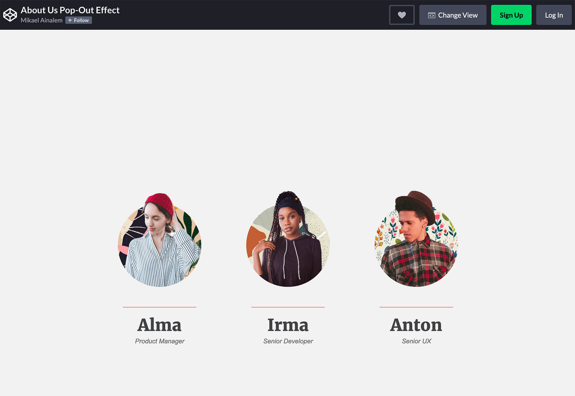
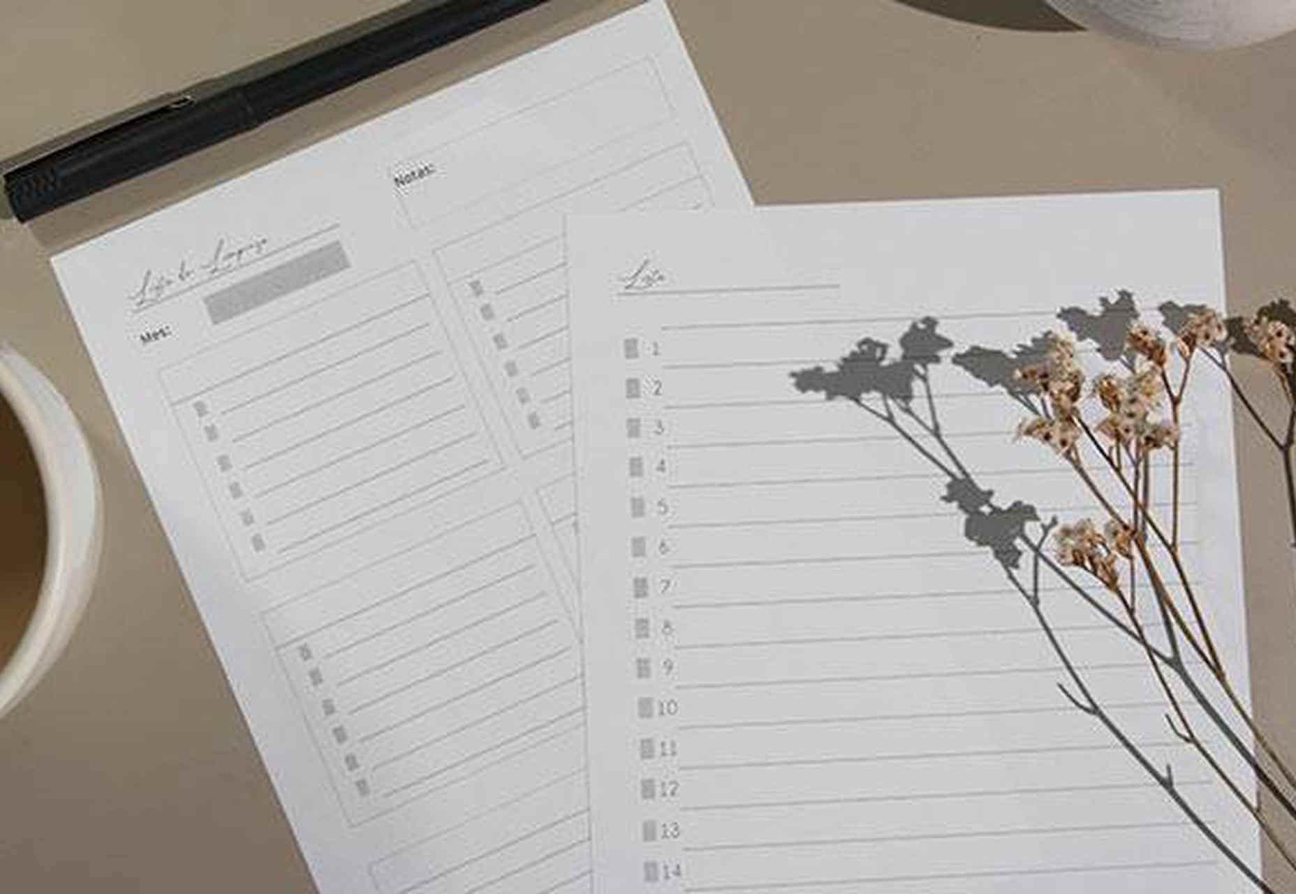
Tip 2: Play Around in the Sandbox
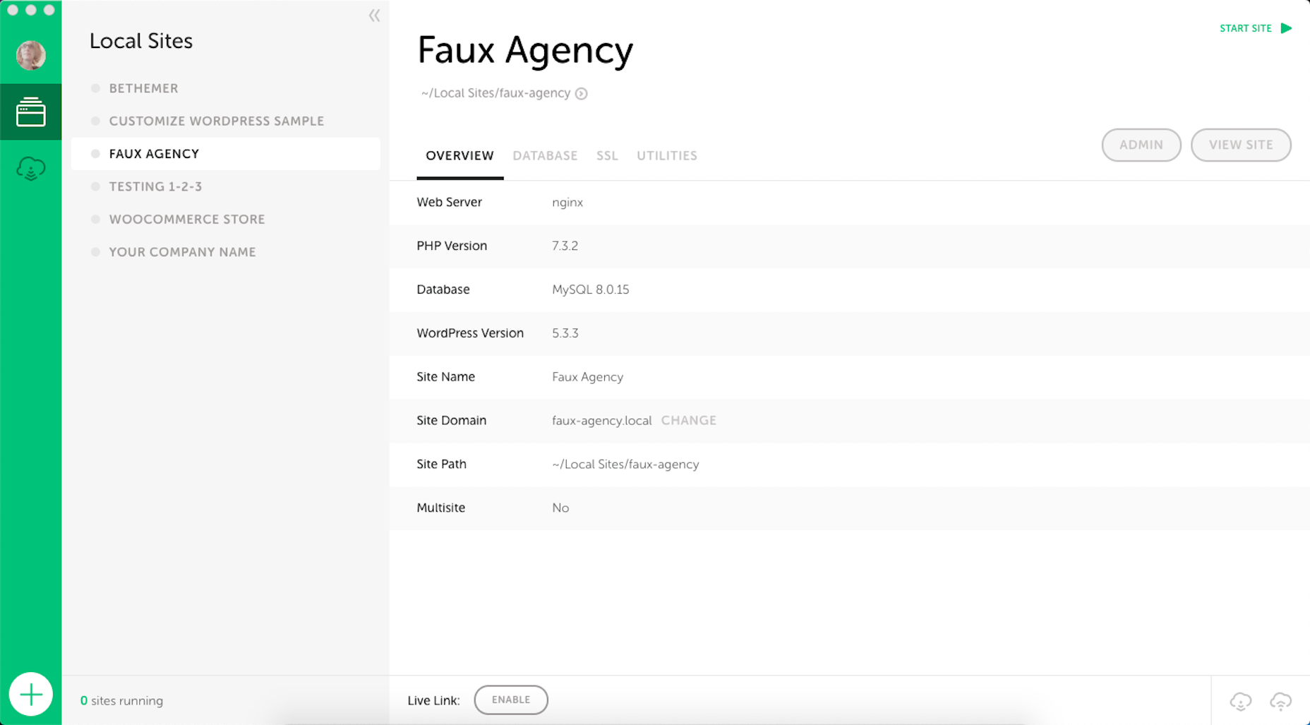
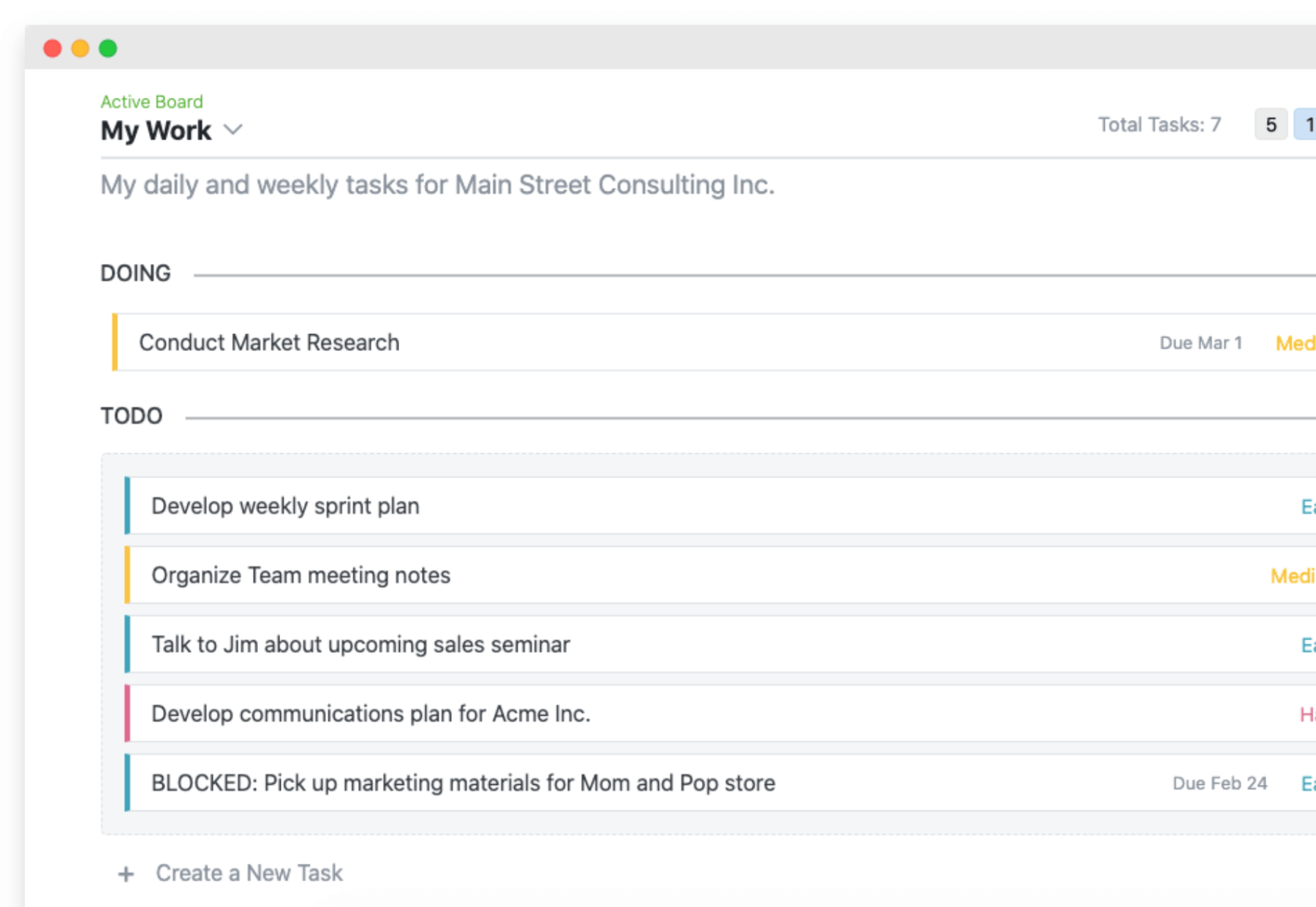
Local development environments are useful for staging websites, doing redesigns, and testing updates safely away from live sites. But you can also use them for experimenting with new design techniques, trends, templates, plugins, and more.
Local by Flywheel is the one I prefer to use:
Here’s a good exercise to start with:
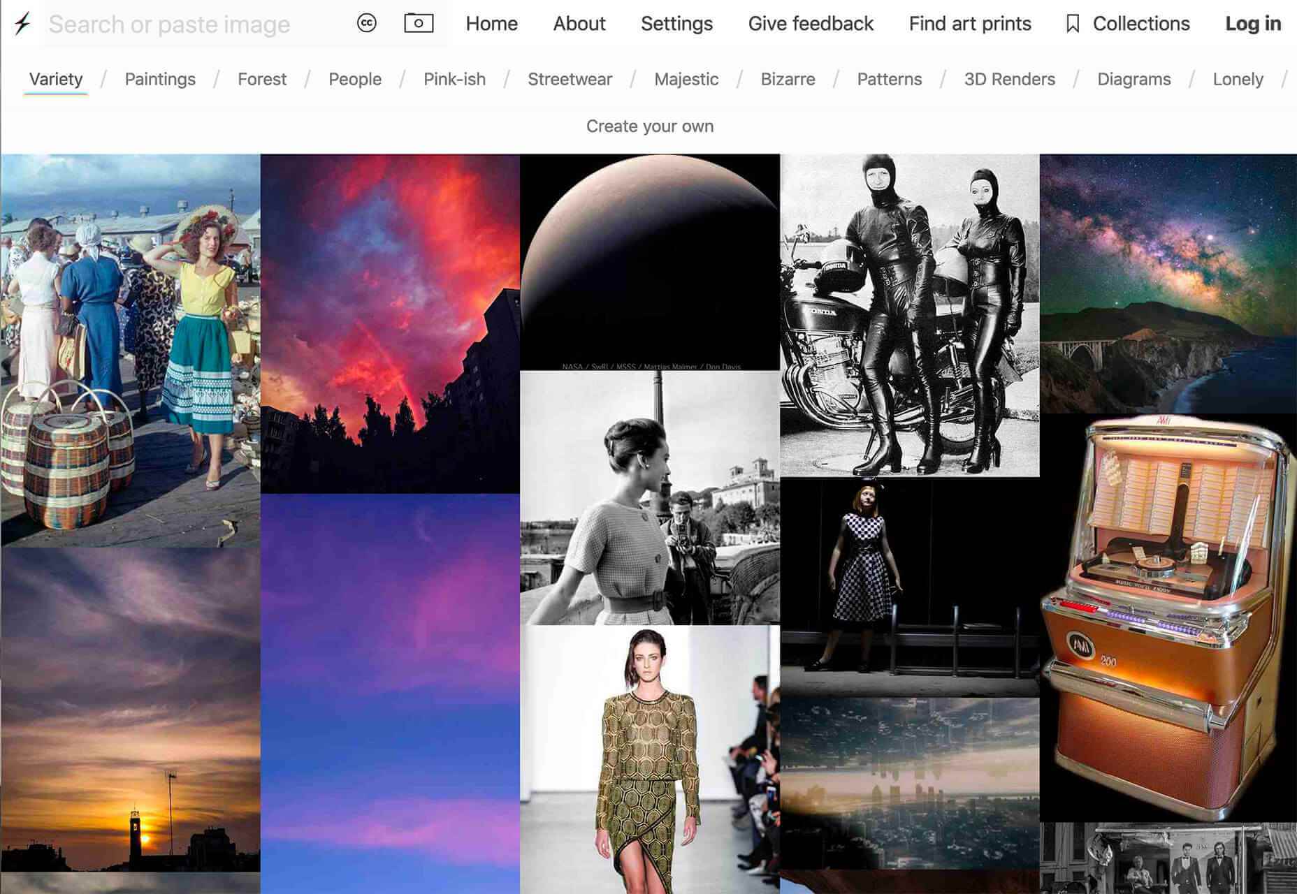
Take a website you like — something you’ve looked at in awe and couldn’t imagine ever building on your own. Then, put yourself to the test. See if you can recreate it in your sandbox.
Don’t be hard on yourself if you don’t figure it out right away. Consult your resources and give yourself time to make sense of what’s going on and implement it with the available skills and tools.
Tip 3: Redesign One of Your First Projects
There’s always a clear evolution in a designer’s skill set, from the day they begin designing to the present day. And that’s a good thing. If your work doesn’t improve or change with time, then you’re going to have a lot of catching up to do when the stagnation begins to hurt your business.
Want to see how much progress you’ve made so far? Revisit one of your first projects and look at it with fresh eyes. I bet you’ll see a big change in how you design today from how you designed that site then.
Now, ask yourself what you would do differently. And then, go to your sandbox and do the redesign.
Tip 4: Work on a Passion Project
A friend of mine is taking a UX design course and needed some users to run through a prototype he created for the class. He could create anything he wanted, so he designed an app related to his other love: Music.
While he could’ve easily thrown together some carbon copy of Spotify or SoundCloud, he came up with a completely new concept. And it was really impressive, to the point where I urged him to put it into production and see if he could list it in the app stores.
I think it’s when we’re really passionate about something that we’re willing to push past our limits. So, carve out some time to tackle that passion project you’ve been toying around with and see where it takes you.
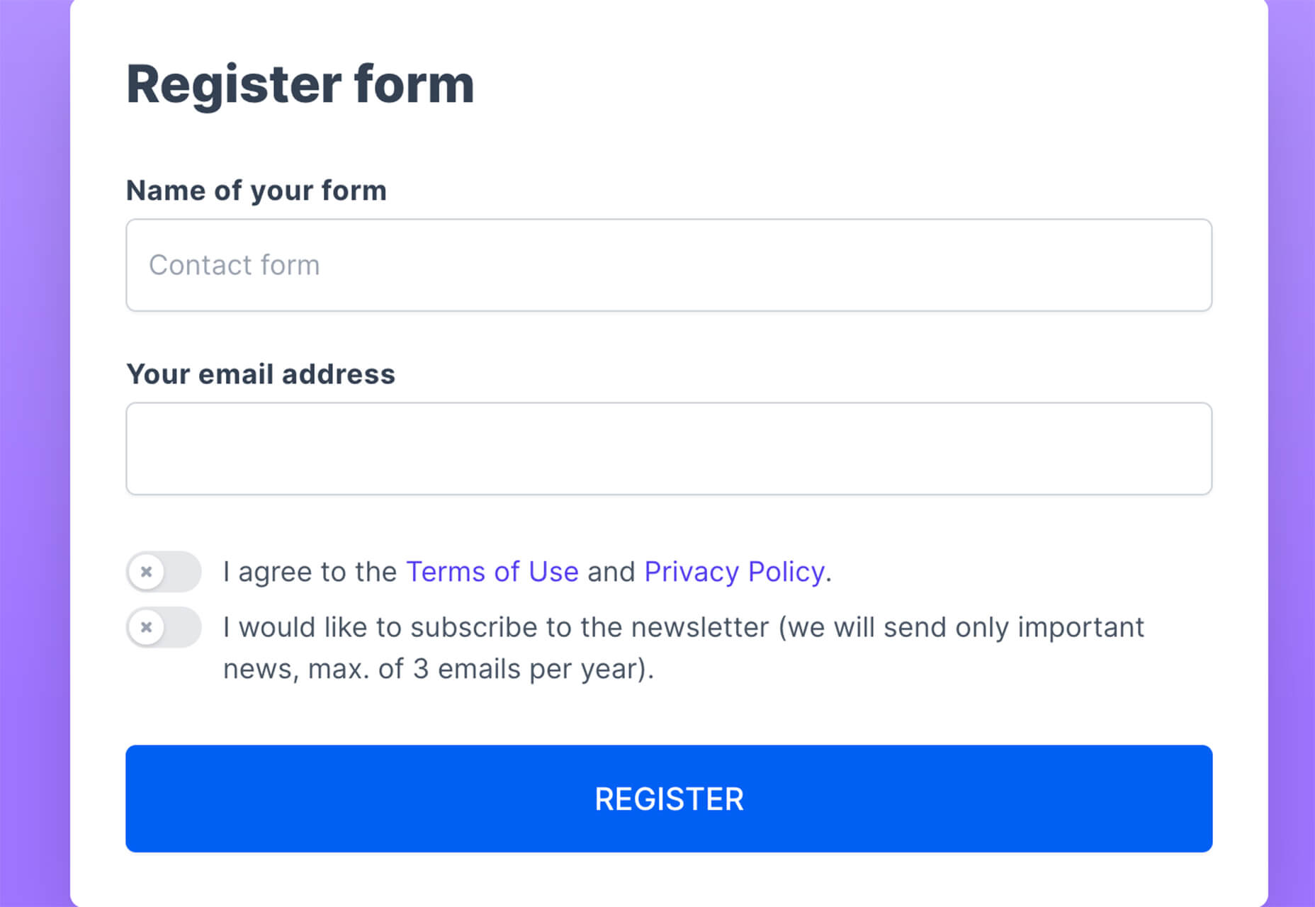
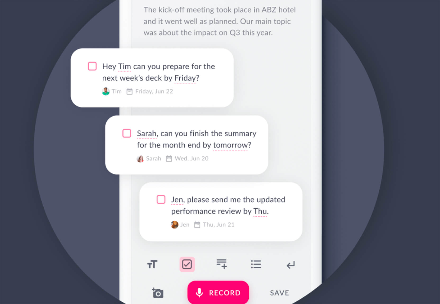
Tip 5: Share Your Designs on Dribbble and Ask for Feedback
One of the reasons UX designers do user testing is how valuable users’ raw input is. While it would be nice to think that design is a completely subjective matter, that isn’t really the case when usability becomes compromised due to design choices.
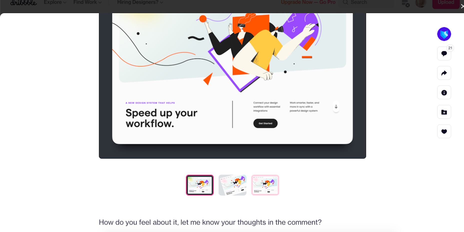
Understanding what users like and dislike is an important part of taking your design skills to the next level. And a good way to do that is to share your designs on Dribbble.
Here’s an example of UI8 asking for feedback:
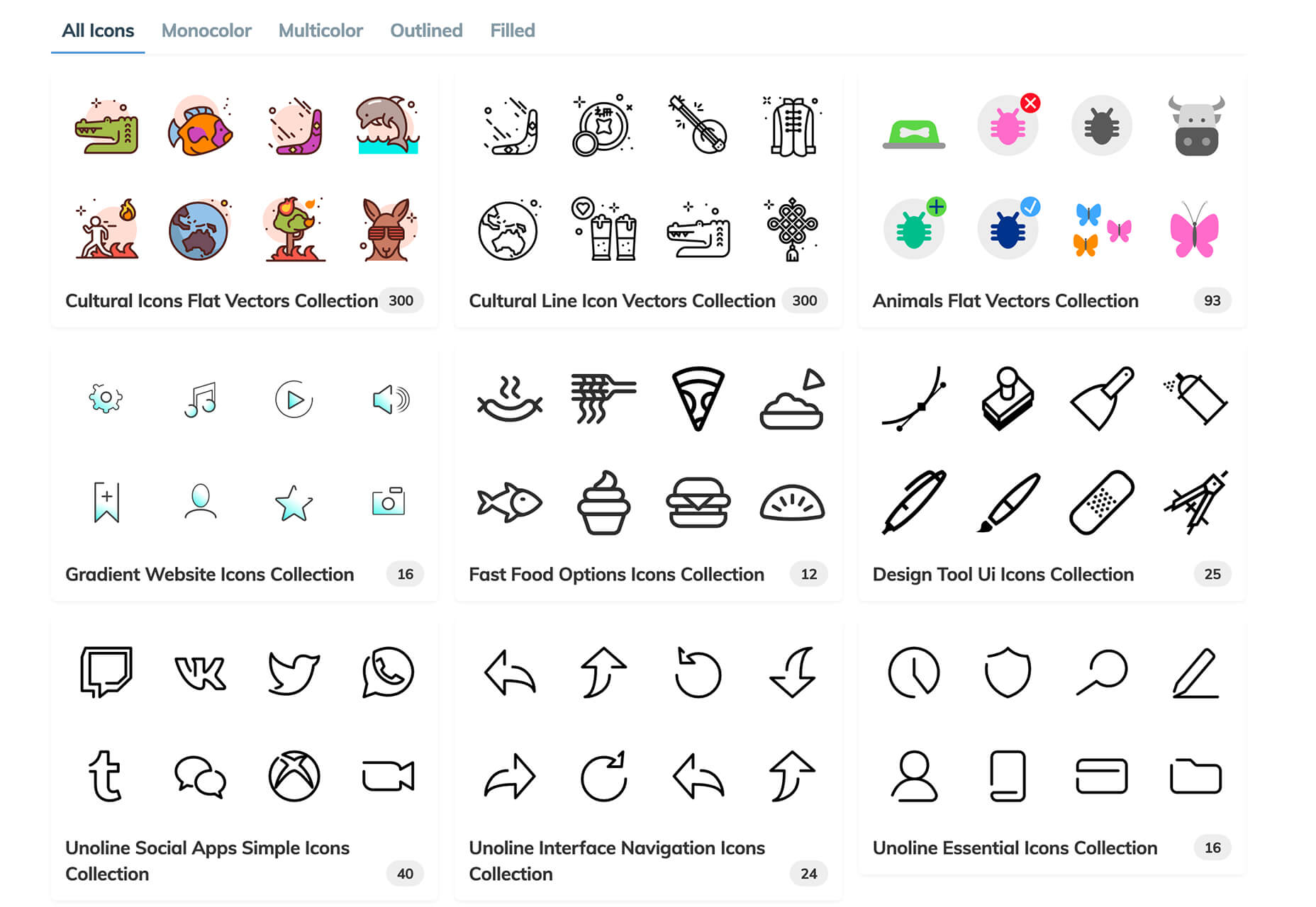
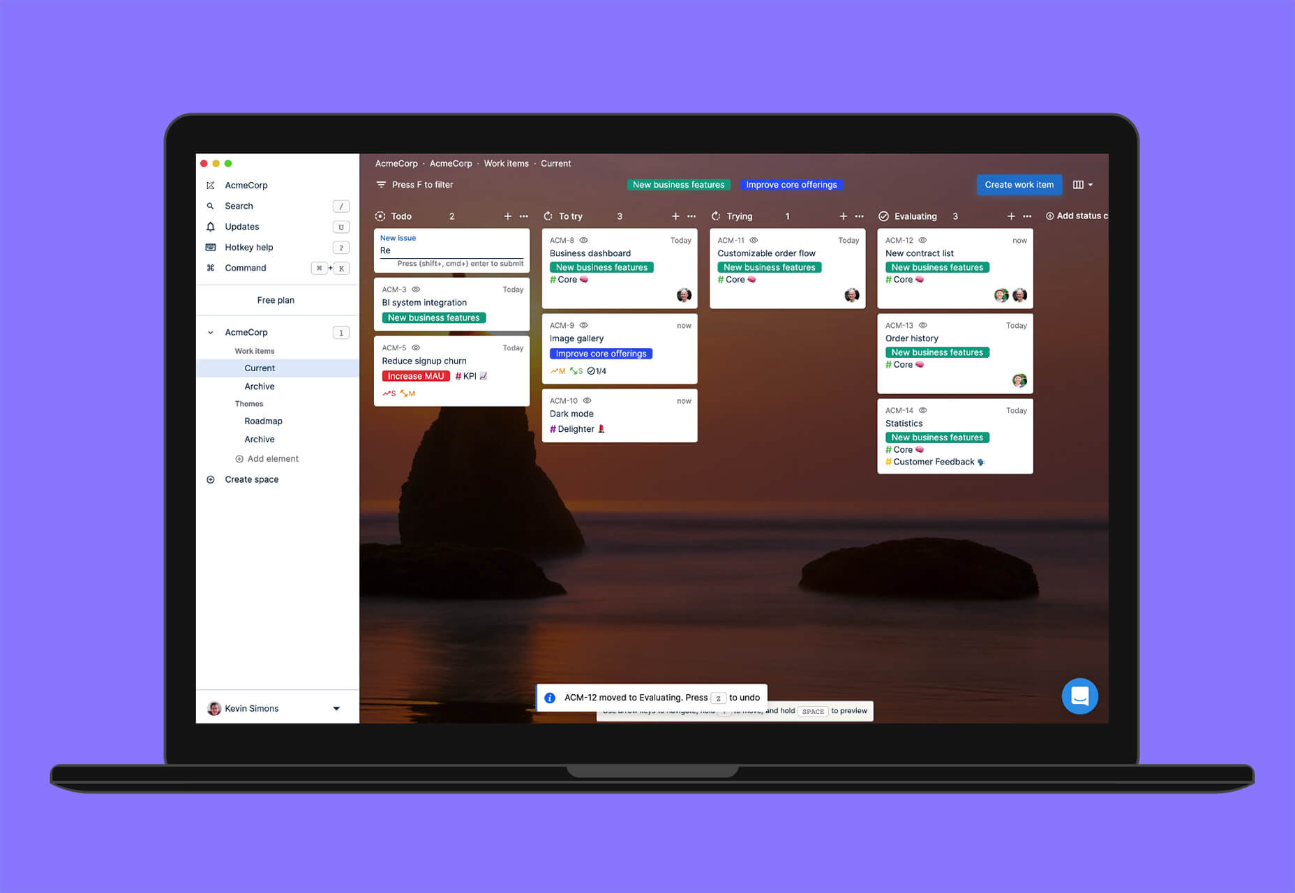
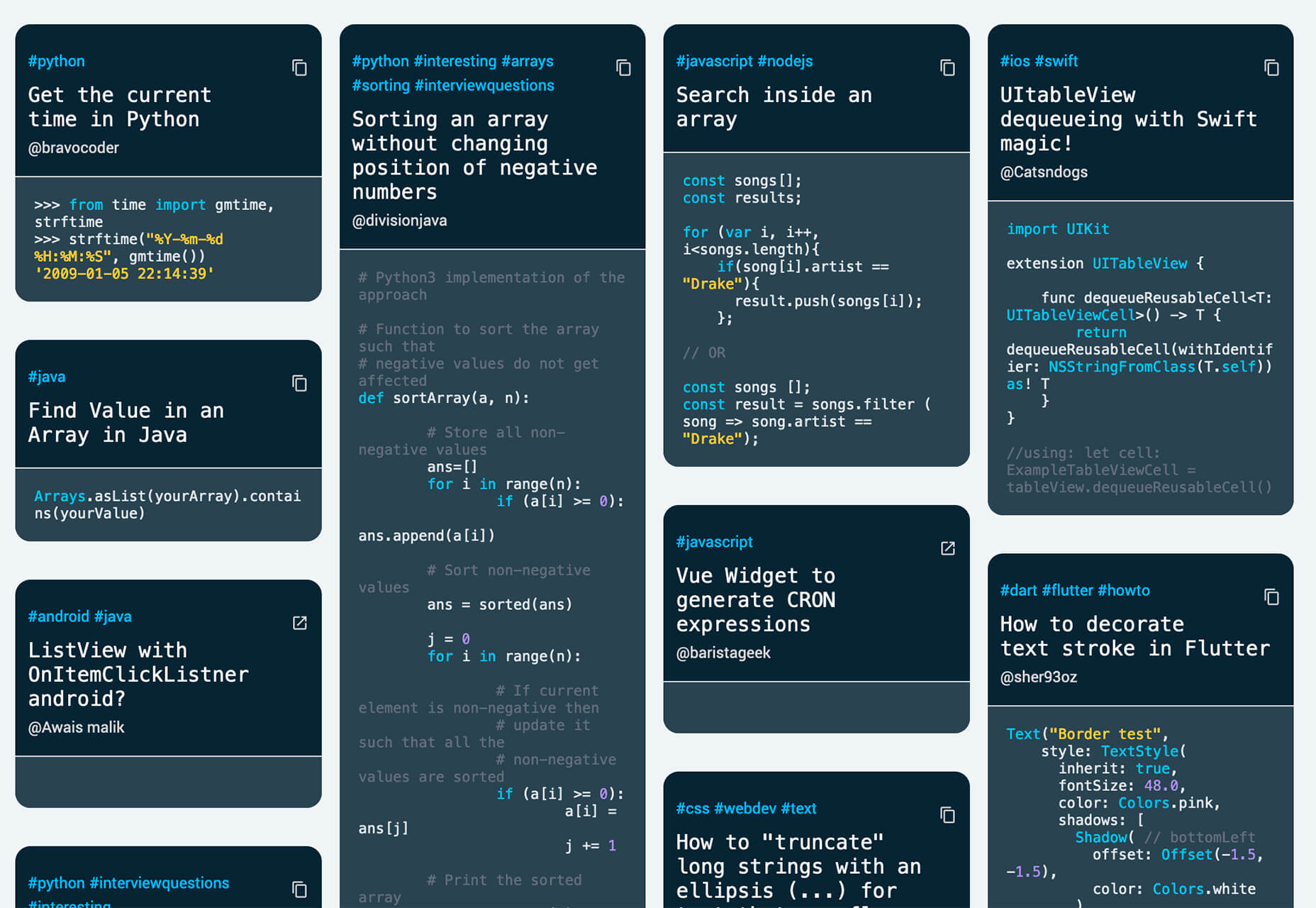
Tip 6: Create a Design Toolbox
I’m a huge fan of automation and shortcuts powering things behind the scenes in business.
After all, one of the reasons you become a web designer is so you can design, right? When you’re bogged down with administrative and logistical tasks, that’s time spent away from doing what you enjoy.
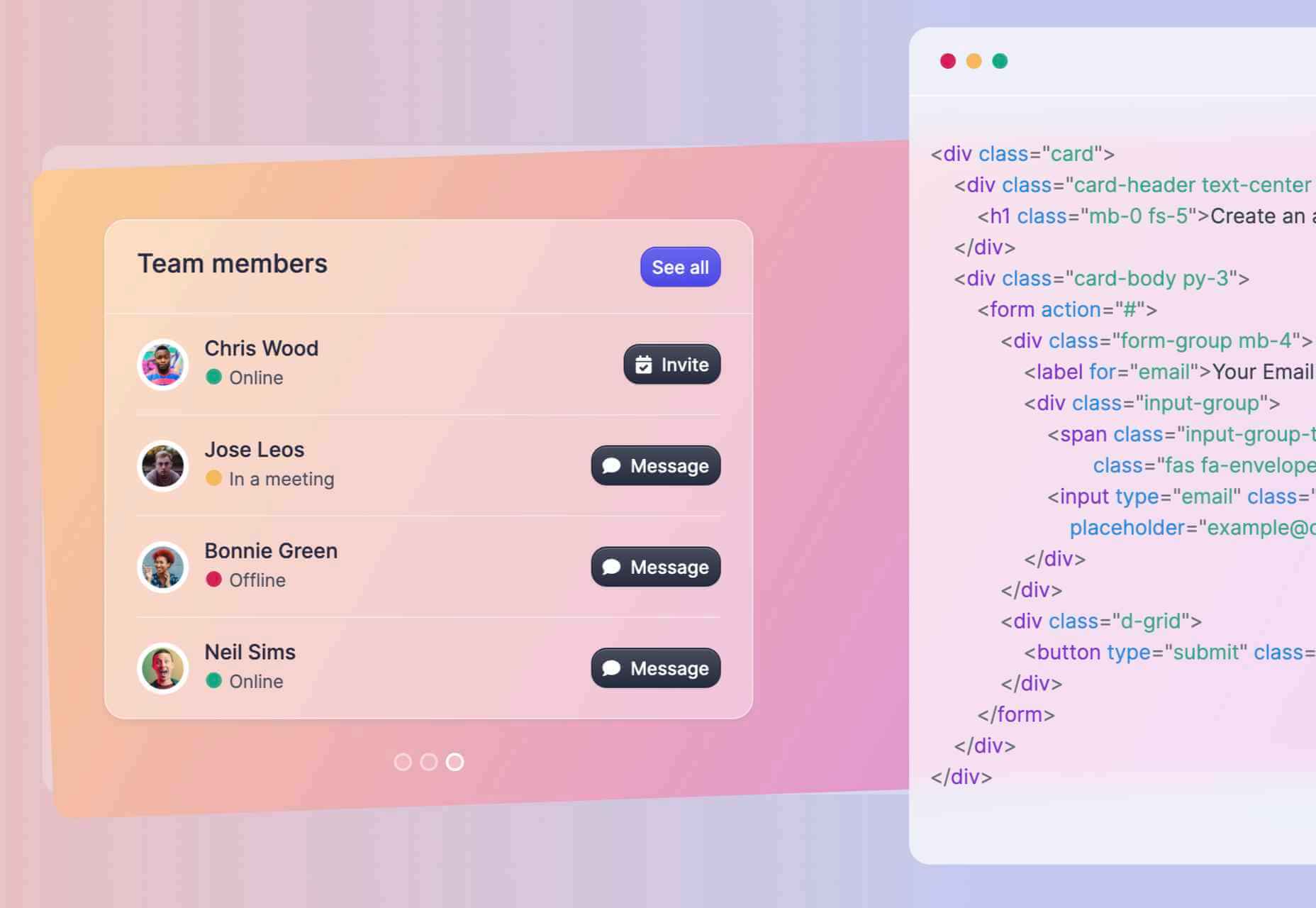
One way in which you can streamline your backend processes is by putting together a design toolbox. Your preferred CMS. Flexible templates or apps you use from project to project. Website testing tools. And so on.
As you do this, it’ll force you to examine how you build websites. Are you really working as efficiently as possible? Are there newer apps or systems that’ll help you design better sites? And as you improve your design toolbox, you’ll improve your design skills.
Tip 7: Subscribe to Your Favorite Blogs
I have a hard time recommending this one, only because I’m reluctant to sign up for yet another newsletter. That said, I do see the value in subscribing to some blog newsletters as I don’t always remember to revisit their websites and check out the latest content.
What I’d suggest you do is pick one or two design blogs that have a good variety of content and publish regularly. And then pick one small business or freelance blog.
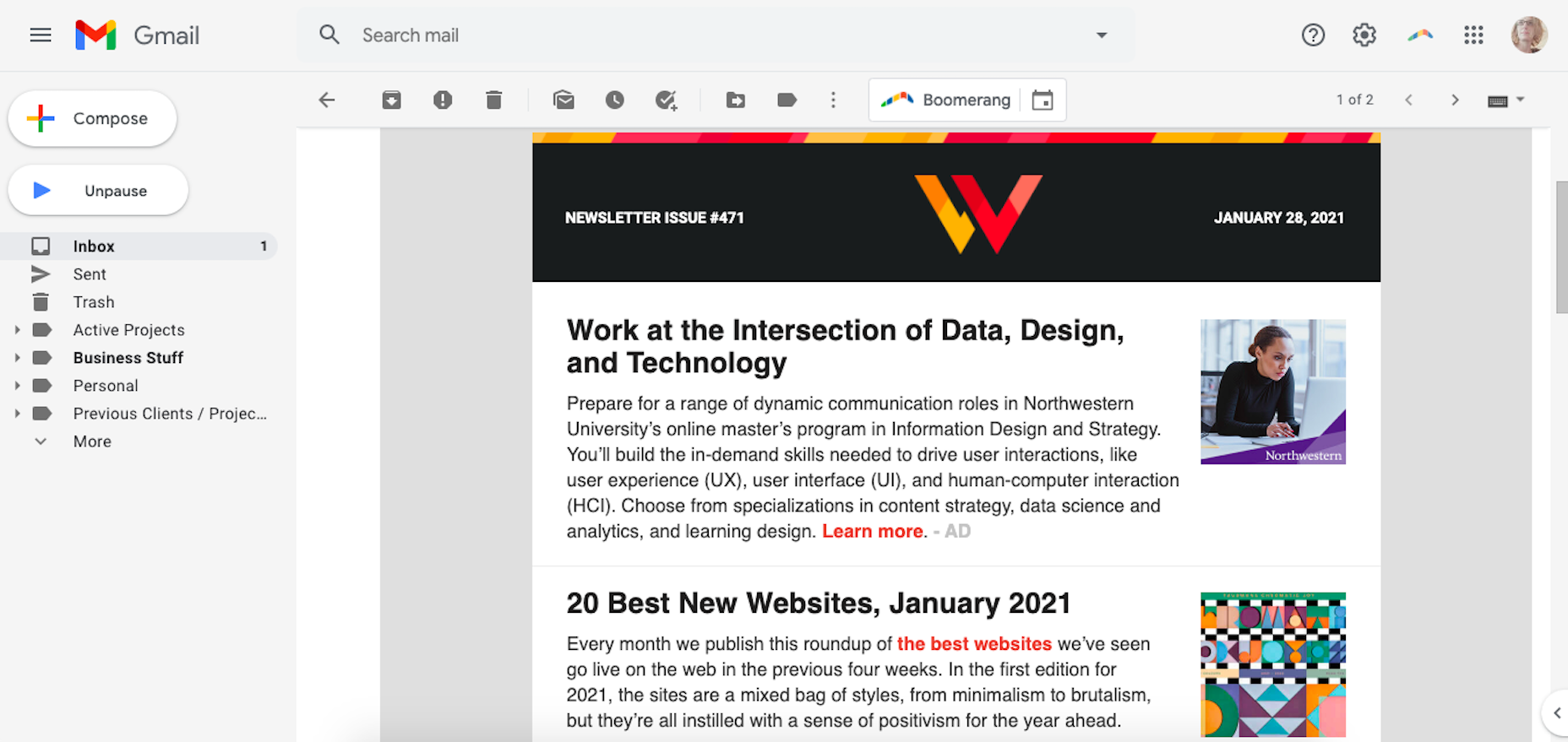
WebdesignerDepot, of course, is a good one to start with as it comes at a good frequency, recommends great reads from all around the web, and is fluff-free:
I’d also recommend signing up for one that’s focused on your niche as well as one for business.
As a freelancer, I’d vote for the Freelancers’ Union newsletter. There’s always something timely and useful in there.
Tip 8: Listen to a Podcast
I just adopted a second dog, so I’ve spent a lot more time on walks while house-training her. At first, I was stressed about it because it was time spent away from work. However, I started to fill that time with podcasts and found that it helped me work better for the rest of the day.
One reason is that I’ve been listening to work-related podcasts, which are always chock full of helpful tips. Another reason is that it gives my eyes a rest from looking at the screen so that when I come back 15 or so minutes later, I feel refreshed and ready to go.
Rebekah Carter has a good set of web design podcast recommendations to get you started.
Tip 9: Take a Free Online Design Course
There’s an overabundance of information online. If you want to brush up on CSS, there are hundreds of YouTube courses that cover it. If you want to learn how to use a new WordPress plugin, you’ll find dozens of great tutorials across various online course platforms, YouTube channels, and even people’s blogs.
There’s no need to go back to school to become a better designer. Here are five places where you’re bound to find free courses for web designers.
Tip 10: Read a Book on Design Principles or Theory
It’s easy to lose sight of design principles when your clients are clamoring for a website that will make them a lot of money, get them a lot of readers, and so on. Sure, you can design a UI and UX that works, but do you remember why the design choices you made are effective?
Choose a book — just one to start — that’ll help you reconnect with the roots of good web design. Not only will you get a good refresher on web design principles or design theory, but you might learn something brand new.
Here are some of my favorite books for web designers:
Tip 11: Find Your People
Now more than ever, finding a community of like-minded web designers, developers, or freelancers is important. It’s not just about having a group of people to vent to when clients drive you nuts (though that’s great, too).
It’s about finding a group that brings something new to the table and enriches your understanding of web design and what it means to be a web designer.
If you’re on Facebook or LinkedIn, start there. There are tons of web design and freelance groups that have productive discussions every day. If you prefer to meet up with local designers and developers, check out Meetup.
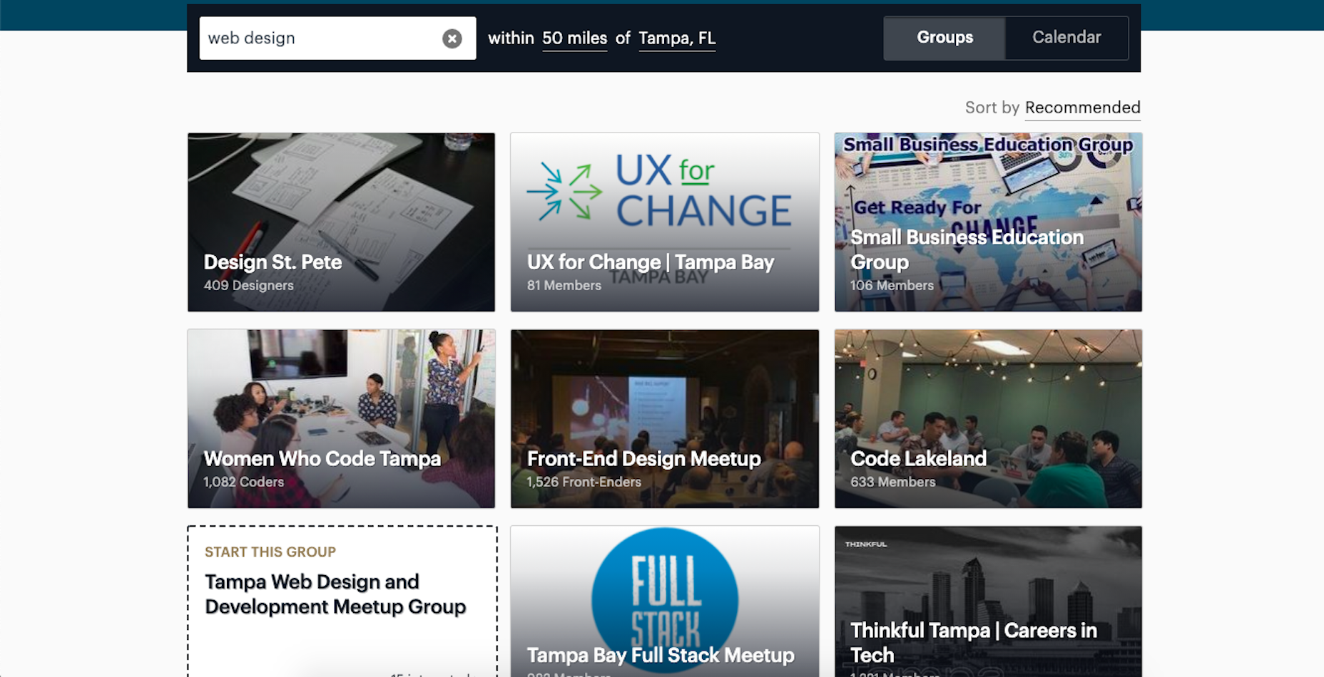
You may be surprised by how many groups there are and the kinds of meetups they have planned.
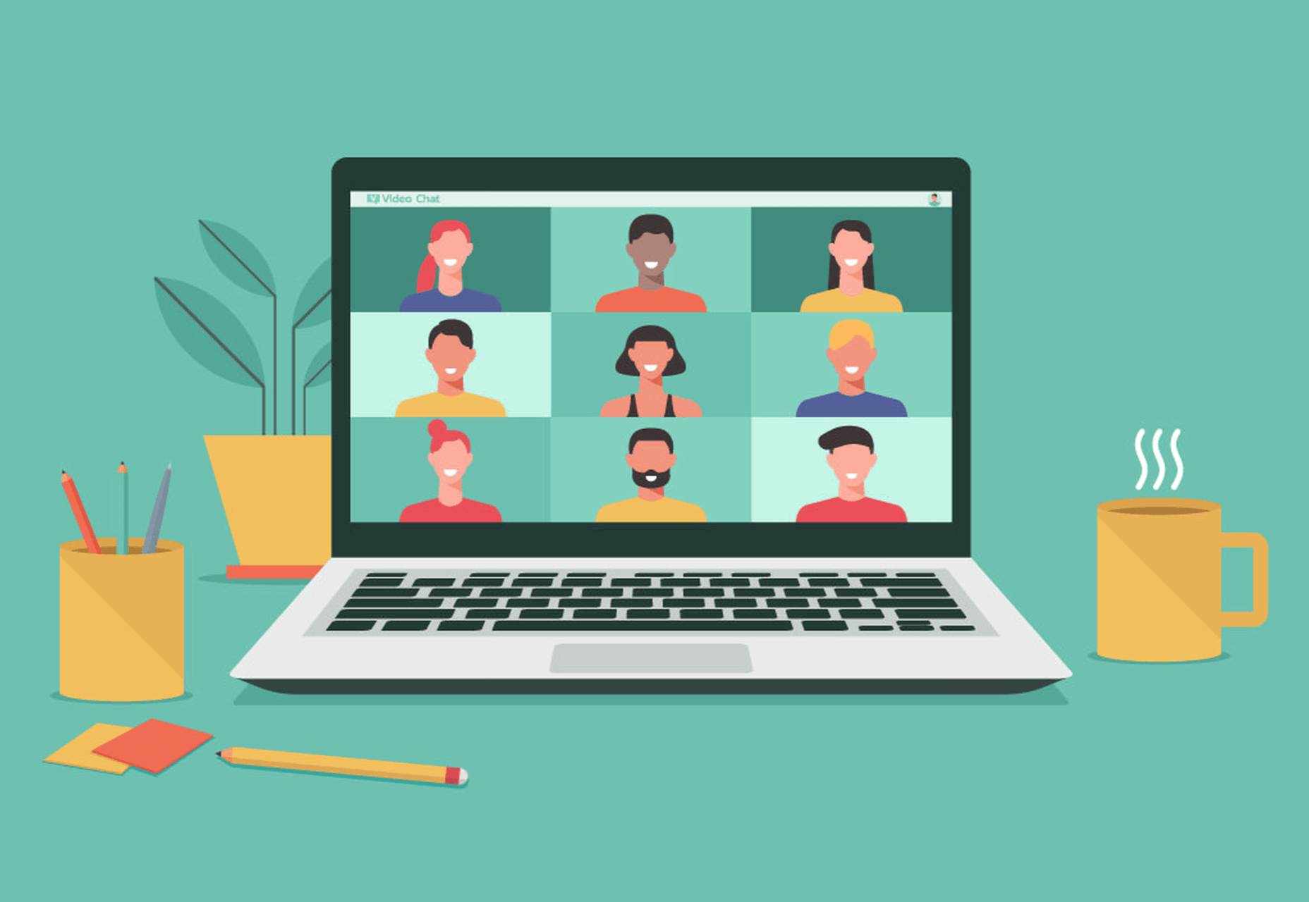
Tip 12: Attend a Virtual Conference
Did any of you attend a design conference last year? I did. I virtually attended Adobe MAX — from the comfort of my home, in my pajamas, for three days.
I scheduled my assignments around the sessions I wanted to attend and didn’t have to pick one over the other (i.e., “Do I make money or do I learn something new?”).
Some of the sessions showed us how to do more with Adobe’s tools, while some of them featured design and business leaders who shared personal insights on how to work more effectively. It was a great way to shake up my normal routine and to get a ton of information about the future of web design in a short period of time.
Which of These Tips Will You Use to Improve Your Design Skills?
Like I said before, there’s a lot you can do to improve your design skills. Just be careful not to overdo it.
Pick one or two things on this list to start with. If you have more time in your schedule and you’re excited about what you’ve learned so far, add a couple more.
Just take it slowly. Your brain will only be able to absorb so much at once. Plus, the last thing you want is to burn yourself out on skills training and not have the energy to complete your work.
Featured image via Unsplash.
Source
The post 12 Tips to Improve Your Web Design Skills in 2021 first appeared on Webdesigner Depot.

Source de l’article sur Webdesignerdepot

 Everyday design fans submit incredible industry stories to our sister-site, Webdesigner News. Our colleagues sift through it, selecting the very best stories from the design, UX, tech, and development worlds and posting them live on the site.
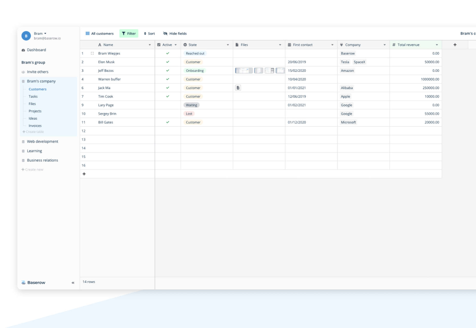


 So, really, you’re in the business of designing websites for your clients’ audiences.
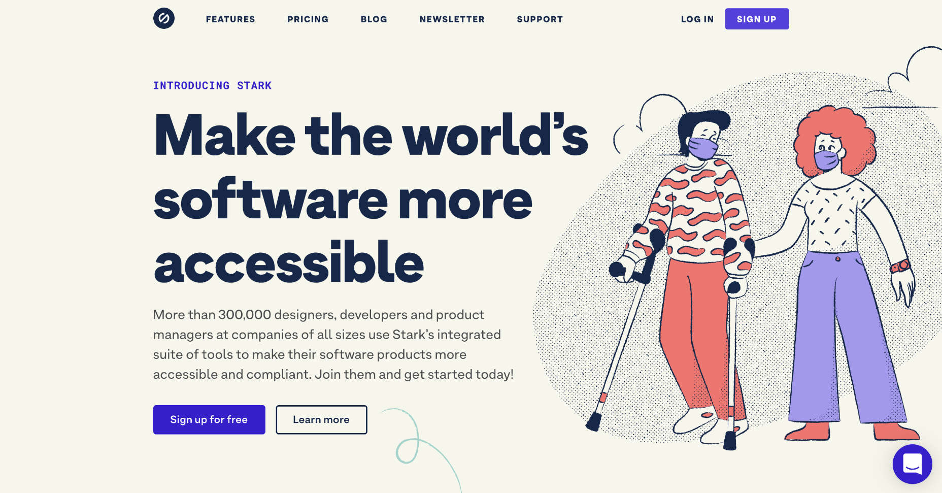
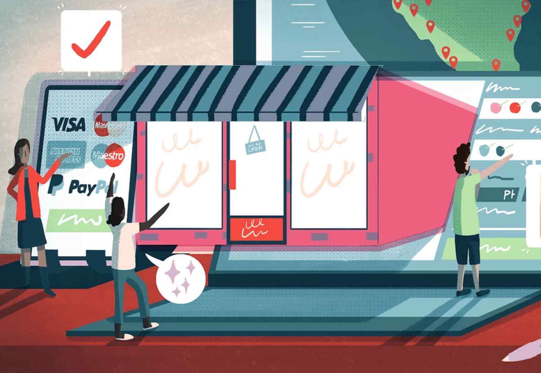
 A key part of designing successful websites for clients is making sure that as many end-users as possible can access and enjoy that site.
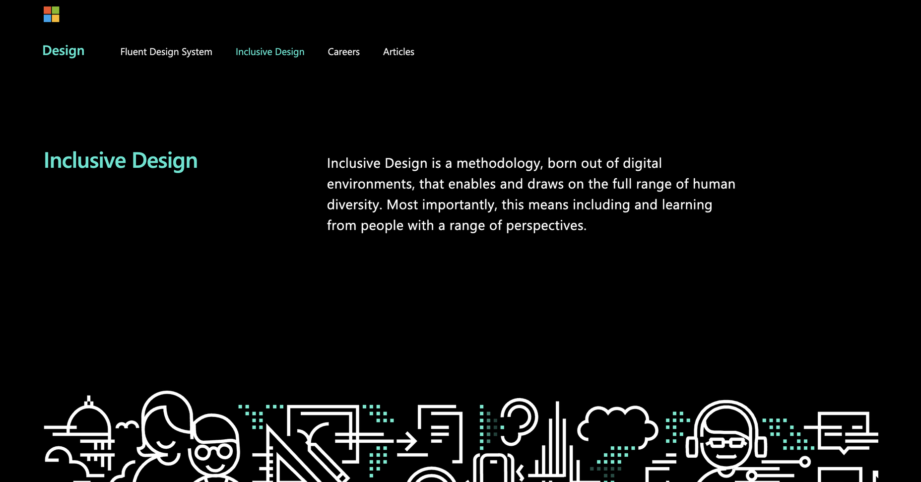

 Everyday design fans submit incredible industry stories to our sister-site,
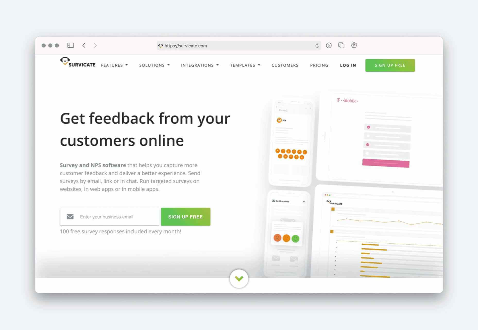
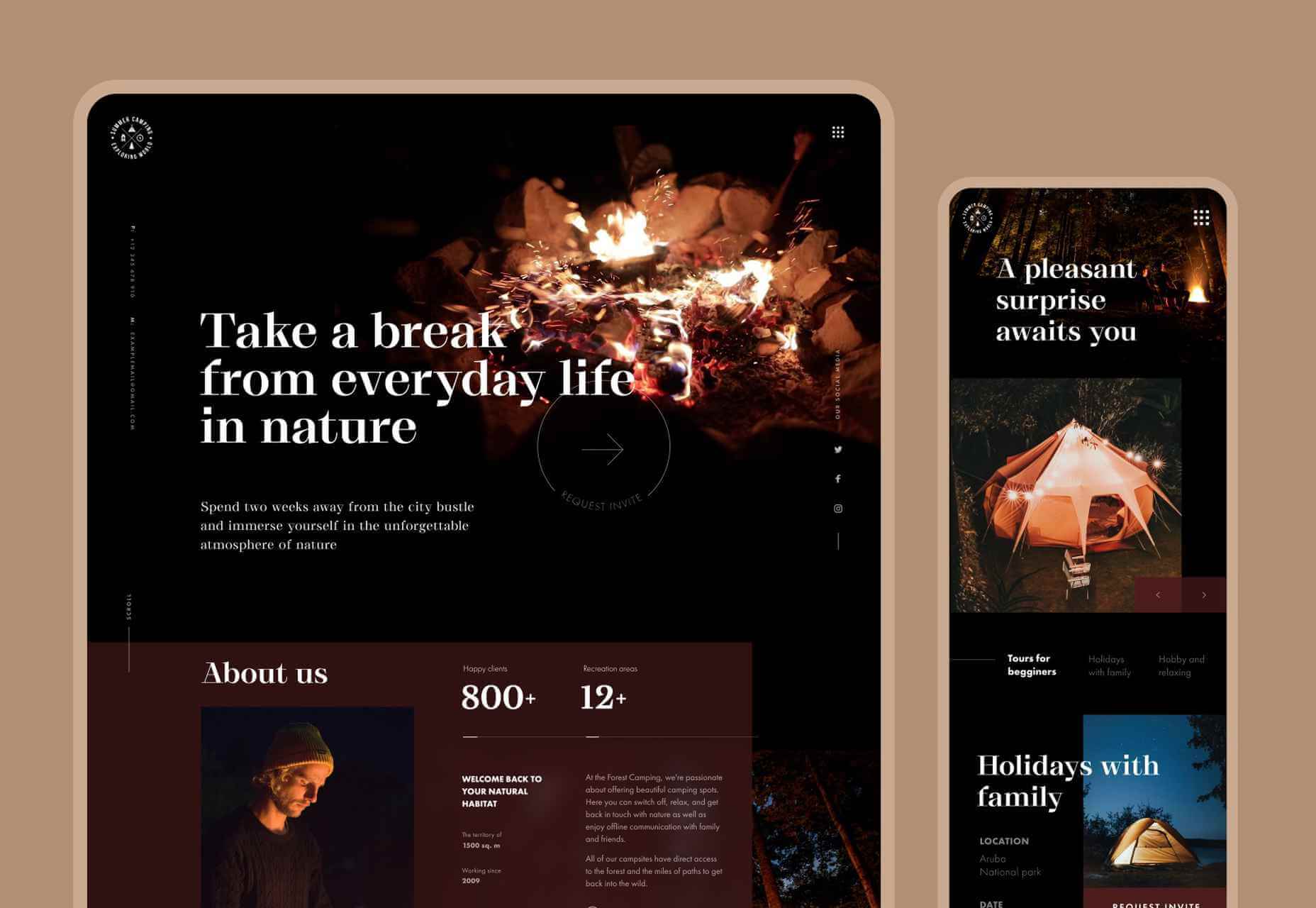
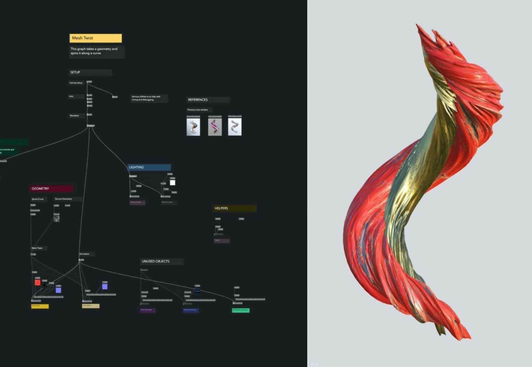


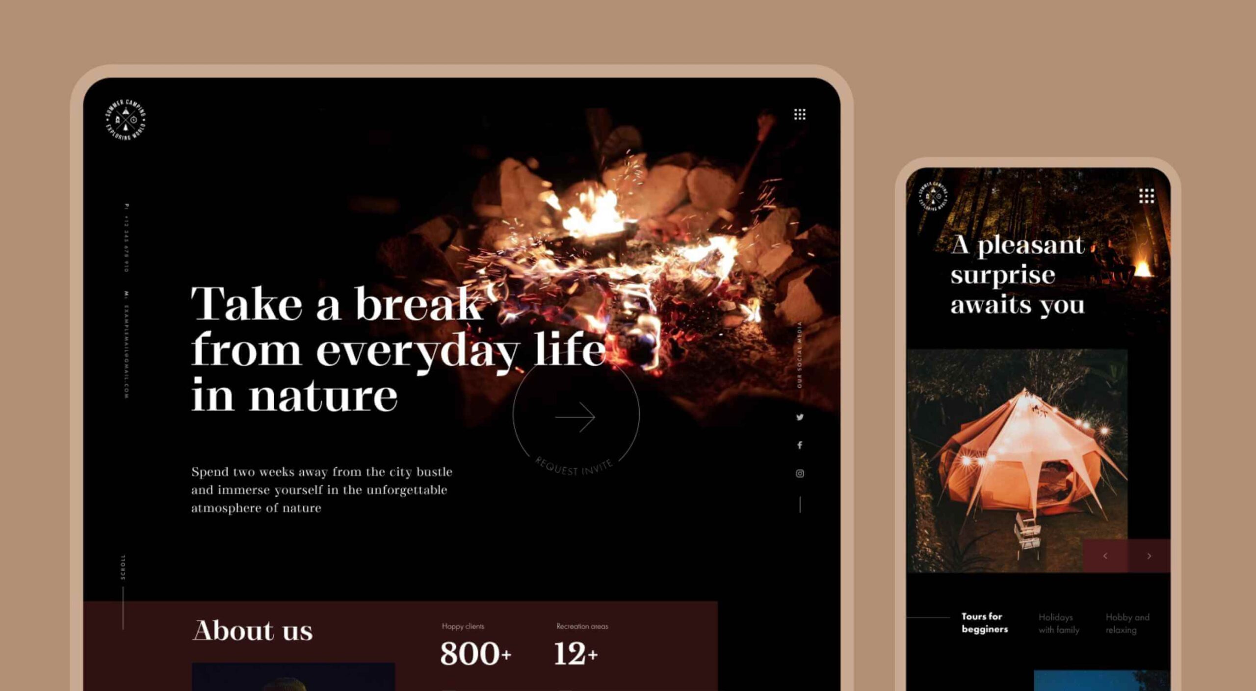
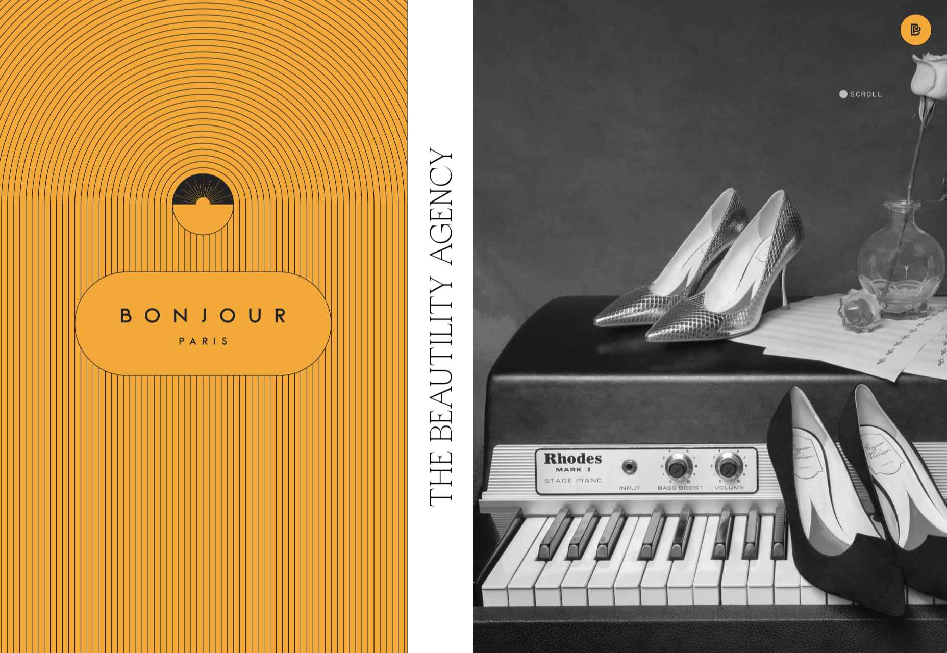
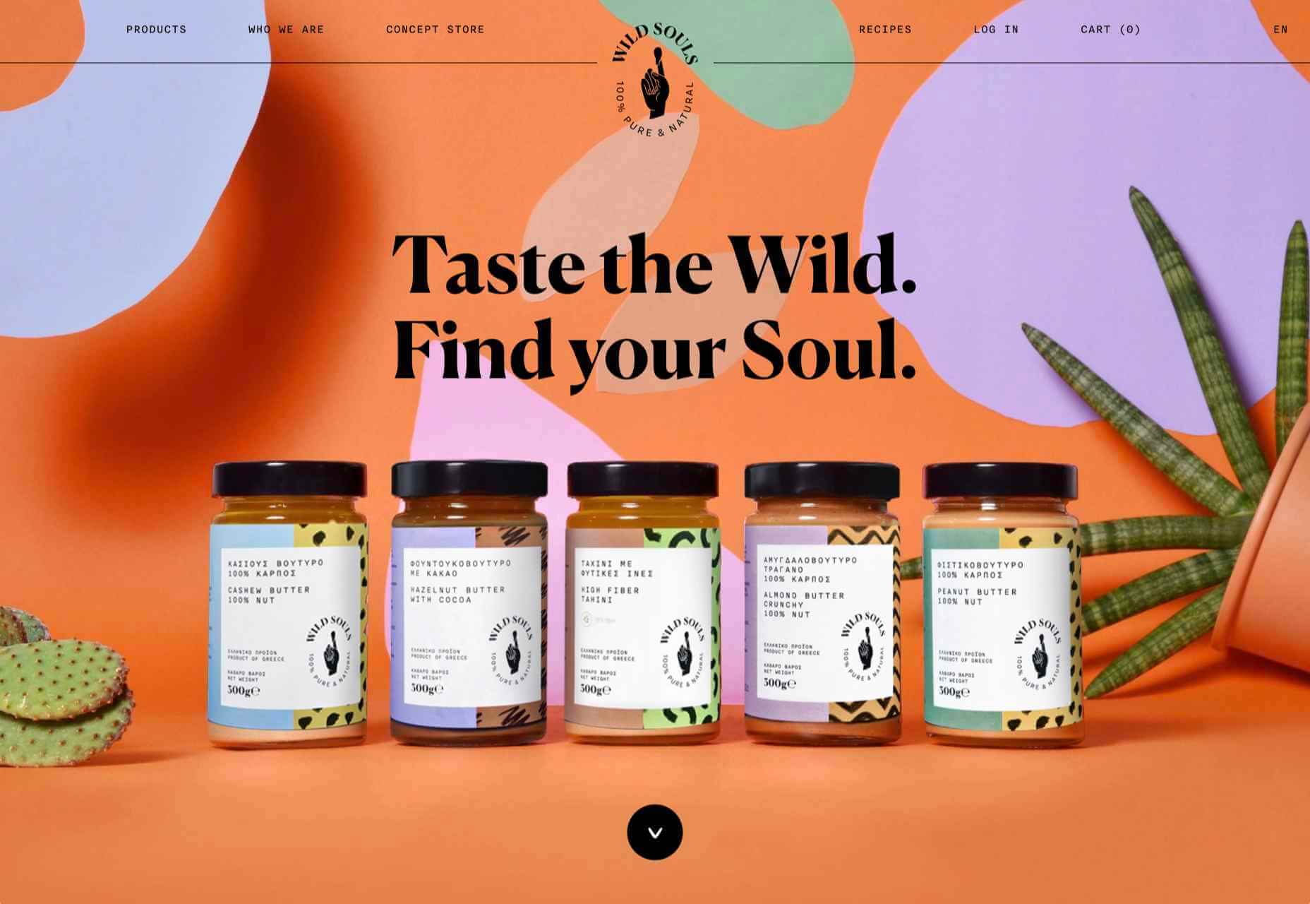
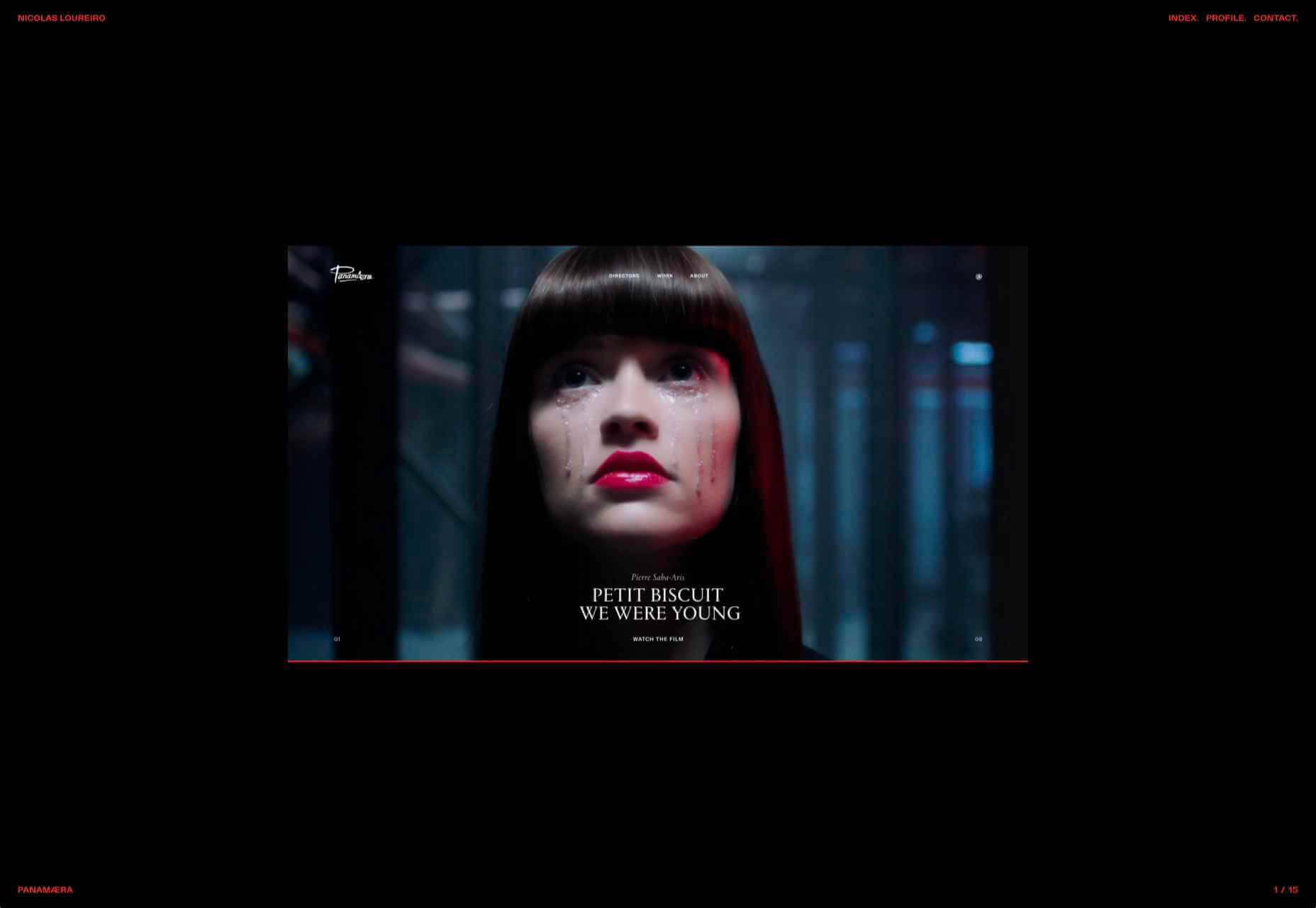
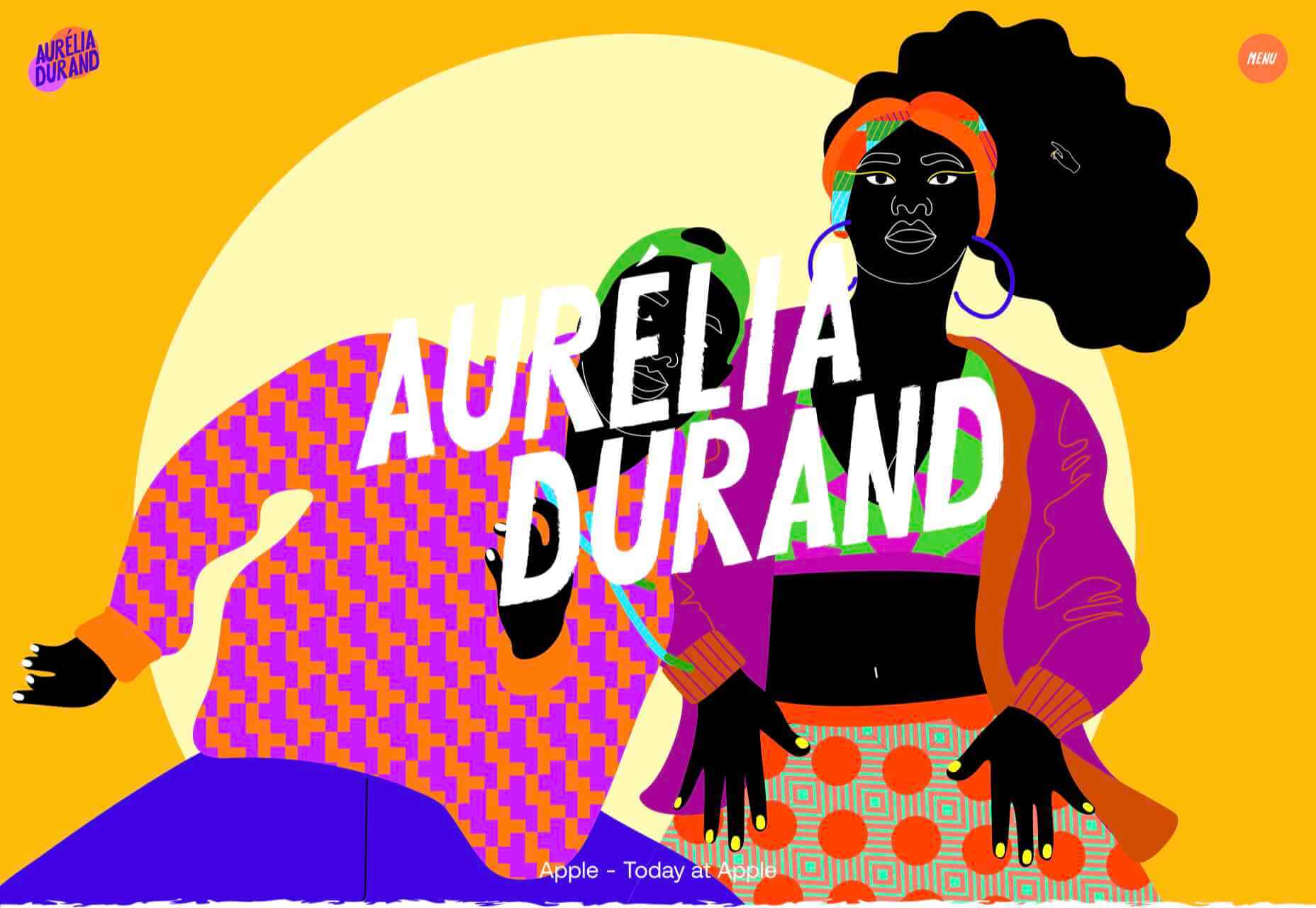
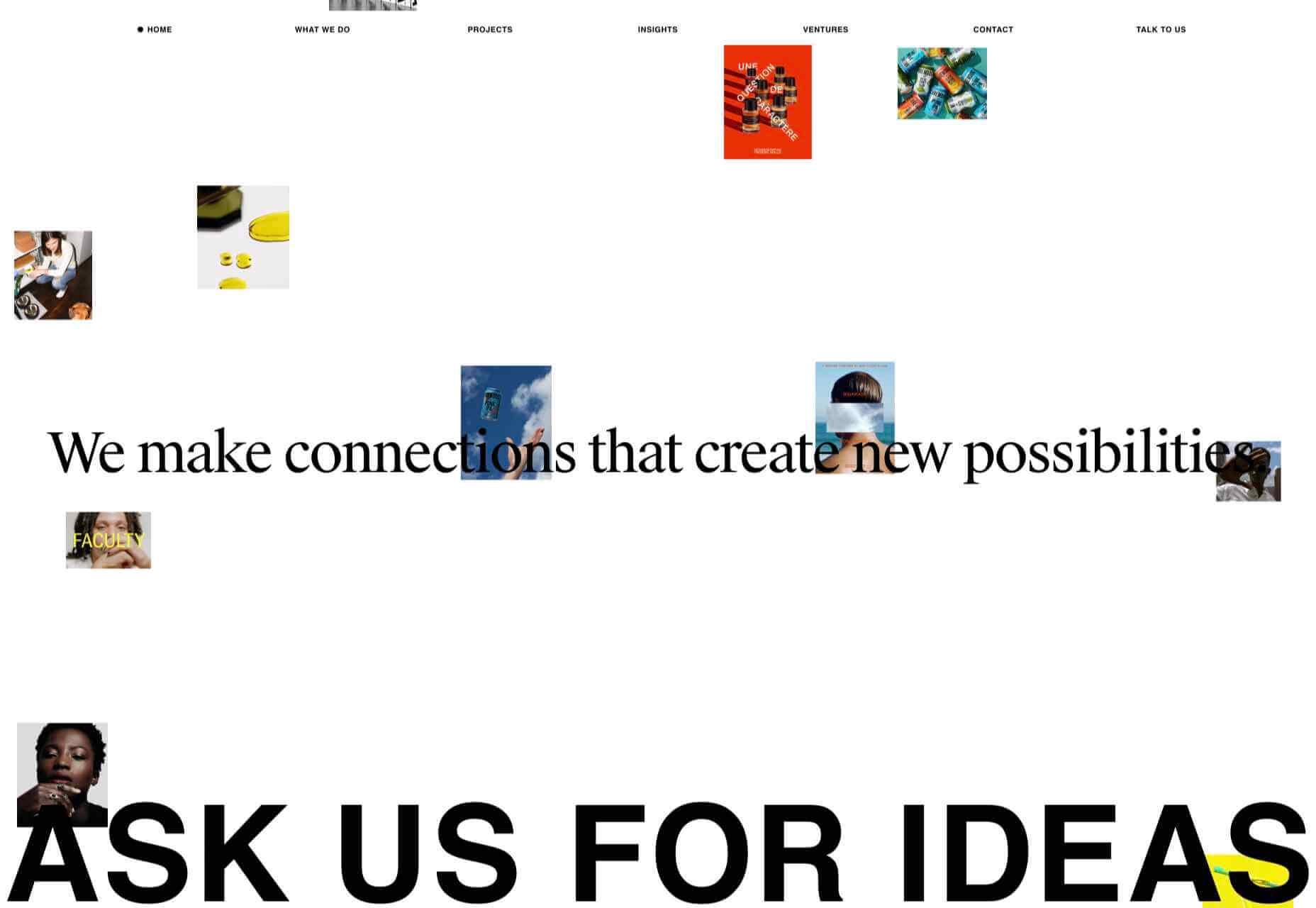
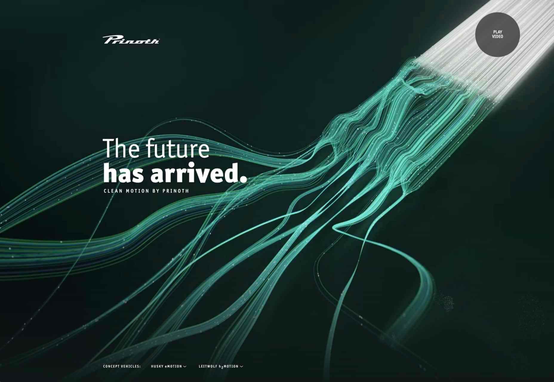
 Looking for something new to get you excited about design work? This list is packed with all kinds of goodies to help you feel inspired and ready to work.


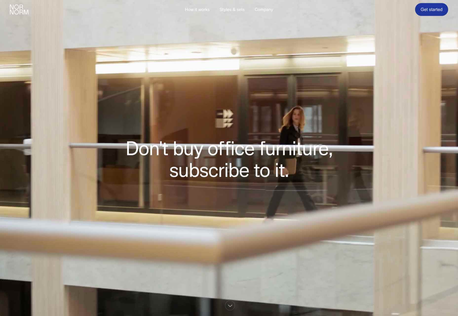
 March is that time of year where the feeling of newness starts, from the first Spring days to fresh design projects. These trends are no exception, with fun new takes on some classic concepts.


 Everyday design fans submit incredible industry stories to our sister-site,


 If you like to build websites with WordPress, then you’re in for a treat.
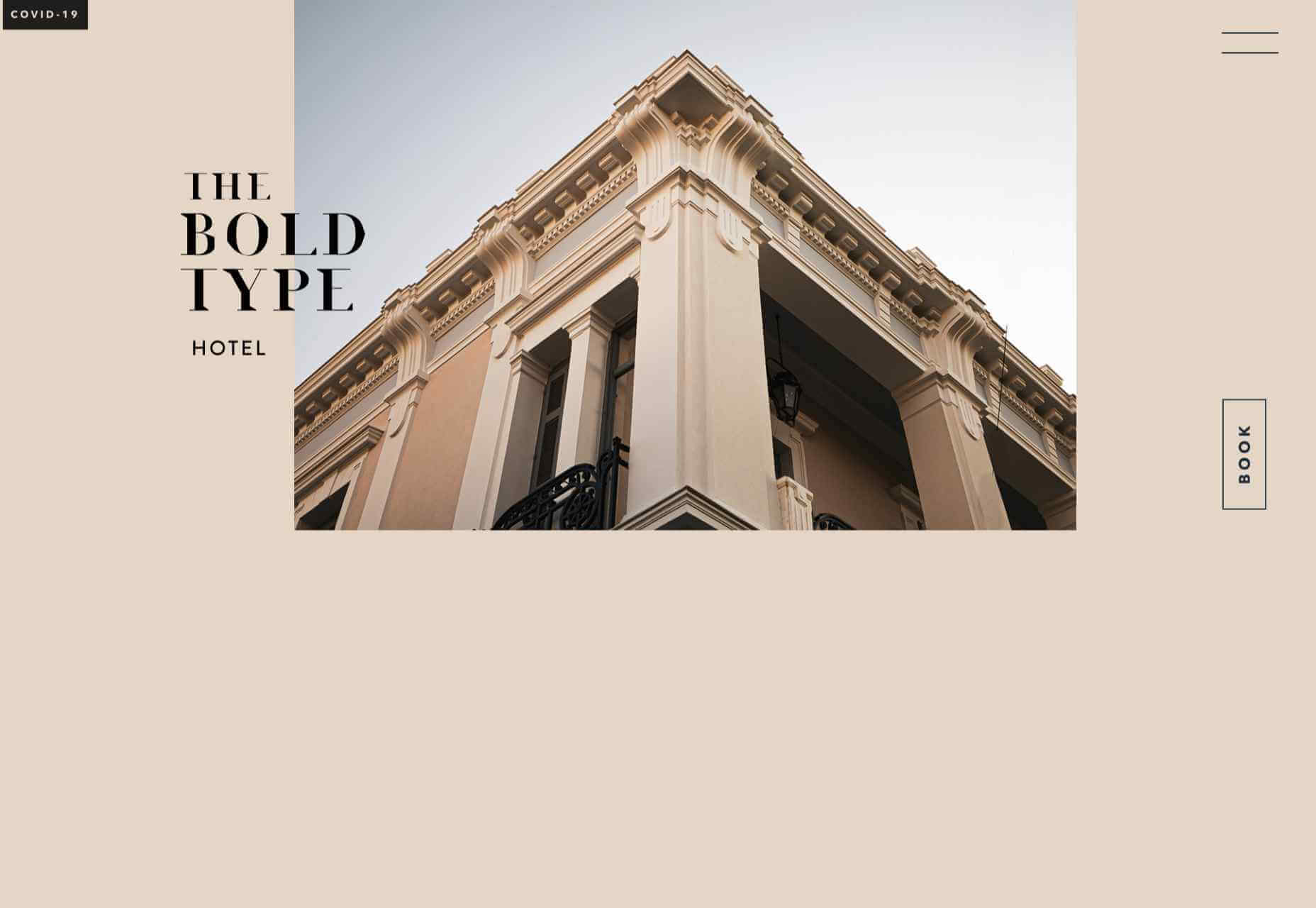
 It’s February, and the spring sun is finally starting to peep through the winter clouds. While many of us are still largely restricted to our homes, the web has kept on growing.


