 If you already have a good idea of what you want a new website to look like, the next step would be to decide on the tools you’ll need to put into play to turn that vision into a reality.
- Tools enable you to present its content in ways that will engage and captivate its audience and gain their trust.
- Tools that will make your website perform flawlessly in all respects.
That is why choosing the right WordPress theme to get the job done is so important. You want a theme that features the page building tools and design aids that make your task far easier than anticipated.
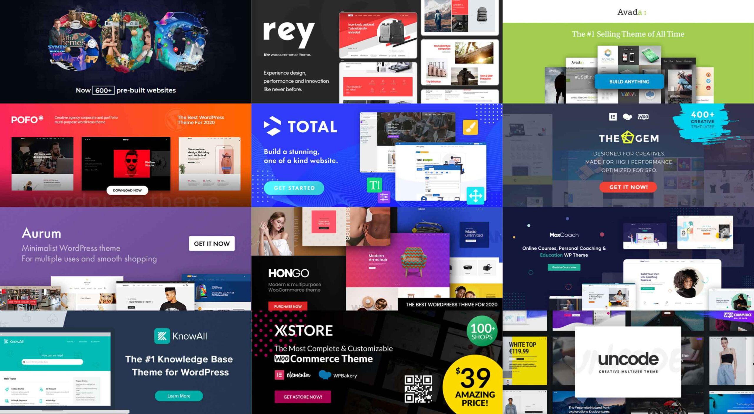
The following 12 top WordPress themes and plugins have been selected with those purposes in mind. They will not only get the job done for you but do it better than most of the other website-building tools in the marketplace are capable of doing.
The choice is up to you. Whatever that choice may be, it should prove to be a winner.
1. BeTheme
A website-building toolkit that can boast of 40+ core features sounds like a pretty good-sized toolkit, and BeTheme is just that. In fact, this popular (200,000 sales) theme is the biggest WordPress theme of them all.
It’s unlikely you will need to put every one of these core features to use for your next project, but some will be essential, such as –
- The Muffin Builder page builder, Admin Panel, and Shortcode Generator combine to make BeTheme easy to use, give you a ton of flexibility, and enable you to build your website without any need for coding.
- Be’s library of shortcodes together with the many Header, Footer, and Grid options, and the new Header Builder extends your design options even more.
- The Layout Generator will come in handy if you want to start a page from scratch.
- You’ll love what may be the most important core feature of them all; Be’s selection of 600+ customizable pre-built websites. They cover most industry sectors and website types plus a variety of business niches.
Click on the banner to learn more.

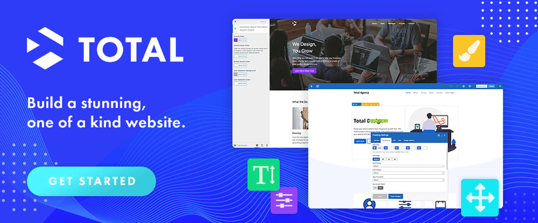
2. Total Theme
Designed with excellence in mind, Total features an exceptional selection of tools and design aids to work with. Total is also well-known for its speed, ease of use, and the flexibility it offers its users.
- Since you can disable any feature you want to, you won’t be distracted by or bothered with those you don’t intend to use.
- Total’s 40+ quick import demos and one-of-a-kind theme cards are designed to get your projects off to a rapid start.
- The Dynamic Template function is a driving force behind this WordPress theme’s remarkable flexibility.
- You’re given a wealth of design options to work with, thanks to the live customizer and the advanced theme panel.
- Total is a WordPress plugin and WooCommerce friendly.
Click on the banner to learn more.
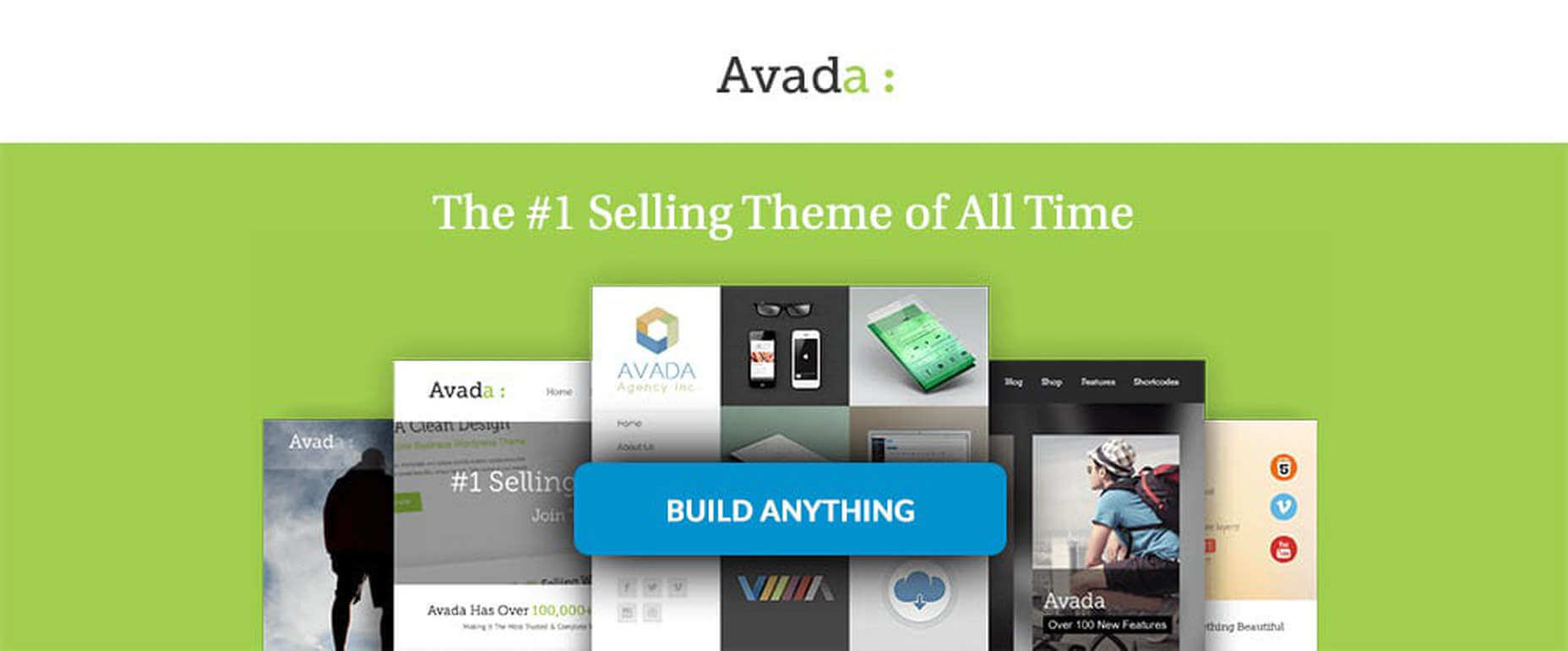
3. Avada Theme
When a WordPress theme has the distinction of being the #1 best seller of all time, you can safely assume that those who created it got it right. Avada’s 450,000+ sales can’t easily be ignored.
Look closer, and you’ll see some of the many reasons behind Avada’s popularity.
- There’s an impressive selection of one-click import demos, pre-built websites, and a wealth of supporting design elements.
- The Fusion drag and drop builder and Fusion page and theme options enable designers to create complex websites without resorting to coding.
- 5-star support and free updates ensure users that they will always be able to follow the latest design trends and create websites as they envision them.
Click on the banner to learn more.
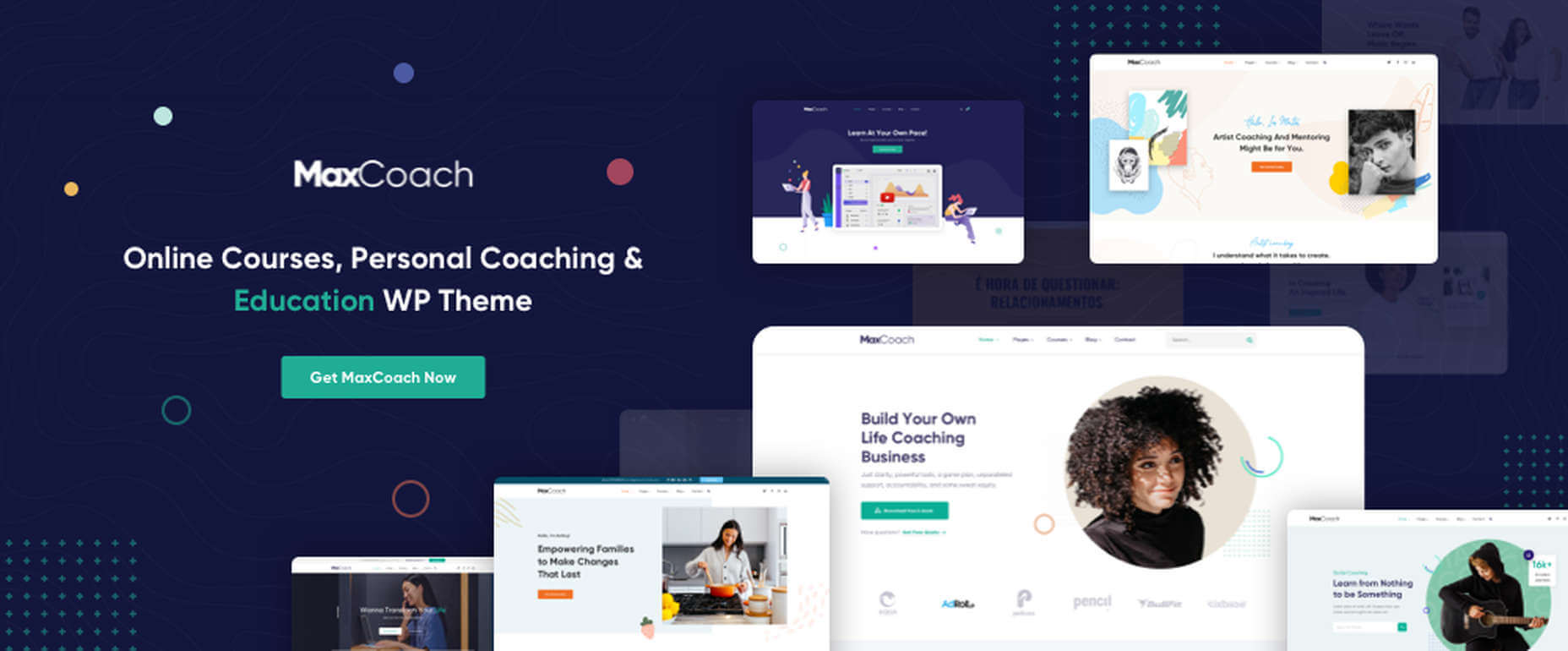
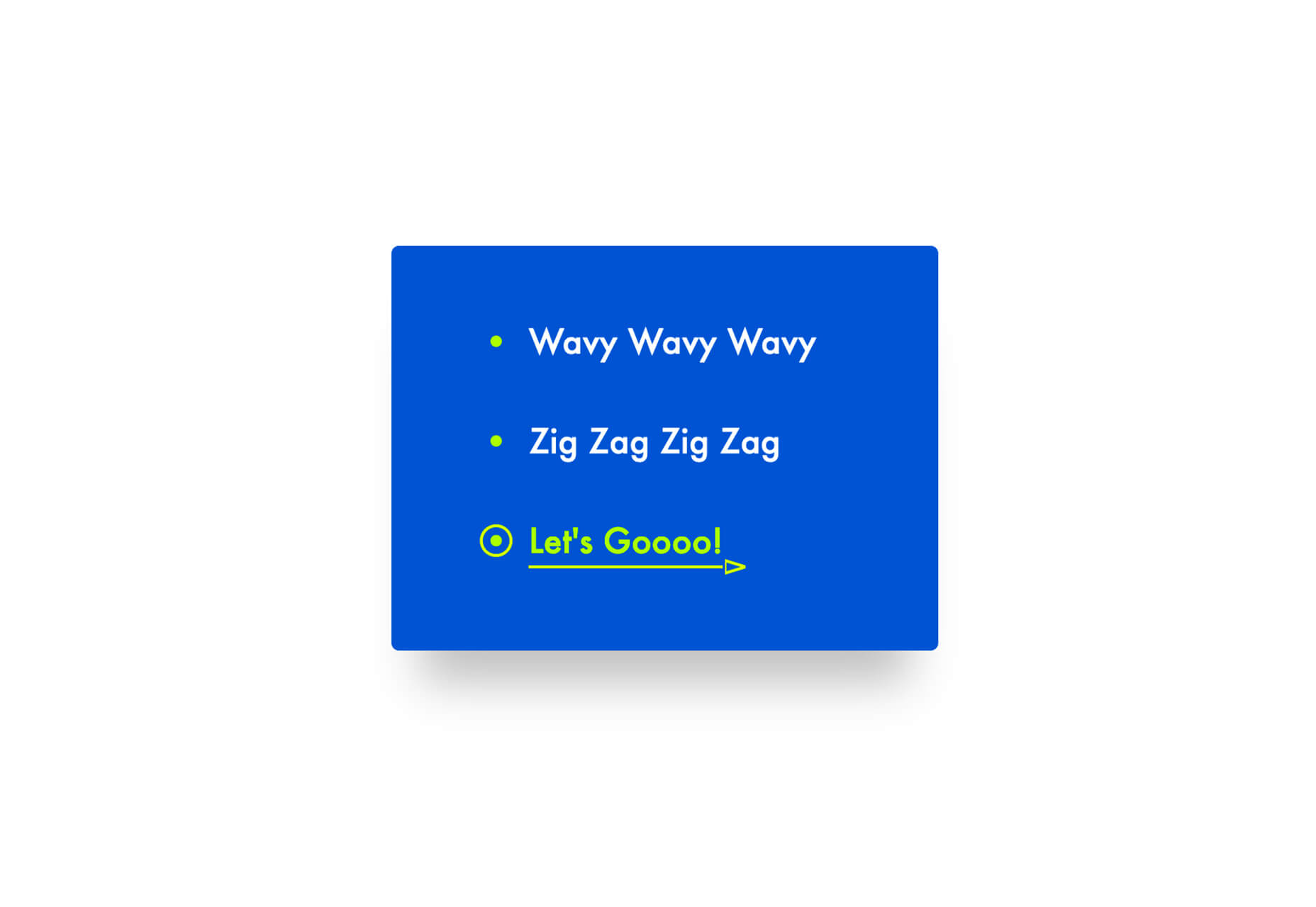
4. MaxCoach – Online Courses, Personal Coaching & Education WP Theme
MaxCoach is a specialty tool that enables web designers to create an online distance learning and/or tutoring platform. This LearnPress theme was last year’s #1 coaching theme, and it will most likely be so in 2021 as well.
- The platform is learner-centric
- MaxCoach’s design is modern, trendy, and unique
- Elementor is the drag and drop page builder of choice
Visit the site to see for yourself why this specialty theme has generated so much interest.
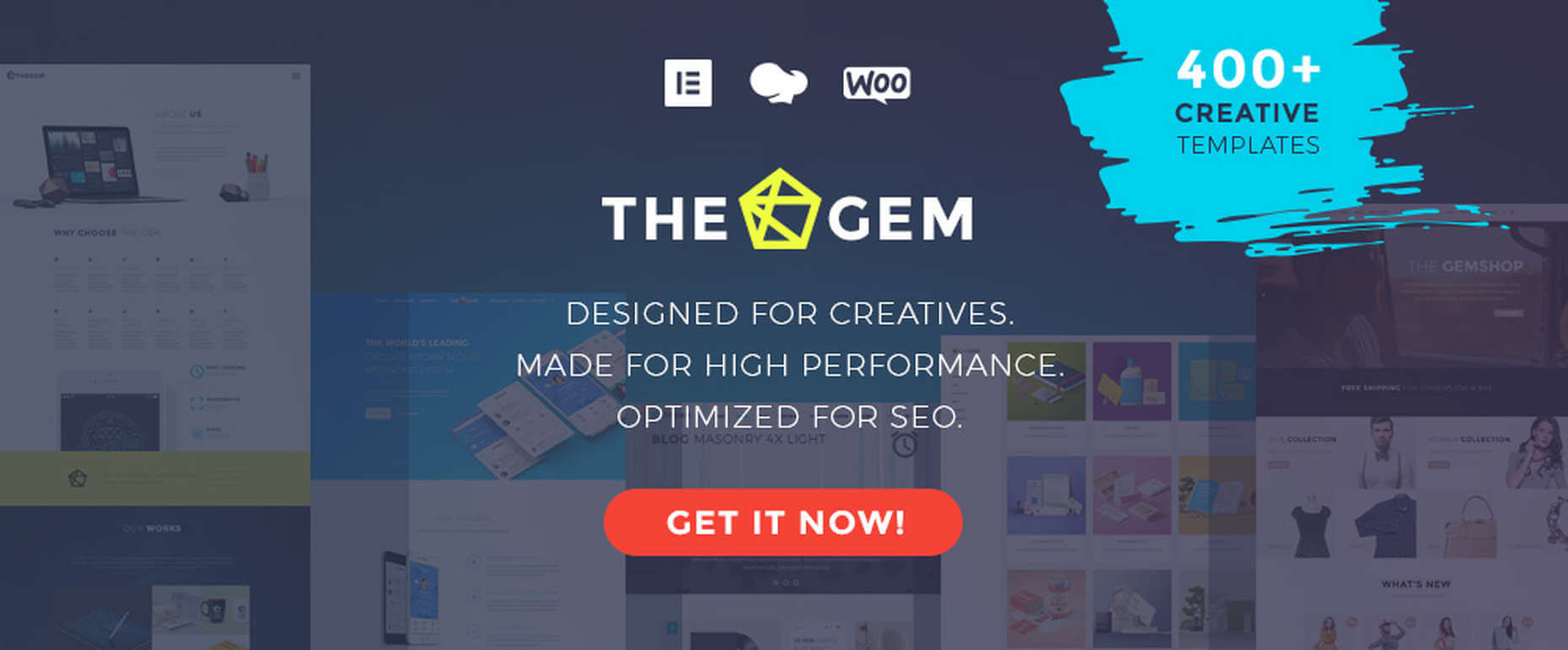
5. TheGem – Creative Multi-Purpose High-Performance WordPress Theme
TheGem, WordPress’s ultimate multiuse toolbox, gives its users:
- A selection of more than 400 professionally-crafted pre-built multi-page and single-page websites
- Two popular page builders – WPBakery and Elementor
- Demos, layouts, and page sections you can mix and match to create a look that’s uniquely yours
The GemBlocks with its 300+ pre-designed section templates to speed up your workflow, plus WooCommerce layouts and design aids
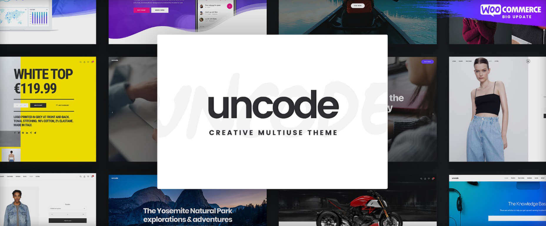
6. Uncode – Creative Multiuse & WooCommerce WordPress Theme
The Uncode multi-use WordPress theme is ideal for entrepreneurs, creative individuals, agencies, and small businesses.
- Its 80.000+ sales to date have made it a ThemeForest best-seller.
- Features include a unique WooCommerce Custom Builder you can use to give site visitors a supreme shopping experience.
Viewing Uncode’s showcase of user-built websites is a must. Click on the banner to visit the site and prepare to be impressed.
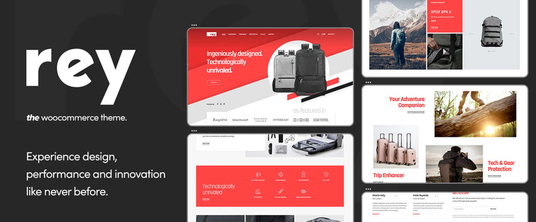
7. Rey Theme
This highly modular popular theme is definitely worth a close look. It is simply one of the most innovative website building tools you’re likely to find on the market today,
- Rey’s features include a library of professionally-designed templates and an imposing selection of WooCommerce site-building tools
- It is easy to set up and easy to use
- You will be more than satisfied with Rey’s robust performance
Rey has built-in SVG support and is user and developer-friendly.
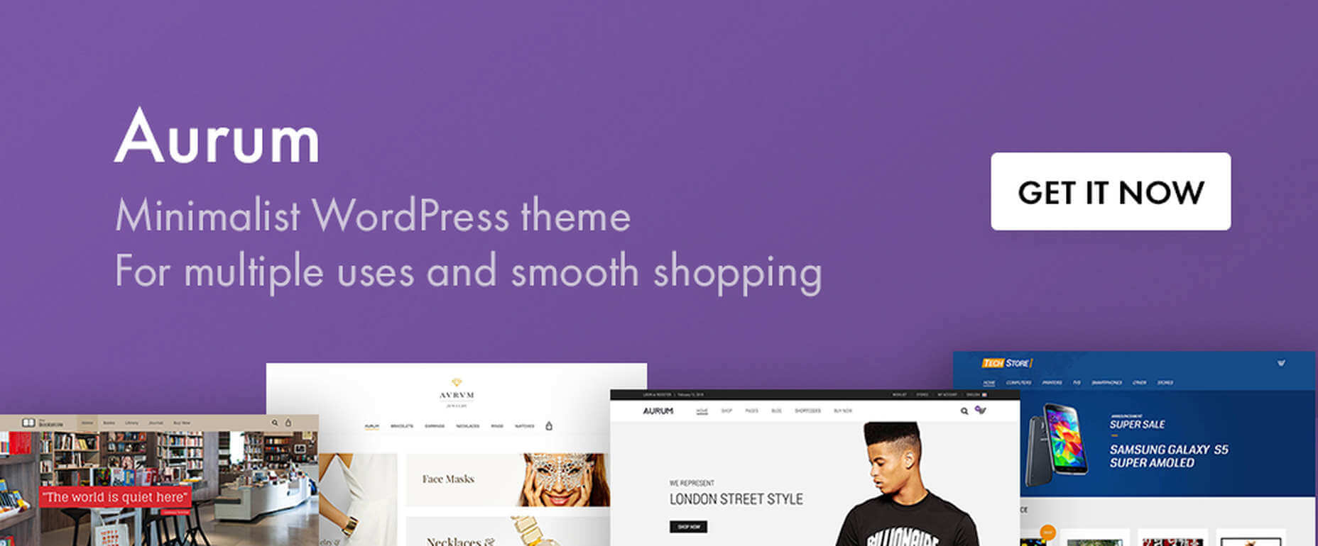
8. Aurum – Minimalist WordPress Theme
With this multiuse minimalist WordPress theme at your fingertips, you’ll be able to create an online store that will give shoppers a fully satisfying shopping experience.
- With Aurum, you can design megamenus to accommodate huge selections of products
- Aurum’s page load times are super-fast, and Aurum’s pages are responsive to every screen size
- Popular plugins are included, and all the popular WordPress plugins are supported
Click on the banner and check it out.
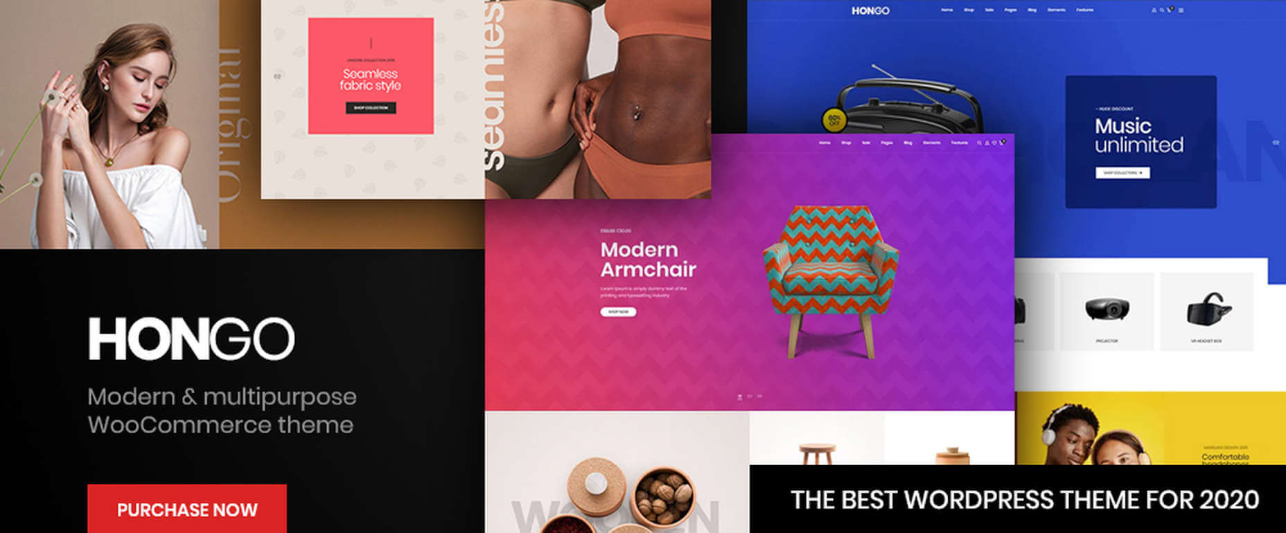
9. Hongo – Modern & Multipurpose WooCommerce WordPress Theme
Its trendy selections of creative design elements and ready-to-go store demos make Hongo an ideal choice for company, blogging, and eCommerce websites.
- Premium plugins and WPBakery custom shortcodes are among the most popular of Hongo’s website-building features
- This multipurpose theme also features an attractive selection of product-related tools that include product compare, quick view, wish lists, and product filter
You can expect and receive exceptional user support.
10. XStore – The Most Customizable WooCommerce Theme Ever
With its $39 price tag, XStore gives you more value for your money than you’ll find in any other WooCommerce theme.
- For starters, there are 100+ good-to-go shops
- A full Ajax shop is another popular feature
- As is XStore’s single product page builder and its selection of product filters and display features
Check XStore out if you’re looking for a way to create an awesome online store in no time at all.

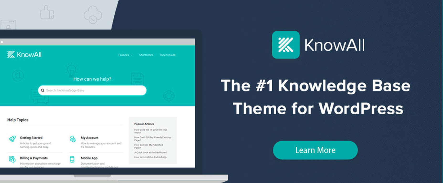
11. KnowAll – Knowledge Base Theme
Have you ever come across a FAQ page you really liked? It doesn’t happen often.
Visitors that can’t find a good answer might decide to make a phone call (and be placed on hold). That answer is OK, but additional information would be more helpful.
With AI-based KnowAll, customers get answers 24/7, and they can search for other relevant information. They will be happier customers, which is obviously good for business.
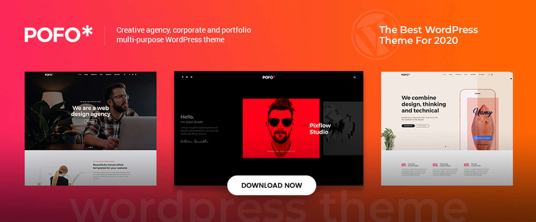
12. Pofo – Creative Portfolio, Blog, and eCommerce WordPress Theme
Bloggers, creatives, agencies, and those looking to create an eCommerce site should give Pofo a good, hard look.
Pofo is fast, flexible, SEO optimized, and packed with useful features that include:
- Trendy selections of pre-built design elements, ready-to-go home pages, and one-click import demo pages.
- Premium plugins, including Revolution Slider and the WPBakery page builder.
Detailed online documentation is provided, and you’ll be more than pleased with this theme’s customer support.
A modern, fast-loading, and smoothly performing theme is what you need. It will help you create a website that will have a significantly positive impact on your business’ growth.
Themes like those presented here can do just that by enabling you to give your website the professional touch you’re looking for. You can do it without having to rely on a single line of code.
These 12 top WordPress themes are modern, trendy, and easy to work with. Trying to find the “best” of the bunch could admittedly be somewhat daunting. But, you can take comfort in the fact that you really can’t make a wrong or bad choice.
[– This is a sponsored post –]
The post 12 Best WordPress Themes for 2021 first appeared on Webdesigner Depot.

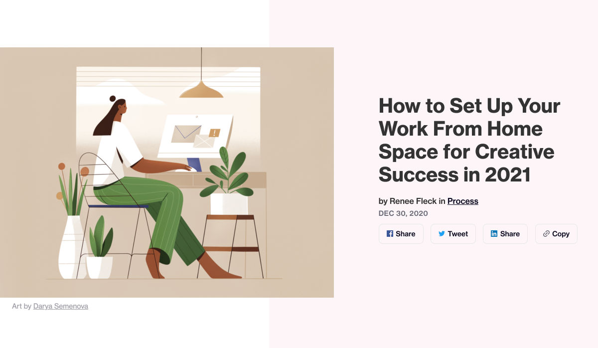
 The new year is often packed with resolutions. Make the most of those goals and resolve to design better, faster, and more efficiently with some of these new tools and resources.


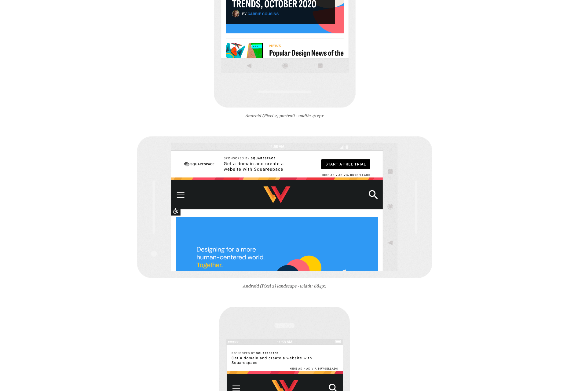
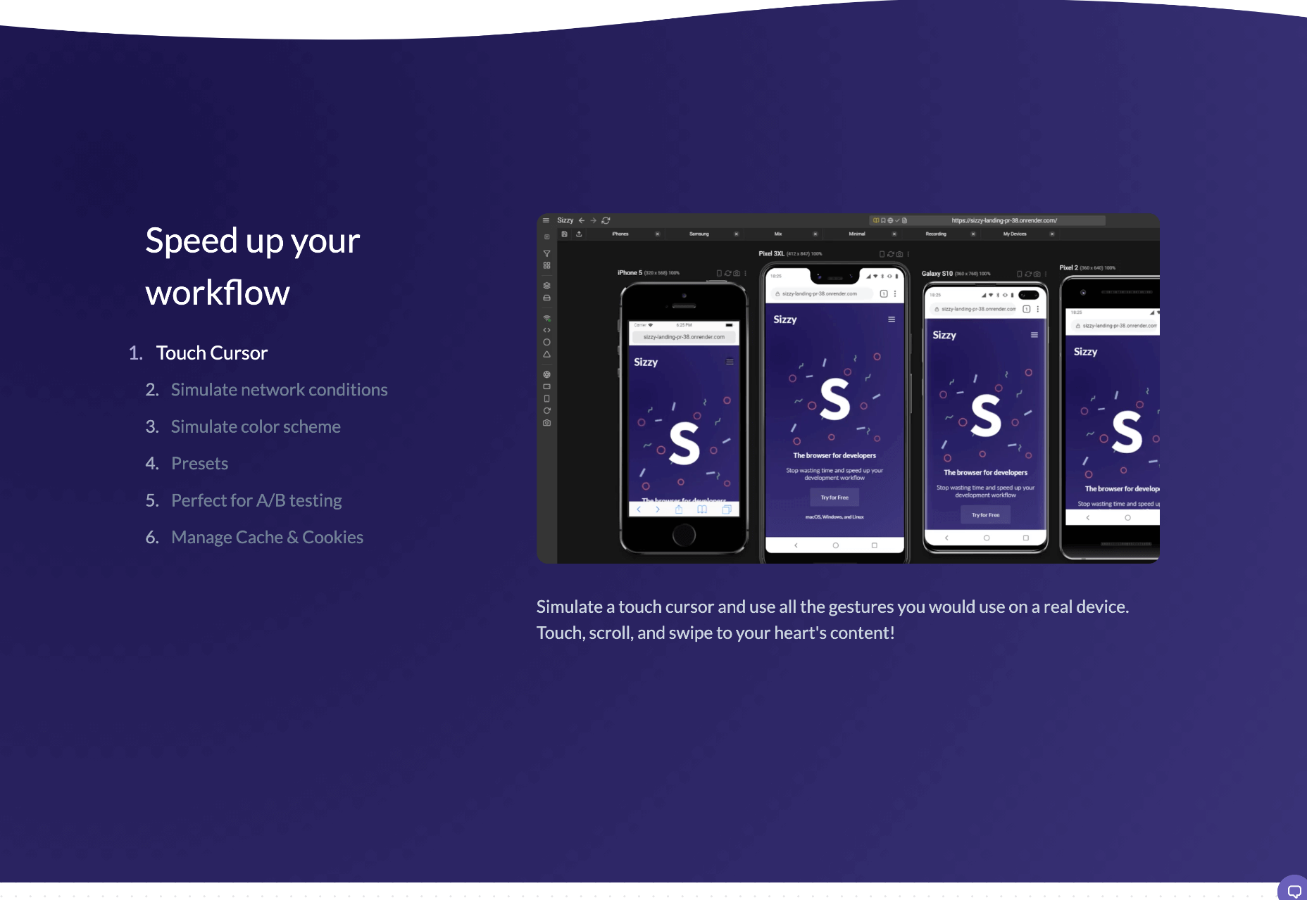
 When creating a website, it’s vital to remember that not only does it need to work and look great on the device you are creating it on, but on all the other devices, it might be used on too.
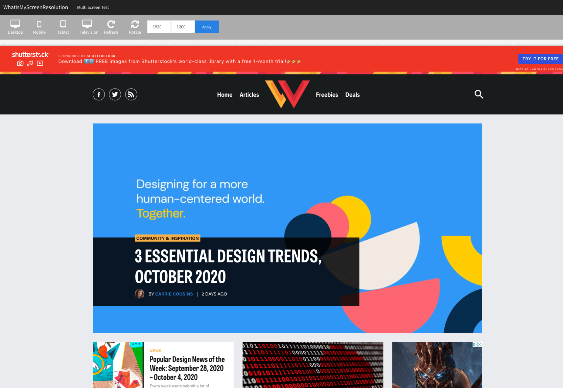

 Every week users submit a lot of interesting stuff on our sister site Webdesigner News, highlighting great content from around the web that can be of interest to web designers.


 There are dozens of factors that influence the UX of your site, app, or game. Most of them are beyond your control; user connection speed, end-system resources, even browser technology is all out of your hands. So when you do have the opportunity to influence your project’s infrastructure, you should seize it.
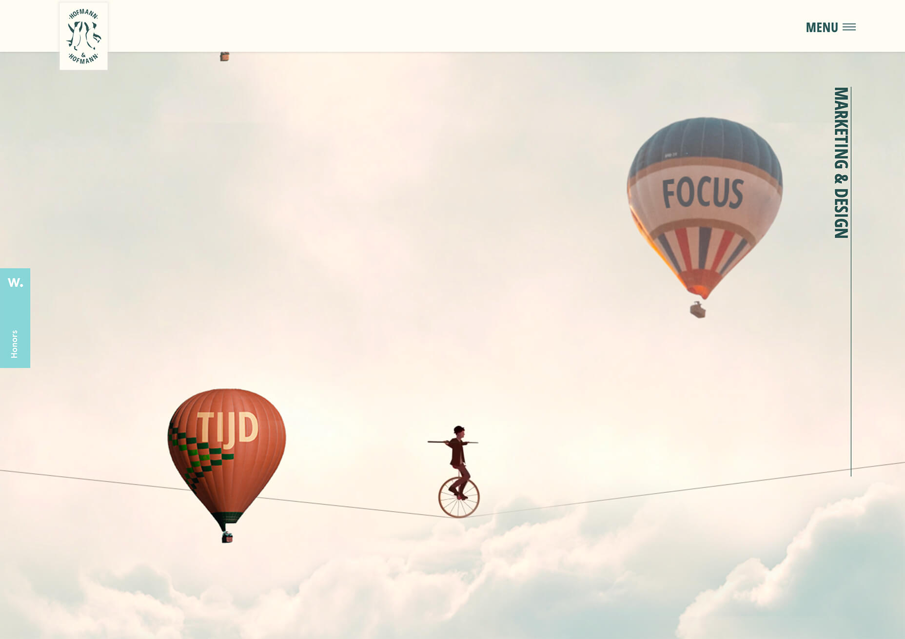
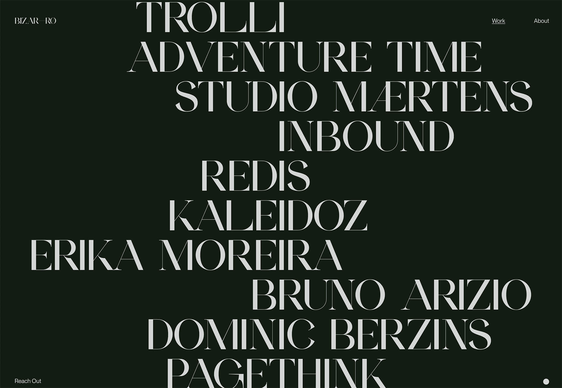
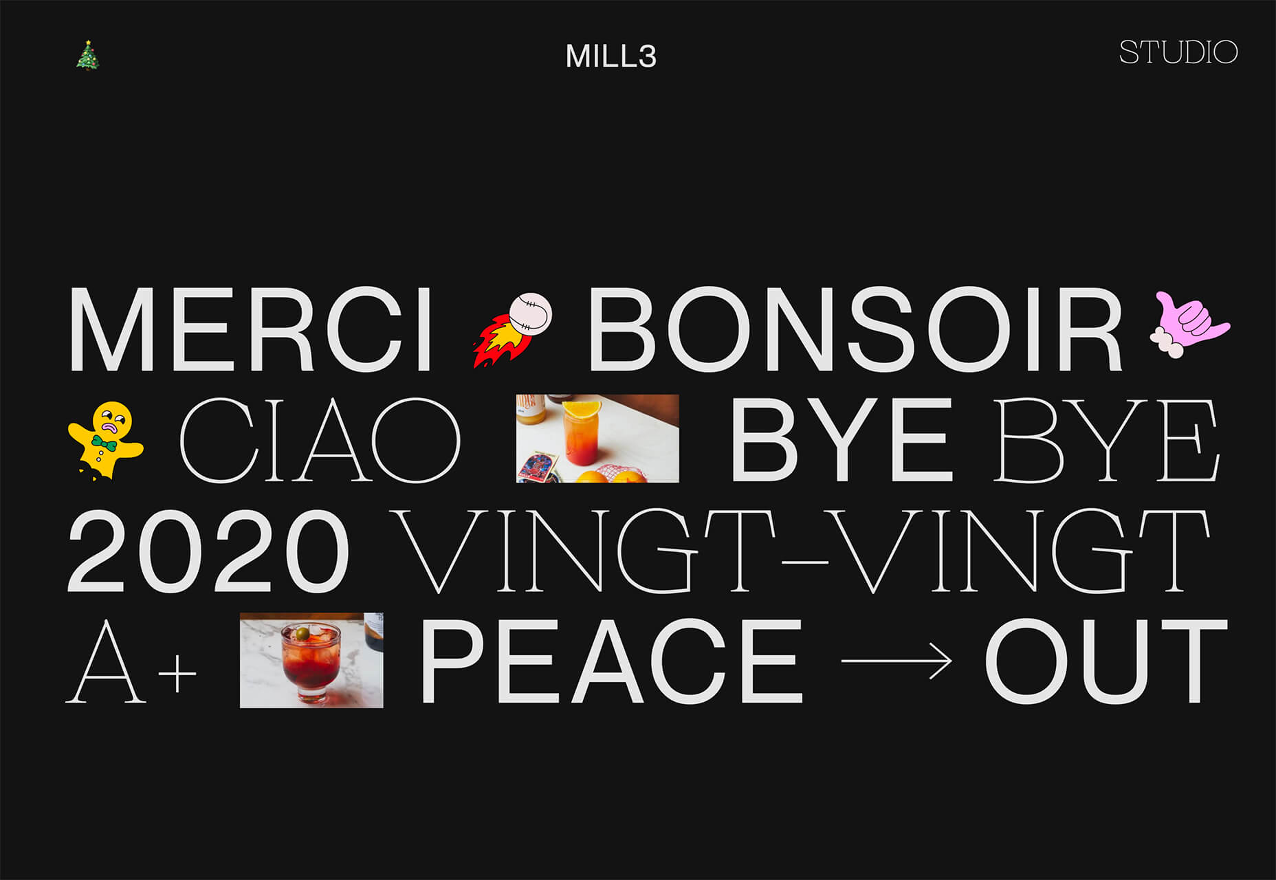
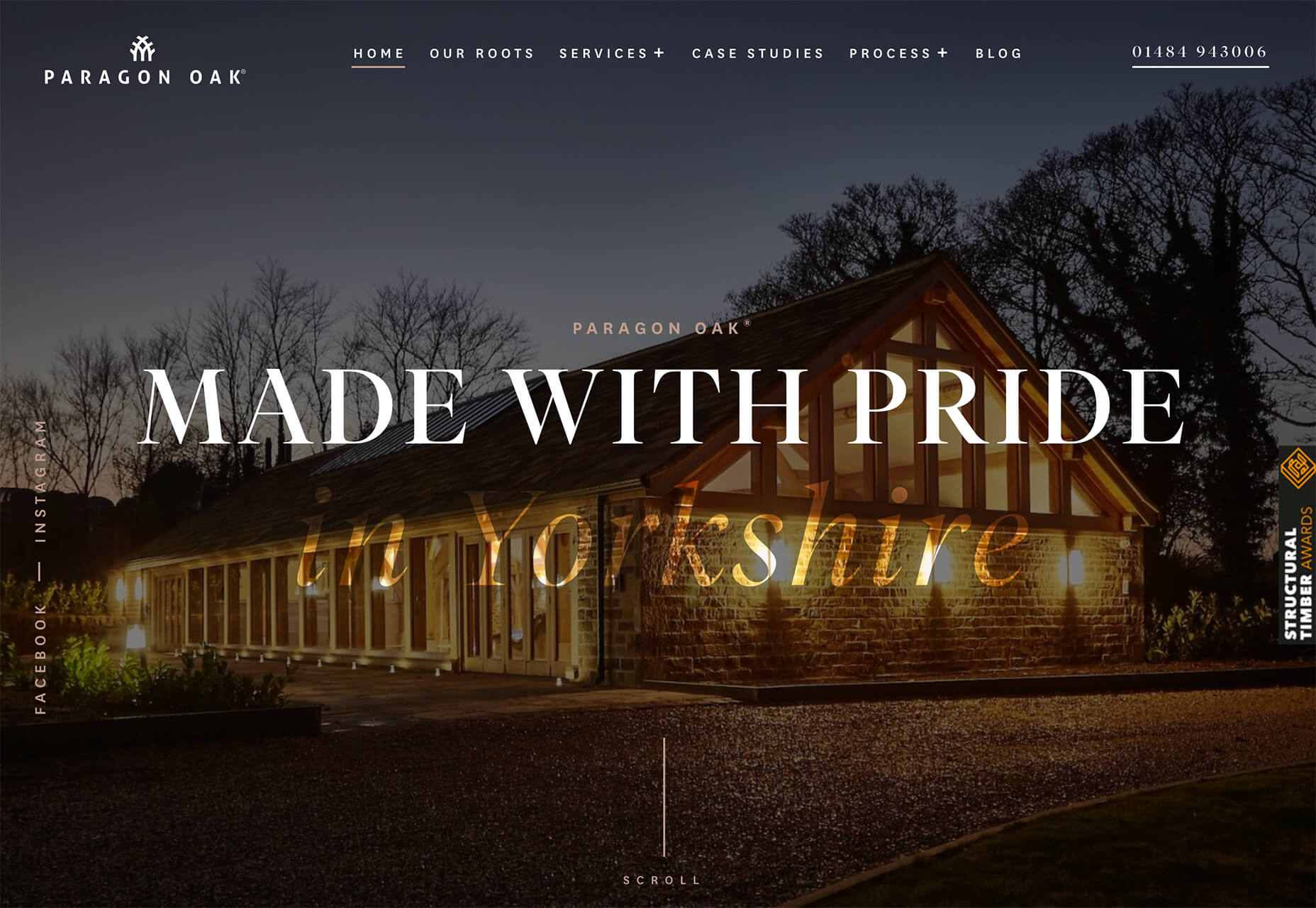
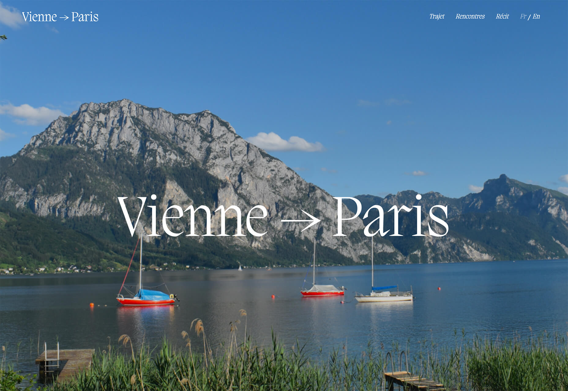
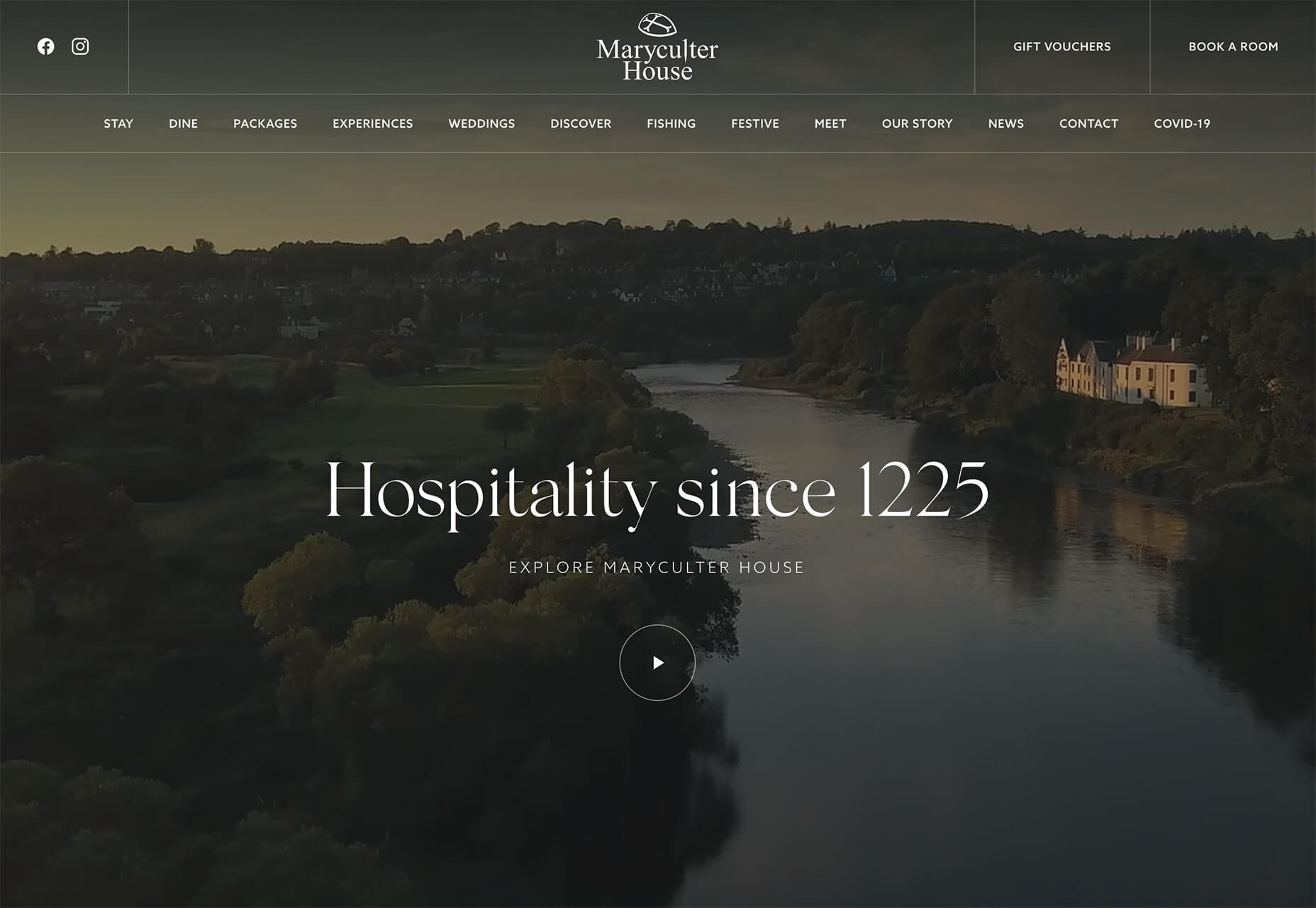
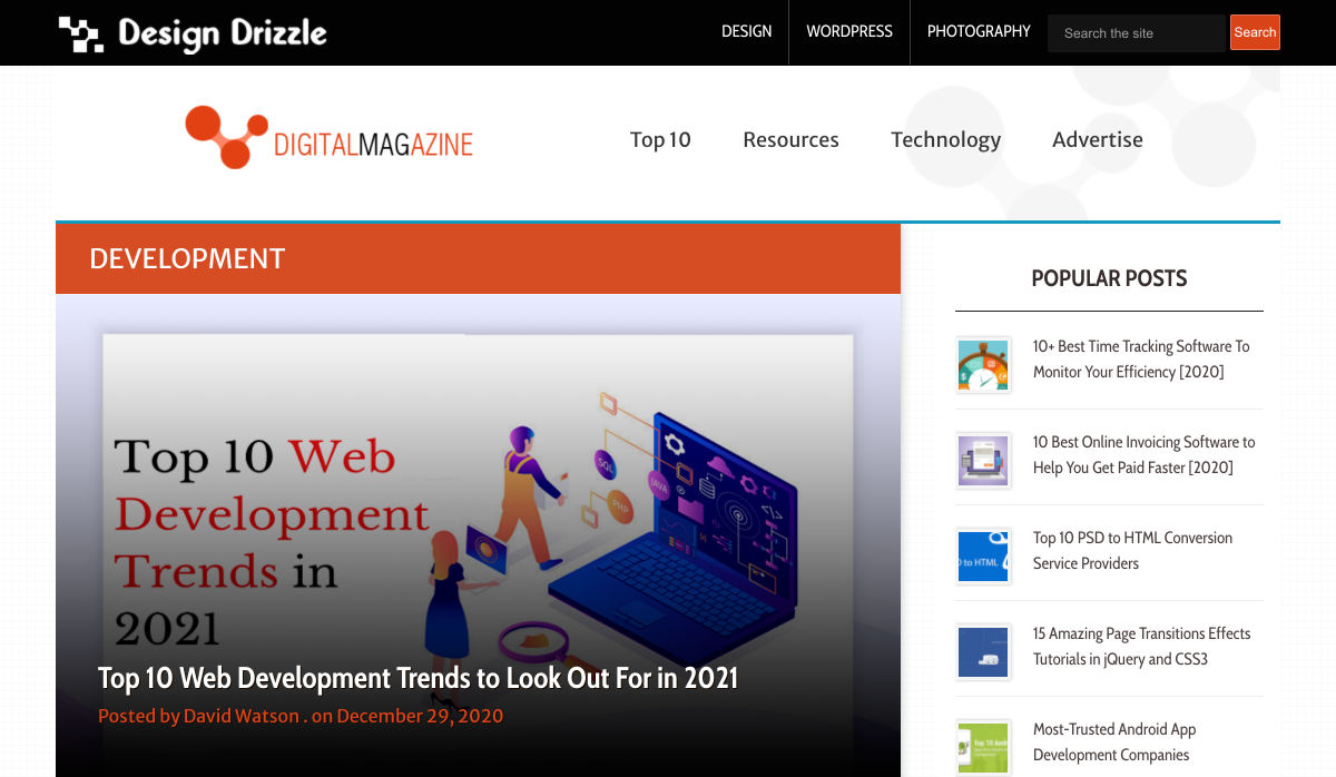
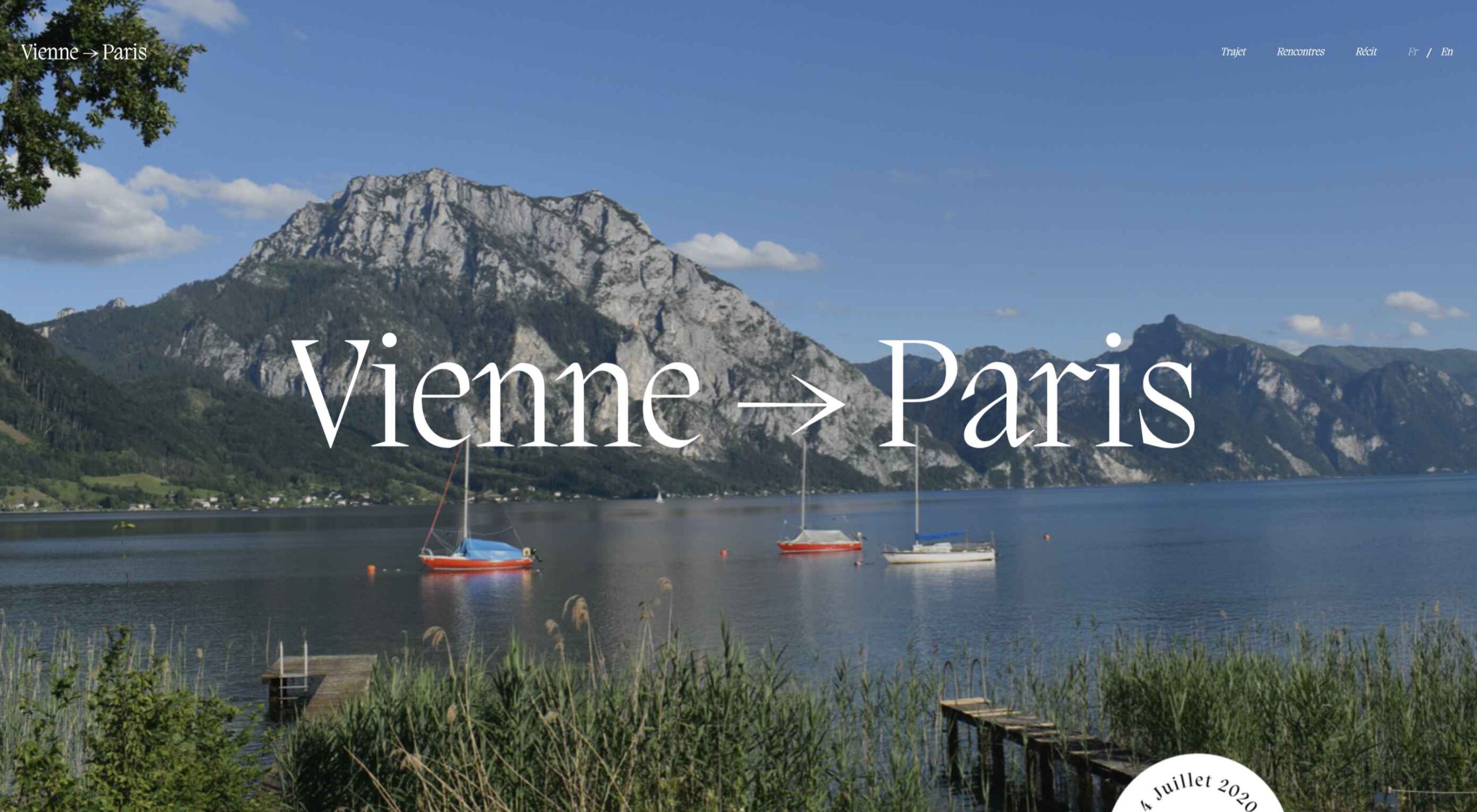 Don’t drop the ball on these website design trends for the new year. All of the trends featured here this month are visual in nature – not as many user interface elements as previous months, but all just as stunning and usable.
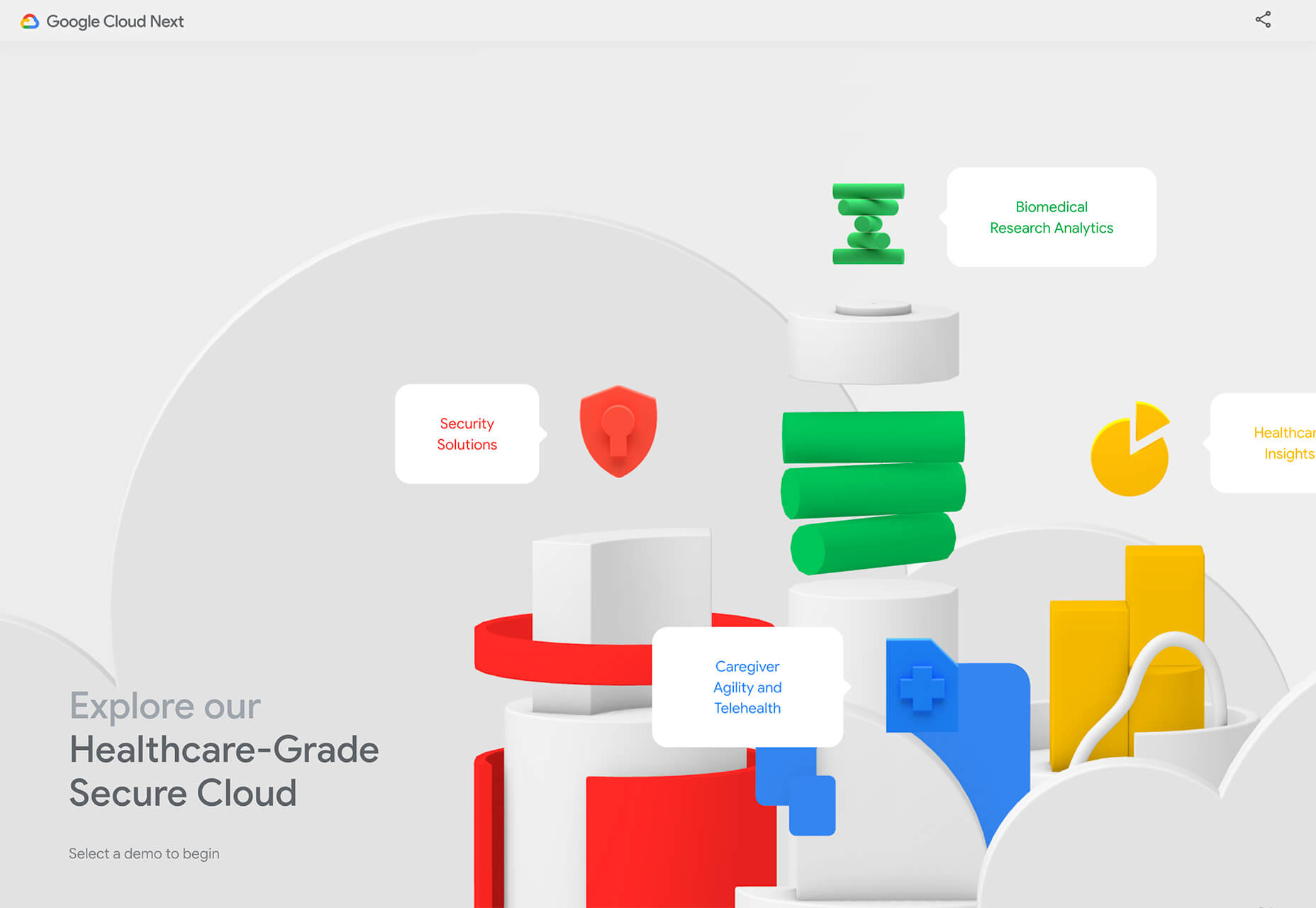


 Every week users submit a lot of interesting stuff on our sister site Webdesigner News, highlighting great content from around the web that can be of interest to web designers.
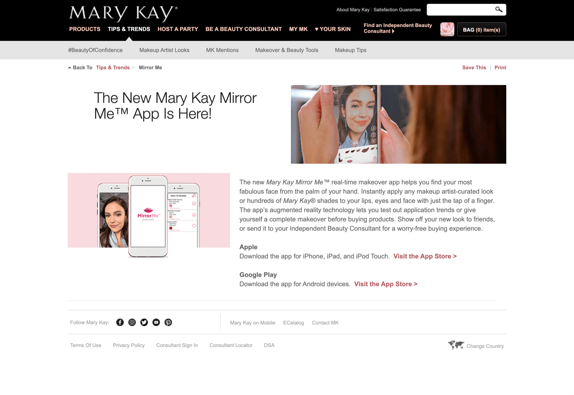
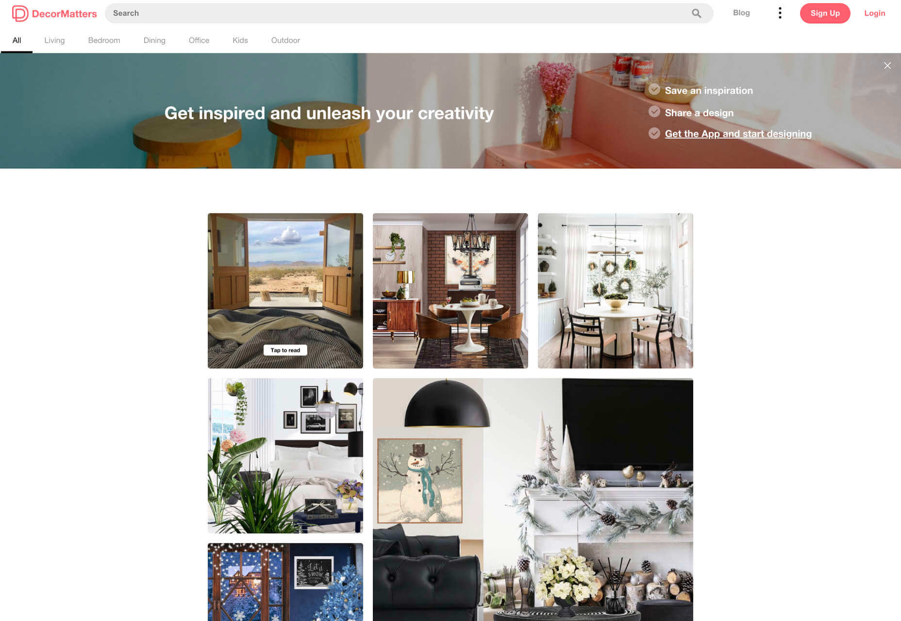
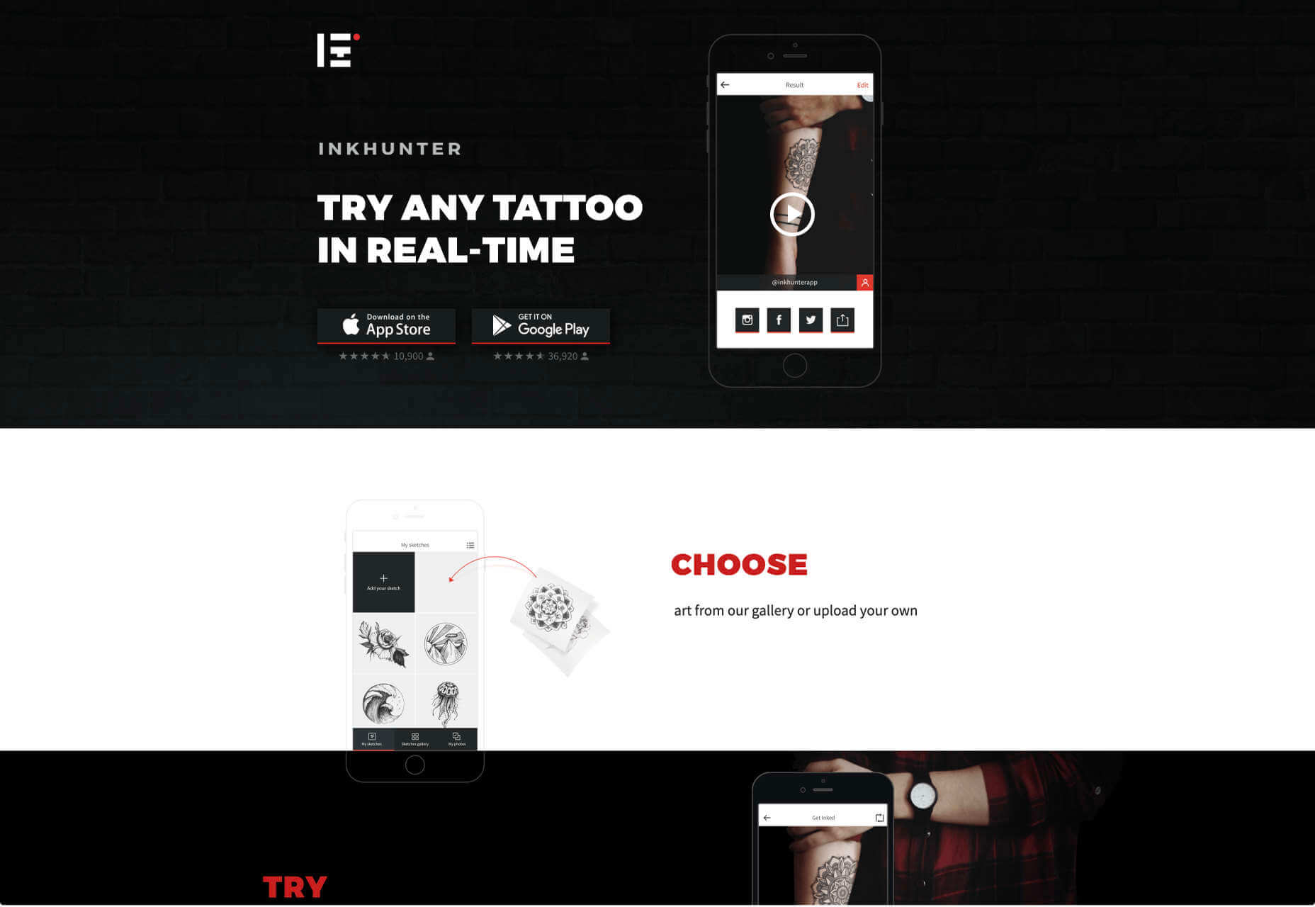
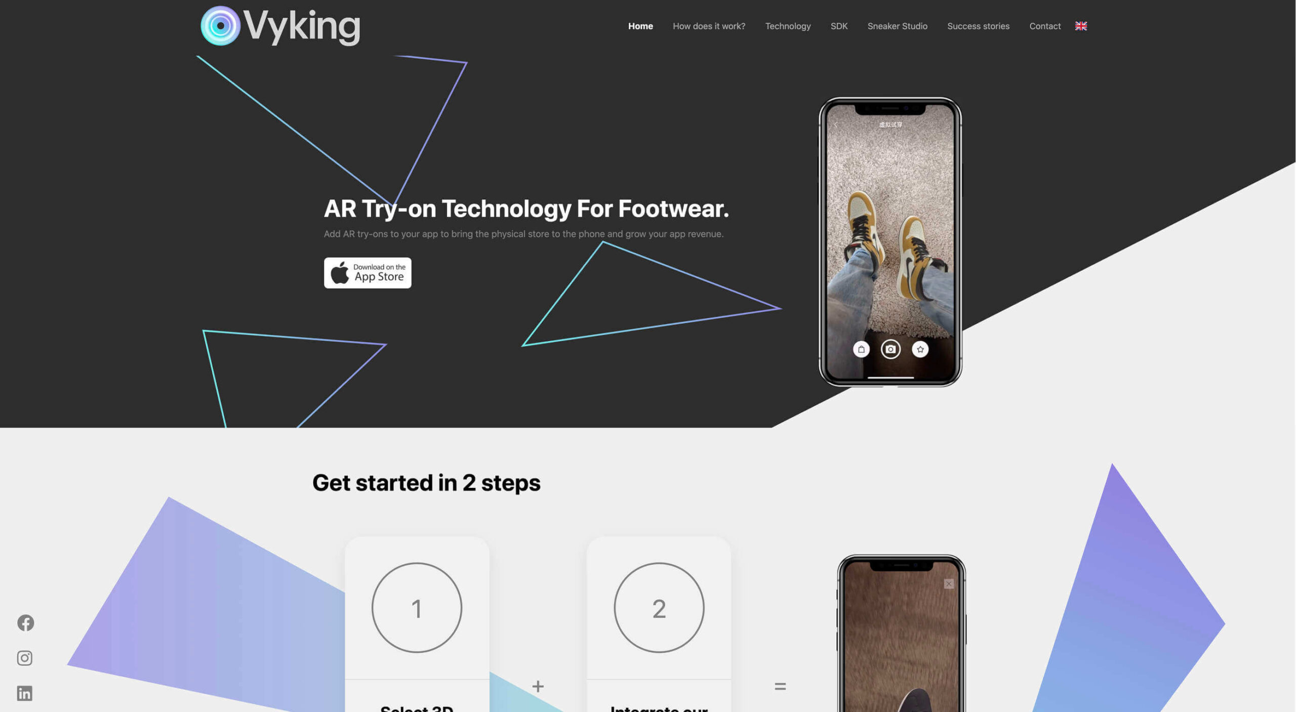 Over the years, experts have repeatedly discussed the possible impact of mixed realities on web design. Concepts like AR and VR are expected to have the potential to change the way that we interact with websites on a fundamental level.
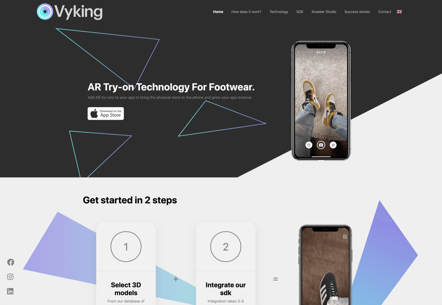

 User experience is one of the most important aspects of web design, but many experts overlook that UX doesn’t just apply to web pages. User experience as a concept encompasses all aspects of end-user interaction with a company.
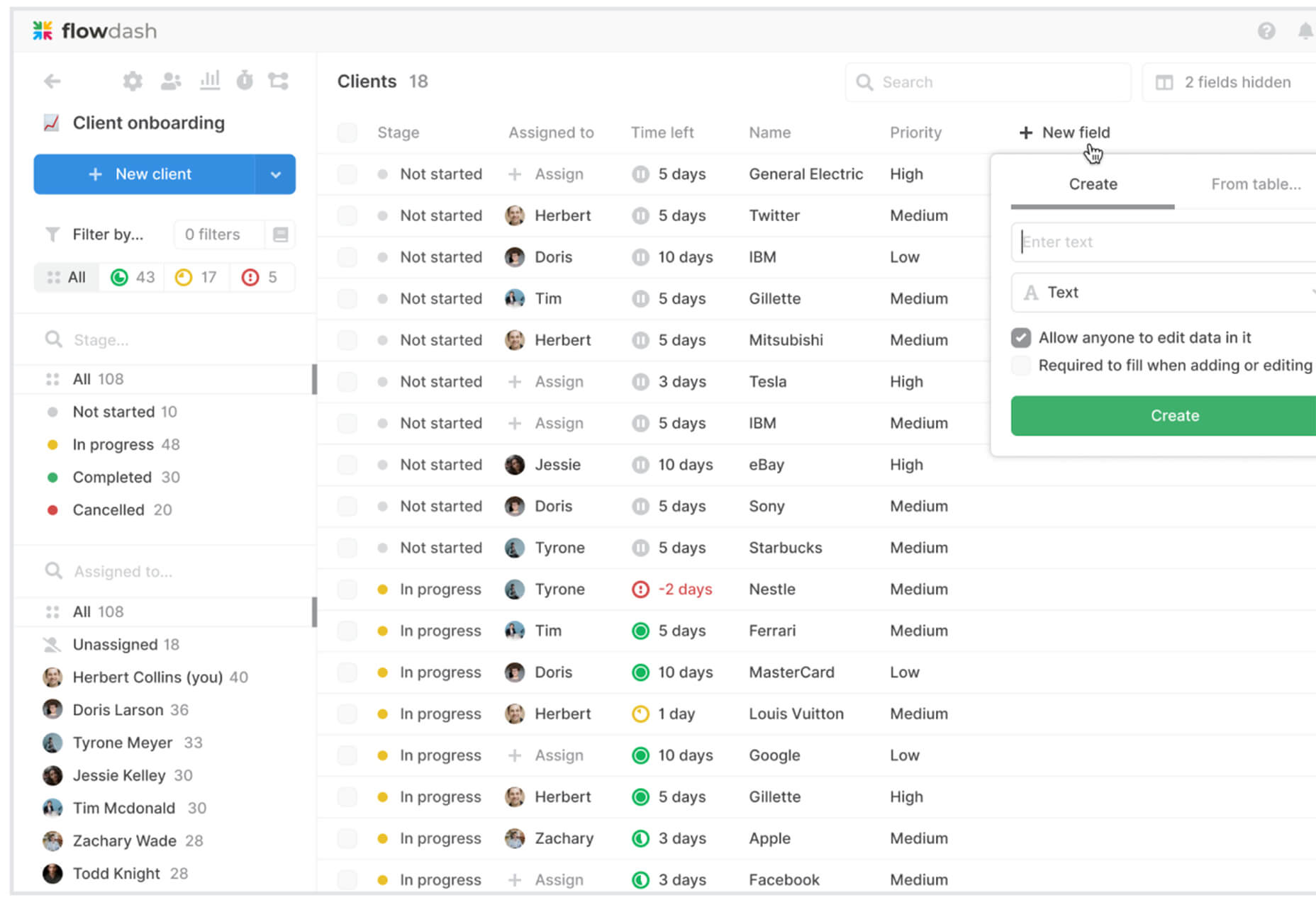
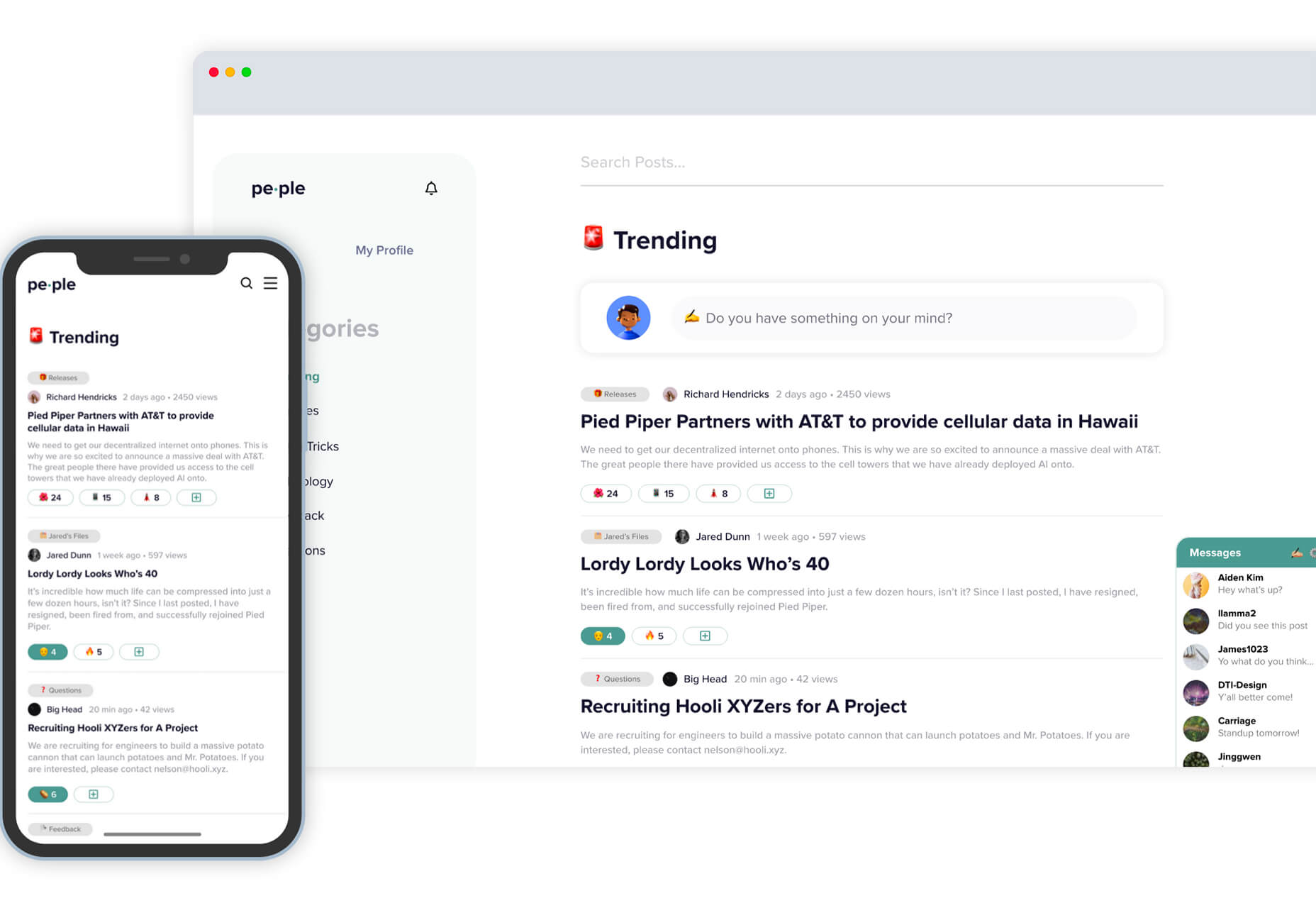
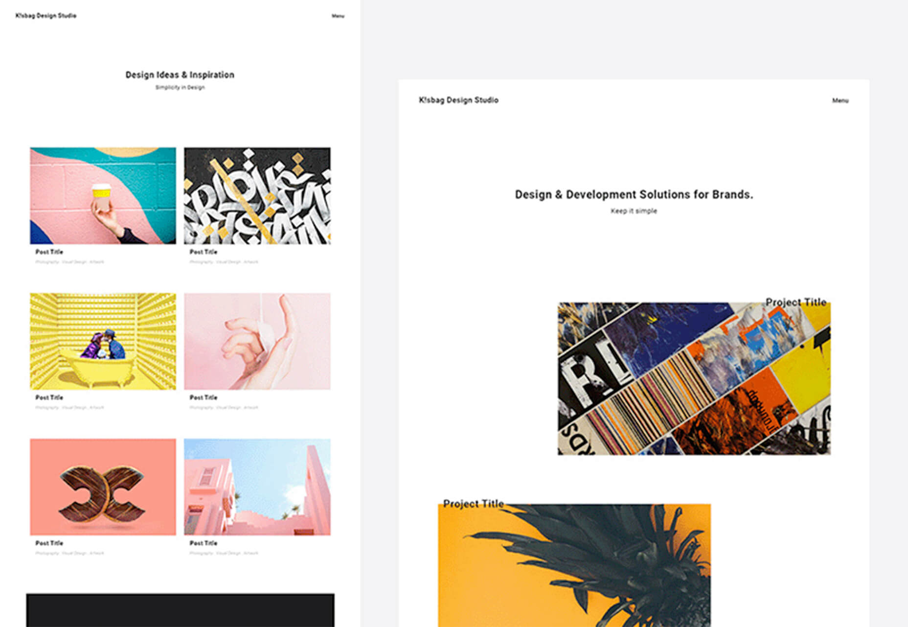
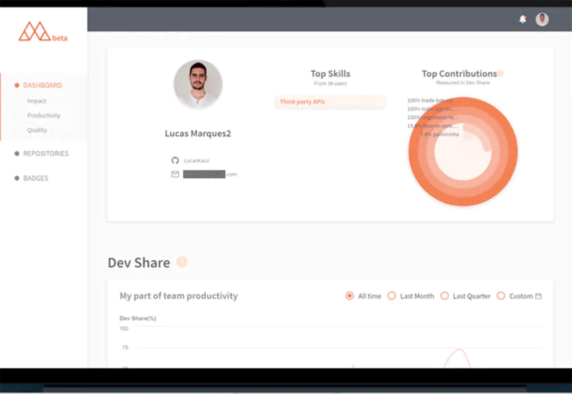
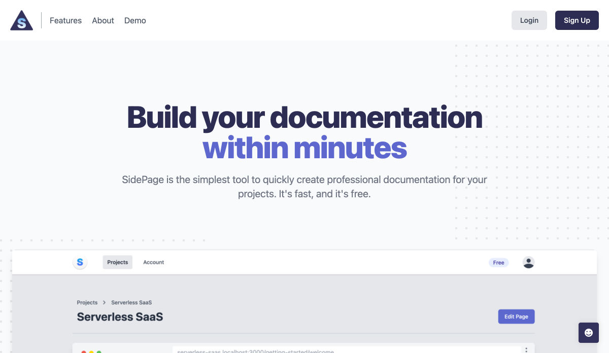
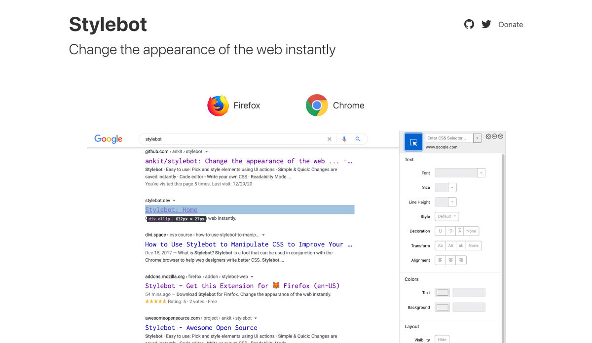
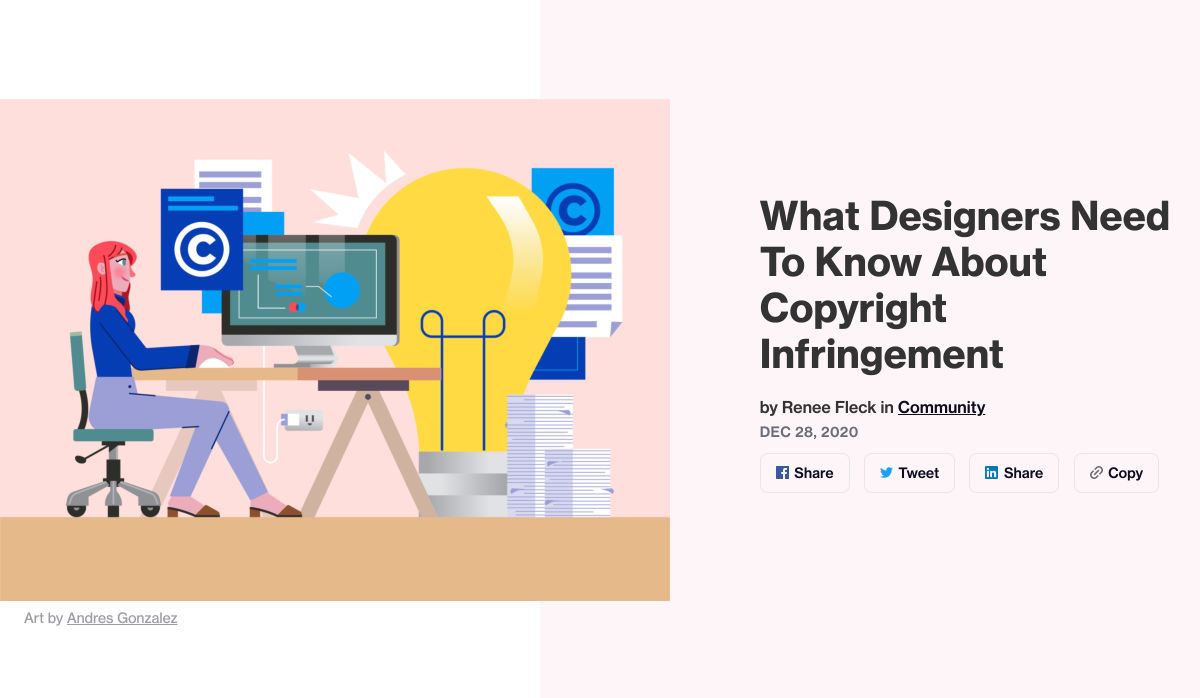
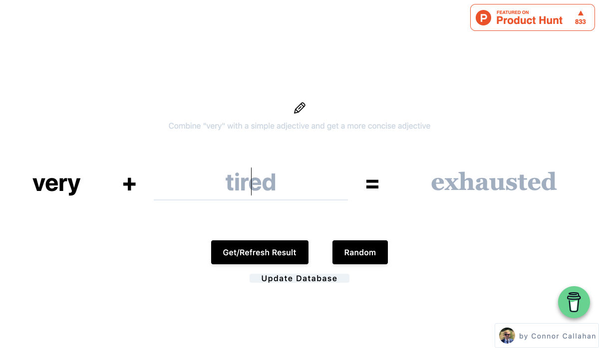
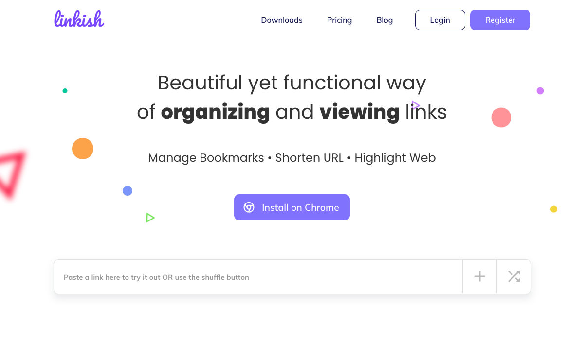
 Looking for the best new CMS plugins to take your website to the next level? Well look no further.