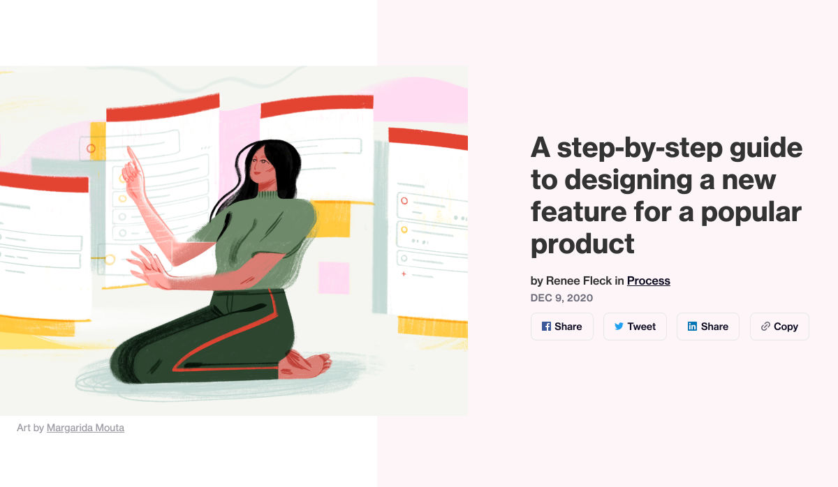
 Animation is a fun and interesting way to bring life to a website. Used correctly, it can capture audience attention, make your website more engaging, and even improve your chances of delivering conversions for your clients.
Unfortunately, like many things in the web design world, it’s also easy to get too carried away with animation. As professional designers and developers, it’s up to us to find the line between making the most of animation on our website projects and creating a site that’s overwhelmed with too much activity.
Fortunately, by the time you’ve finished reading this article, you’ll have a deeper insight into how you can use animation in web design, without going too over the top.
Introducing Animation in Web Design
Animations are virtually everywhere on the web today.
In the past, when designers first discovered that they could embed movement into their websites, the amount of animation we saw was often higher than it needed to be. It wasn’t uncommon to find some websites running entirely on Flash, where every element could be animated.
Fortunately, the trends of modern web design have left those practices behind. These days, it’s a lot more common to make animation a part of the overall user experience, rather than focusing on them as a centerpiece attraction. For instance, you’ve probably noticed plenty of animated sliders showing off pictures in a gallery, or transition animations when people hover over a button.
Since it’s entirely possible to construct an entire website with no animations at all, the key to creating an engaging website today is making sure that every animation you use serves a specific purpose. Your animations should make a website more attractive, easier to use, and better for navigation. Add too many, and you could even risk slowing down a site.
So, where does it make sense to use animation for web design?
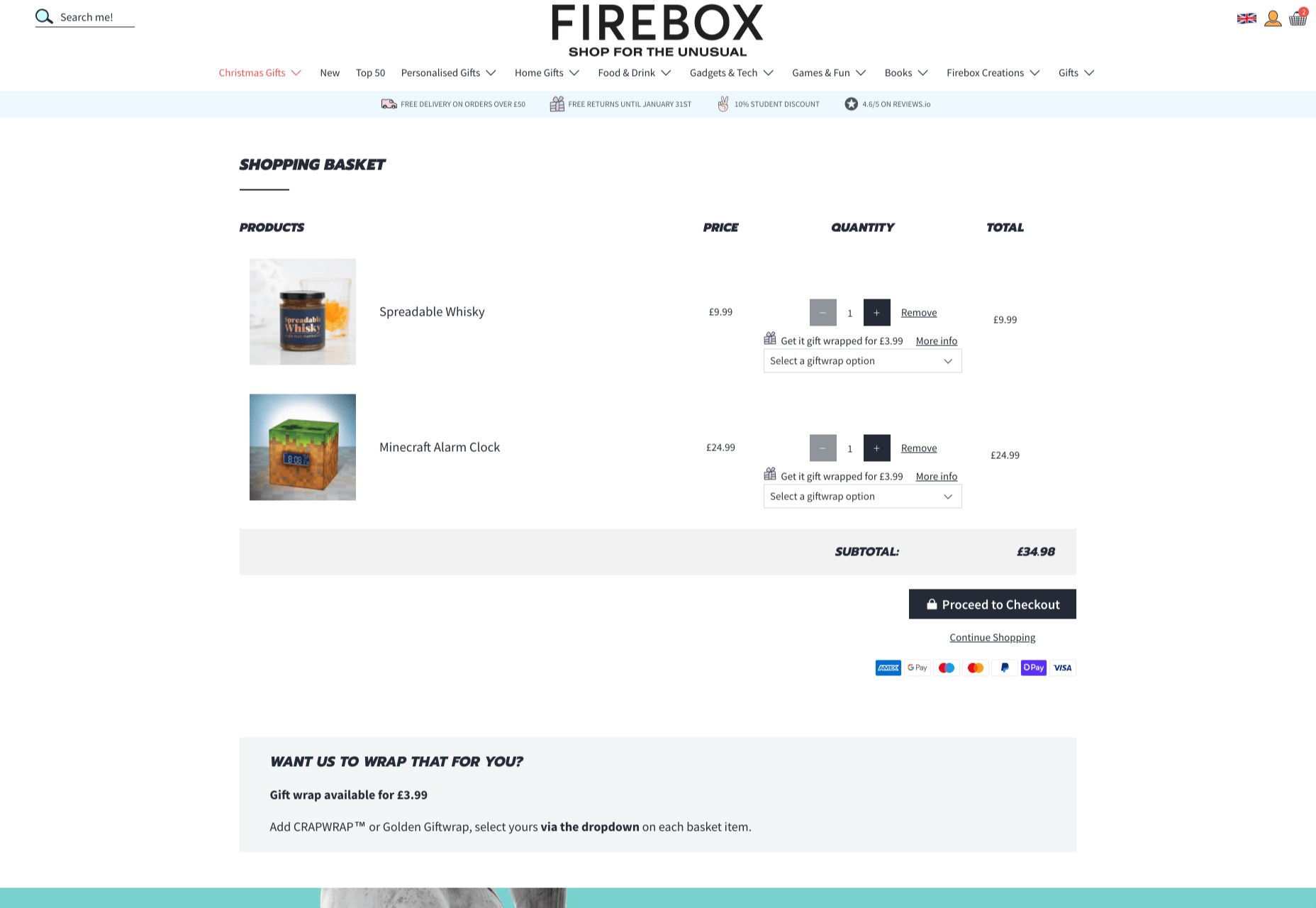
1. Loading Animations
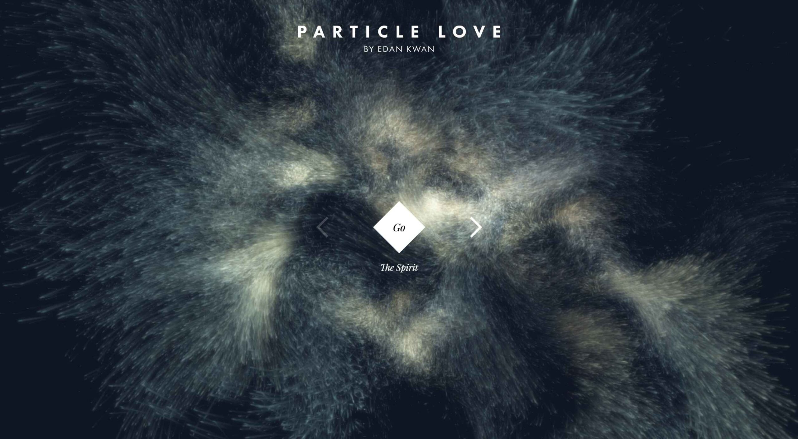
One of the best ways to use animations in a website is to distract and delight users as a page loads. You can use the animation to deliver a unique experience, or even just highlight the playful nature of your brand. For instance, just check out this classic load animation called “Tightrope.”
You can also use things like particle animations to capture a customer’s attention and help your visitors relax when they visit a website. Particle animations can be interactive or non-interactive, and they’re a great way to stop visitors from feeling frustrated when a page takes too long to load.
A website by Edan Kwan called “Particle Love” shows you exactly what kind of experience you can create with real-time animations.
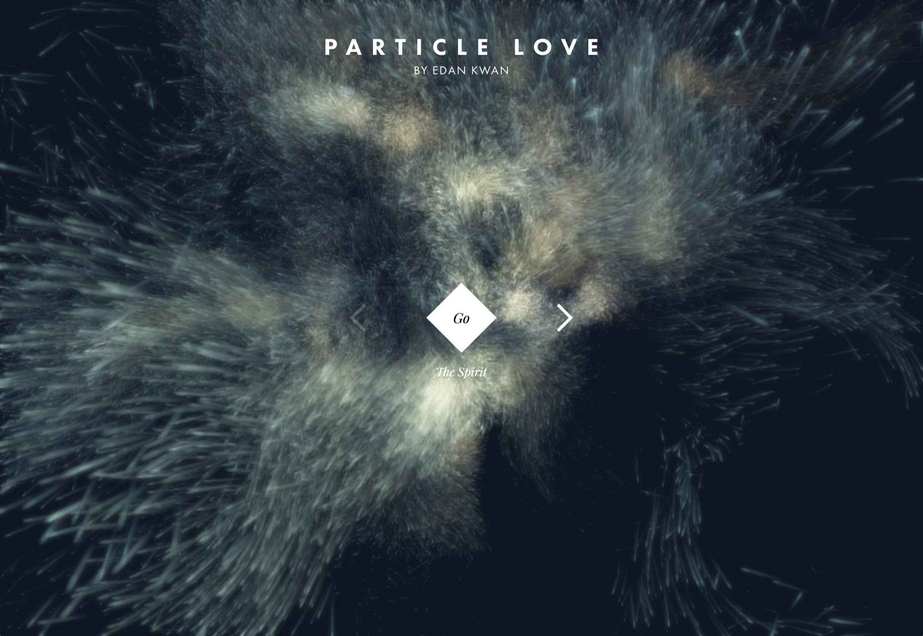
The more you can delight visitors with experiences that keep them engaged while the information they need is loading, the less likely people will be to hit the “back” button.
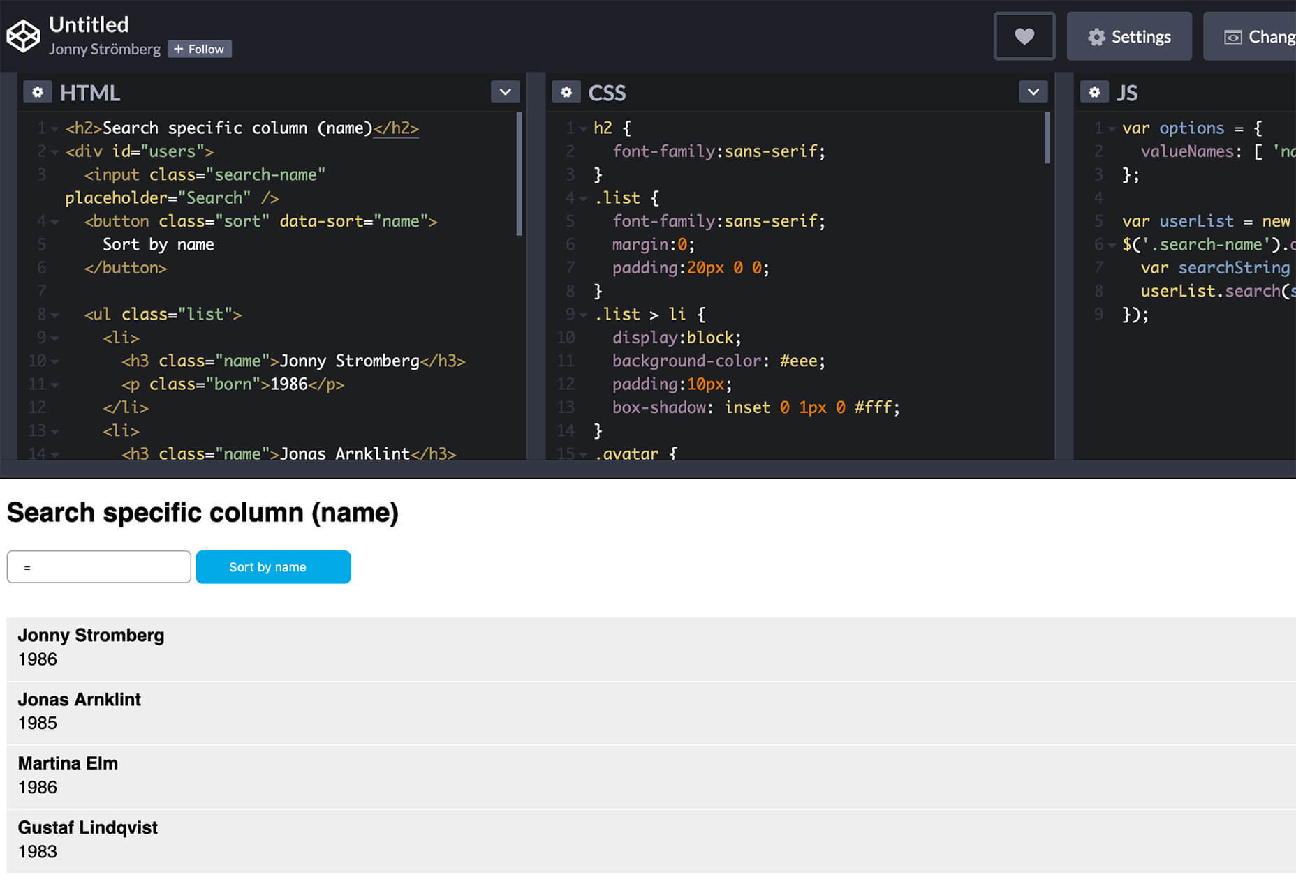
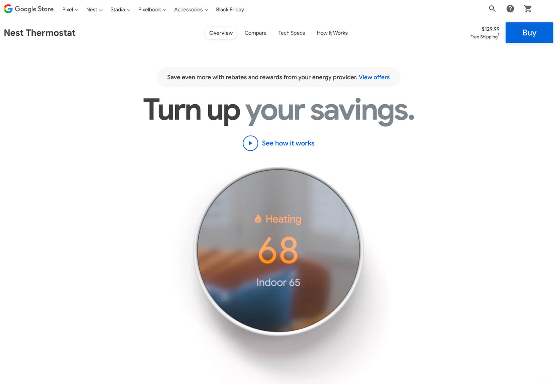
2. Microinteraction Animations
Microinteractions are quick and simple animations that come with specific use cases. Usually, this animation works to provide visual feedback and information when you interact with a specific element.
For instance, this microinteraction design from Colin Garven encourages users to enter their email address and password into a login field:
Ideally, the best way to use microinteractions is to make them as subtle as possible. These tools aren’t here to steal the spotlight from other information on the page. However, they can sometimes encourage your viewers to take the next stage in their conversion journey.
Animated microinteractions can be as complex or as basic as you choose. For instance, you could use them when:
- Highlighting if a feature is switched on or off;
- Letting users know when actions were successful (like sending a message in a contact form);
- Showcasing important information, like prices on a table;
- Animating icons on your site to encourage action;
- Depending on your experience with animations, you can even find themes and plugins that come with options already built-in.
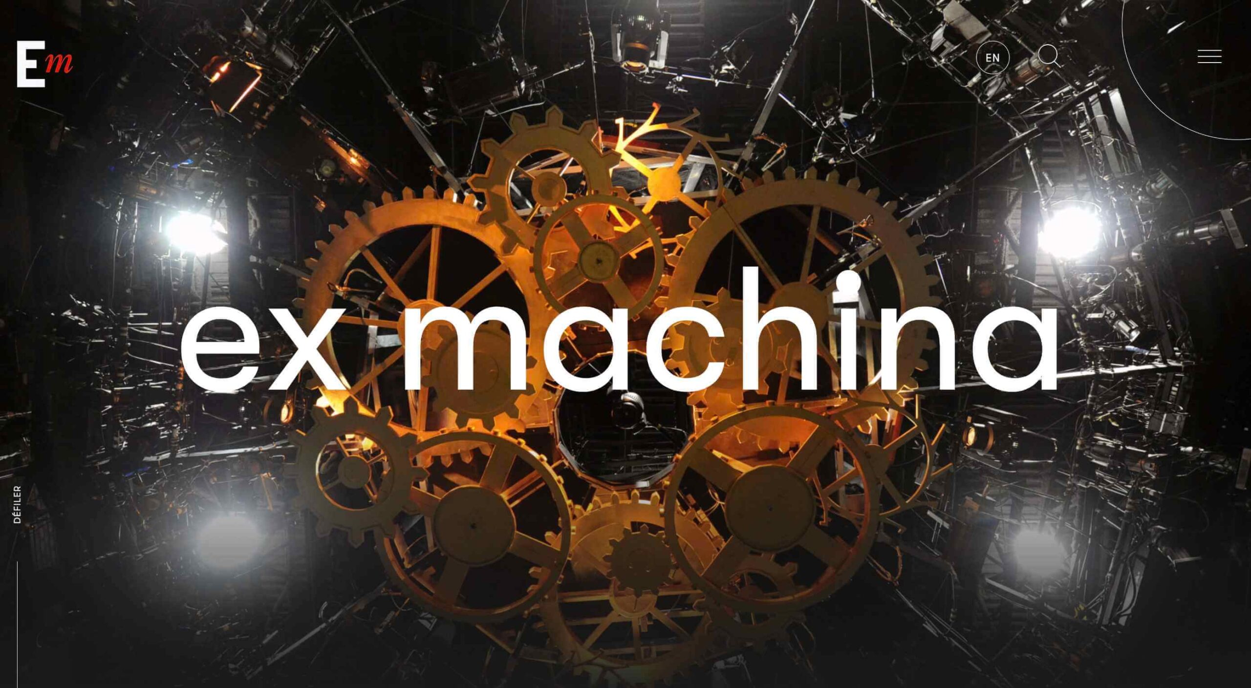
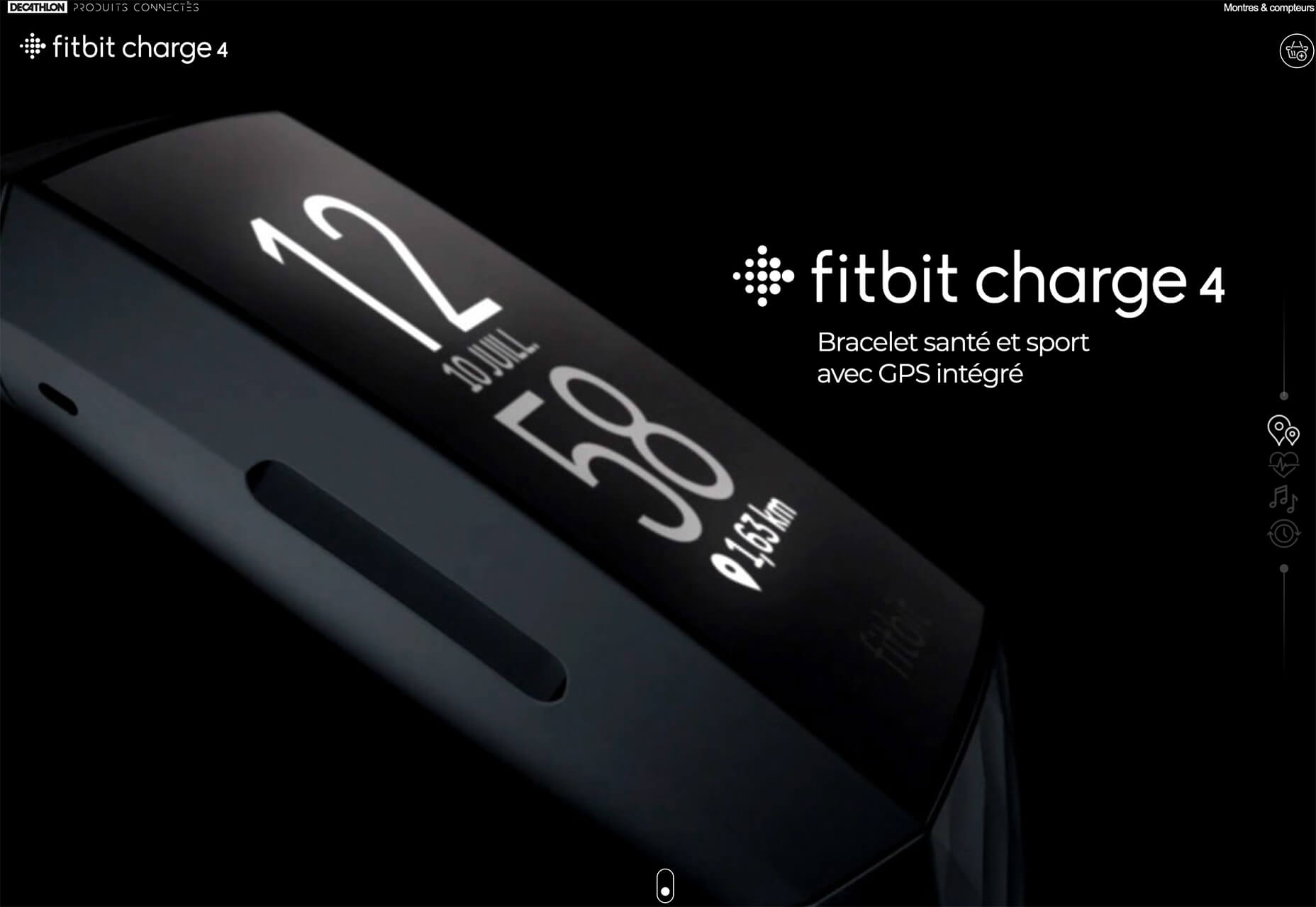
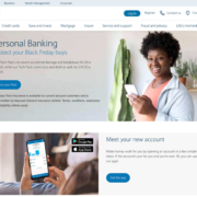
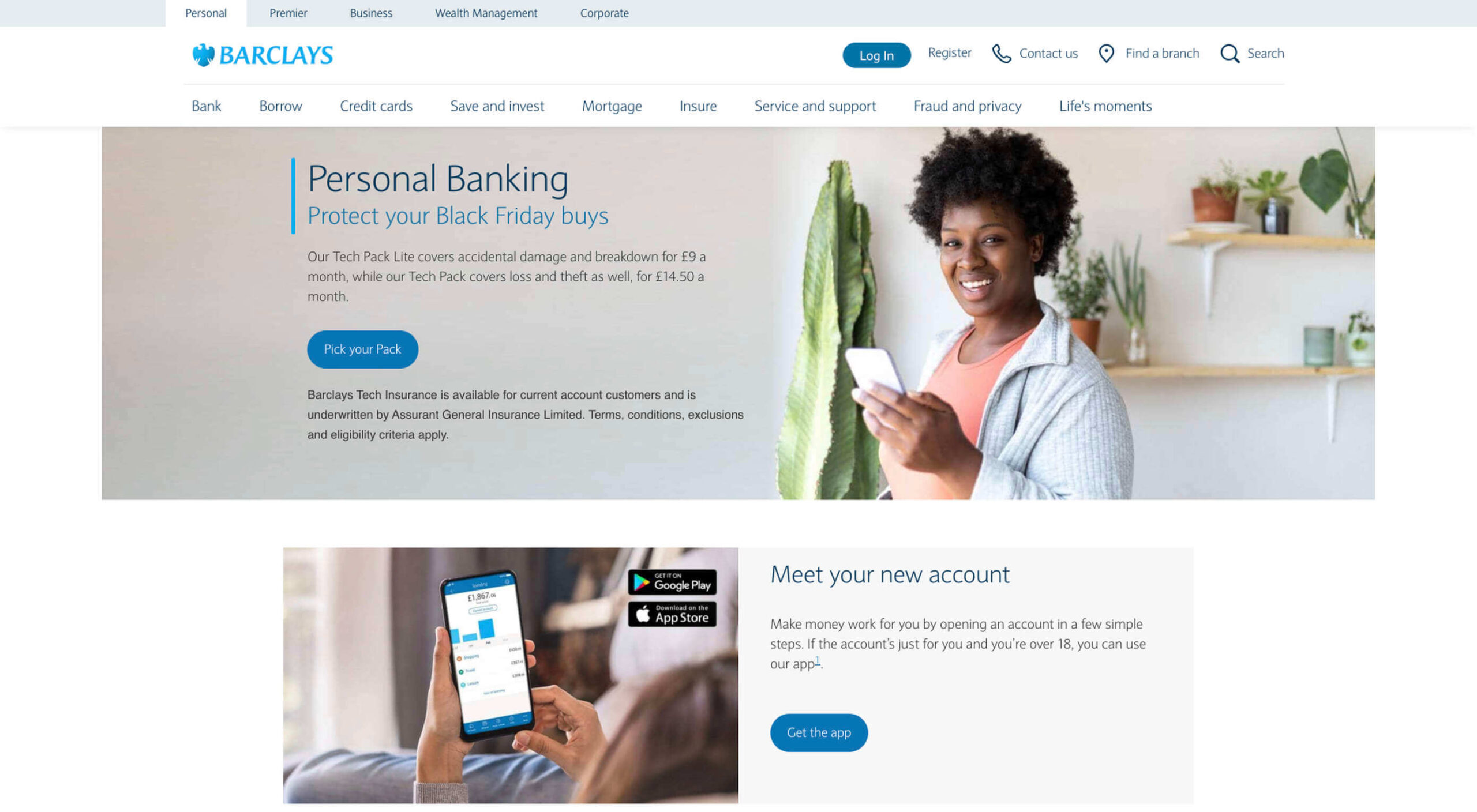
3. Dynamic Backgrounds
An animated background can be an excellent way to make your website stand out from the crowd. However, it’s important to remember that excessive animation has a habit of making your site slower and more clunky than it needs to be.
The animated background on the mystaticself.com website is fantastic for introducing customers to new information with a handy dynamic menu.
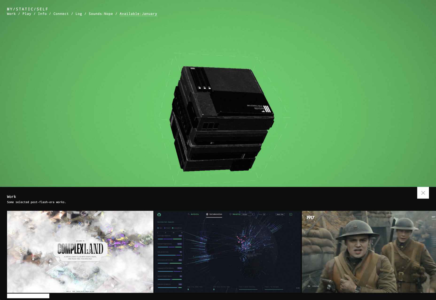
Often, the only reason that you should create your own dynamic background for a website, is if it’s going to improve your customer’s experience in some way.
Remember, ensure that the animations that you’re using on your website aren’t going to make any aspect of your site more difficult to use. Animated backgrounds need to offer a compliment to your existing website, rather than distracting customers from what they want to do.
Before you go all-in with your background animations, focus on animating small sections of an image, one piece at a time. You can also animate components with very small motions too.
4. Reveal Hidden Messages
Another excellent way to use animation in web design is to harness it for showcasing important information. For instance, a navigation menu is an important component in your website design, but it can also take up a lot of valuable space.
In some cases, a hidden menu that appears when a customer scrolls over a small box or icon could make a lot of sense. You can also think about animated drop-down menus if you’re working with a website that has a large number of pages.
Check out this fun example of an animated CSS3 menu:
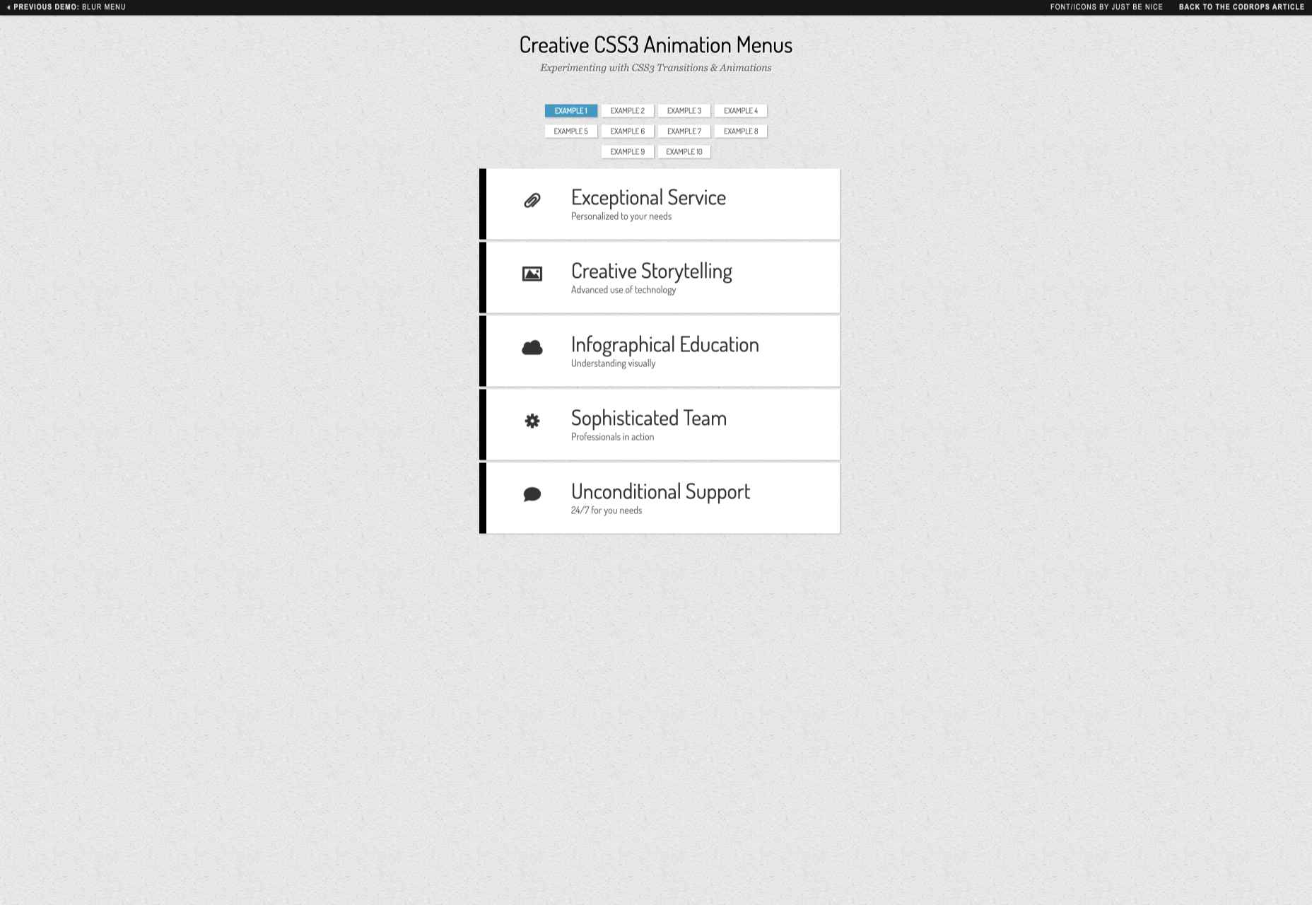
The sections change color and move as you hover over them, making it easier to see exactly where you’re clicking.
It’s up to you exactly how creative you want to be when you’re playing with animated menus. The easiest option is often just to have a component that changes color or shape with a hover effect. However, you can also expose hidden menus and extra information too.
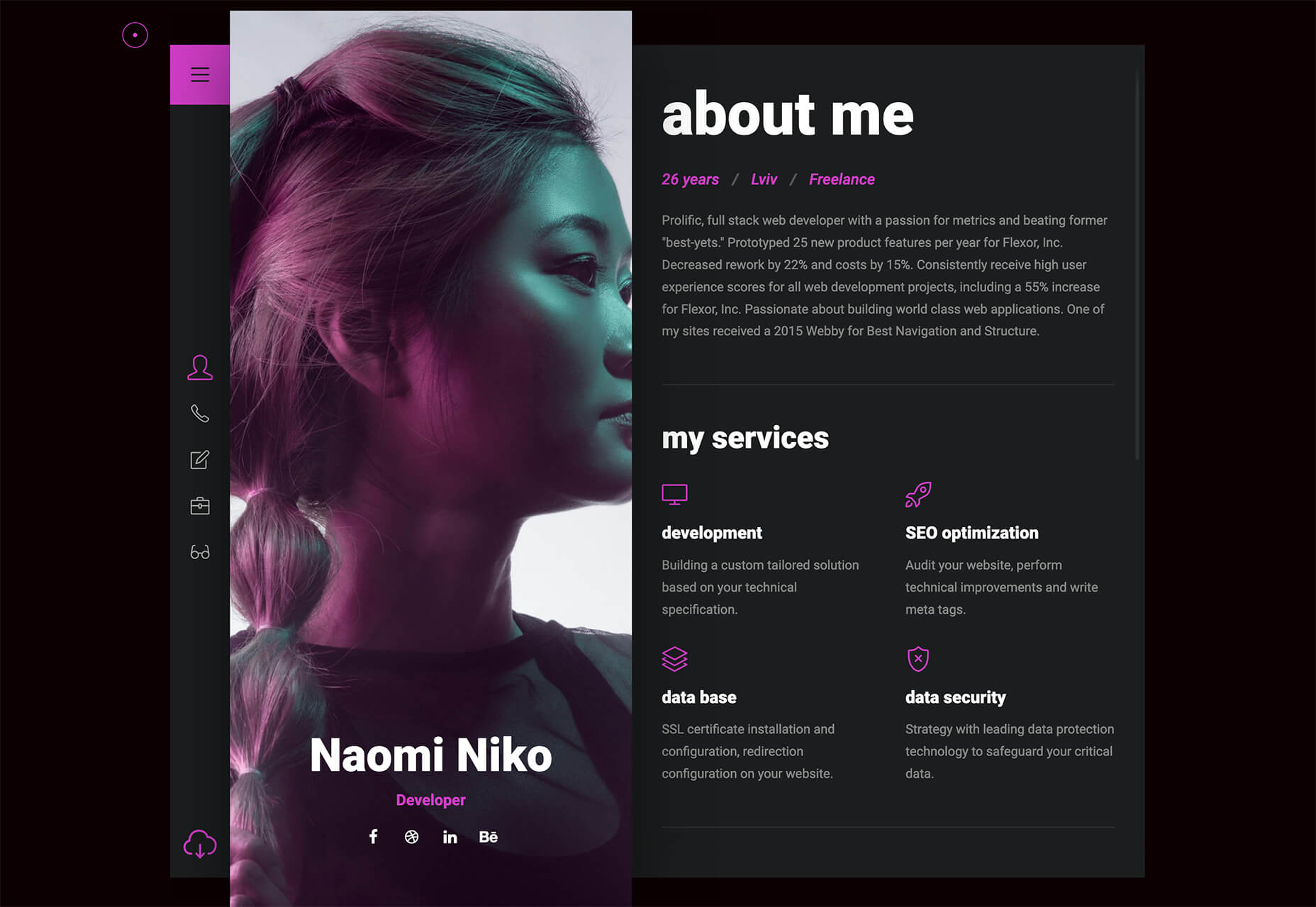
For instance, with some websites, you can create pictures that turn over to show information on the other side. That means that you could create an about page with pictures of team members, which flip to show biography information.
Just make sure that everything works smoothly, both on desktop and mobile.
5. Try Carousels
Finally, we come to perhaps the simplest and most popular way of using animation in web design. Carousels are a common component of almost every theme on the web today. They’re great for showing off useful information, such as what a website has to offer, or which deals are available.
When creating a carousel, you can either give your users control over how quickly an image transitions, or you can implement automatic movement. On the heathfield.co.uk website, the designer has added buttons to let you flip backwards and forwards between photos, while also ensuring that the animation is automatic.
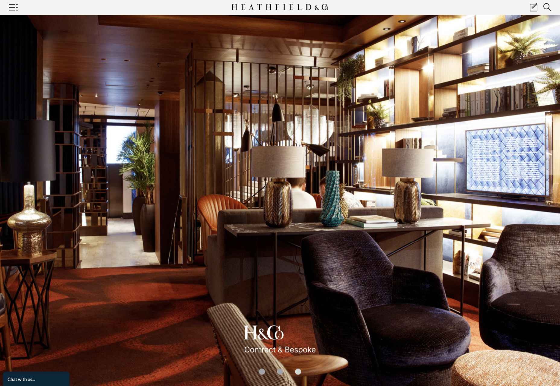
Without the animation to show you the pictures sliding into space, the transitions between each picture would be instant – which is a little more jarring for viewers.
Sliders are such a common component of web design today that customers almost expect to see them on many websites. That means that you can enjoy a very effective experience if you want to avoid doing anything too dramatic with your websites.
You can use sliders for everything from showing off products, to displaying testimonials from customers and more. It’s a great way to compress a lot of useful information into one small space on a site.
Use Website Animation Carefully
The most important thing for most designers to remember with animation and web design is that it’s entirely possible to have too much of a good thing. When it comes to creating amazing designs for your clients, you can take advantage of animation to encourage more engagement and a unique experience. However, you shouldn’t allow yourself to go too over the top.
Rather than animating every aspect of a page to constantly grab visitor attention, think about how you can make the visitor experience more compelling with the right animation choices. If an entire page of animation on the background isn’t right for your target audience, perhaps custom animations on a navigation bar or a slider would be a good option instead.
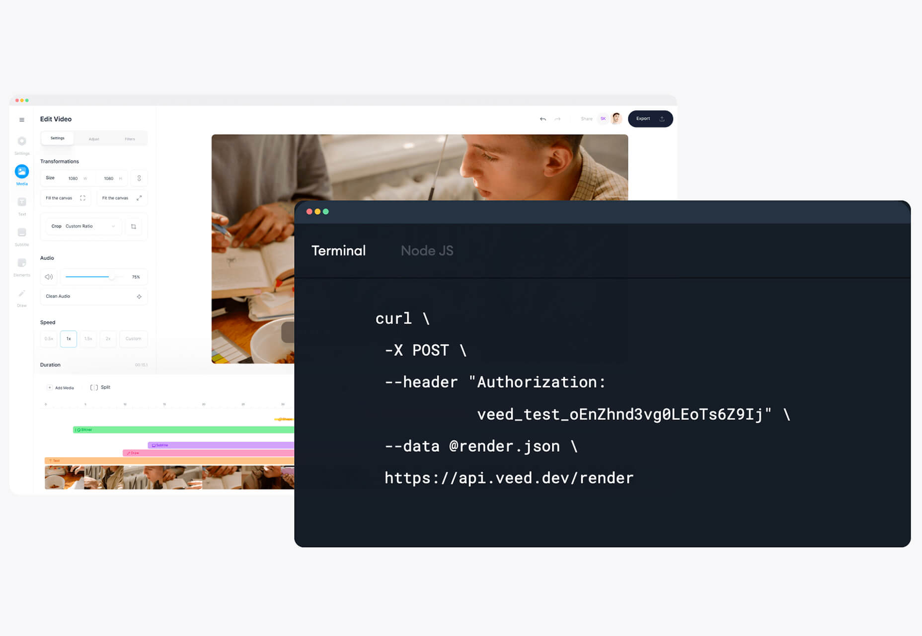
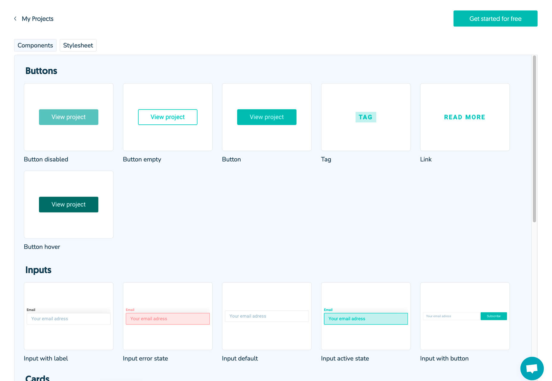
At the same time, remember to make the most of the latest technologies on the market for adding animation to web design. A good combination of CSS3, JavaScript, and HTML5 often makes it easier to create more immersive, high-quality animations that users can interact with on desktop and mobile alike.
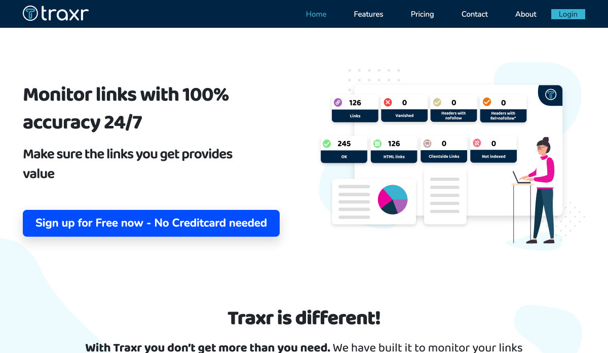
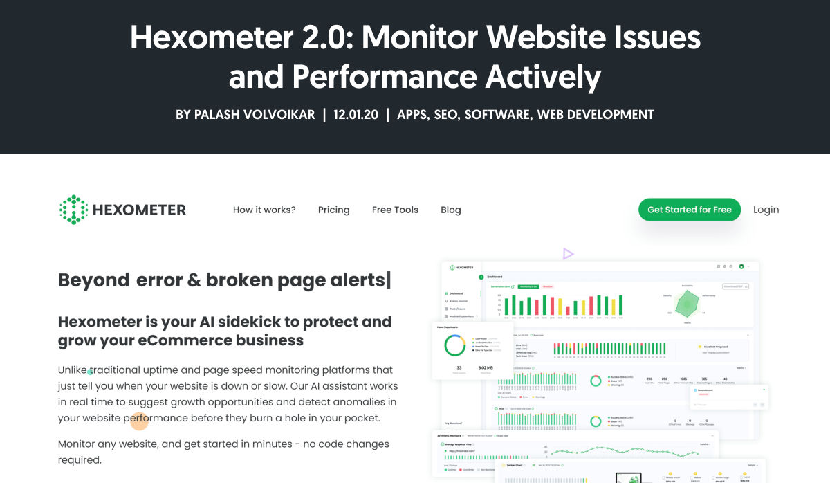
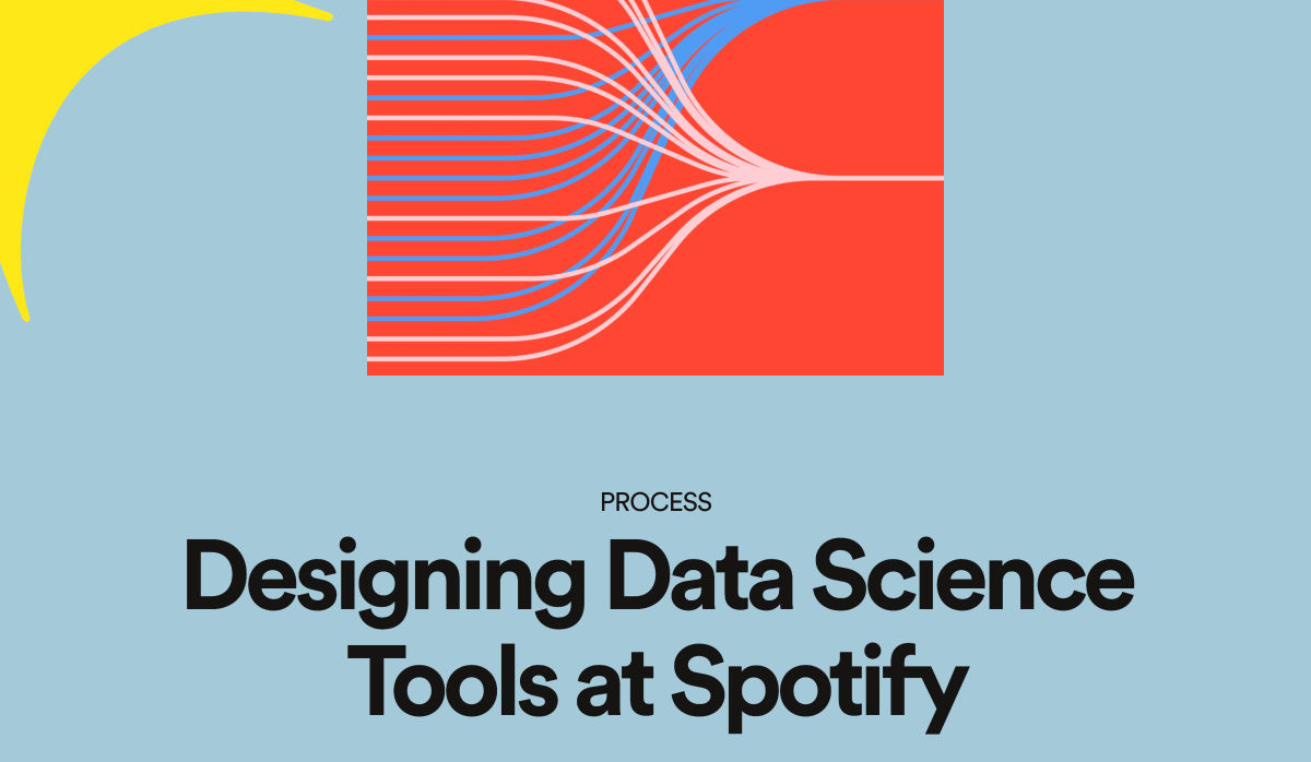
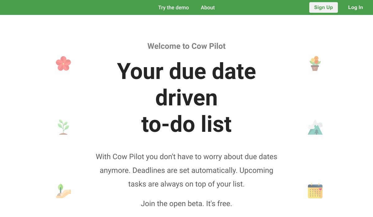
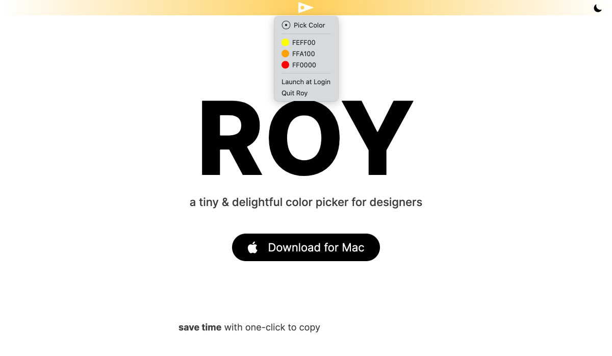
 Jumpstart your next design project or speed up a workflow with some of these new tools and resources. With so many new tools being developed all the time, you are almost certain to find something that can help you with projects.
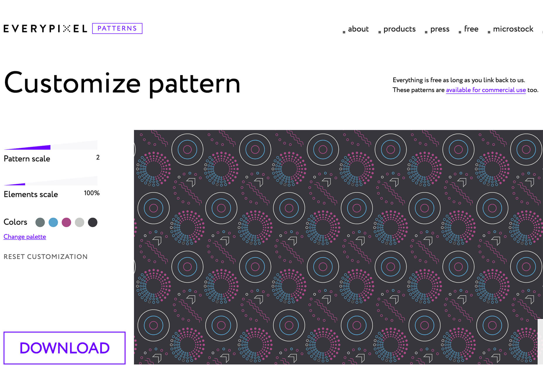
 Every week users submit a lot of interesting stuff on our sister site Webdesigner News, highlighting great content from around the web that can be of interest to web designers.
 Sass – the extended arm of CSS; the power factor that brings elegance to your code.
 By the end of the year, the number of global smartphone users is


 The end of the year tends to be busy for a variety of reasons and it can limit some of the freshness we see in designs during much of the year. Regardless, there are a few trending design elements.
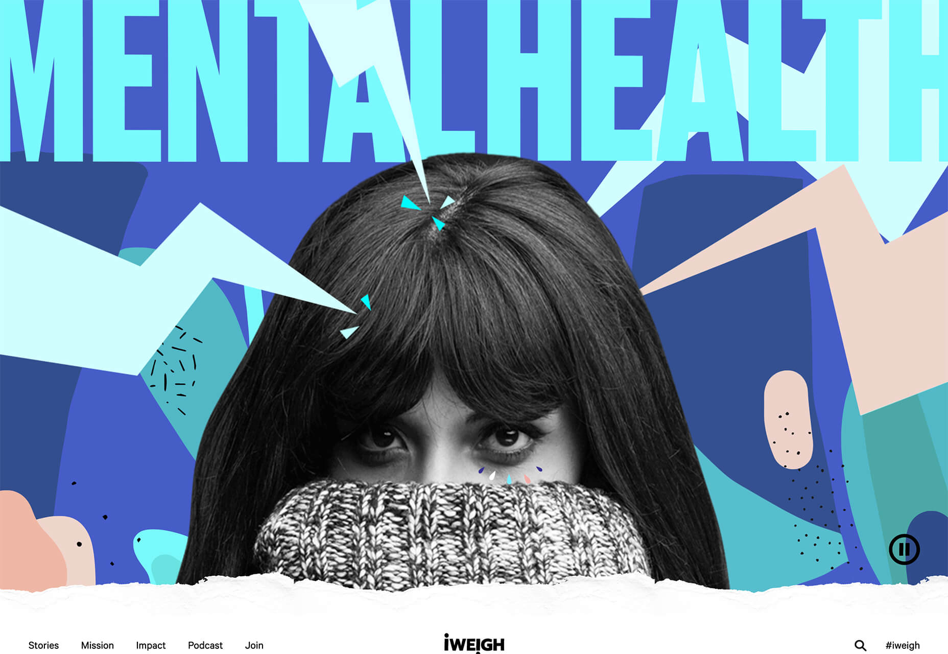

 Every week users submit a lot of interesting stuff on our sister site Webdesigner News, highlighting great content from around the web that can be of interest to web designers.
 As human beings, we like to think that we’re rational creatures.
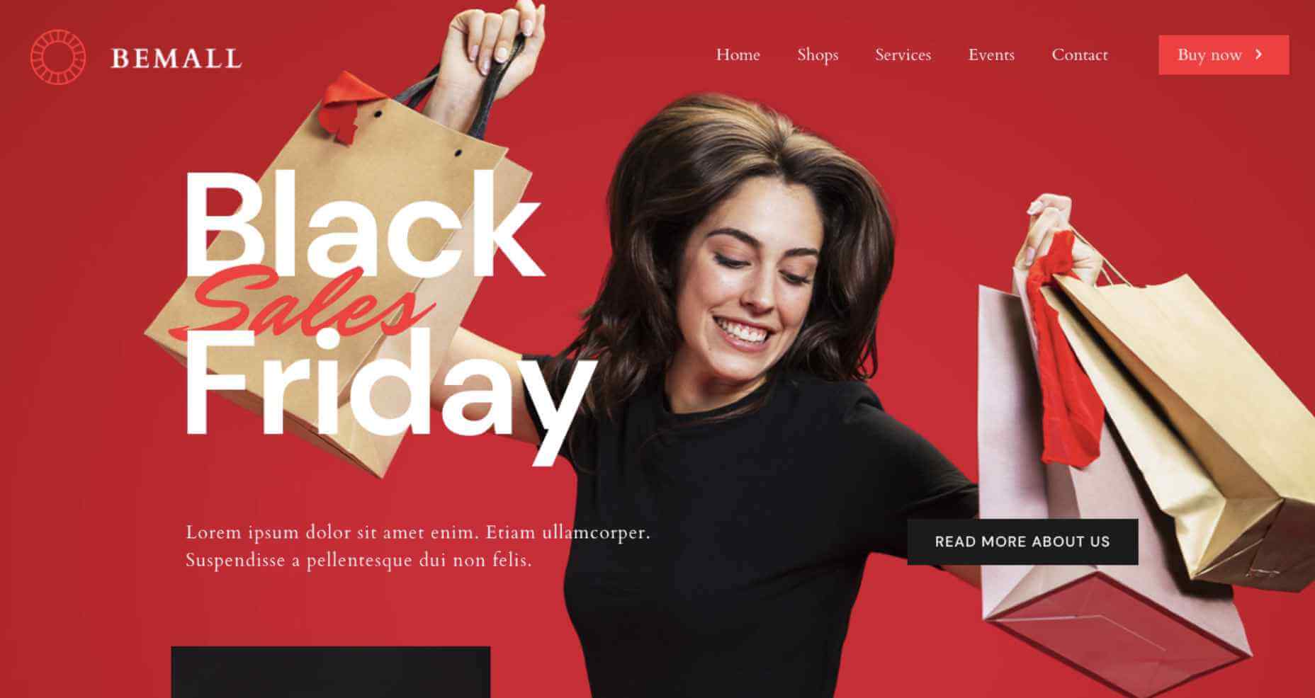
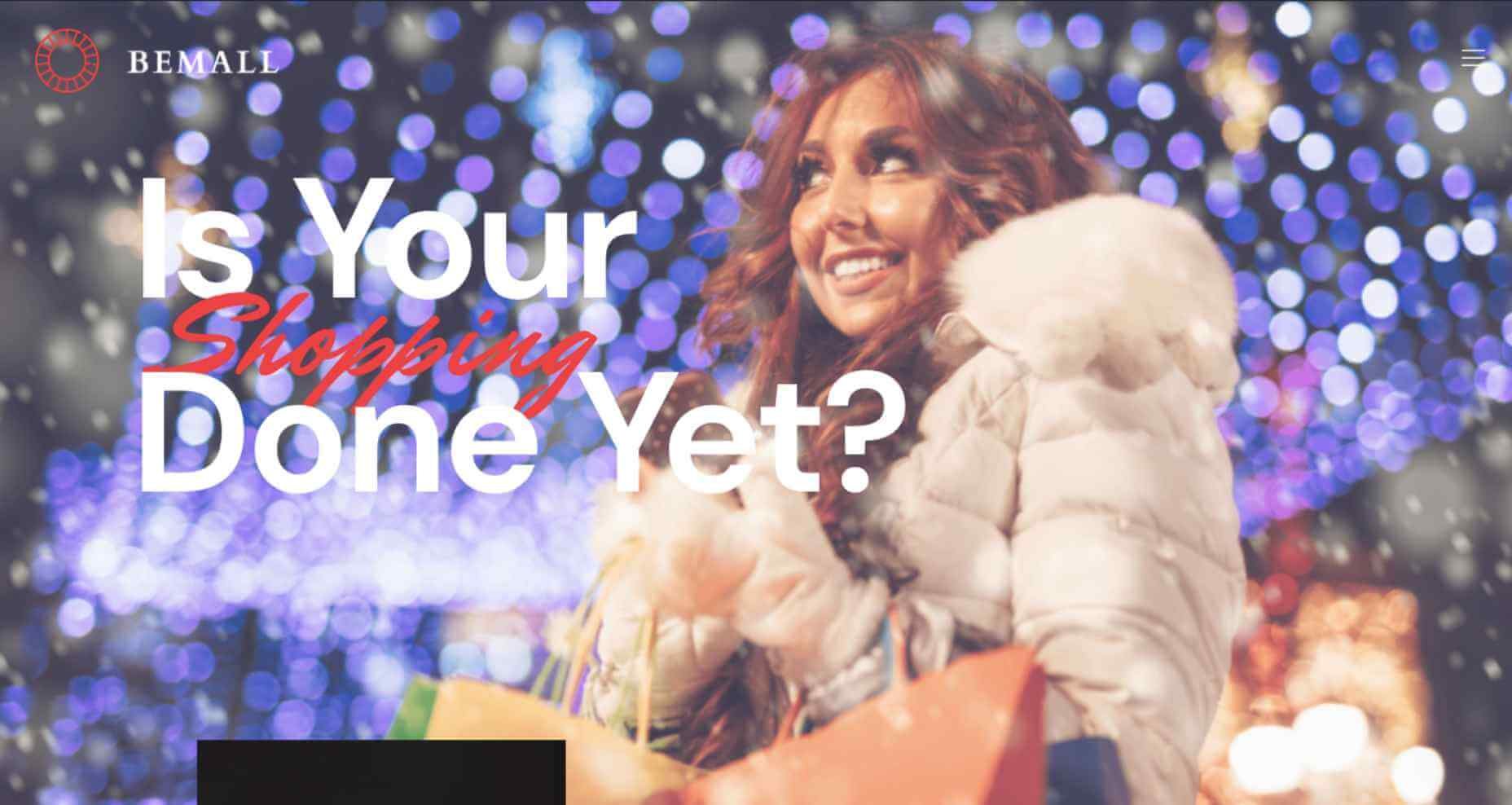
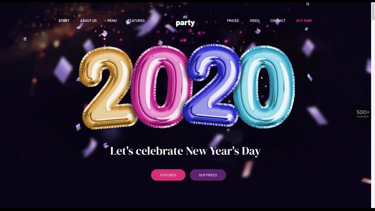
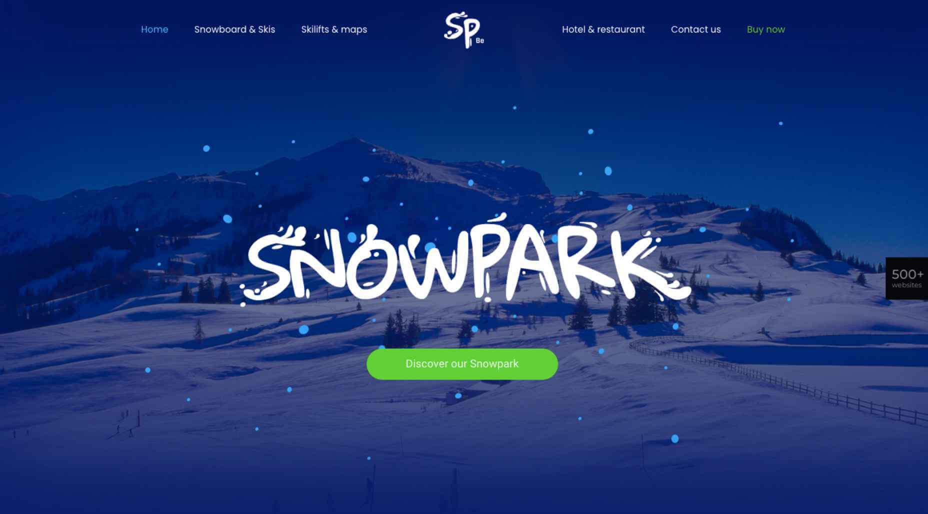
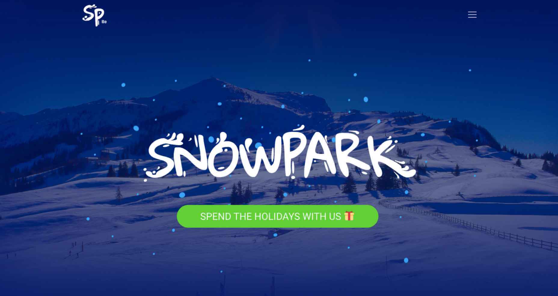
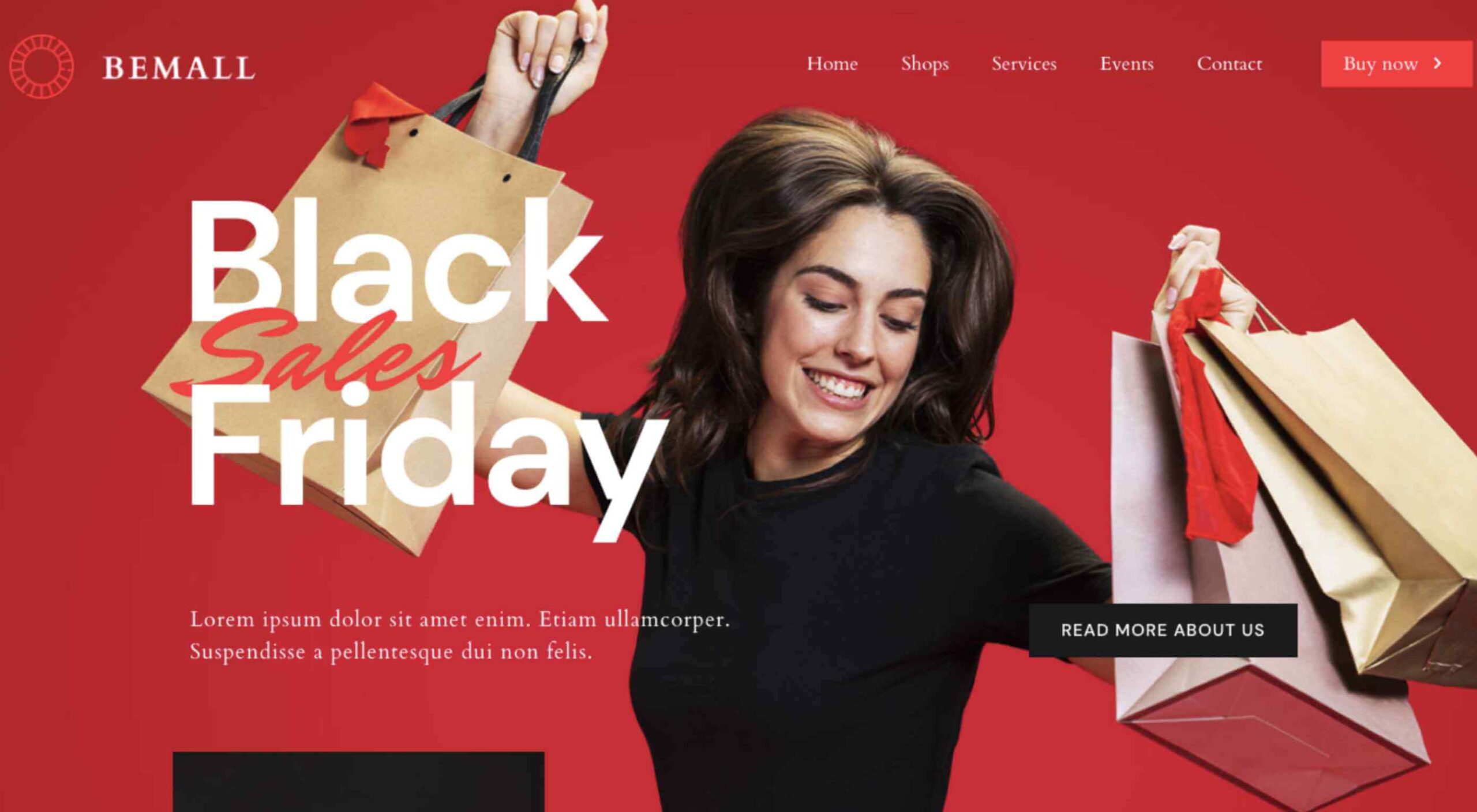 The holidays are fast approaching. But that doesn’t mean it’s too late to get a new website online or to make your existing one look festive for the holiday season.
