 It’s never been easier to set up an ecommerce store and start selling. There are a dizzying array of ecommerce solutions available in 2021, and most are feature-rich and competitively priced.
Ecommerce sites are notoriously difficult to migrate from platform to platform, so more often than not, you’ll be committed to your chosen solution for years. The key when choosing an ecommerce solution to maximize your return on investment, is to consider not just what your business needs today but what it will need tomorrow.
There are two basic approaches to ecommerce. The first is a dedicated platform that handles everything. The second is a plugin that adds ecommerce features to an existing CMS. Both approaches have benefits and drawbacks.
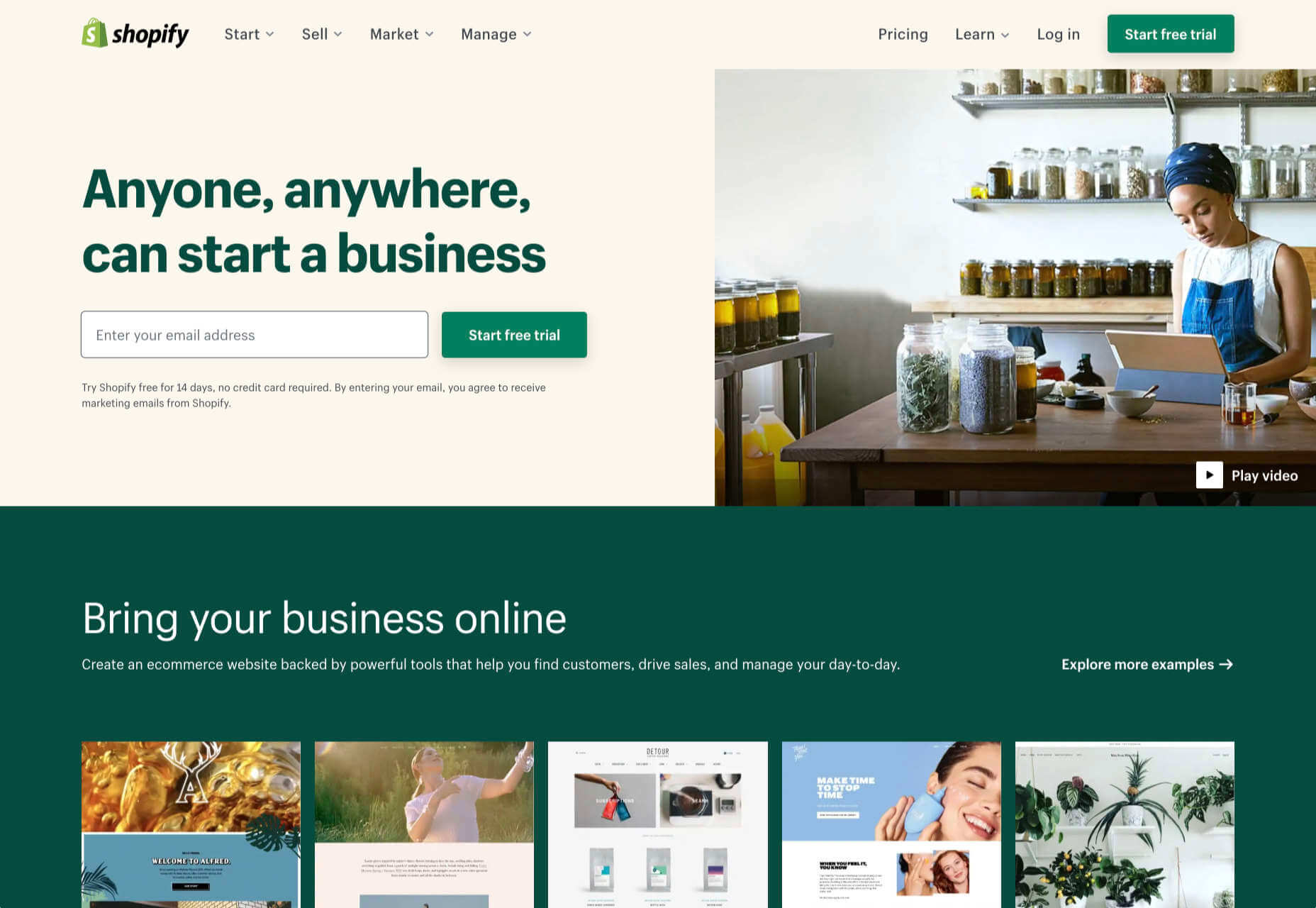
1. Shopify: Best for Almost Everyone
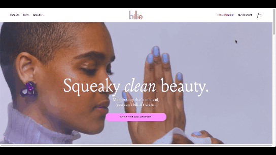
Shopify is a well-known, well-liked, and reliable dedicated ecommerce platform. As a system for getting a business off the ground and selling fast, it is peerless.
Shopify jealously guards developer access, with templates and plugins pre-vetted. Unlike some marketplaces, you can be confident that there are no hidden surprises in your shiny new store.
And because Shopify has passed the point of market saturation, it’s worthwhile for big players to provide their own plugins; credit services like Klarna and shipping companies like netParcel can be integrated with a few clicks.
The admin panel is a touch complex, as Shopify is designed to allow a single account to be linked to multiple stores. But once you’re set up and familiar with where to find everything, it’s a slick, streamlined business management system.
Whenever a client says, “we want to start selling online.” My first thought is, “Shopify.” And for 90% of clients, it’s the right choice.
And that’s where this roundup should end…except there’s still that 10% because Shopify isn’t perfect.
For a start, an all-in-one platform doesn’t suit everyone. If you already have a website you’re happy with, you’ll either need to migrate or lease a dedicated domain for your store.
Shopify’s platform is very secure, which inspires confidence in buyers, but the price of that security is a lack of flexibility in the design.
Then there’s the infamous variant limit. Shopify allows 100 variants on a product. Almost every client runs into that wall at some point. Let’s say you’re selling a T-shirt: male and female cuts are two variants; now add long or short sleeves, that’s four variants; now add seven sizes from XXS to XXL, that’s 28 variants; if you have more than three color options, you’ve passed the 100 variant limit. There are plugins that will allow you to side-step this issue, but they’re a messy hack that hampers UX for both customer and business.
Shopify should certainly be on every new store owner’s shortlist, but there are other options.
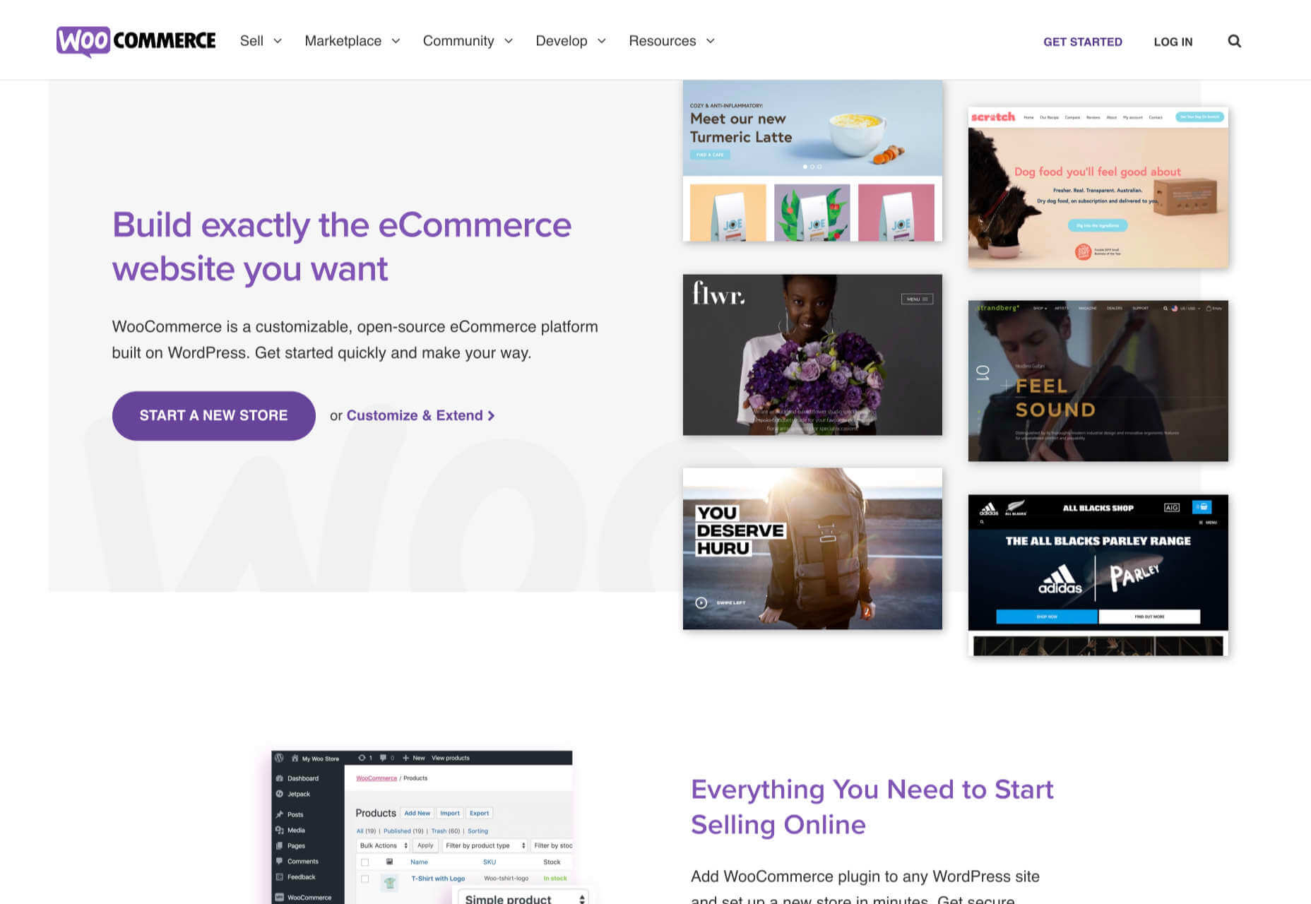
2. WooCommerce: Best for WordPress Users
If you’re one of the millions of businesses with a pre-existing site built on WordPress, then adapting it with a plugin is the fastest way to get up and running with ecommerce.
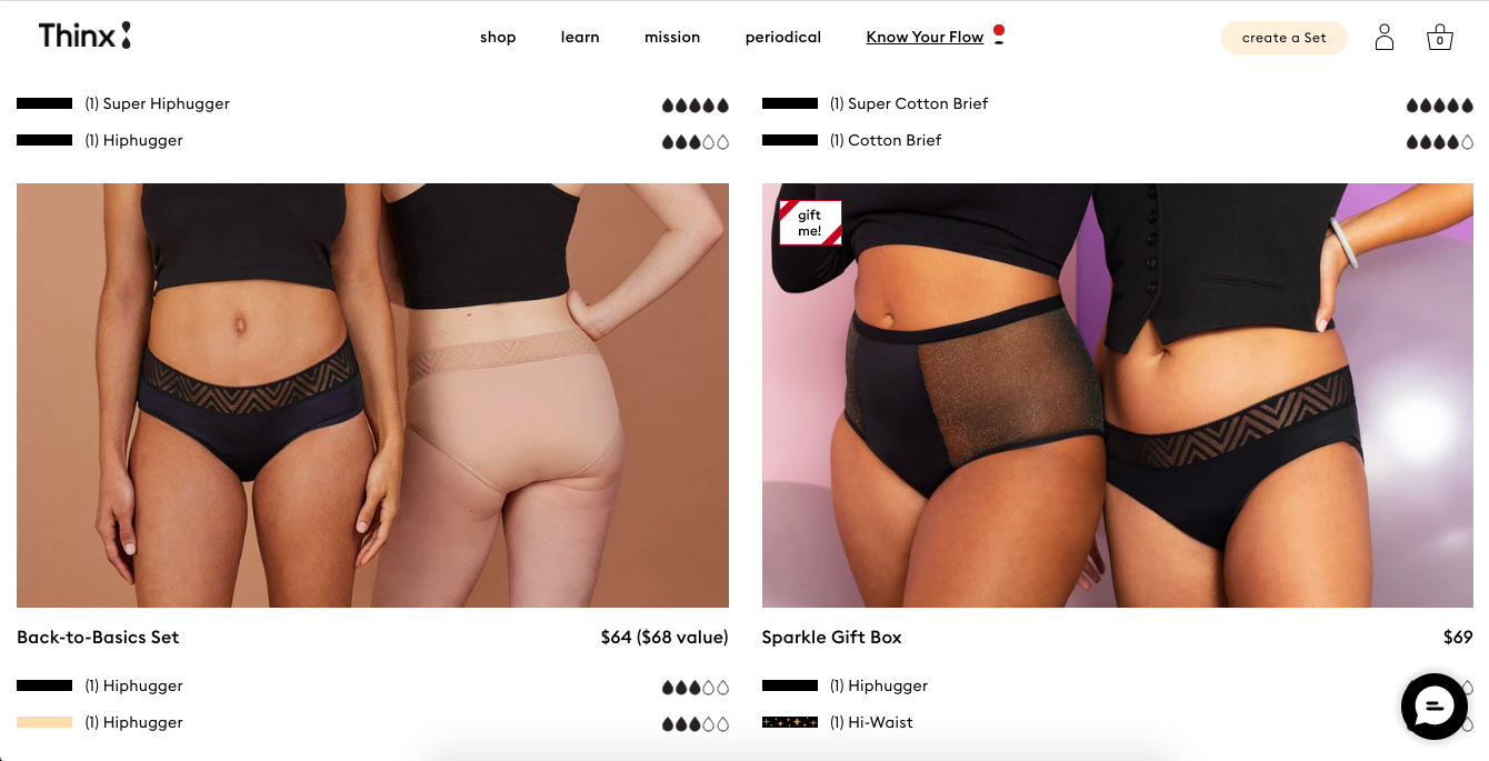
WooCommerce is regularly recommended as “Best for WordPress Users,” which is a back-handed compliment that belies the fact that WooCommerce reportedly powers 30% of all ecommerce stores. If running with the crowd appeals to you — and if you’re using WordPress, it presumably does — then you’re in the right place.
WordPress has a gargantuan plugin range. As such, there are other plugins that will allow you to sell through a WordPress site. The principle benefit of WooCommerce is that as the largest provider, most other plugins and themes are thoroughly tested with it for compatibility issues; most professional WordPress add-ons will tell you if they’re compatible with WooCommerce. If your business is benefitting from leveraging WordPress’ unrivaled ecosystem, it can continue to do so with WooCommerce.
The downside to WooCommerce is that you’re working in the same dashboard as the CMS that runs your content. That can quickly become unmanageable.
WooCommerce also struggles as inventories grow — every product added will slow things a little — it’s ideally suited to small stores selling a few items for supplementary income.
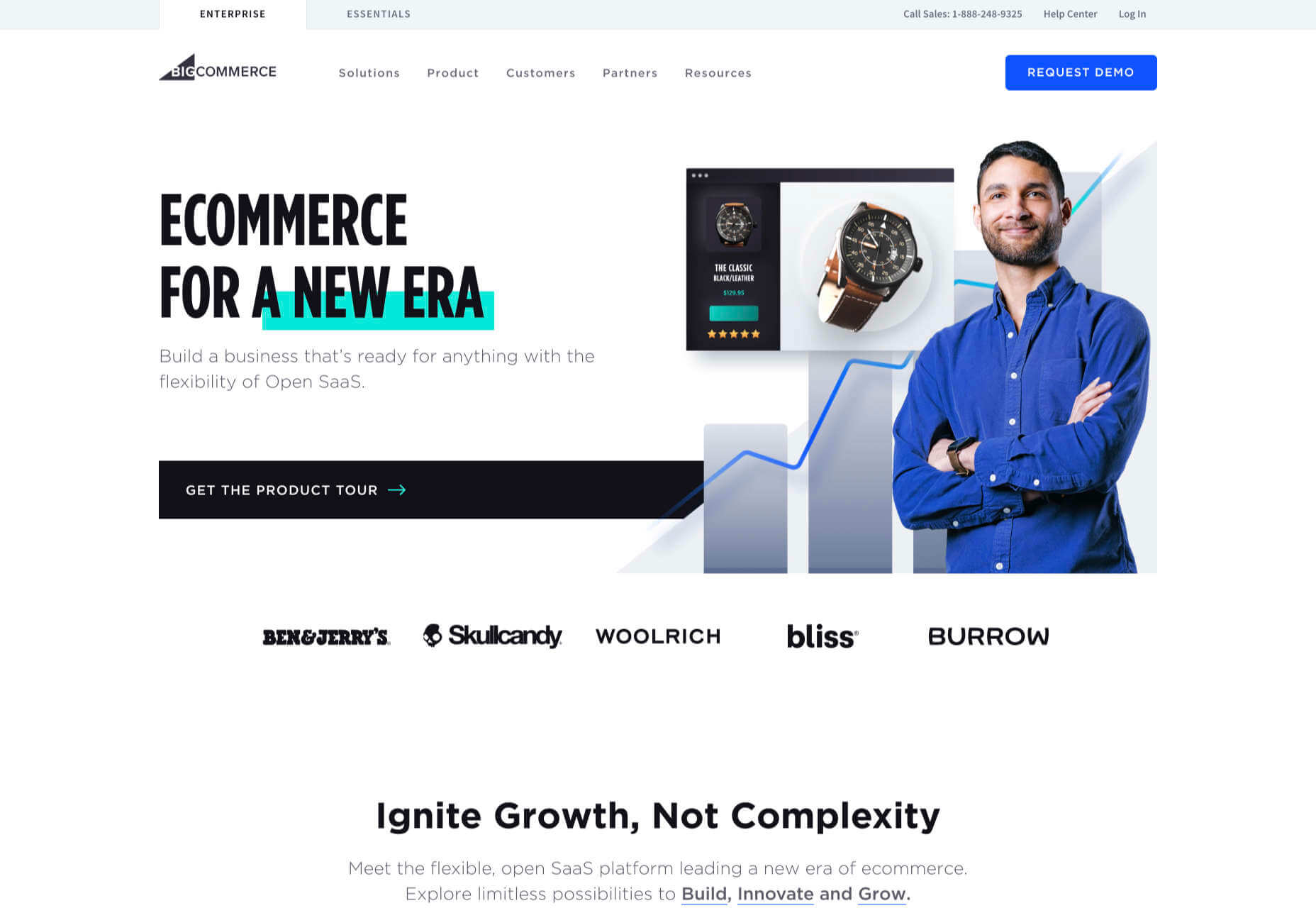
3. BigCommerce: Best for Growth
BigCommerce is an ecommerce platform similar to Shopify, but whereas Shopify is geared towards newer stores, BigCommerce caters to established businesses with larger turnovers.
The same pros and cons of a dedicated ecommerce solution that applied to Shopify also apply to BigCommerce. One of the considerable downsides is that you have less control over your front-end code. This means that you’re swapping short-term convenience for long-term performance. Templates, themes, and plugins — regardless of the platform they’re tied to — typically take 18 months to catch up with best practices, leaving you trailing behind competitors.
BigCommerce addresses this shortcoming with something Shopify does not: a headless option. A headless ecommerce platform is effectively a dedicated API for your own store.
Enabling a headless approach means that BigCommerce can be integrated anywhere, on any technology stack you prefer. And yes, that includes WordPress. What’s more, being headless means you can easily migrate your frontend without rebuilding your backend.
BigCommerce also provides BigCommerce Essentials, which is aimed at entry-level stores. It’s a good way to get your feet wet, but it’s not BigCommerce’s real strength.
If you have the anticipated turnover to justify BigCommerce, it’s a flexible and robust choice that you won’t have to reconsider for years.
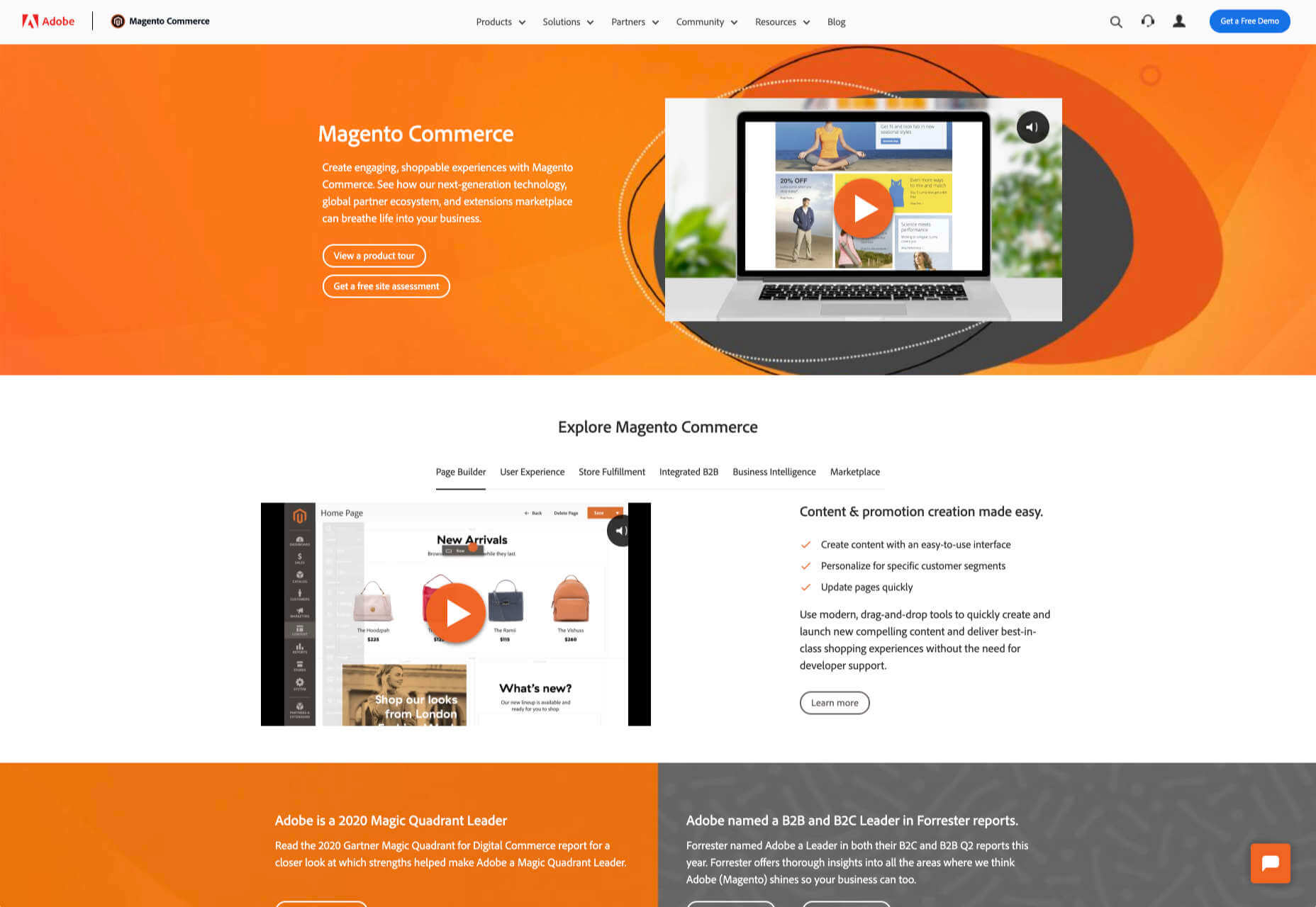
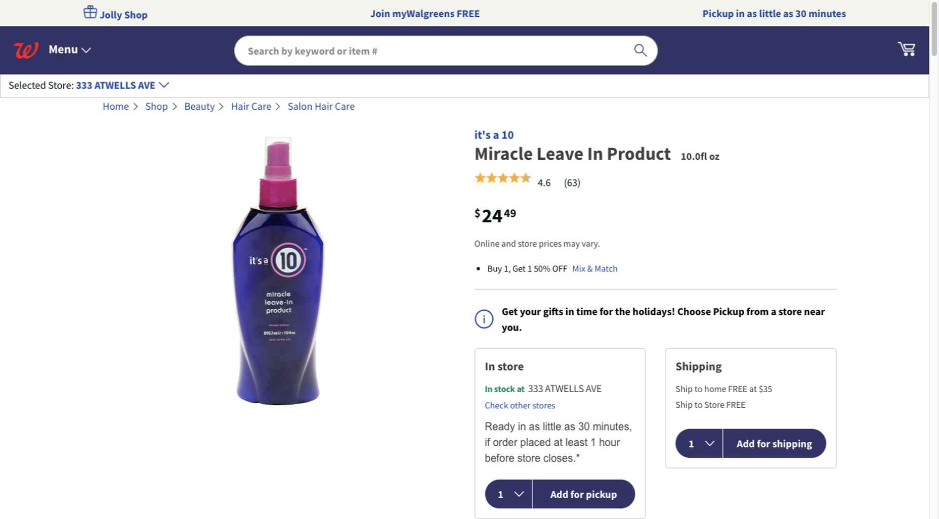
4. Magento: Best for Burning Budgets
If you have a development team at your disposal and a healthy budget to throw at your new store, then Magento could be the option for you.
You can do almost anything with a Magento store; it excels at custom solutions.
Magento’s main offering is its enterprise-level solution. You’ll have to approach a sales rep for a quote — yep, if you have to ask the price, you probably can’t afford it. Magento has the track-record and the client list to appeal to boards of directors for whom a 15-strong development team is a footnote in their budget.
That’s not to say that a Magento store has to be expensive; Magento even offers a free open source option. But if you’re not heavily investing in a custom solution, you’re not leveraging the platform’s key strengths.
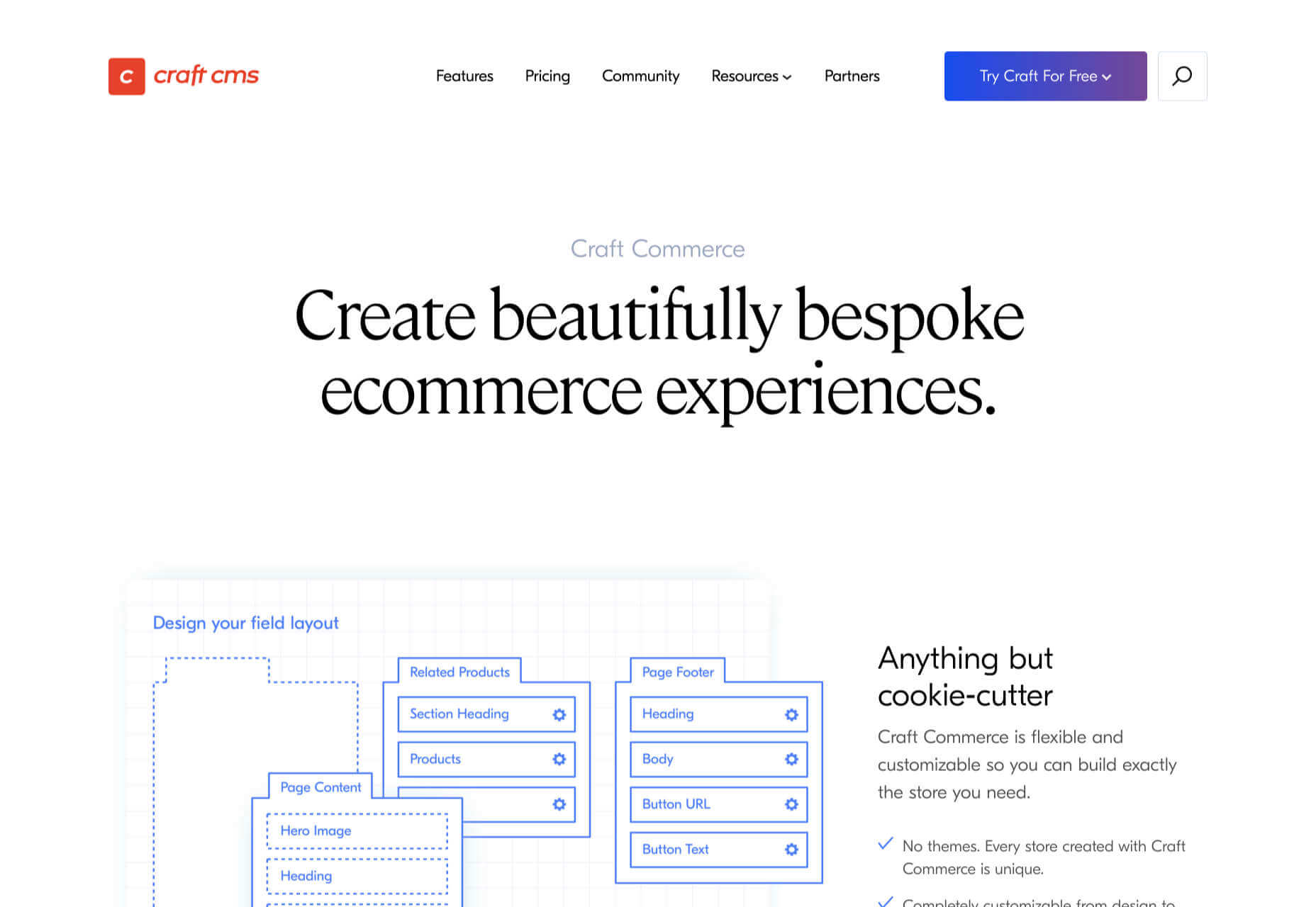
5. Craft Commerce: Best for Custom Solutions
If you’re in the market for a custom solution, and you don’t have the budget for something like Magento, then Craft Commerce is ideally positioned.
Like WooCommerce for WordPress, Craft Commerce is a plugin for Craft CMS that transforms it into an ecommerce store.
Unlike WordPress, Craft CMS doesn’t have a theme feature. Every Craft Commerce store is custom built using a simple templating language called Twig. The main benefit of the approach is that bespoke solutions are fast and relatively cheap to produce, with none of the code bloat of platforms or WordPress.
Because your site is custom coded, you have complete control over your frontend, allowing you to iterate UX and SEO.
You will need a Craft developer to set up Craft Commerce because the learning curve is steeper than a CMS like WordPress. However, once you’re setup, Craft sites are among the simplest to own and manage.
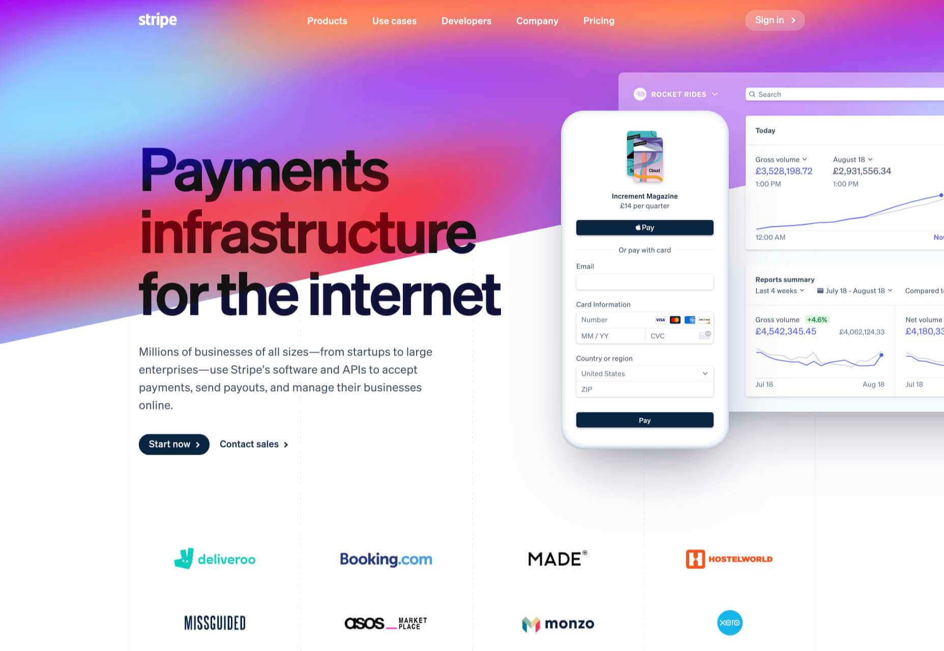
6. Stripe: Best for Outliers
Ecommerce solutions market themselves on different strengths, but the nature of design patterns means they almost all follow a similar customer journey: search for an item, add the item to a cart, review the cart, checkout. Like any business, they want to maximize their market share, which means delivering a solution that caters to the most common business models.
Occasionally a project happens along that doesn’t fit that business model. Perhaps you’re selling a product that’s uniquely priced for each customer. Perhaps you’re selling by auction. Perhaps you don’t want to bill the customer until a certain point in the future.
Whatever your reason, the greatest customization level — breaking out of the standard ecommerce journey — can be managed with direct integration with Stripe.
Stripe is a powerful payment processor that handles the actual financial transaction for numerous ecommerce solutions. Developers love Stripe; its API is excellent, it’s documentation is a joy, it’s a powerful system rendered usable by relentless iteration.
However, this approach is not for the faint-hearted. This is a completely custom build. Nothing is provided except for the financial transaction itself. Every aspect of your site will need to be built from scratch, which means hefty development costs before seeing any return on investment.
The Best eCommerce Solution in 2021
The best ecommerce solution is defined by three factors: the size of your store, the anticipated growth, and the degree of custom design and features you want or need.
Shopify is the choice of most successful small stores because you can be selling inside a day. For businesses with an existing presence and a smaller turnover, those on WordPress will be happy with WooCommerce. For larger stores planning long-term growth, BigCommerce’s headless option is ideal. Craft Commerce is a solid performer that marries low costs with flexibility for businesses that need a custom approach.
Featured image via Unsplash.
Source
The post 6 Best Ecommerce Solutions for 2021 first appeared on Webdesigner Depot.

Source de l’article sur Webdesignerdepot

 Everyday design fans submit incredible industry stories to our sister-site, Webdesigner News. Our colleagues sift through it, selecting the very best stories from the design, UX, tech, and development worlds and posting them live on the site.


 There are some interesting shake-ups on the horizon for ecommerce: Experiential shopping, Virt-ical worlds, Au naturale models.


 One of the few bright spots in 2020 has been the creativity companies and individuals alike have exhibited in dealing with what, at times, seemed to be overwhelming problems.


 We’re going to try something a little different this month; with this roundup of tools and resources for designers, we’re going to pick a few of our favorites and group everything else in a manner that makes it even easier to find elements that will work for you, and your projects, right now.


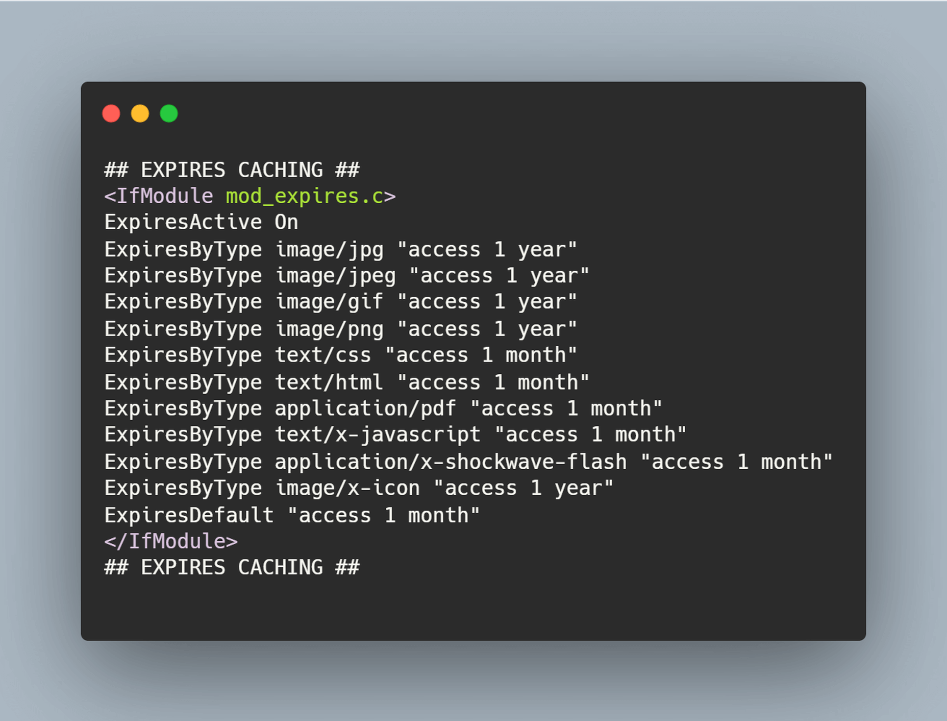
 The ‘need for speed’ is an essential item on every website’s bucket list these days. And why not? Enhanced speed is directly responsible for converting traffic into paying clients.

 Welcome to our roundup of the best plugins for popular CMS, this month. We’re going to cover plugins built to enhance WordPress, Shopify, Craft CMS, and Joomla. Enjoy!
 It’s hard to believe we are more than a month into 2021 already. But that means more trends to dive into this year, right?


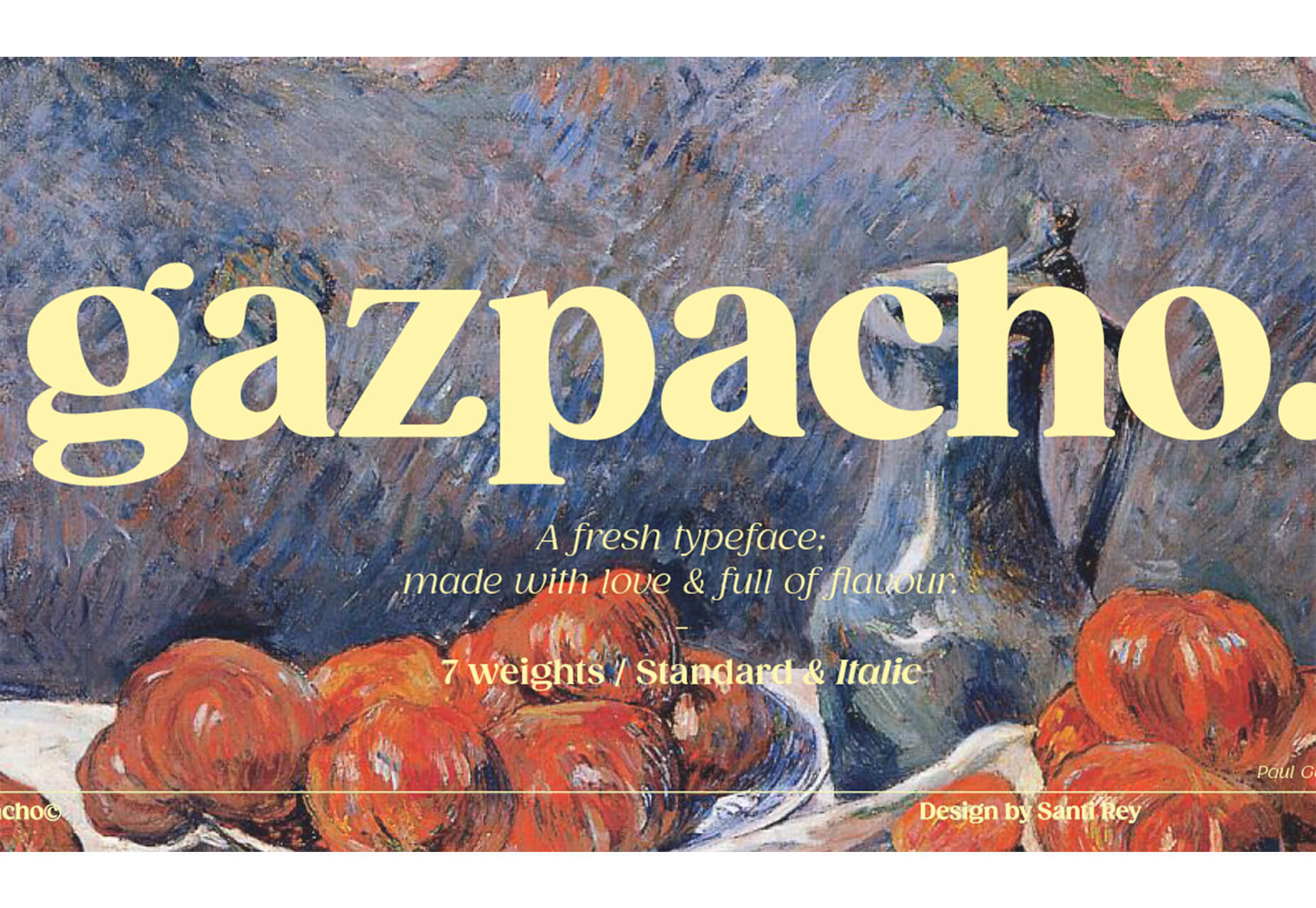
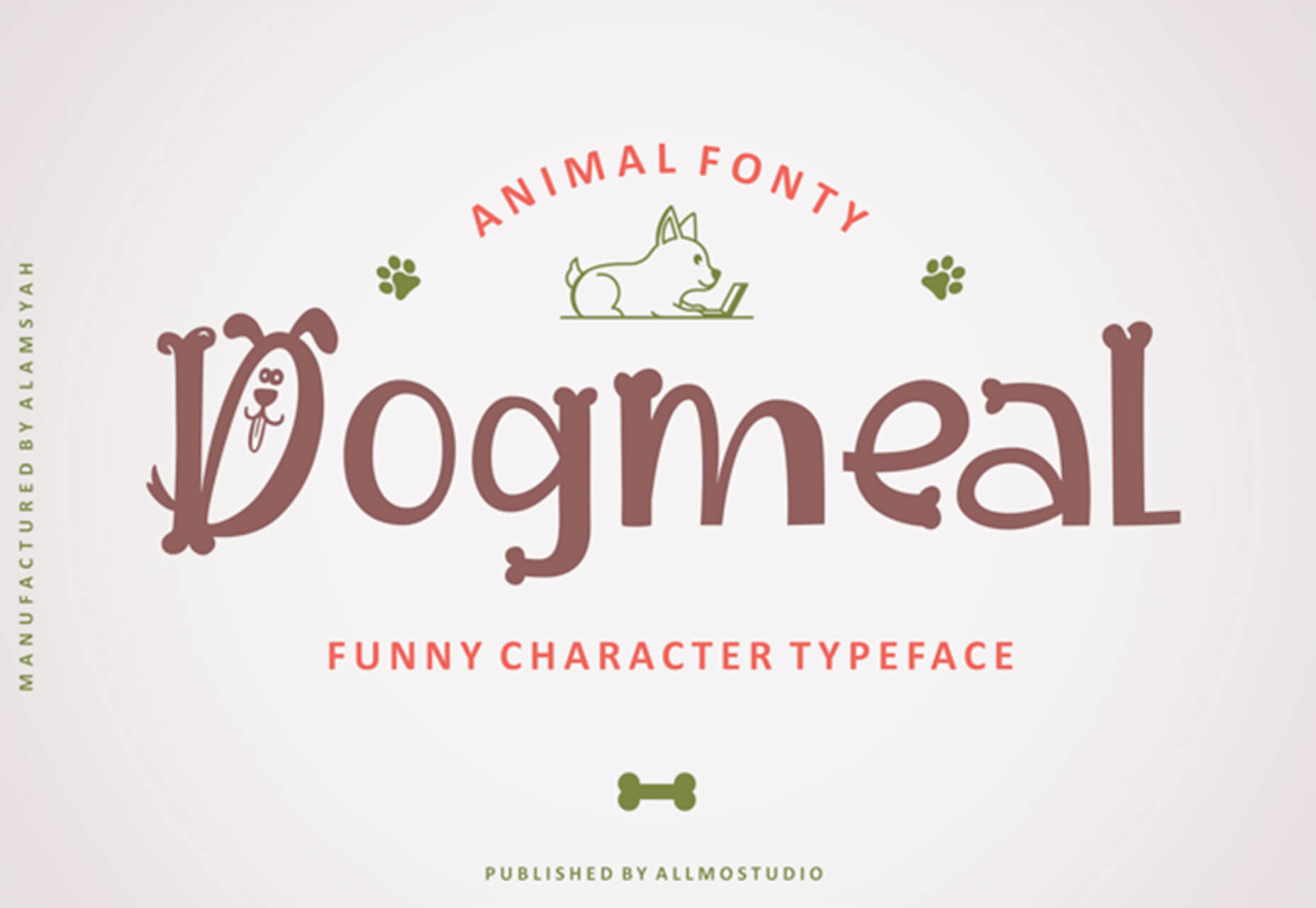
 Typography is one of the most important elements of any site, having a measurably large impact on brand and experience.