Every day design fans submit incredible industry stories to our sister-site, Webdesigner News. Our colleagues sift through it, selecting the very best stories from the design, UX, tech, and development worlds and posting them live on the site.
The best way to keep up with the most important stories for web professionals is to subscribe to Webdesigner News or check out the site regularly. However, in case you missed a day this week, here’s a handy compilation of the top curated stories from the last seven days. Enjoy!
https://ankaa-pmo.com/wp-content/uploads/2021/04/popular-design-news-of-the-week-april-12-2021-april-18-2021.jpg14082560Service comm.https://ankaa-pmo.com/wp-content/uploads/2017/04/Logo-Ankaa-engineering.pngService comm.2021-04-18 16:45:242021-04-18 16:45:24Popular Design News Of The Week: April 12, 2021 – April 18, 2021
Have you ever wondered why we’re so amazed by motion? A moving image is more likely to grab your attention than a static one. Motion is exciting and attention-grabbing – plus, it allows us to access more information in a short space of time.
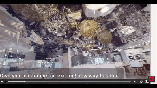
For a while now, companies have been experimenting with all kinds of motion and animation in their design choices. We’ve seen the rise of animated website backgrounds or live-playing videos instead of images on a home page. There are videos and 360-degree pictures on product pages to help people get a better view of certain items and immersive AR experiences on apps.
So why has the power of motion not made its way into the logo design landscape yet?
Sure, there are a few examples of animated logos out there, but they haven’t had the same long-lasting impact as animated websites. Perhaps that’s because people don’t have the right tools to bring their animated logos to life?
Today, we’re going to cover some top tips for live logo design.
1. Understand What “Live Logo” Means
An animated logo or live logo can be a powerful tool in a company’s branding strategy. Although there’s more to a company’s identity than its logo, it’s fair to say that logos make a huge difference to how we feel about brands and their identity.
A powerful logo can make an emotional connection with your target audience and help your brand to thrive in virtually any environment. Live logos, or animated logos, bring more attention to the brand image, by helping a customer to focus on the logo’s action. A live logo might tell a story about what the business does through motion, or just be eye-catching.
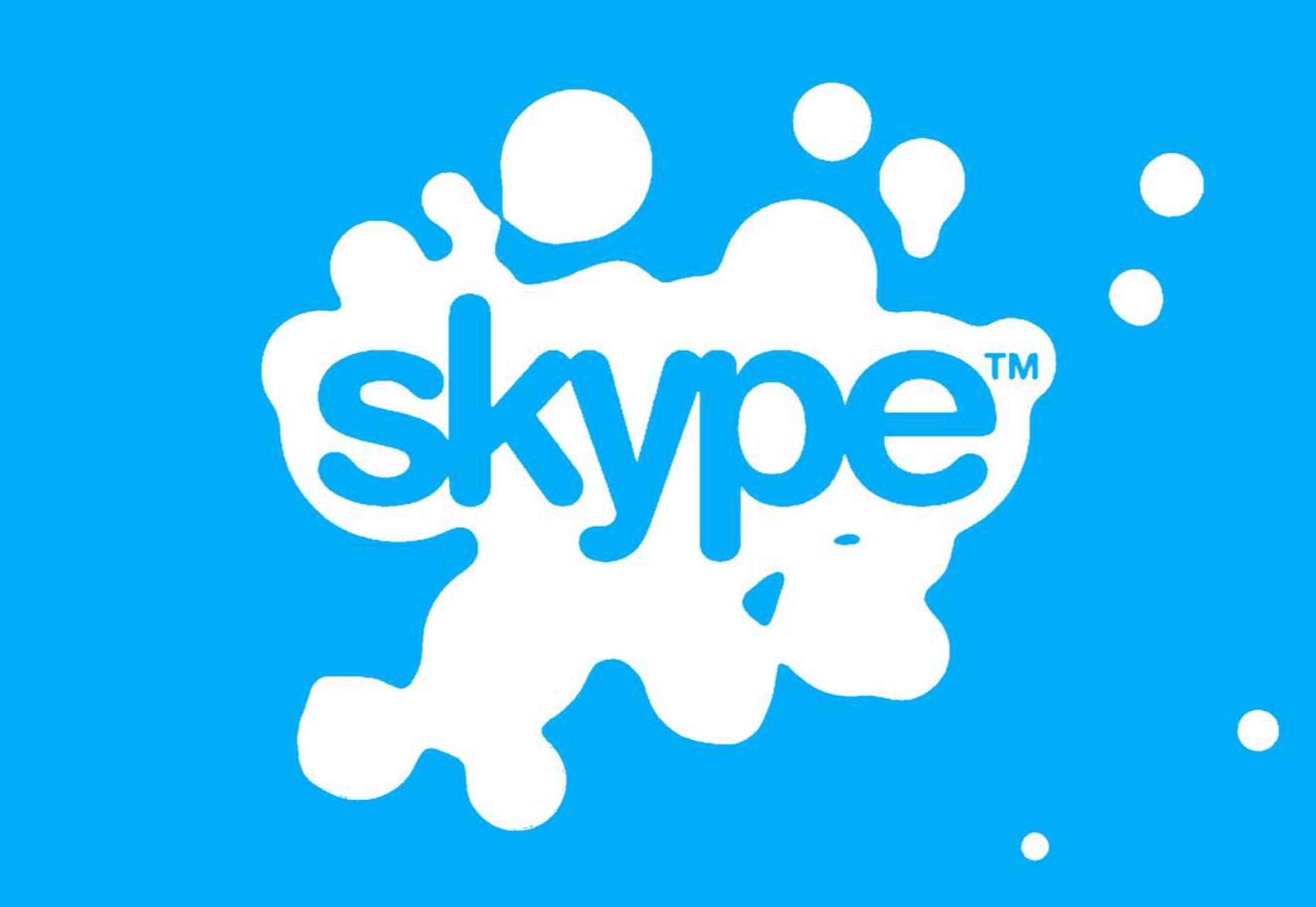
The level of animation varies depending on the designer, but it can go all the way from a short video presentation to a few simple moves. The Skype logo is an excellent example of something simple, that multiple designers have played with to great effect.
Today, there are plenty of open-access tools helping to create more immersive animated graphics in the logo design world. Additionally, the types of animation available are becoming more impressive all the time.
2. Explore the Types of Logo Animation
The next stage of properly leveraged live logos, is knowing what kinds of logo animation are available. There are plenty of different styles of animation to explore today, depending on the kind of impact you want to have.
For instance, sometimes the animation you choose will be connected to your business. A vehicle company might have a logo that seems to “drive” into the central space on the screen. An electricity company might choose a logo that pulses like an electric charge. This animated FedEx logo is an excellent example of how animation can show what a business does.
Options for animation might include:
Rotation: Make an emblem stand out by moving it to the sides or allowing it to move on its axis. Rotation gives a logo a sense of 3D space.
Appearance/Disappearance: You can make a logo grow on the screen by bringing to life one pixel at a time, or have it dissolve and disappear in a similar way.
Transformation: Your logo doesn’t have to start out in the shape it’s going to achieve. You might start with a seed that gradually grows into a tree-shaped logo for a gardening company, for example.
Replacement: Another great way to tell a story is to replace a graphic related to the company in question with the logo through an immersive animated experience.
3. Set Goals for the Live Logo
If you’re not sure what kind of animations to experiment with, then it’s a good idea to start with some solid goals. Your goals will give you a direction to move in with your logo choices. An animated logo can be a dynamic and modern way to present a brand to an audience, but it’s only going to be effective when implemented carefully.
Let’s look at some of the goals you can choose for your live logo:
Differentiation: While it’s true that animation and live content is gaining more attention lately, it’s still relatively new as an overall concept. With an animated logo, you could help a brand to create a more unique image for themselves, which sets them apart from the other organisations in the same space.
Storytelling: As mentioned above, animated logos can tell a story about what the company or product actually does. In this example for Firefox, for instance, the logo mimics a loading wheel to demonstrate a speedy internet browser.
Brand awareness: Dynamic logos and animations are more likely to capture your audience’s attention than static images. They’re also more of a novel experience, which means that customers might want to share them with other people too.
Memorability: Today’s customers are bombarded by hundreds, if not thousands of logos all the time. They need something special to convince them that one image deserves a spot at the front of their mind. Animation can help to make a business more memorable.
4. Do Your Research
Doing your own research is an excellent way to get some inspiration for a live logo or animation. Ideally, you’ll want to focus on the industry you’re already working in, as this will give you some guidance as to the kind of movement that can attract the most attention from the correct audience.
Watch as intros to brand videos and check out as many live logos as you can. Check out the kind of animations that people use in their videos when they’re showcasing products online. You can learn a lot about what works just by evaluating what other people have done before. Just be careful not to simply copy what you’ve found elsewhere.
The aim of your live animation should be to tell a unique story about the company
The aim of your live animation should be to tell a unique story about the company in question. If you’re not sure how to start with differentiating the image, check out the brand guidelines for the company in question. The guidelines that the company used to choose the right brand colors, fonts, and other visual assets can work just as well for your animation strategy.
Remember, the aim here is to tell a specific story, send a message, or evoke a certain emotion. Don’t make the mistake of designing something that looks cool but doesn’t have much of a purchase. Most human beings will naturally look for the meaning behind the content that they see. If there isn’t anything there, it’ll just lead to confusion.
5. Use Live Logos on Brand Websites
The most obvious way to begin experimenting with animated logos in web design, is to implement live logos into a client’s website. Some companies have a “welcome screen” for their site which uses an animation to introduce visitors to the home page and other navigation options. There are also brands out there who love the impact that animation can have but want to use it more subtly.
In these cases, live logos can be an excellent way to draw the eye to a specific spot on a website, perhaps the area just above the “contact” button that encourages a client to reach out. Crucially, to avoid weighing down the website and distracting visitors, companies and designers will need to make some important choices.
Although it might be tempting to keep the animation looping at all times, just in case someone misses the first round, this requires a lot of extra processing power. Too much animation also makes it harder for businesses to push the focus of their visitors to other points on the website, like landing pages for products, or testimonial pages.
Often, as with most innovative decisions in web-design, the best bet is usually to start small and work your way up. Don’t over-do it with animation on day one. See how the visitors to the website respond first.
6. Find the Right Balance
Animations in a live logo are there to grab attention quickly, and effectively. They shouldn’t go on for too long, or you risk overwhelming your audience before they have a chance to browse the rest of the website or check out other content. A live logo should only be active for a few seconds at most, and in that time, it needs to say something valuable.
Often, the best strategy is to start by building up curiosity, and getting your viewer engaged so that they’re keen to see more. Every frame will count to pull the customer in and make them feel connected to the brand in question.
Make sure that the logo animation is dynamic so that it doesn’t just capture the attention of the viewer but maintain their interest for the full time required. During the motion, the viewer’s brain should be working to figure out what’s going to happen next.
Just like most logo design and graphic animation strategies, the key to success is finding the right balance between clever experiences, and simplicity. You want to do something meaningful that earns your viewer’s attention, but you need to compete with the fact that attention spans are plummeting all the time.
7. Explore Logo Animation in Video
One of the best ways to use logo animation, is to draw interest for a company at the beginning of a video. Video is gaining incredible levels of popularity lately, particularly in a world where you can view video content almost anywhere. Companies are adding videos to their product pages, social media accounts, applications, websites, and so much more .
For the majority of companies, a live logo at the start of a video can help their brand to seem more professional. It’s a reminder to viewers of the brand that they’re learning about with that video content. Plus, a logo at the beginning of a piece of video content can also build on the consistency that companies attempt to create by using the same brand assets in various mediums online.
(Starting a video with an animated logo is great for presentation, but it can also be frustrating to customers in certain pieces of content where they’re looking for quick answers to questions. If an animated logo is more than a couple of seconds long, it may be better placed at the back of a video instead.)
With videos for news reports or announcements where you want to get straight to the point and generate excitement about a new product or service, it can be better to jump straight into action. Ending a video with a live logo keeps the brand image front of mind for the customer for longer, even after the message has ended. On the other hand, ending a video with a logo could increase the chances that customers miss the animation, because they click away from the content too quickly.
If you’re new to adding live logos into videos, consider experimenting with different strategies to see which works best. Different companies might get unique results.
8. Bring Logo Animation to the Real World
Another interesting option for live logo design, could be to step outside of the computer screen for a while. In today’s digitally transforming landscape, it’s becoming more common to see the real and digital worlds converging. Most events and trade-shows come with presentations that rely on digital content, like animated presentations and slide shows.
Depending on the signage solutions available at industry events, companies could even use an animated logo above their booth to draw attention in a cluttered environment. Around 48% of exhibitors agree that a more eye-catching stand or booth is often the most effective way to attract visitors and customers at an event.
Animation and live logos may have started life on the computer screen, but they can appear in much more diverse environments today. Offices could use a live logo in the reception room or lobby to make their on-premises environment more appealing. Retail locations could display ads on digital signage, followed by live logos that work to both separate messages, and keep shoppers entertained when they’re enjoying the bricks-and-mortar experience.
9. Include Live Logos in Brand Signatures
Remember, a live logo doesn’t just have to sit on a company’s app or website until someone discovers it. Sometimes, the right logo can also be a powerful way to “sign off” on a message from a brand or its management team. For instance, email remains to be one of the most valuable tools for business marketing and customer relationship building today.
It’s the third most influential source of content and news for a lot of B2B audiences, and yet, most companies aren’t taking full advantage of what their email marketing software solutions are capable of. If you can display gifs and animated videos in an email (which most software solutions can), then you can also add a live logo to the brand signature.
The important thing to remember is that if you’re going to be adding a signature to a lightweight thing, like an email, it needs to be lightweight too. Don’t make the live logo too long and complicated, or it might prevent the email from loading properly.
Outside of email, don’t forget to consider options for live logos in things like social media profile pictures too. According to experts, around 80% of companies use visual assets in their social media marketing. A live logo is a great way to go beyond the basics with a company’s imagery. Motion grabs attention, and video content is quickly gaining steam on a lot of social media platforms.
Embracing a New World of Live Animation
Designers are only just beginning to scratch the surface of what’s possible with animated logos. For many companies, live logos are an excellent way to capture audience attention and encourage engagement with a brand.
A live logo at the beginning of a video, at the start of an app loading screen, or even at the top of a website can differentiate a company and make them stand out. As technology continues to evolve, and customer expectations continue to expand, the options for live animation could continue to grow. You might even be able to infuse live logos with elements of VR and AR, to impart brand essence in a brand-new digital world.
If you haven’t begun experimenting with live logo design yet, now could be the time to start.
https://ankaa-pmo.com/wp-content/uploads/2021/04/9-tips-for-better-live-logo-design.png15292780Service comm.https://ankaa-pmo.com/wp-content/uploads/2017/04/Logo-Ankaa-engineering.pngService comm.2021-04-14 16:45:092021-04-14 16:45:099 Tips for Better Live Logo Design
Everyday design fans submit incredible industry stories to our sister-site, Webdesigner News. Our colleagues sift through it, selecting the very best stories from the design, UX, tech, and development worlds and posting them live on the site.
The best way to keep up with the most important stories for web professionals is to subscribe to Webdesigner News or check out the site regularly. However, in case you missed a day this week, here’s a handy compilation of the top curated stories from the last seven days. Enjoy!
https://ankaa-pmo.com/wp-content/uploads/2021/04/popular-design-news-of-the-week-march-29-2021-april-4-2021.jpg14082560Service comm.https://ankaa-pmo.com/wp-content/uploads/2017/04/Logo-Ankaa-engineering.pngService comm.2021-04-04 12:45:282021-04-04 12:45:28Popular Design News of the Week: March 29, 2021 – April 4, 2021
There are some interesting shake-ups on the horizon for ecommerce: Experiential shopping, Virt-ical worlds, Au naturale models.
We’re starting to see signs of them already — many of them spurred on thanks to the events of 2020. Below, we’re going to explore what’s going on with these new ecommerce trends and technologies and take a look at a bunch of sites that are setting really cool examples for each.
1. Experiential Shopping
With many stores, either closed to in-person shopping during the pandemic or their capacities severely limited, online shopping and BOPIS became much more attractive options for consumers.
That said, buying something like a pair of jeans or a new pair of glasses is much different than the pack of toilet paper someone’s bought for years. There are just some things you have to try to know if you’re going to like it and make sure it fits.
Augmented reality and other immersive shopping tools are bringing those “try-on” capabilities to people’s homes.
There are a number of technologies built specifically for this purpose:
Obsess is a particularly noteworthy one. It’s an ecommerce platform that enables retailers to build virtually immersive shopping experiences. Charlotte Tilbury is one such retailer that is taking advantage of it.
At the end of 2020, Obsess announced that it had received $3.4 million in seed funding, so expect to see more Obsess-powered ecommerce sites and apps.
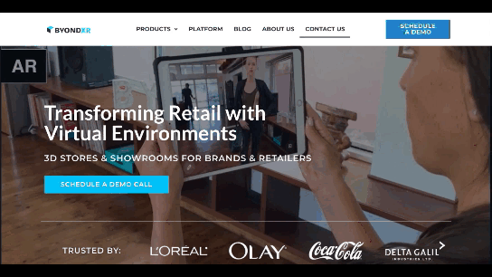
ByondXR is another platform that empowers brands to design immersive experiences for online shoppers:
Retailers like Lancome, Procter & Gamble, and Calvin Klein have used ByondXR’s immersive commerce technology.
This technology is interesting as you’re not just creating a virtual store. You can also design a 3D model of a brick-and-mortar shop that in-store shoppers can use to get in and out quickly.
2. Virt-ical Worlds
There’s a new trend brewing, and we see it most commonly on websites for fresh and youthful brands. I wouldn’t say it’s nostalgic design, per se, though there are certainly some elements reminiscent of the bold, in-your-face style of the web in the late ‘90s and early ‘00s.
No, I think what we see here is a creative reimagining of our world.
With so many people having spent time in their homes and with their faces glued to screens, there’s been a blurring between our VIRTual and physICAL worlds. This new web design trend is one I’m going to call the Virt-ical World. While parts of these sites look like the websites we’ve designed in years past, there are motion, color, and sizing elements that feel more like a trippy virtual simulation.
Let’s look at some examples.
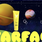
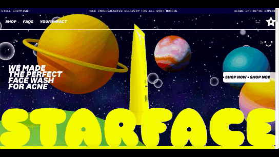
Starface is a company that creates acne-fighting products.
This is one of the more experimental designs in this set of examples. Still, it’s one that shows us how far the boundaries can be pushed without totally compromising the online shopping experience.
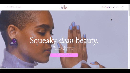
Billie is another company having fun with this trend. I’d say this is on the opposite end of the spectrum.
For the most part, this ecommerce site looks similar to other small retailer sites. However, the fun, candy-colored palette, the bobbing products, and the color shifts add a somewhat surreal element to the design.
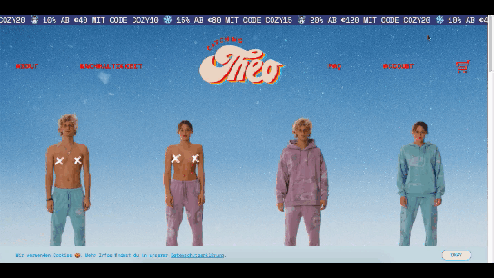
Catching THEO is another ecommerce brand playing around with this Virt-ical World.
See what I mean by this style feeling somewhat nostalgic? Thankfully, this site commits to today’s good, clean, responsive design while only using some of the more fun and quirky elements from the past.
Au Naturale Models
When I talk about au naturale models, I’m really referring to the makeup-less faces, relaxed hairstyles, and casual apparel that we’re seeing ecommerce models don these days.
I think it’s safe to say we have the pandemic to thank for this. And it’s not just because many of us took a more casual approach to getting dressed during the week. It’s also because the pandemic wiped away the glitz and glamour from many of our lives.
I don’t know about you, but it was kind of nice seeing fewer Instagram influencers flaunting their luxurious lifestyles and more real people rocking their matching pajama sets. I think brands have sensed this change in mood over the last year, and they’re now putting forward their own simple and casual styles for us to connect to.
There are tons of ecommerce websites we’re seeing this on in 2021.
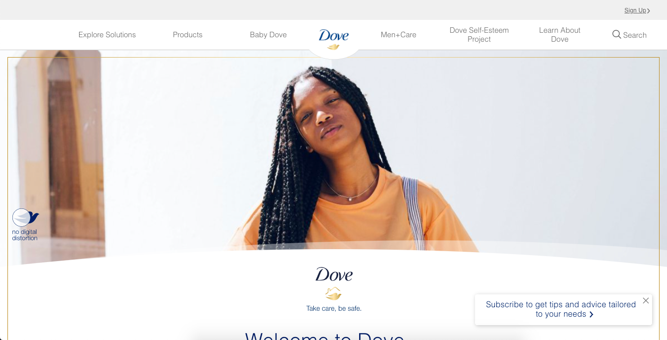
Here’s Dove’s homepage, where they specifically call attention to the lack of digital distortion in the photo:
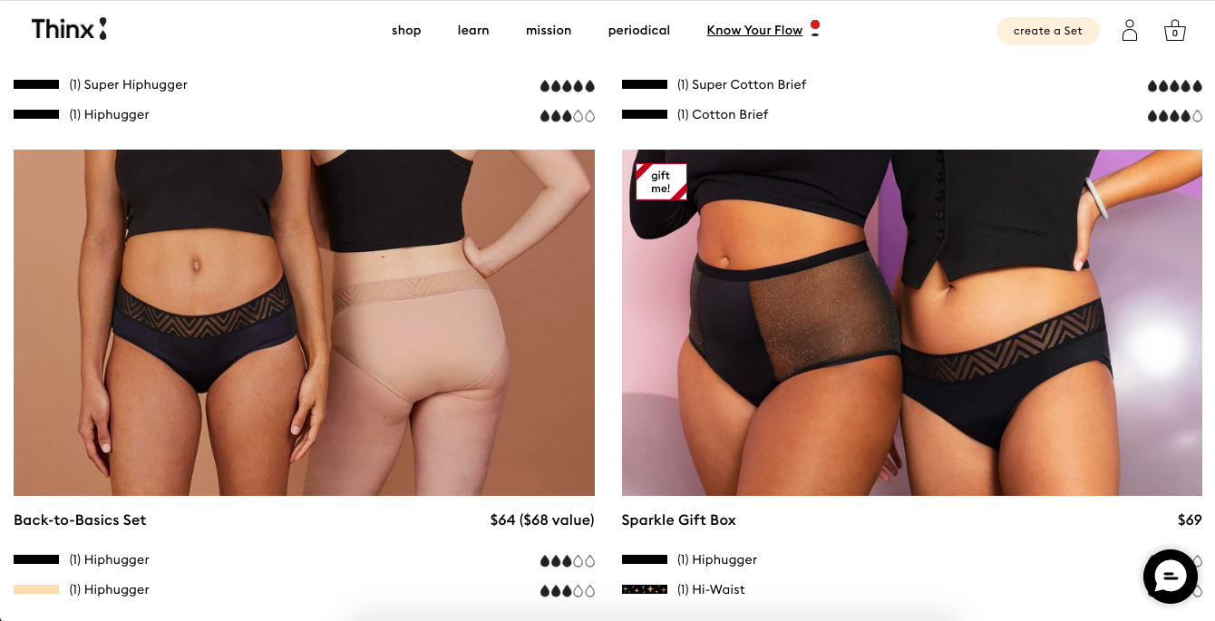
Thinx also uses more natural and realistic-looking models to show off its undergarment products:
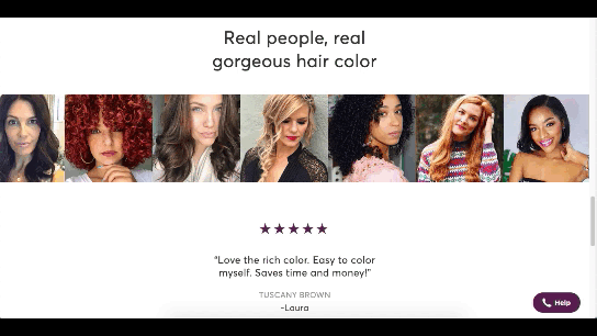
Madison Reed takes a unique approach with this trend:
While the hair color brand does a great job of using diverse models around the site, it also has this scrolling bar showing off its customers’ very natural and real faces.
Wrap-Up
It feels like ecommerce trends and technologies are changing at a rapid pace these days. To help you stay on top of what’s new in ecommerce, stay tuned to this blog for more interesting news and changes to the landscape.
https://ankaa-pmo.com/wp-content/uploads/2021/02/whats-new-in-ecommerce-february-2021.jpg14082560Service comm.https://ankaa-pmo.com/wp-content/uploads/2017/04/Logo-Ankaa-engineering.pngService comm.2021-02-15 11:45:192021-02-15 11:45:19What’s New in Ecommerce, February 2021
The start of the year is always a good time to reassess priorities and consider new approaches, but 2021 is more of a reset than we expected this time last year. 2020 is unlikely to go down in anyone’s autobiography as the best year of their life, but it has done something positive: it’s prepared the ground for rapid change in the next 12 months.
More than any other year in our lifetimes, 2021 is set to be revolutionary, with emerging trends that will last well into the new decade. Here’s what we think you can look forward to around the next corner.
1. The End of Minimalism
Minimalism has been the de facto approach to web design for the last decade because it works.
But design reflects the zeitgeist. Where minimalism once felt clean and fresh, it’s starting to feel dull and uninspired. There have been a few false-starts breaking out of the long-term trend, but thanks to the pandemic, 2021 will be the year minimalism finally folds — at least for a while.
Prior to coronavirus-mandated lockdowns worldwide, there were already signs of a more vibrant, more decorative, more joyful approach to design. Simple typefaces have been replaced with more decorative examples — faces that use ink-traps to fake 3D effects are surprisingly popular.
trends are cyclical, and the wheel always turns
One of the biggest aspects of this blossoming trend is the move away from Material Design-style flat color not just to gradients but to multi-color gradients and even animated gradients. Even Apple, the last bastion of the clean white-box approach, jumped on the gradient bandwagon with its Big Sur branding.
One of the few things COVID-19 hasn’t slowed is the adoption of new web technology, and CSS, in particular, has had some major developments in the last year. CSS Grid is now a practical technology, and our ability to code standards-compliant designs that aren’t dependent on hierarchical boxes is greatly enhanced.
After more than a year of pretty grim news for most people, much of the world will be vaccinated over the next twelve months, and life will rapidly return to normal. The last global crisis on this scale was the 1918 influenza pandemic, and it led directly to the decade known as the Roaring Twenties.
Minimalism was already dipping in popularity — trends are cyclical, and the wheel always turns — but lockdown, or perhaps more precisely the end of lockdown, is the catalyst for significant change.
2. The Decline of WordPress
In Autumn 2020, something entirely unexpected happened: The W3C announced the platform its new web presence would be built on, and WordPress — the previous choice of the web’s steering committee — didn’t even make the list of finalists.
Due to accessibility concerns, the W3C development team opted to migrate away from WordPress to Craft CMS. The decision was met with a mixture of glee and outrage. But whether you agree with the decision or not, it’s hard to see it as anything other than yet another symptom of WordPress’ decline.
WordPress faces a triple threat: there are web builders that do an adequate job for low-end web projects; there are newer rivals like Craft that outperform WordPress as a CMS; there’s a growing interest in alternate approaches, like Jamstack.
So will it all be over for WordPress in 2021? Not even close. There are myriad reasons WordPress will continue to be the choice of designers and developers for years to come. Tens of thousands of professionals worldwide have invested their whole careers in WordPress; there are millions of themes, plugins, templates, and build processes that are tightly woven into the WordPress ecosystem. What’s more, there are millions of sites with substantial content archives powered by WordPress [WebDesignerDepot is one such site].
WordPress reportedly powers approximately 37% of the web, and it will still be the dominant CMS in 2022. But it’s unlikely to grow beyond that 37%, and by 2030 its market share will be in rapid contraction.
2020 was the high-tide mark for WordPress
But for all its faults — and it’s undeniable that WordPress is full of faults — WordPress is the best of the web; it has given a voice to millions of people, launched countless careers, and empowered entrepreneurship worldwide.
2020 was the high-tide mark for WordPress, but it’s not an extinction-level event — even the much-maligned Flash, which was killed dead in a matter of months by the first generation iPhone, limped on until a few weeks ago.
WordPress will have to find a niche and accept a smaller market share; in doing so, it will address the single biggest complaint that anyone has about WordPress: that it’s trying to do too much.
WordPress is one of the great success stories of the web. In a decade, it may have to settle for powering just 10% of the web — a level of failure most of its rivals can only dream of.
3. The Digital Currency Explosion
2021 is undoubtedly the year that cryptocurrency goes mainstream. In 2020 Bitcoin grew by almost 400%; currently valued at around $35k, conservative predictions for a December 2021 valuation are $100k, with five-year predictions as high as $1m. And Bitcoin isn’t the only cryptocurrency; the value of developer-friendly Ether has jumped by more than 50% in the first few weeks of 2021.
In the US, the incoming Biden administration is preparing a multi-trillion dollar relief package, which many believe young Americans will invest in cryptocurrency. Perhaps more importantly, large investment banks are now pumping hundreds of millions in digital currencies. PayPal and Visa are both in the advanced stages of adopting blockchain technology.
The biggest threat to the new digital economy is the volatility of cryptocurrency. You cannot price services in XRP if XRP’s dollar price could crash at any time — as it did a few weeks ago.
And so there are two routes in which this trend will unfold for ecommerce. Either pricing will remain in dollars, and the equivalent price in various cryptocurrencies will be calculated in real-time. Or, transactions will make use of stablecoins like Tether that are tied to the value of the US dollar.
Cryptocurrency is the latest gold-rush, and whether you think it’s the chance of a lifetime or yet another Ponzi scheme, it will become increasingly high-profile in ecommerce throughout 2021.
4. No More Video Calls and also More Video Calls
2020 was the year of Zoom. Its growth from bit-player to overtaking Skype is a material lesson for entrepreneurs that every obstacle is an opportunity.
every obstacle is an opportunity
Over the last year, we’ve discovered two things: meetings are more creative in person, and office costs are significantly reduced when staff work remotely.
There’s going to be a shift in the business landscape this year. Remote working will continue to be normal for years to come as businesses enjoy rent savings. Video calls will still be common for quick update meetings. But expect to travel to physical meeting places periodically for in-depth strategic planning.
Expect to see major cities with deserted office buildings and a rapid expansion of co-working spaces, especially those with meeting spaces — if WeWork can hold on a little longer, there may be light at the end of the tunnel.
As a web professional, you’re in a unique position to thrive in the new business world, even more so if you’re a freelancer. Remember, if you’re working onsite, be mindful of your physical health, and if you’re working remotely, be mindful of your mental health.
What Do You Think?
No one saw 2020 coming. Sometimes world events are outwith our control, and we have to hang on and hope it gets better. It’s been a tough 12 months, and the truth is we’re not through it yet.
But the 2020 coronavirus pandemic is the first pandemic in human history that we’ve had the technology to shorten.
2021 offers the opportunity for enormous change. Will designers look for new, more decorative approaches? Will we replace our technology stack? Will you be billing clients in Ether this year? Will you suffer the misery of a packed evening commute ever again?
https://ankaa-pmo.com/wp-content/uploads/2021/01/4-predictions-for-the-web-in-2021.jpg14082560Service comm.https://ankaa-pmo.com/wp-content/uploads/2017/04/Logo-Ankaa-engineering.pngService comm.2021-01-11 11:45:542021-01-11 11:45:544 Predictions for the Web in 2021
Don’t drop the ball on these website design trends for the new year. All of the trends featured here this month are visual in nature – not as many user interface elements as previous months, but all just as stunning and usable.
Here’s what’s trending in design this month.
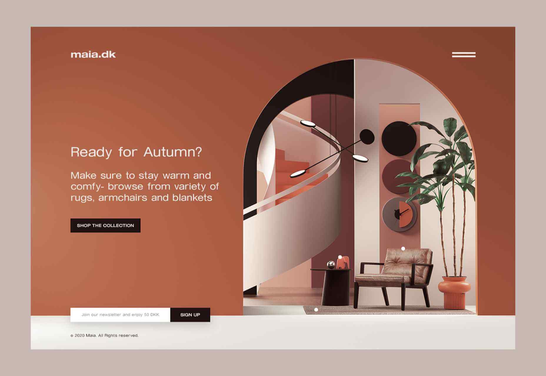
1. 3D Scenes on White (Light)
Three-dimensional scenes are not just a trend this month but are likely to be one of the biggest website design trends that you see all year.
They offer a great way to show off product imagery, design something with illustrations or animation for visual impact, and provide usability and understandability cues for users.
It’s a versatile technique that can work with real or created images and are also “COVID-friendly,” something designers have had to think a lot about in the past few months. (Appropriate imagery in design is a real concern, as is trying to design projects without the ability to produce traditional photoshoots.)
What’s neat about all of these projects – and plenty of others – is that they root the design in white or light backgrounds. The light effect creates an easier visual mood that’s clean and emphasizes the imagery.
This website design trend solves a lot of those problems and looks good doing it.
Google’s Cloud design uses 3D illustrated animation on a white background with plenty of depth elements. The primary color palette of illustrated objects pulls it all together and guides the eye through each of the callout labels.
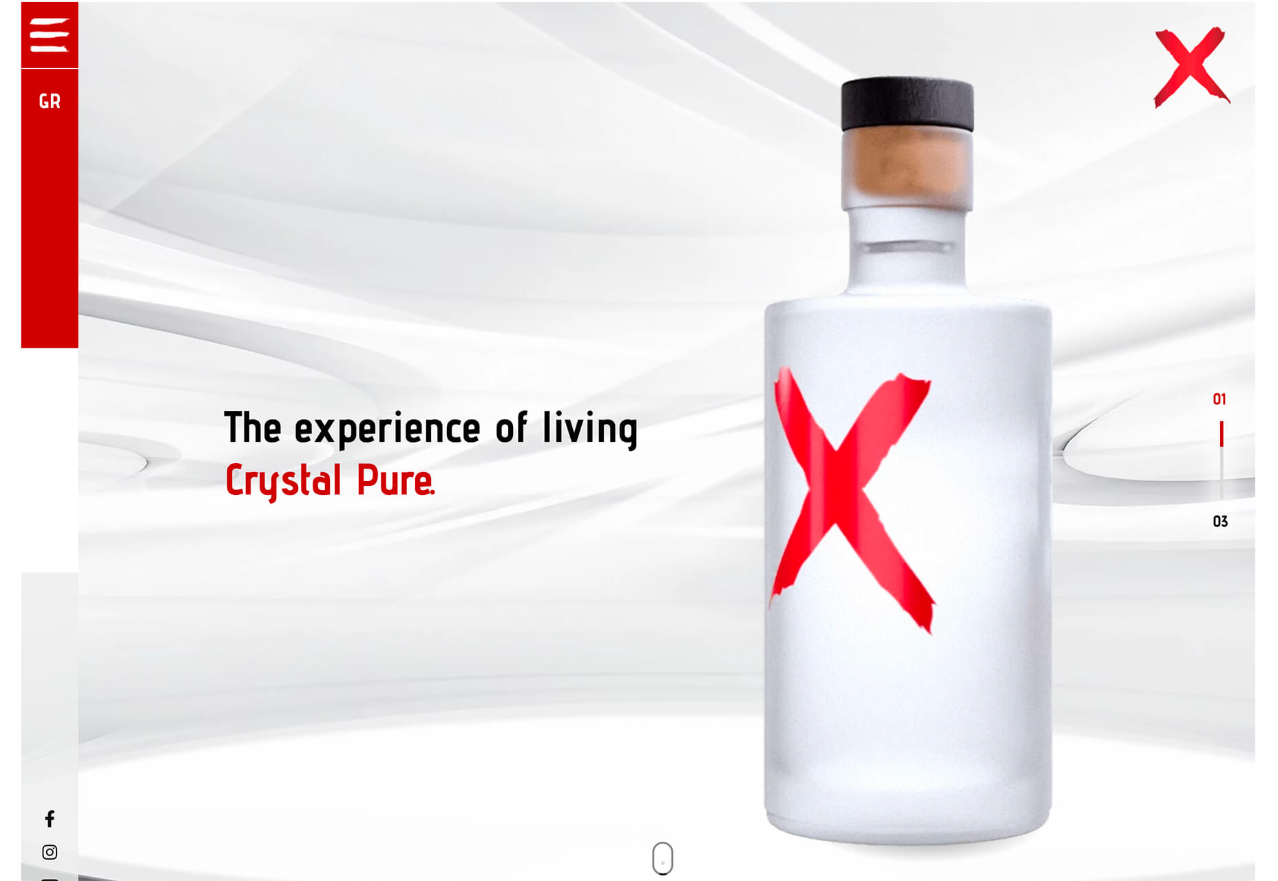
The red words on the screen Crystal Pure fit perfectly with the white-on-white 3D imagery of this design. Red accents pull you into different places on the screen, and it all has a clean feel.
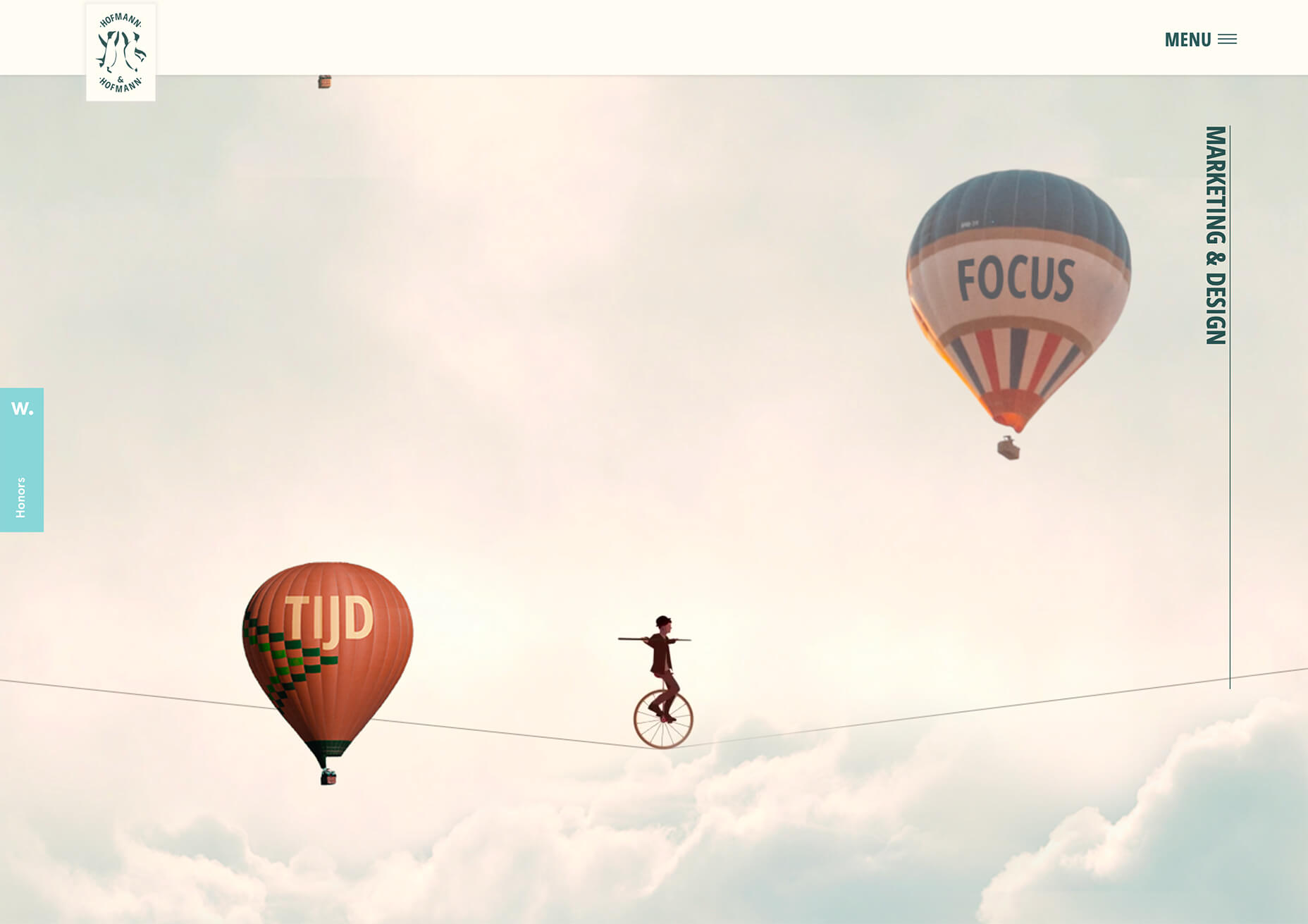
Hofmann & Hofmann uses the same concept with a slightly different approach. The background is still light with a realistic feel and 3D objects, but it is a lot less stark and white. The feel is a little warmer and more inviting than a flat white aesthetic.
2. So Many Stacked Capitals
If you don’t have great artwork or imagery, make your own with typography.
This trend seems like it might be yelling at you just a little, but it still works for the most part — well, as long as you don’t land on too many of these website designs in a row!
What’s interesting about this trend is that many of the designs feature all caps type and serifs. These styles have been making a bit of a comeback, but this use is interesting for many reasons.
The hardest part when using all caps is maintaining readability. That’s why you see some variances in regular, italics, and bold weights, as well as the use of multiple typefaces. The goal is to create a good reading flow with a stunning visual presence.
This trend works best when you have “easy” words on the screen to facilitate scanning. Too many long or complicated letter combinations can get challenging quickly.
Make sure to look for the Easter eggs in each of these projects:
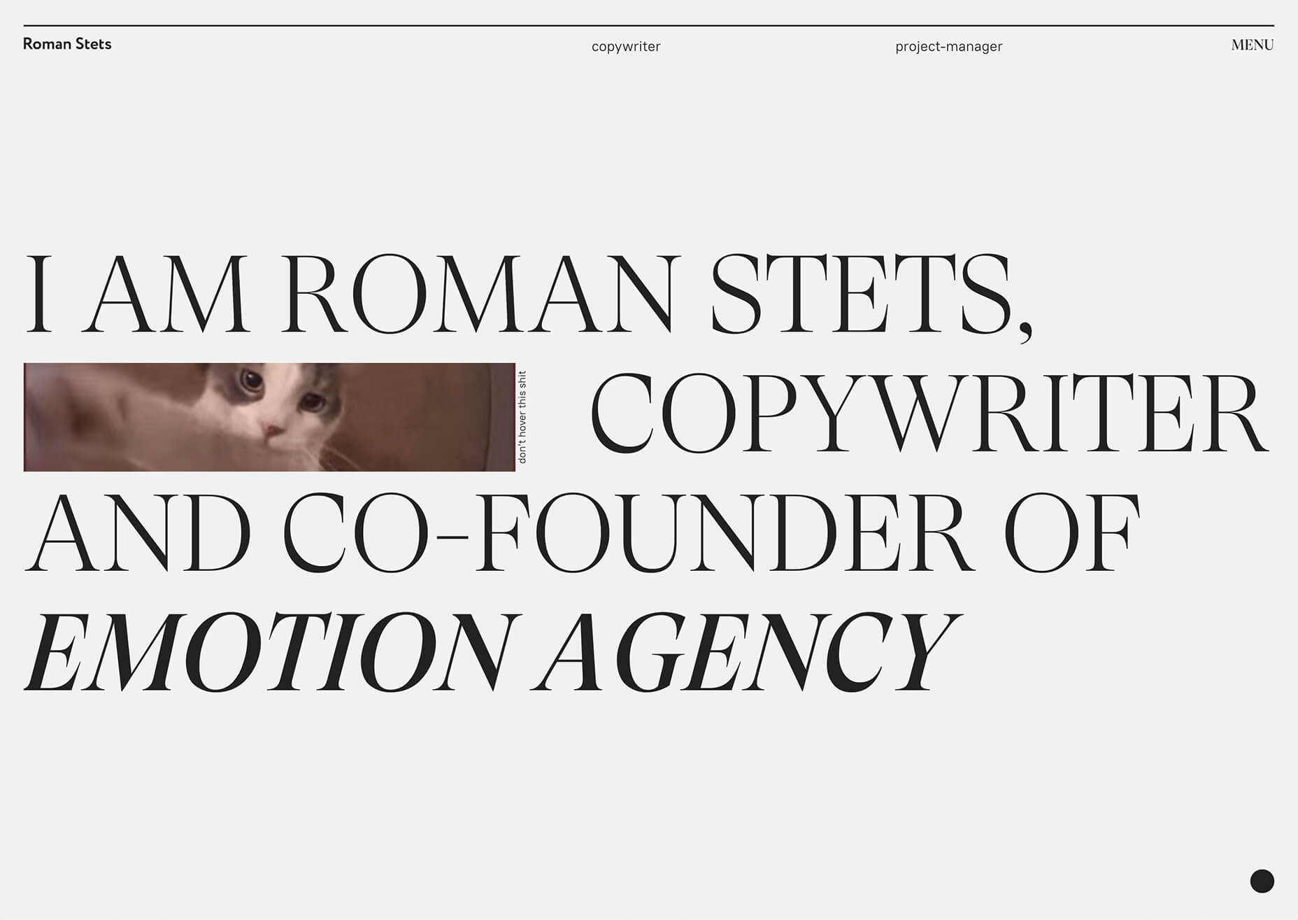
Emotion Agency has tiny “waving” illustrations next to each word (which doubles as the navigation) when you hover over them.
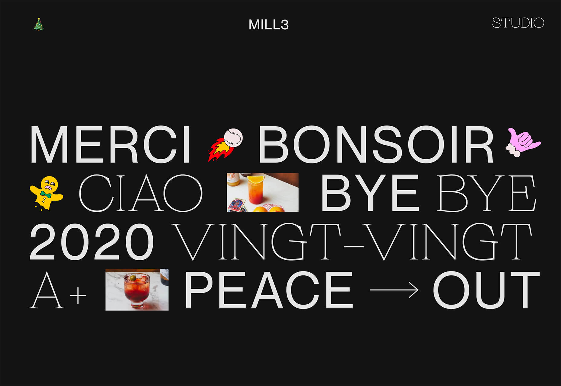
Mill3 Studio has a few animations, from the text flying in and out on load and scroll to subtle movements in the emojis.
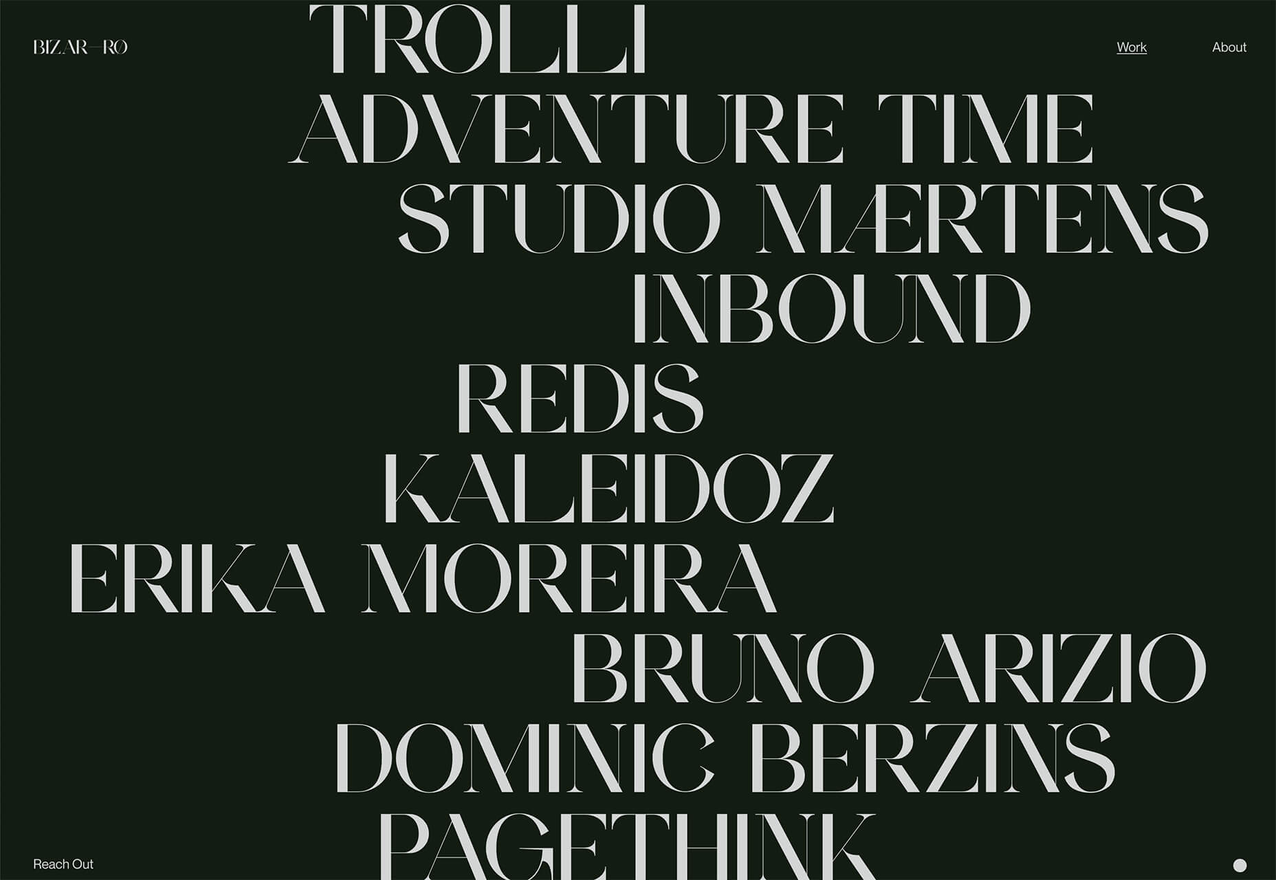
Bizarro has this fun little cat video with a tiny warning not to hover over it, but you definitely should.
3. Empty Places
The final trend in this roundup is a stark reminder of current times. Each of the website design features empty places or locations.
This style of imagery would have been avoided pre-pandemic because tourism locations would want visitors to feel like a part of a bustling environment. Not today. If you travel, chances are you may feel safer or want to be in a more secluded environment.
All of the images and videos from these locations show just that.
Designers are doing this with new stark imagery that stands alone for the design or inserting a few empty place frames into video clips or among images that show more populated times. Even scenes that contain people show very few people and focus on more solitary activities.
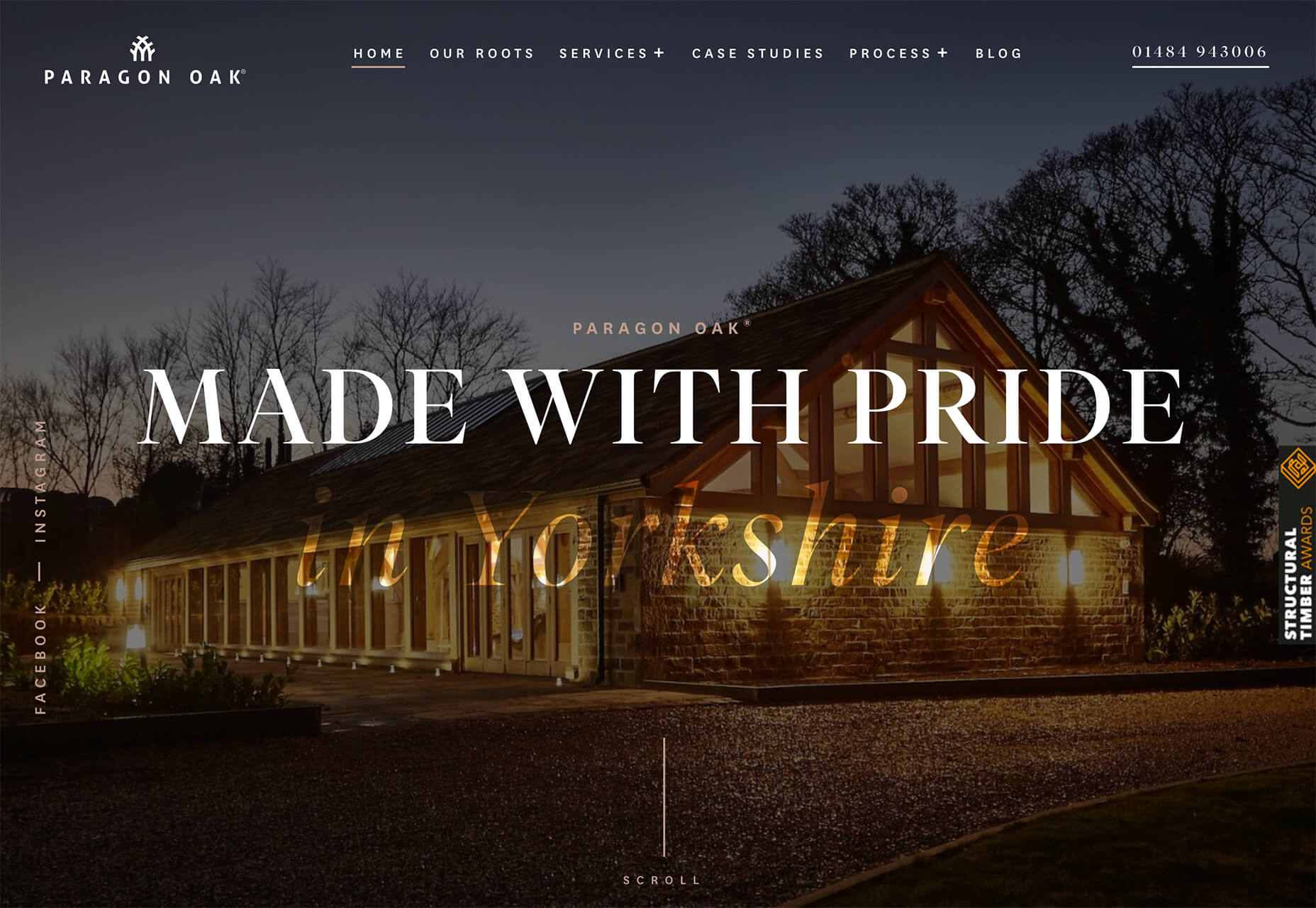
Paragon Oak does this by showing a beautifully lit location at night. Note that using a nighttime photo eliminates questions about where the people are or what they are doing. (This is a clever option when showing imagery of an empty place.)
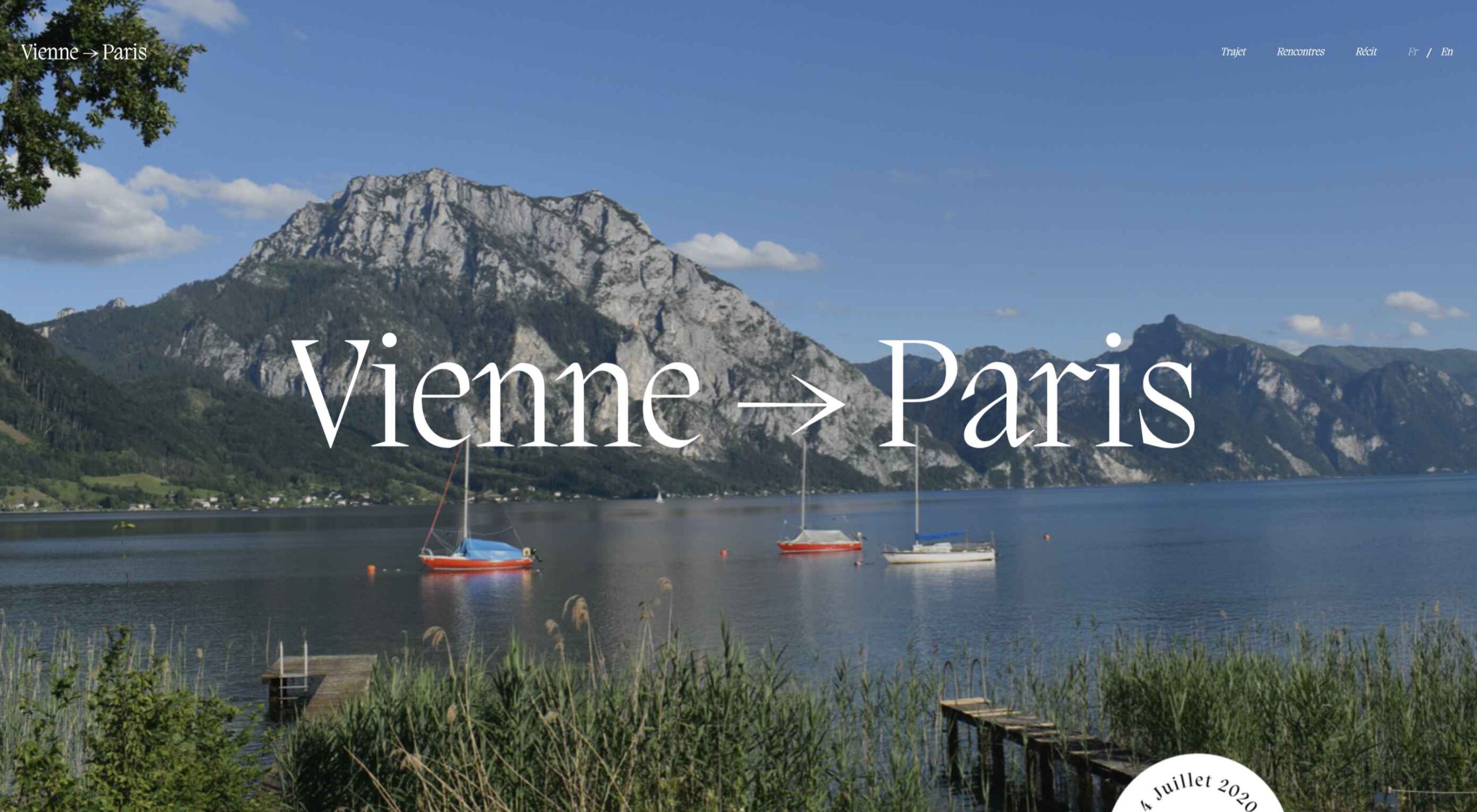
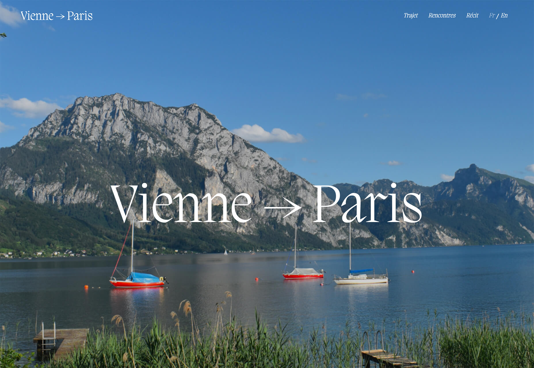
Vienne to Paris shows boats on the water with a beautiful background. While you assume there are people on the water vessels; you don’t see them and get the feeling that everyone is separated in their own “pod,” a pandemic-friendly option for travel.
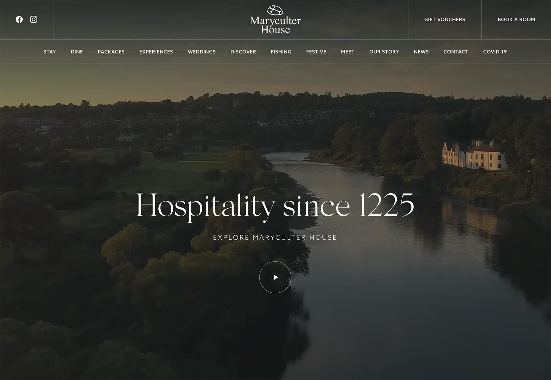
The Maryculter House shows various images without people – the resort’s location on beautiful grounds; empty, but immaculate rooms, and a few images of a person alone on the grounds. Again, the empty nature of the place feels more appropriately welcome for the time we live in.
Conclusion
One of the things that we’ve seen with design trends in the past year is pandemic-related. The composition of images to the way elements are arranged on the screen influences every aspect of our lives.
While the empty place image and video trend is big now, it may fade post-pandemic. Although, it could still be relevant for quite some time. It will be interesting to see what happens as the year progresses with this trend – will it hold on or fade away?
These trends might continue to hold well into 2021.
2020 has been one of the most memorable years in our history. Few of us have been alive long enough to experience a more turbulent time. But throughout the year, we saw design respond to challenging events with positivity, color, and a desire to elevate those people and projects working to make the world better.
As we head into 2021, there’s no denying that 2020 has changed our outlook on life and marked a major turning point in web design trends.
Here’s a collection of the websites we loved the most this year. Enjoy!
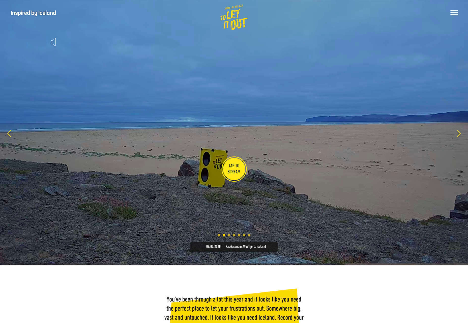
Looks Like You Need Iceland
On Looks Like You Need Iceland, you are invited to record a scream, which will then be broadcast into the Icelandic wilderness. It’s meant as a form of therapy. The idea is that you will one day visit Iceland in person. That might still be some way off for most of us, but we could certainly use a good therapeutic scream.
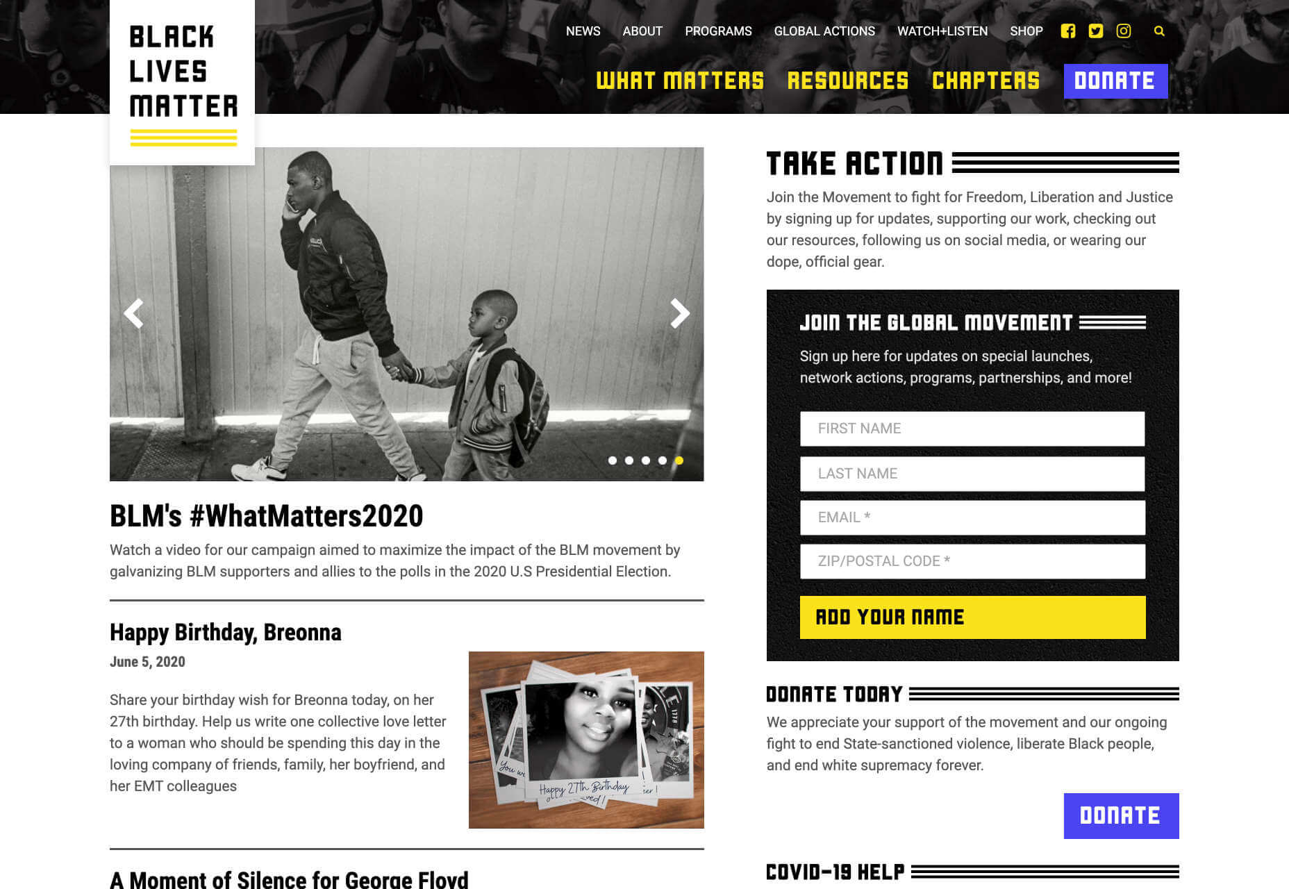
Black Lives Matter
Across 2020 there were major protests around the world in support of Black Lives Matter. The movement’s website is a central hub for news, resources, and civil rights information in 38 countries.
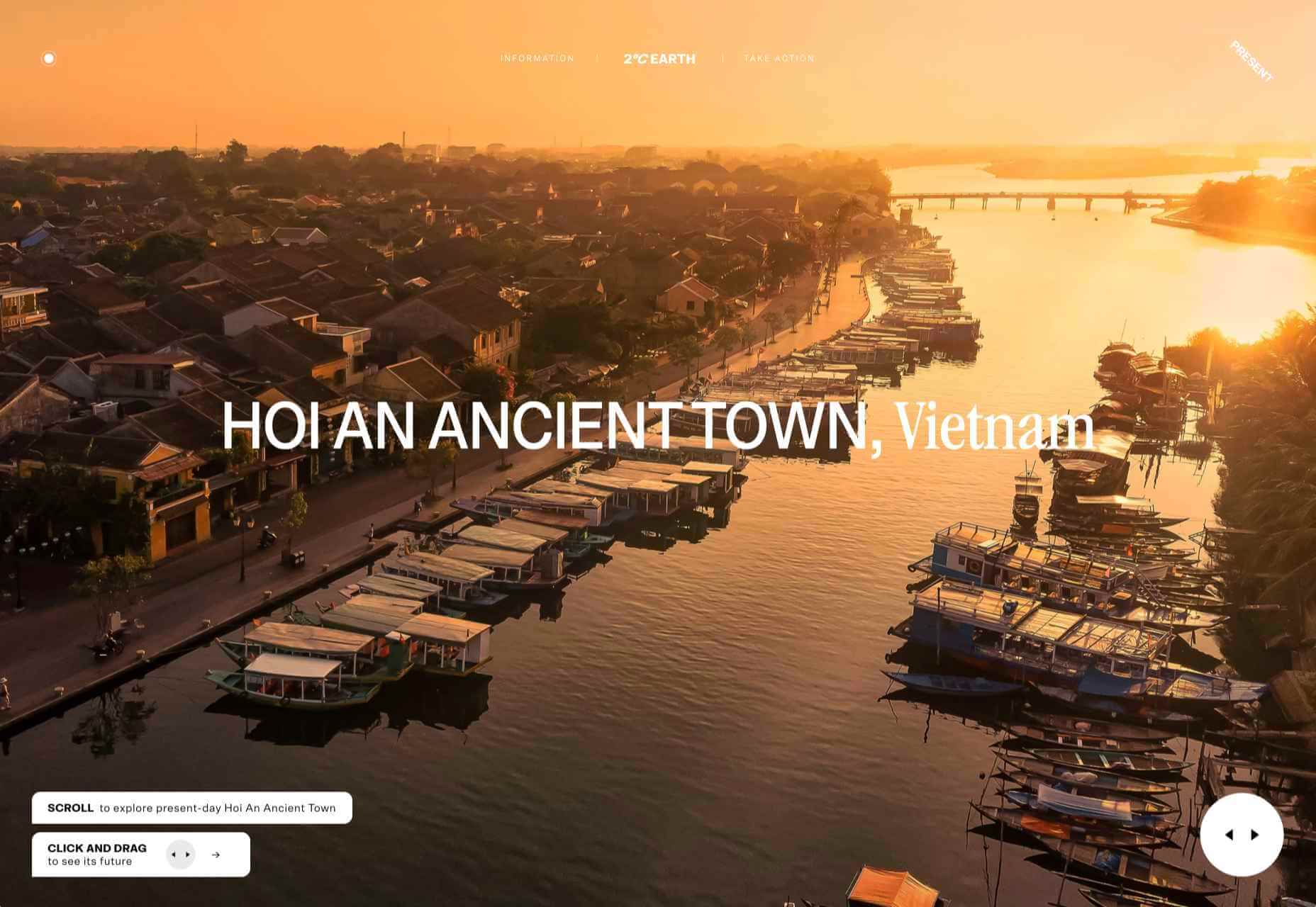
2º Earth
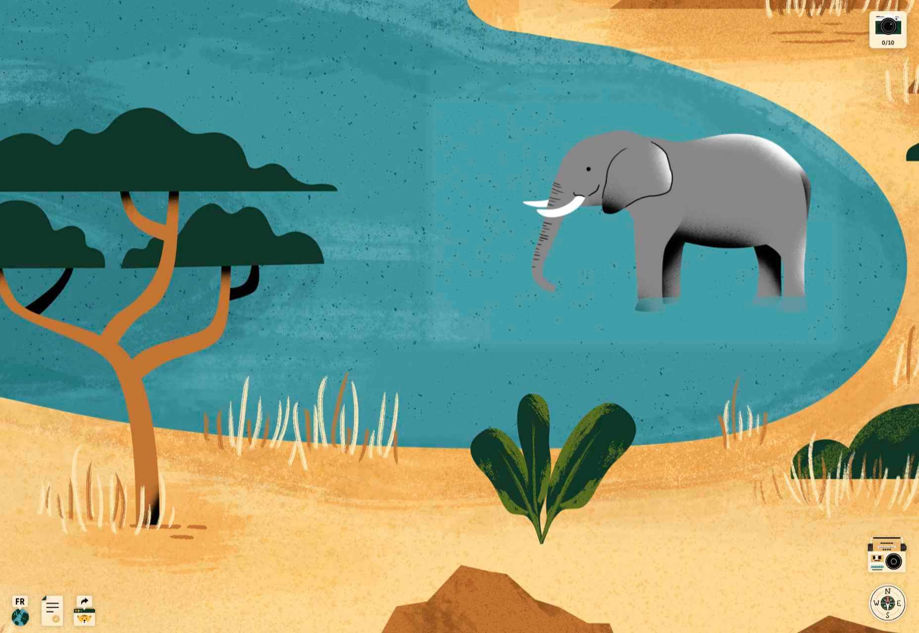
2ºC Earth takes the user to 5 locations worldwide and shows what will happen there if global temperatures rise by 2ºc. Sound is used really well here to create an immersive experience, along with some beautiful photography.
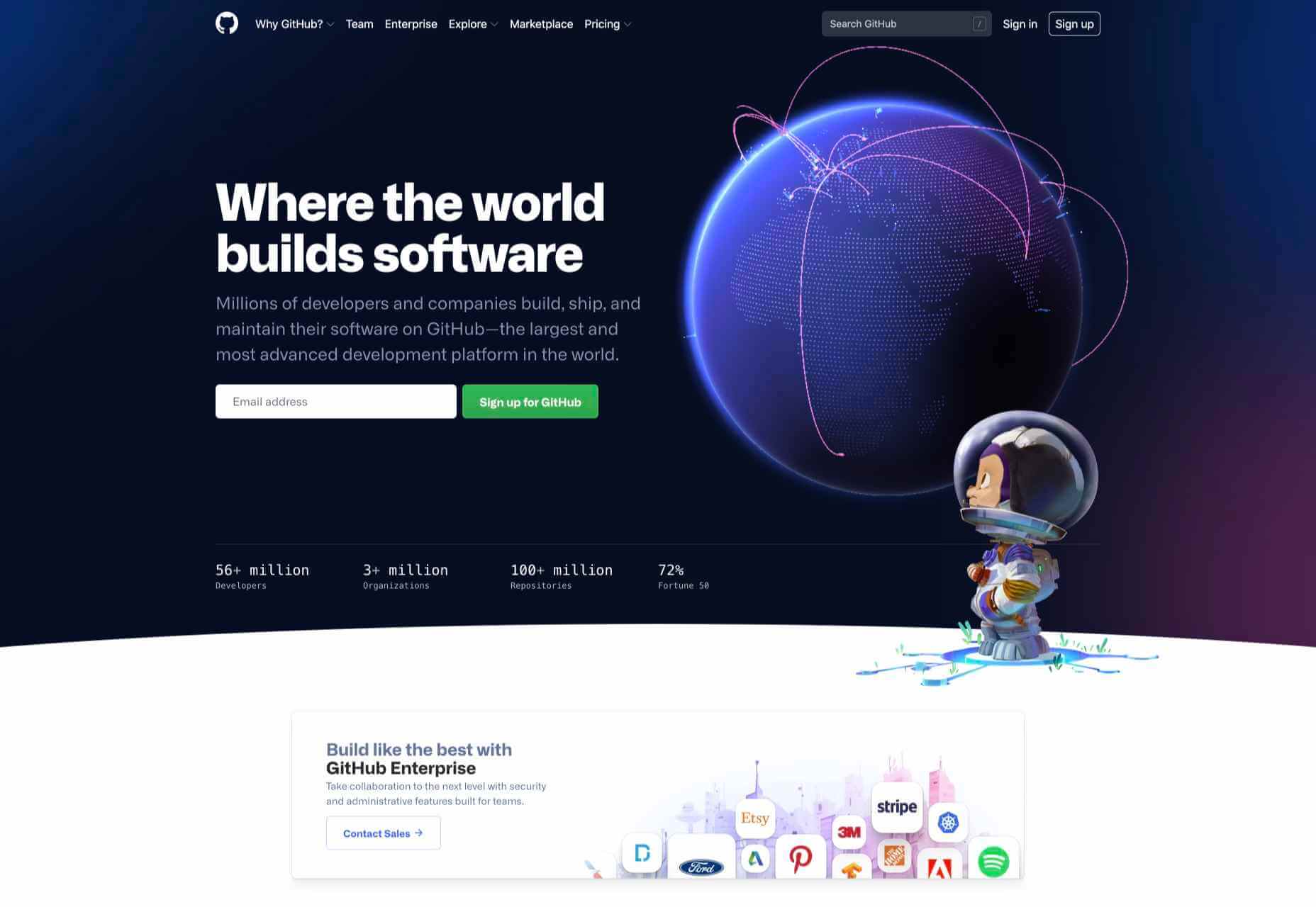
Github
Along with some new features announced earlier this month, GitHub has a glossy new homepage. It has a clean feel, with some nice scrolling animation and sparing but effective use of illustration.
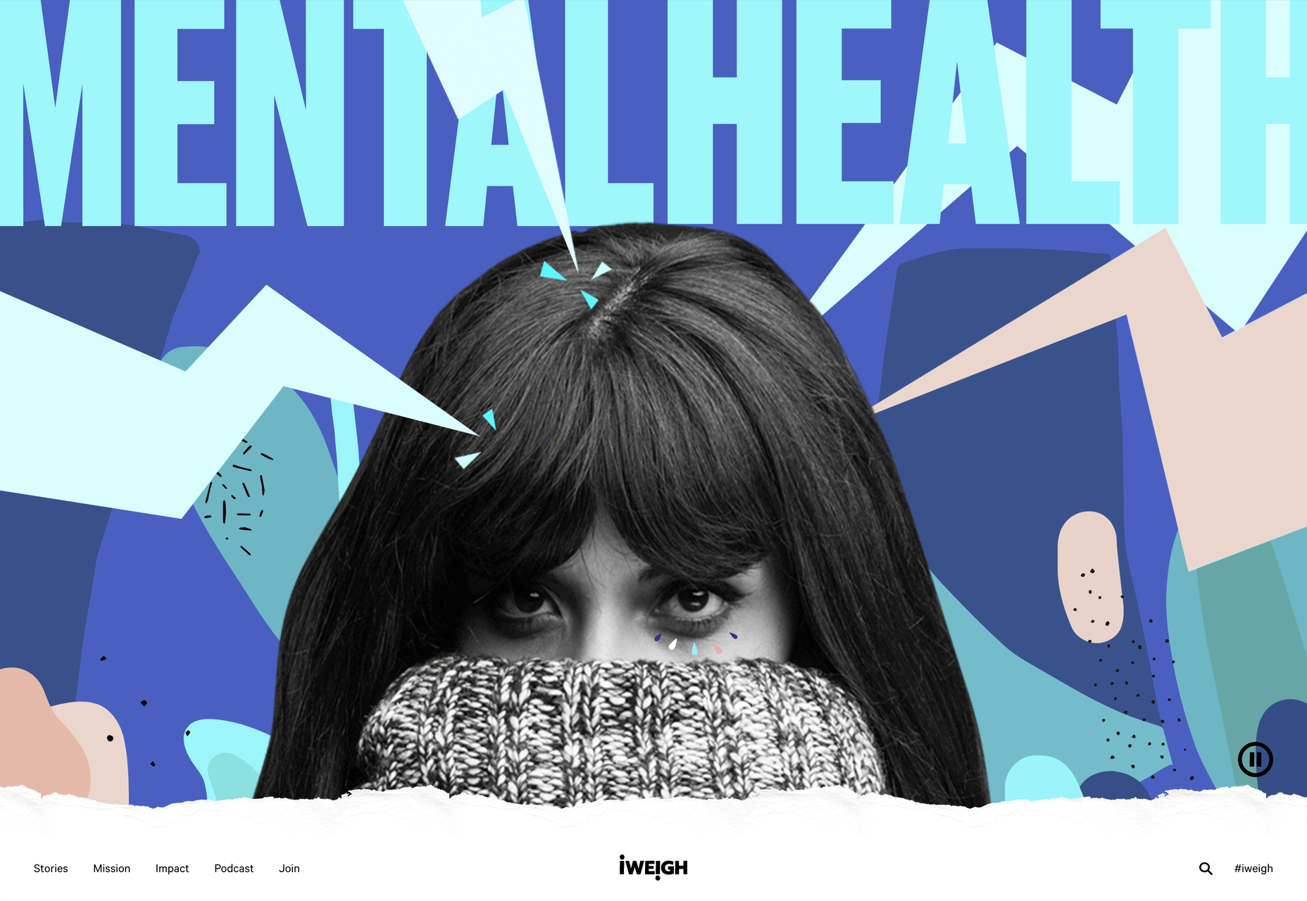
I Weigh Community
Political and social initiatives were big in 2020, and non-profit activism initiative I Weigh Community is the brainchild of actress Jameela Jamil. It’s devoted to radical inclusivity, communicated with bold, expressive graphics.
UNREAL
Back in January, we clicked around UNREAL’s site for hours, enjoying the sharp transitions. The Swiss agency produced a wonderfully chaotic love letter to web animation.
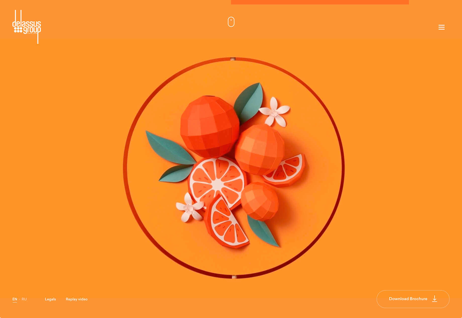
Delassus
Delassus grows fruit, from citrus to avocados. The Moroccan company employs a cornucopia of 3D design to make its site bold, fun, and practical.
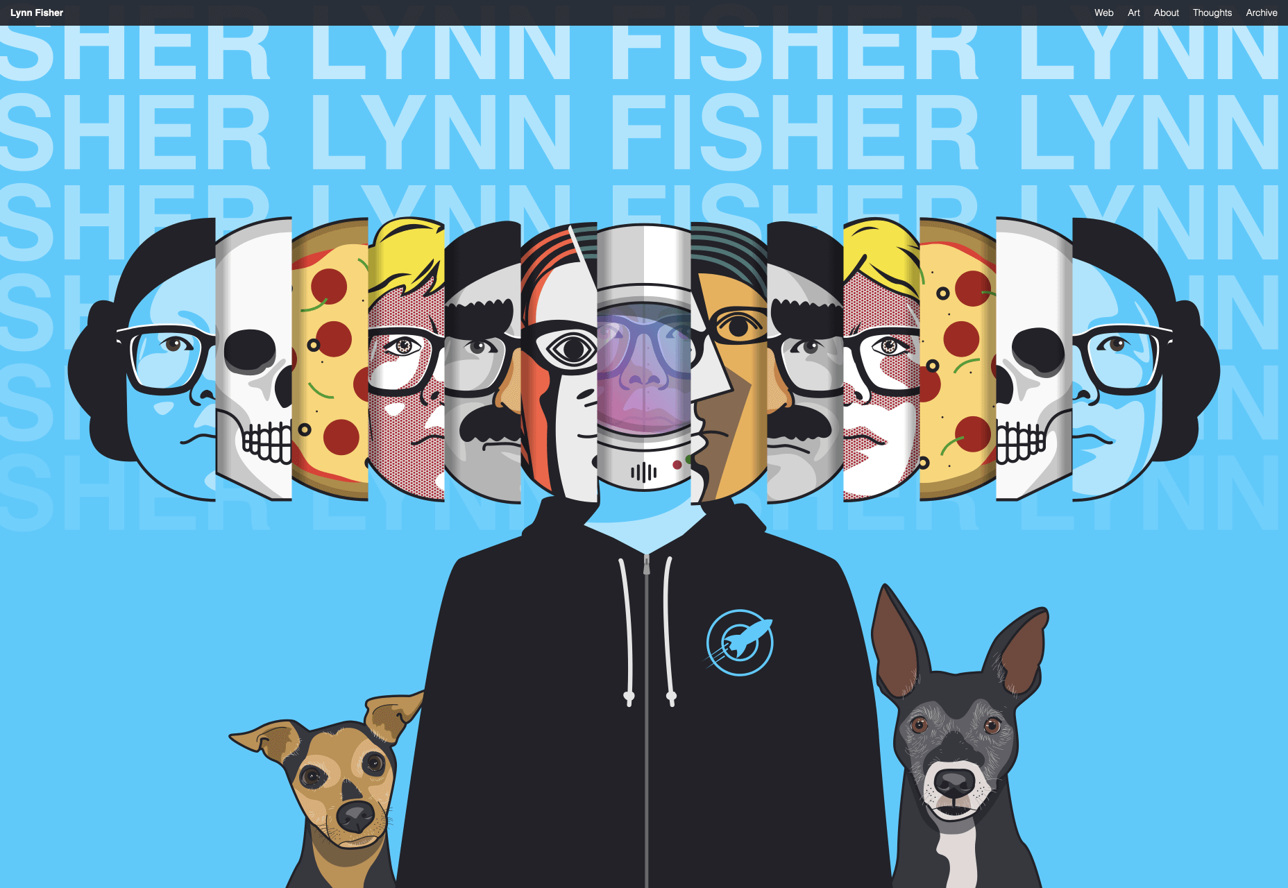
Lynn Fisher
We loved everything about Lynn Fisher’s site back in May. The homepage illustration was awesome. It was a humorous approach to RWD that we really appreciated. The site has since changed, with tons more to explore.
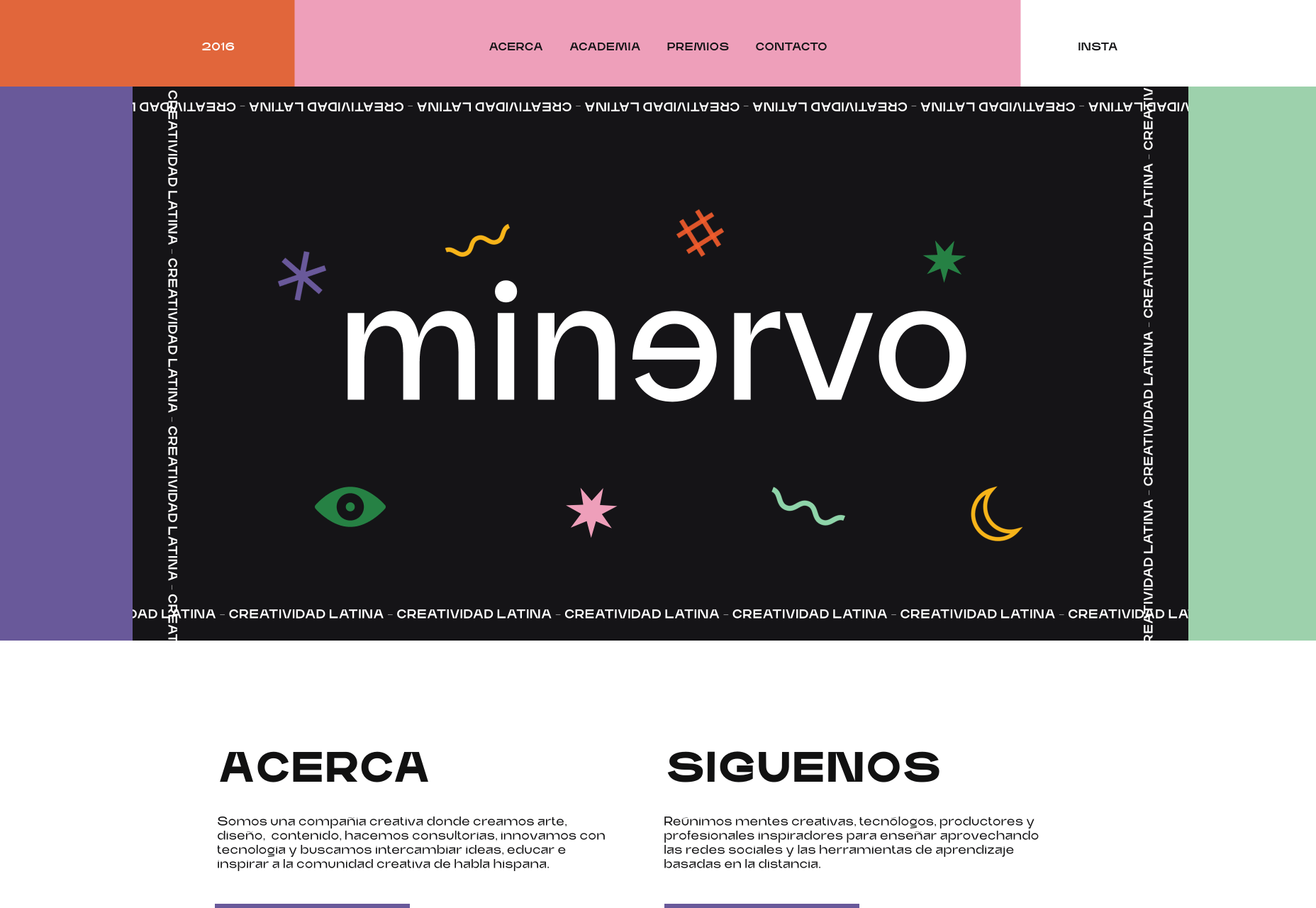
Minervo
The Minervo site feels distinctly Latin, with the hot pinks and sun-blasted desaturation feeling suitably South American. We love the cropping on the custom typeface.
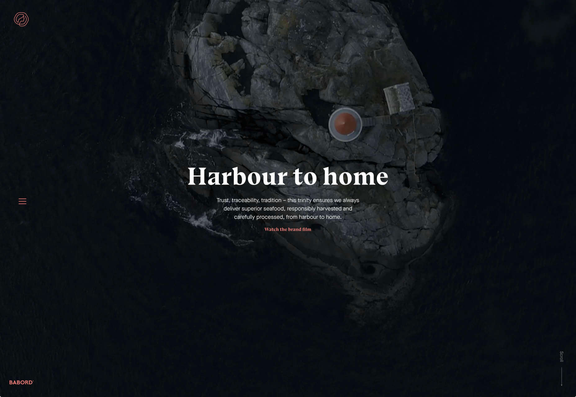
Babord
Norwegians have an almost mystical connection with the sea, which is evident in the site for Babord, a Norwegian seafood supplier. We loved the brand font too.
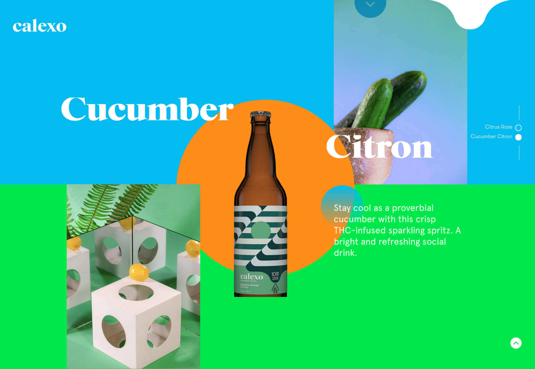
Calexo
Calexo makes THC-infused beverages, and back in April, we loved the color and positivity of the site. The animated hamburger menu was a hit too.
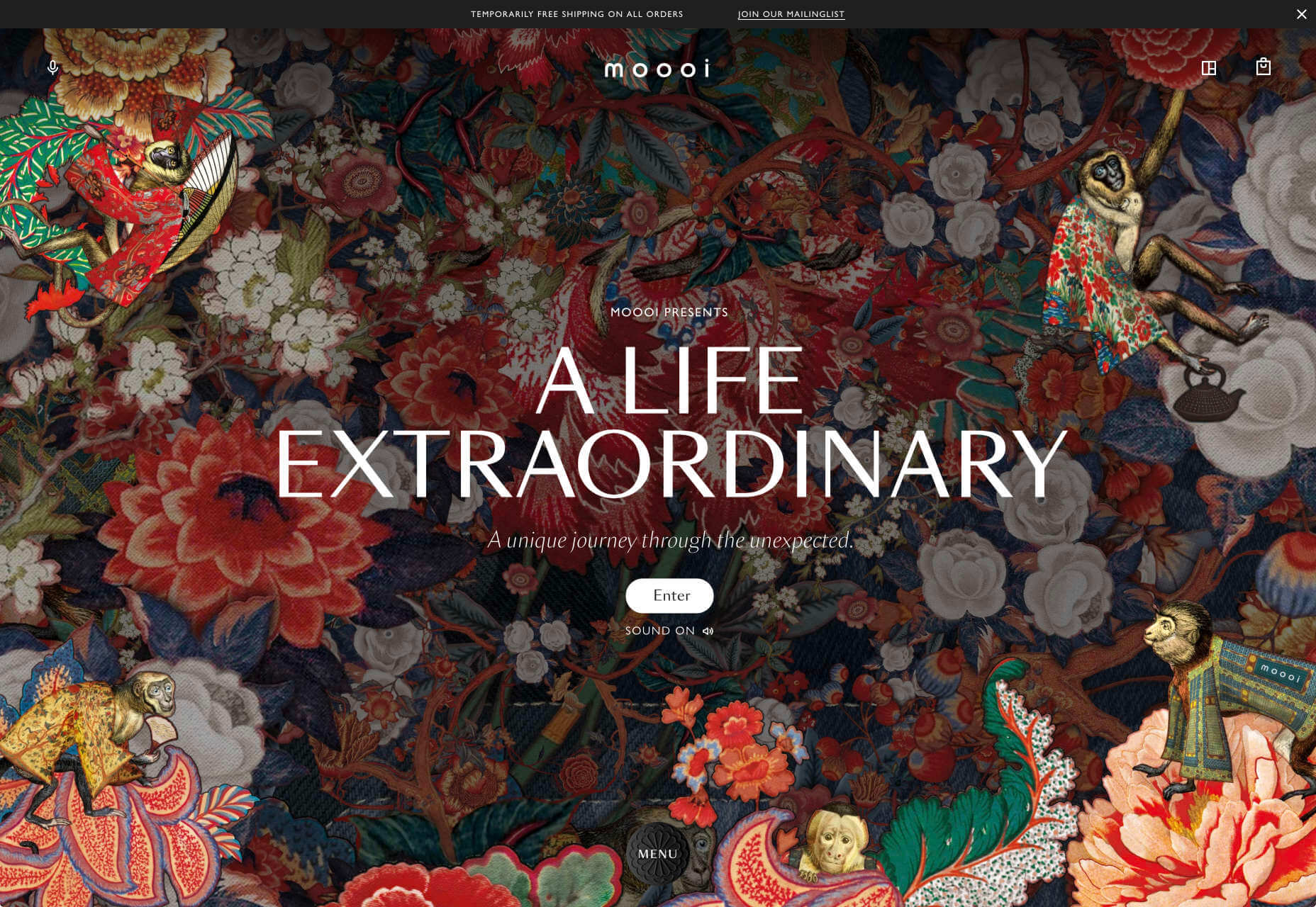
Moooi
Moooi’s site layers illustration with a maximal effect that makes you feel like you’re chasing a white rabbit. There are tons of great UI details here, especially the bar that reveals the product videos.
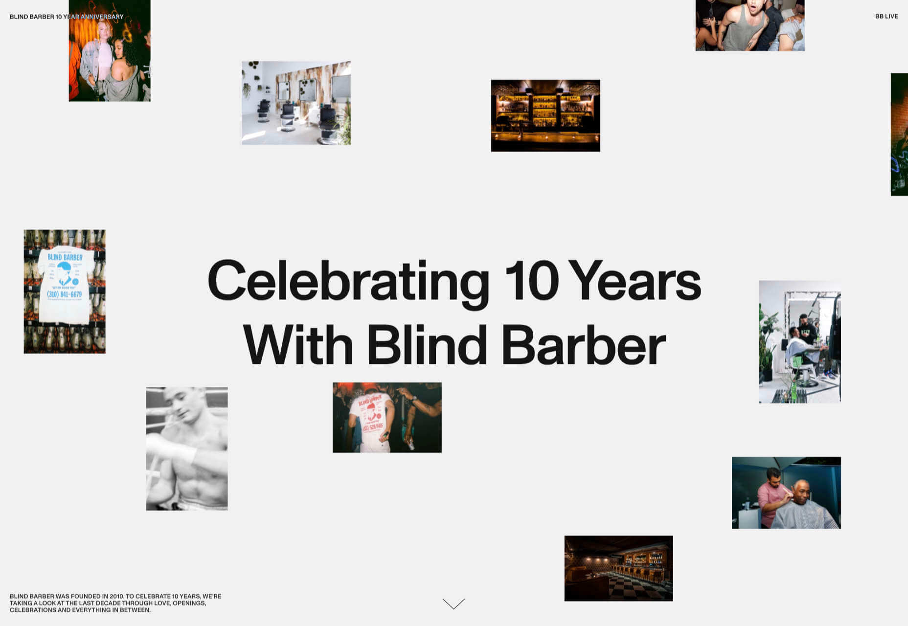
Blind Barber Anniversary
The Blind Barber celebrates 10 years of success with this microsite. A deconstructed grid and an entirely black and white design, but with color photos, create energy and a sense of joy.
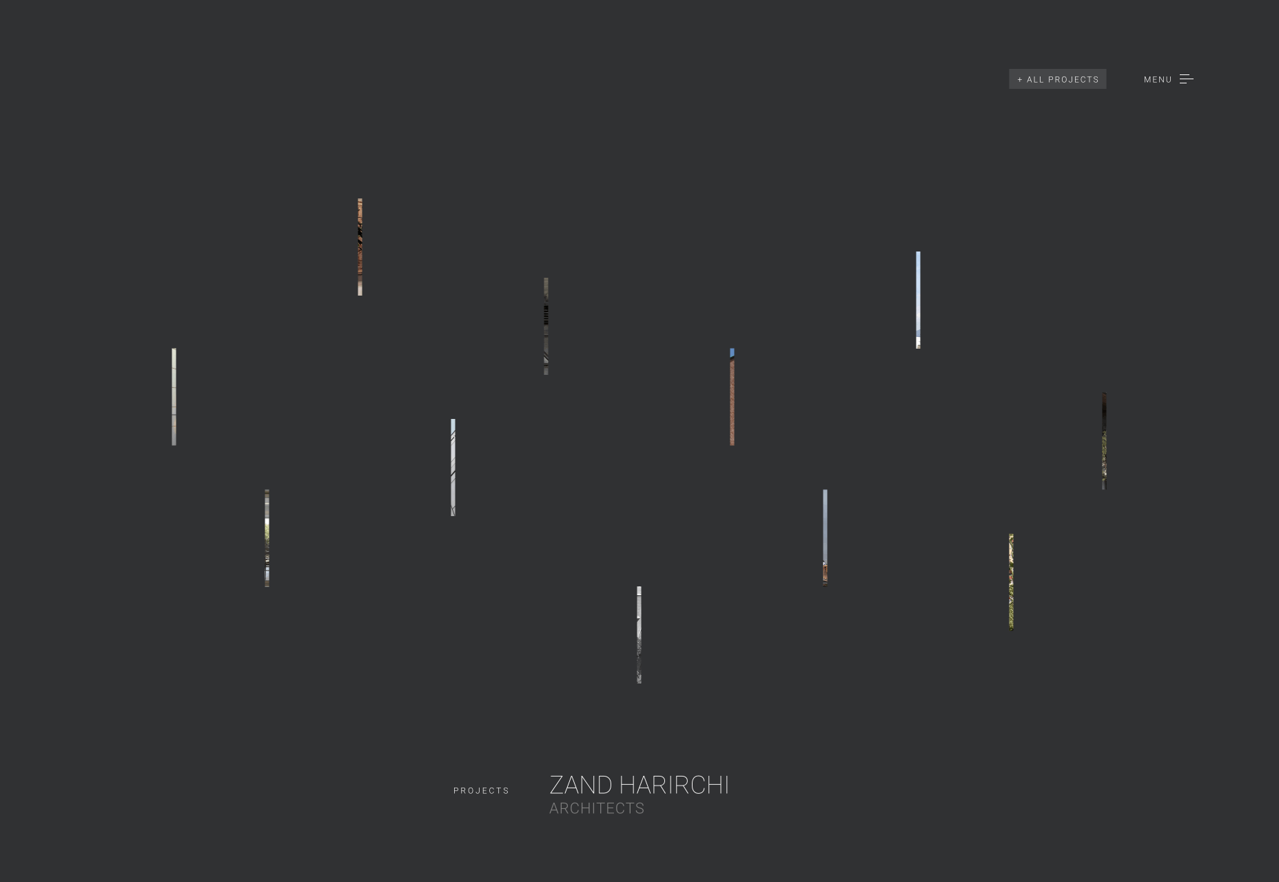
Zand Harirchi Architects
Zand Harirchi is an architecture firm based in Tehran, Iran. Its site features subtle references to architecture, like the delightful thumbnails reminiscent of small windows.
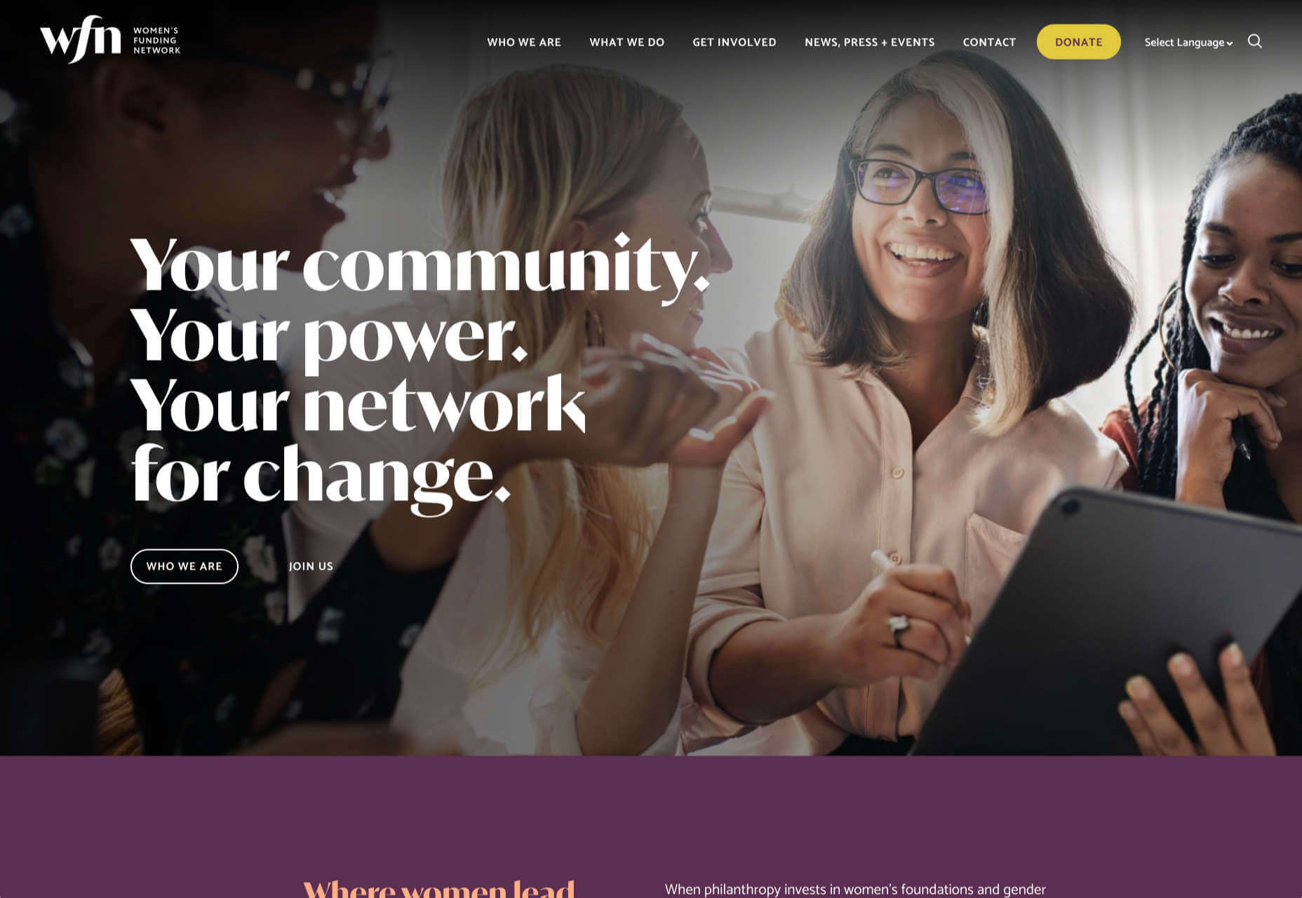
WFN
The WFN (Women’s Funding Network) is an international alliance supporting women’s foundations and gender justice funders. The sophisticated color palette and clean type are both confident and feminine.
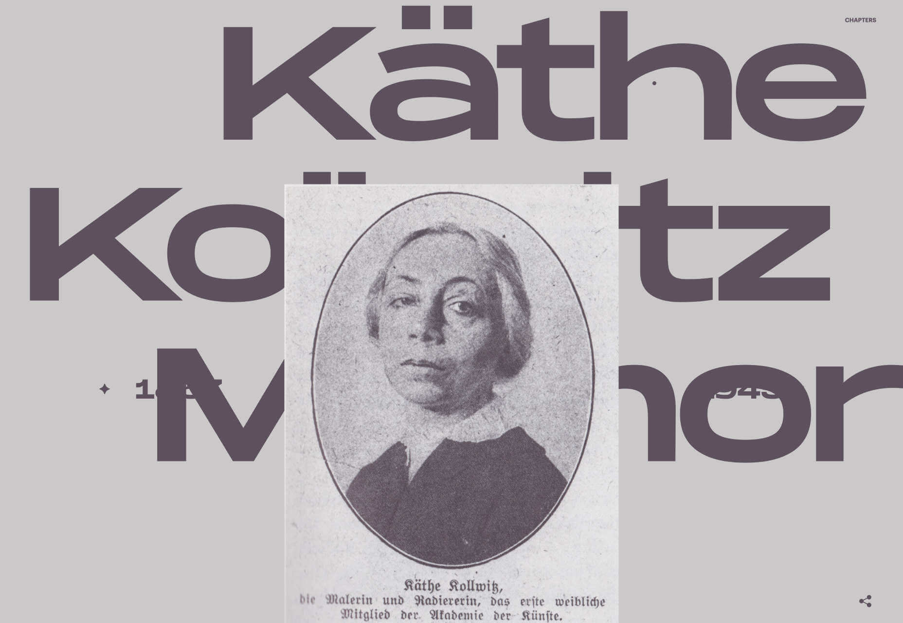
A tribute to the life and work of Käthe Kollwitz, an Expressionist printmaker. There’s a catalog of her work, presented alongside large type and splashy color transitions.
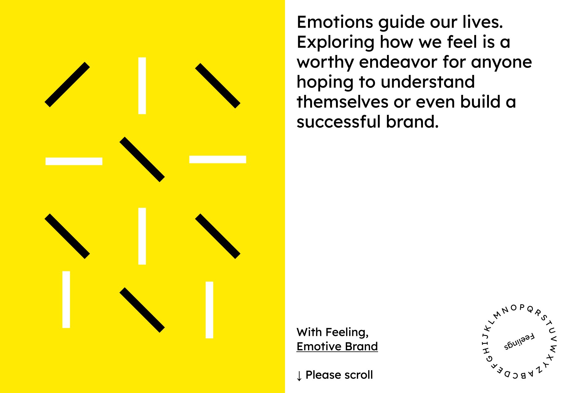
Emotive Feels
Emotive Feels is a design manifesto from the Emotive Brand agency that illustrates an A–Z of potential brand emotions with simple animations that we likened to a Blue Note release.
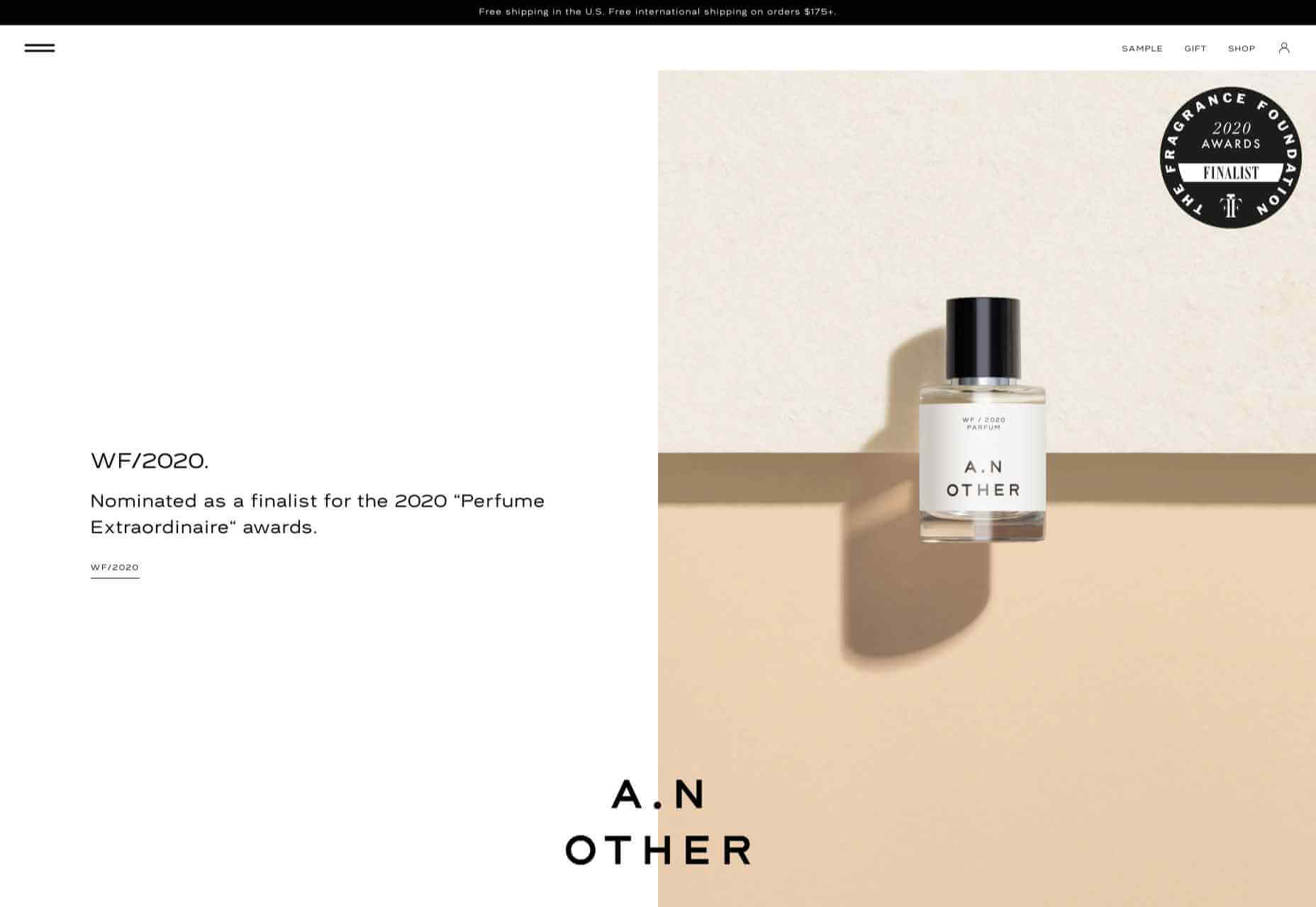
A. N Other
A.N Other’s site for perfume highlights quality ingredients, materials, simplicity, craftsmanship, and the environment; in the process, it cleverly invokes a sense of luxury.
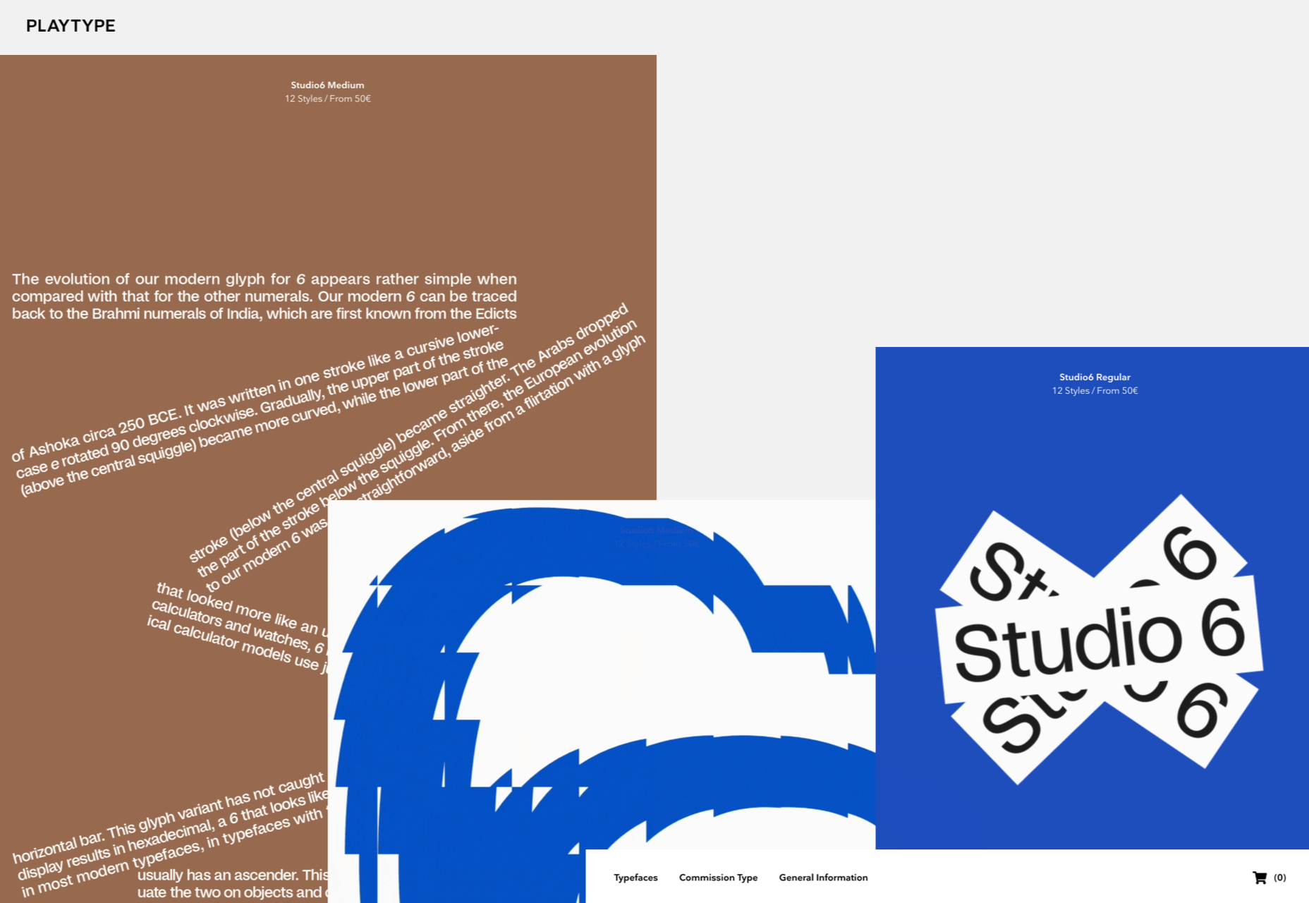
Playtype
Danish type foundry Playtype’s site fits its name perfectly. The playful site with bright blocks of color and the occasional animation shows off some pretty nice typefaces.
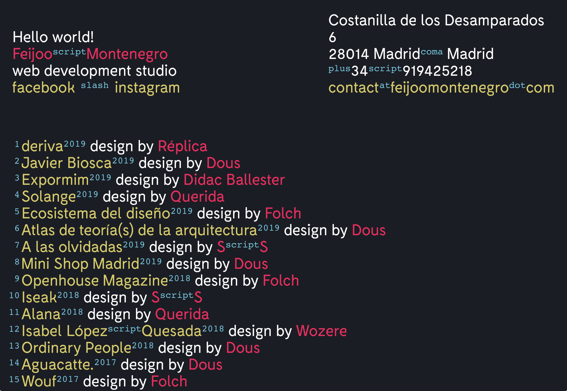
Feijoo Montenegro
All-text sites are always a thrill, and back in June, we were treated to this simple one-pager by Feijoo. Details like the numerals being replaced by words are delightful.
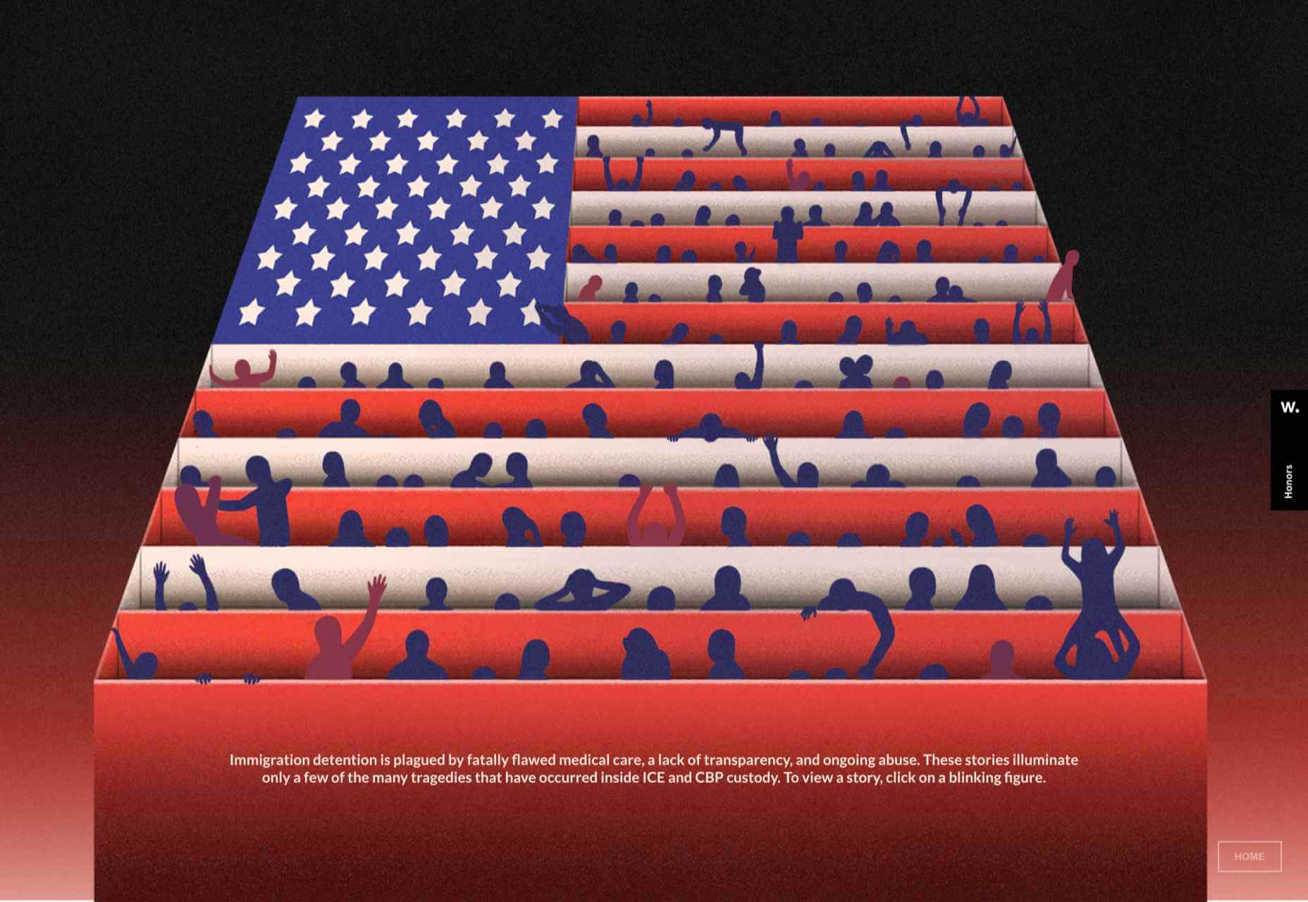
Wavering Stripes
Although this site’s subject matter is harrowing, it is presented in a very beautiful, thoughtful manner.
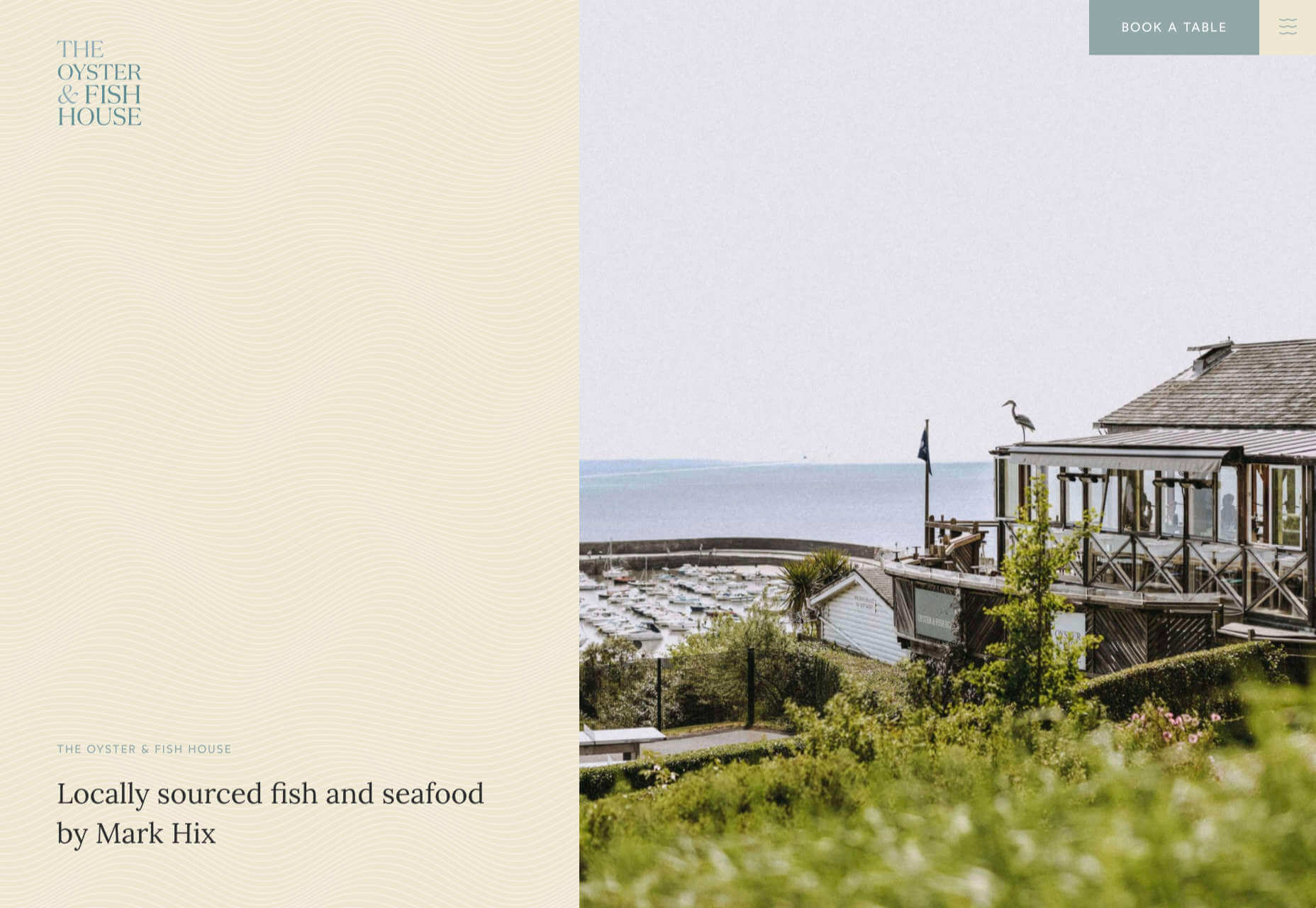
The Oyster & Fish House
Sophisticated typography, the wave textures, the nostalgic feel of the photography, and even the cookie notice’s on-brand styling all show attention to detail, which gives this site its appeal.
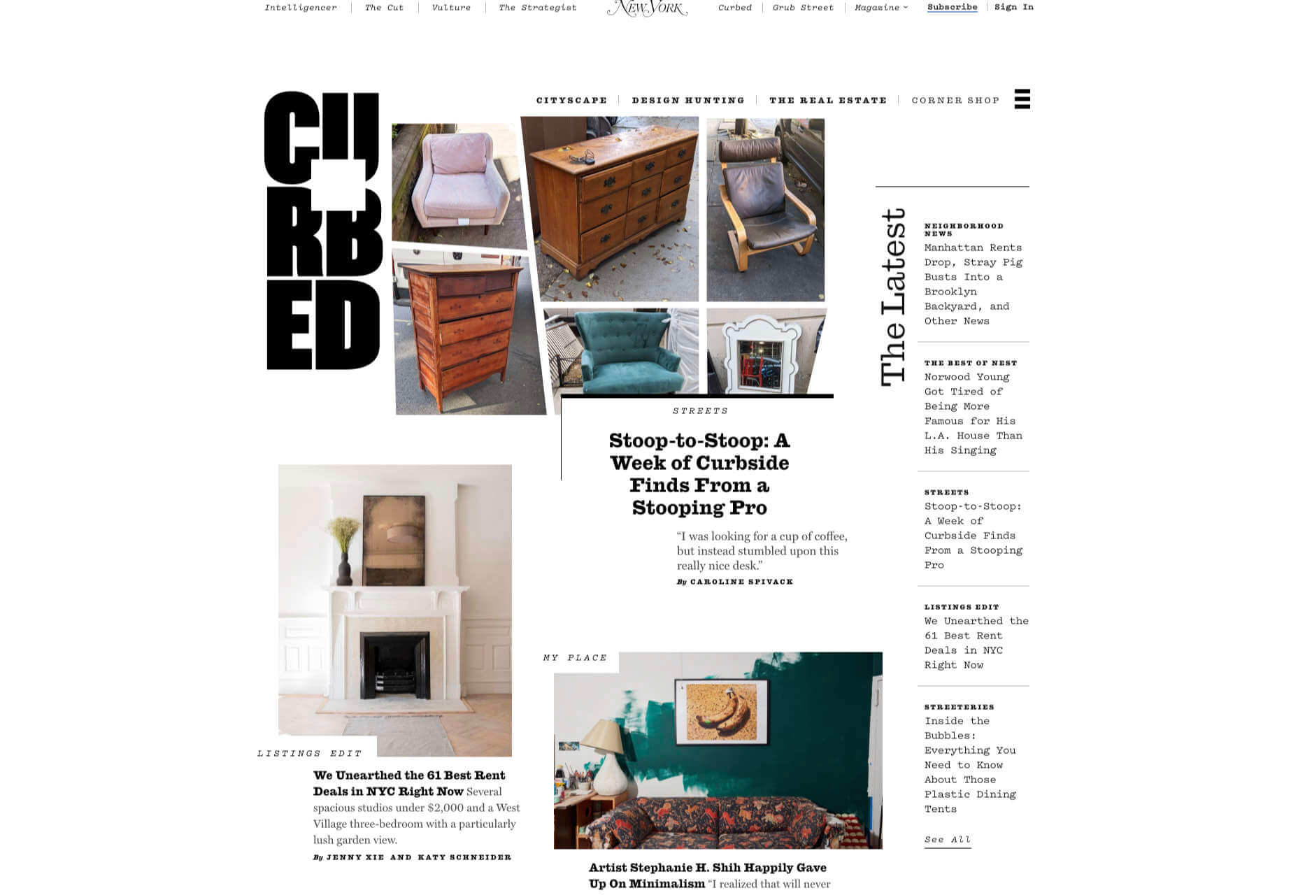
When Curbed came under the umbrella of New York magazine earlier this year, it got a makeover. Neon highlights and a distorted grid give an edge to the classic magazine layout.
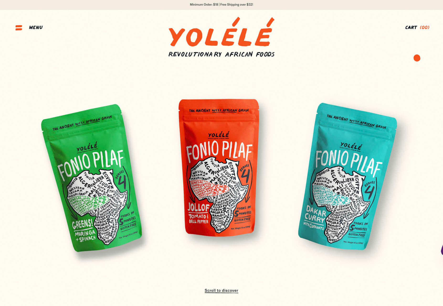
Yolélé
The carousel of fonio (it’s a West African grain) products on Yolélé’s landing page is a good example of horizontal scrolling that works well. There are some great page transitions too.
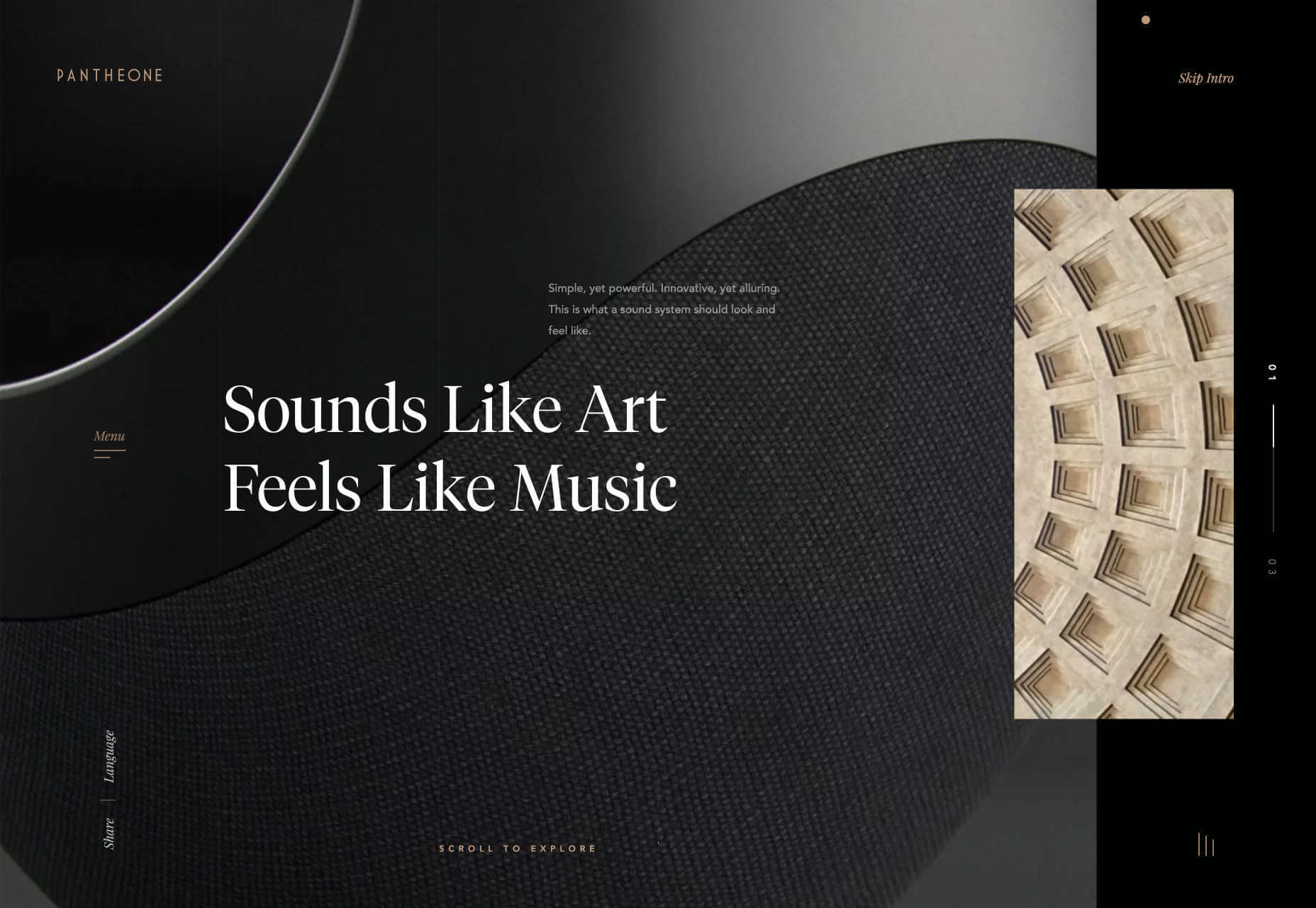
Pantheone Audio
Pantheone Audio’s site employs elegant scrolling to enable seamless navigation of an extremely luxurious site, underpinned by a complex grid.
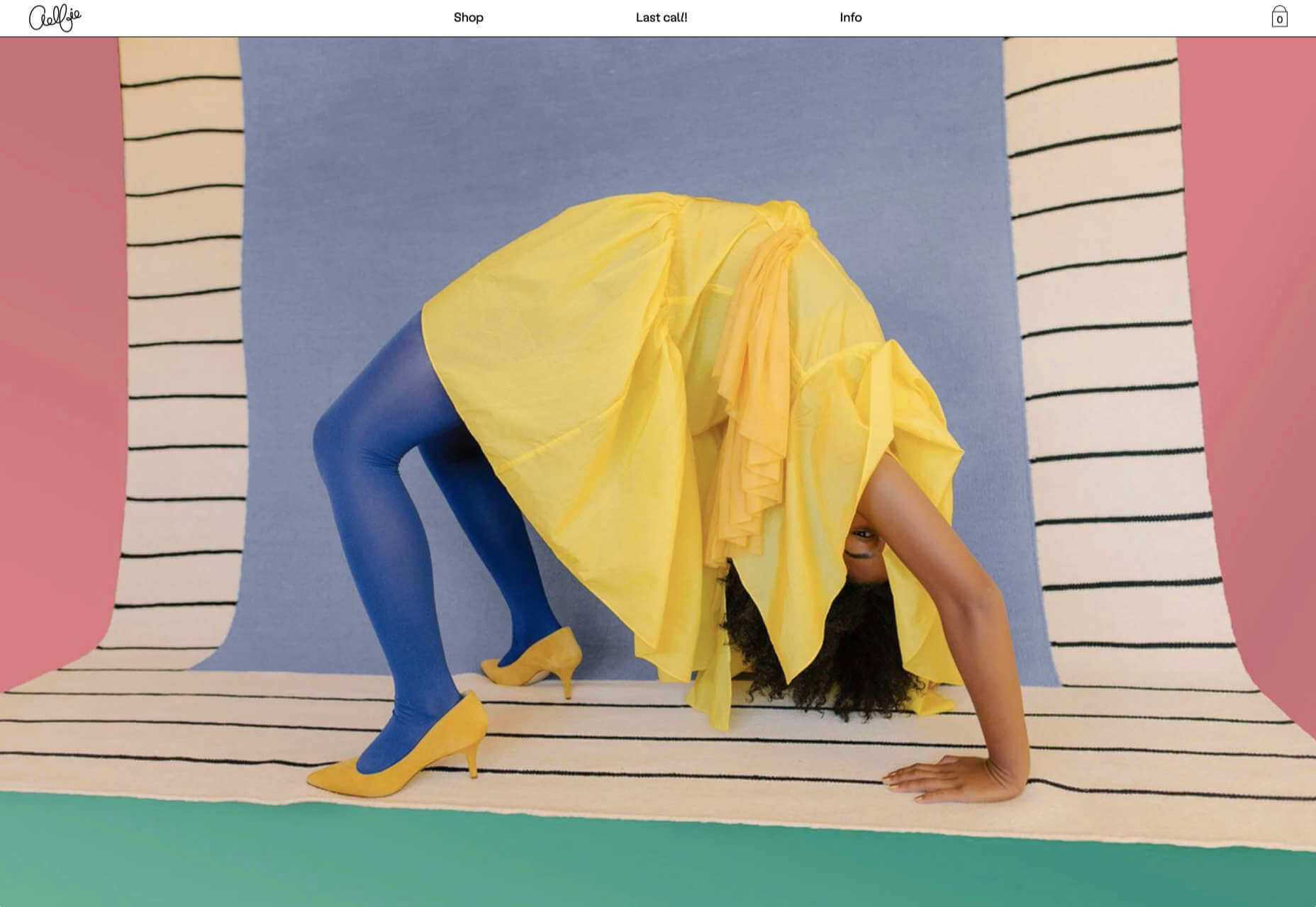
Aelfie
Bright color, an irregular grid, illustrations, and a display type that feels almost hand-drawn perfectly captures the aesthetic of this NY-based home furnishing brand.
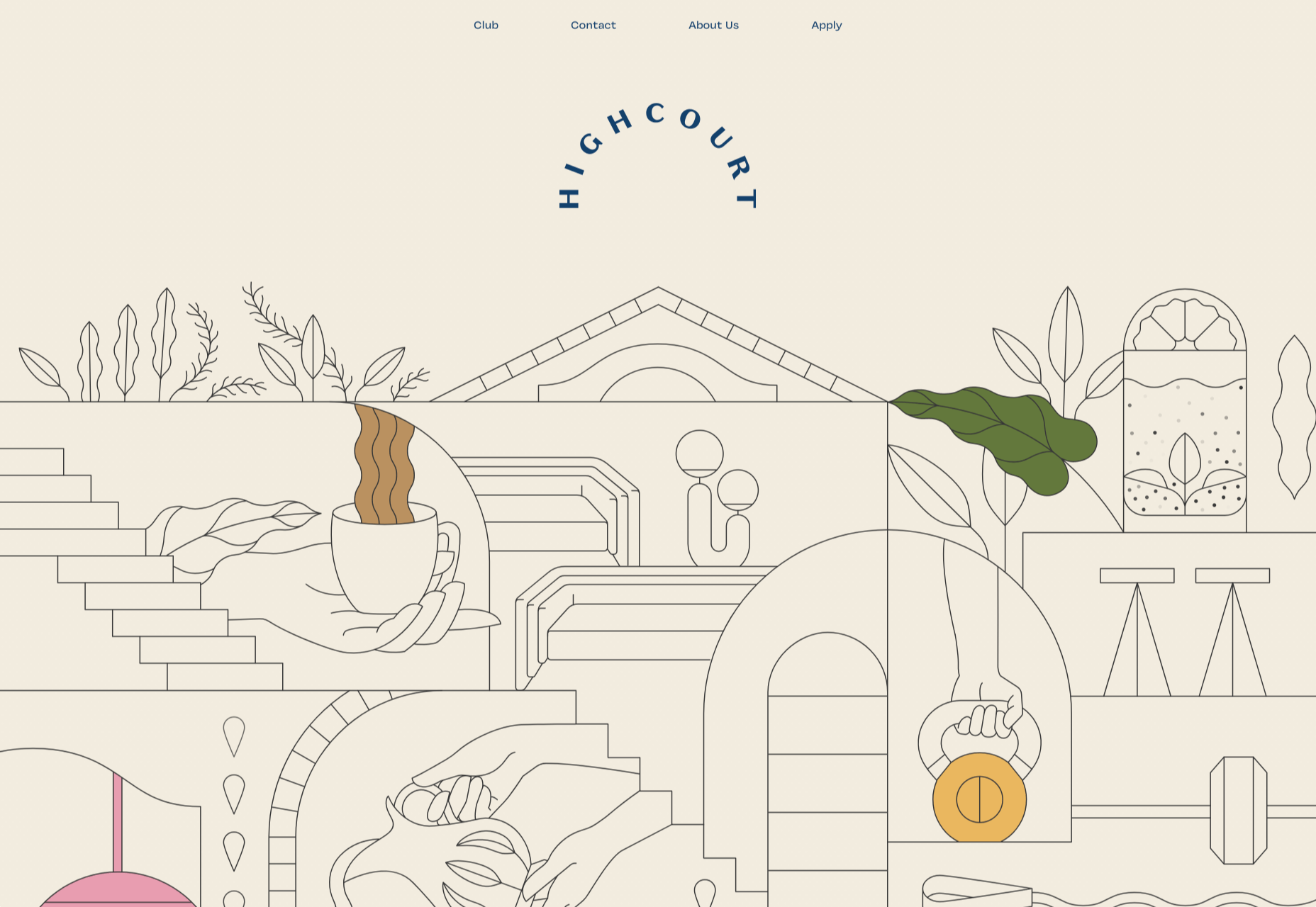
Highcourt
This site for private membership leisure club Highcourt uses subtle background color changes and simple line illustrations to create a sense of calm. Black and white are softened to dark blue and ivory, and gentle animation adds interest.
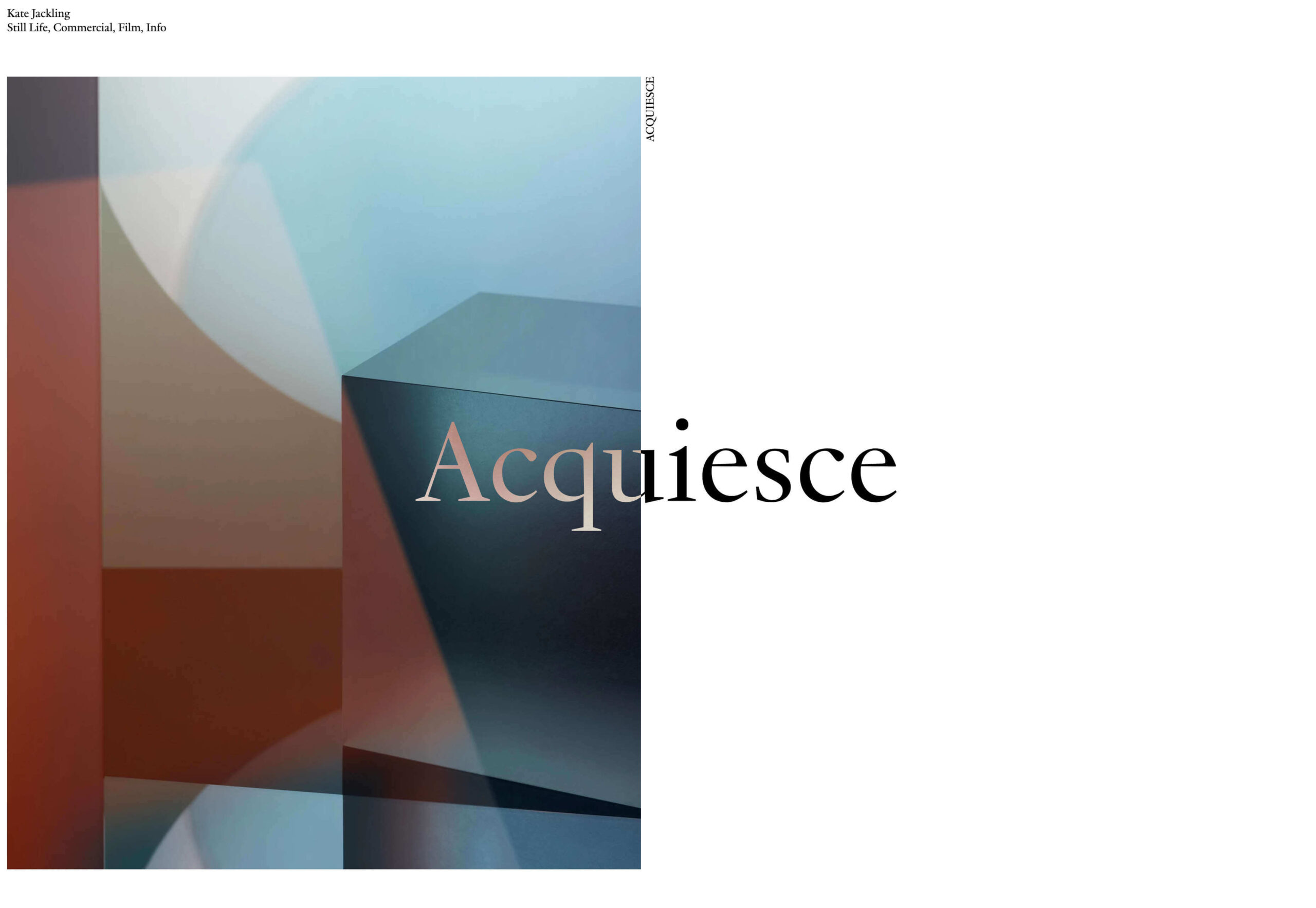
Kate Jackling
Kate Jackling’s site takes a step back and allows the content to bask in the glow of attention, placing her photography at center stage.
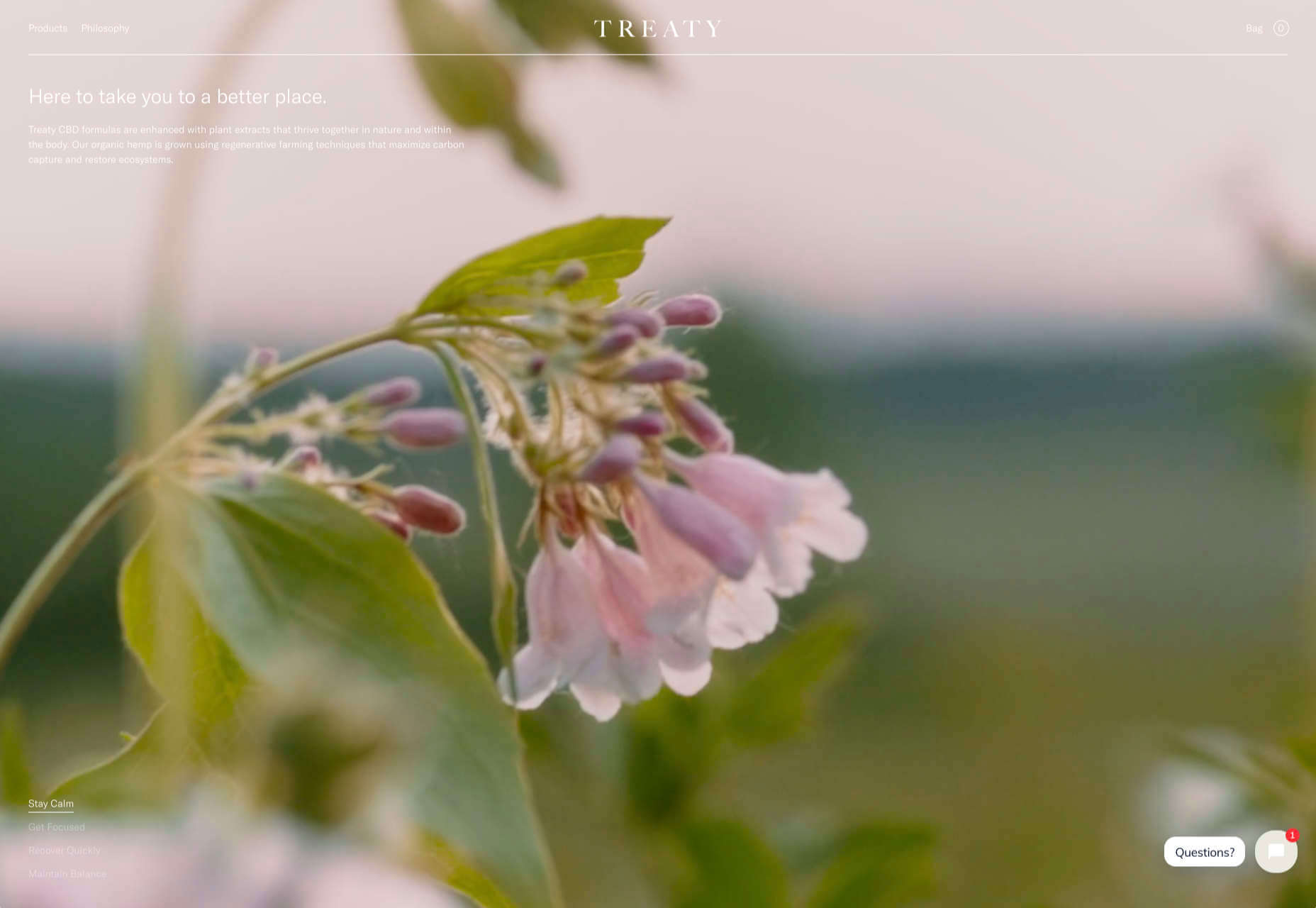
Treaty
While there is less hustle and bustle outside than we were used to pre-pandemic, we could certainly all use some calm. Treaty’s site for CBD oils reflects that calm with a combination of video, whitespace, and botanical drawings.
Ukrainian Railroad Ladies
Ukrainian Railroad Ladies is a book of photographs of women, and some men, who work on the Ukrainian railways. The site is basic, even brutalist, but it has charm, and the photographer’s fascination with his subject comes through.
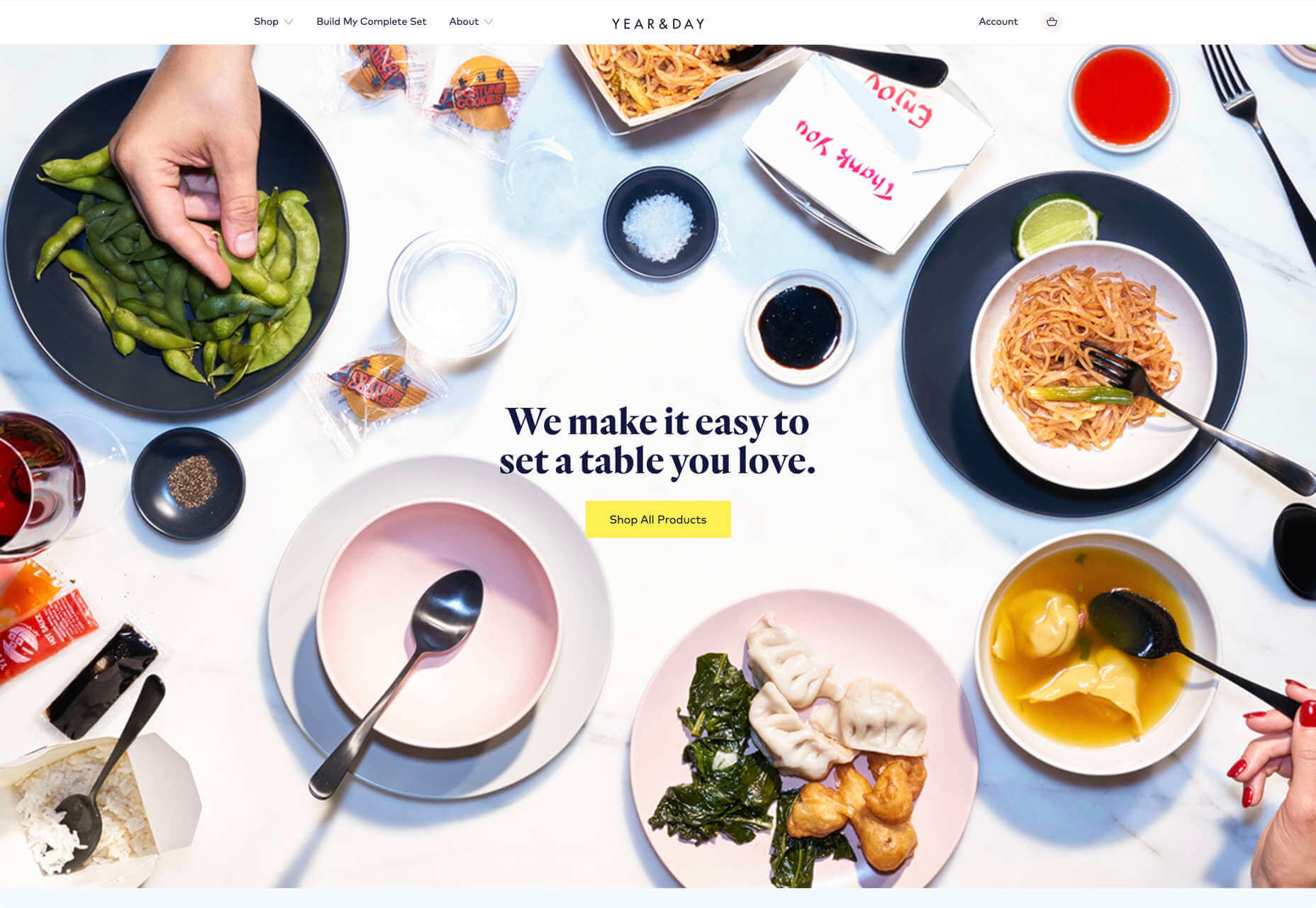
Year & Day
Year & Day is an ecommerce site that sells tableware, from glassware to ceramics. The colorful collection is designed to complement different types of food, and the site’s color scheme reflects that perfectly.
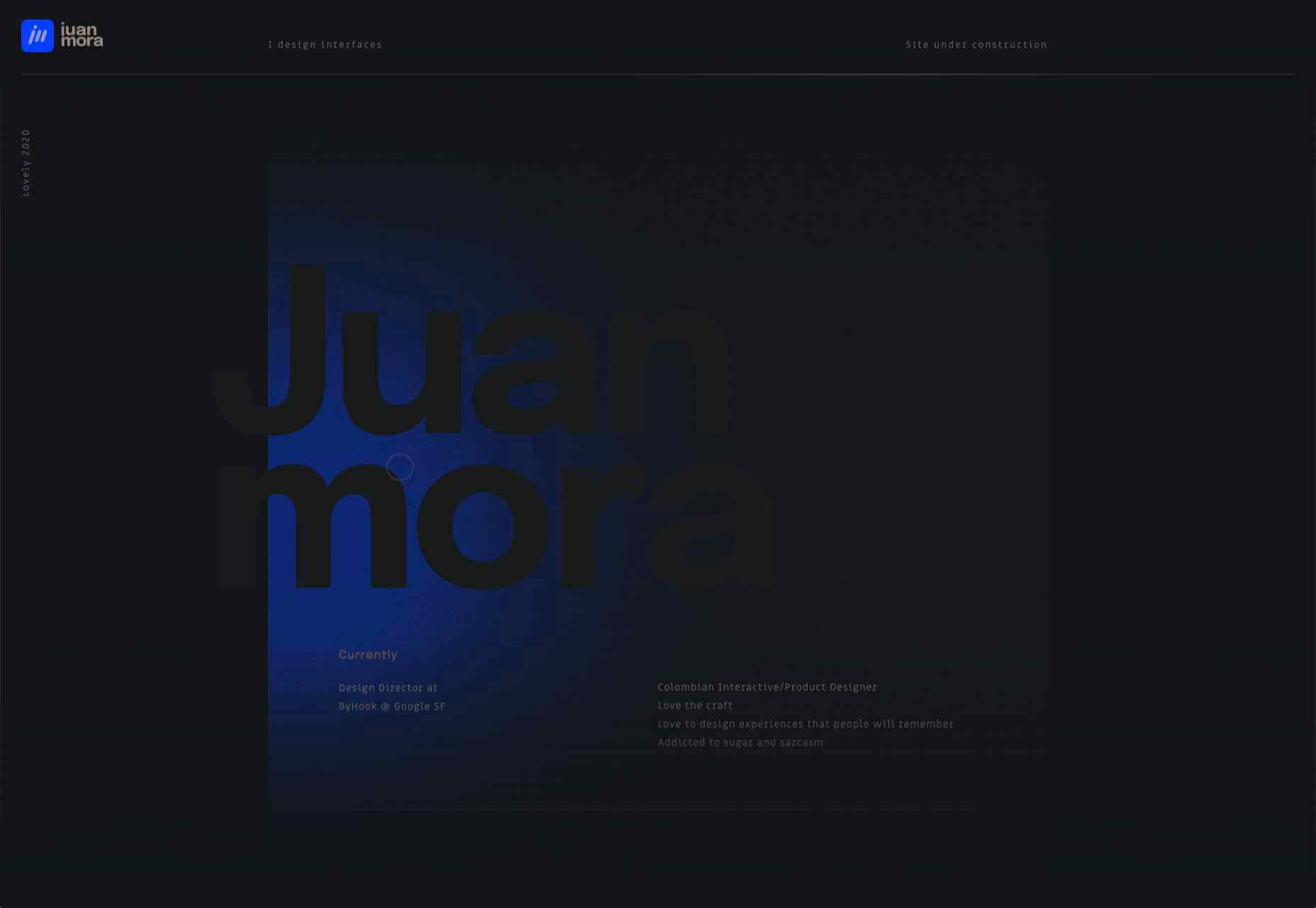
Juan Mora
Juan Mora’s ‘under construction’ holding page has probably been crafted with more care than many full-blown sites. This showcase cleverly manages to demonstrate its subject’s skills without showing a single piece of work.
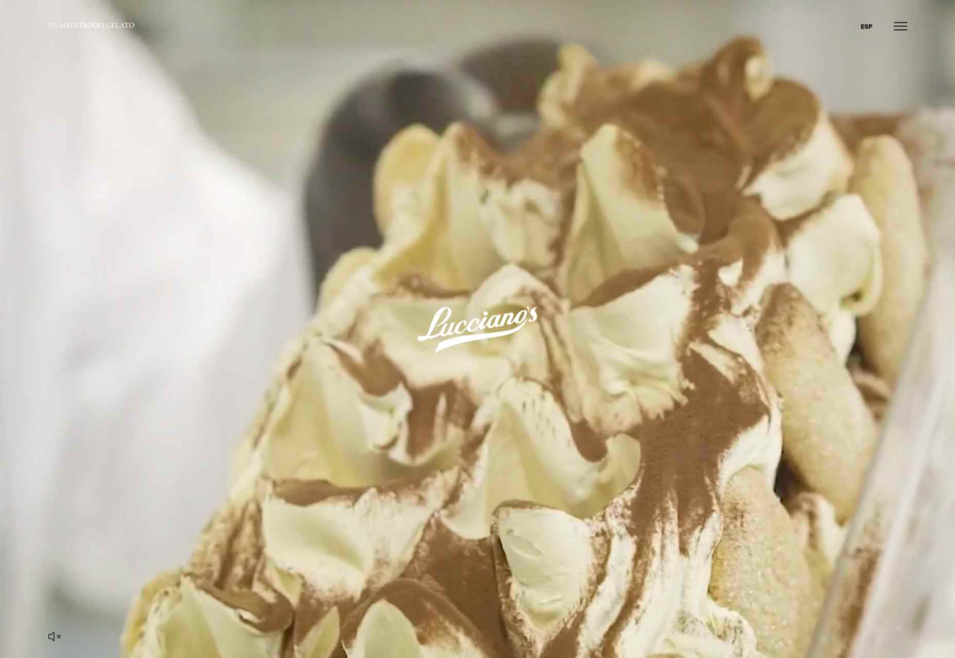
Lucciano’s
Lucciano’s homepage hero video alone will have your mouth watering for some of their gelato. Much of the appeal of food is visual, and the photography here does not disappoint. Circular text boxes in ice cream colors complement the product shots nicely.
Bored Solutions
Back in April, we were already a little weary of lockdown — if only we’d known how long it would last! The amazing color blobbing of bored.solutions was the ideal distraction.
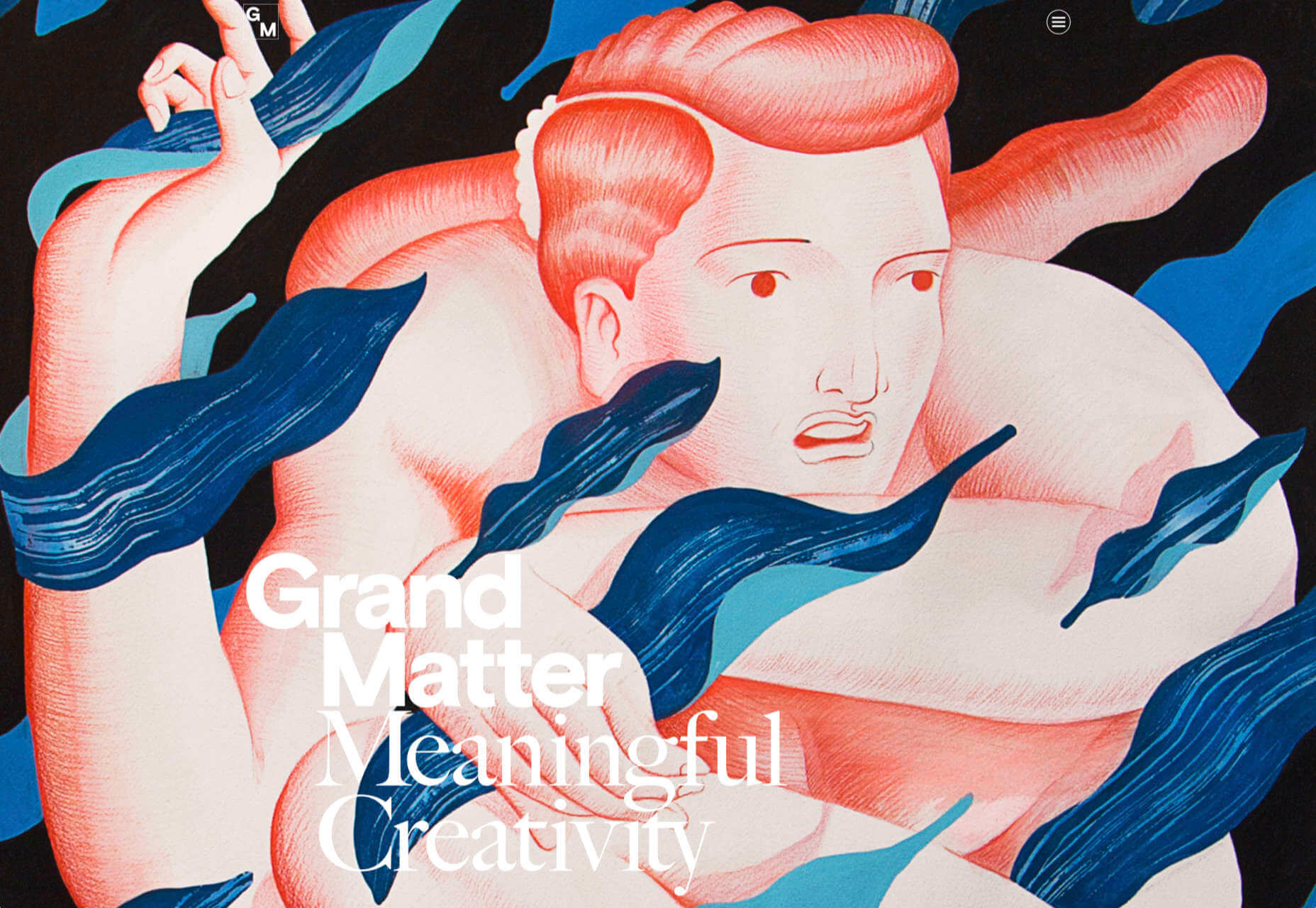
Grand Matter
Grand Matter is an artist agency representing illustrators. There is a wealth of talent on show here and a broad enough range of styles to keep the web interesting for a good while.
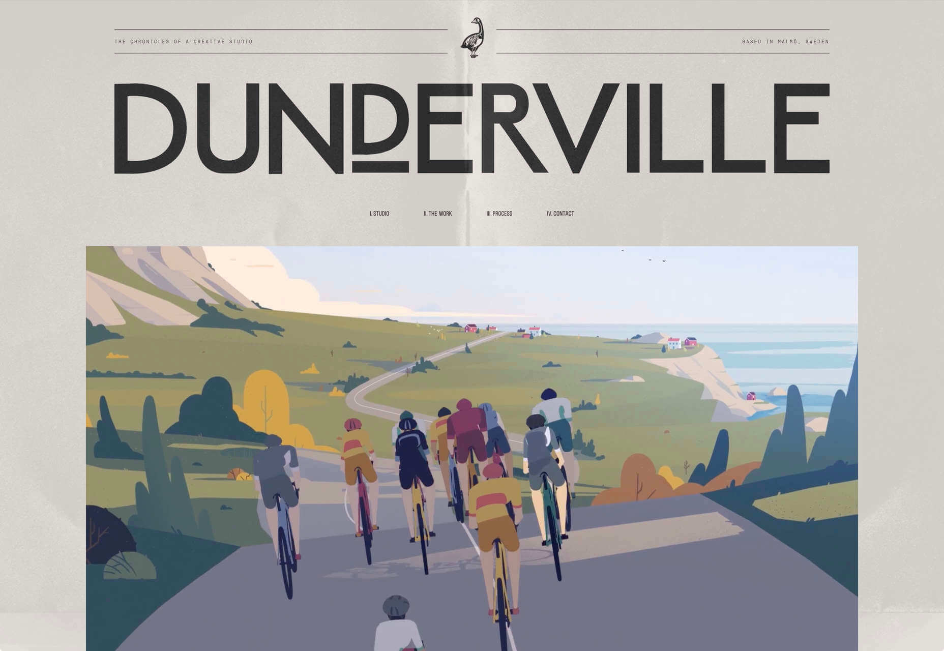
Dunderville
This site for Dunderville motion design studio features a paper fold detail, which adds tactility to the virtual. Some superb type and vector animations showcase an impressive portfolio.
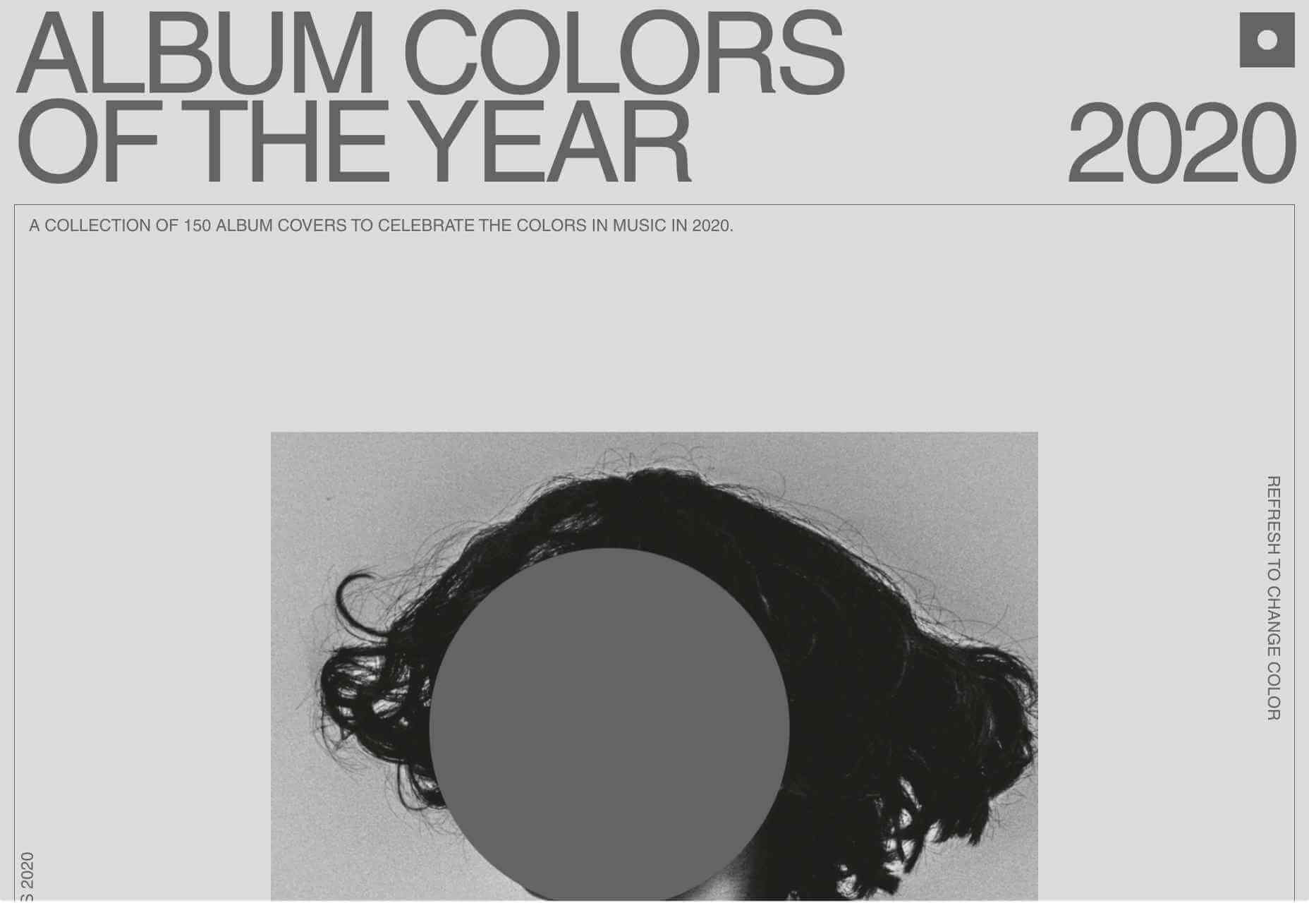
Album Colors of the Year
Album Colors has taken the covers from 150 albums released this year and arranged them by dominant color. The hex code for each color is provided if you want to copy it.
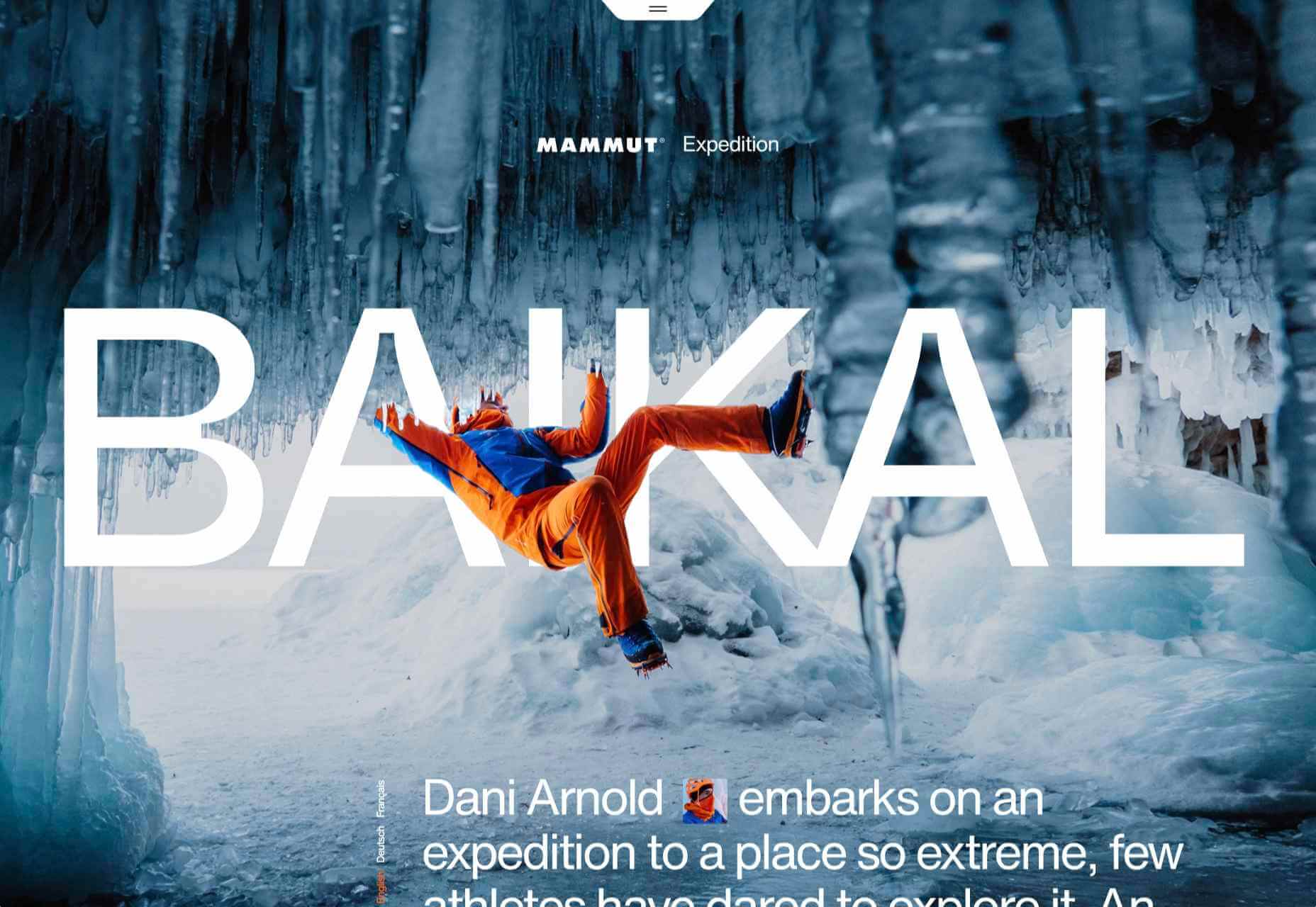
Mammut Expedition Baikal
Mammut uses stunning photography and a strong narrative to present its Eiger Extreme outdoor clothing. Longing for the great outdoors will either be alleviated or exacerbated by this one.
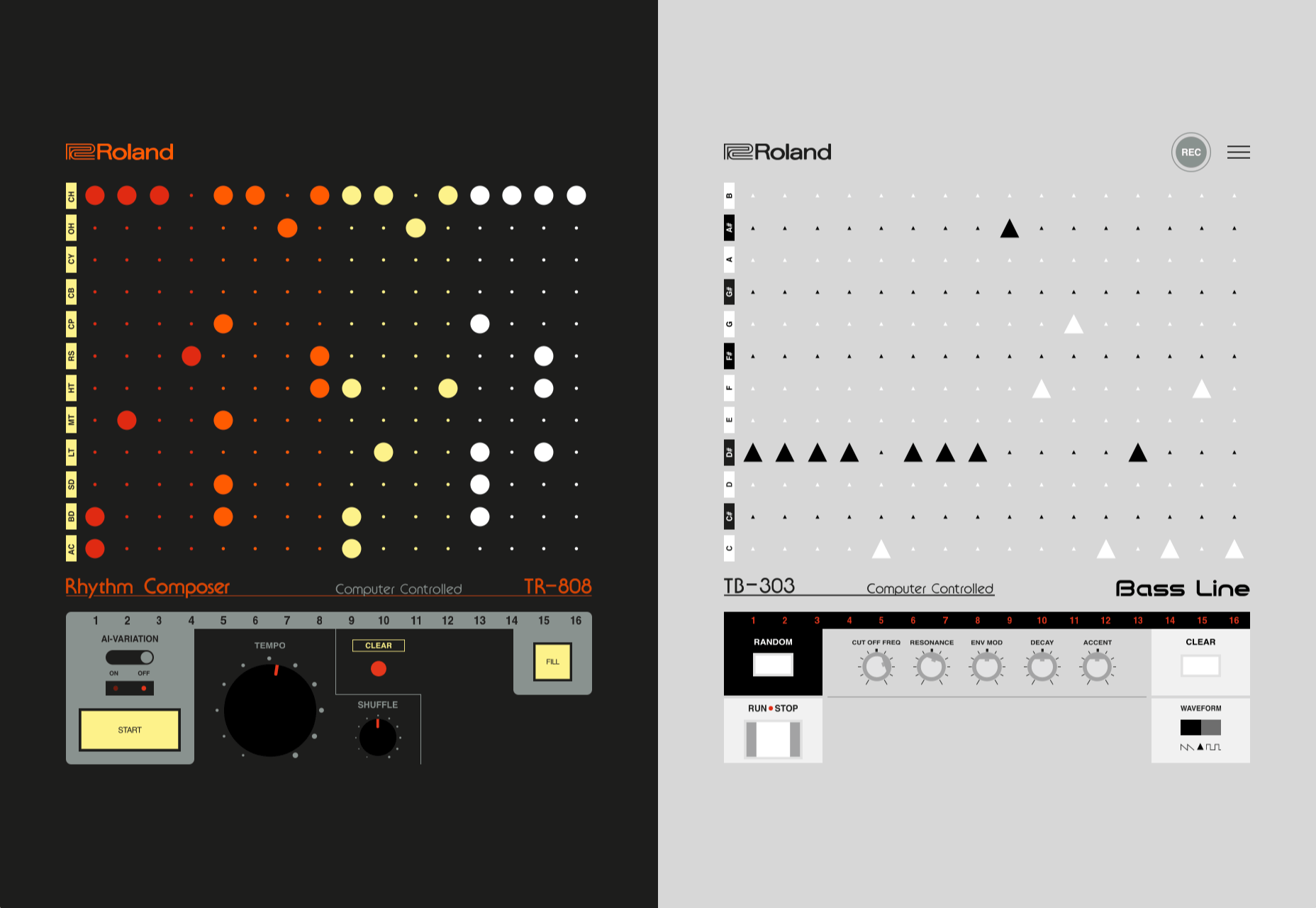
808303
808303.studio is a virtual Roland TR-808 drum machine and TB 303 bass synthesizer. You can program, record, and share your very own 80s techno masterpiece.
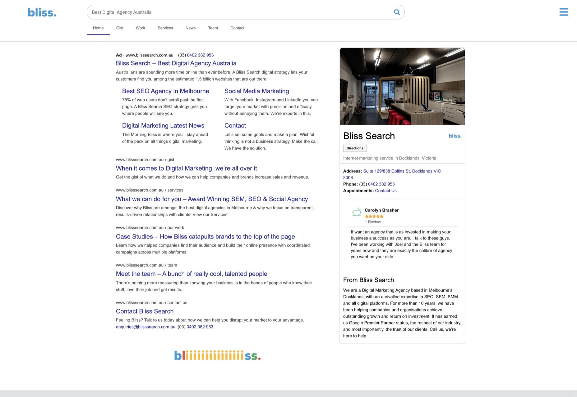
Bliss
Humor can be hard to get right, especially when you want to be taken seriously at the same time. Here, it works, and the result is a memorable site, oozing with confidence.
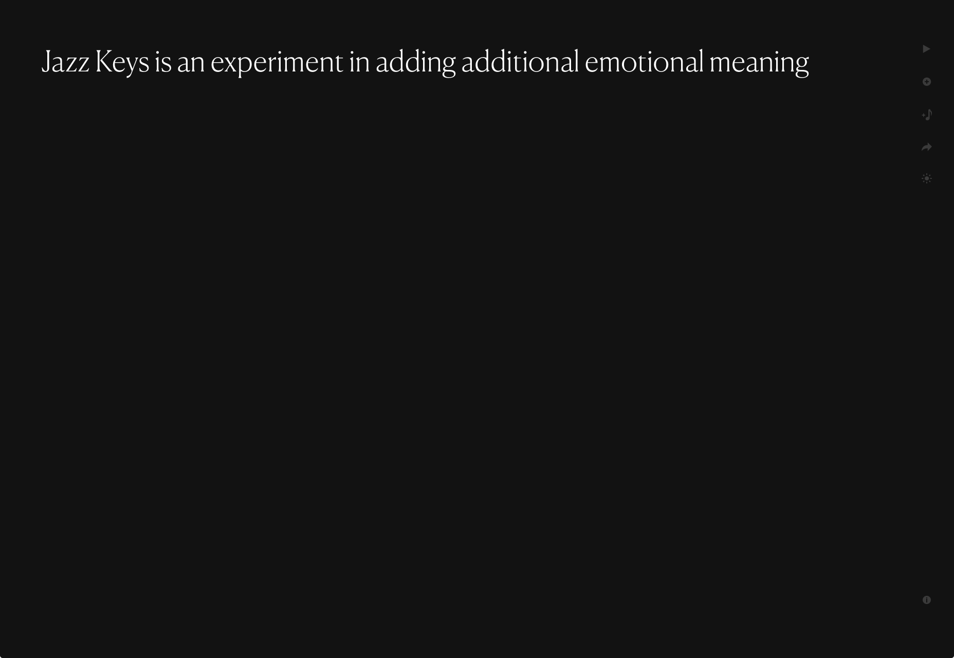
Jazz Keys
Type your message into Jazz Keys, and you’ll hear it in sound. You can send the message to anyone and let them hear your words — the web lives for side-projects like this.
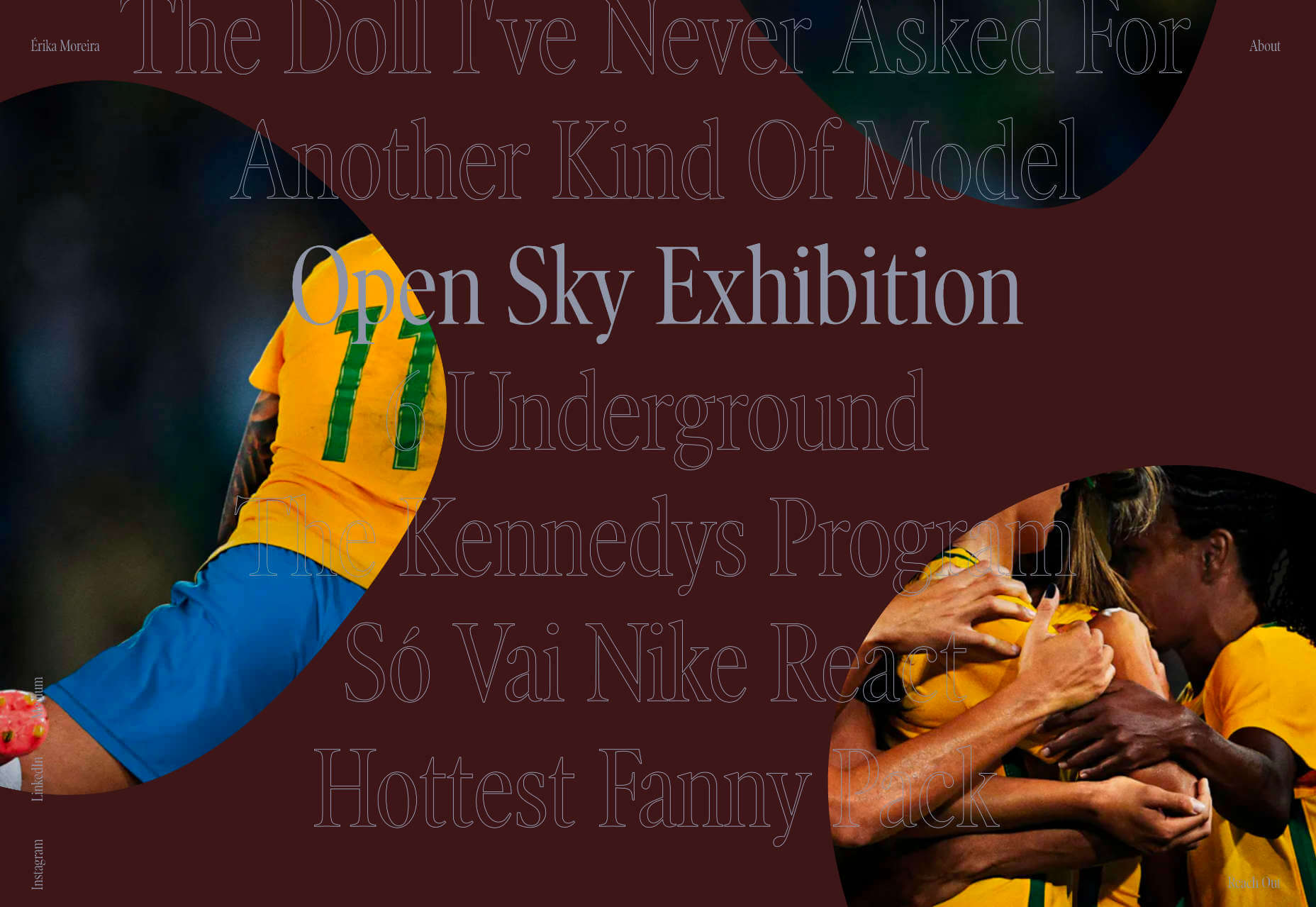
Érika Moreira
The fabulous, simple site for Sao Paulo-based Érika Moreira has some awesome big type and creative case studies. It’s an excellent example of a non-visual portfolio.
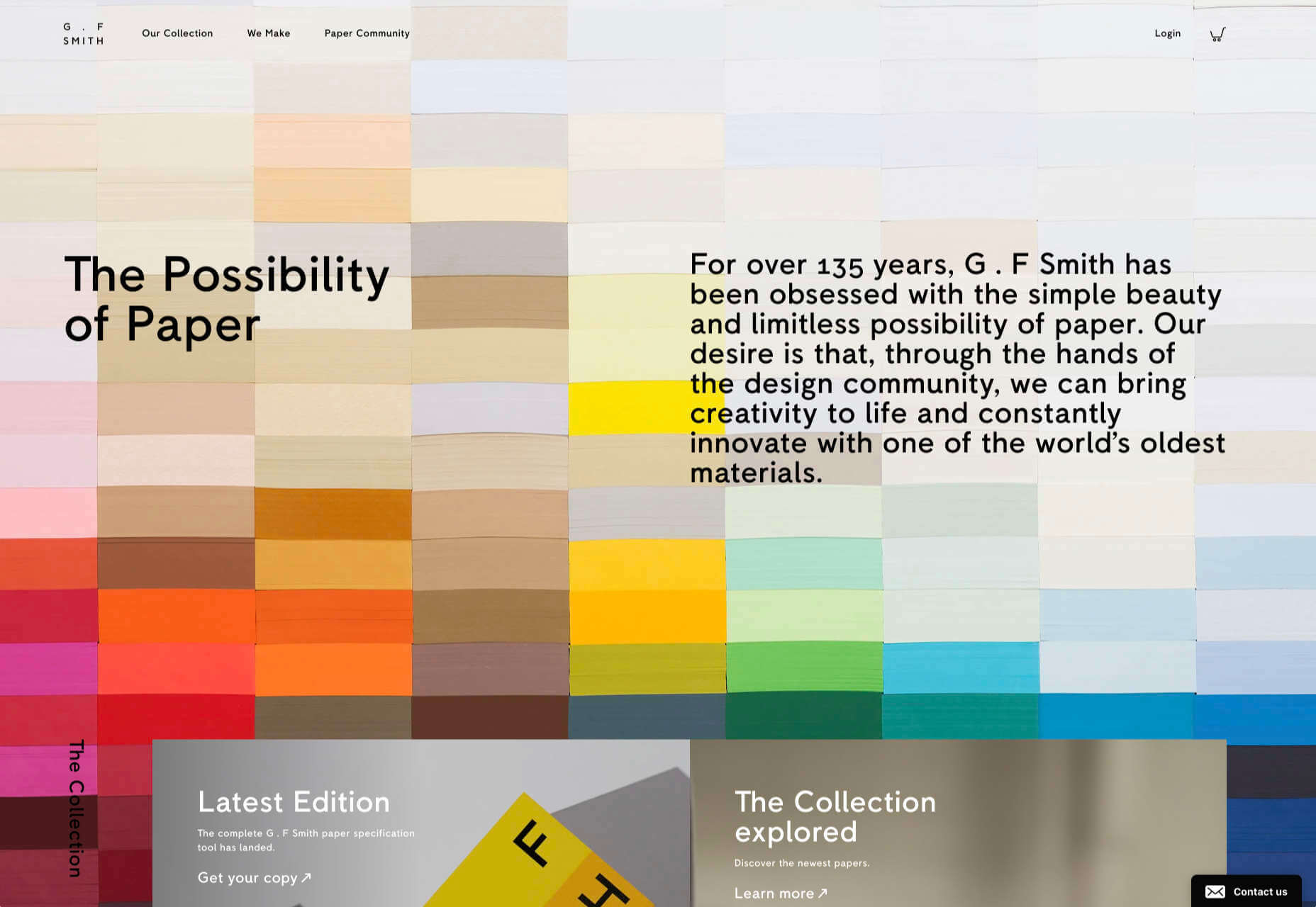
G.F Smith
Earlier this year, the site for leading paper supplier G.F Smith got a redesign. It is a simpler design than the previous site and keeps the visual focus on the products and the colors.
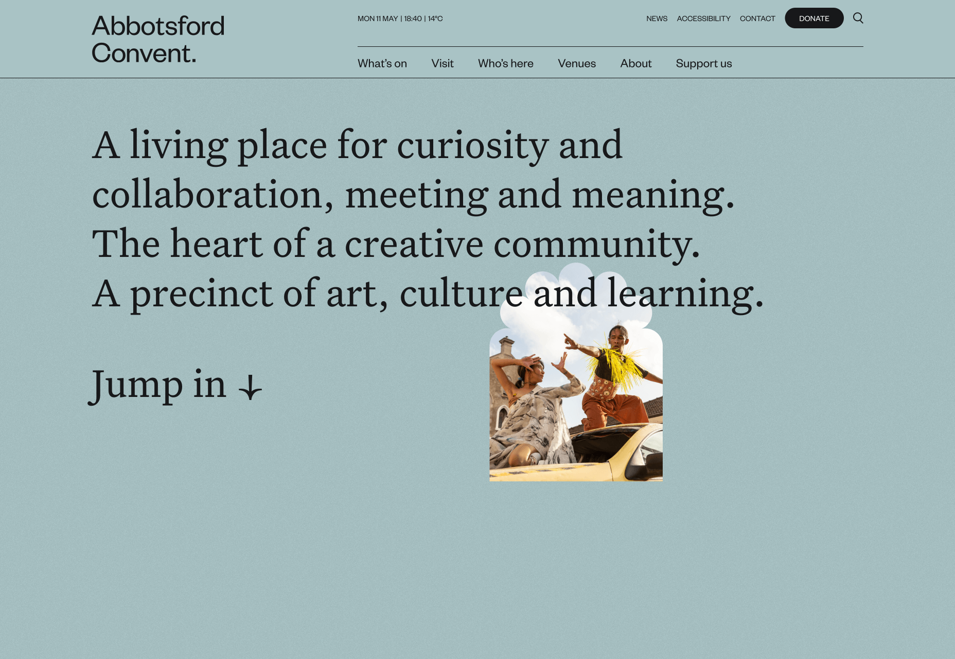
Abbotsford Convent
Abbotsford Convent is a creative arts venue in Melbourne, Australia, based in a former convent. The UI for its site blends architectural forms to acknowledge the building’s heritage.
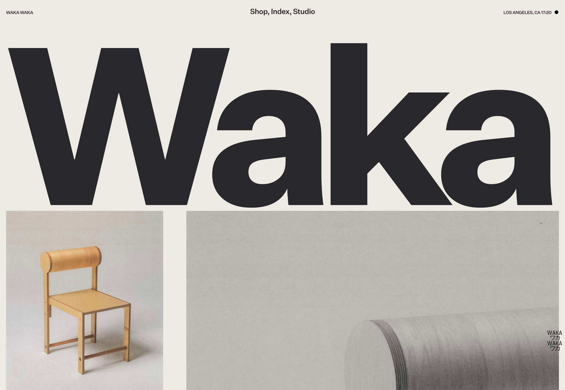
Waka Waka
Waka Waka designs and builds wooden furniture. The mid-century typography and the noise textures transport the site to the last century’s radical graphic design. There’s some clever disruption to the typical thumbnail approach.
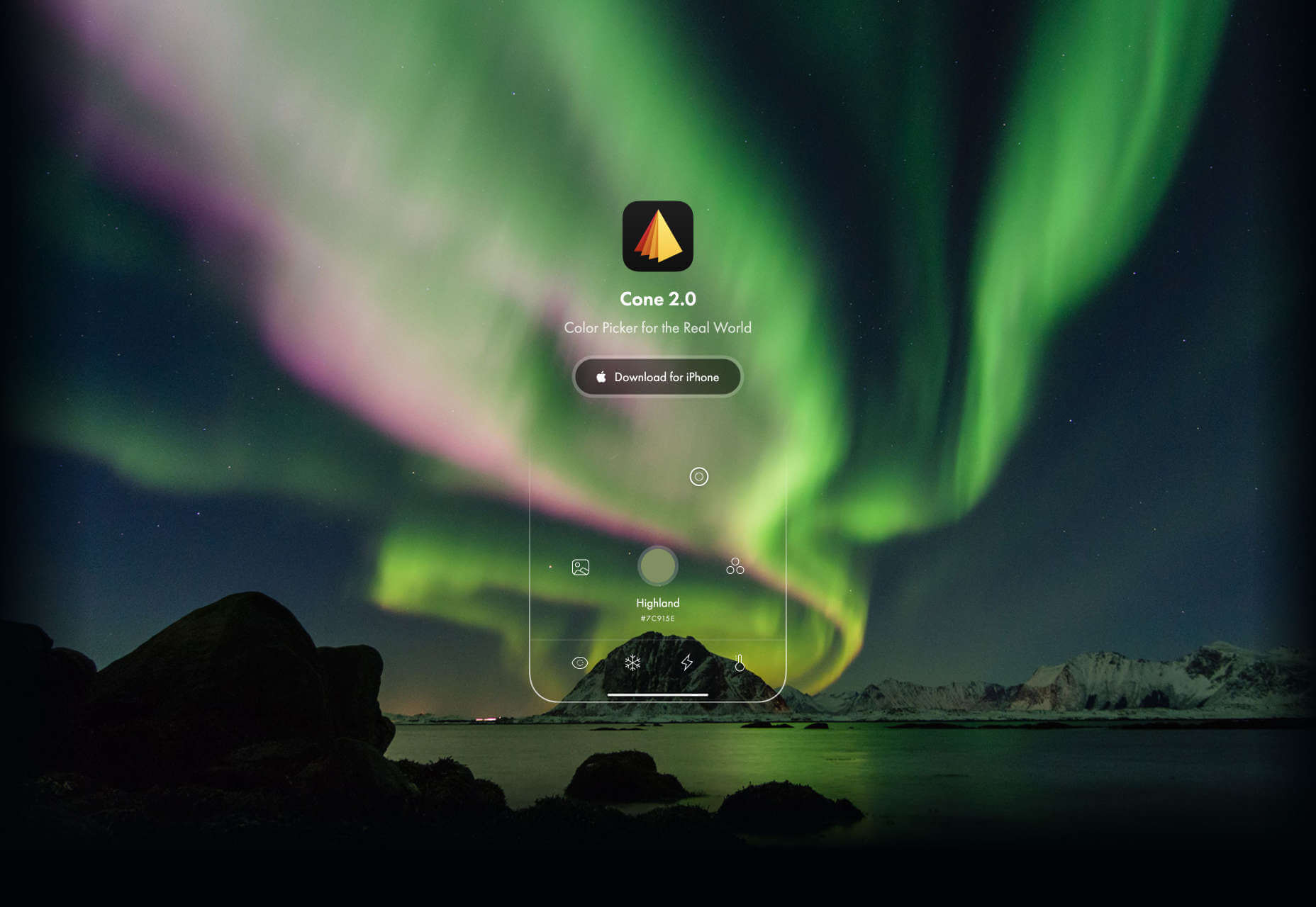
Cone
Sites advertising apps always seem to want to box the design into a hastily de-branded mock-up. Cone takes a daringly refreshing approach by depicting a more expansive mobile experience.
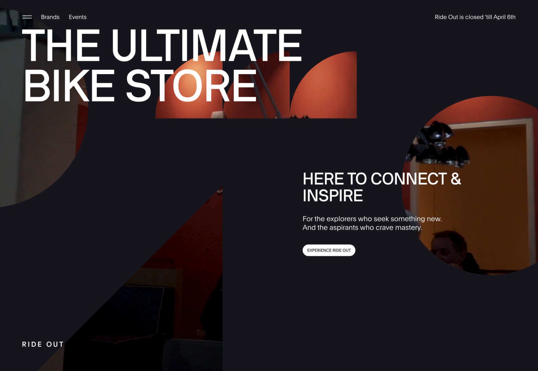
Ride Out
Amsterdam’s Ride Out bike store teases the content with an intriguingly masked video. Plus, we love the wheel-inspired spinning links.
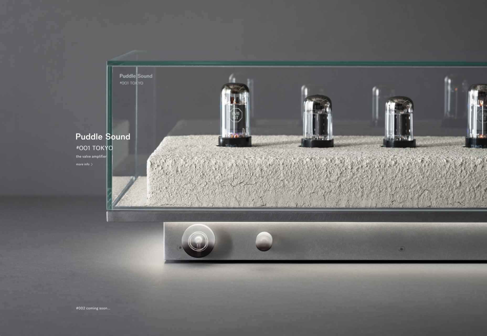
Puddle Sound
This site is a model of minimalism. Beautiful photographs and very little text, there is nothing to distract from the product on display.
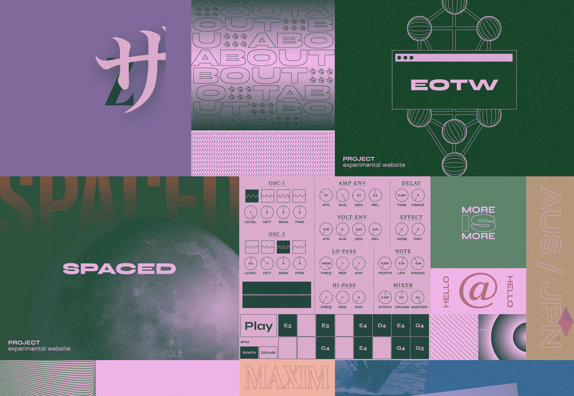
https://ankaa-pmo.com/wp-content/uploads/2022/03/old-habits-die-hard-but-getting-new-ones-is-essential-tips-on-getting-the-most-out-of-typescript.jpg313500Service comm.https://ankaa-pmo.com/wp-content/uploads/2017/04/Logo-Ankaa-engineering.pngService comm.2020-12-28 11:45:042022-04-15 10:02:0250 Best Websites of 2020
De la conception à l’utilisation, le numérique permet de suivre l’ensemble du cycle de vie d’un produit. Mais aussi de transformer la relation entre le fournisseur et ses clients, en proposant des innovations comme le Product as a Service.
Le jumeau numérique est une réplique numérique d’un objet, processus ou système. Alimenté en temps réel par des données venant de son jumeau physique, le jumeau numérique permet de disposer d’informations clés sur le dispositif ou service simulé. L’apport de techniques de Machine Learning ouvre même les portes du prédictif.
De la simulation classique au jumeau numérique
L’utilisation de la simulation numérique et de modèles 3D n’est pas nouvelle, mais cet usage était auparavant limité aux bureaux d’études.
« Le jumeau numérique existe dans l’ingénierie depuis une bonne vingtaine d’années », confirme Denis Goudstikker, en charge du Business Development du PLM et du SLM chez Siemens Digital Industries Software. « Dans l’industrie automobile, la simulation numérique a permis de raccourcir le temps de mise sur le marché d’un nouveau véhicule. Il y a trente ans, on jetait 100 véhicules contre un mur pour pouvoir assurer un certain niveau de sécurité. Il y a vingt ans, on n’en jetait plus que 5, après en avoir jeté 5000 dans un autre mur… virtuel. » Une avancée qui s’est traduite par un meilleur niveau de sécurité et une accélération du processus de conception des voitures.
Avec le jumeau numérique, les barrières sont éliminées entre l’ingénierie, la production et la maintenance. Et même au-delà, puisque cette continuité numérique peut se prolonger hors des murs de l’entreprise.
« Le constructeur nous fournit des définitions numériques de son produit », témoigne Eric Miralles, CIO de SNOP, équipementier automobile de premier plan. « À partir de cette définition, nous fabriquons les outils qui vont nous permettre d’emboutir les tôles suivant ce cahier des charges. Il faut pour cela que la chaîne allant de la conception à la production soit numérisée. La modélisation numérique de l’ensemble de la chaîne permet d’avoir une maîtrise globale des processus. »
Le jumeau numérique offre également des opportunités après la phase de fabrication.
« Si le jumeau numérique est né dans le milieu industriel, la capacité de connecter de façon massive des objets distribués aux clients, au travers de l’IoT, permet de développer de nouveaux services, mais aussi de redéfinir la relation entre client et fournisseur », analyse Luca Ammassari, Group Deputy Chief Information Officer in charge of Applications chez Engie.
Quels usages clés pour les jumeaux numériques ?
De la conception d’un produit à son utilisation, en passant par la production, le jumeau numérique permet de suivre l’ensemble du cycle de vie d’un produit. Mais également de réduire le time to market de nouvelles offres, la simulation numérique permettant d’accélérer la conception, le test et l’industrialisation des produits.
« Le jumeau numérique permet de répondre à des enjeux économiques et de recherche d’efficacité dans la production, analyse Eric Miralles. Sa mise en place nécessite toutefois une transformation numérique, mais aussi une transformation des organisations et des hommes. Il faut savoir saisir cette nouvelle opportunité par étapes et accompagner les équipes dans ce changement. »
« Le jumeau numérique est également important pour identifier et comprendre le comportement du matériel, poursuit Denis Goudstikker. Et ainsi optimiser son design et sa maintenance. Analyser le comportement acoustique d’une turbine permet par exemple de détecter tout changement dans son fonctionnement. Des modèles prédictifs vont alors déterminer si et quand elle tombera en panne. »
Les usages dans le secteur de la maintenance commencent à devenir communs, « mais il y a une chose à laquelle on s’attendait moins : le packaging d’objets et de services, explique Luca Ammassari. Le constructeur d’une turbine va proposer avec son équipement des services prédictifs basés sur l’utilisation d’un jumeau numérique. Il va s’appuyer sur les informations issues de turbines installées dans le monde entier qui seront comparées en temps réel au comportement de votre turbine, pour vous donner des probabilités de défaillance ou de perte de performance. »
Oser le passage au jumeau numérique
Construire le jumeau numérique de l’ensemble d’une ligne de production n’est pas toujours possible. Certains équipements anciens, amortis sur des dizaines d’années, ne sont en effet pas équipés de capteurs et ne peuvent parfois pas l’être.
La bonne pratique consiste à avancer par étapes, sur des projets ciblés, au fort ROI. « Il faut mener ses projets selon une approche agile, par petits pas et construire ainsi progressivement de la compétence en interne, explique Luca Ammassari. Certains projets auront des résultats décevants, mais cela ne doit pas remettre en cause la démarche. »
Difficile de savoir de quoi demain sera fait en matière d’innovation, constate Luca Ammassari, « c’est pourquoi notre objectif est d’accompagner les entreprises en leur fournissant des fondations capables d’intégrer ces innovations. Notre but n’est pas de proposer des offres clé en mains, mais une plate-forme permettant de sortir de la supply chain classique pour créer un nouvel écosystème. »
Une logique de partenaires qui est essentielle pour Eric Miralles. « C’est cet assemblage de partenaires qui nous permettra de digitaliser l’ensemble de notre supply chain », confirme-t-il. Et de conclure : « La crise que nous traversons aujourd’hui est un accélérateur et il y a beaucoup d’opportunités, très positives, qui nous permettent d’accéder à ces innovations. »
https://ankaa-pmo.com/wp-content/uploads/2017/04/Logo-Ankaa-engineering.png00Service comm.https://ankaa-pmo.com/wp-content/uploads/2017/04/Logo-Ankaa-engineering.pngService comm.2020-12-16 11:04:292020-12-16 11:04:29Le jumeau numérique, facteur d’optimisation du cycle de vie des produits
Every week users submit a lot of interesting stuff on our sister site Webdesigner News, highlighting great content from around the web that can be of interest to web designers.
The best way to keep track of all the great stories and news being posted is simply to check out the Webdesigner News site, however, in case you missed some here’s a quick and useful compilation of the most popular designer news that we curated from the past week.
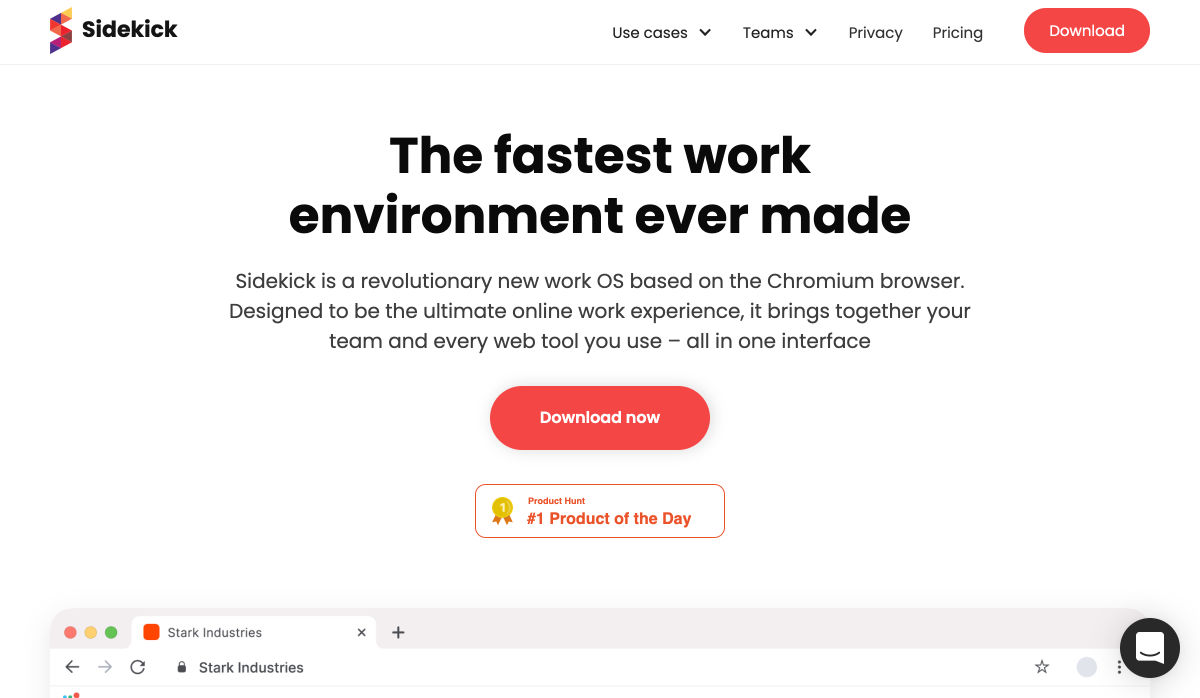
Sidekick Browser – The Fastest Browser Built for Work
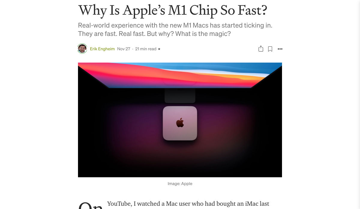
Why is Apple’s M1 Chip so Fast?
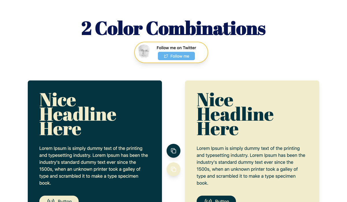
Two Color Combinations – A Curated Collection of 164 Two-color Palette Combinations
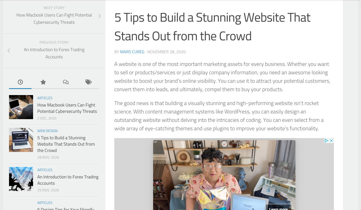
5 Tips to Build a Stunning Website that Stands Out from the Crowd
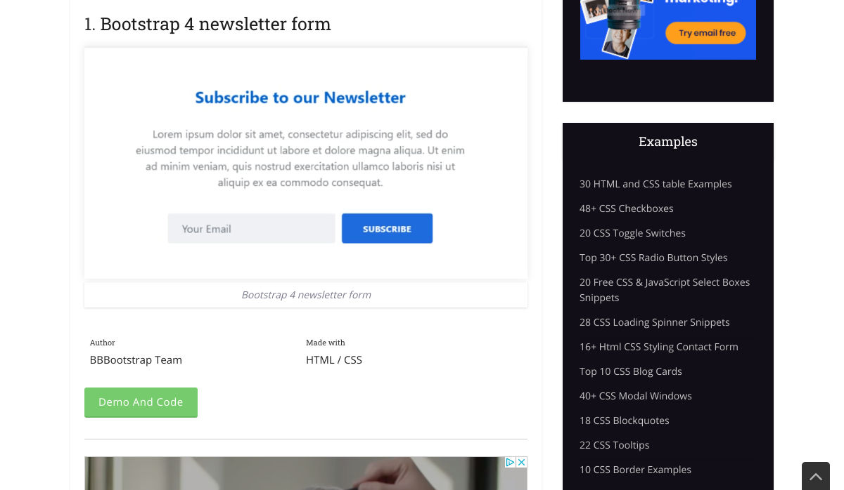
10+ Bootstrap Newsletters
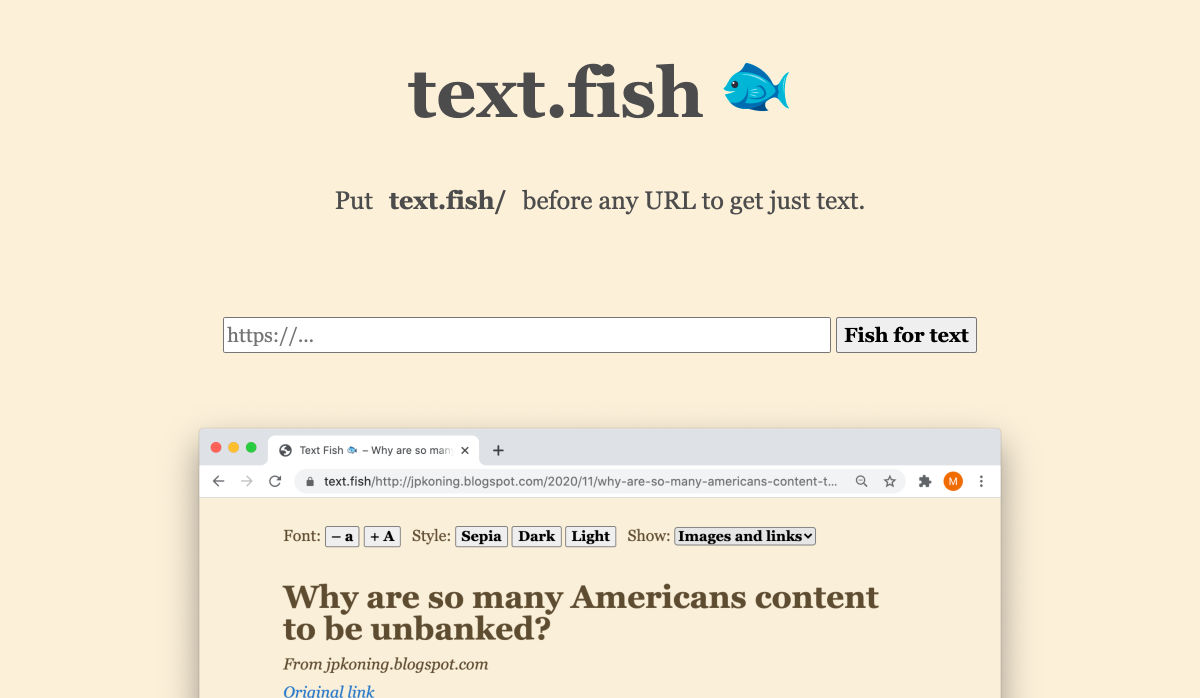
Text Fish – Get Just Text
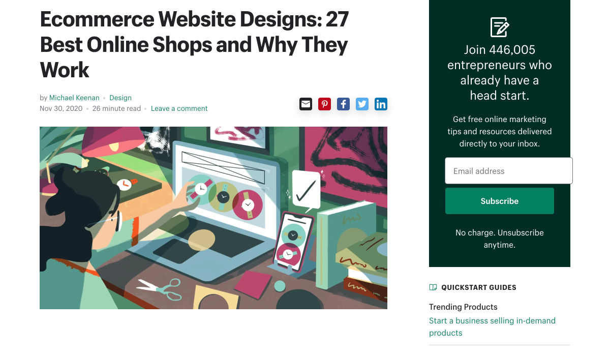
Ecommerce Website Designs: 27 Best Online Shops and Why They Work
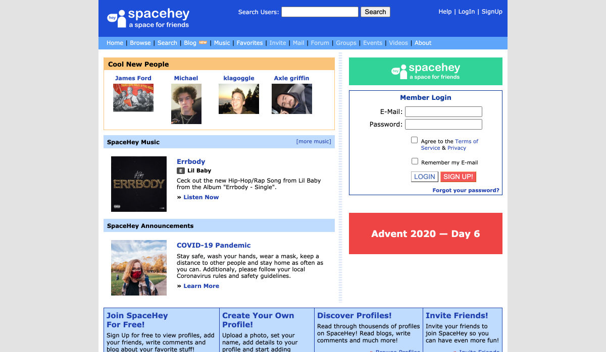
SpaceHey – MySpace Reborn
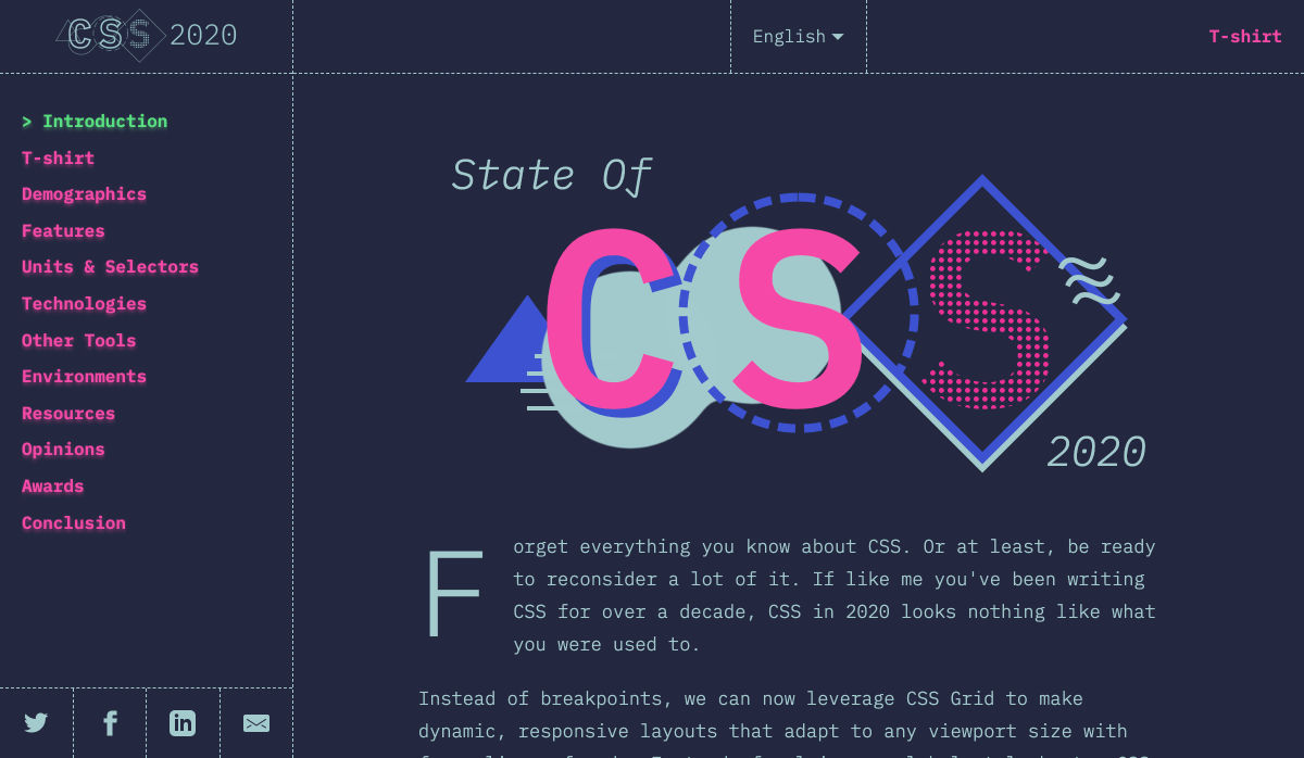
State of CSS – 2020
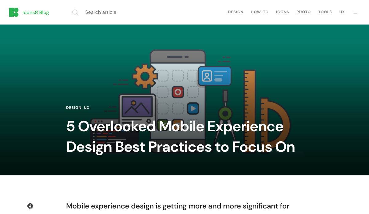
5 Overlooked Mobile Experience Design Best Practices
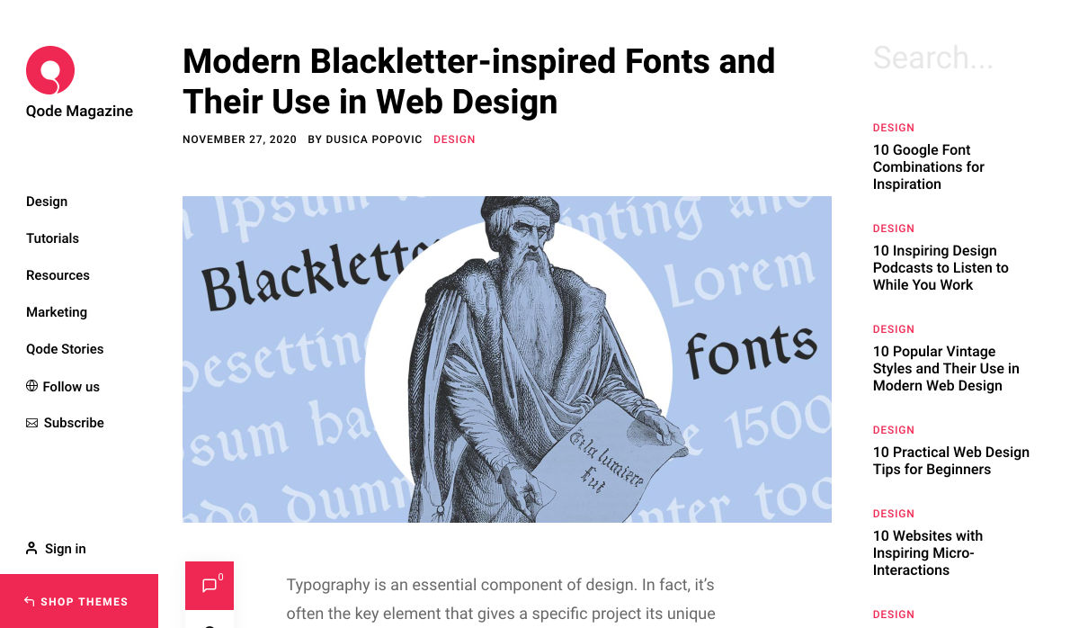
Modern Blackletter Inspired Fonts and their Use in Web Design
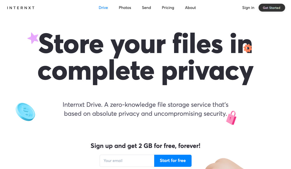
Internxt Drive – Secure & Private Cloud Storage Service
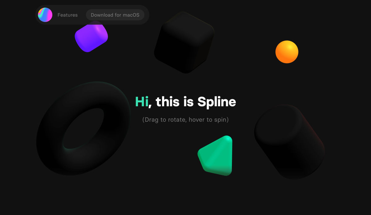
Spline – 3D for the Web (Preview Release)
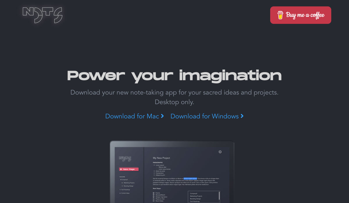
Nots – A Free Beautifully Designed Note-taking App for your Desktop
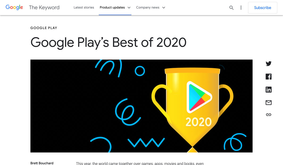
Google Play’s Best of 2020
Beacon – Run SQL Commands in Slack
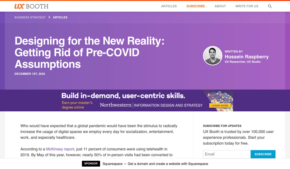
Designing for the New Reality: Getting Rid of Pre-COVID Assumptions
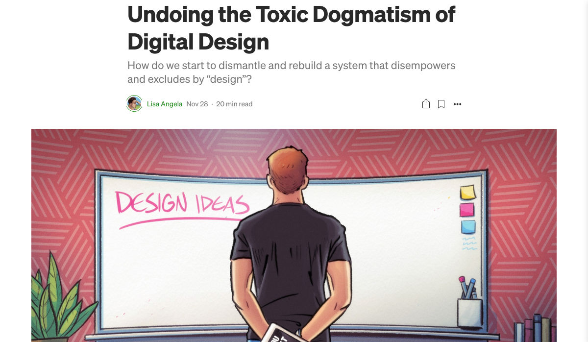
Undoing the Toxic Dogmatism of Digital Design
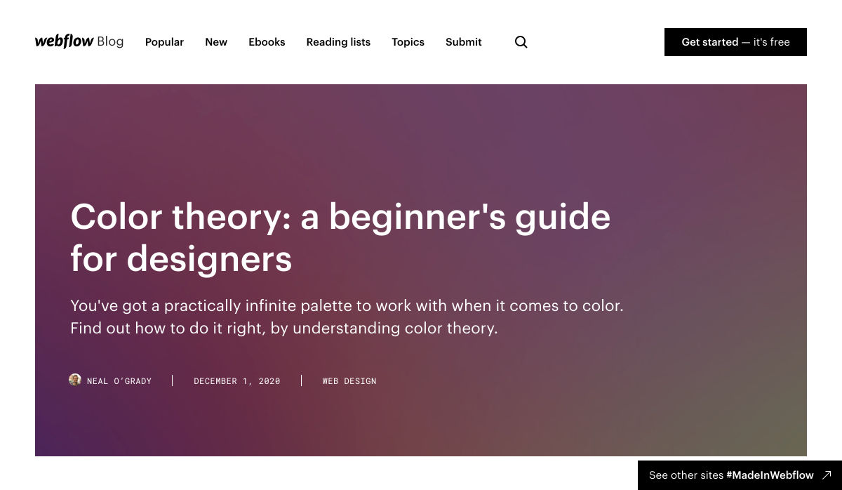
Color Theory: A Beginner’s Guide for Designers
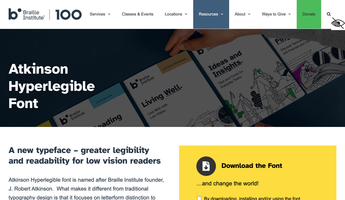
Atkinson Hyperlegible Font
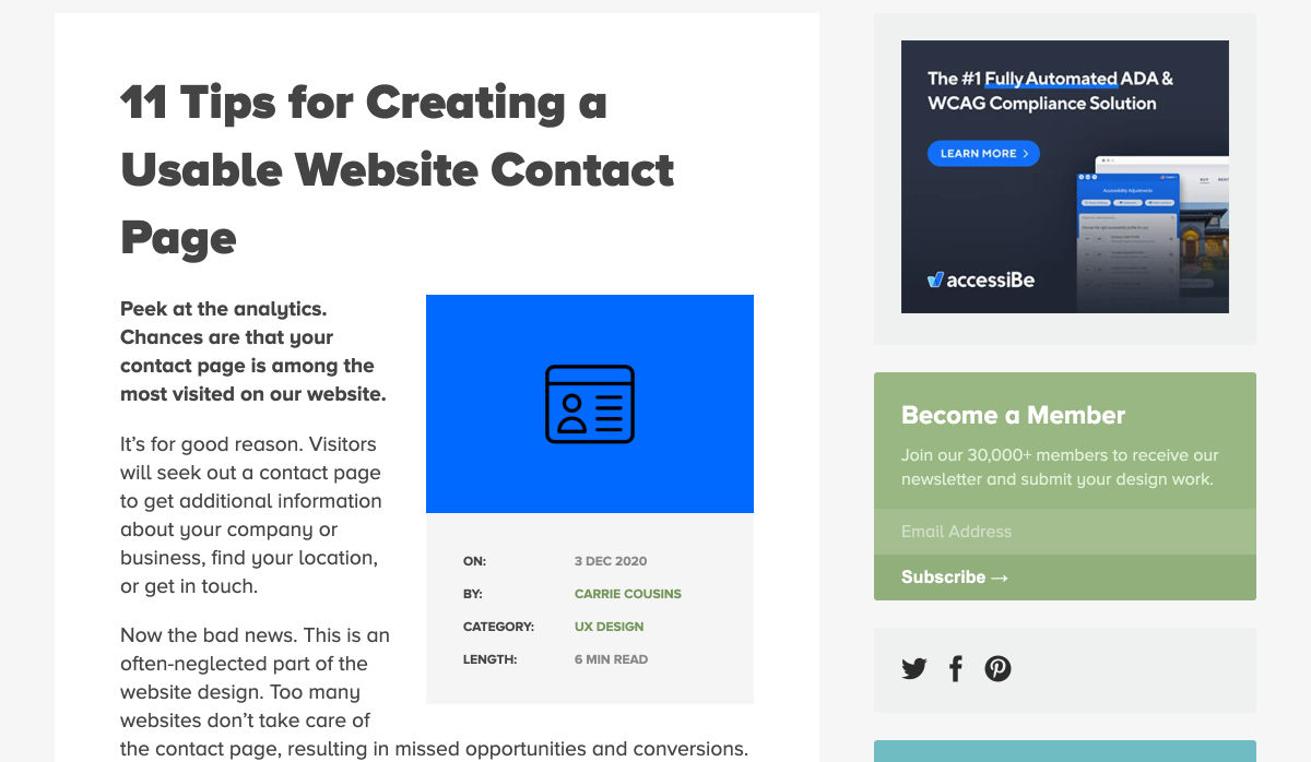
11 Tips for Creating a Usable Website Contact Page
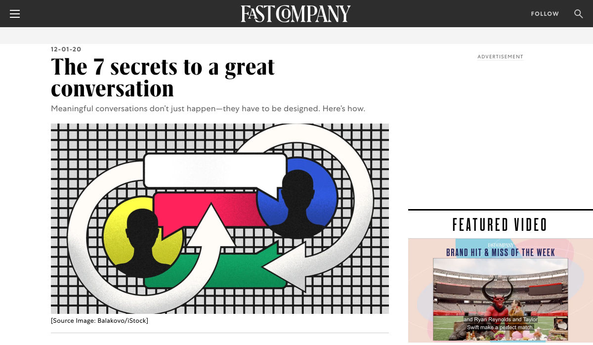
The 7 Secrets to a Great Conversation
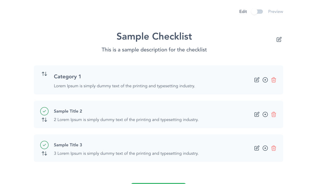
Checklist Generator – Create Checklists for Free and Host Them Wherever You Want
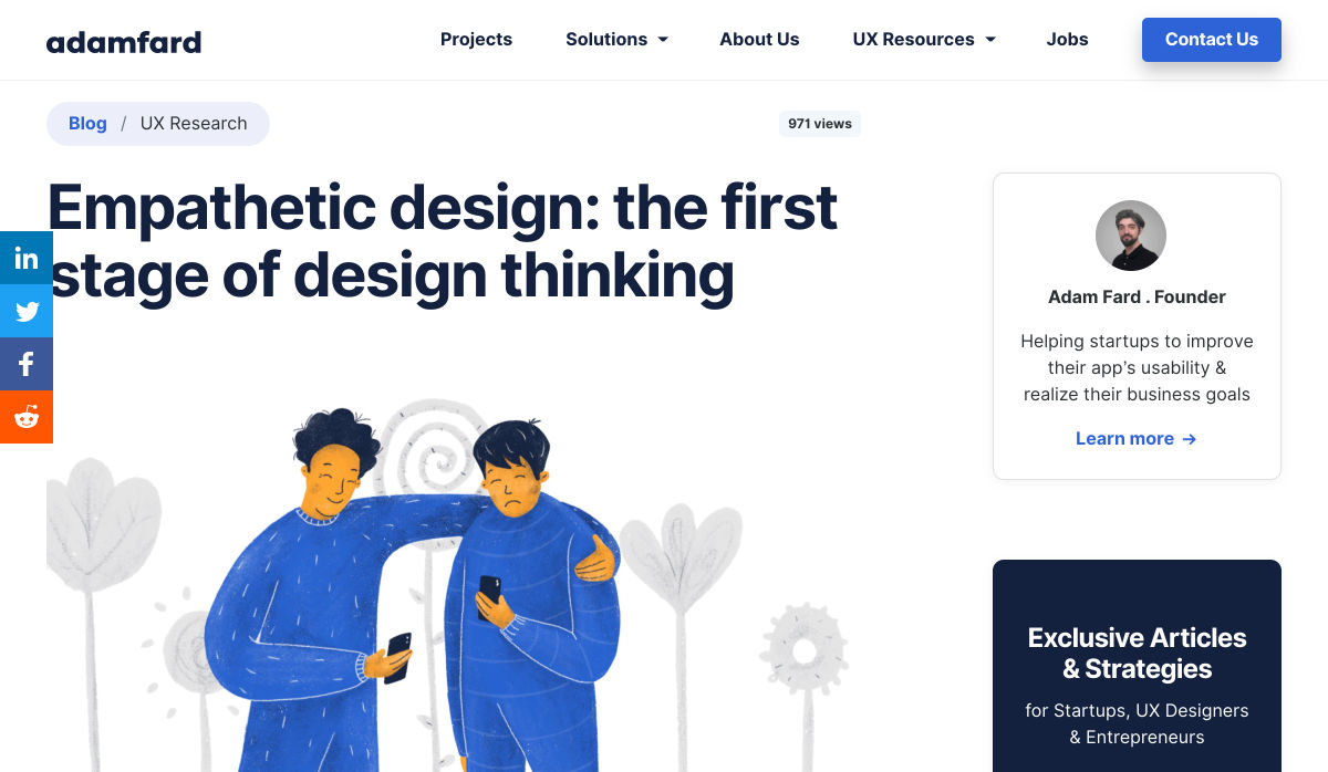
Empathetic Design: The First Stage of Design Thinking
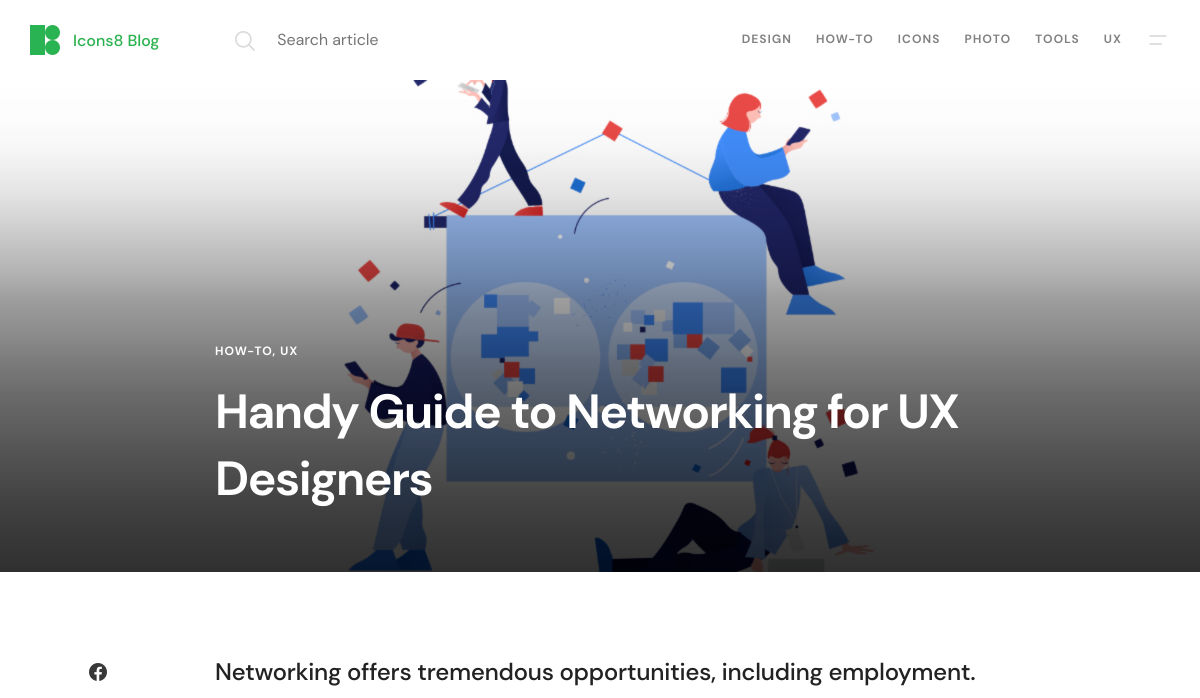
Handy Guide to Networking for UX Designers
Want more? No problem! Keep track of top design news from around the web with Webdesigner News.
https://ankaa-pmo.com/wp-content/uploads/2020/12/popular-design-news-of-the-week-november-30-2020-december-6-2020.jpg9601684Service comm.https://ankaa-pmo.com/wp-content/uploads/2017/04/Logo-Ankaa-engineering.pngService comm.2020-12-06 11:45:162020-12-06 11:45:16Popular Design News of the Week: November 30, 2020 – December 6, 2020
Les innovations technologiques permettent à l’industrie européenne de relever de nouveaux défis, dont la relocalisation de la production et la maîtrise de l’empreinte environnementale. Place à la quatrième révolution industrielle !
Les trois grandes révolutions industrielles sont toutes liées à des innovations majeures :
1re révolution industrielle, le passage de l’artisanal au mécanisé, grâce à la vapeur.
2e révolution industrielle, une production de masse standardisée, grâce à l’électricité.
3e révolution industrielle, la flexibilité des automates programmables, grâce au numérique.
L’Industrie 4.0 s’appuie non pas sur une innovation de rupture, mais sur un package d’innovations : robotique avancée, Machine to Machine, IoT, réseaux 5G, impression 3D, jumeaux numériques, Blockchain pour la traçabilité, mais aussi Machine Learning et Intelligence Artificielle.
Au cœur de cette révolution se trouve la data. Plus précisément la capacité à collecter toutes les données de l’usine, puis à les faire remonter, généralement dans le cloud, avant de les traiter, en mode big data, puis enfin de transformer ces données en décisions, le data to action.
Lancé en 2011 par un ensemble d’acteurs, dont SAP, le concept d’Industrie 4.0 offre l’agilité et la résilience nécessaires pour répondre aux exigences de l’économie d’expérience et aux aléas, devenus hélas de plus en plus fréquents. Il permet également de basculer d’un modèle de production de masse, initié avec la seconde révolution industrielle, vers une stratégie de personnalisation de masse, répondant mieux aux besoins des consommateurs actuels.
Le moment est venu pour l’Industrie 4.0
Si certaines technologies de l’Industrie 4.0 existent parfois depuis des années, une conjonction de facteurs permet aujourd’hui de les combiner et de les démocratiser. « L’Industrie 4.0 entre en production, car son ROI est fort, explique Aymeric de Pontbriand, CEO de Scortex. Les nouvelles technologies deviennent en effet suffisamment abordables pour que l’équation économique prenne du sens aux yeux des industriels. Mais le vrai challenge reste celui des compétences nécessaires au déploiement en masse de ces nouvelles technologies. »
« Aujourd’hui, nous avons de la donnée et les technologies sont matures, poursuit Erwin Guizouarn, président d’Evolution Energie. Se pose la question du passage à l’échelle. Les industriels veulent pouvoir rapidement déployer ces technologies, en masse. Il y a un vrai challenge sur la fourniture de plates-formes personnalisables, robustes et sécurisées. Les données sont là. Les infrastructures et applicatifs sont en train d’arriver. »
Le moment est venu de relocaliser la production
L’hyperpersonnalisation des produits est une chance pour l’Europe, car elle se traduit par une relocalisation des usines. Difficile en effet de faire parvenir dans un temps raisonnable un produit personnalisé à un client, s’il doit traverser la moitié de la planète dans un conteneur.
Cette nouvelle industrie ne sera toutefois pas celle d’hier, ne fabriquera pas les mêmes produits et ne fera pas travailler les mêmes types de profils. Elle est plus technique, mais aussi plus affûtée et mieux optimisée. Elle se veut également plus vertueuse d’un point de vue écologique.
« La relocalisation de la production est une opportunité fantastique pour l’Europe, confirme Aymeric de Pontbriand. Cela se traduira par de l’emploi, souvent dans des régions désertées. Tout en repartant sur de nouvelles bases, avec une production moderne et soucieuse de son impact environnemental. » Erwin Guizouarn confirme cette tendance verte : « Les grands industriels français se sont engagés à devenir neutres en carbone d’ici 5 à 10 ans. Il y a un vrai mouvement en France pour aller vers des énergies propres et une production décarbonée. Industrie 4.0 et transition énergétique sont non seulement conciliables, mais souhaitables. »
Scortex et Evolution Energie montrent la voie
Les industriels veulent pouvoir disposer de solutions de type Industrie 4.0 clés en main, au ROI immédiat. Evolution Energie se concentre sur l’exploitation des données liées à l’énergie et son utilisation, avec comme objectif une maîtrise de ces coûts, qui peuvent représenter jusqu’à 80 % des dépenses de certains industriels. Scortex numérise pour sa part le contrôle qualité au travers de techniques d’Intelligence Artificielle. Le contrôle qualité manuel par inspection visuelle est en effet une tâche ingrate, qui peut représenter de 20 % à 30 % des dépenses d’un industriel.
Grâce à ce type de solutions ciblées, les industries peuvent basculer par étapes vers le 4.0. Mais certains enjeux restent plus globaux. « Le traitement massif de la donnée permet de passer par exemple à du vrai temps réel, ou de mettre en place une gestion globale de la production au niveau d’un groupe entier », illustre Erwin Guizouarn.
« Lors du passage à l’Industrie 4.0, il faut toutefois faire attention à ne pas laisser des sous-traitants sur le bord de la route, prévient Aymeric de Pontbriand. L’Industrie 4.0 va s’accompagner d’un véritable enjeu d’homogénéisation de la Supply Chain. »
Paramètres des cookies et politique de confidentialité
Comment nous utilisons les cookies
Nous utilisons les cookies pour nous faire savoir quand vous visitez nos sites Web, comment vous interagissez avec nous, pour enrichir votre expérience utilisateur et pour personnaliser votre relation avec notre site Web.
Cliquez sur les différents titres de catégories pour en savoir plus. Vous pouvez également modifier certaines de vos préférences. Notez que le blocage de certains types de cookies peut avoir un impact sur votre expérience sur nos sites Web et les services que nous sommes en mesure d'offrir.
Cookies essentiels sur ce site
These cookies are strictly necessary to provide you with services available through our website and to use some of its features.
Because these cookies are strictly necessary to deliver the website, you cannot refuse them without impacting how our site functions. You can block or delete them by changing your browser settings and force blocking all cookies on this website.
Cookies Google Analytics
Ces cookies recueillent des renseignements qui sont utilisés sous forme agrégée pour nous aider à comprendre comment notre site Web est utilisé ou l'efficacité de nos campagnes de marketing, ou pour nous aider à personnaliser notre site Web et notre application pour vous afin d'améliorer votre expérience.
Si vous ne voulez pas que nous suivions votre visite sur notre site, vous pouvez désactiver le suivi dans votre navigateur ici :
Autres services
Nous utilisons également différents services externes comme Google Webfonts, Google Maps et les fournisseurs externes de vidéo. Comme ces fournisseurs peuvent collecter des données personnelles comme votre adresse IP, nous vous permettons de les bloquer ici. Veuillez noter que cela pourrait réduire considérablement la fonctionnalité et l'apparence de notre site. Les changements prendront effet une fois que vous aurez rechargé la page.
.
Paramètres de Google Webfont Settings :
Google Map :
Vimeo et Youtube :
Politique de confidentialité
Vous pouvez lire nos cookies et nos paramètres de confidentialité en détail sur la page suivante
 Every day design fans submit incredible industry stories to our sister-site, Webdesigner News. Our colleagues sift through it, selecting the very best stories from the design, UX, tech, and development worlds and posting them live on the site.


 Everyday design fans submit incredible industry stories to our sister-site,
 There are some interesting shake-ups on the horizon for ecommerce: Experiential shopping, Virt-ical worlds, Au naturale models.
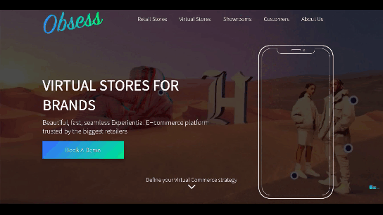

 The start of the year is always a good time to reassess priorities and consider new approaches, but 2021 is more of a reset than we expected this time last year. 2020 is unlikely to go down in anyone’s autobiography as the best year of their life, but it has done something positive: it’s prepared the ground for rapid change in the next 12 months.
 Don’t drop the ball on these website design trends for the new year. All of the trends featured here this month are visual in nature – not as many user interface elements as previous months, but all just as stunning and usable.
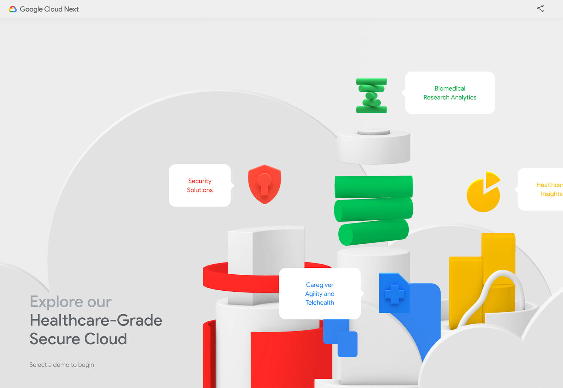


 Every week users submit a lot of interesting stuff on our sister site Webdesigner News, highlighting great content from around the web that can be of interest to web designers.