Articles

Inclusive design is often mistaken for accessibility, or even used as an interchangeable term, which is a good indication that most designers don’t know what it means.

Accessibility is a process that seeks to mitigate issues in a design that is not sufficiently universal; inclusive design increases the universality of the design. In real-world terms, an accessible building may replace its front steps with a ramp; an inclusive building is constructed at the same level as the sidewalk.

Accessibility is concerned with objective, measurable improvements. It’s a UI concern. Inclusive design is subjective, more difficult to measure, and is a UX concern. By designing inclusively, we extend our designs to the widest possible user group and contribute to a better society. Here are three ways to get started.

1. You’re the Edge Case

When designing, it’s normal to assume that we are normal. After all, we are the center of our experience of the world. Everything from our preferences to our empathy stems from our individual place in time and space.

When we use the term “edge case,” what we’re referring to is a minority experience, a way of using our design that is uncommon or distinct from our own expectations.

But what would happen if we treat ourselves as the edge case? What if all of the experiences that we deem to be minority experiences are actually the core, common user experience of our design?

If we start from the position that we are the one out-of-step with the design, that most people will not think or act as we do, then we’re eliminating thousands of biased decisions about how our design should be.

Draw From Life

It has always surprised me that in Europe’s dark ages — ranging from the decline of the Roman empire to the Proto-Renaissance — it didn’t occur to anyone to draw from life. Artists drew things the way they thought they should look, which is why so many Byzantine icons of the infant Jesus look like a middle-aged blonde man that has been shrunk.

It’s important to draw from real life as much as possible. That means abandoning personas — which are by definition under-representative and frequently loaded with bias — and engaging with actual users. Most of all, it means taking a step back and opening your eyes.

2. Stop Making Inclusive Design Part of Your Practice

Inclusive design cannot be a part of your practice; it’s an all-encompassing attitude. Your design practice must be inclusive. At least, it should aspire to be…

As human beings, we are biased—all of us. The reason for that is that bias — be it racism, misogyny, nationalism, homophobia, or anything else — is cultural. And we all exist within society. We’re all bombarded with information that reinforces those biases every day.

Accept that you have biases and that your biases will pull your design work away from the inclusive solution you aspire to. But equally, accept that by acknowledging your biases you’re limiting the influence they have over your decision-making.

Do Not Require Users to Self-Identify

It’s divisive and abusive to partition users into groups, especially when the act of doing so perpetuates bias.

One of the most encouraging developments of the last decade has been the introduction of the answer “prefer not to say” in response to personal questions about race, gender, status, and so forth. But if “prefer not to say” is a valid option, in other words if you don’t actually need to know, then why ask at all?

Beware Occam’s Razor

Occam’s Razor is an often misquoted idea that (to paraphrase) states that when making a decision, the one with the least assumptions is the correct choice.

The problem is that Occam’s Razor implies that there is a ‘correct’ decision. But in fact, inclusive design benefits most from a flexible UI and a high tolerance for deviation.

If you can identify the assumptions in a design decision sufficiently to count them, then you’re best served by testing, not comparing, those assumptions.

3. Design Flexibility Into Everything

There is no such thing as a “natural normal,” but there is “perceived normal.” Much of our behavior is governed by the experiences we’ve had since we were very young. Despite existing somewhere on a scale of ability and preference, most of us have inched towards what we have been told is a “normal” range all our lives.

However, it is a physiological fact that every characteristic exists somewhere on a spectrum. There are no black and whites; it’s all grey.

When we design a site or app, we tend to silo certain characteristics into one. Someone who is visually impaired is treated to the same ‘solution’ as someone who is blind, even though visual impairment can range from screen reflections on a sunny day to someone who was born without optic nerves.

There are people who have lost their sight through degeneration or accident and will be able to make visual connections based on remembered visuals. Other people have never seen anything and their conscious mental process isn’t figurative at all.

To accommodate the full gamut of possible interactions with our design, we need to design to a scale, not with absolute values. This means thinking less about set colors and sizes and more in terms of contrast and scale.

Avoid Communicating in Color

Few areas are more indicative of a spectrum of experiences than color.

Color is instantly problematic for designers because quite apart from color blindness, color has deeply personal associations.

Over the last couple of decades, it’s been repeatedly proven that it is contrast, not hue, that increases engagement. Green does not always mean go; red does not always mean stop.

Color involves so many biases and assumptions that it’s simply better to work with contrast than select the ‘right’ hue.

Bigger Typography (Sometimes)

In the first draft of this article, I wrote that increasing the scale of your typography was always good.

My rationale was that some users will benefit from larger type, and zero users will be hindered by it. But that’s not true. Larger type means fewer lines per viewport, which means more scrolling; not a problem for some users, but potentially an issue for those with motor control issues.

That was one of my biases right there.

Congratulations, You’re Now An Inclusive Designer

Good design is self-aware in origin and unselfconscious in execution.

Inclusive design isn’t about enabling access for everyone; it’s about designing for a user experience that is welcoming and respectful. Every one of your users should feel not just enabled but validated.

Inclusive design isn’t a series of items on a checklist; it’s an ideal, like harmony or beauty, that we may struggle to achieve but that we should strive for nonetheless.
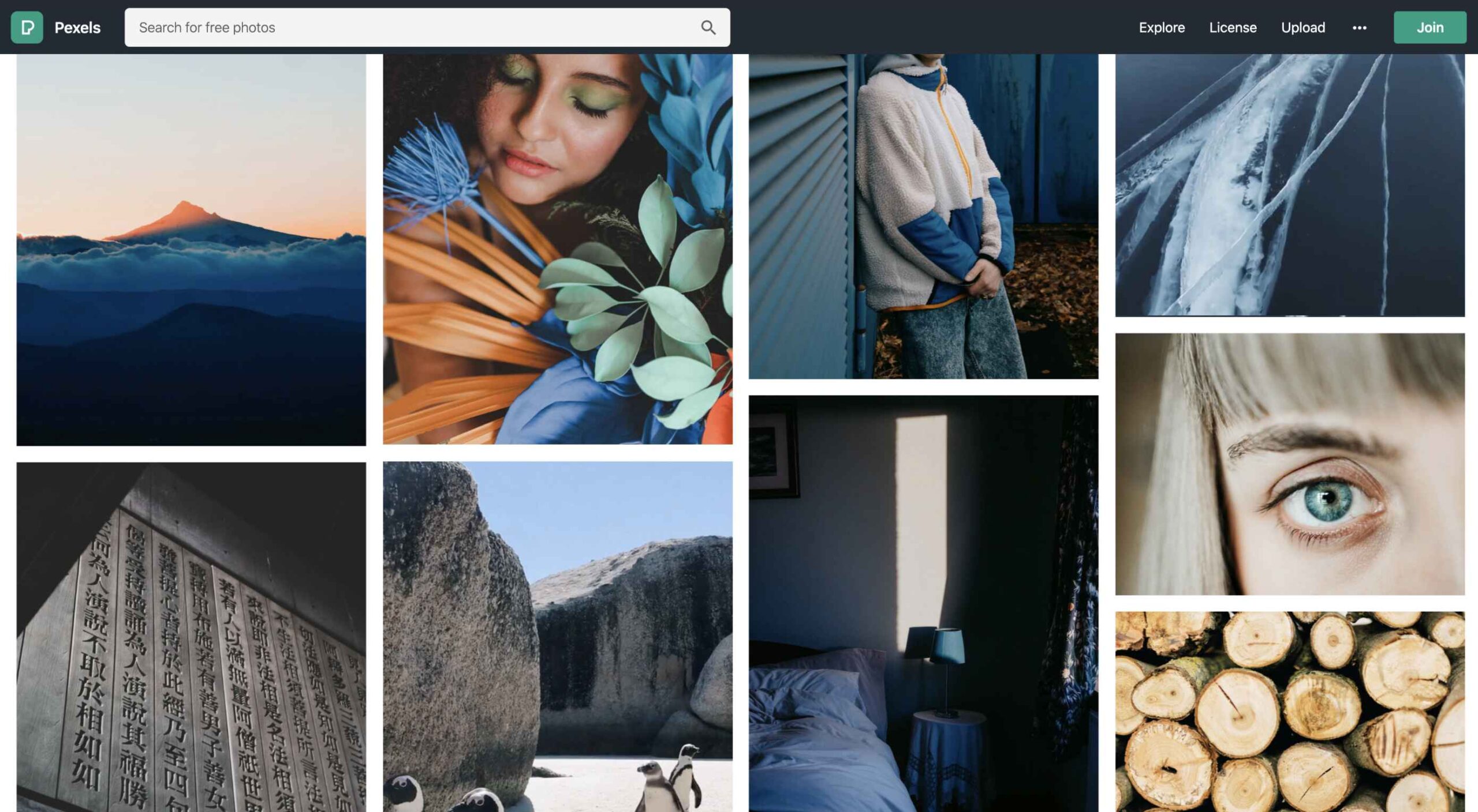
 

Image via Pexels.

Source

The post 3 Ways to Design More Inclusively first appeared on Webdesigner Depot.
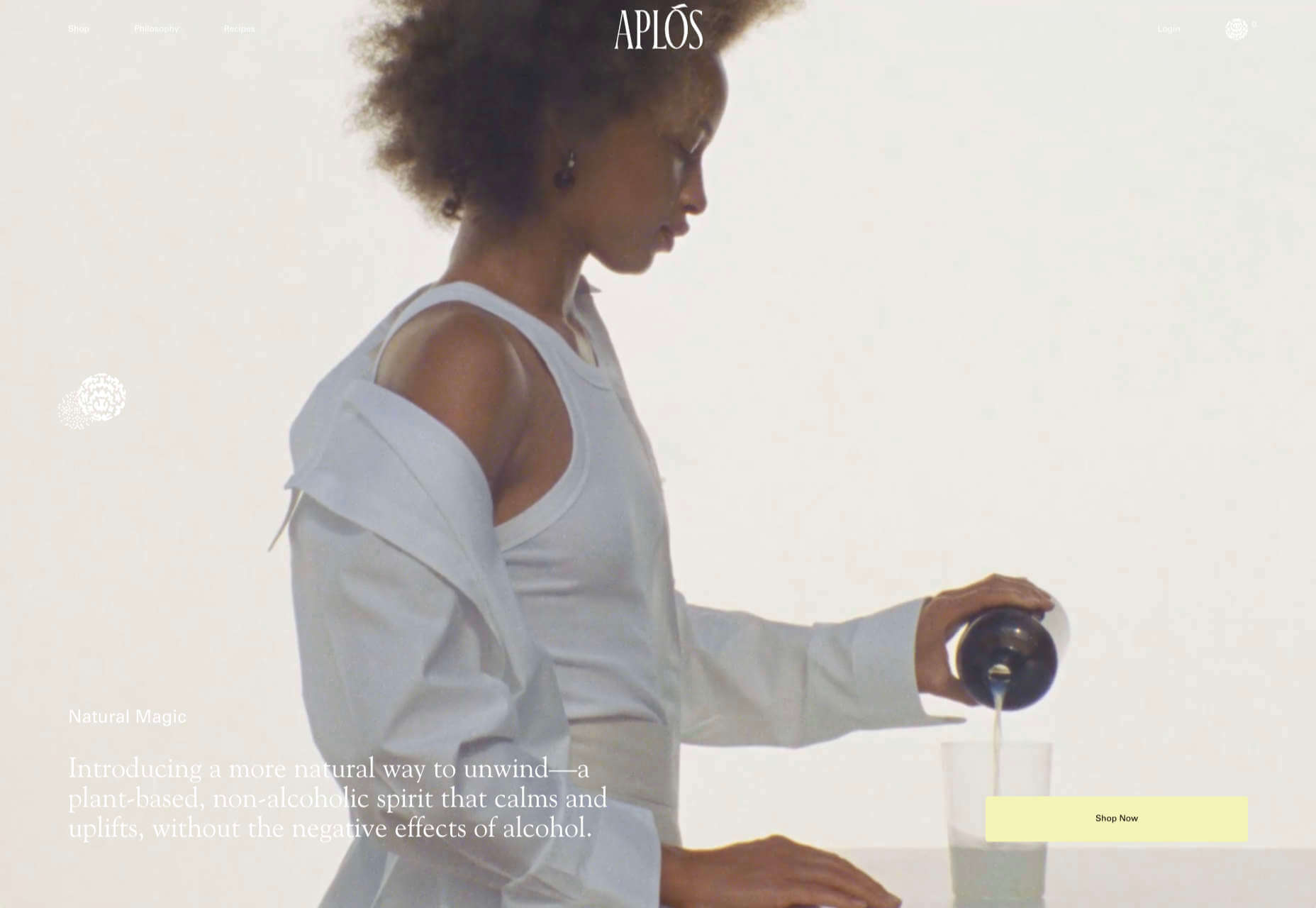
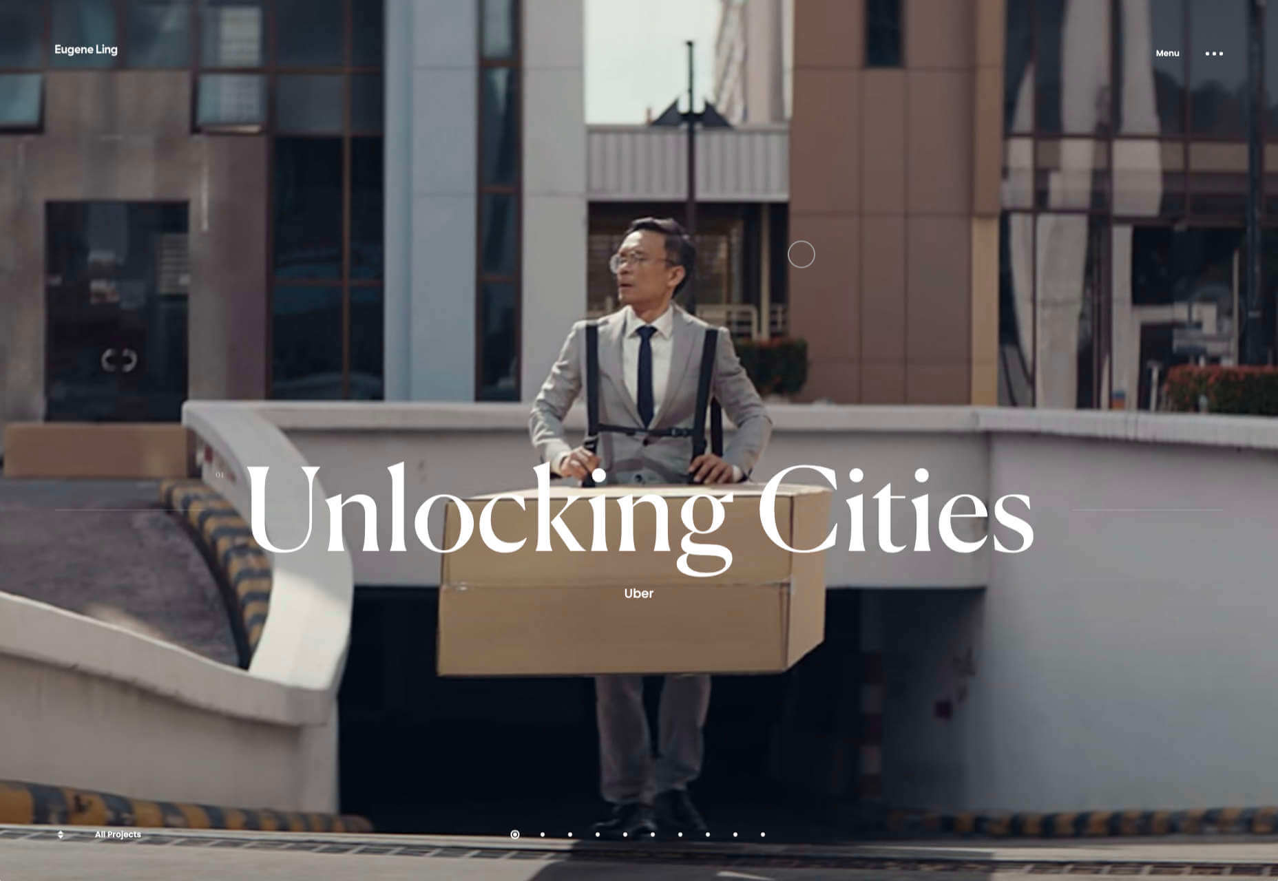
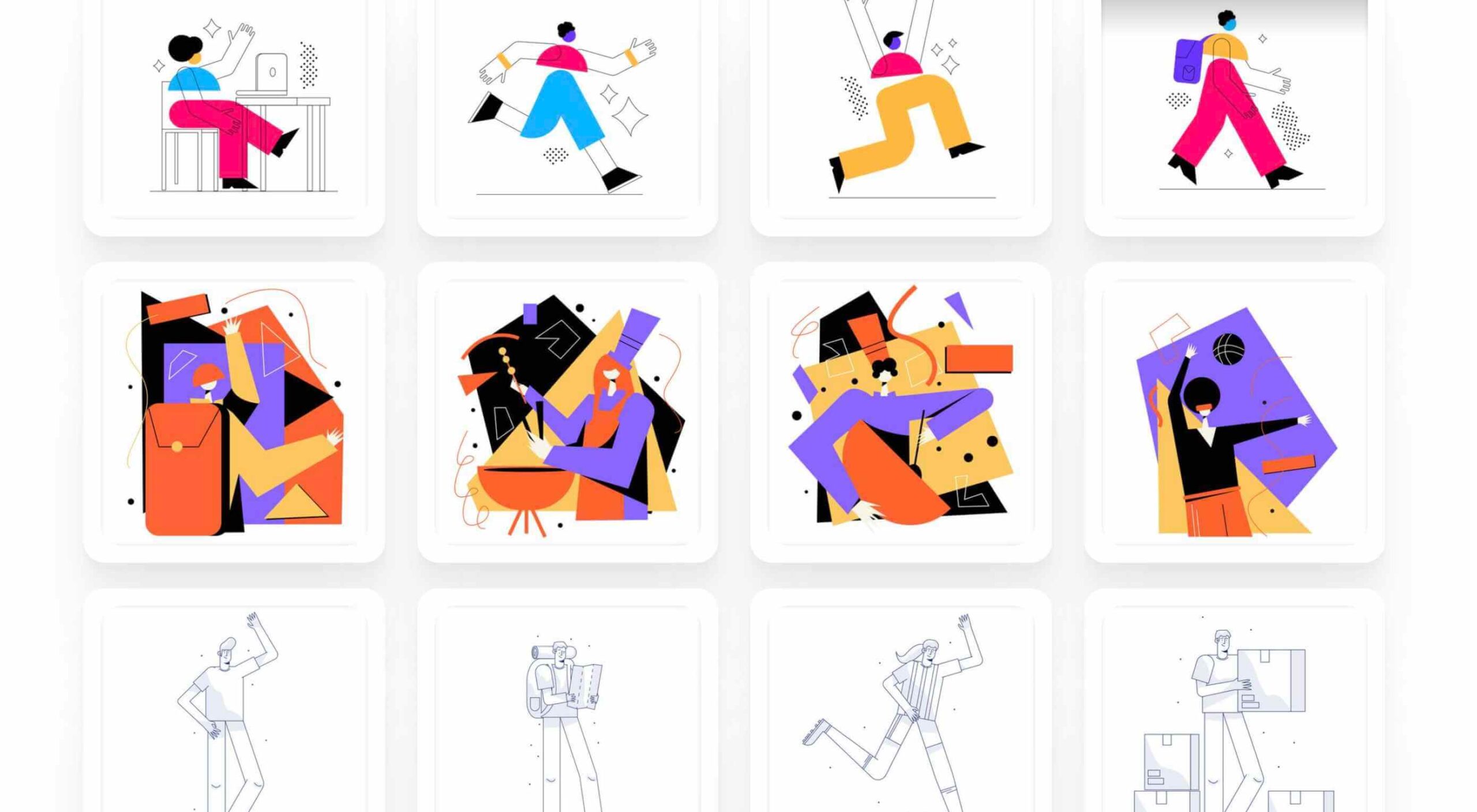
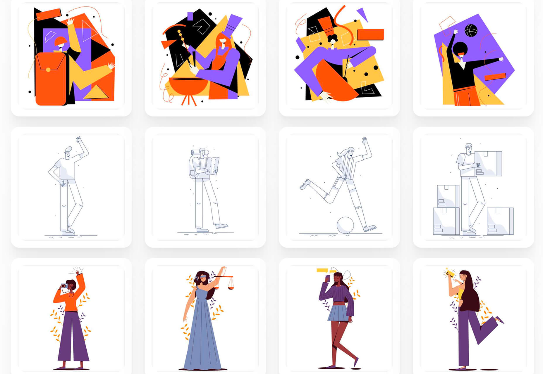
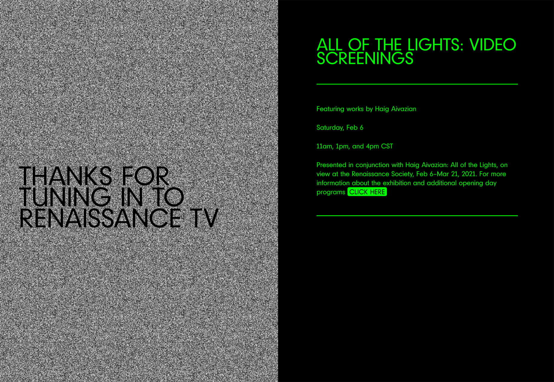

Source de l’article sur Webdesignerdepot

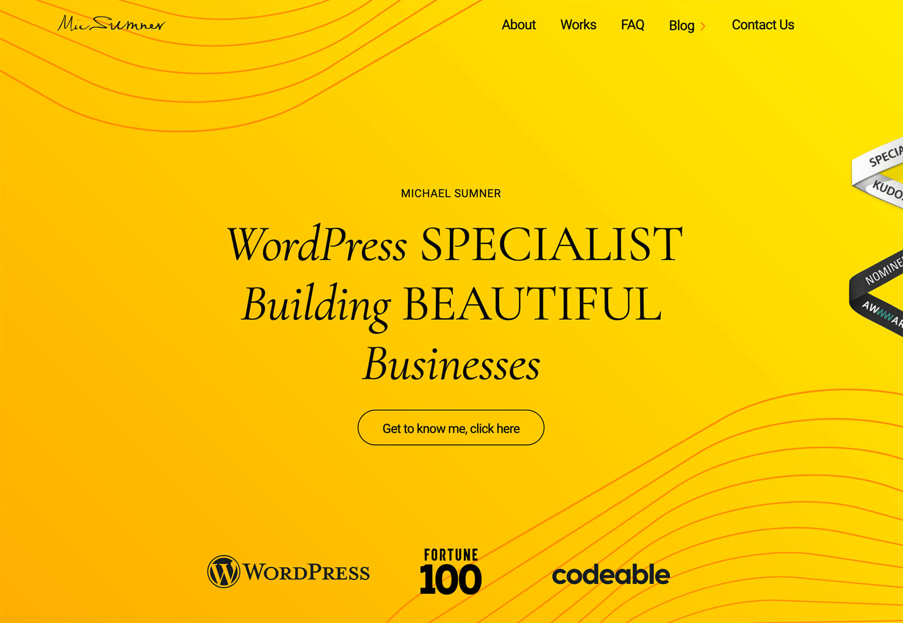
Rather than spring cleaning, do some spring “shopping” for tools that will make your design life easier. Packed with free options this month, this list is crammed full of tools and elements that you can use in your work every day.
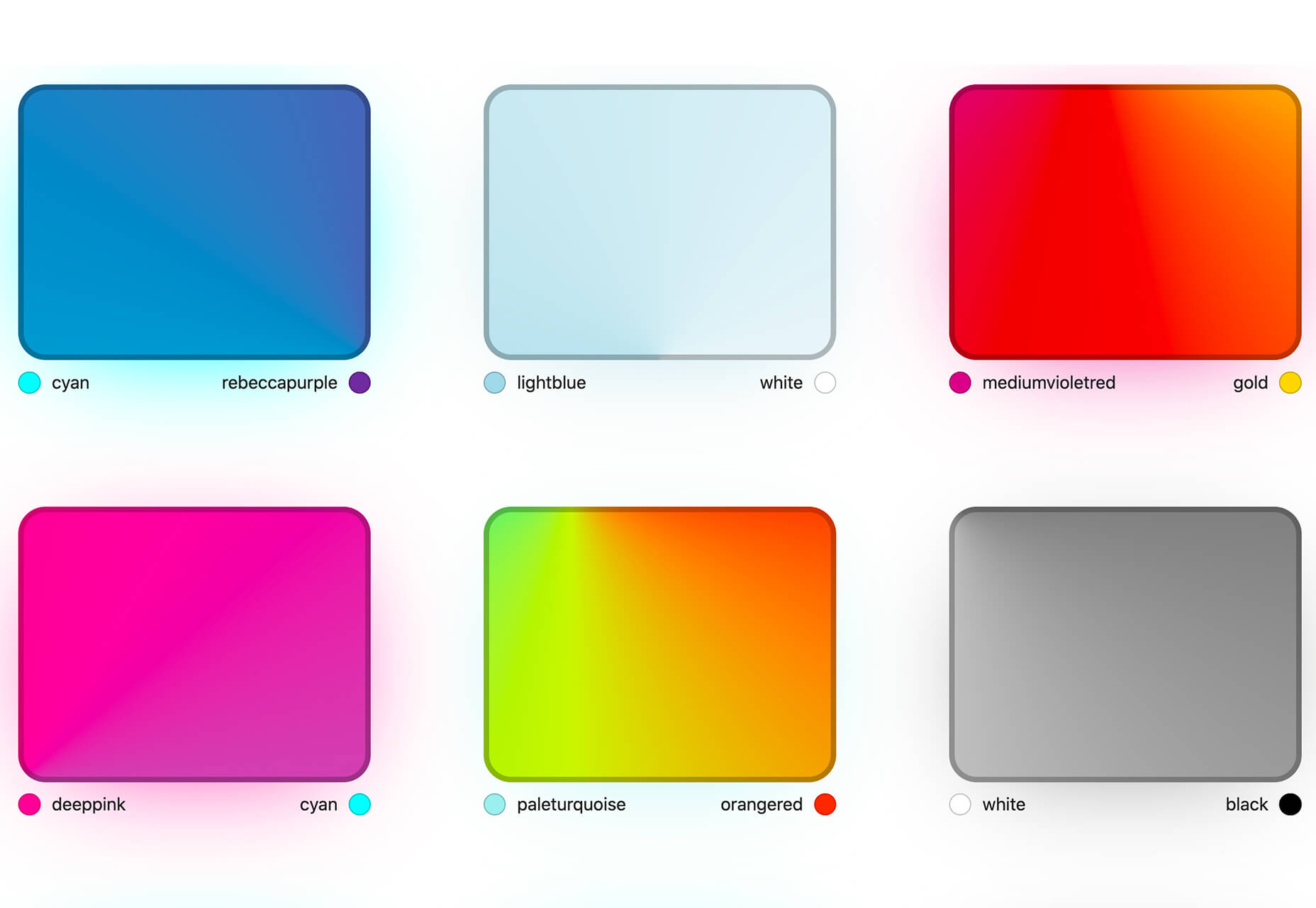
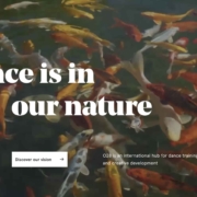
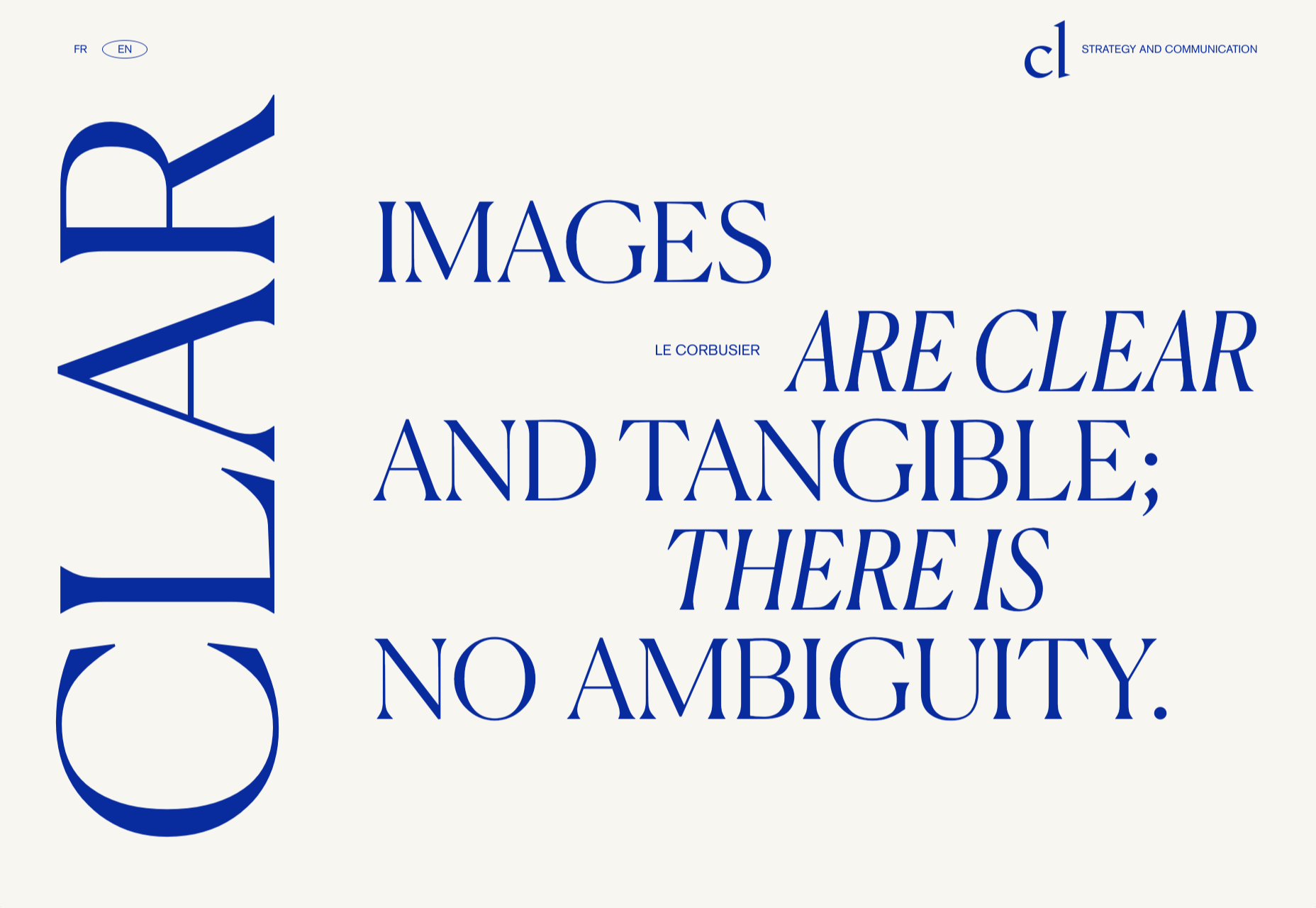
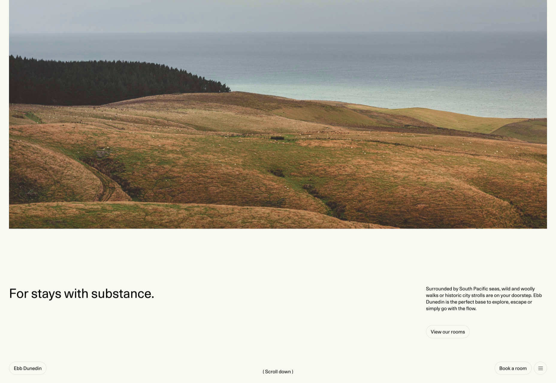
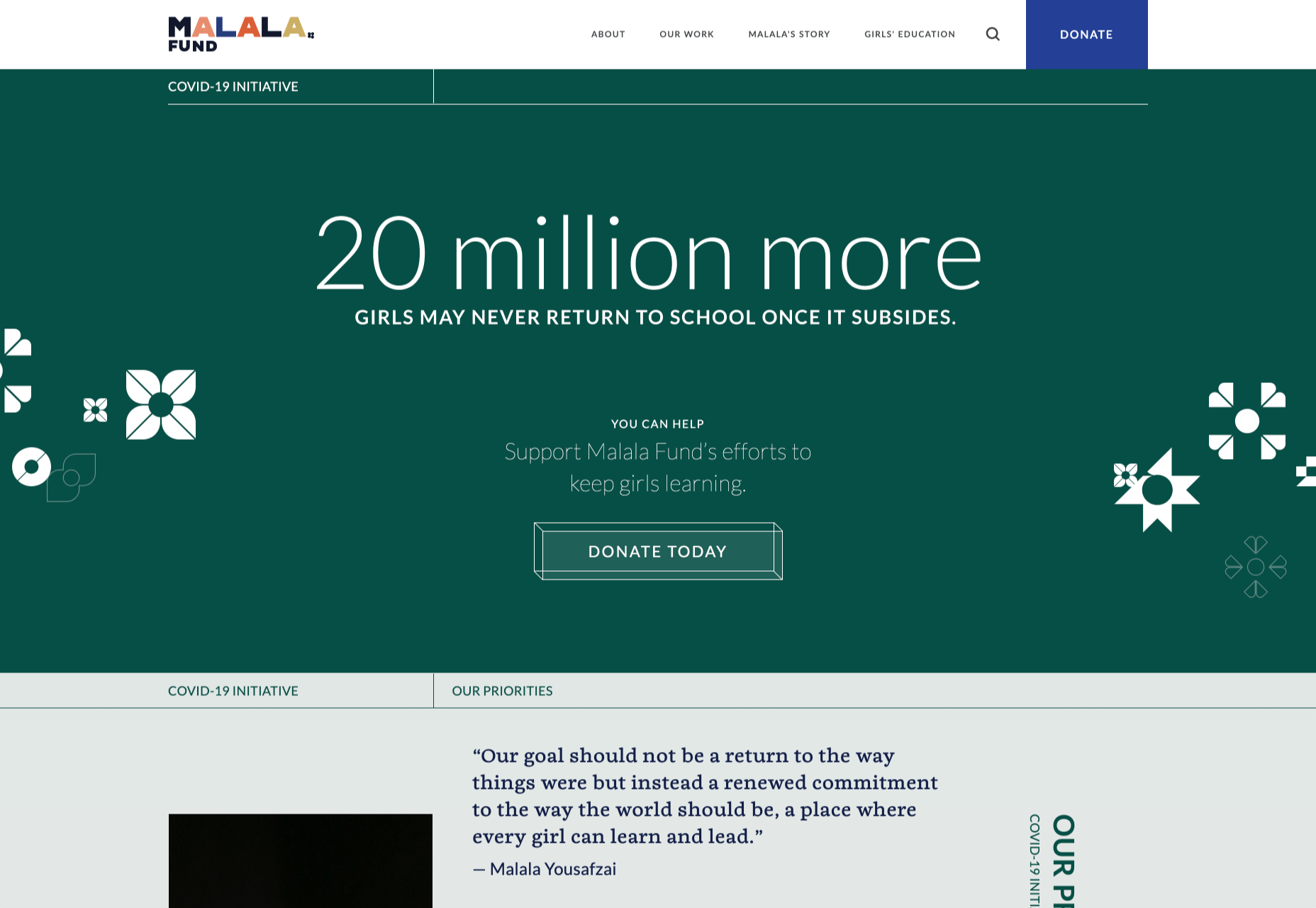
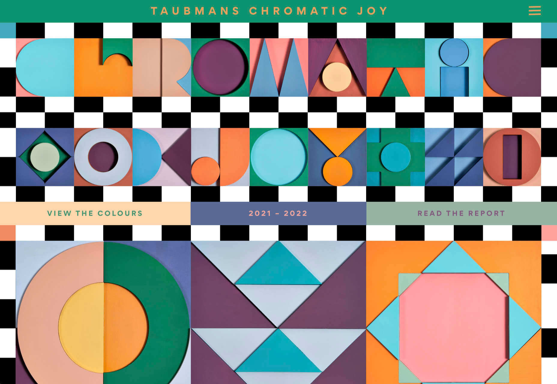
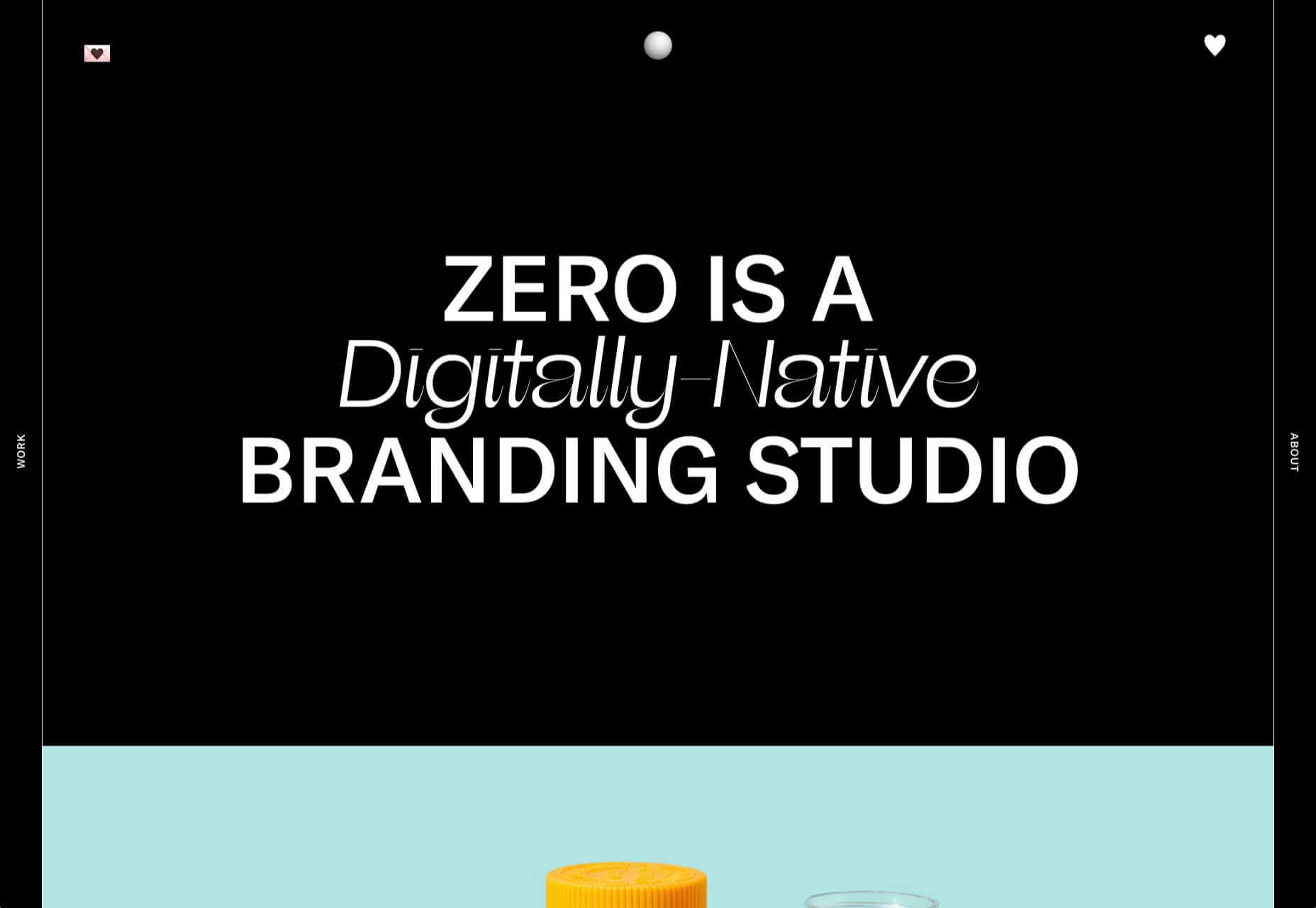
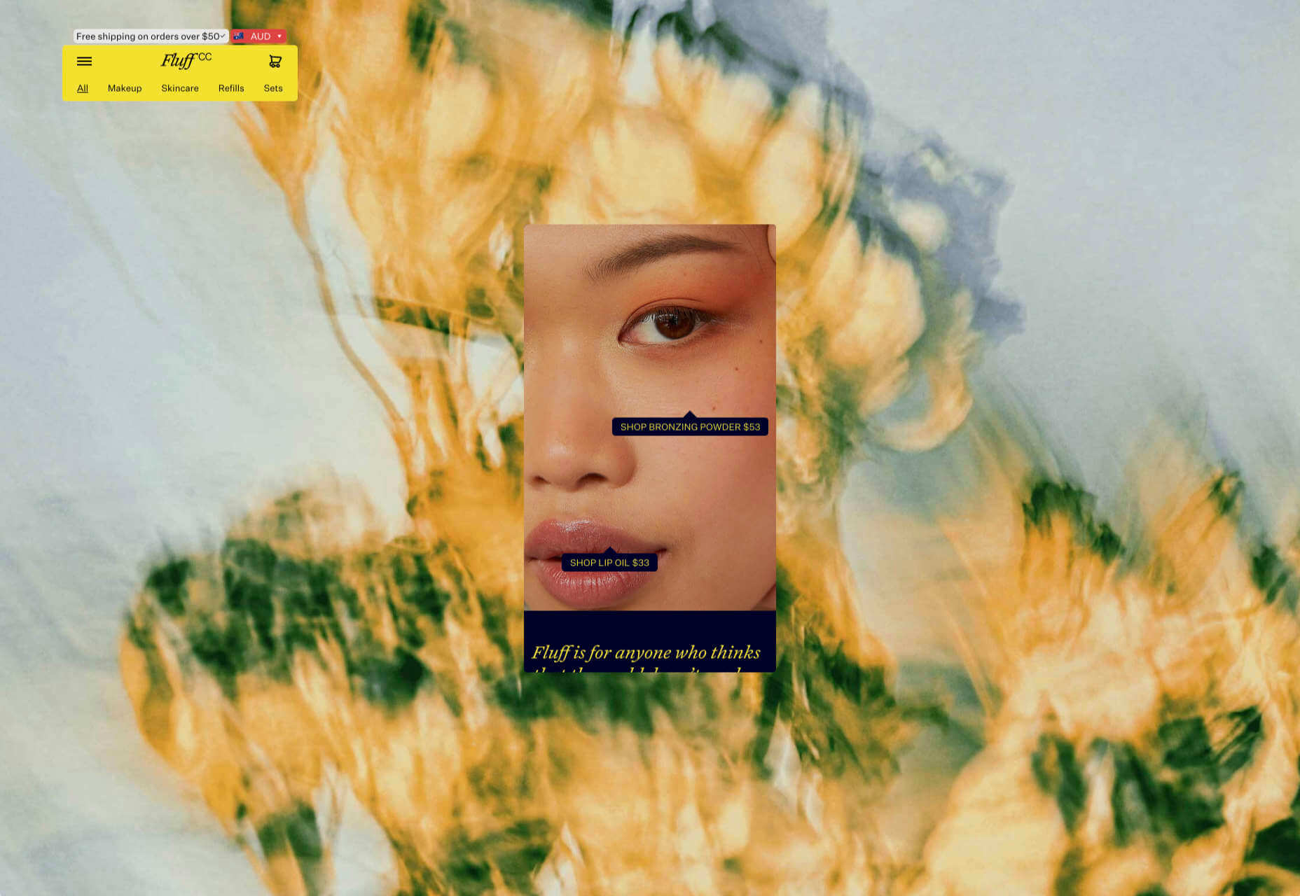
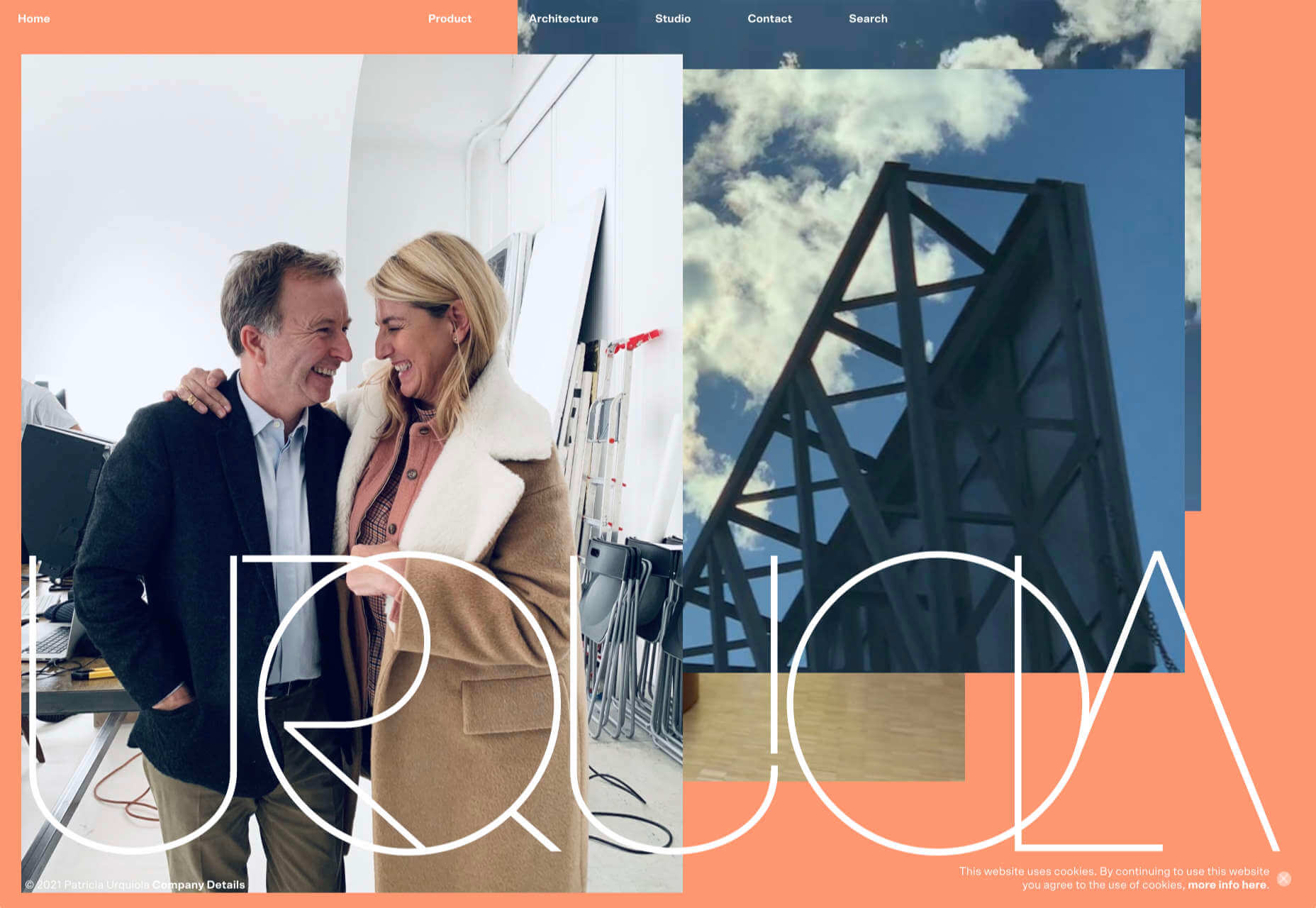
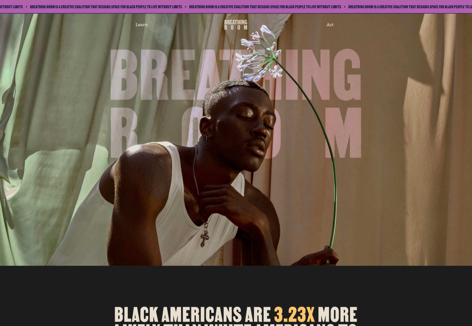
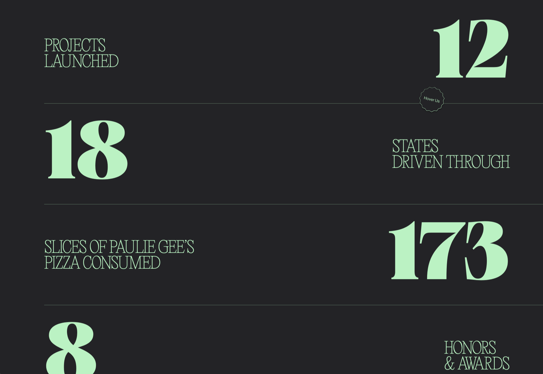
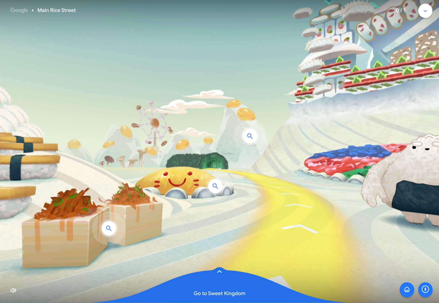
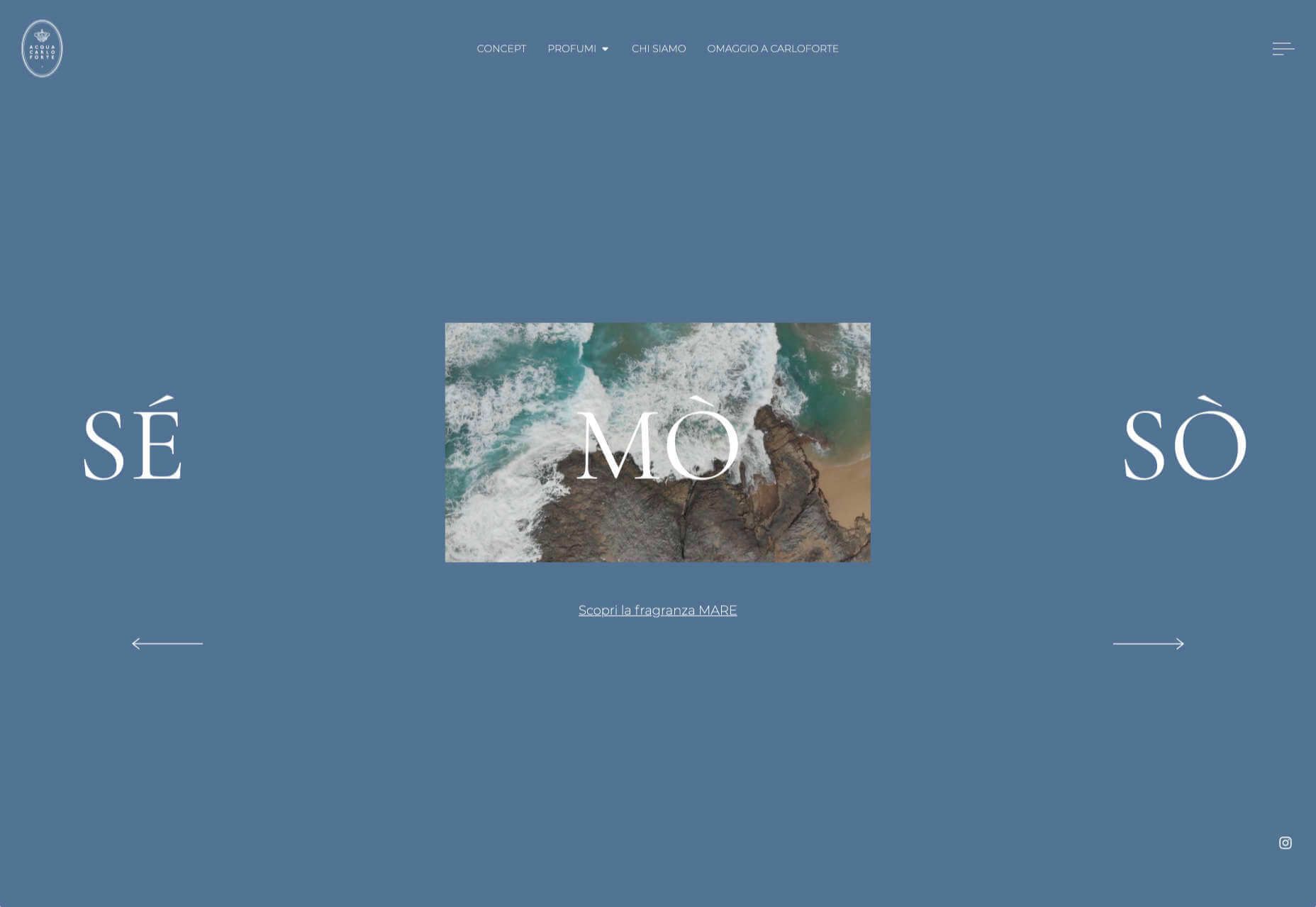
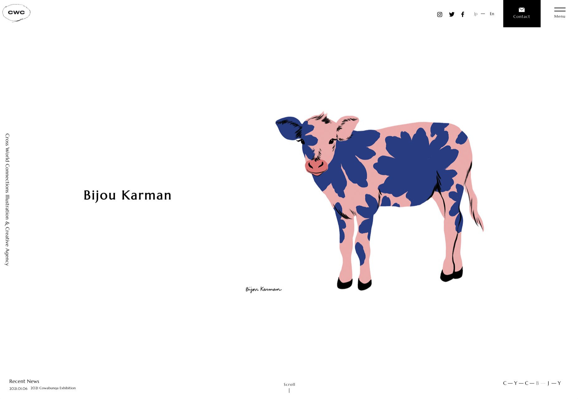
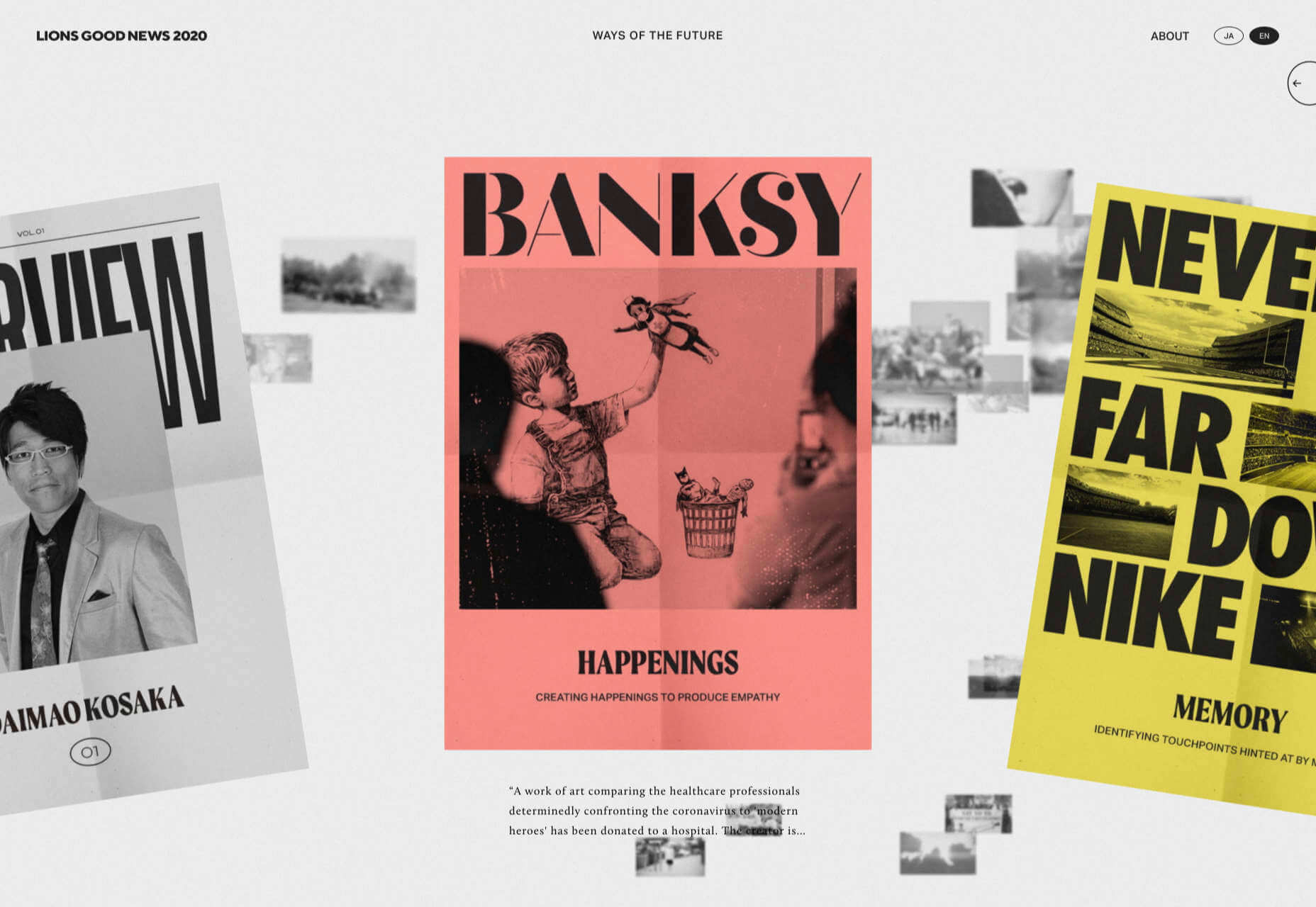
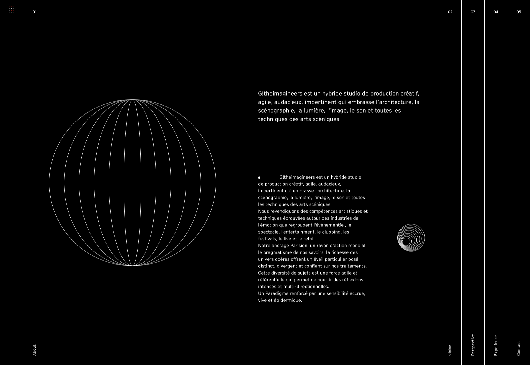
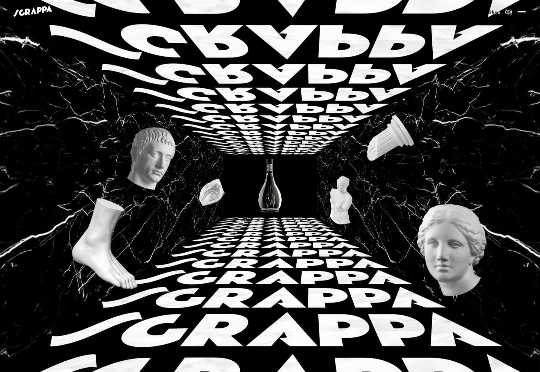
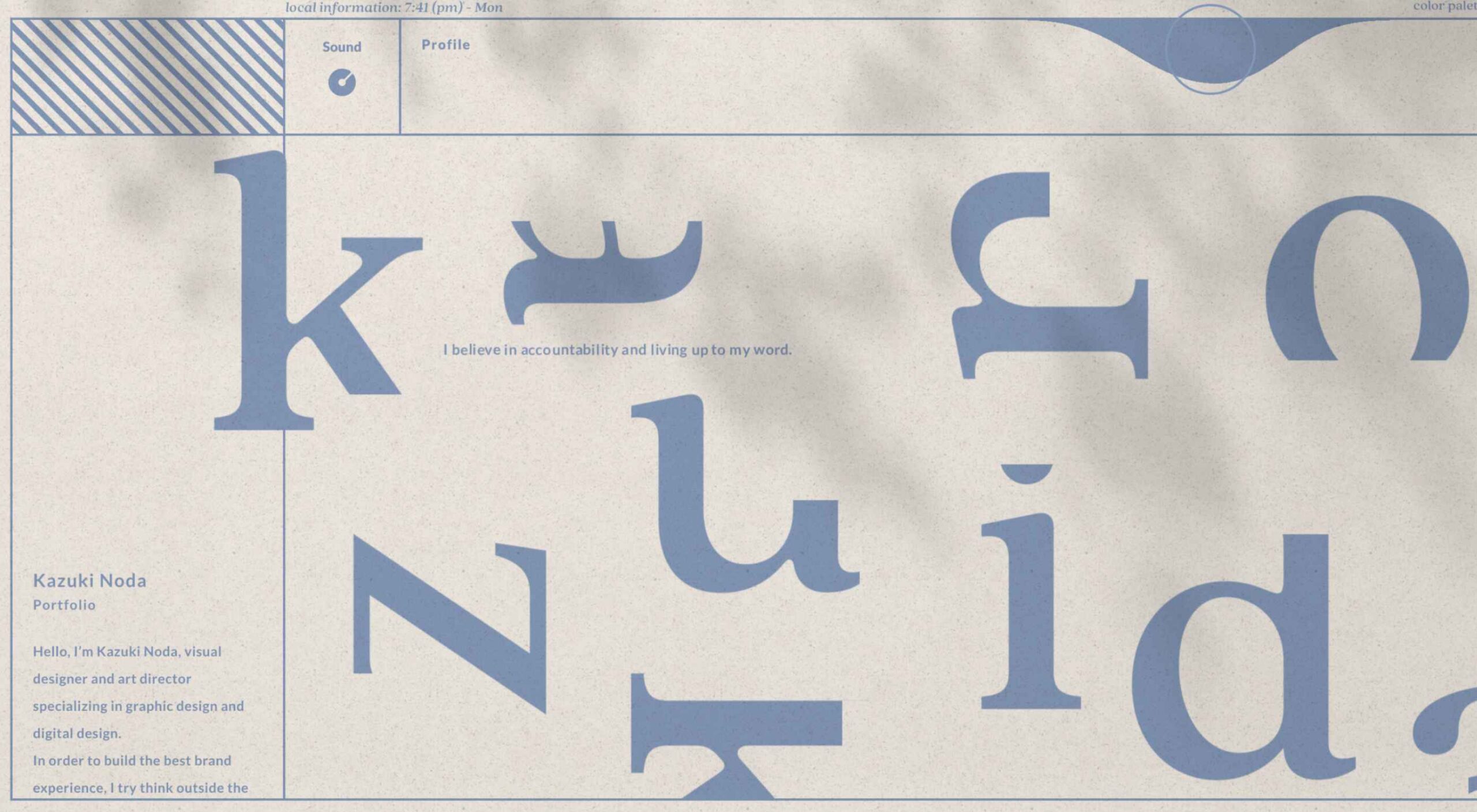
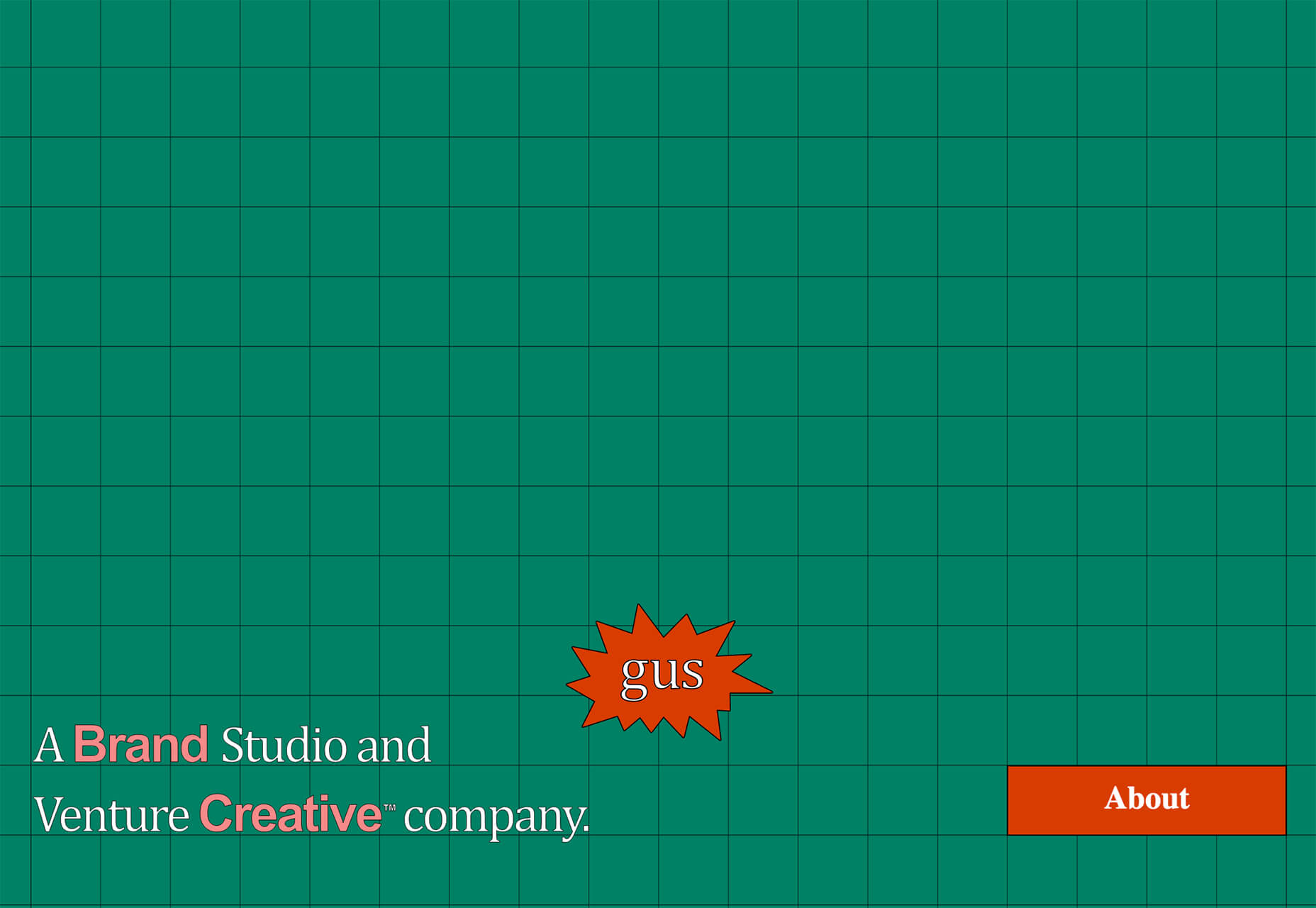
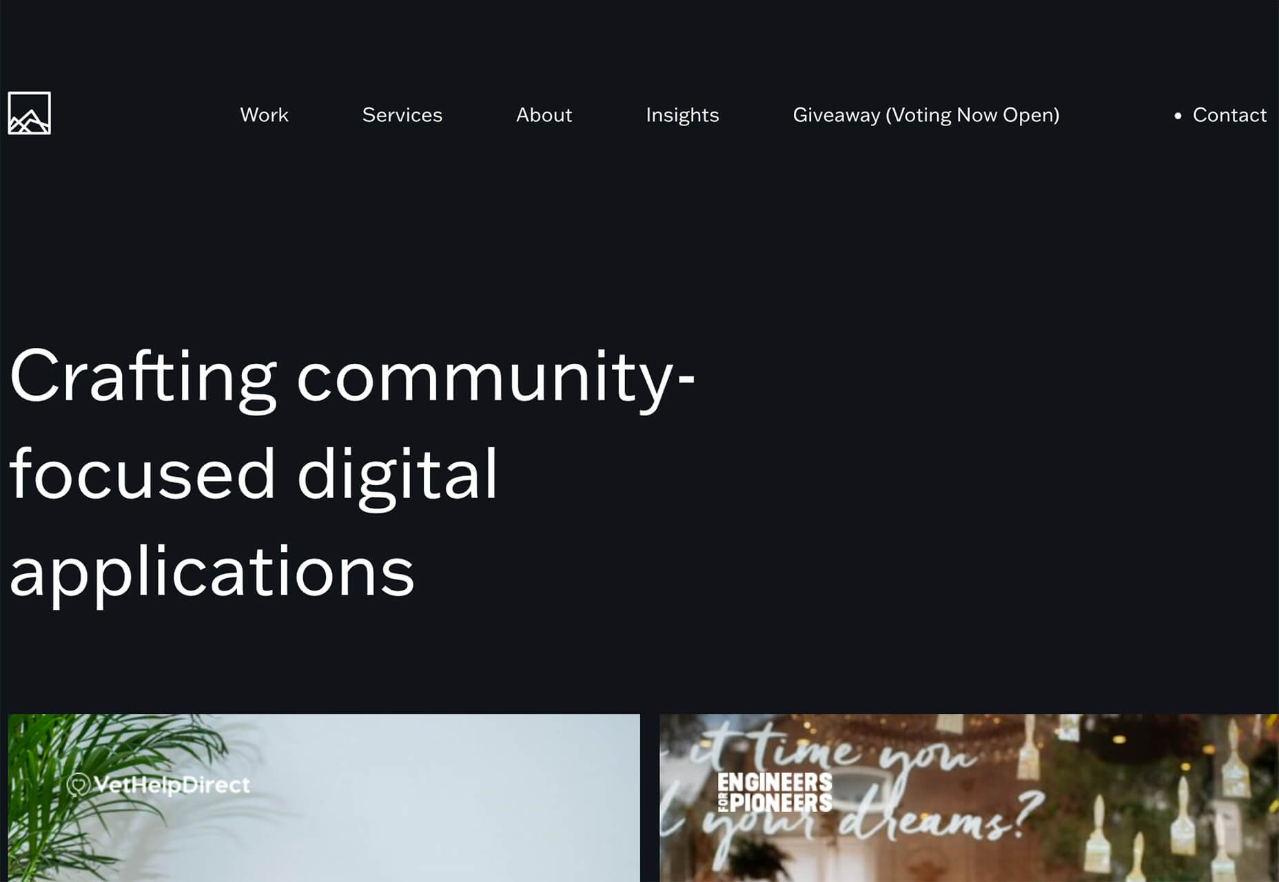
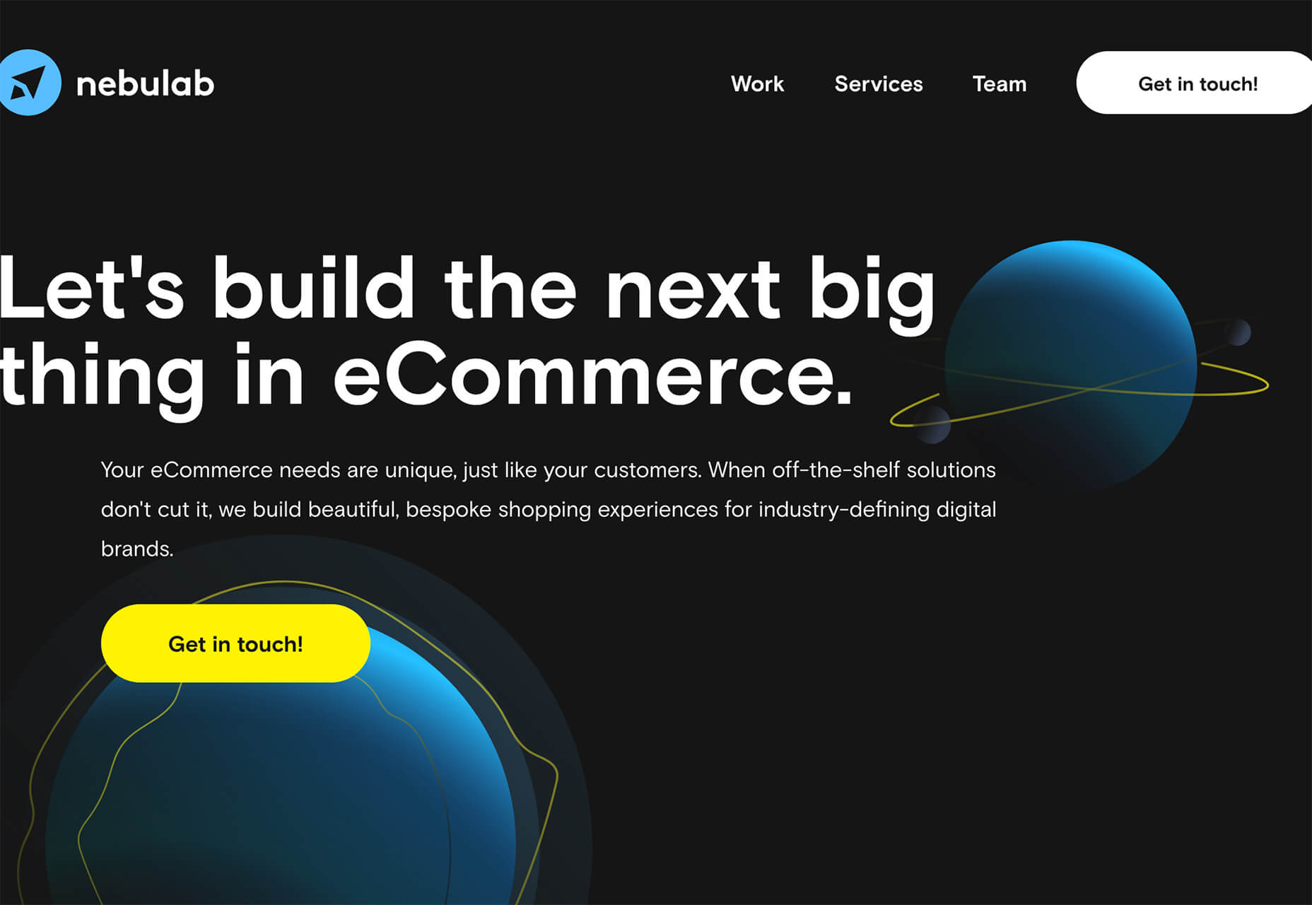
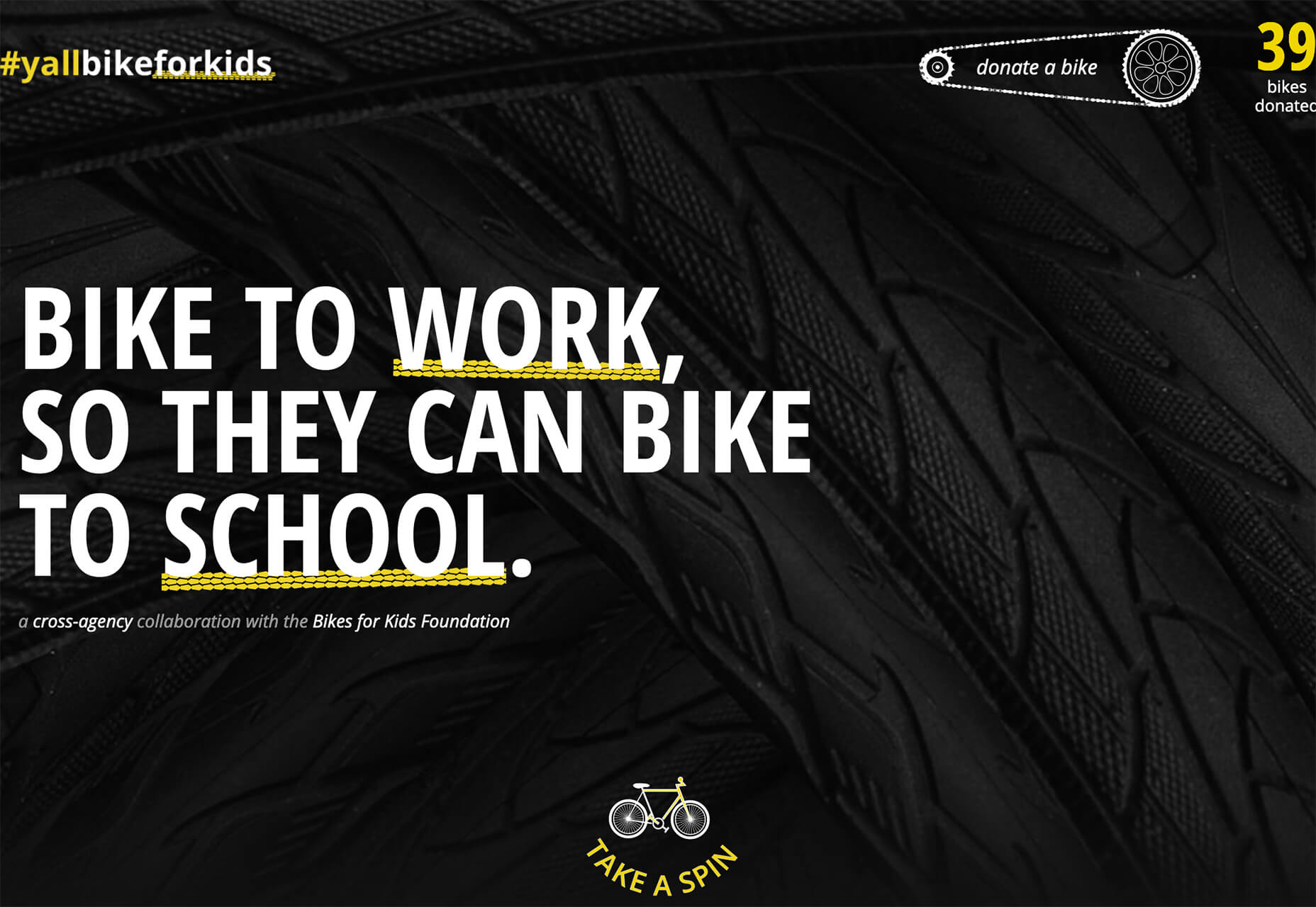
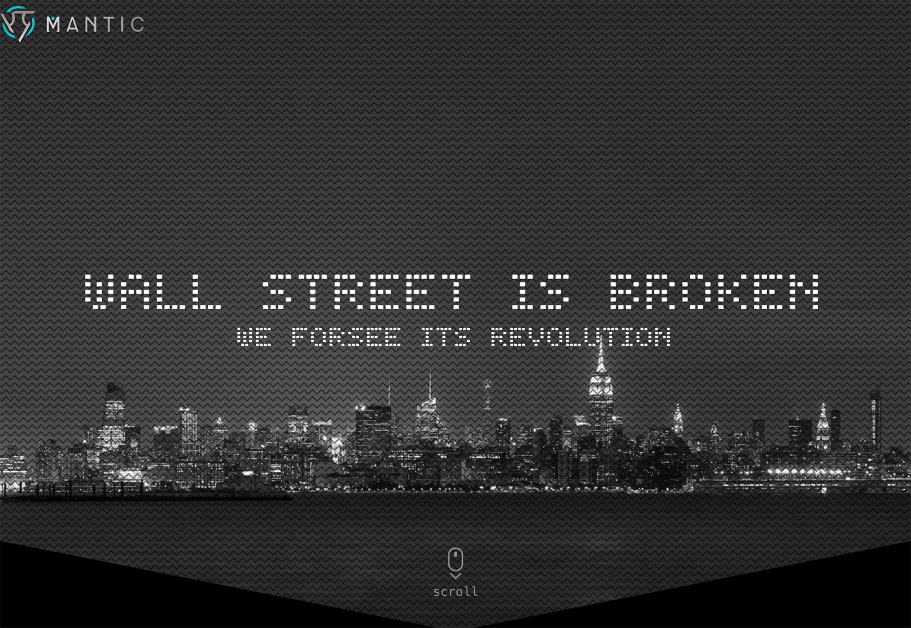
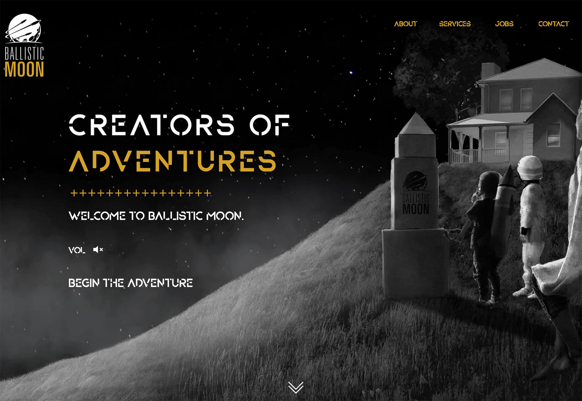
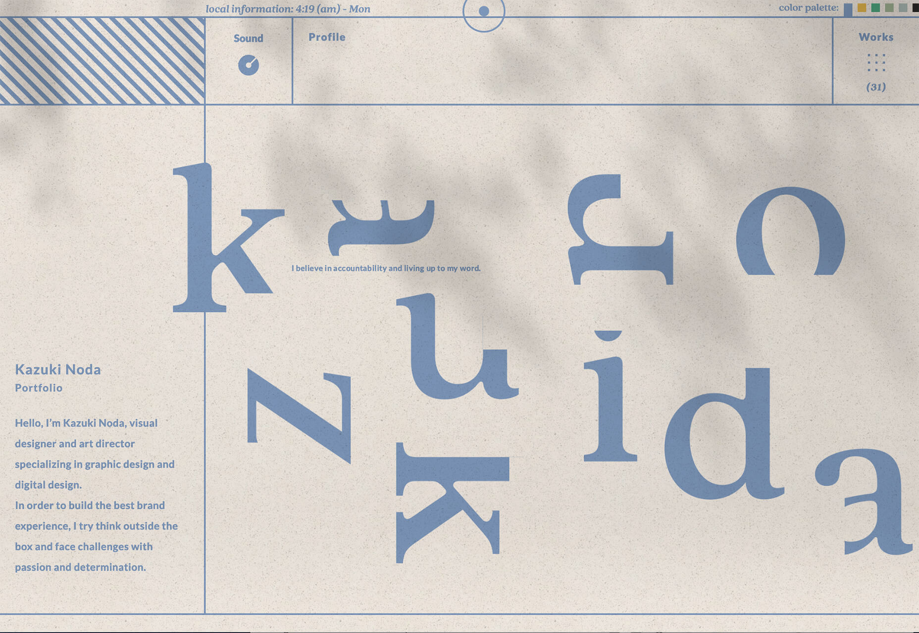
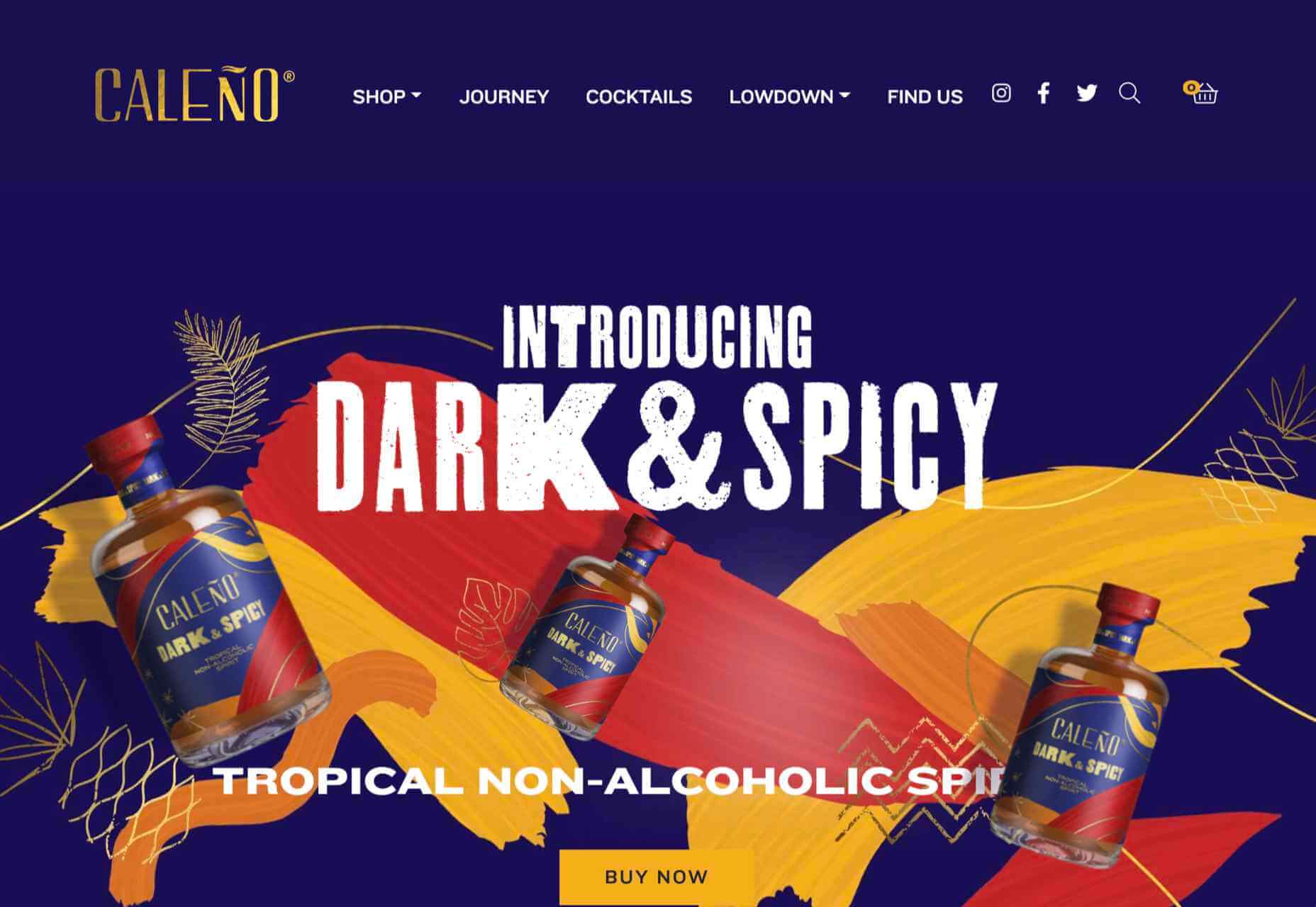
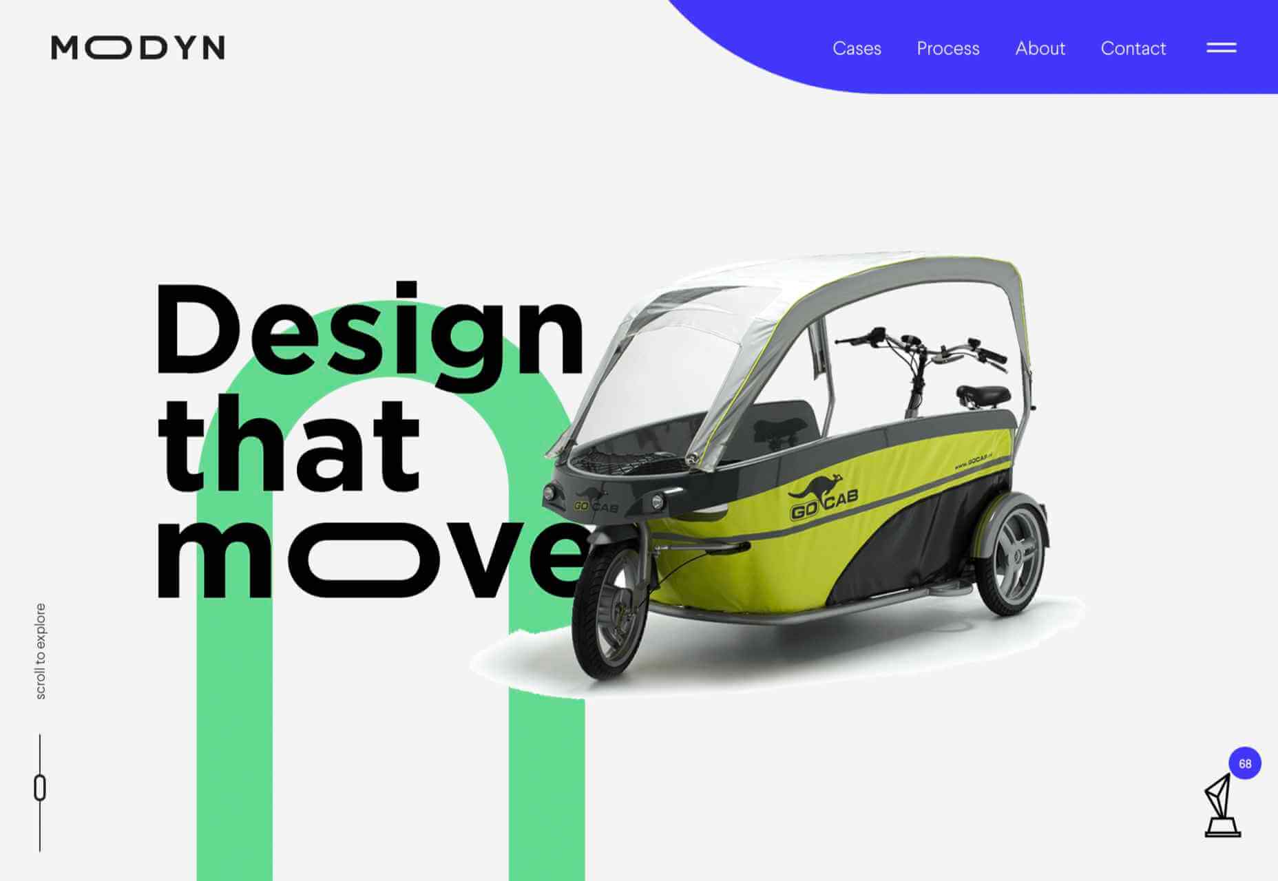
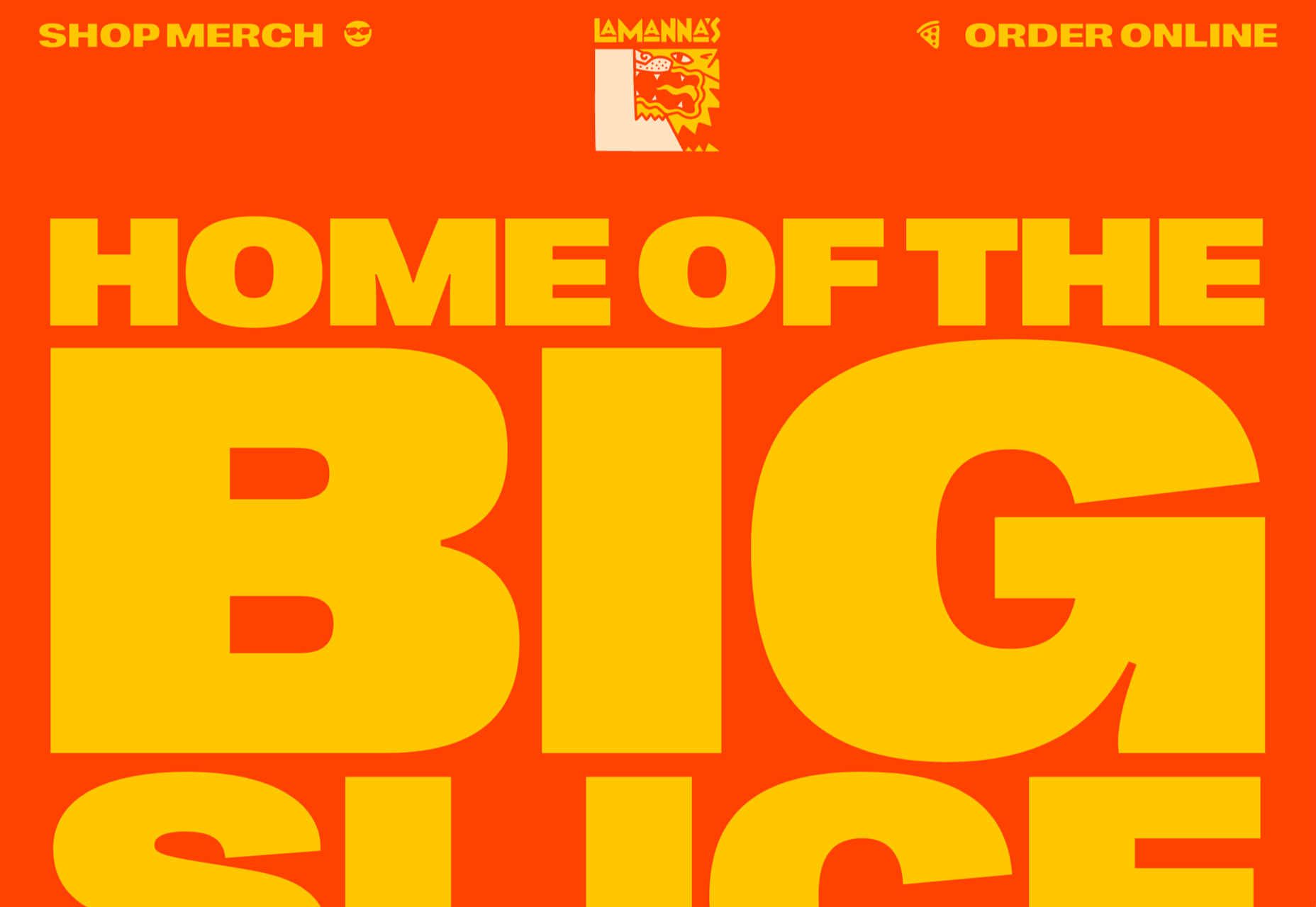
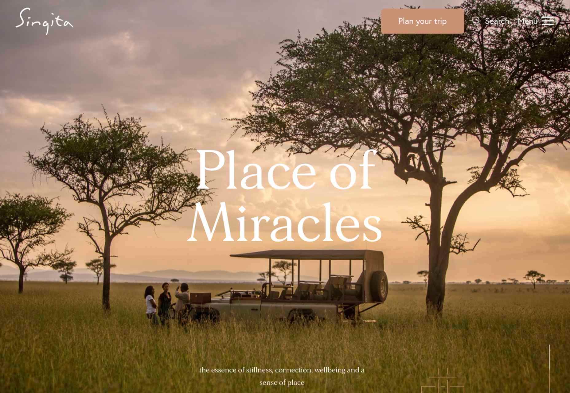
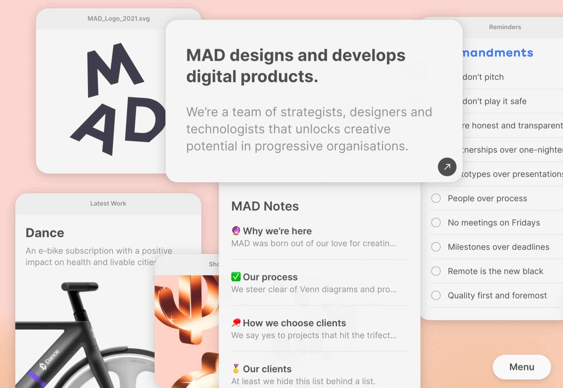
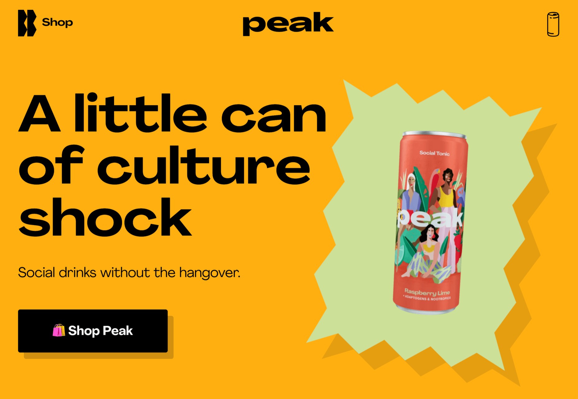
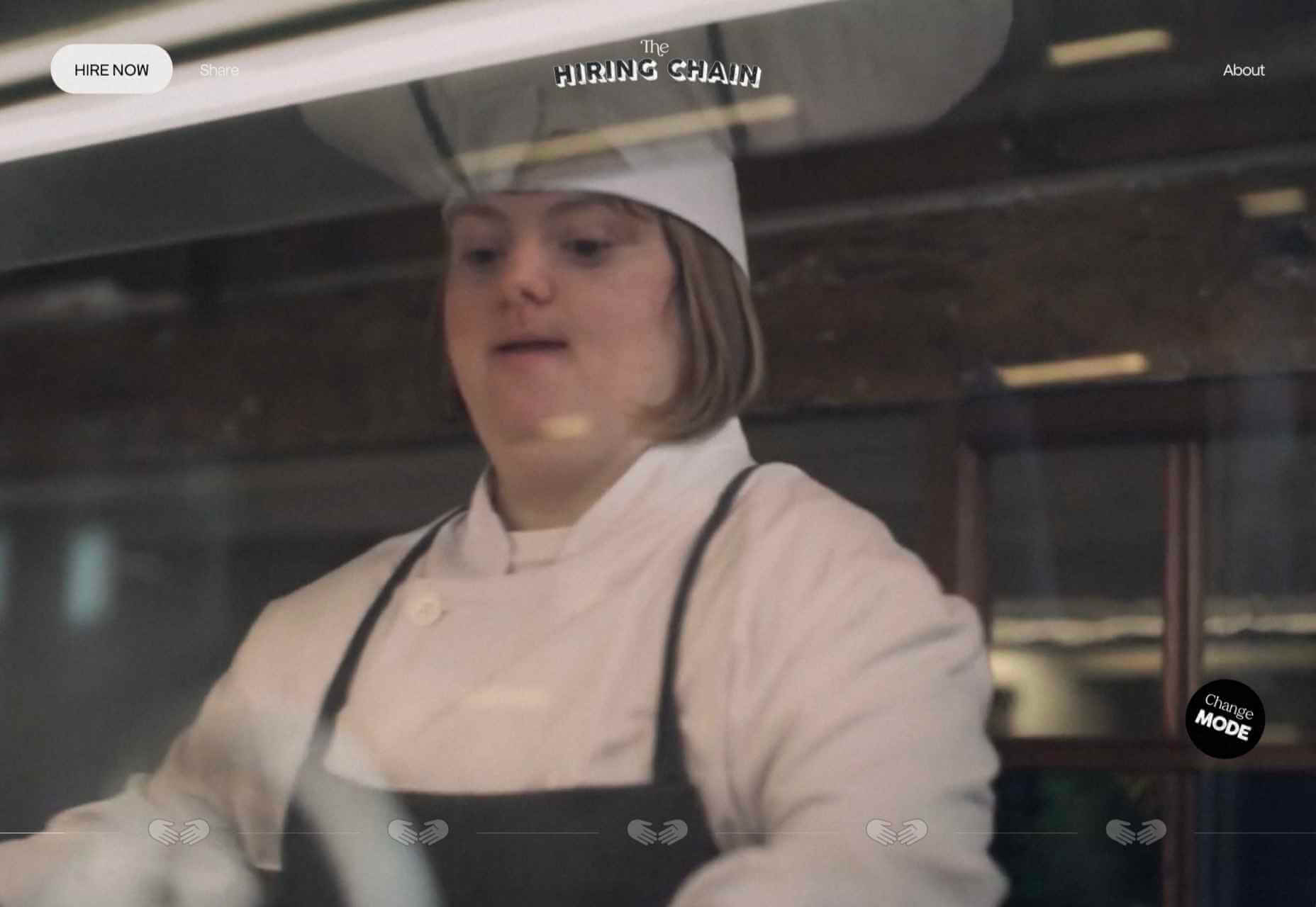
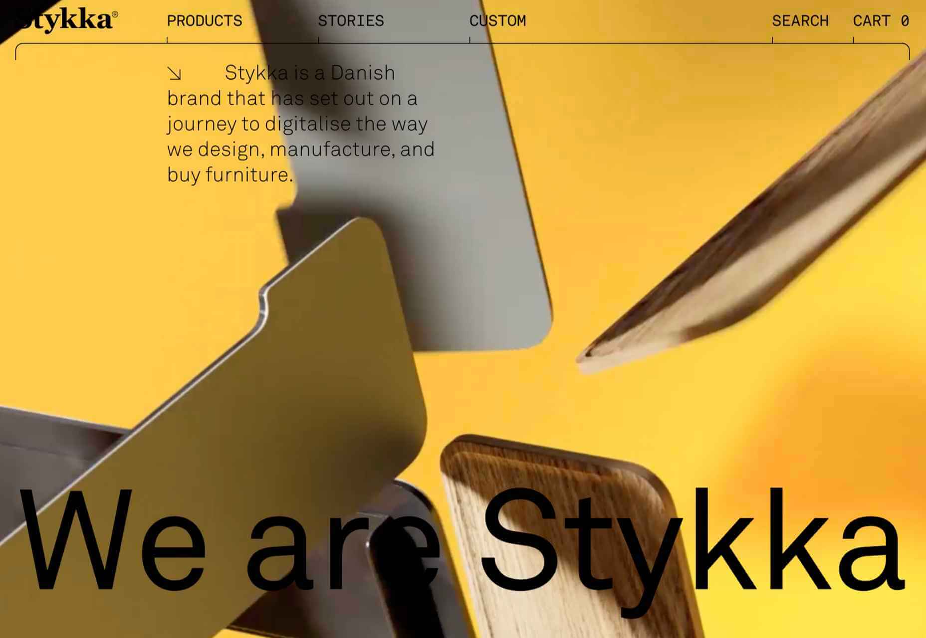
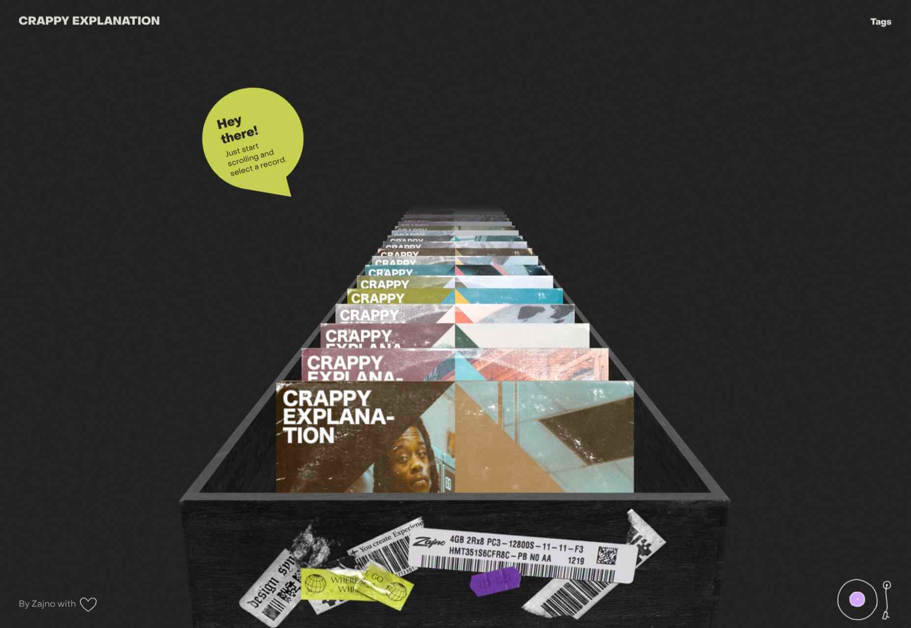
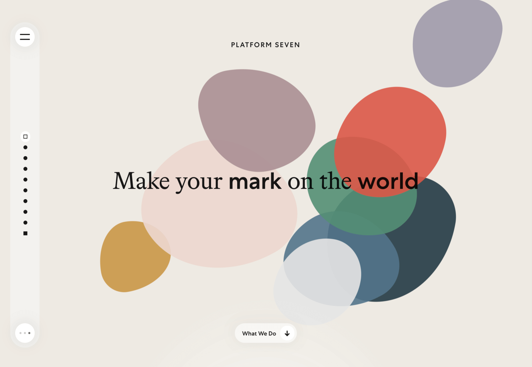
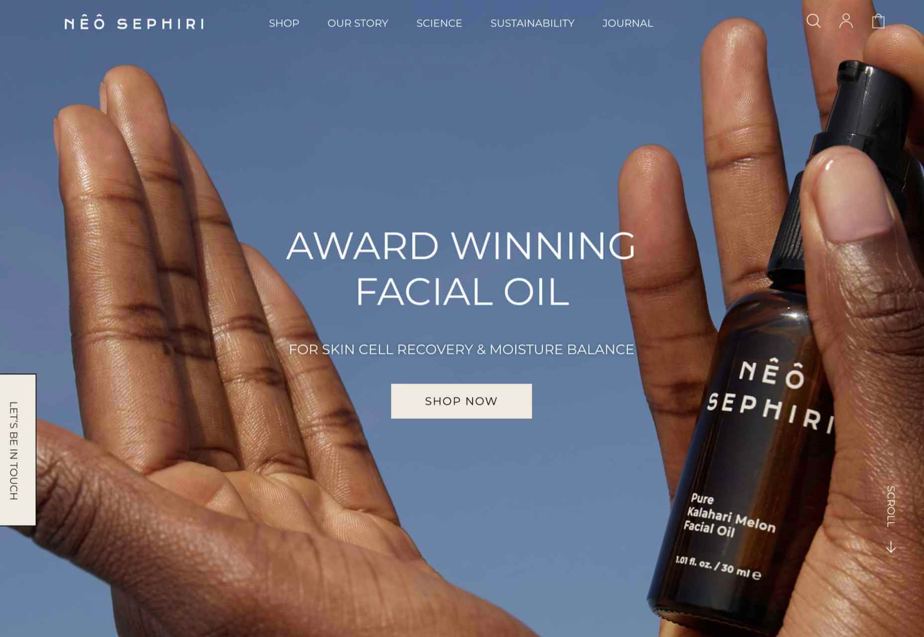
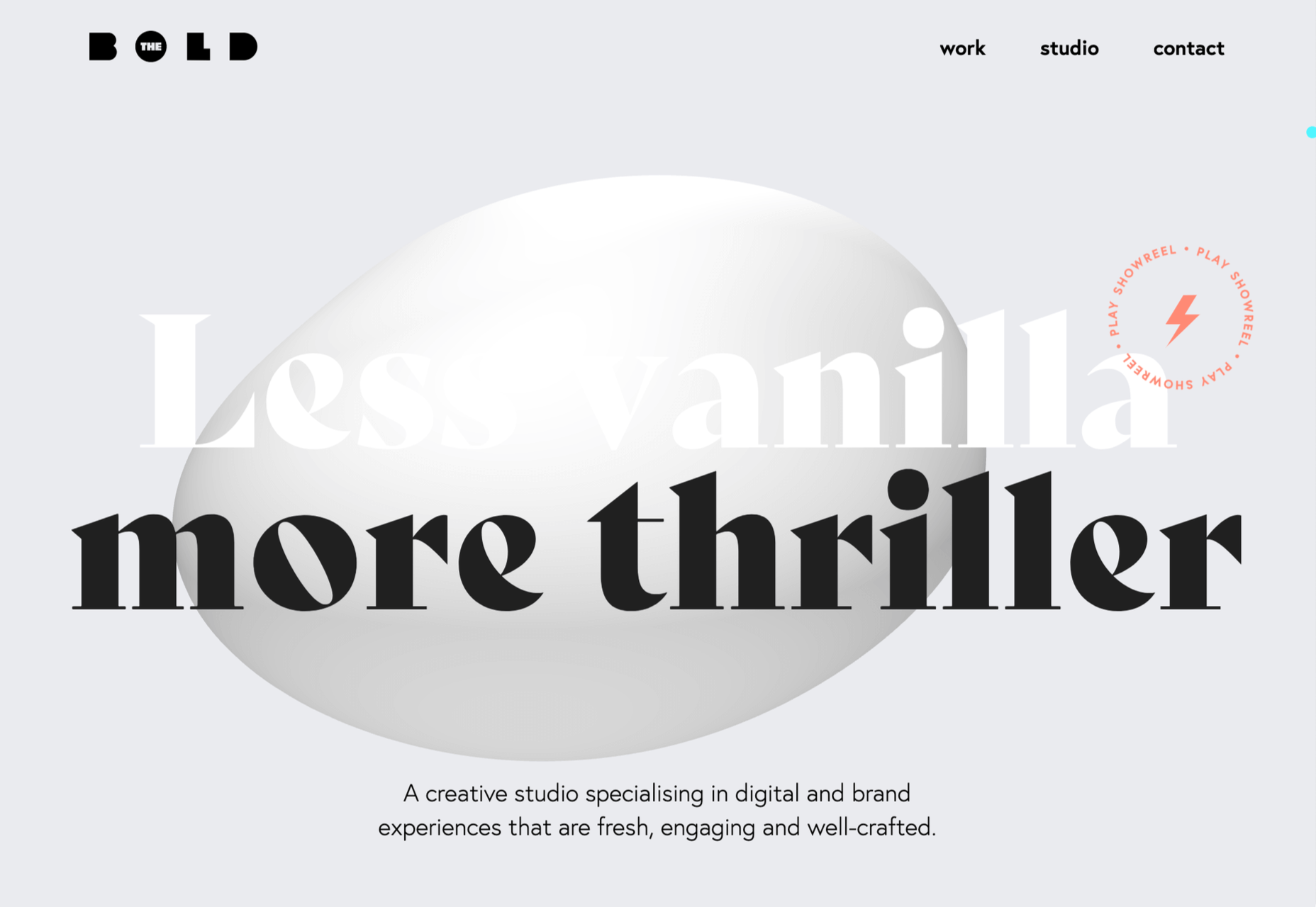
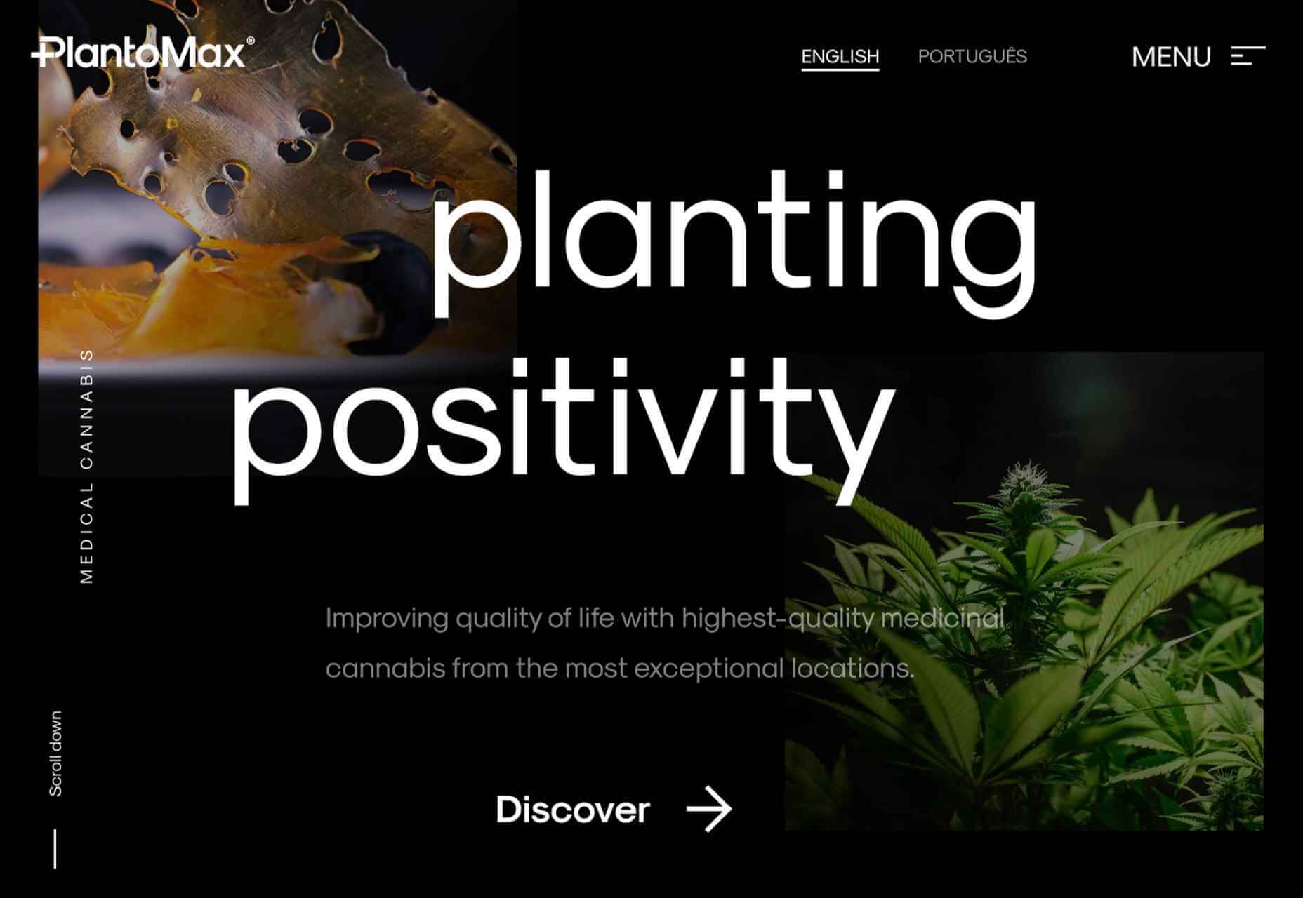
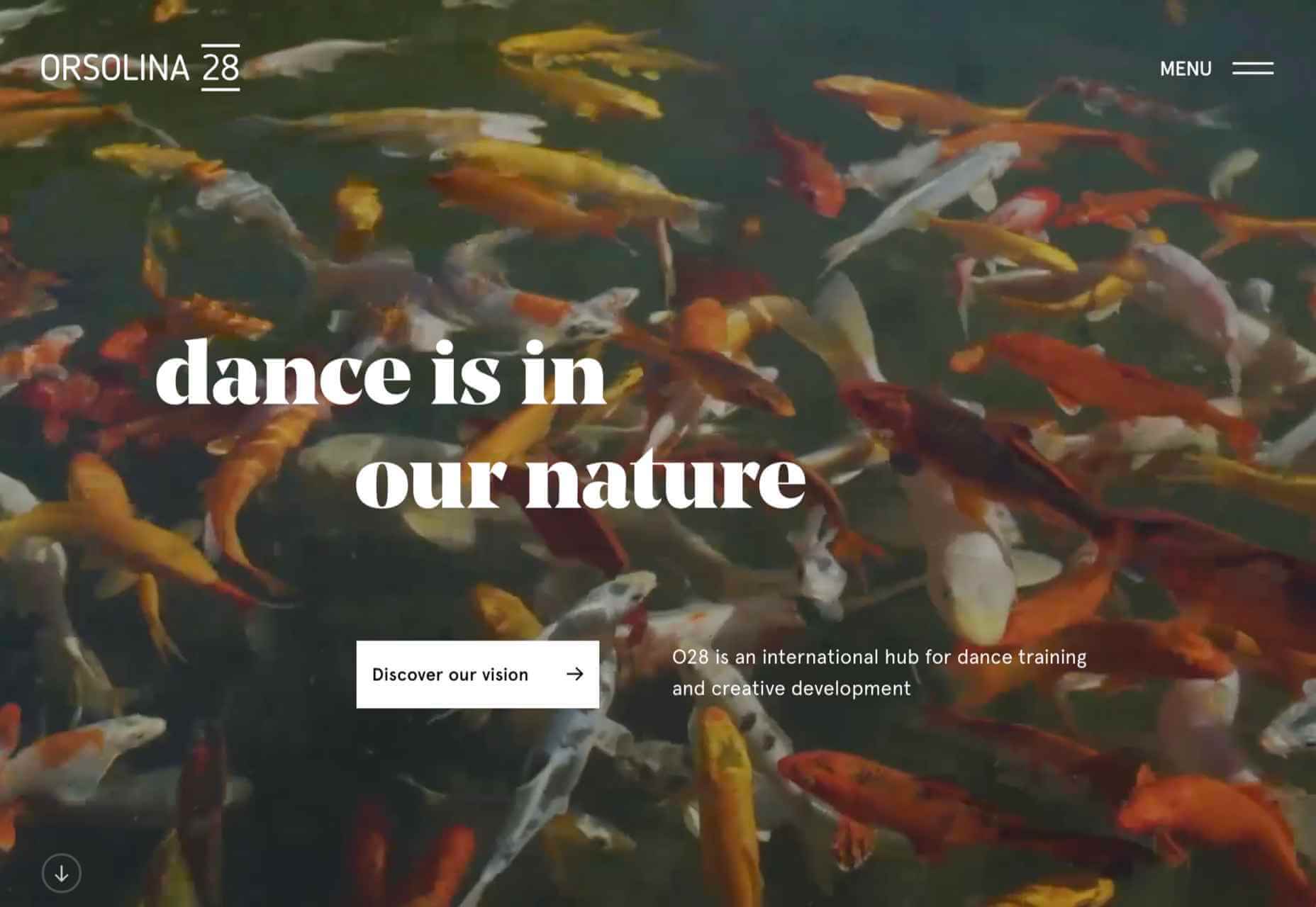
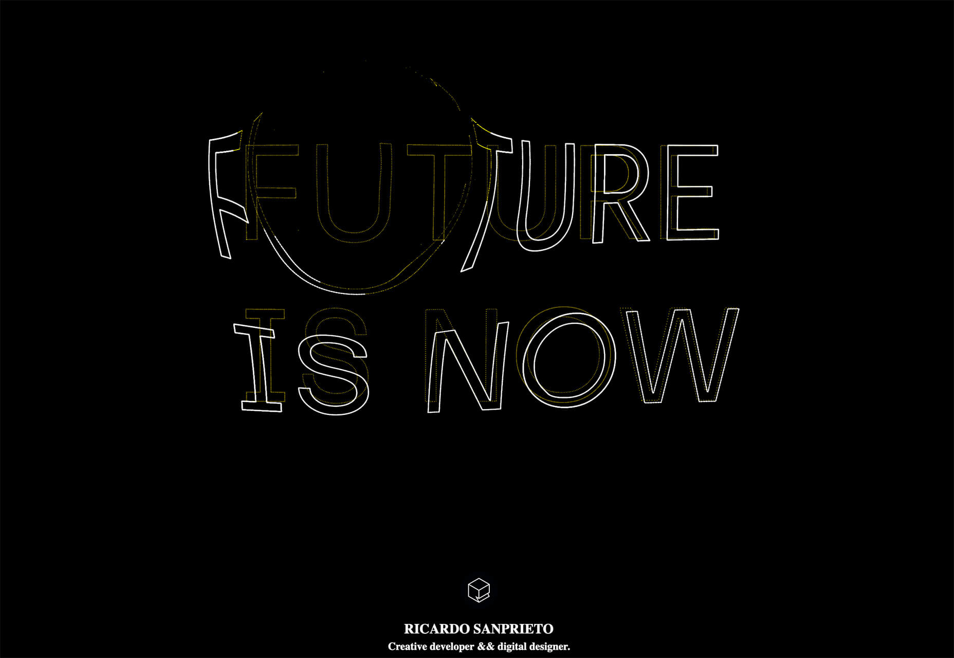
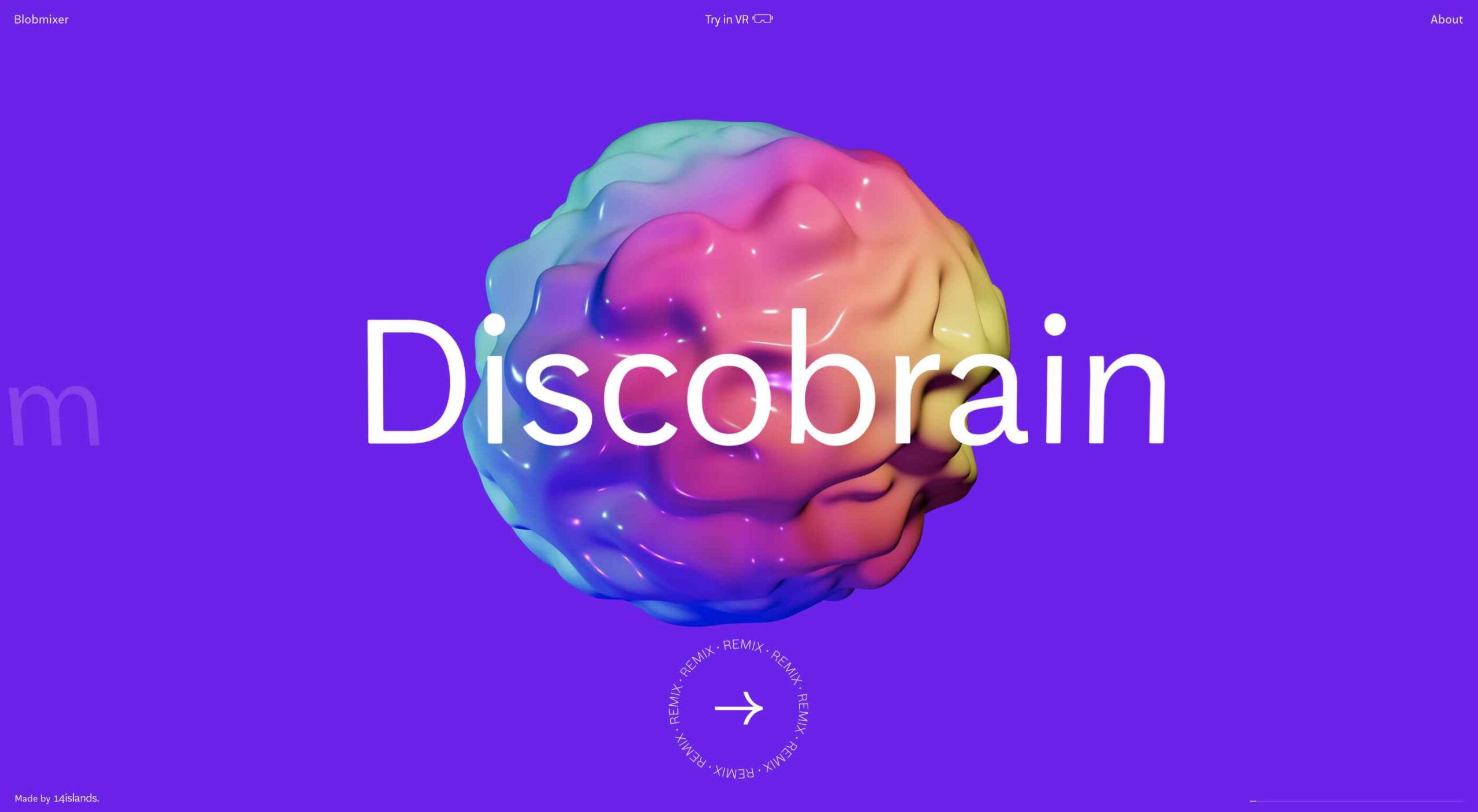
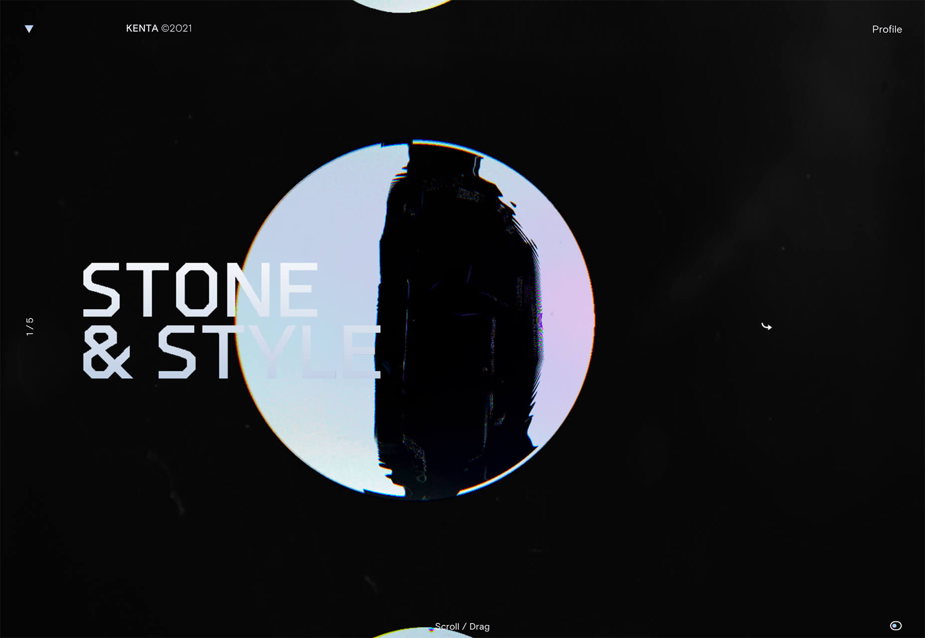
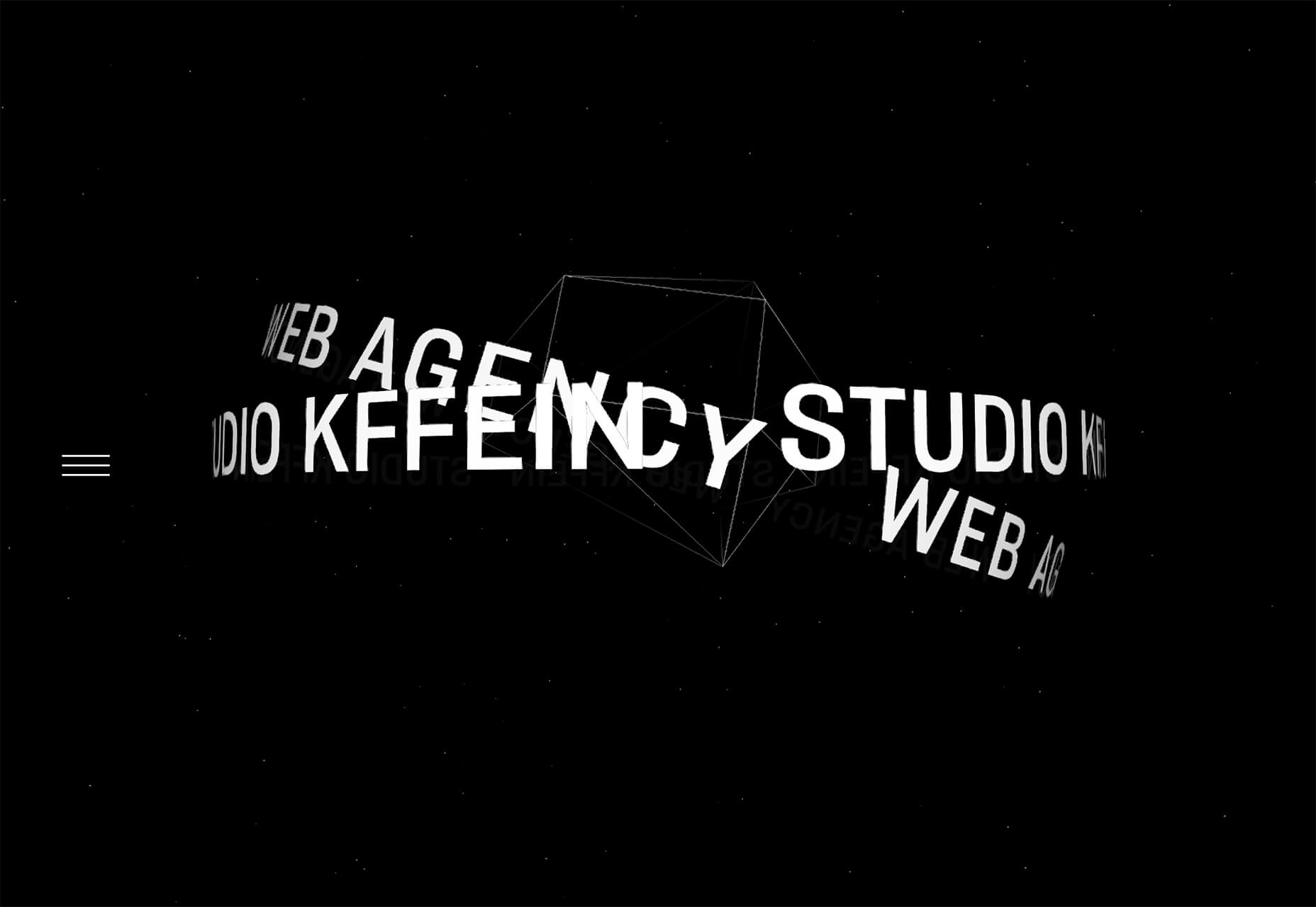
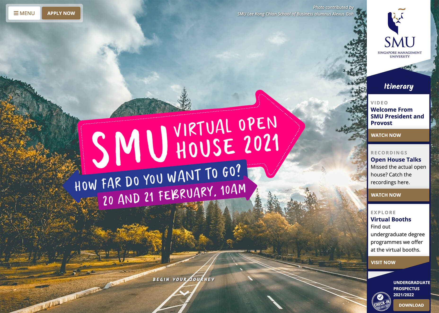
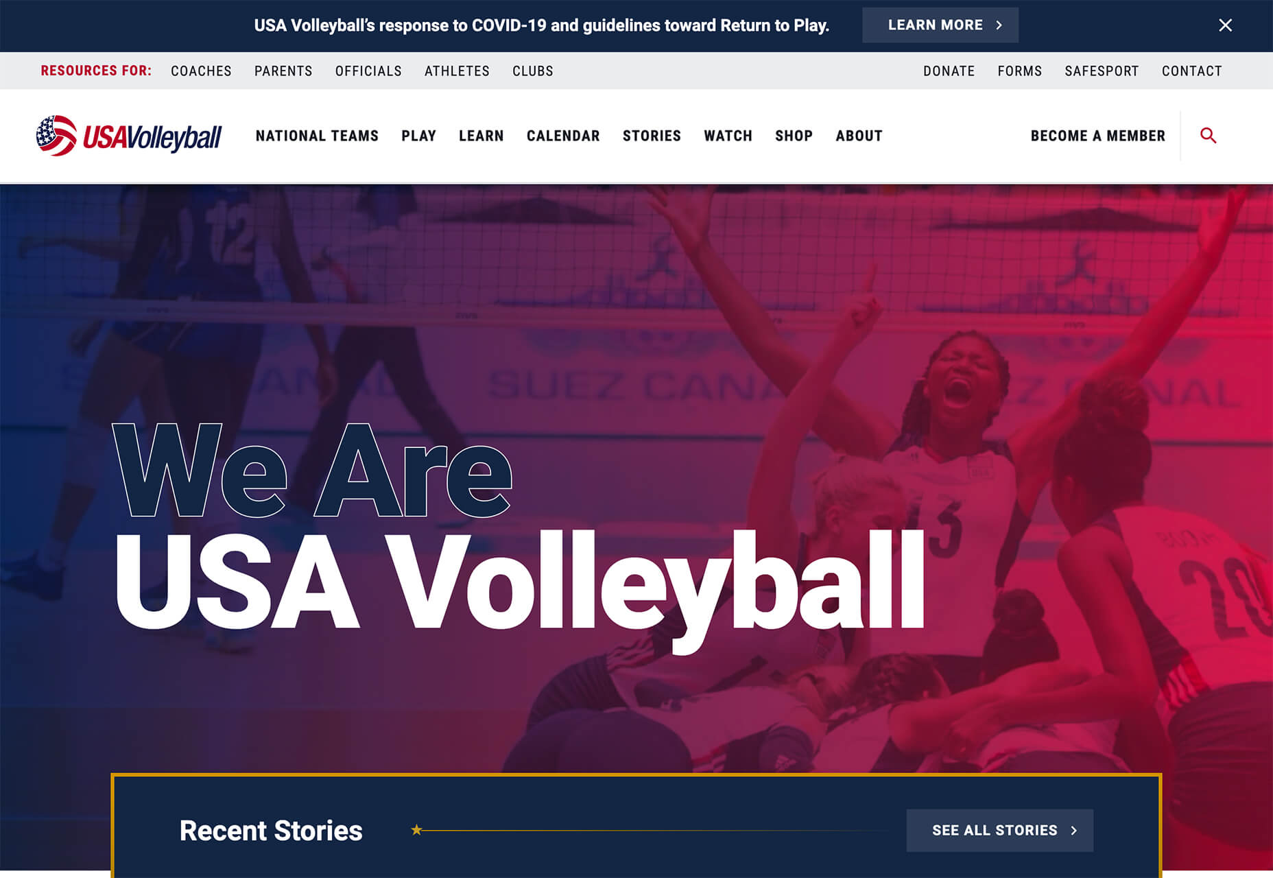
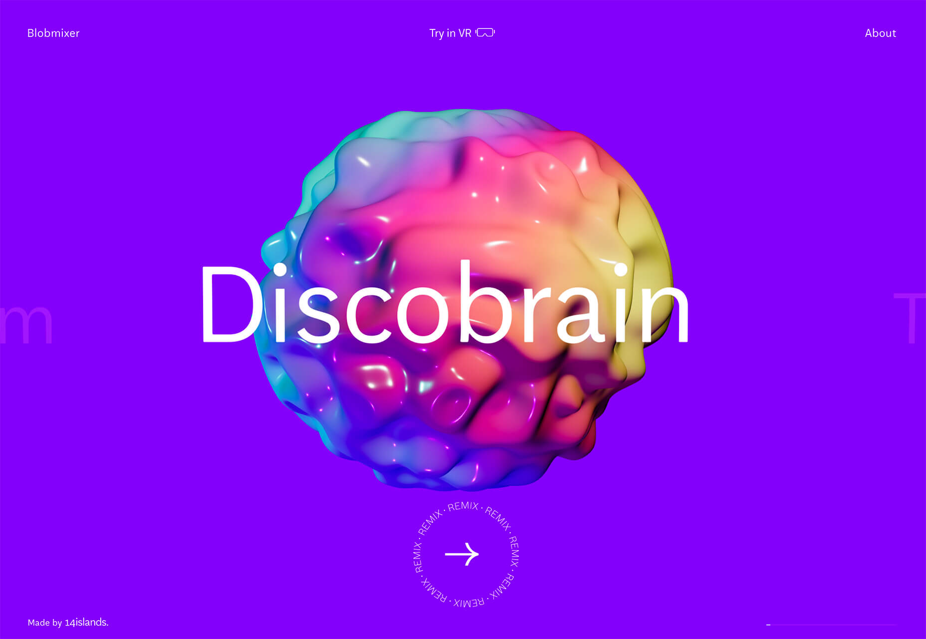
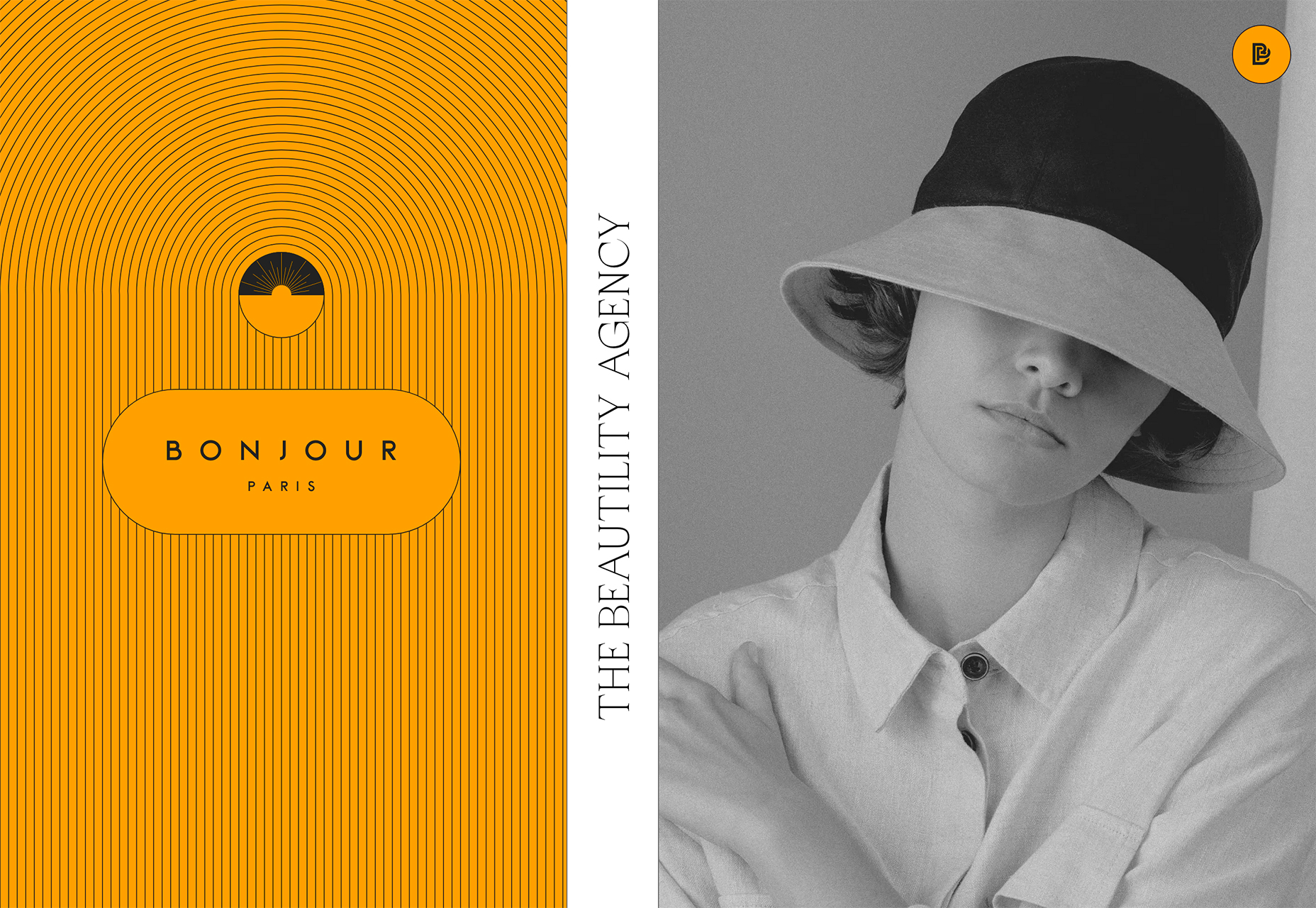
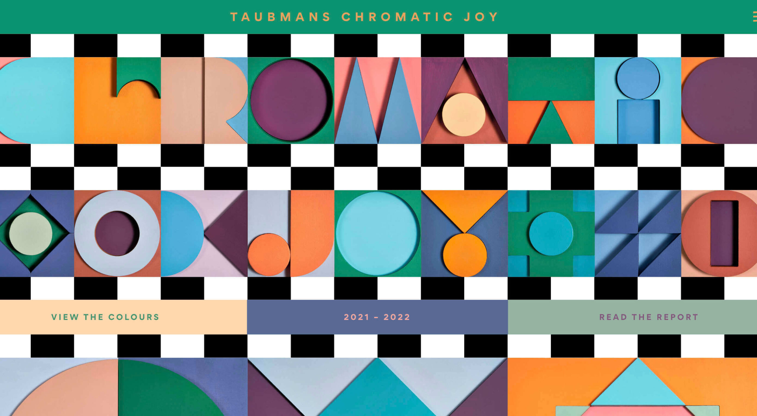
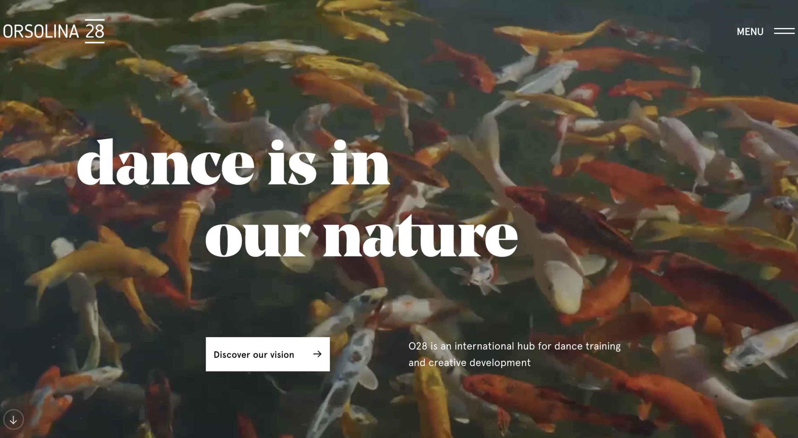
Here’s what new for designers this month:

April’s Top Picks

Charts.css

Charts.css makes creating beautiful online charts that much easier. It’s a modern CSS framework that uses CSS utility classes to style HTML elements as charts. It’s accessible, customizable, responsive, and open source. There’s a quick start option and available source code to work with.

Haikei SVG Generator

Haikei is a web app that helps you generate SVG shapes, backgrounds, and patterns in all types of shapes to use in projects. Everything can be exported into the tools you are already using for easy integration, and every element is customizable. The tool is free right now – no credit card needed – and you get access to 15 generators and can export in SVG and PNG format. A premium option is on the way, and you can sign up to get notified for access.

Fluid Space Calculator

Fluid Space Calculator helps you create a related space system and export the CSS to implement it. The calculator allows you to add space value pairs and multipliers and see the impact on the screen before snagging the related code. It’s great for determining how things will look in different viewports and for creating custom space pairs.

Night Eye WordPress Plugin

Night Eye WordPress Plugin helps you create a dark mode option for your WordPress website with ease. It’s completely customizable, schedulable, and one of those things that users are starting to expect. The plugin has free and paid versions – the only difference is a link to credit the developer.

3 Productivity Boosters

Macro

Macro is a supercharged checklist app for recurring processes. It’s designed to help teams document, assign, track, and automate for maximum efficiency. Now is the time to test this tool because it is free in public beta.

Writex.io

Writex.io is a free writing app that uses AI and smart features to help you write more efficiently. It can check readability as you write, make suggestions, check spelling, and allows you to work with versioning. All the settings are customizable, so you can get help and suggestions when you want them and avoid things you don’t want.

Taloflow

Taloflow, which is in beta, is a tool that helps you find the top cloud and dev tools for your use case. This is designed to be a time-saving solution to finding the right infrastructure and API products for your work.

8 Kits with Illustrations and User Interface Elements

Skribbl

Skribbl is a collection of free, hand-drawn illustrations in a light and fun style. The black and white sketches are friendly, and the collection keeps growing. Plus, the illustrators are allowing them to be used free for any use.

Mobile Chat Kit

Mobile Chat Kit is a free starter kit for building apps in Figma, Sketch, and Adobe XD. It includes more than 50 screen options with mapped-out flows for a quick-start project.

Flowchart.fun

Flowchart.fun is exactly what the name implies. The app allows you to type, create nodes, and link elements to develop simple flow charts quickly. Then you can alter shape and size with drag and drop. Export it for use as an SVG, JPG, or PNG.

Shuffle

Shuffle is a marketplace packed with UI libraries to help you with a variety of digital projects. There are more than 1,500 pre-built components to choose from with professional designs. This premium tool comes with a monthly subscription or lifetime license.

Cryptocurrency 3D Pack

Cryptocurrency 3D Pack is a set of icons with fun colors in three-dimensional shapes that you can use to represent different crypto elements. The pack includes 55 #D icons in PNG and BLEND formats.

Stratum UI Kit for Figma

Stratum UI Kit for Figma includes nine free screens that are ready to use. Options include API documentation, Kanban, document, data dashboard, ecommerce product list, ecommerce product options, payments spreadsheet, cloud storage, and newsfeed.

Conic.css

Conic.css is a collection of simple gradients that you can browse and then click to copy the code into your CSS to use them in projects. It’s quick and easy while using trendy color options.

Artify Illustrations

Artify Illustrations is a Figma plugin that allows you to access more than 5,000 SVG and PNG illustrations within the app. It’s got a built-in search feature, everything is high-resolution, and the huge library includes various styles.

2 Tutorials

A Complete Guide to Accessible Front-End Components

A Complete Guide to Accessible Front-End Components is an amazingly comprehensive guide from Smashing Magazine with everything you need to know about accessible components. From tabs to tables to toggles to tooltips, you’ll find it all here and learn how to use it the right way.

Grid CheatSheet in 2021

Grid CheatSheet in 2021 is a useful guide of everything you can do with CSS Grid. Plus, it has plenty of fun illustrations and an accompanying video.

8 Fresh and Fun Fonts

Athina

Athina is a modern display serif with beautiful connector strokes. The free version is a demo, and there’s a full family that you can buy.

Brique

Brique is a free (personal and commercial) display font with a wide stance and uppercase character set. The letters have a lot of personality and a readable configuration.

Code Next

Code Next is a great geometric sans serif with a full family of styles. Including two variable fonts. It’s highly readable and would work for almost any application.

Inter

Inter is a simple and functional sense serif family with everything from extra light to heavy weights. The extra character personality makes this a fun and functional font option.

Nothing Clean

Nothing Clean is a fun grunge-type option. It’s an all uppercase character set with alternates.

Playout

Playout is a fun, hand-drawn style typeface with interesting glyphs and alternate characters. The most fun feature might be the pawprint characters in the demo set.

Rockford Sans

Rockford Sans is a geometric typeface with subtly rounded edges. It has eight weights and italics. With its large x-height and round features, it’s legible and friendly. It’s suited to cover a wide variety of tasks from editorial to brand design and advertising.

SpaceType

SpaceType is a fun and funky typeface in regular and expanded styles. The stretched letterforms make interesting alternates for display purposes.

Source

The post 25 Exciting New Tools For Designers, April 2021 first appeared on Webdesigner Depot.


Source de l’article sur Webdesignerdepot

Hybrid cloud architectures are the new black for most companies. A cloud-first is obvious for many, but legacy infrastructure must be maintained, integrated, and (maybe) replaced over time. Event Streaming with the Apache Kafka ecosystem is a perfect technology for building hybrid replication in real-time at scale.

App Modernization and Streaming Replication With Apache Kafka at Bayer

Most enterprises require a reliable and scalable integration between legacy systems such as IBM Mainframe, Oracle, SAP ERP, and modern cloud-native applications like Snowflake, MongoDB Atlas, or AWS Lambda.

Source de l’article sur DZONE

Clôture provisoire, clôture définitive, clôture légale, clôture de gestion ou clôture de groupe : pour répondre aux multiples attentes en matière de clôture comptable, dans le respect des délais, les services financiers du monde entier utilisent des outils logiciels. Afin d’optimiser la clôture financière, il faut une stratégie cohérente et bien menée pour la gestion des systèmes, individus et processus : des processus de comptabilité transactionnelle à la clôture d’entité, en passant par le reporting d’entreprise, financier et de gestion, ou encore les déclarations. Cela requiert une gouvernance robuste, de la centralisation des processus et contrôles de conformité jusqu’à la gestion des données de base. Et tout cela se fait maintenant à distance.

La transformation de la clôture financière ne se résume pas à un projet ponctuel : il s’agit d’un parcours continu et incrémental, et les gains perçus dès les premières étapes de ce processus d’amélioration peuvent être considérables. Cela se traduit par une réduction de la durée du cycle de clôture, des risques et des frais d’audit, mais aussi par un moindre recours aux ressources financières et comptables internes pour les activités de clôture.

En limitant les heures supplémentaires, l’amplitude des journées et le travail répétitif liés aux activités de clôture, les entreprises aux opérations de clôture financière optimisées seront mieux positionnées pour retenir et attirer des talents comptables hautement performants ou à fort potentiel, et ce dans un environnement où le service financier est amené à jouer un rôle de plus en plus stratégique.

Le processus de clôture financière comporte de nombreuses étapes et les domaines à améliorer ne manquent pas. Rejoignez-nous le 16 février pour le sommet virtuel Finance and Risk pour obtenir plus d’insights de la part de pairs et d’experts SAP.

Max Koebler, SAP, concernant l’amélioration du processus de clôture d’entité

Pour réaliser rapidement une clôture financière, il faut exécuter de multiples étapes de processus correctement, dans les délais et dans le bon ordre. Des lacunes en matière de communication peuvent entraîner des retards qui compromettent le respect des délais de clôture.

De nombreuses entreprises gèrent le processus à l’aide d’une liste de contrôle, généralement dans Excel. Chaque entité de l’entreprise doit clôturer ses comptes et cela implique de nombreuses étapes et souvent différentes personnes. Souvent, différentes parties de l’entreprise gèrent différents sous-ensembles de la clôture (partage par division ou par localisation géographique par exemple). Ainsi, de nombreuses listes de contrôle Excel sont utilisées pour gérer le processus. Comme pour la plupart des étapes du processus de clôture financière, ces activités manuelles sont propices aux erreurs et particulièrement chronophages. La gestion du processus de clôture d’entité peut clairement bénéficier d’une standardisation, d’une centralisation et d’une automatisation accrues.

Philip Aliband, SAP, concernant la rationalisation du reporting de groupe et du processus de consolidation

Les entreprises doivent effectuer une consolidation d’entreprise et un reporting de groupe précis et dans les temps. La consolidation financière au niveau groupe constitue une tâche critique, hautement complexe et risquée. Avec les multiples entités d’entreprise, systèmes ERP, réglementations comptables, devises et personnes impliqués, la consolidation peut constituer un véritable défi. De nombreuses entreprises travaillent dans un monde fait de silos de données, sources d’inefficacités, de temps perdu et de frustration. Par exemple, des systèmes isolés conduisent souvent à des enregistrements comptables incomplets, à des processus de rapprochement particulièrement longs et même à différentes versions de la réalité.

Une consolidation unifiée offre une solution efficace pour relever ces défis. Cette nouvelle approche combine clôture locale et clôture de groupe, pour offrir bien plus de rapidité, de précision et de transparence à l’échelle du groupe. L’accès direct aux données financières des entités du groupe élimine le besoin de recourir à différents outils de clôture indépendants. Les données de clôture locale et les ajustements requis se reflètent immédiatement dans les résultats du reporting de groupe, sans avoir à les transférer manuellement. Ainsi, le processus de clôture est considérablement accéléré, libérant par conséquent les membres des équipes comptables et financières, qui pourront mener des activités à plus forte valeur ajoutée et devenir de véritables conseillers de confiance dans l’entreprise.

Krzysztof Noster, de Stanley Black & Decker, concernant la centralisation du processus de clôture et l’automatisation des rapprochements de comptes

Stanley Black & Decker renforce l’efficacité et l’automatisation de ses processus de comptabilité, de conformité, de reporting et de traitement des transactions grâce à SAP S/4HANA pour une gestion financière centralisée. Non seulement l’entreprise gagne du temps pour des activités à plus forte valeur, mais elle réduit aussi le nombre d’erreurs. Elle centralise non seulement son reporting, mais aussi ses processus comptables. Avec SAP Account Substantiation and Automation par BlackLine, Stanley Black & Decker a pu standardiser et rationaliser ses processus de clôture, complétant et étendant ainsi les solutions financières SAP. Cette application cloud optimise les étapes essentielles tout au long du parcours et soutient des pratiques de comptabilité continue afin d’améliorer l’efficacité, la productivité et l’intégrité des données.

Pour toutes ces raisons, je vous encourage pleinement à participer au sommet virtuel SAP Finance and Risk 2021 !

The post Réinventez votre clôture financière au niveau entité et groupe appeared first on SAP France News.

Source de l’article sur sap.com

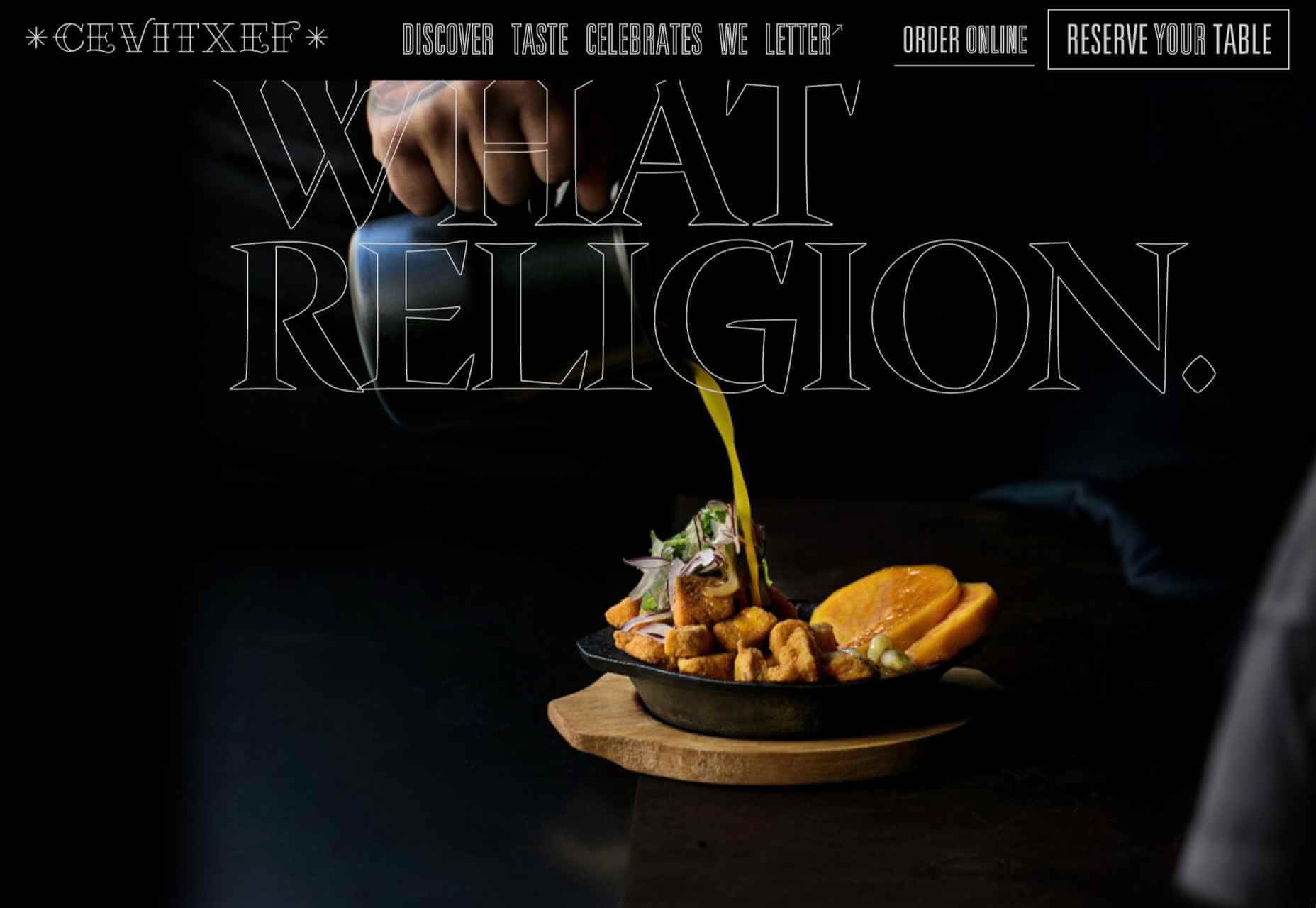
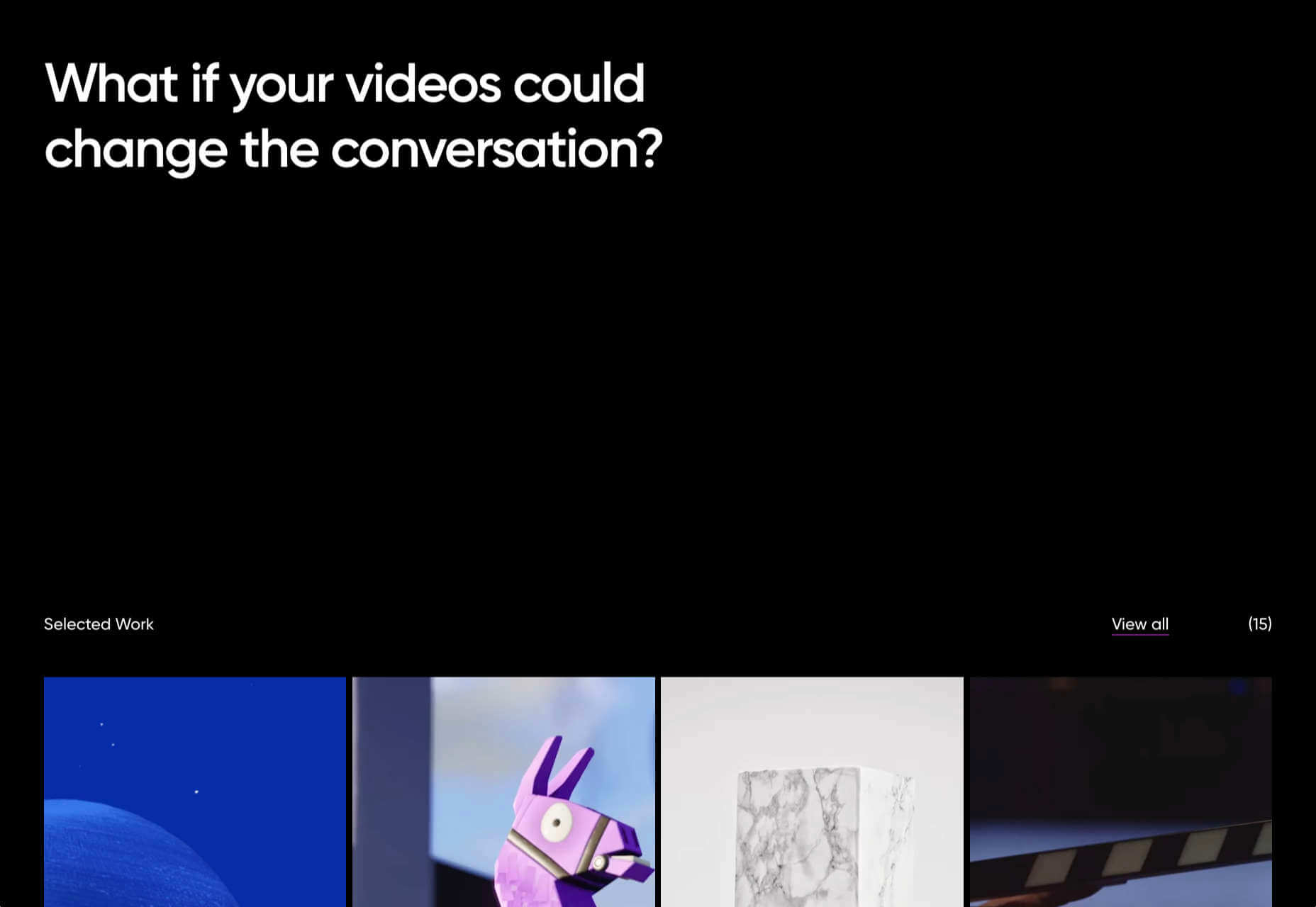
Looking for something new to get you excited about design work? This list is packed with all kinds of goodies to help you feel inspired and ready to work.

Here’s what new for designers this month.

Top Picks for March

Same Energy

Same Energy, in beta, is a visual search engine. You can search with a minimum number of words or an image. The website is designed to help you find art, photography, decoration ideas, and practically anything. It uses deep learning and algorithms to create images on the home page, and you can create feeds in the same manner. The coolest part of this tool is that it tries to match the visual and artistic style you ask for with image mood and objects.

SVG Repo

SVG Repo is a collection of more than 300,000 SVG vectors and icons that you can download and use in projects for free (even commercial use). The site has a powerful search tool to help you find the right image, and the platform is designed so that you can contribute.

Penpot

Penpot is an open-source design and prototyping platform for cross-domain teams. It is a web-based tool that isn’t dependent on any operating system and works with open web standards. It’s designed to be zippy and interactive so your team can work fast.

Directual

Directual is a no-code platform for building scalable apps using a visual interface. (Perfect for designers with less development experience.) It includes integrations with other popular tools and is free to use while figuring out how the app works and how you can make it fit your business goals.

HTML Boilerplates

HTML Boilerplates helps you start web projects by generating a custom HTML boilerplate that you can download. Just choose the elements you want to include and then copy and paste the code into your editor.

6 Productivity Boosters

Rows

Rows is a spreadsheet tool with built-in web integrations that’s made for team collaboration. It works with other tools you already use, such as Google Analytics, Twitter, LinkedIn, Mailchimp, and so many others. Without scripts, you can use it to automate workflows, analyze data, share dashboards, and build forms and tools that make work simpler.

Form.Taxi

Form.taxi is a premium web-based form tool. You can create web forms without code or programming and connect them to your website. The tool then stores information, filters for spam, and notifies you of form submissions.

Verbz

Verbz is a voice productivity app that allows you to create notes, assign tasks, make announcements, run standups, or chat. Talk or type, listen or read. It works as your own voice assistant for teams. It’s available in Beta from the App Store, and there’s a waitlist for Android users.

Flameshot

Flameshot is a tool for grabbing screenshots. It has a customizable appearance, is easy to use, and lets you draw and edit screenshots as you work.

Kitemaker

Kitemaker is a collaboration tool for development processes. It can help you keep track of everything from tools such as Slack, Discord, Figma, and Github in one place. It helps you structure projects and keep discussions about work moving forward in one place.

This Code Works

This Code Works is a place to save code snippets that work for when you need them again. You can group and organize snippets and share with others. You might think of it as the “Pinterest of code.”

3 Icons and User Interface Elements

Sensa Emoji

Sensa Emoji is a collection of common emoji icons that you can use in your materials. Every element is fully vector and free to use.

Google Fonts Icons

Google Fonts now supports icons, starting with Material Icons. Choose between outlined, filled, rounded, sharp, or two-tone options in the open-source library.

Toolbox Neumorphism Generator

Toolbox Neumorphism Generator is a design tool that helps developers to generate CSS in the soft UI /neomorphism style for the elements with real-time output.

3 Tutorials and Demos

An Interactive Guide to CSS Transitions

An Interactive Guide to CSS Transitions explains everything you need to know about this great animation tool for website designers. This tutorial digs in with code and examples to help you create more polished animations and is designed for anyone from beginners to experienced designers with some pro tips throughout.

About Us Pop-Out Effect

The About Us Pop-Out Effect adds a special element to any team or contact page with a nifty pop animation. Each person seems to lift out of the circle frame in this pen by Mikael Ainalem.

Interactive Particles Text Create with Three.js

Interactive Particles Text Create with Three.js is a web element you could play with all day. Text shifts into particles and follows mouse movement in a fluid motion in the pen by Ricardo Sanprieto.

10 Fresh Fonts and Text Tools

Bitmap Fonts

Bitmap Fonts is a collection of various bitmap typefaces all pulled and stored in a single location. This is the perfect solution if you are looking for a bitmap option.

Uniwidth Typefaces

Uniwidth Typefaces for Interface Design is another collection of fonts for a specific purpose – here universal widths for interface design. Uniwidth fonts are proportionally-spaced typefaces where every character occupies the same space across different cuts or weights. This is both a tutorial on the type style as well as font collection.

Bubble Lemon

Bubble Lemon is a typeface for projects with a childlike feel. With an outline and regular style, the thick bubble letters look like some of the sketches you may have done in grade school.

Core Font

Core Font is an open-source project with a funky and modern style. It has a full upper- and lower-case character set, numerals, and a few punctuation marks.

GHEA Aram

GHEA Aram is a superfamily with a Central European flair, according to the type designer. The premium typeface includes everything from light to black italic and even some Armenian ligatures.

Make Wonderful Moments Duo

Make Wonderful Moments Duo is a script and sans serif font pair with a lighthearted feel and highly readable character set. The regular (sans serif) only has uppercase characters.

Ribheud

Ribheud is a slab-style display font with a heavy look and strong presence. What makes it interesting is the left-outline/shadow on each character.

Rose Knight

Rose Knight has an old-style feel that can take on multiple moods, depending on supporting design elements. All of the characters are uppercase with alternates. It could make a fun branding option.

The Glester

The Glester is a beautiful premium typeface in a calligraphic style. The most interesting element of this typeface is all of the extra decorations that allow you to change individual characters (380 glyph alternates).

Velatus

Velatus is a vintage-style typeface with plenty of swashes and flourishes that make it unique. It comes with 157 characters and 96 glyphs.

Source

The post 27 Exciting New Tools For Designers, March 2021 first appeared on Webdesigner Depot.


Source de l’article sur Webdesignerdepot

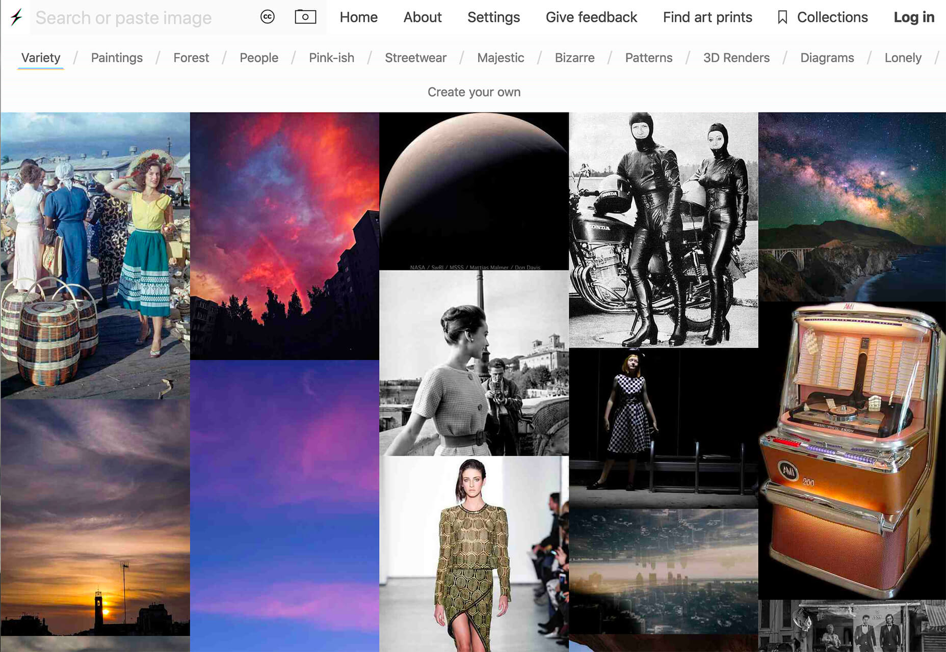
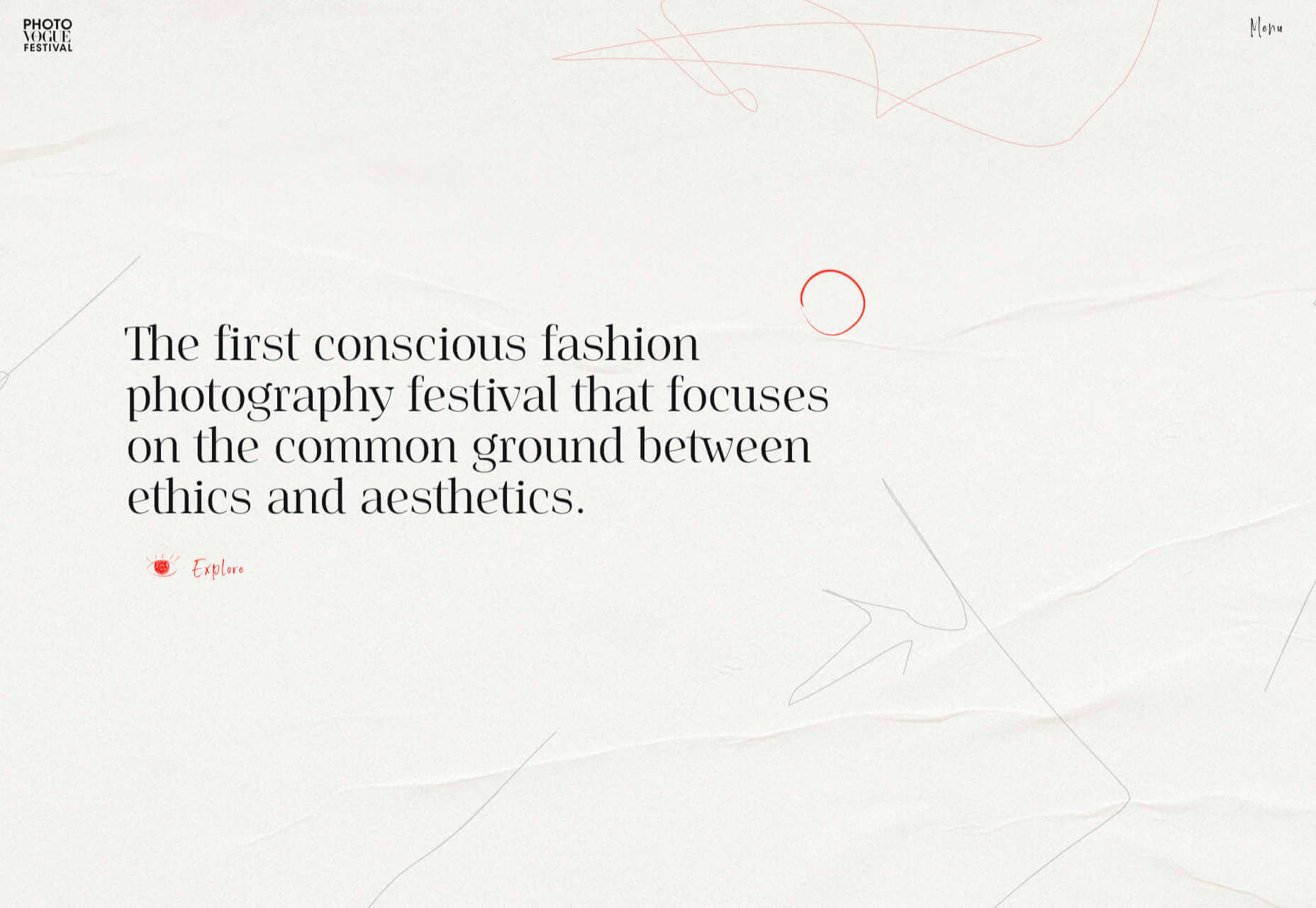
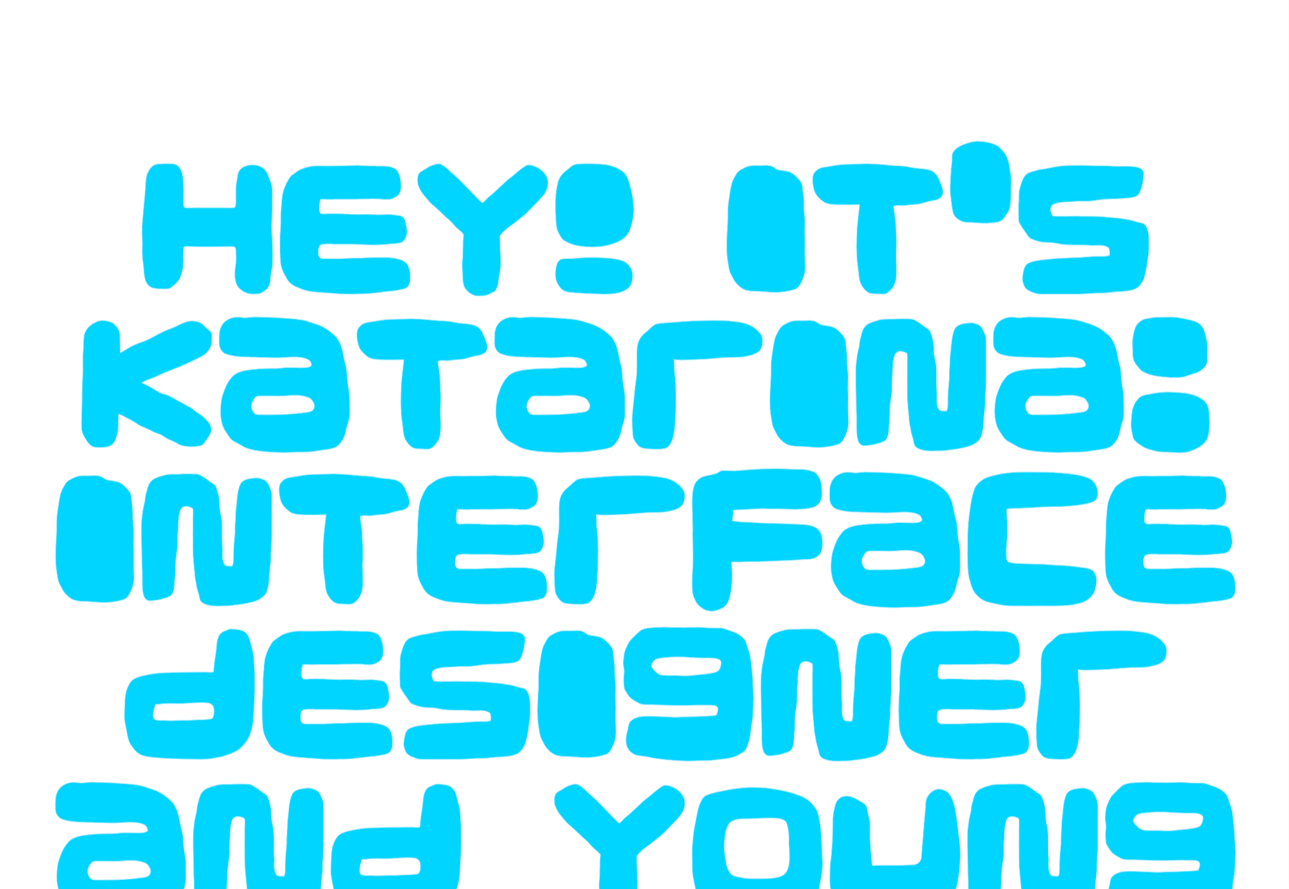
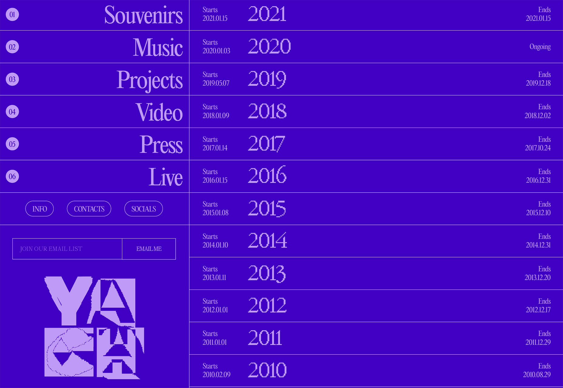
March is that time of year where the feeling of newness starts, from the first Spring days to fresh design projects. These trends are no exception, with fun new takes on some classic concepts.

Circles are always popular, but the top trend is an animated take on the traditional element; plus, fun pink and purple color palettes and a few faux split screen designs round out trending styles.

Here’s what’s trending in design this month.

Circle Animations

Circles are one of those shapes that never leave the design sphere. They have a lot of classical meaning and are flexible in terms of design options.

Designers are having a lot of fun with this shape right now. From animations to text circles to image frames, they seem to be all over the place.

More recently trending is more circle-shaped animations. This trend maintains a circle’s properties as a unified and harmonious element with movement to create more engagement and make you look at the design just a little bit more.

Each of these examples uses circles in a different but equally interesting – and animated – way.

Universal Favourite uses a circular blob. It’s almost like a giant bubble. It wiggles and flows, and stretches within the space without any help from the user. It has a smoothly quality that makes you want to stare at it. The color here helps, with the circle and background not having an immense amount of contrast. Also, note the cute little circle button in the bottom corner.

Kenta Toshikura put most of the subtle animation for this design inside the circle. With a hover state, the entire circle moves on the screen with a second layer of animation, and the cursor is also a circle that hops around the black background.

Kffein takes a totally different approach with a circle made from the primary test elements. Identifying website information rotates in a circle around another geo shape on the main plane. Not only is there a circular animation, but an almost three-dimensional effect that happens due to the way elements are layered here.


Pink and Purple Palettes

The prevalent pink and purple color combination isn’t for everyone – although you wouldn’t know it from the number of designs using similar colors.

This bright combination almost screams “spring” and has a lightness to it that almost seems to lift the mood of any project. (Maybe color selection is a reflection of how we all want to feel.)

What’s nice about these colors is that they flow into one another nicely. They can also be expanded to fall into neighboring hues on the color wheel, such as red from pink and blue from purple.

Maybe the most popular use of this color pair is as a gradient. You can find pink to purple everywhere, from background gradients to image overlays to buttons and user interface elements. There’s no lack of use here.

Each of these examples shows opportunities with this color combination.

SMU uses bright pink, blue, and purple to create a giant “road sign” in the design that jumps out from the rest of the project. The sign almost seems out of place and doesn’t fit as part of the normal color palette. This is what draw you right to it.

USA Volleyball uses the popular gradient option and extends the pink to the purple palette to hints of blue and red. What’s great about this design is that it uses a super trend element and color option and makes it work with their current color palette. You can almost imagine the design conversation when someone wanted to use a pink to purple gradient for a brand that features red, white, and blue. The gamble paid off, and it works beautifully without being off-brand.

Blobmixer uses purple, pink, and a few other bright colors – note the animated circles, too – to draw users into the design. The entire project is a fun, customizable experience that you can play with, and the color choices are what make you interested enough to try. This design also offers a great example of tactile animation and elements that feel real even when you interact with them using a mouse on the screen.


Faux Split Screens

Split-screen designs were a huge trend for about two years. The aesthetic was also functional for content that required a this or that choice on the part of users.

Now, we see the design elements but without the function. (Maybe because it just looks nice and creates a sense of balance without a symmetrical design.)

These projects look like they might offer multiple gateways to content, but there is only one call to action on the dual-screen aside from navigation elements.

What this design option does is help draw the eyes across the screen. One side will immediately appeal to you, and when done well, you’ll feel a subtle push of pull from the color, text, and images to look at the other side as well.

Renaissance TV does it with heavy animation with “dancing dots” from an old TV that doesn’t work. But then you need to look at the green text to understand what is happening.

Yacht uses text weight and space to push the eyes across the screen. Almost everyone will go to the heavier areas first and then gaze across the screen through blocks of space to the final small text on the right side. And it all happens in a fraction of seconds.

Bonjour Paris pairs bold color with black and white images. You may look at either side first, depending on personal preference, but the other half of the screen is necessary for a complete understanding of the website.


Conclusion

While all of these design trends are evident in new and recent projects, the use of pink and purple color palettes – particularly with a gradient – seems to be everywhere you look. These color choices are popular and come in a lot of forms.

Maybe the most obvious is with brighter pink and purple gradients, but other variations are also trending. It’s definitely one to watch in the longer term.

Source

The post 3 Essential Design Trends, March 2021 first appeared on Webdesigner Depot.


Source de l’article sur Webdesignerdepot

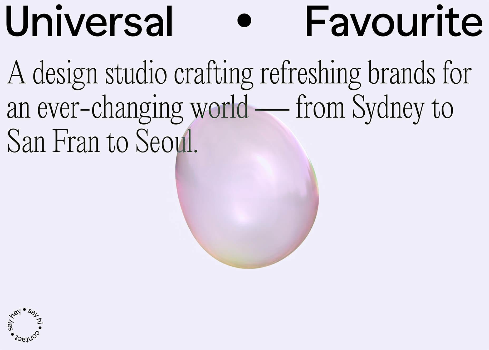
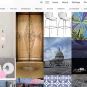
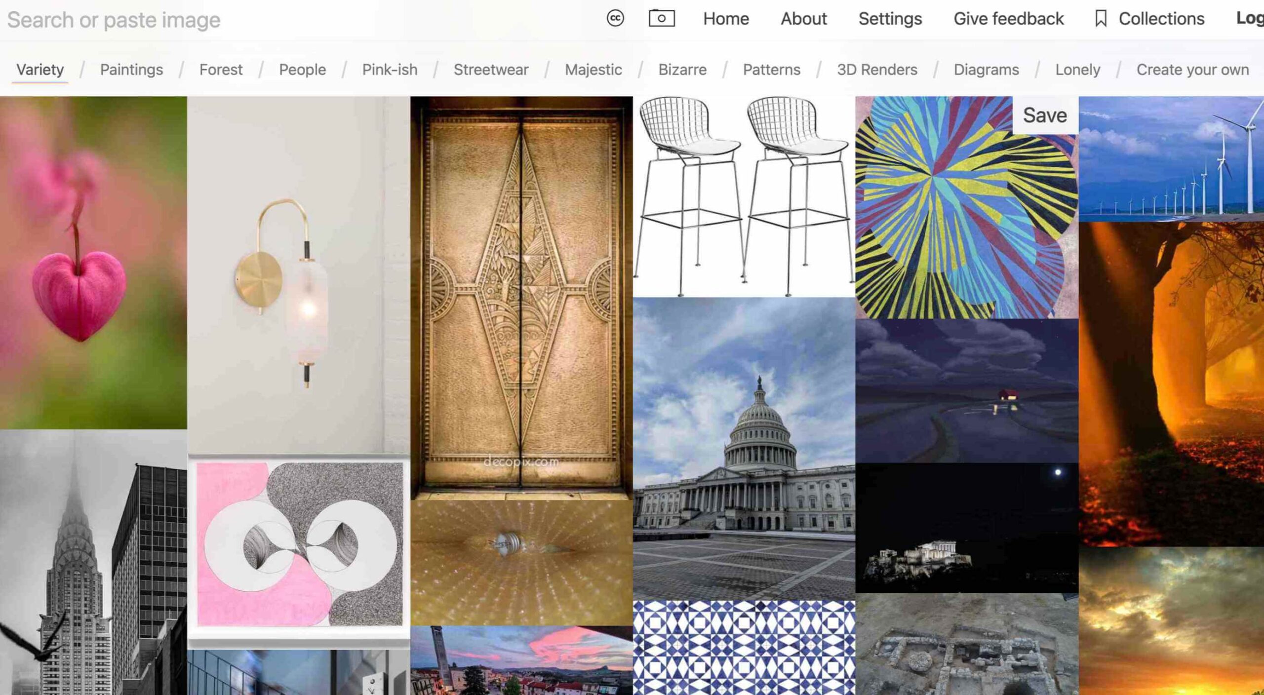
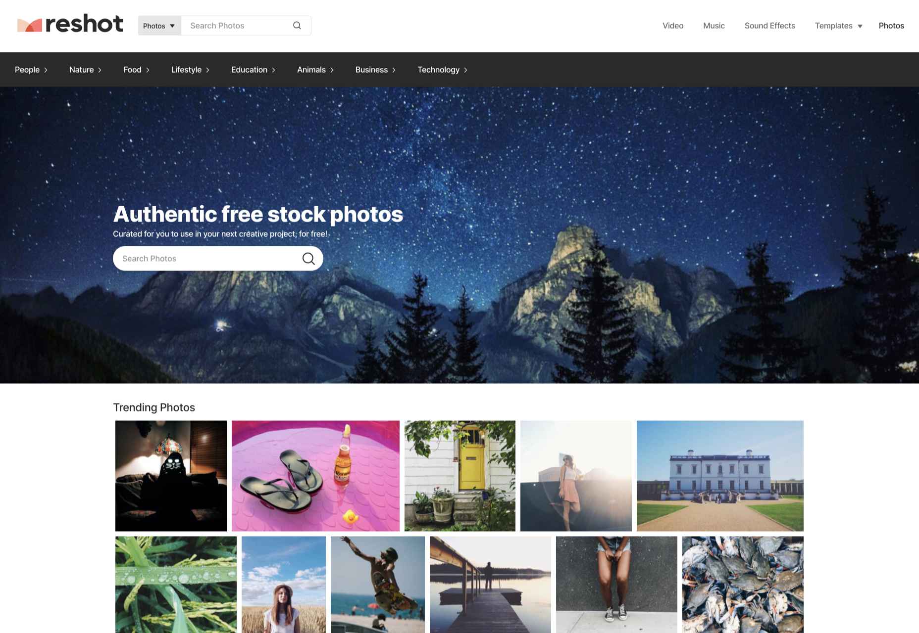
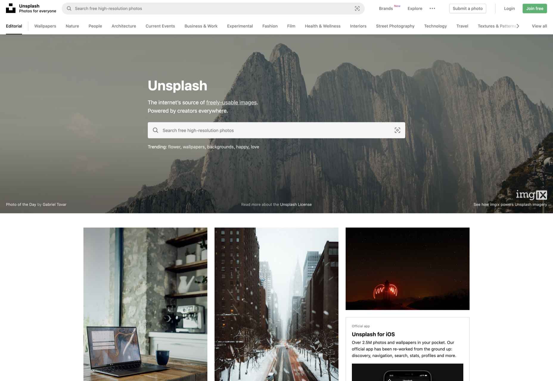
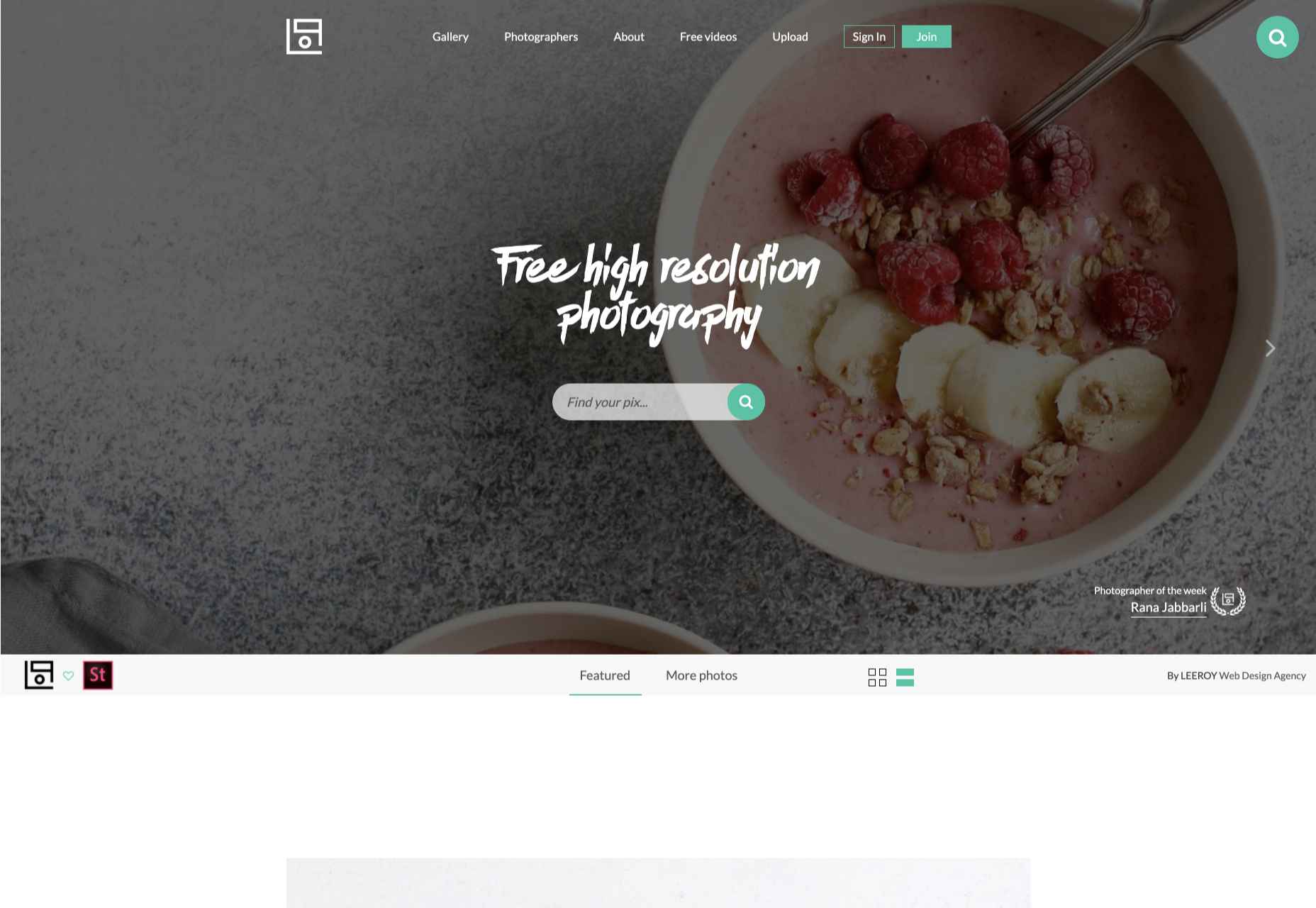
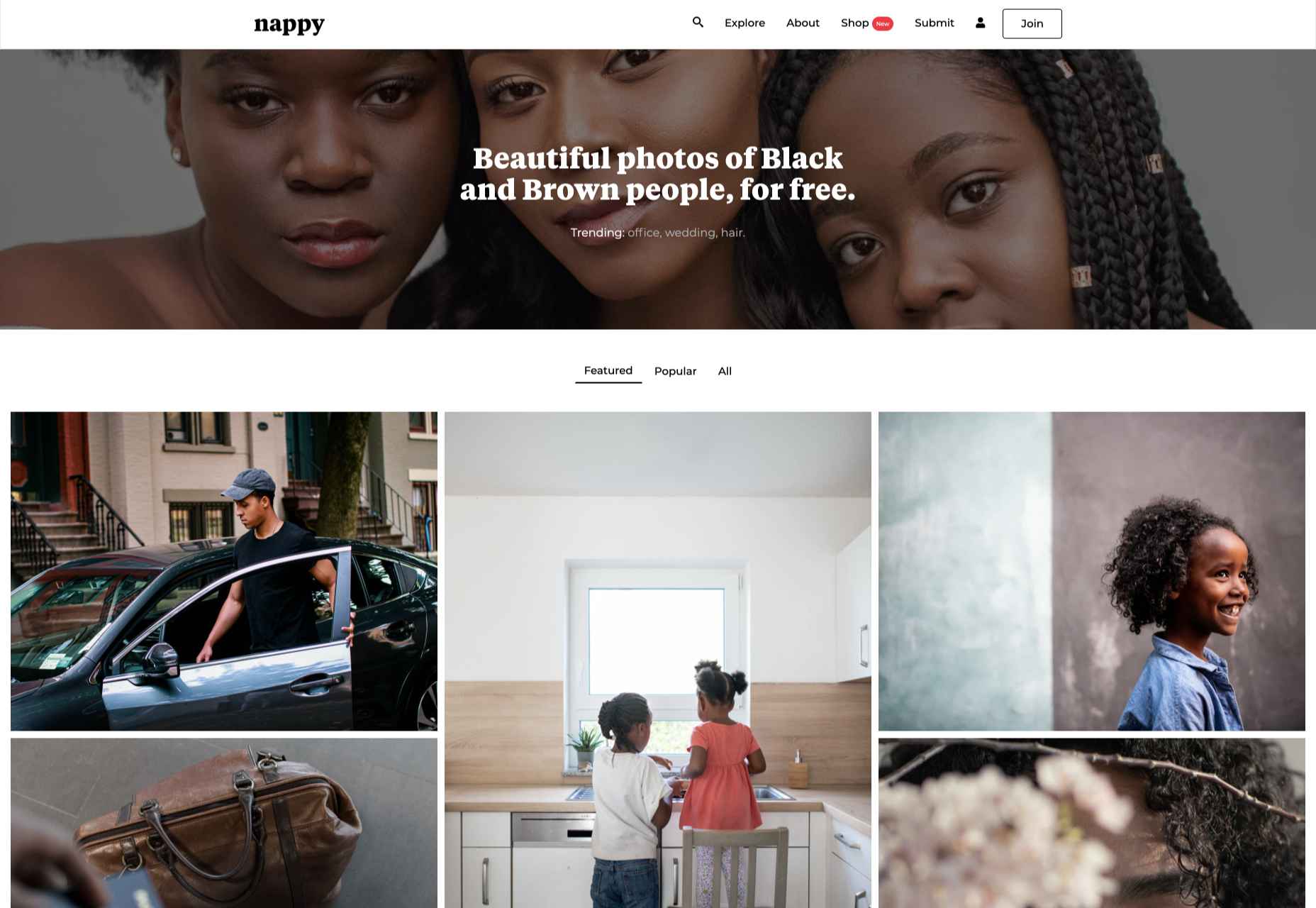
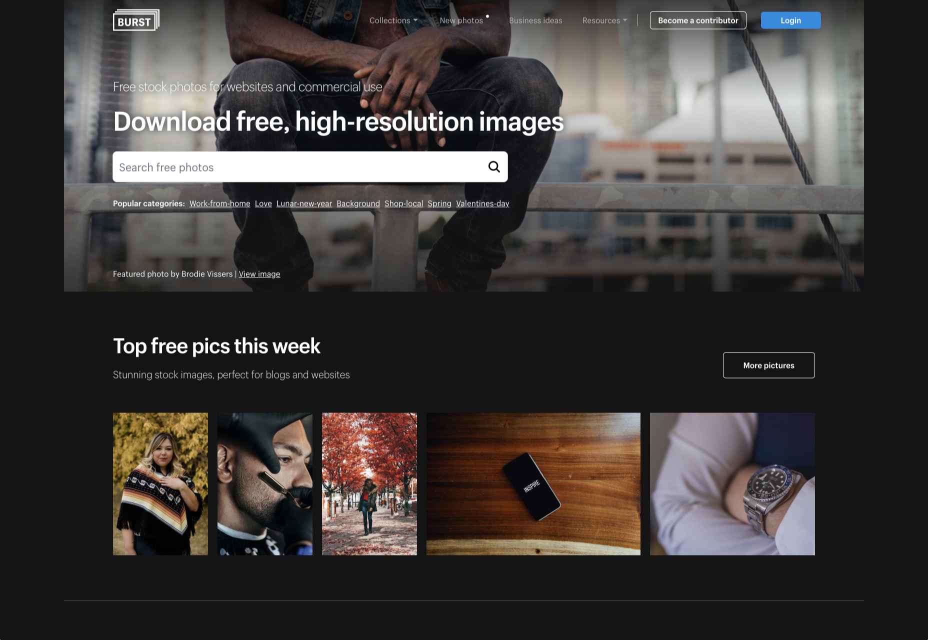
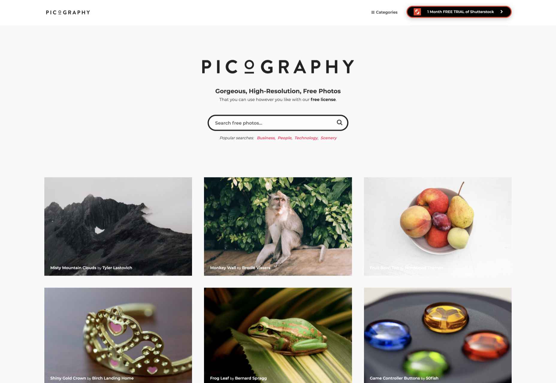
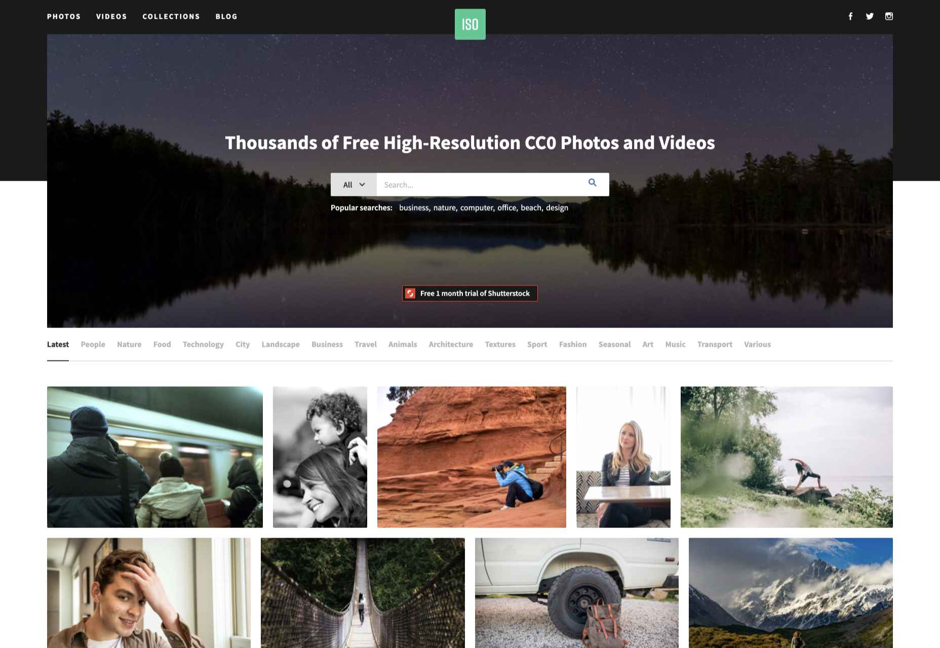
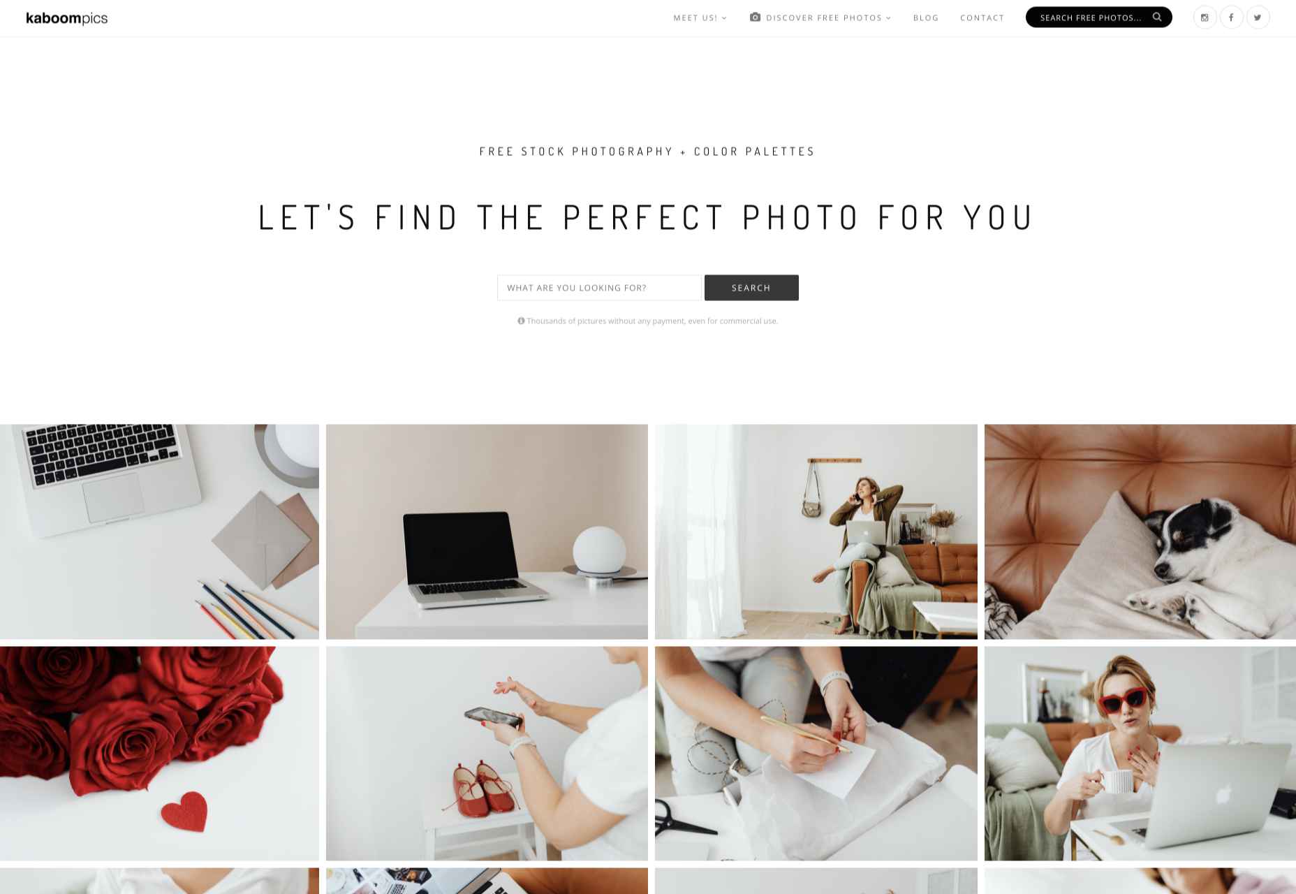
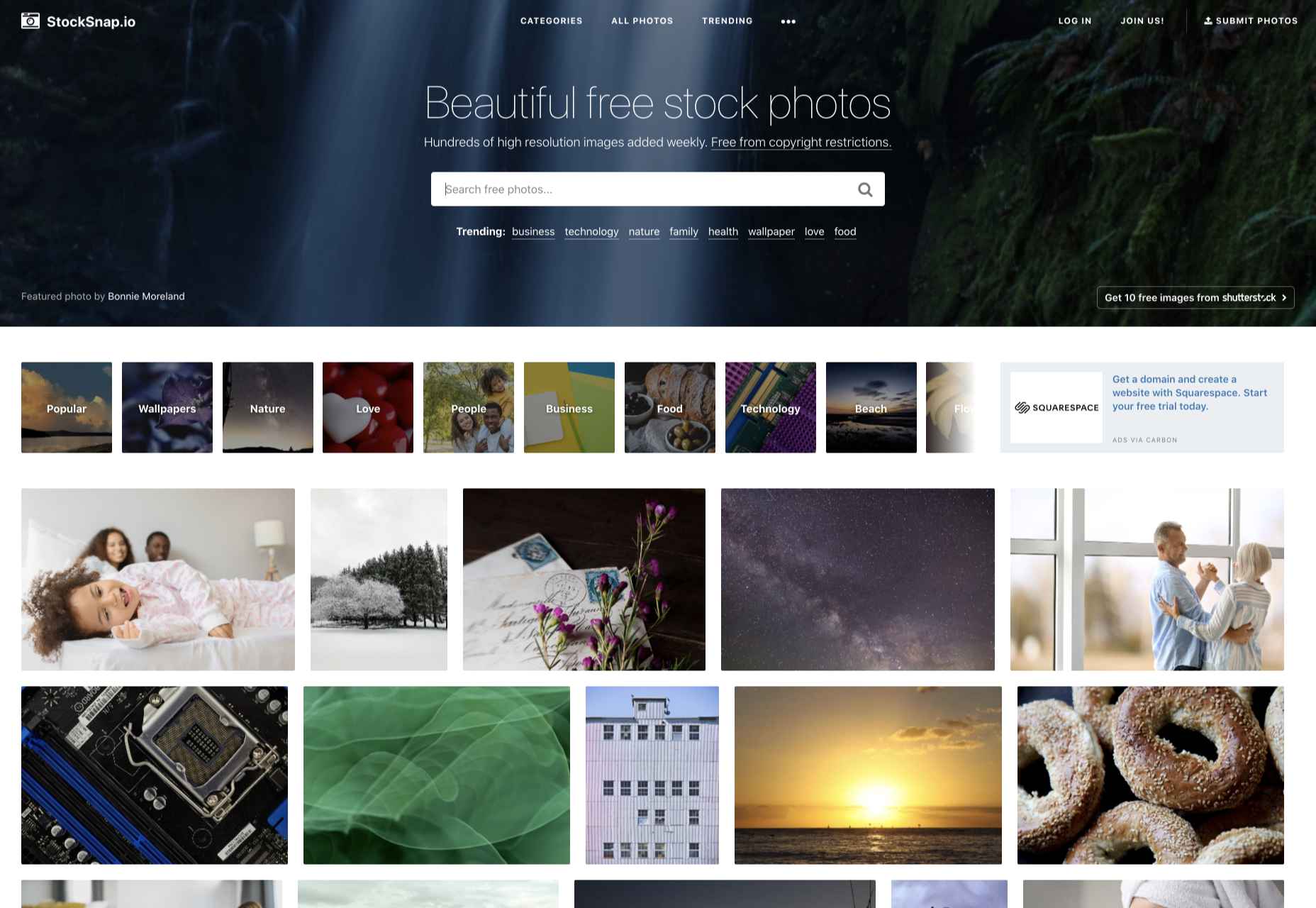
When photographers take images to sell commercially, like every other business, they want to maximize their returns, so they adapt their ideas to meet commercial trends. As a result, stock always looks like stock, and that minor deception introduces a small amount of doubt in users.

But the rise of camera phones, and the increasing affordability of DSLRs, has led to a growth in people who aren’t monetizing every shot. What that means is if you know where to look, you can find images that are less posed, more natural, less clichéd, and far more diverse.

Here are ten places to look for engaging, and trust-building stock images, all free to use…

1. Pexels

Pexels has a huge collection of high-quality images that would not feel out of place on a ‘premium’ site. You’ll also find a ton of free videos. Pexels’ search feature is particularly well-tuned. Pexels also runs regular challenges, with cash prizes for photographers; reviewing the past competitions is a great shortcut to finding original images.

2. Reshot

Reshot is one of the better stock sites on the web, with a wide selection of curated images. There’s a distinctly Instagram feel to the images on Reshot; they don’t feel staged, in many cases, they don’t look like stock at all. That gives them an authentic feel that many ‘premium’ stock sites fail to deliver.

3. Unsplash

Unsplash is one of the largest collections of free images on the web. It has a good collection of standard stock and a growing collection of more creative, experimental images. Its free-forever approach is backed by product placement instead of adverts or premium sections, which means you may find the more marketable images include easily identifiable brands.

4. Life of Pix

Life of Pix highlights one photographer per week to feature ten images; that adds a competitive angle to the site as photographers submit premium shots to get noticed. Unless you’re very fortunate, the ideal shot for you isn’t going to be found in the current set, but click the ‘Gallery’ link, and you’ll have access to all the shots that have previously been uploaded.

5. Nappy

Unlike ‘premium’ sites that are set up to turn a profit, free stock sites often set out to address a hole in the market. Nappy was set up to redress the underrepresentation of black and brown people on many stock sites. At least some of your users fall into this demographic, and it’s a great idea to show them they’re valued by using images like these.

6. Burst

Burst is a stock site provided by Shopify to help new entrepreneurs find stock to help them sell products. Anyone can use the shots, but there is a natural inclination towards commercial rather than editorial images. There’s a good mix that rivals many paid sites and some less obvious shots.

7. Picography

If quirky and offbeat isn’t right for your project — and it may very well not be — then check out Picography for a more middle-of-the-road collection of free stock images. There’s a wide selection, but they do tend to feel more stock-like than many other collections.

8. ISO Republic

ISO Republic has a broad range of images and videos to choose from. Again, the images tend to be more stock-like than some other options, and you do have to dig around to find the best. ISO Republic is a good place to search when you want to swap like-for-like with a ‘premium’ stock source.

9. Kaboompics

Kaboompics specializes in lifestyle images. If you’re hoping for a woman sipping a frappuccino while making commanding business decisions, you’re in the right place. Kaboompics is a one-woman show, so the perspective is a little narrower than the ideal, but the free images are consistently high-quality.

10. StockSnap

StockSnap has a good balance of images. Many professional photographers use sites like StockSnap to upload the images they choose not post to ‘premium’ sites for one reason or another, so you’ll often find premium-quality shots for absolutely nothing.

Source

The post 10 Best Free Stock Image Sites For 2021 first appeared on Webdesigner Depot.


Source de l’article sur Webdesignerdepot

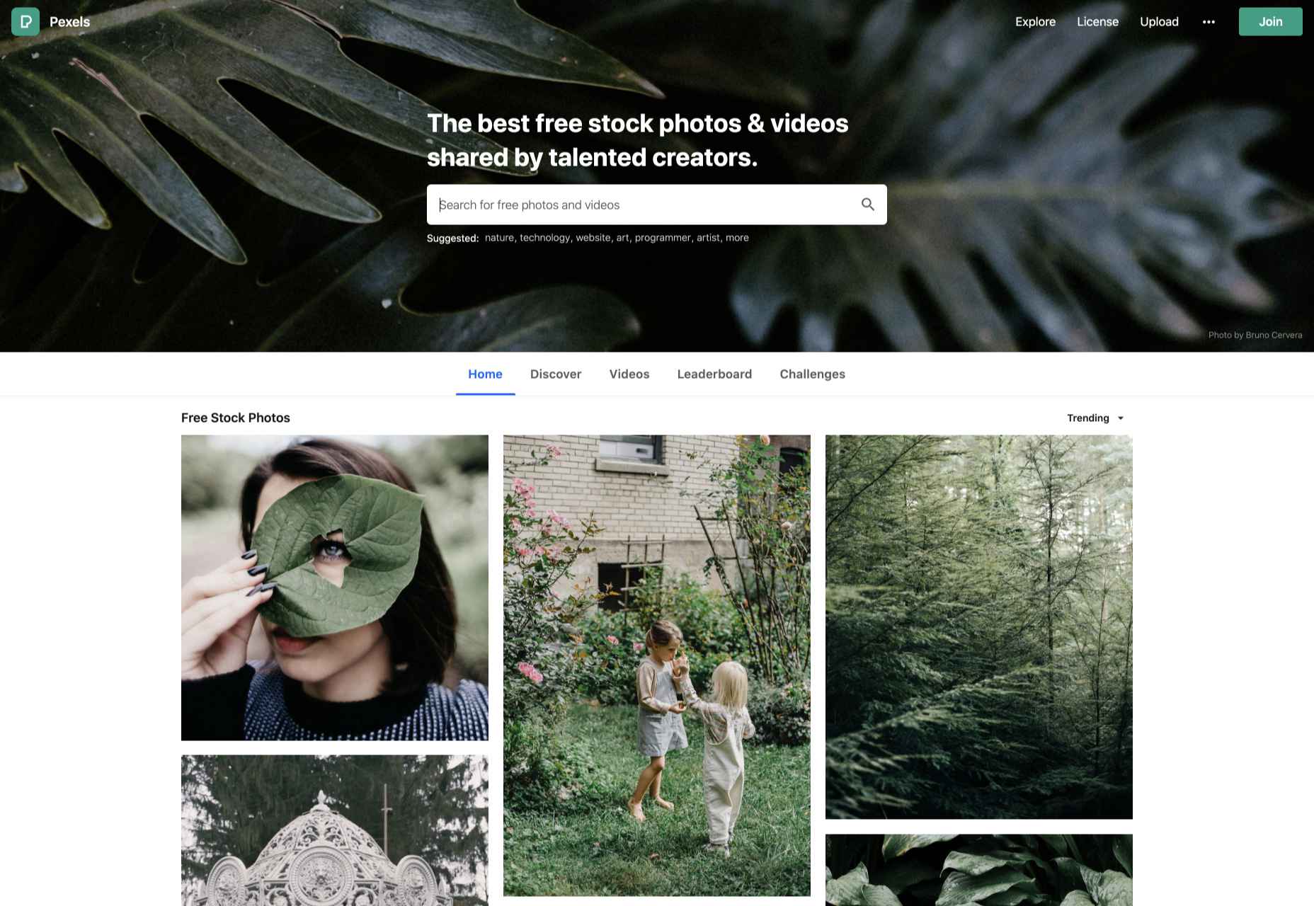
Here we are into a brand new year, and although we’re far from out of the woods yet, there is a feeling of renewed hope on many fronts.

In this first collection of the year, we have a mix of retrospectives, brand new ventures, and business as usual. There is an eclectic mix of styles on offer, from glossy and slick to minimalist and brutalist, but all confident and looking to a better world in the year ahead.

Clar

Brand strategists Clar have a simple but strong site. Aside from a few personnel profile shots and the odd bit of line animation, it is all text. The typography is good, and the use of color holds interest.

Ebb Dunedin

This boutique hotel, opening in March 2021 (COVID permitting), has bucked the usual luxury hotel trend and bravely gone for a more minimal design style to complement its interiors.

Aplós

Perfect for Dry January, Aplós is a new, non-alcoholic spirit that can be drunk on its own, with a mixer or in a cocktail. The site design and branding aesthetic is sophisticated calm.

Malala Fund COVID Initiative

Subtle color and simple line decorations keep this site for the Malala Fund’s COVID Initiative clean but warm and appealing.

Taubmans Chromatic Joy

This micro-site promoting Taubmans’ new paint color collection is bursting with color and makes a big nod to the Memphis style of the 1980s.

Myriad

Myriad video production agency’s site uses small amounts of bright colors really well. And they quote Eleanor Shellstrop.

The Ocean Cleanup

Cleaning all the plastic crap out of the oceanic garbage patches is a grim job, but it’s getting done, and The Ocean Cleanup site explains how and why in a not grim way.

Photo Vogue Festival

This site displaying the work and talks from Vogue Italia’s 2020 Photo Festival mixes a hand-drawn style with clean type and a strong grid.

Zero

Zero is a digital branding agency. Their site is glossy with lots of high-quality images, smooth transitions, and a clear structure. The background options are a fun touch.

Fluff

This site for cosmetics brand Fluff takes an old school approach to designing for different viewports — sticking a fullscreen background behind your mobile view for desktop sounds like a terrible idea, but here it works.

Patricia Urquiola

The new site for Patricia Urquiola design studio is bright, bold, and assured, inspiring confidence.

Breathing Room

Breathing Room describes itself as a volunteer creative coalition that designs spaces for black people to live without limits through art, design, and activism. The design radiates confidence and optimism.

A Year in Review

A microsite from Milkshake Studio, highlighting their work over the past year. Some good scrolling animation.

Umamiland

Umamiland is an animated interactive introduction to Japanese food, with links to Google search results for individual items or where to get them.

Acqua Carloforte

Carloforte is the town on the island of San Pietro, near Sardinia, and the scents of the island inspire the perfumes of Acqua Carloforte. Cue beautiful photography.

Eugene Ling

Eugen Ling’s portfolio site is simple and straightforward with little or no marketing-speak and a lovely, understated slider transition.

CWC Tokyo

Cross World Connections is an Illustration and Creative Agency based in Japan and represents illustrators from all over the world.

Lions Good News

Following the cancellation of the Cannes Lions Festival of Creativity in 2020, this site was set up to highlight good news in creativity during the pandemic. A carousel of paper flyers forms the main navigation and creates a lo-fi, DIY feel.

G!theimagineers

G!theimagineers is a production studio for events and entertainment. White lines on black, horizontal concertina navigation, and lots of circles.

Sgrappa

Sgrappa is handmade grappa with attitude, and this site has an uncompromising, in your face vibe.

Source

The post 20 Best New Websites, January 2021 first appeared on Webdesigner Depot.


Source de l’article sur Webdesignerdepot