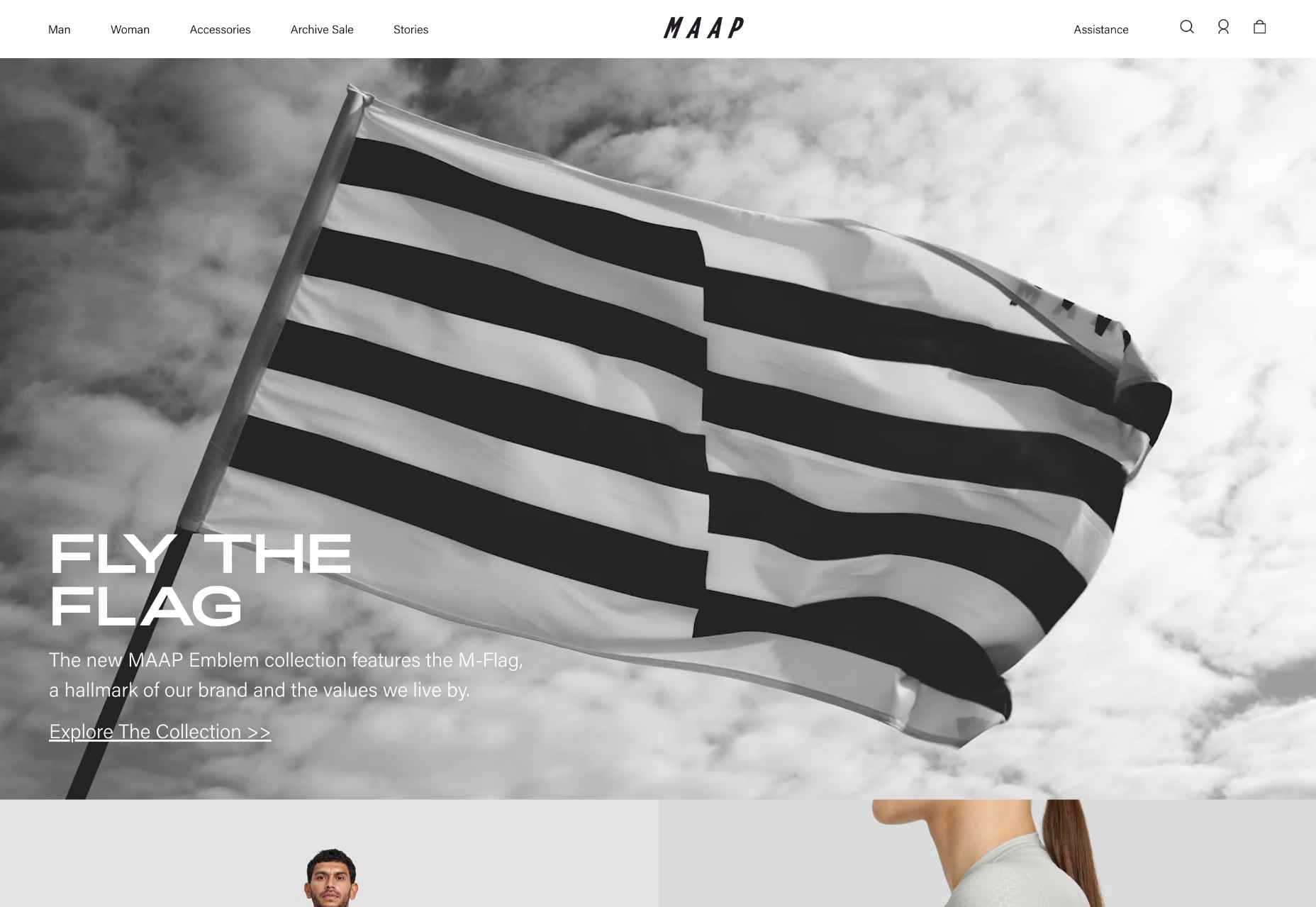
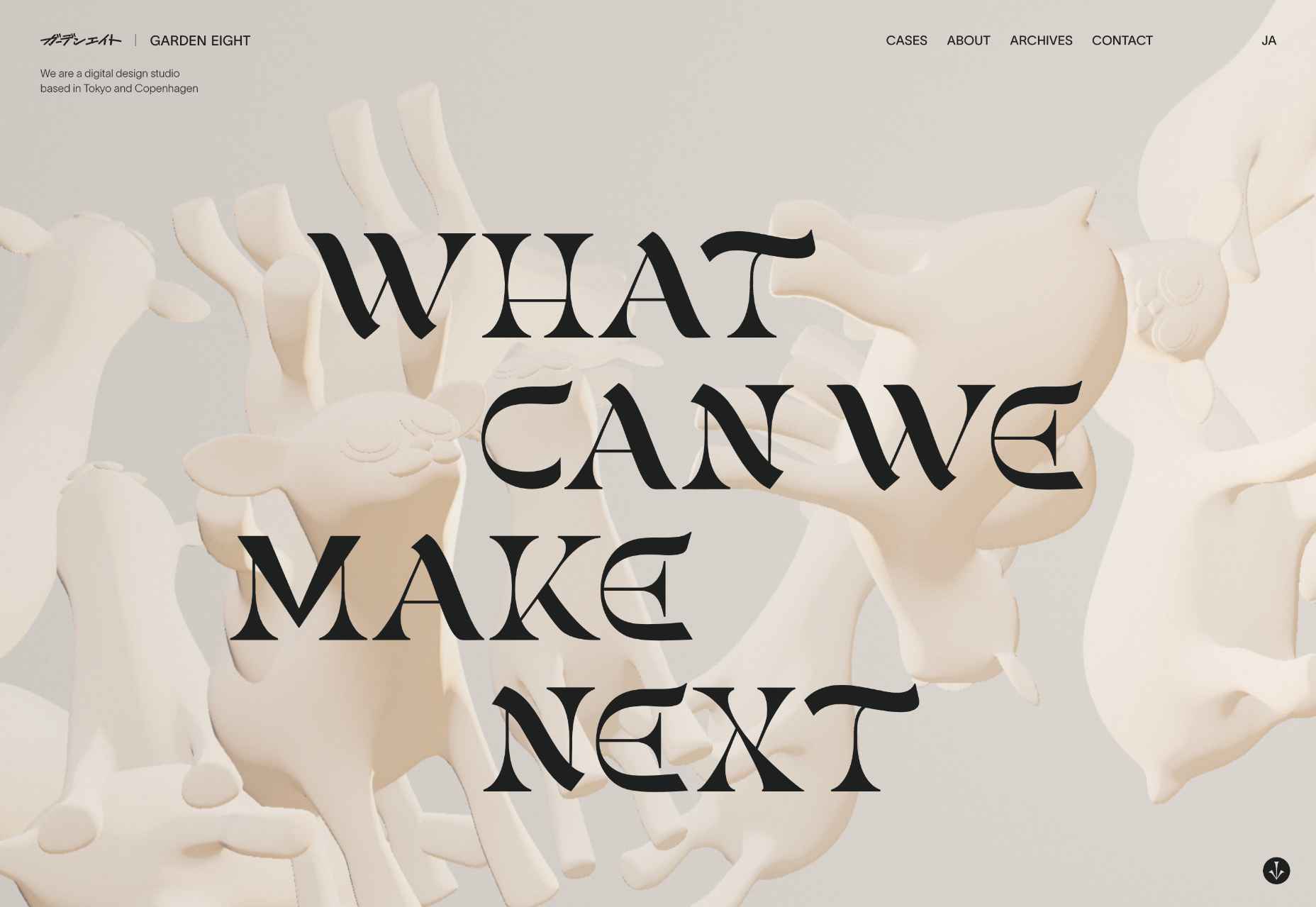
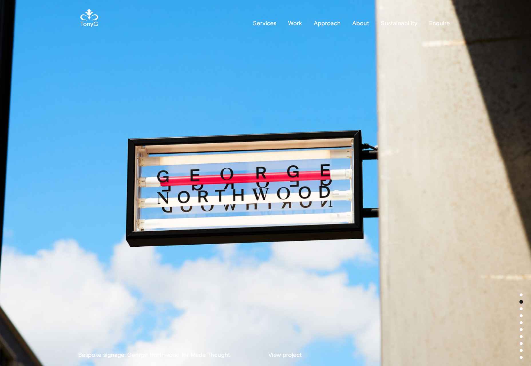
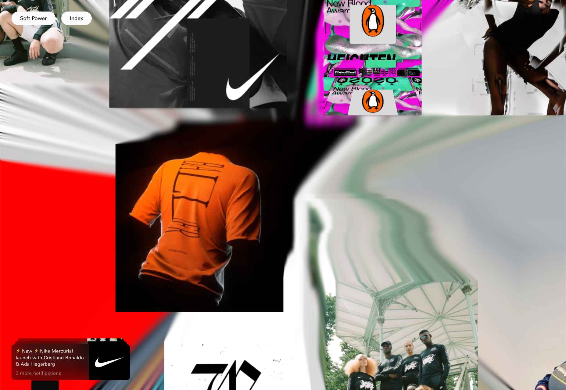
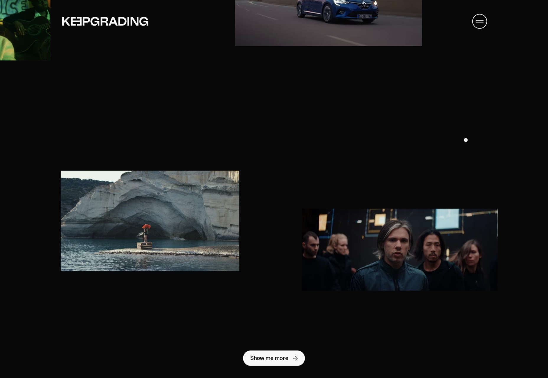
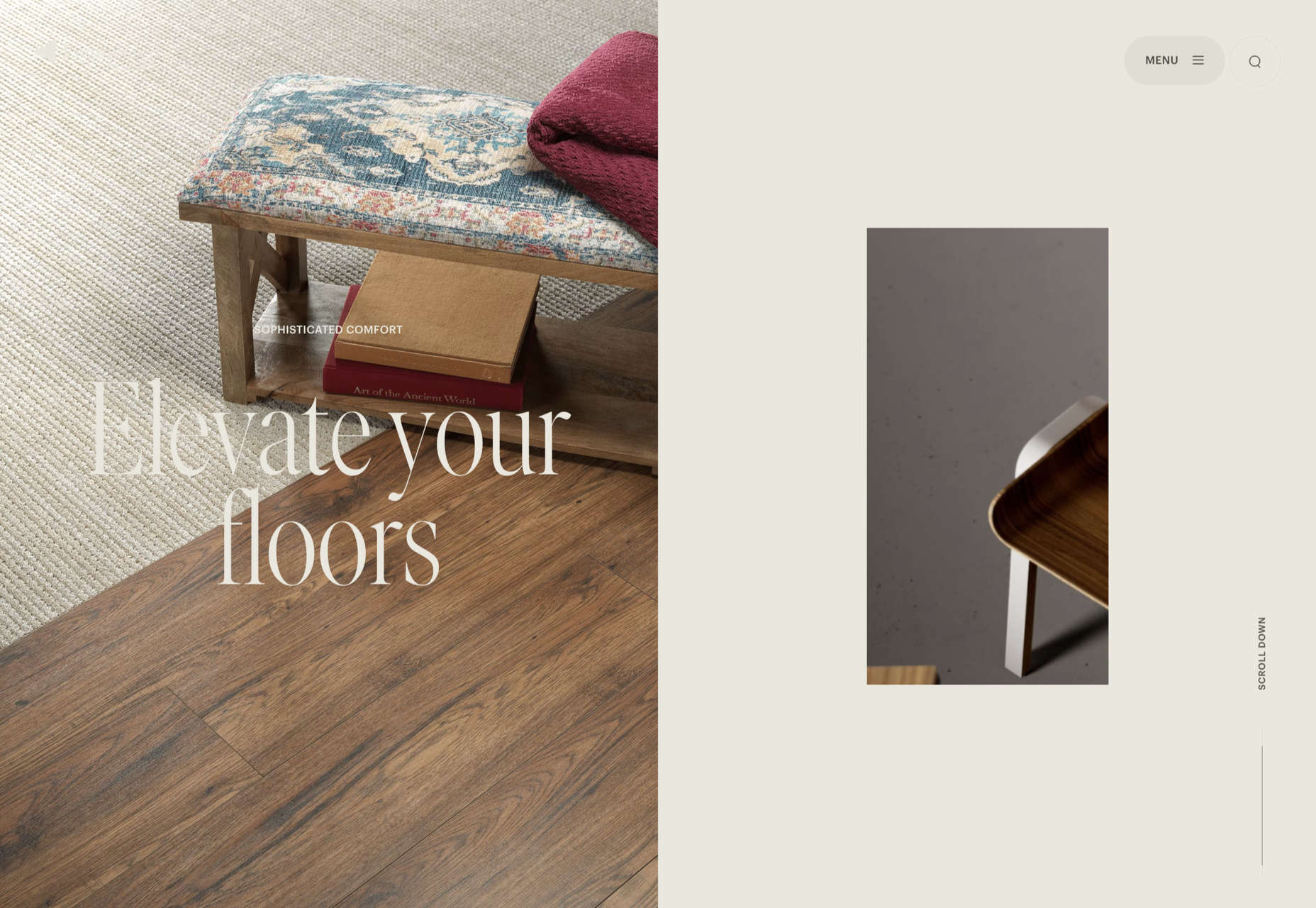
 This month’s collection of the best new sites is a mixed bag. Positivity remains from last month’s edition, and what we’re seeing is designers being far more ambitious for the experiences they create.
We have a couple of sites helping to alleviate the damage of war, some unusual approaches to topics that are normally very dour, and some excellent portfolios to be jealous of. Enjoy!
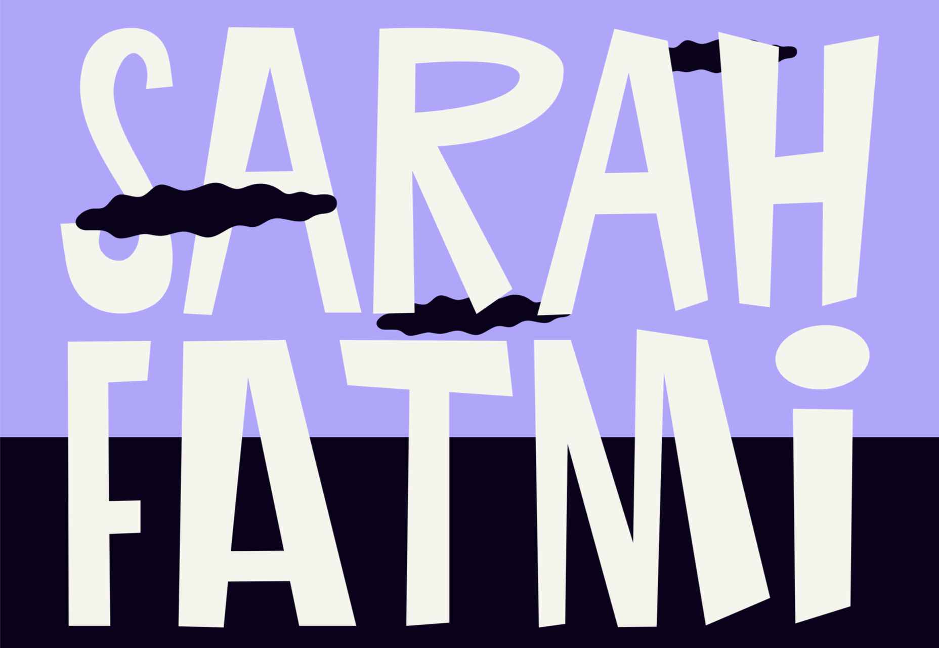
Sarah Fatmi
Characterful illustration and desktop sideways scrolling make this portfolio site for illustrator Sarah Fatmi stand out.
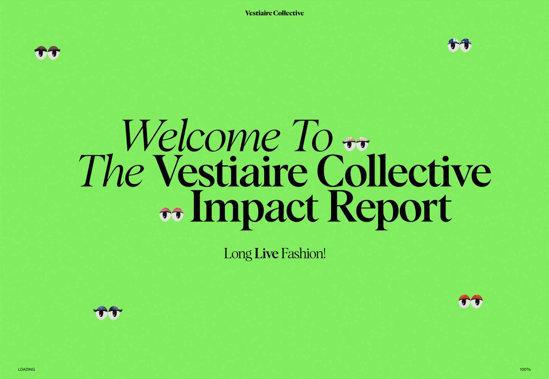
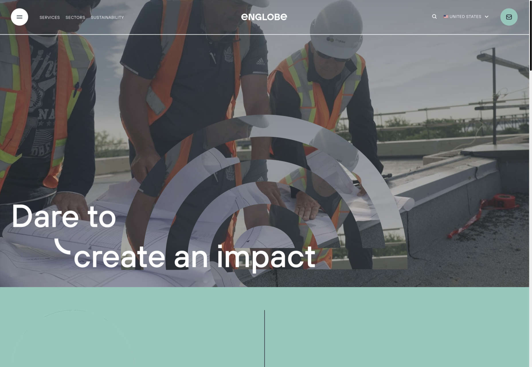
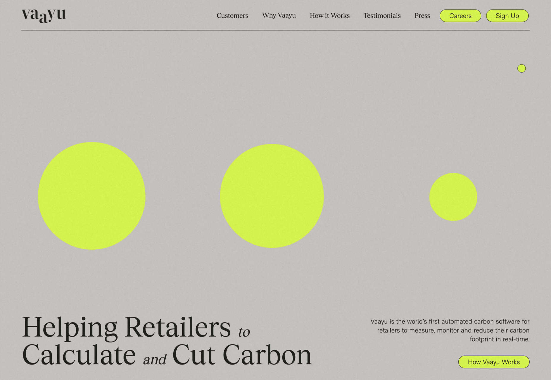
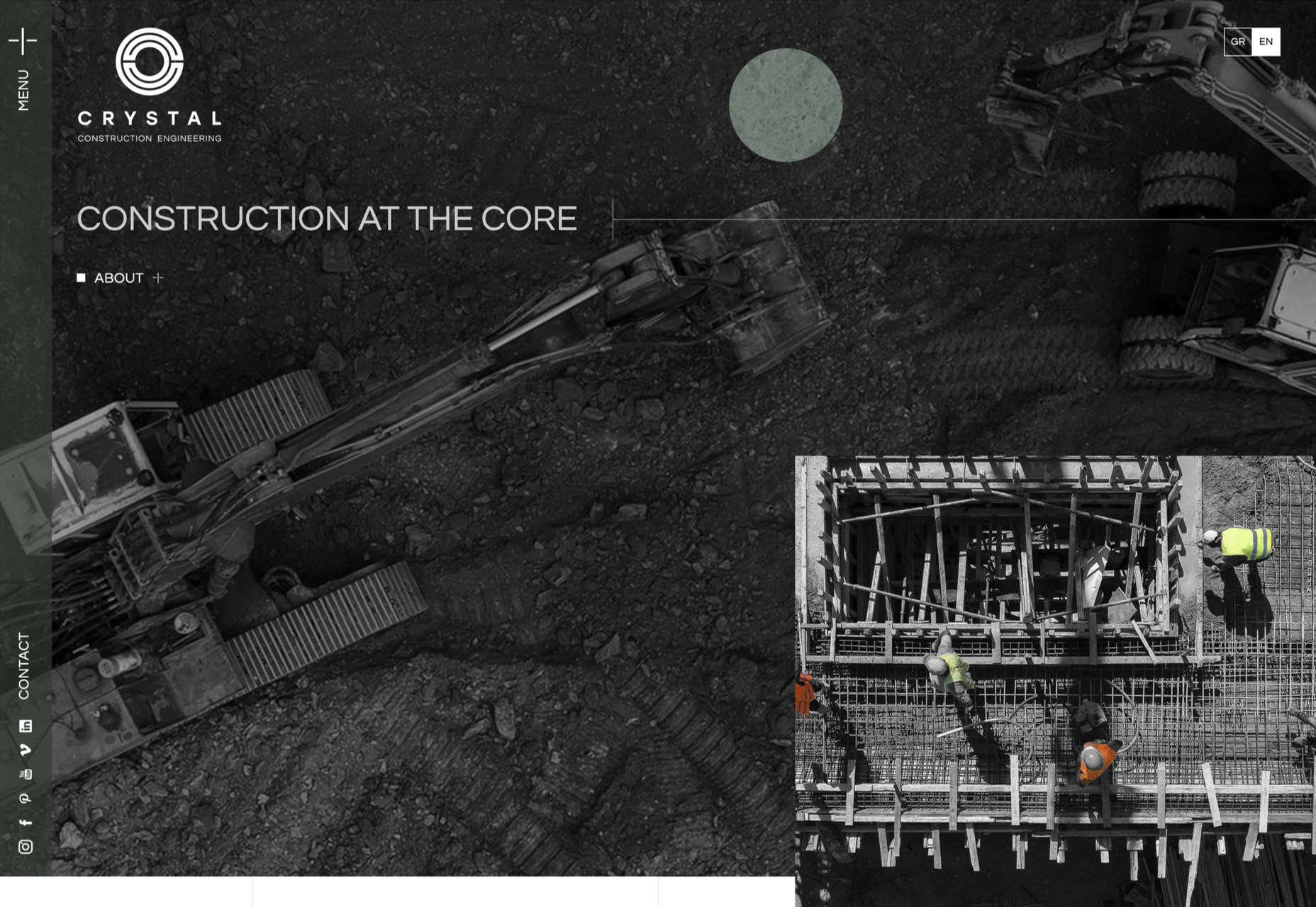
Vestiaire Impact Report
Green is the new black, and fashion resale platform Vestiaire presents its green credentials in an informative and engaging way.
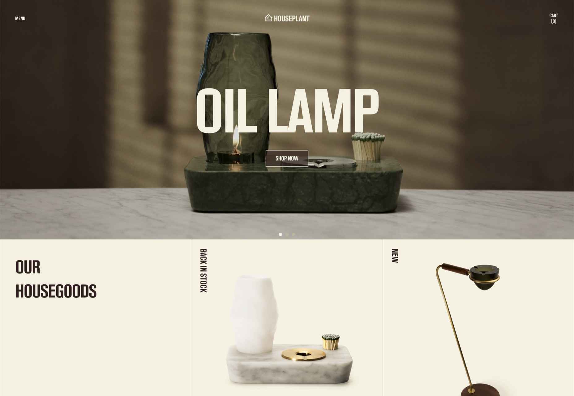
Houseplant
Houseplant is a collection of cannabis-related products designed by Seth Rogen and Evan Goldberg; this site is a lot classier than the average headshop.
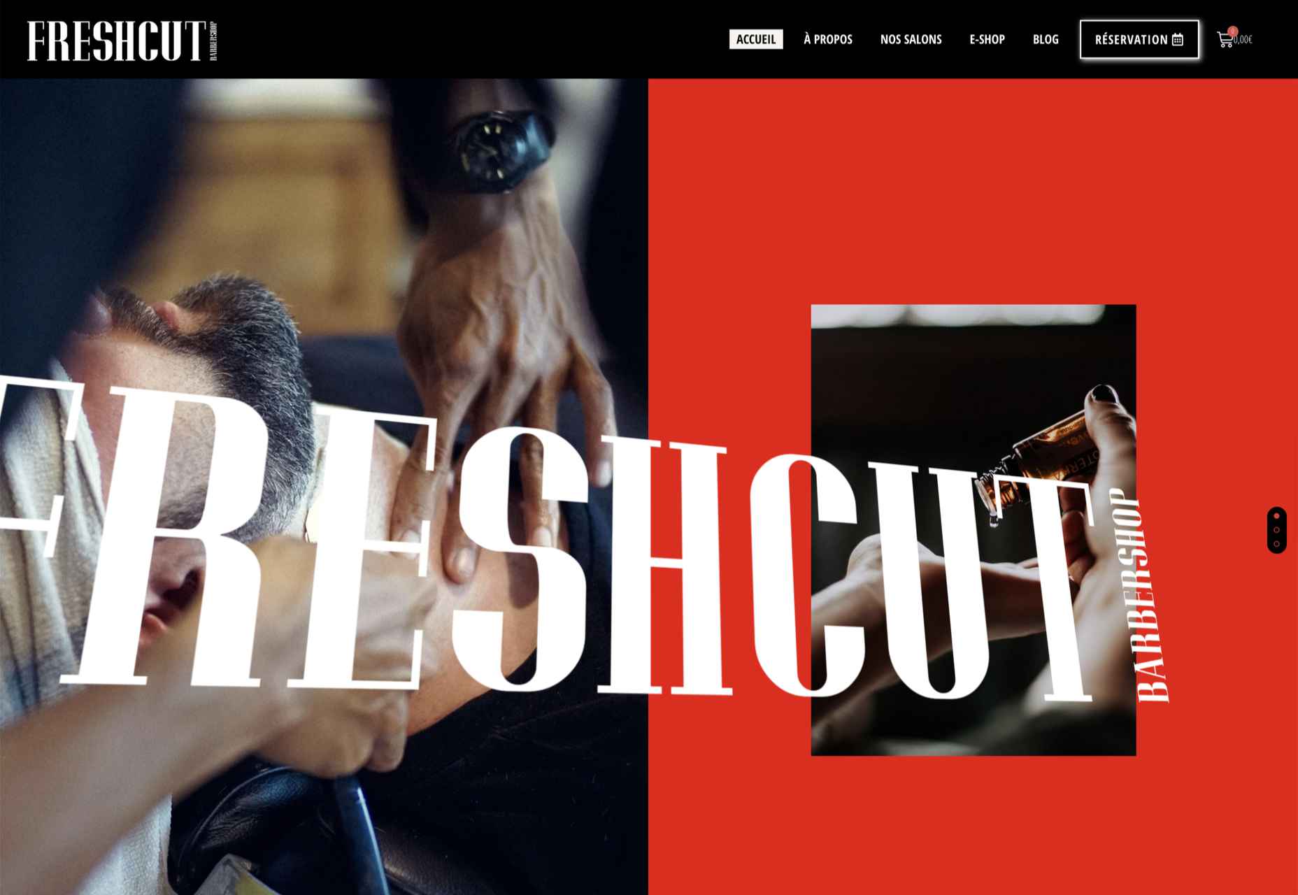
FreshCut BarberShop
The site for FreshCut BarberShop is modern, bold, and gets its message across clearly, even if the user doesn’t read French.
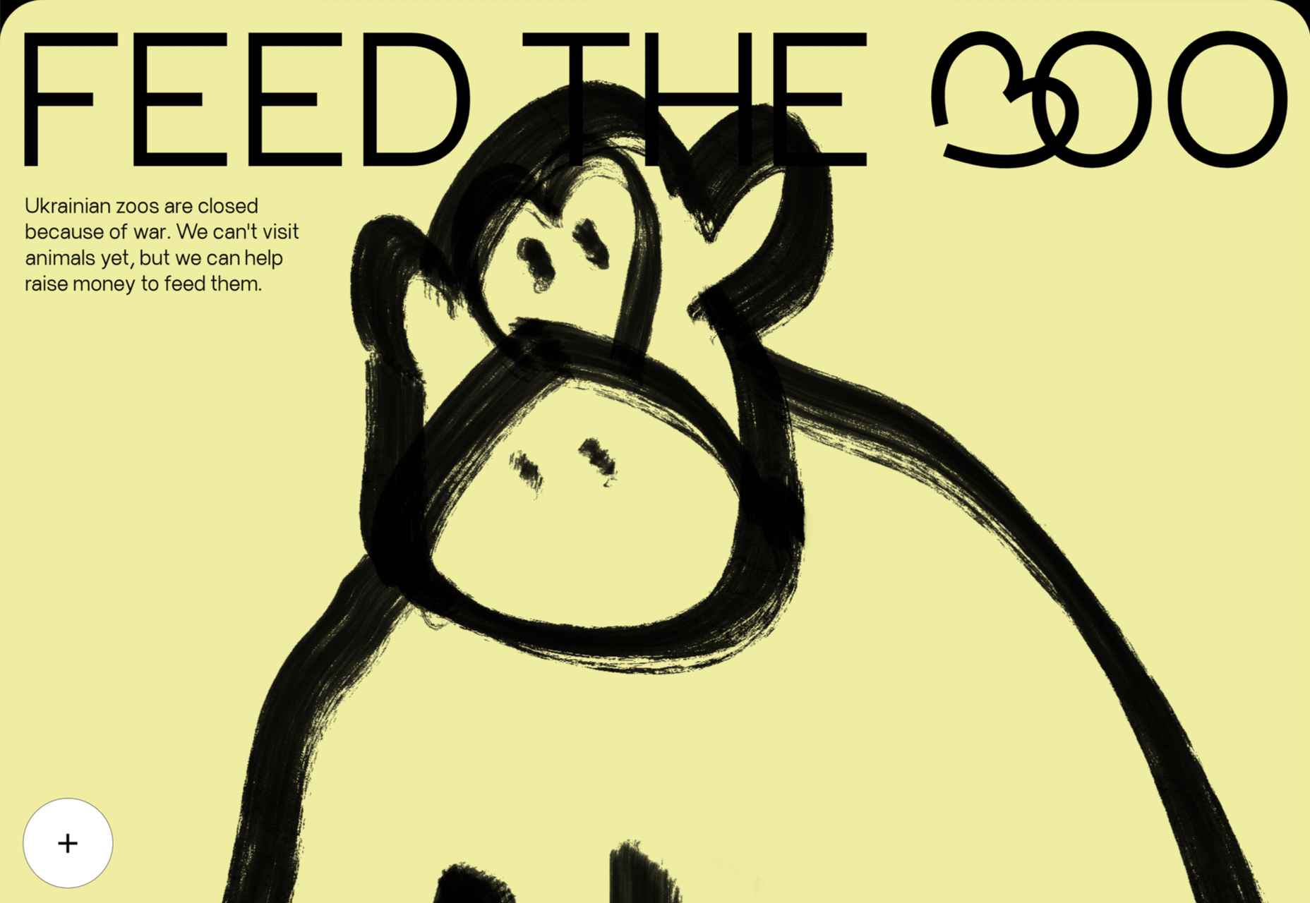
Feed The 300
Feed the 300 is an appeal in aid of the animals in Ukraine’s zoos. It is very simple in concept and design, but endearing animated line drawings give it character.
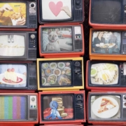
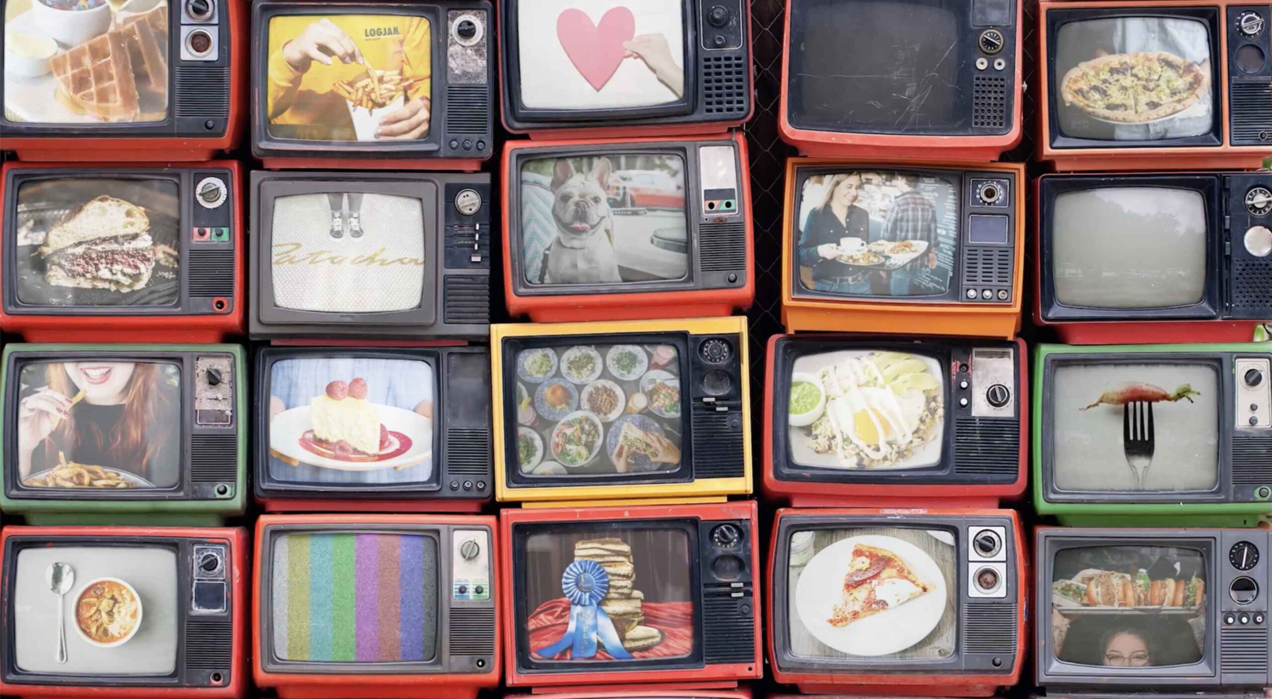
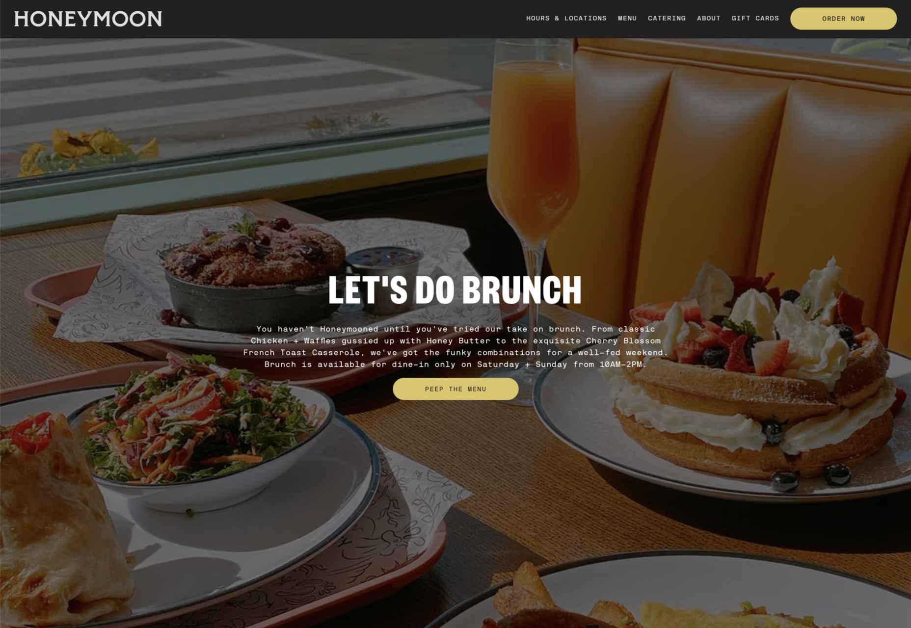
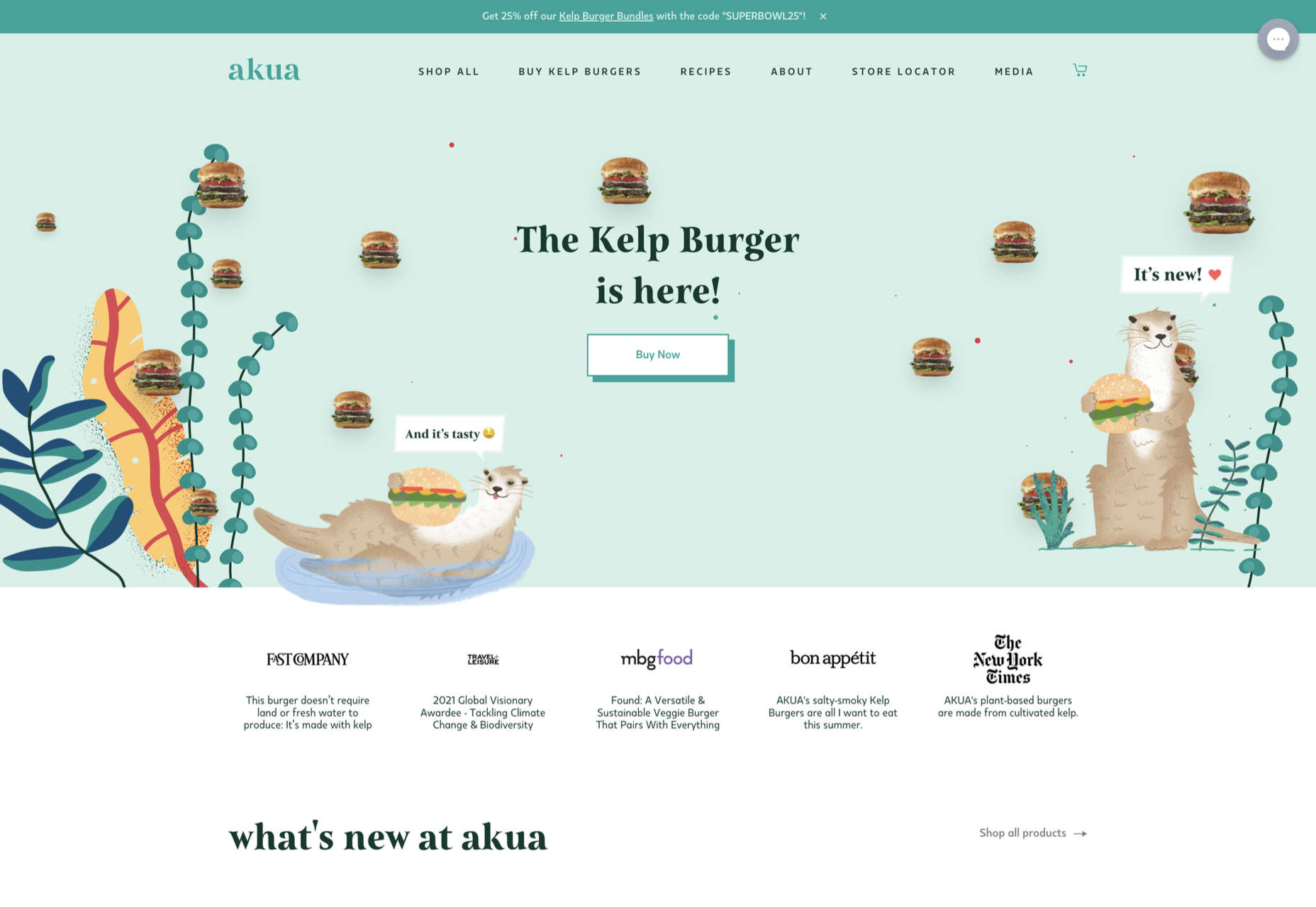
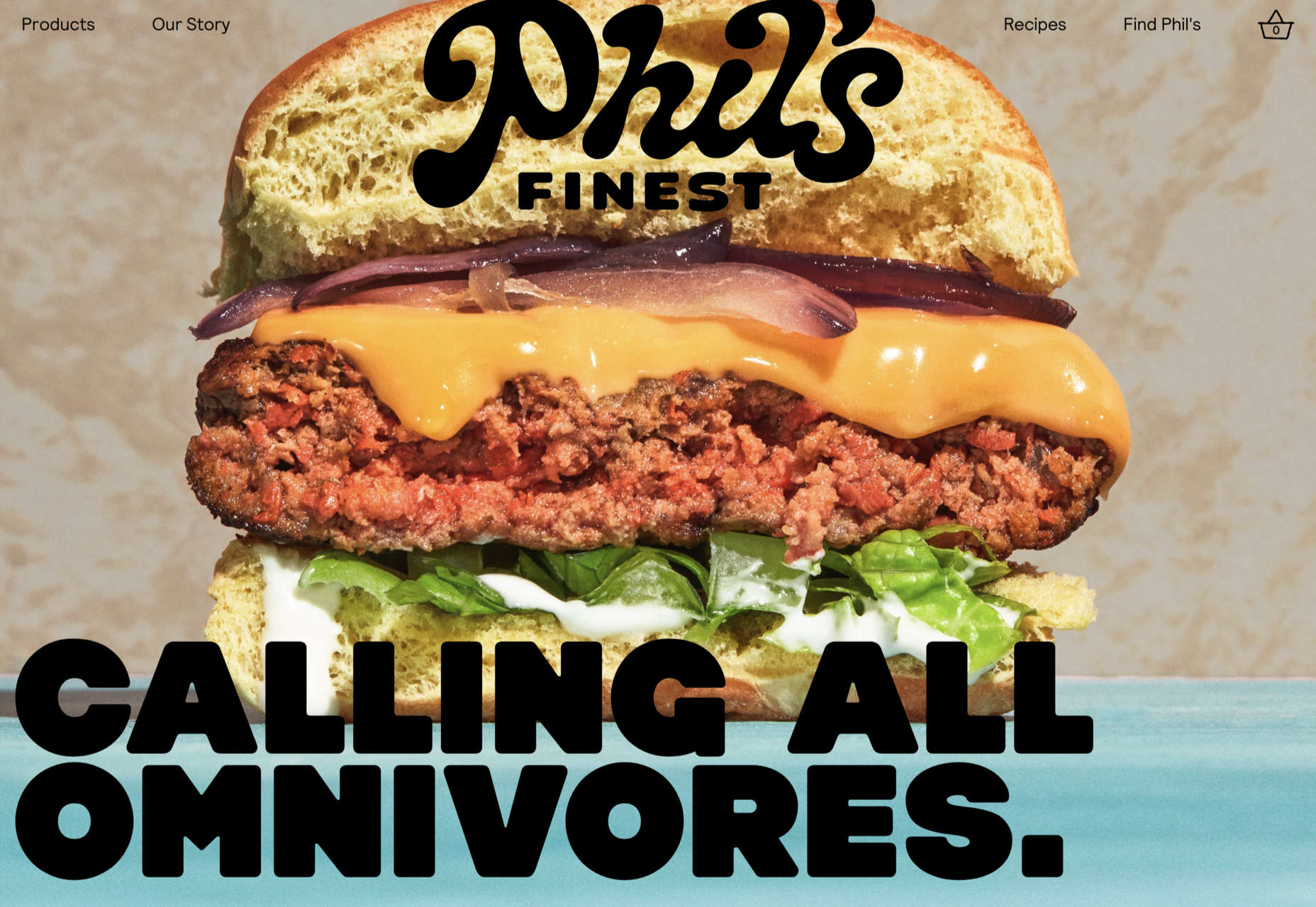
Honeymoon Chicken
Luscious photography combined with surprisingly delicate illustrations makes Honeymoon Chicken very inviting.
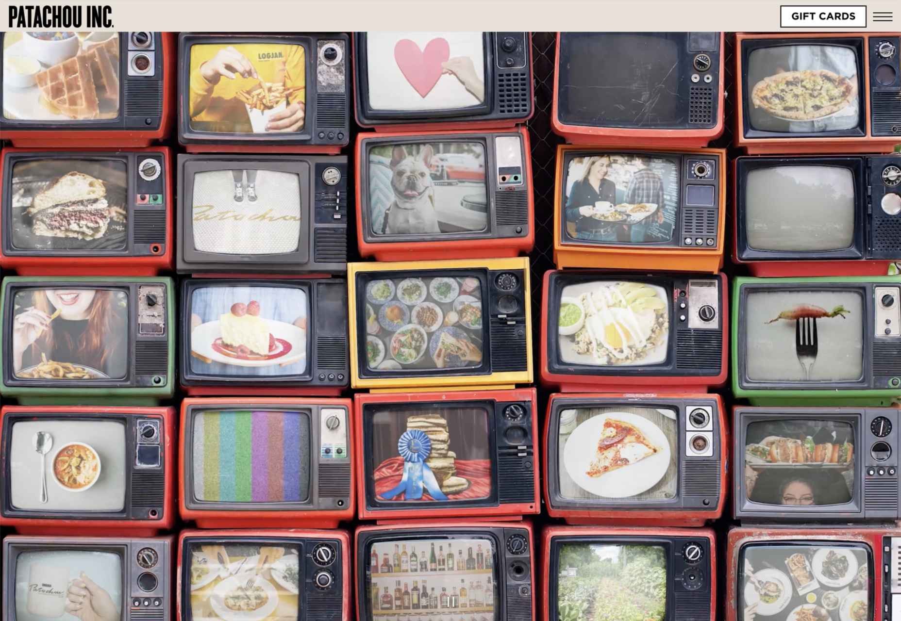
Patachou Inc
Patachou Inc operates a group of eateries and the site does a good job of conveying both the very different individual brand identities of each establishment, and the common ethic behind all of them.
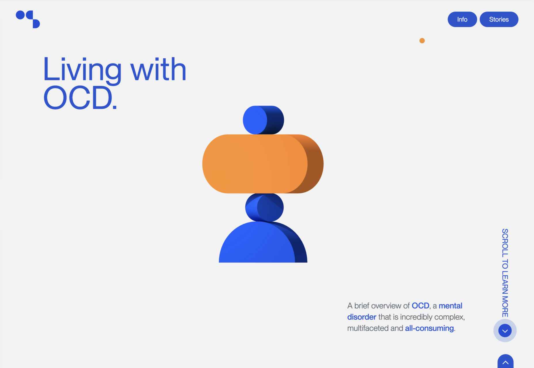
Living With OCD
Many design studios do showcase projects, and Living With OCD by designedbyla is one of the more publicly beneficial, and well-executed, examples around.
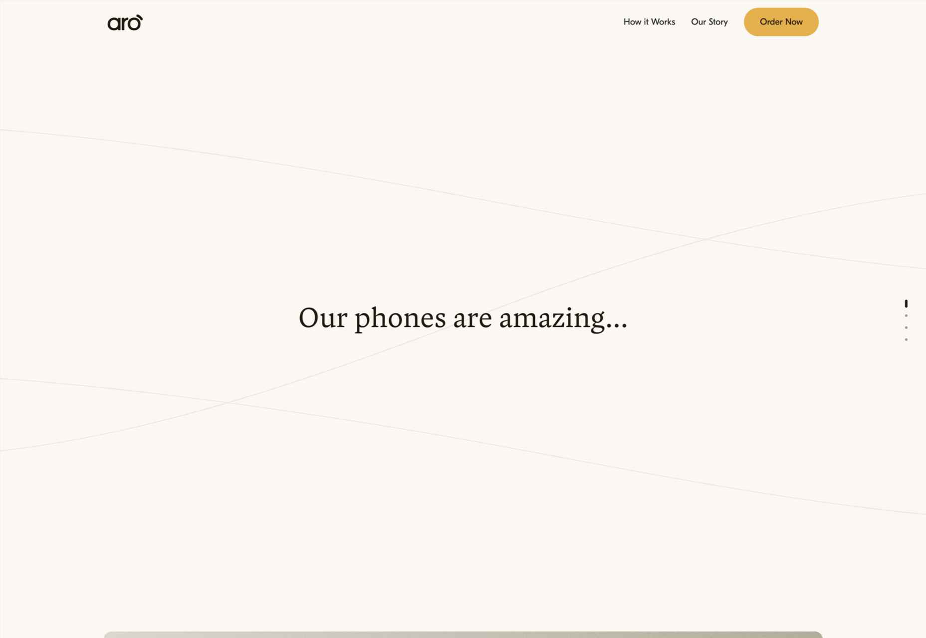
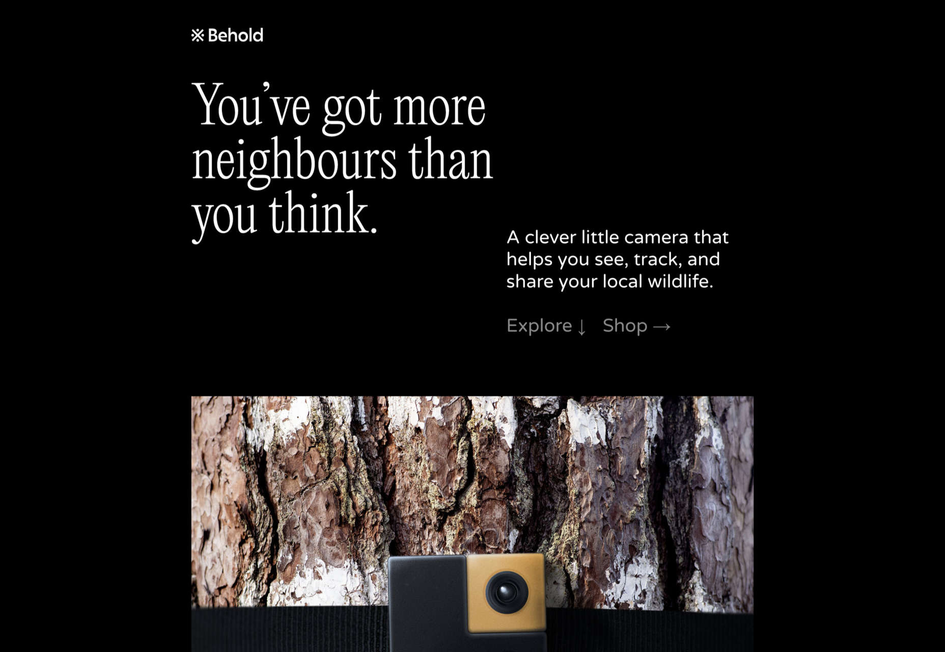
Aro
Aro is a product with a very simple concept — basically, a box to put away a phone, that also charges it — but this website does a great job of increasing the product’s desirability.
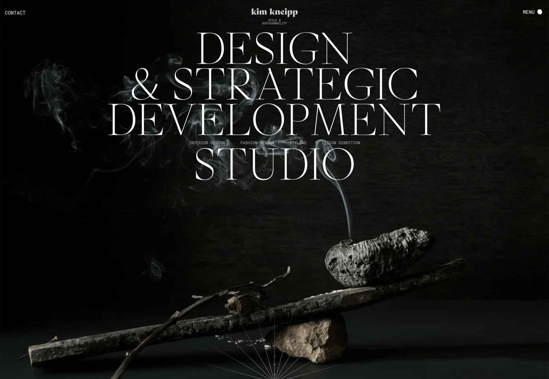
Kim Kniepp
The navigation on this site for Kim Kniepp’s design studio feels very interconnected, an effect heightened by the overlapping masonry grid.
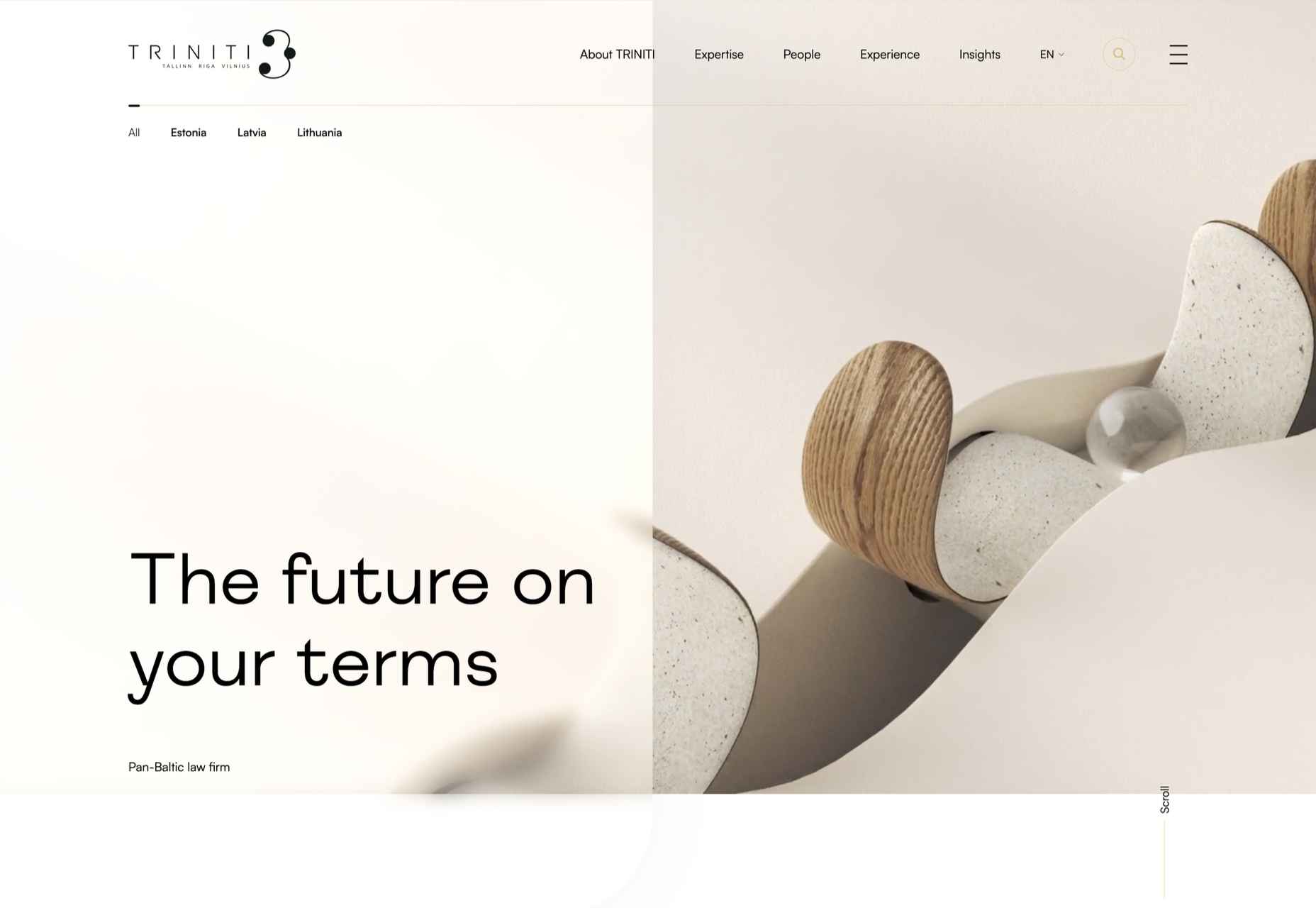
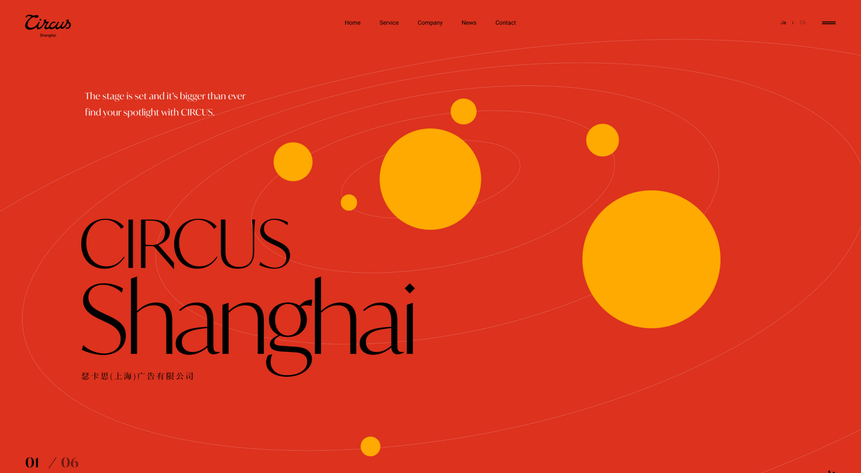
Triniti
There is a calming, reassuring quality to the color used here for Pan-Baltic law firm Triniti. The perpetual motion style hero video adds a confident, soothing touch too.
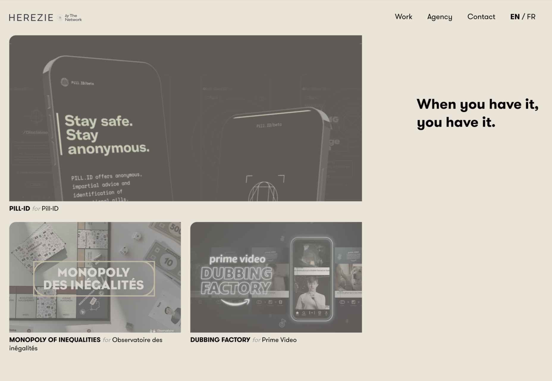
Herezie
Creative agency Herezie uses saturation and gradual color changes to pleasing effect in this confident, assured website.
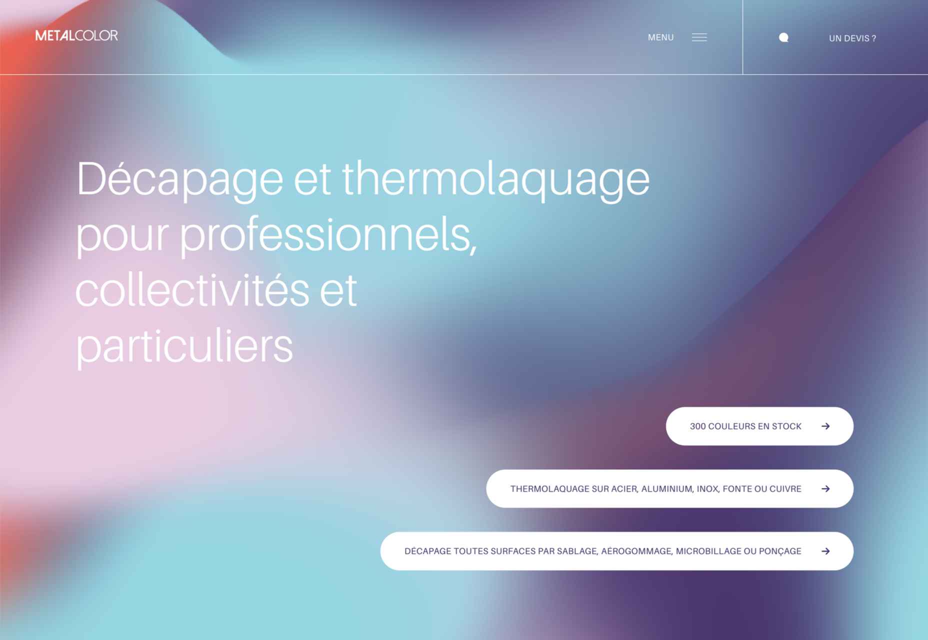
MetalColor
The color choices in this site for MetalColor, and how they are used, succeed in evoking what results the company could achieve without focusing on the less glamorous parts of the process.
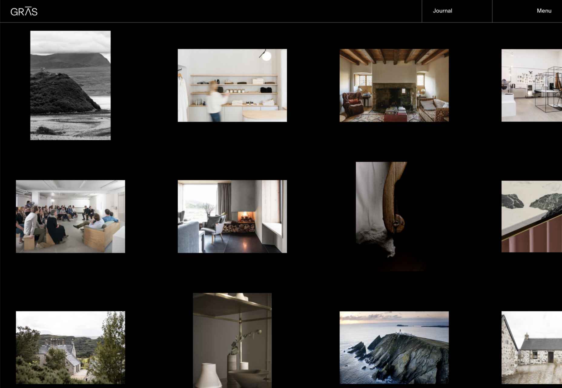
Gras
Architecture and design studio Gras goes for a clean feel with an irregular grid layout and carefully curated images. The blog sidebar works well too.
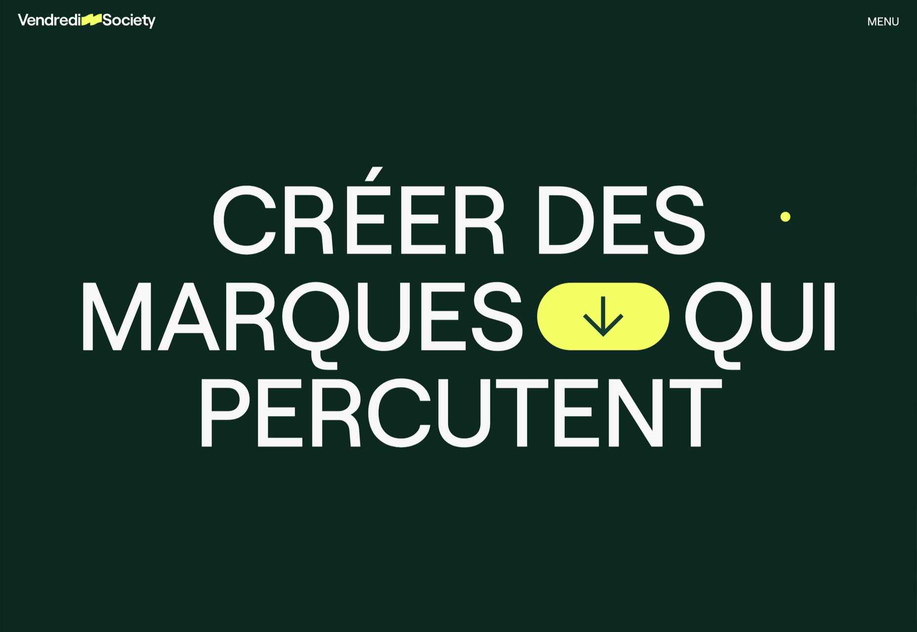
Vendredi Society
Dark green and bright yellow make a strong statement in this portfolio site for brand strategists Vendredi Society.
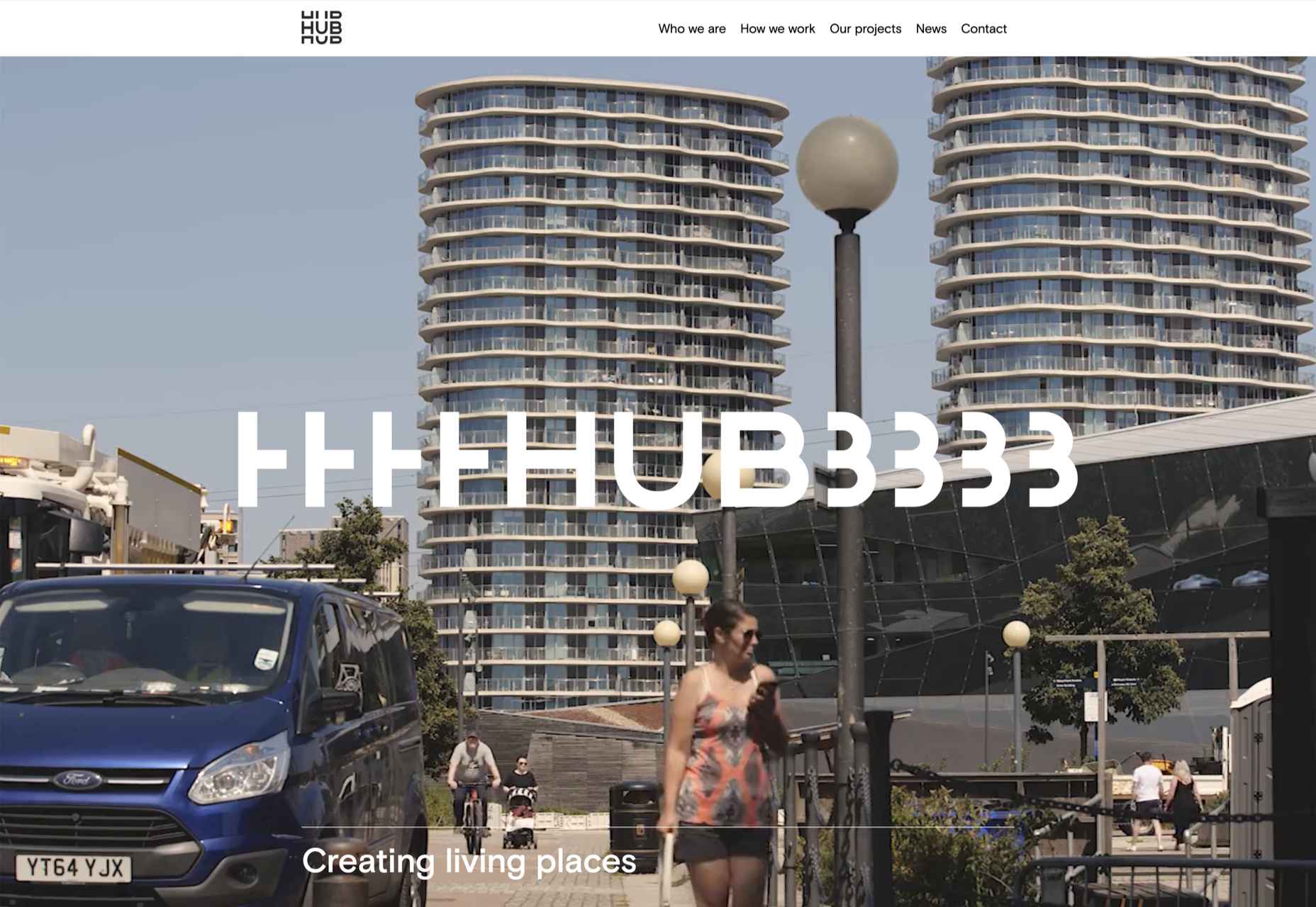
HUB
HUB describes itself as a progressive property developer and this site does a great job of leaving behind the corporate image usually associated with property developers.
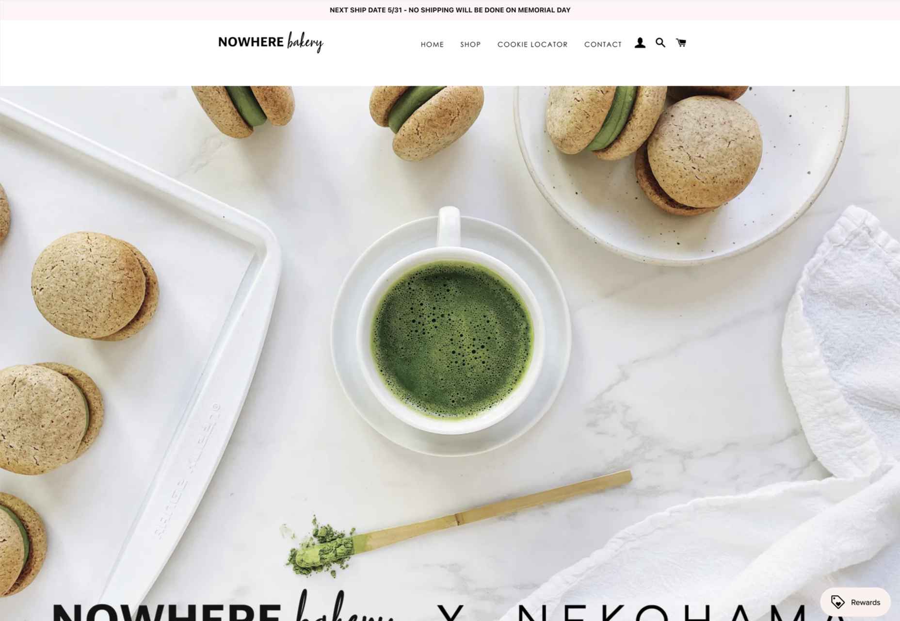
Nowhere Bakery
Nowhere Bakery makes vegan, paleo, gluten-free cookies, which don’t sound all that appealing on paper. This site manages to make them seem both really tasty and healthy.
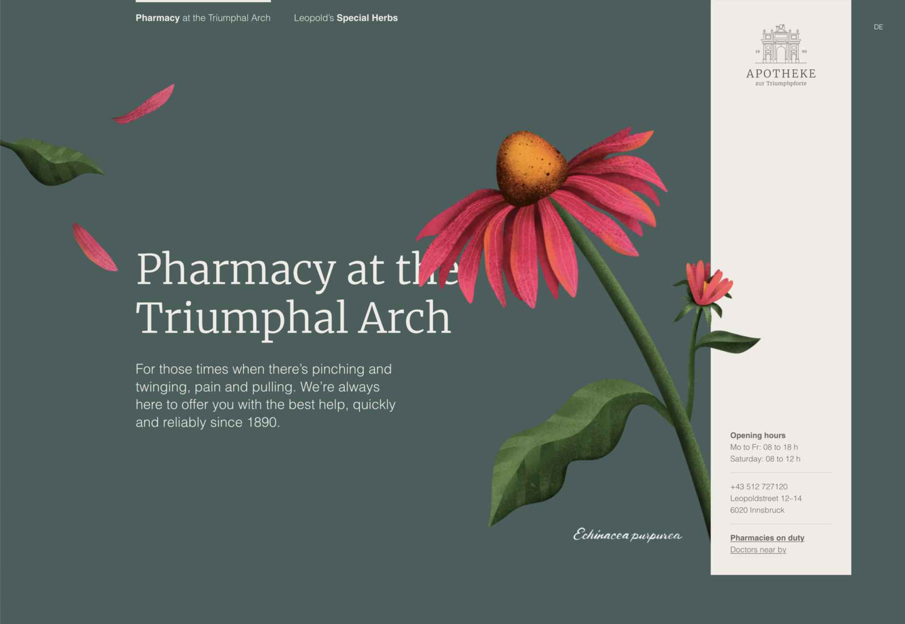
Apotheke zur Triumphpforte
The botanical illustration style images on Apotheke zur Triumphpforte’s site help create an approachable brand identity while adding visual interest.
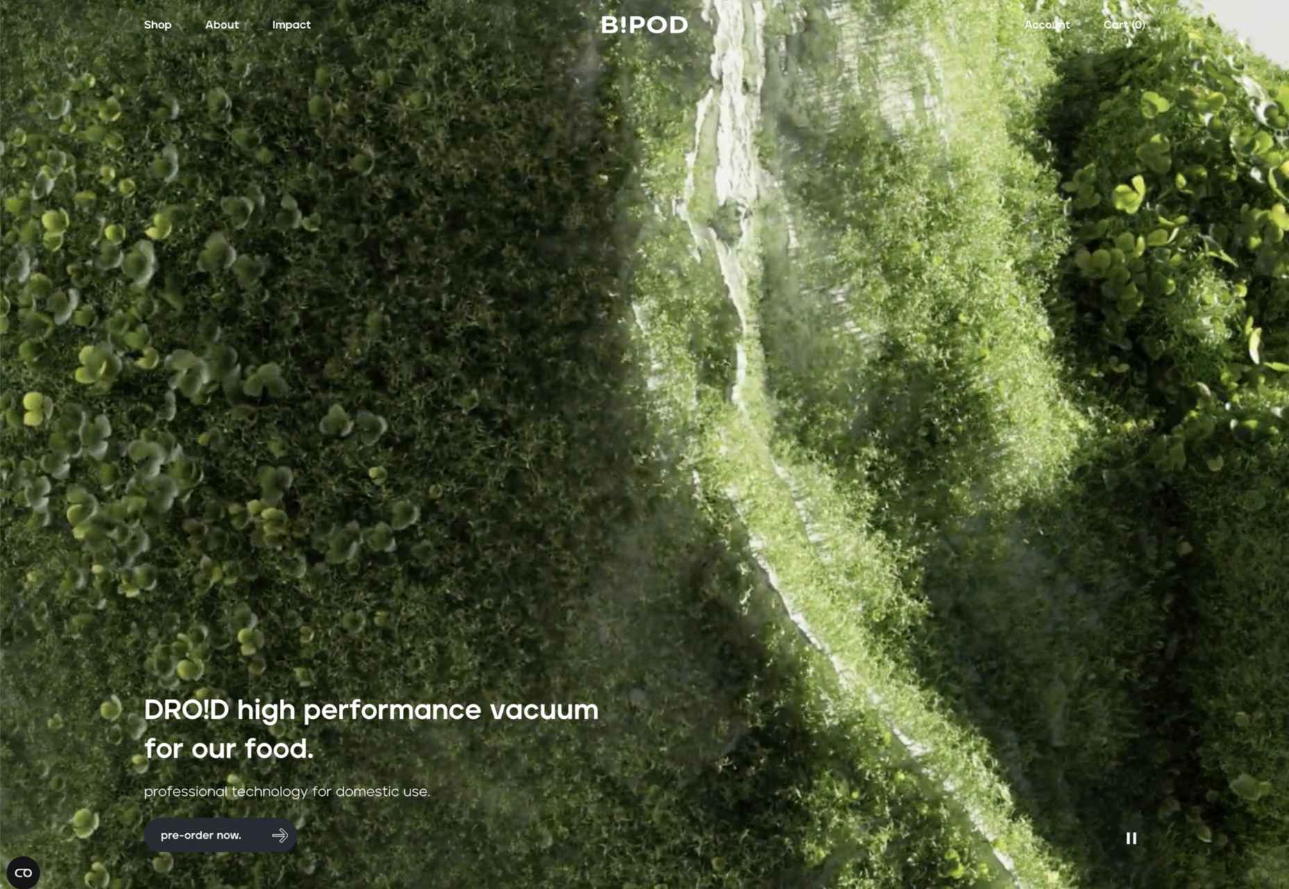
B!POD
A good balance of images, animation, and illustration combine to create an impactful presence for B!pod’s first product, a food vacuum storage system.
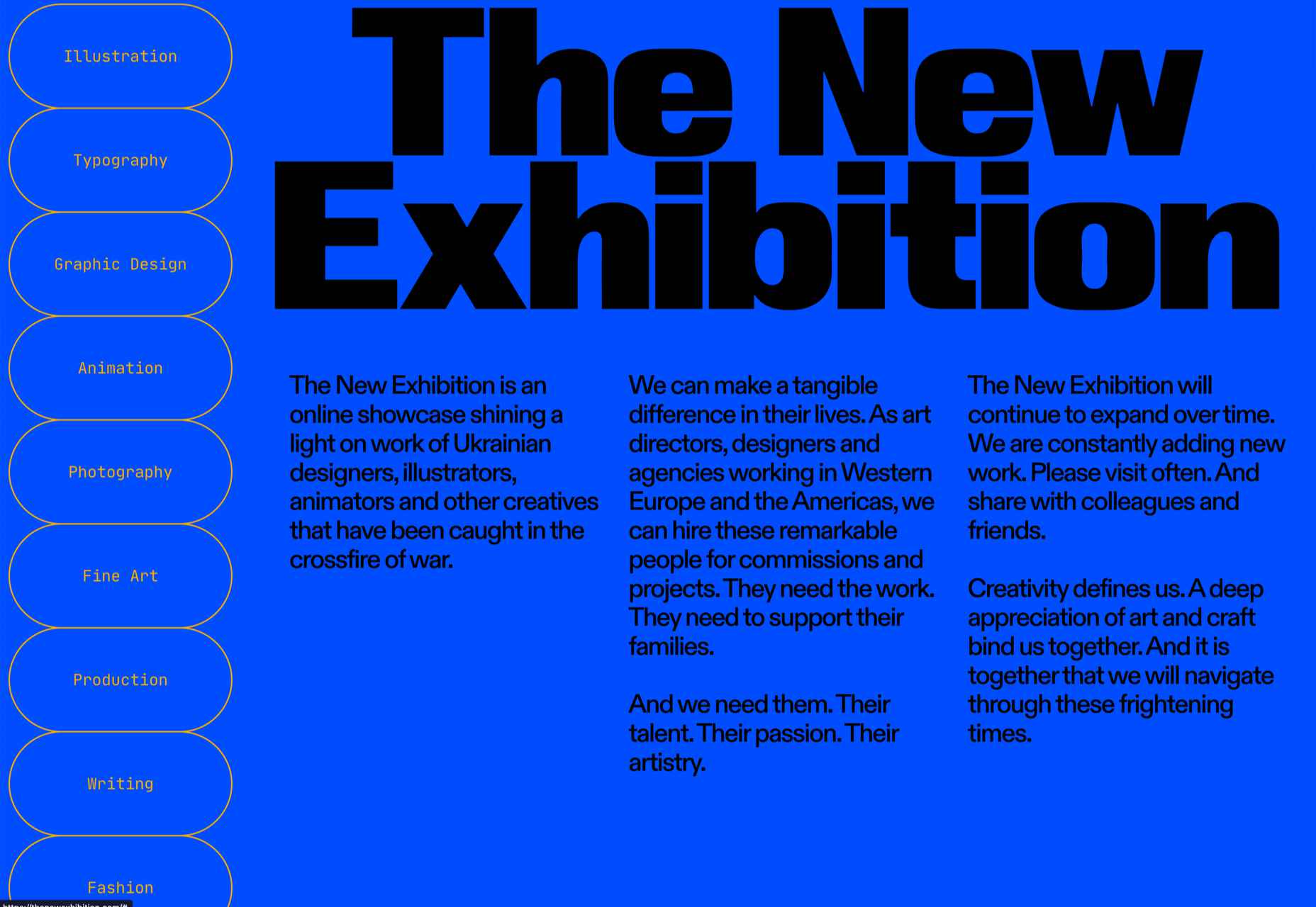
The New Exhibition
The New Exhibition is a showcase platform for Ukrainian creatives — type designers, illustrators, graphic designers, photographers, and others — whose ability to get work has been affected by war.
The post 20 Best New Sites, June 2022 first appeared on Webdesigner Depot.
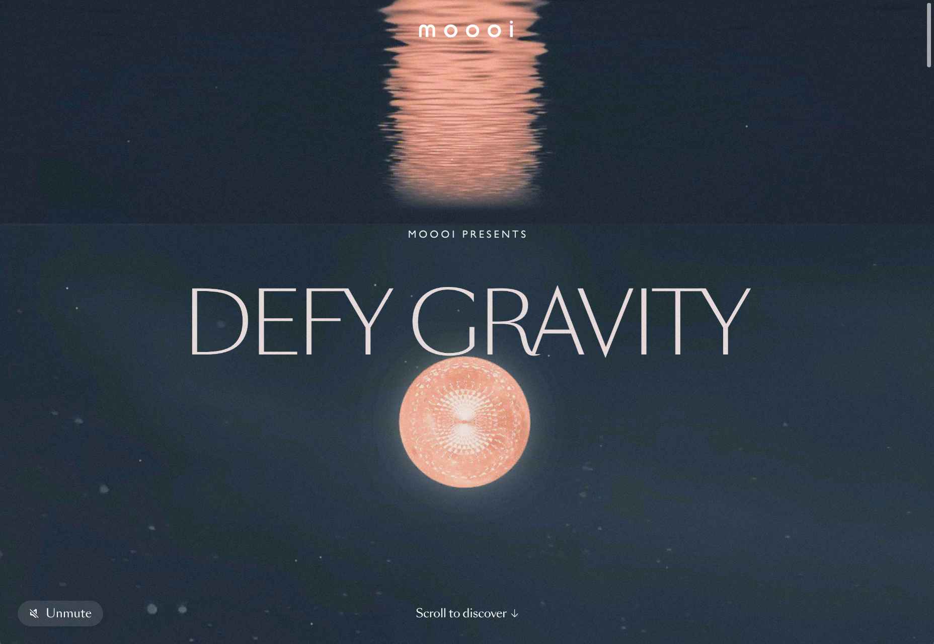
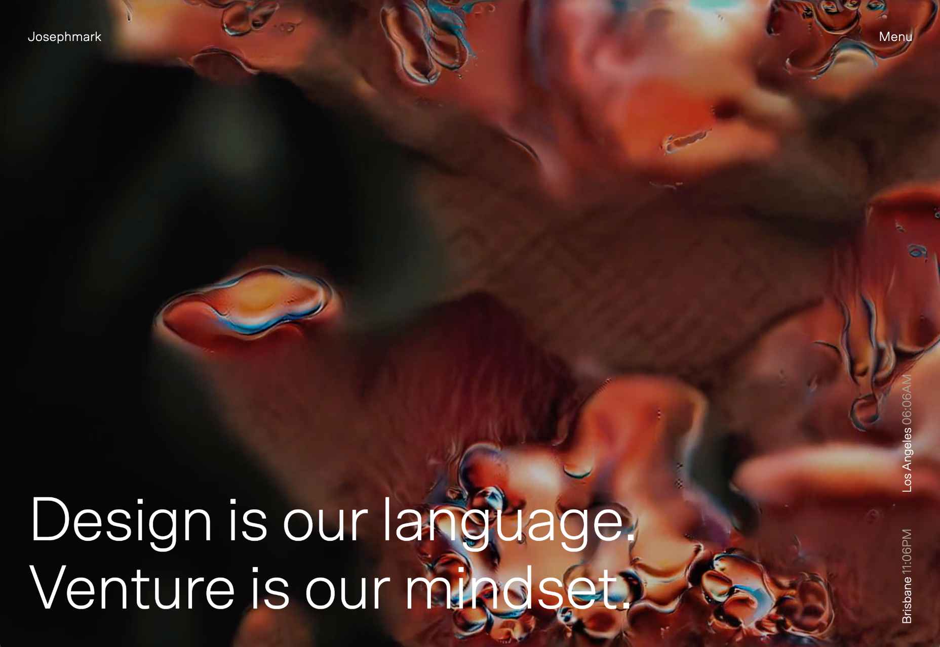
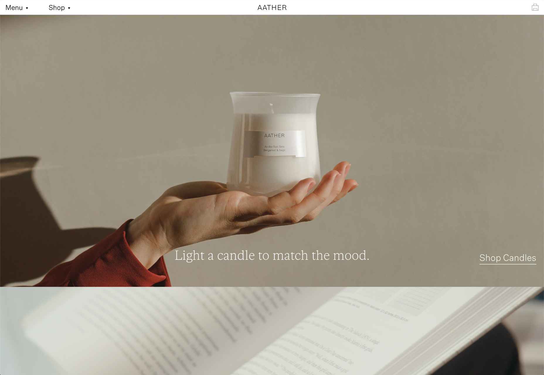
 This month’s collection of the best new sites released in the previous four weeks might seem like a mixed bag, but if you look carefully you’ll see distinct themes emerging. Full-page images and videos are back with a vengeance, and designers are embracing large-scale 20th century-inspired typography from Art Nouveau to ’80s corporate.
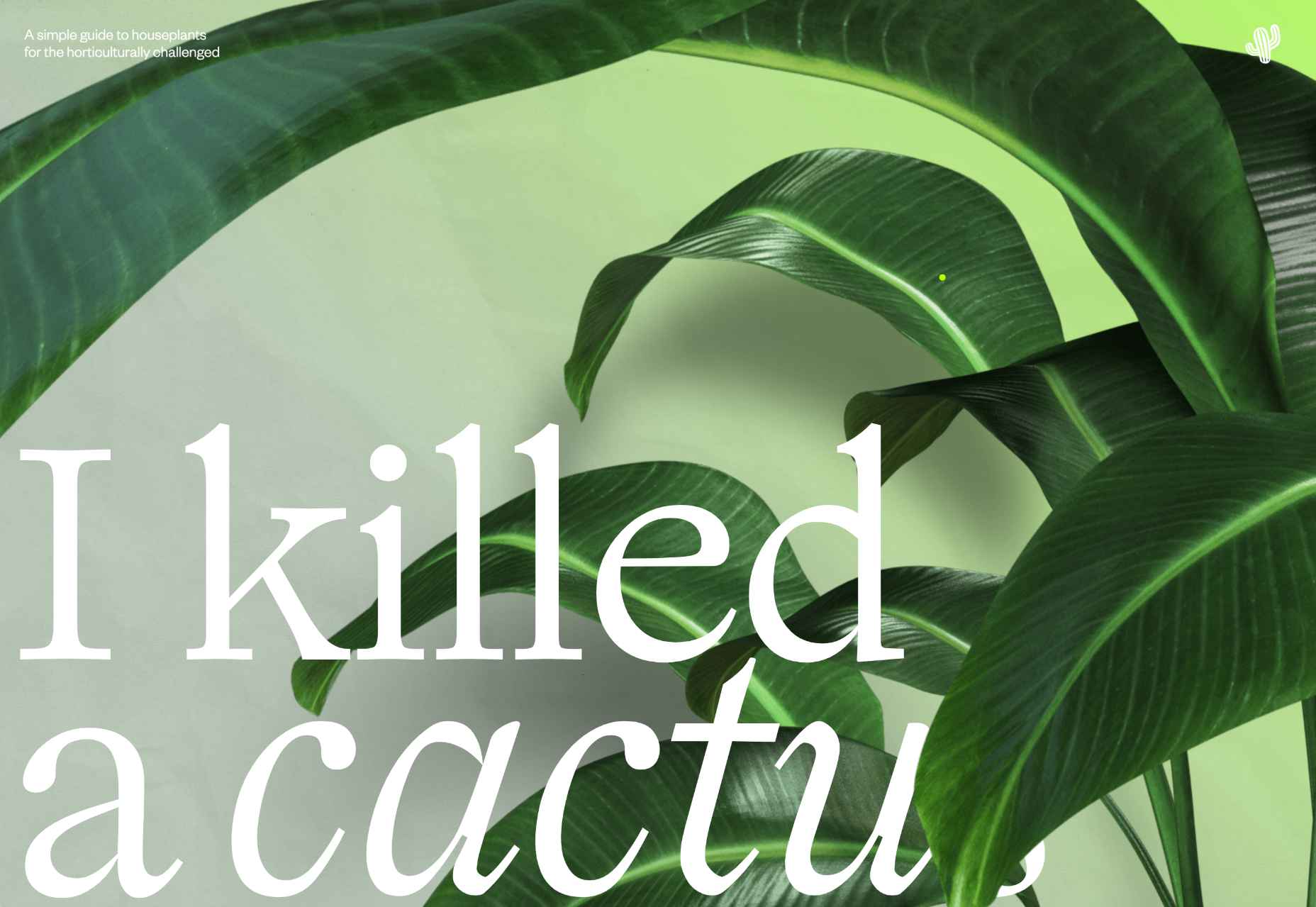

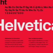
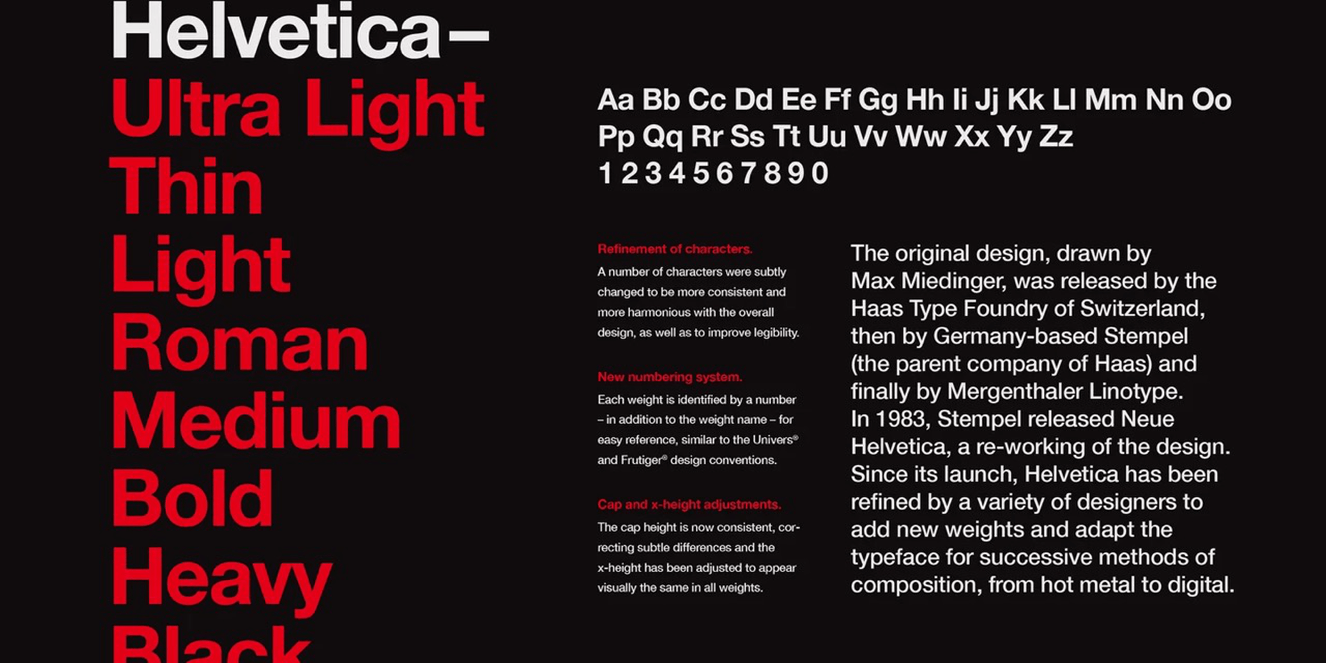
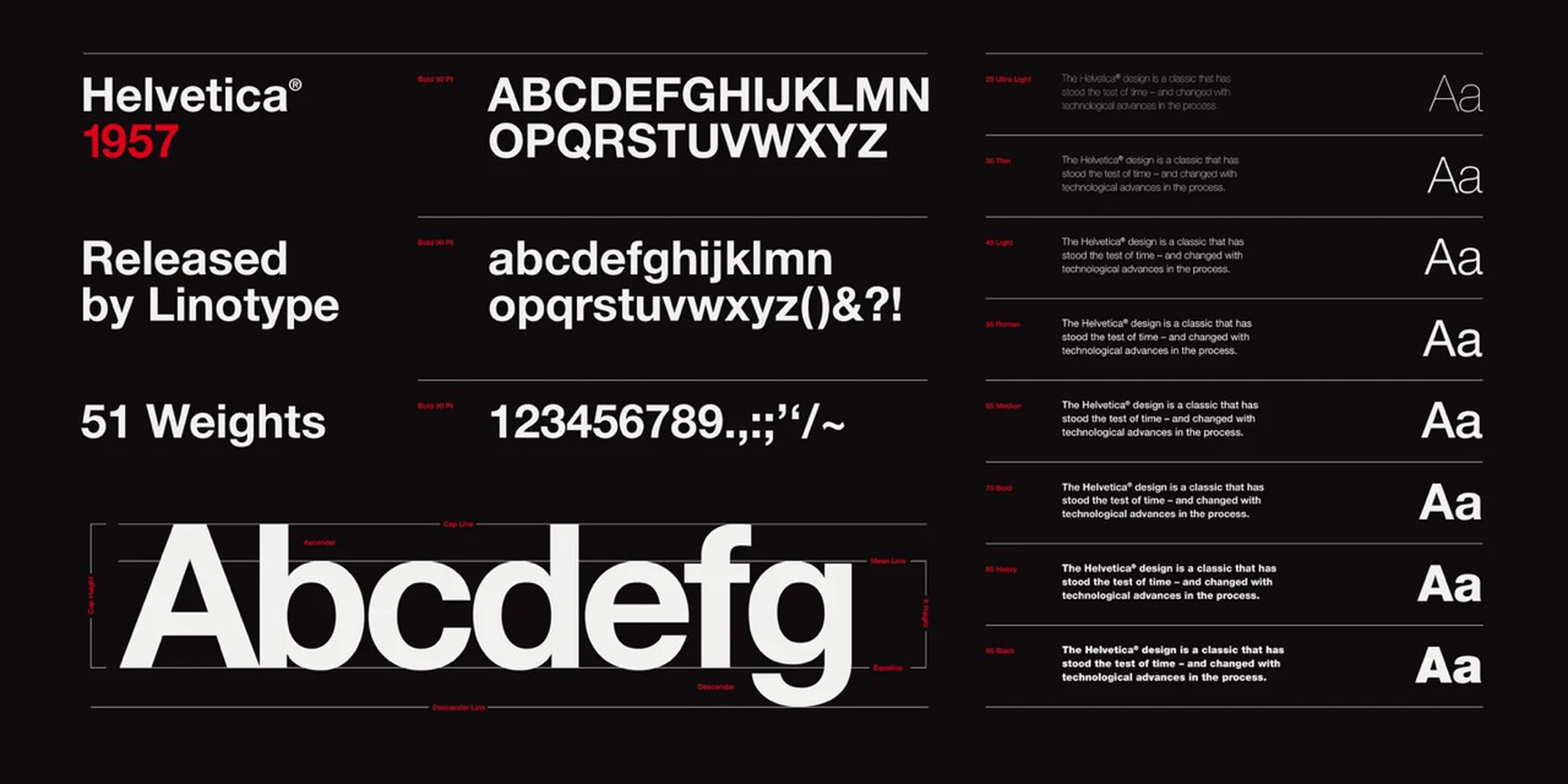
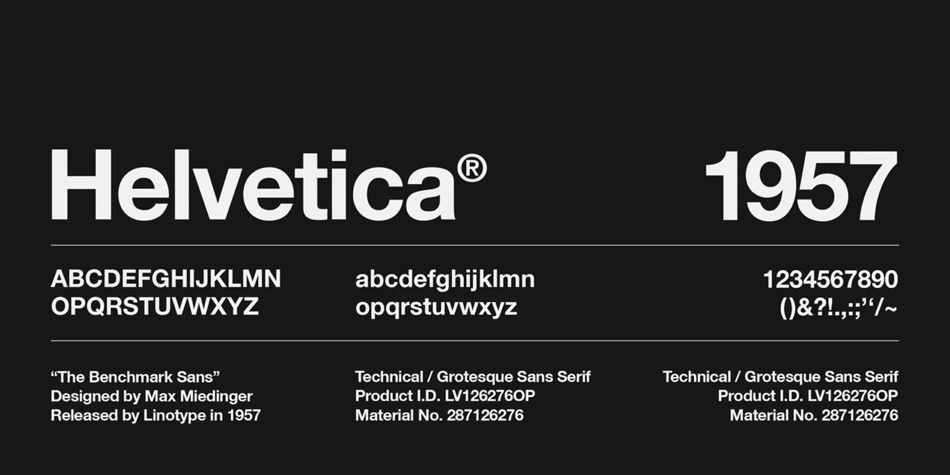
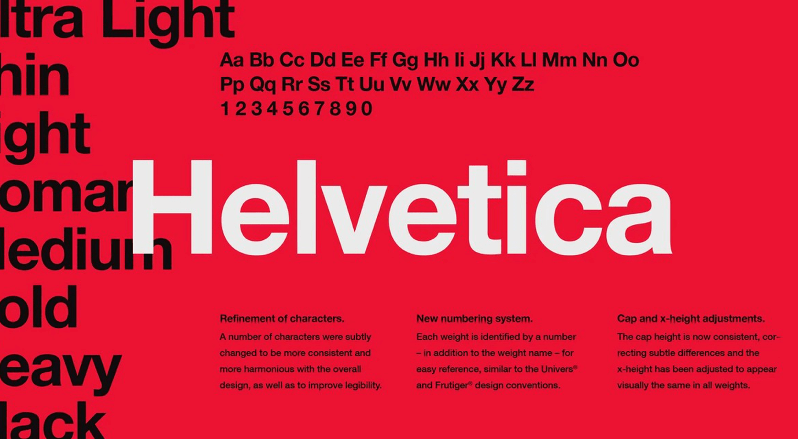 Few fonts in the world have become a part of the cultural landscape that they have an entire documentary film and a MOMA exhibition made about them. Helvetica, however, is different. It has been the go-to font for everyone from government agencies to hip pop-up shops whenever clean and modern text is called for. It has become so much a part of our daily lives that it has created a long list of detractors.
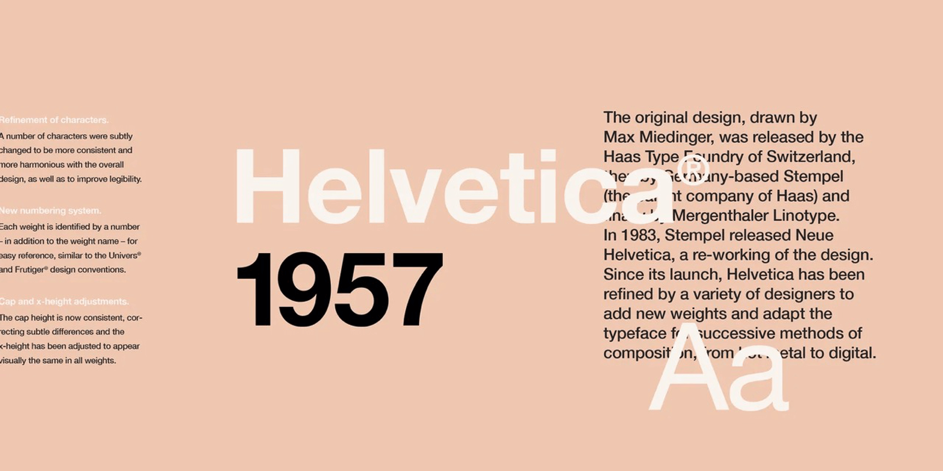

 No one likes talking about money. Most of us got into web design because we loved it. But the fact is, we’ve all got bills to pay.
 The email channel is known for multiple advantages. It is convenient to implement practically, offers many options, and has a fantastic
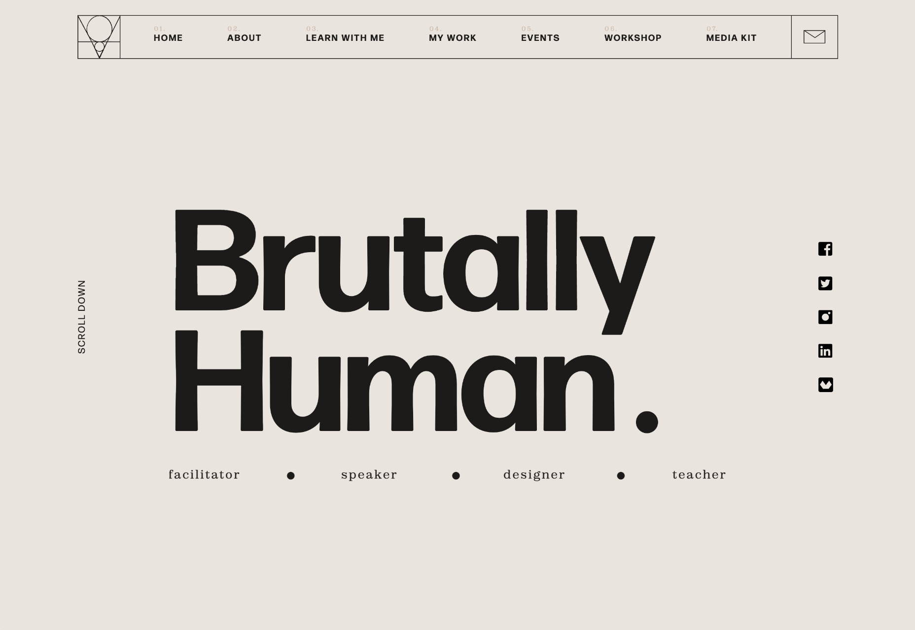
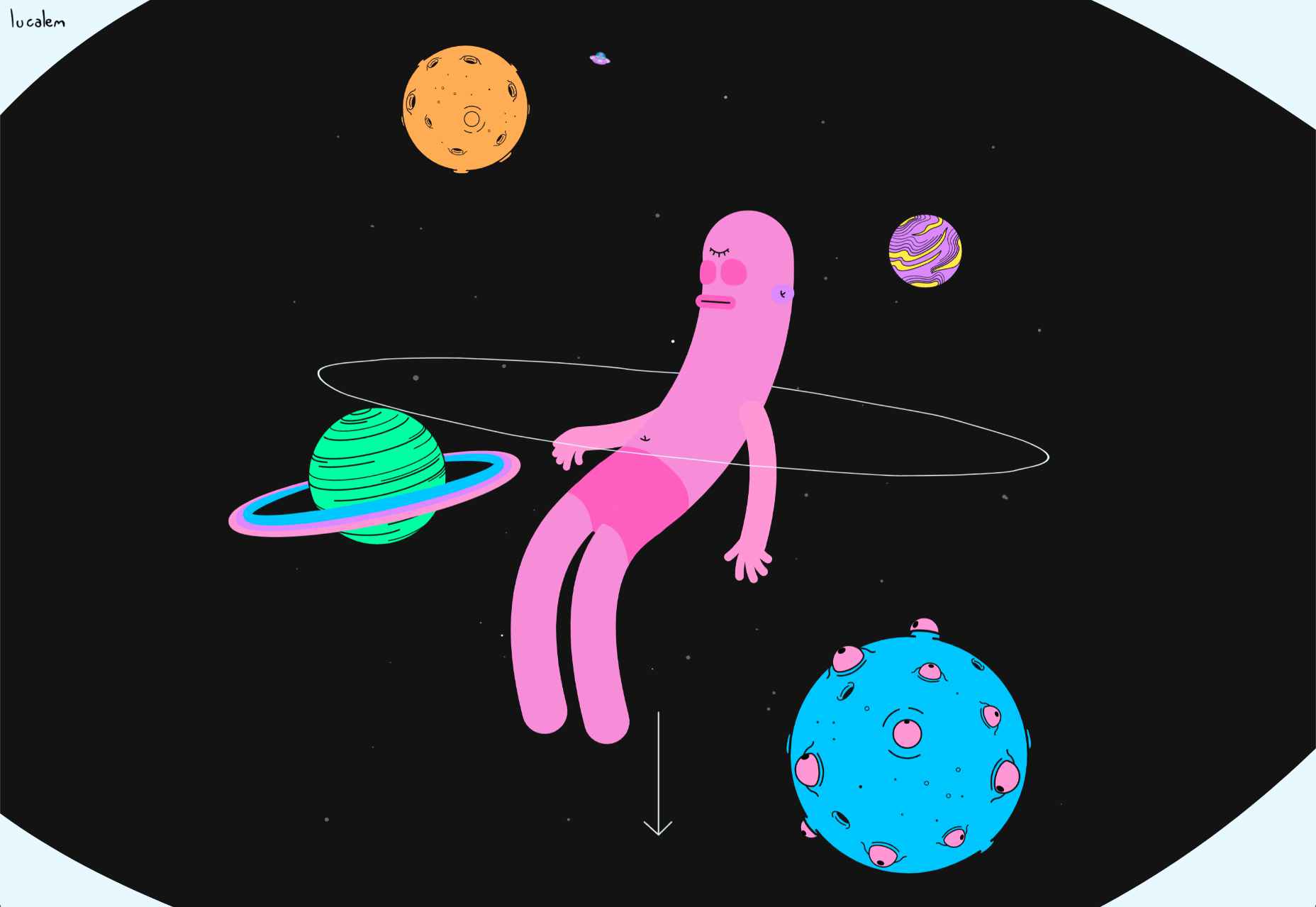
 Welcome to the latest edition of our top 20 sites of the month. In this February’s collection, the overall feel is lighthearted and optimistic, as we are seeing the positivity of a new year persisting across the web.


 Every year, at this time, blogs like this one like to try and predict what’s going to happen in the year ahead. It’s a way of drawing a line under the archive and starting afresh. A rejuvenation that, as humans, we find life-affirming.