![]()
Whether you’re new to the job or are an experienced designer, the anxiety of a new project can sometimes – often unexpectedly – cause us to freeze in our tracks. This creative paralysis sees us staring at a blank page, unable to come up with ideas, and the knowledge that time is slowly ticking away.
We’ve all been there. So we thought it would be helpful to share our tips and tricks for overcoming the tyranny of the blank page and help you get back to doing great work.
The first thing to know is that you are not alone; blank page syndrome has a basis in science, with a clearly identifiable set of symptoms that consistently occur together.
The first thing to know is that you are not alone; blank page syndrome has a basis in science
It starts when you become stressed. Stress causes your brain to produce hormones that slow down neural functions, which only serves to increase the feelings of inadequacy over a lack of creative spark – and fuel anxiety. Understandably, this causes a spiral as your mind seems to get emptier and the blank page more threatening.
But don’t fear! Because there are ways to move past blank page paralysis and get back to productivity.
Just Relax
Once you’re in a negative spiral, it’s notoriously difficult to get out of. The best solution is to avoid the spiral entirely – by starting in the right frame of mind. This means setting up a calm work environment before you even sit down.
Do your best to avoid major distractions – such as young children who need your attention or colleagues who like to play music that vexes your soul. We’re not saying that you need a sound-proofed home office – the kitchen table might be fine – but schedule your work time for when the kids are at school or with a minder, or work from home if the office is likely to be noisy. A pair of noise-canceling headphones can be handy, too.
Avoid Distractions
Seemingly small things can also get in the way of your work. Chat and email notifications are the digital equivalents of a person calling your name from across a room. Try to avoid or silence anything that stops you getting into the creative mindset, even if you just mute things for a few hours. It’ll help you mentally separate your creative workspace from everything else.
all of those notifications will still be there when you resurface
Ultimately, you need to create a mood that you subconsciously associate with being productive. But even when the space around you is perfect, it can still take a while to get into the zone. Brains don’t just flip into creativity at the flick of a switch, so be kind to yourself. And remember – all of those notifications will still be there when you resurface later in the day.
Do a Warm-Up
Studies have shown that a blank page is particularly stressful because it makes the task in front of you feel bigger than it really is. Gazing at an empty page is like seeing the whole project stretching out before you. The stress comes from the feeling of having to fill the whole journey, all the way from A to Z.
So don’t start with A! Instead, begin with a warm-up. Just as dancers always start with a series of exercises to warm up their muscles, creative designers can benefit from something similar. You could start by talking things through with colleagues or sketch some ideas using pen and paper, before opening your design app.
Alternatively, you could start by planning your content hierarchy. You don’t need all the final words – but it can be helpful to work out how many headings you’re going to have, where images will sit, and whether your copy will be in paragraphs or lists.
By doing this, you’ll have elements to place and a rough idea of their relative importance. It’s easy to get overawed by the importance of actual content – so start by getting a grip on the type, density, and length of content.
Take Inspiration
The world around us is filled with inspiration and according to an icon designer Yannick Lung:
It helps to observe things in the real world and play around with them.
It can also help to borrow an idea. Obviously, we never condone copying someone’s work, but using existing work as a reference or jumping-off-point can help. Think of it as putting your own twist on an existing idea.
“I sometimes find it useful to reverse engineer a good example of the sort of thing I’m trying to write (and this works for design too). I usually break down a successful example into its constituent parts and swap them out for things more relevant to the project at hand, then refine from there,” says Harvey, one of Sketch’s brand storytellers.
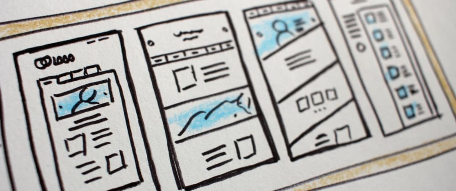
Let Templates Take the Strain
Instead of putting pressure on yourself to instantly start designing, begin by creating templates or wireframes. This isn’t an avoidance tactic. Spending time creating an outline template saves time in the long run – plus, doing practical work that doesn’t need lots of detail will act as a warm-up. It might even help you catch potential issues in your designs earlier.
Be Collaborative and Welcome Early Feedback
In general, people don’t work well in isolation – so collaborating with colleagues is a great way to get design ideas flowing. At the start of a project, reach out to your colleagues to let them know what you’re going to be working on and set up a session to collaborate on ideas and ask for direct input.
Never wait until the end of a project to ask for feedback. Involving your colleagues in the process early helps counter blank page paralysis and involving stakeholders can help you manage expectations. Aim to get regular and consistent feedback rather than waiting for it – which could cause a delay in your project.
And of course, you should always choose a design software that enables real-time collaboration so that everyone working on a project can avoid version conflicts.
Avoid Burnout
When work isn’t physical, it can be hard to judge how much it takes out of us
When work isn’t physical, it can be hard to judge how much it takes out of us. If you’re suffering from blank page paralysis, it’s probably a sign that you’re starting to get burnt out. Try setting an alarm on the other side of the room so you have to get up to turn it off regularly – or just scheduling some time into your day to take a break, stretch, or even take a walk. Stepping away from your screen is good for your brain and your body.
In the end, the most important thing to remember when it comes to blank page syndrome is that you have to be kind to yourself. Nobody can be productive 100% of the time – we’re only human, after all. What matters is that you do whatever you need to get your creativity flowing.
Featured image via Pexels.
The post Overcoming Blank Page Paralysis first appeared on Webdesigner Depot.

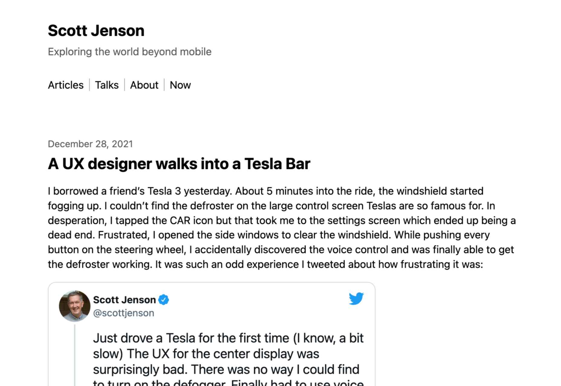
 No one likes talking about money. Most of us got into web design because we loved it. But the fact is, we’ve all got bills to pay.
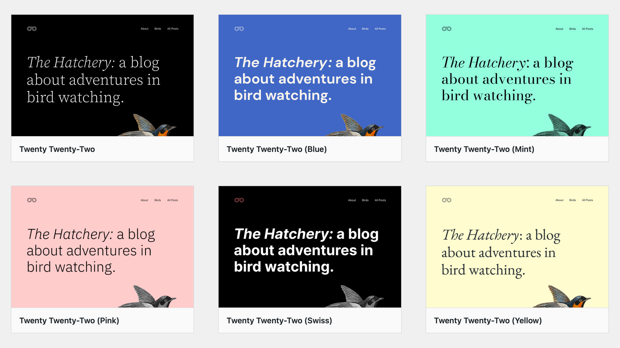
 It’s something every design team dreams about – a better design process and handoff procedure. Your design team is not alone if you are looking for a better solution.


 If you want to know how well-dressed someone is, look at their shoes. Shoes tell you a lot about a person’s style, activities, and choices. We often choose clothes to deceive people about who we are — we want to be brighter, more successful, more relaxed, more adventurous than we actually are. But, our shoes paint an honest picture and offer endless insights into who the wearer is.

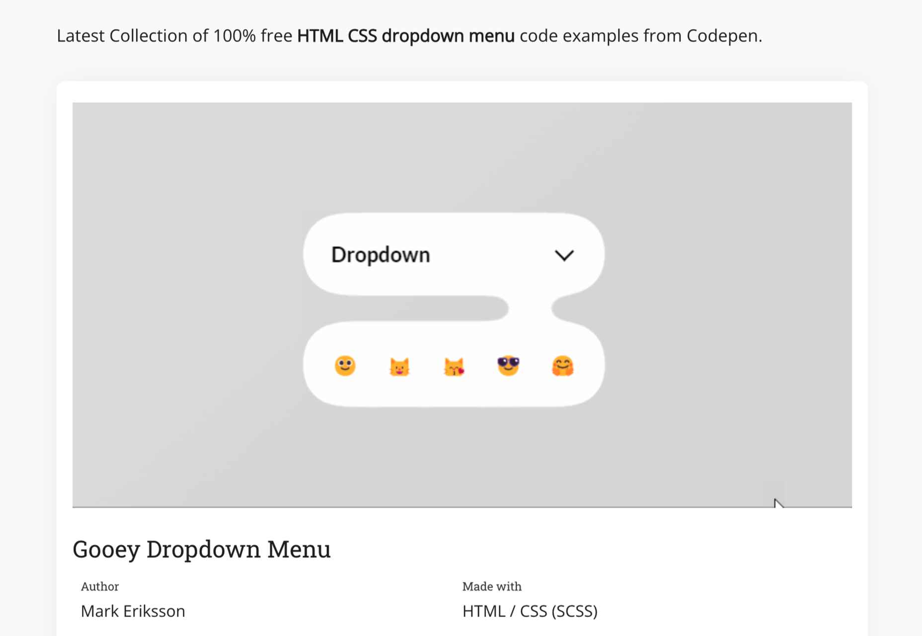
 Every day design fans submit incredible industry stories to our sister-site, Webdesigner News. Our colleagues sift through it, selecting the very best stories from the design, UX, tech, and development worlds and posting them live on the site.


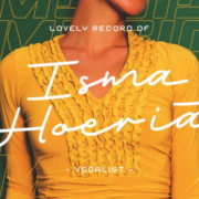
 As we move closer to spring, we’re going to see a change in typography styles come with it. While we always need new serifs and sans serifs to design with, in the spring, it’s not uncommon to use more nature-inspired and whimsical fonts to usher in the warmer temps, wedding season, and holidays like Earth Day and Mother’s Day.
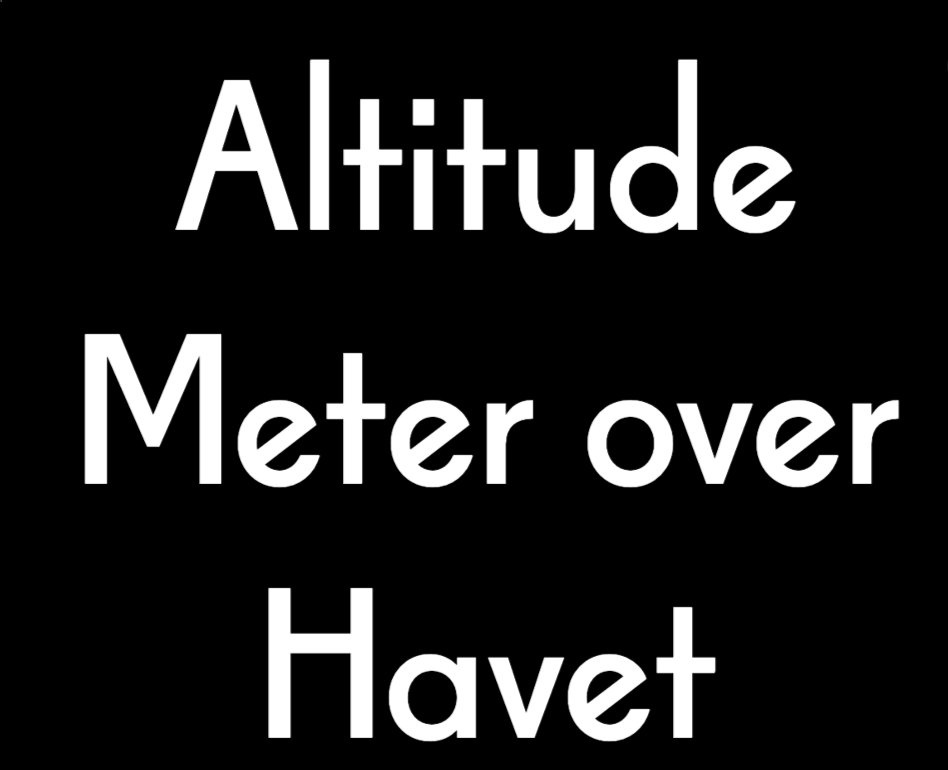

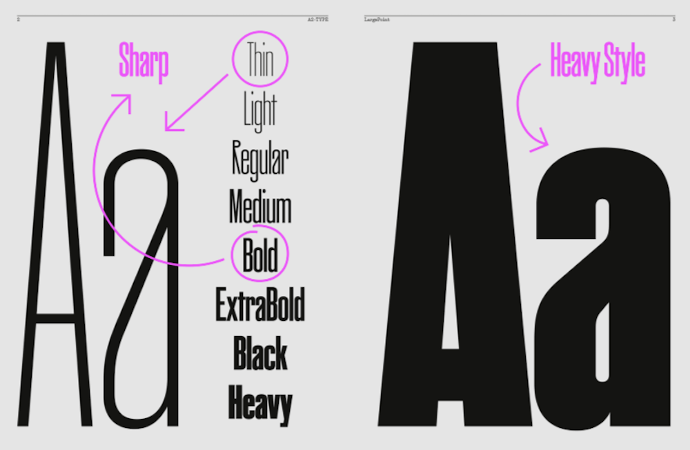

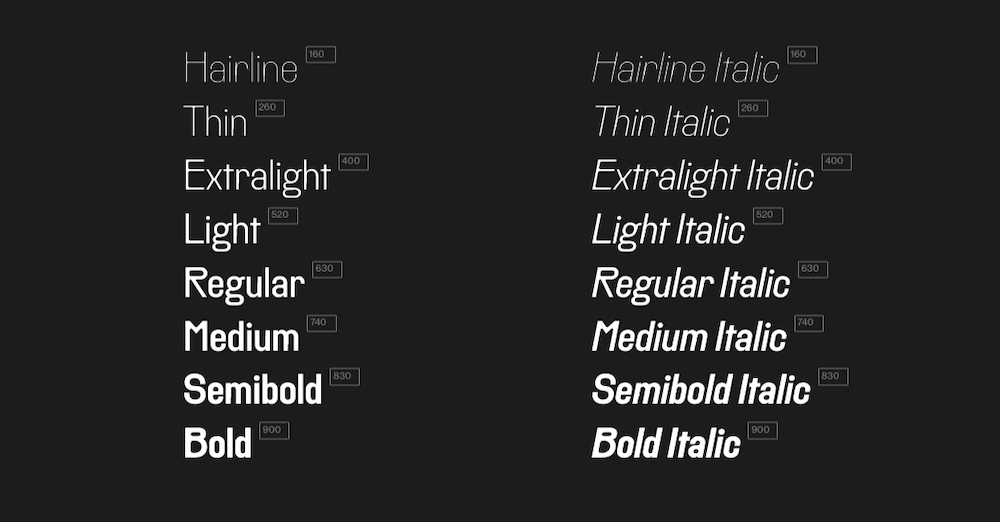

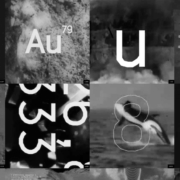
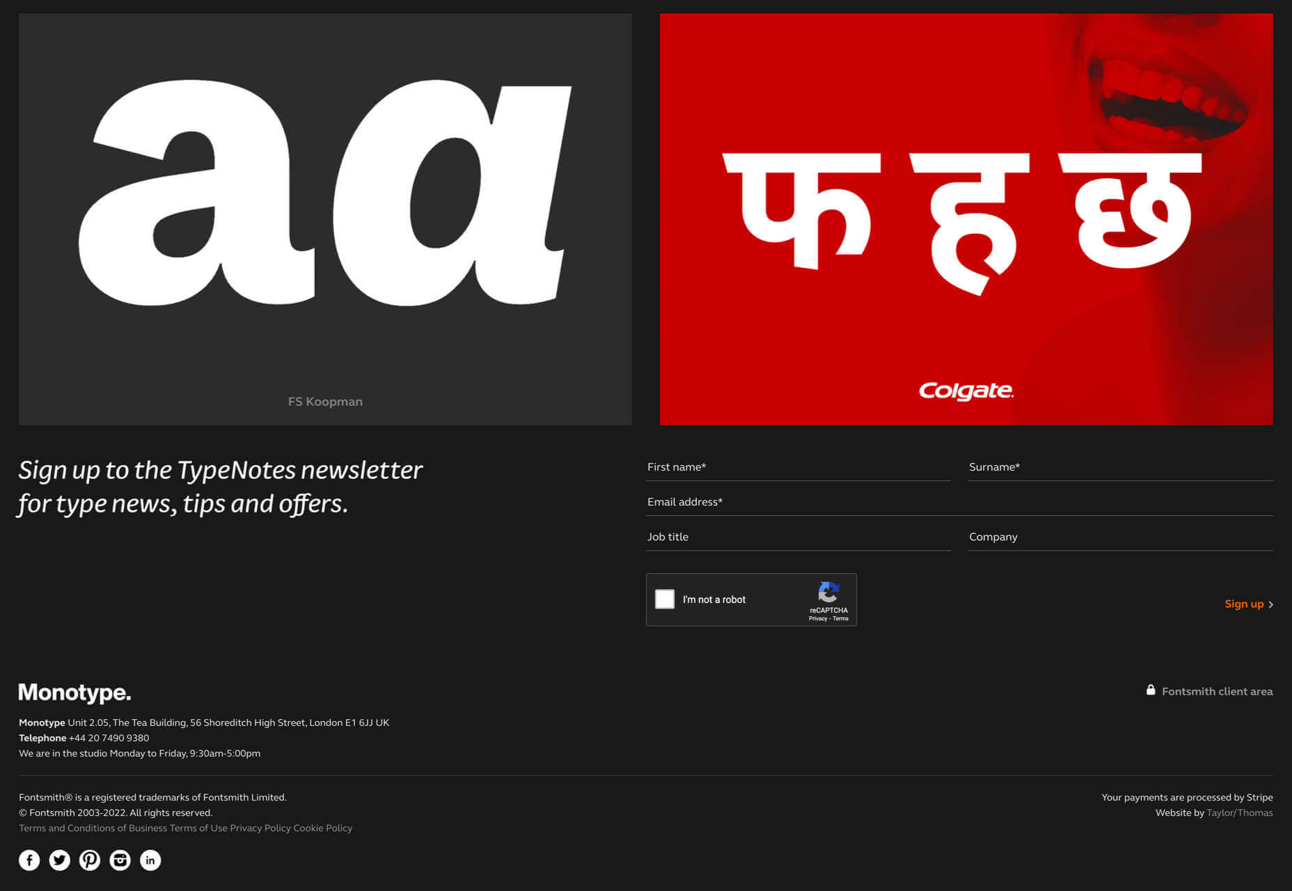
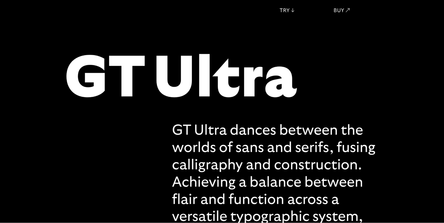
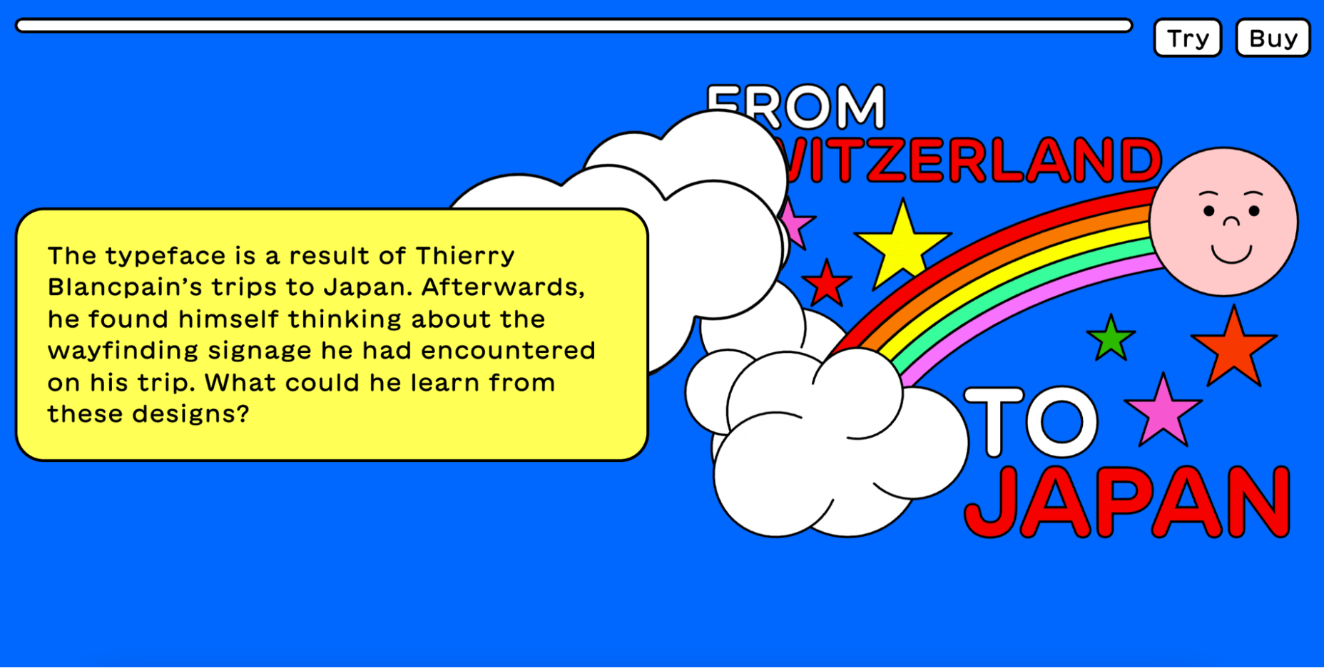
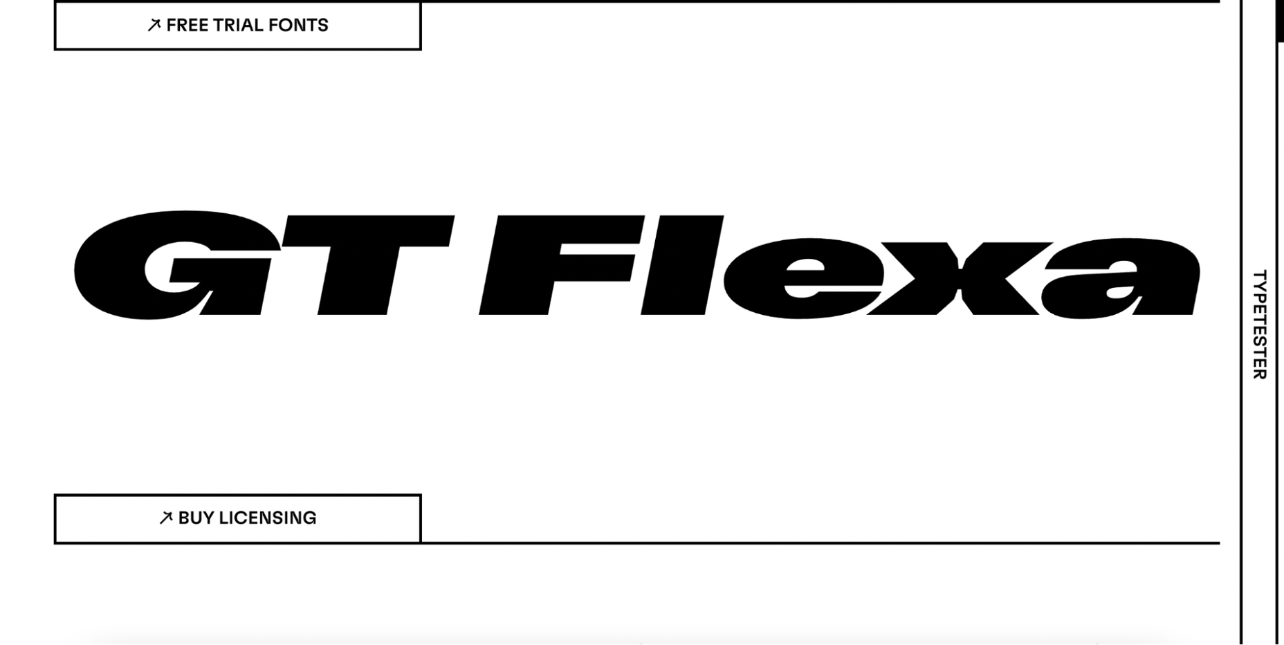
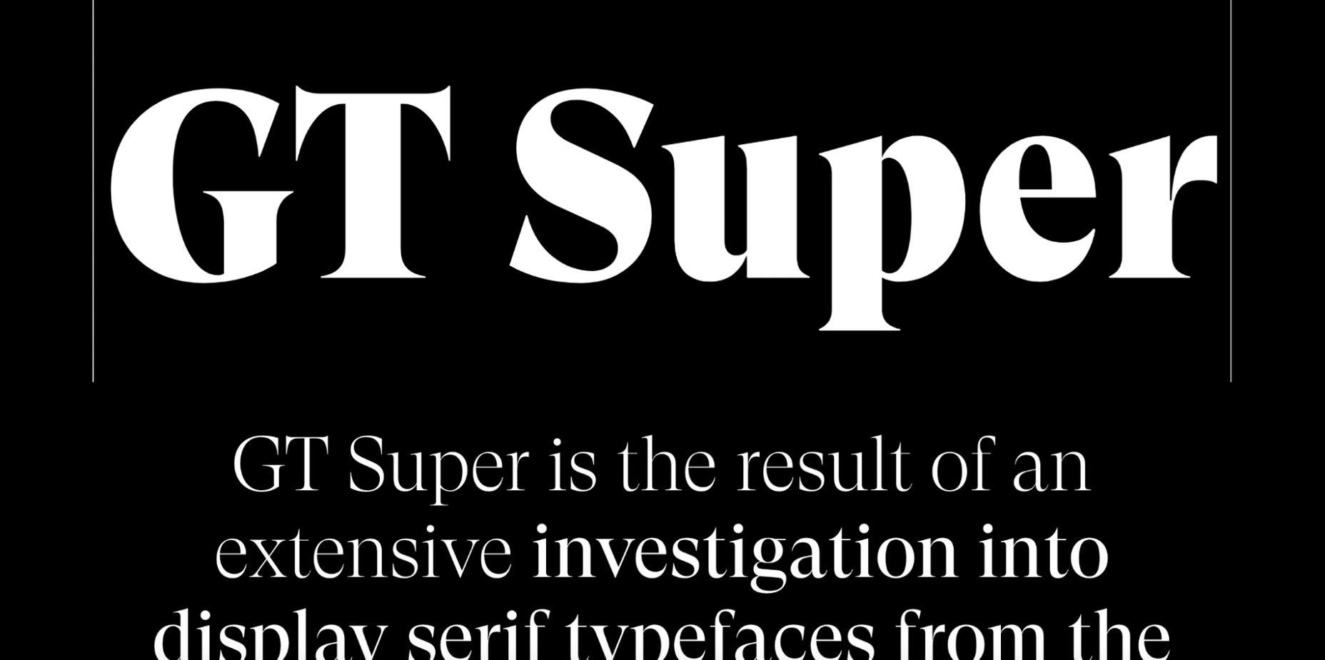
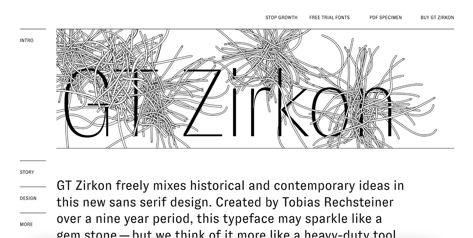
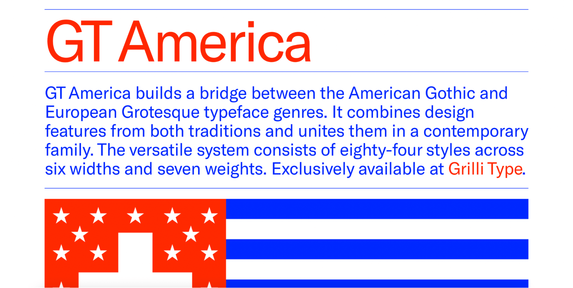
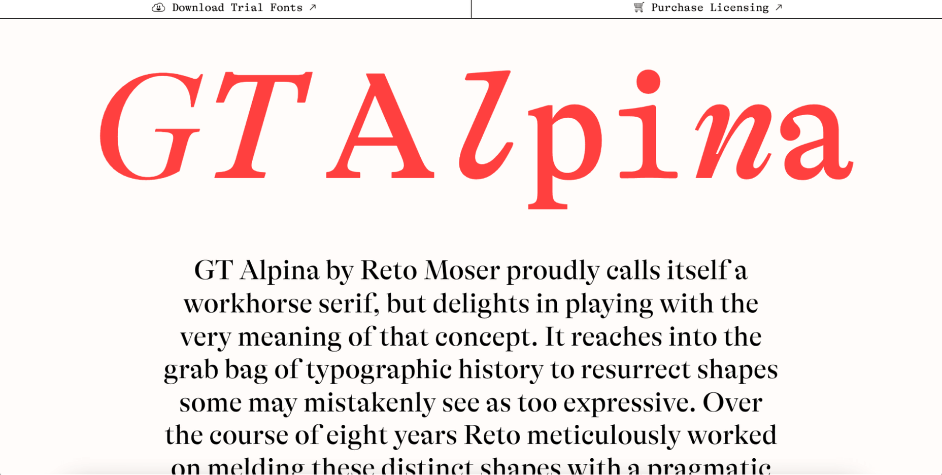
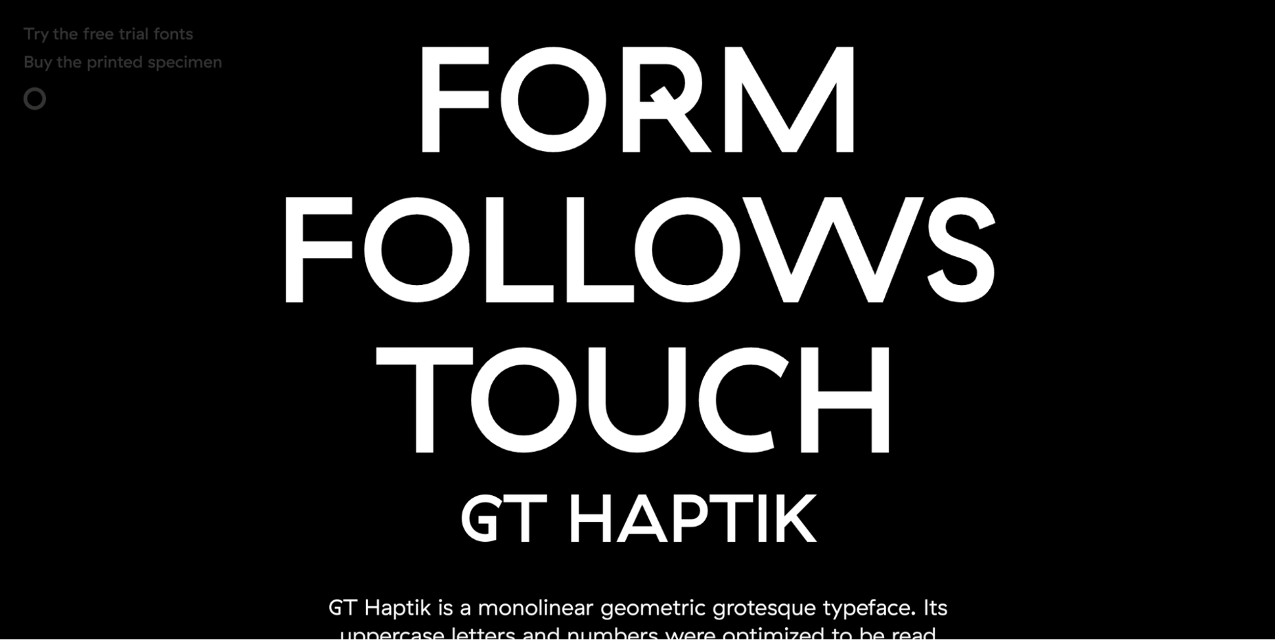
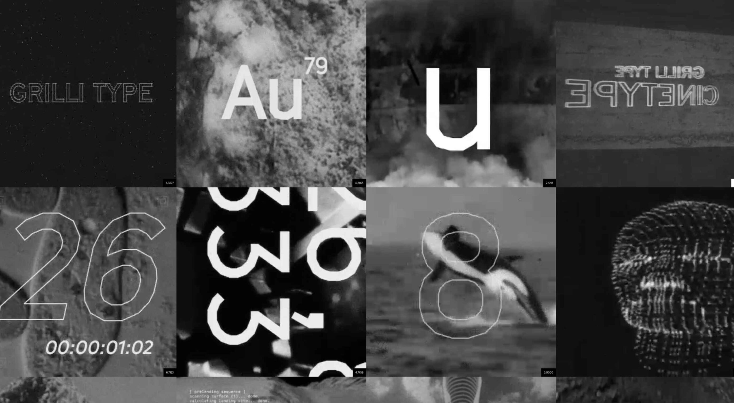 Are you looking for a unique font that will make your next project shine? Or maybe you need a typeface with a beautiful design and rich history behind it. Luckily, mini-sites for fonts allow us to creatively explore a font’s origins and history. We know (from our own experience) how important it is for UI and UX designers to have a variety of fonts for our designs.
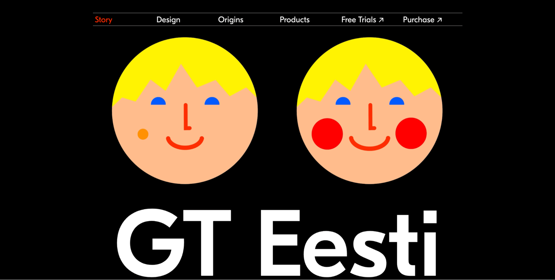
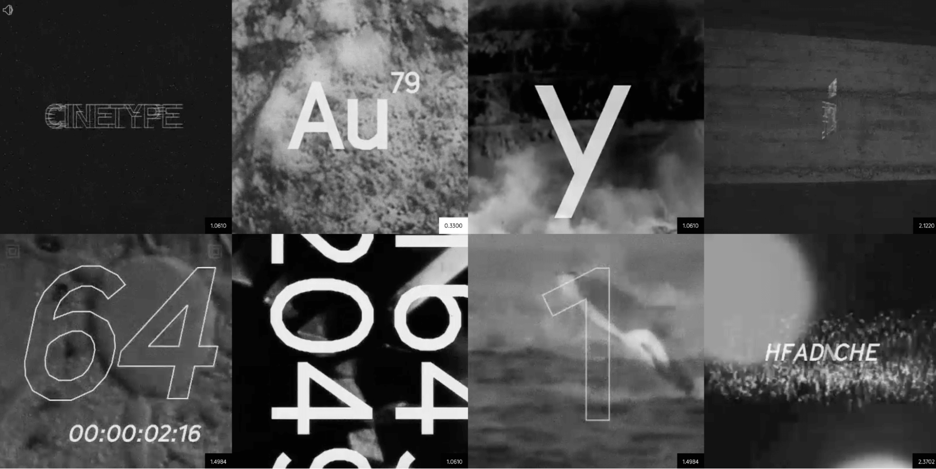
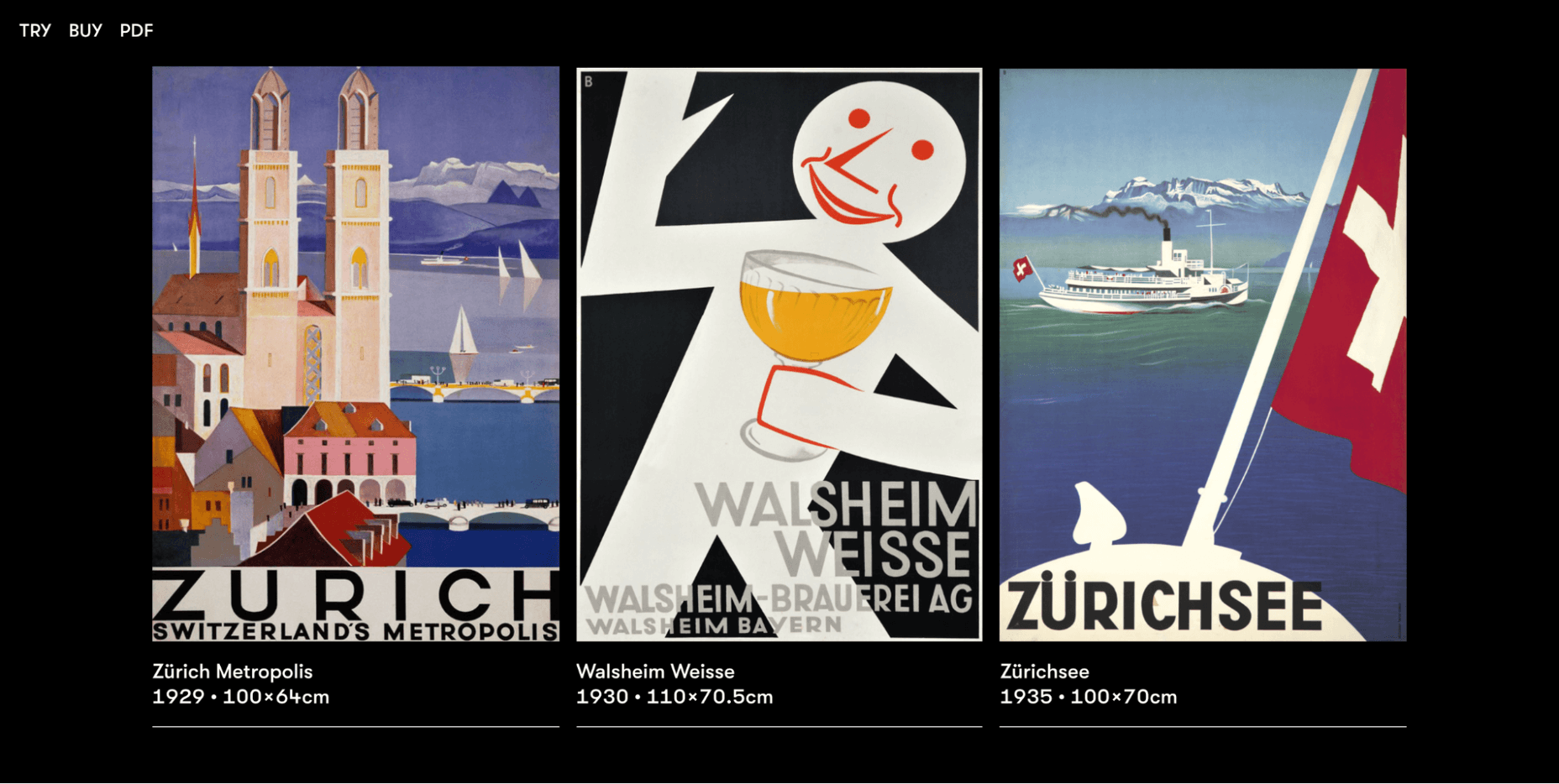
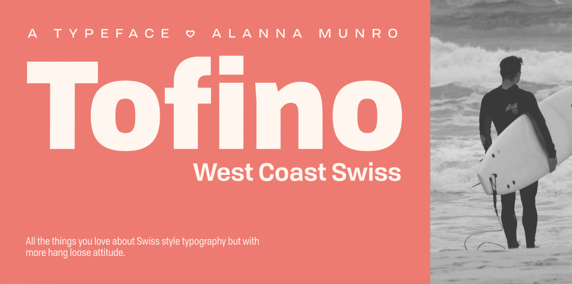
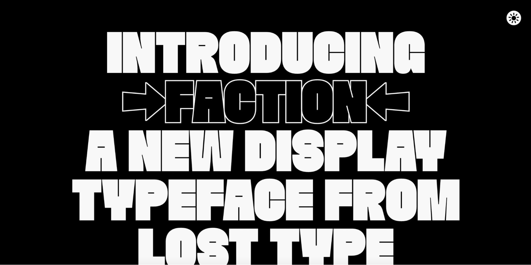
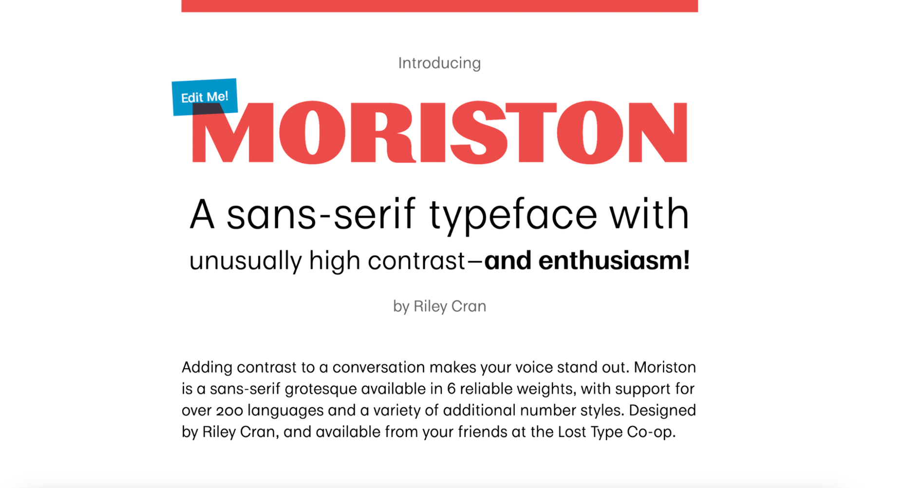
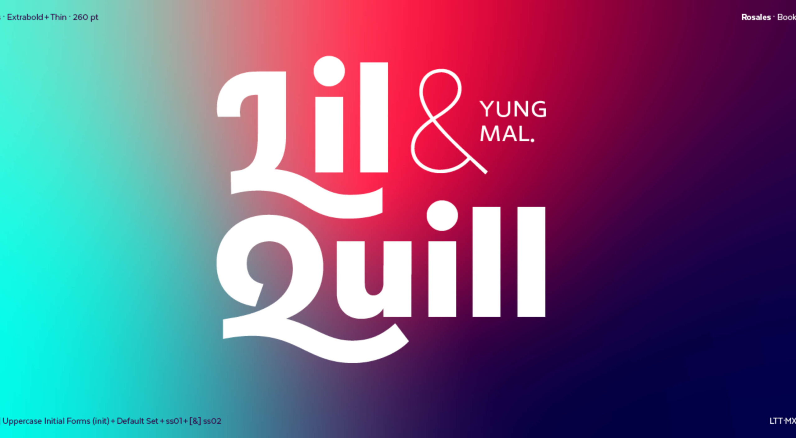
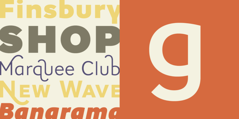
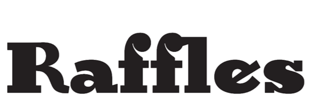
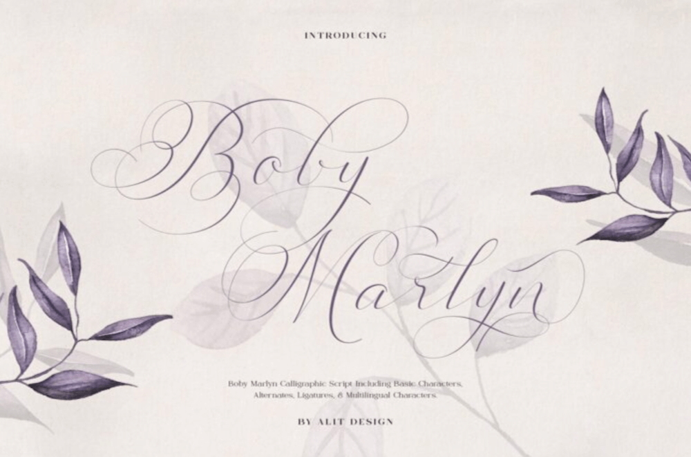
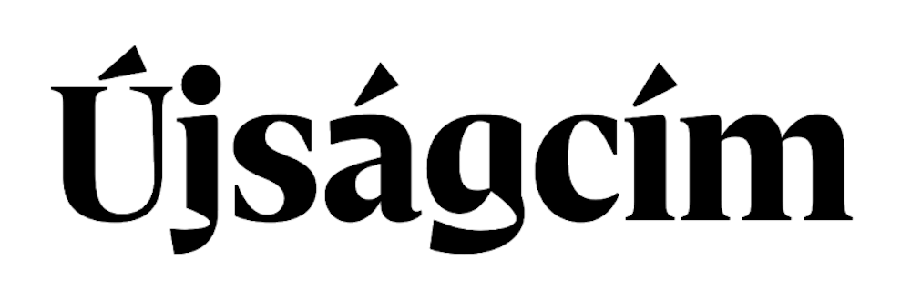
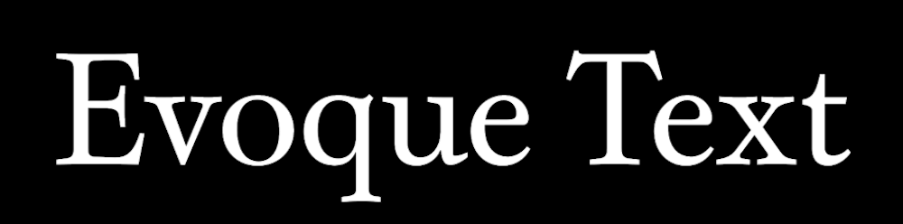
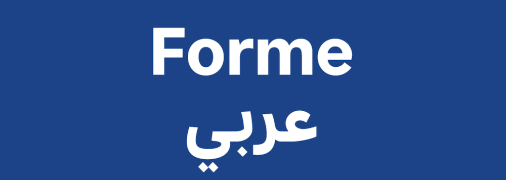
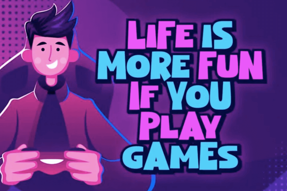
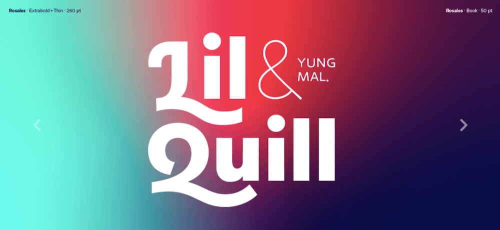
 Type foundries have been putting out some really interesting fonts these last few months. Based on the collection of the best new fonts for February 2022, it looks like we’re going to see lots of throwbacks to the ‘70s in the coming year.


 Every day design fans submit incredible industry stories to our sister-site,

 What stands out as an incredible web design project for you? Do you count your creation as a success if it’s modern,