Articles

There are dozens of factors that influence the UX of your site, app, or game. Most of them are beyond your control; user connection speed, end-system resources, even browser technology is all out of your hands. So when you do have the opportunity to influence your project’s infrastructure, you should seize it.

The world’s fastest muscle car can’t perform at its best when traffic is gridlocked bumper to bumper; likewise, the most finely tuned website can’t meet its potential running on shared hosting.

If you want your website, application, or service to run quickly and securely, maximizing both UX and SEO, then you need to look at the bare metal servers from OVHcloud.

Bare Metal Performance

Bare metal (or dedicated) servers aren’t uncommon. Still, most hosts only offer a single type of server, expecting small startups to pay for resources at the same rate as global giants, which can make dedicated hosting prohibitively expensive.

OVHcloud is different; it offers a range of bare metal server products optimized for a wide variety of challenges. That means small startups can invest in fast, easily scalable solutions that meet the most demanding security requirements without breaking the bank.

Whatever your aims, there’s a different OVHcloud solution configured for you:

OVHcloud Rise

Rise is the perfect option for a website, or web app hosting. With its low entry-cost, Intel-powered performance, bundled DDoS protection, and simplified administration, Rise is the natural choice for your first step into bare metal servers.

OVHcloud Advance

To meet SMEs’ need for reliable infrastructure to run mission-critical applications, OVHcloud configured Advance. From in-house CRMs to web-facing SaaS products, Advance is a solid foundation upon which to build your business.

OVHcloud Storage

Storage is ideal for storing large amounts of data securely. Hosting data on standard servers is a colossal waste of resources; with OVHcloud’s Storage product you can host up to 504TB and seamlessly access it via a performance-tuned server.

OVHcloud Infrastructure

For large companies with thousands of employees, global non-profits, colleges, and even local governments, OVHcloud Infrastructure offers scalability and flexibility beyond the average dedicated server.

OVHcloud High-End

For web apps that are leveraging cutting edge technology like machine learning and big data, OVHcloud’s High-End product is a no-compromise custom solution, the humdinger of bare metal servers, with every conceivable option available.

OVHcloud Game

If you’re developing video games, then lightning-quick, reliable streaming servers are essential. OVHcloud’s Game product delivers the type of speed your customers demand, with massive performance gains over comparable bare metal servers.

How to Choose a Bare Metal Server

It’s easy to get bogged down in detail, especially if this is your first foray into bare metal servers.

But here’s the good news: every OVHcloud bare metal server is a massive boost in performance over shared web hosting. That’s because, with a dedicated server, all of the server’s resources are…dedicated; that is, you don’t have to share with anyone. Shared hosting is pot-luck: You might wind up on a server with thoughtful users who don’t eat up all the resources, and you might end up on a server with one selfish user who hogs the processes and compromises the security. With a bare metal server, that’s not an issue.

Choosing a bare metal server is a two-step process. The first step is to think about what you intend to use it for:

Are you going to store a lot of data? If so, think about OVHcloud’s Storage product. But a lot of data doesn’t mean a WordPress blog. Let’s say you’re a polling company, collating millions of records that you hope to analyze to predict political movement; that requires a lot of storage. On the other hand, all servers have some storage. OVHcloud’s Rise product comes with 500Gb and can be configured with more. So if you’re planning to host something the size of a blog, then OVHcloud’s Storage might be using a sledgehammer to crack a nut.

The second step is to ask how complex the operations you’re going to ask the server to perform will be:

Hitting up a database to retrieve some data is not a complex operation. Even something like a complex search isn’t too taxing. If that’s the kind of process you expect to perform, OVHcloud’s Rise is more than adequate. But if you’re manipulating large amounts of data, like resizing hundreds of raster images dynamically; or using facial recognition to search through millions of biometric data records; or even managing your advertising application serving millions of ads to sites across the web; in those cases, you need the sort of performance OVHcloud’s Infrastructure product delivers.

OVHcloud’s products are all scaleable. Its High-End bare metal server product is entirely customizable. Whatever you choose, and however your needs change over time, you can be confident you’re running the optimum server for your project.

Why Choose OVHcloud

There are a mind-boggling array of processors, and OS, and a seemingly infinite — and increasingly expensive — amount of hardware on offer on the web. OVHcloud radically simplifies running a bare metal server by delivering a range of popular packages, tailored for everyday uses, that are both customizable and scaleable.

What OVHcloud delivers is a clear choice, letting you choose the right server for your product.

Whether you need lighting fast response times to maximize your SEO or the space to store a digital archive of the world’s most important art, for reliability and choice, opt for OVHcloud bare metal servers.


[— This is a sponsored post on behalf of OVHcloud —]

Source

The post How to Choose a Bare Metal Server From OVHcloud first appeared on Webdesigner Depot.


Source de l’article sur Webdesignerdepot

In the 2020 COVID pandemic, most enterprises have realized the importance of creating an effective digital presence. While some businesses used digital presence to promote their services and business continuity, other companies used the latest trends to stay ahead among competitors. One of the most popular and widely used platforms is Node.JS, which is widely used for the development process.

What is Node.JS? 

Source de l’article sur DZONE

Over the years, experts have repeatedly discussed the possible impact of mixed realities on web design. Concepts like AR and VR are expected to have the potential to change the way that we interact with websites on a fundamental level.

Now that we’re in the year 2021, however, discussions about AR aren’t just observational anymore. The age of mixed-reality interfaces is here, in everything from Pokémon Go, to Snapchat filters.

The question is, how do web designers create incredible user experiences in a world where there are now multiple digital realities to consider?

The Benefits of Experimenting with AR

Before we look at some of the steps that web designers can take to enhance their projects with AR, it’s worth examining the benefits of interacting with augmented reality in the first place. 

While virtual reality replaces the typical world around us completely with digital components, AR augments it. This means that developers and designers need to learn how to thrive in an environment where the real world and the digital one work together. 

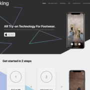
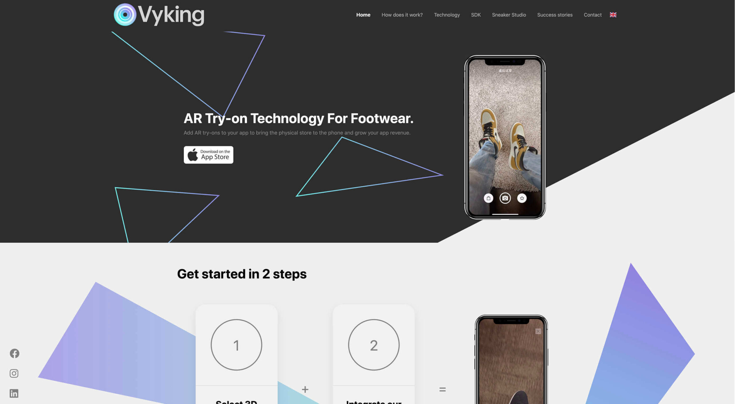
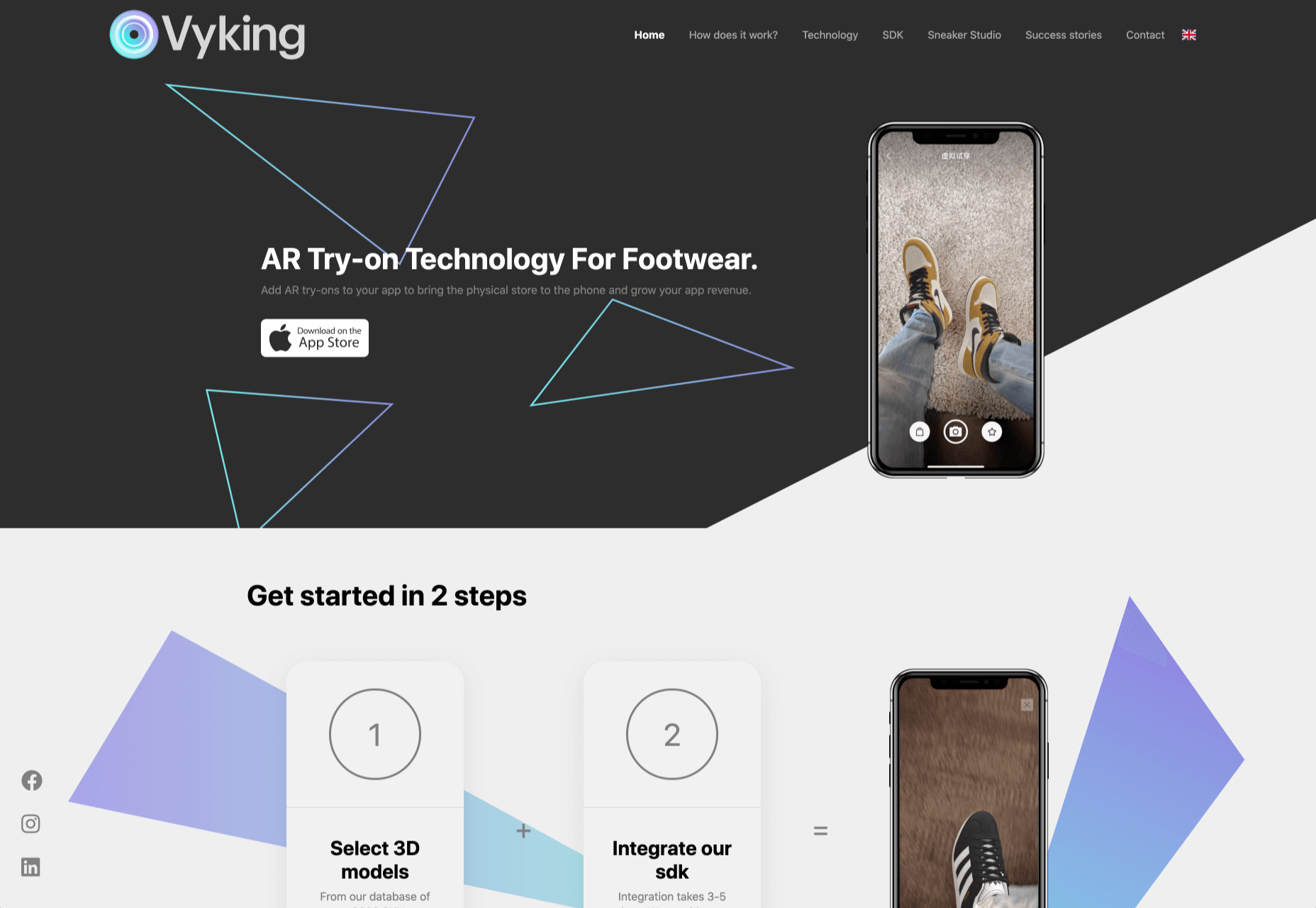
The most common AR application for website owners is to provide a solution for real-time and remote product visualization. Imagine being able to try on a pair of shoes before you buy them online. That’s a service that the Vyking brand can deliver by creating technology that “reinvents” the digital shopping experience. 

This test functionality plays a massive role in purchasing decisions. In a world where people can’t see a shade of make-up in person when they’re shopping online, or check how an item of furniture looks in their home, AR has a crucial role to play. 

In simple terms, AR helps shoppers to make more informed purchases. 

Here’s how you can use augmented reality to deliver incredible UX. 

1. Focus on Real-Time Feedback

Augmented reality is all about connecting the real world to the virtual world. 

Doing this provides users a unique experience – one that’s filled with real-time feedback that can deliver crucial and insightful information. For instance, an augmented reality system in a GPS app can calculate the average time before reaching a destination based on previous trips.

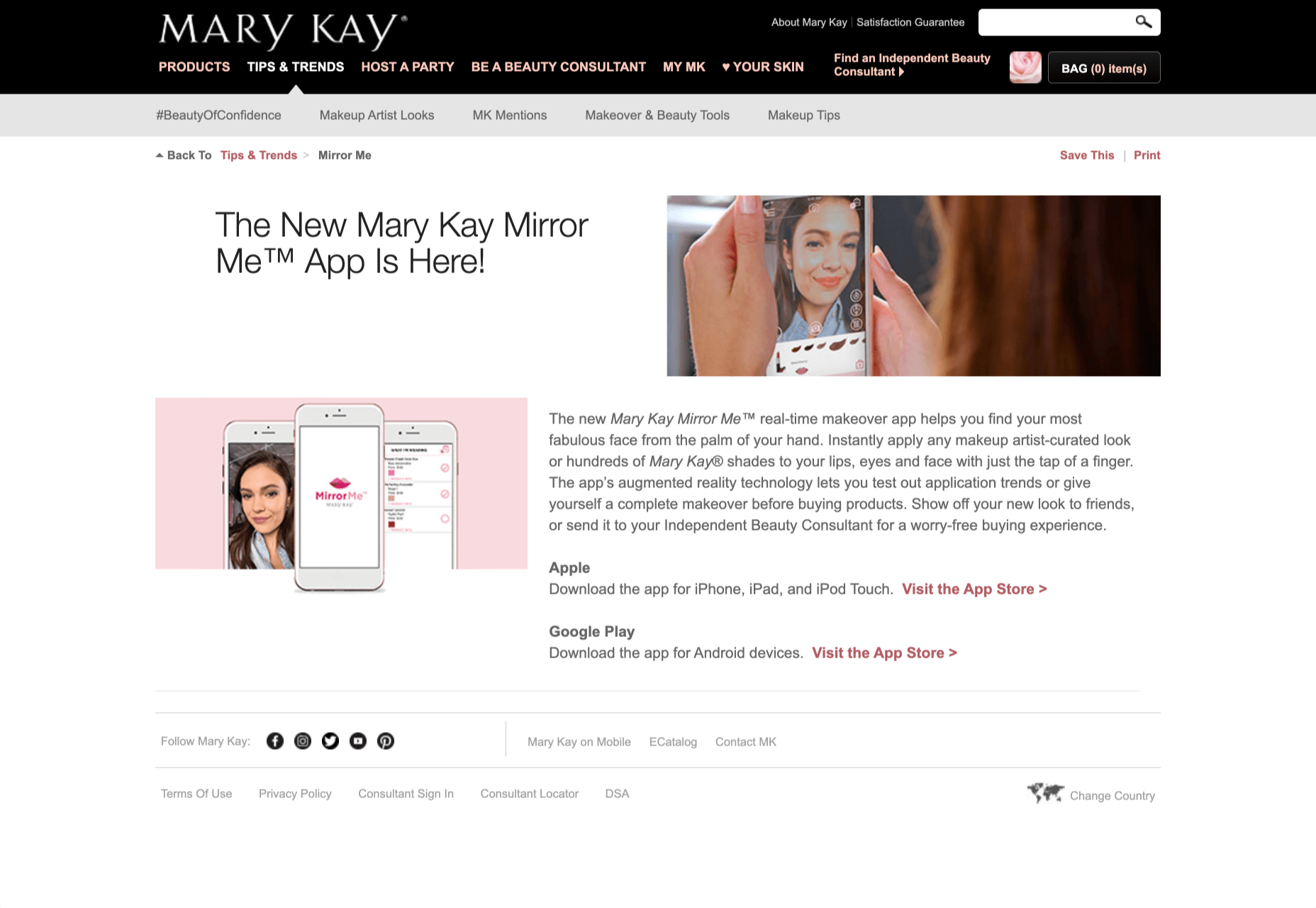
Another option is for an augmented reality to use solutions like face-mapping to help customers determine how a certain makeup product will look before they buy it. For instance, that’s the case for the Mary Kay Mirror Me app, which simplifies the process of shopping for make-up. 

When designing for AR, experts need to consider how they can provide customers with real-time information that they can use to make better purchasing decisions. 

2. Define input and output

Although you’ve probably performed similar exercises when designing for traditional websites and applications in the past, defining inputs and outputs of UX in AR environments can be tough.

Defining inputs and outputs allows you to determine which elements of an interface your user can actually interact with, in your interface. This gives you a better idea of what to “augment.” For instance, you might decide that physical gestures like a swipe of the hand will be essential for AR inputs. However, you’ll also need to consider how each mobile device offers different input possibilities. 

Outputs are a little simpler. For instance, you could offer a three-dimensional model of a product that your customers are interested in. Once you have that output, you can think about how the customer will interact with it by changing colors or position.

3. Embrace Customer-Friendly Performance

Another feature at the heart of AR applications is interactivity. 

Good designs in the augmented reality world need to be simple to access and use, otherwise customers will end up avoiding them. For instance, 60% of customers say they want to use AR when they’re shopping for furniture. However, they’re only going to use your app if it actually works. 

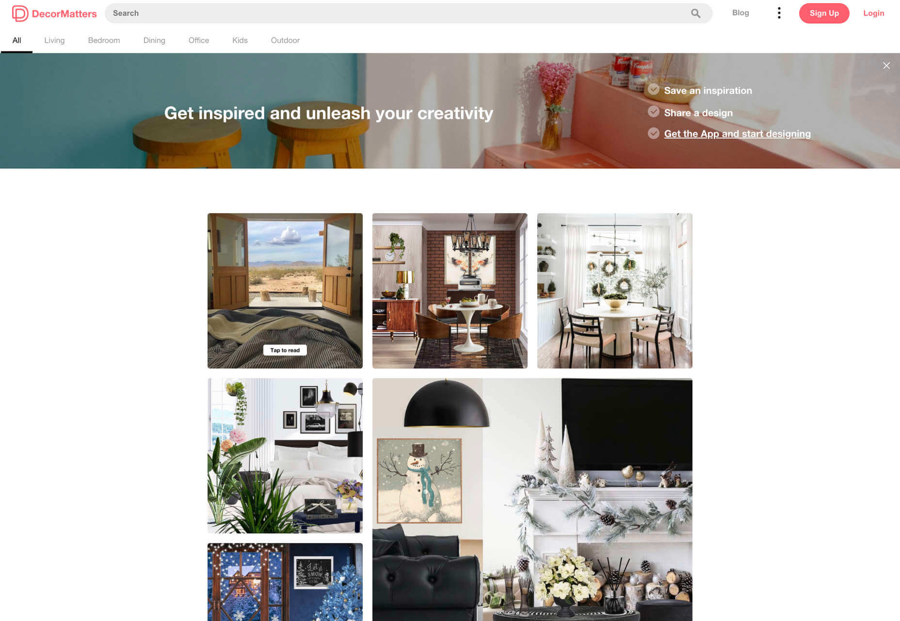
The Décor Matters website and app mix gamification with home decorating features that help customers get a better view of the home goods they’re planning on buying. The website even has inspiration pages available to help users find and try new design options with their AR technology. 

When designing for AR, think about how you can make your applications or technology as simple to use as possible, so customers actually want to interact with it. 

4. Address the Environment

In augmented and virtual reality applications, it’s important to remember that interfaces aren’t bound by physical screens. The viewport will move with the user, shifting perspectives in response. Most AR designers will use four different signifiers to describe AR environments:

  • Public environment: The entire body of the user is involved as a controller, like with the Xbox Kinect or Nintendo Wii;
  • Intimate environment: Where a user can be seated – often in a desktop environment;
  • Personal environment: AR on smartphones, mobile devices, and tablets, like Pokémon Go;
  • Private environments: Completely private spaces, such as with wearable technology like the Google Glass solution.

The environment that you’re designing for will be crucial for your project outcomes. Remember, spatial considerations need to be carefully considered when accounting for how users will interact with objects in a frame. 

5. Remember User Fatigue

Another thing to keep in mind when designing for AR technology is that user fatigue is likely to be a much more significant consideration. After all, people interact with websites and applications in a much more intimate and in-depth way when AR is involved. 

AR applications can often use the entire body of a customer as a controller. Because of this, designers need to be careful about exhausting interactions. High-effort and repetitive interactions could tire the user out mentally and physically, causing them to give up on the interaction. 

When designing, you’ll need to consider how you might over-stimulate the user with too many interaction-focused elements at once. Keep it simple.

6. Remember the Essential Principles of UX Design

Remember, just because you’re tapping into a relatively new technology doesn’t mean that you should abandon all the basic tenets of user experience design that you’ve come to understand over the years. Although UX is constantly evolving and changing, it’s always going to keep a few fundamental principles in mind. 

For instance, you’ll always strive to give users the best digital experience in exchange for the lowest amount of effort on their part. Additionally, you’ll need to think about how you can make end-users as comfortable as possible when they’re interacting with new types of technology on websites and apps. 

For instance, since AR is most commonly associated with gaming in the current environment, it might be a good idea to implement gamification concepts into your AR design. What can you do to make sure your customers are having fun?

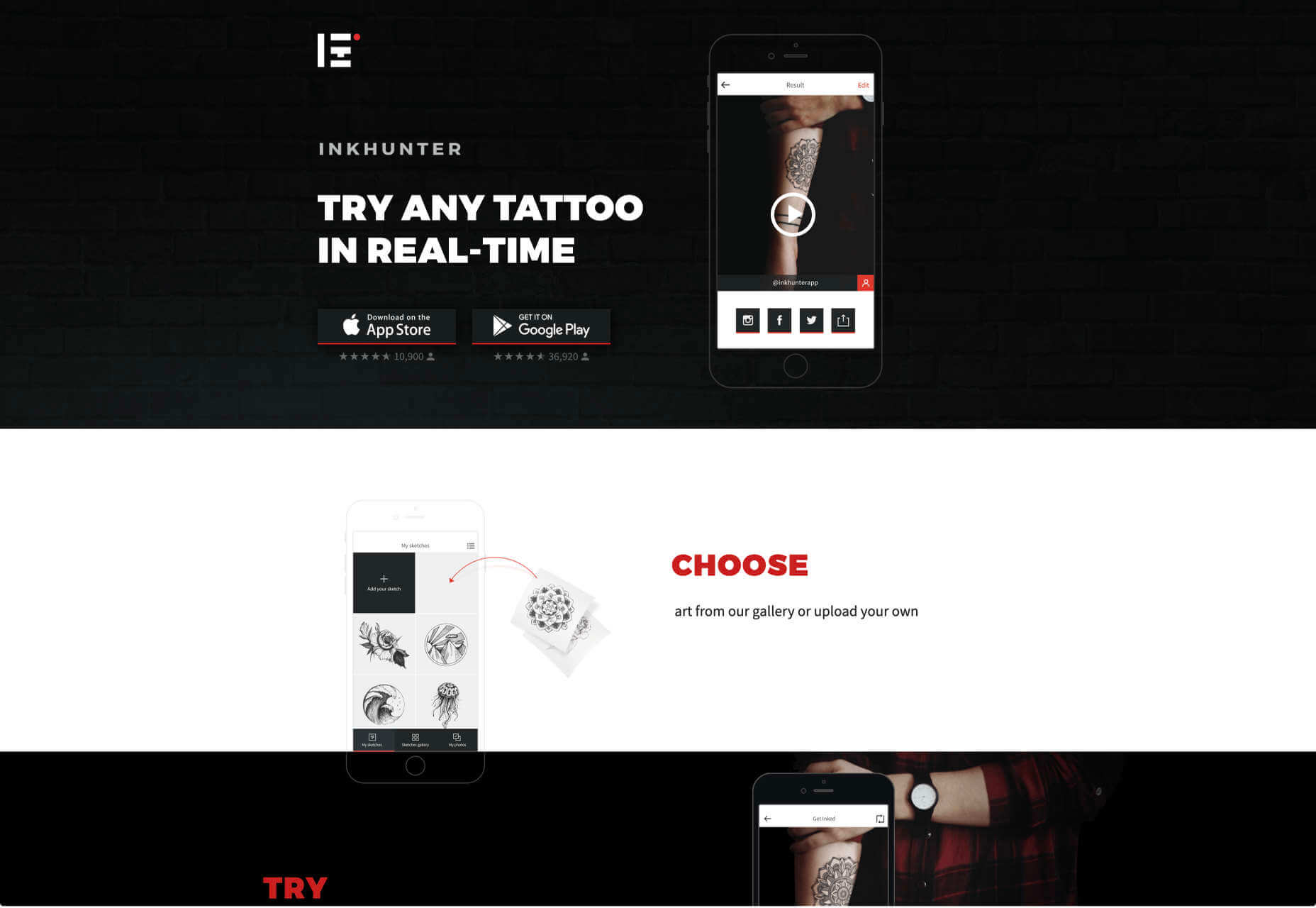
For instance, Inkhunter is an app that allows users to try on tattoos just like using a filter on Snapchat. The experience feels familiar, comfortable, and exciting.

Unlocking the Potential of AR Web Design

Augmented Reality technology has come a long way over the years. Today, developers and designers can access simple plug-in tools like WordPress VR, allowing designers to upload 360-degree videos into WordPress sites and other unique web extensions. 

Augmented reality is becoming much more readily available on sites and apps of all shapes and sizes. Additionally, customers are accessing more ways to unlock AR’s power through everything from headsets to mobile interfaces. 

However, just like any new technology in the web design world, designers need to think carefully about how they will overcome the challenges in user experience that AR can present. For instance, though AR can offer more information for a customer and help them make purchasing decisions faster, there are also risks. For instance, add too many interactive features to a single website or application, and you could scare users off with too much information. 

In the short-term, web designers need to explore the new tools that are available to them and think about the customers they’re designing for. Only this way will we be able to make any considerable advances in the possibilities of AR. 

Are You Ready to Embrace AR?

Designing for augmented reality applications and websites can be an intimidating concept – even for seasoned designers. However, this is just another technology that creatives can use to drive better experiences for end-users. 

Learn how the latest technology works and get an insight into your customers’ needs, and you’ll be amazed at what you can accomplish in the AR world.

Source


Source de l’article sur Webdesignerdepot

User experience is one of the most important aspects of web design, but many experts overlook that UX doesn’t just apply to web pages. User experience as a concept encompasses all aspects of end-user interaction with a company.

That means you need to discover the right UX strategies for everything from your homepage to your email marketing and even your listings on Google.

Today, we’re going to explore some of how you can apply UX principles to your client’s image on search engines.

Why Your Search Engine Listing Matters

Let’s start with the basics: 89% of customers start their purchasing process with a search engine. That means that whether you’re creating a portfolio to sell your services or building a website for a client, the first connection a customer has with your design isn’t on the homepage.

Most of the time, you’re driving a specific experience for an end-user before you even realize it. Before you can wow an audience with a beautiful site design or an amazing CTA offer, you need to convince them to click on your Google link.

When you invest in user experience, you think carefully about the journey that an end-user goes through when interacting with a brand. This often means considering things like the user’s intent, their needs, and their pain points.

Those same principles apply to create an impressive search engine listing.

UX on a website is all about giving your audience what they need in an informed, and strategic manner; UX in the search engine results works the same way.

How to Make Your Search Listing Stand Out with UX

So, how do you begin to apply the principles of UX to your Google Search results?

It’s much easier than you’d think.

Step 1: Show Immediate Value

Delivering an excellent experience on a website often means providing end-users with the information they need as quickly as possible. Imagine designing a landing page; you wouldn’t want your audience to scroll forever to find what they need. Instead, you’d make sure that the value of the page was immediately obvious.

When creating an image for your search engine listing, you’ll need to take the same approach. This often means thinking carefully about two things: your headline and your meta description.

Around 8 out of 10 users say that they’ll click a title if it’s compelling. That means that before you do anything else to improve your SEO strategy, you need to make sure that your web page’s title is going to grab your audience’s attention.

The best titles deliver instant value. These titles tell the audience exactly what they’re going to get when they click onto the page. The promise drives action, while clarity highlights the informed nature of the brand.

The great thing about using an excellent title for a page is that it doesn’t matter where you’re ranked on the search results. Whether you’re number 2 or number 5, your customers will click if they find something they want.

It’s just like using a CTA on a landing page. Make sure your titles are:

  • Informative — show your audience value immediately;
  • Optimized for mobile — remember, your audience might not see your full title on some screens; this means that you need to make the initial words count;
  • Easy to read — keep it short, simple, and clear, speak the end-users’ language.

Step 2: Build Trust with Your URLs

Trust factors are another essential part of good UX.

When you’re designing a website for a new brand, you know that it’s your job to make visitors feel at ease. Even in today’s digital world, many customers won’t feel comfortable giving their money or details to a new company.

Within the website that you design, you can implement trust symbols, reviews, and testimonials to enhance brand credibility. On search engines, it all starts with your URL.

Search-friendly URLs that highlight the nature of the page will put your audience’s mind at ease. When they click on a page about “What is SEO” in the SERPs, they want to see an URL that matches, not a bunch of numbers and symbols

Use search-friendly permalink structures to make your listing seem more authoritative. This will increase the chances of your customer clicking through to a page and make them more likely to share the link with friends.

Once you decide on a link structure, make sure that it stays consistent throughout the entire site. If a link doesn’t appear to match the rest of the URLs that your audience sees for your website, they may think they’re on the wrong page. That increases your bounce rate.

Step 3: Be Informative with Your Meta Description

To deliver excellent UX on a website, you ensure that your visitor can find all of the answers to their most pressing questions as quickly as possible. This includes providing the right information on each page and using the correct navigational structure to support a visitor’s journey.

In the SERPs, you can deliver that same informative experience with a meta description. Although meta descriptions often get ignored, they can provide a lot of value and help you or your client make the right first impression.

To master your meta descriptions:

  • Use the full 160 characters — make the most of your meta description by providing as much useful information as you can within that small space;
  • Include a CTA — just as CTAs help to guide customers through the pages on a website, they can assist with pulling in clicks on the SERPS; a call to action like “read about the” or “click here” makes sense when you’re boosting your search image;
  • Focus on value — concentrate on providing your customers with an insight into what’s in it for them if they click on your listing.

Don’t forget that adding keywords to your meta description is often helpful too. Keywords will boost your chances of a higher ranking, but they’ll also show your audience that they’re looking at the right result.

Step 4: Draw the Eye with Rich Snippets

You’ve probably noticed that the search engine result pages have changed quite a bit in the last couple of years. As Google strives to make results more relevant and informative, we’ve seen the rise of things like rich snippets. Rich snippets are excellent for telling your audience where to look.

On a website, you would use design elements, like contrasting colors and animation, to pull your audience’s attention to a specific space. On search engines, rich snippets can drive the same outcomes. The difference is that instead of telling a visitor what to do next on a page, you’re telling them to click on your site, not a competitor’s.

When Google introduced rich snippets, it wanted to provide administrators with a way of showcasing their best content. Rich snippets are most commonly used today on product pages and contact pages because they can show off reviews.

Install a rich snippet plugin into your site if you’re a WordPress user or your client is. When you enter the content that you need into the website, use the drop-down menu in your Rich snippet tool to configure the snippet.

Ideally, you’ll want to aim for the full, rich snippet if you want to stand out at the top of the search results. Most featured snippets have both text and an image. It would help if you aimed to access both of these by writing great content and combining it with a relevant image.

Step 5: Provide Diversity (Take Up More of the Results)

As a website designer or developer, you’ll know that different people on a website will often be drawn to different things. Some of your visitors might immediately see a set of bullet-points and use them to search for the answer to their question. Other visitors will want pictures or videos to guide them. So, how do you deliver that kind of diversity in the SERPS?

The easiest option is to aim to take up more of the search result pages. Google now delivers a bunch of different ways for customers to get the answers they crave. When you search for “How to use Google my Business” on Google, you’ll see links to blogs, as well as a list of YouTube Videos and the “People Also Ask” section.

Making sure that you or a client has different content ranking pieces for the same keywords can significantly improve the experience any customer has on the search engines. Often, the process of spreading your image out across the SERPs is as simple as creating some different kinds of content.

To access the video’s benefits, ask your client to create YouTube videos for some of their most commonly asked questions or most covered topics. If you’re helping with SEO marketing for your client, then make sure they have an FAQ page or a way of answering questions quickly and concisely on articles, so they’re more likely to appear in “People Also Ask”:

Step 6: Add Authority with Google My Business

Speaking of Google My Business, that’s another excellent tool that’s perfect for improving UX in the search results. GMB is a free tool provided by Google. It allows business owners to manage how information appears in the search results.

With this service, you can manage a company’s position on Google maps, the Knowledge Graph, and online reviews. Establishing a company’s location is one of the most important things you can do to help audiences quickly find a business. Remember, half of the customers that do a local search on a smartphone end up visiting the store within the same day.

Start by setting up the Google Business listing for yourself or your client. All you need to do is hit the “Start Now” button and fill out every relevant field offered by Google. The more information you can add to Google My Business, the more your listing will stand out. Make sure you:

  • Choose a category for a business, like “Grocery store”;
  • Load up high-quality and high-resolution images;
  • Ensure your information matches on every platform;
  • Use a local number for contact;
  • Encourage reviews to give your listing a five-star rating.

Taking advantage of a Google My Business listing will ensure that your audience has all the information they need to make an informed decision about your company before they click through to the site. This means that you or your client get more warm leads and fewer people stumbling onto your website that might not want to buy from you.

Step 7: Use Structured Data Markup to Answer Questions

If you’re already using things like rich snippets in your Google listings, you should also have a structured schema markup plan. Schema markup on Google tells the search engines what your data means. This means that you can add extra information to your listings that will guide your customers more accurately to the support they need.

Providing additional schema markup information to your listings gives them an extra finishing touch to ensure that they stand out from the competition. You might add something like a “product price” to a product page or information about the product’s availability.

Alternatively, you could provide the people who see a search result with other options. This could be an excellent option if you’re concerned that some of the people who might come across your listing might need slightly different information. For instance, you can ask Google to list other pages along with your search results that customers can “jump to” if they need additional insights.

Baking structured data into your design process when you’re working on a website does several positive things. It makes the search engine’s job easier so that you can ensure that you or your client ranks higher. Additionally, it means that your web listings will be more thorough and useful.

Since UX is all about giving your audience the best possible experience with a brand, that starts with making sure they get the information they need in the search results.

Constantly Improve and Experiment

Remember, as you begin to embed UX elements into your search engine listings, it’s important to be aware of relevant evolutions. Ultimately, the needs of any audience can change very rapidly. Paying attention to your customers and what kind of links they click on the most will provide you with lots of valuable data. You can use things like Google analytics to A/B test things like titles, pictures, featured snippets, and other things that may affect UX.

At the same time, it’s worth noting that the Google search algorithms are always changing. Running split tests on different pages will give you an insight into what your customers want. However, you’ll need to keep an eye on the latest documentation about Google Search if you want to avoid falling behind the competition.

Like most exceptional UX aspects, mastering your SERP position isn’t a set it and forget it strategy. You’ll need to constantly expand your knowledge if you want to show clients that you can combine UX and SEO effectively.

It’s easy to forget that there’s more to UX than making your buttons clickable on mobile devices or ensuring that scrolling feels smooth. For a designer or developer to deliver wonderful UX for a brand, they need to consider every interaction that a company and customer have. Most of the time, this means starting with the way a website appears when it’s listed on the search engines. Getting your SEO listing right doesn’t just boost your chances of a good ranking. This strategy also improves your reputation with your audience and delivers more meaningful moments in the buyer journey.


Featured image via Unsplash.

Source


Source de l’article sur Webdesignerdepot
De la conception à l’utilisation, le numérique permet de suivre l’ensemble du cycle de vie d’un produit. Mais aussi de transformer la relation entre le fournisseur et ses clients, en proposant des innovations comme le Product as a Service.

Le jumeau numérique est une réplique numérique d’un objet, processus ou système. Alimenté en temps réel par des données venant de son jumeau physique, le jumeau numérique permet de disposer d’informations clés sur le dispositif ou service simulé. L’apport de techniques de Machine Learning ouvre même les portes du prédictif.

De la simulation classique au jumeau numérique

L’utilisation de la simulation numérique et de modèles 3D n’est pas nouvelle, mais cet usage était auparavant limité aux bureaux d’études.

« Le jumeau numérique existe dans l’ingénierie depuis une bonne vingtaine d’années », confirme Denis Goudstikker, en charge du Business Development du PLM et du SLM chez Siemens Digital Industries Software. « Dans l’industrie automobile, la simulation numérique a permis de raccourcir le temps de mise sur le marché d’un nouveau véhicule. Il y a trente ans, on jetait 100 véhicules contre un mur pour pouvoir assurer un certain niveau de sécurité. Il y a vingt ans, on n’en jetait plus que 5, après en avoir jeté 5000 dans un autre mur… virtuel. » Une avancée qui s’est traduite par un meilleur niveau de sécurité et une accélération du processus de conception des voitures.

Avec le jumeau numérique, les barrières sont éliminées entre l’ingénierie, la production et la maintenance. Et même au-delà, puisque cette continuité numérique peut se prolonger hors des murs de l’entreprise.

« Le constructeur nous fournit des définitions numériques de son produit », témoigne Eric Miralles, CIO de SNOP, équipementier automobile de premier plan. « À partir de cette définition, nous fabriquons les outils qui vont nous permettre d’emboutir les tôles suivant ce cahier des charges. Il faut pour cela que la chaîne allant de la conception à la production soit numérisée. La modélisation numérique de l’ensemble de la chaîne permet d’avoir une maîtrise globale des processus. »

Le jumeau numérique offre également des opportunités après la phase de fabrication.

« Si le jumeau numérique est né dans le milieu industriel, la capacité de connecter de façon massive des objets distribués aux clients, au travers de l’IoT, permet de développer de nouveaux services, mais aussi de redéfinir la relation entre client et fournisseur », analyse Luca Ammassari, Group Deputy Chief Information Officer in charge of Applications chez Engie.

Quels usages clés pour les jumeaux numériques ?

De la conception d’un produit à son utilisation, en passant par la production, le jumeau numérique permet de suivre l’ensemble du cycle de vie d’un produit. Mais également de réduire le time to market de nouvelles offres, la simulation numérique permettant d’accélérer la conception, le test et l’industrialisation des produits.

« Le jumeau numérique permet de répondre à des enjeux économiques et de recherche d’efficacité dans la production, analyse Eric Miralles. Sa mise en place nécessite toutefois une transformation numérique, mais aussi une transformation des organisations et des hommes. Il faut savoir saisir cette nouvelle opportunité par étapes et accompagner les équipes dans ce changement. »

« Le jumeau numérique est également important pour identifier et comprendre le comportement du matériel, poursuit Denis Goudstikker. Et ainsi optimiser son design et sa maintenance. Analyser le comportement acoustique d’une turbine permet par exemple de détecter tout changement dans son fonctionnement. Des modèles prédictifs vont alors déterminer si et quand elle tombera en panne. »

Les usages dans le secteur de la maintenance commencent à devenir communs, « mais il y a une chose à laquelle on s’attendait moins : le packaging d’objets et de services, explique Luca Ammassari. Le constructeur d’une turbine va proposer avec son équipement des services prédictifs basés sur l’utilisation d’un jumeau numérique. Il va s’appuyer sur les informations issues de turbines installées dans le monde entier qui seront comparées en temps réel au comportement de votre turbine, pour vous donner des probabilités de défaillance ou de perte de performance. »

Oser le passage au jumeau numérique

Construire le jumeau numérique de l’ensemble d’une ligne de production n’est pas toujours possible. Certains équipements anciens, amortis sur des dizaines d’années, ne sont en effet pas équipés de capteurs et ne peuvent parfois pas l’être.

La bonne pratique consiste à avancer par étapes, sur des projets ciblés, au fort ROI. « Il faut mener ses projets selon une approche agile, par petits pas et construire ainsi progressivement de la compétence en interne, explique Luca Ammassari. Certains projets auront des résultats décevants, mais cela ne doit pas remettre en cause la démarche. »

Difficile de savoir de quoi demain sera fait en matière d’innovation, constate Luca Ammassari, « c’est pourquoi notre objectif est d’accompagner les entreprises en leur fournissant des fondations capables d’intégrer ces innovations. Notre but n’est pas de proposer des offres clé en mains, mais une plate-forme permettant de sortir de la supply chain classique pour créer un nouvel écosystème. »

Une logique de partenaires qui est essentielle pour Eric Miralles. « C’est cet assemblage de partenaires qui nous permettra de digitaliser l’ensemble de notre supply chain », confirme-t-il. Et de conclure : « La crise que nous traversons aujourd’hui est un accélérateur et il y a beaucoup d’opportunités, très positives, qui nous permettent d’accéder à ces innovations. »

The post Le jumeau numérique, facteur d’optimisation du cycle de vie des produits appeared first on SAP France News.

Source de l’article sur sap.com

LEVALLOIS-PERRET, France – 10 décembre 2020 – SAP France, 5ème filiale du Groupe SAP, leader du marché des logiciels d’applications d’entreprise, annonce le renforcement de sa stratégie « Green Line » avec la création d’une direction dédiée. Dirigée par Pascal Le Nahédic, celle-ci vise à aider les organisations à répondre à une de leurs priorités incontournables : améliorer leur impact environnemental et sociétal. SAP entend ainsi accélérer sur les sujets clés du développement durable.

En effet, les entreprises européennes sont face à une problématique complexe : alors qu’elle ont consacré 124 milliards d’euros l’an dernier à de nouvelles actions de réduction de leurs émissions de Co2, elles vont encore devoir doubler les investissements bas carbone pour avoir une chance d’atteindre l’objectif de zéro émission nette en 2050 fixé par Bruxelles.

Pascal Le Nahédic nommé Directeur des solutions à impact écologique et sociétal, SAP France

Pascal Le Nahédic prend les commandes des solutions à impact écologique et sociétal de SAP et sera en charge d’accompagner les clients de SAP dans le développement de nouvelles pratiques pour réduire leur empreinte sur l’environnement grâce aux technologies.

Après avoir passé 10 ans au sein du Groupe Exxon en Europe et en Asie, Pascal rejoint SAP France en 1999 en tant que Directeur de projet. En 2007, il occupe la fonction de Presales Industries. Depuis 2015, il assure le rôle de Presales Business Architect pour l’industrie ENR. Passionné par le sujet d’économie circulaire, il multiplie les initiatives d’intrapreneuriat en interne dont un projet innovant visant à aider les entreprises à réduire leurs déchets en termes de PLV (Publicité sur Lieu de Vente).

Sylvie Turcotte – Directrice Avant-Vente, SAP France

Sylvie Turcotte est à la tête de l’ensemble de l’organisation Avant-Vente pour SAP France.  Elle a pour mission de renforcer la croissance cloud de la filiale française par la mise en place de nouvelles approches avant-vente. Passionnée du milieu des technologies depuis 30 ans dont 20 ans au sein du groupe SAP. Sylvie a débuté sa carrière chez SAP Canada en 2000 comme consultante Finance, Funds management et Real Estate, avant de rejoindre l’équipe avant-vente Secteur Public pendant plusieurs années pour ensuite devenir directrice des ventes de Premium Engagement. Par la suite, elle a été nommée Customer Solution Director (CSD) puis Directrice de l’équipe Digital Core (Finance et Supply Chain) au niveau de SAP Canada, rôle qu’elle occupait depuis 3 ans.

The post SAP France nomme Pascal Le Nahédic, Directeur des solutions à impact écologique et sociétal et Sylvie Turcotte, Directrice avant-vente appeared first on SAP France News.

Source de l’article sur sap.com

The end of the year tends to be busy for a variety of reasons and it can limit some of the freshness we see in designs during much of the year. Regardless, there are a few trending design elements.
What we are seeing right now is rooted in deep simplicity with a focus on the message.

Here’s what’s trending in design this month…

Activism and Engagement

Websites with a focus on societal issues have moved to the forefront. While the look and design techniques used for these websites can vary greatly, there’s a common theme of activism, community engagement, and support.

What’s great about this movement – and what it reflects – is that people can take to the digital space to help amplify their message or find support with people who are going through the same things they are.

While some of these efforts are backed by people and brands you may know, that’s not always the case.

The designs also work best when they reflect the personality of the spokesperson or mood of the issue at hand. Note the vast differences in the three examples.

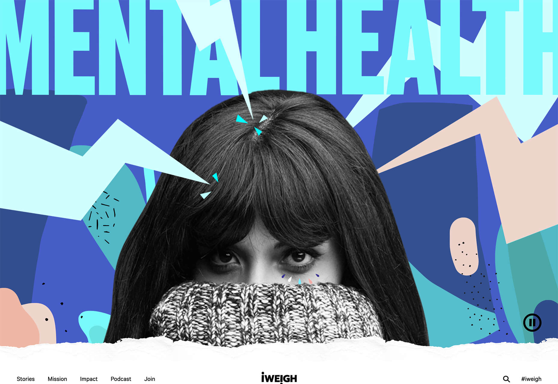
The I Weigh Community uses bright color with a black and white image of promoter and celebrity Jameela Jamil to bring attention to mental health issues.

Wear the Waste by retailer H&M uses simple typography in a natural environment to set the stage for more eco-friendly clothing options.

Wavering Stripes uses an illustrative approach to bring attention to the stories of immigrants in detention.

Each design is vastly different but all are striking and draw attention to the causes therein. The common thread is that each design is simple enough to draw you in and help you better understand the message and not get lost in tricks or design effects.


In Your Face Products

’Tis the season for product promotion.

Designers are opting for larger-than-life product images that allow shoppers to see every detail before making a purchase. (Seems like a good plan in a socially-distanced pandemic world.)

It can work in a number of ways:

  • With an oversized image and ability to use on-screen controls to take a closer look;
  • With video and animation effects to see the product in action;
  • With super high-resolution and zoomed in photography.

Pair these visuals with strong descriptive language and you’ve got a winning combination.

The variance in the examples is a good showcase of how to do this well, while not over-doing effects.

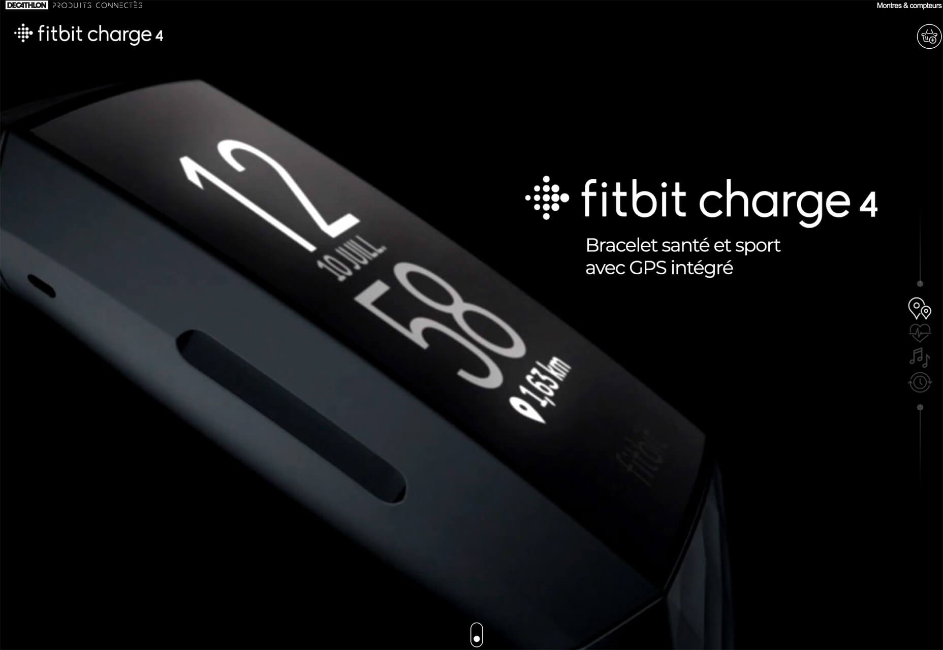
The Fitbit Charge 4 website uses an opening image of the device that’s way larger in scale than reality (especially if you are on a large desktop screen). Users control using click and scroll to get more views and details of the device. Zoom and animation aren’t overwhelming, providing a solid look at the product.

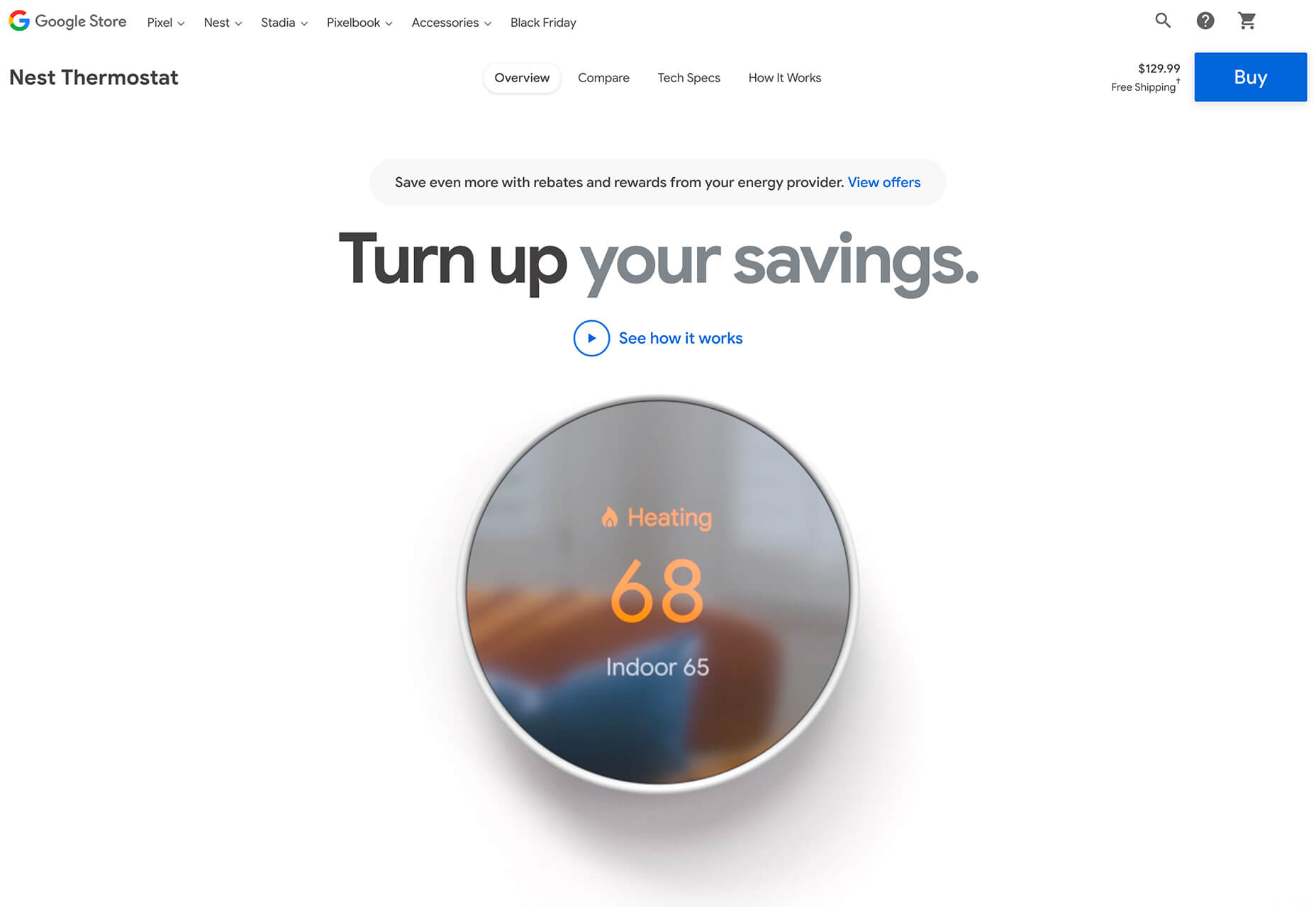
The Nest Thermostat opens with a video animation of the device moving into the forefront of the screen. (It’s rather quick.) From there, if you want more detail, there’s a video to watch that provides deeper product information in a digestible manner.

The final example isn’t really a product at all, but rather an art installation. What’s interesting is that it uses these same oversized options to show the art in detail. This is a great way to handle seeing something that you may not be able to experience in person. What makes it work so well is that the angles of the photography mimic how you would view it, looking up toward the piece hanging from the ceiling.


Simple Motion for Impact

Carrying on the theme of big, bold, and oversized designs, this trend focuses on simple animation for maximum impact.

While all-out cinematic animation can be fun to watch, it can be a little overwhelming at times. This more subtle approach is easier to digest and helps put the focus on the content at hand rather than the effect on the display.

There are plenty of ways to use simple animated effects, including scrolling animations, hover actions, and constantly moving elements. (You can see each of these if you click through the examples.)

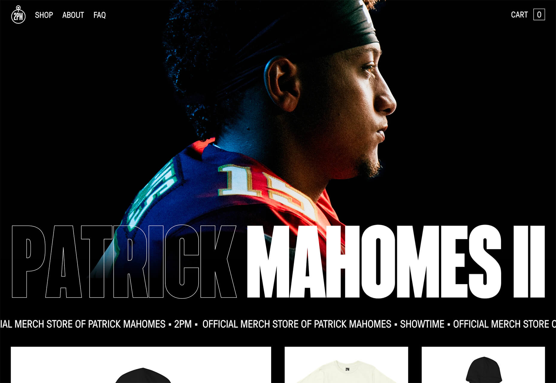
The Patrick Mahomes store, 2PM, uses a single line of moving text that tells you what the website is about. It differentiates the retail store website from information about the athlete or his other efforts. White text on a black background is classic and easy to read. The most important thing of note may be the speed of the animation; it’s timed in a way that’s scannable but not dizzying. Sometimes the hardest part of nailing an animation is getting the speed right.

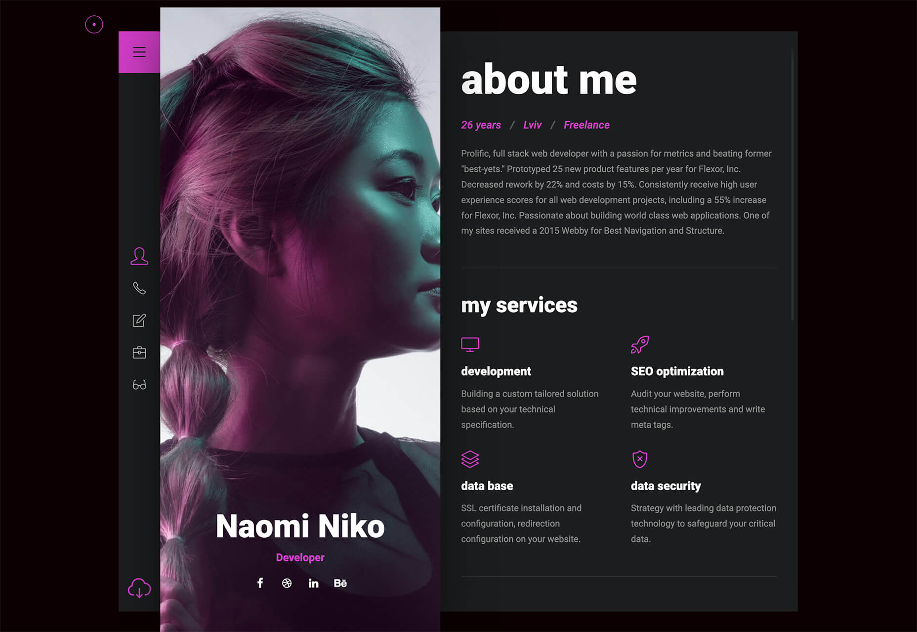
The resume-style website for Naomi Niko is striking and simple, but neat hover effects and a simple scroll animation for her resume only – and not the photo or details on the left side of the screen – make the design intriguing. The almost awkward crop and directional pull of her image also creates interest and makes you want to get further into the design.

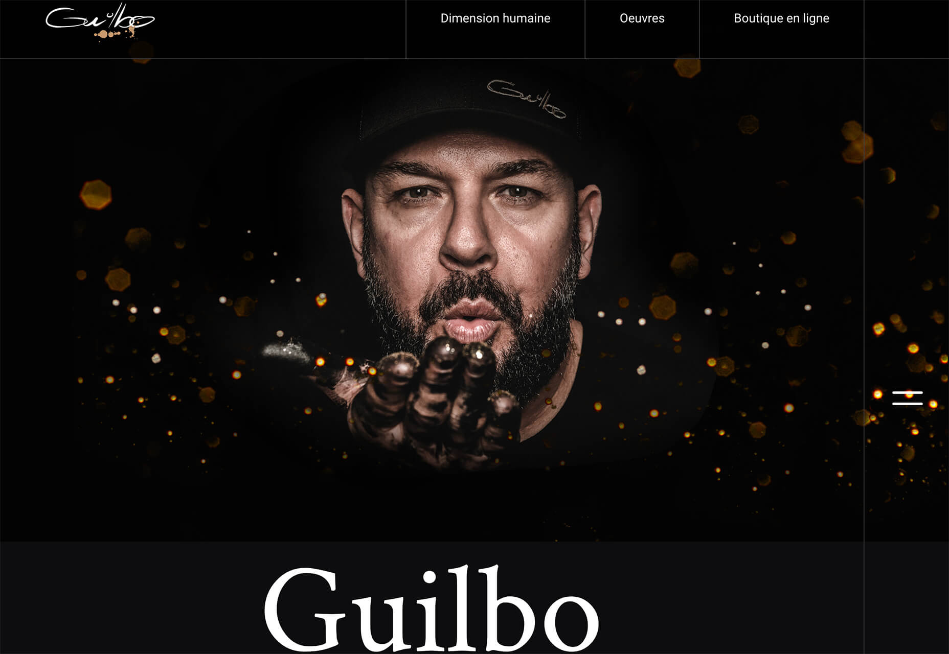
Guilbo uses layered hover animation to make it look like he’s blowing a glittery-dust off the screen and at the user. The rugged detail of his face with the sparkle of the animation is a fun contrast. The design uses layering with dots in the foreground and background for an additional depth effect. It’s also especially nice that the objects are made to stay off his face for a realistic effect.


Conclusion

While 2020 has been an interesting year, designers have continued to find new ways to evolve the craft and create visual experiences that are inspiring. These trends are no exception.

It shows that even in unusual circumstances or with odd constraints, that amazing work and creativity can thrive. Stay creative everyone, and keep those new designs – and potential trends – coming!

Source


Source de l’article sur Webdesignerdepot

Every week users submit a lot of interesting stuff on our sister site Webdesigner News, highlighting great content from around the web that can be of interest to web designers.
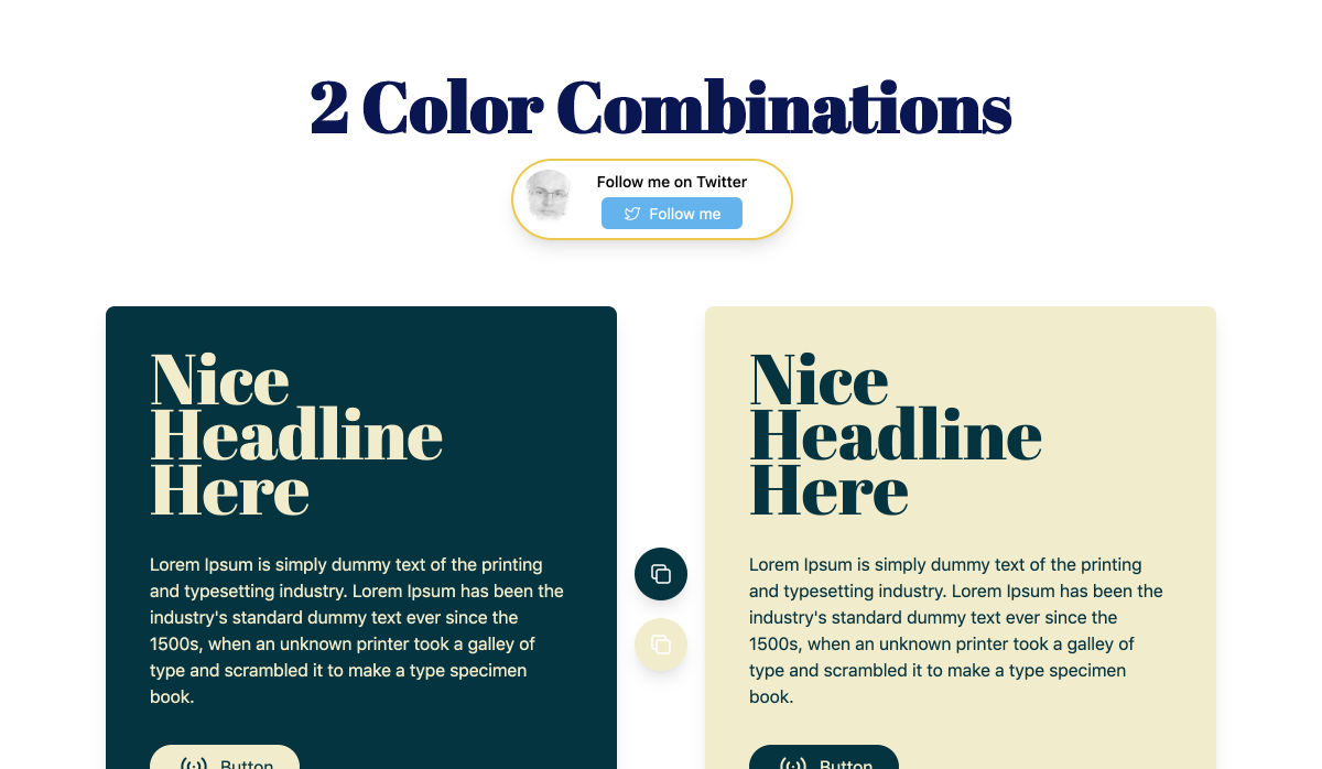
The best way to keep track of all the great stories and news being posted is simply to check out the Webdesigner News site, however, in case you missed some here’s a quick and useful compilation of the most popular designer news that we curated from the past week.

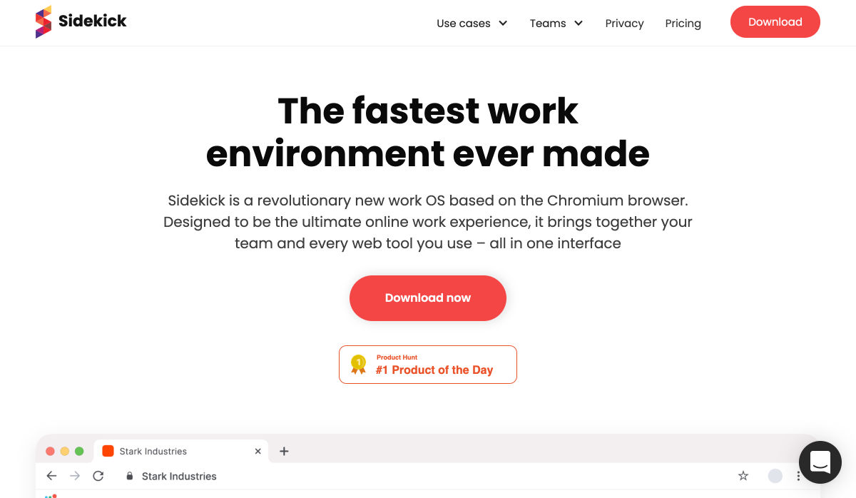
Sidekick Browser – The Fastest Browser Built for Work


Why is Apple’s M1 Chip so Fast?


Two Color Combinations – A Curated Collection of 164 Two-color Palette Combinations


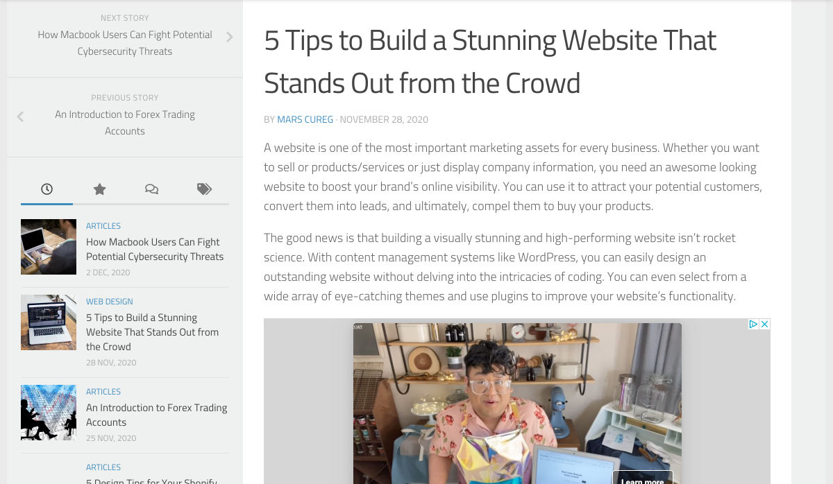
5 Tips to Build a Stunning Website that Stands Out from the Crowd


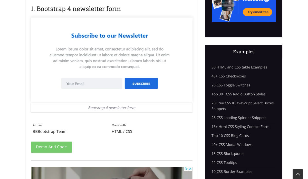
10+ Bootstrap Newsletters


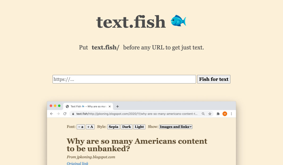
Text Fish – Get Just Text


Ecommerce Website Designs: 27 Best Online Shops and Why They Work


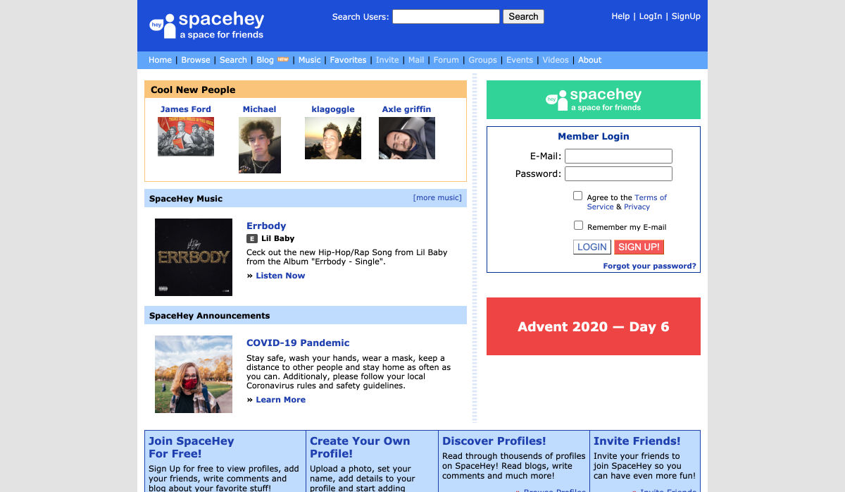
SpaceHey – MySpace Reborn


State of CSS – 2020


5 Overlooked Mobile Experience Design Best Practices


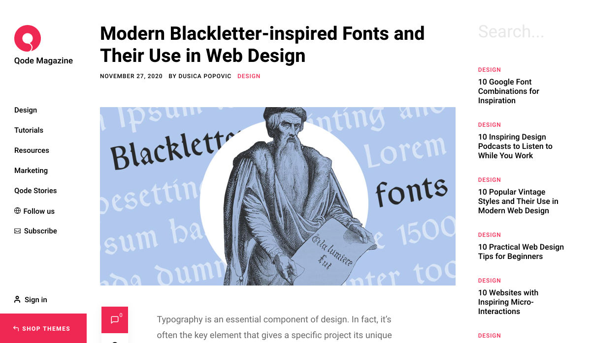
Modern Blackletter Inspired Fonts and their Use in Web Design


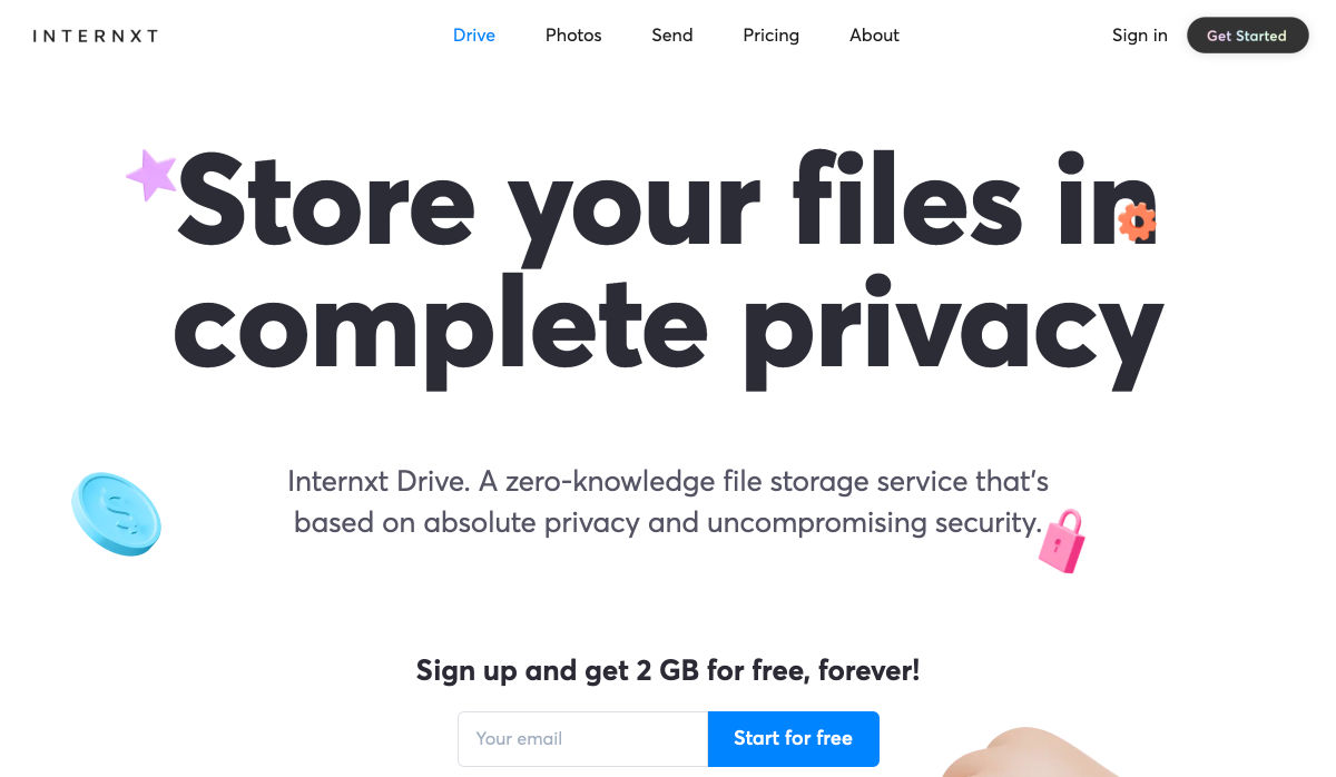
Internxt Drive – Secure & Private Cloud Storage Service


Spline – 3D for the Web (Preview Release)


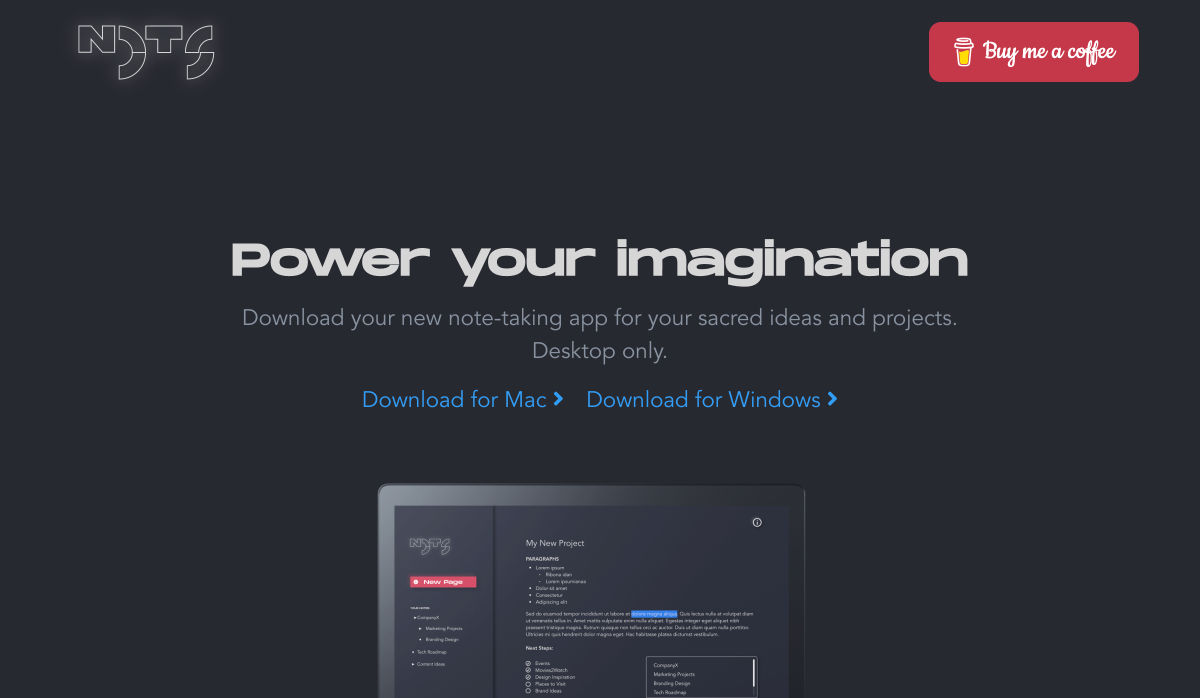
Nots – A Free Beautifully Designed Note-taking App for your Desktop


Google Play’s Best of 2020


Beacon – Run SQL Commands in Slack


Designing for the New Reality: Getting Rid of Pre-COVID Assumptions


Undoing the Toxic Dogmatism of Digital Design


Color Theory: A Beginner’s Guide for Designers


Atkinson Hyperlegible Font


11 Tips for Creating a Usable Website Contact Page


The 7 Secrets to a Great Conversation


Checklist Generator – Create Checklists for Free and Host Them Wherever You Want


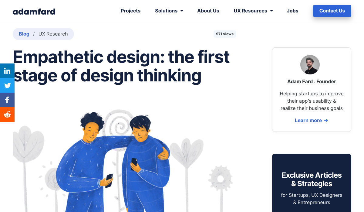
Empathetic Design: The First Stage of Design Thinking


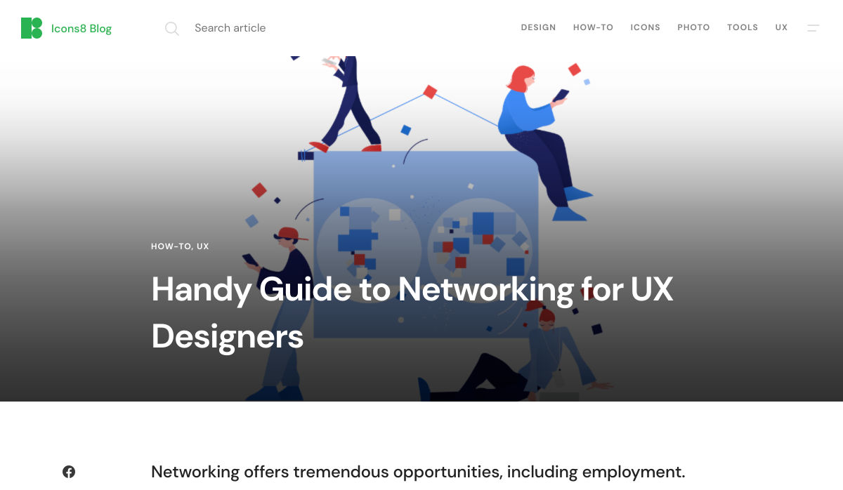
Handy Guide to Networking for UX Designers


Want more? No problem! Keep track of top design news from around the web with Webdesigner News.

Source


Source de l’article sur Webdesignerdepot

As human beings, we like to think that we’re rational creatures.
We tell ourselves that we make our decisions based on fact and logic. However, that’s rarely the full truth. As much as we try to make choices guided by rationality, the truth is that we’re often highly emotional people, driven by the way that things make us feel.

So, what does that mean for a website designer?

Though designing a functional and logical website is important, it’s crucial not to forget about the emotional impact of each interaction that your customer has with the sites that you build.

Sites that don’t elicit any kind of emotional response aren’t just boring; they’re forgettable.

A forgettable website is poison to any website designer’s portfolio.

That’s why we’re going to introduce you to some easy ways to use emotion in your designs this year.

Getting to the Bottom of Emotion in Web Design

First, you need to understand the part that emotion plays in user decisions.

Don Norman’s book Emotional Design says that there are many things that designers can do to make their designs more emotional. Even something as simple as focusing on the aesthetic impact of your website can make it more likely that you’ll reach your audience on an emotional level.

One important thing to remember about emotional design, is that it’s not just about making your customers feel good. Emotion can be both positive and negative. Sometimes negative emotion is more impactful than positive feelings – it all depends on the kind of site you’re trying to create.

A website selling health products to customers needs to make that audience feel comfortable and confident that they’re buying a trustworthy item. However, it may also need to trigger small feelings of worry or concern in the audience about what might happen if they don’t buy.

Knowing how to walk that balance between positive and negative feelings is how a designer takes a simple website design and turns it into something incredible.

So, where do you get started?

Step 1: Use Visual Elements to Trigger Emotion

Visual elements are one of the easiest points to get started with when you’re designing for emotion. That’s because visuals are fantastic at drawing out feelings.

An animation can create an emotional connection with your audience by helping them to understand how your product works or making them laugh when they land on your page. A genuine photograph of your team working together can inspire trust and feelings of affinity.

One of the most common visual elements used to trigger emotion is color.

Shades like blue and green in the digital design world are more likely to drive feelings of calmness and comfort. On the other hand, red and yellow often encourage feelings of enthusiasm and happiness.

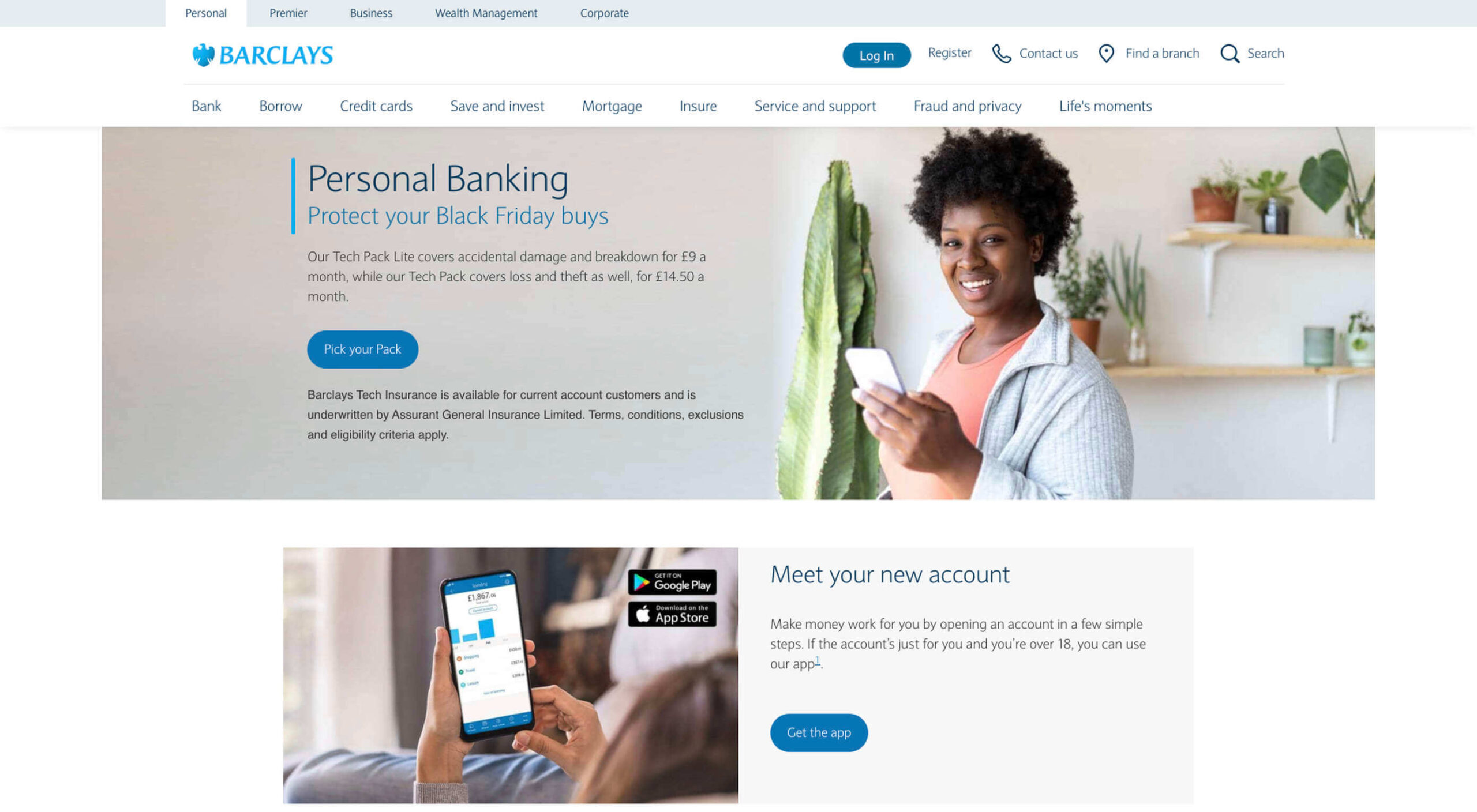
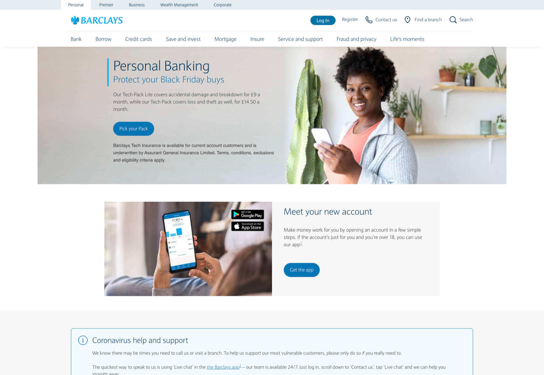
The way that you use color can make a massive difference to how users feel when they arrive on a website. For instance, the Barclay’s website would have been pretty boring if it was just a basic black and white screen. However, a banking site can’t afford to go over the top with animations or illustrations in most cases, as this can detract from its professional image.

Adding small patches of blue in a way that complements the brand’s color palette is a great way to generate feelings of trust. Combined with the image of a genuine real-life person, and calm tones, the bank instantly presents itself as something approachable and honest.

At the same time, the clear hierarchical layout of the bank’s website, with an easy-to-follow navigation bar, easy-to-read font, and clear headings and buttons comfort the customer. Users get exactly what they expect when they come to a financial website, and that makes users feel as though they’re in the right place.

Step 2: Create Engaging and Emotional Interactions

Visual elements are a great way to embed emotion into digital design. However, they’re just the first step. The emotional aspects of your web design choices should also appear throughout the interactions that customers have with the website.

A good interaction on a website or app needs to be simple and straightforward enough that users feel comfortable taking the next step in their journey. However, it also needs to drive the right emotional response from users too.

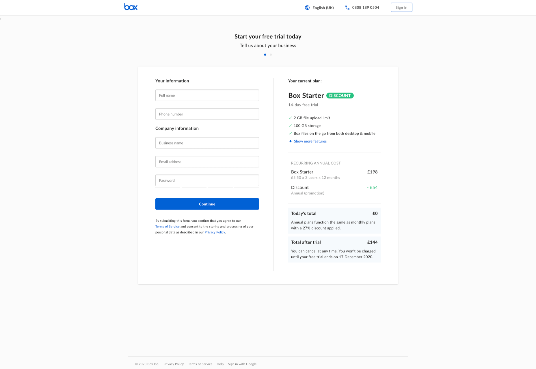
For instance, when you sign up for a free account trial from Box.com, you don’t just get a form full of information that you need to fill out.

Next to the form, you also get information about what you’re signing up for, complete with small checks next to each of the free features you’re getting. This helps to put the customer’s mind at ease and remind them that they’re in the right place.

The use of a box, including discount information next to the sign-up form also helps to make the interaction more emotional, by reminding customers that they’re getting something for free.

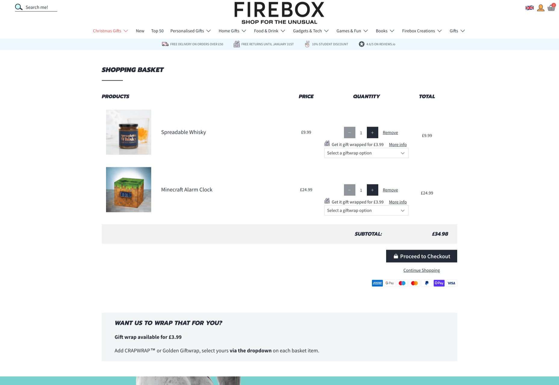
Every time a customer interacts with a website, there’s another opportunity to engage them on an emotional level. On the Firebox website, when a customer adds something to their cart, there’s a small animation on the cart icon that informs them that something is waiting for them.

When they click through to the checkout, they get instant information, including what they can do to “gift wrap” their item, and buttons showing the various payment options available.

Whenever you’re designing a page for a website, whether it’s the checkout page, a product page, or something else entirely, think about the interaction that the visitor is having at that moment. How can you ensure that each customer feels more comfortable, delighted, informed, or engaged?

Step 3: Leverage Microcopy and Detail to Express Emotions

Visuals are an excellent way to express emotions.

However, they’re not the only option.

As a designer, you’ll need to think about how you can combine web design with the use of microcopy to connect with customers on a deeper level.

Rather than drawing attention to tedious, dull, or impersonal instructions, notifications, and error messages on a site, how you can you make sure that everything on the website delivers the same emotional impact?

The simple addition of a tiny illustration is enough to provide a much more emotional experience to customers. Compelling micro copy and illustrations on 404 pages can also strengthen the connections that customers have with the sites they visit.

Just look at how Google added a dinosaur game to the page that customers are sent to when they don’t have an internet connection.

The right micro copy and interactions can instantly transform even a negative experience, like not being able to connect to the internet, into something emotionally engaging and positive.

When it comes to making an emotional connection between your customer and their end users, web designers need to remember that often the smallest details can make the biggest differences. Little extra features, like implementing a way for customers to have fun when their internet connections aren’t working, are the things that make websites more memorable from an emotional perspective.

Don’t Choose Emotion Over Functionality

Although emotional impact can be an essential aspect of a fantastic website design, it’s important not to get carried away. Adding too much to a website in the form of little extra graphics and unique interactions could end up weighing down a site and making it slow to load.

Although it’s valuable to think about how every interaction an end-user has with a website will make them feel, it’s important not to overlook the basics of web design when you’re at it. You’ll still need to ensure that the finishing design is easy to use, engaging, and attractive.

Pay attention to the basics of user experience design, and make sure that the extra emotional elements you’re infusing into your sites aren’t going to damage the experience that end-users get.

If you can get the blend right between emotional impact and functionality, then you could create the kind of website that audiences will never forget.

It pays to implement emotion into your design portfolio.

Source


Source de l’article sur Webdesignerdepot

2020 has been an interesting year, to say the least. And although I’m sure many of you can’t wait until the calendar flips ahead to 2021, it doesn’t look as though we’re going to be able to say goodbye to 2020 so easily. Many of the changes we’ve had to make this year are now expected to stay with us — a least for the following year.
The latest research gives us some hints about what’s to come.

If you want to start preparing for 2021 now, then these reports and surveys from organizations like 99designs, Upwork, Content Marketing Institute, and McKinsey & Company are a must-read:

1. 99designs Reports on the Common Challenges Freelancers Faced in 2020

I don’t want to make 99designs’s Design Without Borders 2020 report sound like it’s all doom-and-gloom. Because it’s not.

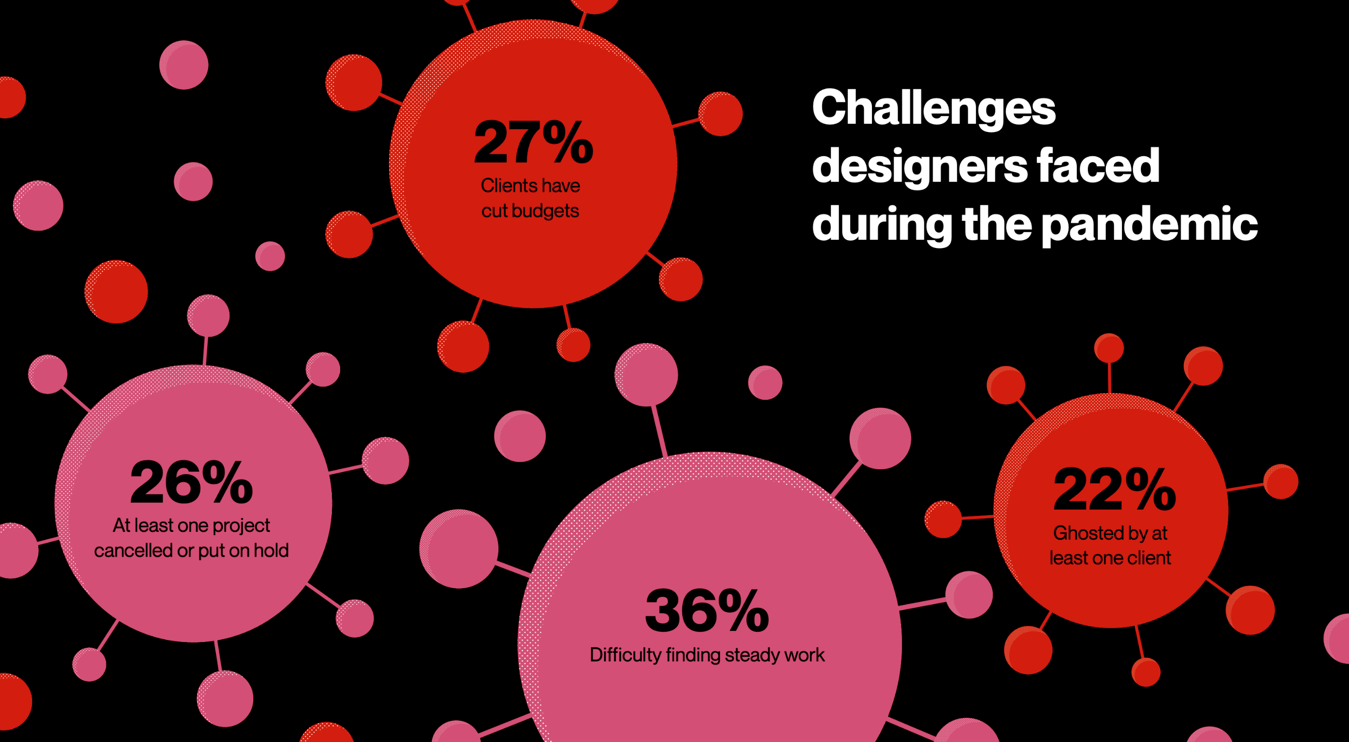
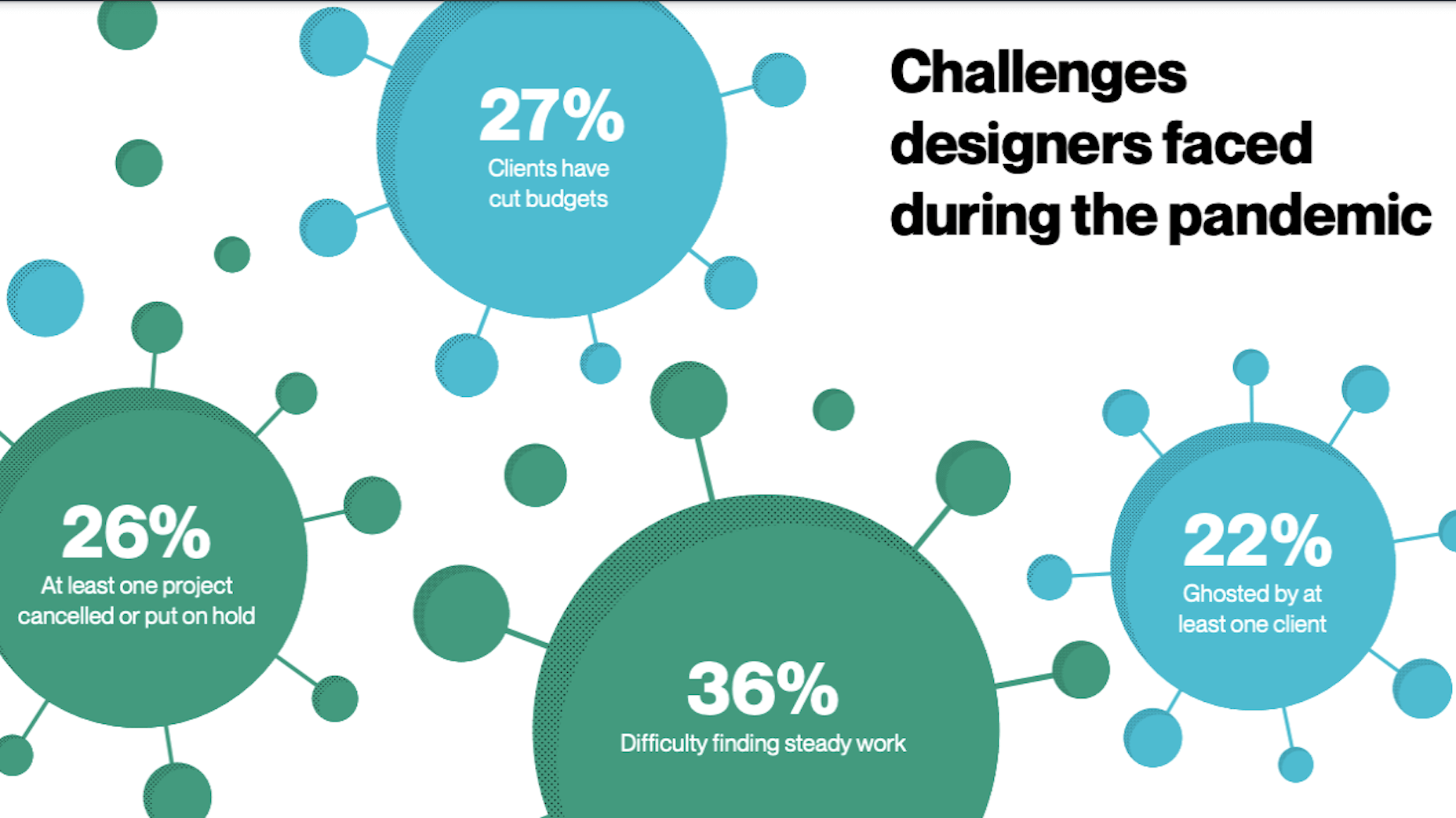
That said, 2020 has been a rough year and it would be irresponsible for me not to acknowledge the challenges that all of us freelancers have encountered this year. This report is one of the few I’ve found that includes data on the major challenges freelancers have dealt with this year, including:

  • 36% have struggled to maintain a steady flow of work or a stable client base;
  • 27% had clients who cut their business budgets and, consequently, their freelancers’ workloads;
  • 26% had at least one project cancelled or indefinitely paused;
  • 22% have been ghosted by at least one client.

Beyond working more hours and hustling to find new clients all the time, what else can freelancers do to weather a business disruptor like COVID-19? There are a number of things.

For starters, it would be really helpful to have a crisis management plan for your finances. It would also be beneficial to refocus your efforts on finding clients who pay for the value you provide and not for the hours you spend building websites. Clients who see the value in what you do will be less likely to ghost or drop you at the first sign of trouble.

2. Upwork’s Survey Reveals Educational Opportunities for Freelancers

Upwork commissioned Edelman Intelligence to put together its very first Freelance Forward survey. The goal of the ensuing report was to shed light on the state of freelancing, how the pandemic has changed it, and what we can expect in the future as a result.

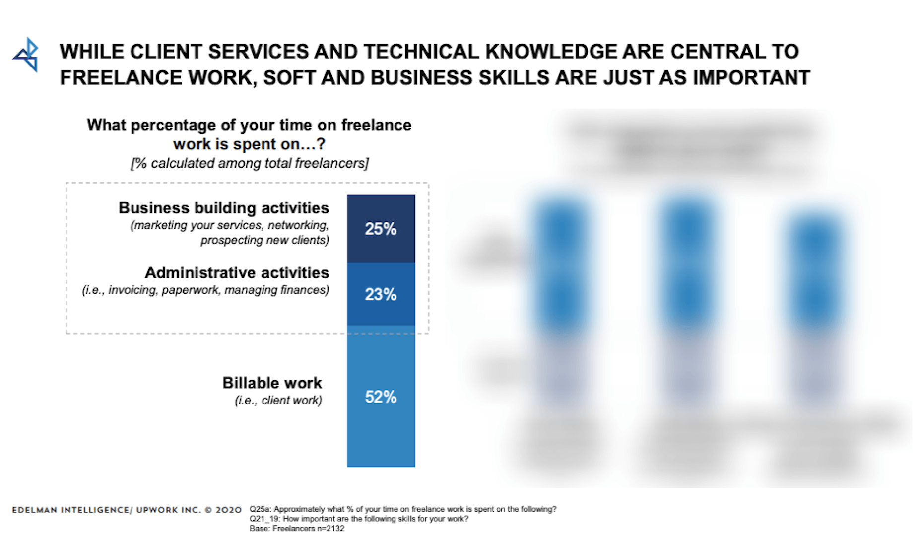
One of the data sets I think web designers should pay close attention to is this:

According to this survey, freelancers only spend about 52% of their time on billable work.

Now, one of the reasons why entrepreneurs and enterprise companies make so much money is because tasks are relegated to different team members. For instance, if a design agency owner is good at building relationships with prospects, they’re going to spend time on sales calls and managing social media. The day-to-day admin tasks would then get offloaded to virtual assistants and billable project work would go to designers, developers, writers, and so on.

But as a freelancer, you don’t have the ability to delegate and scale when you’re working solo.

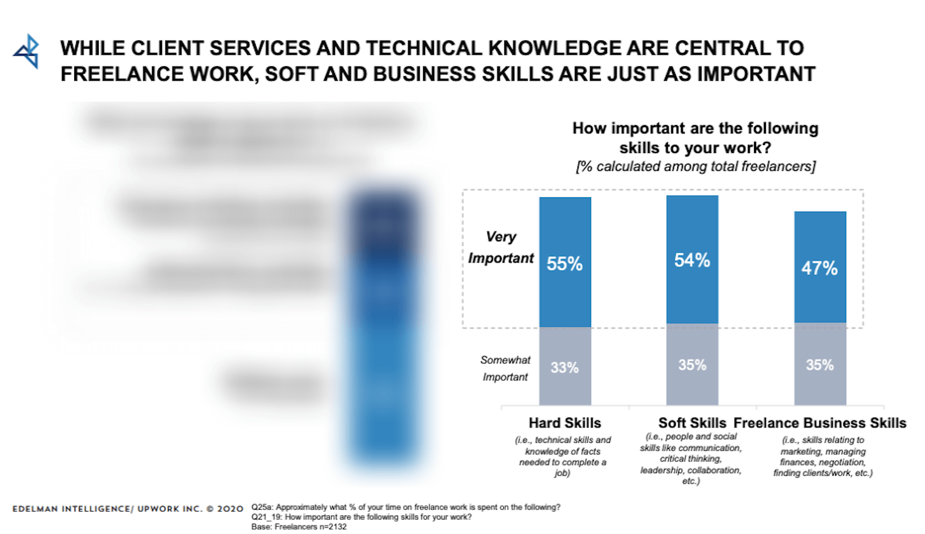
Rather than burn yourself out trying to handle all these things yourself, the report suggests there’s something else you can do:

Although freelancers recognize how important soft skills and business skills are, the first data set suggests that not enough attention might be paid to them.

What I suggest is that you take a look at the division of your work hours. If you’re spending less than half of your time on billable work, it might be a good idea to strengthen your non-design skills. That way, things like marketing, contract preparation, and client management won’t consume so much of your time in the future and you can bill more.

3. CMI’s Annual Report Reveals Profitable Opportunities for Web Designers

Content Marketing Institute’s annual B2B Content Marketing Report is, once again, chock full of useful tidbits about the state of content marketing.

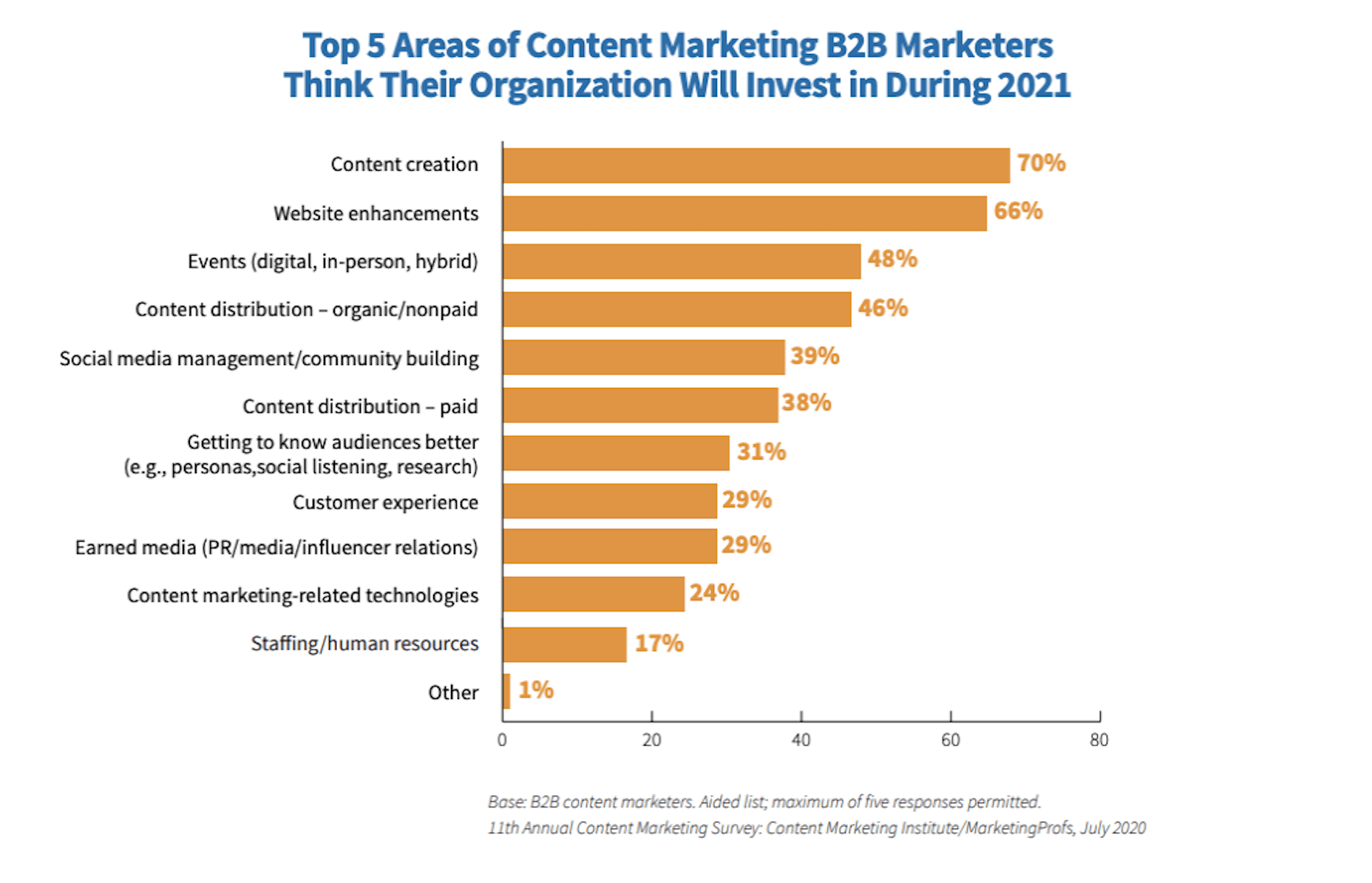
While a lot of the data is focused around marketing organizations and how they’ve pivoted during the pandemic, I thought this bit of info would be really helpful for web designers:

For those of you who design B2B websites, take note of where these companies plan to invest in 2021. If 2020 has been particularly hard on you, or you simply want to expand your horizons, there are some other opportunities worth jumping into:

B2B Marketing Investment => Web Designer Opportunity
Content creation => Blog graphic design, infographic design, and schema markup creation
Website enhancements => Website redesign, website audits
Content distribution => Social media ad design, Google ad design, schema markup creation
Getting to know audiences better => UX research, UX design
Customer experience => Chatbot/live chat development, support portal creation

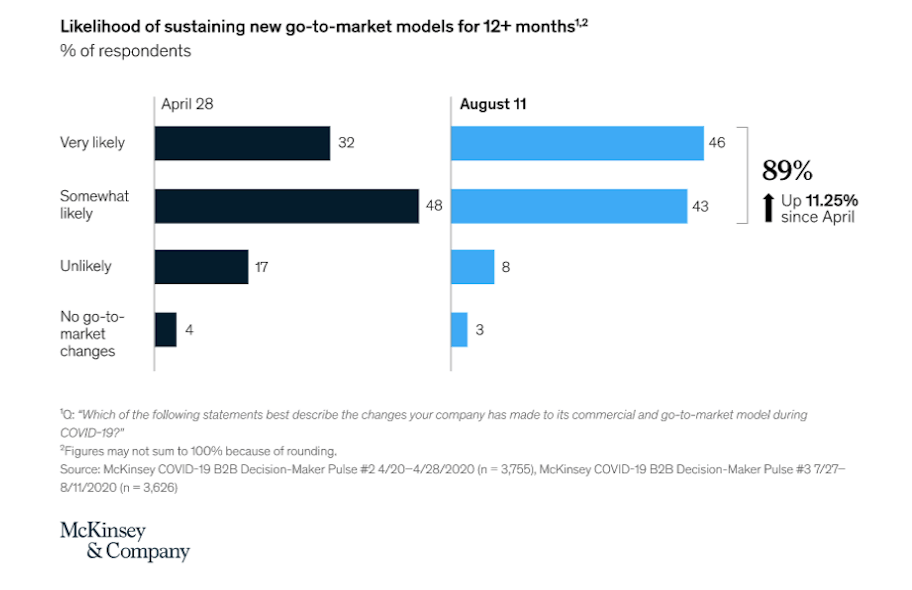
4. McKinsey B2B Analysis Suggests That Digital Is Here to Stay

For those of you who’ve worked for a B2B sales organization before, you know how important in-person interactions are to them. It’s not as though they can just sell their products or services online the way B2C ecommerce companies can. The key to B2B success is through customer (and partner) relationship building.

Prior to 2020, this meant lots of in-person meetings, phone calls, and emails. But something has changed this year, on both sides of the fence.

This chart from McKinsey suggests that digital relationship building and customer service aren’t just a temporary solution for COVID-19. B2B decision-makers are coming around to the idea that this is going to be their “next normal” (as McKinsey refers to it).

These new “go-to-market models” include the following:

  1. Talk to prospects, customers, and partners via video calls;
  2. Digital self-service options for customers who prefer the DIY method.

As a web designer, you can help your B2B clients level up their efforts to achieve this next normal.

For starters, you can integrate scheduling into their websites. This’ll empower prospects to schedule video meetings (for demos, discovery calls, etc.) with your clients’ sales teams.

Another thing you can do is build out self-service elements like live chat or chatbots, FAQs pages, knowledgebases, and support portals. As consumers become more confident with doing business online, these self-service options will make a world of difference in their experience with brands.

Wrap-Up

I know, I know. 2020 sucked. But at least we have a good amount of research and experience that gives us a much clearer idea of what we’re getting ourselves into with the coming year. (At least, I hope so.)

Source


Source de l’article sur Webdesignerdepot