Articles

User experience design is something that most of us associate with websites. But why isn’t it something we extend beyond the website?

Here’s why I ask this:

As a consumer, it’s so rare that your only interaction with a brand is through its website. Take an ecommerce site, for example. You buy a product from it, and then what happens?

  • You get a confirmation email;
  • You get another email when the package ships;
  • You might get another email or SMS notification when the package is delivered;
  • You retrieve the package and open it;
  • You open up your purchase and use it.

These are all an extension of that initial user experience on the site. If there’s just one hiccup along the way, it could easily erode the trust and happiness you felt after quickly finding and buying what you needed on the site.

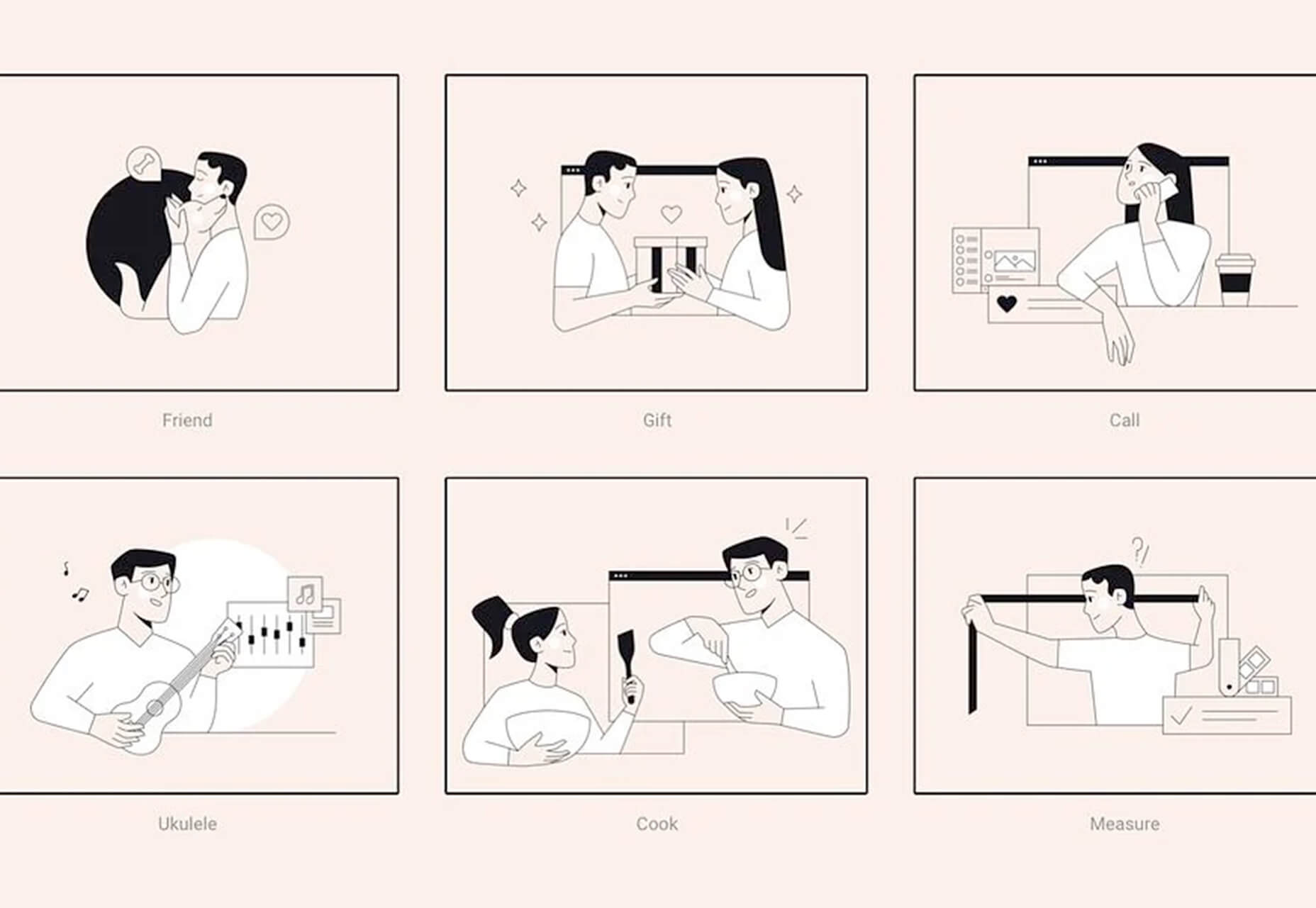
So, what I’d like to do today is look at 10 areas where UX design should extend beyond the website to ensure that the frictionless experience started there remains untarnished.

Extending UX Design Beyond the Website

As a web designer, you might be thinking that this part of the user experience doesn’t fall under the umbrella of your responsibilities. And you may be right about that.

For brands to truly be successful and profitable, someone needs to carefully examine the bigger picture and ensure that the user experience is flawless no matter how far away from the site it is. At the very least, you should share the UX research and strategy you do for a client’s site so their team can ensure it carries over to other areas of the business.

Here are some things to think about:

1. Mobile App

It’s not uncommon for websites to have mobile app counterparts these days. The layout doesn’t need to be identical since mobile users tend to behave differently than those on desktop.

That said, an app shouldn’t force users accustomed to the desktop experience to re-learn how to navigate or engage with the brand. So, the branding, UI design, speed, security, and navigation all need to be on par with what’s already been established in terms of usability.
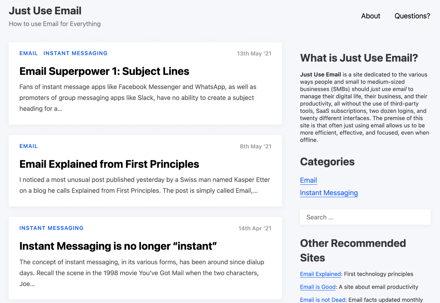
2. Email

Most websites have a direct connection to email. For example, blog newsletters, purchase confirmation emails, and lead generation follow-ups all start on the website.

Consumers are well aware that when they hand over their email address, they will receive an email in return. In many cases, those emails are welcomed when they’re done right. But if something feels off, that bridge could easily burn between brand and consumer.

To preserve the UX, emails should come with the following:

  • The same branding and visual style as the website;
  • A personalized subject line, greeting, or offer;
  • Consistent messaging as the site, especially when it comes to the CTA.

Another thing to remember is that email isn’t the time to inject dark patterns into the experience. So, the “Unsubscribe” option should be in an easy-to-spot area and a sharply contrasting font color.

3. Social Media

Social media is another channel that’s commonly connected to a website. While you can’t control the aesthetics of social media websites themselves, the visuals and messaging in posts need to be on-brand.

That means that things like memes and emojis — which are popular means of communication on social — should only be used if they’re normally part of the brand identity. If not, you’ll need to find other ways to communicate engagingly.

Another part of the user experience to think about is customer support. Social media is a lot like going into a store. If someone has an issue with what they bought or the service they received, there will be many people around to witness the complaint. Social media only amplifies that — so the quality of customer care needs to be consistent with how the brand handles it everywhere else.

4. SMS

Not every brand will need to be connected to customers via text messaging. eCommerce companies, news sites, and personal services providers likely will, though.

However a brand uses SMS, the same UX guidelines apply here as they do across all other channels:

  • Keep messages concise;
  • Make sure they’re relevant and valuable;
  • Use branded messaging and design;
  • Don’t abuse the privilege and send too many;
  • Make it easy to opt out.

Basically, if you can’t make it a valuable extension of the brand’s offering, don’t use it.

5. Phone

Any website that publishes its phone number should expect to receive calls from prospects and customers. While there’s nothing to design here visually, the experience of getting on the phone with a company should be consistent with what they experience elsewhere.

One way to do this is to design an easy-to-follow routing system. It should be simple for callers to figure out which number to choose. What’s more, there should be no endless loops. If a caller has exhausted the options, they should be immediately directed to a representative.

Another way to ensure consistency is to adhere to a script — that goes for call centers for enterprises as well as the local lawyer’s office. Every caller should be greeted with the same tone and handled in the same manner (depending on the situation, of course).

6. Ads

There are a lot of places where brands can advertise these days:

  • Google search;
  • Social media;
  • Ad networks;
  • TV;
  • Radio;
  • Podcasts;
  • Blogs;
  • Billboards;
  • Direct mail.

When designing an ad campaign, there should be consistent messaging, aesthetics (when relevant), and CTAs presented. If branding isn’t consistent from ad to ad, there may be a delay in consumers recognizing the brand or its offer. Or, worse, not recognizing it at all.

7. Packaging

For brands that sell products, you have to think about how the packaging will impact the user experience. There are two types of packages to consider, too.

The first is the product’s own packaging. Branding should be clear as day and consistent with the site they bought it from.

It should also be easy to open. There’s nothing more frustrating than finally getting your purchase, only to realize you need tools to get it out of the packaging.

You also have to think about packaging for products that get shipped.

The product should fit well within the packaging. A too-roomy package will feel downright wasteful. So will excessive bubble wrap and paper filler.

Having a shipping label present in the package is also important. If the website makes it easy to make a purchase, the package should offer a convenient way to return the product if they’re not happy.

8. Product

The product itself has to align with the expectations set by the website.

Take the example of a SaaS. You’ve built an awesome landing page and mobile app store page to promote it. It looks great, it loads fast, and it’s easy to get around. But if the SaaS itself is ugly, disorganized, slow, or otherwise just clunky, all of the work you did to market it will end up being just false advertising.

So, make sure the expectations set before and during purchase naturally carry over to the experience with the product.

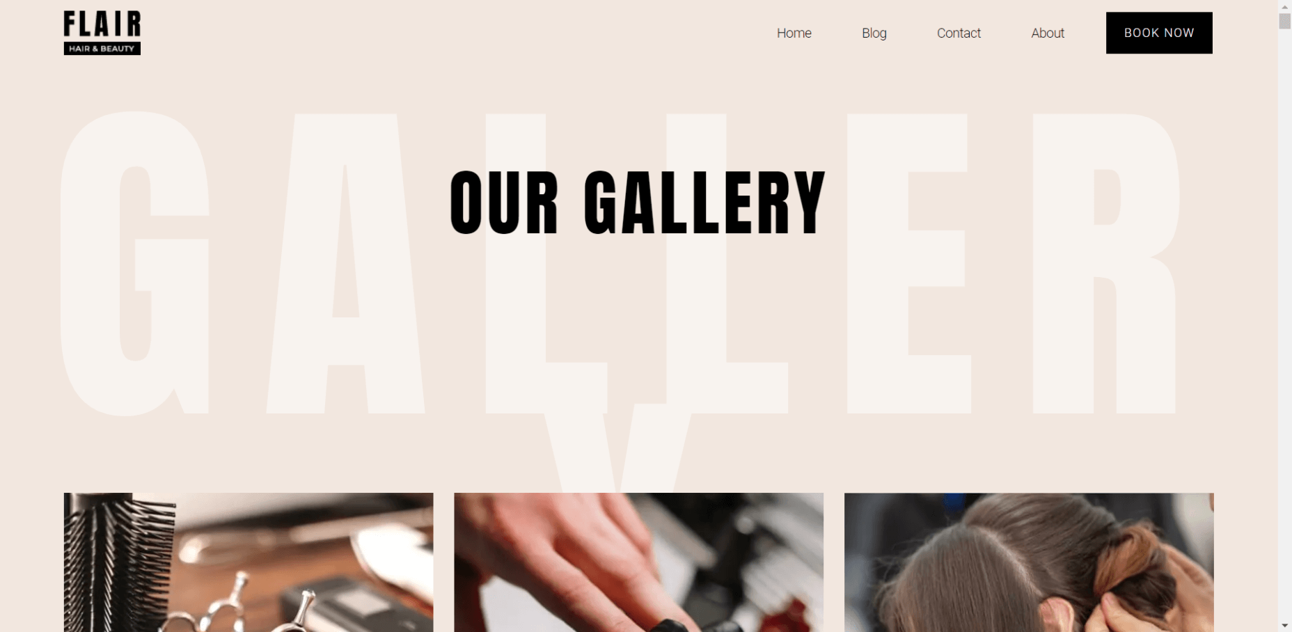
9. Business Exterior

For brick-and-mortar companies, the business’s exterior matters just as much as what happens inside it.

The most obvious thing to focus on is the aesthetics of the building. Does it look attractive? Is it in a safe area? Is there clear signage around it? Is it easy to find?

But you also have to think about user experiences that take place outside of the building. For example, there’s now a rise in curbside pickup. There are tons of things that can affect how happy the customer is with the experience — like if the pickup area is hard to find, there are never enough spots or the associates who deliver the orders always seem to be in a foul mood.

The business’s exterior should always set a good impression for what takes place inside.

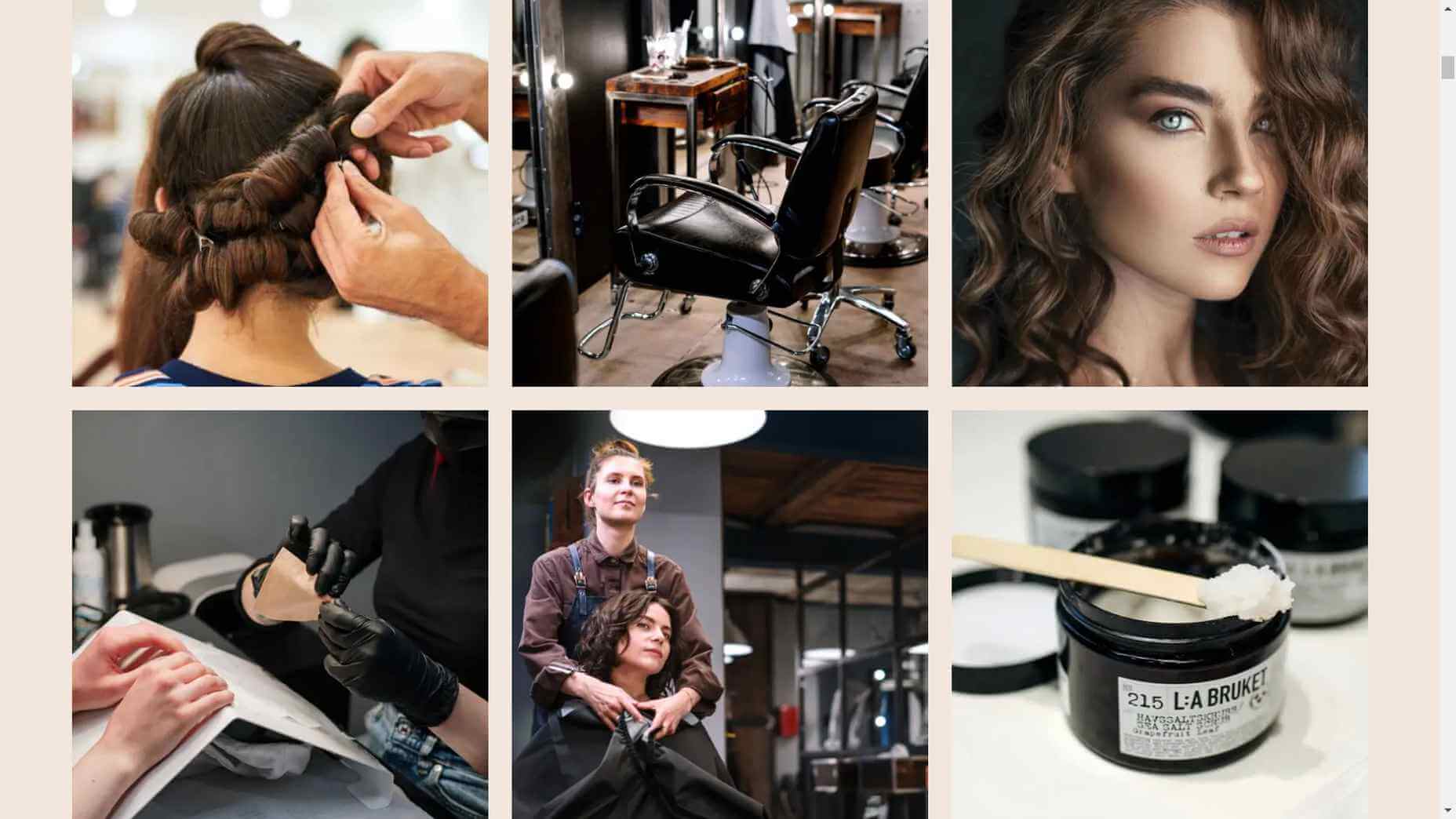
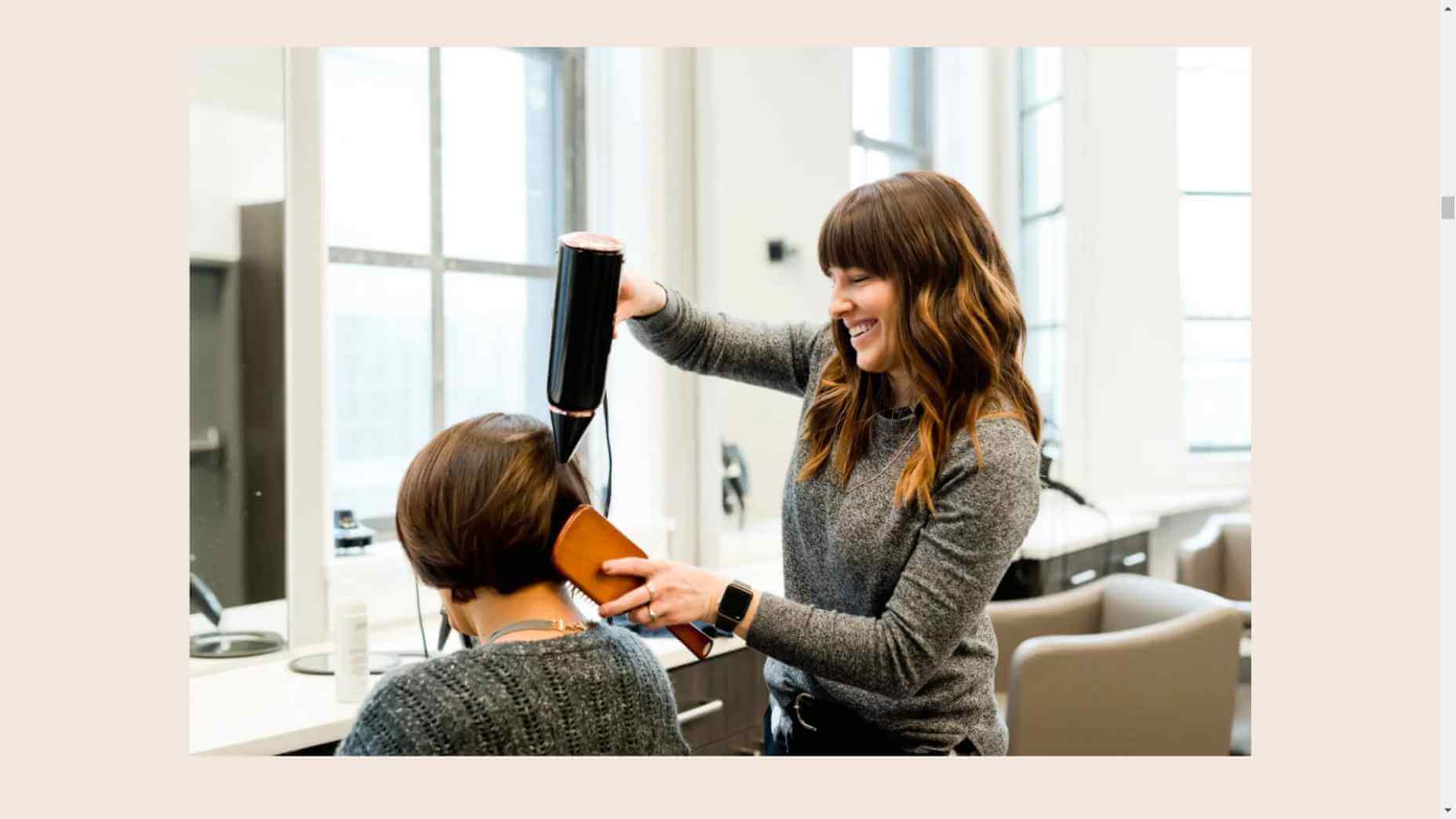
10. Business Interior

Here are some things to think about when it comes to “designing” business interiors for a good UX:

  • Decor;
  • Layout;
  • Signage;
  • Furnishings;
  • Product discoverability;
  • Availability (of products or people);
  • Quality of customer service;
  • Checkout process.

It doesn’t matter what the company does — whether it’s a large retailer like Walmart or your own freelance design business. If a business’s establishment doesn’t look good, operate flawlessly, or provide a good person-to-person experience, it’s going to be very hard to get people to return.

So, all those things you do to design a streamlined website journey should be applied to a bricks-and-mortar business’s interior.

Wrapping Up

Depending on the types of companies you build sites for, some of the channels and suggestions above might not be relevant. Hopefully, this has got you thinking about other ways you (and your clients) can extend the UX design and strategy from the website.

If you can maintain the high-quality user experience from channel to channel, your clients’ brands will get more business, grow their profitability, and see a rise in loyalty, too.


Featured image via Pexels.

Source

The post UX Design Doesn’t End With Your Website first appeared on Webdesigner Depot.


Source de l’article sur Webdesignerdepot

Each day design fans submit incredible industry stories to our sister-site, Webdesigner News. Our colleagues sift through it, selecting the very best stories from the design, UX, tech, and development worlds and posting them live on the site.

The best way to keep up with the most important stories for web professionals is to subscribe to Webdesigner News or check out the site regularly. However, in case you missed a day this week, here’s a handy compilation of the top curated stories from the last seven days. Enjoy!

Little Smashing Stories

All-In-One Browser Extension For Web Development

26 Exciting New Tools For Designers, May 2021

10+ CSS Wave Animation Examples

Speeding Up Development Process with Bootstrap 5

Desqk: Set Your Creative Life Free

Facebook Cover Maker

Just Use Email

A to Z of Figma: Tips & Tricks!

Free, “Do WTF You Want With” Pixel-Perfect Icons

The Use of Uppercase Sans Serif Typography in Modern Web Design

Yes, You Need A Design Process

CSS Hell

Codewell: Improve Your HTML And CSS Skills

Dashboard for Tailwind CSS

Source

The post Popular Design News of the Week: May 10 2021 – May 16, 2021 first appeared on Webdesigner Depot.


Source de l’article sur Webdesignerdepot

Every month we feature a set of comics created exclusively for WDD.

The content revolves around web design, blogging and funny situations that we encounter in our daily lives as designers.

These great cartoons are created by Jerry King, an award-winning cartoonist who’s one of the most published, prolific and versatile cartoonists in the world today.

So for a few moments, take a break from your daily routine, have a laugh and enjoy these funny cartoons!

Review fear


Free at last!


Too many?

Source

The post Comics for Designers #442 first appeared on Webdesigner Depot.


Source de l’article sur Webdesignerdepot

Are you thinking of building a website with a site builder but find yourself confused by the dizzying array of options? Well, puzzle no more because we’ve put together this great infographic to cut to the heart of the question: Which is better for you,
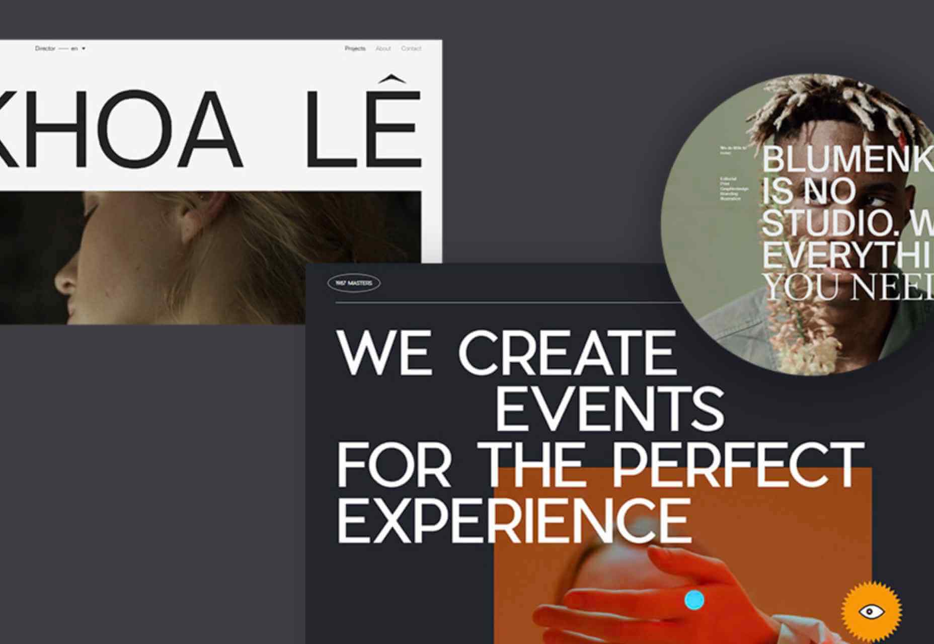
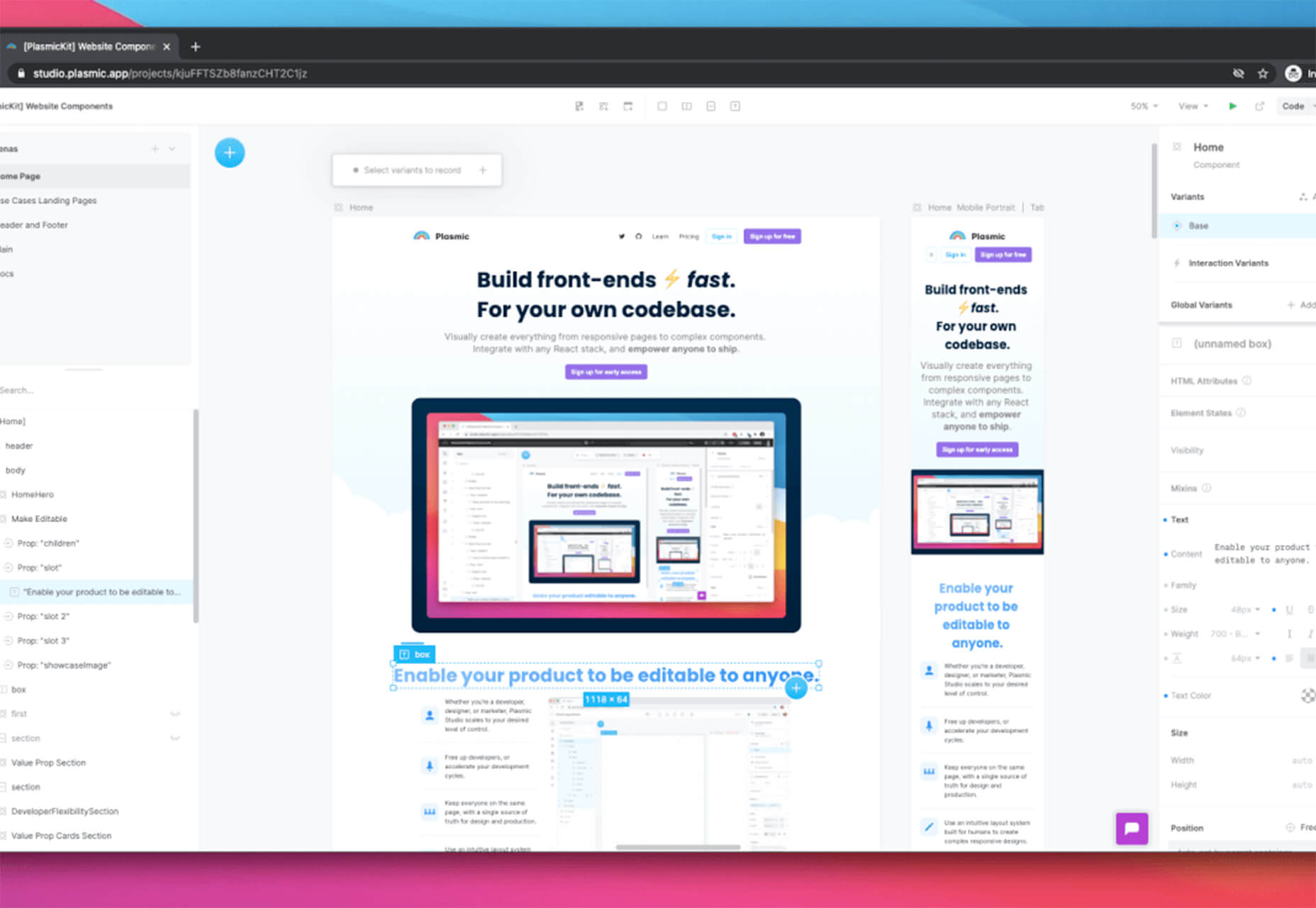
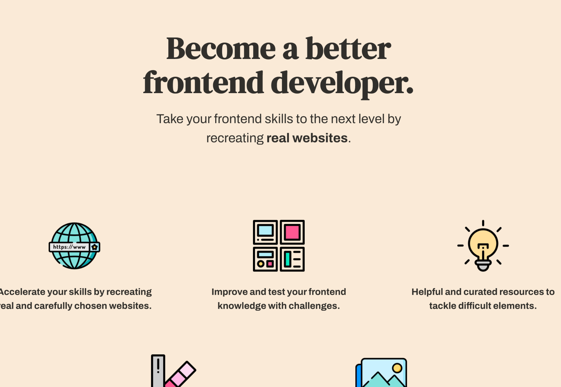
 Squarespace or Wix?

Each of these site-building giants is ideal for a particular type of person, but which is best suited to your next project? Do you need total creative freedom? How about a large amount of bandwidth to share content? Would you like to rely on AI? Or, is ecommerce the most important thing for you?

Check out our infographic to determine which one of these options is right for you.

Source

The post Infographic: Squarespace Vs Wix first appeared on Webdesigner Depot.


Source de l’article sur Webdesignerdepot

Le système d’exploitation Microsoft Windows propose un service de gestion des requêtes HTTP sous la forme d’un pilote en mode noyau appelé http.sys. Une vulnérabilité a été découverte dans ce pilote pour Windows Server et Windows 10. Elle permet à un attaquant de provoquer une exécution de …
Source de l’article sur CERT-FR

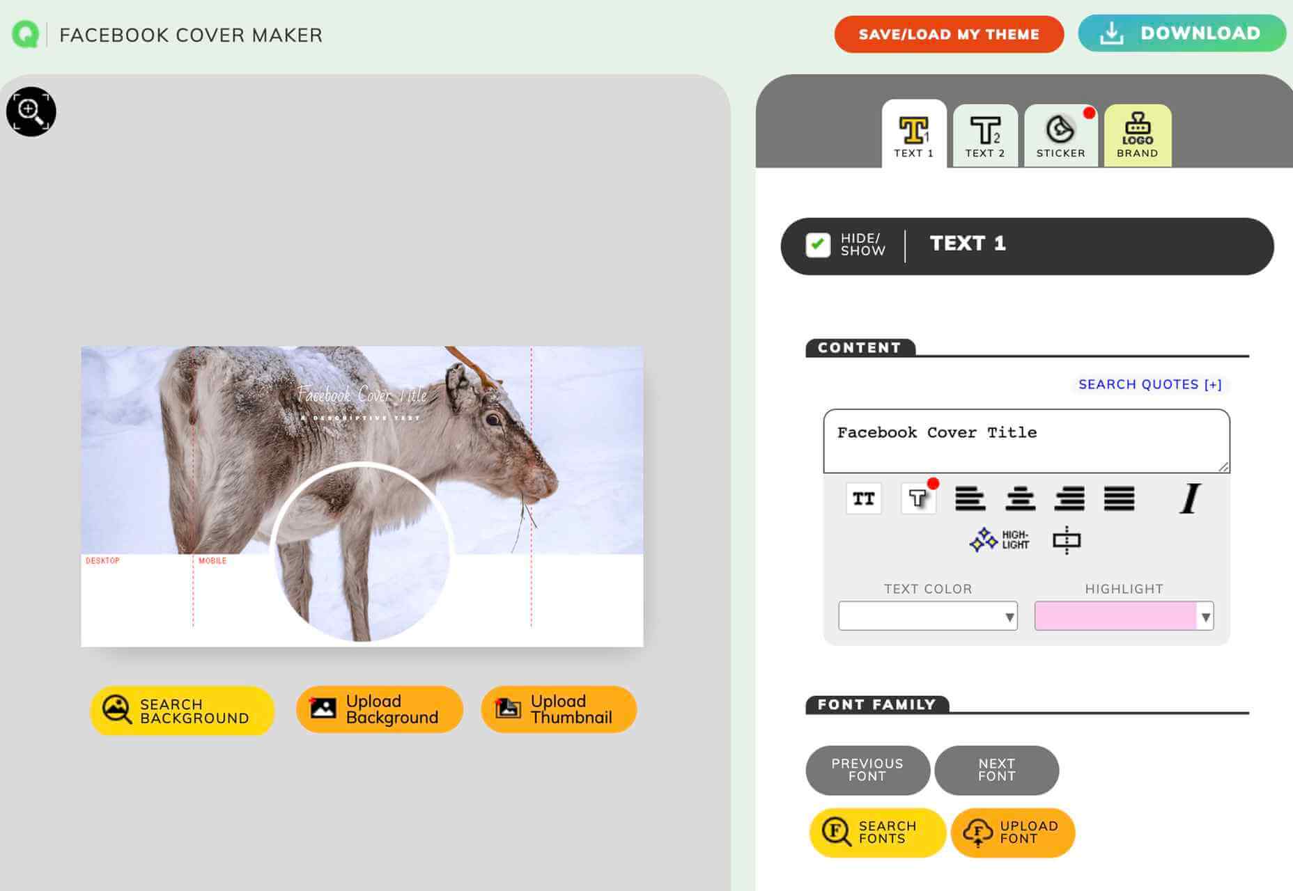
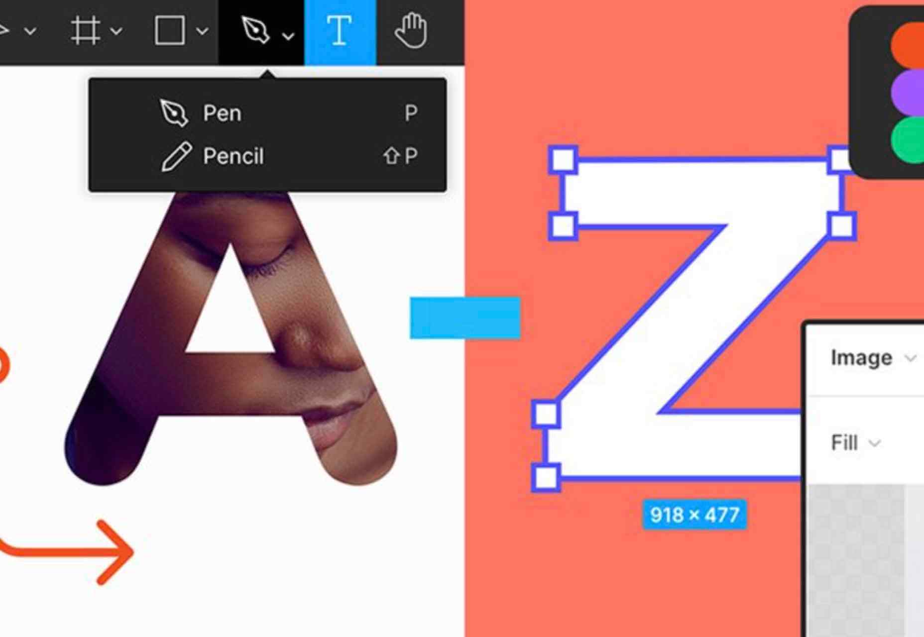
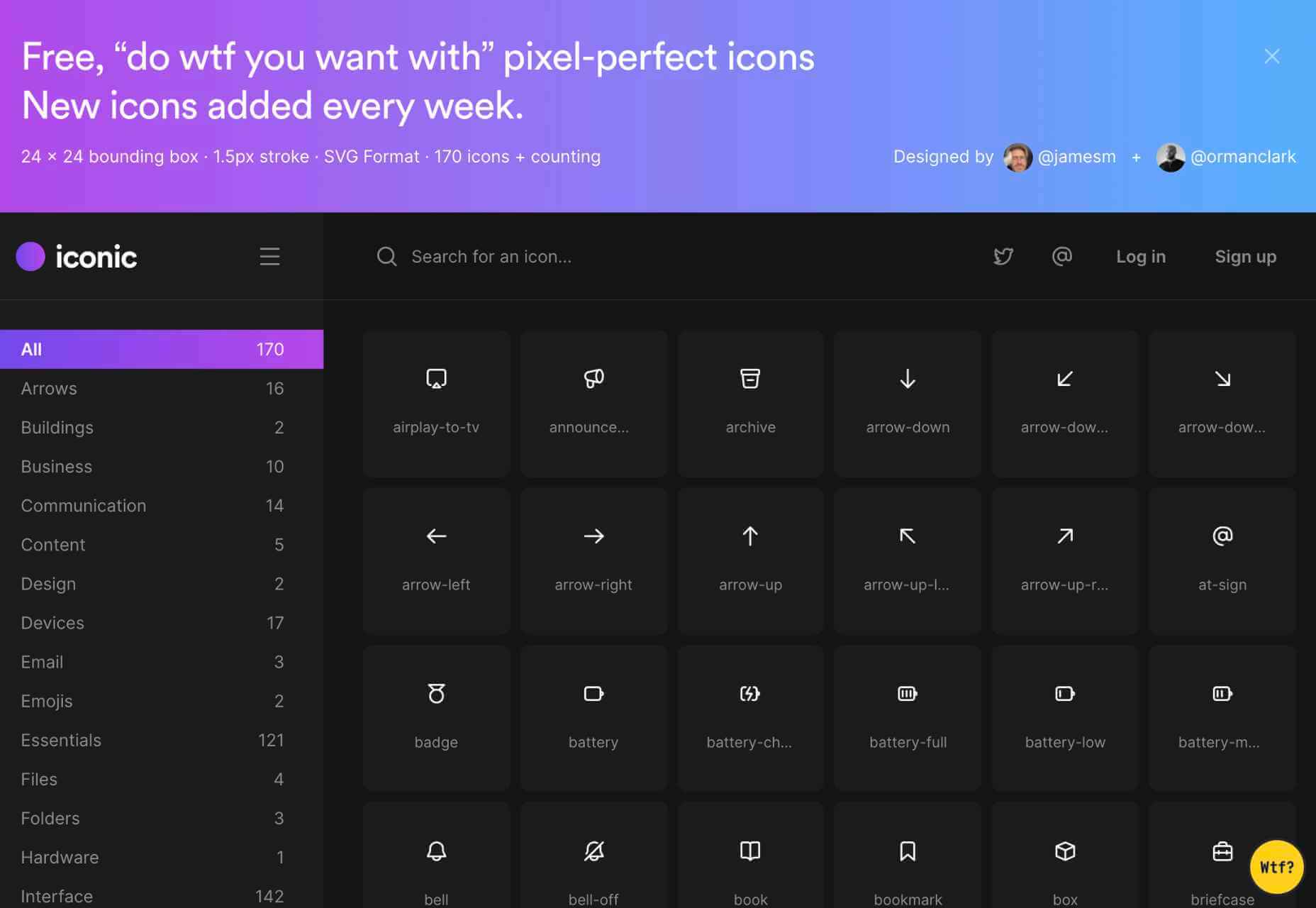
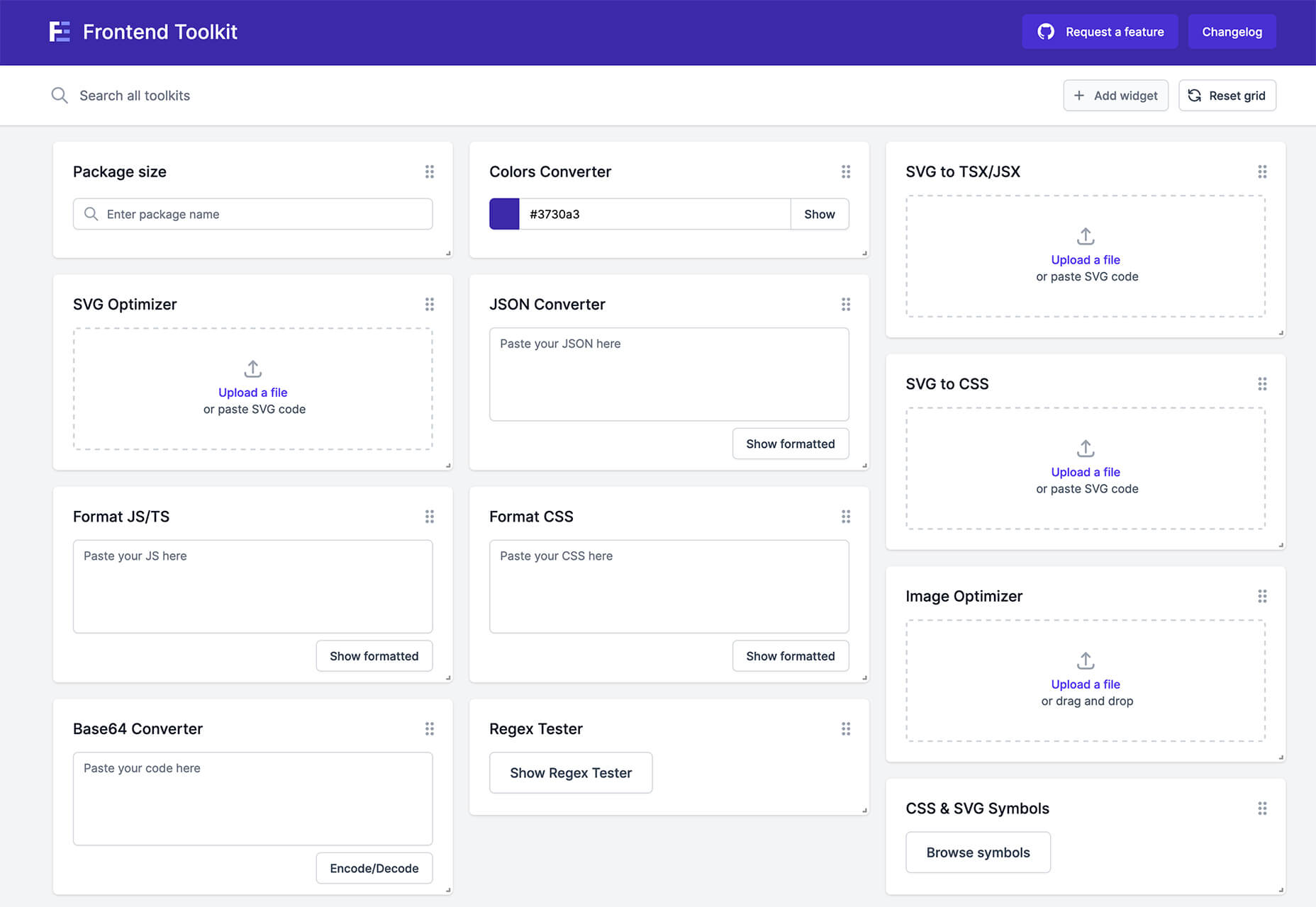
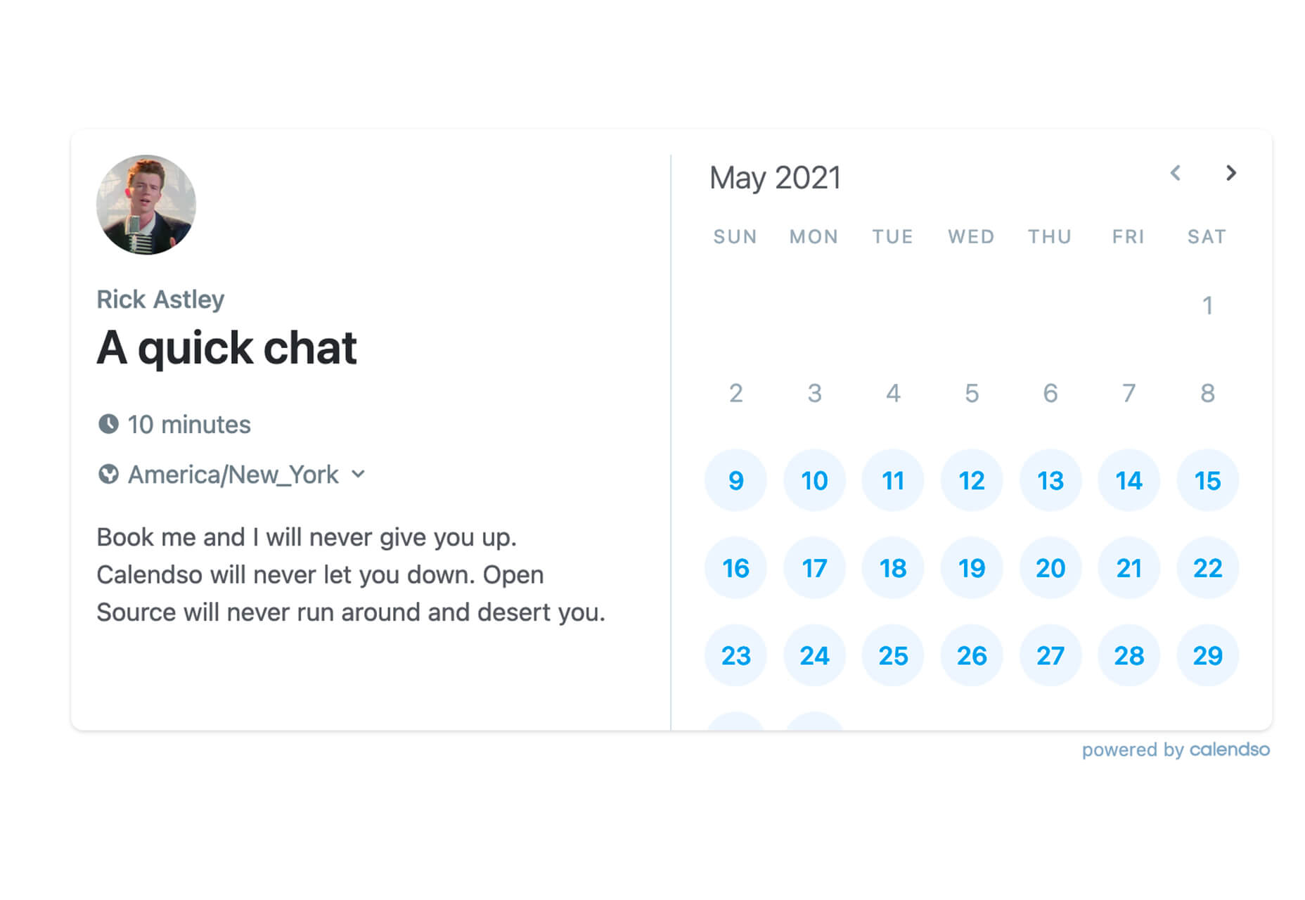
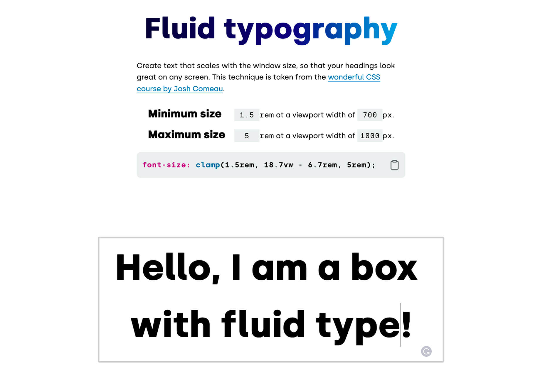
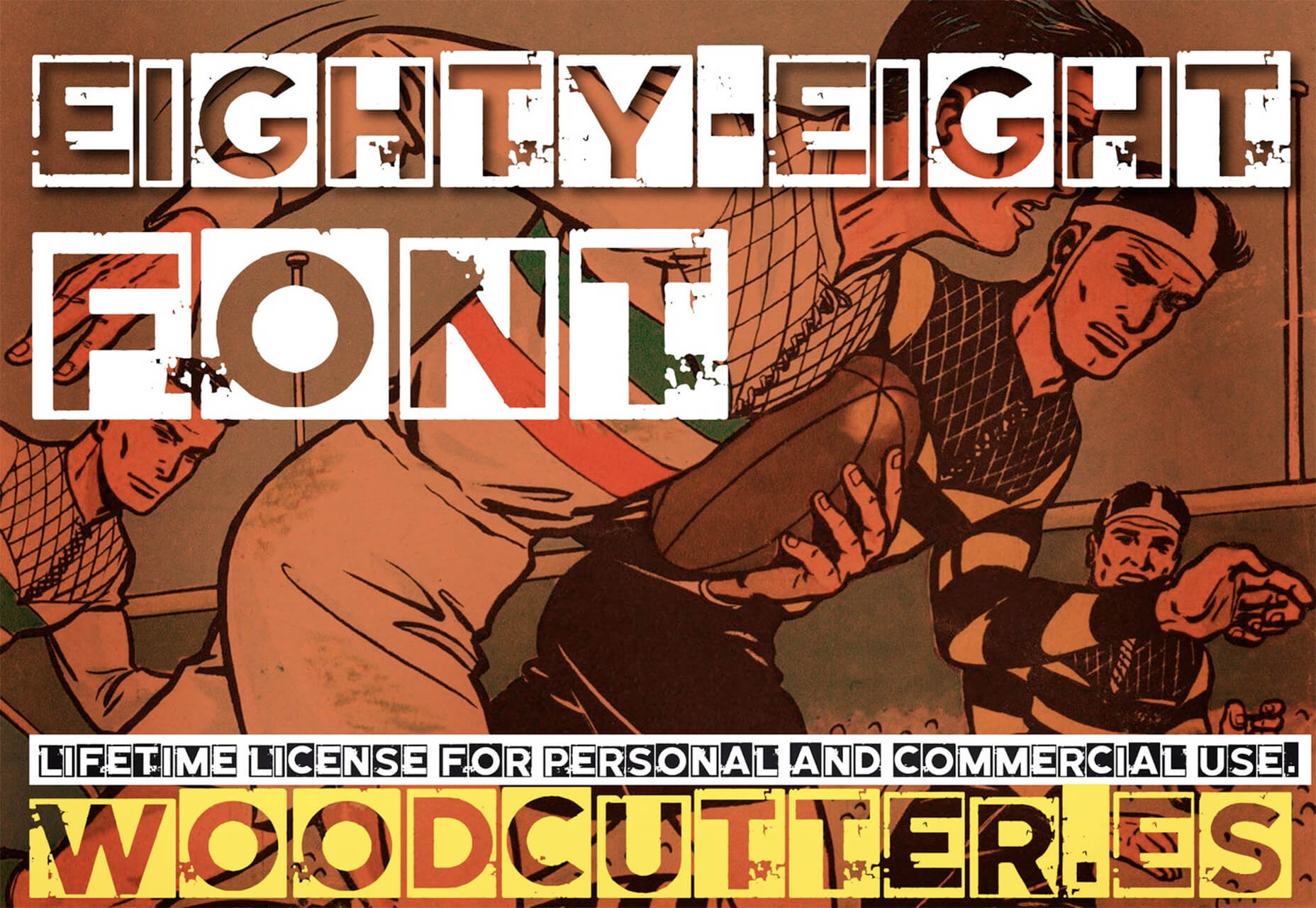
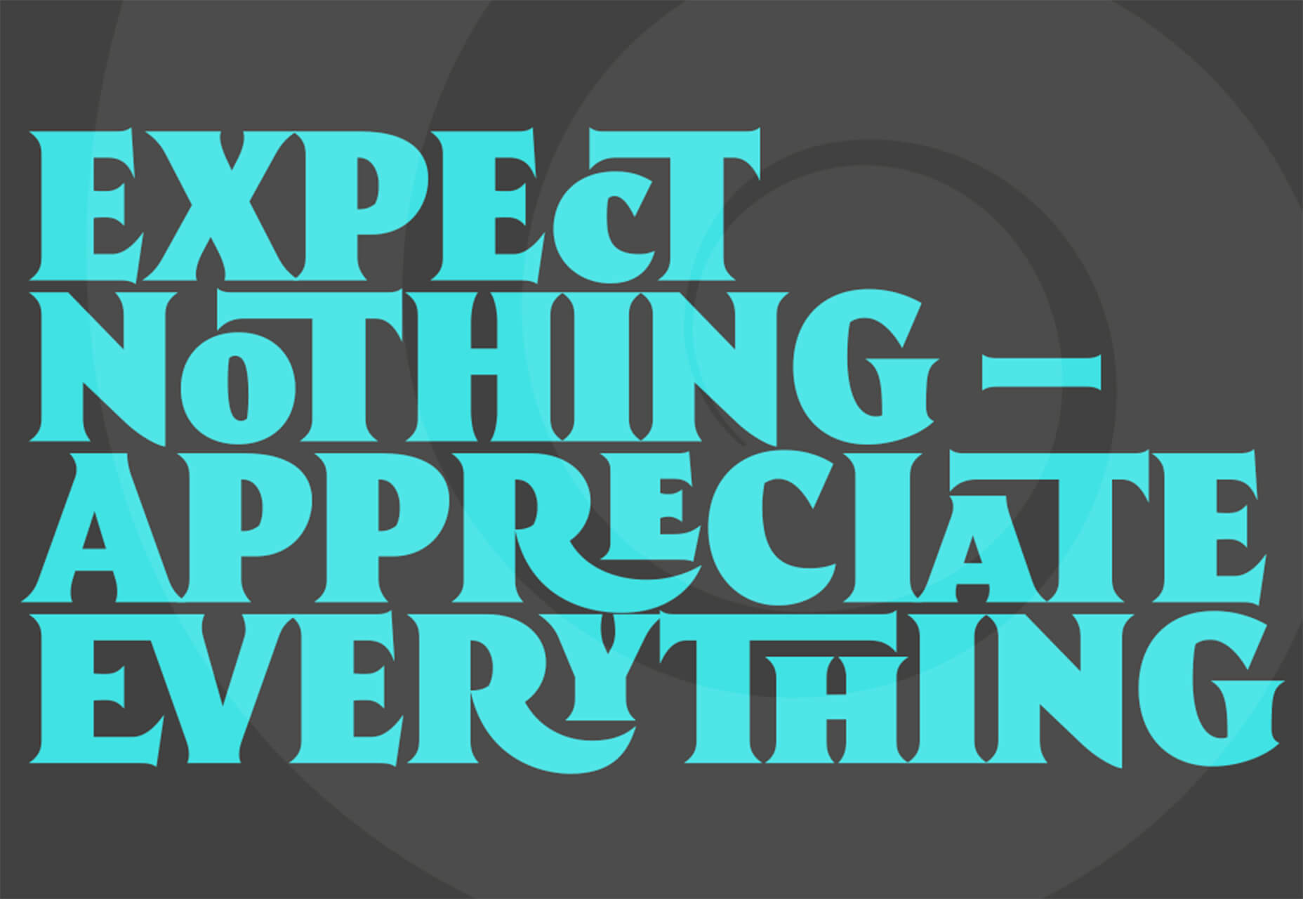
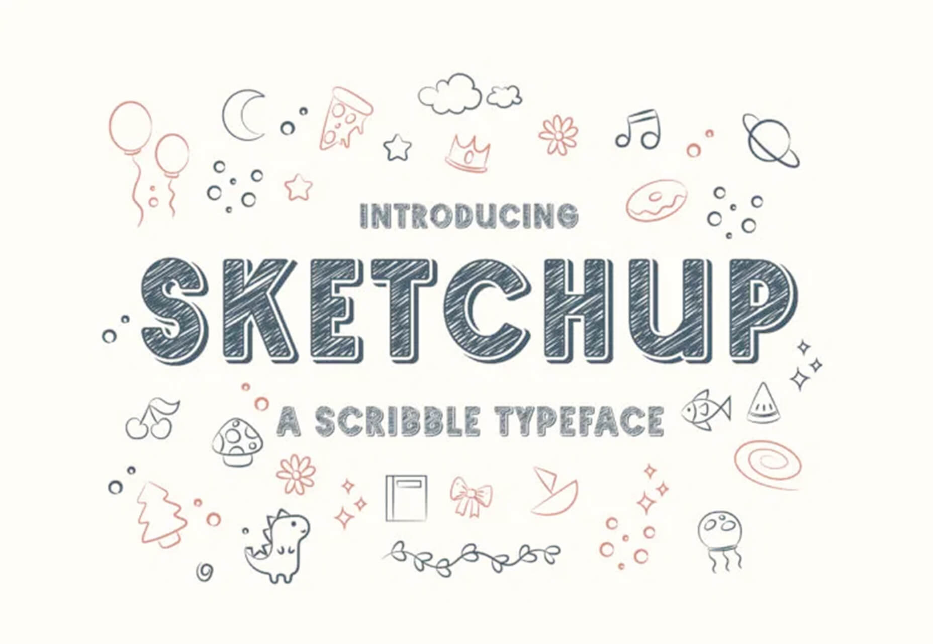
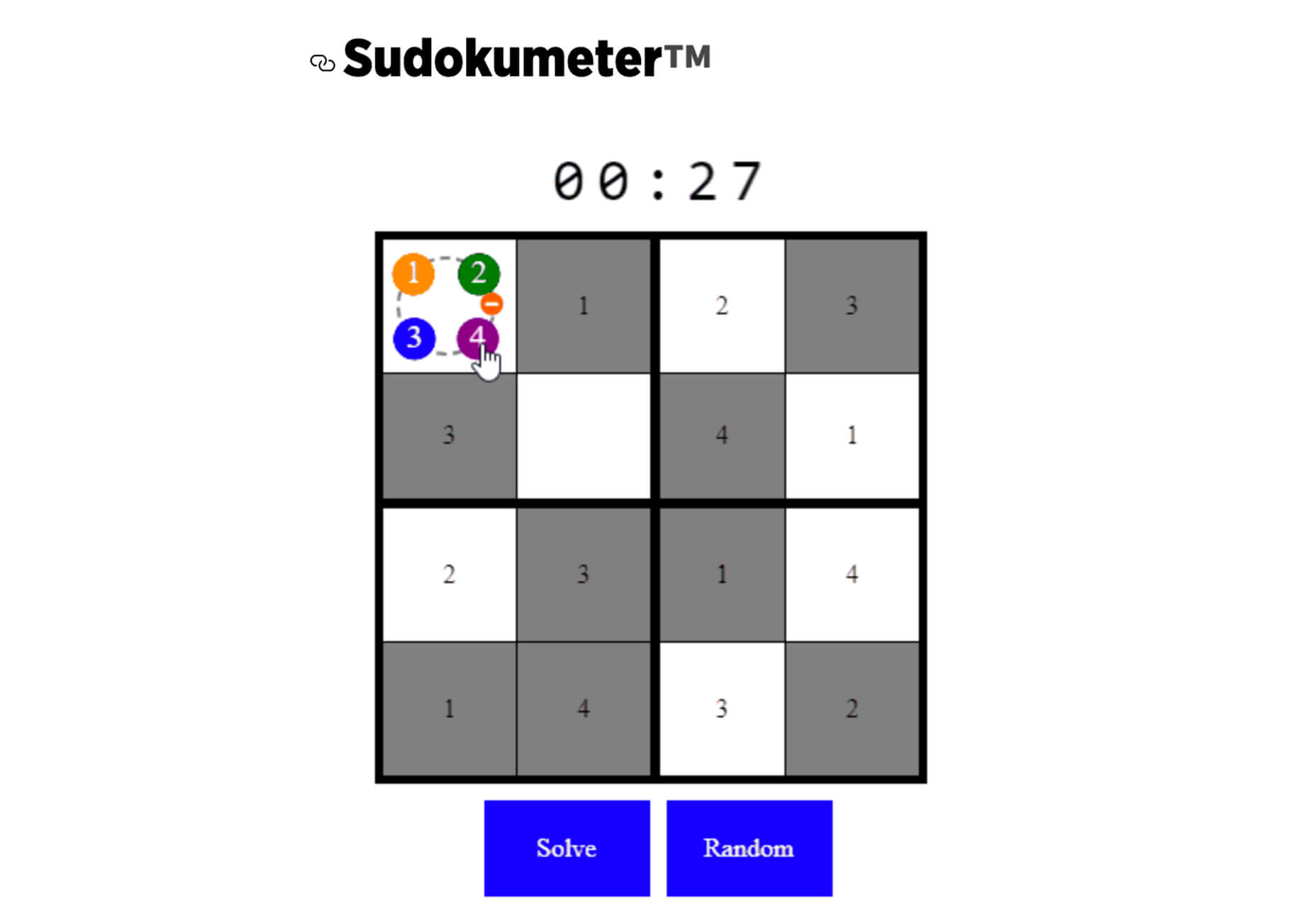
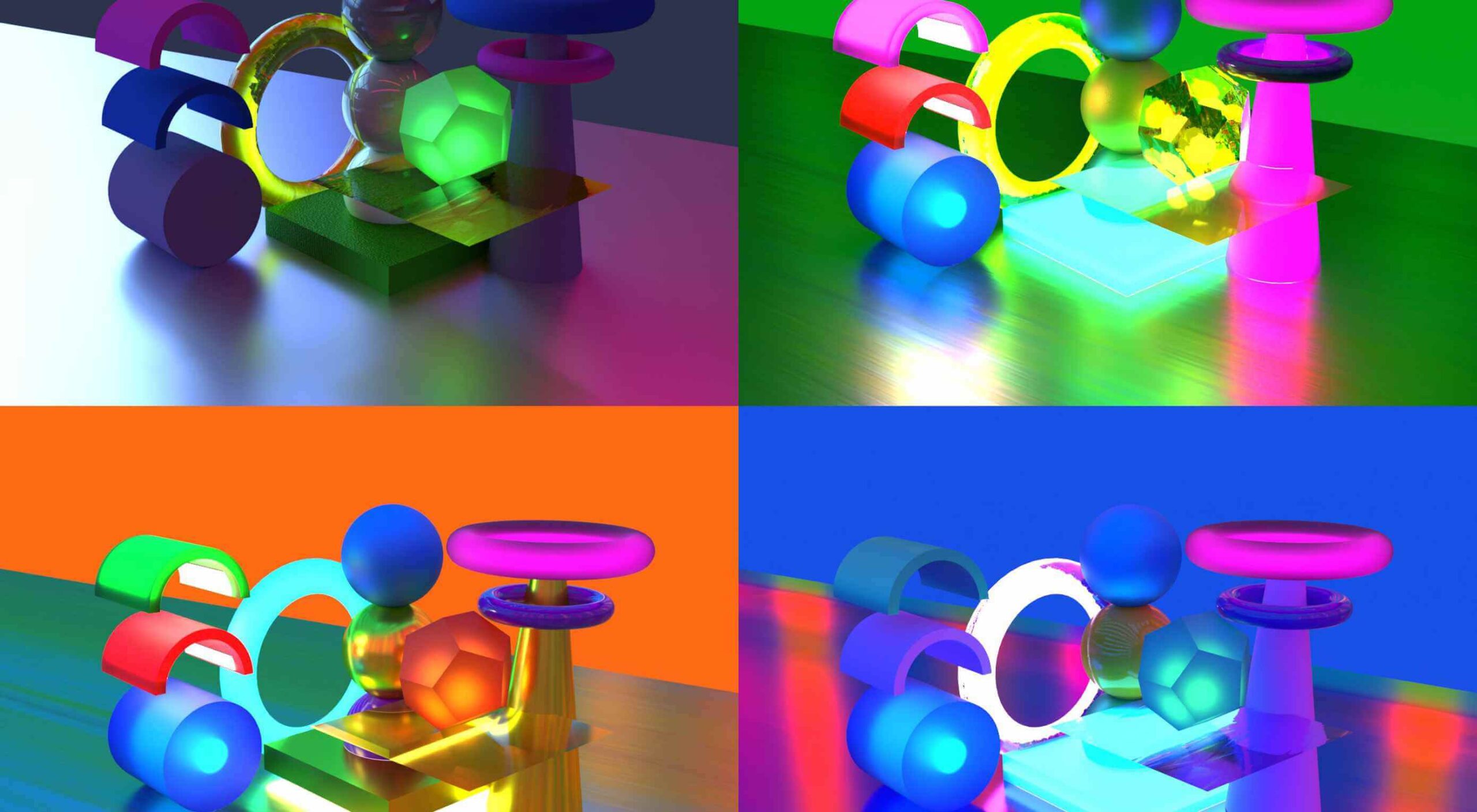
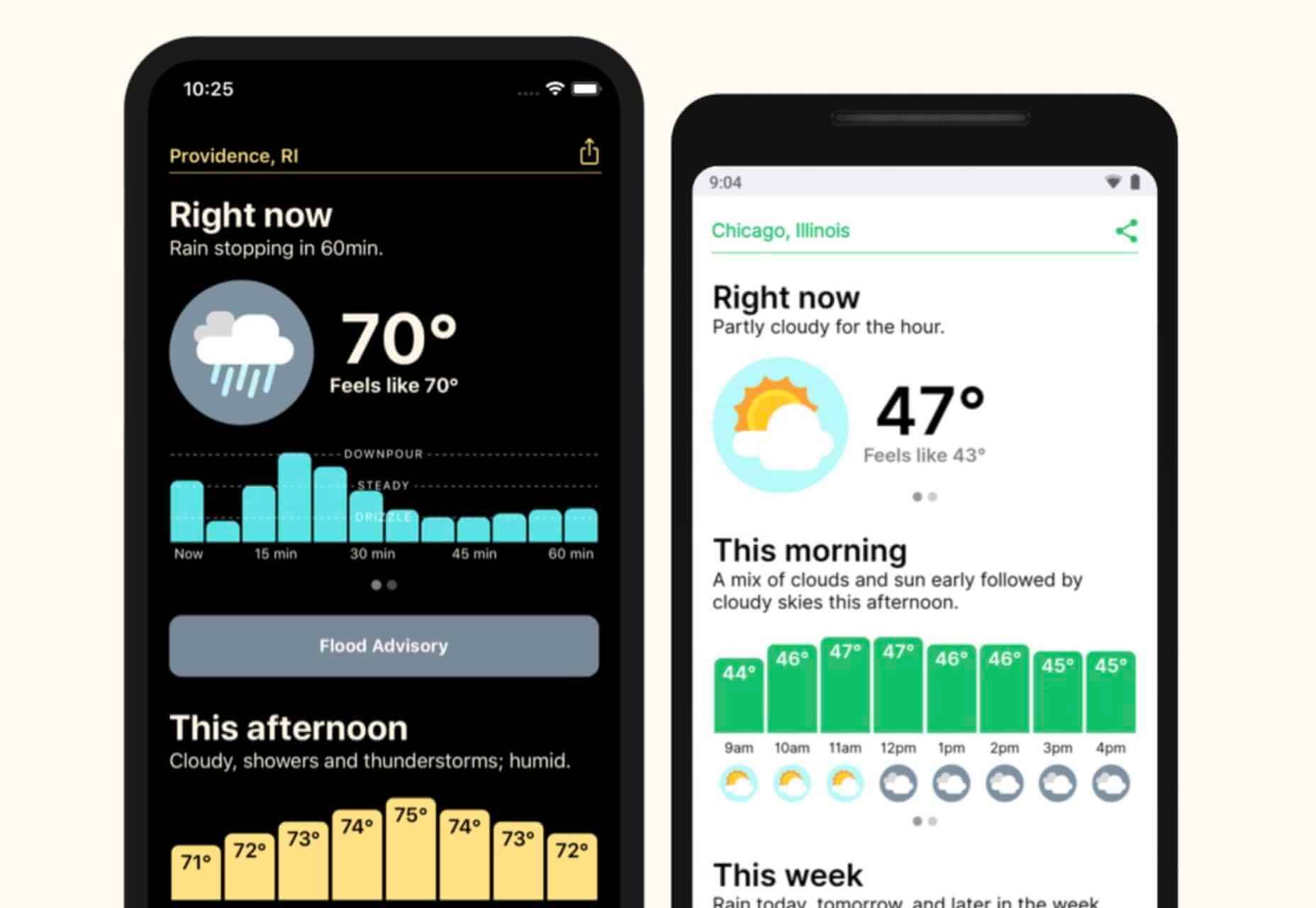
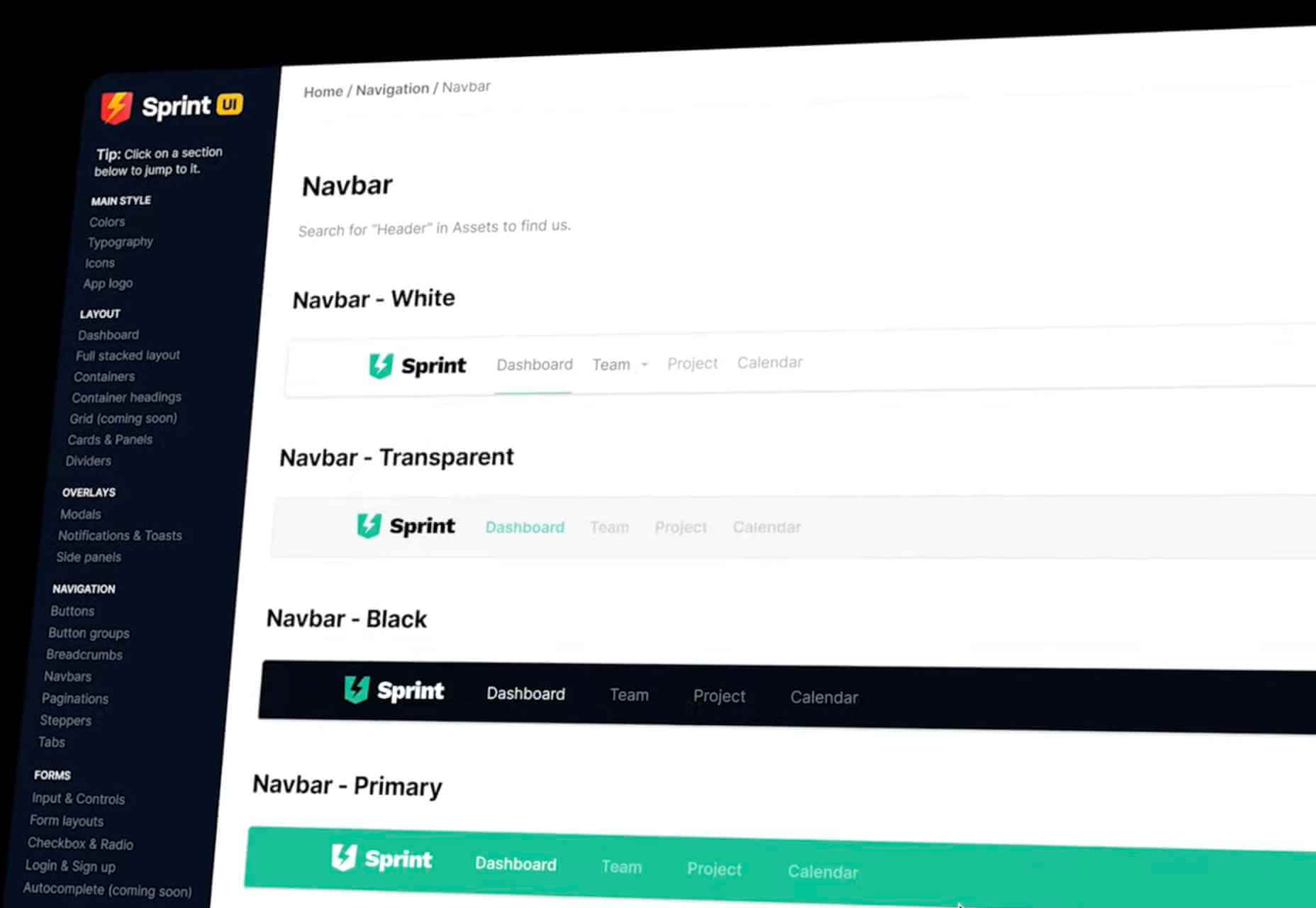
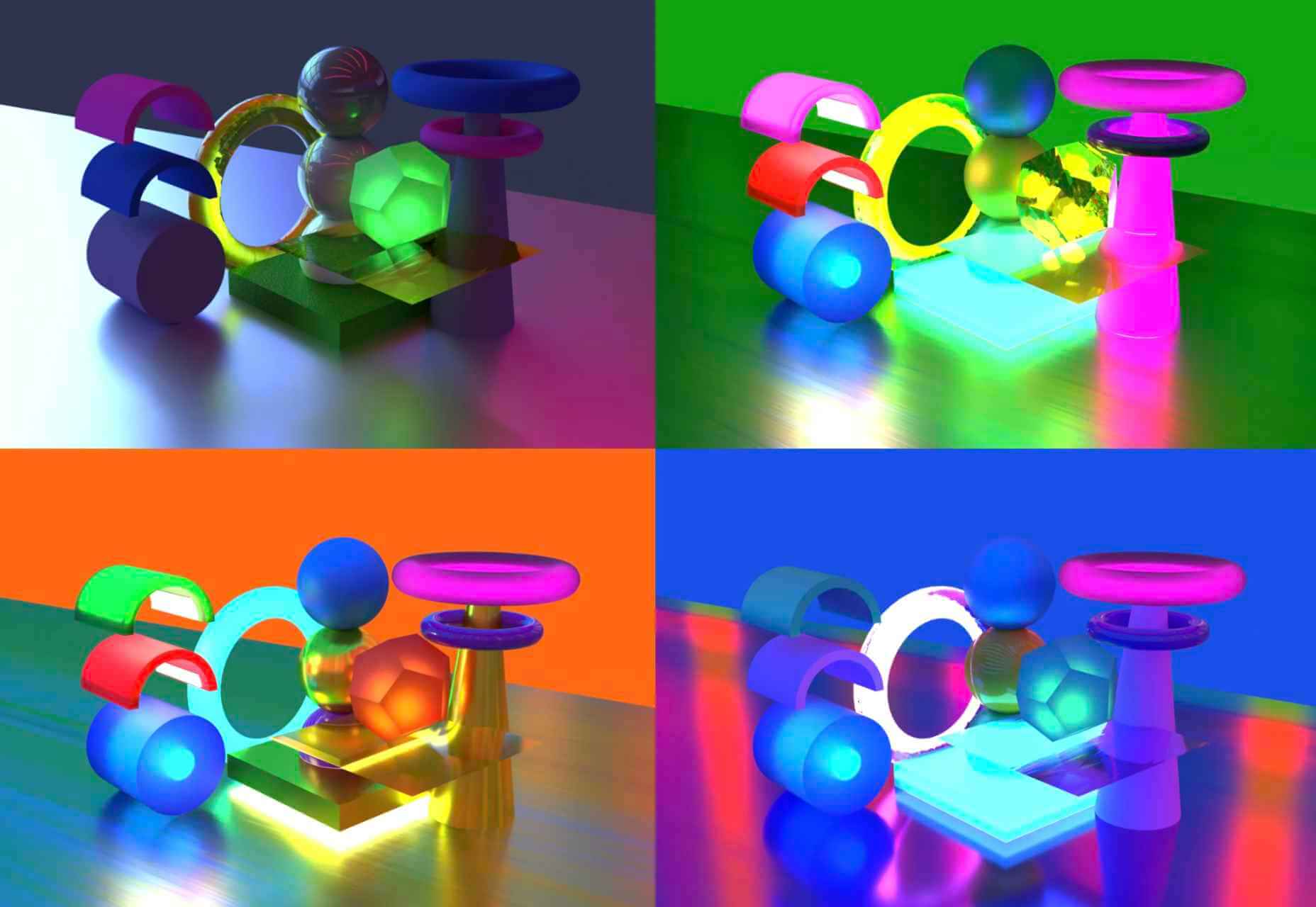
From dev tools to productivity to a little bit of fun with sudoku, this month’s collection of new tools is packed with something for everyone.

Here’s what new for designers this month.

May’s Top Picks

Am I FLoCed?

Am I FLoCed? Is a tool to see if you are part of a Google Chrome origin trial. It tests a new tracking feature called Federated Learning of Cohorts (FLoC). According to Google, the trial currently affects 0.5% of users in selected regions, including Australia, Brazil, Canada, India, Indonesia, Japan, Mexico, New Zealand, the Philippines, and the United States. The page will try to detect whether you’ve been made a guinea pig in Google’s ad-tech experiment.

According to the designers of Am I FloCed: “FLoC runs in your browser. It uses your browsing history from the past week to assign you to a group with other ‘similar’ people around the world. Each group receives a label, called a FLoC ID, which is supposed to capture meaningful information about your habits and interests. FLoC then displays this label to everyone you interact with on the web. This makes it easier to identify you with browser fingerprinting, and it gives trackers a head start on profiling you.”

Uncut

Uncut is a Libre typeface catalog that just got started in April. It features contemporary typefaces and styles and is set to be updated regularly. Sort by sans serif, serif, monospace, or display typefaces. Plus, you can submit a typeface for inclusion.

Dashblock

Dashblock allows you to build automations without coding. Use it to create visual automations, or turn blocks into use-cases. (It is a premium tool, but comes with a 14-day free trial to test it out.)

Instant

Instant is a fast and secure one-click checkout tool that works with WooCommerce. Users fill out a short form the first time they shop and then join the network to enable instant, frictionless, 1-click checkouts without passwords. It makes shopping easier and cuts abandoned carts.

5 Image Tools

Triangula

Triangula uses a modified genetic algorithm to triangulate images. It works best with images smaller than 3000px and with fewer than 3000 points, typically producing an optimal result within a couple of minutes. The result is a nifty-looking image.

Content-Aware Image Resizing in Javascript

Content-Aware Image Resizing in Javascript solves that problem with images where you have a photo but it just doesn’t quite fit. A crop doesn’t work because you lose important information. The carver slices and cuts photos to give you the image elements you want in the size you want them. It’s probably a good idea to read through the tutorial before jumping into the open-source code on GitHub.

Globs Design

Globs Design uses toggles and drag and drop to help you create funky shapes and fills that you can save in SVG format for projects.

Root Illustrations

Root Illustrations is a stylish set of people-based illustrations that you can customize to create scenes for your projects. Construct a scene and then snag your set of vector graphics that also work with Sketch and Figma. The set includes 24 characters, more than 100 details, and the ability to change colors and styles.

Make Your Photo 16×9

Make Your Photo 16×9 is as simple as it sounds. It is a cropping tool that allows you to upload any shape of photo – even vertical – and pick options to fill the space to make it fit the standard 16×9 aspect ratio.

6 Dev Tools

Devbook

Devbook is a search engine for developers that helps them to find the resources they need and answer their questions faster. Fast, accessible right from a code editor, and fully controllable with just a keyboard.

Madosel

Madosel is a fast, advanced responsive HTML front-end framework that’s in an alpha version. The open-source tool is made to create websites and apps that look great on any device. Plus, it is semantic, readable, flexible, and customizable.

Say Hello to CSS Container Queries

Say Hello to CSS Container Queries helps solve a problem with media queries and smart stacking of elements. CSS Container Queries allow you to make a fluid component that adjusts based on the parent element and everything is independent of viewport width. This post takes you through everything you need to do to implement this yourself.

Frontend Toolkit

Frontend Toolkit is a customizable dashboard that you can use to keep up with recurring tasks. It’s one of those little tools that can speed up workflows.

Flatfile

Flatfile is a production-ready importer for SaaS applications. It allows you to auto-format customer spreadsheets without manual cleaning of data and you can do it all without a CSV parser. The tool also includes an elegant UI component to guide users through the process.

Plasmic

Plasmic is a visual website builder that works with your codebase. It’s designed to speed up development with developers focusing on code (not pixel pushing) and allows non-developers to publish pages and content. The premium tool works with any hosting, CMS, or framework and you can adapt it by the component, section, or page.

2 Productivity Tools

Calendso

Calendso is an open-source calendar scheduling tool. It’s flexible with the ability to host it yourself or with the makers of the calendar. It is API-driven and allows you to control events and information. The interface is simple and sleek and can integrate into your website.

Slidev

Slidev is a set of presentation slides for developers. What’s different about this presentation deck is that you can write slides in a single markdown file with themes, code blocks, and interactive components.

4 Icons and UI Kits

Iconic

Iconic is a set of pixel-perfect icons that gets updated each week. The collection of 24×24 px elements in SVG format contains 160 icons and counting. The simple style is easy to implement and you can search for just what you need by category.

5 Dashboard Templates for Figma

5 Dashboard Templates for Figma is a set of free ready-made screens with light and dark modes for each that you can use with components such as calendars, charts, tables, and more. The free elements are a preview of a larger premium Figma set if you like how they look and work.

Free Mobile Chat UI Kit

Free Mobile Chat UI Kit is a tool of components for Sketch, Figma, and Adobe XD that includes more than 50 messaging screens with light and dark modes.

Stratum UI Design Kit

Stratum UI Design Kit is a collection of more than 9,000 consistent elements for Figma. It’s packed with elements and tools that make this premium UI kit a tool that gets projects moving quickly.

4 Type Tools and Fresh Fonts

Fluid Typography

Fluid Typography is a nifty tool that allows you to test headings in any size at different viewports to ensure it looks great everywhere. Then you can copy the CSS and use it in your projects.

Eighty-Eight

Eighty-Eight is a funky block-style typeface for display use.

Harmonique

Harmonique is a robust typeface family with lovely serifs and alternates. It’s a type family of two styles that work in harmony together to add distinction and personality to your own typographic compositions. Harmonique’s low contrast forms have the appeal of a humanist sans serif typeface.

Sketchup

Sketchup is a charming display typeface that has a nice pen style. The free version has a limited character set.

Just for Fun

Generating and Solving Sudokus in CSS

Generating and Solving Sudokus in CSS by Lee Meyer for CSS-Tricks is a fun deep dive into using CSS for something you might not expect. It’s a complicated – but fun – look at some of the things CSS can do with plenty of code snippets. The final result is a solvable puzzle with 16 squares.

Source

The post 26 Exciting New Tools For Designers, May 2021 first appeared on Webdesigner Depot.


Source de l’article sur Webdesignerdepot

Every day design fans submit incredible industry stories to our sister-site, Webdesigner News. Our colleagues sift through it, selecting the very best stories from the design, UX, tech, and development worlds and posting them live on the site.

The best way to keep up with the most important stories for web professionals is to subscribe to Webdesigner News or check out the site regularly. However, in case you missed a day this week, here’s a handy compilation of the top curated stories from the last seven days. Enjoy!

White House Launches AI Website

Become A Better Frontend Developer

Hello Weather

Sprint UI Design System Generator

How Pixar Uses Hyper-Colors to Hack Your Brain

Bootstrap 5

Microsoft’s New Font: Your Work Will Soon Take On A New Character

HTML Tips

Everything You Need to Know About UX Writing In Web Design

3 Essential Design Trends, May 2021

Source

The post Popular Design News of the Week: May 3 2021 – May 9, 2021 first appeared on Webdesigner Depot.


Source de l’article sur Webdesignerdepot

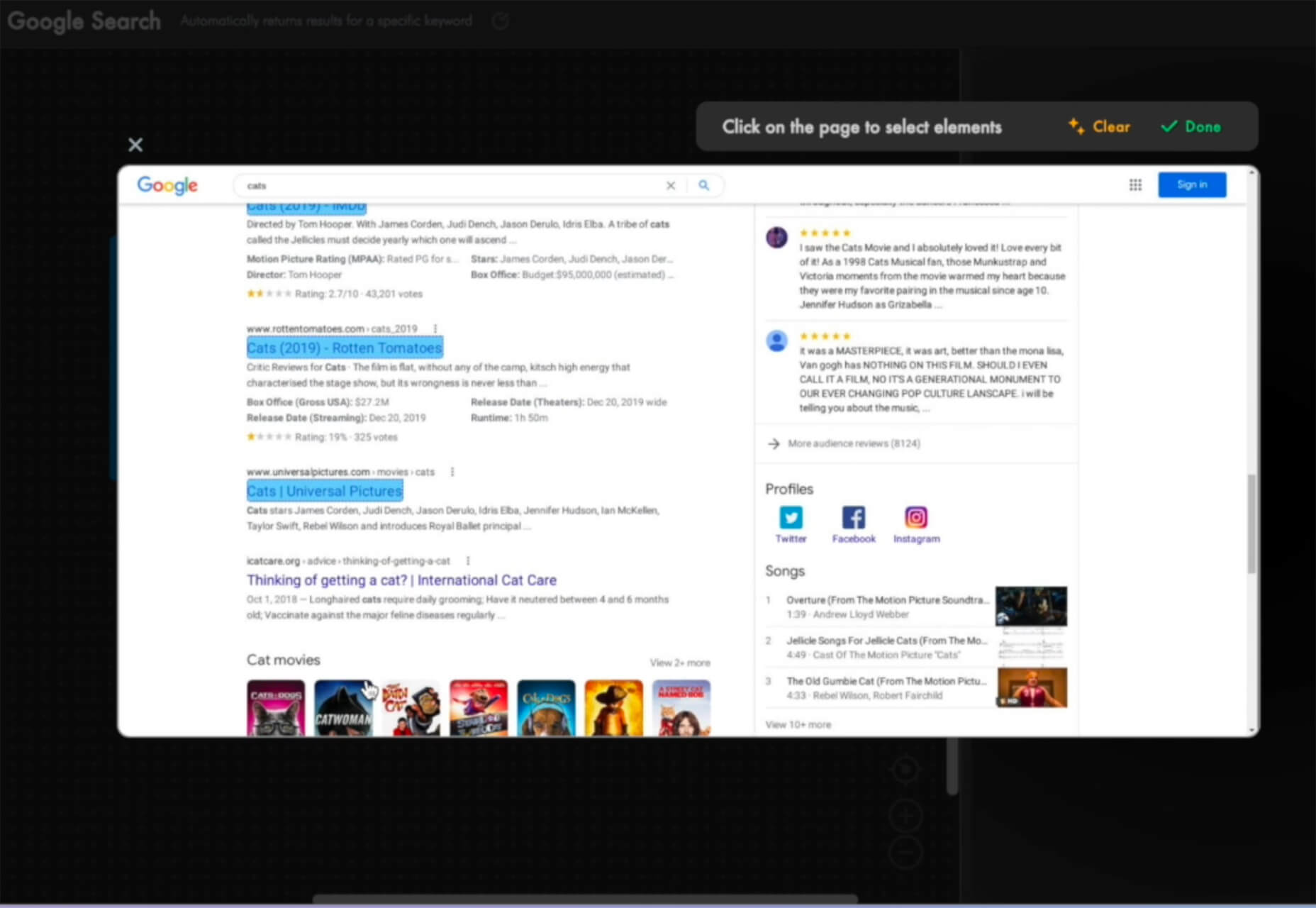
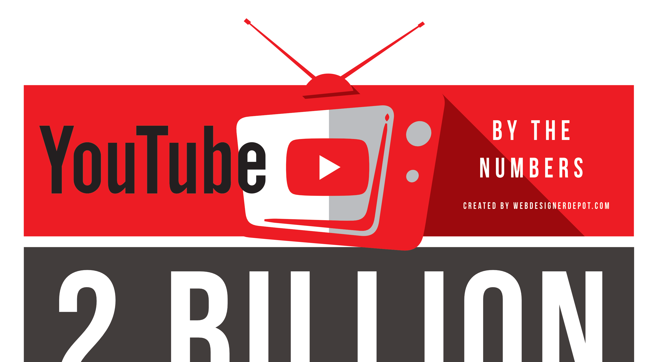
YouTube is the Web’s biggest video channel. Hundreds of hours of video are uploaded to the service every minute. The volume of data it stores and streams is beyond comprehension.

Owned by Google, YouTube has been central to our lives online in such a big way, that it’s almost unbelievable that it’s been with us for less than two decades.

If you’ve ever wondered just how big it is, which videos broke its records, or how many users it has, this is the infographic for you!

Source

The post Infographic: YouTube By The Numbers first appeared on Webdesigner Depot.


Source de l’article sur Webdesignerdepot

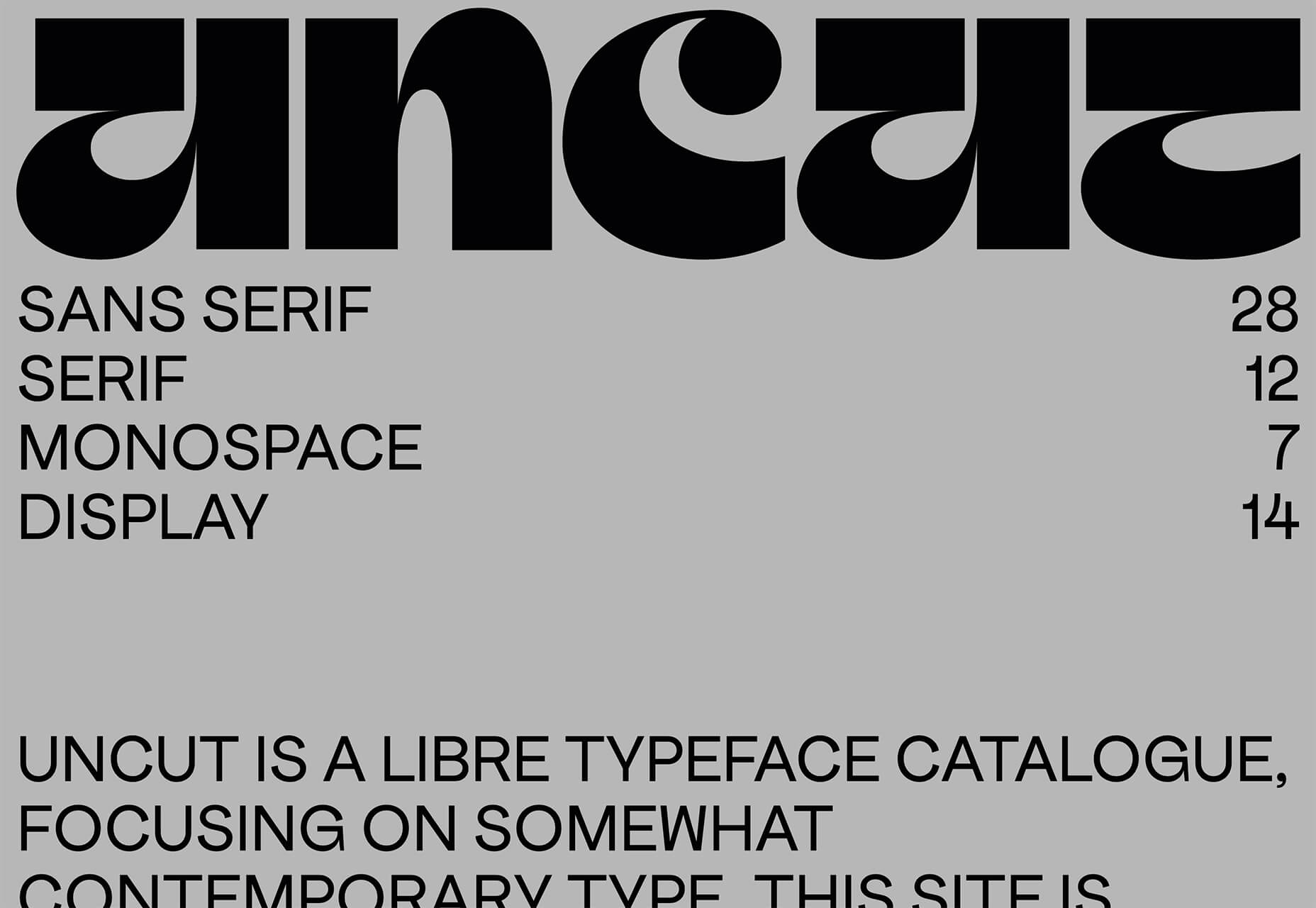
WordPress powers nearly 40% of all websites, thanks to its commitment to making publication possible for everyone, for free. Combined with premium plugins and themes, it’s possibly the ultimate tool for building attractive, unique, and feature-rich websites without any coding or design experience.

However, you do pay the price for this experience, with WordPress and its third-party products not always being built for performance – whether it’s page loading times or SEO.

Image optimization is a particularly big concern. Images are one, if not the largest, contributors to page weight, and it’s growing significantly by the year. So, while images are crucial for beautifying your website pages, they are also one of the biggest factors slowing it down.

In terms of image optimization, WordPress+Elementor brings very little to the table. WordPress core now comes with both responsive syntax and lazy-loading. Elementor itself also only comes with responsive syntax out-of-the-box. However, these are baseline techniques for image optimization that will deliver the bare minimum of improvements.

This means that, while Elementor makes it easy to design sweet-looking WordPress pages (with tonnes of creatively utilized images), you will probably pay the price when it comes to performance. But don’t worry. We will show you how to dramatically improve web performance by over 30 points on scoring tools like Google’s PageSpeed Insight

Why Optimize Your Elementor Images with ImageEngine?

In general, image CDNs use various techniques to get image payloads as small as possible and deliver image content faster, all while minimizing the visual impact. ImageEngine is no different in that regard.

Firstly, ImageEngine, when used in auto mode, will apply all of the following optimizations that web performance tools like Google’s PageSpeed Insight recommend. For example:

  • Properly size images – ImageEngine automatically resizes images for optimal size-to-quality ratios depending on the screen size of the user device. ImageEngine supports Retina devices.
  • Efficiently encode images – Applies different rates of compression depending on the PPI of the user devices. For example, ImageEngine adapts and more aggressively compresses on higher PPI devices without losing visual quality.
  • Next-gen format conversion – Automatically converts images to the optimal next-gen format according to the browser, device, or OS. ImageEngine can convert images to WebP or JPEG-2000 as well as GIFs to MP4 or WebP.  AVIF is also available in a manual directive mode.
  • Strip unnecessary metadata

While these features are standard for most image CDNs, ImageEngine is unique for its use of WURFL device detection. This gives ImageEngine much deeper insight into the user device accessing a website page and, by extension, its images. Using the screen size, resolution, PPI, etc., ImageEngine can make more intelligent decisions regarding how to reduce image payloads while maintaining visual quality.

This is why ImageEngine brands itself as an “intelligent, device-aware” image CDN and why it can reduce image payloads by as much as 80% (if not more).

ImageEngine also provides a proprietary CDN service to accelerate image delivery. The CDN consists of 20 globally positioned PoPs with the device-aware logic built-in. This allows you to deliver image content faster in different regions while also serving images straight from the cache with a ~98% hit ratio.

ImageEngine also supports Chrome’s save data setting. If someone has a slow connection or has activated this setting, ImageEngine will automatically compress image payloads even more, to provide a better user experience on slower connections.

How to Use ImageEngine with WordPress and Elementor

If you’re using WordPress and Elementor, then chances are you want to spend as little time on development and other technicalities as possible. Luckily, ImageEngine is a highly streamlined tool that requires little to no effort to integrate or maintain with a WordPress site.

Assuming you already have a WordPress website with Elementor, here are the step-by-step instructions to use ImageEngine:

  1. Go to ImageEngine.io and sign up for a 30-day free trial.
  2. Provide ImageEngine with the URL of the website you want to optimize.
  3. Create an account (or sign up with your existing Google, GitHub, or ScientiaMobile account).
  4. Provide ImageEngine with the current origin where your images are served from. If you upload images to your WordPress website as usual, then that means providing your WordPress website address again.
  5. Finally, ImageEngine will generate an ImageEngine delivery address for you from where your optimized images will be served. This typically takes the form of: {randomstring}.cdn.imgeng.in. You can change the delivery address to something more meaningful from the dashboard, such as myimages.cdn.imgeng.in.

Now, to set up ImageEngine on your WordPress website:

  1. Go to the WordPress dashboard and head to Plugins -> Add New.
  2. Search for the “Image CDN” plugin by ImageEngine. When you find it, install and activate the plugin.

  1. Go to Settings -> Image CDN. OK, so this is the ImageEngine plugin dashboard. To configure it, all you need to do is:

a. Copy the delivery address you got from ImageEngine above and paste it in the “Delivery Address” field.

b. Tick the “Enable ImageEngine” box.

That’s literally it. All images that you use on your WordPress/Elementor pages should now be served via the ImageEngine CDN already optimized. 

ImageEngine is largely a “set-it-and-forget-it” tool. It will provide the best results in auto mode with no user input. However, you can override some of ImageEngine’s settings from the dashboard or by using URL directives to manipulate images.

For example, you can resize an image to 300 px width and convert it to WebP by changing the src attribute like this:

<img src="https://myimages.cdn.imgeng.in/wp-content/uploads/2021/03/banner-logo.png?imgeng=/w_300/f_webp">

However, use this only when necessary, as doing so will limit ImageEngine’s adaptability under different conditions.

What Improvement Can You Expect?

Let’s see what results you can expect from using an image CDN to improve your page loading times.

For this, I created two identical WordPress pages using the Elementor theme. The one page purely relied on WordPress and Elementor, while I installed and set up ImageEngine for the other. The page had some galleries as well as full-size images:

The pages used many high-quality images, as you might expect to find on a professional photography gallery, photography blog, stock photo website, large e-commerce site, etc. I then ran page performance tests using Chrome’s built-in Lighthouse audit tool, choosing scores representing the average results I got for each page.

For thoroughness, I tested both the mobile and desktop performance. However, I focused on the mobile results as these showcase more of the image CDN’s responsive capabilities. Mobile traffic also accounts for the majority share of internet traffic and seems to be the focus for search engines going forward.

So, first of all, let’s see the mobile score for the page without ImageEngine:

As you can see, there was definitely a struggle to deliver the huge amount of image content. Google has shown that 53% of mobile users abandon a page that takes more than 3s to load. So, clearly, this page has major concerns when it comes to user experience and retaining traffic.

The desktop version fared much better, although it still left much to be desired:

When digging into the reasons behind the slowdown, we can identify the following problems:

Most of the issues related somehow to the size and weight of the images. As you can see, Lighthouse identified a 3.8 MB payload while the total image payload of the entire page was close to 40 MB.

Now, let’s see what kind of improvement ImageEngine can make to these issues by looking at the mobile score first:

So, as you can see, a major improvement of 30 points over the standard WordPress/Elementor page. The time to load images was cut down by roughly 80% across the key core web vital metrics, such as FCP, LCP, and the overall Speed Index.

In fact, we just reached that critical 3s milestone for the FCP (the largest element on the visible area of the page when it initially loads), which creates the impression that the page has finished loading and will help you retain a lot of mobile traffic.

The desktop score was also much higher, and there was further improvement across the key performance metrics.

If we look at the performance problems still present, we see that images are almost completely removed as a concern. We also managed to bring down the initial 3.8 MB payload to around 1.46 MB, which is a ~62% reduction:

An unfortunate side effect of using WordPress and WordPress plugins is that you will almost inevitably face a performance hit due to all the additional JavaScript and CSS. This is part of the reason why we didn’t see even larger improvements. That’s the price you pay for the convenience of using these tools.

That being said, the more images you have on your pages, and the larger their sizes, the more significant the improvement will be.

It’s also worth noting that lazy-loaded images were loaded markedly faster with ImageEngine if you quickly scroll down the page, again making for an improved user experience.

Thanks to its intelligent image compression, there was also no visible loss in image quality, as you can see from this comparison:

Conclusion

So, as you can see, we can achieve significant performance improvements on image-heavy websites by using the ImageEngine image CDN, despite inherent performance issues using a CMS. This will translate to happier users, better search engine rankings, and an overall more successful website.

The best part is that ImageEngine stays true to the key principles of WordPress. You don’t have to worry about any of the nuts and bolts on the inside. And, ImageEngine will automatically adjust automation strategies as needed, future-proofing you against having to occasionally rework images for optimization.

Source

The post Create Beautiful WordPress Pages with Optimized Images Using Elementor and ImageEngine first appeared on Webdesigner Depot.


Source de l’article sur Webdesignerdepot