Articles

Le Big Data est le flot d’informations dans lequel nous nous trouvons tous les jours (des zettaoctets de données provenant de nos ordinateurs, des terminaux mobiles et des capteurs). Ces données sont utilisées par les entreprises pour orienter la prise de décisions, améliorer les processus et les stratégies, et créer des produits, des services et des expériences centrés sur le client.

Le Big Data désigne non seulement de gros volumes de données, mais aussi des données de nature variée et complexe. Il dépasse généralement la capacité des bases de données traditionnelles à capturer, gérer et traiter ce type de données. De plus, le Big Data peut provenir de n’importe où et de tout ce que nous sommes en mesure de surveiller numériquement. Les satellites, les appareils IoT (Internet des Objets), les radars et les tendances des réseaux sociaux ne sont que quelques exemples parmi la multitude de sources de données explorées et analysées pour rendre les entreprises plus résilientes et compétitives.


L’importance de l’analyse du Big Data

La véritable valeur du Big Data se mesure d’après votre capacité à l’analyser et à le comprendre. L’intelligence artificielle (IA), le machine learning et les technologies de base de données modernes permettent de visualiser et d’analyser le Big Data pour fournir des informations exploitables en temps réel. L’analyse du Big Data aide les entreprises à exploiter leurs données en vue de saisir de nouvelles opportunités et de créer de nouveaux modèles de gestion. Comme l’a si bien dit Geoffrey Moore, auteur et analyste de gestion, « sans analyse du Big Data, les entreprises sont aveugles et sourdes, errant sur le Web comme des cerfs sur une autoroute ».

How does Big Data and Analytics work? Simply Explained

Click the button below to load the content from YouTube.

How does Big Data and Analytics work? Simply Explained


L’évolution du Big Data

Aussi inconcevable que cela puisse paraître aujourd’hui, l’Apollo Guidance Computer a emmené l’homme sur la lune avec moins de 80 kilo-octets de mémoire. Depuis, la technologie informatique s’est développée à un rythme exponentiel, de même que la génération de données. La capacité technologique mondiale à stocker des données a doublé tous les trois ans depuis les années 1980. Il y a un peu plus de 50 ans, lors du lancement d’Apollo 11, la quantité de données numériques générées dans le monde aurait pu tenir dans un ordinateur portable. Aujourd’hui, l’IDC estime ce chiffre à 44 zettaoctets (soit 44 000 milliards de gigaoctets) et prévoit qu’il atteindra 163 zettaoctets en 2025.

44 zettaoctets de données numériques aujourd’hui, IDC

163 zettaoctets de données numériques en 2025, IDC

Plus les logiciels et la technologie se développent, moins les systèmes non numériques sont viables. Le traitement des données générées et collectées numériquement requiert des systèmes de data management plus avancés. En outre, la croissance exponentielle des plates-formes de réseaux sociaux, des technologies pour smartphones et des appareils IoT connectés numériquement ont contribué à l’émergence du Big Data.


Types de Big Data : que sont les données structurées et non structurées ?

Les ensembles de données sont généralement catégorisés en trois types, selon leur structure et la complexité de leur indexation.

Illustration des différents types de big data : données structurées, données non-structurées, données semi-structurées.

  1. Données structurées : ce type de données est le plus simple à organiser et à rechercher. Il peut inclure des données financières, des machine logs et des détails démographiques. Une feuille de calcul Microsoft Excel, avec sa mise en forme de colonnes et de lignes prédéfinies, offre un moyen efficace de visualiser les données structurées. Ses composants peuvent facilement être catégorisés, ce qui permet aux concepteurs et administrateurs de bases de données de définir des algorithmes simples pour la recherche et l’analyse. Même lorsque les données structurées sont très volumineuses, elles ne sont pas nécessairement qualifiées de Big Data, car elles sont relativement simples à gérer et ne répondent donc pas aux critères qui définissent le Big Data. Traditionnellement, les bases de données utilisent un langage de programmation appelé SQL (Structured Query Language) pour gérer les données structurées. SQL a été développé par IBM dans les années 1970 pour permettre aux développeurs de créer et gérer des bases de données relationnelles (de type feuille de calcul) qui commençaient à émerger à l’époque.
  2. Données non structurées : cette catégorie de données peut inclure des publications sur les réseaux sociaux, des fichiers audio, des images et des commentaires client ouverts. Ces données ne peuvent pas être facilement capturées dans les bases de données relationnelles standard en lignes et colonnes. Auparavant, les entreprises qui voulaient rechercher, gérer ou analyser de grandes quantités de données non structurées devaient utiliser des processus manuels laborieux. La valeur potentielle liée à l’analyse et à la compréhension de ces données ne faisait aucun doute, mais le coût associé était souvent trop exorbitant pour en valoir la peine. Compte tenu du temps nécessaire, les résultats étaient souvent obsolètes avant même d’être générés. Contrairement aux feuilles de calcul ou aux bases de données relationnelles, les données non structurées sont généralement stockées dans des lacs de données, des entrepôts de données et des bases de données NoSQL.
  3. Données semi-structurées : comme leur nom l’indique, les données semi-structurées intègrent à la fois des données structurées et non structurées. Les e-mails en sont un bon exemple, car ils incluent des données non structurées dans le corps du message, ainsi que d’autres propriétés organisationnelles telles que l’expéditeur, le destinataire, l’objet et la date. Les dispositifs qui utilisent le marquage géographique, les horodatages ou les balises sémantiques peuvent également fournir des données structurées avec un contenu non structuré. Une image de smartphone non identifiée, par exemple, peut indiquer qu’il s’agit d’un selfie et préciser l’heure et l’endroit où il a été pris. Une base de données moderne exécutant une technologie d’IA peut non seulement identifier instantanément différents types de données, mais aussi générer des algorithmes en temps réel pour gérer et analyser efficacement les ensembles de données disparates.

Les sources du Big Data

Les objets générateurs de données se développent à un rythme spectaculaire, depuis les drones jusqu’aux grille-pains. Toutefois, à des fins de catégorisation, les sources de données sont généralement divisées en trois types :
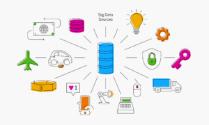
Illustration des différentes sources du big data : données sociales, données machine, données altérables.

Données sociales

Comme leur nom l’indique, les données sociales sont générées par les réseaux sociaux : commentaires, publications, images et, de plus en plus, vidéos. En outre, compte tenu de l’ubiquité croissante des réseaux 4G et 5G, on estime que le nombre de personnes dans le monde qui regardent régulièrement des contenus vidéo sur leur smartphone atteindra 2,72 milliards en 2023. Bien que les tendances concernant les réseaux sociaux et leur utilisation évoluent rapidement et de manière imprévisible, leur progression en tant que générateurs de données numériques est incontestable.

Données machine

Les machines et appareils IoT sont équipés de capteurs et ont la capacité d’envoyer et de recevoir des données numériques. Les capteurs IoT aident les entreprises à collecter et traiter les données machine provenant des appareils, des véhicules et des équipements. Globalement, le nombre d’objets générateurs de données augmente rapidement, des capteurs météorologiques et de trafic jusqu’à la surveillance de la sécurité. Selon l’IDC, il y aura plus de 40 milliards d’appareils IoT en 2025, générant près de la moitié des données numériques mondiales.

Données altérables

Il s’agit des données parmi les plus évolutives au monde. Par exemple, un détaillant international traite plus d’un million de transactions client par heure. Si l’on ajoute à cela les transactions d’achat et bancaires au niveau mondial, on comprend mieux le volume phénoménal de données générées. En outre, les données altérables contiennent de plus en plus de données semi-structurées, y compris des images et des commentaires, ce qui les rend d’autant plus complexes à gérer et à traiter.


Les cinq V du Big Data

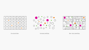
Ce n’est pas parce qu’un ensemble de données est volumineux qu’il s’agit nécessairement de Big Data. Pour être qualifiées en tant que telles, les données doivent posséder au minimum les cinq caractéristiques suivantes :

Illustration des 5 V du Big Data : Volume, Vitesse, Variété, Véracité, Valeur.

  1. Volume : même si le volume n’est pas le seul composant qui constitue le Big Data, il s’agit d’une de ses caractéristiques principales. Pour gérer et exploiter pleinement le Big Data, des algorithmes avancés et des analyses pilotées par l’IA sont nécessaires. Mais avant tout cela, il doit exister un moyen fiable et sécurisé de stocker, d’organiser et d’extraire les téraoctets de données détenus par les grandes entreprises.
  2. Vitesse : auparavant, les données générées devaient ensuite être saisies dans un système de base de données traditionnel (souvent manuellement) avant de pouvoir être analysées ou extraites. Aujourd’hui, grâce à la technologie du Big Data, les bases de données sont capables de traiter, d’analyser et de configurer les données lorsqu’elles sont générées, parfois en l’espace de quelques millisecondes. Pour les entreprises, cela signifie que les données en temps réel peuvent être exploitées pour saisir des opportunités financières, répondre aux besoins des clients, prévenir la fraude et exécuter toute autre activité pour laquelle la rapidité est un facteur clé.
  3. Variété : les ensembles de données contenant uniquement des données structurées ne relèvent pas nécessairement du Big Data, quel que soit leur volume. Le Big Data comprend généralement des combinaisons de données structurées, non structurées et semi-structurées. Les solutions de gestion des données et les bases de données traditionnelles n’offrent pas la flexibilité et le périmètre nécessaires pour gérer les ensembles de données complexes et disparates qui constituent le Big Data.
  4. Véracité : bien que les bases de données modernes permettent aux entreprises d’accumuler et d’identifier des volumes considérables de Big Data de différents types, elles ne sont utiles que si elles sont précises, pertinentes et opportunes. S’agissant des bases de données traditionnelles alimentées uniquement avec des données structurées, le manque de précision des données était souvent dû à des erreurs syntaxiques et des fautes de frappe. Les données non structurées présentent toute une série de nouvelles difficultés en matière de véracité. Les préjugés humains, le « bruit social » et les problèmes liés à la provenance des données peuvent avoir un impact sur la qualité des données.
  5. Valeur : les résultats de l’analyse du Big Data sont souvent fascinants et inattendus. Mais pour les entreprises, l’analyse du Big Data doit fournir une visibilité qui les aident à gagner en compétitivité et en résilience, et à mieux servir leurs clients. Les technologies modernes du Big Data offrent la possibilité de collecter et d’extraire des données susceptibles de procurer un avantage mesurable à la fois en termes de résultats et de résilience opérationnelle.

Avantages du Big Data

Les solutions modernes de gestion du Big Data permettent aux entreprises de transformer leurs données brutes en informations pertinentes avec une rapidité et une précision sans précédent.

  • Développement de produits et de services :l’analyse du Big Data permet aux développeurs de produits d’analyser les données non structurées, telles que les témoignages clients et les tendances culturelles, et de réagir rapidement.
  • Maintenance prédictive : dans le cadre d’uneenquête internationale, McKinsey a constaté que l’analyse du Big Data émanant des machines IoT pouvait réduire les coûts de maintenance des équipements jusqu’à 40 %.
  • Expérience client :dans le cadre d’une enquête réalisée en 2020 auprès de responsables d’entreprises du monde entier, Gartner a déterminé que « les entreprises en croissance collectent plus activement des données sur l’expérience client que les entreprises à croissance nulle ». L’analyse du Big Data permet aux entreprises d’améliorer et de personnaliser l’expérience de leurs clients avec leur marque.
  • Gestion de la résilience et des risques :la pandémie de COVID-19 a été une véritable prise de conscience pour de nombreux dirigeants d’entreprise qui se sont rendu compte à quel point leur activité était vulnérable. La visibilité offerte par le Big Data peut aider les entreprises à anticiper les risques et à se préparer aux imprévus.
  • Économies et efficacité accrue : lorsque les entreprises effectuent une analyse avancée du Big Data pour tous les processus de l’organisation, elles peuvent non seulement détecter les inefficacités, mais aussi déployer des solutions rapides et efficaces.
  • Amélioration de la compétitivité : les informations obtenues grâce au Big Data peuvent aider les entreprises à réaliser des économies, à satisfaire leurs clients, à concevoir de meilleurs produits et à innover dans les opérations de gestion.

IA et Big Data

La gestion du Big Data repose sur des systèmes capables de traiter et d’analyser efficacement de gros volumes d’informations disparates et complexes. À cet égard, le Big Data et l’IA ont une relation de réciprocité. Sans l’IA pour l’organiser et l’analyser, le Big Data n’aurait pas grande utilité. Et pour que l’IA puisse générer des analyses suffisamment fiables pour être exploitables, le Big Data doit contenir des ensembles de données suffisamment étendus. Comme l’indique Brandon Purcell, analyste chez Forrester Research, « les données sont au cœur de l’intelligence artificielle. Un système d’IA doit apprendre des données pour remplir sa fonction ».

« Les données sont au cœur de l’intelligence artificielle. Un système d’IA doit apprendre des données pour remplir sa fonction ».

Brandon Purcell, analyste, Forrester Research


Machine learning et Big Data

Les algorithmes de machine learning définissent les données entrantes et identifient des modèles associés. Ces informations permettent de prendre des décisions avisées et d’automatiser les processus. Le machine learning se nourrit du Big Data, car plus les ensembles de données analysés sont fiables, plus le système est susceptible d’apprendre, de faire évoluer et d’adapter ses processus en continu.


Technologies du Big Data

Architecture du Big Data

À l’instar de l’architecture du bâtiment, l’architecture du Big Data fournit un modèle pour la structure de base déterminant la manière dont les entreprises gèrent et analysent leurs données. L’architecture du Big Data mappe les processus requis pour gérer le Big Data à travers quatre « couches » de base, des sources de données au stockage des données, puis à l’analyse du Big Data, et enfin via la couche de consommation dans laquelle les résultats analysés sont présentés en tant que Business Intelligence.

‍Analyse du Big Data

Ce processus permet de visualiser les données de manière pertinente grâce à l’utilisation de la modélisation des données et d’algorithmes spécifiques aux caractéristiques du Big Data. Dans le cadre d’une étude approfondie et d’une enquête de la MIT Sloan School of Management, plus de 2 000 dirigeants d’entreprise ont été interrogés sur leur expérience en matière d’analyse du Big Data. Comme on pouvait s’y attendre, ceux qui s’étaient impliqués dans le développement de stratégies de gestion du Big Data ont obtenu les résultats les plus significatifs.

Big Data et Apache Hadoop

Imaginez une grande boîte contenant 10 pièces de 10 centimes et 100 pièces de 5 centimes. Puis imaginez 10 boîtes plus petites, côte à côte, contenant chacune 10 pièces de 5 centimes et une seule pièce de 10 centimes. Dans quel scénario sera-t-il plus facile de repérer les pièces de 10 centimes ? Hadoop fonctionne sur ce principe. Il s’agit d’une structure en open source permettant de gérer le traitement du Big Data distribué sur un réseau constitué de nombreux ordinateurs connectés. Ainsi, au lieu d’utiliser un gros ordinateur pour stocker et traiter toutes les données, Hadoop regroupe plusieurs ordinateurs sur un réseau pouvant évoluer presque à l’infini et analyse les données en parallèle. Ce processus utilise généralement un modèle de programmation appelé MapReduce, qui coordonne le traitement du Big Data en regroupant les ordinateurs distribués.

Lacs de données, entrepôts de données et NoSQL

Les bases de données traditionnelles de type feuille de calcul SQL servent à stocker les données structurées. Le Big Data non structuré et semi-structuré nécessite des modèles de stockage et de traitement uniques, car il ne peut pas être indexé et catégorisé. Les lacs de données, les entrepôts de données et les bases de données NoSQL sont des référentiels de données capables de gérer les ensembles de données non traditionnels. Un lac de données est un vaste pool de données brutes qui n’ont pas encore été traitées. Un entrepôt de données est un référentiel de données qui ont déjà été traitées à des fins spécifiques. Les bases de données NoSQL fournissent un schéma flexible qui peut être modifié en fonction de la nature des données à traiter. Ces systèmes présentent chacun des avantages et des inconvénients, c’est pourquoi de nombreuses entreprises utilisent plutôt une combinaison de ces référentiels de données pour répondre au mieux à leurs besoins.

Bases de données in-memory

Les bases de données traditionnelles sur disque ont été conçues pour SQL et les bases de données relationnelles. Bien qu’elles soient capables de traiter de gros volumes de données structurées, elles ne sont pas adaptées au stockage et au traitement des données non structurées. Dans le cas des bases de données in-memory, le traitement et l’analyse se font entièrement dans la RAM, pour ne pas avoir à extraire les données d’un système sur disque. Les bases de données in-memory reposent également sur des architectures distribuées. Cela signifie qu’elles peuvent atteindre des vitesses beaucoup plus élevées en utilisant le traitement parallèle, par rapport aux modèles de base de données sur disque à un seul nœud.


Fonctionnement du Big Data

Le Big Data remplit ses fonctions lorsque son analyse fournit des informations pertinentes et exploitables qui améliorent l’activité de manière significative. Pour se préparer à la transition vers le Big Data, les entreprises doivent s’assurer que leurs systèmes et processus sont en mesure de collecter, de stocker et d’analyser le Big Data.

Illustration du fonctionnement du Big Data : collecter le Big Data, stocker le Big Data, Analyser le Big Data

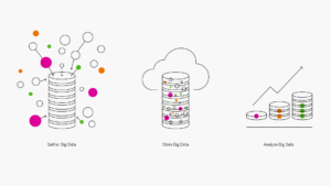
  1. Collecter le Big Data.Une grande partie du Big Data est constituée d’énormes ensembles de données non structurées qui émanent de sources disparates et incohérentes. Les bases de données traditionnelles sur disque et les mécanismes d’intégration des données ne sont pas suffisamment performants pour les gérer. La gestion du Big Data requiert des solutions de base de données in-memory et des solutions logicielles spécifiques de l’acquisition de ce type de données.
  2. Stocker le Big Data.Comme son nom l’indique, le Big Data est volumineux. De nombreuses entreprises utilisent des solutions de stockage sur site pour leurs données existantes et espèrent réaliser des économies en réutilisant ces référentiels pour traiter le Big Data. Toutefois, le Big Data est plus performant lorsqu’il n’est pas soumis à des contraintes de taille et de mémoire. Les entreprises qui n’intègrent pas dès le départ des solutions de stockage Cloud dans leurs modèles de Big Data le regrettent souvent quelques mois plus tard.
  3. Analyser le Big Data. Il est impossible d’exploiter pleinement le potentiel du Big Data sans utiliser les technologies d’IA et de machine learning pour l’analyser. L’un des cinq V du Big Data est la « vitesse ». Pour être utiles et exploitables, les informations du Big Data doivent être générées rapidement. Les processus d’analyse doivent s’auto-optimiser et tirer régulièrement profit de l’expérience, un objectif qui ne peut être atteint qu’avec l’IA et les technologies modernes de bases de données.

Applications du Big Data

La visibilité offerte par le Big Data est bénéfique à la plupart des entreprises ou secteurs d’activité. Cependant, ce sont les grandes entreprises aux missions opérationnelles complexes qui en tirent souvent le meilleur parti.

Finance

Dans le Journal of Big Data, une étude de 2020 souligne que le Big Data « joue un rôle important dans l’évolution du secteur des services financiers, en particulier dans le commerce et les investissements, la réforme fiscale, la détection et les enquêtes en matière de fraude, l’analyse des risques et l’automatisation ». Le Big Data a également contribué à transformer le secteur financier en analysant les données et les commentaires des clients pour obtenir les informations nécessaires à l’amélioration de la satisfaction et de l’expérience client. Les ensembles de données altérables figurent parmi les plus importants et les plus évolutifs au monde. L’adoption croissante de solutions avancées de gestion du Big Data permettra aux banques et aux établissements financiers de protéger ces données et de les utiliser d’une manière qui bénéficie à la fois au client et à l’entreprise.

Hygiène et santé
publique

L’analyse du Big Data permet aux professionnels de santé d’établir des diagnostics plus précis, fondés sur des données avérées. De plus, le Big Data aide les administrateurs d’hôpitaux à identifier les tendances, à gérer les risques et à limiter les dépenses inutiles, afin de consacrer le maximum de fonds aux soins des patients et à la recherche. En cette période de pandémie, les chercheurs du monde entier s’efforcent de traiter et de gérer au mieux la COVID-19, et le Big Data joue un rôle fondamental dans ce processus. Un article de juillet 2020 paru dans The Scientist explique comment des équipes médicales ont pu collaborer et analyser le Big Data afin de lutter contre le coronavirus : « Nous pourrions transformer la science clinique en exploitant les outils et les ressources du Big Data et de la science des données d’une manière que nous pensions impossible ».

Transport et logistique

L’« effet Amazon » est un terme qui définit la manière dont Amazon a fait de la livraison en un jour la nouvelle norme, les clients exigeant désormais la même vitesse d’expédition pour tout ce qu’ils commandent en ligne. Le magazine Entrepreneur souligne qu’en raison de l’effet Amazon, « la course logistique au dernier kilomètre ne fera que s’intensifier ». Les entreprises du secteur s’appuient de plus en plus sur l’analyse du Big Data pour optimiser la planification des itinéraires, la consolidation des charges et les mesures d’efficacité énergétique.

Éducation

Depuis l’apparition de la pandémie, les établissements d’enseignement du monde entier ont dû réinventer leurs programmes d’études et leurs méthodes d’enseignement afin de faciliter l’apprentissage à distance. L’un des principaux défis a été de trouver des moyens fiables d’analyser et d’évaluer la performance des étudiants et l’efficacité globale des méthodes d’enseignement en ligne. Un article paru en 2020 au sujet de l’impact du Big Data sur la formation et l’apprentissage en ligne indique, au sujet des enseignants, que « le Big Data les aide à gagner en confiance pour personnaliser l’enseignement, développer l’apprentissage mixte, transformer les systèmes d’évaluation et promouvoir l’apprentissage continu ».

Énergie et services publics

Selon le U.S. Bureau of Labor Statistics, le service public consacre plus de 1,4 milliard de dollars aux relevés de compteurs et s’appuie généralement sur des compteurs analogiques et des lectures manuelles peu fréquentes. Les relevés de compteurs intelligents fournissent des données numériques plusieurs fois par jour et, grâce à l’analyse du Big Data, ces informations permettent d’accroître l’efficacité de la consommation énergétique, ainsi que la précision des prix et des prévisions. En outre, lorsque les agents n’ont plus à se charger des relevés de compteurs, la saisie et l’analyse des données peuvent permettre de les réaffecter plus rapidement là où les réparations et les mises à niveau sont les plus urgentes.

Publié en anglais sur insights.sap.com

The post Qu’est-ce que le Big Data ? appeared first on SAP France News.
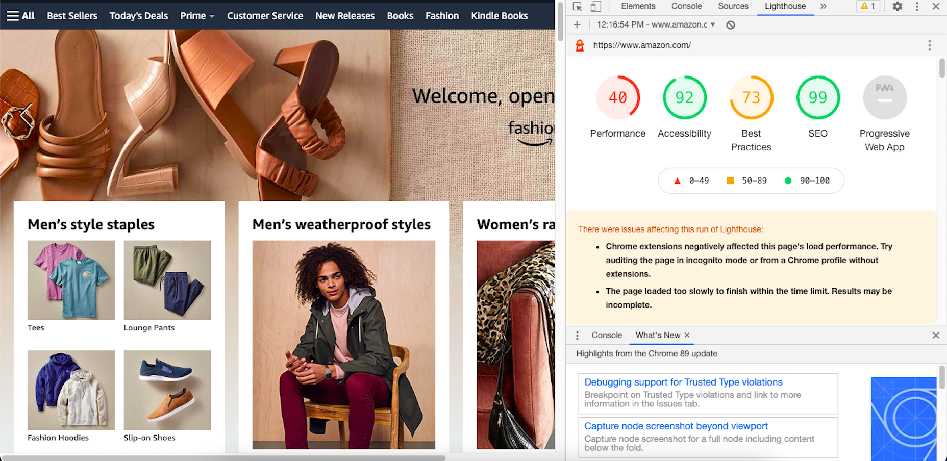
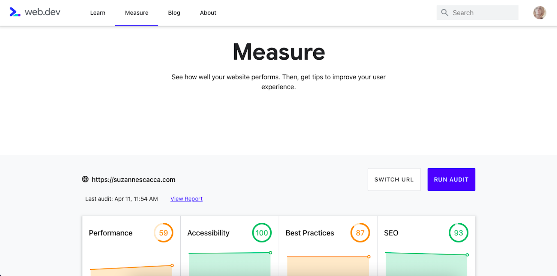
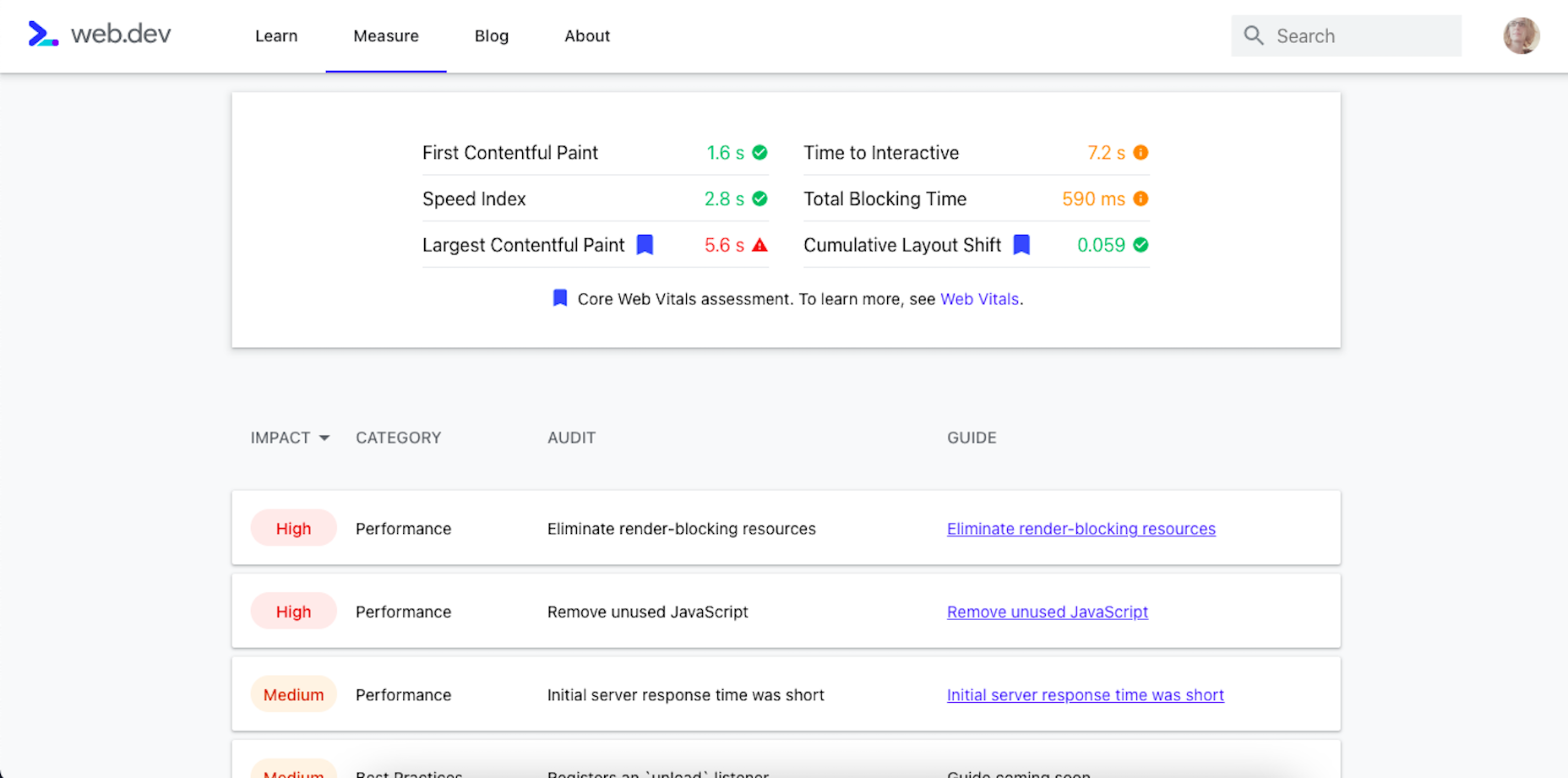
Source de l’article sur sap.com

As a web designer, you face plenty of challenges, both good and bad. One of the bad ones is to suddenly find out that you’re either in danger of missing a client’s deadline or will be unable to meet it at all.

A missed deadline could be due to something beyond your control and no fault of your own. There are measures you can take to avoid what you do have control over. Such as not having the right design tool or design resources to do a task that has to be done.

An ounce of prevention can definitely be worth a pound of cure in this case. Before starting a project, make sure the tool or tools you will be using will be up to the task.

The 15 design tools presented here are the tops in their respective categories. You should be better able to handle whatever is thrown at you.

1. Be Theme

Its more than 200,000 sales to date have certainly established the BeTheme multipurpose WordPress theme as an all-time favorite among web designers.

In truth, “multipurpose” doesn’t do BeTheme justice. Users might argue that “all-purpose” would be a more accurate description.

Be’s 40+ core features give web designers plenty to work with in terms of page-building tools, design aids, design options, and special effects.

Most notably:

  • The Muffin Builder, which when used with other core features, makes building a website quick, easy, and coding-free;
  • The Admin Panel/Shortcode Generator combo gives all the flexibility designers need;
  • BeTheme’s 600+ customizable pre-built websites could well be the star of the show. They cover 30 business sectors and all the popular website types, they are customizable, responsive, and feature cool UX features, and they can get any project off to a rapid start.

Click on the banner to learn more about Be’s other core features.

2. Timezy Booking Software

Timezy will help you create a booking environment that works best for your business by allowing clients and customers to book your services as easily as possible. You can then integrate Timezy into your website to streamline and speed up your booking operation.

  • Clients and customers can book appointments online 24/7;
  • They can receive real-time email notifications and reminders;
  • Timezy can be integrated with Zoom;
  • You can reorder steps on the booking form to fit your needs;
  • Timezy can be used to manage employee assignments and schedules, vacations, and special days.

If you lack a website of your own, Timezy will provide you with a modern web page you can customize to fit your brand for clients to book appointments at any time.

3. wpDataTables

wpDataTables is the top-selling and most powerful WordPress table and chart-building plugin on the market. There are other good ones, but their table and chart-building capabilities quickly become inadequate as you go down the list of what wpDataTables can do that most others cannot.

wpDataTables key features and capabilities:

  • The ability to create interactive and responsive tables and charts;
  • The ability to create frontend editable and easily maintainable tables and charts;
  • The ability to rapidly process massive amounts of data that come in various formats and from various sources;
  • The ability to build tables and charts using real-time data.

You can also brighten up or improve a table or chart’s readability by highlighting or color-coding key information.

Click on the banner to find out more about what this plugin can do for you.

4. LayerSlider

LayerSlider is not for sliders only. This multipurpose WordPress tool can also be used to create eye-catching animations and engaging content.

  • Add a little spice to a stale website;
  • Create popups with stunning effects to interact better with visitors;
  • Avoid coding, since LayerSlider is drag and drop.

This popular design tool has been assisting web designers for nearly a decade and serves millions of active monthly users.

5. Amelia Booking Plugin

Amelia is a user-friendly WordPress booking plugin you can use to manage your appointments and events on a single platform.

  • Clients can instantly book, change, or cancel appointments online 24/7;
  • Employees and customers can manage meetings, appointments, and events from their own dashboards;
  • Amelia can be integrated with Zoom to conduct training or consultation sessions;
  • Amelia can also create packages of services with discounts and validity periods.

Amelia can service multiple business locations.

6. Uncode – Creative Multiuse & WooCommerce WordPress Theme

With its more than 80.000 sales to date, Uncode has become one of ThemeForest’s all-time best sellers.

  • You can create custom layouts and designs with Uncode’s Dynamic Content feature and use them as templates for category pages;
  • Uncode features the WooCommerce Product Builder, custom Checkout, Cart, My Account, Quick-View, etc.

Uncode has a comprehensive library of tutorial videos and a showcase of user-created websites that is well worth visiting.

7. Total WordPress Theme

Created with perfection in mind, Total is nonetheless an extremely user-friendly WordPress theme.

  • This drag and drop website building tool’s extreme flexibility allows users to create any type or style of website;
  • The WPBakery page builder is accompanied by an assortment of custom modules;
  • Total is RTL and Translation-ready and easily integrates with WooCommerce;
  • Total is developer-friendly.

Click on the banner to learn more.

8. Dr. Link Check

Dr. Link Check saves you the inconvenience of having to periodically conduct a manual search of your site for broken links.

Dr. Link Check inspects for:

  • Broken links and improper URL formatting;
  • Blacklisted malicious content links;
  • Websites that do not contain any valuable content, including ad-only sites.

Dr. Link Check publishes downloadable daily, weekly, or monthly reports.

9. Mobirise Website Builder

Mobirise is not only a top tool for creating fast, responsive, user-friendly websites. It also has the advantages of being offline. Mobirise is also free.

Factors that contribute to Mobirise’s excellent performance include:

  • Google Amp and Bootstrap 4 frameworks;
  • Professionally-crafted website templates, popups, sliders, and eCommerce features;
  • Mobirise is all drag and drop.

Click on the banner to download your very own copy.

10. 8b Website Builder

When a website builder is fast, free, responsive, user friendly, and Google-friendly as well, it is certainly worthy of consideration.

The 8b website builder:

  • Allows you to create websites at home or on the go on any device;
  • Features templates and website sections designed to get projects off to a rapid start;
  • It gives your site a Google ranking with a couple of clicks;
  • It can be hosted wherever you want.

Download your copy now.

11. WHATFONTIS

WhatFontIs, with its database of more than 700K commercial and free fonts and font-finding AI functionality enables you to identify fonts from images you upload.

This top-of-the-line font-finding tool:

  • Identifies an uploaded font 90% of the time;
  • Gives answers in seconds;
  • Identifies cursive fonts (the letters in the image must be separated);
  • Displays 60+ similar fonts for each uploaded image.

12. Litho – The Multipurpose HTML5 Template

Litho is a responsive multipurpose Bootstrap 4 HTML5 template that gives startups, design agencies, and other businesses an ideal website-building starting point.

Litho’s features include:

  • Cool selections of ready-made home pages, inner pages, and template blocks;
  • Page styles for portfolio, shop, and blogging sites;
  • Sliders, banners, forms, and other creative design elements.

Litho offers 5-star professional support.

13. XStore – The Most Customizable WooCommerce Theme Ever

XStore may be the best tool anyone could have at their fingertips when looking for a fast and easy way to create a high-performance eCommerce website –  for only $39.

XStore’s key features include:

  • 100+ customizable ready-to-go shops;
  • $500+ worth of premium WordPress plugins;
  • A Single Product builder and a Header builder.

14. Goodiewebsite

GOODIE’s web development platform assists clients who are eager to get a professionally-coded website quickly up and running.

GOODIE’s services focus on:

  • Web designers seeking a development partner;
  • Startups looking for ways to test their ideas and concepts;
  • Small businesses seeking an online presence or improvement of an existing one.

GOODIE’s specialties include 1-10 page, WordPress, and eCommerce websites.

15. Heroic Inbox

There are several excellent reasons for letting Heroic Inbox manage your business’s departmental email inboxes.

They include:

  • Encouraging efficient staff collaboration on email assignments and responses;
  • Helping staff members accomplish and maintain Inbox Zero status;
  • Tracking key team performance metrics.

Two key Heroic Inbox features are its smart workflows and a fast and friendly UI.

Every web designer owns a toolbox of tips and tricks they use in their website building projects. Even when a toolbox is superbly stocked, it is always challenging to keep it up to date. Doing so requires maintaining a knowledge of the latest and greatest web design resources and tools—some of which you may need to meet ever-changing industry demands.

This article features the top tools & resources for designers and agencies for 2021. Choosing one or more of them could not only help you stay on top of your game but could even make your day.

Source

The post 15 Useful Tools & Resources Worth Checking Out first appeared on Webdesigner Depot.


Source de l’article sur Webdesignerdepot

It’s Friday, and we wanted to have a little fun with a design test that might make you go cross-eyed.

Here are ten images, each with a dot in the middle of another shape — a square, a circle, or maybe something trickier. Can you tell with a glance if the dot is in the exact center of the shape? See how many you can get right; pathetically easy or fiendishly difficult? You decide!

Source

The post Quiz: Can You Spot The Center Of These Shapes? first appeared on Webdesigner Depot.


Source de l’article sur Webdesignerdepot

So, really, you’re in the business of designing websites for your clients’ audiences.

But how do you ensure you get it right? You could take what your client tells you at face value, but that’s only going to scrape the surface of who their audience is.

What you need to do is figure out how consumers think and why they respond to websites the way they do. A lot of this is already explained to us by psychology principles.

Once you memorize them, you’ll be able to design user journeys that get visitors to respond exactly as you and your client want them to.

15 Psychology Principles to Use in Web Design

We as humans think certain ways, and your design should cater to those underlying thought processes and natural responses.

Below are 15 psychology principles that’ll help you design better, more intuitive digital experiences for your end-users:

1. Aesthetics-Usability Effect

The Aesthetics-Usability Effect suggests that people equate more attractive interfaces with more usable ones. In other words, a good, modern, responsive design should always be your starting point.

2. Color Psychology

Color psychology tells us about color’s influence over how something is perceived. With color so strongly tied to emotion, you can do a lot to affect how visitors perceive a website and the brand behind it.

3. Psychology of Shapes

Just as a color has the ability to affect someone’s perception of a brand or the content they’re looking at, so too do individual shapes used within an interface. Each shape — circles, squares, triangles, hexagons, and polygons — has a unique psychological association.

4. Gestalt Principles

Gestalt Principles are a way for humans to make sense of chaotic data presented to them. So, rather than see a bunch of text, images, and space, the human brain recognizes patterns to simplify complexity.

About half a dozen principles are associated with this theory, and they’re related to factors like symmetry, similarity, and proximity.

5. Mere-Exposure Effect / Jakob’s Law

The Mere-Exposure Effect, or Familiarity Principle, suggests that people are more likely to prefer things that seem familiar.

Jakob’s Law applies this psychology specifically to the internet user experience. It suggests that users expect your website to work the same way as the other sites they spend their time on.

6. Von Restorff Effect

The Von Restorff Effect, or Isolation Effect, describes what happens when someone is exposed to identical stimuli, and then a unique element is introduced to the fold. It’s the outlier that will most effectively grab their attention.

7. Selective Disregard

Selective disregard is a type of “blindness” users develop to anything seemingly irrelevant to their main goal. This often occurs when a design or marketing trend grows stale — like websites that use the exact same cookie consent banner.

8. Hick’s Law

Hick’s Law states that the number of choices a person has to make will increase the amount of time it takes to make a decision.

This is a fundamental principle to pay attention to on ecommerce sites as you want to speed up the decision-making process, not slow it down.

9. Loss Aversion

Loss Aversion states that decision-making is more commonly driven by avoiding losses than acquiring gains.

If your website or the content within it gives visitors any reason not to trust it or feel confident in taking action, you’re more likely to see high abandonment rates than conversions.

10. Paradox of Choice

The Paradox of Choice is a response to the problem posited by Hick’s Law. It suggests that the reduction of choices makes consumers feel less anxious, which, in turn, increases confidence and satisfaction with purchases.

If your site suffers from high cart abandonment or product returns, the paradox of choice would be a useful principle to leverage.

11. Miller’s Law

Miller’s Law, also referred to as Cognitive Load Theory, has to do with memory capacity. On average, people can only have about seven items stored in their working memory at any given time.

This psychology principle encourages the reduction of options and the general reduction of content to improve focus and decision-making capabilities.

12. Feedback

Feedback is one of the principles of learning and plays a big part in interaction design.

Feedback is what designers use to tell people when they’ve made progress towards a goal or achieved it. You can also use it to teach visitors how a website will respond to their actions, which encourages faster and more confident engagements with your website.

13. Extrinsic Motivation

There are two types of motivation. Intrinsic motivation is an internal one, whereas extrinsic is external.

It’s Extrinsic Motivation that plays a role in getting users to complete more tasks online. As a designer, you have to make sure these kinds of “rewards” are obvious.

14. Social Proof

Not so much a psychological principle as it is a psychological phenomenon, Social Proof or Influence, suggests that people will copy the actions of the masses. It also refers to the assumption that the truth lies with the majority.

This is why customer reviews, client testimonials, and user-generated content have become so useful on websites.

15. Peak-End Rule

The Peak-End Rule states that people will judge an experience based on their very first and last impressions of it. This is somewhat related to the Serial Position Effect, whereby people will remember the first and last items in a group.

So, this is something to remember when you build out the top and bottom of each page as well as the start and expected end to the user journey.

Wrap-Up

Want to build better websites? Then, you need to design from the end users’ perspective.

The best place to start is with psychology principles, as they’ll tell you how most consumers think and what motivates them to respond. If you understand this inherent cause-and-effect relationship, you can design websites that elicit the right kind of response from your visitors.

Source

The post 15 Psychology Principles Every Designer Should Know first appeared on Webdesigner Depot.


Source de l’article sur Webdesignerdepot

Looking for something new to get you excited about design work? This list is packed with all kinds of goodies to help you feel inspired and ready to work.

Here’s what new for designers this month.

Top Picks for March

Same Energy

Same Energy, in beta, is a visual search engine. You can search with a minimum number of words or an image. The website is designed to help you find art, photography, decoration ideas, and practically anything. It uses deep learning and algorithms to create images on the home page, and you can create feeds in the same manner. The coolest part of this tool is that it tries to match the visual and artistic style you ask for with image mood and objects.

SVG Repo

SVG Repo is a collection of more than 300,000 SVG vectors and icons that you can download and use in projects for free (even commercial use). The site has a powerful search tool to help you find the right image, and the platform is designed so that you can contribute.

Penpot

Penpot is an open-source design and prototyping platform for cross-domain teams. It is a web-based tool that isn’t dependent on any operating system and works with open web standards. It’s designed to be zippy and interactive so your team can work fast.

Directual

Directual is a no-code platform for building scalable apps using a visual interface. (Perfect for designers with less development experience.) It includes integrations with other popular tools and is free to use while figuring out how the app works and how you can make it fit your business goals.

HTML Boilerplates

HTML Boilerplates helps you start web projects by generating a custom HTML boilerplate that you can download. Just choose the elements you want to include and then copy and paste the code into your editor.

6 Productivity Boosters

Rows

Rows is a spreadsheet tool with built-in web integrations that’s made for team collaboration. It works with other tools you already use, such as Google Analytics, Twitter, LinkedIn, Mailchimp, and so many others. Without scripts, you can use it to automate workflows, analyze data, share dashboards, and build forms and tools that make work simpler.

Form.Taxi

Form.taxi is a premium web-based form tool. You can create web forms without code or programming and connect them to your website. The tool then stores information, filters for spam, and notifies you of form submissions.

Verbz

Verbz is a voice productivity app that allows you to create notes, assign tasks, make announcements, run standups, or chat. Talk or type, listen or read. It works as your own voice assistant for teams. It’s available in Beta from the App Store, and there’s a waitlist for Android users.

Flameshot

Flameshot is a tool for grabbing screenshots. It has a customizable appearance, is easy to use, and lets you draw and edit screenshots as you work.

Kitemaker

Kitemaker is a collaboration tool for development processes. It can help you keep track of everything from tools such as Slack, Discord, Figma, and Github in one place. It helps you structure projects and keep discussions about work moving forward in one place.

This Code Works

This Code Works is a place to save code snippets that work for when you need them again. You can group and organize snippets and share with others. You might think of it as the “Pinterest of code.”

3 Icons and User Interface Elements

Sensa Emoji

Sensa Emoji is a collection of common emoji icons that you can use in your materials. Every element is fully vector and free to use.

Google Fonts Icons

Google Fonts now supports icons, starting with Material Icons. Choose between outlined, filled, rounded, sharp, or two-tone options in the open-source library.

Toolbox Neumorphism Generator

Toolbox Neumorphism Generator is a design tool that helps developers to generate CSS in the soft UI /neomorphism style for the elements with real-time output.

3 Tutorials and Demos

An Interactive Guide to CSS Transitions

An Interactive Guide to CSS Transitions explains everything you need to know about this great animation tool for website designers. This tutorial digs in with code and examples to help you create more polished animations and is designed for anyone from beginners to experienced designers with some pro tips throughout.

About Us Pop-Out Effect

The About Us Pop-Out Effect adds a special element to any team or contact page with a nifty pop animation. Each person seems to lift out of the circle frame in this pen by Mikael Ainalem.

Interactive Particles Text Create with Three.js

Interactive Particles Text Create with Three.js is a web element you could play with all day. Text shifts into particles and follows mouse movement in a fluid motion in the pen by Ricardo Sanprieto.

10 Fresh Fonts and Text Tools

Bitmap Fonts

Bitmap Fonts is a collection of various bitmap typefaces all pulled and stored in a single location. This is the perfect solution if you are looking for a bitmap option.

Uniwidth Typefaces

Uniwidth Typefaces for Interface Design is another collection of fonts for a specific purpose – here universal widths for interface design. Uniwidth fonts are proportionally-spaced typefaces where every character occupies the same space across different cuts or weights. This is both a tutorial on the type style as well as font collection.

Bubble Lemon

Bubble Lemon is a typeface for projects with a childlike feel. With an outline and regular style, the thick bubble letters look like some of the sketches you may have done in grade school.

Core Font

Core Font is an open-source project with a funky and modern style. It has a full upper- and lower-case character set, numerals, and a few punctuation marks.

GHEA Aram

GHEA Aram is a superfamily with a Central European flair, according to the type designer. The premium typeface includes everything from light to black italic and even some Armenian ligatures.

Make Wonderful Moments Duo

Make Wonderful Moments Duo is a script and sans serif font pair with a lighthearted feel and highly readable character set. The regular (sans serif) only has uppercase characters.

Ribheud

Ribheud is a slab-style display font with a heavy look and strong presence. What makes it interesting is the left-outline/shadow on each character.

Rose Knight

Rose Knight has an old-style feel that can take on multiple moods, depending on supporting design elements. All of the characters are uppercase with alternates. It could make a fun branding option.

The Glester

The Glester is a beautiful premium typeface in a calligraphic style. The most interesting element of this typeface is all of the extra decorations that allow you to change individual characters (380 glyph alternates).

Velatus

Velatus is a vintage-style typeface with plenty of swashes and flourishes that make it unique. It comes with 157 characters and 96 glyphs.

Source

The post 27 Exciting New Tools For Designers, March 2021 first appeared on Webdesigner Depot.


Source de l’article sur Webdesignerdepot

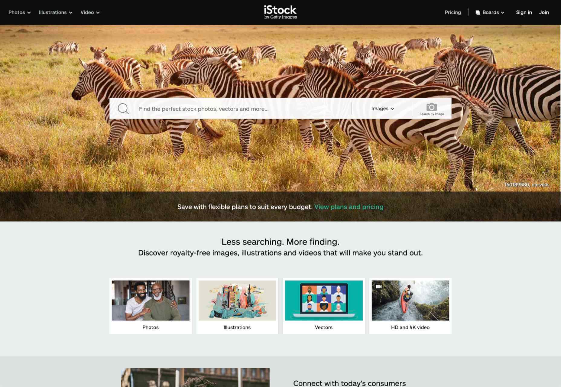
Stock images are an essential tool for anyone working with clients who can’t afford to hire a photographer for a bespoke shoot, and with the cost of photography shoots running into thousands of dollars, that’s most clients.

Last month we looked at the 10 Best Free Stock Image Sites for 2021, and this month we’re focusing on the premium end of the market.

Paying for stock doesn’t guarantee that you’re getting a higher quality product than the free alternative, but the higher quality product is rarely free.

Ultimately, the right image is the right image, regardless of price. These are the best places to start your search in 2021.

1. Stocksy

Stocksy is a tremendous site with a slight edge to its imagery. There’s a certain cool vibe to the images featured on Stocksy. If you’re looking for a stock image that doesn’t look like a stock image, this is a great place to begin. Its prices range from around $15 for a small web image to $1000s for the image’s exclusive use.

2. EyeEm

EyeEm is a great source of editorial-style images. It has some excellent categories that are geared towards finding images instead of categorizing the collection. Pricing starts at $35 per image, with discounts for image packs. EyeEm has recently introduced the option to book a photoshoot — for clients ready to pay for custom images.

3. Getty Images

It’s impossible to make a list of stock image sites without including Getty Images. The stock behemoth not only has one of the largest collections of stock images but owns several subsidiaries. Loved by news media for its comprehensive coverage, if you’re looking for a particular stock image, try Getty. Getty’s a mid-price supplier with prices for small images starting at around $75.

4. Death to Stock

Death to Stock is all about leveraging the stock industry to fund photographers. These are photographs that photography professionals admire; there’s no filler whatsoever. Subscriptions for creative professionals start from $33/month. There are 100+ new images added to the collection monthly, meaning it’s still small, but if you want something truly authentic, consider Death to Stock.

5. Cavan Images

Cavan’s focus is on building a broad range of photographers, which has produced an outstanding set of diverse images. The curated collections, which are more editorial than commercial, are powerful. Cavan also offers a great support service in case you need help tracking down a particular image. Prices vary but start from $50.

6. Offset & Shutterstock

Shutterstock is one of the best-known stock collections on the web, with over 300 million images. Offset is a subsidiary of the much larger Shutterstock; it’s a high-end version of Shutterstock, with slightly elevated prices to reflect the higher quality. Shutterstock prices start around $2.50/image, Offset’s start around $300; that’s the price you pay for having someone pre-vet your options.

7. Westend61

Westend61 has a smaller collection, but its images are all consistently high quality. Westend61 is particularly useful for designing banner images because the images are very commercial, with authentic-looking people and lots of eye contact. Prices per image start at approximately $25.

8. iStock

iStock was originally independent but was bought by Getty. iStock offers both credit, and subscription options starting around $2.50/image. Although you won’t find everything you’ll find on the larger Getty site, it’s worth checking to see if the image you want is here.

Source

The post 8 Best Premium Stock Image Sites for 2021 first appeared on Webdesigner Depot.


Source de l’article sur Webdesignerdepot

March is that time of year where the feeling of newness starts, from the first Spring days to fresh design projects. These trends are no exception, with fun new takes on some classic concepts.

Circles are always popular, but the top trend is an animated take on the traditional element; plus, fun pink and purple color palettes and a few faux split screen designs round out trending styles.

Here’s what’s trending in design this month.

Circle Animations

Circles are one of those shapes that never leave the design sphere. They have a lot of classical meaning and are flexible in terms of design options.

Designers are having a lot of fun with this shape right now. From animations to text circles to image frames, they seem to be all over the place.

More recently trending is more circle-shaped animations. This trend maintains a circle’s properties as a unified and harmonious element with movement to create more engagement and make you look at the design just a little bit more.

Each of these examples uses circles in a different but equally interesting – and animated – way.

Universal Favourite uses a circular blob. It’s almost like a giant bubble. It wiggles and flows, and stretches within the space without any help from the user. It has a smoothly quality that makes you want to stare at it. The color here helps, with the circle and background not having an immense amount of contrast. Also, note the cute little circle button in the bottom corner.

Kenta Toshikura put most of the subtle animation for this design inside the circle. With a hover state, the entire circle moves on the screen with a second layer of animation, and the cursor is also a circle that hops around the black background.

Kffein takes a totally different approach with a circle made from the primary test elements. Identifying website information rotates in a circle around another geo shape on the main plane. Not only is there a circular animation, but an almost three-dimensional effect that happens due to the way elements are layered here.


Pink and Purple Palettes

The prevalent pink and purple color combination isn’t for everyone – although you wouldn’t know it from the number of designs using similar colors.

This bright combination almost screams “spring” and has a lightness to it that almost seems to lift the mood of any project. (Maybe color selection is a reflection of how we all want to feel.)

What’s nice about these colors is that they flow into one another nicely. They can also be expanded to fall into neighboring hues on the color wheel, such as red from pink and blue from purple.

Maybe the most popular use of this color pair is as a gradient. You can find pink to purple everywhere, from background gradients to image overlays to buttons and user interface elements. There’s no lack of use here.

Each of these examples shows opportunities with this color combination.

SMU uses bright pink, blue, and purple to create a giant “road sign” in the design that jumps out from the rest of the project. The sign almost seems out of place and doesn’t fit as part of the normal color palette. This is what draw you right to it.

USA Volleyball uses the popular gradient option and extends the pink to the purple palette to hints of blue and red. What’s great about this design is that it uses a super trend element and color option and makes it work with their current color palette. You can almost imagine the design conversation when someone wanted to use a pink to purple gradient for a brand that features red, white, and blue. The gamble paid off, and it works beautifully without being off-brand.

Blobmixer uses purple, pink, and a few other bright colors – note the animated circles, too – to draw users into the design. The entire project is a fun, customizable experience that you can play with, and the color choices are what make you interested enough to try. This design also offers a great example of tactile animation and elements that feel real even when you interact with them using a mouse on the screen.


Faux Split Screens

Split-screen designs were a huge trend for about two years. The aesthetic was also functional for content that required a this or that choice on the part of users.

Now, we see the design elements but without the function. (Maybe because it just looks nice and creates a sense of balance without a symmetrical design.)

These projects look like they might offer multiple gateways to content, but there is only one call to action on the dual-screen aside from navigation elements.

What this design option does is help draw the eyes across the screen. One side will immediately appeal to you, and when done well, you’ll feel a subtle push of pull from the color, text, and images to look at the other side as well.

Renaissance TV does it with heavy animation with “dancing dots” from an old TV that doesn’t work. But then you need to look at the green text to understand what is happening.

Yacht uses text weight and space to push the eyes across the screen. Almost everyone will go to the heavier areas first and then gaze across the screen through blocks of space to the final small text on the right side. And it all happens in a fraction of seconds.

Bonjour Paris pairs bold color with black and white images. You may look at either side first, depending on personal preference, but the other half of the screen is necessary for a complete understanding of the website.


Conclusion

While all of these design trends are evident in new and recent projects, the use of pink and purple color palettes – particularly with a gradient – seems to be everywhere you look. These color choices are popular and come in a lot of forms.

Maybe the most obvious is with brighter pink and purple gradients, but other variations are also trending. It’s definitely one to watch in the longer term.

Source

The post 3 Essential Design Trends, March 2021 first appeared on Webdesigner Depot.


Source de l’article sur Webdesignerdepot

Everyday design fans submit incredible industry stories to our sister-site, Webdesigner News. Our colleagues sift through it, selecting the very best stories from the design, UX, tech, and development worlds and posting them live on the site.

The best way to keep up with the most important stories for web professionals is to subscribe to Webdesigner News or check out the site regularly. However, in case you missed a day this week, here’s a handy compilation of the top curated stories from the last seven days. Enjoy!

The New Trello – Going Beyond the Board

Flameshot – Superb Screenshot Tool

GitHub Surf – Open repositories in a VSCode Environment

The Never-Ending Job of Selling Design Systems

The Secret Ingredients to Design

What Saul Bass Can Teach Us About Web Design

2021 Planner for Notion – A Smart Notion Workspace

Ideas for CSS Button Hover Animations

Ray.so – Create Beautiful Images of Your Code

Variable Font Reveals The Full Horror of The Climate Crisis

Design Systems For Figma: Year In The Life Of A Material Design Advocate

Interface Market – An Extensive Collection of App UI Kits

DogeHouse – Open-Source Audio Chat on the Web

Interaction Design is More Than Just User Flows and Clicks

Design Trends 2021

Straw.Page – Extremely Simple Website Builder

The Impact of Web Design and SEO Conversion Rates

Powerful Microinteractions to Improve Your Prototypes

What’s New in Ecommerce, February 2021

Colortopia – The Easiest Way to Find Colors

5 Simple Design Patterns to Improve Your Website

TextBuddy for macOS – A Swiss Army Knife for Plain Text

Upcoming Interesting JavaScript ES2021 (ES12) Features

WordPress 5.7: Big ol’ jQuery Update

JavaScript reducer – A Simple, Yet Powerful Array Method

Source

The post Popular Design News of the Week: February 15, 2021 – February 21, 2021 first appeared on Webdesigner Depot.


Source de l’article sur Webdesignerdepot