Articles

Everyday design fans submit incredible industry stories to our sister-site, Webdesigner News. Our colleagues sift through it, selecting the very best stories from the design, UX, tech, and development worlds and posting them live on the site.

The best way to keep up with the most important stories for web professionals is to subscribe to Webdesigner News or check out the site regularly. However, in case you missed a day this week, here’s a handy compilation of the top curated stories from the last seven days. Enjoy!

The Application of Augmented Reality in Web Design

15 Funny Web Design Memes Only Web Designers Will Get

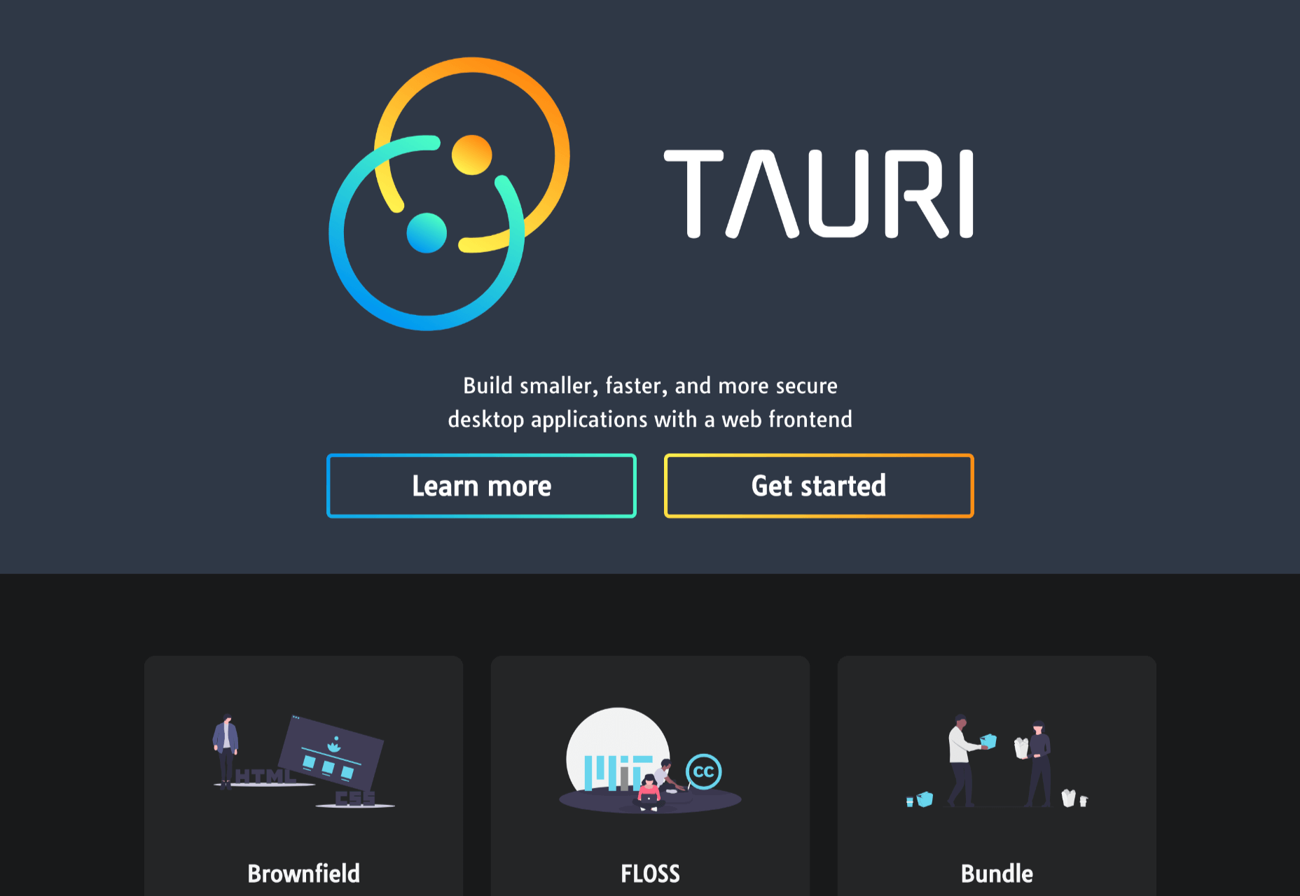
Tauri: Build Desktop Applications with a Web Frontend

20 Best New Websites, February 2021

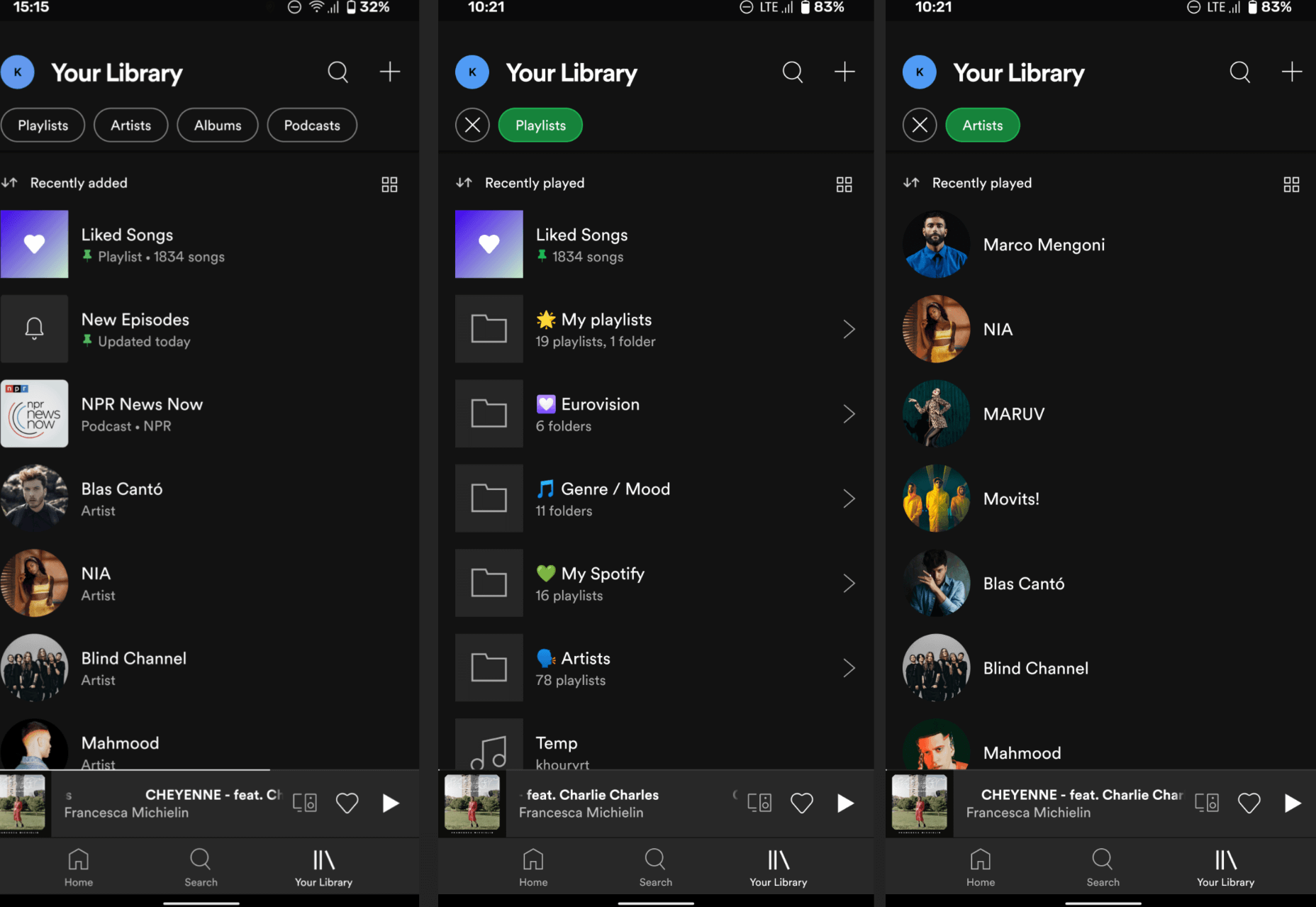
Spotify is Testing a Redesigned (and Much-Improved) Library UI

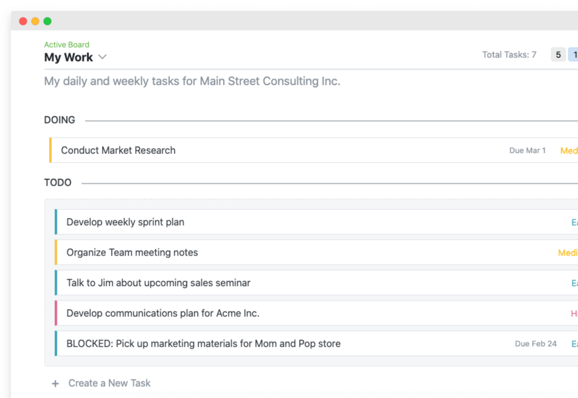
Boardly – A Minimalistic Planning Board for Your Projects

A Big List of Must-Bookmark Sites for Digital Designers

10+ HTML CSS Marquee Examples

7 JavaScript ES2020 Features You Should Try

16 Office Pranks For When Life Goes Back To Normal

What Is the Best Ecommerce Platform?

Choosing New Tools and Technology for Your Web Projects

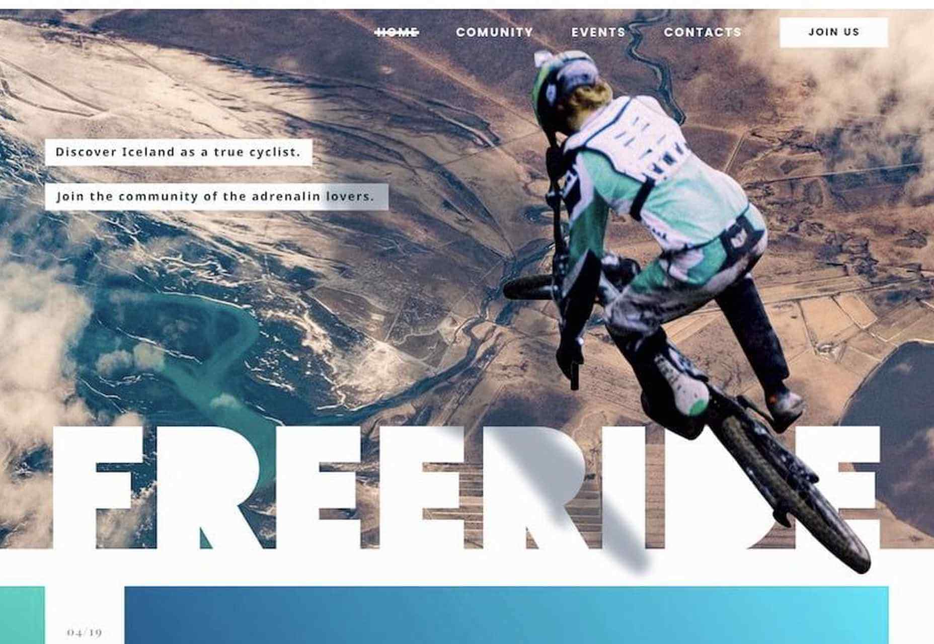
Getting Deep into Shadows

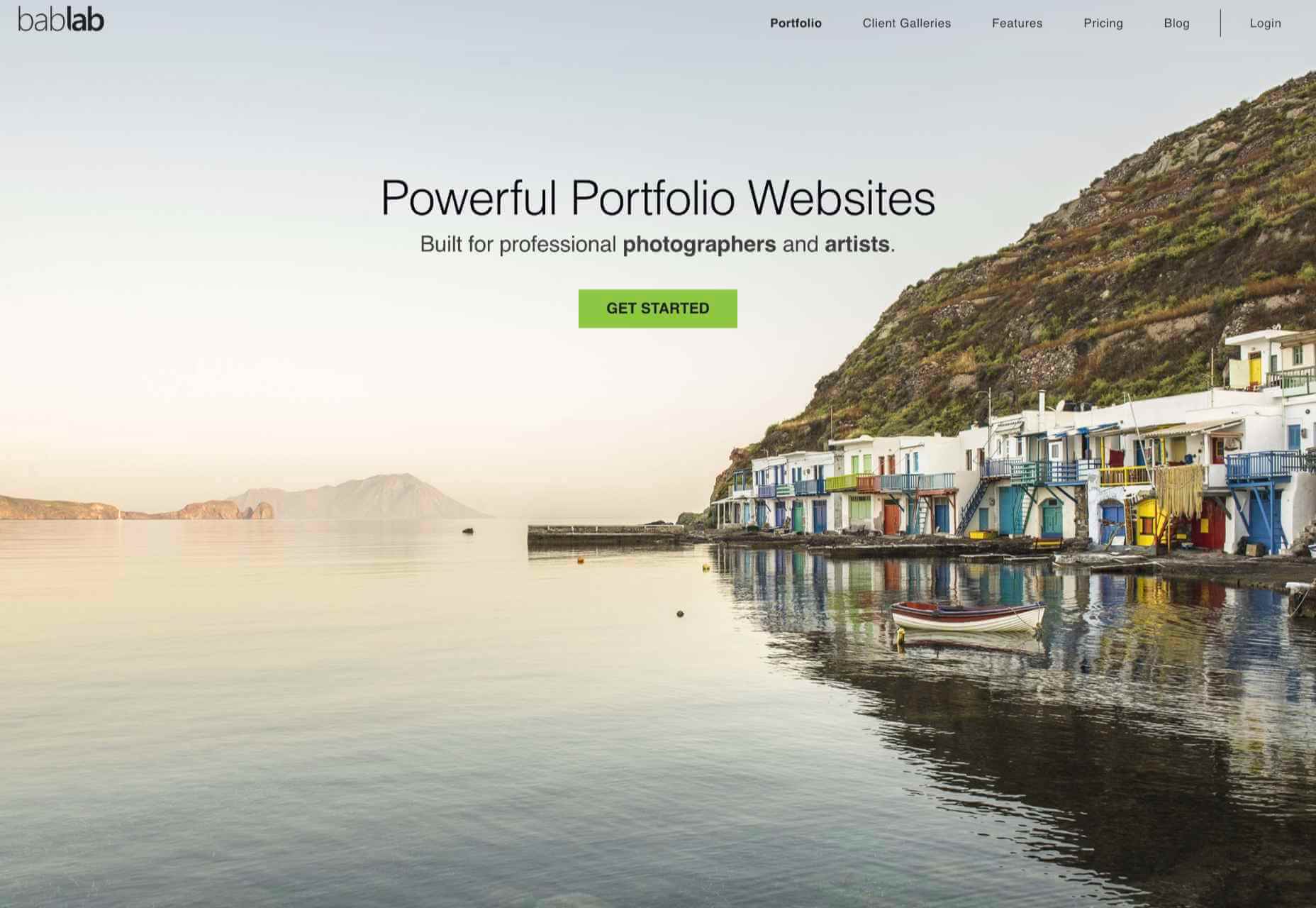
Bablab – Portfolio Websites for Photographers and Artists

7 Essential WordPress Plugins for a New Client’s Website

Source

The post Popular Design News of the Week: February 22, 2021 – February 28, 2021 first appeared on Webdesigner Depot.


Source de l’article sur Webdesignerdepot

It’s February, and the spring sun is finally starting to peep through the winter clouds. While many of us are still largely restricted to our homes, the web has kept on growing.

We see a shift in attitude towards natural health, wellbeing, and sustainability, and these are now being branded less often as outliers and increasingly mainstream. We’re also seeing more and more color all the time, ranging from an emotional signifier in the background to being a functional element in its own right.

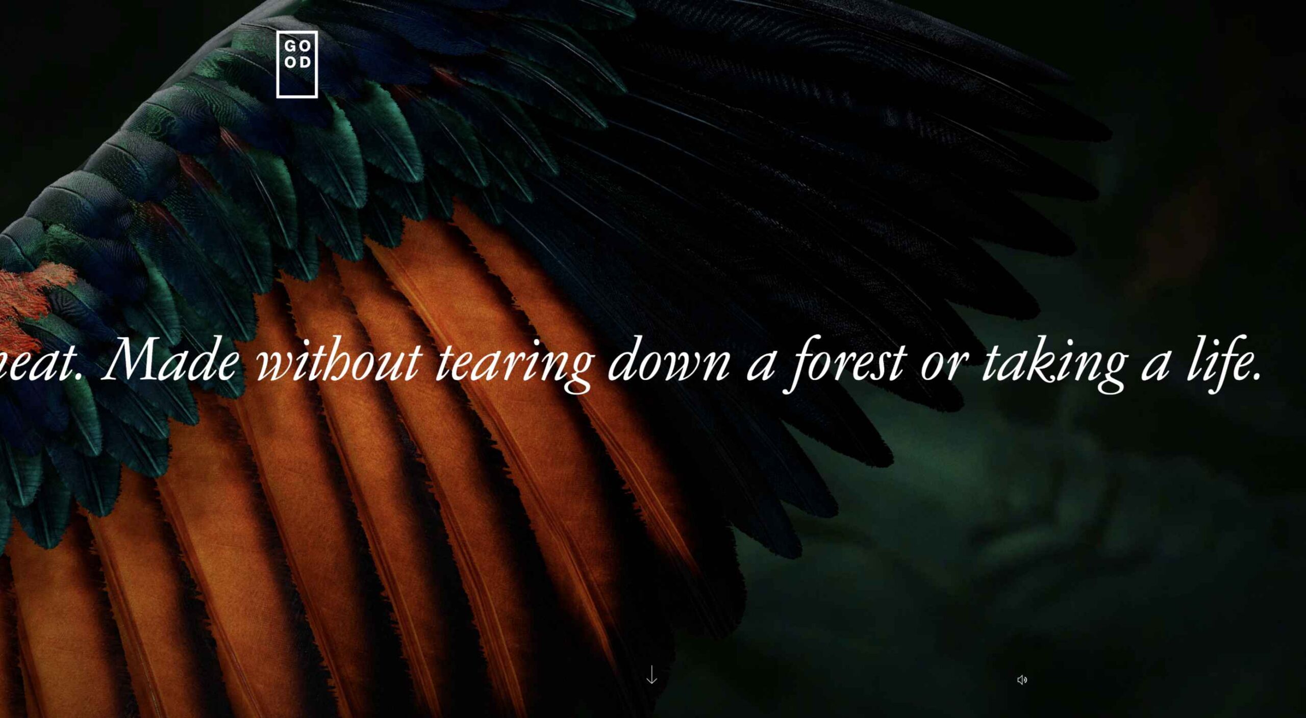
GOOD Meat

Gorgeous color in the background image and the scrolling narrative pull the user in on this site for lab ‘grown’ meat.

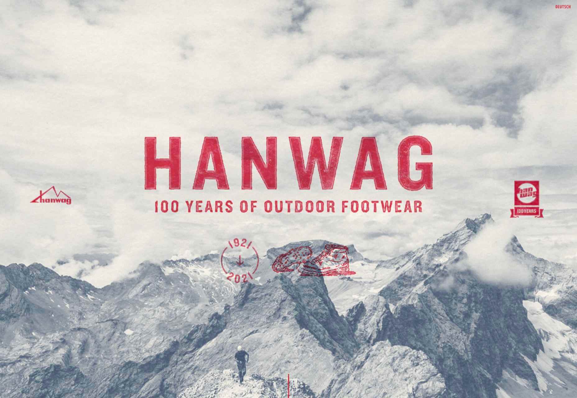
Hanwag 100 Years

This page celebrating 100 years of outdoor footwear company Hanweg uses a mix of illustrations and photographs to create a timeline marking the company’s highlights alongside what else was happening at the time. Any excuse to get Yoda in.

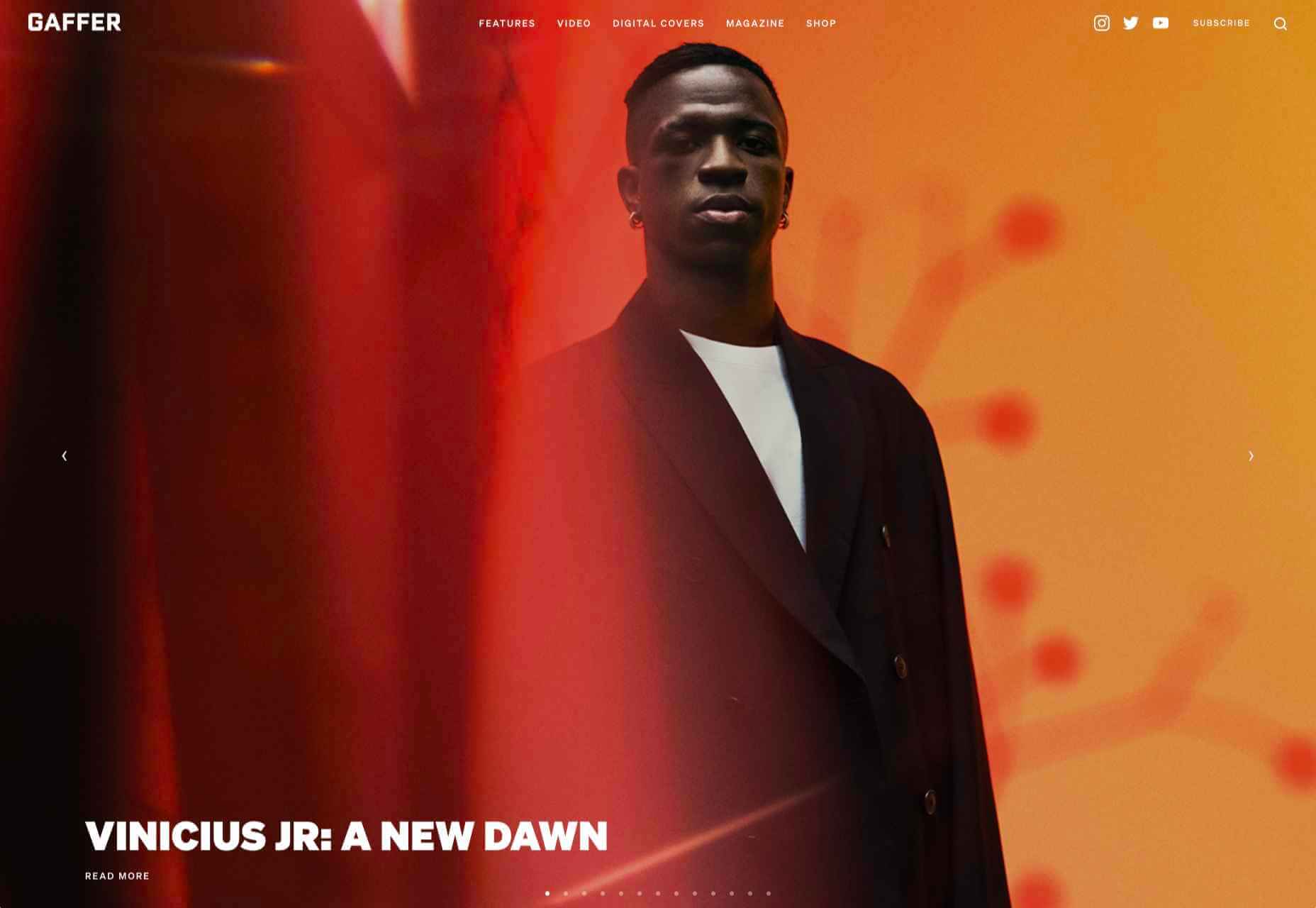
Gaffer

Gaffer describes itself as bridging the gap between football, music, fashion, and culture. The site has a glossy feel, with strong art direction and an easily navigable architecture.

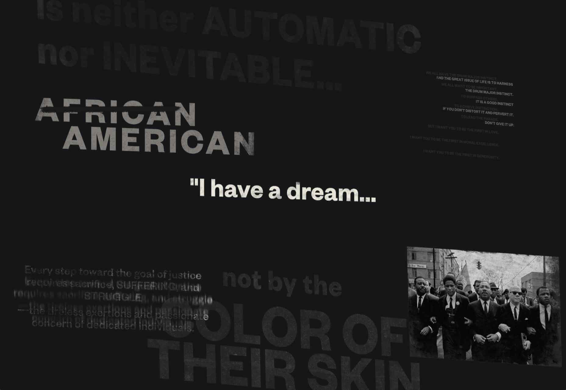
Remember MLK

This rather beautifully made tribute to Martin Luther King uses some great typographic effects, and the variations, in contrast, create a layering of the different content elements.

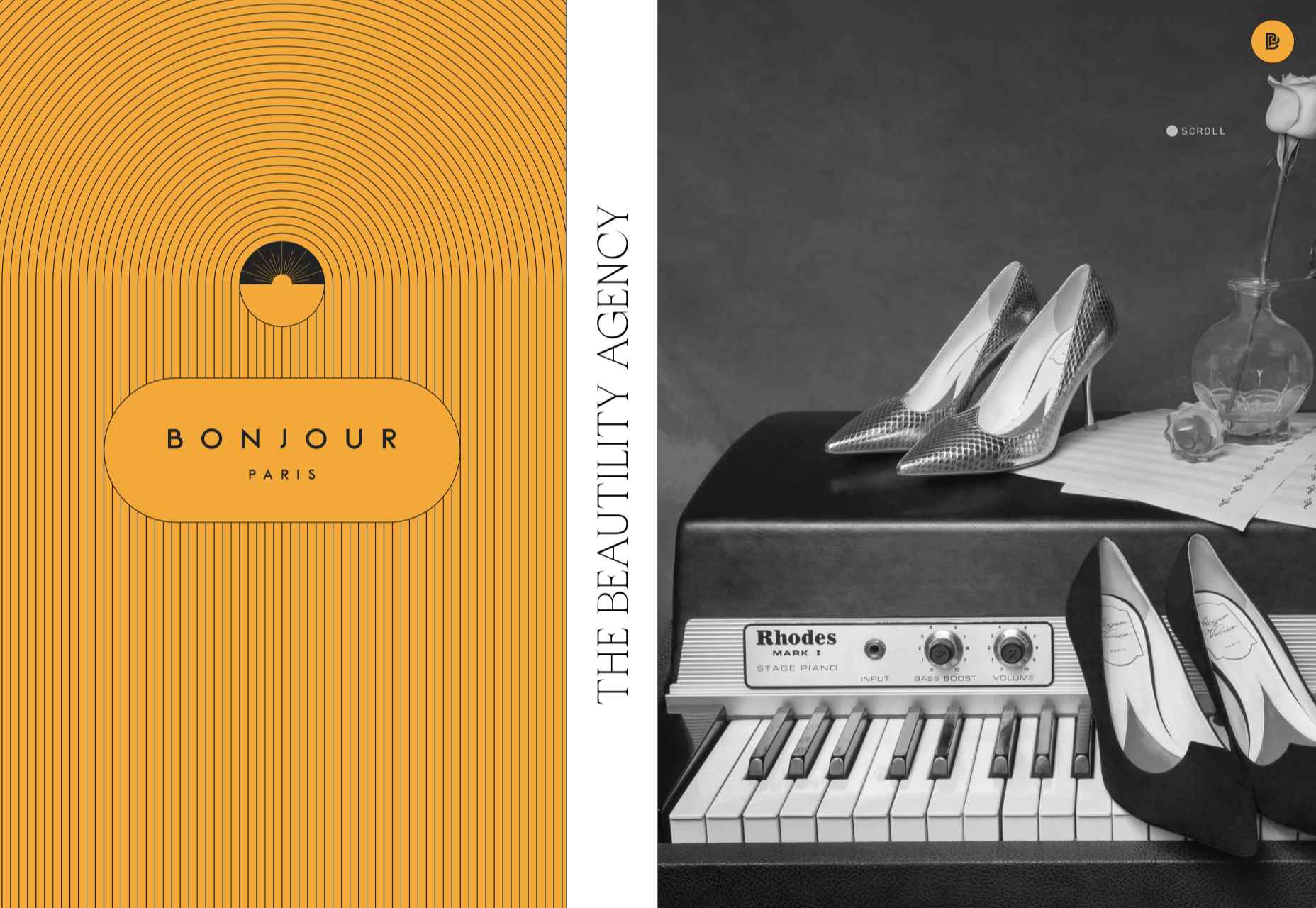
Bonjour Agency

The home page for design agency Bonjour Paris uses sideways scrolling to give an overview of the whole site. There is a lot of content, but it doesn’t feel like waffle, and exploring the site is a pleasant experience in itself.

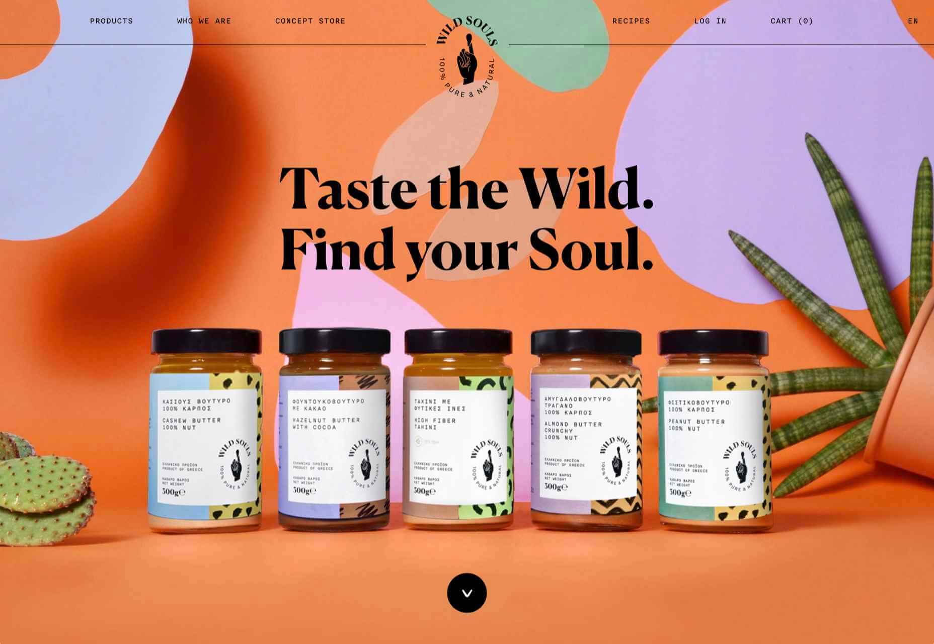
Wild Souls

Wild Souls is a Greek company that principally makes nut butters, tahini, and halva. The site is very colorful but warm, and the display type — Canela — has a slight softness to it that is appealing.

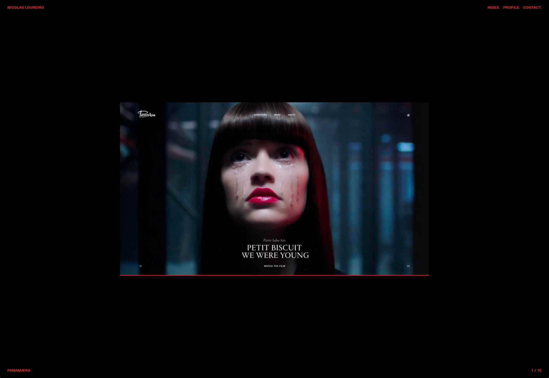
Nicolas Loureiro

This is a strong portfolio site for interactive and graphic designer Nicolas Loureiro. The work is front and center, and the navigation is pleasing.

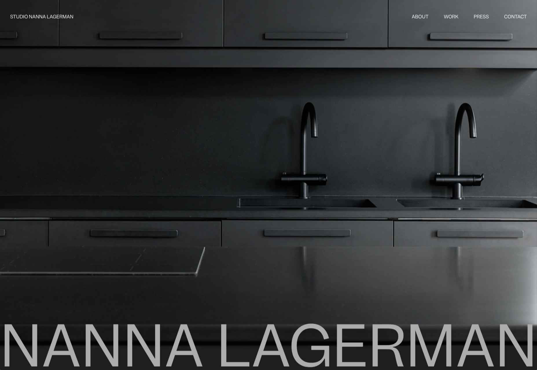
Studio Nanna Lagerman

Studio Nanna Lagermann is a small interior design studio that works on private homes, public spaces, and set design. The site creates a feeling of space and calm. Colors are soft and neutral, and the type, although massive in places, is clean and sophisticated.

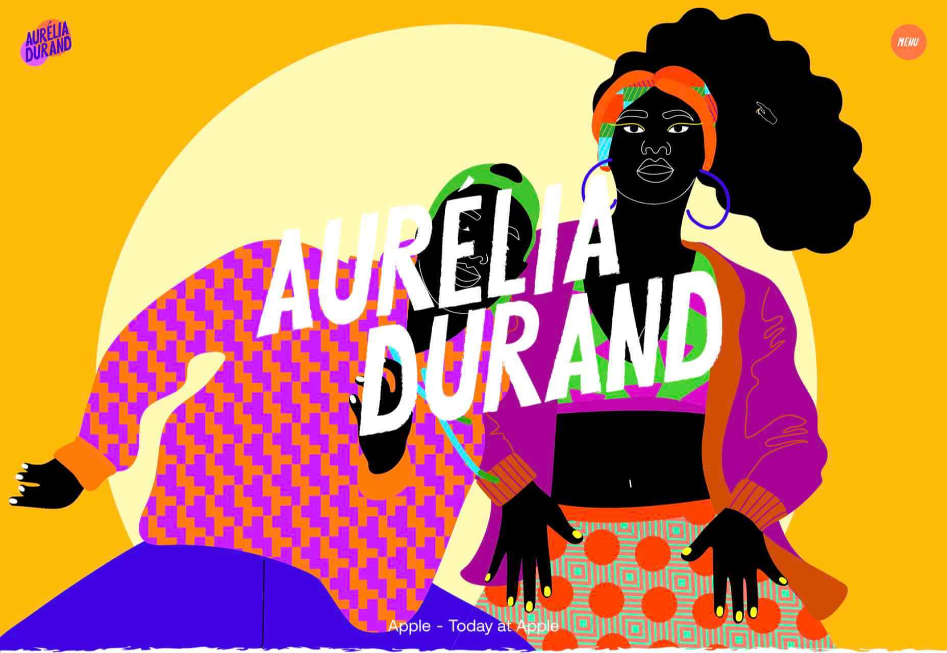
Aurelia Durand

Illustrator Aurelia Durand created her own typeface that she uses in her work, and it is used as the main display font here too. This site has a sense of joy about it that is hard to resist.

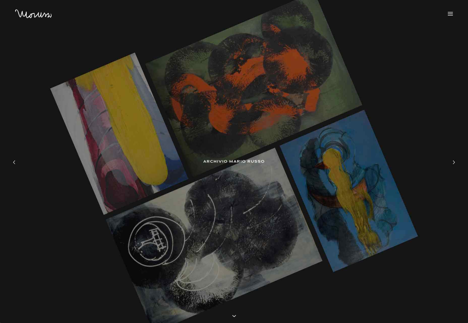
Archivio Mario Russo

This site documents the life and work of 20th-century Italian artist Mario Russo. The layout is thoughtful, and the text, while informative, doesn’t detract from the work being shown.

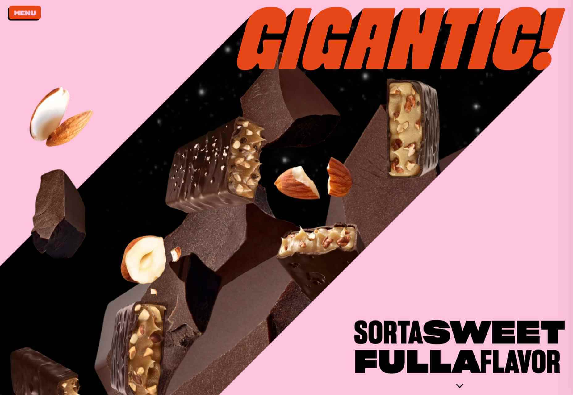
Gigantic Candy

Gigantic Candy makes vegan chocolate candy bars. The site is big, bold and lo-fi, and has a sense of fun to it.

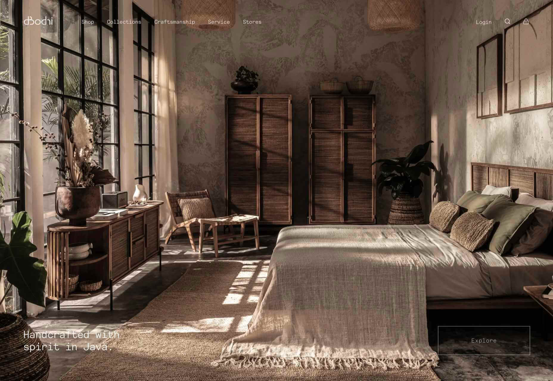
dBodhi

dBodhi sells handcrafted furniture from Java, made from reclaimed teak and locally grown plant materials. The clean layout combined with a slight sepia tone on all the photography creates a feeling of quietness and nature.

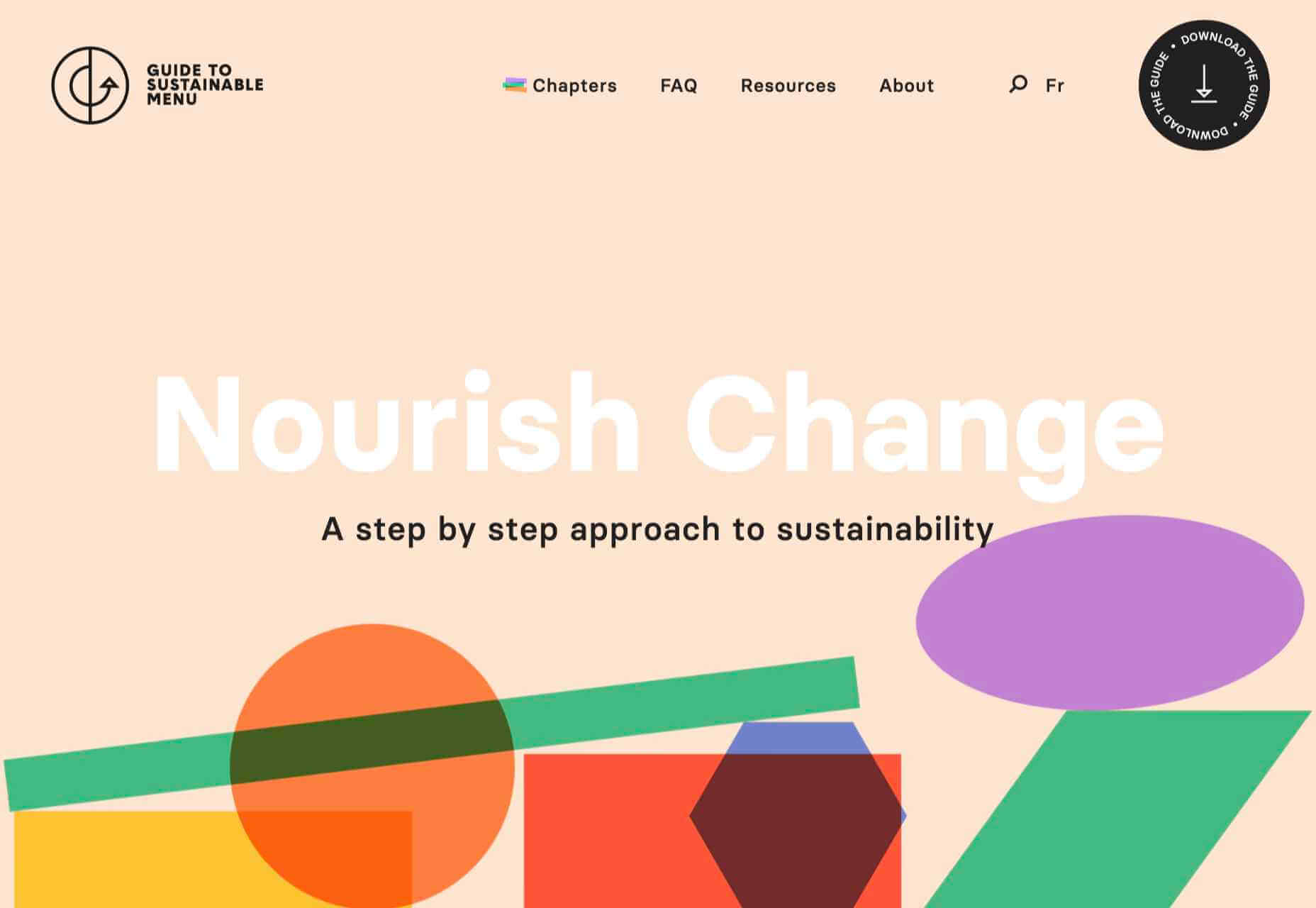
Menu Durable

Menu Durable is a guide to creating healthier, sustainable food menus in Canadian healthcare facilities. There is a lot of information here, and it is well written and attractively presented with clear color coding.

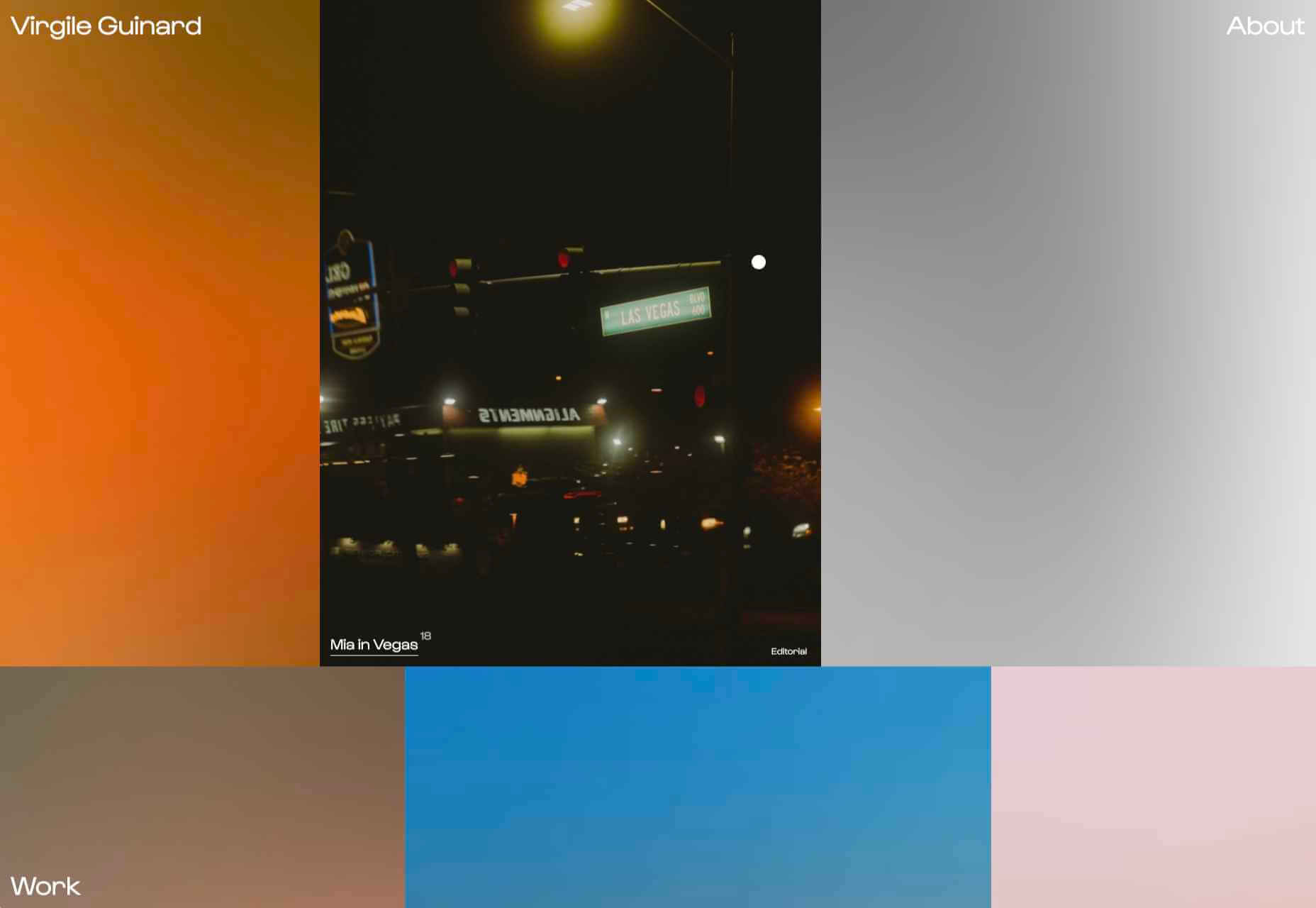
Virgile Guinard

This is a lovely, simple portfolio site for photographer Virgile Guinard. By using blocks of color pulled from each photograph’s predominant color and only revealing each photograph on rollover, each image is allowed to stand out.

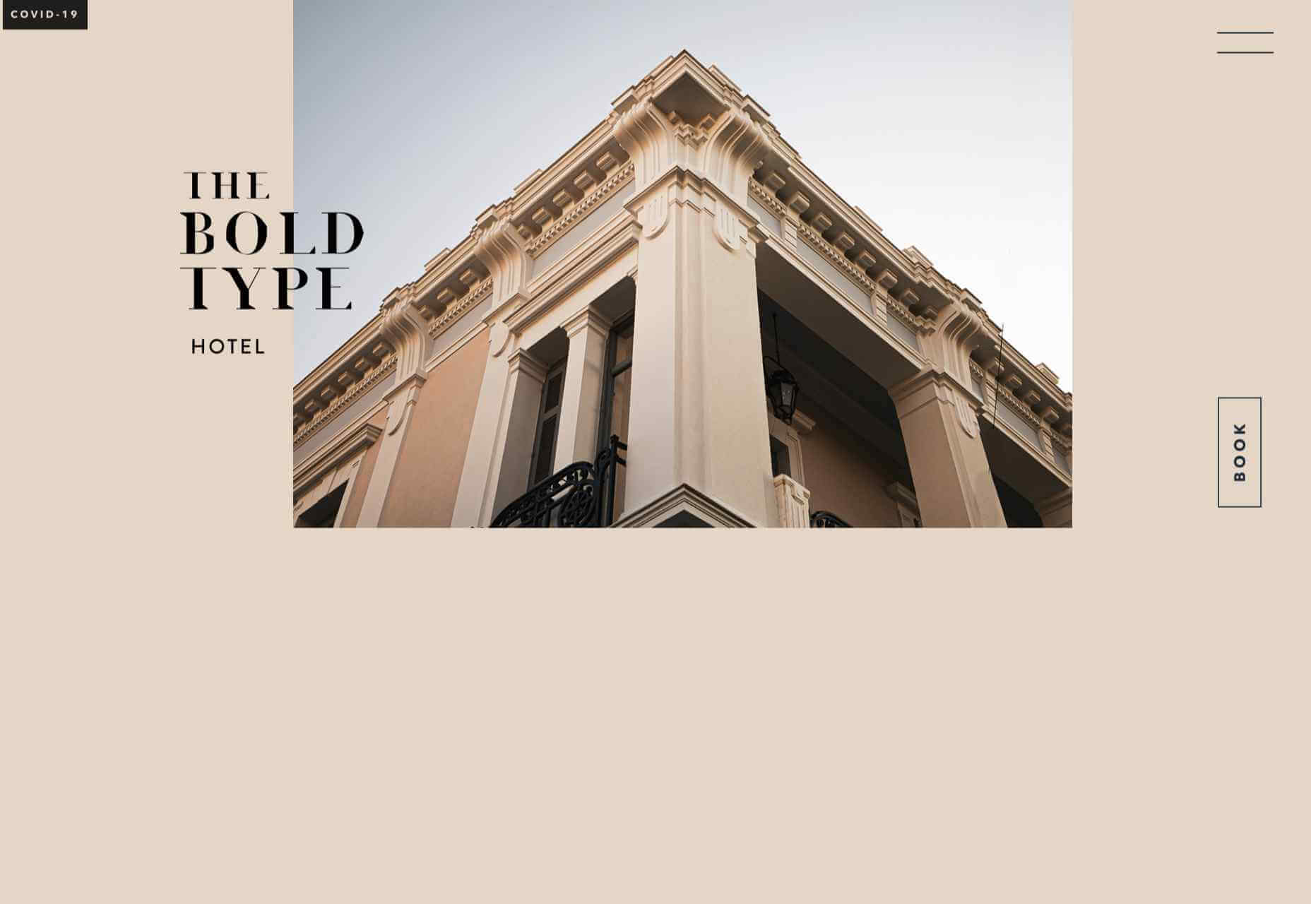
The Bold Type

This site for The Bold Type Hotel in Patra, Greece, is a boutique hotel website archetype, but it is done well. The pinky sand background color is a good choice, and the photographs are excellent.

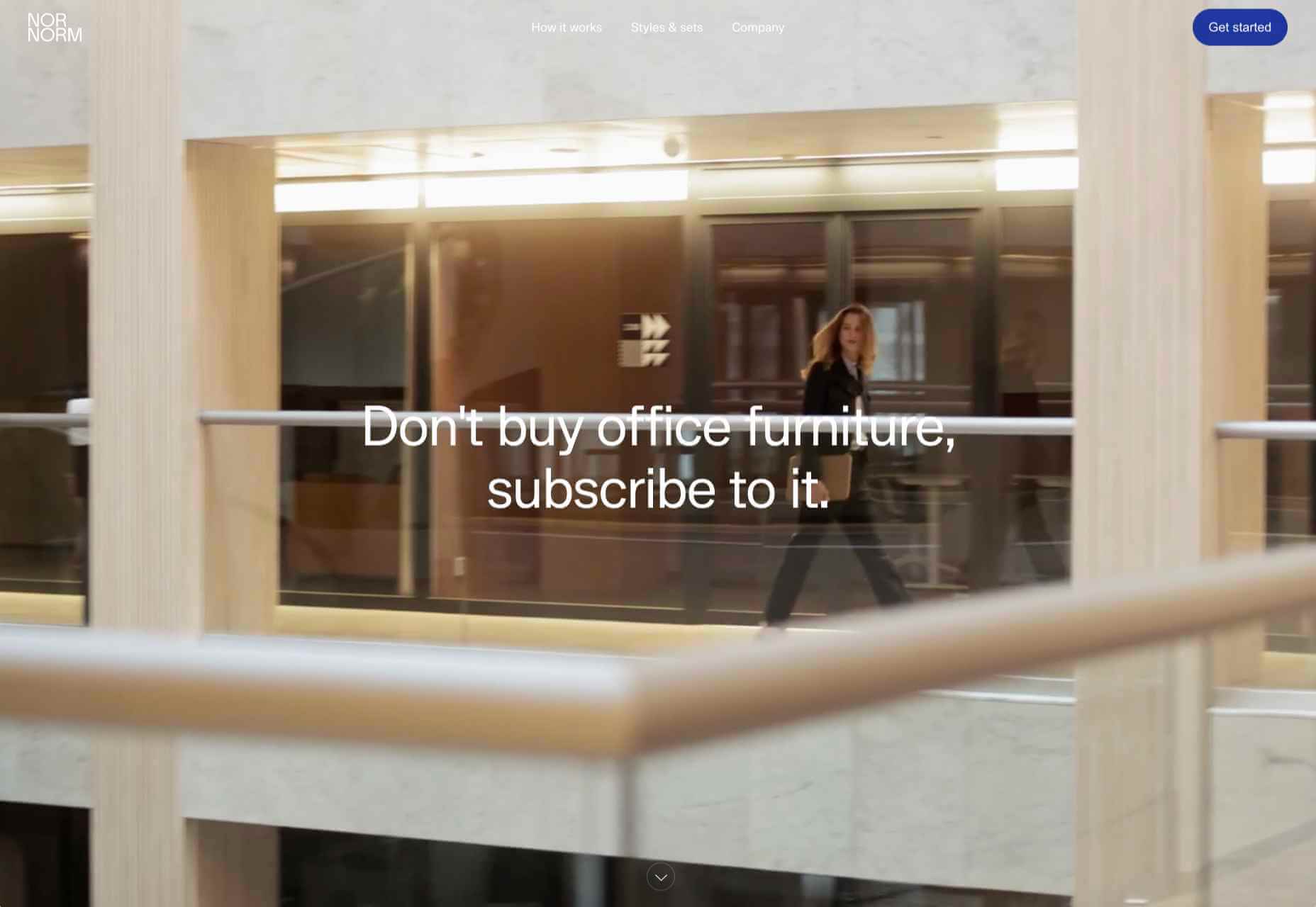
NOR NORM

Nor Norm provide an office furniture subscription service. The site is clean with a feeling of light and space. There is a good balance between an overview of the process and details of the individual items available.

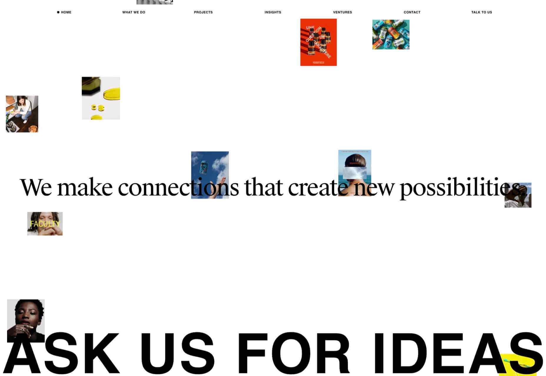
Ask Us For Ideas

At first glance, Ask Us For Ideas looks like a creative agency, but it is actually a creative broker, matching clients with agencies.

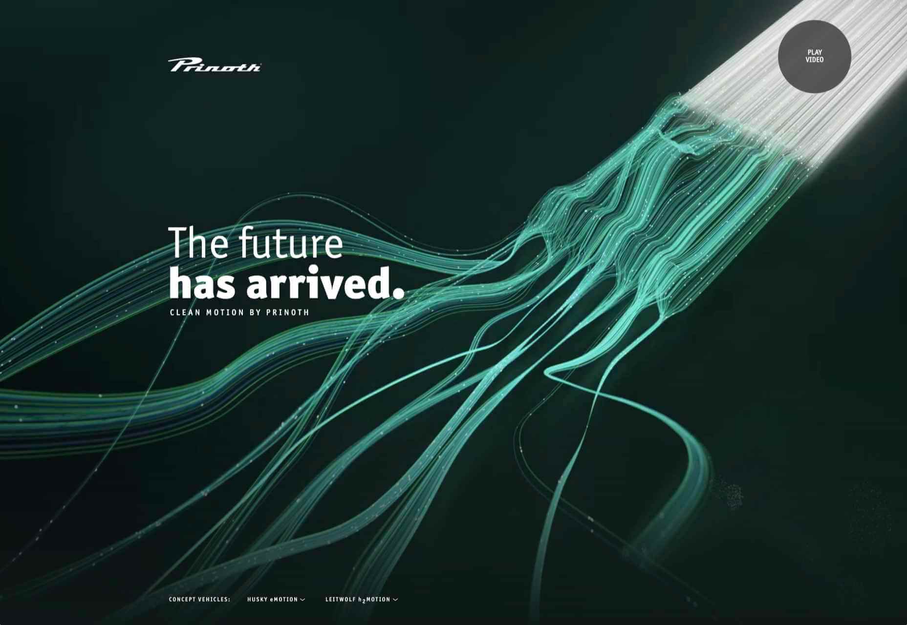
Prinoth Clean Motion

Prinoth has been making snow groomers since the 1960s, and this microsite is to mark the launch of their new hydrogen and electric versions. It is as slick and glossy as any luxury car website. And now I know what a snow groomer is.

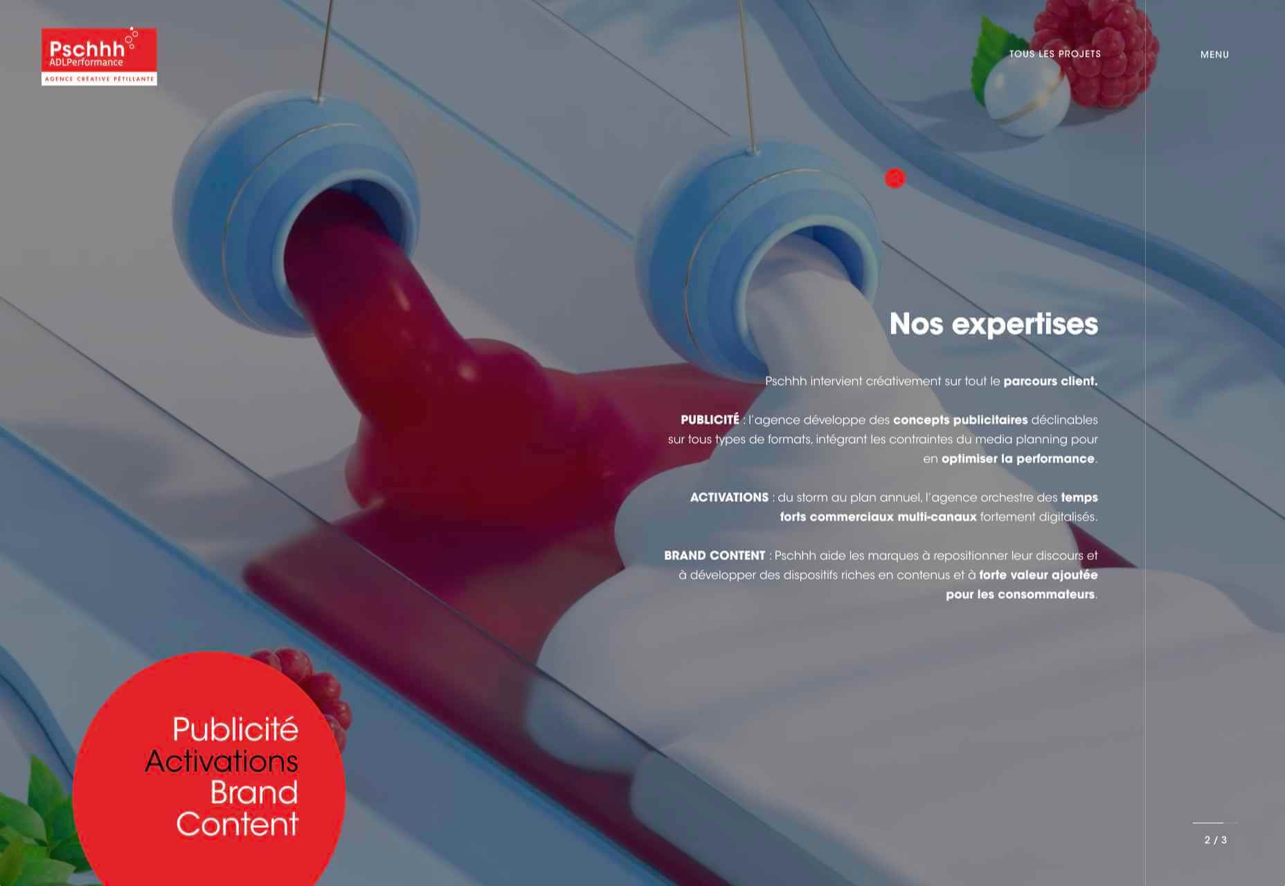
Pschhh

Design agency Pschhh has embraced the use of circles, reflecting the sound of bubbles their name suggests.

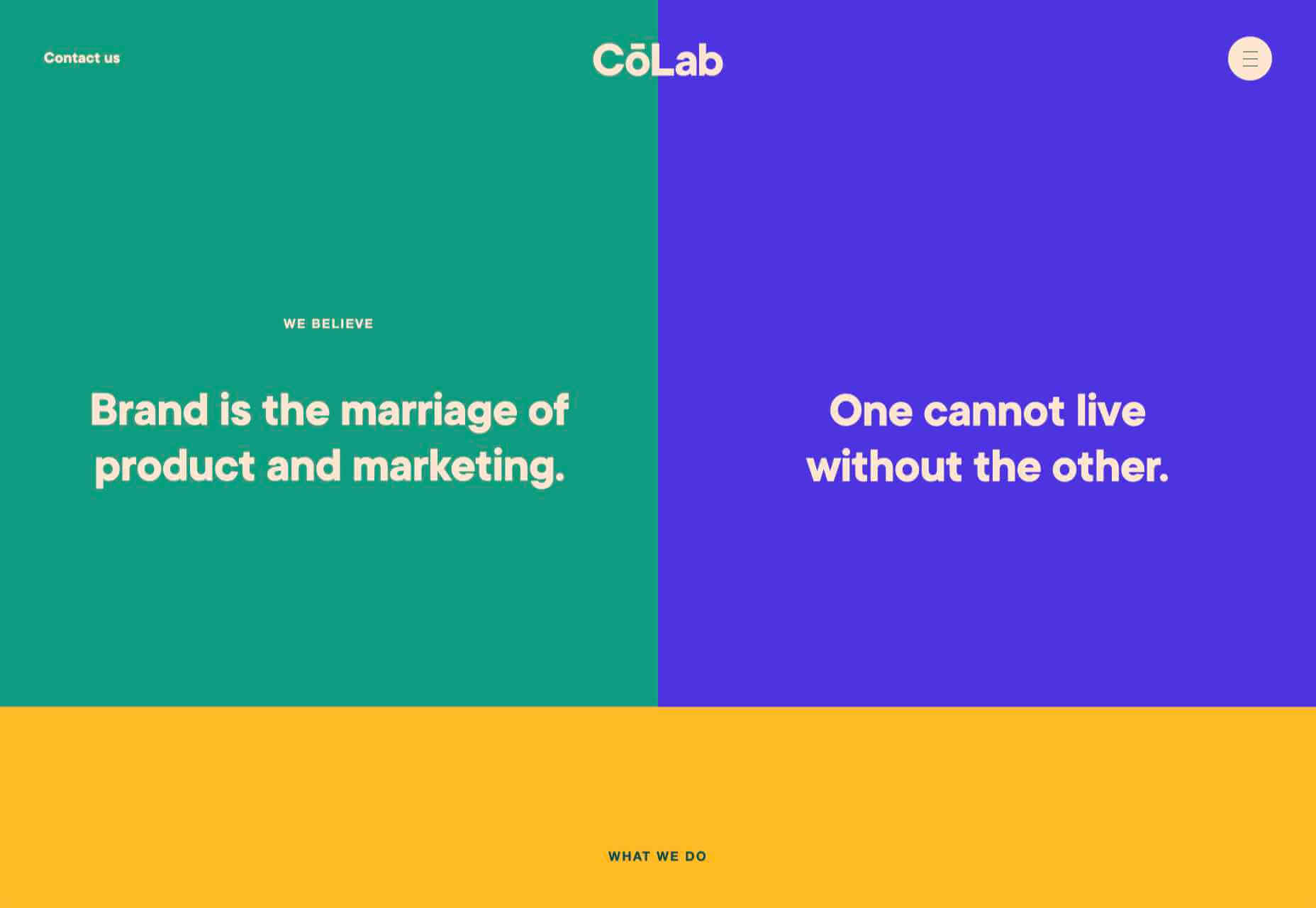
CōLab

CōLab is a design and marketing firm. There is a great use of color and movement here, and you don’t really notice initially that there is no actual work on show.

Source

The post 20 Best New Websites, February 2021 first appeared on Webdesigner Depot.


Source de l’article sur Webdesignerdepot

Imagine a room with a wall of screens displaying closed-circuit video feeds from dozens of cameras, like a security office in a film. In the movies, there is often a guard responsible for keeping an eye on the screens that inevitably falls asleep, allowing something bad to happen. Although intuition and other distinctly “people skills” are useful in security, most would agree that the human attention span isn’t well-suited for always-on, 24/7 video monitoring. Of course, footage can always be reviewed after something happens, but it’s easy to see the security value of detecting something out of the ordinary as it unfolds.

Several cameras capturing different scenes.
Cameras capture our every move, but who watches them?

Now imagine a video artificial intelligence (AI) application capable of processing thousands of camera feeds in real-time. The AI constantly compares new footage to historical footage, then classifies anomalous events by their threat level. Humans are still involved, both to manage the system as well as review and respond to potential threats, but AI takes over where we fall short. This isn’t a hypothetical situation: from smart police drones to intelligent doorbells sold by Amazon and Google, AI-powered surveillance solutions are becoming increasingly sophisticated, affordable, and ubiquitous.

Source de l’article sur DZONE

The start of the year is always a good time to reassess priorities and consider new approaches, but 2021 is more of a reset than we expected this time last year. 2020 is unlikely to go down in anyone’s autobiography as the best year of their life, but it has done something positive: it’s prepared the ground for rapid change in the next 12 months.

More than any other year in our lifetimes, 2021 is set to be revolutionary, with emerging trends that will last well into the new decade. Here’s what we think you can look forward to around the next corner.

1. The End of Minimalism

Minimalism has been the de facto approach to web design for the last decade because it works.

But design reflects the zeitgeist. Where minimalism once felt clean and fresh, it’s starting to feel dull and uninspired. There have been a few false-starts breaking out of the long-term trend, but thanks to the pandemic, 2021 will be the year minimalism finally folds — at least for a while.

Prior to coronavirus-mandated lockdowns worldwide, there were already signs of a more vibrant, more decorative, more joyful approach to design. Simple typefaces have been replaced with more decorative examples — faces that use ink-traps to fake 3D effects are surprisingly popular.

trends are cyclical, and the wheel always turns

One of the biggest aspects of this blossoming trend is the move away from Material Design-style flat color not just to gradients but to multi-color gradients and even animated gradients. Even Apple, the last bastion of the clean white-box approach, jumped on the gradient bandwagon with its Big Sur branding.

One of the few things COVID-19 hasn’t slowed is the adoption of new web technology, and CSS, in particular, has had some major developments in the last year. CSS Grid is now a practical technology, and our ability to code standards-compliant designs that aren’t dependent on hierarchical boxes is greatly enhanced.

After more than a year of pretty grim news for most people, much of the world will be vaccinated over the next twelve months, and life will rapidly return to normal. The last global crisis on this scale was the 1918 influenza pandemic, and it led directly to the decade known as the Roaring Twenties.

Minimalism was already dipping in popularity — trends are cyclical, and the wheel always turns — but lockdown, or perhaps more precisely the end of lockdown, is the catalyst for significant change.

2. The Decline of WordPress

In Autumn 2020, something entirely unexpected happened: The W3C announced the platform its new web presence would be built on, and WordPress — the previous choice of the web’s steering committee — didn’t even make the list of finalists.

Due to accessibility concerns, the W3C development team opted to migrate away from WordPress to Craft CMS. The decision was met with a mixture of glee and outrage. But whether you agree with the decision or not, it’s hard to see it as anything other than yet another symptom of WordPress’ decline.

WordPress faces a triple threat: there are web builders that do an adequate job for low-end web projects; there are newer rivals like Craft that outperform WordPress as a CMS; there’s a growing interest in alternate approaches, like Jamstack.

So will it all be over for WordPress in 2021? Not even close. There are myriad reasons WordPress will continue to be the choice of designers and developers for years to come. Tens of thousands of professionals worldwide have invested their whole careers in WordPress; there are millions of themes, plugins, templates, and build processes that are tightly woven into the WordPress ecosystem. What’s more, there are millions of sites with substantial content archives powered by WordPress [WebDesignerDepot is one such site].

WordPress reportedly powers approximately 37% of the web, and it will still be the dominant CMS in 2022. But it’s unlikely to grow beyond that 37%, and by 2030 its market share will be in rapid contraction.

2020 was the high-tide mark for WordPress

But for all its faults — and it’s undeniable that WordPress is full of faults — WordPress is the best of the web; it has given a voice to millions of people, launched countless careers, and empowered entrepreneurship worldwide.

2020 was the high-tide mark for WordPress, but it’s not an extinction-level event — even the much-maligned Flash, which was killed dead in a matter of months by the first generation iPhone, limped on until a few weeks ago.

WordPress will have to find a niche and accept a smaller market share; in doing so, it will address the single biggest complaint that anyone has about WordPress: that it’s trying to do too much.

WordPress is one of the great success stories of the web. In a decade, it may have to settle for powering just 10% of the web — a level of failure most of its rivals can only dream of.

3. The Digital Currency Explosion

2021 is undoubtedly the year that cryptocurrency goes mainstream. In 2020 Bitcoin grew by almost 400%; currently valued at around $35k, conservative predictions for a December 2021 valuation are $100k, with five-year predictions as high as $1m. And Bitcoin isn’t the only cryptocurrency; the value of developer-friendly Ether has jumped by more than 50% in the first few weeks of 2021.

In the US, the incoming Biden administration is preparing a multi-trillion dollar relief package, which many believe young Americans will invest in cryptocurrency. Perhaps more importantly, large investment banks are now pumping hundreds of millions in digital currencies. PayPal and Visa are both in the advanced stages of adopting blockchain technology.

The biggest threat to the new digital economy is the volatility of cryptocurrency. You cannot price services in XRP if XRP’s dollar price could crash at any time — as it did a few weeks ago.

And so there are two routes in which this trend will unfold for ecommerce. Either pricing will remain in dollars, and the equivalent price in various cryptocurrencies will be calculated in real-time. Or, transactions will make use of stablecoins like Tether that are tied to the value of the US dollar.

Cryptocurrency is the latest gold-rush, and whether you think it’s the chance of a lifetime or yet another Ponzi scheme, it will become increasingly high-profile in ecommerce throughout 2021.

4. No More Video Calls and also More Video Calls

2020 was the year of Zoom. Its growth from bit-player to overtaking Skype is a material lesson for entrepreneurs that every obstacle is an opportunity.

every obstacle is an opportunity

Over the last year, we’ve discovered two things: meetings are more creative in person, and office costs are significantly reduced when staff work remotely.

There’s going to be a shift in the business landscape this year. Remote working will continue to be normal for years to come as businesses enjoy rent savings. Video calls will still be common for quick update meetings. But expect to travel to physical meeting places periodically for in-depth strategic planning.

Expect to see major cities with deserted office buildings and a rapid expansion of co-working spaces, especially those with meeting spaces — if WeWork can hold on a little longer, there may be light at the end of the tunnel.

As a web professional, you’re in a unique position to thrive in the new business world, even more so if you’re a freelancer. Remember, if you’re working onsite, be mindful of your physical health, and if you’re working remotely, be mindful of your mental health.

What Do You Think?

No one saw 2020 coming. Sometimes world events are outwith our control, and we have to hang on and hope it gets better. It’s been a tough 12 months, and the truth is we’re not through it yet.

But the 2020 coronavirus pandemic is the first pandemic in human history that we’ve had the technology to shorten.

2021 offers the opportunity for enormous change. Will designers look for new, more decorative approaches? Will we replace our technology stack? Will you be billing clients in Ether this year? Will you suffer the misery of a packed evening commute ever again?


Featured image via Unsplash

Source

The post 4 Predictions for the Web in 2021 first appeared on Webdesigner Depot.


Source de l’article sur Webdesignerdepot

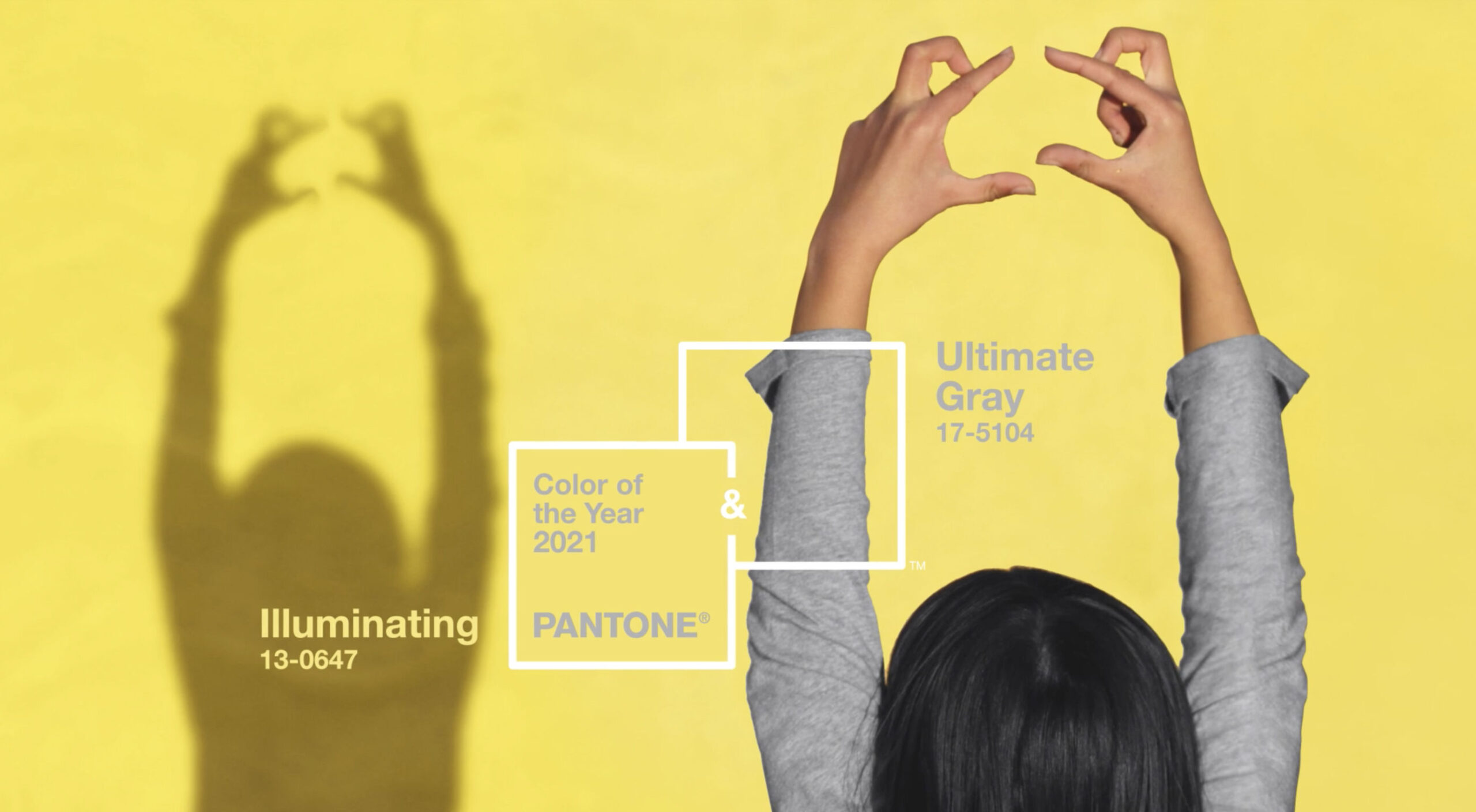
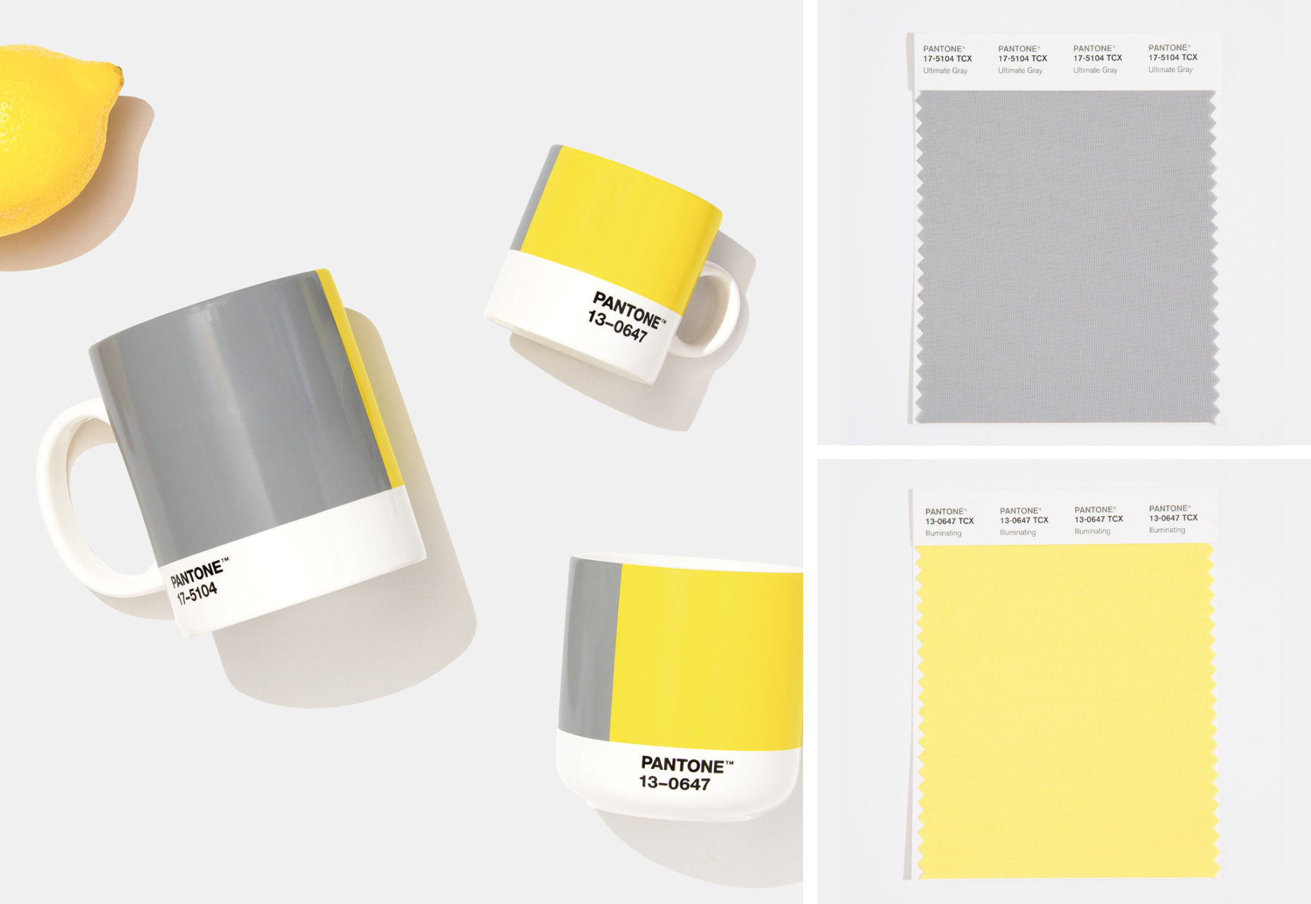
It’s that time again: the self-fulfilling prophecy that is the Pantone Color of the Year has been announced for 2021.

For 2021, we’re getting two colors of the year. The colors selected to grace museum gift shops, and end-of-year blog posts are Ultimate Gray (a mid-range gray somewhere around #939597) and Illuminating (a citrus yellow that’s approximately #F5DF4D).

A marriage of color conveying a message of strength and hopefulness that is both enduring and uplifting.

The last time Pantone selected two colors was Rose Quartz & Serenity in 2016, and we all know what a tranquil, serene year that was; so 2021 will presumably unleash the curse of an ancient mummy on the world, or see us collide with the Sun.

2020’s color, “Classic Blue”, probably wasn’t much of a color of the year unless it happens to be the color you painted your home office. If the company had genuine foresight, it might have opted for the blandest beige it could find — in fact in the Summer paint brand Dulux almost opted for that for 2021, naming “Brave Ground” its color for next year, but for beige’s “resilient” qualities rather than any lockdown boredom.

Perhaps that’s why Pantone’s PR department opted for two colors in 2021: a nondescript grey to keep us going until we’re all vaccinated, and a wildly luminous yellow for the latter part of the year.

In fairness to Pantone, its color choices aren’t predictions as is often reported, rather aspirations. Pantone believes the pairing “expresses a message of positivity supported by fortitude” which may be just what the world needs right now.

A combination of colors is much more sensible than a single color, with so much about color dependent on context. But the actual color treatment of 2021 is much more likely to be multi-color gradients.

You can try out Pantone’s colors for 2021 on Instagram, or on Pantone Connect.

Source


Source de l’article sur Webdesignerdepot

WALLDORF – SAP SE (NYSE: SAP) annonce aujourd’hui que Benedikt Lehnert rejoindra SAP en tant que Chief Design Officer à compter du 1er janvier 2021. Benedikt Lehnert rejoint SAP après Microsoft où il était Directeur du Design Produit pour Microsoft Fluent, Office, Fluid et M365 Experiences.

Avec Alexander Lingg, Head of SAP User Experience, Benedikt Lehnert est chargé de définir un Design System unique, d’intégrer les besoins des clients et des utilisateurs finaux, et de travailler avec les équipes d’ingénierie de SAP pour implémenter un développement basé sur le design.

« Avec son expérience, Benedikt est parfaitement qualifié pour ce rôle », a déclaré Jan Gilg, président de SAP S/4HANA. « Il a joué un rôle crucial dans l’évolution du Design System de Microsoft et dans la mise à disposition de services de productivité multiplateformes sur la large gamme de produits de l’entreprise. »

SAP a franchi une étape majeure vers une nouvelle expérience utilisateur en introduisant le Design System SAP Fiori en 2014. Avec les cinq principes de conception de SAP Fiori qui rendent l’accès de l’utilisateur basé sur les rôles, adaptatif, simple, cohérent et agréable, l’entreprise a construit un leadership dans le domaine de la conception de logiciels d’entreprise. SAP réintroduit le rôle de Chief Design Officer pour soutenir une expérience utilisateur uniforme dans l’ensemble du portefeuille de solutions. Benedikt Lehnert renforcera la démarche de SAP centrée sur les besoins de ses clients pour la conception de l’ensemble de ses applications.

The post SAP accueille son nouveau Chief Design Officer appeared first on SAP France News.

Source de l’article sur sap.com

In part one, I discussed the first version/Bluetooth version of my desk upgrade.

In this article, I’ll discuss upgrading the desk to use Google Smart Home so I can control my desk with my voice.

Source de l’article sur DZONE

In the spirit of fall feasts, this month’s collection of tools and resources is a smorgasbord of sorts. You’ll find everything from web tools to icon libraries to animation tools to great free fonts. Let’s dig in.

Here’s what new for designers this month.

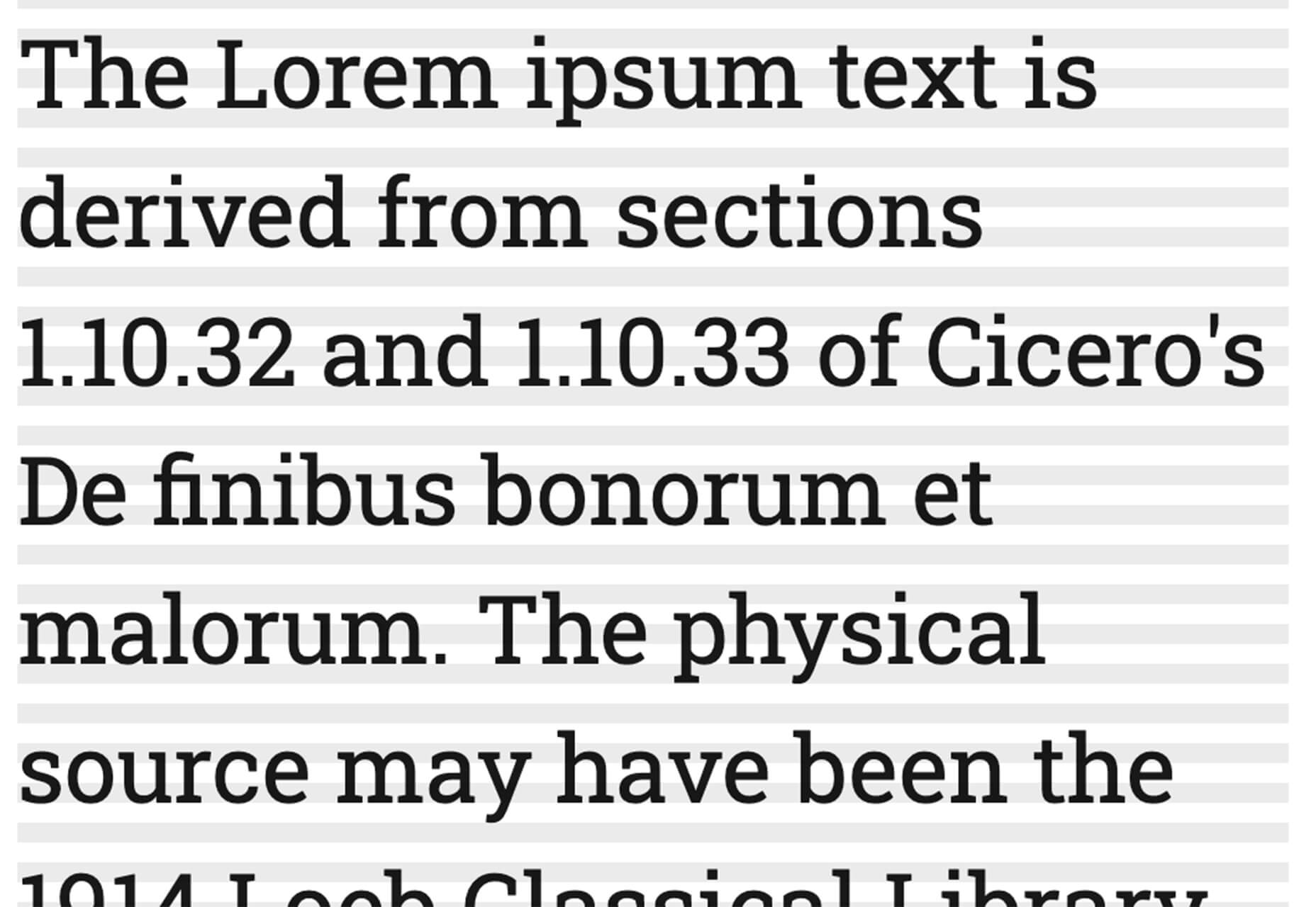
The Good Line-Height

The Good Line-Height is the tool you won’t be able to live without after using it a few times. The tool calculates the ideal line-height for every text size in a typographic scale so that everything always fits the baseline grid. Set the font size, multiplier, and grid row height to get started.

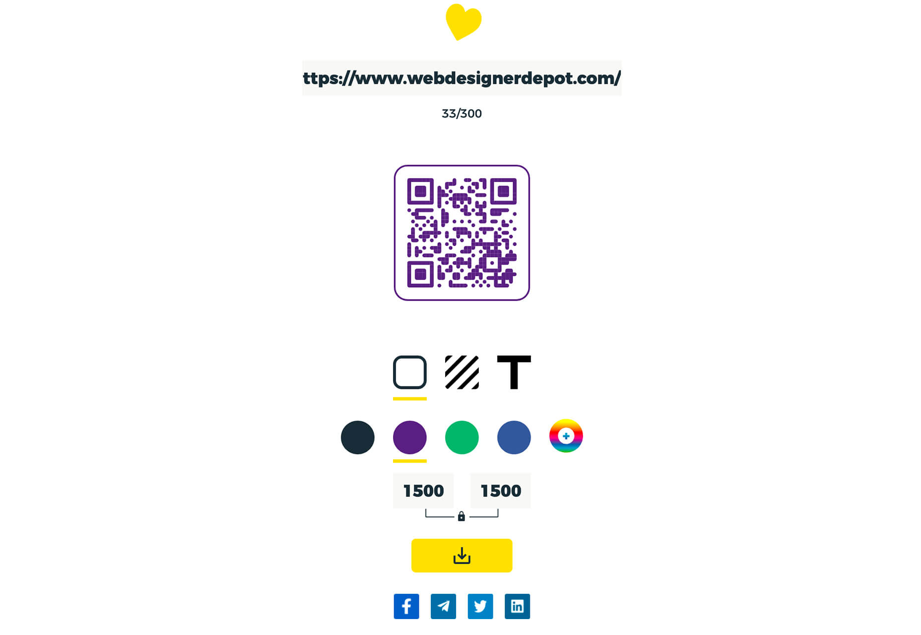
Link-to-QR

Link-to-QR makes creating quick codes a breeze. Paste in your link and the tool creates an immediate QR code that you can download or share. Pick a color and transparency, plus size, and you are done.

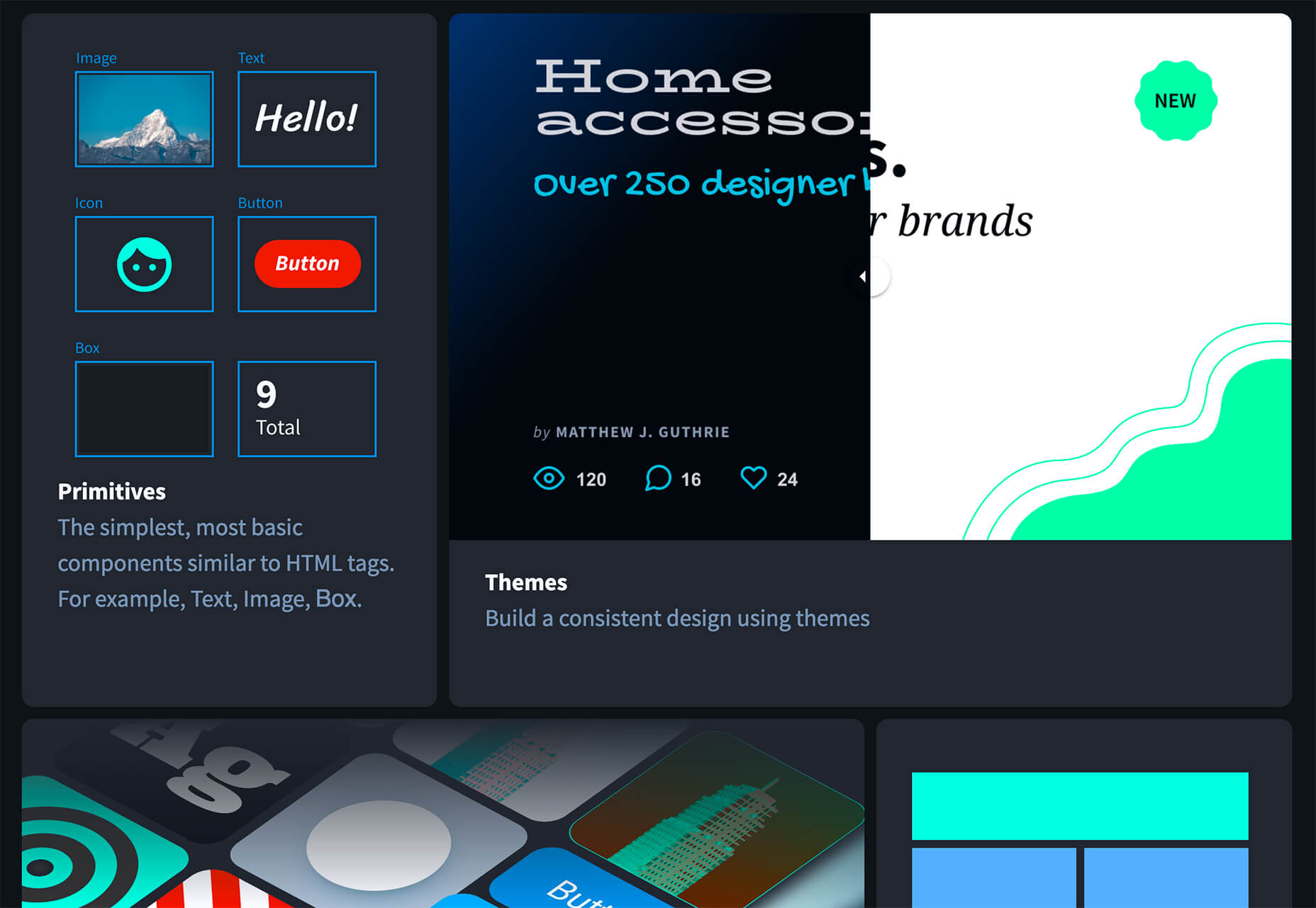
Quarkly

Quarkly allows you to create websites and web apps both using a mouse and typing code – you get all the pros of responsive editing, but can also open the code editor at any time and manually edit anything and it all synchronizes. The tool is built for design control and is in beta.

UnSpam.email

Unspam.email is an online spam tester tool for emails. Improve deliverability with the free email tester. The service analyzes the main aspects of an email and returns a spam score and predicts results with a heat map of your email newsletter.

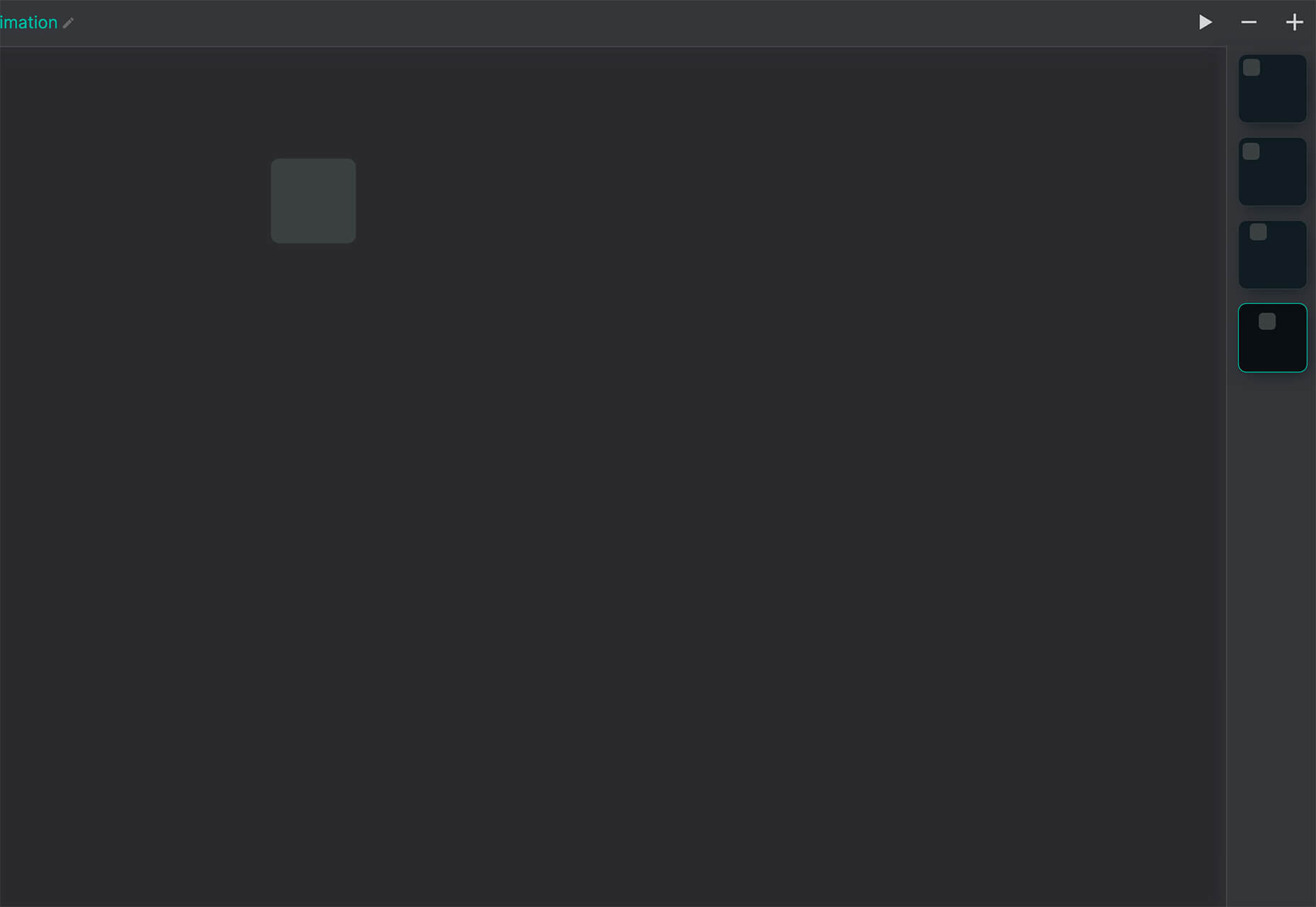
Filmstrip

Filmstrip allows you to create or import keyframe animations, make adjustments, and export them for web playback. It’s a quick and easy tool for modern web animation.

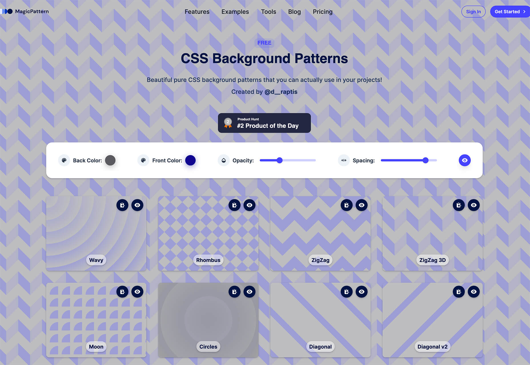
CSS Background Patterns

CSS Background Patterns is packed with groovy designs that you can adjust and turn into just the right background for your web project. Set the colors, opacity, and spacing; then pick a pattern; preview it right on the screen; and then snag the CSS. You can also submit your own patterns.

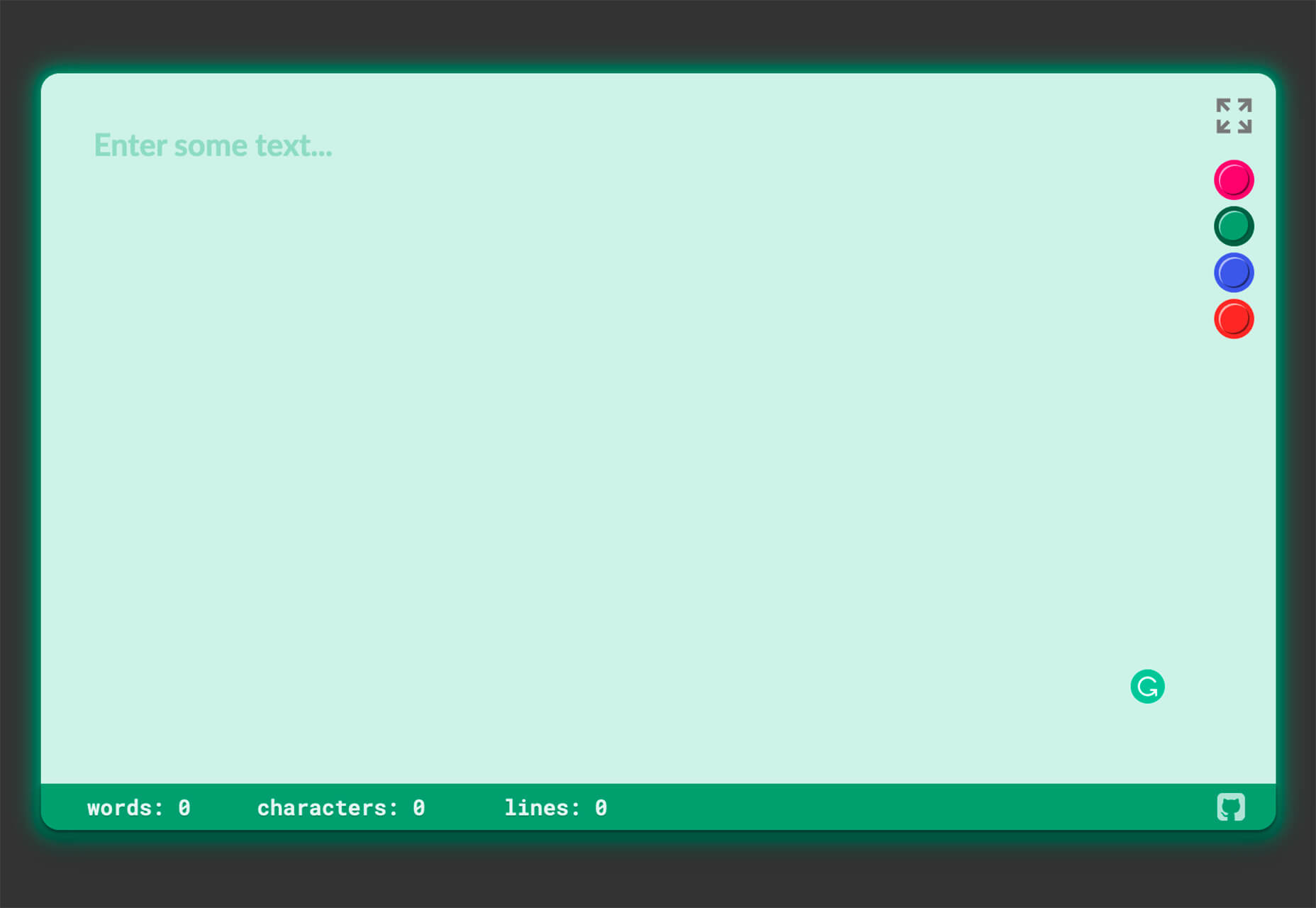
Neonpad

Neonpad is a simple – but fun – plain text editor in neon colors. Switch hues for a different writing experience. Use it small or expand to full browser size.

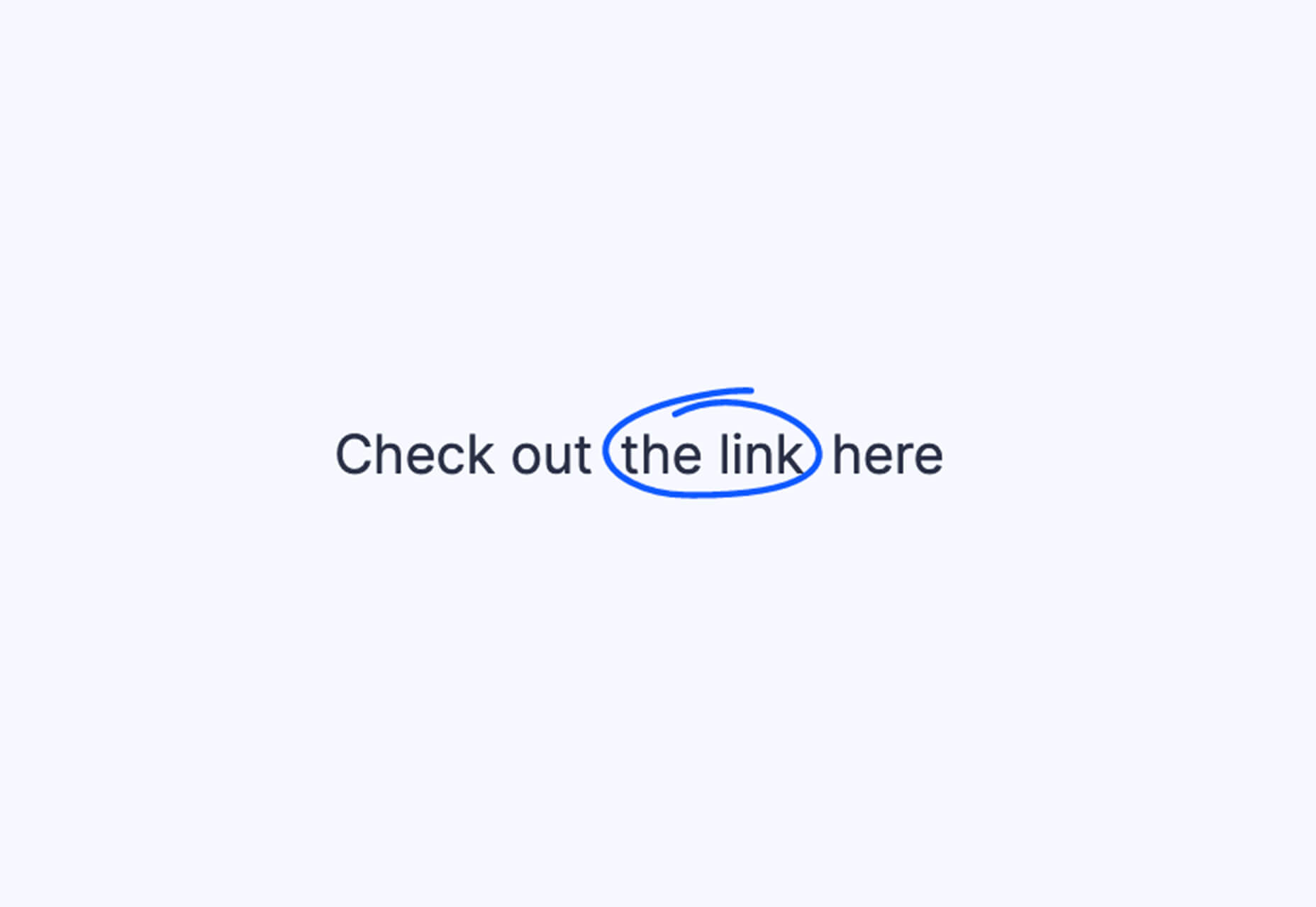
Link Hover Animation

Link Hover Animation is a nifty twist on a hover state. The animation draws a circle around the link!

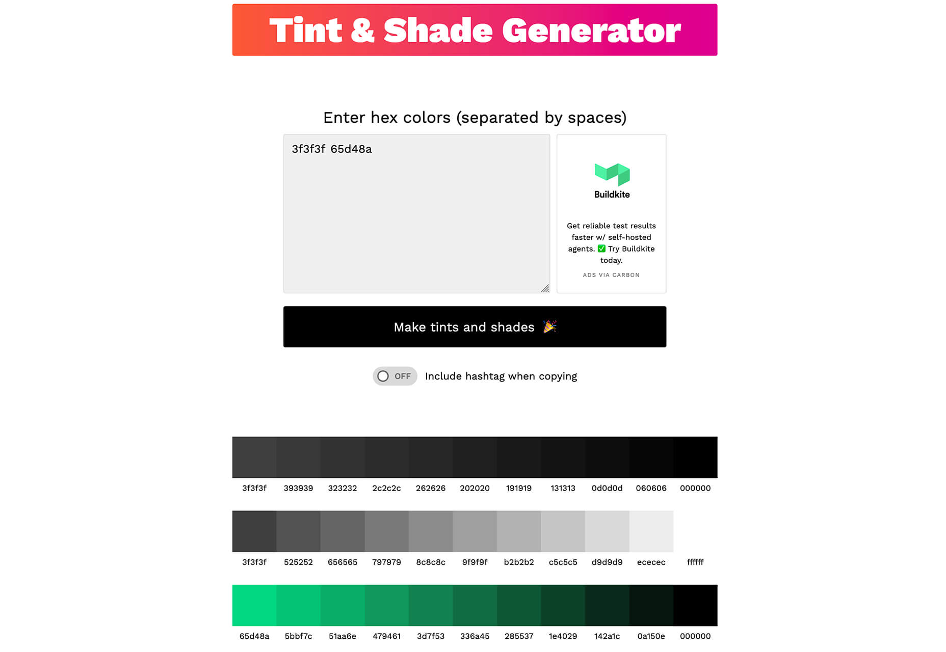
Tint and Shade Generator

Tint and Shade Generator helps you make the most of any hex color. Start with a base color palette and use it to generate complementary colors for gradients, borders, backgrounds, or shadows.

Pure CSS Product Card

Pure CSS Product Card by Adam Kuhn is a lovely example of an e-commerce design that you can learn from. The card is appealing and functional.

Free Favicon Maker

Free Favicon Maker allows you to create a simple SVG or PNG favicon in a few clicks. You can set a style that includes a letter or emoji, font and size, color, and edge type and you are ready to snag the HTML or download the SVG or PNG file.

Ultimate Free iOS Icon Pack

The Ultimate Free iOS Icon Pack is a collection of 100 minimal icons in an Apple style. With black and white version of each icon and original PSD files, you can create sleek icons for your iPhone screen in minutes. And it’s completely free! No email address or registration required.

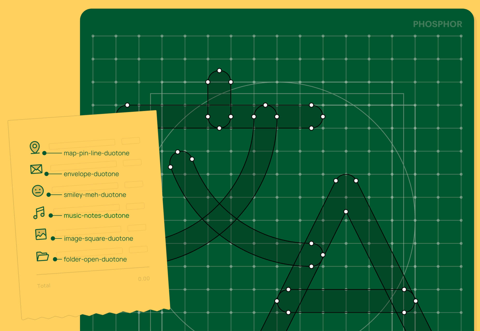
Phosphor Icon Family

Phosphor is a flexible icon family for all the things you need icons for including diagrams and presentations. There are plenty of arrows, chats, circles, clocks, office elements, lists, business logos, and more. Everything is in a line style, filled, or with duotone color. Everything is free but donations are accepted.

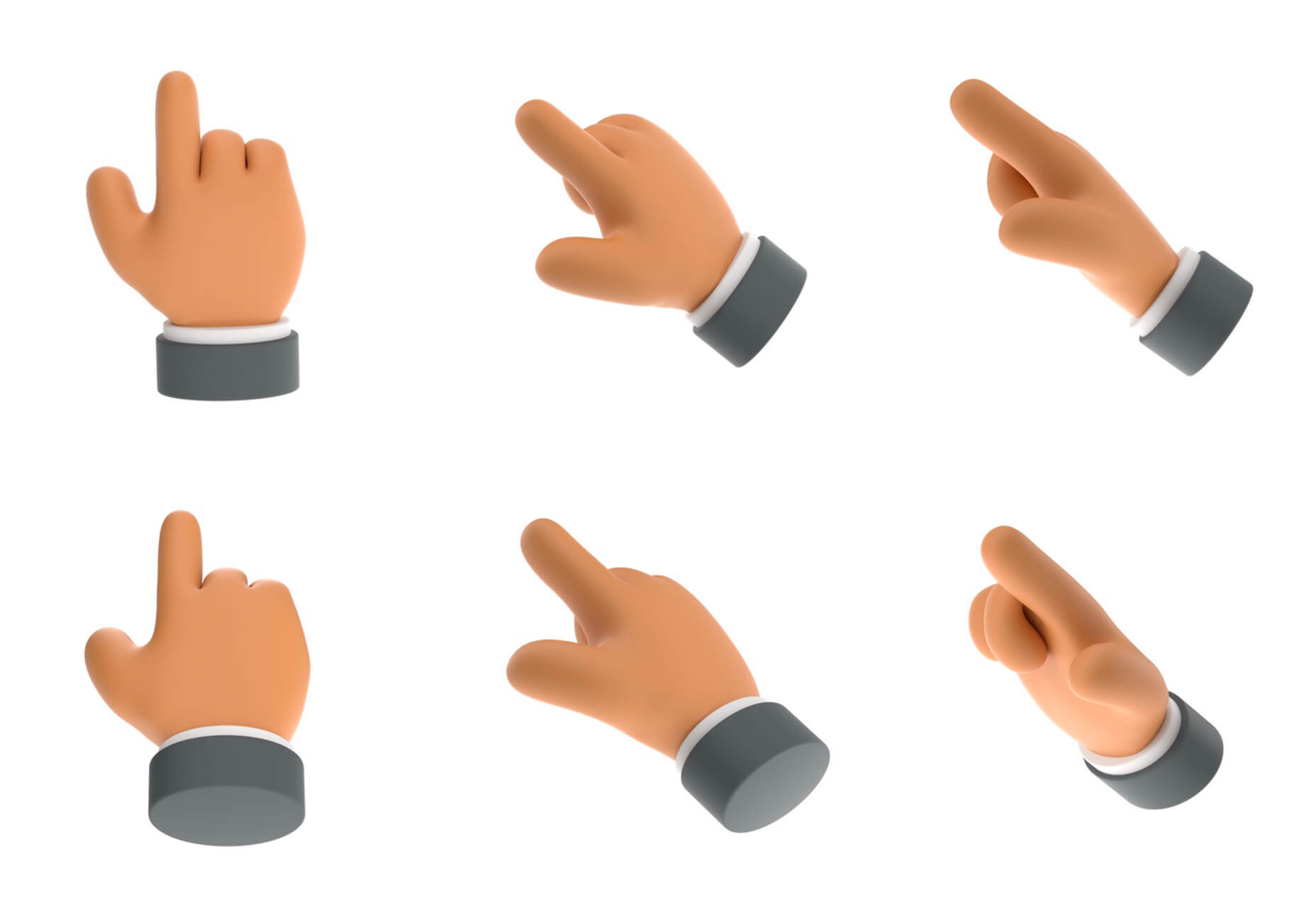
3,000 Hands

3,000 Hands is a kit of hands that includes plenty of gestures and style in six skin tones and with 10 angles of every gesture. They have a 3D-ish shape and are in an easy to use PNG format. This kit has everything you need from a set of hand icons.

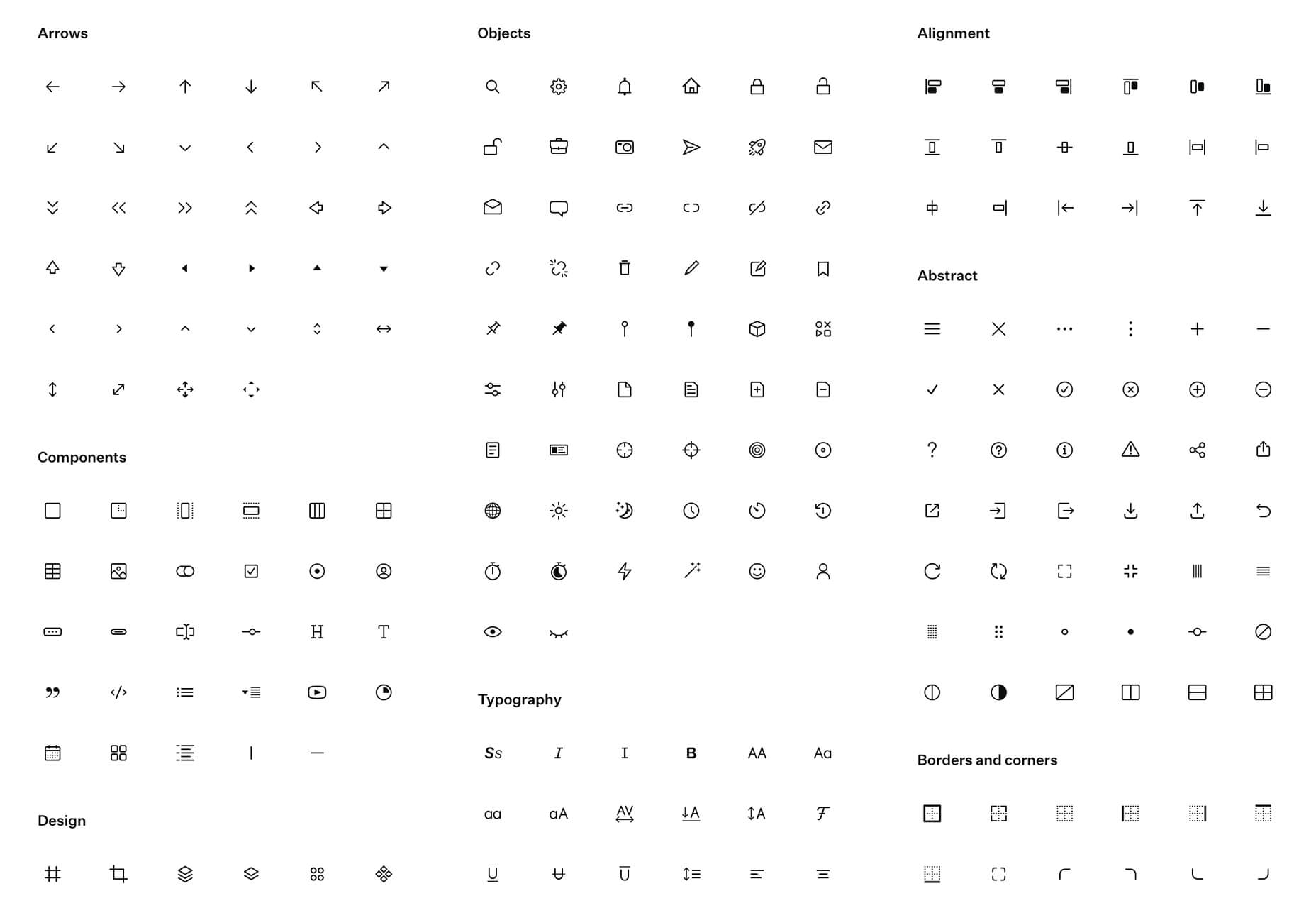
Radix Icons

Radix Icons is a set of 15px by 15px icons for tiny spaces. They are in a line style and are available in a variety of formats including Figma, Sketch, iconJar, SVG, npm installation, or GitHub.

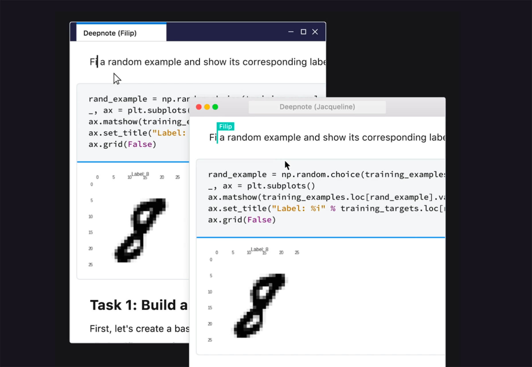
Deepnote

Deepnote is a new kind of data science notebook. It is Jupyter-compatible with real-time collaboration and running in the cloud and designed for data science teams.

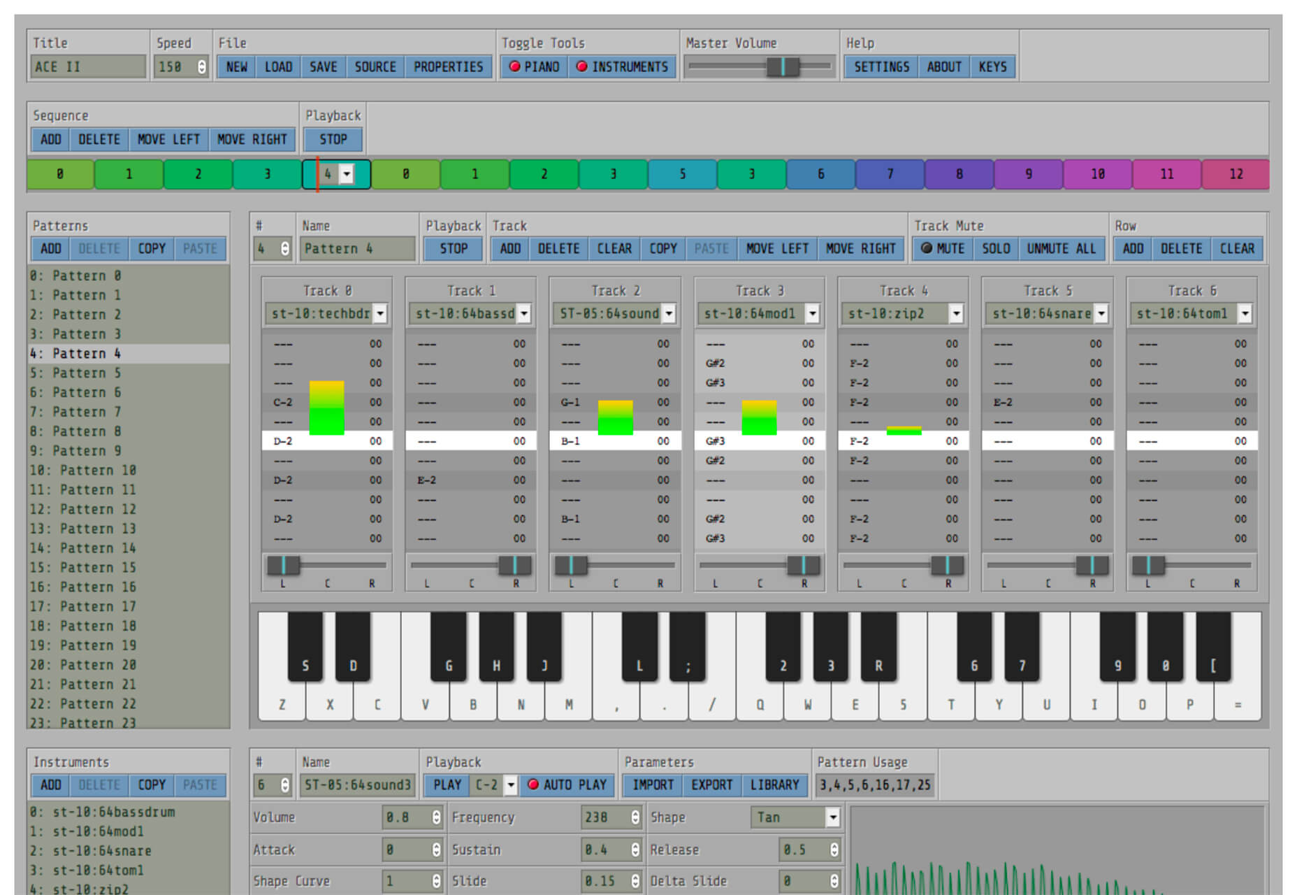
ZzFXM Tiny JavaScript Music Generator

ZzFXM is a tiny JavaScript function that generates stereo music tracks from patterns of note and instrument data. Instrument samples are created using a modified version of the super-tiny ZzFX sound generator by Frank Force. It is designed for size-limited productions.

Image Tiles Scroll Animation

Image Tiles Scroll Animation is a different type of scrolling pattern using Locomotive Scroll. The grid creates a smooth animation in a fun and modern style.

Bubbles

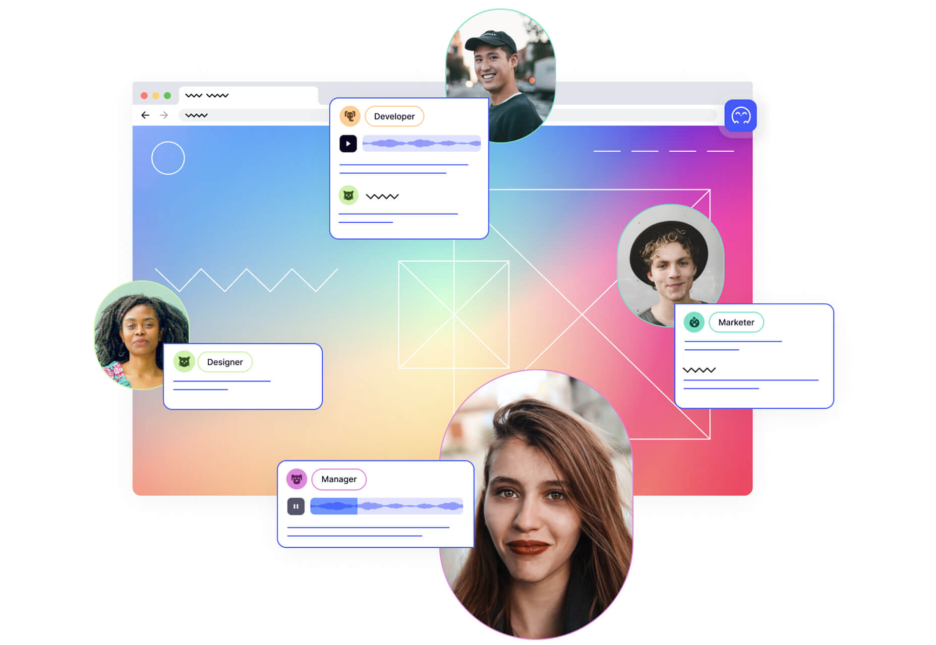
Bubbles is a Chrome extension that allows you to collaborate by clicking anywhere on your screen and then dropping a comment to start a conversation with anyone. This is a nice option for work from home teams.

Tyrus

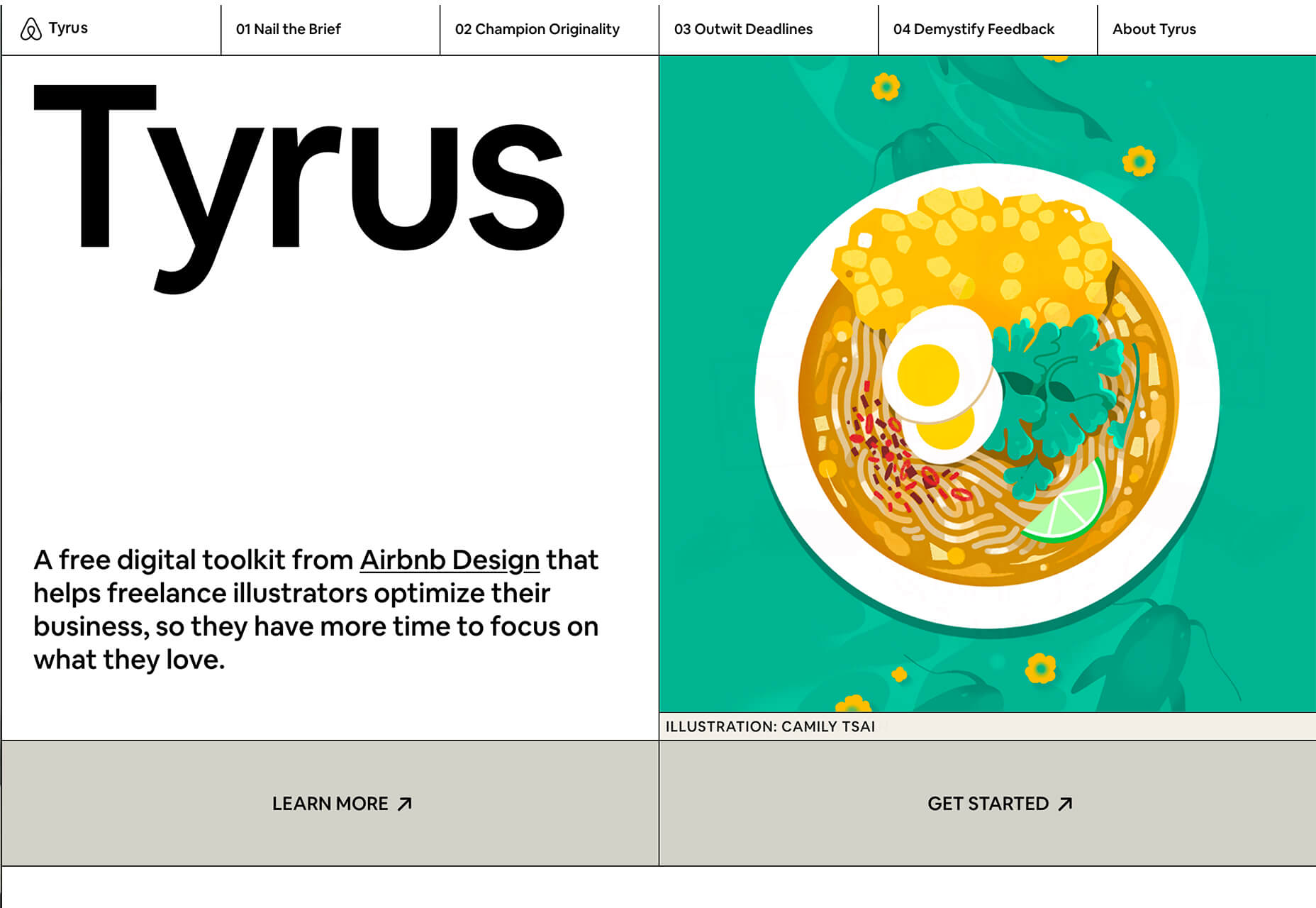
Tyrus is a toolkit from the design team at Airbnb to help illustrators make the most out of their design businesses. It is broken into sections to help you with design briefs, originality, deadlines, and feedback.

PatchGirl

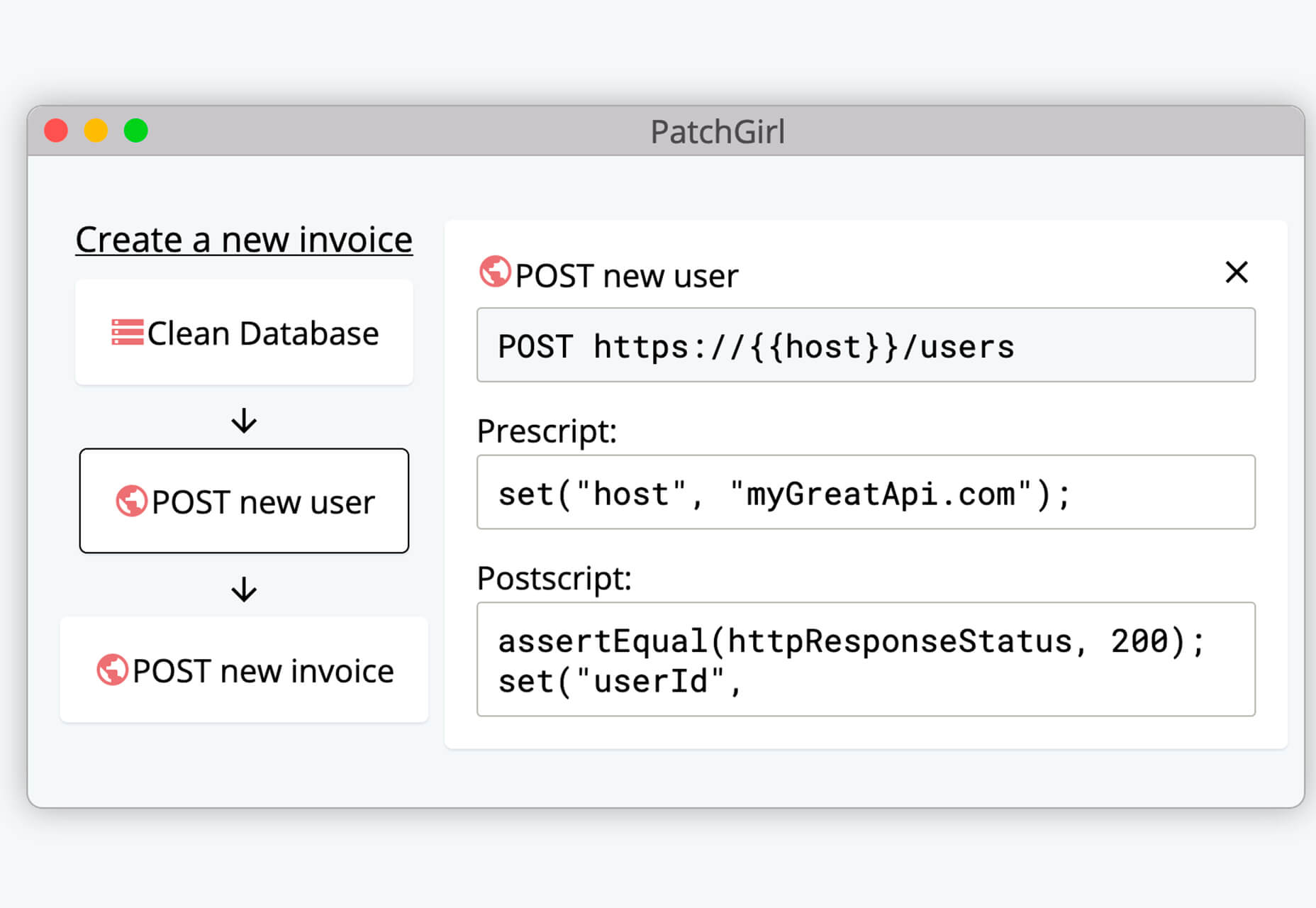
PatchGirl is an automated QA tool for developers. You can combine SQL and HTTP queries to build any possible state of your database.

Apparel

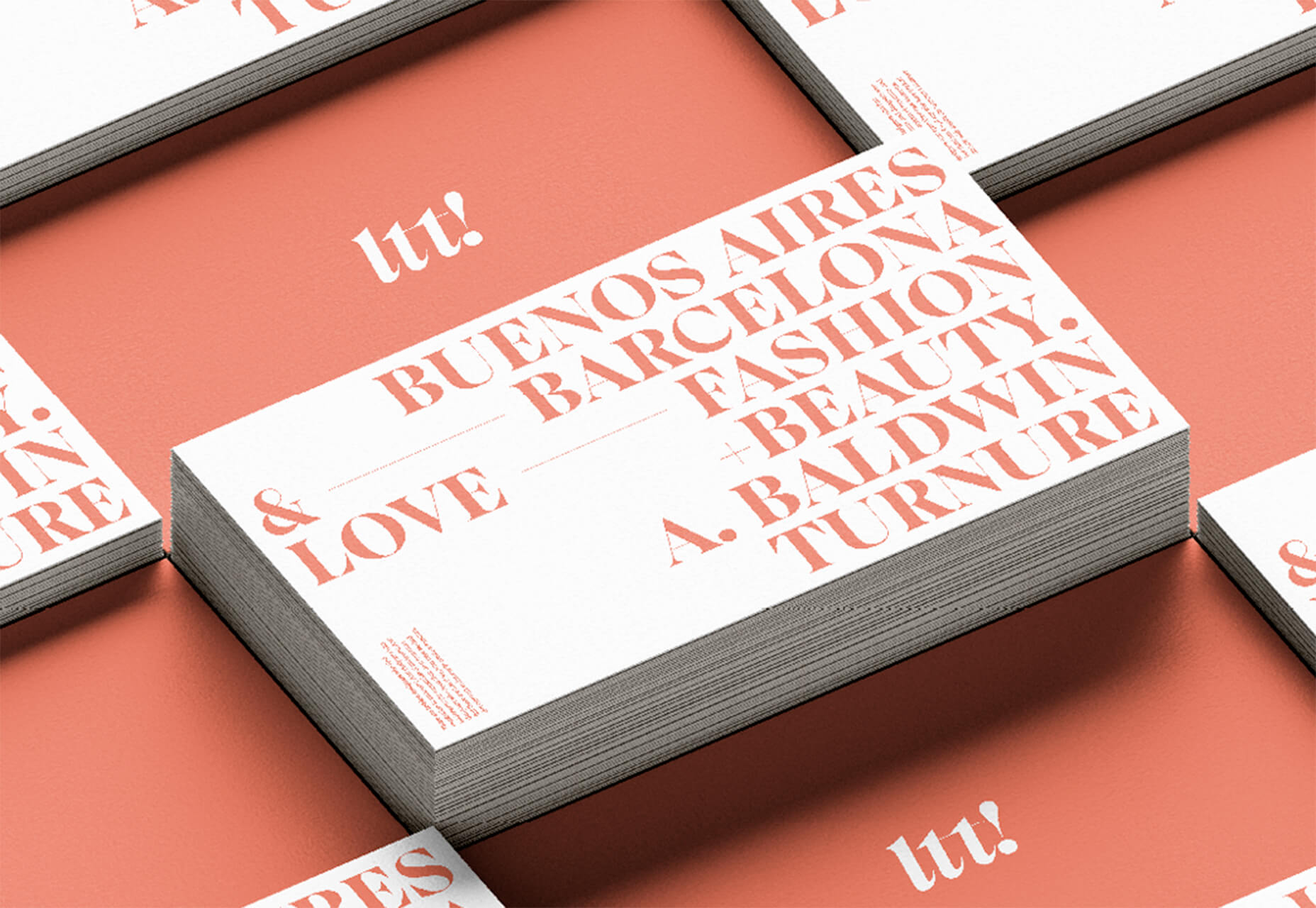
Apparel is a beautiful premium typeface family with plenty of versatility in a modern serif style. It is a contemporary, classy, and fresh serif typeface with a laid-back. Its medium-large x-height makes it ideal for headlines and brand identity design.

Christmas Story

Christmas Story is a nice solution if you are already starting to think ahead to holiday projects or cards. The long swashes and tails are elaborate and fun.

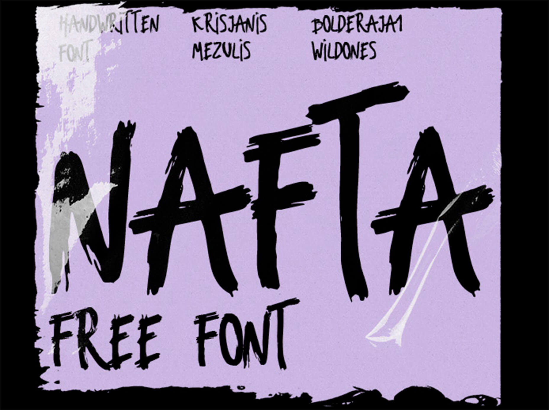
Nafta

Nafta is a fun handwriting style font that has a marker-style stroke. It’s a modern take on the popular Sharpie font. It includes all uppercase letters.

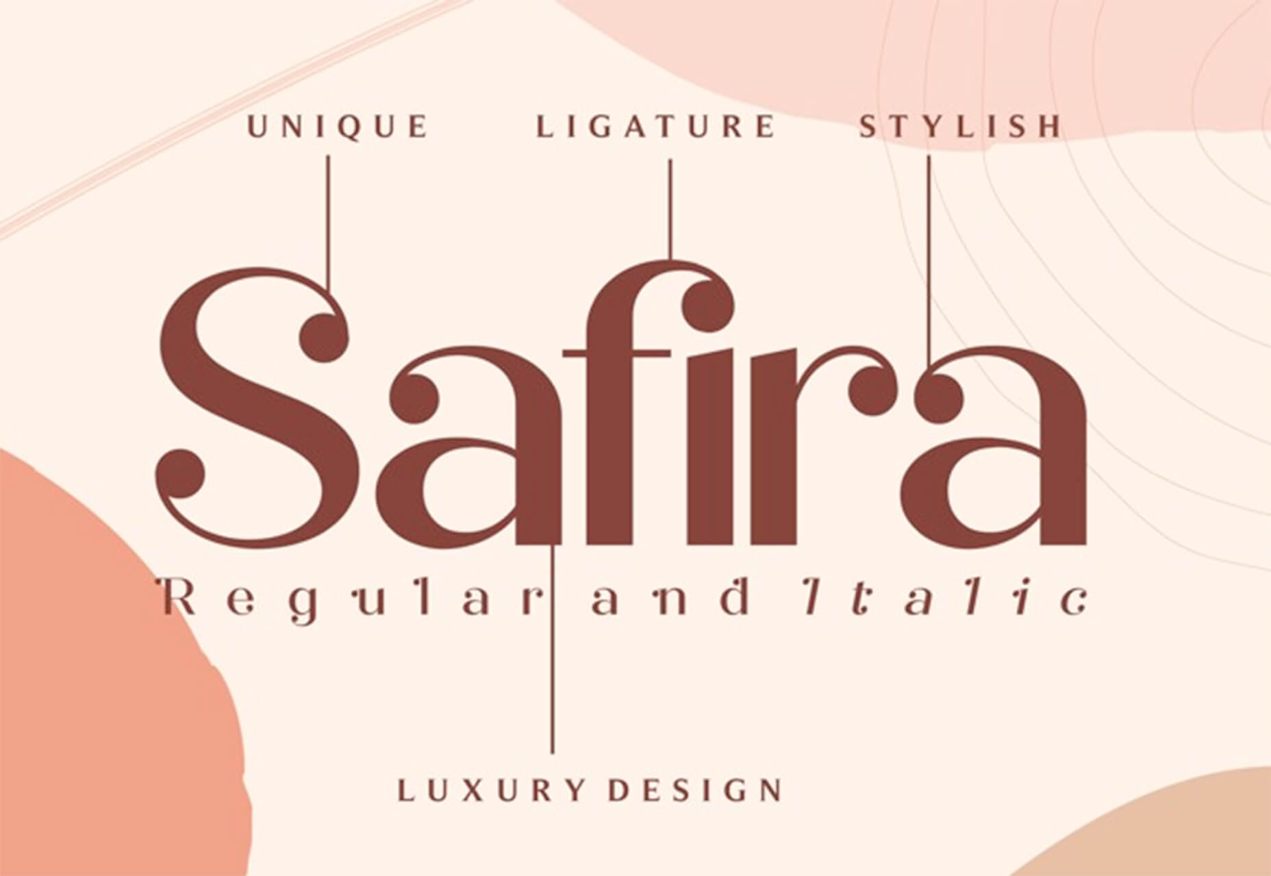
Safira

Safira is a wide and modern sans with ligatures and a stylish feel. The rounded ball terminals are especially elegant.

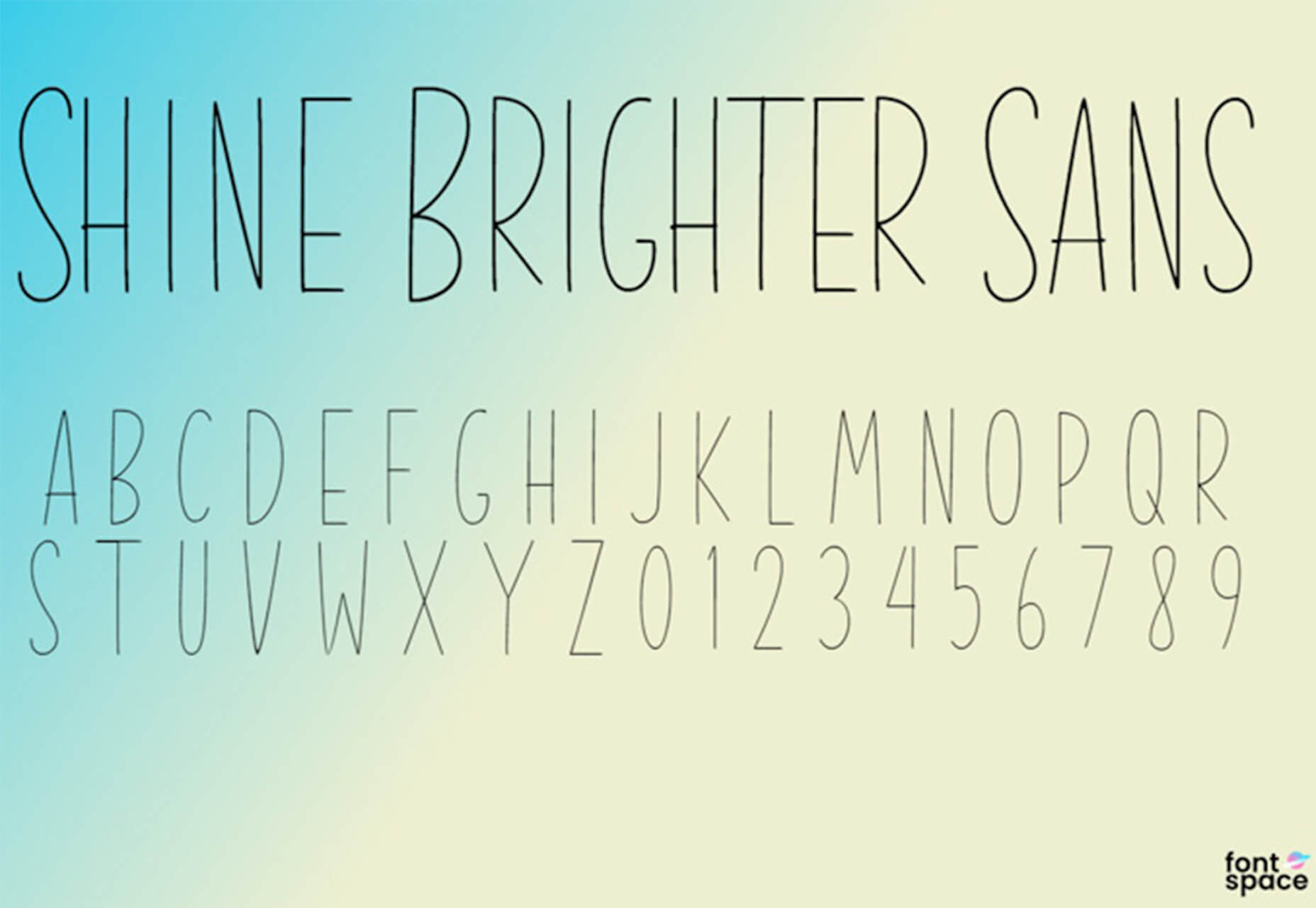
Shine Brighter Sans

Shine Brighter Sans is a super-thin sans-serif with a light attitude. The limited character set combined with its light weight is best for display use.

Source


Source de l’article sur Webdesignerdepot

How can your customer reach you? If a client arrives on your website after searching on Google, what can they do to take the next step in a relationship with your brand, without buying anything?

One of the primary aims of any website is to drive conversions. However, it usually takes between 5 and 8 touchpoints to generate a viable sales lead. People don’t want to convert straight away.

Since building a relationship with customers is crucial to success, it makes sense that the contact page would be an essential part of driving results. Unfortunately, a lot of website owners pay virtually no attention to that page. They ask their designer to create a page with their address and phone number on – and that’s it.

What many business owners don’t realize, is that the contact page is the door to deeper, more lucrative relationships with potential prospects. The design of this essential website element needs to be fantastic to drive results.

So, where do you start?

Defining a Well-Designed Contact Page

Let’s start with the basics, what makes a great contact page?

The complete answer to that question depends on the target audience. Some customers will want to see fun and friendly contact pages, complete with social media sharing buttons. Others will want to see a map that shows them exactly how to reach an office or business.

There are a few golden rules to keep in mind, of course. Contact pages should be:

  • Easy to find: Don’t hide the link to the contact page on the website footer. Make it easy for customers to find out how they can get in touch.
  • Simple: Don’t put too much content on this page or it will overwhelm your audience. Just let them know where they can go to get answers to various questions.
  • Professional: Even if you have a friendly brand personality, your contact form still needs to be grammatically correct and well-designed to show a professional edge.
  • Convenient: Make your phone number clickable so customers can use it on Skype. The same can apply for your email address. Provide easy access to social media profiles, and if you have a contact form – keep it short and sweet.
  • Informative: Include all of your contact information in the same place. This may include your address, a map to your location, social media pages, email addresses, and even forums.
  • Accurate: Ensure that the information on your contact page matches the information listed elsewhere. Check directories and Google my Business listings to be sure.
  • Attractive: Yes, a contact page needs to look good too. Plenty of white space will make essential information stand out. A good layout will guide the eye through the page.
  • Consistent: Make sure the contact form on your website matches the brand personality that appears on all of your other pages.

Take a look at the Tune Contact page:
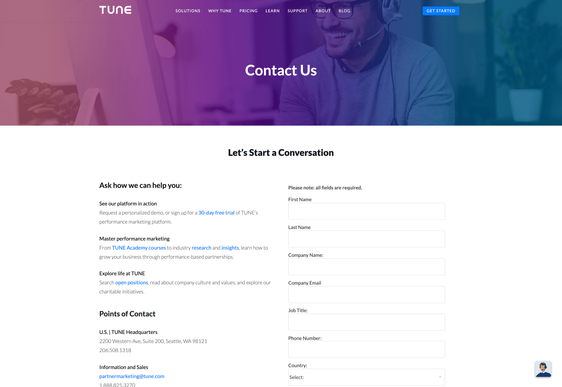
It’s beautifully laid out, with clear information that’s easy to read. The company shows exactly why customers might want to get in touch and how they can reach out. As you scroll through the page, you’ll find additional office locations, email addresses for different teams (sales and support), and links to social media accounts too.

How to Drive Engagement on a Contact Us Page

A good contact page needs to look fantastic, showcase the company’s personality, and capture audience attention. However, there’s a big difference between a contact page that gets the job done, and one that convinces your audience they have to connect with you.

Here are some excellent ways to make your contact us page stand out.

Step 1: Using Color Correctly

Color and color psychology have a massive impact on user experience.

Studies constantly demonstrate the conversion powers of having the right shades on certain pages throughout your website. For instance, changing a CTA button from red to green can increase click-through rates by 27%.

However, every audience is different. The colors that drive engagement on a contact page for your company will depend on your target customer. A/B testing color palettes that match your brand personality is a good way to get started.

One interesting example of colors that make the right impact on a Contact Us page comes from Hubspot. Here, the brand maintains it’s brand color (orange), but it also introduces some new shades that convey trustworthiness and professionalism.
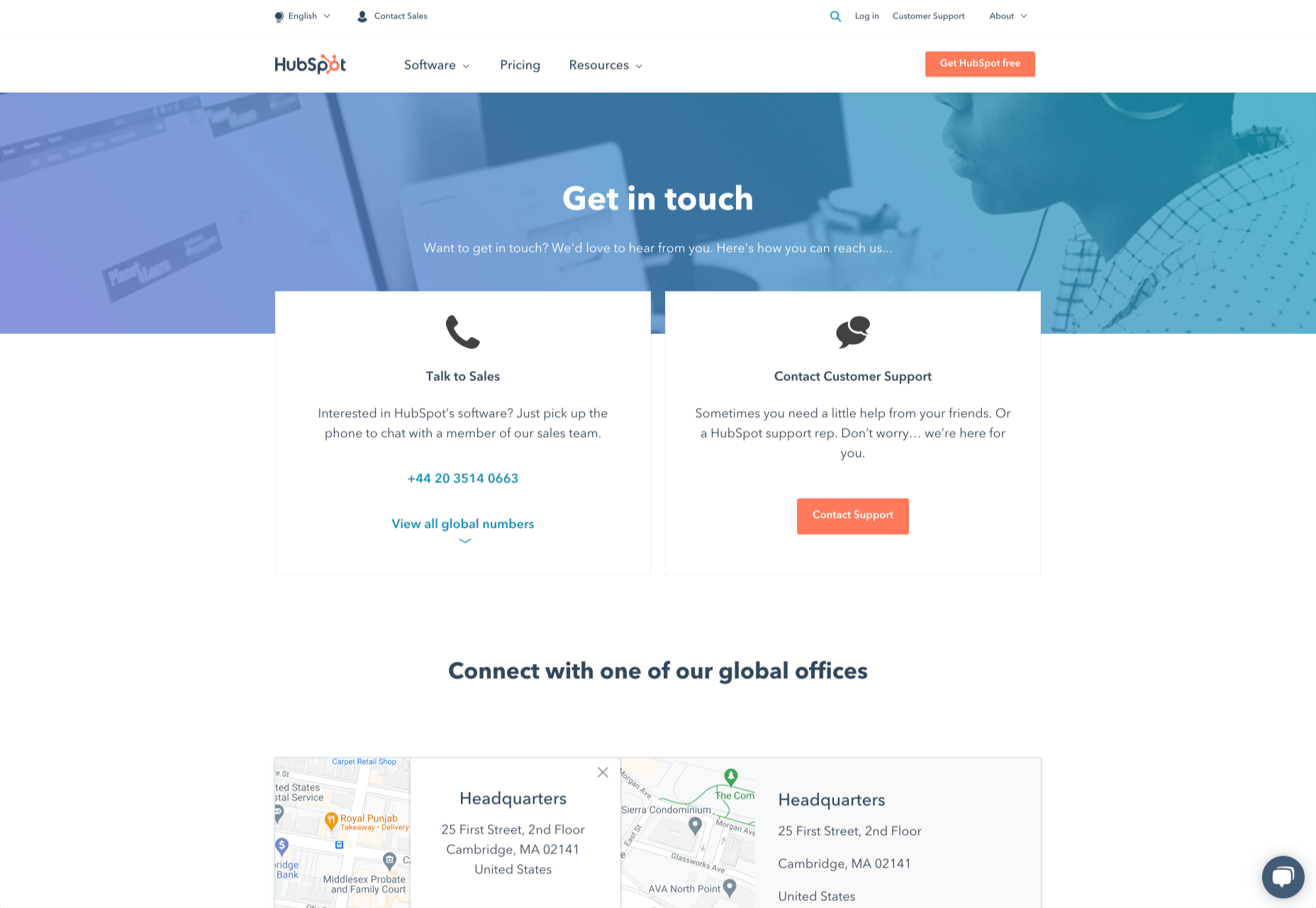
Blue is the most calming and credible color for any brand, The gradient that Hubspot uses here blends perfectly with its brand identity, allowing for a stunning contact page, with CTA buttons that still stand out.

Experiment with colors that can generate the right emotional response from your audience, but don’t ignore the golden rules of color in web design. You still need to showcase your brand identity, and you still need a way of making crucial information stand out.

Step 2: Humanizing the Customer Service Team

Some of the customers that arrive at a contact page are interested in your product or inspired by the potential of your service. Other customers will be looking for assistance because they’re frustrated with something or stressed out.

If you’ve ever had a problem with a product and wanted to reach out to the brand about it, you’ve probably noticed how annoying it is to find a blank contact page with nothing but an email address. The lack of effort and humanity in the contact page is enough to convince you that you probably won’t get a response.

But what if you add some happy smiling faces to the page?

Research indicates that brains are fine-tuned to recognize and appreciate human faces. Having a picture of your customer service team, or just any human being on your contact page makes you instantly more approachable. Your customers start to feel like they’re reaching out to a person – not an empty website.

Look at how engaging and personalized this contact page from Amber McCue looks:
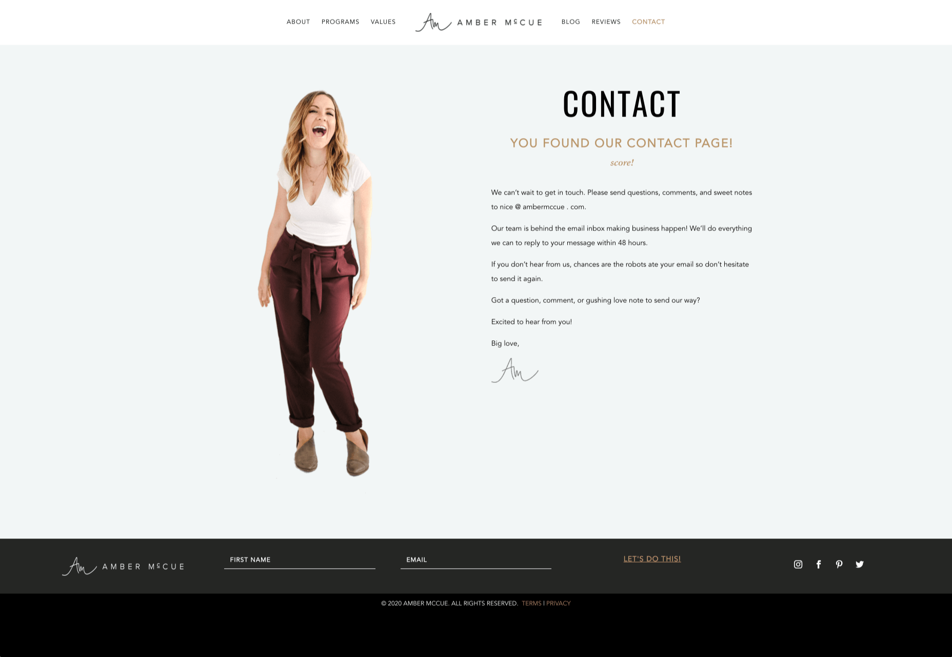
Although you can show any human face on your contact page and potentially get results, showing your actual agents will be more likely to drive positive results. It’s a great way to showcase the authenticity and humanity of your team.

Step 3: Making it Easy to Find

A surprisingly large amount of the time, companies shove their contact information into the footer of their website, forcing customers to spend forever looking for them. However, your audience might not want to spend an age searching for your details if they’re in a hurry to get answers.

Stowing a contact page in a footer is also a problem for those visiting your website via mobile, as they might not be able to see all your footer details and links as well.

A Contact Us page doesn’t have to be a massive part of your website navigation if you don’t want it to be. However, it should be one of the first things your audience can see. Putting the information on the header of your website, or even sticking it to the top of the page as your users scroll is very helpful.

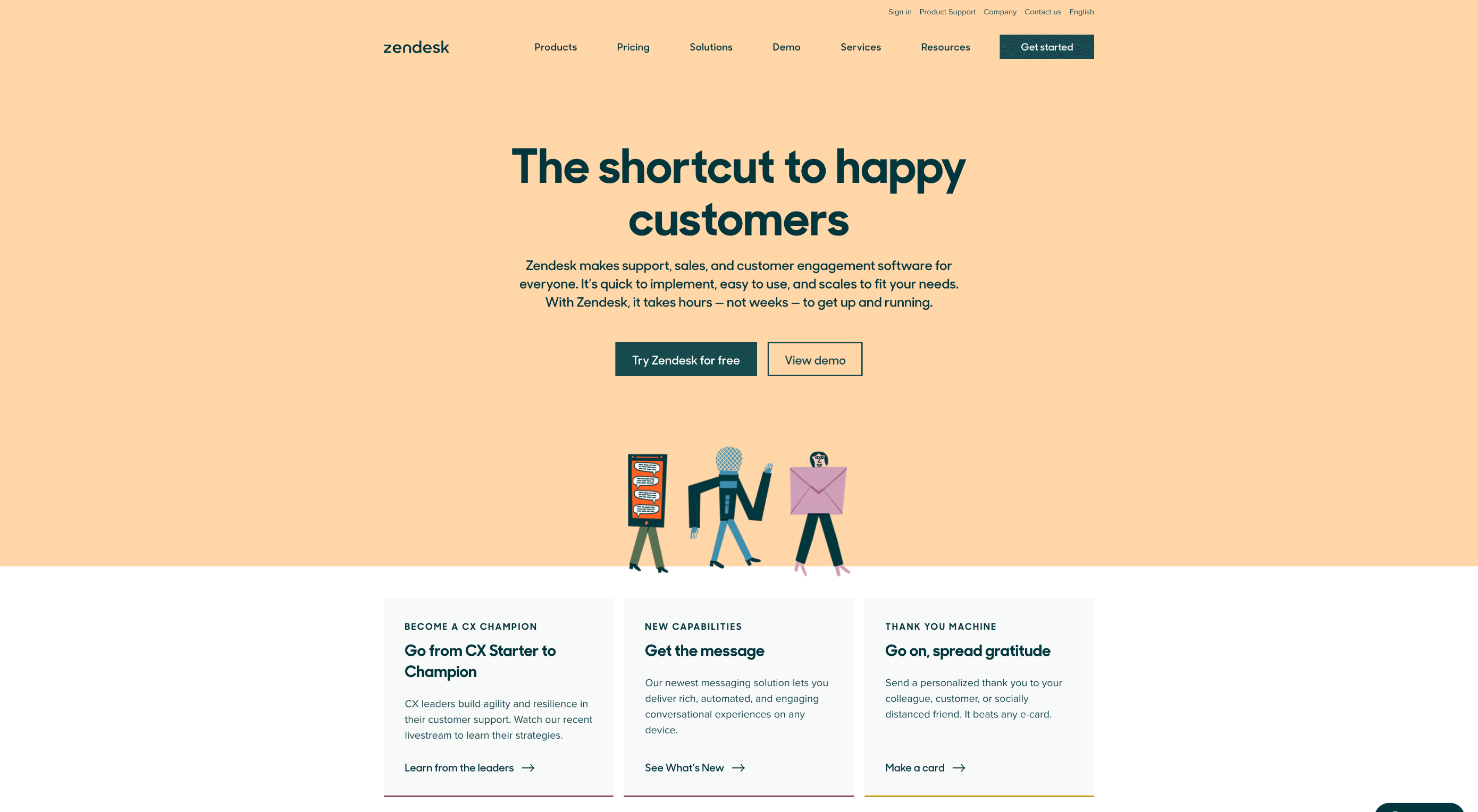
Zendesk makes it easy for customers to get in touch in multiple ways. First, the Contact section of the website is clear at the top of the page. Secondly, if you start scrolling through the Zendesk website, a “Get Help” button pops up, so you don’t have to scroll back to find assistance:
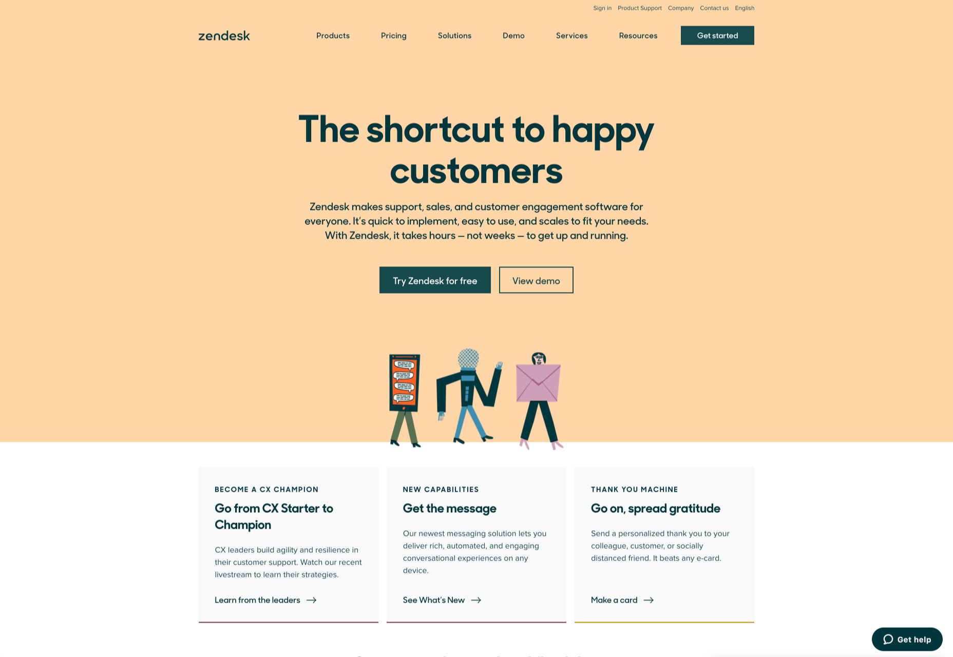
Remember, aside from making sure that your contact page appears in the right part of your website, it’s also worth ensuring that it’s easy to understand. Don’t use unusual terms like “Chat”, or “Chill with us”. Stick to tried-and-true options like Help, Contact, or Support.

Step 4: Making the Experience Relevant

There’s a reason why it’s practically impossible to find a one-size-fits-all contact page.

It’s because different customers need different things from your brand.

Some customers will be looking for the answer to a question; others will want to discuss something with your sales team. That’s why many companies are using adaptive contact pages that can change to suit the situation.

For instance, you may start by asking customers what they need help with. Zapier takes this approach with its Contact page:
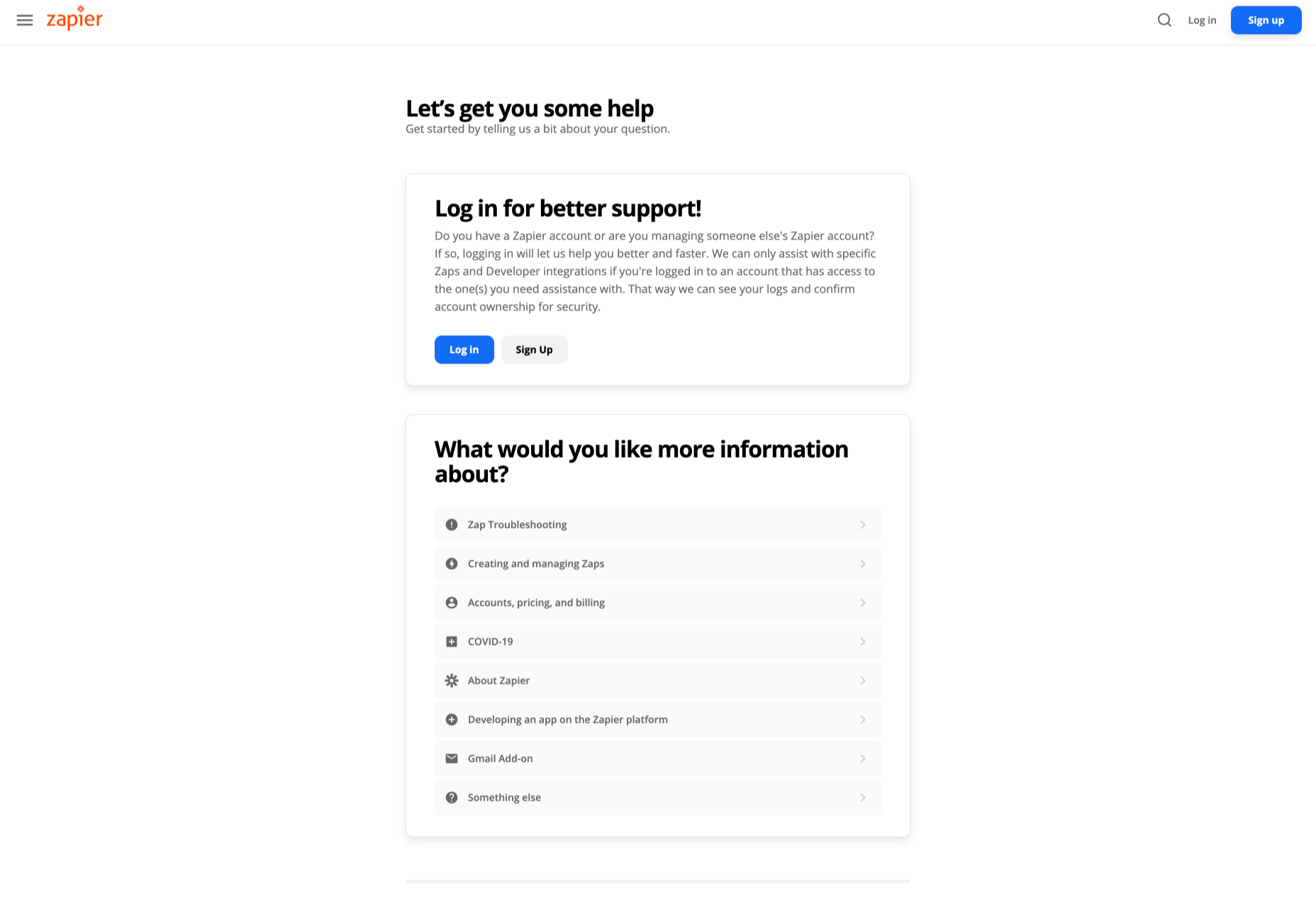
By asking the client what they need straight away, Zapier can make sure that the visitor finds the right information, and the right number or email address for the appropriate agent. You can even scroll down the help page and look for something in the available help centre, using the search bar. Or you can click on View our experts to hire a Zapier pro.

Creating a dynamic and customized experience like this does a few things. First, it ensures that the customer will reach the right person to help them first-time around. This reduces the number of inappropriate calls your employees have to deal with, and the number of transfers.

Secondly, you deliver a better experience overall for your client, because they don’t have to repeat their issue to multiple people or start a massive email thread. They get the support they need immediately.

Dynamic contact pages can even save you some money and time. If clients decide to solve an issue themselves, using your resources, that’s great for your busy agents.

Step 5: Direct People to the Right Place

The central focus of your contact us page needs to be the available contact options. Centralizing the contact options on a page is an excellent way to make sure that they get the right amount of attention. Centralizing also means that your customers can spend less time searching for the contact details that they need, which is great for usability.

The Melonfree.com website uses a contact us form that’s centralized to immediately pull attention to the customer’s options for getting help.
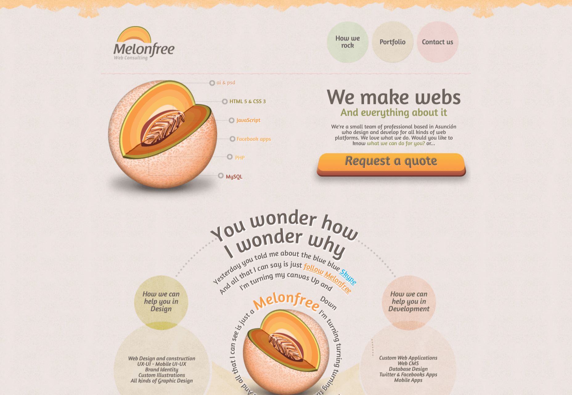
Centralization isn’t the only way of using design principles to guide visitors on a contact page. According to Ray Hyman and Edmund Hick, increasing the number of choices on a page often increases the time it takes for people to make a decision.

When it comes to connecting with a brand, the right option for each customer will depend on the person and the situation they’re trying to overcome. For instance, a customer that needs to reset their password will probably be able to get the solution they need from an FAQ page.

On the other hand, someone who needs help using a new feature might need the guidance of a professional. To help guide customers to the right solution, Basecamp gives customers a variety of steps to follow to get the right solution fast.
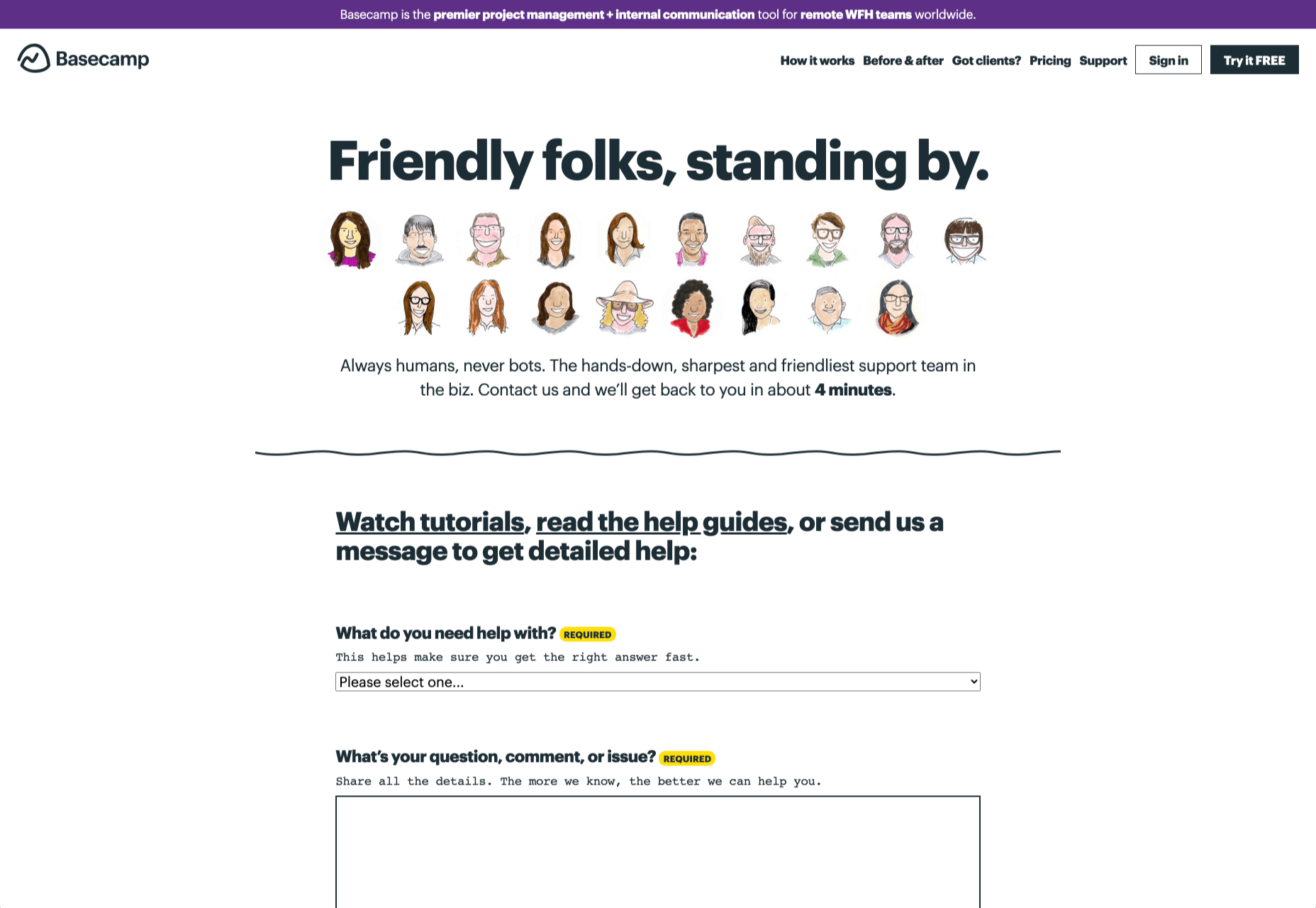
The main purpose of the contact page is to help customers get the right answer with an informative form. However, there are unobtrusive alternative options available too. If all you’re looking for is a way to help yourself fix a problem, you can click on the help guides link before you ever scroll down to the form.

Step 6: Support the Contact Team Too

The best contact us pages aren’t just a great way to improve customer experience. Well-designed solutions also help the customer service team to save time and stay productive.

One of the primary metrics that companies consider when evaluating the success of a service team, is the number of replies required before an issue is resolved. However, if the initial question from a customer doesn’t contain enough information, this number often increases.

Using the design of the contact form to access the right information helps with:

  • Automatically routing people to the right team member: Companies can set up segmentation rules that automatically send certain emails to different employees based on keywords. You might have questions that go to the sales team, and separate queries that you direct straight to the customer service team.
  • Show appropriate support options and FAQs: Remember to give the audience a chance to help themselves before they reach out for extra support. Links to an FAQ page or self-service options can really reduce the pressure on a team. Some companies even add automated chatbots to the mix to help with self-service.
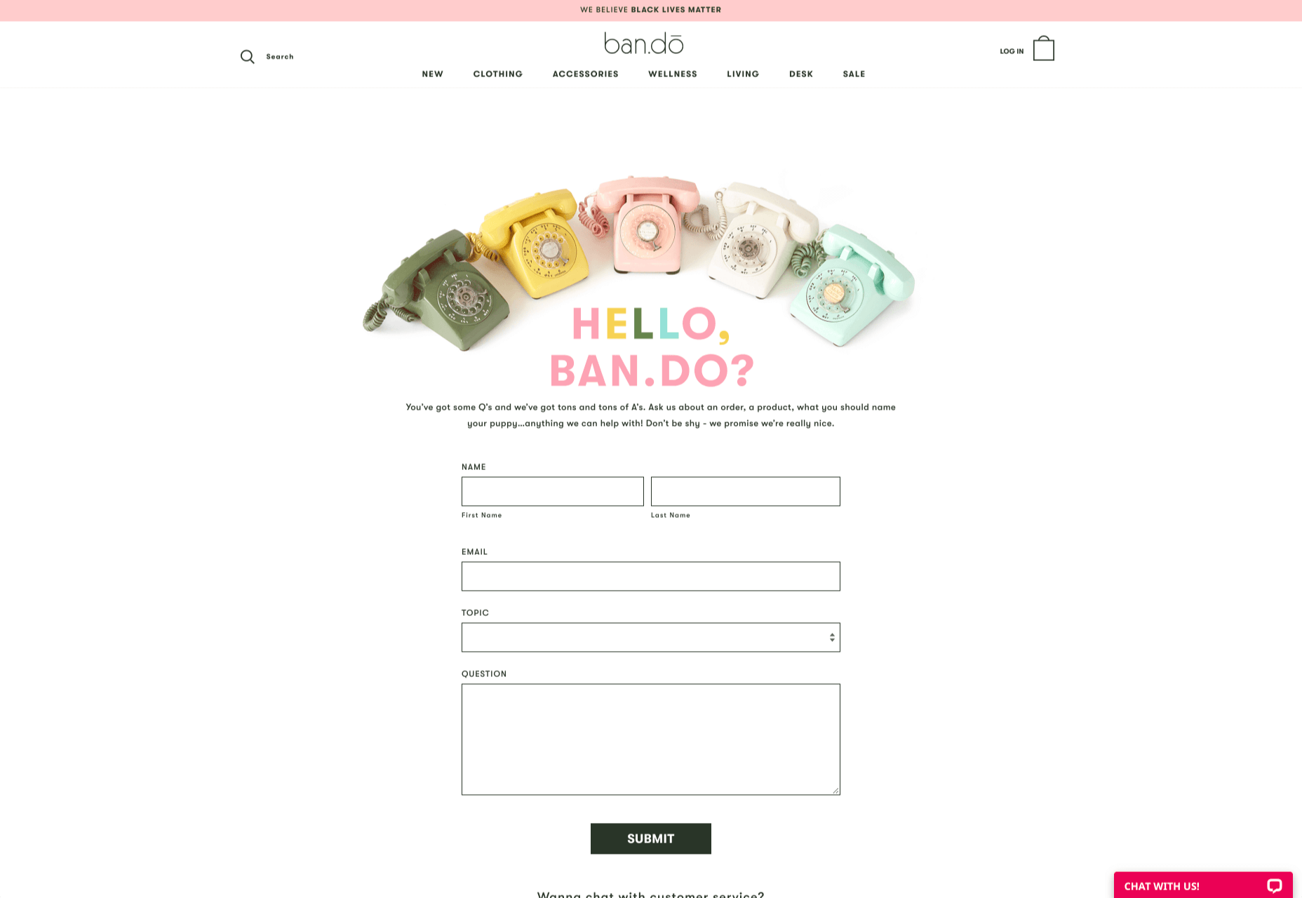
  • Prompt for extra context: Although not every customer will take advantage of an opportunity to add extra information to a form, some will. Adding a box to your contact form for “anything we need to know?” is a great way to generate more information. Ban.do includes a simple “question” box where customers can add as much detail as they like. An option to add screen shots or documents might be a nice touch too.
Building Your Own Contact Us Page

Every customer has their own specific set of needs. The right contact page for another business might not be the right one for you. That’s why it’s so important to take some time getting to know your customers and speaking to your support team.

When you’re planning your contact page, it helps to ask yourself some basic questions about what you want to achieve. For instance:

  • What kind of channels will our customers want to use to connect with us? Look at things like social media messaging, email, or phone calls. If you’ve got a relatively tech-savvy audience, then they might want to use things like instant messaging with chat bots too.
  • How can we direct clients to the appropriate channels in as little time as possible? Having a system in place to automatically route your customers to the right agent will reduce the time to resolution for your customers. The faster you solve problems, the better your reputation becomes.
  • What can we do to set customer expectations and build confidence before they speak to us? Designing a professional-looking contact page will increase customer confidence, while an FAQ section shows that you’re ready to answer common questions.
  • How can we showcase a unique brand personality without making the page complicated? Everything from using distinct brand colors on a contact page, to adding images and illustrations reminds customers that they’re in the right place.
  • What can we do to reduce the friction points in a customer’s path to contact? Avoid adding too many input options to a contact form and ensure that it’s easy to reach out when your clients have a problem.

Understanding exactly what your audience needs from you, and what they’re looking for when they come to your team for help reduces the effort involved for your client when they reach out for help. Remember, today’s digitally-savvy customers expect their interactions with companies to be as streamlined and simple as possible.

Make the Most of Your Contact Page

Contact pages are frequently an afterthought in the website design process. However, they’re one of the most valuable tools your company has. With a good contact page, you ensure that your customers can always reach you when they have problems. What’s more, you boost your chances of people wanting to reach out to the sales team too!

Good luck creating a contact page that encourages engagement from your target audience. Don’t forget to track your results from each design, and A/B test for optimization.

Source


Source de l’article sur Webdesignerdepot