Articles

There are dozens of factors that influence the UX of your site, app, or game. Most of them are beyond your control; user connection speed, end-system resources, even browser technology is all out of your hands. So when you do have the opportunity to influence your project’s infrastructure, you should seize it.

The world’s fastest muscle car can’t perform at its best when traffic is gridlocked bumper to bumper; likewise, the most finely tuned website can’t meet its potential running on shared hosting.

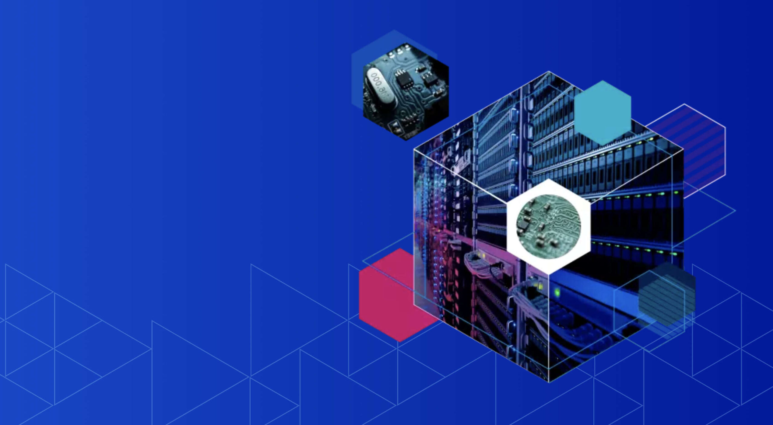
If you want your website, application, or service to run quickly and securely, maximizing both UX and SEO, then you need to look at the bare metal servers from OVHcloud.

Bare Metal Performance

Bare metal (or dedicated) servers aren’t uncommon. Still, most hosts only offer a single type of server, expecting small startups to pay for resources at the same rate as global giants, which can make dedicated hosting prohibitively expensive.

OVHcloud is different; it offers a range of bare metal server products optimized for a wide variety of challenges. That means small startups can invest in fast, easily scalable solutions that meet the most demanding security requirements without breaking the bank.

Whatever your aims, there’s a different OVHcloud solution configured for you:

OVHcloud Rise

Rise is the perfect option for a website, or web app hosting. With its low entry-cost, Intel-powered performance, bundled DDoS protection, and simplified administration, Rise is the natural choice for your first step into bare metal servers.

OVHcloud Advance

To meet SMEs’ need for reliable infrastructure to run mission-critical applications, OVHcloud configured Advance. From in-house CRMs to web-facing SaaS products, Advance is a solid foundation upon which to build your business.

OVHcloud Storage

Storage is ideal for storing large amounts of data securely. Hosting data on standard servers is a colossal waste of resources; with OVHcloud’s Storage product you can host up to 504TB and seamlessly access it via a performance-tuned server.

OVHcloud Infrastructure

For large companies with thousands of employees, global non-profits, colleges, and even local governments, OVHcloud Infrastructure offers scalability and flexibility beyond the average dedicated server.

OVHcloud High-End

For web apps that are leveraging cutting edge technology like machine learning and big data, OVHcloud’s High-End product is a no-compromise custom solution, the humdinger of bare metal servers, with every conceivable option available.

OVHcloud Game

If you’re developing video games, then lightning-quick, reliable streaming servers are essential. OVHcloud’s Game product delivers the type of speed your customers demand, with massive performance gains over comparable bare metal servers.

How to Choose a Bare Metal Server

It’s easy to get bogged down in detail, especially if this is your first foray into bare metal servers.

But here’s the good news: every OVHcloud bare metal server is a massive boost in performance over shared web hosting. That’s because, with a dedicated server, all of the server’s resources are…dedicated; that is, you don’t have to share with anyone. Shared hosting is pot-luck: You might wind up on a server with thoughtful users who don’t eat up all the resources, and you might end up on a server with one selfish user who hogs the processes and compromises the security. With a bare metal server, that’s not an issue.

Choosing a bare metal server is a two-step process. The first step is to think about what you intend to use it for:

Are you going to store a lot of data? If so, think about OVHcloud’s Storage product. But a lot of data doesn’t mean a WordPress blog. Let’s say you’re a polling company, collating millions of records that you hope to analyze to predict political movement; that requires a lot of storage. On the other hand, all servers have some storage. OVHcloud’s Rise product comes with 500Gb and can be configured with more. So if you’re planning to host something the size of a blog, then OVHcloud’s Storage might be using a sledgehammer to crack a nut.

The second step is to ask how complex the operations you’re going to ask the server to perform will be:

Hitting up a database to retrieve some data is not a complex operation. Even something like a complex search isn’t too taxing. If that’s the kind of process you expect to perform, OVHcloud’s Rise is more than adequate. But if you’re manipulating large amounts of data, like resizing hundreds of raster images dynamically; or using facial recognition to search through millions of biometric data records; or even managing your advertising application serving millions of ads to sites across the web; in those cases, you need the sort of performance OVHcloud’s Infrastructure product delivers.

OVHcloud’s products are all scaleable. Its High-End bare metal server product is entirely customizable. Whatever you choose, and however your needs change over time, you can be confident you’re running the optimum server for your project.

Why Choose OVHcloud

There are a mind-boggling array of processors, and OS, and a seemingly infinite — and increasingly expensive — amount of hardware on offer on the web. OVHcloud radically simplifies running a bare metal server by delivering a range of popular packages, tailored for everyday uses, that are both customizable and scaleable.

What OVHcloud delivers is a clear choice, letting you choose the right server for your product.

Whether you need lighting fast response times to maximize your SEO or the space to store a digital archive of the world’s most important art, for reliability and choice, opt for OVHcloud bare metal servers.


[— This is a sponsored post on behalf of OVHcloud —]

Source

The post How to Choose a Bare Metal Server From OVHcloud first appeared on Webdesigner Depot.


Source de l’article sur Webdesignerdepot

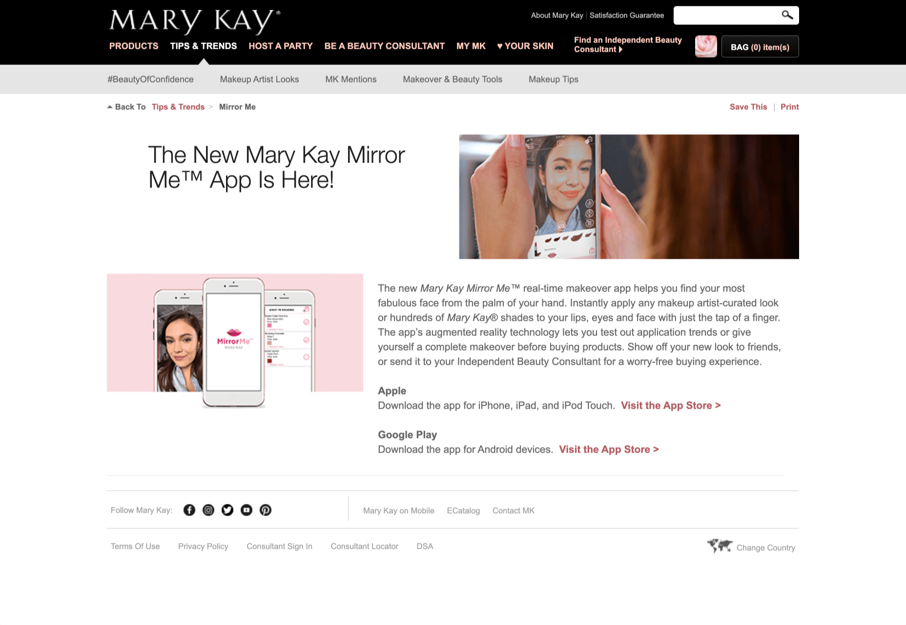
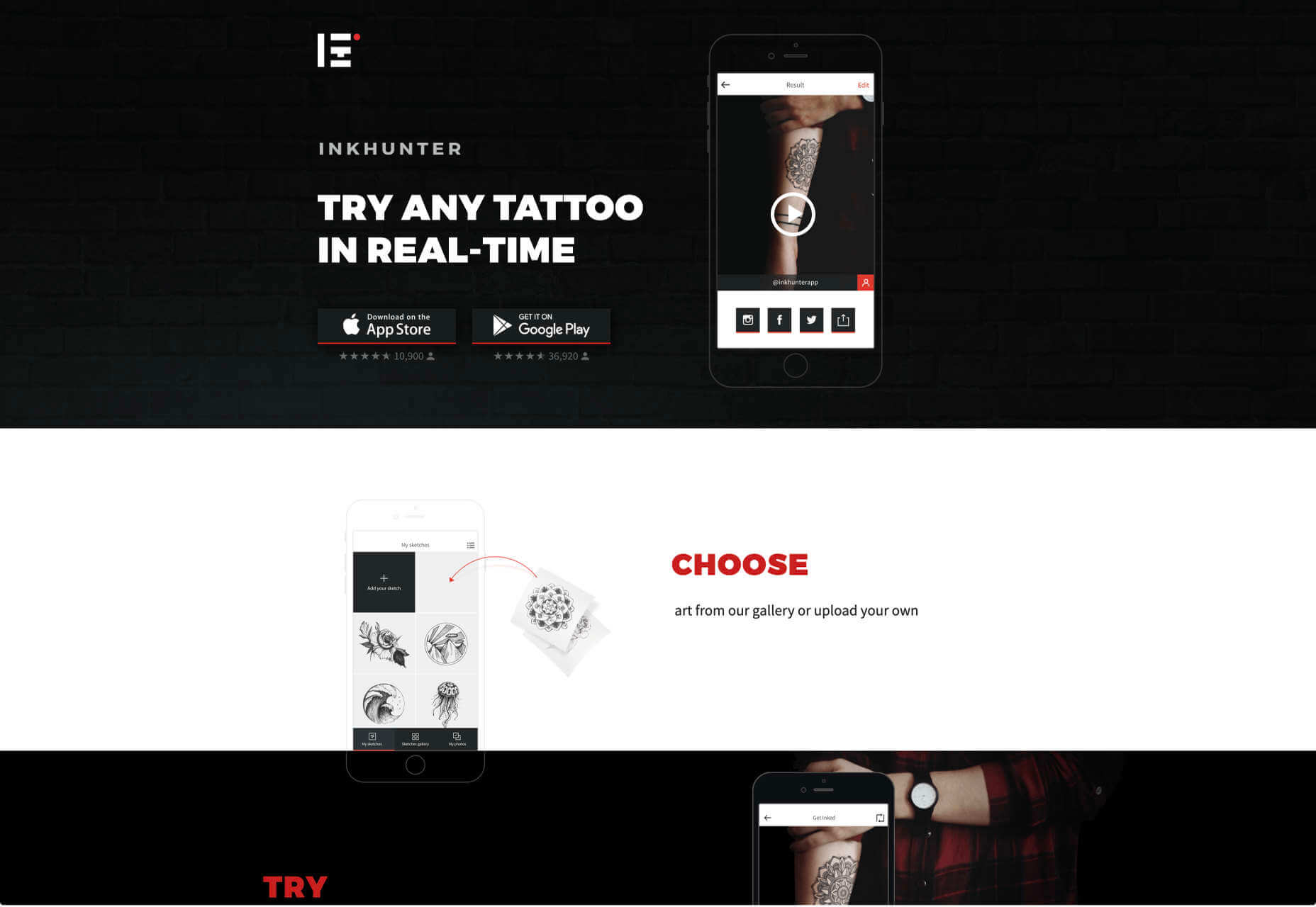
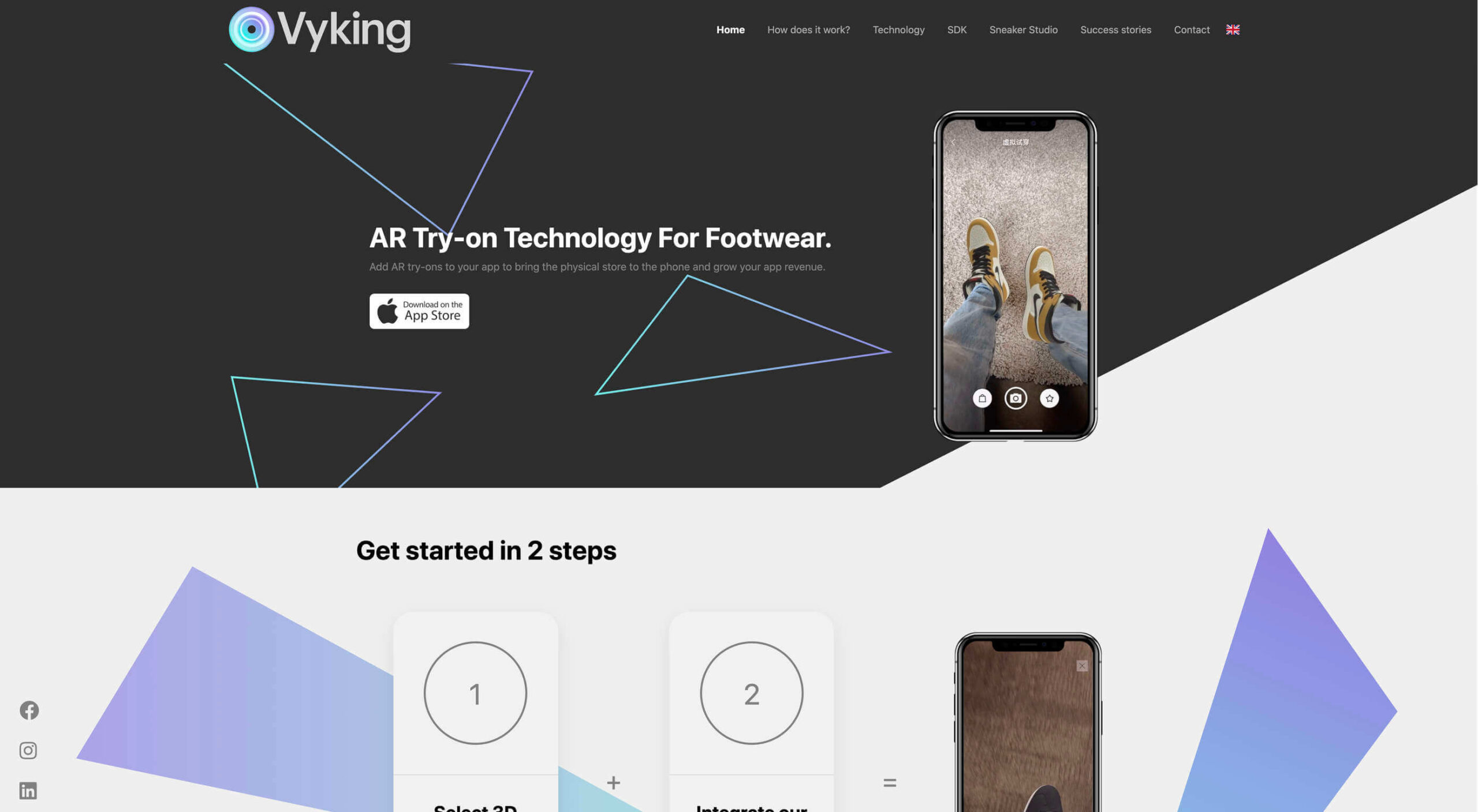
Over the years, experts have repeatedly discussed the possible impact of mixed realities on web design. Concepts like AR and VR are expected to have the potential to change the way that we interact with websites on a fundamental level.

Now that we’re in the year 2021, however, discussions about AR aren’t just observational anymore. The age of mixed-reality interfaces is here, in everything from Pokémon Go, to Snapchat filters.

The question is, how do web designers create incredible user experiences in a world where there are now multiple digital realities to consider?

The Benefits of Experimenting with AR

Before we look at some of the steps that web designers can take to enhance their projects with AR, it’s worth examining the benefits of interacting with augmented reality in the first place. 

While virtual reality replaces the typical world around us completely with digital components, AR augments it. This means that developers and designers need to learn how to thrive in an environment where the real world and the digital one work together. 

The most common AR application for website owners is to provide a solution for real-time and remote product visualization. Imagine being able to try on a pair of shoes before you buy them online. That’s a service that the Vyking brand can deliver by creating technology that “reinvents” the digital shopping experience. 

This test functionality plays a massive role in purchasing decisions. In a world where people can’t see a shade of make-up in person when they’re shopping online, or check how an item of furniture looks in their home, AR has a crucial role to play. 

In simple terms, AR helps shoppers to make more informed purchases. 

Here’s how you can use augmented reality to deliver incredible UX. 

1. Focus on Real-Time Feedback

Augmented reality is all about connecting the real world to the virtual world. 

Doing this provides users a unique experience – one that’s filled with real-time feedback that can deliver crucial and insightful information. For instance, an augmented reality system in a GPS app can calculate the average time before reaching a destination based on previous trips.

Another option is for an augmented reality to use solutions like face-mapping to help customers determine how a certain makeup product will look before they buy it. For instance, that’s the case for the Mary Kay Mirror Me app, which simplifies the process of shopping for make-up. 

When designing for AR, experts need to consider how they can provide customers with real-time information that they can use to make better purchasing decisions. 

2. Define input and output

Although you’ve probably performed similar exercises when designing for traditional websites and applications in the past, defining inputs and outputs of UX in AR environments can be tough.

Defining inputs and outputs allows you to determine which elements of an interface your user can actually interact with, in your interface. This gives you a better idea of what to “augment.” For instance, you might decide that physical gestures like a swipe of the hand will be essential for AR inputs. However, you’ll also need to consider how each mobile device offers different input possibilities. 

Outputs are a little simpler. For instance, you could offer a three-dimensional model of a product that your customers are interested in. Once you have that output, you can think about how the customer will interact with it by changing colors or position.

3. Embrace Customer-Friendly Performance

Another feature at the heart of AR applications is interactivity. 

Good designs in the augmented reality world need to be simple to access and use, otherwise customers will end up avoiding them. For instance, 60% of customers say they want to use AR when they’re shopping for furniture. However, they’re only going to use your app if it actually works. 

The Décor Matters website and app mix gamification with home decorating features that help customers get a better view of the home goods they’re planning on buying. The website even has inspiration pages available to help users find and try new design options with their AR technology. 

When designing for AR, think about how you can make your applications or technology as simple to use as possible, so customers actually want to interact with it. 

4. Address the Environment

In augmented and virtual reality applications, it’s important to remember that interfaces aren’t bound by physical screens. The viewport will move with the user, shifting perspectives in response. Most AR designers will use four different signifiers to describe AR environments:

  • Public environment: The entire body of the user is involved as a controller, like with the Xbox Kinect or Nintendo Wii;
  • Intimate environment: Where a user can be seated – often in a desktop environment;
  • Personal environment: AR on smartphones, mobile devices, and tablets, like Pokémon Go;
  • Private environments: Completely private spaces, such as with wearable technology like the Google Glass solution.

The environment that you’re designing for will be crucial for your project outcomes. Remember, spatial considerations need to be carefully considered when accounting for how users will interact with objects in a frame. 

5. Remember User Fatigue

Another thing to keep in mind when designing for AR technology is that user fatigue is likely to be a much more significant consideration. After all, people interact with websites and applications in a much more intimate and in-depth way when AR is involved. 

AR applications can often use the entire body of a customer as a controller. Because of this, designers need to be careful about exhausting interactions. High-effort and repetitive interactions could tire the user out mentally and physically, causing them to give up on the interaction. 

When designing, you’ll need to consider how you might over-stimulate the user with too many interaction-focused elements at once. Keep it simple.

6. Remember the Essential Principles of UX Design

Remember, just because you’re tapping into a relatively new technology doesn’t mean that you should abandon all the basic tenets of user experience design that you’ve come to understand over the years. Although UX is constantly evolving and changing, it’s always going to keep a few fundamental principles in mind. 

For instance, you’ll always strive to give users the best digital experience in exchange for the lowest amount of effort on their part. Additionally, you’ll need to think about how you can make end-users as comfortable as possible when they’re interacting with new types of technology on websites and apps. 

For instance, since AR is most commonly associated with gaming in the current environment, it might be a good idea to implement gamification concepts into your AR design. What can you do to make sure your customers are having fun?

For instance, Inkhunter is an app that allows users to try on tattoos just like using a filter on Snapchat. The experience feels familiar, comfortable, and exciting.

Unlocking the Potential of AR Web Design

Augmented Reality technology has come a long way over the years. Today, developers and designers can access simple plug-in tools like WordPress VR, allowing designers to upload 360-degree videos into WordPress sites and other unique web extensions. 

Augmented reality is becoming much more readily available on sites and apps of all shapes and sizes. Additionally, customers are accessing more ways to unlock AR’s power through everything from headsets to mobile interfaces. 

However, just like any new technology in the web design world, designers need to think carefully about how they will overcome the challenges in user experience that AR can present. For instance, though AR can offer more information for a customer and help them make purchasing decisions faster, there are also risks. For instance, add too many interactive features to a single website or application, and you could scare users off with too much information. 

In the short-term, web designers need to explore the new tools that are available to them and think about the customers they’re designing for. Only this way will we be able to make any considerable advances in the possibilities of AR. 

Are You Ready to Embrace AR?

Designing for augmented reality applications and websites can be an intimidating concept – even for seasoned designers. However, this is just another technology that creatives can use to drive better experiences for end-users. 

Learn how the latest technology works and get an insight into your customers’ needs, and you’ll be amazed at what you can accomplish in the AR world.

Source


Source de l’article sur Webdesignerdepot

WALLDORF, Allemagne – 18 décembre 2020 – SAP SE (NYSE : SAP) a dévoilé la solution SAP® SuccessFactors® Time Tracking. Cette nouvelle solution cloud offre aux entreprises des outils simples et innovants pour enregistrer, approuver et contrôler le temps de travail de leurs collaborateurs. Dotée d’une interface utilisateur intuitive, la solution SAP SuccessFactors Time Tracking améliore l’expérience des collaborateurs et permet de s’assurer que les salariés sont payées avec précision, dans les délais et conformément aux réglementations locales.

Grâce à des fonctionnalités avancées de gestion du temps et des présences, SAP SuccessFactors Time Tracking offre une vue en temps réel de la saisie des temps du personnel, ce qui permet une plus grande transparence des rémunérations et un meilleur contrôle des horaires et des heures supplémentaires. Les dirigeants peuvent suivre et minimiser les coûts de main-d’œuvre grâce à des informations et des tableaux de bord intégrés, ce qui contribue à améliorer la productivité de l’ensemble du personnel. La solution s’intègre aux solutions SAP SuccessFactors Employee Central, SAP SuccessFactors Employee Central Payroll ainsi qu’aux solutions de paie SAP classiques. La solution s’intègre également avec les badgeuses du marché. Les entreprises peuvent ainsi partager des données pertinentes entre plusieurs systèmes afin de garantir l’exactitude des paiements. En outre, la solution SAP SuccessFactors Time Tracking est une solution internationale conçue pour prendre en charge les spécificités locales notamment les fuseaux horaires, les langues, les calendriers de vacances, les règlementaires de paie spécifiques à chaque pays.

« La solution SAP SuccessFactors Time Tracking offre aux employés la personnalisation et la simplicité qu’ils sont en droit d’attendre d’une expérience de site internet grand public », a déclaré Amy Wilson, vice-présidente senior, HXM Product & Design, SAP SuccessFactors. « En même temps, elle apporte l’innovation dont nos clients ont besoin pour gérer des effectifs diversifiés et mondiaux et leur offre une plus grande flexibilité dans leur démarche vers le cloud ». 

Les principaux avantages et caractéristiques prévus pour la solution SAP SuccessFactors sont les suivants :

  • Une plus grande flexibilité pour les employés : Pour aider les employés à gérer leur équilibre entre vie professionnelle et vie privée, les salariés éligibles peuvent choisir soit d’être payés pour leurs heures supplémentaires, soit de les utiliser pour prendre des congés supplémentaires. La gestion des horaires flexibles permet aux employés de déterminer le rythme de travail qui leur conviennent le mieux dans le respect des règles imposées par l’employeur.
  • Gestion simplifiée des horaires de travail : Le suivi intelligent des horaires permet aux collaborateurs de pointer à l’entrée et à la sortie et de suivre leur temps de travail au cours de la journée. Il permet aux RH de définir des alertes automatiques pour rappeler aux employés et aux responsables de remplir les feuilles de présence et les pointages de sortie. Les alertes de temps fournissent des avertissements et des messages d’erreur qui permettent aux administrateurs d’examiner et de corriger les problèmes de gestion et de pointage, tels que les heures supplémentaires excessives. En outre, la fonction de suivi de la valorisation des temps fournit des informations détaillées sur chaque étape de valorisation pour un employé, en montrant comment les saisies de temps spécifiques sont calculées. Cela permet aux RH de répondre rapidement et facilement aux questions des collaborateurs concernant leur rémunération.
  • Amélioration de la transparence des processus de rémunération : Grâce à des flux d’approbation intelligents, les RH peuvent définir des règles pour automatiser l’approbation des feuilles de temps par lots. Grâce à l’approbation d’un seul enregistrement, les gestionnaires peuvent pré-approuver des demandes spécifiques, telles que le temps de déplacement associé au temps de travail effectif.
  • Une visibilité accrue sur l’ensemble des effectifs : Les responsables disposent d’une parfaite visibilité sur les coûts salariaux, y compris les feuilles de temps planifiées et enregistrées, sur les heures de travail et les coûts associés. Cela permet de connaître les coûts de main-d’œuvre, le suivi des congés et de la productivité, et ainsi de prendre de meilleures décisions.

« La nouvelle solution SAP SuccessFactors Time Tracking est un ajout important à la suite SAP SuccessFactors Human Experience Management« , a déclaré Steve Goldberg, vice-président et directeur de recherche de Ventana Research Inc. « L’automatisation et l’activation de ces processus peuvent être ardues, voire complexes, et les limites des solutions existantes sur le terrain n’ont pas aidé. Cette solution de gestion du temps basée sur le cloud offre un large éventail de fonctionnalités essentielles et innovantes, associées au type d’interface utilisateur moderne que les clients attendent des solutions SAP SuccessFactors ».

La disponibilité de la solution SAP SuccessFactors Time Tracking est prévue pour janvier 2021. Pour en savoir plus sur la solution, consultez le site sap.com/time-tracking.

Visitez le SAP News Center. Suivez SAP sur Twitter @SAPNews.

The post SAP SuccessFactors Time Tracking : une nouvelle solution cloud pour simplifier les processus RH et améliorer l’expérience des salariés appeared first on SAP France News.

Source de l’article sur sap.com

LEVALLOIS-PERRET, France – 10 décembre 2020 – SAP France, 5ème filiale du Groupe SAP, leader du marché des logiciels d’applications d’entreprise, annonce le renforcement de sa stratégie « Green Line » avec la création d’une direction dédiée. Dirigée par Pascal Le Nahédic, celle-ci vise à aider les organisations à répondre à une de leurs priorités incontournables : améliorer leur impact environnemental et sociétal. SAP entend ainsi accélérer sur les sujets clés du développement durable.

En effet, les entreprises européennes sont face à une problématique complexe : alors qu’elle ont consacré 124 milliards d’euros l’an dernier à de nouvelles actions de réduction de leurs émissions de Co2, elles vont encore devoir doubler les investissements bas carbone pour avoir une chance d’atteindre l’objectif de zéro émission nette en 2050 fixé par Bruxelles.

Pascal Le Nahédic nommé Directeur des solutions à impact écologique et sociétal, SAP France

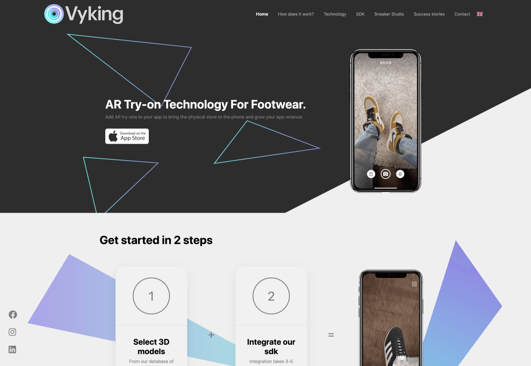
Pascal Le Nahédic prend les commandes des solutions à impact écologique et sociétal de SAP et sera en charge d’accompagner les clients de SAP dans le développement de nouvelles pratiques pour réduire leur empreinte sur l’environnement grâce aux technologies.

Après avoir passé 10 ans au sein du Groupe Exxon en Europe et en Asie, Pascal rejoint SAP France en 1999 en tant que Directeur de projet. En 2007, il occupe la fonction de Presales Industries. Depuis 2015, il assure le rôle de Presales Business Architect pour l’industrie ENR. Passionné par le sujet d’économie circulaire, il multiplie les initiatives d’intrapreneuriat en interne dont un projet innovant visant à aider les entreprises à réduire leurs déchets en termes de PLV (Publicité sur Lieu de Vente).

Sylvie Turcotte – Directrice Avant-Vente, SAP France

Sylvie Turcotte est à la tête de l’ensemble de l’organisation Avant-Vente pour SAP France.  Elle a pour mission de renforcer la croissance cloud de la filiale française par la mise en place de nouvelles approches avant-vente. Passionnée du milieu des technologies depuis 30 ans dont 20 ans au sein du groupe SAP. Sylvie a débuté sa carrière chez SAP Canada en 2000 comme consultante Finance, Funds management et Real Estate, avant de rejoindre l’équipe avant-vente Secteur Public pendant plusieurs années pour ensuite devenir directrice des ventes de Premium Engagement. Par la suite, elle a été nommée Customer Solution Director (CSD) puis Directrice de l’équipe Digital Core (Finance et Supply Chain) au niveau de SAP Canada, rôle qu’elle occupait depuis 3 ans.

The post SAP France nomme Pascal Le Nahédic, Directeur des solutions à impact écologique et sociétal et Sylvie Turcotte, Directrice avant-vente appeared first on SAP France News.

Source de l’article sur sap.com

By the end of the year, the number of global smartphone users is expected to reach 3.5 billion. That’s a significant 9.3% increase over the last 12 months.

In a world where everyone is constantly connected to their mobile devices, it makes sense that web developers and designers would need to consider new rules for how they create engaging experiences. After all, most of us find browsing from our smartphones to be much more convenient than sitting down at a laptop each day.

With a little luck, you’re already taking steps to mobile optimize your website but standards are changing all the time. To make sure your website is up to scratch, here’s your guide to prioritizing your site for mobile, ready for the new year.

Understanding Mobile-First Design

The first step in updating your web design and development principles, is understanding the concept of mobile first design, and how it’s changed.

With a responsive website, you create something that adjusts to the screen size of any device; with a mobile-first site, you’re focusing first-and-foremost on the user experience that people get when they’re on mobile, taking that as your starting point, and building from there. Instead of building your website for the desktop and using mobile as an afterthought, you start with a consideration of mobile.

Even Google is highlighting the demand for this process lately, with the mobile-first indexing algorithm. If you can’t design for mobile-first, then you could risk your clients being unable to rise up the search engine ranks.

So, how do you get started?

1. Start With the Right Tools

Web developers and designers are nothing without a great toolkit.

The good news is that there are solutions out there that can help you to master the right skills for a mobile-focused user experience. For instance, Skeleton is excellent for small-scale projects that require fluid grids and minimal compiling.

Alternatively, Bootstrap can offer a one-size-fits-all solution for the front-end development for mobile devices. There’s a default grid system available, plenty of components, and JavaScript plugins to work with.

With the right tools, you can minimize and prioritize the content that’s most valuable for your website projects. This is crucial for maximizing website speed and creating clarity when it comes to content and imagery.

For instance, check out the ESPN website; it’s split into very easy-to-follow categories of content that are perfect for scrolling on a smartphone. The grid of videos makes it feel like you’re using a tool like YouTube.

2. Prioritize Mobile-First Elements

Once you have the right tools to assist you, it’s time to begin building your mobile-first website from the ground up. Rather than jumping straight into considerations of the latest design trends, it’s important to start with the foundations.

For instance, navigation within a mobile page is usually hidden under a hamburger button. However, you can take this concept to the next level too. For example, the Shojin mobile website only demonstrates the most important website options within the navigation bar to avoid overwhelming users.

The key here is to keep things as simple as possible, without restricting what your audience can do when they visit your website. Although you want to keep the number of interactive elements on your site small, you also need to ensure that those elements are easy to find and use.

All buttons and CTAs should be clear and tappable. Fonts need to be large enough to read from any screen, and your navigation system needs to be 100% simple, without slowing anything down.

On average, we recommend making all clickable elements at least 48 pixels in height.

3. Use Responsive Imagery and SVGs

Images are a crucial part of any website. They add context and appeal to your design. However, they can also seriously slow down your website if you’re not careful.

Remember, different devices have different demands when it comes to imagery. A desktop page may need a 1200px wide image, while a mobile-only needs the image to be 400px wide at most. The old way of making your images work was to load a large resolution image and use the same file on every platform. Unfortunately, this slows downloading time significantly.

Instead, it’s better to have at least two different versions of the same image for your mobile and desktop solutions. You can also consider SVG.

SVGs are incredibly scalable – more so than bitmaps. With SVG, you can ensure any icon or graphic continues to look sharp and clickable across all devices. Because these files are often smaller, your site loads quicker too! Hubspot is great at using SVGs.

Intricate illustrations are a massive component of HubSpot’s brand. If those images were saved as PNGs or other alternative files, then they would take forever to load. Because they’re all SVGs, you can enjoy the same consistent experience across desktop and mobile.

4. Get the Typography Right

It’s not just the big graphics and images that make a huge difference to your website when it comes to mobile-first design. You also need to think about the legibility and clarity of your website across all devices and platforms. If people can’t read the value proposition of the company that you’re designing for, you’re going to have a major problem.

Focus on making your content as easy to read as possible. Look into the typefaces that seem most appealing on a range of devices.

Remember to balance the body and heading font sizes for the device size too. You’ll need to ensure that the experience feels consistent and smooth as your users scroll through each page. Just take a look at the mobile version of the IMPACT website, for instance.

The headings aren’t as huge as they are on the desktop version of the website, and they’re displayed below, rather than above the featured image. However, this helps to give a more immediately eye-catching and structured experience to mobile users.

There’s even a handy “Search Engine Optimization” tag included, that users can click on if they want to find more related articles.

When it comes to typography, remember that it’s not just size and clarity that matter, but how things are structured throughout your website too. Your type should naturally guide your visitors along the page.

5. Master Available Device Features

Finally, on smartphones, you can accomplish a range of amazing things that you might not be able to do when using a desktop device. Your users can make calls, open apps, send messages, and more, all from within their mobile browser. They can also move their smartphone around a room, taking advantage of concepts like AR and VR.

Taking advantage of the unique capabilities that smartphone design can offer gives you a chance to get unique with your user experience.

Making the most of the mobile experience can be much simpler than you’d think. For instance, on a desktop site, you could list your phone number on a contact page. On a mobile site, the number can begin a call when clicked. You can also take the same approach with email addresses, and social media icons too.

Depending on how experimental you feel, there’s also plenty of opportunities to go above and beyond with your mobile features. You may decide to create a mobile app version of a website that your customers can download onto their phones.

Alternatively, you can look into things like AR technology. This could allow your users to practice placing items of furniture that they may be thinking of buying from an online retailer into their house, so they can see how well they work with their other interior design choices.

Making the Most of Mobile-First Design

Ultimately, having a responsive website that works on both mobile and desktop devices is mandatory in the modern world. However, going above and beyond with mobile-first design is a great way to get ahead of the game.

If you can focus on building a website that puts the experiences of mobile users first, then you can create something that’s much more likely to grab audience attention and deliver amazing experiences.

If nothing else, showing your clients that you have what it takes to design for mobile is an excellent way to ensure that you can gain as many new project opportunities as possible.

Source


Source de l’article sur Webdesignerdepot

While doing some work with Kubernetes (K8s) and studying for the CKAD exam, I came across a page on Matthew Palmer’s website entitled “Practice Exam for Certified Kubernetes Application Developer (CKAD) Certification” and which contains five practice questions, which I’ll go over here. If you see a problem with anything I’ve done below, including inefficient solutions, please let me know in the comments.

We will focus on not just showing a possible solution to each problem but also verifying our work.

Source de l’article sur DZONE

Le 7 Octobre 2020 SAP a annoncé la disponibilité générale de SAP S/4HANA 2020 :  la sixième version de SAP S/4 HANA vient d’apparaitre avec toujours plus d’innovations à la clé.

Avec la version 2020 de SAP S/4HANA on poursuit la logique d’innovation continue avec des nouveautés fonctionnelles disponibles sur l’ensemble des processus finance.

Ces nouveautés sont immédiatement opérationnelles et disponibles lors de la sortie de la nouvelle version On Premise car elles ont été préalablement implémentées et testées depuis des mois dans la version Cloud de SAP S/4HANA.

Le document What’s new in SAP S/4HANA 2020 récapitule de façon exhaustive toutes les nouveautés apportées par cette version dans les différents domaines de la solution. Cette nouvelle version comporte des centaines d’innovations uniquement dans le domaine de la Finance et il est impossible de toutes les présenter ici. A titre d’illustration, nous vous proposons de passer en revue quelques-unes des nouveautés les plus remarquables :

Par exemple, dans le domaine de la comptabilité générale et bancaire, la nouvelle version réduit l’utilisation des comptes généraux, notamment des comptes bancaires, en simplifiant les processus de gestion des relations bancaires. L’utilisation des mêmes ensembles de comptes de rapprochement bancaire et de comptes d’attente pour la connectivité de la banque société réduit considérablement le nombre de comptes généraux requis pour les processus de paiement. Cette méthode offre également l’avantage de faciliter la gestion du plan comptable.

Dans le domaine de la clôture financière, avec SAP S/4HANA for Group Reporting, les équipes de consolidation peuvent générer simultanément des résultats dans plusieurs devises du groupe dans un seul processus de clôture. Ceci améliore l’efficacité et l’automatisation lorsque vous travaillez avec différentes devises dans le  groupe ou plusieurs taux de conversions de devise, par exemple pour une conversion à taux de change constants pour le reporting comparatif.


Dans la gestion des Clients et le contrôle de Crédit, un ensemble d’états de reporting avancés a été développé sur SAP Analytics Cloud avec pour objectif de donner les moyens au crédit manager d’améliorer le pilotage du contrôle crédit.  Ces états de reporting, nativement intégrés dans SAP S/4HANA, sont alimentés en temps réel par les flux des ventes et ouvrent la possibilité d’effectuer du drill-down vers les transactions opérationnelles.


Dans ce même domaine, une autre innovation réside dans la création d’une application Fiori qui donne accès à un cockpit de pilotage permettant une vue à 360° de toutes les informations nécessaires au contrôle crédit d’un partenaire donné. On peut ainsi accéder depuis un même endroit aux information générales sur le profil de crédit, des informations par segment et leurs limites et taux d’utilisation, une balance âgée synthétique, les commandes en attente d’approbation et même des informations sur des assurances ou garanties collatérales éventuelles. La navigation est ainsi grandement facilitée, les informations clés regroupées et disponibles de façon rapide, souvent dans un format graphique : voici un bel exemple d’innovation mise en œuvre pour faciliter l’adoption de la solution et assurer la meilleure expérience possible à l’utilisateur.

La plateforme SAP Central Finance a été optimisée dans la version SAP S/4HANA 2020 avec la mise à disposition de solutions d’intégration développées avec Magnitude dans le cadre du partenariat Solution Extension :

  • SAP Central Finance Data Harmonization by Magnitude
  • SAP Central Finance Transaction Replication by Magnitude


Central Finance permet la réplication des transactions des opérations issues de différentes sources dans une instance unique SAP S/4HANA, ce qui génère d’importants avantages liés à la centralisation, par exemple dans le cadre du reporting,  la comptabilisation des allocations, les opérations inter-sociétés ou la mise en place et opération de centres de services.

Ces nouvelles solutions d’intégration permettent de faciliter et d’accélérer l’intégration des données tout en fiabilisant le processus et en réduisant le TCO de Central Finance.

Deux autres innovations remarquables dans Central Finance :

  • La fonctionnalité de ventilation à la pièce est désormais disponible dans Central Finance et ceci même lorsque les systèmes SAP source n’en disposent pas.
  • Concernant le contrôle budgétaire, le budget des ordres internes peut être géré désormais de manière centrale dans SAP Central Finance grâce au suivi de la consommation de celui-ci dans les systèmes sources.

En conclusion, la version 2020 de SAP S/4HANA comporte une grande quantité de nouveautés qui méritent d’être découvertes lors d’une prochaine formation chez SAP France.


Voici le lien vers le calendrier des formations de H1 2021 afin de choisir celle qui vous convient le plus. Vous pouvez aussi avoir un aperçu des formations susceptibles de vous intéresser à l’aide des différents parcours de formation détaillés dans les  Learning Journeys mis à votre disposition par SAP Training and Adoption France.


The post Quoi de neuf dans la Comptabilité Financière avec la release SAP S/4HANA 2020 ? appeared first on SAP France News.

Source de l’article sur sap.com

In my role as a consultant for CleanSlate Technology Group, I am required to enter my time on a periodic basis. Our company currently utilizes the FinancialForce solution within Salesforce for professional services billing. For years, I have found that it is easier to enter my time on a daily basis. This allows me to provide detailed comments on what was accomplished with each time entry. At the start of the month, I work with the service delivery manager and my clients to establish a personal goal. This goal is normally set in total hours for a given month.

I like to make my goal and create a personal burndown chart, so I can quickly see how my billable hours compare to the hours expected. I quickly realized that Salesforce did not provide a default reporting solution that met my needs. Using Microsoft Excel, I was able to create a sheet which included a burndown chart:

Source de l’article sur DZONE

Aujourd’hui les entreprises s’efforcent de plus en plus à offrir une expérience employé exceptionnelle. Et elles ont de bonnes raisons de le faire.

Les recherches révèlent que l’expérience employé a une incidence sur la façon dont les salariés perçoivent leur travail et les efforts qu’ils fournissent. Cette expérience a ensuite un impact sur la satisfaction client, la fidélisation, le rendement des actifs et les ventes (1).

Bien que de nombreux facteurs entrent en jeu, environ 30% de l’expérience employé est liée à l’utilisation de la technologie par leur organisation. Grâce à elle, les salariés peuvent gagner en productivité, flexibilité, améliorer leurs relations professionnelles, mieux gérer le travail à distance. A l’inverse, elle peut aussi les distraire, créer un sentiment d’isolement et limiter leur capacité à se « déconnecter ».

Pour en savoir plus, SAP SuccessFactors a mené des entretiens avec des employés dans le monde entier. Nous avons étudié l’influence de la technologie sur le bien-être, l’engagement, le sentiment d’appréciation et de valeur, la productivité, ainsi que l’expérience globale des processus RH

Bien que cette recherche soit toujours en cours, les résultats préliminaires révèlent trois insights sur la façon dont la technologie peut contribuer à une expérience employé exceptionnelle.

Les employés ont besoin d’outils pour effectuer le travail qu’ils trouvent important et se décharger de ce qu’ils jugent inutile. Nous les avons interrogés sur les tâches, activités, ce qu’ils apprécient le plus et les motive à se lever chaque matin. Selon eux, le « travail utile » est un travail qui implique :

  • La mise en œuvre de quelque chose, par exemple un projet
  • La collaboration avec des collègues dans le but d’atteindre un objectif commun
  • La contribution à une solution et voir les résultats de ces efforts

Sans surprise, lorsqu’on leur demande des exemples illustrant comment la technologie les a aidé, les employés mentionnent des outils conçus pour les soutenir dans ces activités (pour la productivité, Microsoft 365, pour la collaboration, Microsoft Teams et Skype). Avec des résultats plus prononcés chez les employés régulièrement en déplacement ou télétravail.

Mais ils mentionnent aussi des outils qui leur permettent de gagner du temps sur les tâches opérationnelles et administratives. En voici quelques exemples :

  • Une application qui indique les places de parking disponibles lorsqu’on se rend au travail
  • Une application pour commander le déjeuner à l’avance et éviter de faire la queue
  • Les solutions SAP Concur : un employé interrogé a indiqué qu’il a réduit d’au moins 1/3 son temps passé à envoyer ses frais de voyage
  • Des outils qui définissent des modèles fondés sur des comportements antérieurs et qui présentent des propositions de manière proactive. Un employé mentionne une application de navigation GPS qui propose automatiquement un itinéraire en fonction des comportements précédents. Un autre affirme : « J’aime avoir accès au système pour effectuer une tâche, et que le système reconnaisse à l’avance la façon dont j’agis habituellement et prenne en charge certaines étapes à ma place afin que je puisse m’occuper de mon travail […]. Plus vite le système gère les informations, mieux c’est, car ce sont généralement des choses que je […] ne veux pas faire ».

Moins de systèmes séparés et disparates

Les employés soulignent que devoir passer par plusieurs systèmes pour accomplir une tâche ou trouver des informations est extrêmement frustrant et chronophage. Certaines recherches ont démontré que les employés passent jusqu’à 30 % de leur journée de travail à chercher des informations qui peuvent être stockées dans des systèmes et des bases de données disparates.

« J’aimerais faire certaines choses en exactement 20 secondes », confie un employé. « Je ne veux pas avoir à me demander si je dois accéder au portail RH, au portail informatique ou au facility portal. Peu importe qui résout mon problème, je veux juste qu’il soit résolu ».

De meilleures solutions en libre-service avec une assistance humaine

Pendant trop longtemps les solutions technologiques RH des entreprises (surtout celles en libre-service) ont été conçues en tenant compte des RH plutôt que des utilisateurs finaux : les employés. Par conséquent, les employés sont souvent obligés d’utiliser quotidiennement des solutions libre-service obsolètes, non intuitives et mal conçues.

Comme le décrit un employé : « J’essayais de réserver un vol et je recevais sans cesse un message d’erreur, mais le message ne précisait pas ce qui n’allait pas. Ce qui aurait dû me prendre cinq minutes a fini par me prendre plus de trois heures Et quand j’ai finalement réussi à joindre quelqu’un au téléphone, mon interlocuteur n’a pas pu m’en dire plus […]. C’était vraiment frustrant ».

Les conséquences d’une expérience frustrante liée à la technologie vont bien au-delà de la perte de temps. Elles peuvent avoir des effets négatifs sur le bien-être psychologique et physique des employés. Des recherches ont démontré que les expériences frustrantes liées à la technologie peuvent entraîner une perte d’efficacité et un sentiment de colère, impacter l’humeur et les interactions avec les autres, diminuer à la fois le niveau de satisfaction professionnelle et la qualité du travail, compromettre la productivité et même augmenter la pression sanguine ainsi que la tension musculaire (2).

Des recherches antérieures ont démontré que l’élément indispensable des solutions libre-service est la possibilité, si besoin, de parler à quelqu’un. Et cela sans effort important et sans avoir à répéter sans fin une tâche (3).

L’effet de la technologie sur les moments importants : pas toujours positif

Qu’il s’agisse de rejoindre une entreprise, fêter une promotion, s’occuper d’un proche malade ou d’accueillir un nouvel enfant dans sa famille, les moments qui définissent la carrière ainsi que la vie personnelle sont des occasions essentielles de montrer aux employés qu’ils sont reconnus et appréciés. Pourtant, l’expérience technologique associée à ces moments véhicule souvent le message inverse.

Par exemple, un employé interrogé confie : « J’étais très excité quand j’ai trouvé ce travail. Mais le fait d’avoir dû entrer manuellement les informations relatives à mon CV dans le système à plusieurs reprises ne m’a pas laissé une première impression positive de l’entreprise ».

Une récente enquête auprès des candidats et employés de la génération Z est éclairante. 54% d’entre eux déclarent qu’ils ne soumettraient pas une candidature si les méthodes de recrutement de l’entreprise sont dépassées. 26% s’accordent à dire qu’un manque de technologie tout au long du processus d’embauche les dissuaderait d’accepter un emploi.

Alors que les entreprises continuent d’investir dans l’expérience employé, elles doivent être attentives aux solutions technologiques fournies aux collaborateurs. Des solutions dépassées, difficiles à utiliser, qui n’ont pas été conçues en pensant aux employés, désavantageront grandement les organisations lorsqu’il s’agira d’attirer et de fidéliser les talents dans l’économie de l’expérience d’aujourd’hui.

En fin de compte c’est l’un de nos clients interrogés qui le souligne le mieux : « Lorsque nous lançons de nouveaux services de ressources humaines, nous ne voulons pas seulement avoir des utilisateurs. Nous voulons avoir des fans ».

Publié en anglais sur news.sap.com


Lauren Bidwell est chercheuse en gestion du capital humain pour SAP SuccessFactors chez SAP.

(1) The Financial Impact of a Positive Employee Experience ; A Beginner’s Guide to Employee Experience

(2) Ceaparu et al. (2004) ; Lazar et al. (2006) ; Norman (2004) ; Scheirer et al. (2002) ; Murrell & Sprinkle (1993)

(3) Howard & Worboys (2003)

The post Comment créer une expérience employé engageante : le rôle de la technologie appeared first on SAP France News.

Source de l’article sur sap.com

In the « Using Heroku to Quickly Build a Multi-Tenant SaaS Product » article, I documented the foundation for a new SaaS solution that I am building (initially for my sister-in-law) — utilizing the Heroku ecosystem. Using Heroku allowed me to deploy the app quickly, without having to worry about infrastructure, DevOps, scalability when the app gets popular, etc. The « Integrating Twilio Into My SaaS Solution In Heroku » publication provided an example of how easy it is to create a Twilio instance and integrate the solution into my Fitness-based SaaS solution. This current journey has resulted in a feature set that both trainers and their clients have been able to enjoy.

This article is going to focus on invoicing clients for services that have been performed and will utilize messaging solutions within the Heroku ecosystem. The goals of the invoice process are as follows:

Source de l’article sur DZONE