Every day design fans submit incredible industry stories to our sister-site, Webdesigner News. Our colleagues sift through it, selecting the very best stories from the design, UX, tech, and development worlds and posting them live on the site.
The best way to keep up with the most important stories for web professionals is to subscribe to Webdesigner News or check out the site regularly. However, in case you missed a day this week, here’s a handy compilation of the top curated stories from the last seven days. Enjoy!
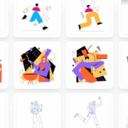
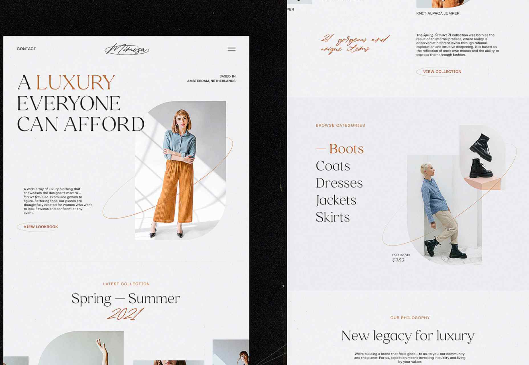
https://ankaa-pmo.com/wp-content/uploads/2021/04/popular-design-news-of-the-week-april-19-2021-april-25-2021.jpg14082560Service comm.https://ankaa-pmo.com/wp-content/uploads/2017/04/Logo-Ankaa-engineering.pngService comm.2021-04-25 16:45:092021-04-25 16:45:09Popular Design News Of The Week: April 19, 2021 – April 25, 2021
Gartner predicts that by 2023, over 50% of medium to large enterprises will have adopted a Low-code/No-code application as part of their platform development.
The proliferation of Low-code/No-code tooling can be partially attributed to the COVID-19 pandemic, which has put pressure on businesses around the world to rapidly implement digital solutions. However, adoption of these tools — while indeed accelerated by the pandemic — would have occurred either way.
Even before the pandemic, the largest, richest companies had already formed an oligopsony around the best tech talent and most advanced development tools. Low-Code/No-code, therefore, is an attractive solution for small and mid-sized organizations to level the playing field, and it does so by giving these smaller players the power to do more with their existing resources.
While these benefits are often realized in the short term, the long-term effect of these tools is often shockingly different. The promise of faster and cheaper delivery is the catch — or lure — inside this organizational mousetrap, whereas backlogs, vendor contracts, technical debts, and constant updates are the hammer.
So, what exactly is the No-Code trap, and how can we avoid it?
What is a No-Code Tool?
First, let’s make sure we clear up any confusion regarding naming. So far I have referred Low-Code and No-Code as if they were one term. It’s certainly easy to confuse them — even large analyst firms seem to have a hard time differentiating between the two — and in the broader context of this article, both can lead to the same set of development pitfalls.
Under the magnifying glass, however, there are lots of small details and capabilities that differentiate Low-code and No-code solutions. Most of them aren’t apparent at the UI level, leading to much of the confusion between where the two come from.
In this section, I will spend a little bit of time exploring the important differences between those two, but only to show that when it comes to the central premise of this article they are virtually equivalent.
Low-Code vs. No-Code Tools
The goal behind Low-Code is to minimize the amount of coding necessary for complex tasks through a visual interface (such as Drag ‘N’ Drop) that integrates existing blocks of code into a workflow.
Skilled professionals have the potential to work smarter and faster with Low-Code tools because repetitive coding or duplicating work is streamlined. Through this, they can spend less time on the 80% of work that builds the foundation and focuses more on optimizing the 20% that makes it different. It, therefore, takes on the role of an entry-level employee doing the grunt work for more senior developers/engineers.
No-Code has a very similar look and feel to Low-Code, but is different in one very important dimension. Where Low-Code is meant to optimize the productivity of developers or engineers that already know how to code (even if just a little), No-Code is built for business and product managers that may not know any actual programming languages. It is meant to equip non-technical workers with the tools they need to create applications without formal development training.
No-Code applications need to be self-contained and everything the No-Code vendor thinks the user may need is already built into the tool.
As a result, No-Code applications create a lot of restrictions for the long-term in exchange for quick results in the short-term. This is a great example of a ‘deliberate-prudent’ scenario in the context of the Technical Debt Quadrant, but more on this later.
Advantages of No-Code Solutions
The appeal of both Low-Code and No-Code is pretty obvious. By removing code organizations can remove those that write it — developers — because they are expensive, in short supply, and fundamentally don’t produce things quickly.
The benefits of these two forms of applications in their best forms can be pretty substantial:
Resources: Human Capital is becoming increasingly scarce — and therefore expensive. This can stop a lot of ambitious projects dead in their tracks. Low-Code and No-Code tools minimize the amount of specialized technical skills needed to get an application of the ground, which means things can get done more quickly and at a lower cost.
Low Risk/High ROI: Security processes, data integrations, and cross-platform support are all built into Low-Code and No-Code tools, meaning less risk and more time to focus on your business goals.
Moving to Production: Similarly, for both types of tools a single click is all it takes to send or deploy a model or application you built to production.
Looking at these advantages, it is no wonder that both Low-Code and No-Code have been taking industries by storm recently. While being distinctly different in terms of users, they serve the same goal — that is to say, faster, safer and cheaper deployment. Given these similarities, both terms will be grouped together under the ‘No-Code’ term for the rest of this article unless otherwise specified.
List of No-Code Data Tools
So far, we have covered the applications of No-Code in a very general way, but for the rest of this article, I would like to focus on data modeling. No-Code tools are prevalent in software development, but have also, in particular, started to take hold in this space, and some applications even claim to be an alternative to SQL and other querying languages (crazy, right?!). My reasons for focusing on this are two-fold:
Firstly, there is a lot of existing analysis around this problem for software development and very little for data modeling. Secondly, this is also the area in which I have the most expertise.
Now let’s take a look at some of the vendors that provide No-Code solutions in this space. These in no way constitute a complete list and are, for the most part, not exclusively built for data modeling.
1. No-Code Data Modeling in Power BI
Power BI was created by Microsoft and aims to provide interactive visualizations and business intelligence capabilities to all types of business users. Their simple interface is meant to allow end-users to create their own reports and dashboards through a number of features, including data mapping, transformation, and visualization through dashboards. Power BI does support some R coding capabilities for visualization, but when it comes to data modeling, it is a true No-Code tool.
2. Alteryx as a Low-Code Alternative
Alteryx is meant to make advanced analytics accessible to any data worker. To achieve this, it offers several data analytics solutions. Alteryx specializes in self-service analytics with an intuitive UI. Their offerings can be used as Extract, Transform, Load (ETL) Tools within their own framework. Alteryx allows data workers to organize their data pipelines through their custom features and SQL code blocks. As such, they are easily identified as a Low-Code solution.
3. Is Tableau a No-Code Data Modeling Solution?
Tableau is a visual analytics platform and a direct competitor to Power BI. They were recently acquired by Salesforce which is now hoping to ‘transform the way we use data to solve problems—empowering people and organizations to make the most of their data.’ It is also a pretty obvious No-Code platform that is supposed to appeal to all types of end-users. As of now, it offers fewer tools for data modeling than Power BI, but that is likely to change in the future.
4. Looker is a No-Code Alternative to SQL
Looker is a business intelligence software and big data analytics platform that promises to help you explore, analyze, and share real-time business analytics easily. Very much in line with Tableau and Power BI, it aims to make non-technical end-users proficient in a variety of data tasks such as transformation, modeling, and visualization.
You might be wondering why I am including so many BI/Visualization platforms when talking about potential alternatives to SQL. After all, these tools are only set up to address an organization’s reporting needs, which constitute only one of the use cases for data queries and SQL. This is certainly a valid point, so allow me to clarify my reasoning a bit more.
While it is true that reporting is only one of many potential uses for SQL, it is nevertheless an extremely important one. There is a good reason why there are so many No-Code BI tools in the market—to address heightening demand from enterprises around the world — and therefore, it is worth taking a closer look at their almost inevitable shortcomings.
Rather than spring cleaning, do some spring “shopping” for tools that will make your design life easier. Packed with free options this month, this list is crammed full of tools and elements that you can use in your work every day.
Here’s what new for designers this month:
April’s Top Picks
Charts.css
Charts.css makes creating beautiful online charts that much easier. It’s a modern CSS framework that uses CSS utility classes to style HTML elements as charts. It’s accessible, customizable, responsive, and open source. There’s a quick start option and available source code to work with.
Haikei SVG Generator
Haikei is a web app that helps you generate SVG shapes, backgrounds, and patterns in all types of shapes to use in projects. Everything can be exported into the tools you are already using for easy integration, and every element is customizable. The tool is free right now – no credit card needed – and you get access to 15 generators and can export in SVG and PNG format. A premium option is on the way, and you can sign up to get notified for access.
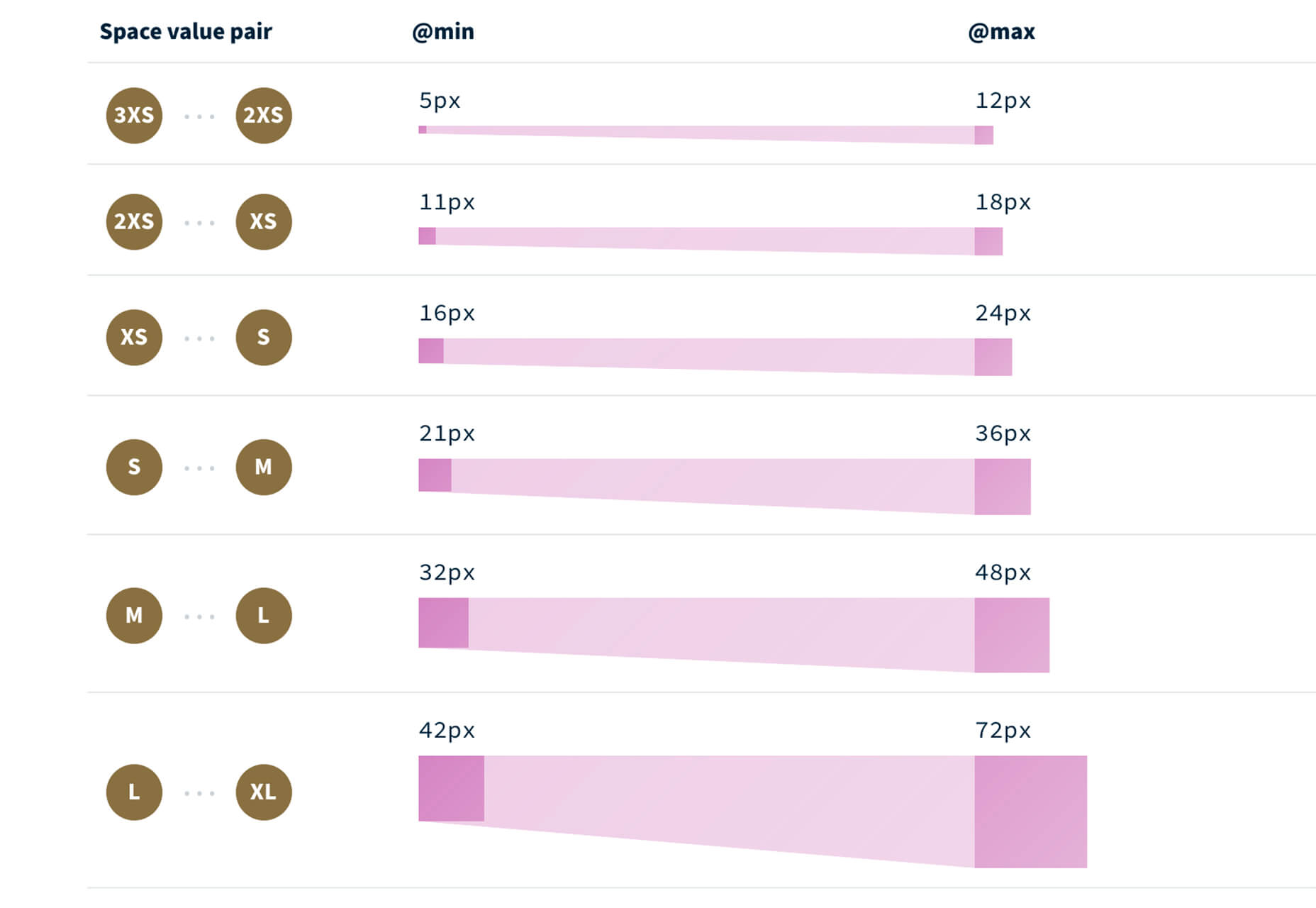
Fluid Space Calculator
Fluid Space Calculator helps you create a related space system and export the CSS to implement it. The calculator allows you to add space value pairs and multipliers and see the impact on the screen before snagging the related code. It’s great for determining how things will look in different viewports and for creating custom space pairs.
Night Eye WordPress Plugin
Night Eye WordPress Plugin helps you create a dark mode option for your WordPress website with ease. It’s completely customizable, schedulable, and one of those things that users are starting to expect. The plugin has free and paid versions – the only difference is a link to credit the developer.
3 Productivity Boosters
Macro
Macro is a supercharged checklist app for recurring processes. It’s designed to help teams document, assign, track, and automate for maximum efficiency. Now is the time to test this tool because it is free in public beta.
Writex.io
Writex.io is a free writing app that uses AI and smart features to help you write more efficiently. It can check readability as you write, make suggestions, check spelling, and allows you to work with versioning. All the settings are customizable, so you can get help and suggestions when you want them and avoid things you don’t want.
Taloflow
Taloflow, which is in beta, is a tool that helps you find the top cloud and dev tools for your use case. This is designed to be a time-saving solution to finding the right infrastructure and API products for your work.
8 Kits with Illustrations and User Interface Elements
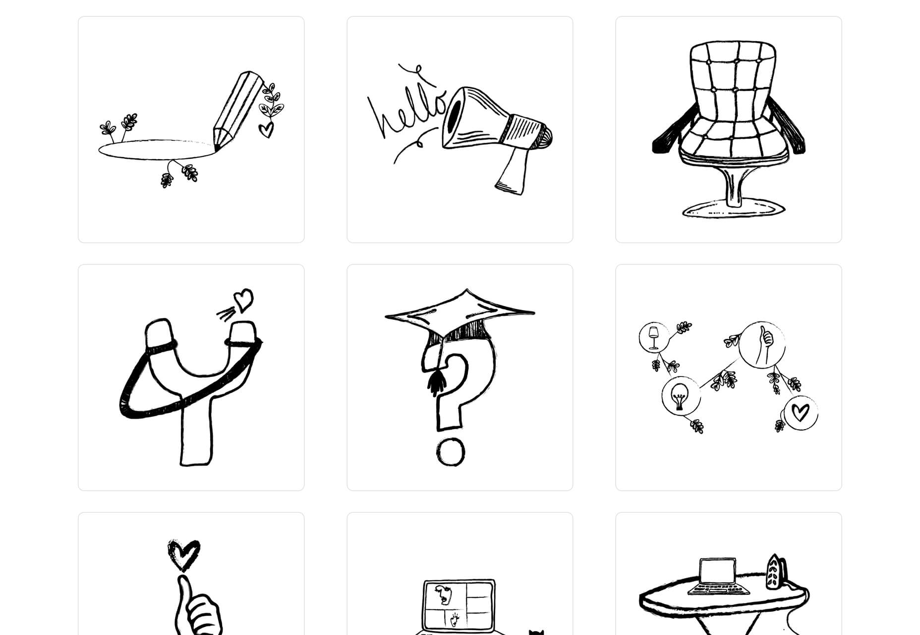
Skribbl
Skribbl is a collection of free, hand-drawn illustrations in a light and fun style. The black and white sketches are friendly, and the collection keeps growing. Plus, the illustrators are allowing them to be used free for any use.
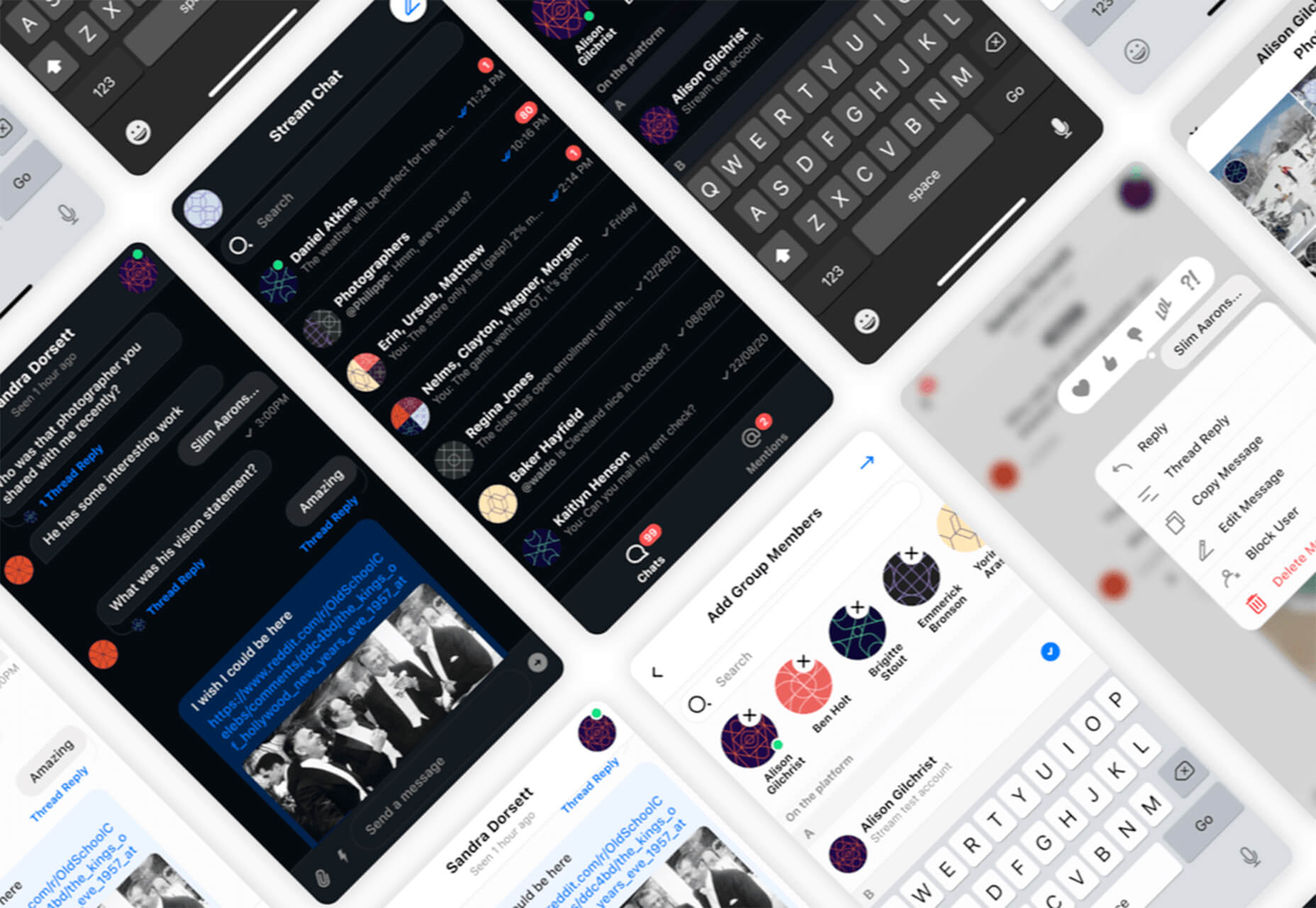
Mobile Chat Kit
Mobile Chat Kit is a free starter kit for building apps in Figma, Sketch, and Adobe XD. It includes more than 50 screen options with mapped-out flows for a quick-start project.
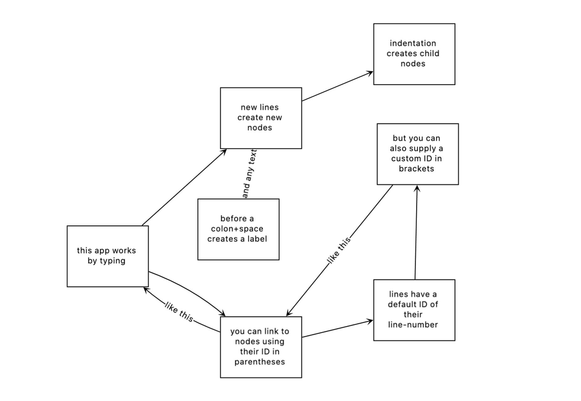
Flowchart.fun
Flowchart.fun is exactly what the name implies. The app allows you to type, create nodes, and link elements to develop simple flow charts quickly. Then you can alter shape and size with drag and drop. Export it for use as an SVG, JPG, or PNG.
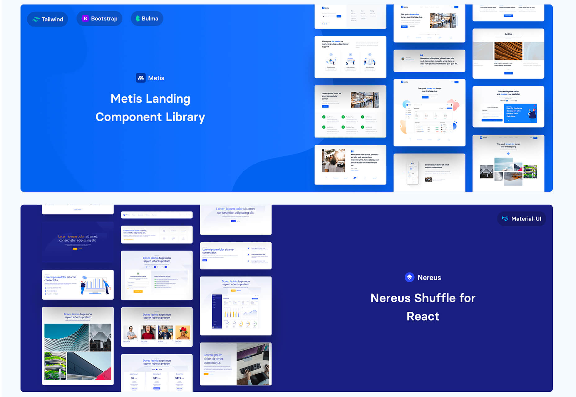
Shuffle
Shuffle is a marketplace packed with UI libraries to help you with a variety of digital projects. There are more than 1,500 pre-built components to choose from with professional designs. This premium tool comes with a monthly subscription or lifetime license.
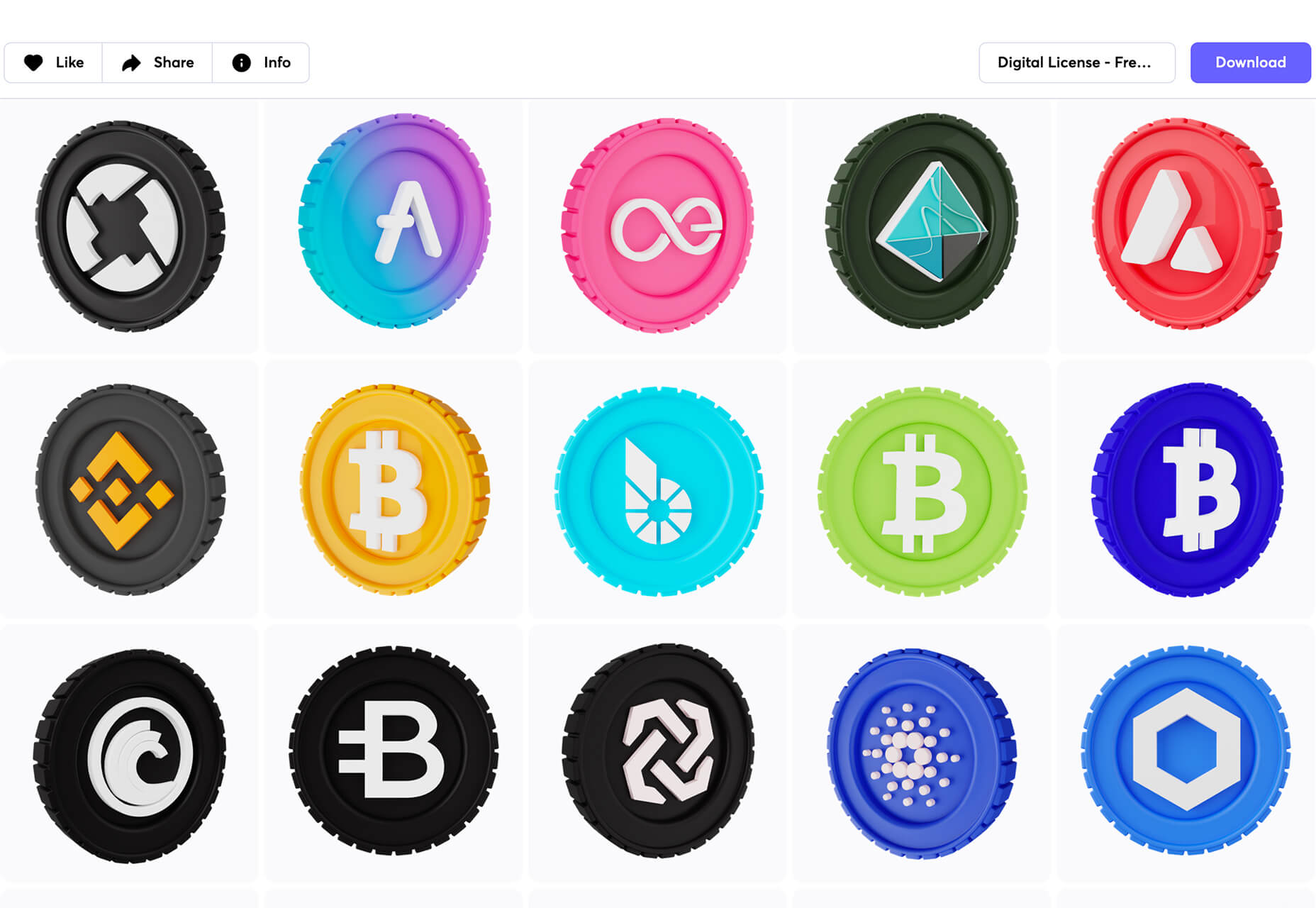
Cryptocurrency 3D Pack
Cryptocurrency 3D Pack is a set of icons with fun colors in three-dimensional shapes that you can use to represent different crypto elements. The pack includes 55 #D icons in PNG and BLEND formats.
Stratum UI Kit for Figma
Stratum UI Kit for Figma includes nine free screens that are ready to use. Options include API documentation, Kanban, document, data dashboard, ecommerce product list, ecommerce product options, payments spreadsheet, cloud storage, and newsfeed.
Conic.css
Conic.css is a collection of simple gradients that you can browse and then click to copy the code into your CSS to use them in projects. It’s quick and easy while using trendy color options.
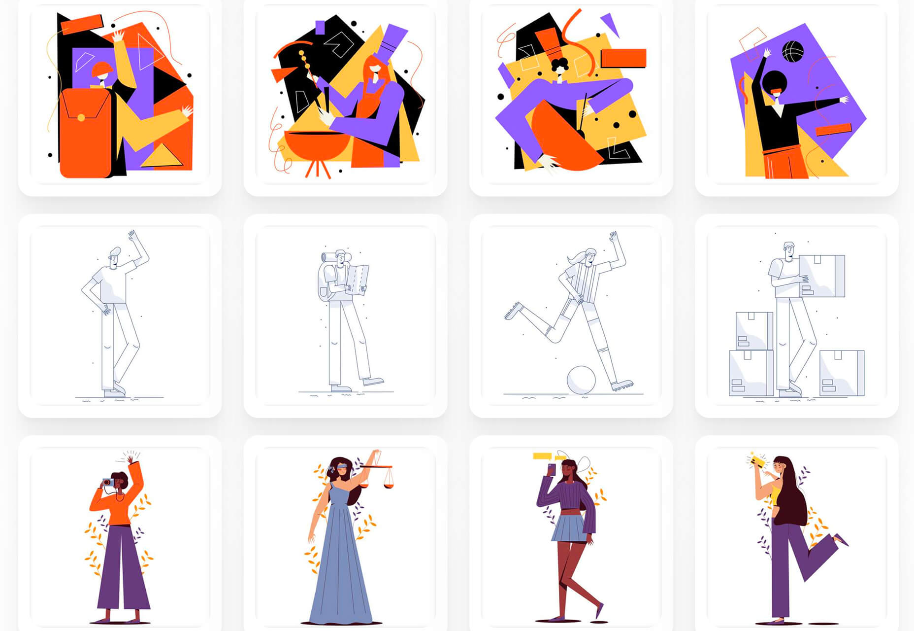
Artify Illustrations
Artify Illustrations is a Figma plugin that allows you to access more than 5,000 SVG and PNG illustrations within the app. It’s got a built-in search feature, everything is high-resolution, and the huge library includes various styles.
2 Tutorials
A Complete Guide to Accessible Front-End Components
A Complete Guide to Accessible Front-End Components is an amazingly comprehensive guide from Smashing Magazine with everything you need to know about accessible components. From tabs to tables to toggles to tooltips, you’ll find it all here and learn how to use it the right way.
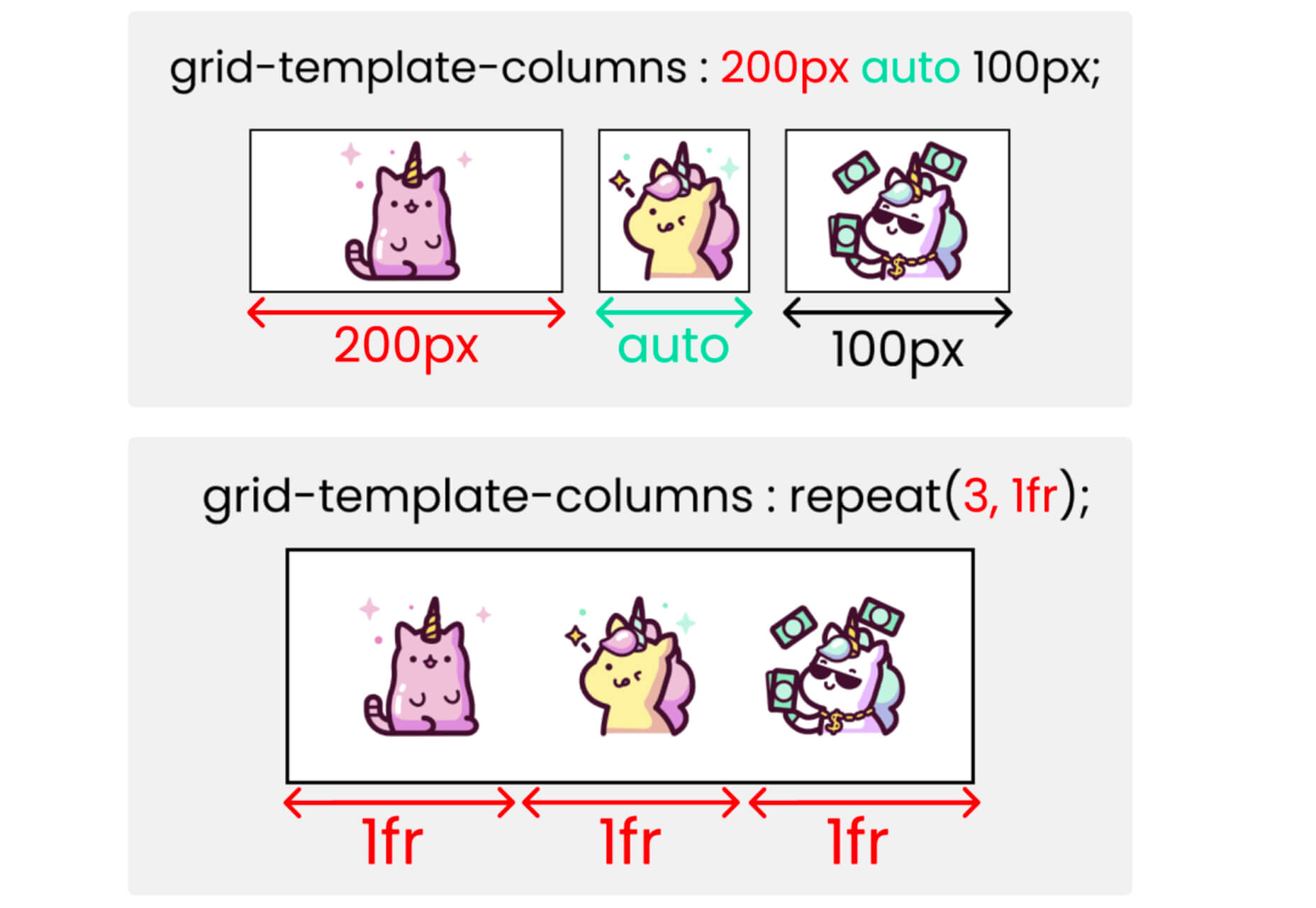
Grid CheatSheet in 2021
Grid CheatSheet in 2021 is a useful guide of everything you can do with CSS Grid. Plus, it has plenty of fun illustrations and an accompanying video.
8 Fresh and Fun Fonts
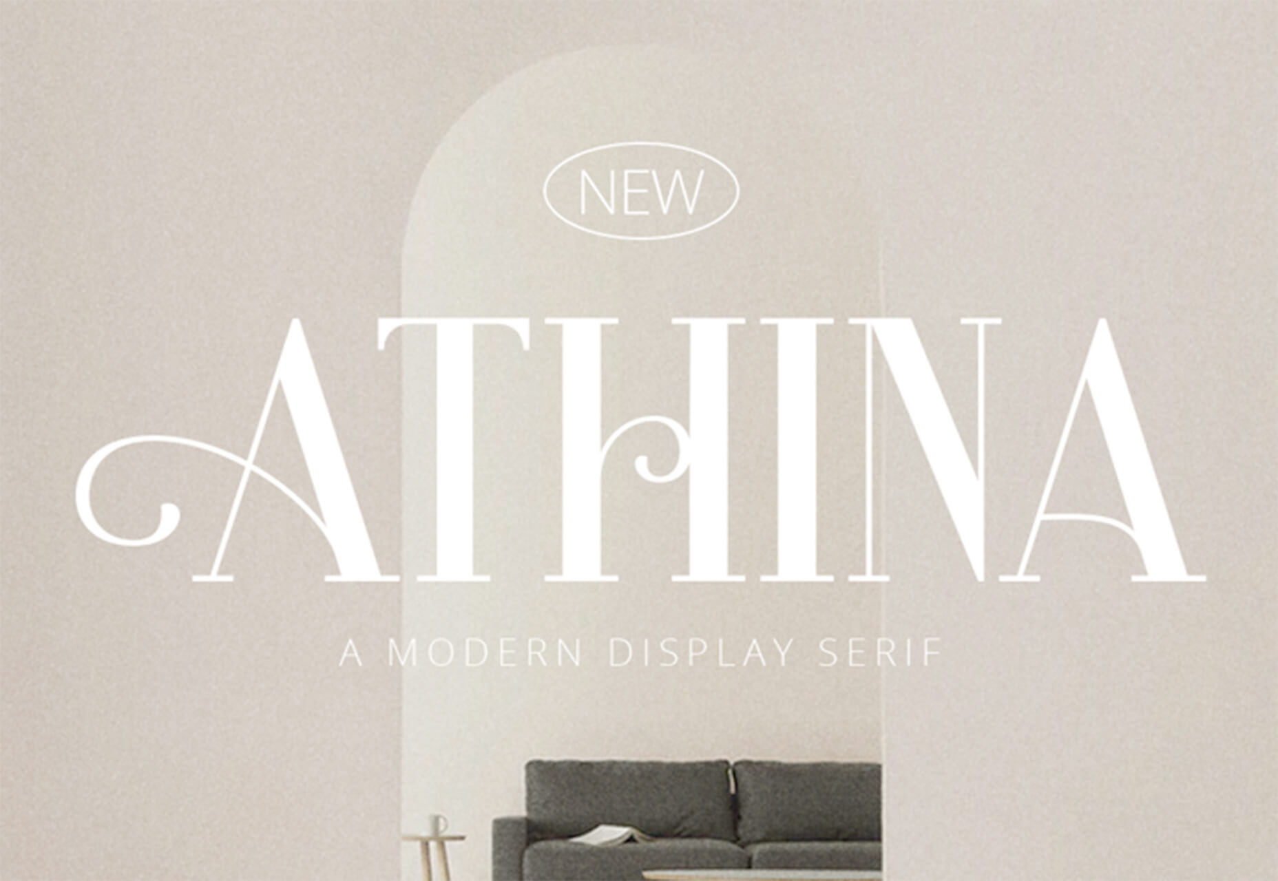
Athina
Athina is a modern display serif with beautiful connector strokes. The free version is a demo, and there’s a full family that you can buy.
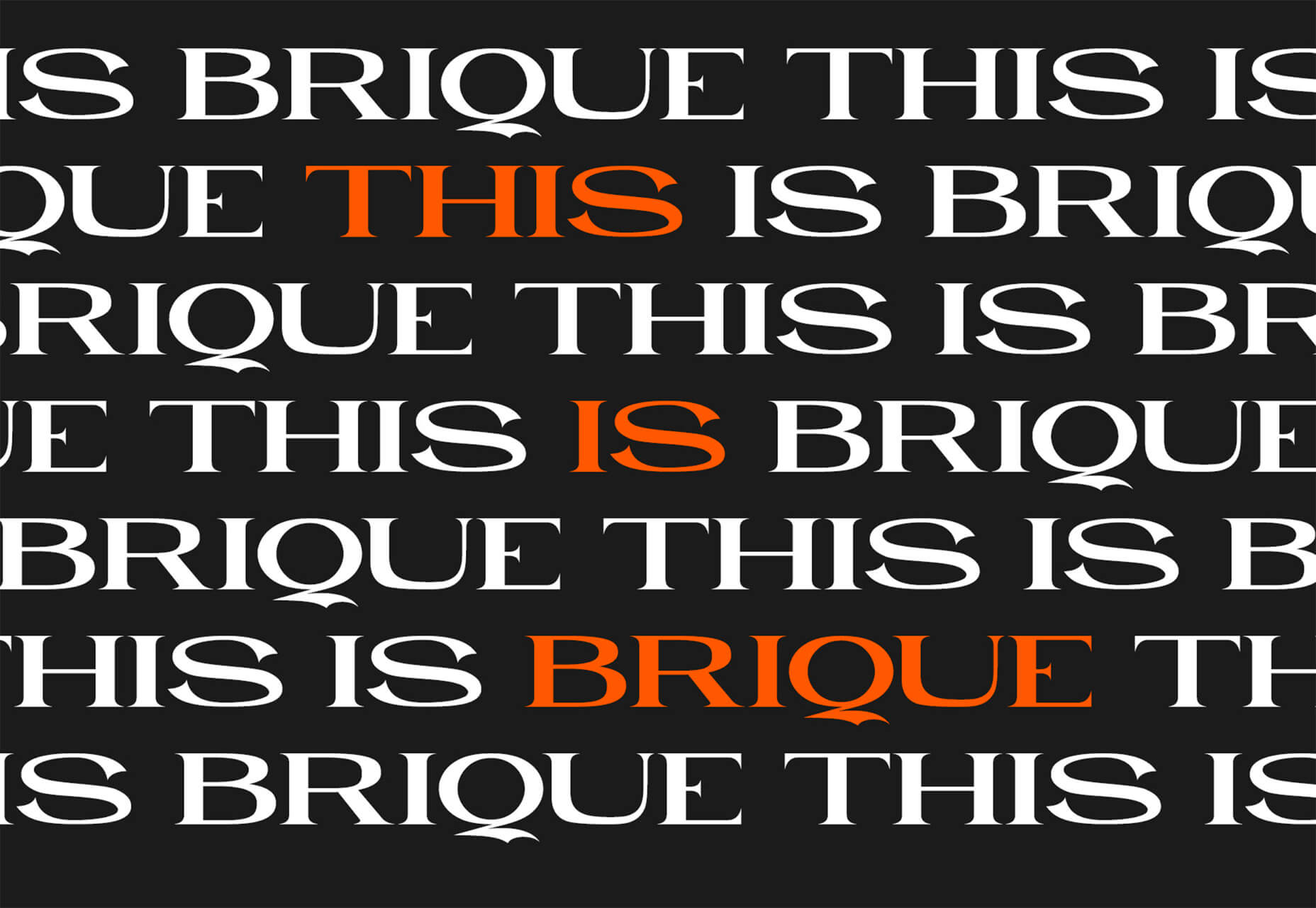
Brique
Brique is a free (personal and commercial) display font with a wide stance and uppercase character set. The letters have a lot of personality and a readable configuration.
Code Next
Code Next is a great geometric sans serif with a full family of styles. Including two variable fonts. It’s highly readable and would work for almost any application.
Inter
Inter is a simple and functional sense serif family with everything from extra light to heavy weights. The extra character personality makes this a fun and functional font option.
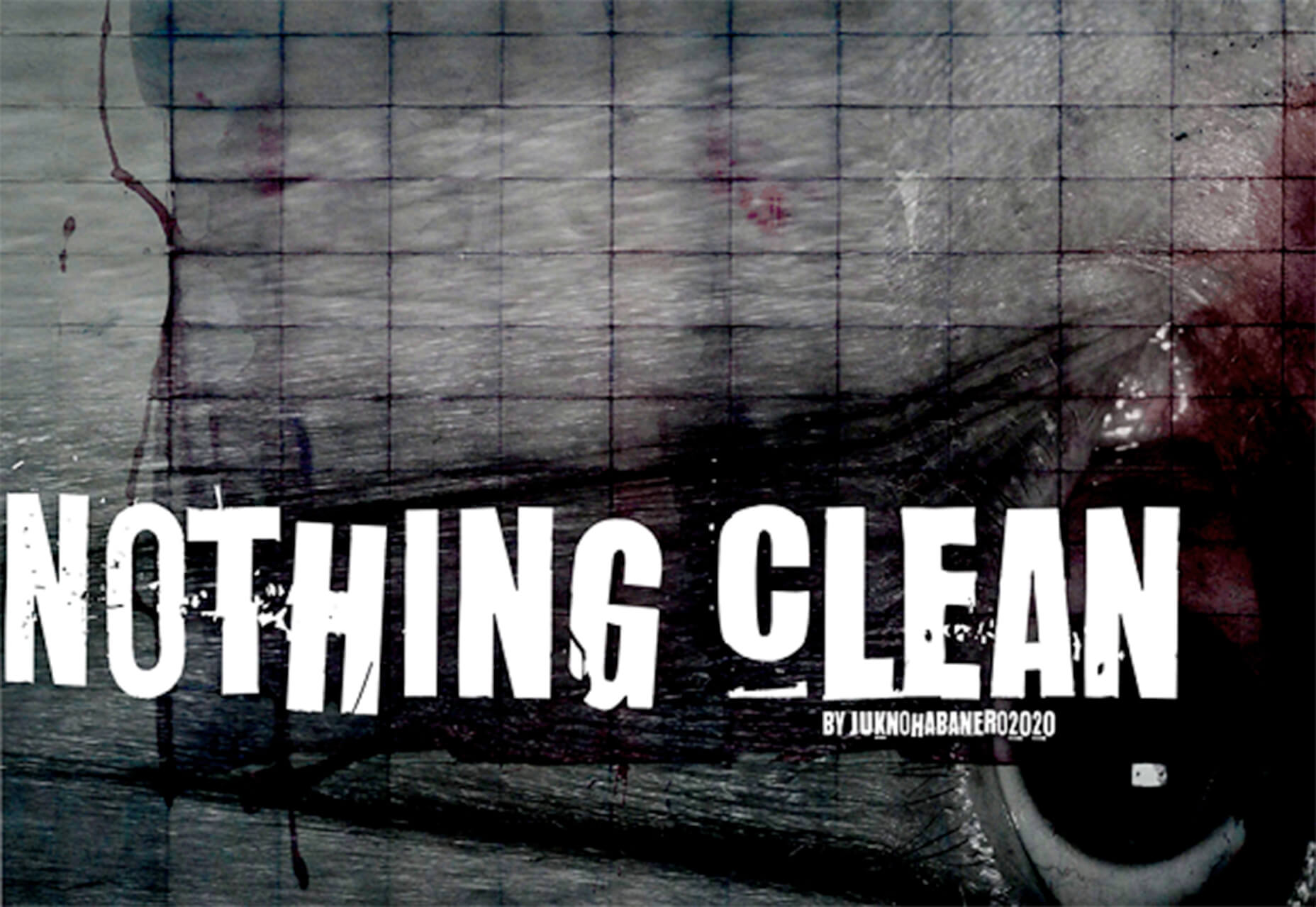
Nothing Clean
Nothing Clean is a fun grunge-type option. It’s an all uppercase character set with alternates.
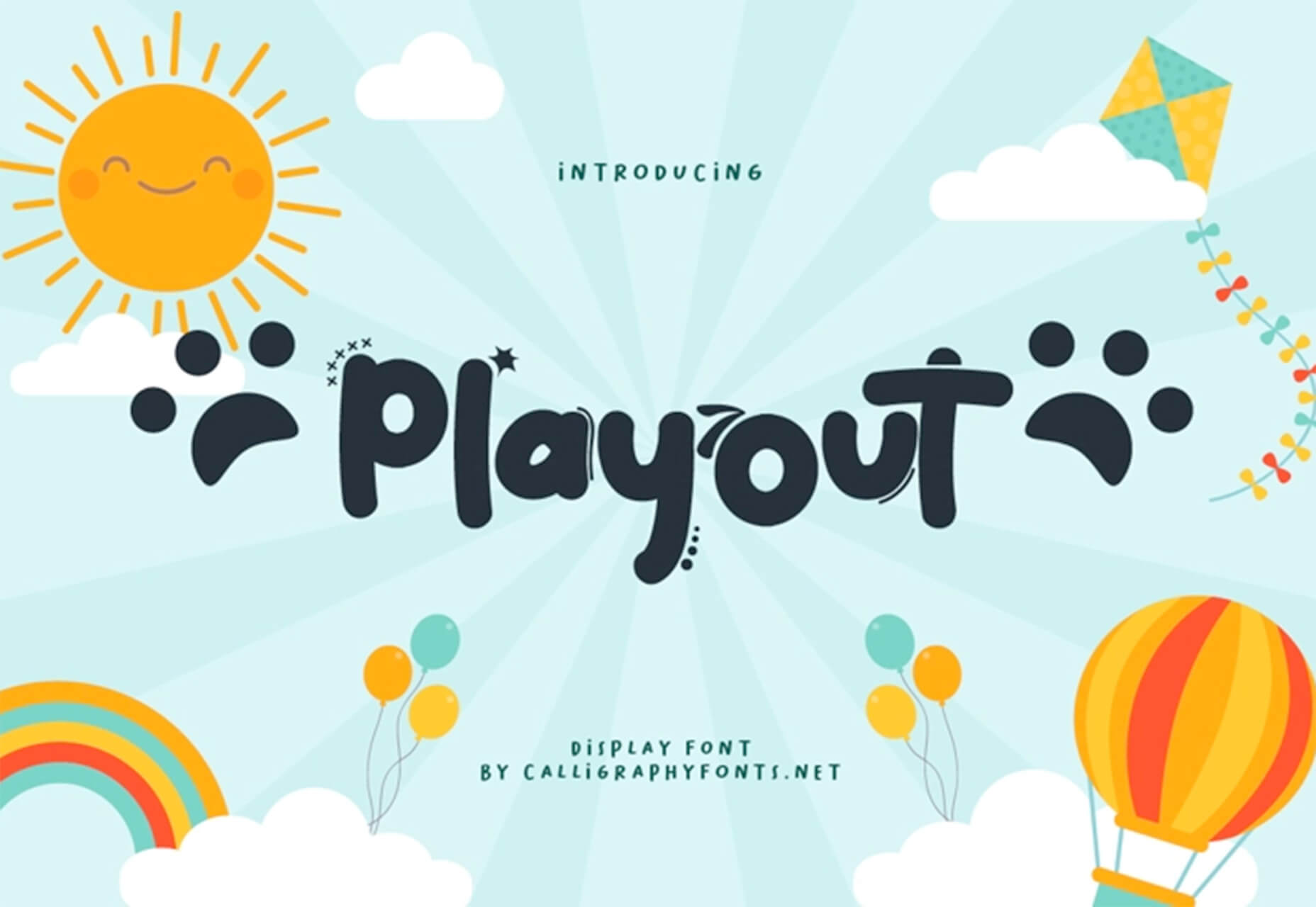
Playout
Playout is a fun, hand-drawn style typeface with interesting glyphs and alternate characters. The most fun feature might be the pawprint characters in the demo set.
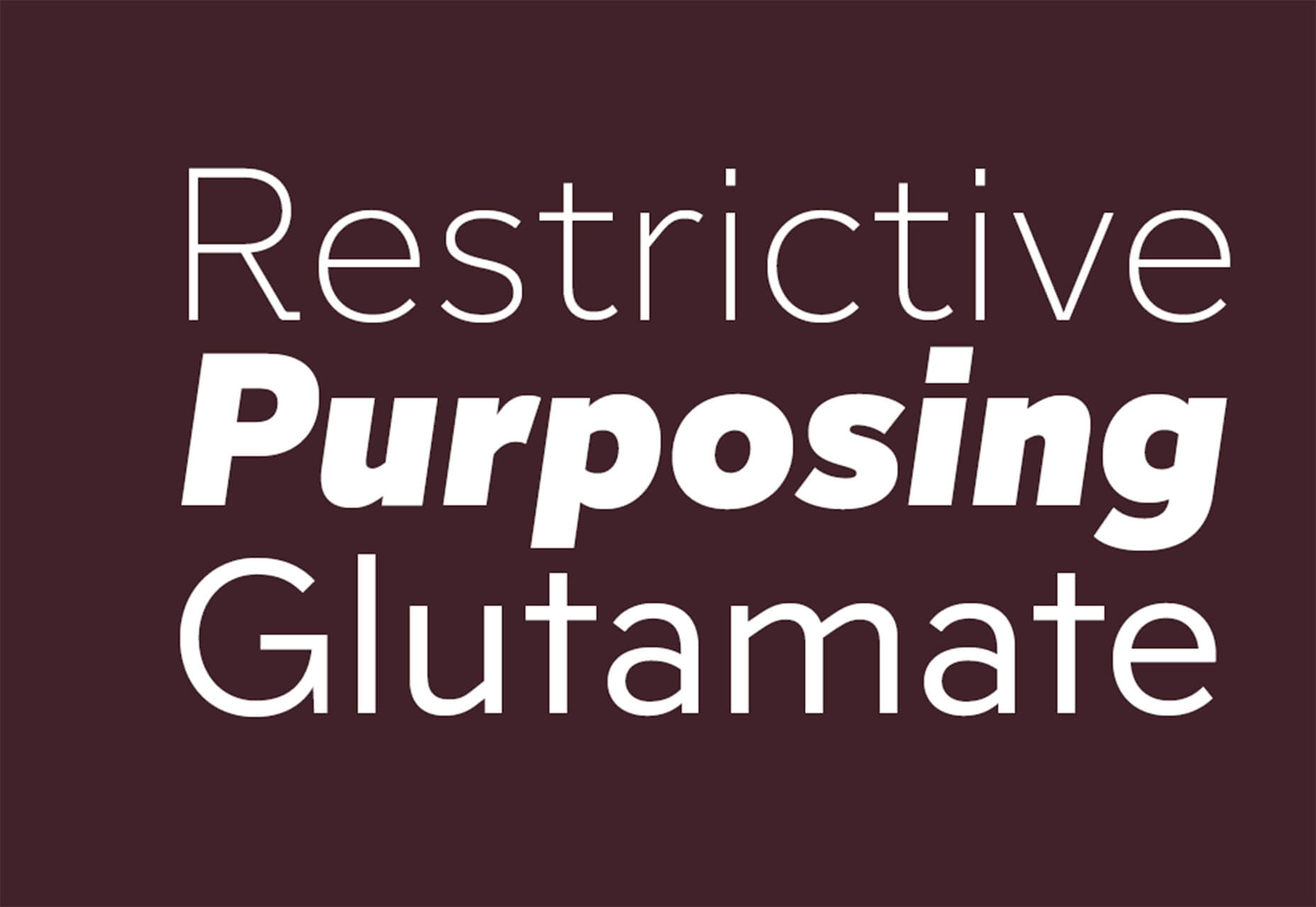
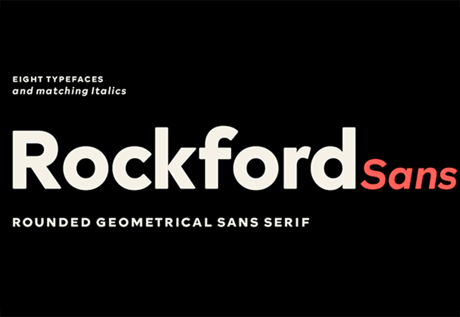
Rockford Sans
Rockford Sans is a geometric typeface with subtly rounded edges. It has eight weights and italics. With its large x-height and round features, it’s legible and friendly. It’s suited to cover a wide variety of tasks from editorial to brand design and advertising.
SpaceType
SpaceType is a fun and funky typeface in regular and expanded styles. The stretched letterforms make interesting alternates for display purposes.
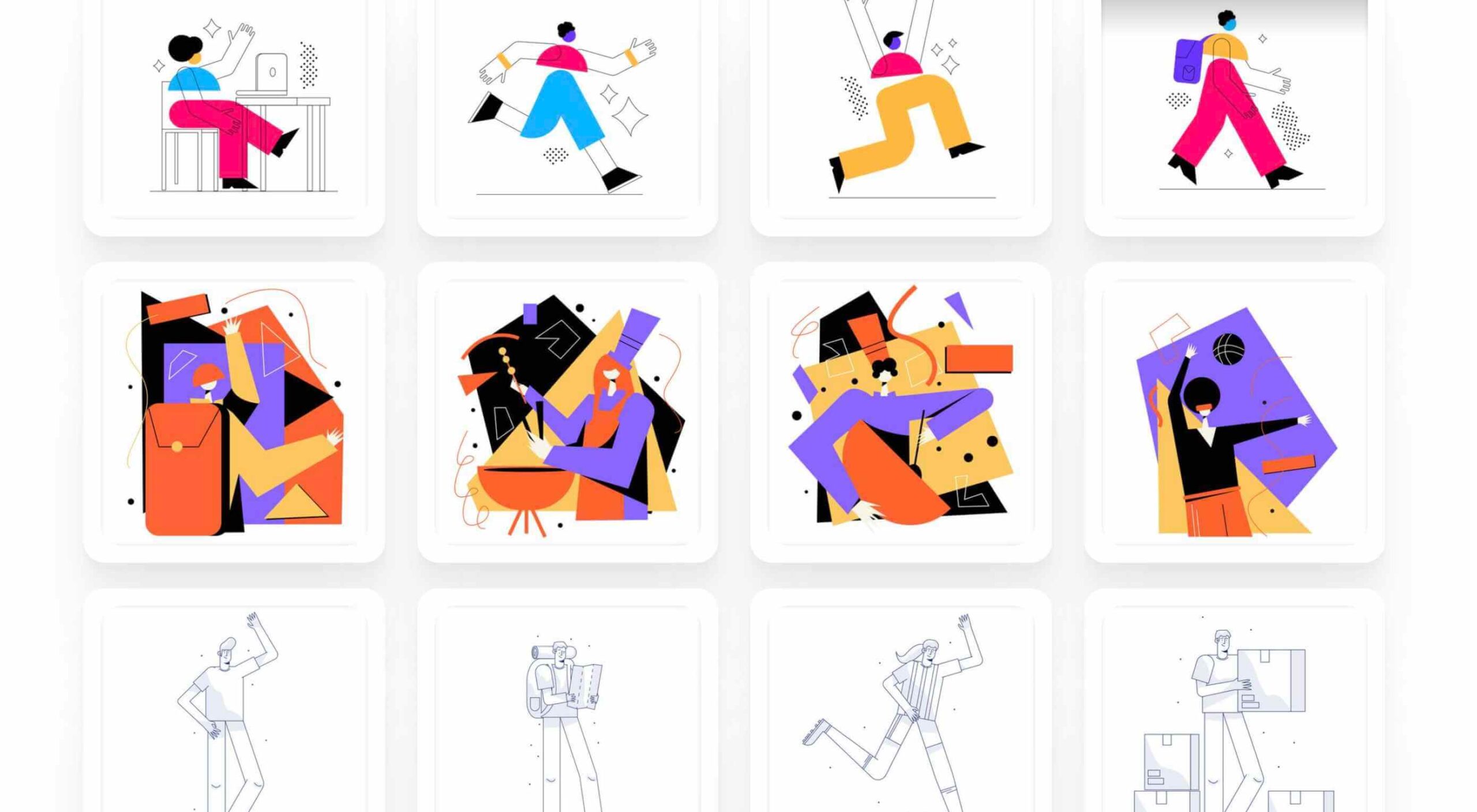
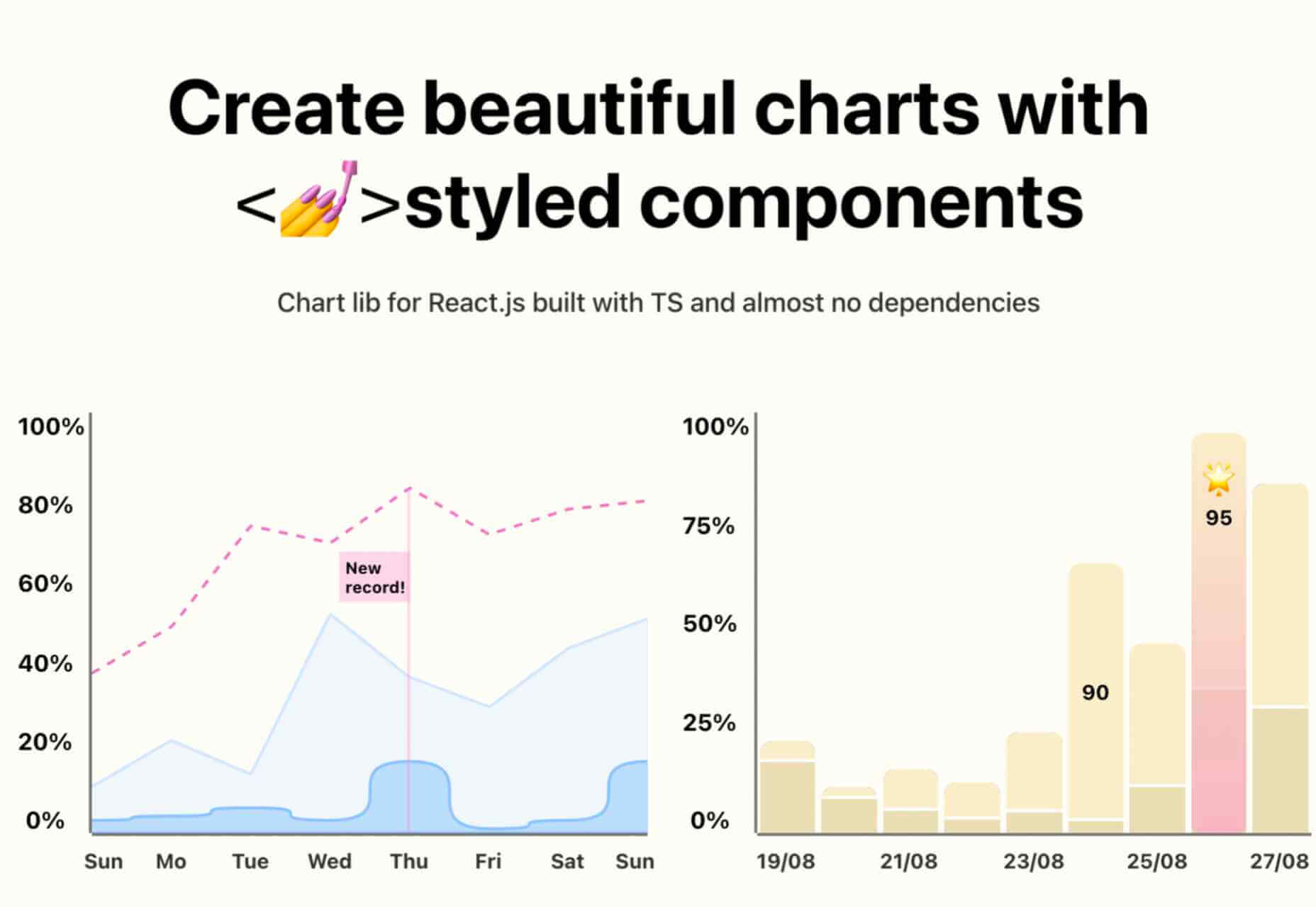
https://ankaa-pmo.com/wp-content/uploads/2021/04/25-exciting-new-tools-for-designers-april-2021.jpg14082560Service comm.https://ankaa-pmo.com/wp-content/uploads/2017/04/Logo-Ankaa-engineering.pngService comm.2021-04-19 16:45:302021-04-19 16:45:3025 Exciting New Tools For Designers, April 2021
Have you ever wondered why we’re so amazed by motion? A moving image is more likely to grab your attention than a static one. Motion is exciting and attention-grabbing – plus, it allows us to access more information in a short space of time.
For a while now, companies have been experimenting with all kinds of motion and animation in their design choices. We’ve seen the rise of animated website backgrounds or live-playing videos instead of images on a home page. There are videos and 360-degree pictures on product pages to help people get a better view of certain items and immersive AR experiences on apps.
So why has the power of motion not made its way into the logo design landscape yet?
Sure, there are a few examples of animated logos out there, but they haven’t had the same long-lasting impact as animated websites. Perhaps that’s because people don’t have the right tools to bring their animated logos to life?
Today, we’re going to cover some top tips for live logo design.
1. Understand What “Live Logo” Means
An animated logo or live logo can be a powerful tool in a company’s branding strategy. Although there’s more to a company’s identity than its logo, it’s fair to say that logos make a huge difference to how we feel about brands and their identity.
A powerful logo can make an emotional connection with your target audience and help your brand to thrive in virtually any environment. Live logos, or animated logos, bring more attention to the brand image, by helping a customer to focus on the logo’s action. A live logo might tell a story about what the business does through motion, or just be eye-catching.
The level of animation varies depending on the designer, but it can go all the way from a short video presentation to a few simple moves. The Skype logo is an excellent example of something simple, that multiple designers have played with to great effect.
Today, there are plenty of open-access tools helping to create more immersive animated graphics in the logo design world. Additionally, the types of animation available are becoming more impressive all the time.
2. Explore the Types of Logo Animation
The next stage of properly leveraged live logos, is knowing what kinds of logo animation are available. There are plenty of different styles of animation to explore today, depending on the kind of impact you want to have.
For instance, sometimes the animation you choose will be connected to your business. A vehicle company might have a logo that seems to “drive” into the central space on the screen. An electricity company might choose a logo that pulses like an electric charge. This animated FedEx logo is an excellent example of how animation can show what a business does.
Options for animation might include:
Rotation: Make an emblem stand out by moving it to the sides or allowing it to move on its axis. Rotation gives a logo a sense of 3D space.
Appearance/Disappearance: You can make a logo grow on the screen by bringing to life one pixel at a time, or have it dissolve and disappear in a similar way.
Transformation: Your logo doesn’t have to start out in the shape it’s going to achieve. You might start with a seed that gradually grows into a tree-shaped logo for a gardening company, for example.
Replacement: Another great way to tell a story is to replace a graphic related to the company in question with the logo through an immersive animated experience.
3. Set Goals for the Live Logo
If you’re not sure what kind of animations to experiment with, then it’s a good idea to start with some solid goals. Your goals will give you a direction to move in with your logo choices. An animated logo can be a dynamic and modern way to present a brand to an audience, but it’s only going to be effective when implemented carefully.
Let’s look at some of the goals you can choose for your live logo:
Differentiation: While it’s true that animation and live content is gaining more attention lately, it’s still relatively new as an overall concept. With an animated logo, you could help a brand to create a more unique image for themselves, which sets them apart from the other organisations in the same space.
Storytelling: As mentioned above, animated logos can tell a story about what the company or product actually does. In this example for Firefox, for instance, the logo mimics a loading wheel to demonstrate a speedy internet browser.
Brand awareness: Dynamic logos and animations are more likely to capture your audience’s attention than static images. They’re also more of a novel experience, which means that customers might want to share them with other people too.
Memorability: Today’s customers are bombarded by hundreds, if not thousands of logos all the time. They need something special to convince them that one image deserves a spot at the front of their mind. Animation can help to make a business more memorable.
4. Do Your Research
Doing your own research is an excellent way to get some inspiration for a live logo or animation. Ideally, you’ll want to focus on the industry you’re already working in, as this will give you some guidance as to the kind of movement that can attract the most attention from the correct audience.
Watch as intros to brand videos and check out as many live logos as you can. Check out the kind of animations that people use in their videos when they’re showcasing products online. You can learn a lot about what works just by evaluating what other people have done before. Just be careful not to simply copy what you’ve found elsewhere.
The aim of your live animation should be to tell a unique story about the company
The aim of your live animation should be to tell a unique story about the company in question. If you’re not sure how to start with differentiating the image, check out the brand guidelines for the company in question. The guidelines that the company used to choose the right brand colors, fonts, and other visual assets can work just as well for your animation strategy.
Remember, the aim here is to tell a specific story, send a message, or evoke a certain emotion. Don’t make the mistake of designing something that looks cool but doesn’t have much of a purchase. Most human beings will naturally look for the meaning behind the content that they see. If there isn’t anything there, it’ll just lead to confusion.
5. Use Live Logos on Brand Websites
The most obvious way to begin experimenting with animated logos in web design, is to implement live logos into a client’s website. Some companies have a “welcome screen” for their site which uses an animation to introduce visitors to the home page and other navigation options. There are also brands out there who love the impact that animation can have but want to use it more subtly.
In these cases, live logos can be an excellent way to draw the eye to a specific spot on a website, perhaps the area just above the “contact” button that encourages a client to reach out. Crucially, to avoid weighing down the website and distracting visitors, companies and designers will need to make some important choices.
Although it might be tempting to keep the animation looping at all times, just in case someone misses the first round, this requires a lot of extra processing power. Too much animation also makes it harder for businesses to push the focus of their visitors to other points on the website, like landing pages for products, or testimonial pages.
Often, as with most innovative decisions in web-design, the best bet is usually to start small and work your way up. Don’t over-do it with animation on day one. See how the visitors to the website respond first.
6. Find the Right Balance
Animations in a live logo are there to grab attention quickly, and effectively. They shouldn’t go on for too long, or you risk overwhelming your audience before they have a chance to browse the rest of the website or check out other content. A live logo should only be active for a few seconds at most, and in that time, it needs to say something valuable.
Often, the best strategy is to start by building up curiosity, and getting your viewer engaged so that they’re keen to see more. Every frame will count to pull the customer in and make them feel connected to the brand in question.
Make sure that the logo animation is dynamic so that it doesn’t just capture the attention of the viewer but maintain their interest for the full time required. During the motion, the viewer’s brain should be working to figure out what’s going to happen next.
Just like most logo design and graphic animation strategies, the key to success is finding the right balance between clever experiences, and simplicity. You want to do something meaningful that earns your viewer’s attention, but you need to compete with the fact that attention spans are plummeting all the time.
7. Explore Logo Animation in Video
One of the best ways to use logo animation, is to draw interest for a company at the beginning of a video. Video is gaining incredible levels of popularity lately, particularly in a world where you can view video content almost anywhere. Companies are adding videos to their product pages, social media accounts, applications, websites, and so much more .
For the majority of companies, a live logo at the start of a video can help their brand to seem more professional. It’s a reminder to viewers of the brand that they’re learning about with that video content. Plus, a logo at the beginning of a piece of video content can also build on the consistency that companies attempt to create by using the same brand assets in various mediums online.
(Starting a video with an animated logo is great for presentation, but it can also be frustrating to customers in certain pieces of content where they’re looking for quick answers to questions. If an animated logo is more than a couple of seconds long, it may be better placed at the back of a video instead.)
With videos for news reports or announcements where you want to get straight to the point and generate excitement about a new product or service, it can be better to jump straight into action. Ending a video with a live logo keeps the brand image front of mind for the customer for longer, even after the message has ended. On the other hand, ending a video with a logo could increase the chances that customers miss the animation, because they click away from the content too quickly.
If you’re new to adding live logos into videos, consider experimenting with different strategies to see which works best. Different companies might get unique results.
8. Bring Logo Animation to the Real World
Another interesting option for live logo design, could be to step outside of the computer screen for a while. In today’s digitally transforming landscape, it’s becoming more common to see the real and digital worlds converging. Most events and trade-shows come with presentations that rely on digital content, like animated presentations and slide shows.
Depending on the signage solutions available at industry events, companies could even use an animated logo above their booth to draw attention in a cluttered environment. Around 48% of exhibitors agree that a more eye-catching stand or booth is often the most effective way to attract visitors and customers at an event.
Animation and live logos may have started life on the computer screen, but they can appear in much more diverse environments today. Offices could use a live logo in the reception room or lobby to make their on-premises environment more appealing. Retail locations could display ads on digital signage, followed by live logos that work to both separate messages, and keep shoppers entertained when they’re enjoying the bricks-and-mortar experience.
9. Include Live Logos in Brand Signatures
Remember, a live logo doesn’t just have to sit on a company’s app or website until someone discovers it. Sometimes, the right logo can also be a powerful way to “sign off” on a message from a brand or its management team. For instance, email remains to be one of the most valuable tools for business marketing and customer relationship building today.
It’s the third most influential source of content and news for a lot of B2B audiences, and yet, most companies aren’t taking full advantage of what their email marketing software solutions are capable of. If you can display gifs and animated videos in an email (which most software solutions can), then you can also add a live logo to the brand signature.
The important thing to remember is that if you’re going to be adding a signature to a lightweight thing, like an email, it needs to be lightweight too. Don’t make the live logo too long and complicated, or it might prevent the email from loading properly.
Outside of email, don’t forget to consider options for live logos in things like social media profile pictures too. According to experts, around 80% of companies use visual assets in their social media marketing. A live logo is a great way to go beyond the basics with a company’s imagery. Motion grabs attention, and video content is quickly gaining steam on a lot of social media platforms.
Embracing a New World of Live Animation
Designers are only just beginning to scratch the surface of what’s possible with animated logos. For many companies, live logos are an excellent way to capture audience attention and encourage engagement with a brand.
A live logo at the beginning of a video, at the start of an app loading screen, or even at the top of a website can differentiate a company and make them stand out. As technology continues to evolve, and customer expectations continue to expand, the options for live animation could continue to grow. You might even be able to infuse live logos with elements of VR and AR, to impart brand essence in a brand-new digital world.
If you haven’t begun experimenting with live logo design yet, now could be the time to start.
https://ankaa-pmo.com/wp-content/uploads/2021/04/9-tips-for-better-live-logo-design.png15292780Service comm.https://ankaa-pmo.com/wp-content/uploads/2017/04/Logo-Ankaa-engineering.pngService comm.2021-04-14 16:45:092021-04-14 16:45:099 Tips for Better Live Logo Design
Google has been talking about the Core Web Vitals tool and the Page Experience Update for about a year now.
With the update scheduled to roll out in May 2021, now is the time to make sure your websites are prepared for it. It’s taking a lot of the best practices Google has recommended over the years and making them an official part of the search algorithm, so not taking this seriously could negatively impact your sites’ rankings.
Today, we’re going to look at everything Google has told us about the update and how to use the Core Web Vitals tool to ensure your site rankings don’t drop once it rolls out.
What We Know About the Google Page Experience Update
Google first told us about the page experience update back in May 2020. Here’s what we know about the upcoming update:
Google’s Search Algorithm Will Change in May 2021
Although there’s no specific day given, we do know that the page experience update will go live sometime in May 2021.
The Goal is to Reduce Friction on the Web
It’s not as though user experience is something that designers and developers overlook when building websites. Heck, there’s an entire disciple of UX design dedicated to it.
That said, Google hasn’t taken too hard line of an approach in enforcing its page experience suggestions, like mobile-first design, removing intrusive pop-ups, or improving page speed. With this update, though, Google is now telling every site owner that performance, accessibility, technical best practices, and SEO must be built into their websites.
Of course, the goal isn’t to create more work on your side of things. Google believes that by encouraging developers to build better web experiences that consumers will experience less friction and businesses will be more profitable as a result.
The Update Will Include Older Signals
According to Google, the page experience update is going to combine a bunch of older signals with the new Core Web Vitals:
The Core Web Vitals tool will now merge all of that data we once had to gather from various Google apps. That’ll make it more convenient for designers and developers to improve the on-page experience across a variety of areas.
The Page Experience Algorithm Will Change Over Time
Per Google:
Because we continue to work on identifying and measuring aspects of page experience, we plan to incorporate more page experience signals on a yearly basis to both further align with evolving user expectations and increase the aspects of user experience that we can measure.
So, don’t expect this to be a one-and-done thing. You’ll have to rely on the Core Web Vitals tool, and pay close attention to updates out of Google, to ensure your sites are keeping up with Google’s page experience standards.
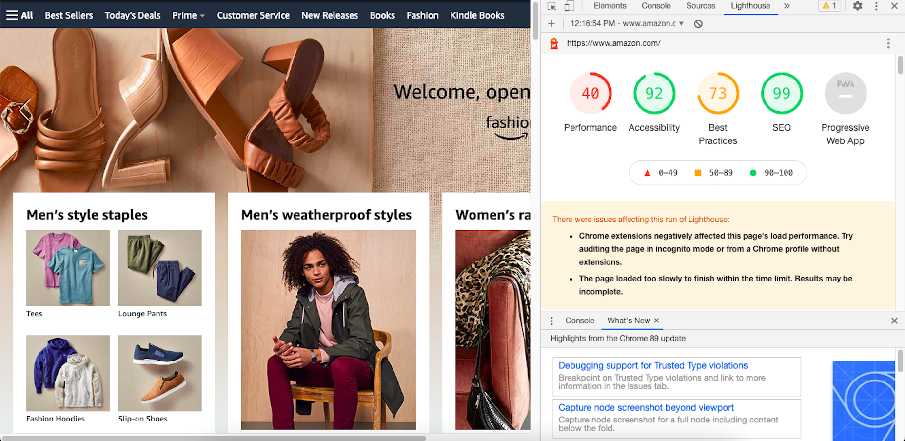
Your Other Google Apps Have Already Been Updated with Core Web Vitals
If you hadn’t noticed, Google has already updated its other apps in anticipation of the page experience update.
Here’s an example of how Lighthouse’s report on the Amazon website now looks:
By including these metrics within the tools you’re already using, you don’t necessarily have to add the Core Web Vitals tool to your growing toolbox. That said, there are some really valuable reports in there, so I’ll show you why you may want to add it anyway.
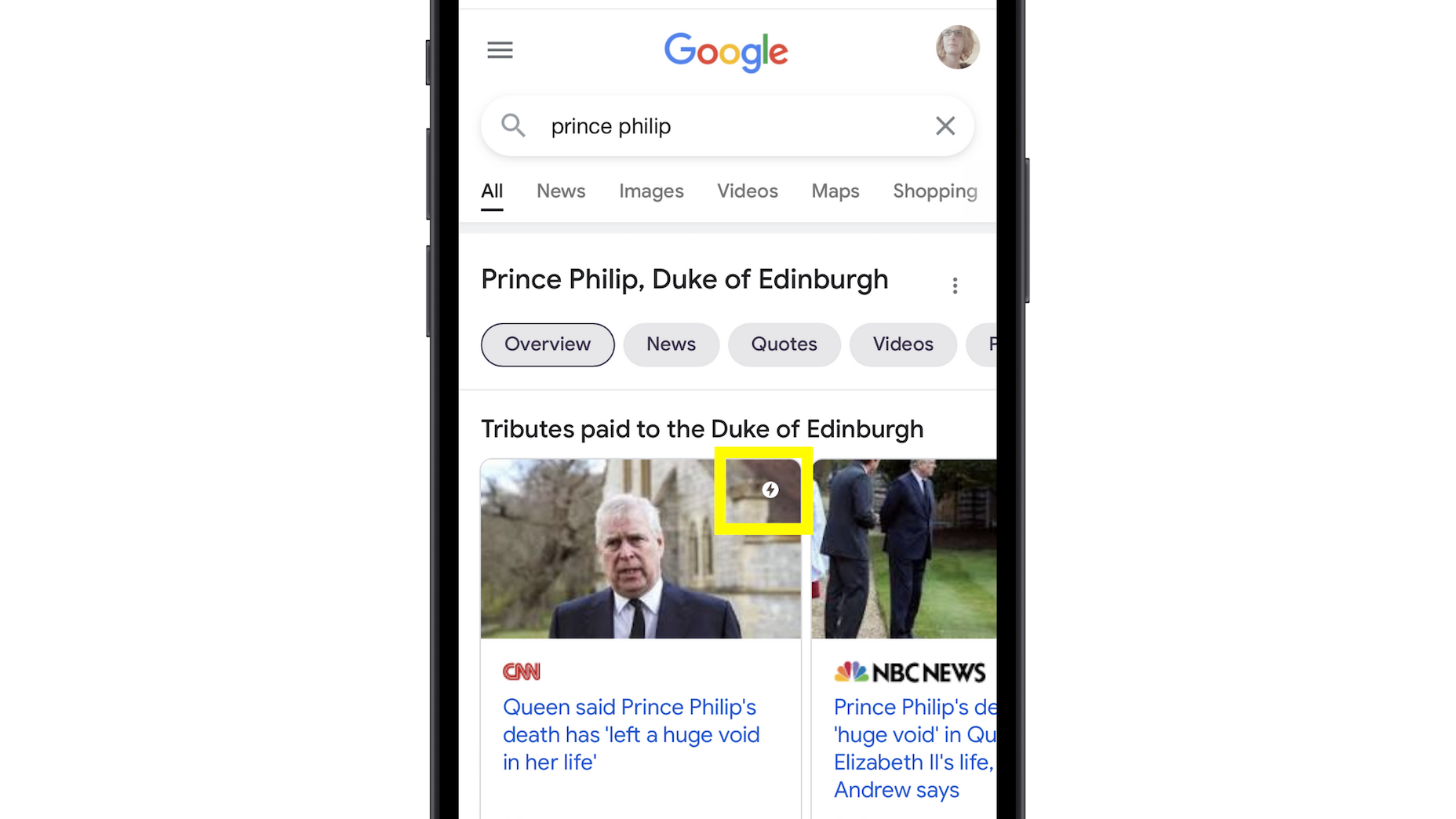
Google’s Top Stories Will Be Affected
In the past when someone did a news-related search on Google, they’d see “Top Stories” results like this one:
Until now, the only pages shown here were AMP-enabled ones.
Once the page experience update goes live, though, the AMP requirement is going away. So long as a page meets the page experience criteria along with Google News content policies, it can now rank in this section.
Google Search Results May Show a Page Experience Indicator
In the Top Stories example above, notice the AMP indicator I highlighted in yellow. Google is thinking about adding something similar to any search result that fulfills its page experience criteria.
While I think a small, eye-catching icon might draw a little more attention from Google users, I’m not sure if it’ll be that big of a deal to them. People working in this industry certainly know what that lightning bolt means, and we’ll also be the ones who recognize the page experience indicator, but I’m not convinced it’ll matter to users.
That said, this is something Google is thinking about rolling about, so it’s something to be aware of. At the very least, you can consider it a badge of honor when showing your websites to clients and prospects who want to see what you can do for them.
Content Is Still More Important Than Page Experience
Even if a website checks off all the page experience boxes, there’s no guarantee that it’ll start to rank better than websites that haven’t. The quality and value of the content on the page still matters greatly.
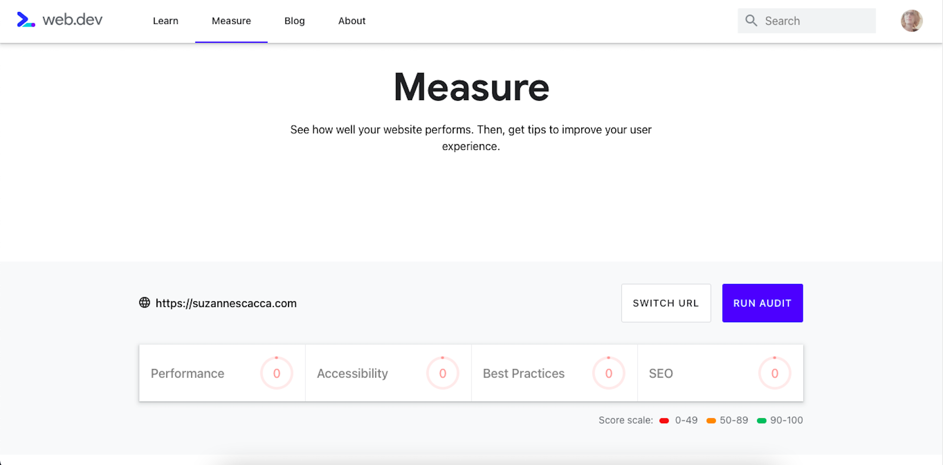
Using Core Web Vitals to Measure Page Experience
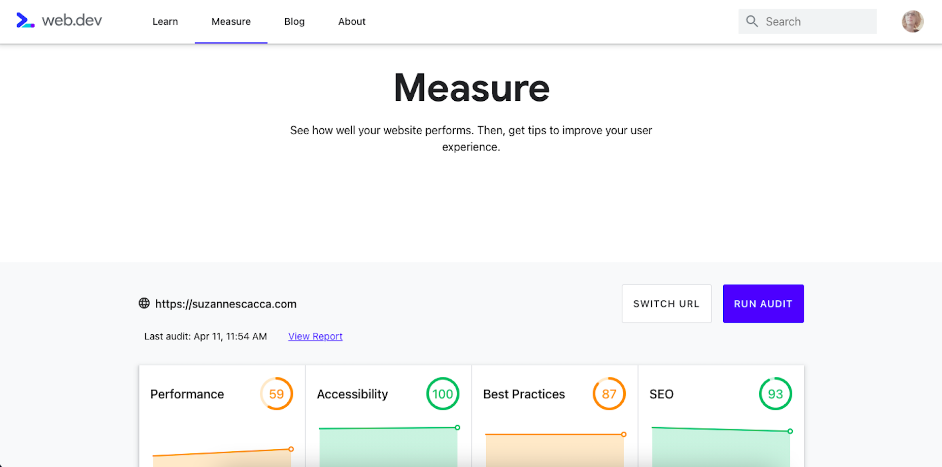
Alright, so let’s take a look at this Core Web Vitals tool. Here’s what the tool looks like when you enter the “Measure” tab:
It’s like most other Google analyzer tools. You enter the URL you want to audit and let the tool run. The results then spit out something that looks like this:
Core Web Vitals are graded on four categories:
Performance measures the loading speed, interactivity, and stability of the page.
Best Practices focus on the technical aspects of the page, including things like having an SSL certificate and making sure images fit within the parameters of the mobile screen.
SEO checks on the typical SEO signals like metadata, structured data, and so on.
Accessibility reports any issues with visitors not being able to see or access parts of the page.
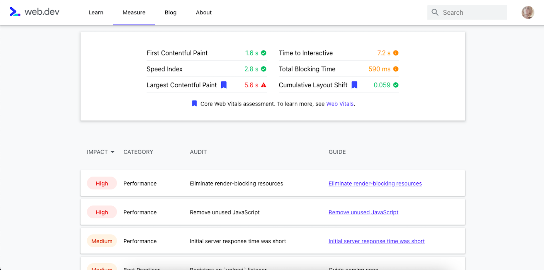
If you scroll down just a little bit on the page, there’s more data available. It mainly has to deal with the technical stuff, like page speeds and unoptimized code:
Now, this isn’t really anything new. We can get this data about load time, interactivity, and content stability from Google’s other apps.
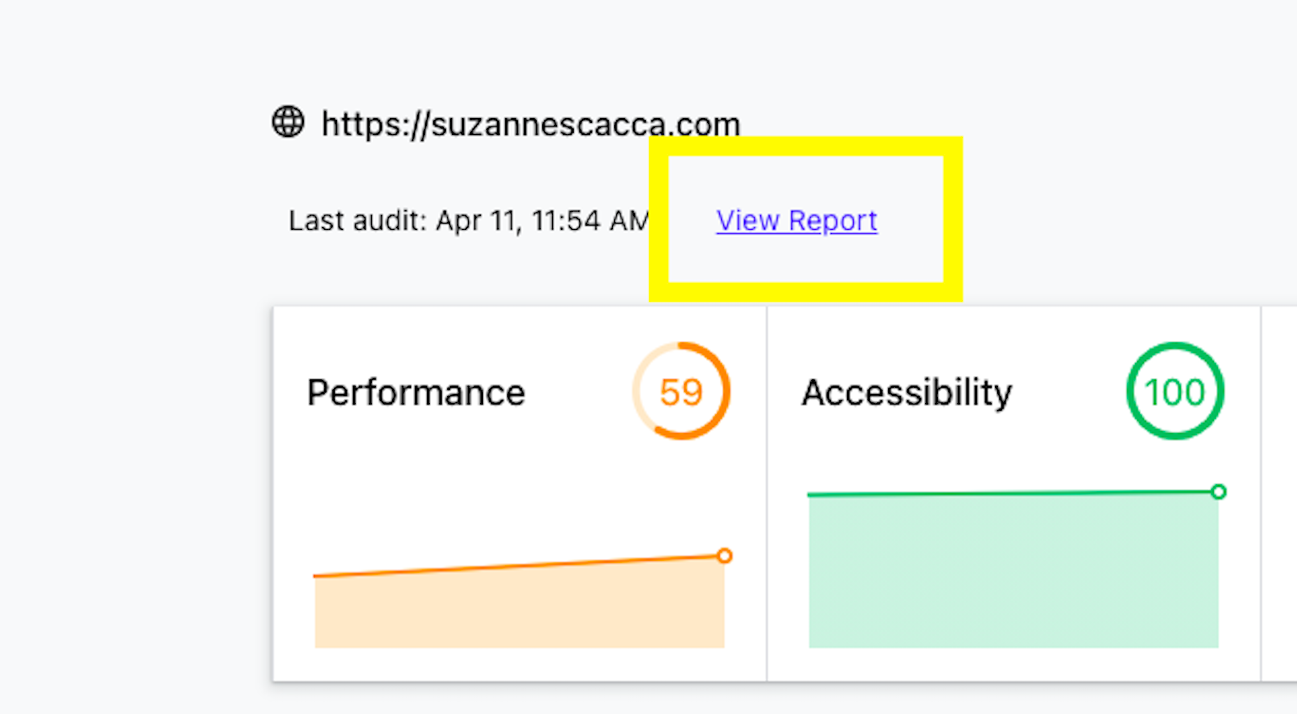
The real value is in the report, which you can access up top next to the date of your audit.
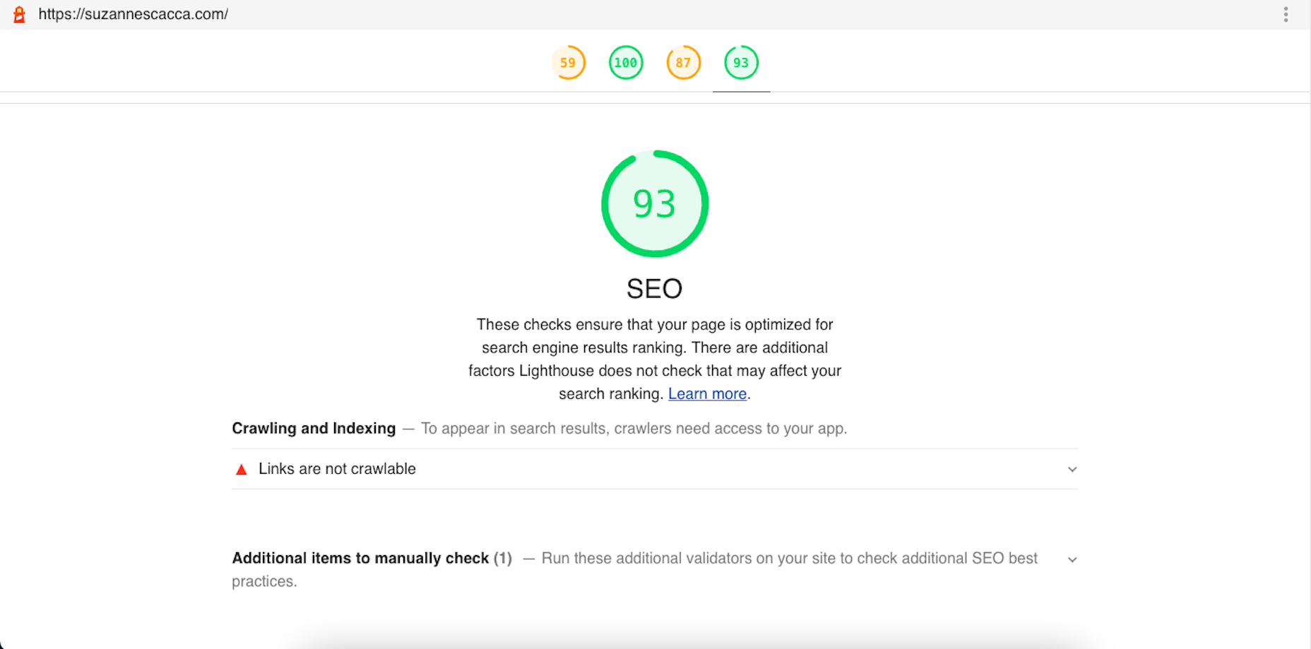
Open the report and you’ll find specific suggestions and pro tips to optimize each part of the page experience, like this SEO report:
Just like other Google tools, this one can teach you a lot about what makes one site more rankable than another. So, make sure you update your web design strategy going forward to integrate all of these ranking signals.
While you’ll have to do annual audits on your sites to see how much Google has changed the page experience signals, you’ll create less work for yourself if this baseline set of criteria are met with every site you build.
https://ankaa-pmo.com/wp-content/uploads/2021/04/get-ready-for-next-months-google-shakeup.png15292780Service comm.https://ankaa-pmo.com/wp-content/uploads/2017/04/Logo-Ankaa-engineering.pngService comm.2021-04-12 12:45:202021-04-12 12:45:20Get Ready For Next Month’s Google Shakeup
Every day design fans submit incredible industry stories to our sister-site, Webdesigner News. Our colleagues sift through it, selecting the very best stories from the design, UX, tech, and development worlds and posting them live on the site.
The best way to keep up with the most important stories for web professionals is to subscribe to Webdesigner News or check out the site regularly. However, in case you missed a day this week, here’s a handy compilation of the top curated stories from the last seven days. Enjoy!
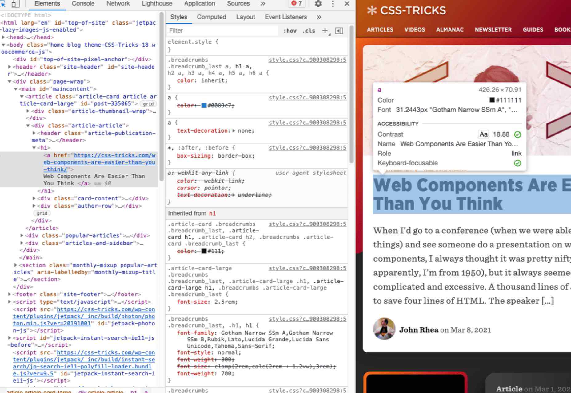
https://ankaa-pmo.com/wp-content/uploads/2021/04/popular-design-news-of-the-week-april-5-2021-april-11-2021.jpg14082560Service comm.https://ankaa-pmo.com/wp-content/uploads/2017/04/Logo-Ankaa-engineering.pngService comm.2021-04-11 16:45:332021-04-11 16:45:33Popular Design News of the Week: April 5, 2021 – April 11, 2021
Inclusive design is all about designing sites with everyone in mind instead of designing for your own preferences. It’s an essential component in a professional-grade site and the cornerstone of a successful project.
Accessibility (A11y for short) is the technical branch of inclusive design. Accessibility is a science: it knows what markup is required to make the text available to the visually impaired; it knows the minimum button size for someone with limited motor control; it knows how complex navigation can be for someone with cognitive dysfunction. Accessibility is the engine that powers an inclusive design.
Because accessibility is so complex, it takes a huge wealth of knowledge to do it well. Luckily for you and me, there’s now a free resource you can use to brush up on your skills and improve the ROI of your site.
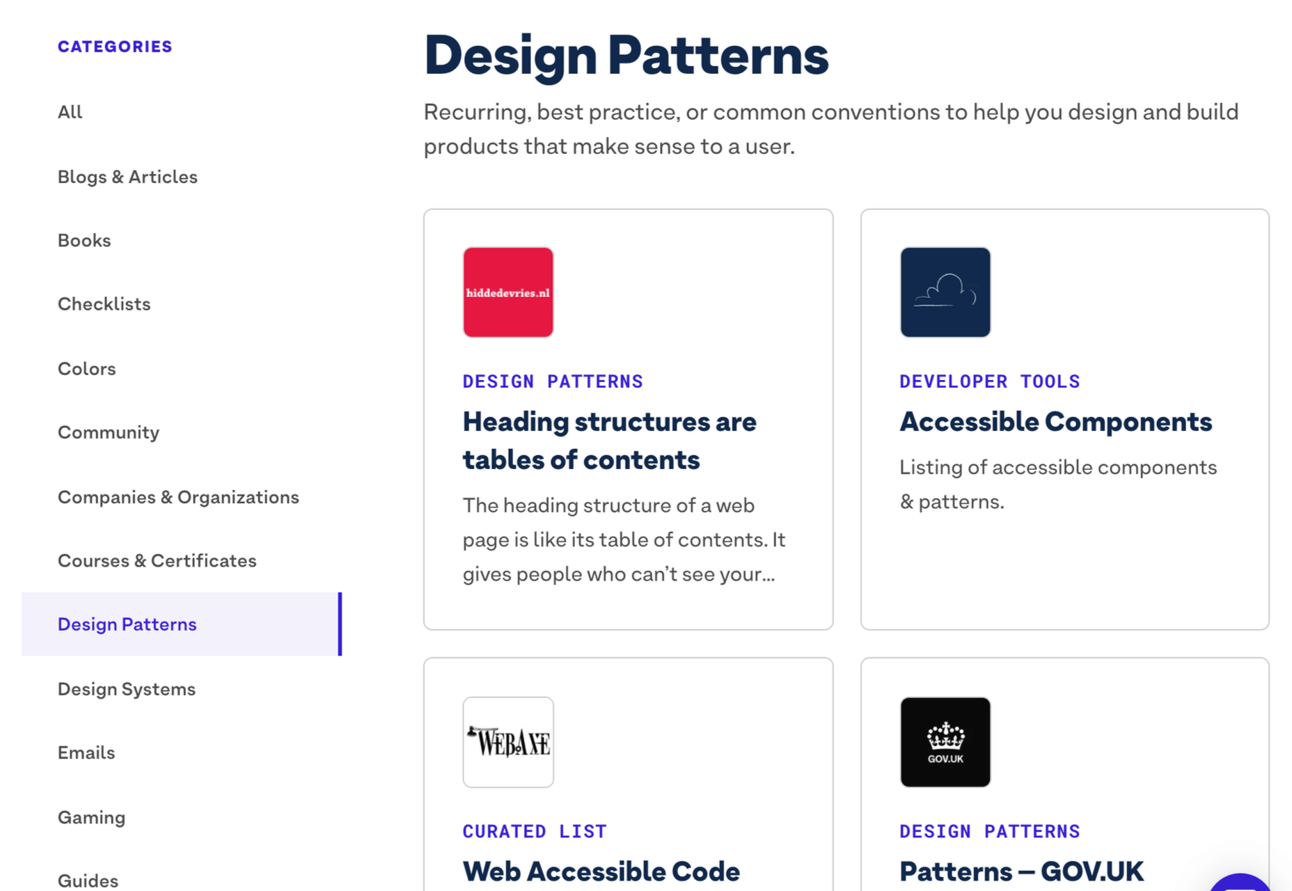
Stark has just acquired a11yresource and relaunched it as the Stark Public Library — reportedly the largest accessibility resource on the web. The library contains around a thousand different resources. You’ll find blog articles, checklists, formal courses, tools, links to web standards, and a whole lot more. As the library grows, the expectation is that Stark will add new features aimed at fostering a community.
Stark is a suite of accessibility tools for designers that integrates with XD, Sketch, and Figma. It’s free to use the basic package, and the commercial plan is $60 per year. The Public Library is free for everyone to access.
https://ankaa-pmo.com/wp-content/uploads/2021/04/stark-launches-public-library-for-accessibility.jpg14082560Service comm.https://ankaa-pmo.com/wp-content/uploads/2017/04/Logo-Ankaa-engineering.pngService comm.2021-04-09 20:45:232021-04-09 20:45:23Stark Launches Public Library For Accessibility
Web design is an ever-evolving field. Those of us that have been in the industry a long time (i.e., six months plus) have seen the launch of more products, the establishment of more ideas, and the promise of more growth than most industries see over a whole career.
While the tools we use, the terminology we employ, and the goalposts we shoot for are constantly changing, core skills are transferable and long-lasting and will ensure you not only survive in the industry but thrive in it.
These skills are characteristics that you can learn, that will help you grow in 2021, 2022, and beyond.
1. Decision Making
Life is a series of decisions, from which pair of socks to wear to which crypto to store your life savings in. Each of us has a finite amount of decision-making fuel in the day — the more decisions you make, the sooner you reach decision fatigue.
Most people burn their decision-making fuel by second-guessing themselves; they make a decision and then remake the same decision over and over as doubt creeps in.
The ability to make a decision, and stick to it, separates those people who still have the fuel to make strategic decisions after close of business and those people who can’t decide what to have for dinner.
2. Clarity of Purpose
It’s never a bad idea to brush up on design fundamentals. From color theory to typography to UI and layout, these core skills are not only beneficial to your design practice, but they help you think about design on a higher level.
Too often, designers fail to see the wood for the trees, focusing on the project at hand instead of a wider picture. The wider picture doesn’t mean your portfolio; it means the whole history, culture, and design context.
Many musicians can play multiple styles, but they tend to favor one instrument; they made a fundamental decision that freed them to explore music in greater depth
Despite the term, design fundamentals aren’t universal; they’re personal to you. For example, should you pair a script with a serif? Your answer is probably, “it depends” because you’re an awesome designer; my answer is “no,” because, for me, that is a design fundamental.
Design fundamentals can be limiting, but by providing default answers to common questions, they also free you to consider larger questions about what you’re doing and why, which leads to clarity of purpose.
Many musicians can play multiple styles, but they tend to favor one instrument; they made a fundamental decision that freed them to explore music in greater depth.
3. The Holy Trinity
The holy trinity in web design is HTML, CSS, and JavaScript. Learn what they are and what they do.
You need to understand them well enough to hold an intelligent boardroom-level conversation about them. You don’t actually need to know how to code them — although I’ve never actually met someone who knew enough about their roles to hold a strategic conversation, who didn’t also know how to code them from scratch.
I’m not talking about frameworks, libraries, or the latest build tools. Those things are just macros for coders. I’m talking about understanding the building blocks of a site, so if someone asks you whether you really need the company logo in the site footer, you can answer, and back your answer up with facts.
4. Simple Presentation
No matter what field of design you’re in, you’re going to need to present your ideas to someone who doesn’t share your knowledge. Whether you’re explaining the basics to a client or explaining your decision-making to a colleague, presenting your ideas simply is the best way to be heard.
a pitch is most effective when you exclude extraneous detail
Often, a persuasive presentation utilizes the less-is-more approach. Just as a design is finished when you’ve removed everything unnecessary, so too a pitch is most effective when you exclude extraneous detail.
Often you’ll find metaphor useful, especially if you have a passing knowledge of the person’s own area of expertise because it translates a concept into a format the person understands and is comfortable with.
“We should…because it will improve [a metric] by approximately…%” is often the most welcome language. If the person you’re selling your decision needs more detail — and they probably don’t need to know details, that’s what they have you for — they can ask.
5. Strategic SEO
SEO (Search Engine Optimisation, for the two people in the world who don’t know what that acronym stands for) is a vast field with as many sub-divisions as there are UX job titles.
There are various branches of SEO that a site needs to consider. Technical SEO is the stuff that coders do; if you’re not a coder, you can ignore that. Content SEO is the stuff that marketers do; if you’re not a marketer, you can ignore that. Strategic SEO is a macro-view of a site’s plans; everyone on every project should understand strategic SEO.
Strategic SEO covers topics like landing pages, single-page sites, whether a blog is necessary, how, if at all, social media is employed. Strategic SEO feeds all other branches of SEO. It is so fundamental that it informs the earliest decisions about a site. If you want to do more than make things look pretty, learn more about strategic SEO.
6. A Second Language
You’ve probably noticed by now that the web extends beyond your town limits. It’s a global force, which means billions of people who don’t speak the same language.
If you’re not a native-English speaker, then it’s a no-brainer to learn a little English. You don’t need to be fluent; you certainly don’t need to be poetic, but the vast majority of documentation, GUIs, blog posts, forums, conferences, and the Web itself are in English, and translation code only gets you so far.
If you are a native English speaker, then learn something relevant to your region or the industry you specialize in. It doesn’t really matter what you learn; picking up a language, and culture, makes you a more rounded human being. And provided you don’t pick something obscure, you’re opening yourself up to millions or even billions of users you were previously missing out on.
7. Saying, “No.”
It doesn’t matter whether you’re a freelancer sofa-diving for spare pennies to meet the rent or a seasoned in-house designer with targets to meet; everyone struggles to say, “no.”
The fear is that if we decline a project, or a feature request, that we won’t be asked next time; eventually, we’ll be passed over for all projects until we have no career left.
The problem is that we only have so many hours in a day. If we do too much, we end up doing it badly, so there have to be limits. Every time you say “yes,” you’re increasing the chances that you will have to say “no,” to a future opportunity that’s great for you.
By all means, decline gracefully. Do it politely. Be kind. Offer to refer the client elsewhere. But it’s better to say “no” than to have to say “no” to the perfect project because you’re over-stretched.
https://ankaa-pmo.com/wp-content/uploads/2021/04/7-skills-you-need-to-thrive-as-a-web-designer-in-2021.jpg14072560Service comm.https://ankaa-pmo.com/wp-content/uploads/2017/04/Logo-Ankaa-engineering.pngService comm.2021-04-07 16:45:592021-04-07 16:45:597 Skills You Need To Thrive As A Web Designer In 2021
Everyday design fans submit incredible industry stories to our sister-site, Webdesigner News. Our colleagues sift through it, selecting the very best stories from the design, UX, tech, and development worlds and posting them live on the site.
The best way to keep up with the most important stories for web professionals is to subscribe to Webdesigner News or check out the site regularly. However, in case you missed a day this week, here’s a handy compilation of the top curated stories from the last seven days. Enjoy!
https://ankaa-pmo.com/wp-content/uploads/2021/04/popular-design-news-of-the-week-march-29-2021-april-4-2021.jpg14082560Service comm.https://ankaa-pmo.com/wp-content/uploads/2017/04/Logo-Ankaa-engineering.pngService comm.2021-04-04 12:45:282021-04-04 12:45:28Popular Design News of the Week: March 29, 2021 – April 4, 2021
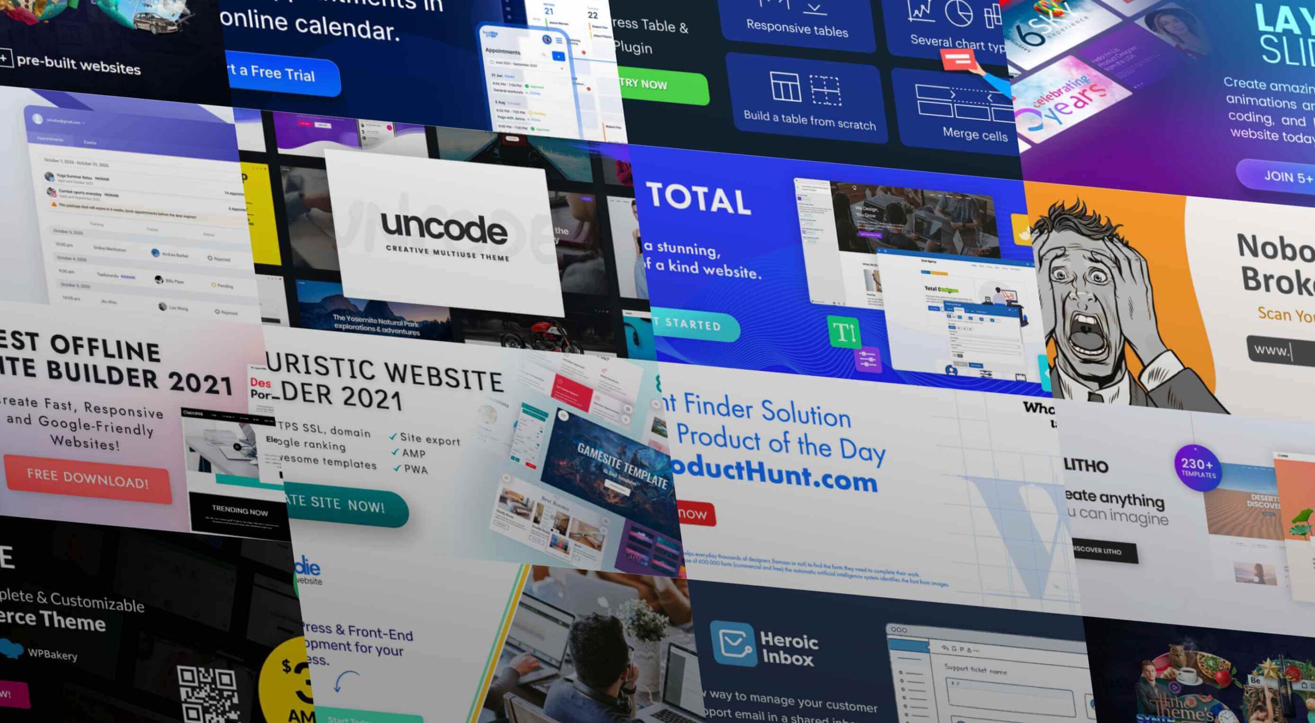
As a web designer, you face plenty of challenges, both good and bad. One of the bad ones is to suddenly find out that you’re either in danger of missing a client’s deadline or will be unable to meet it at all.
A missed deadline could be due to something beyond your control and no fault of your own. There are measures you can take to avoid what you do have control over. Such as not having the right design tool or design resources to do a task that has to be done.
An ounce of prevention can definitely be worth a pound of cure in this case. Before starting a project, make sure the tool or tools you will be using will be up to the task.
The 15 design tools presented here are the tops in their respective categories. You should be better able to handle whatever is thrown at you.
1. Be Theme
Its more than 200,000 sales to date have certainly established the BeTheme multipurpose WordPress theme as an all-time favorite among web designers.
In truth, “multipurpose” doesn’t do BeTheme justice. Users might argue that “all-purpose” would be a more accurate description.
Be’s 40+ core features give web designers plenty to work with in terms of page-building tools, design aids, design options, and special effects.
Most notably:
The Muffin Builder, which when used with other core features, makes building a website quick, easy, and coding-free;
The Admin Panel/Shortcode Generator combo gives all the flexibility designers need;
BeTheme’s 600+ customizable pre-built websites could well be the star of the show. They cover 30 business sectors and all the popular website types, they are customizable, responsive, and feature cool UX features, and they can get any project off to a rapid start.
Click on the banner to learn more about Be’s other core features.
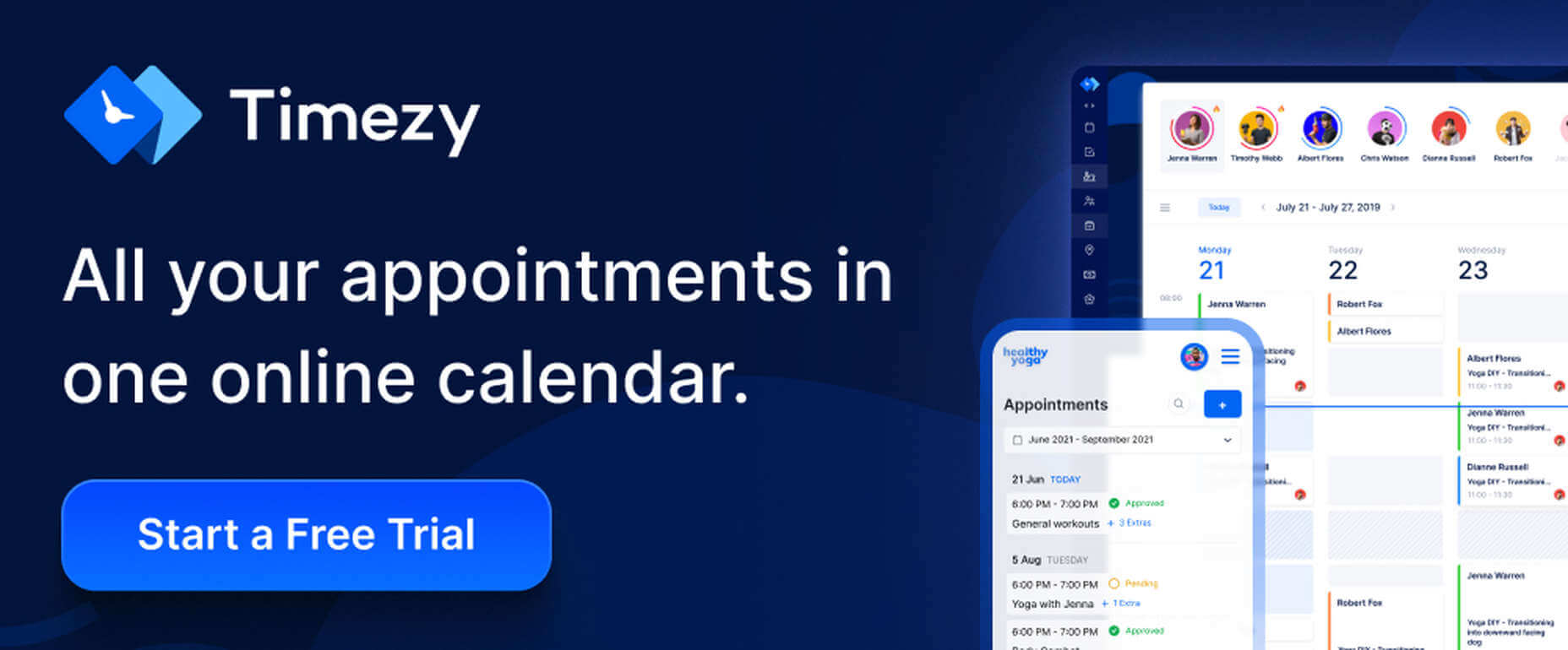
2. Timezy Booking Software
Timezy will help you create a booking environment that works best for your business by allowing clients and customers to book your services as easily as possible. You can then integrate Timezy into your website to streamline and speed up your booking operation.
Clients and customers can book appointments online 24/7;
They can receive real-time email notifications and reminders;
Timezy can be integrated with Zoom;
You can reorder steps on the booking form to fit your needs;
Timezy can be used to manage employee assignments and schedules, vacations, and special days.
If you lack a website of your own, Timezy will provide you with a modern web page you can customize to fit your brand for clients to book appointments at any time.
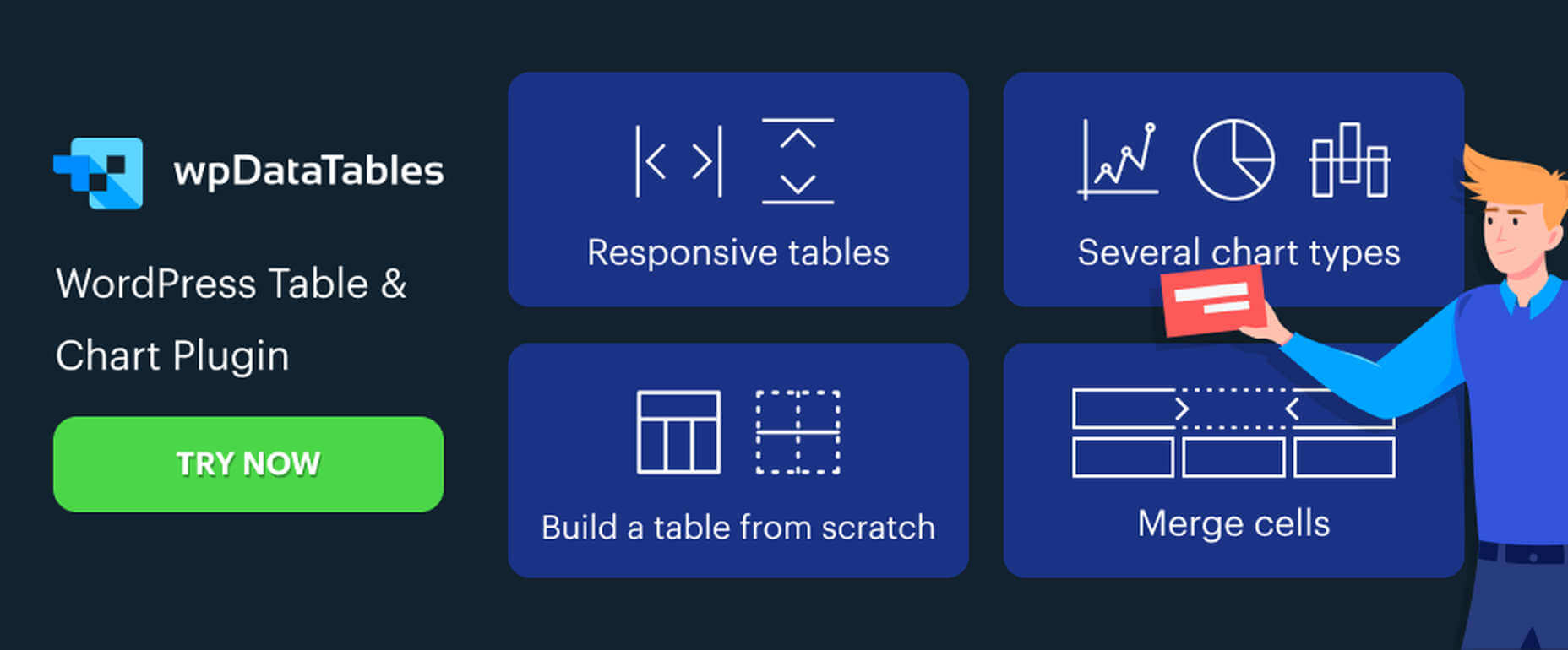
3. wpDataTables
wpDataTables is the top-selling and most powerful WordPress table and chart-building plugin on the market. There are other good ones, but their table and chart-building capabilities quickly become inadequate as you go down the list of what wpDataTables can do that most others cannot.
wpDataTables key features and capabilities:
The ability to create interactive and responsive tables and charts;
The ability to create frontend editable and easily maintainable tables and charts;
The ability to rapidly process massive amounts of data that come in various formats and from various sources;
The ability to build tables and charts using real-time data.
You can also brighten up or improve a table or chart’s readability by highlighting or color-coding key information.
Click on the banner to find out more about what this plugin can do for you.
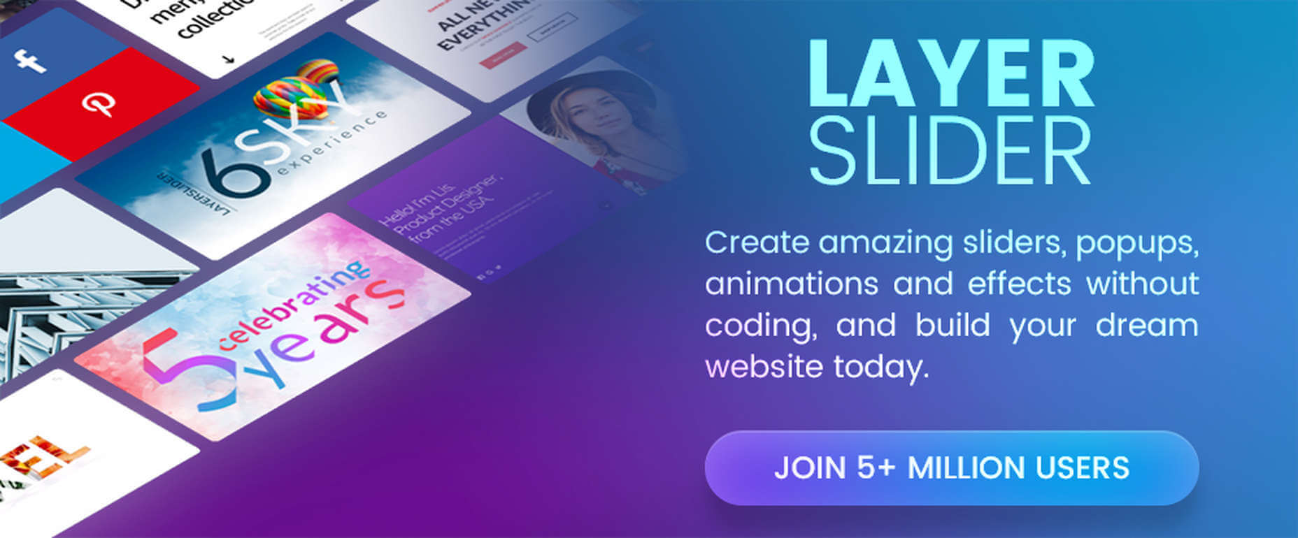
4. LayerSlider
LayerSlider is not for sliders only. This multipurpose WordPress tool can also be used to create eye-catching animations and engaging content.
Add a little spice to a stale website;
Create popups with stunning effects to interact better with visitors;
Avoid coding, since LayerSlider is drag and drop.
This popular design tool has been assisting web designers for nearly a decade and serves millions of active monthly users.
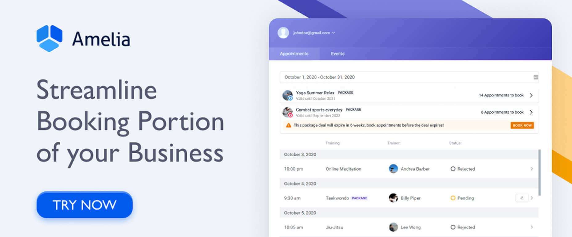
5. Amelia Booking Plugin
Amelia is a user-friendly WordPress booking plugin you can use to manage your appointments and events on a single platform.
Clients can instantly book, change, or cancel appointments online 24/7;
Employees and customers can manage meetings, appointments, and events from their own dashboards;
Amelia can be integrated with Zoom to conduct training or consultation sessions;
Amelia can also create packages of services with discounts and validity periods.
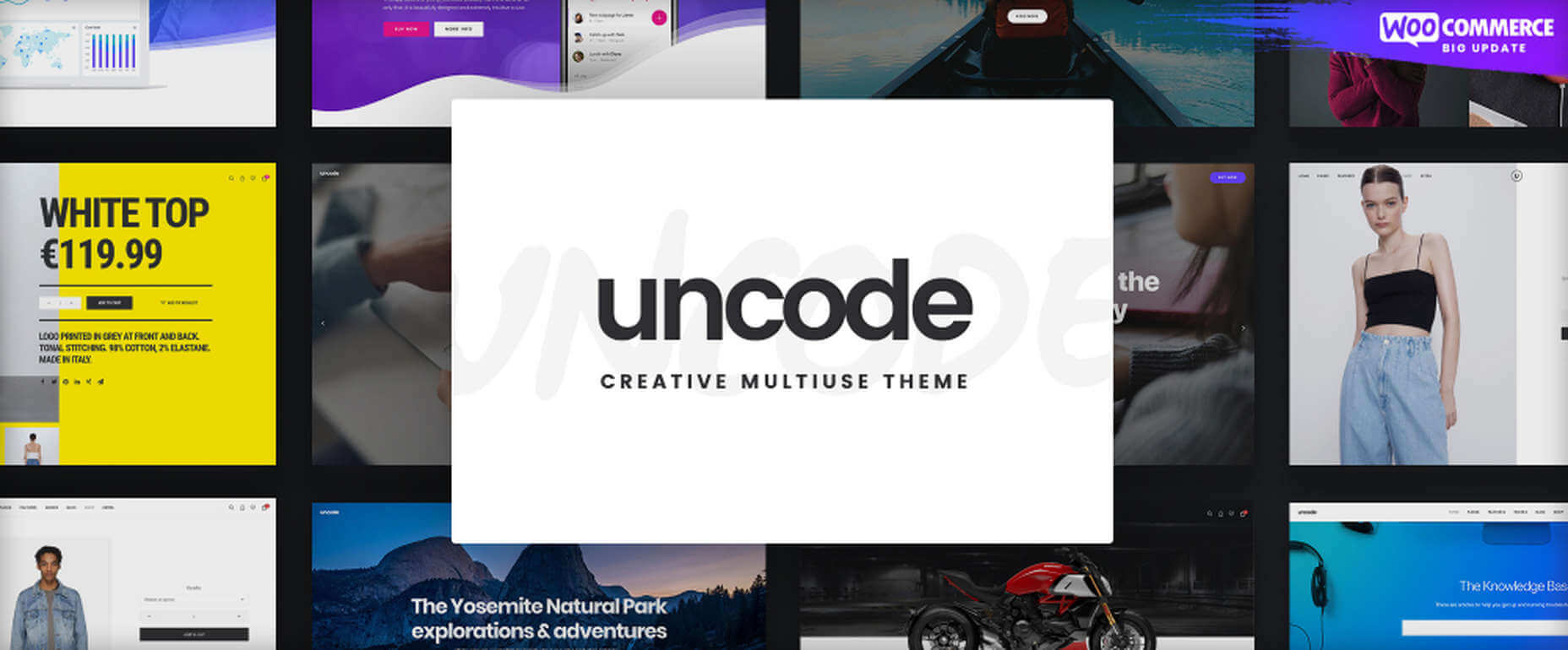
With its more than 80.000 sales to date, Uncode has become one of ThemeForest’s all-time best sellers.
You can create custom layouts and designs with Uncode’s Dynamic Content feature and use them as templates for category pages;
Uncode features the WooCommerce Product Builder, custom Checkout, Cart, My Account, Quick-View, etc.
Uncode has a comprehensive library of tutorial videos and a showcase of user-created websites that is well worth visiting.
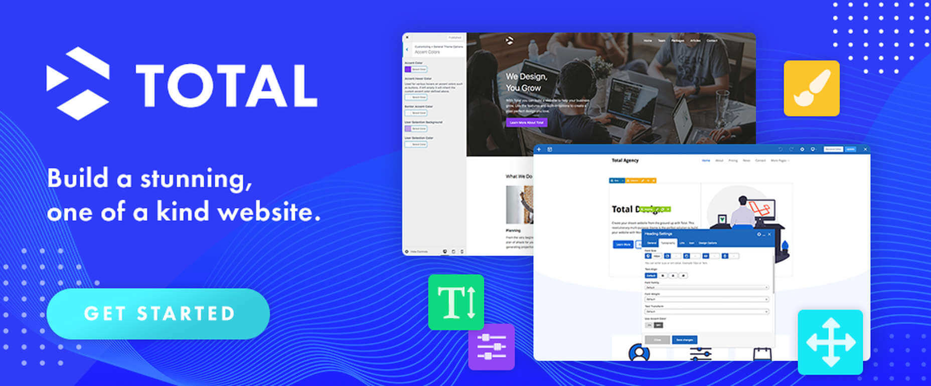
7. Total WordPress Theme
Created with perfection in mind, Total is nonetheless an extremely user-friendly WordPress theme.
This drag and drop website building tool’s extreme flexibility allows users to create any type or style of website;
The WPBakery page builder is accompanied by an assortment of custom modules;
Total is RTL and Translation-ready and easily integrates with WooCommerce;
Total is developer-friendly.
Click on the banner to learn more.
8. Dr. Link Check
Dr. Link Check saves you the inconvenience of having to periodically conduct a manual search of your site for broken links.
Dr. Link Check inspects for:
Broken links and improper URL formatting;
Blacklisted malicious content links;
Websites that do not contain any valuable content, including ad-only sites.
Dr. Link Check publishes downloadable daily, weekly, or monthly reports.
9. Mobirise Website Builder
Mobirise is not only a top tool for creating fast, responsive, user-friendly websites. It also has the advantages of being offline. Mobirise is also free.
Factors that contribute to Mobirise’s excellent performance include:
Google Amp and Bootstrap 4 frameworks;
Professionally-crafted website templates, popups, sliders, and eCommerce features;
Mobirise is all drag and drop.
Click on the banner to download your very own copy.
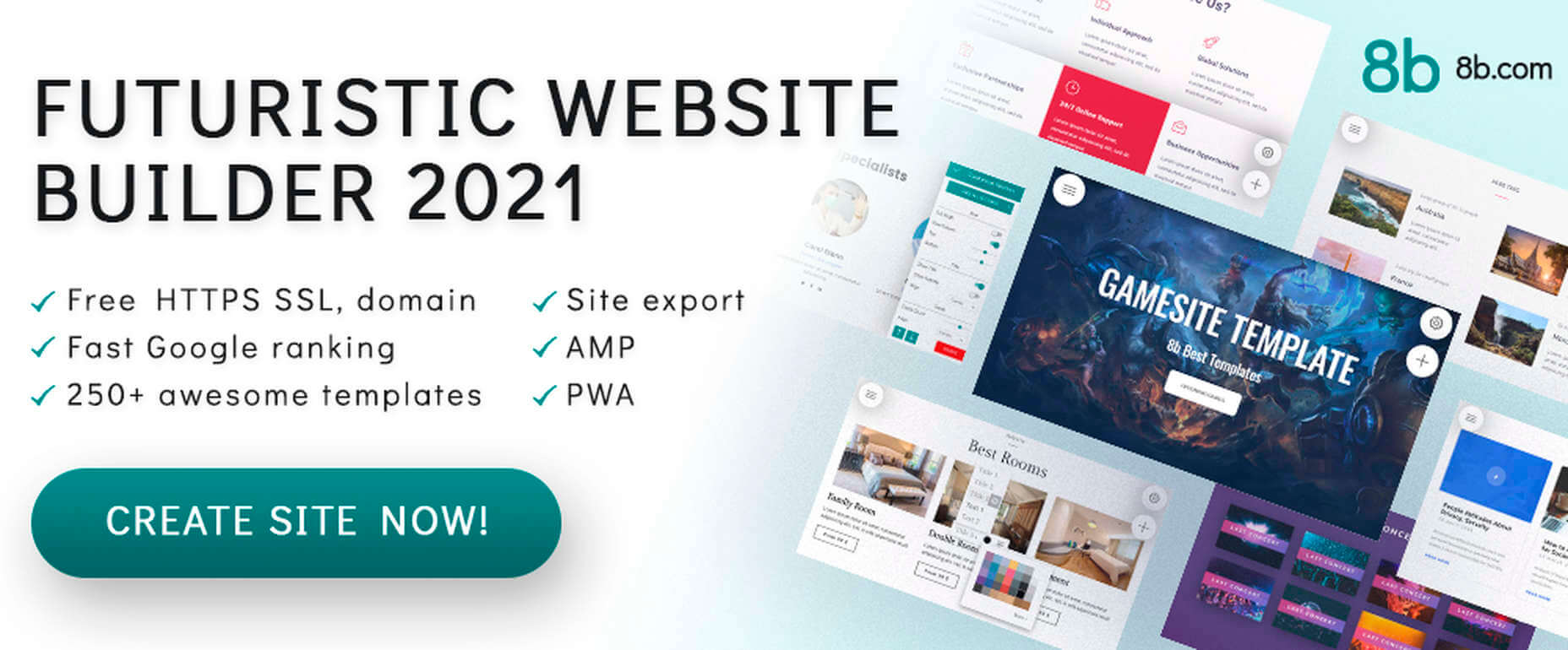
10. 8b Website Builder
When a website builder is fast, free, responsive, user friendly, and Google-friendly as well, it is certainly worthy of consideration.
Allows you to create websites at home or on the go on any device;
Features templates and website sections designed to get projects off to a rapid start;
It gives your site a Google ranking with a couple of clicks;
It can be hosted wherever you want.
Download your copy now.
11. WHATFONTIS
WhatFontIs, with its database of more than 700K commercial and free fonts and font-finding AI functionality enables you to identify fonts from images you upload.
This top-of-the-line font-finding tool:
Identifies an uploaded font 90% of the time;
Gives answers in seconds;
Identifies cursive fonts (the letters in the image must be separated);
Displays 60+ similar fonts for each uploaded image.
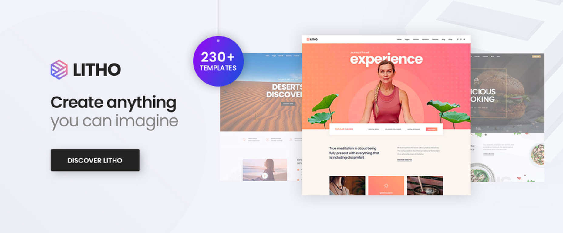
12. Litho – The Multipurpose HTML5 Template
Litho is a responsive multipurpose Bootstrap 4 HTML5 template that gives startups, design agencies, and other businesses an ideal website-building starting point.
Litho’s features include:
Cool selections of ready-made home pages, inner pages, and template blocks;
Page styles for portfolio, shop, and blogging sites;
Sliders, banners, forms, and other creative design elements.
Litho offers 5-star professional support.
13. XStore – The Most Customizable WooCommerce Theme Ever
XStore may be the best tool anyone could have at their fingertips when looking for a fast and easy way to create a high-performance eCommerce website – for only $39.
Startups looking for ways to test their ideas and concepts;
Small businesses seeking an online presence or improvement of an existing one.
GOODIE’s specialties include 1-10 page, WordPress, and eCommerce websites.
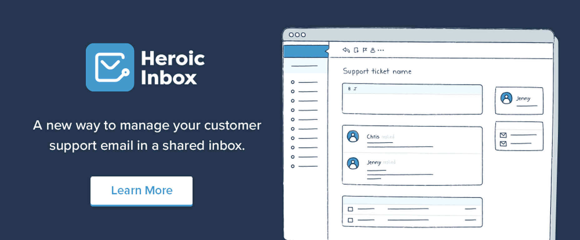
15. Heroic Inbox
There are several excellent reasons for letting Heroic Inbox manage your business’s departmental email inboxes.
They include:
Encouraging efficient staff collaboration on email assignments and responses;
Helping staff members accomplish and maintain Inbox Zero status;
Tracking key team performance metrics.
Two key Heroic Inbox features are its smart workflows and a fast and friendly UI.
Every web designer owns a toolbox of tips and tricks they use in their website building projects. Even when a toolbox is superbly stocked, it is always challenging to keep it up to date. Doing so requires maintaining a knowledge of the latest and greatest web design resources and tools—some of which you may need to meet ever-changing industry demands.
This article features the top tools & resources for designers and agencies for 2021. Choosing one or more of them could not only help you stay on top of your game but could even make your day.
Paramètres des cookies et politique de confidentialité
Comment nous utilisons les cookies
Nous utilisons les cookies pour nous faire savoir quand vous visitez nos sites Web, comment vous interagissez avec nous, pour enrichir votre expérience utilisateur et pour personnaliser votre relation avec notre site Web.
Cliquez sur les différents titres de catégories pour en savoir plus. Vous pouvez également modifier certaines de vos préférences. Notez que le blocage de certains types de cookies peut avoir un impact sur votre expérience sur nos sites Web et les services que nous sommes en mesure d'offrir.
Cookies essentiels sur ce site
These cookies are strictly necessary to provide you with services available through our website and to use some of its features.
Because these cookies are strictly necessary to deliver the website, you cannot refuse them without impacting how our site functions. You can block or delete them by changing your browser settings and force blocking all cookies on this website.
Cookies Google Analytics
Ces cookies recueillent des renseignements qui sont utilisés sous forme agrégée pour nous aider à comprendre comment notre site Web est utilisé ou l'efficacité de nos campagnes de marketing, ou pour nous aider à personnaliser notre site Web et notre application pour vous afin d'améliorer votre expérience.
Si vous ne voulez pas que nous suivions votre visite sur notre site, vous pouvez désactiver le suivi dans votre navigateur ici :
Autres services
Nous utilisons également différents services externes comme Google Webfonts, Google Maps et les fournisseurs externes de vidéo. Comme ces fournisseurs peuvent collecter des données personnelles comme votre adresse IP, nous vous permettons de les bloquer ici. Veuillez noter que cela pourrait réduire considérablement la fonctionnalité et l'apparence de notre site. Les changements prendront effet une fois que vous aurez rechargé la page.
.
Paramètres de Google Webfont Settings :
Google Map :
Vimeo et Youtube :
Politique de confidentialité
Vous pouvez lire nos cookies et nos paramètres de confidentialité en détail sur la page suivante

 Every day design fans submit incredible industry stories to our sister-site, Webdesigner News. Our colleagues sift through it, selecting the very best stories from the design, UX, tech, and development worlds and posting them live on the site.


 Rather than spring cleaning, do some spring “shopping” for tools that will make your design life easier. Packed with free options this month, this list is crammed full of tools and elements that you can use in your work every day.


 Google has been talking about the Core Web Vitals tool and the Page Experience Update for about a year now.
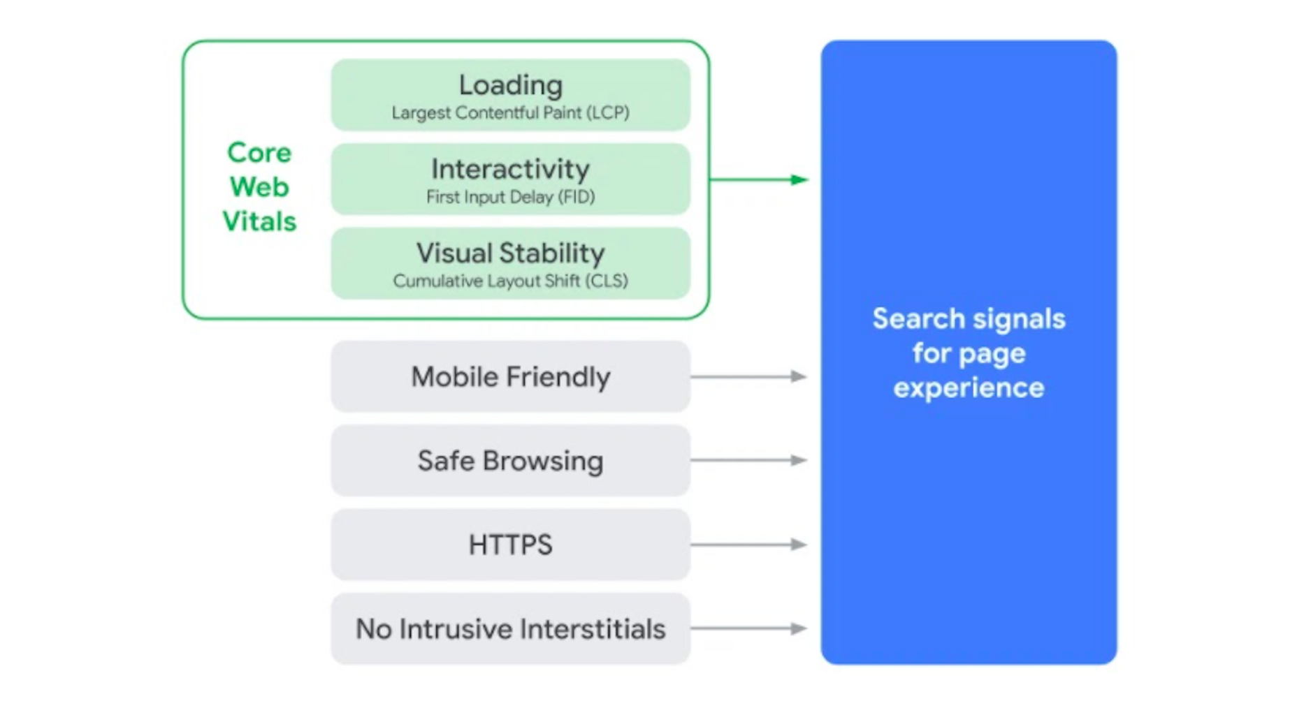

 Every day design fans submit incredible industry stories to our sister-site,


 Inclusive design is all about designing sites with everyone in mind instead of designing for your own preferences. It’s an essential component in a professional-grade site and the cornerstone of a successful project.
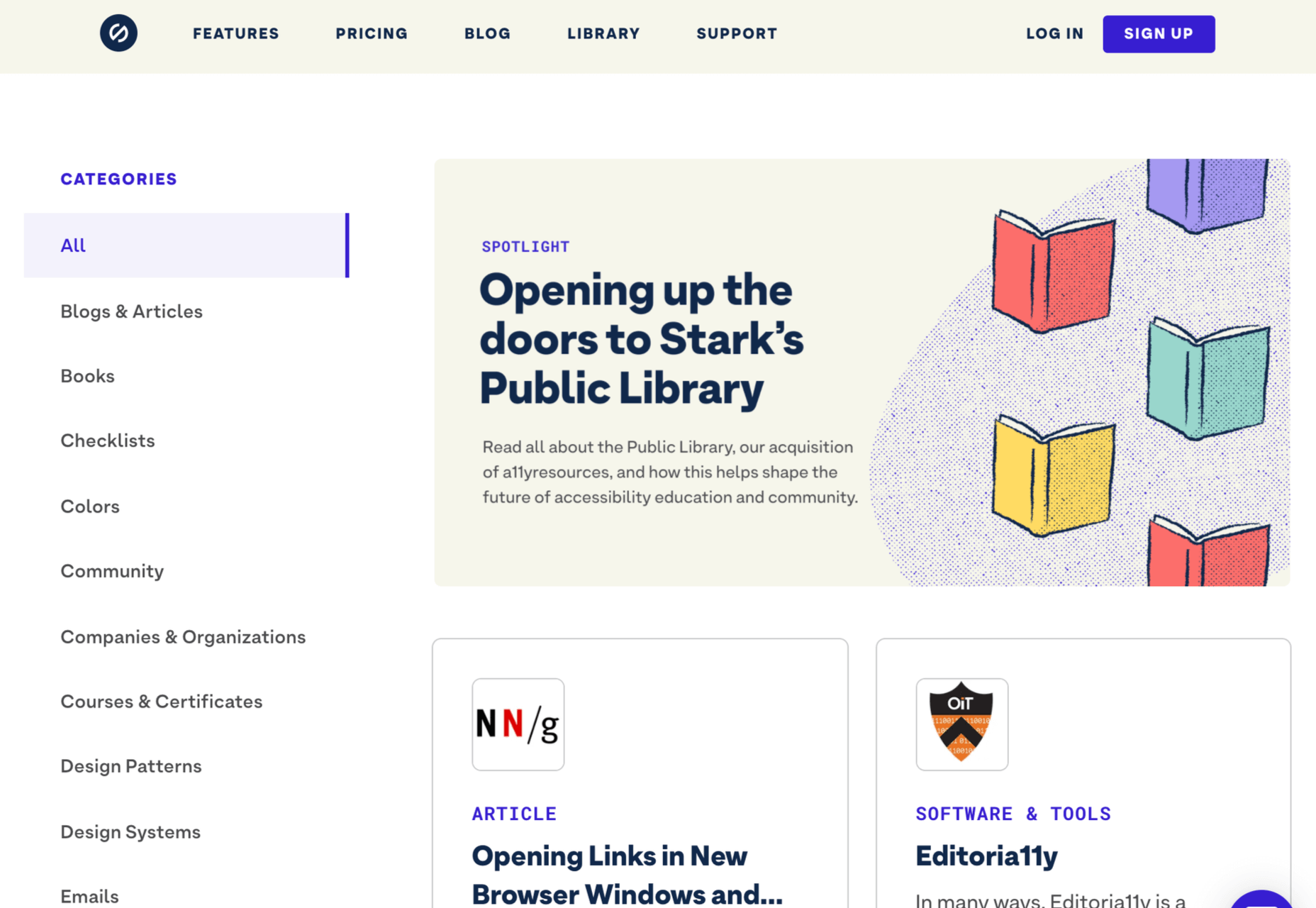

 Web design is an ever-evolving field. Those of us that have been in the industry a long time (i.e., six months plus) have seen the launch of more products, the establishment of more ideas, and the promise of more growth than most industries see over a whole career.
 Everyday design fans submit incredible industry stories to our sister-site,
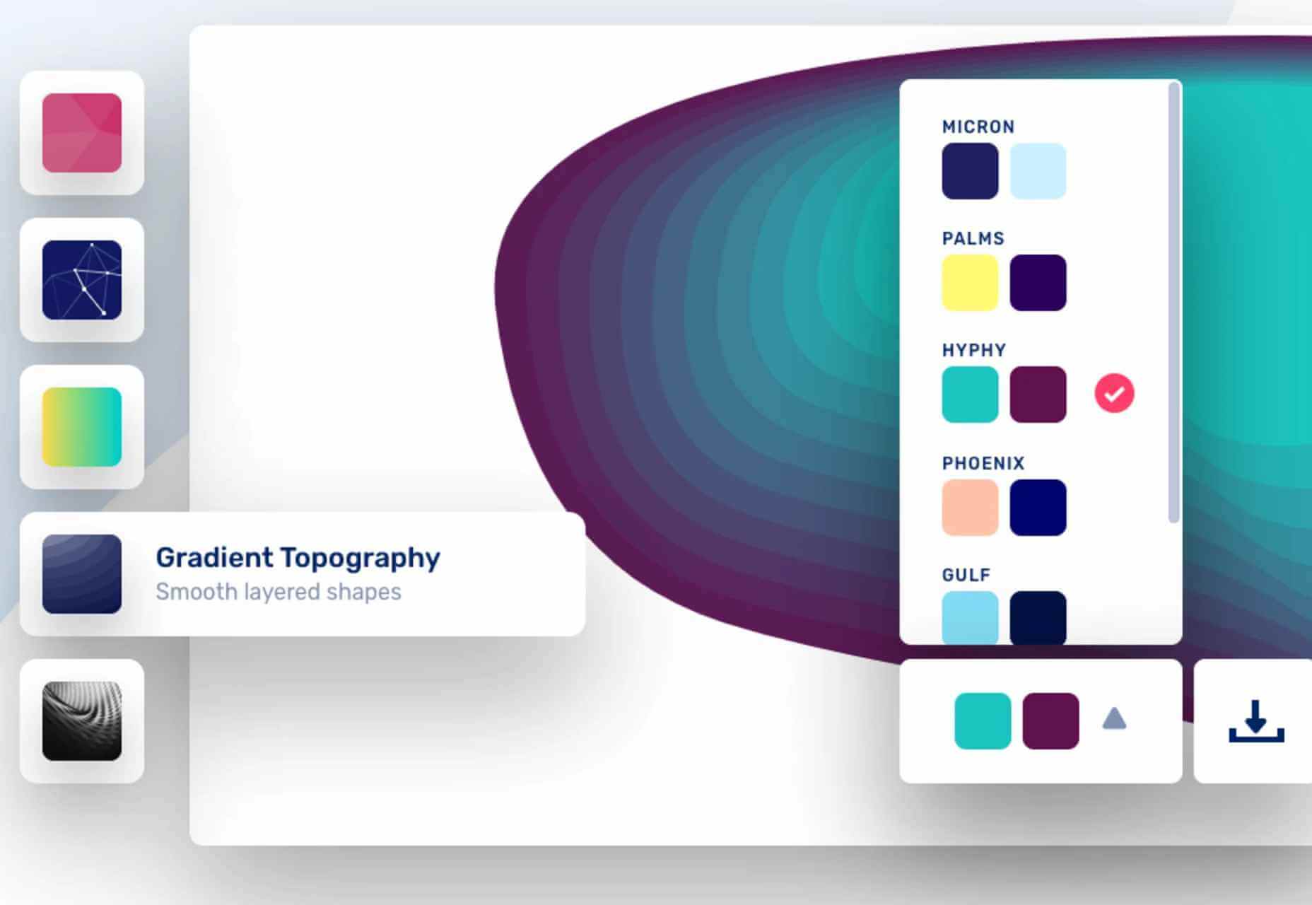
 As a web designer, you face plenty of challenges, both good and bad. One of the bad ones is to suddenly find out that you’re either in danger of missing a client’s deadline or will be unable to meet it at all.