Articles

This week Google announced further details of its plan to remove cookies from ad tracking. The strategy, which the ad giant expects to be fully implemented by 2022, has come about due to increasingly stringent privacy laws in a growing number of territories around the globe.

Google’s first step was the announcement in January of FLoC (Federated Learning of Cohorts). Google itself is still testing and fine-tuning the system, but in essence, Google will replace 3rd-party cookies in Chrome with groups of anonymized users.

Critics of the plan have questioned whether users will be genuinely anonymous or whether Google will be tracking individuals to group them properly. The answer came earlier this week in a low-key announcement of KaST.

What is KaST?

KaST (Key and Surface Tracking) is the first iteration of Google’s new tracking technology. It works entirely without cookies and is fully device-agnostic.

The technology behind KaST is surprisingly old. It was first trialed in 1987 as a simple process for auditing the input of stenographers. Although the latest version of the technology draws heavily on voice recognition software algorithms, the original version of KaST — software named TAAA (Typist Account Accuracy Audit) — predates modern voice recognition by at least two years.

KaST uses…biomechanical and cognitive patterns, identifying individual users based on their keystrokes.

Just as your voice has a unique, identifiable modulation — anyone who uses telephone banking will be familiar with speaking their password — so too does your biomechanical input.

When you type on a keyboard or a touchscreen, the force, speed, and accuracy with which you hit characters are dependent on two things: your cognitive process and the unique biomechanics of your hands (the bones, ligaments, and muscles).

For example, when I type WordPress, I almost always type it as WordPRess (with a capitalized R). That is one facet of my combined biomechanical and cognitive process.

KaST uses keyboards and touch screens to track combined biomechanical and cognitive patterns, identifying individual users based on their keystrokes.

Mobile Approaches to KaST

KaST is heavily reliant on BMaC (Bio-Mechanical and Cognitive) input. Although Google hasn’t released any data to support the accuracy of KaST, BMaC is known to be surprisingly accurate.

Reports suggest that the KaST algorithm is 89.7% effective for character strings of 12 characters or more, leaping to 97.6% for 19 characters or more on a single device. That makes it too inaccurate for high-end processes like security but well within the necessary margin of error for a non-critical process like serving ads.

Google will be able to identify you on any machine, on any device, in any context, as soon as you type 19 characters or more

When switching to a touch-screen device, the accuracy plummets to just 87.8%. This may be one reason Google has been low-key in its trumpeting of the new technology so far.

According to TechBeat, initial trials of the tri-axis position of a device (X, Y, and Z rotation) were abandoned as inaccurate. Still, even without those additional tracking signals, Google claims KaST on mobile will achieve ~94% accuracy by the 1st quarter of 2022.

What Does KaST Mean for Users?

Much like many of the algorithms that govern our daily lives, KaST will be largely invisible to most of us. Unlike cookies that can be legislated for and removed from a local machine, your BMaC is as inescapable as your DNA.

Where privacy concerns really grow is that your BMaC follows you from device to device. How you type at home is identical to how you type at work. Your personal and professional profiles are now instantly connectable; Google will be able to identify you on any machine, on any device, in any context, as soon as you type 19 characters or more.

KaST Prompts Pre-M1 MacBook Rush

Within 24 hours of KaST’s announcement, Apple stores were reporting rush orders of pre-M1 MacBook Pros. With some stores reportedly selling out late on Wednesday.

The rush came in the wake of a Reddit post — that has since been removed — that claimed that the notoriously bad butterfly keyboard on pre-M1 MacBook Pros circumvented KaST because the inaccuracy of the keystrokes, and the tendency of the keys to stick introduced a random element that disguised the end-user from the KaST algorithm.

Although the Reddit post is unsubstantiated, it transpires that M1 Mac owners may not be the lucky ones after all.

Should You Worry About KaST?

Advocates maintain that KaST — and Google’s wider FLoC strategy — are beneficial to users and the web as a whole. They claim that identifying users without 3rd party cookies does more to protect privacy than hinder it.

Opponents argue that in a digital world rife with user tracking, privacy compromises of this magnitude cannot be contemplated simply to enable more sophisticated ad-serving.

Despite KaST’s early stages of development, privacy concerns are mounting, and a campaign has been launched to regulate Google’s use of the technology.

Source

The post Key and Surface Tracking Comes to Chrome first appeared on Webdesigner Depot.


Source de l’article sur Webdesignerdepot


Introduction

While many of us are habituated to executing Spark applications using the ‘spark-submit’ command, with the popularity of Databricks, this seemingly easy activity is getting relegated to the background. Databricks has made it very easy to provision Spark-enabled VMs on the two most popular cloud platforms, namely AWS and Azure. A couple of weeks ago, Databricks announced their availability on GCP as well. The beauty of the Databricks platform is that they have made it very easy to become a part of their platform. While Spark application development will continue to have its challenges – depending on the problem being addressed – the Databricks platform has taken out the pain of having to establish and manage your own Spark cluster.

Using Databricks

Once registered on the platform, the Databricks platform allows us to define a cluster of one or more VMs, with configurable RAM and executor specifications. We can also define a cluster that can launch a minimum number of VMs at startup and then scale to a maximum number of VMs as required. After defining the cluster, we have to define jobs and notebooks. Notebooks contain the actual code executed on the cluster. We need to assign notebooks to jobs as the Databricks cluster executes jobs (and not Notebooks). Databricks also allows us to setup the cluster such that it can download additional JARs and/or Python packages during cluster startup. We can also upload and install our own packages (I used a Python wheel).

Source de l’article sur DZONE

Today we’re going to draw directions route on a map in React Native, showcasing the path between two different locations. We’re going to make use of react-native-maps which is a powerful library, allowing us to draw polylines between multiple coordinates. We are also going to use Google Directions API in order to fetch precise directions routes between two coordinates.

It is important to note that the react-native-maps library as of the time of this writing only officially supports the polyline module on the latest React Native version due to the increasing changes in the React Native ecosystem that are not easy to keep up with.

Source de l’article sur DZONE

If you are in the world of software development, you must be aware of Node.js. From Amazon to LinkedIn, a plethora of major websites use Node.js. Powered by JavaScript, Node.js can run on a server, and a majority of devs use it for enterprise applications. As they consider it a very respectable language due to the power it provides them to work with. And if you follow Node.js best practices, you can increase your application performance on a vast scale.

When it comes to automation testing, it requires a very systematic approach to automate test cases and set them up for seamless execution of any application. This requires us to follow a set of defined best practices for better results. To help you do that, we will let you in on the best Node.js tips for automation testing.

Source de l’article sur DZONE

So, really, you’re in the business of designing websites for your clients’ audiences.
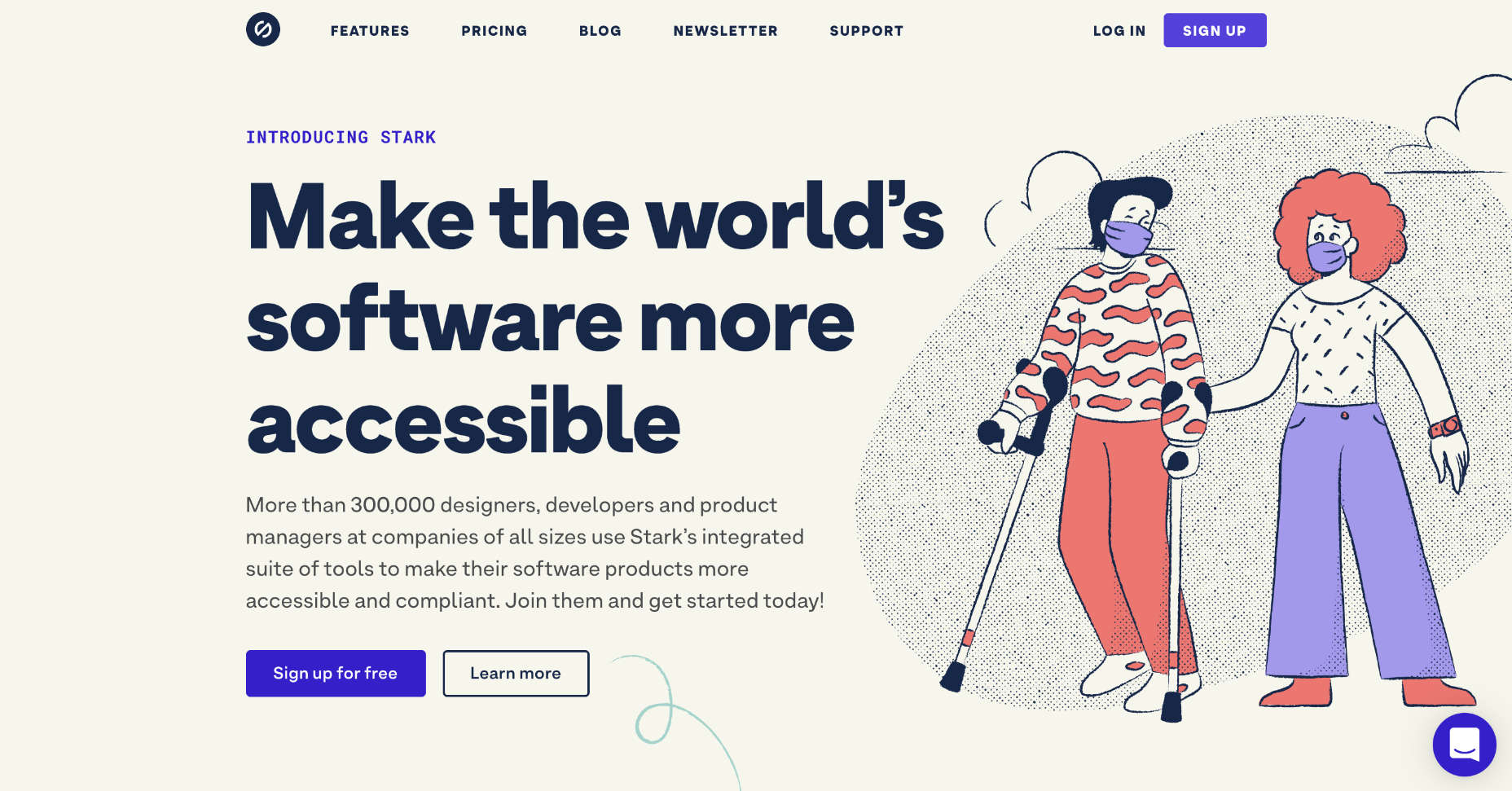
But how do you ensure you get it right? You could take what your client tells you at face value, but that’s only going to scrape the surface of who their audience is.

What you need to do is figure out how consumers think and why they respond to websites the way they do. A lot of this is already explained to us by psychology principles.

Once you memorize them, you’ll be able to design user journeys that get visitors to respond exactly as you and your client want them to.

15 Psychology Principles to Use in Web Design

We as humans think certain ways, and your design should cater to those underlying thought processes and natural responses.

Below are 15 psychology principles that’ll help you design better, more intuitive digital experiences for your end-users:

1. Aesthetics-Usability Effect

The Aesthetics-Usability Effect suggests that people equate more attractive interfaces with more usable ones. In other words, a good, modern, responsive design should always be your starting point.

2. Color Psychology

Color psychology tells us about color’s influence over how something is perceived. With color so strongly tied to emotion, you can do a lot to affect how visitors perceive a website and the brand behind it.

3. Psychology of Shapes

Just as a color has the ability to affect someone’s perception of a brand or the content they’re looking at, so too do individual shapes used within an interface. Each shape — circles, squares, triangles, hexagons, and polygons — has a unique psychological association.

4. Gestalt Principles

Gestalt Principles are a way for humans to make sense of chaotic data presented to them. So, rather than see a bunch of text, images, and space, the human brain recognizes patterns to simplify complexity.

About half a dozen principles are associated with this theory, and they’re related to factors like symmetry, similarity, and proximity.

5. Mere-Exposure Effect / Jakob’s Law

The Mere-Exposure Effect, or Familiarity Principle, suggests that people are more likely to prefer things that seem familiar.

Jakob’s Law applies this psychology specifically to the internet user experience. It suggests that users expect your website to work the same way as the other sites they spend their time on.

6. Von Restorff Effect

The Von Restorff Effect, or Isolation Effect, describes what happens when someone is exposed to identical stimuli, and then a unique element is introduced to the fold. It’s the outlier that will most effectively grab their attention.

7. Selective Disregard

Selective disregard is a type of “blindness” users develop to anything seemingly irrelevant to their main goal. This often occurs when a design or marketing trend grows stale — like websites that use the exact same cookie consent banner.

8. Hick’s Law

Hick’s Law states that the number of choices a person has to make will increase the amount of time it takes to make a decision.

This is a fundamental principle to pay attention to on ecommerce sites as you want to speed up the decision-making process, not slow it down.

9. Loss Aversion

Loss Aversion states that decision-making is more commonly driven by avoiding losses than acquiring gains.

If your website or the content within it gives visitors any reason not to trust it or feel confident in taking action, you’re more likely to see high abandonment rates than conversions.

10. Paradox of Choice

The Paradox of Choice is a response to the problem posited by Hick’s Law. It suggests that the reduction of choices makes consumers feel less anxious, which, in turn, increases confidence and satisfaction with purchases.

If your site suffers from high cart abandonment or product returns, the paradox of choice would be a useful principle to leverage.

11. Miller’s Law

Miller’s Law, also referred to as Cognitive Load Theory, has to do with memory capacity. On average, people can only have about seven items stored in their working memory at any given time.

This psychology principle encourages the reduction of options and the general reduction of content to improve focus and decision-making capabilities.

12. Feedback

Feedback is one of the principles of learning and plays a big part in interaction design.

Feedback is what designers use to tell people when they’ve made progress towards a goal or achieved it. You can also use it to teach visitors how a website will respond to their actions, which encourages faster and more confident engagements with your website.

13. Extrinsic Motivation

There are two types of motivation. Intrinsic motivation is an internal one, whereas extrinsic is external.

It’s Extrinsic Motivation that plays a role in getting users to complete more tasks online. As a designer, you have to make sure these kinds of “rewards” are obvious.

14. Social Proof

Not so much a psychological principle as it is a psychological phenomenon, Social Proof or Influence, suggests that people will copy the actions of the masses. It also refers to the assumption that the truth lies with the majority.

This is why customer reviews, client testimonials, and user-generated content have become so useful on websites.

15. Peak-End Rule

The Peak-End Rule states that people will judge an experience based on their very first and last impressions of it. This is somewhat related to the Serial Position Effect, whereby people will remember the first and last items in a group.

So, this is something to remember when you build out the top and bottom of each page as well as the start and expected end to the user journey.

Wrap-Up

Want to build better websites? Then, you need to design from the end users’ perspective.

The best place to start is with psychology principles, as they’ll tell you how most consumers think and what motivates them to respond. If you understand this inherent cause-and-effect relationship, you can design websites that elicit the right kind of response from your visitors.

Source

The post 15 Psychology Principles Every Designer Should Know first appeared on Webdesigner Depot.


Source de l’article sur Webdesignerdepot


WebDriverIO: Next-generation Automation Framework

WebDriverIO is an open-source next-generation automation framework, that allows us to automate modern web and mobile applications. It has an extended set of built-in and community plugins that help in designing robust, scalable tests and easily integrate with third-party applications including cloud services (BrowserStack, Applitools, Sauce Labs), Docker, Jenkins, Bamboo, GitHub, and many more.

It helps in designing automation tests for web applications and native mobile applications in just a few lines of code, making it very popular among developers and testers. It runs on WebDriver protocol to support cross-browser testing, and Chrome DevTools protocol to support Chromium-based automation. 

Source de l’article sur DZONE

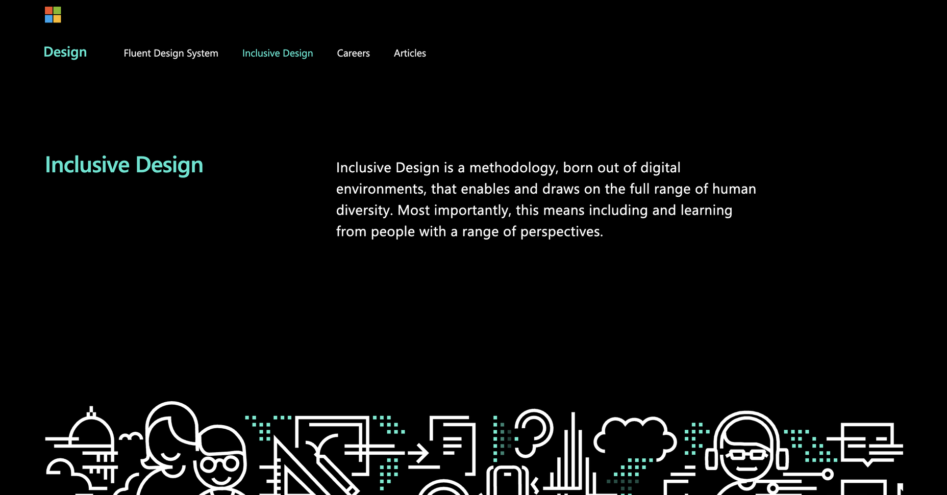
We tend not to think about it, but the Internet has a physical dimension. It’s a complex network of wires, cables, servers, and technical odds and ends — if you really want to, you can track it down; doing so is particularly easy on small islands because there tends to be a single cable tethering the region to the wider world.

Those physical cables run all the way to your building, and although an ISP manages them, they are normally rented from public bodies as part of your national infrastructure.

Beyond the physical, international bodies govern protocols like ARP, IEEE, HTTP, NTP, FTP, and others, which control how data is transmitted through the network and keep everything playing nice.

Then, at the other end of the equation, there’s your device. It may be a phone, a tablet, a notebook, a desktop. It’s probably several of these. And because it’s your device, everything on it feels like yours. We tend to think of it as our method of accessing the Internet instead of being part of the Internet — in reality, it’s both.

On your device, the software you use to access the Internet is your browser. For 65% of people, that’s Chrome. Even if you’re reading this on Edge, it’s created with the Blink engine, an extension of Chromium, which is the basis for Chrome. In fact, almost every browser is built using a variation of Chromium, except those on Apple devices that require Apple’s own WebKit to be used instead.

Chromium is ostensibly open-source. WebKit is not, but both are geared towards their primary contributors’ business goals; neither Chromium nor WebKit will make a change that negatively impacts Alphabet or Apple.

Your browser is just a copy of a pre-compiled set of source files sat in a Git repo somewhere. You may have installed a few plugins in your browser. You may have bookmarked a few pages. You’ve probably moved it to your dock or your home screen. Those features are just nice add-ons for the GUI; what really matters is what decisions are made about how to render web technologies.

Imagine a world in which every single car used the same mid-range Ford engine. Add in a stereo, and paint it any color you like, you can even pick your own tires, but under the hood, it has to be that mid-range Ford engine. And the only justification is that it’s too much work to create an alternative.

The 2020s are going to be a time of enormous change. You can smell the panic in traditional banking sectors every time Cryptocurrency is mentioned. Real estate billionaires are desperately trying to get us back into offices we don’t want to return to. And yes, I’m sorry, but the climate crisis is looming, and it will force our hand. The values of a whole generation have been rapidly reassessed. Innovation and the potential for innovation are rife, except, ironically, on the Internet, where we’re still chugging away with the mid-range Ford engine under the hood.

The web has reached the point at which the browser engines we choose define real-world infrastructure. There’s a fork in the road: either browser engines are part of an infrastructure that should be rationalized into a single browser protocol, or alternative browser engines need to be nurtured, encouraged, and accessible by choice.

Featured image via Pexels.

Source

The post Poll: Is It Time to Merge Browser Engines Into a Browser Protocol? first appeared on Webdesigner Depot.


Source de l’article sur Webdesignerdepot


Introduction

People are trading convenience for privacy in today’s digital world – which means they share more and more information about themselves. While one-click checkouts and saved passwords can all be appreciated, that mental « autopilot » can sometimes steer us wrong. While we were all once wary of anyone asking for information about ourselves, we now assume that it’s just the cost of participation —you’re asking for my favorite book, I’m giving it to you; you’re sending me an email from my boss, and you’re getting my attention and reaction. But this autopilot is what cybercriminals and hackers from people like you and me around the world effortlessly turn into hundreds of millions of dollars every year. In this article, we will discuss the definition and types of cybercrime and available cybersecurity courses.

What Is Cybercrime?

Cybercrime is a crime that either attacks or exploits a computer, a computer network, or a networked system. Cybercrime is mainly, but not always, committed by cybercriminals or hackers who want to make money — people or organizations are carrying out cybercrime. Any cybercriminals that are coordinated are extremely technically trained and use sophisticated techniques. Others are hacking novices. In extreme cases, for reasons other than personal gain, cybercrime attempts to hurt computers. This may be political or personal.

Source de l’article sur DZONE

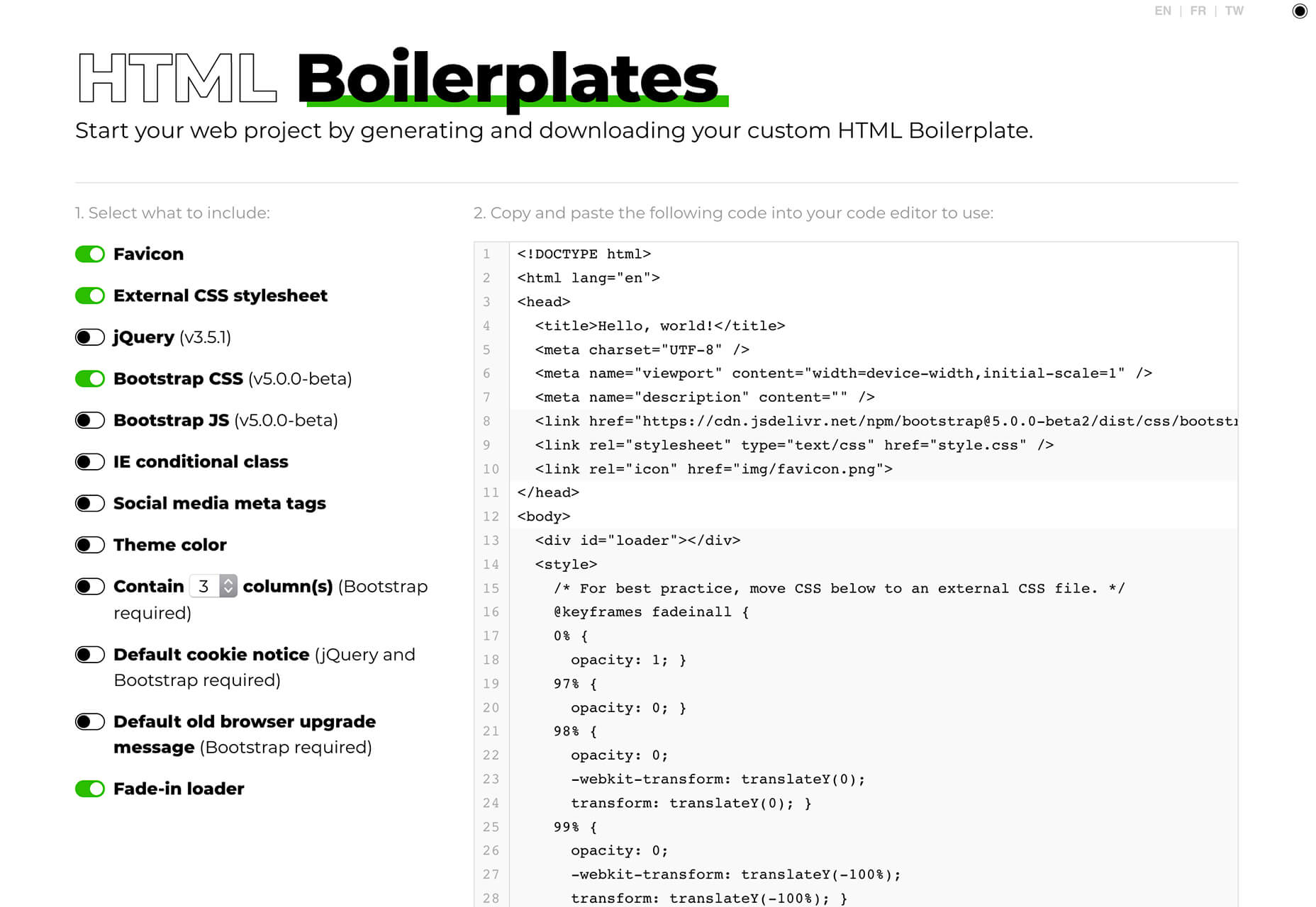
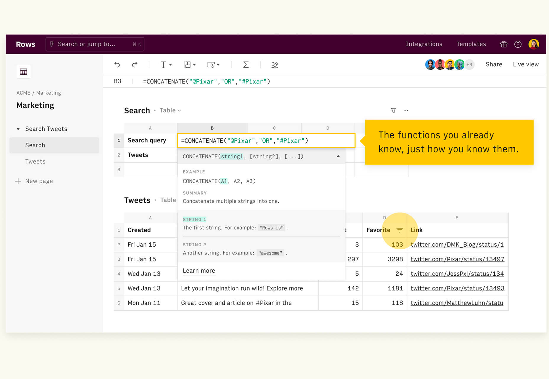
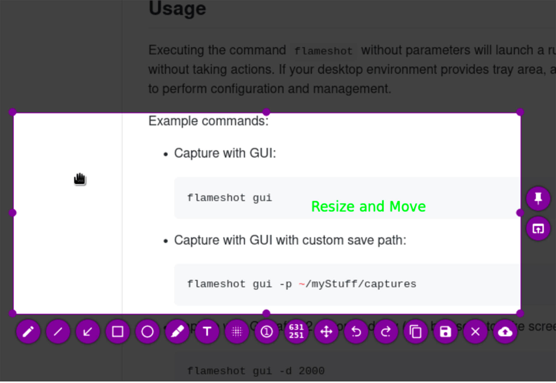
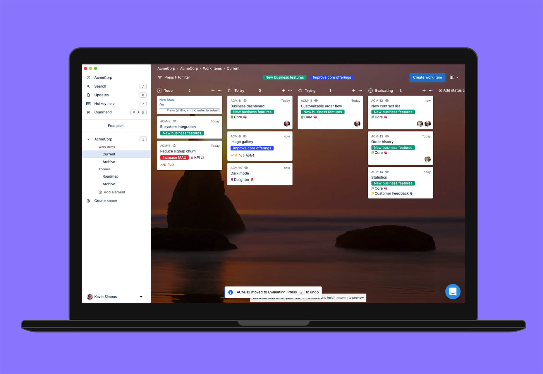
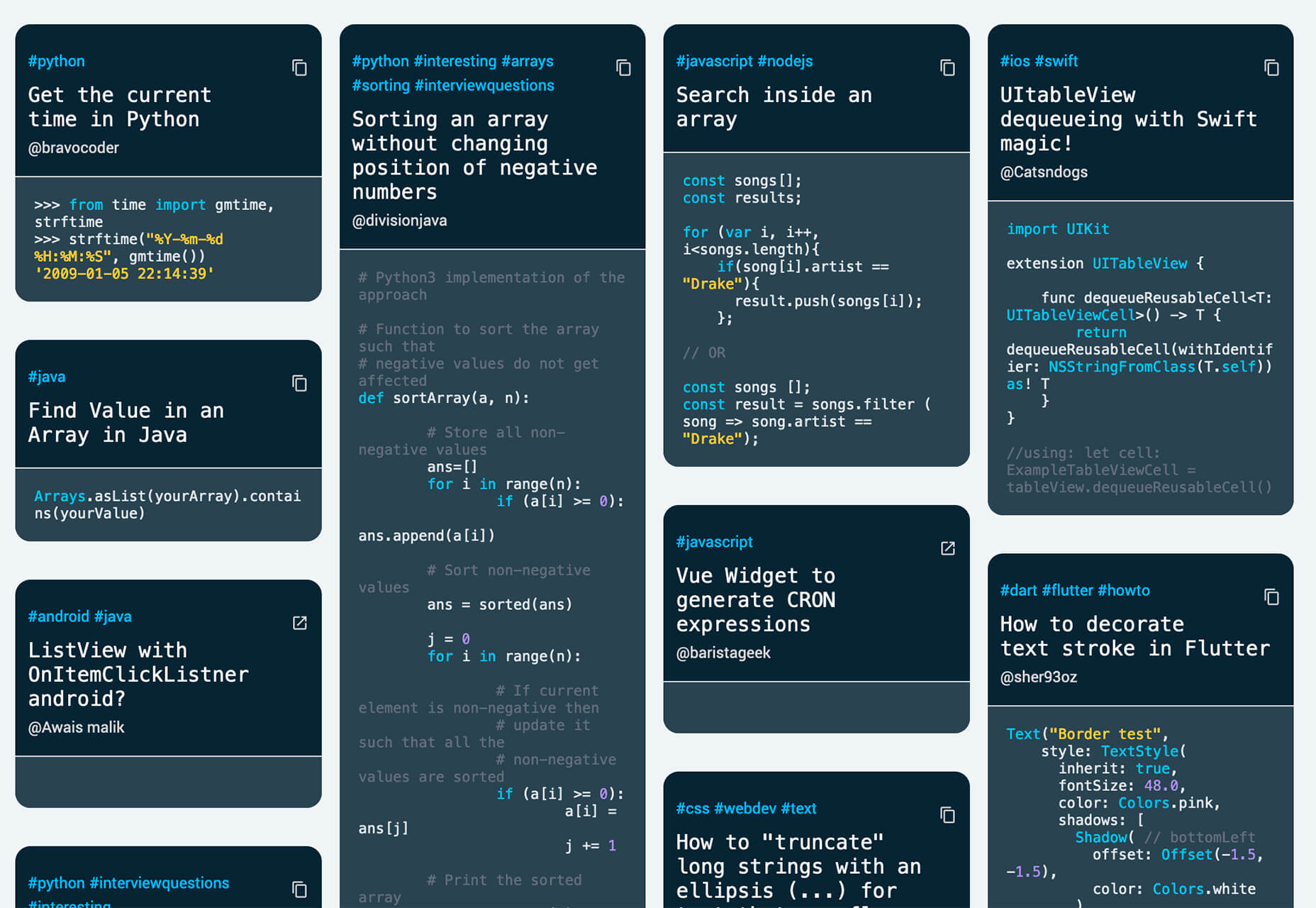
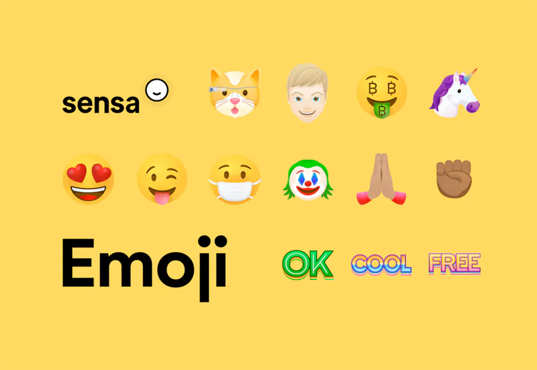
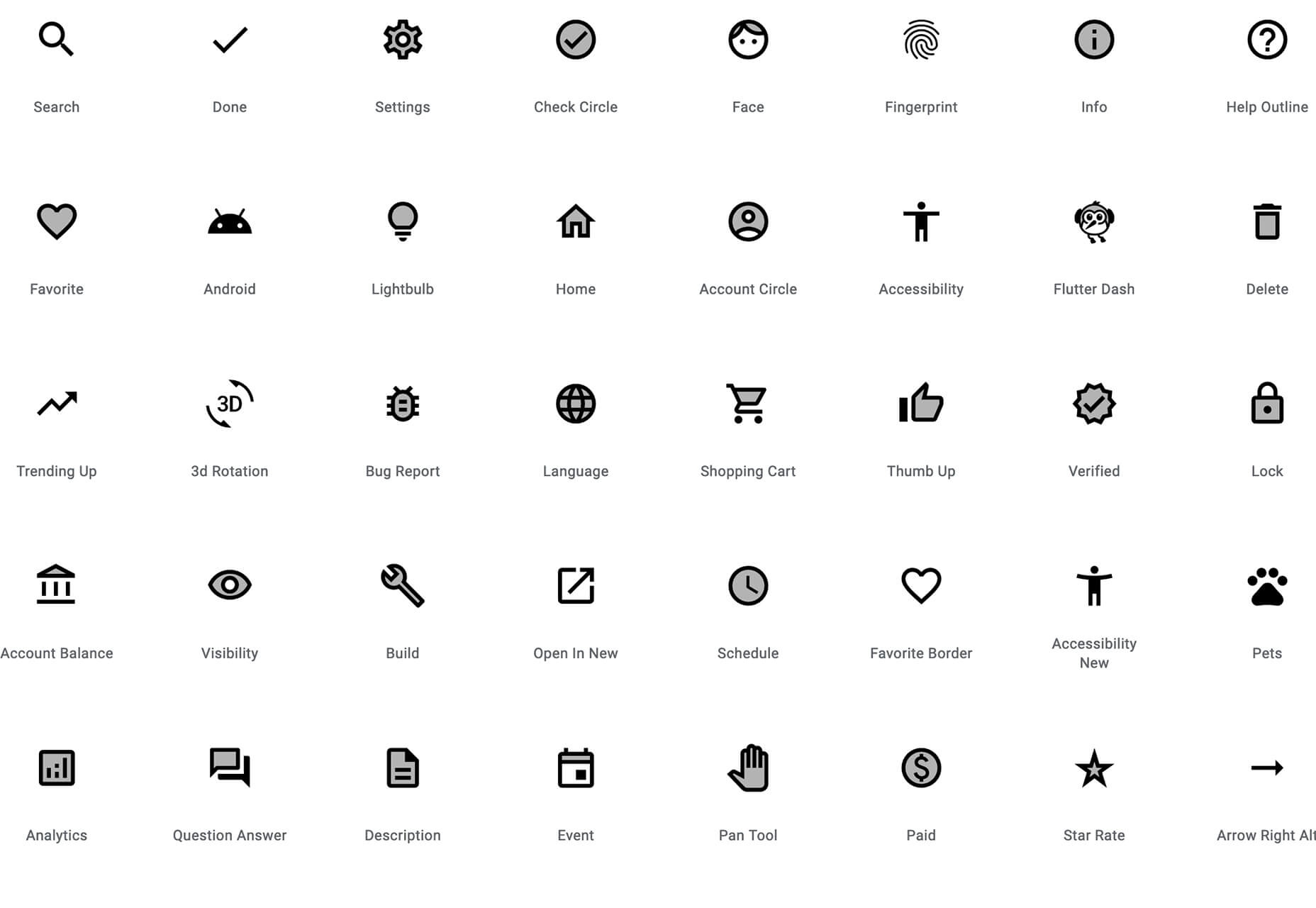
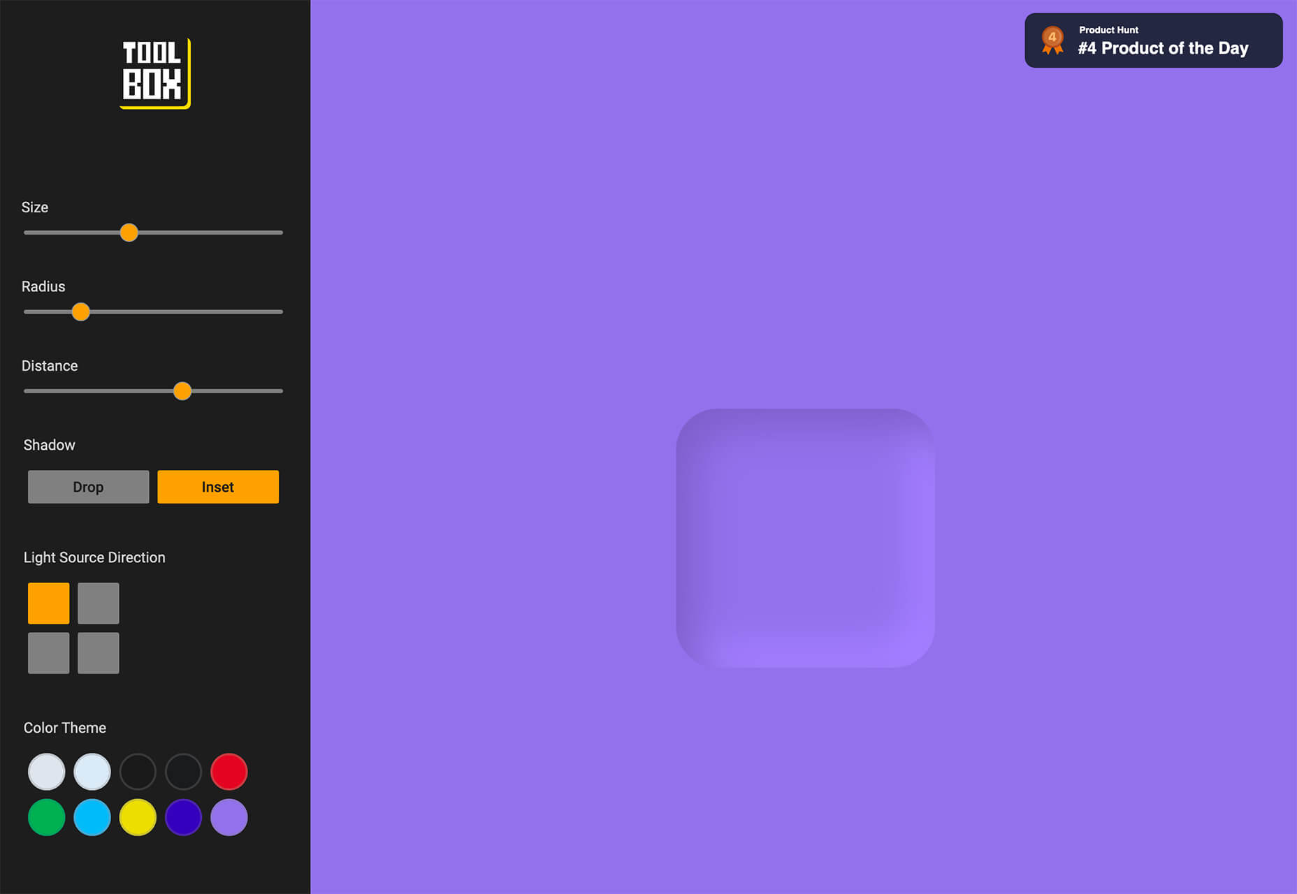
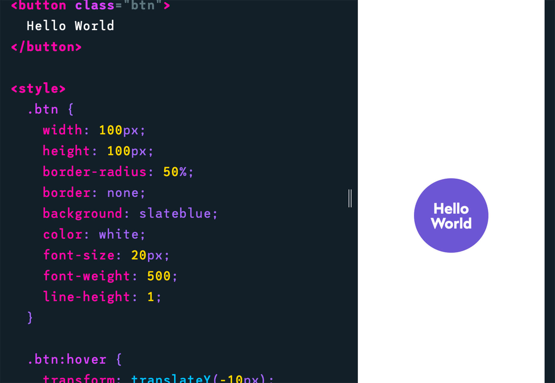
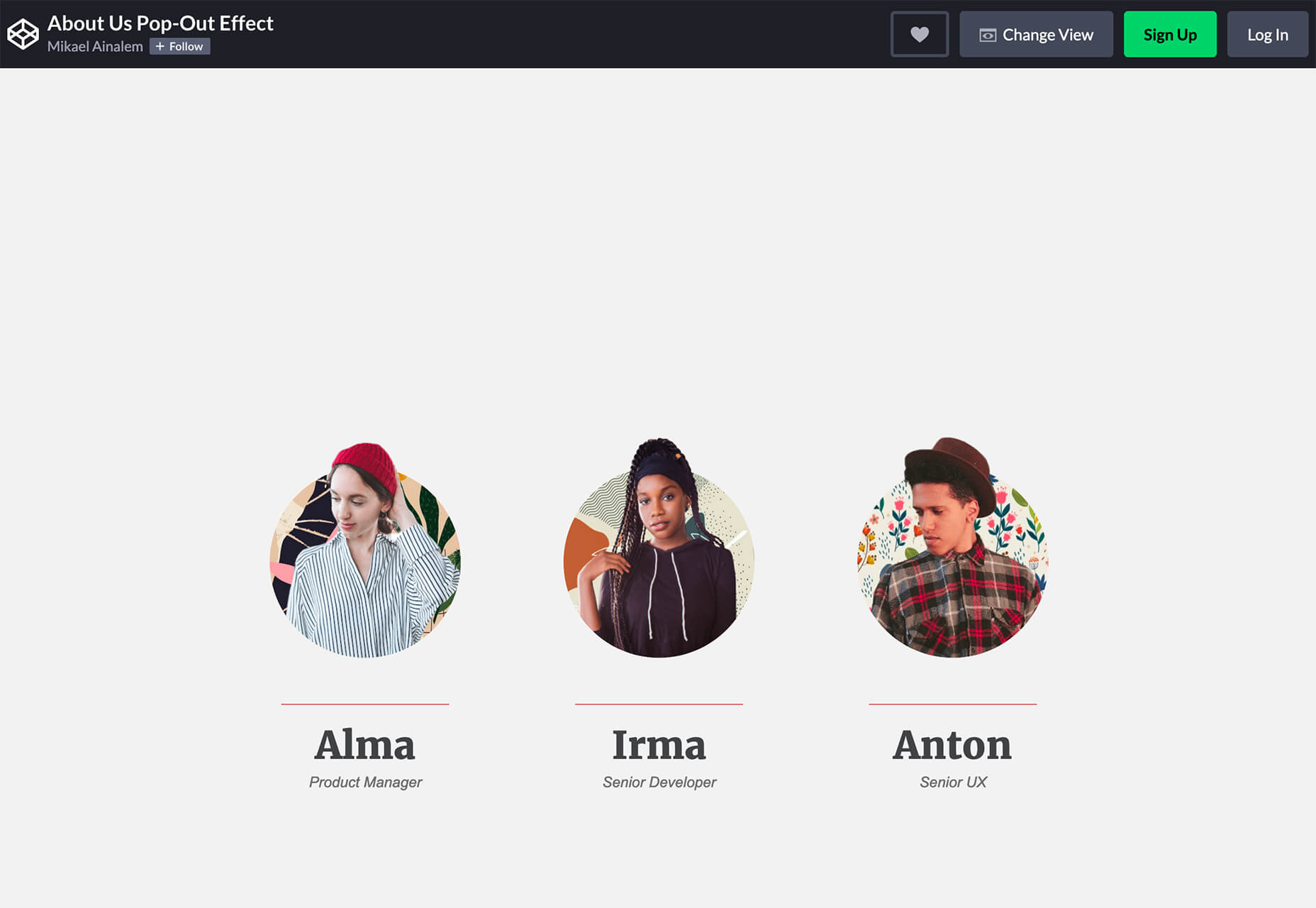
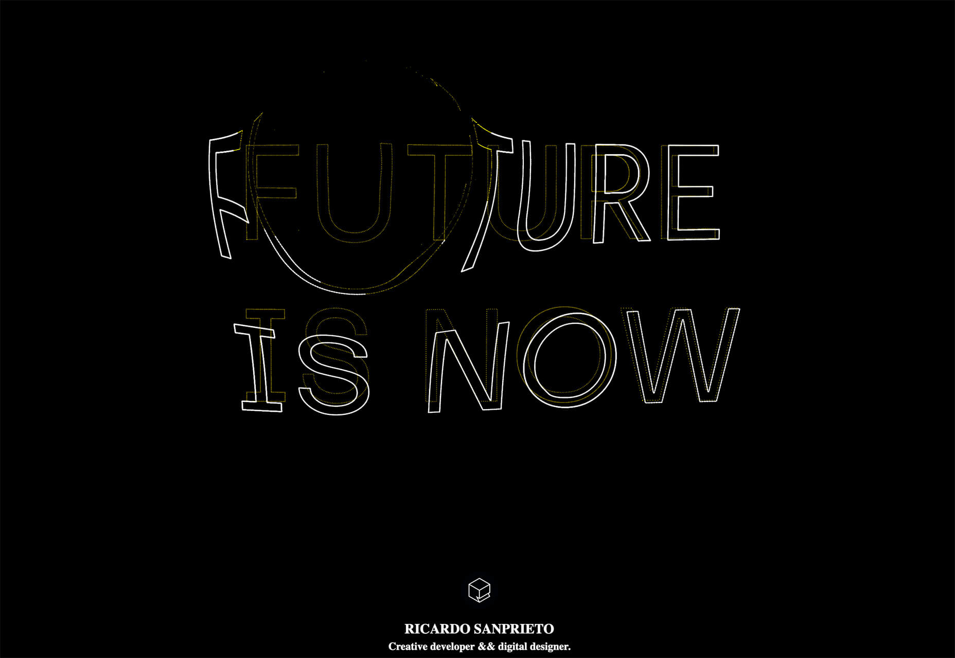
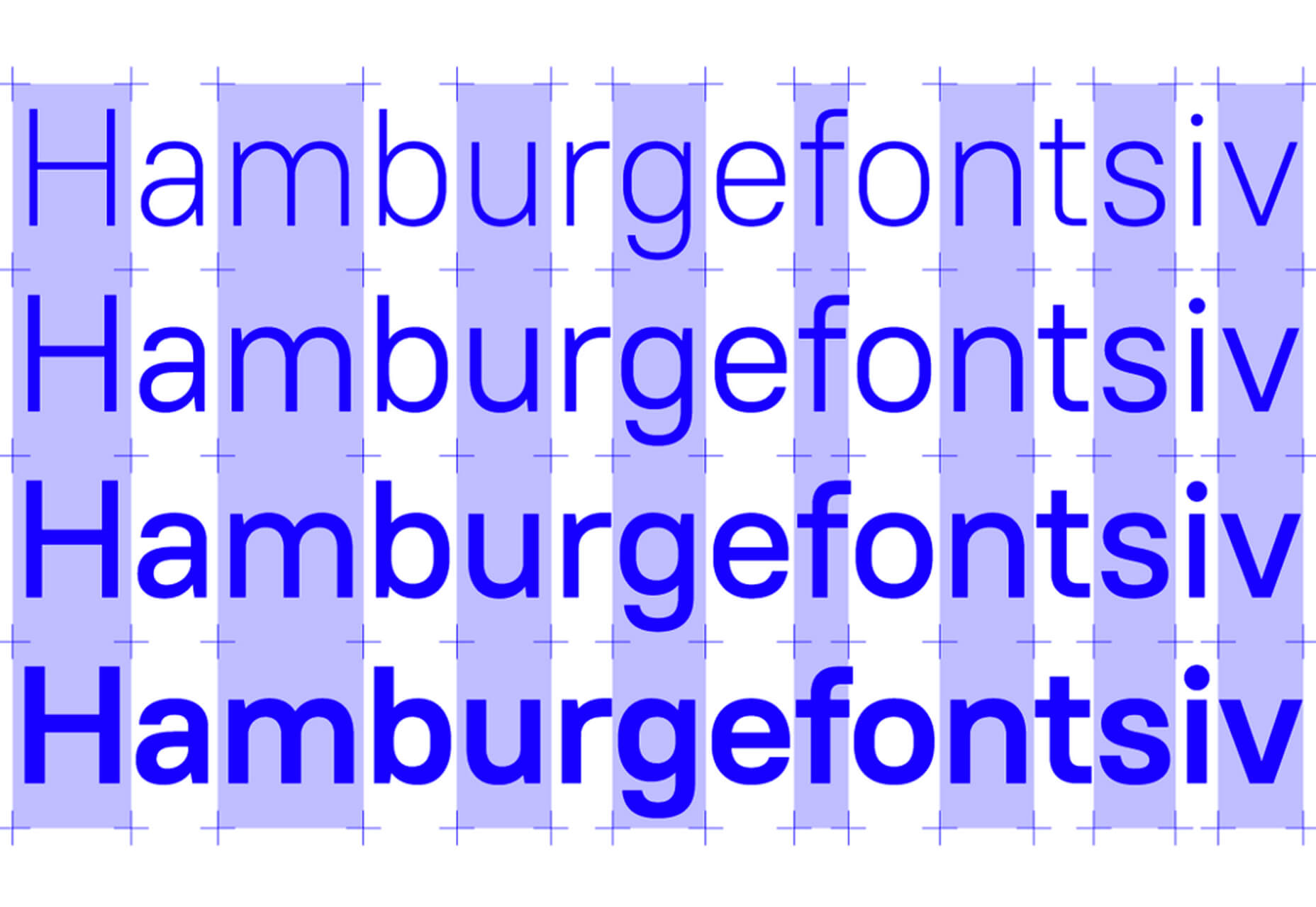
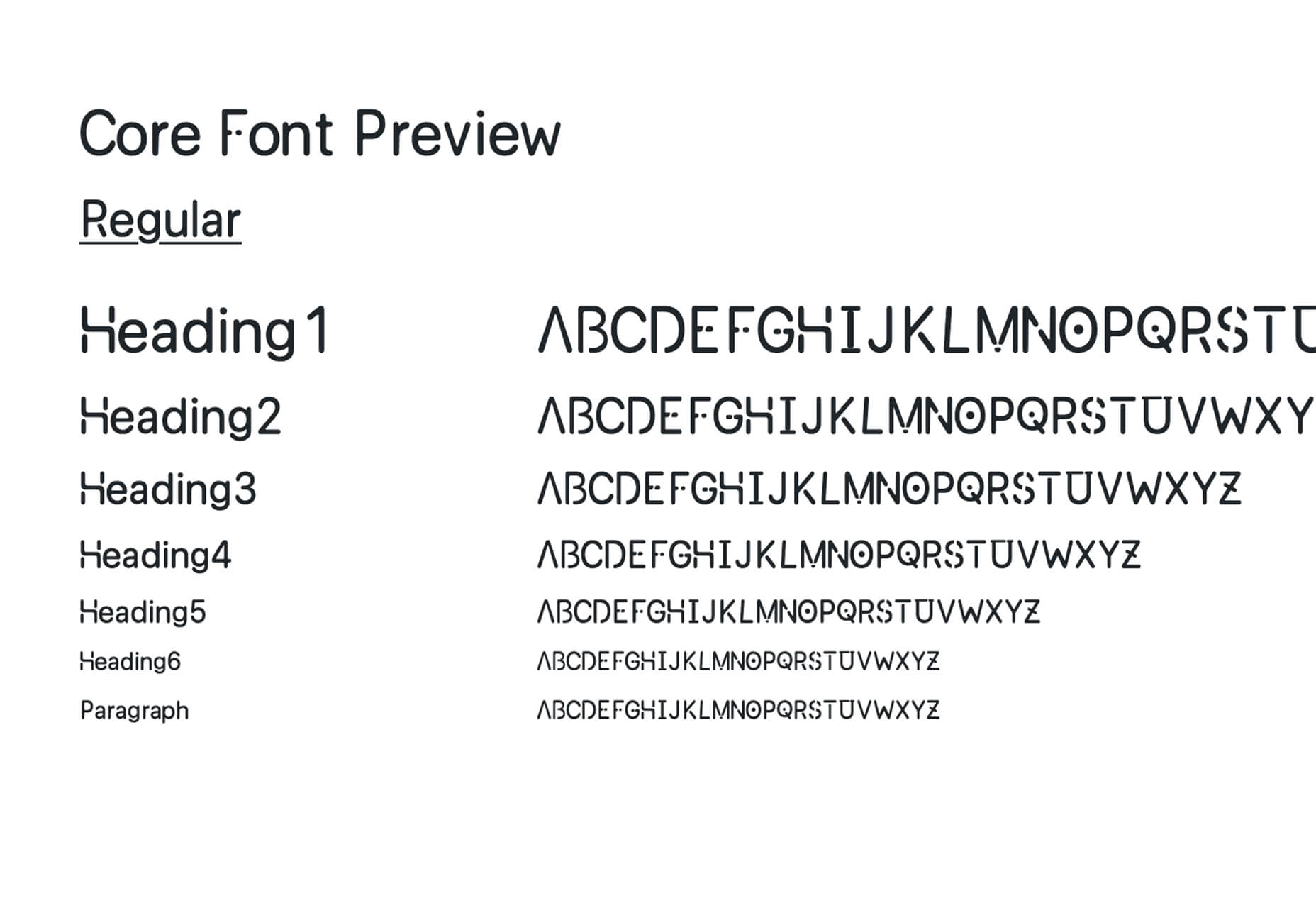
Looking for something new to get you excited about design work? This list is packed with all kinds of goodies to help you feel inspired and ready to work.

Here’s what new for designers this month.

Top Picks for March

Same Energy

Same Energy, in beta, is a visual search engine. You can search with a minimum number of words or an image. The website is designed to help you find art, photography, decoration ideas, and practically anything. It uses deep learning and algorithms to create images on the home page, and you can create feeds in the same manner. The coolest part of this tool is that it tries to match the visual and artistic style you ask for with image mood and objects.

SVG Repo

SVG Repo is a collection of more than 300,000 SVG vectors and icons that you can download and use in projects for free (even commercial use). The site has a powerful search tool to help you find the right image, and the platform is designed so that you can contribute.

Penpot

Penpot is an open-source design and prototyping platform for cross-domain teams. It is a web-based tool that isn’t dependent on any operating system and works with open web standards. It’s designed to be zippy and interactive so your team can work fast.

Directual

Directual is a no-code platform for building scalable apps using a visual interface. (Perfect for designers with less development experience.) It includes integrations with other popular tools and is free to use while figuring out how the app works and how you can make it fit your business goals.

HTML Boilerplates

HTML Boilerplates helps you start web projects by generating a custom HTML boilerplate that you can download. Just choose the elements you want to include and then copy and paste the code into your editor.

6 Productivity Boosters

Rows

Rows is a spreadsheet tool with built-in web integrations that’s made for team collaboration. It works with other tools you already use, such as Google Analytics, Twitter, LinkedIn, Mailchimp, and so many others. Without scripts, you can use it to automate workflows, analyze data, share dashboards, and build forms and tools that make work simpler.

Form.Taxi

Form.taxi is a premium web-based form tool. You can create web forms without code or programming and connect them to your website. The tool then stores information, filters for spam, and notifies you of form submissions.

Verbz

Verbz is a voice productivity app that allows you to create notes, assign tasks, make announcements, run standups, or chat. Talk or type, listen or read. It works as your own voice assistant for teams. It’s available in Beta from the App Store, and there’s a waitlist for Android users.

Flameshot

Flameshot is a tool for grabbing screenshots. It has a customizable appearance, is easy to use, and lets you draw and edit screenshots as you work.

Kitemaker

Kitemaker is a collaboration tool for development processes. It can help you keep track of everything from tools such as Slack, Discord, Figma, and Github in one place. It helps you structure projects and keep discussions about work moving forward in one place.

This Code Works

This Code Works is a place to save code snippets that work for when you need them again. You can group and organize snippets and share with others. You might think of it as the “Pinterest of code.”

3 Icons and User Interface Elements

Sensa Emoji

Sensa Emoji is a collection of common emoji icons that you can use in your materials. Every element is fully vector and free to use.

Google Fonts Icons

Google Fonts now supports icons, starting with Material Icons. Choose between outlined, filled, rounded, sharp, or two-tone options in the open-source library.

Toolbox Neumorphism Generator

Toolbox Neumorphism Generator is a design tool that helps developers to generate CSS in the soft UI /neomorphism style for the elements with real-time output.

3 Tutorials and Demos

An Interactive Guide to CSS Transitions

An Interactive Guide to CSS Transitions explains everything you need to know about this great animation tool for website designers. This tutorial digs in with code and examples to help you create more polished animations and is designed for anyone from beginners to experienced designers with some pro tips throughout.

About Us Pop-Out Effect

The About Us Pop-Out Effect adds a special element to any team or contact page with a nifty pop animation. Each person seems to lift out of the circle frame in this pen by Mikael Ainalem.

Interactive Particles Text Create with Three.js

Interactive Particles Text Create with Three.js is a web element you could play with all day. Text shifts into particles and follows mouse movement in a fluid motion in the pen by Ricardo Sanprieto.

10 Fresh Fonts and Text Tools

Bitmap Fonts

Bitmap Fonts is a collection of various bitmap typefaces all pulled and stored in a single location. This is the perfect solution if you are looking for a bitmap option.

Uniwidth Typefaces

Uniwidth Typefaces for Interface Design is another collection of fonts for a specific purpose – here universal widths for interface design. Uniwidth fonts are proportionally-spaced typefaces where every character occupies the same space across different cuts or weights. This is both a tutorial on the type style as well as font collection.

Bubble Lemon

Bubble Lemon is a typeface for projects with a childlike feel. With an outline and regular style, the thick bubble letters look like some of the sketches you may have done in grade school.

Core Font

Core Font is an open-source project with a funky and modern style. It has a full upper- and lower-case character set, numerals, and a few punctuation marks.

GHEA Aram

GHEA Aram is a superfamily with a Central European flair, according to the type designer. The premium typeface includes everything from light to black italic and even some Armenian ligatures.

Make Wonderful Moments Duo

Make Wonderful Moments Duo is a script and sans serif font pair with a lighthearted feel and highly readable character set. The regular (sans serif) only has uppercase characters.

Ribheud

Ribheud is a slab-style display font with a heavy look and strong presence. What makes it interesting is the left-outline/shadow on each character.

Rose Knight

Rose Knight has an old-style feel that can take on multiple moods, depending on supporting design elements. All of the characters are uppercase with alternates. It could make a fun branding option.

The Glester

The Glester is a beautiful premium typeface in a calligraphic style. The most interesting element of this typeface is all of the extra decorations that allow you to change individual characters (380 glyph alternates).

Velatus

Velatus is a vintage-style typeface with plenty of swashes and flourishes that make it unique. It comes with 157 characters and 96 glyphs.

Source

The post 27 Exciting New Tools For Designers, March 2021 first appeared on Webdesigner Depot.


Source de l’article sur Webdesignerdepot