Articles

There are many reasons you might be wanting to improve your design skills this year. Perhaps you have extra time on your hands and want to put it to good use. Or maybe you’re new to web design and finding that there’s a lot you still don’t know how to do. It could also be that you recognize that the web is changing, and your skills could use some refreshing to keep up.

Whatever the reason, there are many ways to level up your web design skills in 2021. Here are 12 ideas to get you started:

Tip 1: Niche Down If You Haven’t Already

Jack-of-all-trades designers might be able to say “yes” to everyone. However, they’re going to be stretched very thin as they attempt to strengthen every skill needed to keep up with demand.

It’s much easier to become a trusted designer and to improve your skills if you have a smaller and more specific skill set to develop.

Just keep in mind that niching down doesn’t necessarily mean focusing on a particular industry. For instance, you might choose to be a UX designer instead of a web designer. Or you might specialize in designing ecommerce websites instead of monetized blogs. Just find something that you’re passionate about and will be good at doing, and zero-in on the skills needed for it.

Tip 2: Play Around in the Sandbox

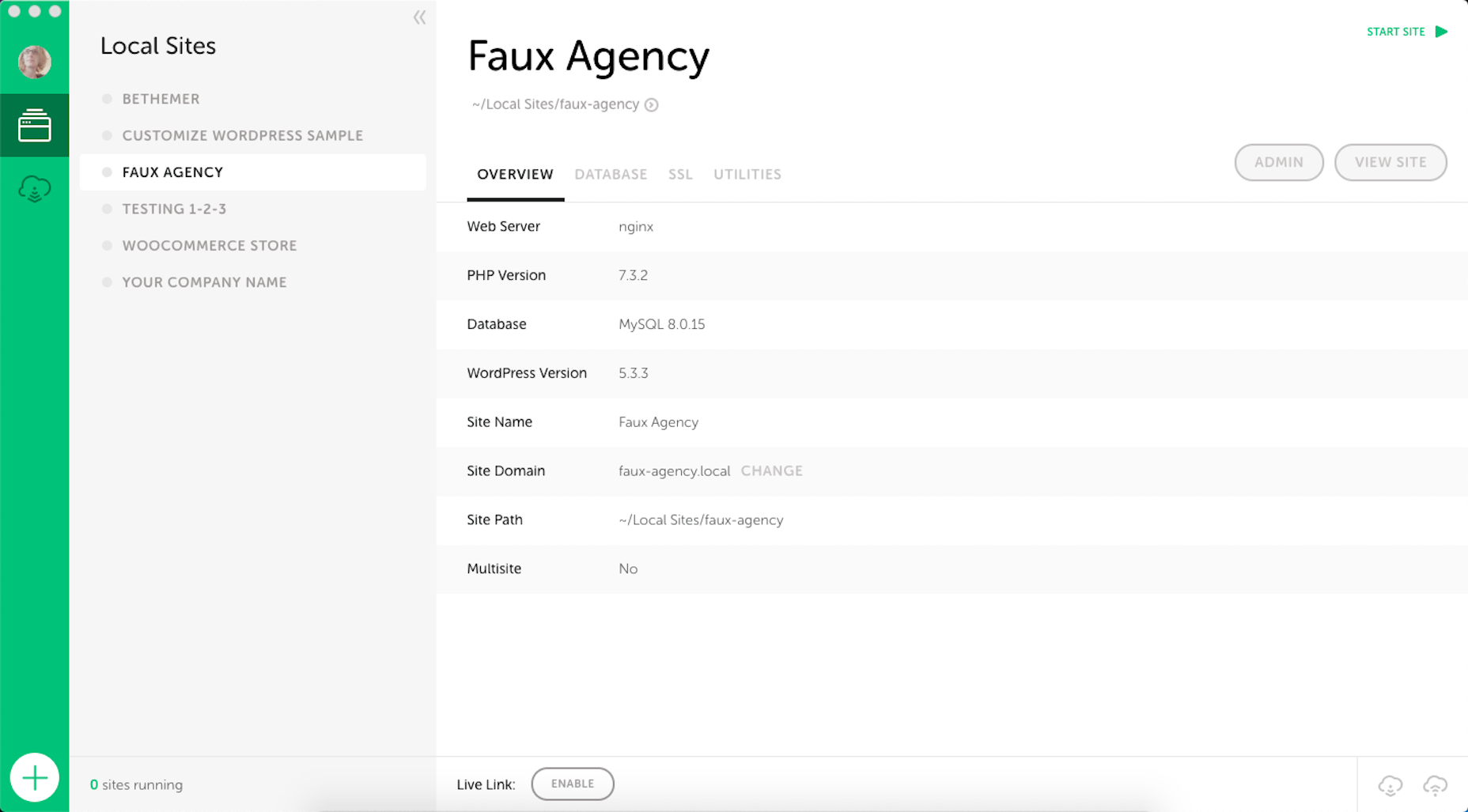
Local development environments are useful for staging websites, doing redesigns, and testing updates safely away from live sites. But you can also use them for experimenting with new design techniques, trends, templates, plugins, and more.

Local by Flywheel is the one I prefer to use:
Here’s a good exercise to start with:

Take a website you like — something you’ve looked at in awe and couldn’t imagine ever building on your own. Then, put yourself to the test. See if you can recreate it in your sandbox.

Don’t be hard on yourself if you don’t figure it out right away. Consult your resources and give yourself time to make sense of what’s going on and implement it with the available skills and tools.

Tip 3: Redesign One of Your First Projects

There’s always a clear evolution in a designer’s skill set, from the day they begin designing to the present day. And that’s a good thing. If your work doesn’t improve or change with time, then you’re going to have a lot of catching up to do when the stagnation begins to hurt your business.

Want to see how much progress you’ve made so far? Revisit one of your first projects and look at it with fresh eyes. I bet you’ll see a big change in how you design today from how you designed that site then.

Now, ask yourself what you would do differently. And then, go to your sandbox and do the redesign.

Tip 4: Work on a Passion Project

A friend of mine is taking a UX design course and needed some users to run through a prototype he created for the class. He could create anything he wanted, so he designed an app related to his other love: Music.

While he could’ve easily thrown together some carbon copy of Spotify or SoundCloud, he came up with a completely new concept. And it was really impressive, to the point where I urged him to put it into production and see if he could list it in the app stores.

I think it’s when we’re really passionate about something that we’re willing to push past our limits. So, carve out some time to tackle that passion project you’ve been toying around with and see where it takes you.

Tip 5: Share Your Designs on Dribbble and Ask for Feedback

One of the reasons UX designers do user testing is how valuable users’ raw input is. While it would be nice to think that design is a completely subjective matter, that isn’t really the case when usability becomes compromised due to design choices.

Understanding what users like and dislike is an important part of taking your design skills to the next level. And a good way to do that is to share your designs on Dribbble.

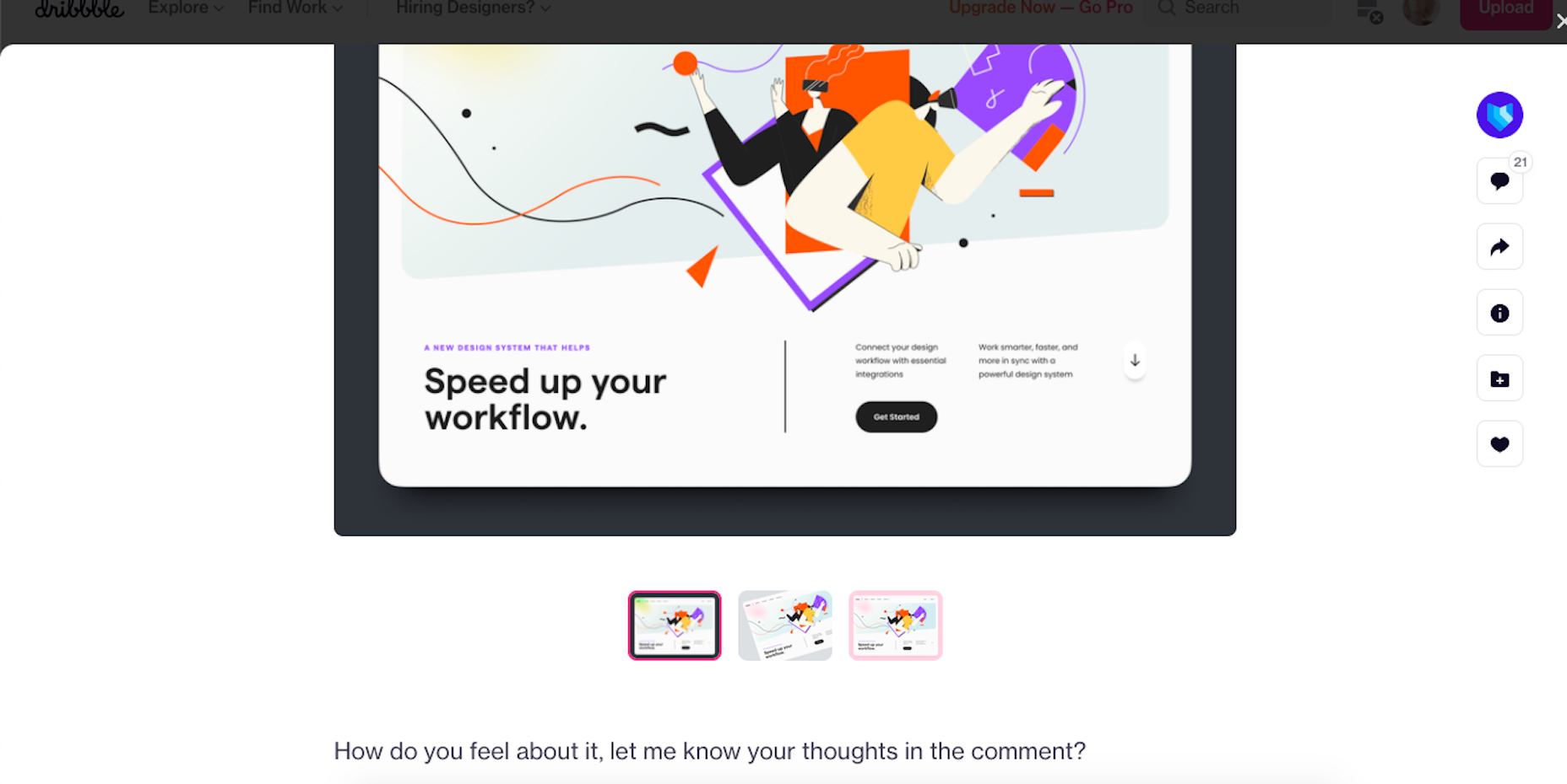
Here’s an example of UI8 asking for feedback:
Tip 6: Create a Design Toolbox

I’m a huge fan of automation and shortcuts powering things behind the scenes in business.

After all, one of the reasons you become a web designer is so you can design, right? When you’re bogged down with administrative and logistical tasks, that’s time spent away from doing what you enjoy.

One way in which you can streamline your backend processes is by putting together a design toolbox. Your preferred CMS. Flexible templates or apps you use from project to project. Website testing tools. And so on.

As you do this, it’ll force you to examine how you build websites. Are you really working as efficiently as possible? Are there newer apps or systems that’ll help you design better sites? And as you improve your design toolbox, you’ll improve your design skills.

Tip 7: Subscribe to Your Favorite Blogs

I have a hard time recommending this one, only because I’m reluctant to sign up for yet another newsletter. That said, I do see the value in subscribing to some blog newsletters as I don’t always remember to revisit their websites and check out the latest content.

What I’d suggest you do is pick one or two design blogs that have a good variety of content and publish regularly. And then pick one small business or freelance blog.

WebdesignerDepot, of course, is a good one to start with as it comes at a good frequency, recommends great reads from all around the web, and is fluff-free:
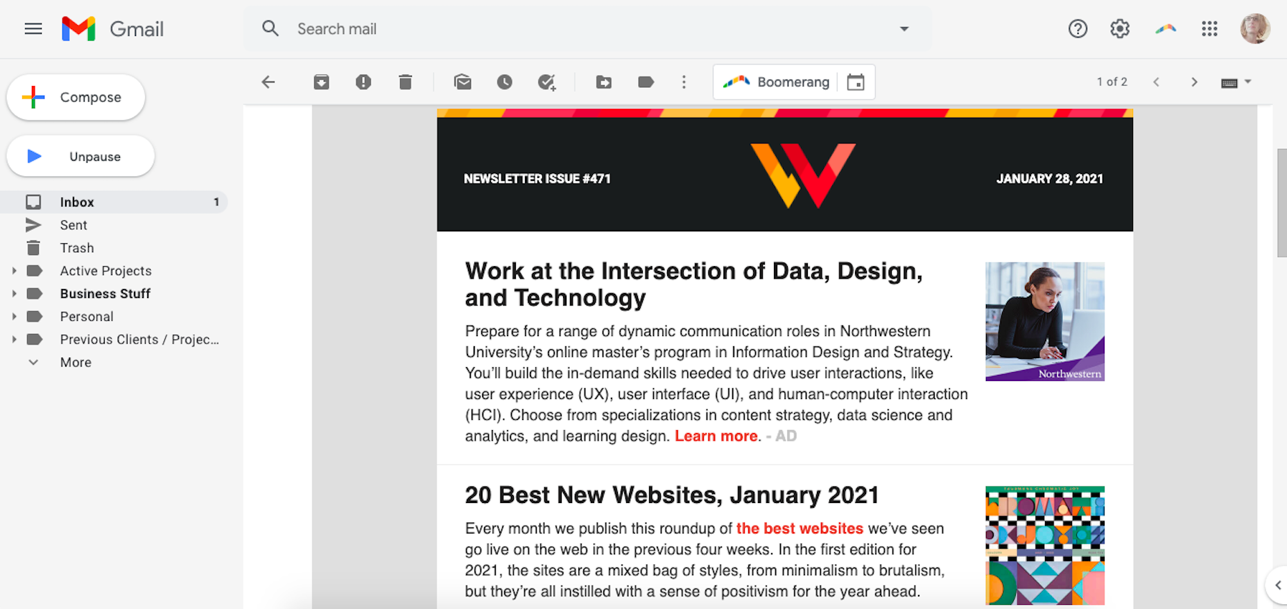
I’d also recommend signing up for one that’s focused on your niche as well as one for business.

As a freelancer, I’d vote for the Freelancers’ Union newsletter. There’s always something timely and useful in there.

Tip 8: Listen to a Podcast

I just adopted a second dog, so I’ve spent a lot more time on walks while house-training her. At first, I was stressed about it because it was time spent away from work. However, I started to fill that time with podcasts and found that it helped me work better for the rest of the day.

One reason is that I’ve been listening to work-related podcasts, which are always chock full of helpful tips. Another reason is that it gives my eyes a rest from looking at the screen so that when I come back 15 or so minutes later, I feel refreshed and ready to go.

Rebekah Carter has a good set of web design podcast recommendations to get you started.

Tip 9: Take a Free Online Design Course

There’s an overabundance of information online. If you want to brush up on CSS, there are hundreds of YouTube courses that cover it. If you want to learn how to use a new WordPress plugin, you’ll find dozens of great tutorials across various online course platforms, YouTube channels, and even people’s blogs.

There’s no need to go back to school to become a better designer. Here are five places where you’re bound to find free courses for web designers.

Tip 10: Read a Book on Design Principles or Theory

It’s easy to lose sight of design principles when your clients are clamoring for a website that will make them a lot of money, get them a lot of readers, and so on. Sure, you can design a UI and UX that works, but do you remember why the design choices you made are effective?

Choose a book — just one to start — that’ll help you reconnect with the roots of good web design. Not only will you get a good refresher on web design principles or design theory, but you might learn something brand new.

Here are some of my favorite books for web designers:

Tip 11: Find Your People

Now more than ever, finding a community of like-minded web designers, developers, or freelancers is important. It’s not just about having a group of people to vent to when clients drive you nuts (though that’s great, too).

It’s about finding a group that brings something new to the table and enriches your understanding of web design and what it means to be a web designer.

If you’re on Facebook or LinkedIn, start there. There are tons of web design and freelance groups that have productive discussions every day. If you prefer to meet up with local designers and developers, check out Meetup.
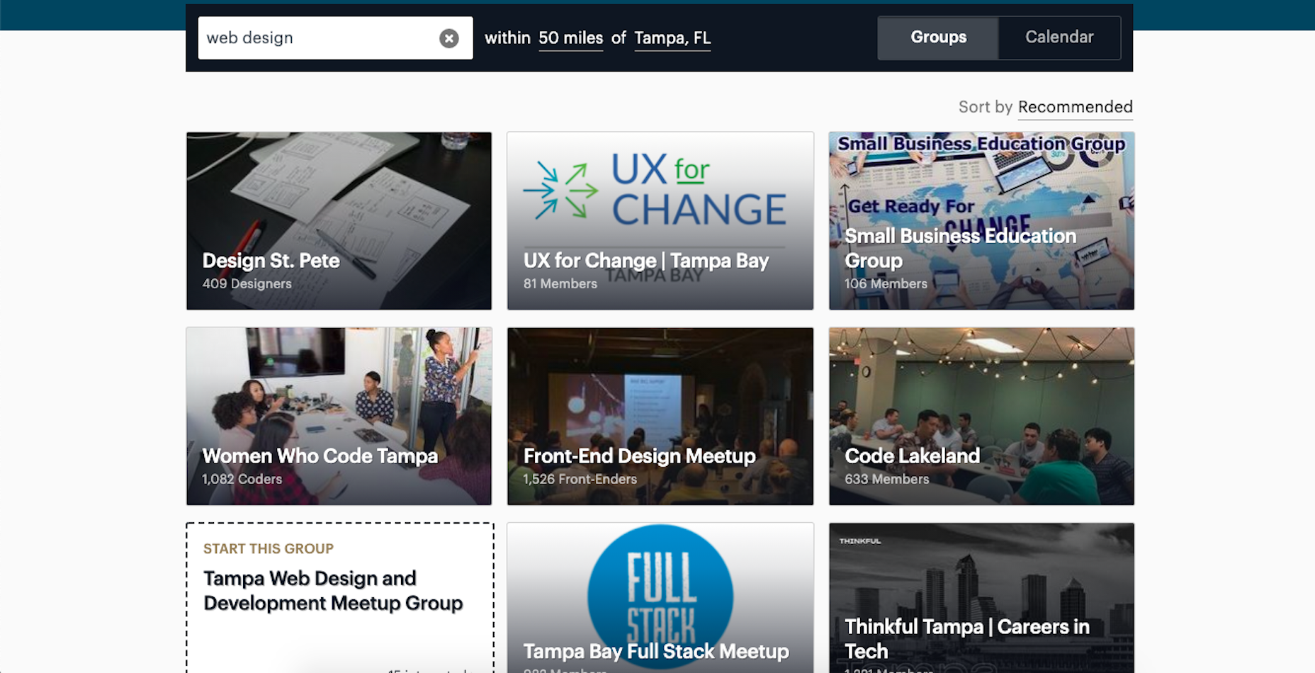
You may be surprised by how many groups there are and the kinds of meetups they have planned.

Tip 12: Attend a Virtual Conference

Did any of you attend a design conference last year? I did. I virtually attended Adobe MAX — from the comfort of my home, in my pajamas, for three days.

I scheduled my assignments around the sessions I wanted to attend and didn’t have to pick one over the other (i.e., “Do I make money or do I learn something new?”).

Some of the sessions showed us how to do more with Adobe’s tools, while some of them featured design and business leaders who shared personal insights on how to work more effectively. It was a great way to shake up my normal routine and to get a ton of information about the future of web design in a short period of time.

Which of These Tips Will You Use to Improve Your Design Skills?

Like I said before, there’s a lot you can do to improve your design skills. Just be careful not to overdo it.

Pick one or two things on this list to start with. If you have more time in your schedule and you’re excited about what you’ve learned so far, add a couple more.

Just take it slowly. Your brain will only be able to absorb so much at once. Plus, the last thing you want is to burn yourself out on skills training and not have the energy to complete your work.


Featured image via Unsplash.

Source

The post 12 Tips to Improve Your Web Design Skills in 2021 first appeared on Webdesigner Depot.


Source de l’article sur Webdesignerdepot

It’s February, and the spring sun is finally starting to peep through the winter clouds. While many of us are still largely restricted to our homes, the web has kept on growing.

We see a shift in attitude towards natural health, wellbeing, and sustainability, and these are now being branded less often as outliers and increasingly mainstream. We’re also seeing more and more color all the time, ranging from an emotional signifier in the background to being a functional element in its own right.

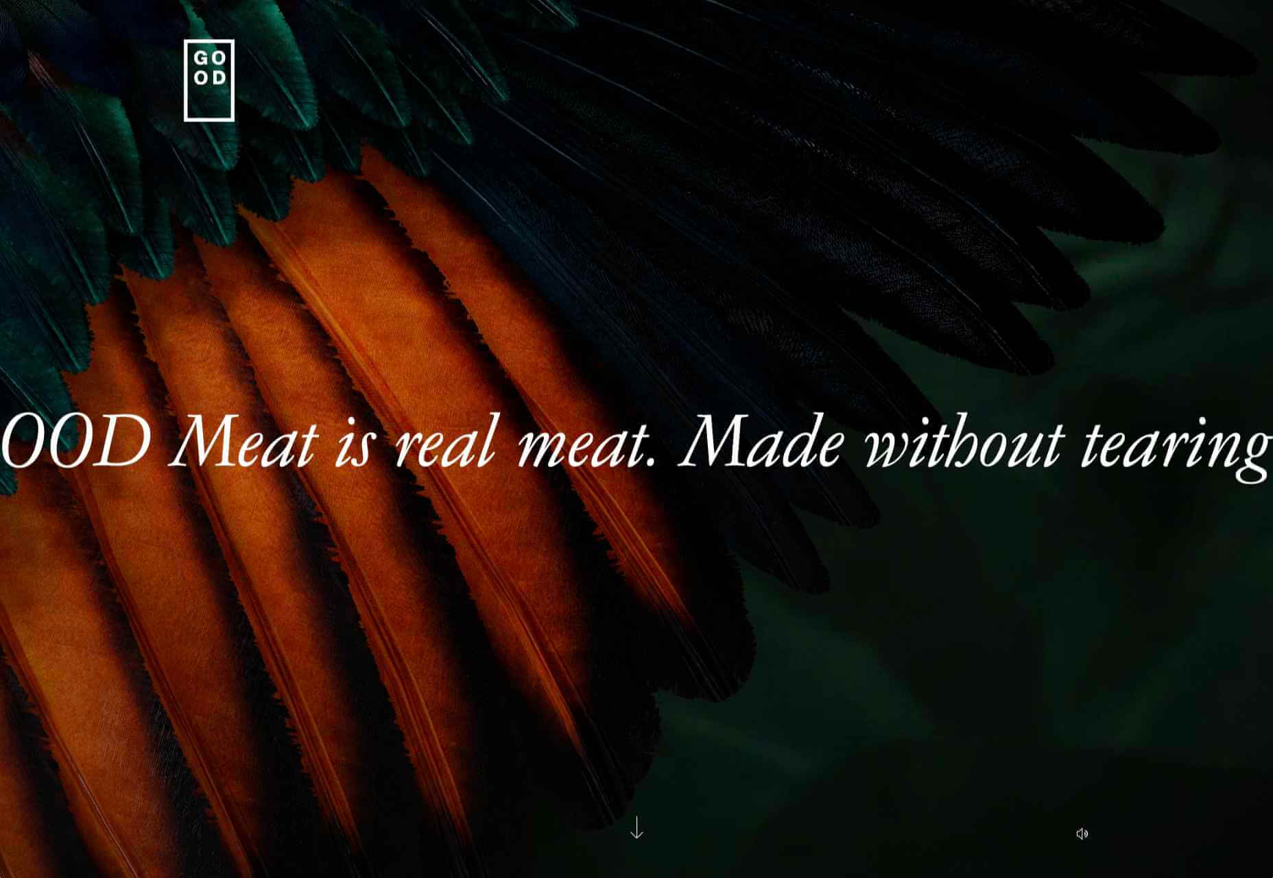
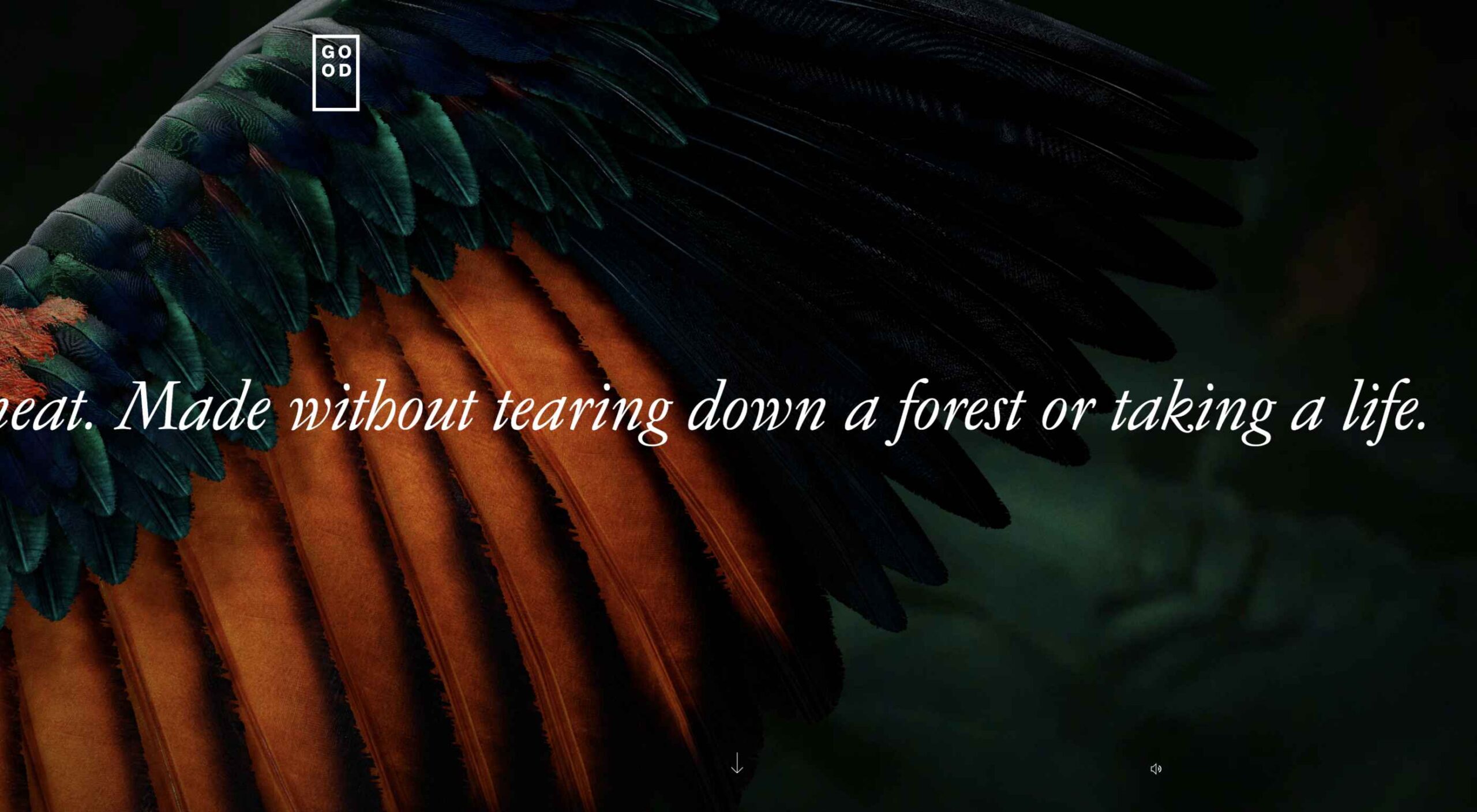
GOOD Meat

Gorgeous color in the background image and the scrolling narrative pull the user in on this site for lab ‘grown’ meat.

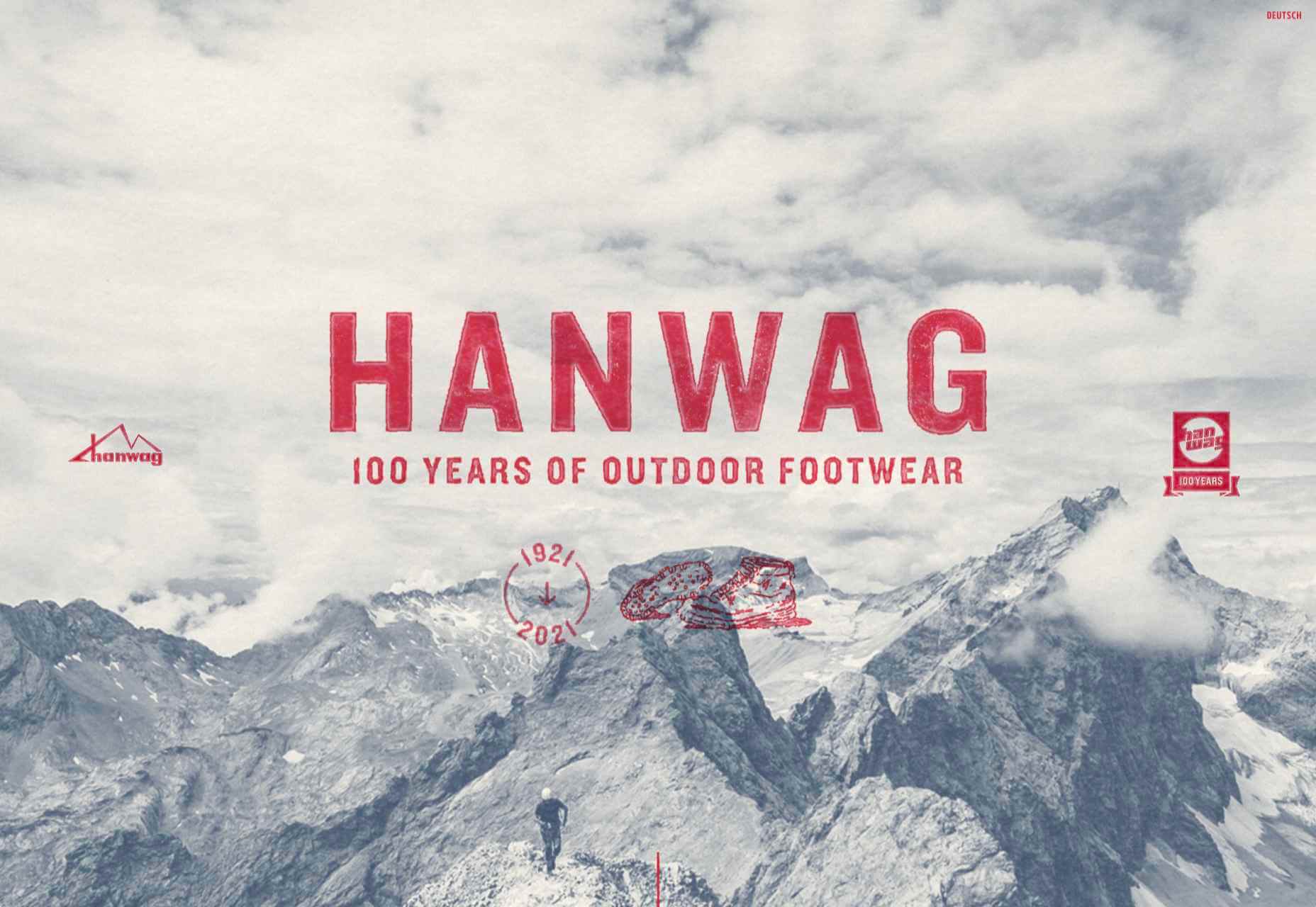
Hanwag 100 Years

This page celebrating 100 years of outdoor footwear company Hanweg uses a mix of illustrations and photographs to create a timeline marking the company’s highlights alongside what else was happening at the time. Any excuse to get Yoda in.

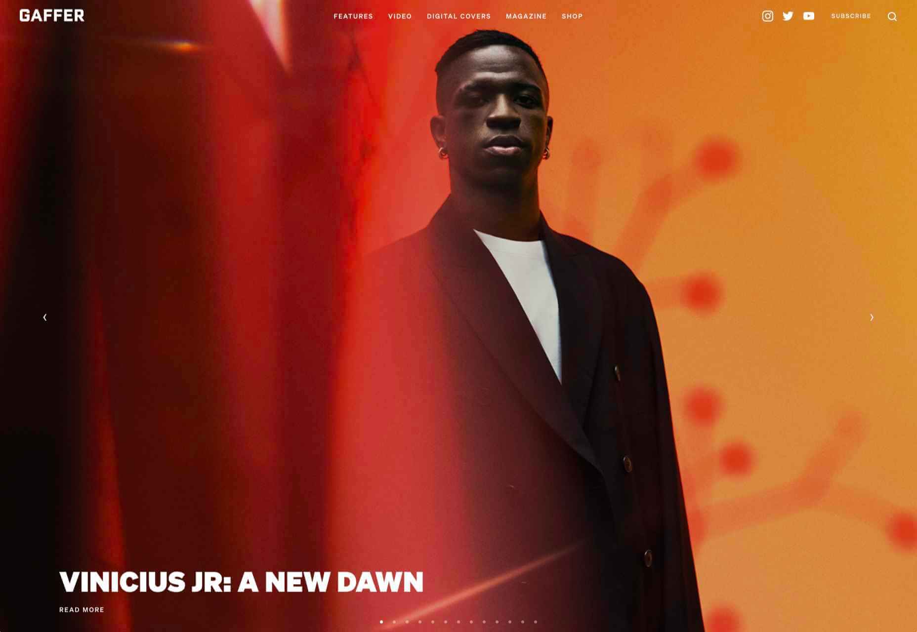
Gaffer

Gaffer describes itself as bridging the gap between football, music, fashion, and culture. The site has a glossy feel, with strong art direction and an easily navigable architecture.

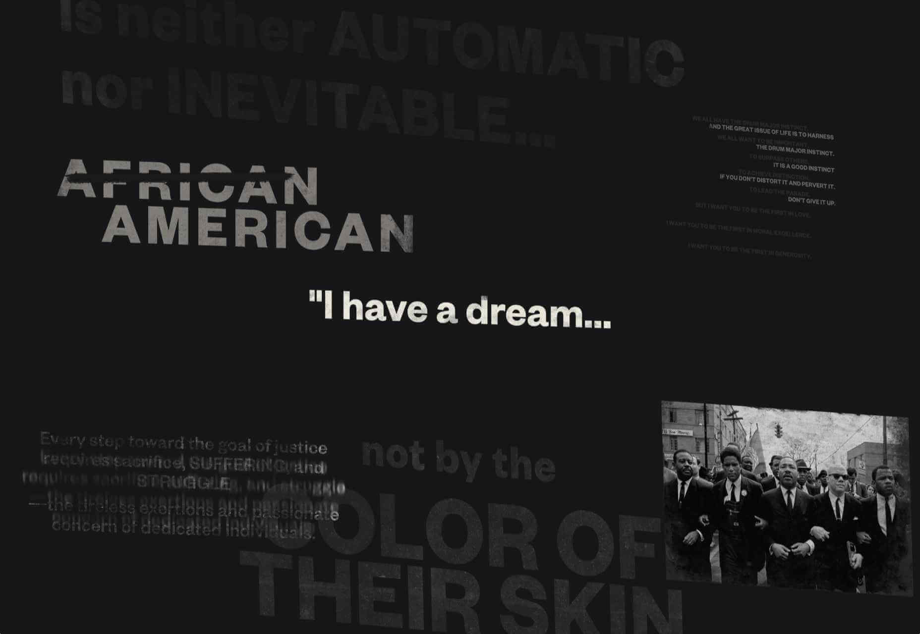
Remember MLK

This rather beautifully made tribute to Martin Luther King uses some great typographic effects, and the variations, in contrast, create a layering of the different content elements.

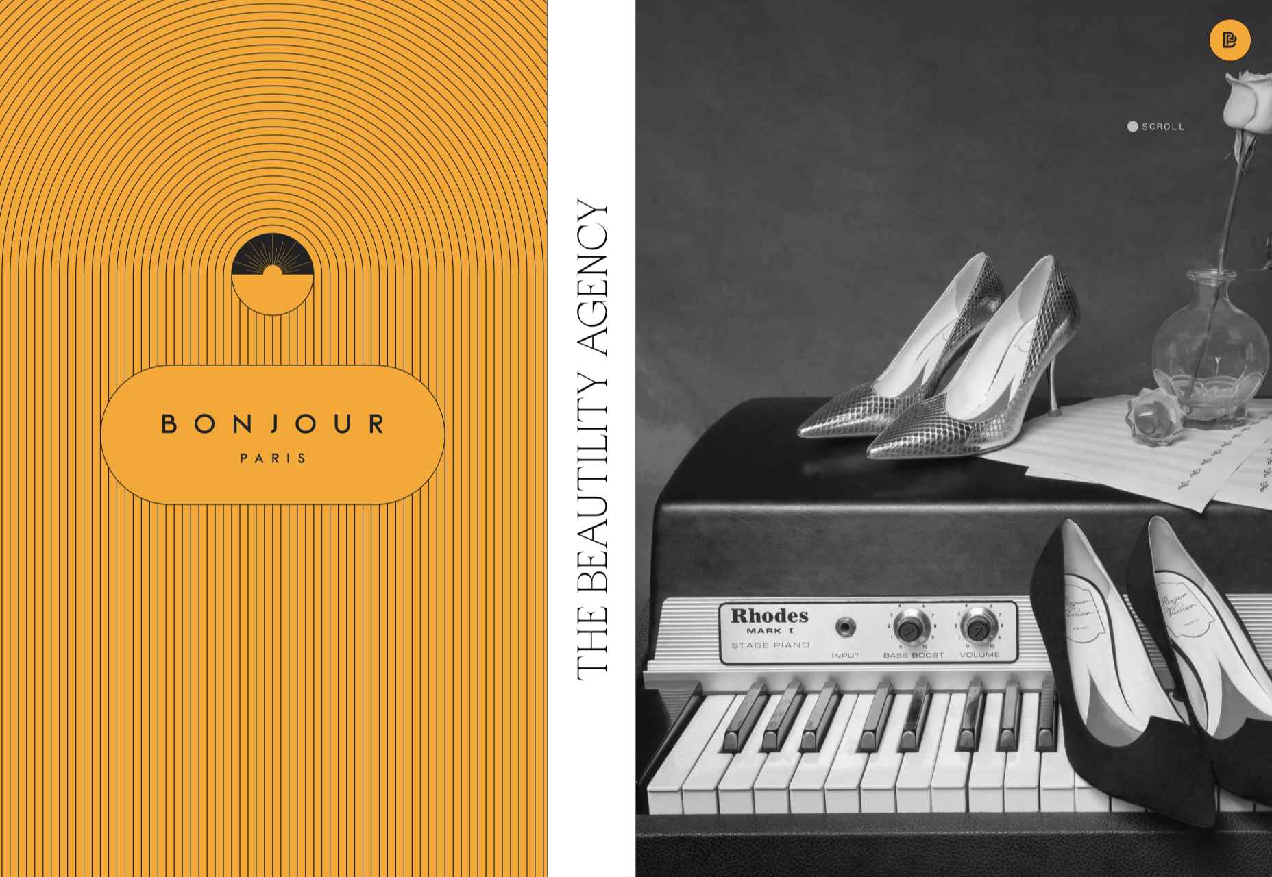
Bonjour Agency

The home page for design agency Bonjour Paris uses sideways scrolling to give an overview of the whole site. There is a lot of content, but it doesn’t feel like waffle, and exploring the site is a pleasant experience in itself.

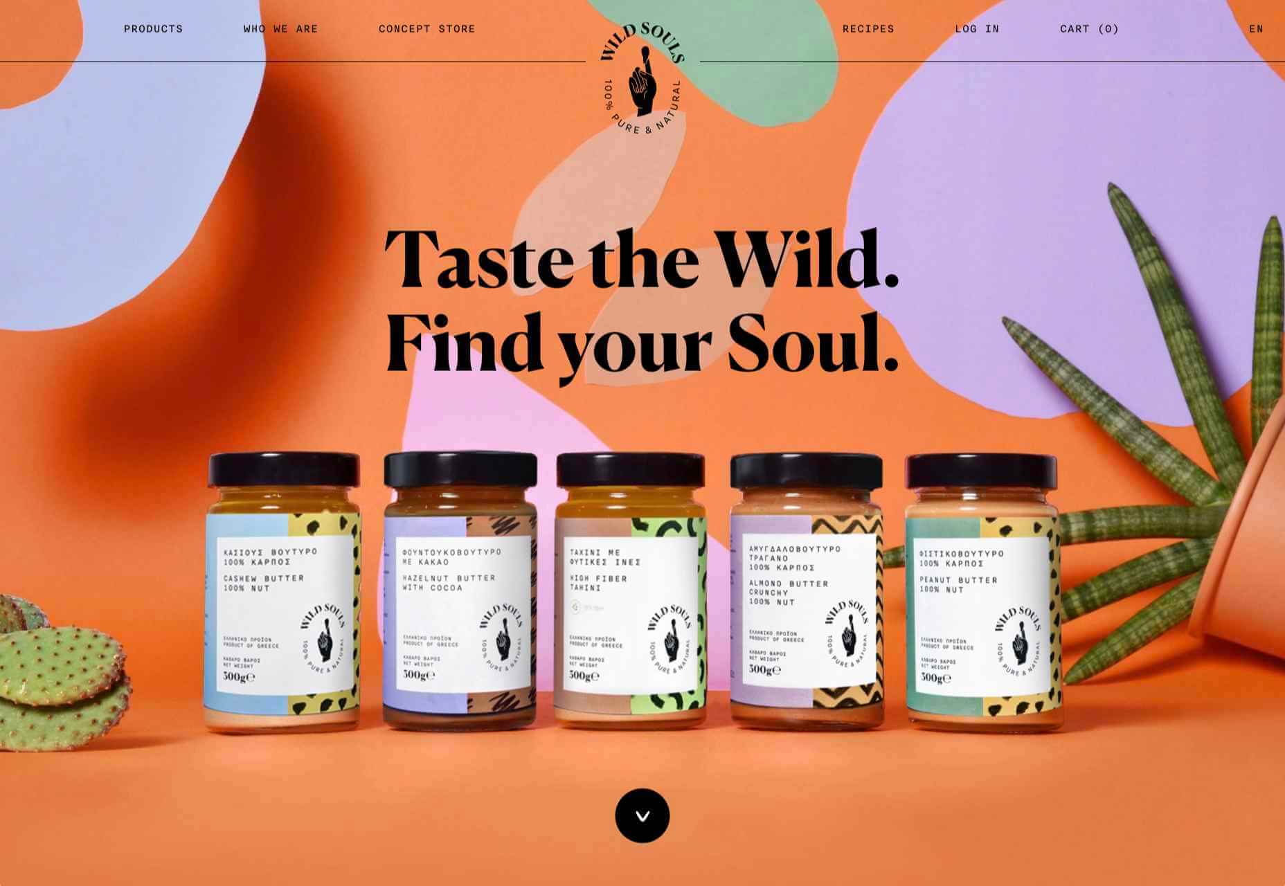
Wild Souls

Wild Souls is a Greek company that principally makes nut butters, tahini, and halva. The site is very colorful but warm, and the display type — Canela — has a slight softness to it that is appealing.

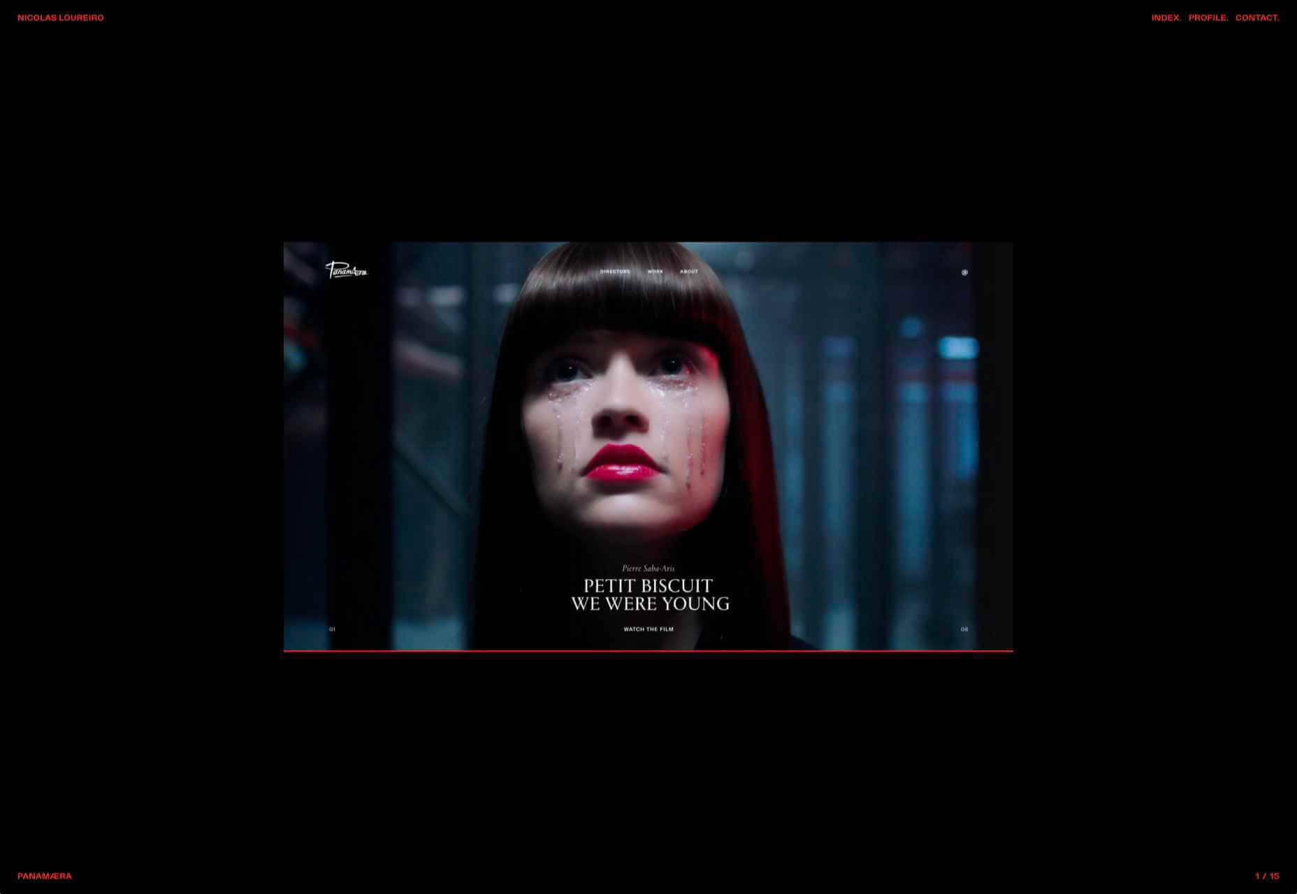
Nicolas Loureiro

This is a strong portfolio site for interactive and graphic designer Nicolas Loureiro. The work is front and center, and the navigation is pleasing.

Studio Nanna Lagerman

Studio Nanna Lagermann is a small interior design studio that works on private homes, public spaces, and set design. The site creates a feeling of space and calm. Colors are soft and neutral, and the type, although massive in places, is clean and sophisticated.

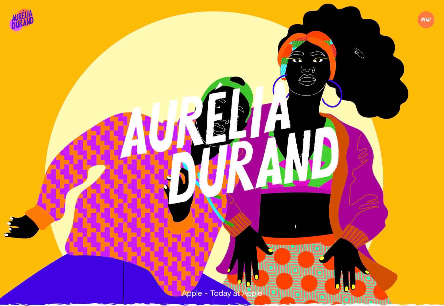
Aurelia Durand

Illustrator Aurelia Durand created her own typeface that she uses in her work, and it is used as the main display font here too. This site has a sense of joy about it that is hard to resist.

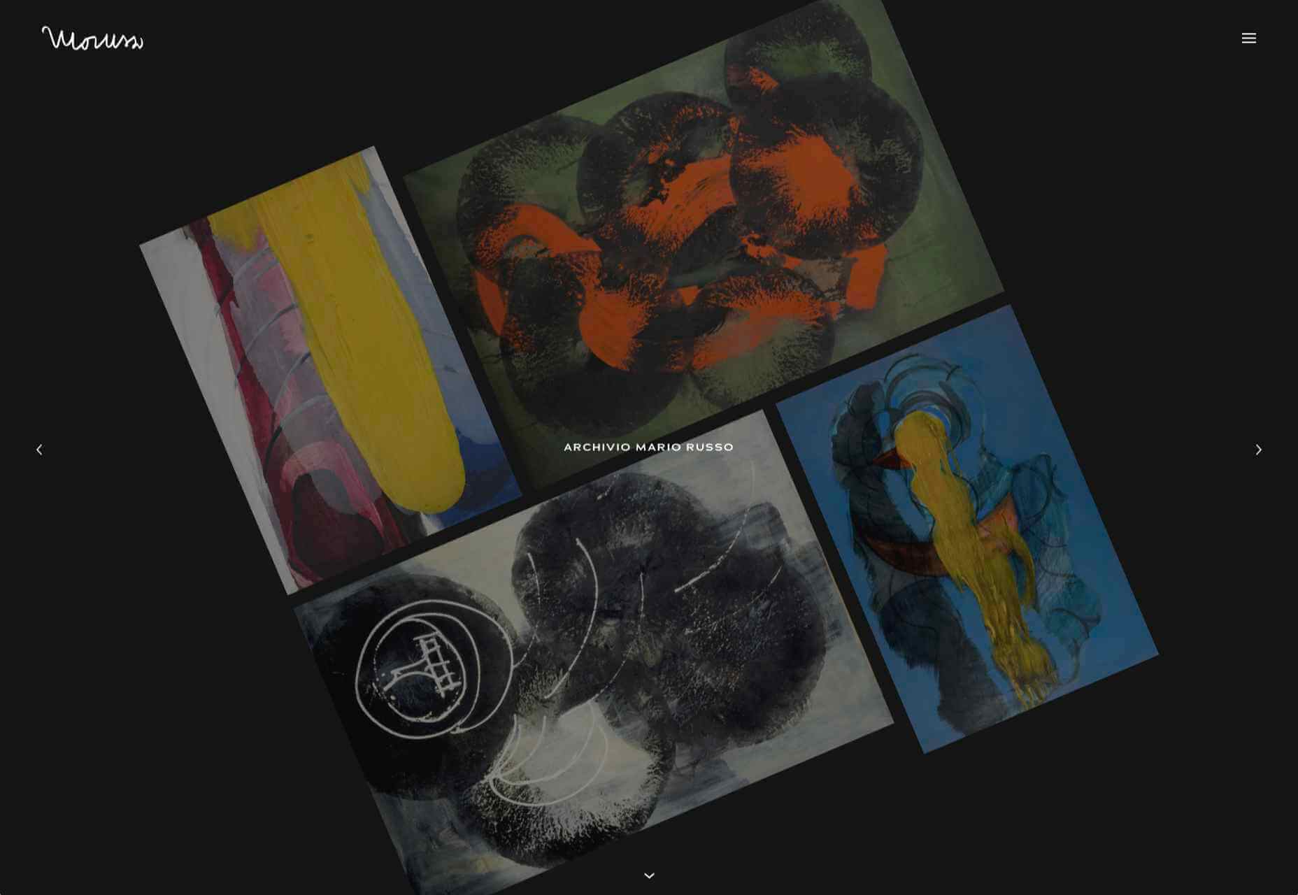
Archivio Mario Russo

This site documents the life and work of 20th-century Italian artist Mario Russo. The layout is thoughtful, and the text, while informative, doesn’t detract from the work being shown.

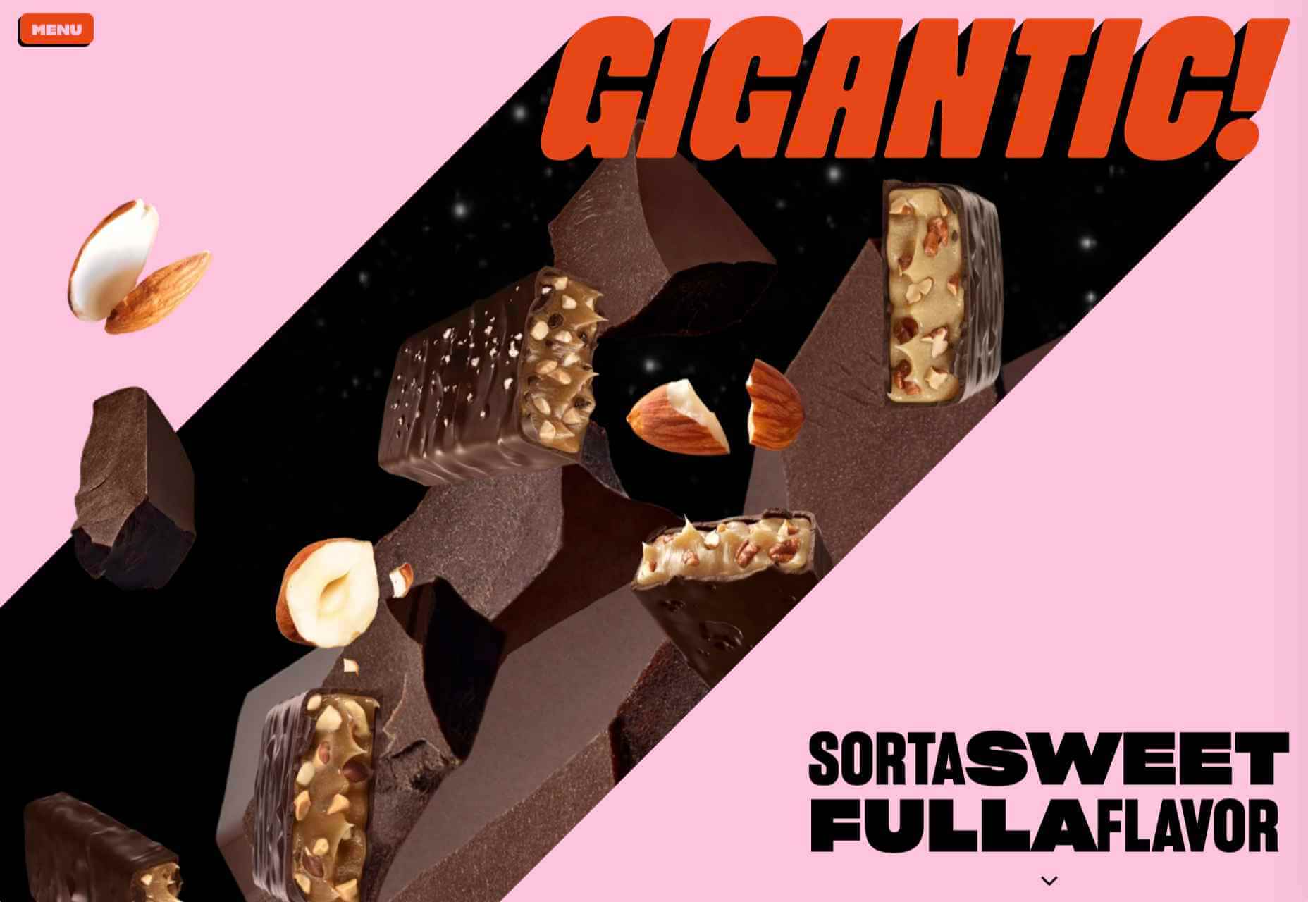
Gigantic Candy

Gigantic Candy makes vegan chocolate candy bars. The site is big, bold and lo-fi, and has a sense of fun to it.

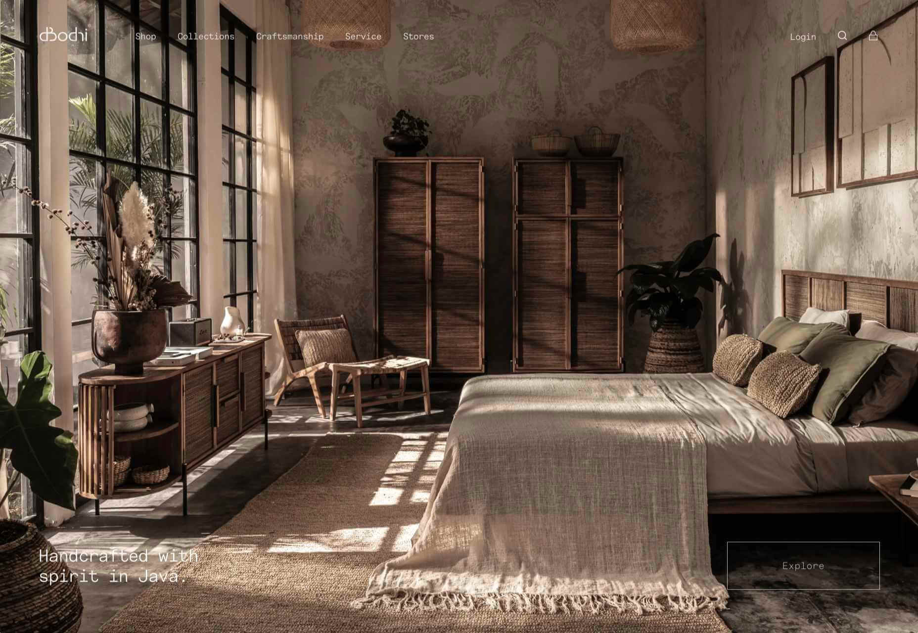
dBodhi

dBodhi sells handcrafted furniture from Java, made from reclaimed teak and locally grown plant materials. The clean layout combined with a slight sepia tone on all the photography creates a feeling of quietness and nature.

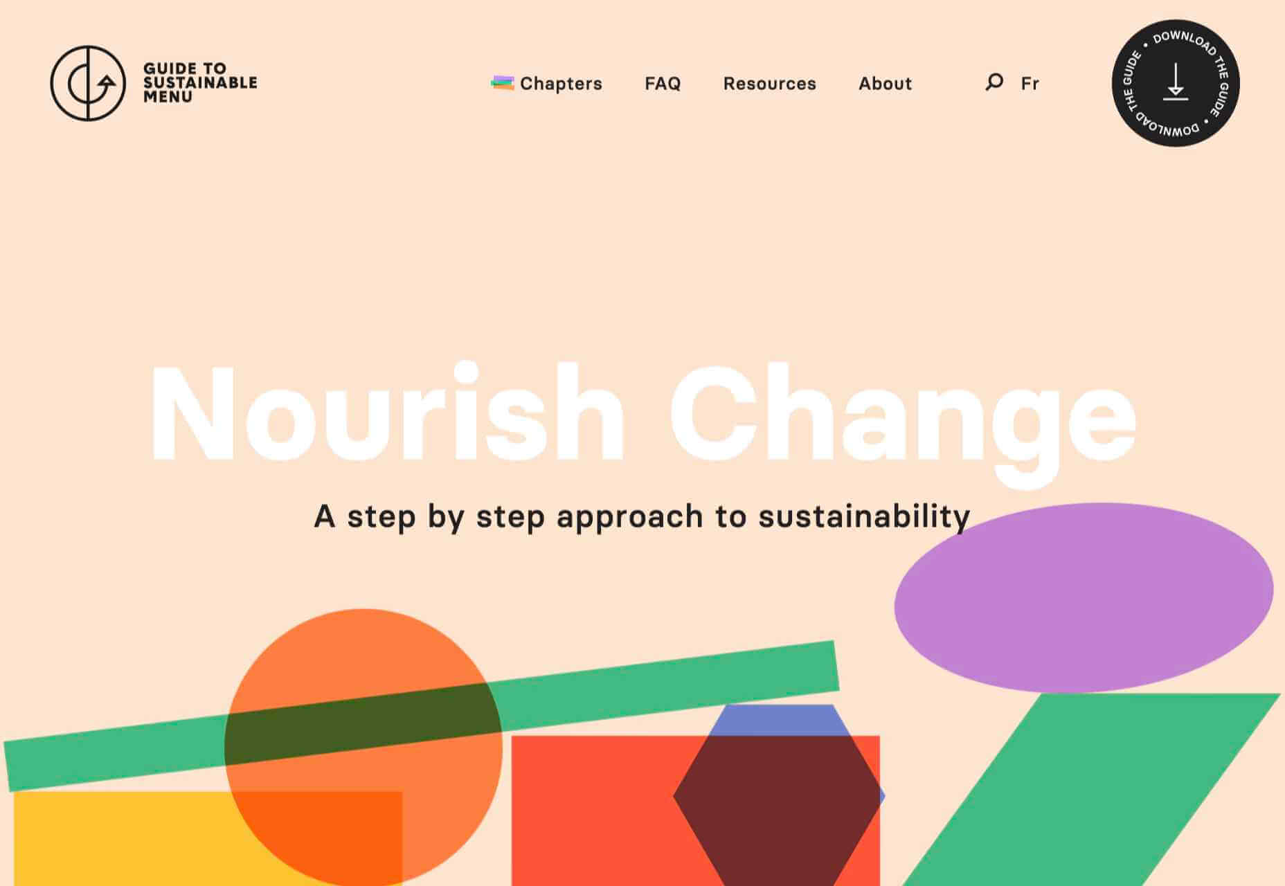
Menu Durable

Menu Durable is a guide to creating healthier, sustainable food menus in Canadian healthcare facilities. There is a lot of information here, and it is well written and attractively presented with clear color coding.

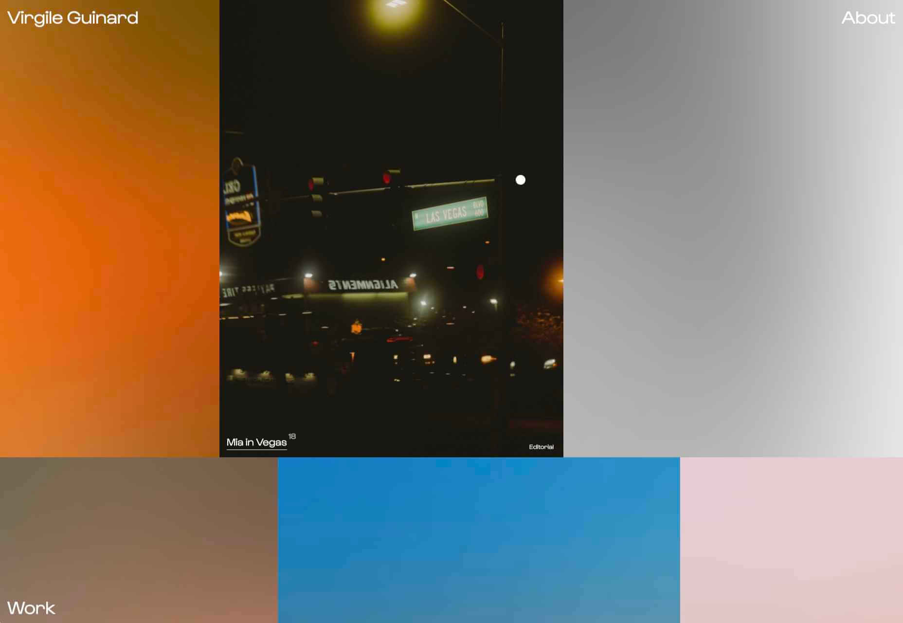
Virgile Guinard

This is a lovely, simple portfolio site for photographer Virgile Guinard. By using blocks of color pulled from each photograph’s predominant color and only revealing each photograph on rollover, each image is allowed to stand out.

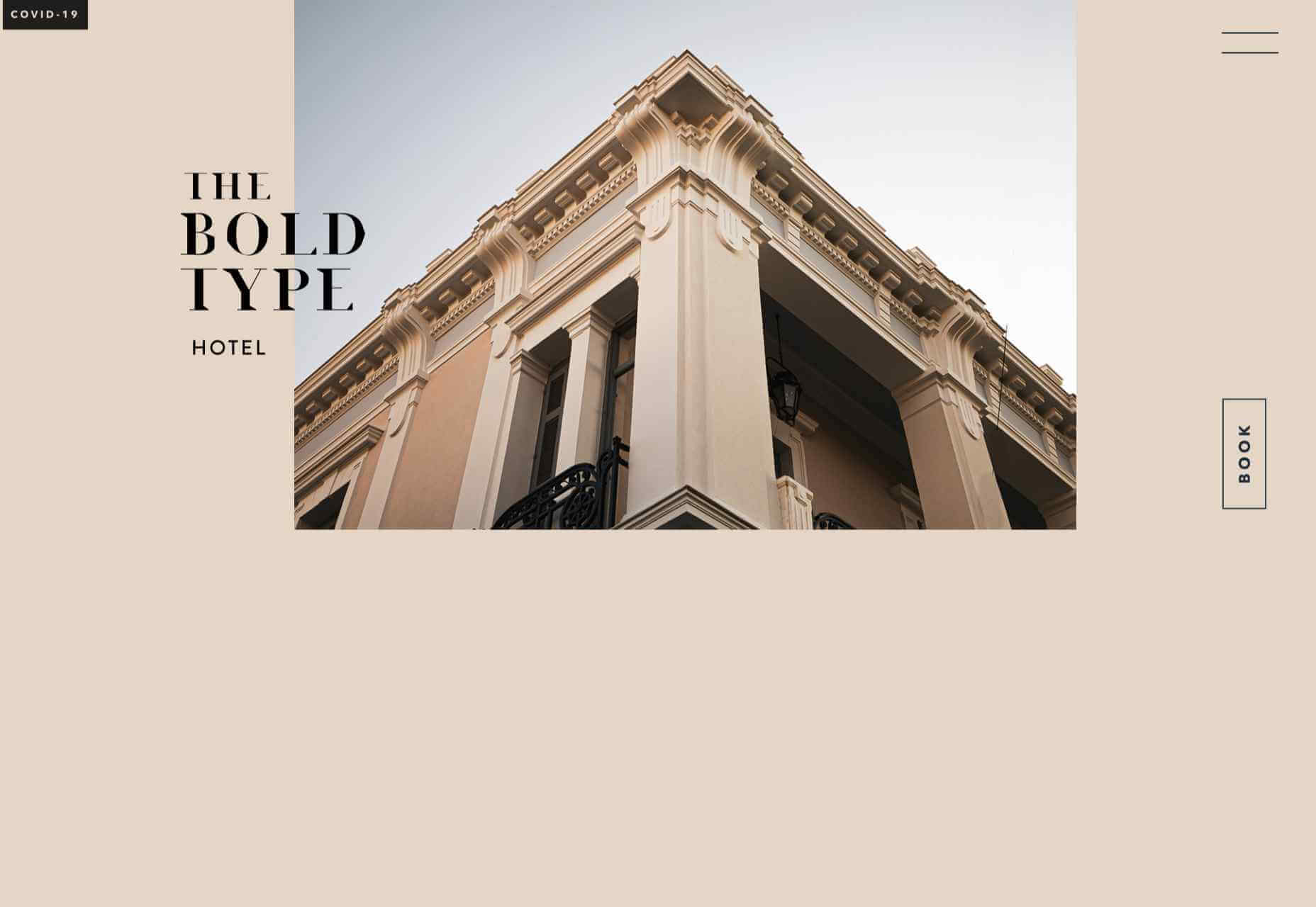
The Bold Type

This site for The Bold Type Hotel in Patra, Greece, is a boutique hotel website archetype, but it is done well. The pinky sand background color is a good choice, and the photographs are excellent.

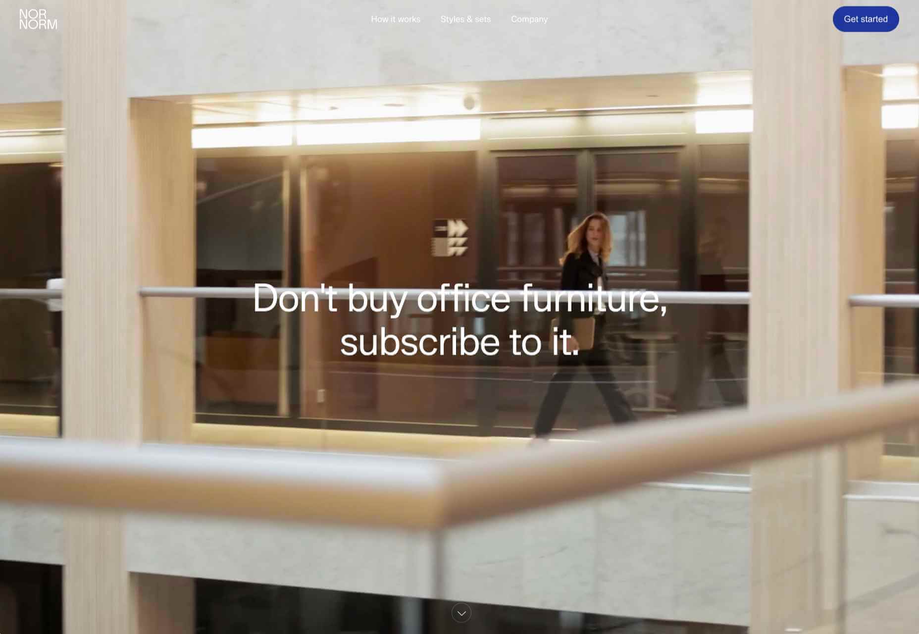
NOR NORM

Nor Norm provide an office furniture subscription service. The site is clean with a feeling of light and space. There is a good balance between an overview of the process and details of the individual items available.

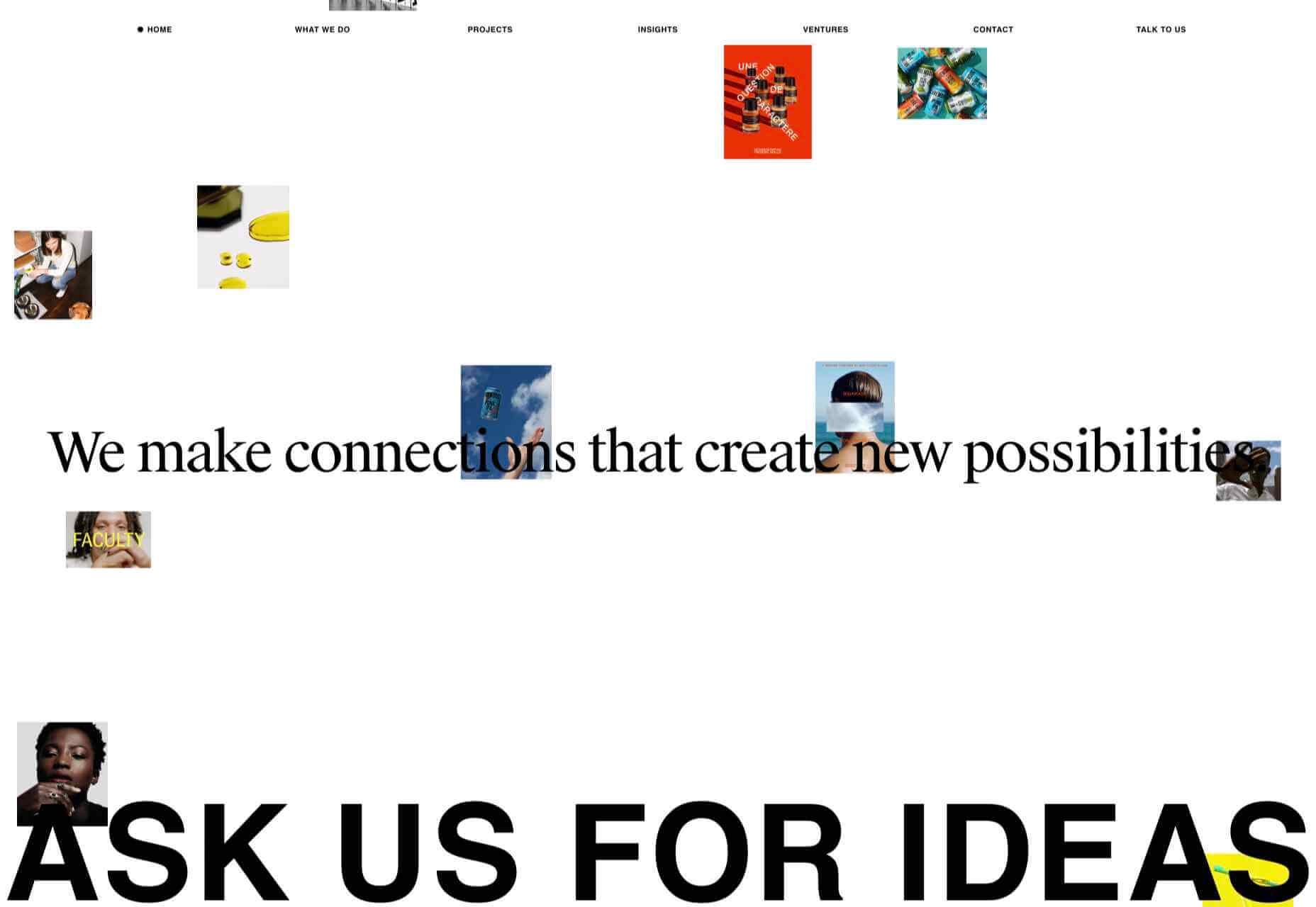
Ask Us For Ideas

At first glance, Ask Us For Ideas looks like a creative agency, but it is actually a creative broker, matching clients with agencies.

Prinoth Clean Motion

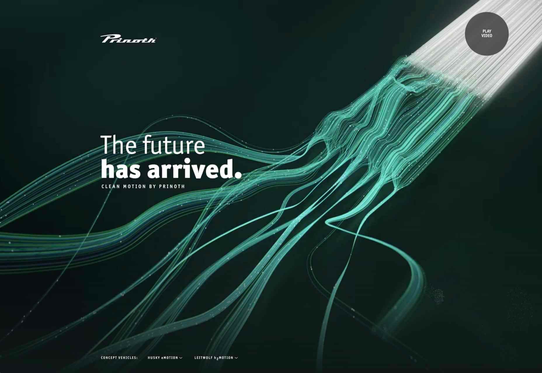
Prinoth has been making snow groomers since the 1960s, and this microsite is to mark the launch of their new hydrogen and electric versions. It is as slick and glossy as any luxury car website. And now I know what a snow groomer is.

Pschhh

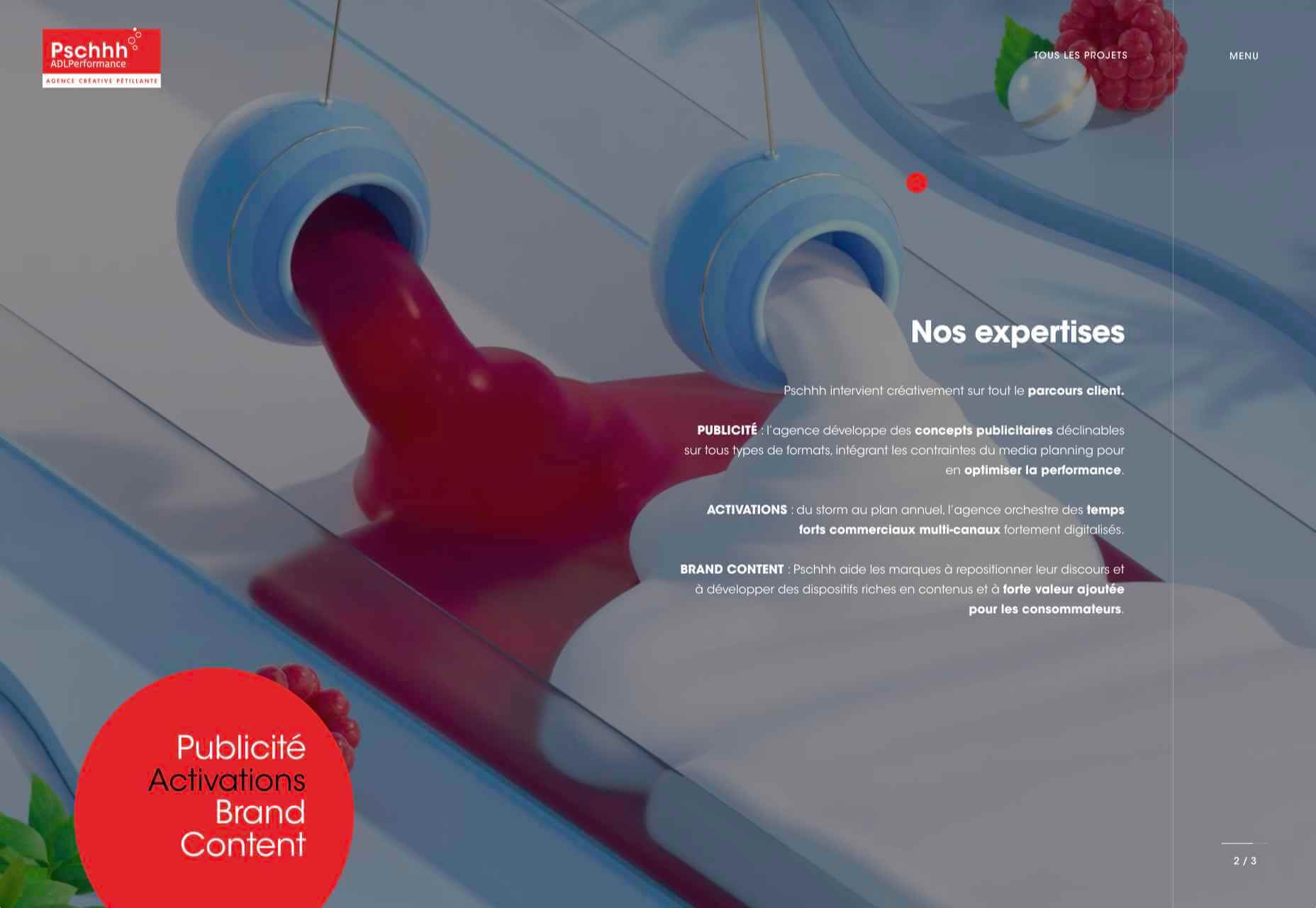
Design agency Pschhh has embraced the use of circles, reflecting the sound of bubbles their name suggests.

CōLab

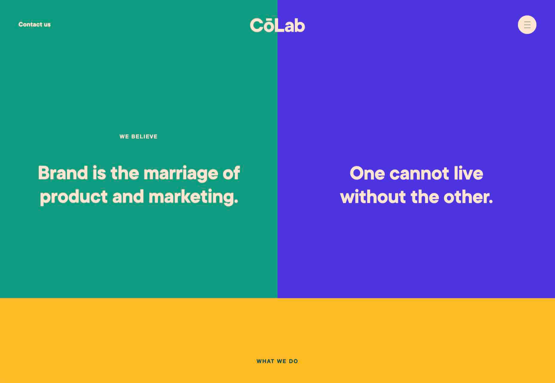
CōLab is a design and marketing firm. There is a great use of color and movement here, and you don’t really notice initially that there is no actual work on show.

Source

The post 20 Best New Websites, February 2021 first appeared on Webdesigner Depot.

Source de l’article sur Webdesignerdepot

JSON Document Store in Gemfire Cache.

Let us consider below JSON needs to stored in Gemfire Cache.

Source de l’article sur DZONE

Everyday design fans submit incredible industry stories to our sister-site, Webdesigner News. Our colleagues sift through it, selecting the very best stories from the design, UX, tech, and development worlds and posting them live on the site.

The best way to keep up with the most important stories for web professionals is to subscribe to Webdesigner News or check out the site regularly. However, in case you missed a day this week, here’s a handy compilation of the top curated stories from the last seven days. Enjoy!

The New Trello – Going Beyond the Board

Flameshot – Superb Screenshot Tool

GitHub Surf – Open repositories in a VSCode Environment

The Never-Ending Job of Selling Design Systems

The Secret Ingredients to Design

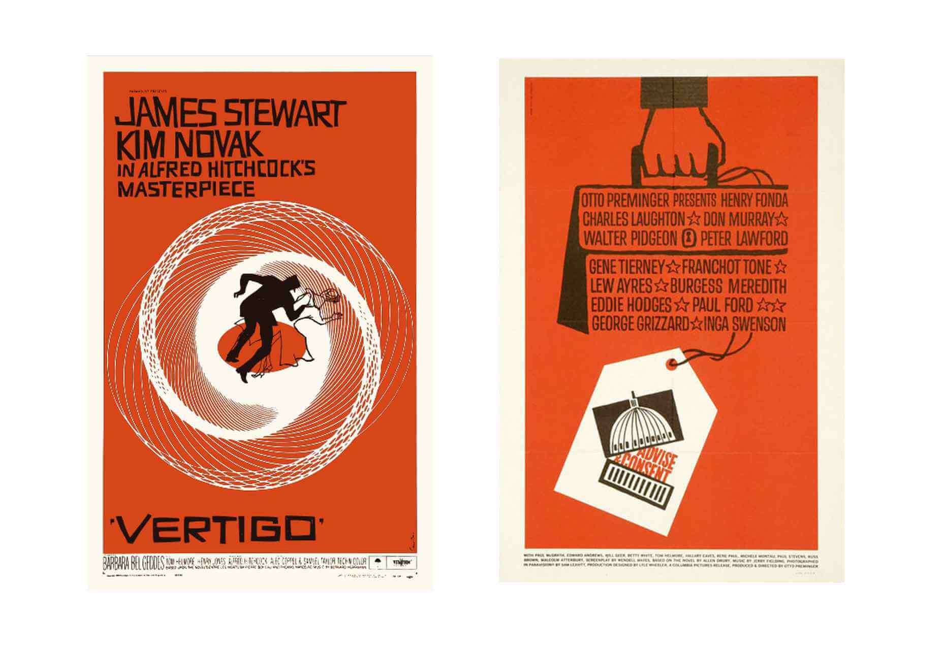
What Saul Bass Can Teach Us About Web Design

2021 Planner for Notion – A Smart Notion Workspace

Ideas for CSS Button Hover Animations

Ray.so – Create Beautiful Images of Your Code

Variable Font Reveals The Full Horror of The Climate Crisis

Design Systems For Figma: Year In The Life Of A Material Design Advocate

Interface Market – An Extensive Collection of App UI Kits

DogeHouse – Open-Source Audio Chat on the Web

Interaction Design is More Than Just User Flows and Clicks

Design Trends 2021

Straw.Page – Extremely Simple Website Builder

The Impact of Web Design and SEO Conversion Rates

Powerful Microinteractions to Improve Your Prototypes

What’s New in Ecommerce, February 2021

Colortopia – The Easiest Way to Find Colors

5 Simple Design Patterns to Improve Your Website

TextBuddy for macOS – A Swiss Army Knife for Plain Text

Upcoming Interesting JavaScript ES2021 (ES12) Features

WordPress 5.7: Big ol’ jQuery Update

JavaScript reducer – A Simple, Yet Powerful Array Method

Source

The post Popular Design News of the Week: February 15, 2021 – February 21, 2021 first appeared on Webdesigner Depot.

Source de l’article sur Webdesignerdepot

Do you have the recurring thought that you don’t have enough time or that it is too late to accomplish what you want to?  If so, you may be suffering from what is referred to as “time anxiety.” It is pretty common, especially in today’s day and age with social media portraying unrealistic expectations and forcing our lives to rush us by.

Time anxiety is no fun and can be weighing you down in your everyday life. Here is everything you need to know and some strategies and tips to overcome this anxiety and work towards being more at peace with the way that you are living.

Source de l’article sur DZONE

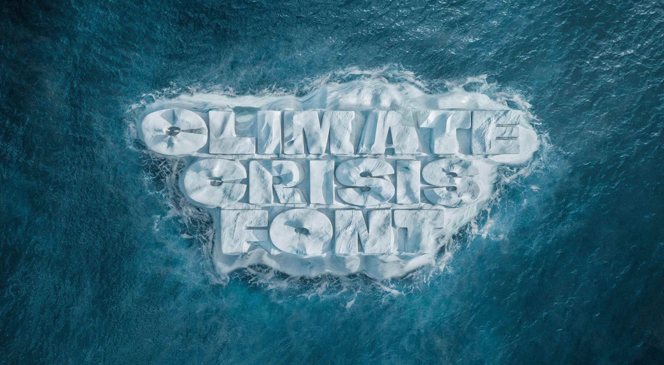
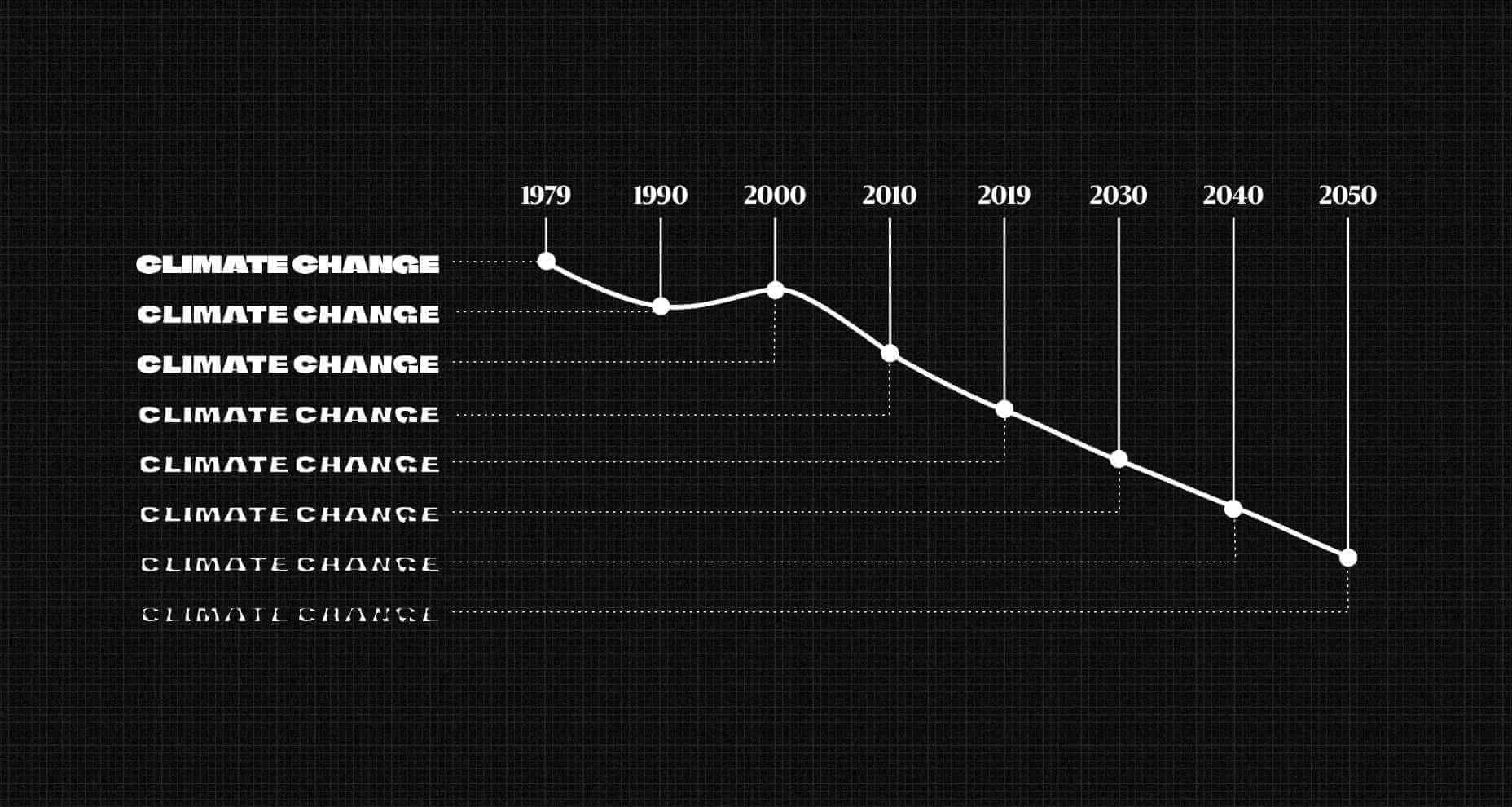
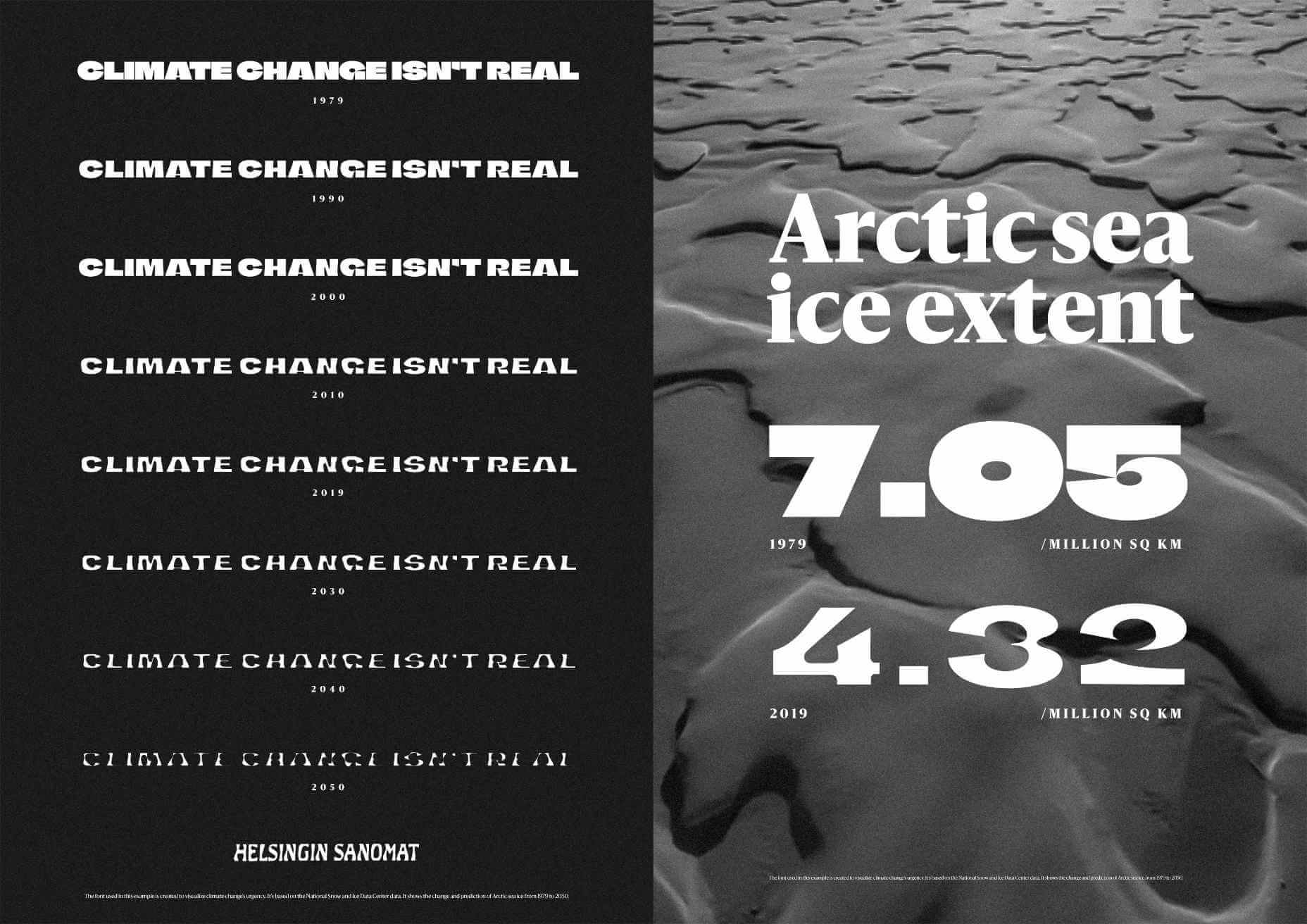
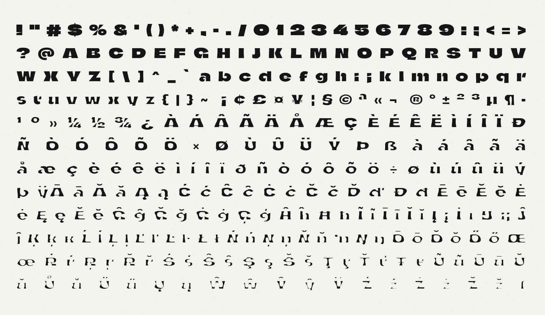
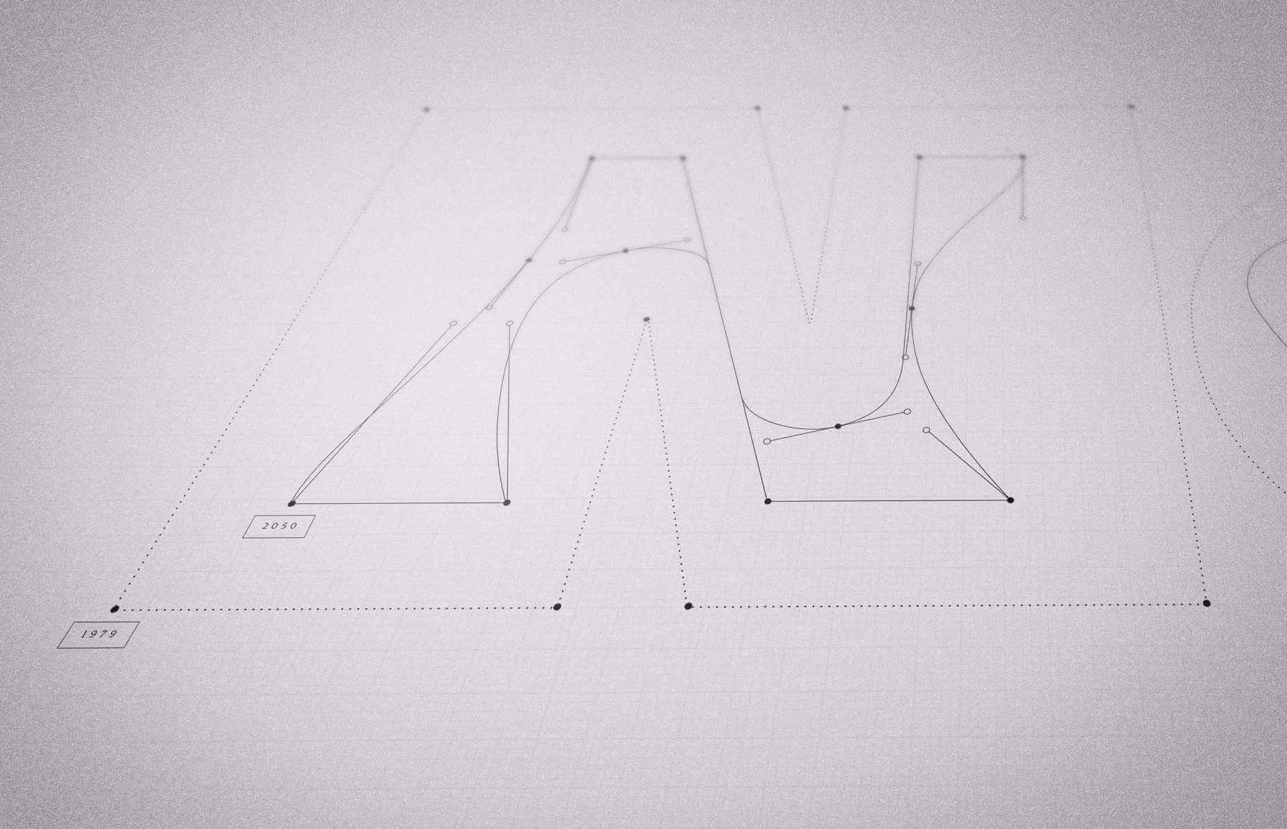
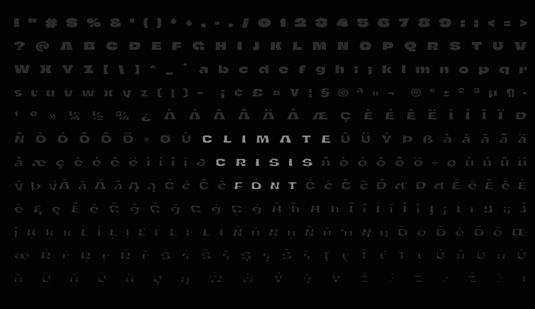
Finnish newspaper Helsingin Sanomat has developed a variable font, that is designed to make the effects of human-driven climate change tangible in a simple graphical form.
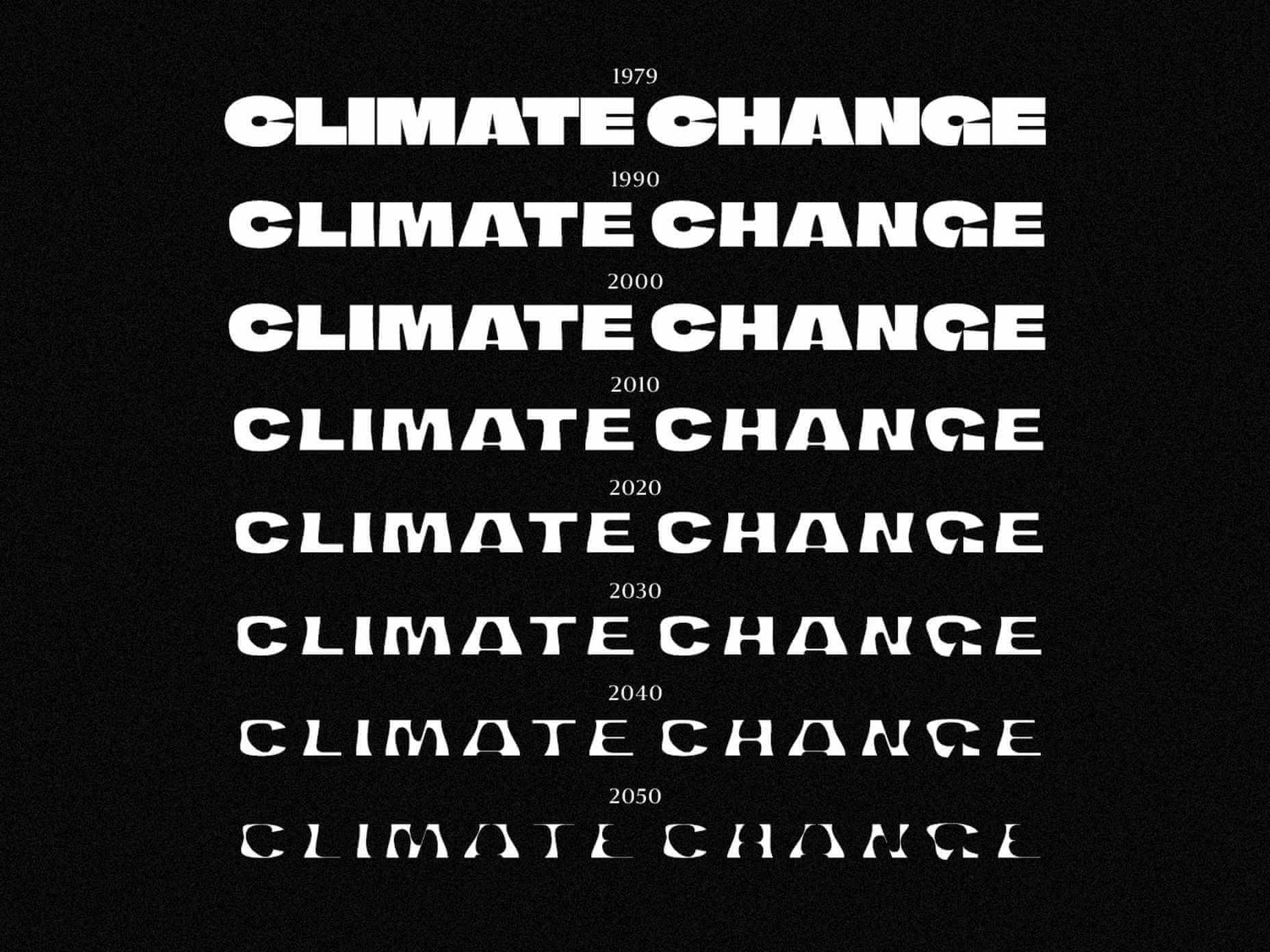
Whereas most type designers use variable font techniques to embed a range of weights in a single font file, the team — lead by Helsingin Sanomat’s art director Tuomas Jääskeläinen, and typographer Eino Korkala — used the technique to “melt” the typeface.

In the design process, we tried out countless letter shapes and styles, only to find that most of them visualized the disaster right in the earliest stages of the transformation. That’s something we wanted to avoid because unlike a global pandemic, climate change is a crisis that sneaks up on us.

— Tuomas Jääskeläinen

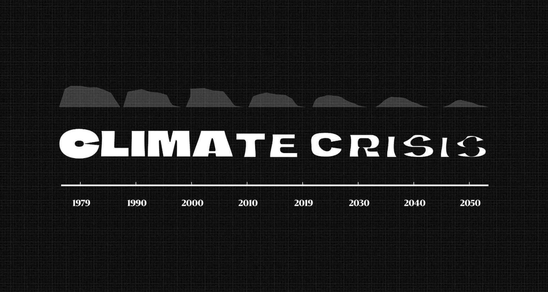
The default typeface represents the volume of Arctic sea ice in 1979 (when records began). It’s a rather beautiful, chiseled, chunky sans-serif, with cut-aways that open up counters to give it a modern appeal. As you move through the years towards 2050 the shapes appear to melt away, to the point that they’re barely legible.

Set the scale to 2021 and you’ll see an already dramatic loss of Arctic sea ice, and the resulting desalination of the ocean.

As depressing as these outlines are, they aren’t an estimate. The typeface’s outlines precisely match real data — there was an unexpected uptick in Arctic sea ice in 2000, and that’s reflected in the font.

The historical data is taken from the NSIDC (The US National Snow and Ice Data Center) and the predictive data comes from the IPCC (The Intergovernmental Panel on Climate Change).

We hope that using the font helps people see the urgency of climate change in a more tangible form – it is a call for action.

— Tuomas Jääskeläinen

You can download the font for free, for personal or commercial work.

Source

The post Variable Font Reveals The Full Horror of The Climate Crisis first appeared on Webdesigner Depot.


Source de l’article sur Webdesignerdepot

There are some interesting shake-ups on the horizon for ecommerce: Experiential shopping, Virt-ical worlds, Au naturale models.
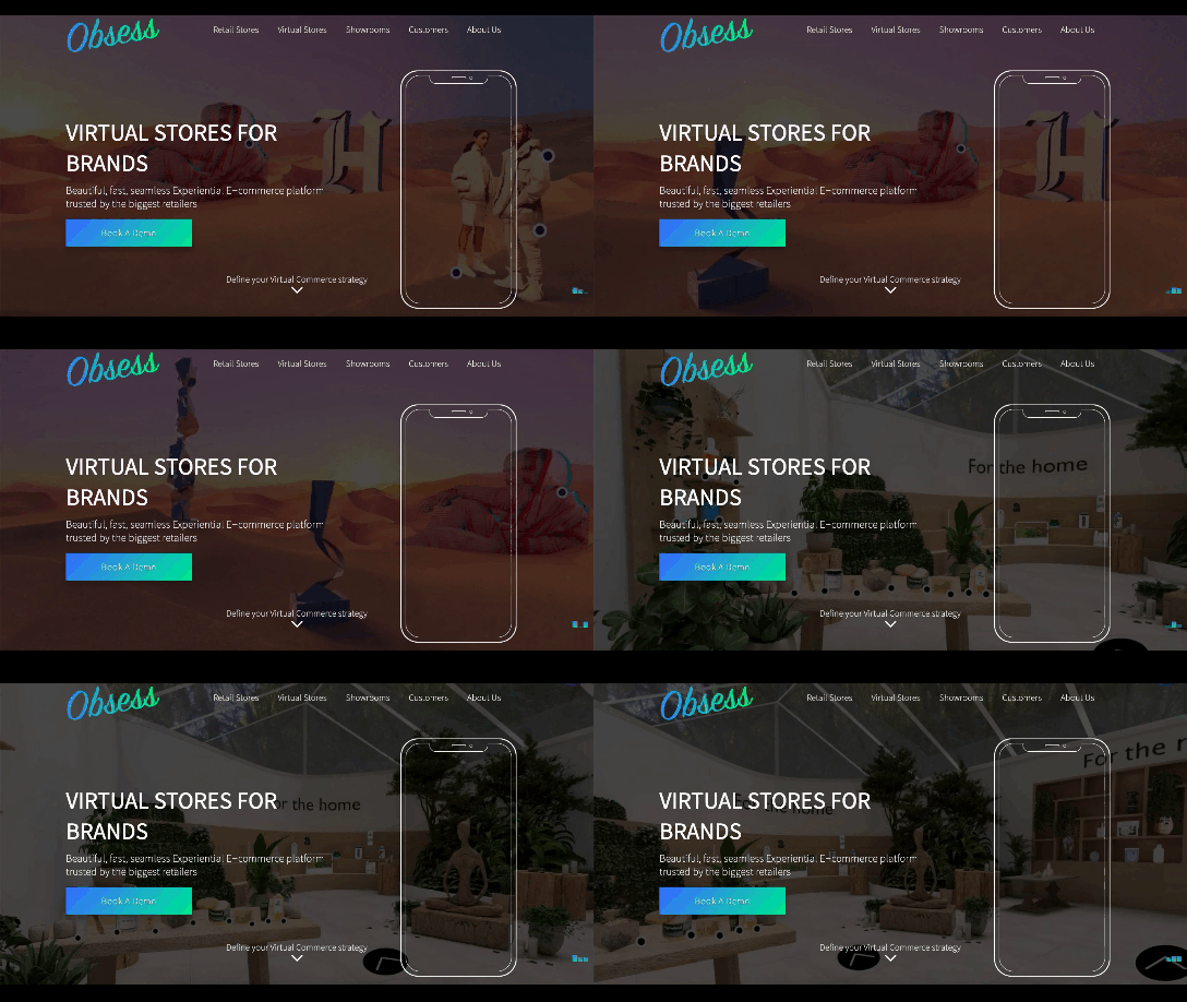
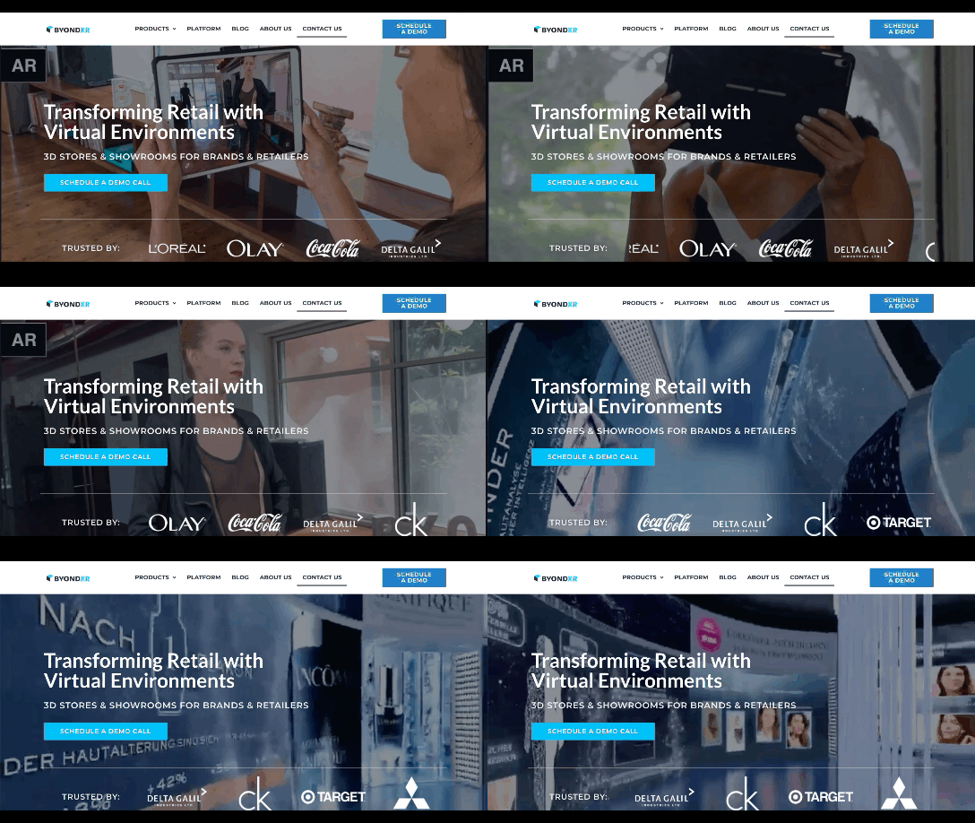
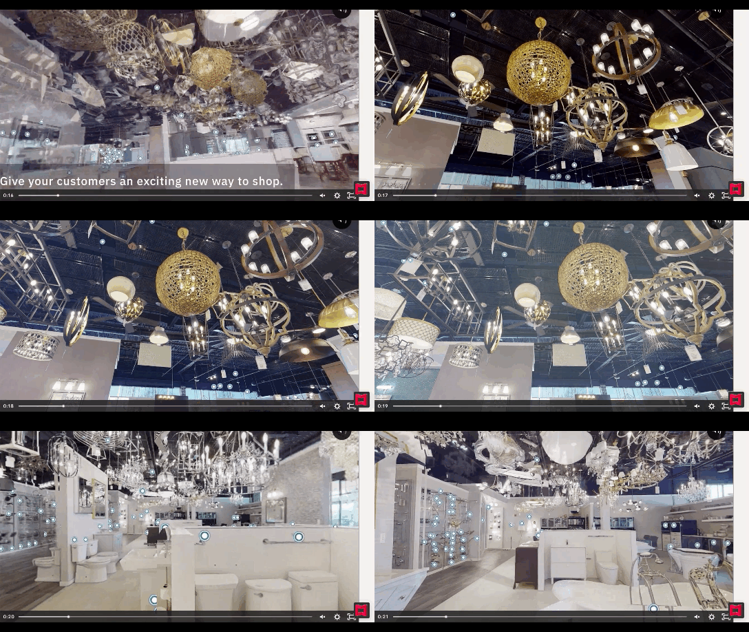
We’re starting to see signs of them already — many of them spurred on thanks to the events of 2020. Below, we’re going to explore what’s going on with these new ecommerce trends and technologies and take a look at a bunch of sites that are setting really cool examples for each.

1. Experiential Shopping

With many stores, either closed to in-person shopping during the pandemic or their capacities severely limited, online shopping and BOPIS became much more attractive options for consumers.

That said, buying something like a pair of jeans or a new pair of glasses is much different than the pack of toilet paper someone’s bought for years. There are just some things you have to try to know if you’re going to like it and make sure it fits.

Augmented reality and other immersive shopping tools are bringing those “try-on” capabilities to people’s homes.

There are a number of technologies built specifically for this purpose:

Obsess is a particularly noteworthy one. It’s an ecommerce platform that enables retailers to build virtually immersive shopping experiences. Charlotte Tilbury is one such retailer that is taking advantage of it.

Obsess, the augmented reality and immersive shopping experience platform

At the end of 2020, Obsess announced that it had received $3.4 million in seed funding, so expect to see more Obsess-powered ecommerce sites and apps.

ByondXR is another platform that empowers brands to design immersive experiences for online shoppers:

ByondXR helps brands create experiential shopping

Retailers like Lancome, Procter & Gamble, and Calvin Klein have used ByondXR’s immersive commerce technology.

Another option is offered by Matterport:

Matterport's virtual shopping experiences and 3D store mapping tech

This technology is interesting as you’re not just creating a virtual store. You can also design a 3D model of a brick-and-mortar shop that in-store shoppers can use to get in and out quickly.

2. Virt-ical Worlds

There’s a new trend brewing, and we see it most commonly on websites for fresh and youthful brands. I wouldn’t say it’s nostalgic design, per se, though there are certainly some elements reminiscent of the bold, in-your-face style of the web in the late ‘90s and early ‘00s.

No, I think what we see here is a creative reimagining of our world.

With so many people having spent time in their homes and with their faces glued to screens, there’s been a blurring between our VIRTual and physICAL worlds. This new web design trend is one I’m going to call the Virt-ical World. While parts of these sites look like the websites we’ve designed in years past, there are motion, color, and sizing elements that feel more like a trippy virtual simulation.

Let’s look at some examples.

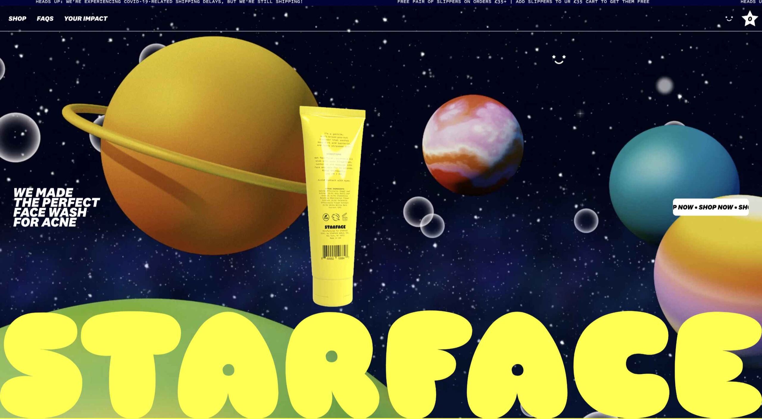
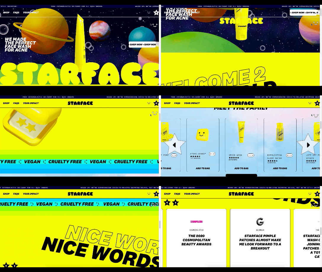
Starface is a company that creates acne-fighting products.

Starface's in-your-face website design

This is one of the more experimental designs in this set of examples. Still, it’s one that shows us how far the boundaries can be pushed without totally compromising the online shopping experience.

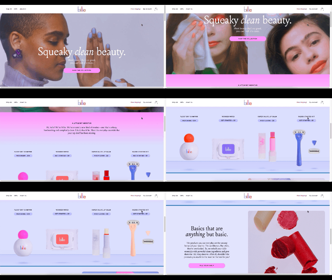
Billie is another company having fun with this trend. I’d say this is on the opposite end of the spectrum.

Billie has a fun, candy-colored website design

For the most part, this ecommerce site looks similar to other small retailer sites. However, the fun, candy-colored palette, the bobbing products, and the color shifts add a somewhat surreal element to the design.

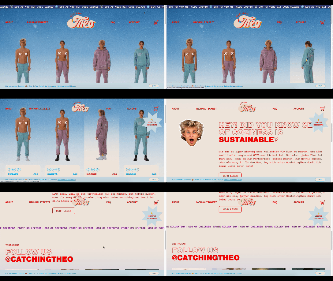
Catching THEO is another ecommerce brand playing around with this Virt-ical World.

Catching THEO mixes nostalgia and modern design

See what I mean by this style feeling somewhat nostalgic? Thankfully, this site commits to today’s good, clean, responsive design while only using some of the more fun and quirky elements from the past.

Au Naturale Models

When I talk about au naturale models, I’m really referring to the makeup-less faces, relaxed hairstyles, and casual apparel that we’re seeing ecommerce models don these days.

I think it’s safe to say we have the pandemic to thank for this. And it’s not just because many of us took a more casual approach to getting dressed during the week. It’s also because the pandemic wiped away the glitz and glamour from many of our lives.

I don’t know about you, but it was kind of nice seeing fewer Instagram influencers flaunting their luxurious lifestyles and more real people rocking their matching pajama sets. I think brands have sensed this change in mood over the last year, and they’re now putting forward their own simple and casual styles for us to connect to.

There are tons of ecommerce websites we’re seeing this on in 2021.

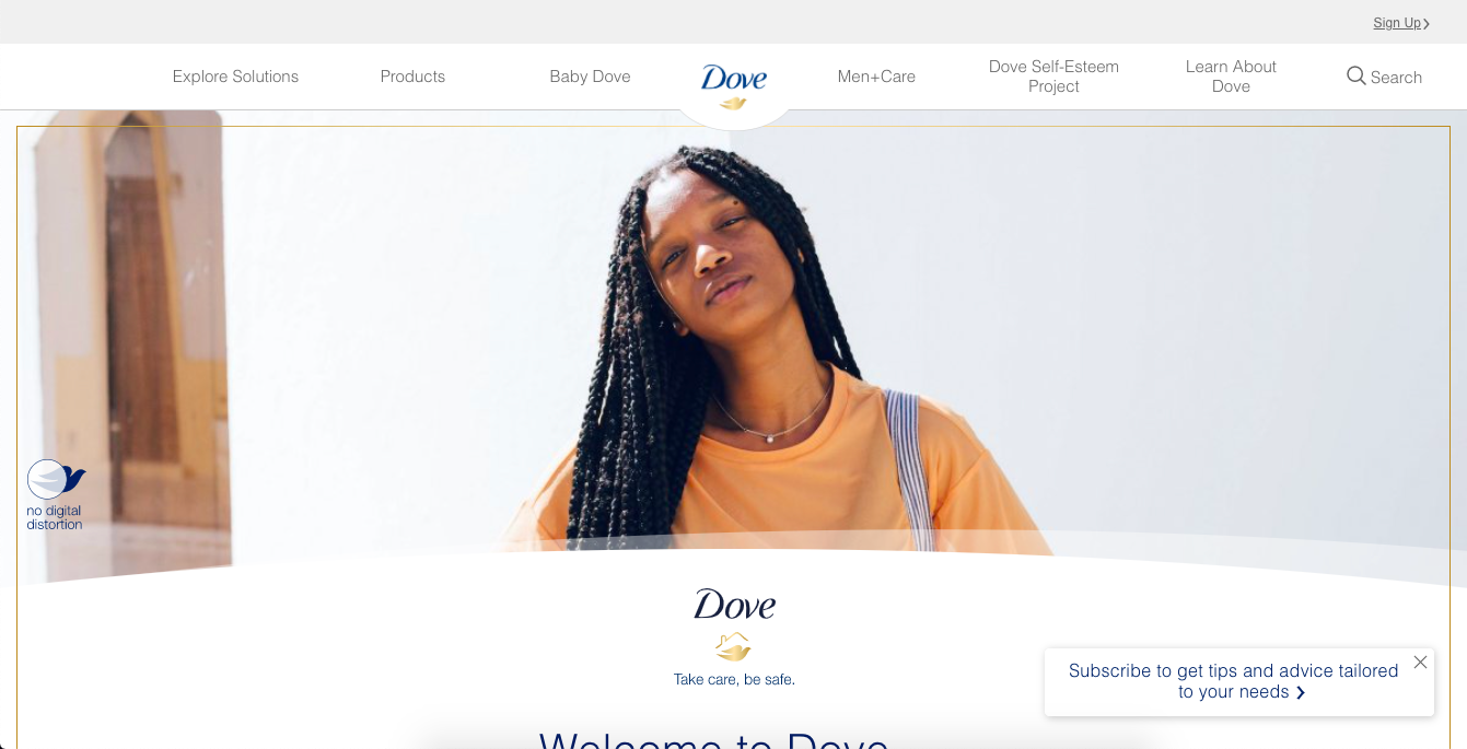
Here’s Dove’s homepage, where they specifically call attention to the lack of digital distortion in the photo:

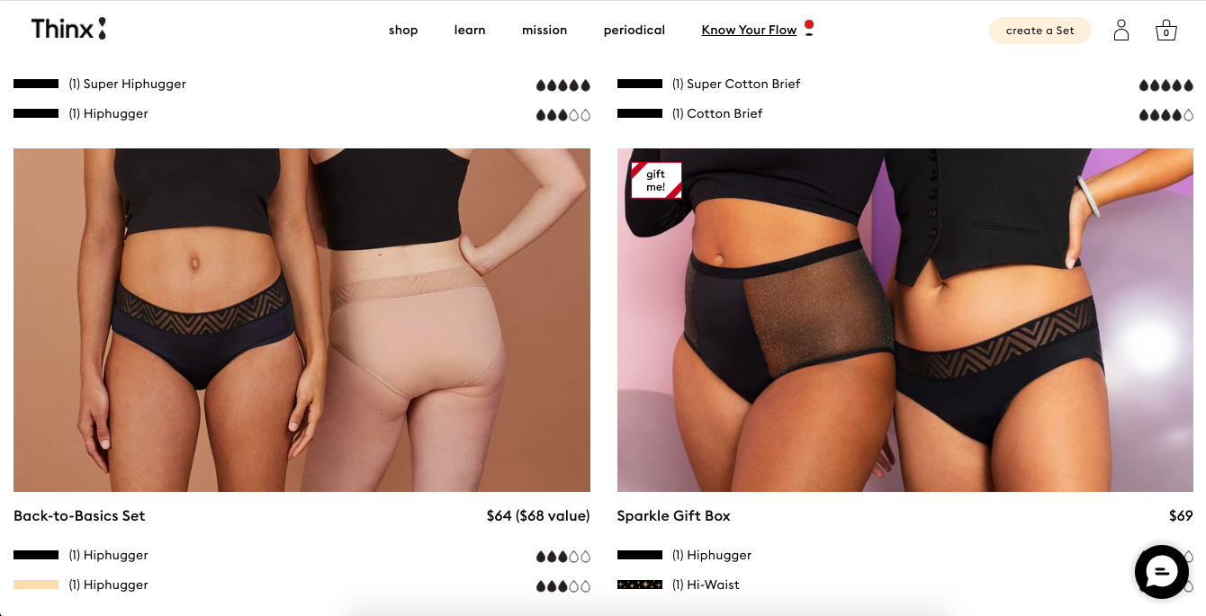
Thinx also uses more natural and realistic-looking models to show off its undergarment products:

Madison Reed takes a unique approach with this trend:

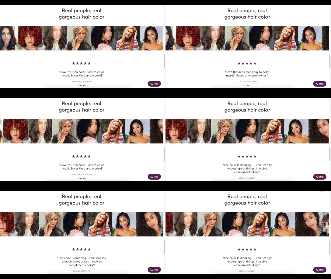
Madison Reed shows off some of the real faces of its customers

While the hair color brand does a great job of using diverse models around the site, it also has this scrolling bar showing off its customers’ very natural and real faces.

Wrap-Up

It feels like ecommerce trends and technologies are changing at a rapid pace these days. To help you stay on top of what’s new in ecommerce, stay tuned to this blog for more interesting news and changes to the landscape.

Source

The post What’s New in Ecommerce, February 2021 first appeared on Webdesigner Depot.


Source de l’article sur Webdesignerdepot

If you’ve read our piece about the habits engineers need to beat tech debt, you might recall Conway’s law, which states that organizations which design systems […] are constrained to produce designs that are copies of the communication structures of these organizations.

It’s one of the forces that can push us towards technical bankruptcy because the systems designed by software engineers are constrained by their company’s organizational structure, over which they have little control. The right way to fight these forces is to talk about tech debt across the whole company so that everyone can understand why it’s vital to manage it carefully.

Source de l’article sur DZONE

Every week users submit incredible stories to our sister-site Webdesigner News. Our colleagues sift through it, sorting the wheat from the chaff, and then post it for us to relish.
If you want to keep up with the latest news for web designers, the best way is to check out the Webdesigner News site. However, if you missed a day, here’s a useful compilation of the top curated stories from the past week. Enjoy!

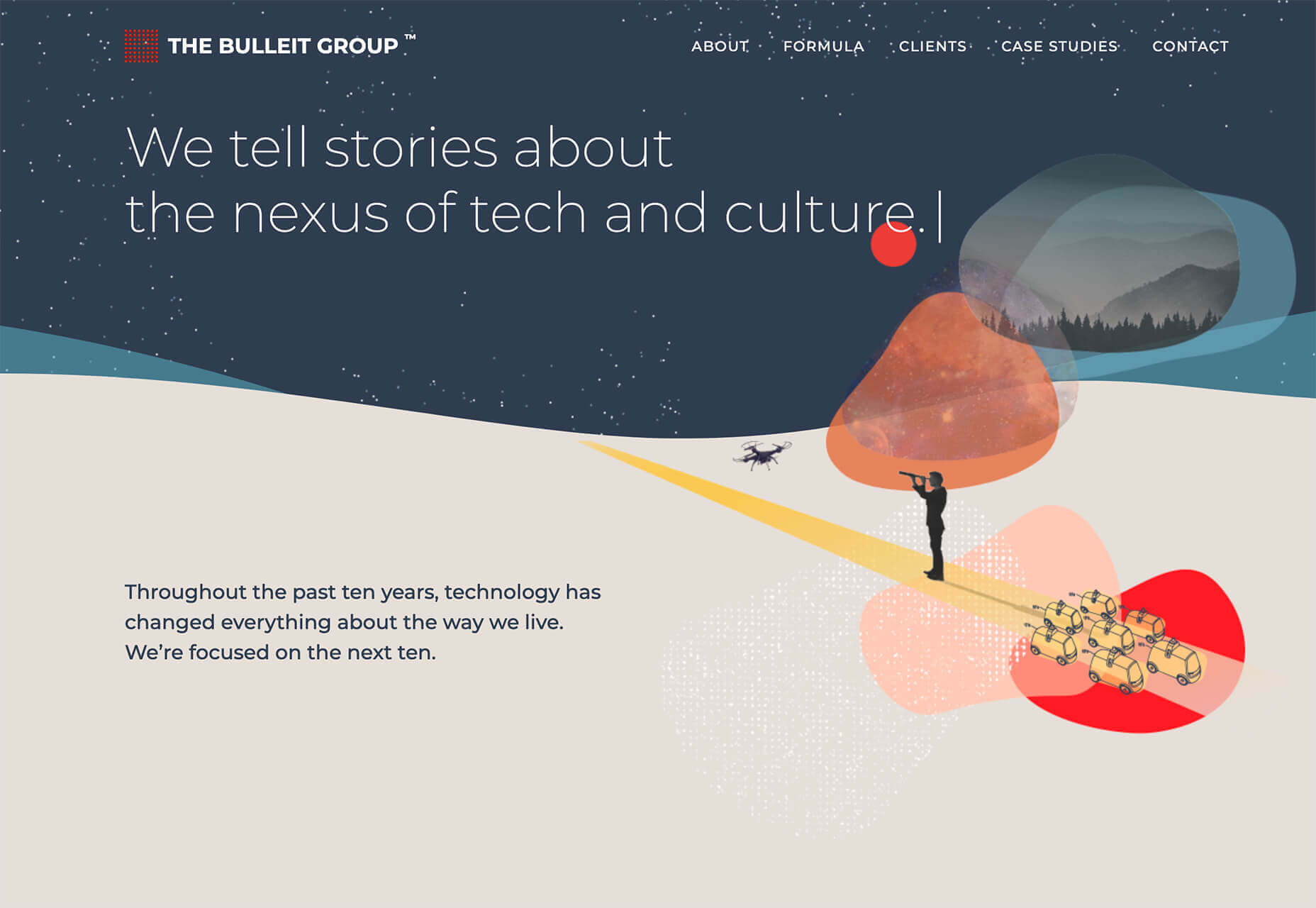
3 Essential Design Trends, February 2021

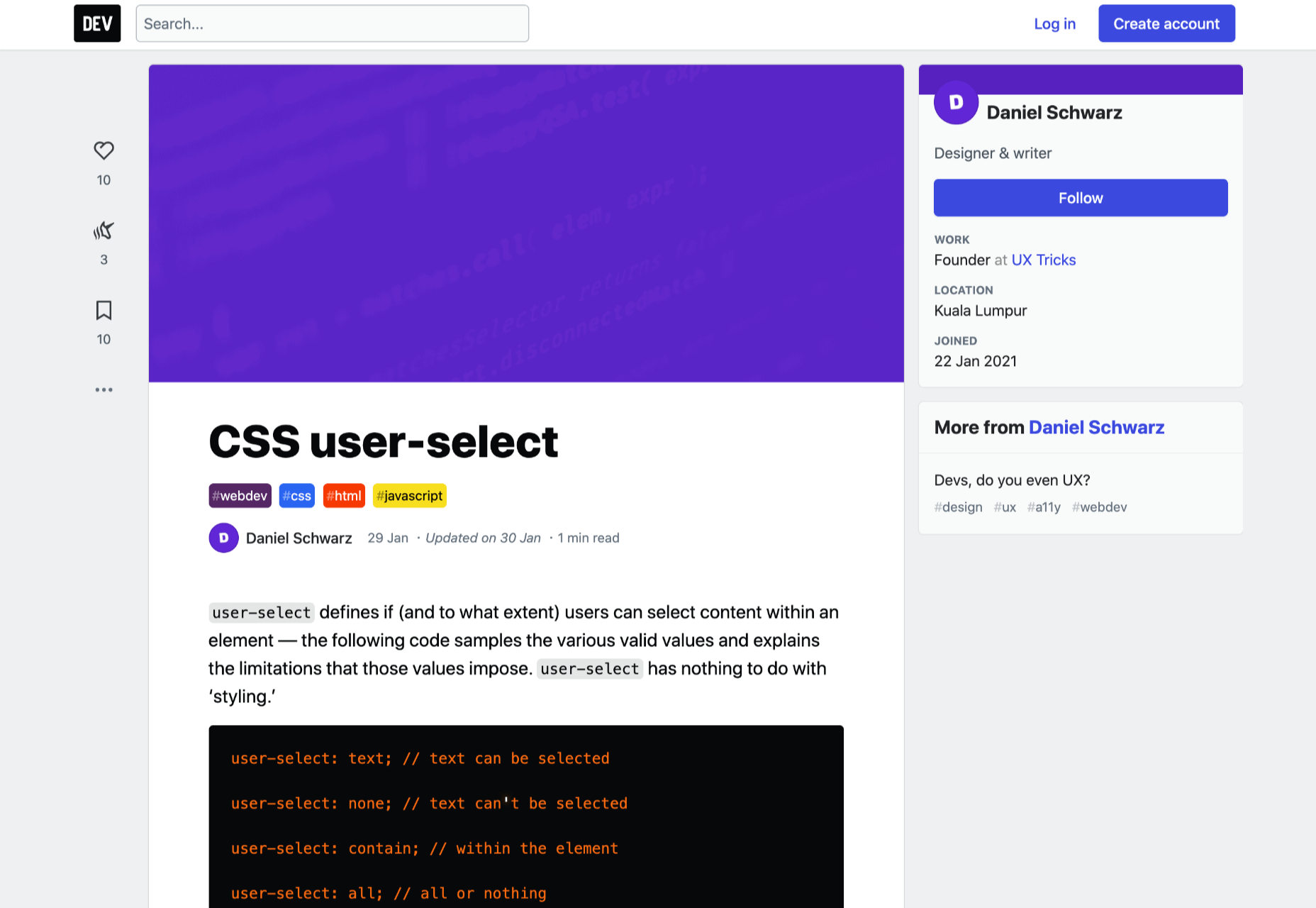
CSS user-select

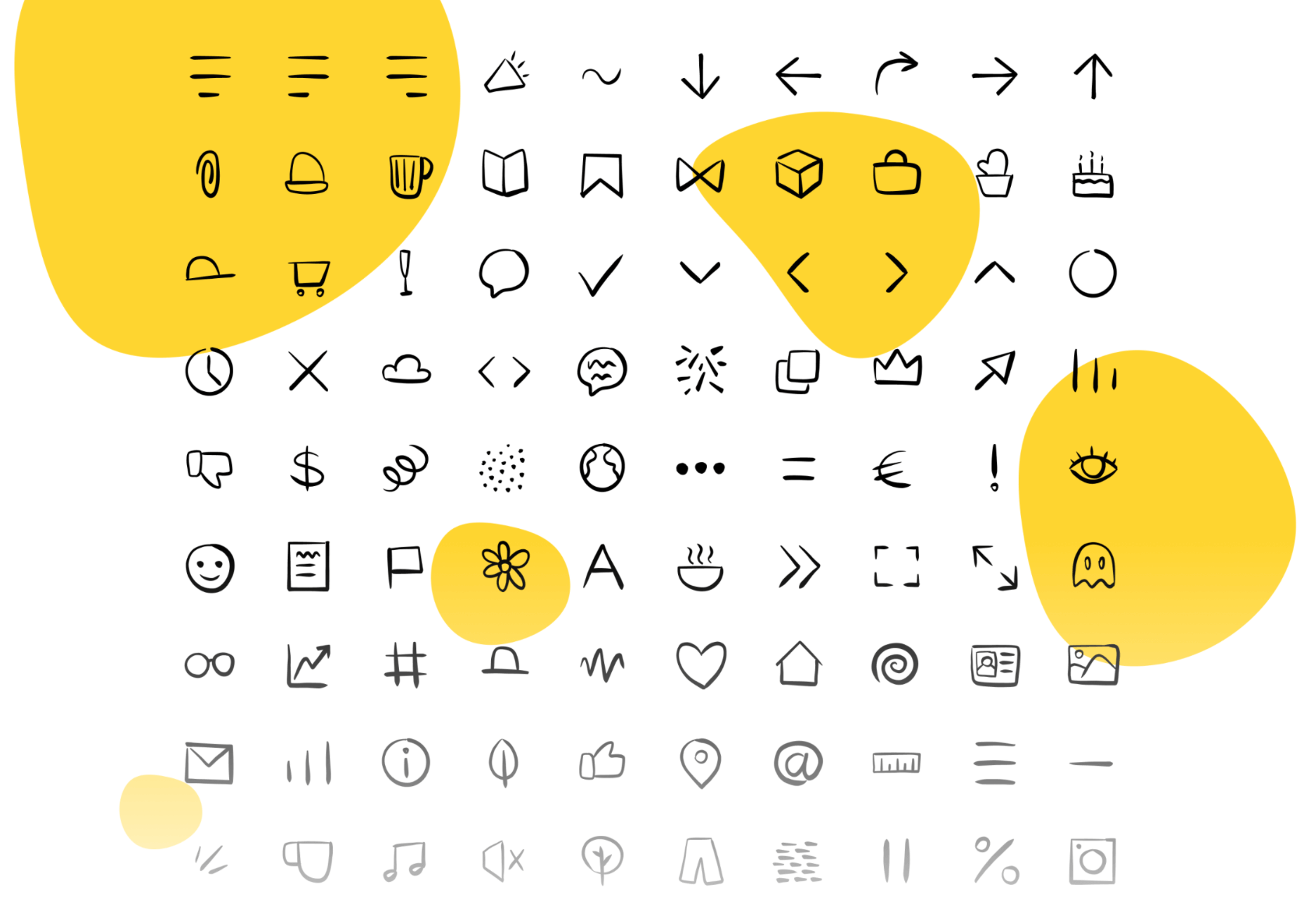
100+ Hand-Drawn Icons

Luxa CSS

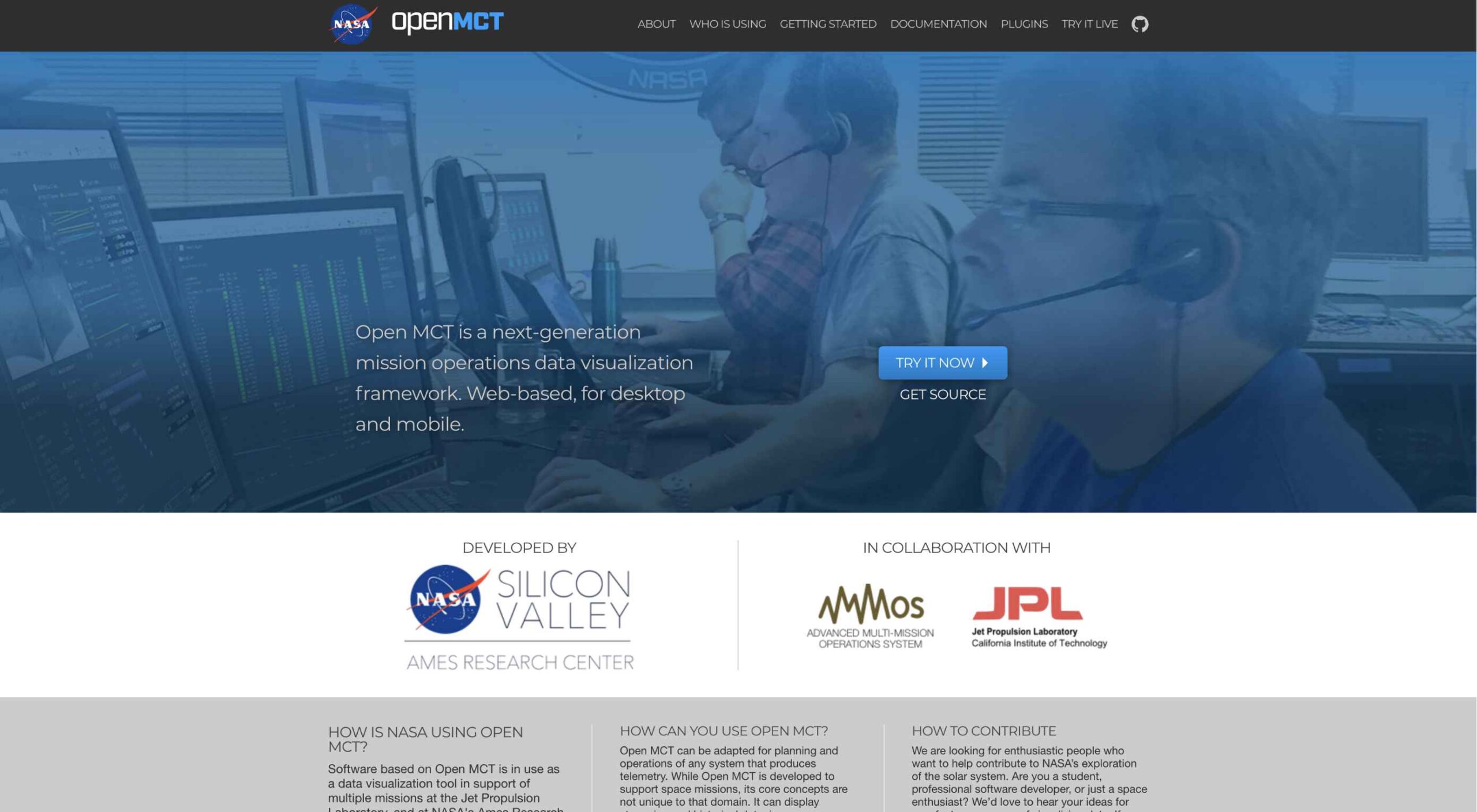
Open Source Mission Control Software from NASA

Source

The post Popular Design News of the Week: February 1, 2021 – February 7, 2021 first appeared on Webdesigner Depot.


Source de l’article sur Webdesignerdepot

Now, we have everything prepared and ready to go to a Kubernetes Cluster in a cloud provider. It is a fact that creating a cluster in any cloud provider manually is a difficult task. Moreover, if we want to automate this deployment, we need something that helps us in this tedious task. In this article, we will see how to create a Kubernetes Cluster and all of its required objects, deploying our Alexa Skill with Terraform using Google Kubernetes Engine.

Pre-Requisites

Here, you have the technologies used in this project:

Source de l’article sur DZONE