
 Designing for user experiences is what all designers do. UX is often thought of as the preserve of app or web designers; however, even a print designer laying out a magazine anticipates reader reaction to the scale of type, the placement of adverts, and the art direction of successive stories.
Because all designers design user experiences, the role of UX Designer has come to mean someone focused on creating a product or service utilizing research and testing to guide decision-making.
To research and test anything, you need metrics: a baseline and a target against which to measure. No one set of metrics is suitable for all projects, but because UX tends to be for financial profit, the Pirate Metrics Framework — Acquisition, Activation, Retention, Referral, Revenue — is a good starting place.
You might seek out very different metrics in some cases. For instance, a museum might measure the success of its education program based on how many students go on to study paleontology. However, those types of metrics are notoriously difficult to quantify. Excepting a few niche cases, successful UX increases user productivity, decreases errors, reduces the cost of support, and increases sales.
So if it’s as easy as counting dollars, why does UX go bad?
UX vs. Design Principles
To understand what UX is, you need to understand what UX is not.
One of the most straightforward design principles to understand is hierarchy: bigger is more important, i.e., a heading is visually stronger than a sub-heading, a sub-heading is visually stronger than the body text.
Design principles stem from one thing: human-centered design. At the most basic level, bigger is more important because the bigger a saber-toothed tiger appears, the more likely it intends to eat me.
The evolution of human beings is so slow that had a smartphone existed at the time, a neanderthal would have been able to tap a button with the same level of precision as me. Prehistoric man shares the same minimum button size as modern man: 48 x 48px. Design principles don’t change, don’t require research, and don’t need verifying with tests.
On the other hand, a neanderthal would not have understood a smartphone, let alone an app. You only need to step back by a single generation to find perfectly intelligent people baffled by a commonly employed design pattern.
Unlike design principles, user experience is a house built on sand. When the sand shifts, the walls crack. The bricks are still solid, but the rain gets in.
Because effective UX is temporary, so is the ROI.
Technology Breaks UX
Technology unfolds at a rapid pace. As technology develops, the user experience defined by that technology changes.
The classic example is the mobile revolution, but technological change does not necessarily mean hardware. One of the most significant shifts in UXD (User Experience Design) in my career has been the popularisation of AJAX — the process of using JavaScript to load new data without refreshing the page. This seamlessness has been around since the early 2000s, but it’s only in the last ten years, as the code to achieve it has simplified, that it’s been widely used.
Jakob’s Law states that users spend most of their time on other sites and, as a result, prefer your site to function like other sites by following familiar design patterns.
Even if your UX is rigorously tested and optimized, when other sites and services carry out their own research, they are testing against the background of younger technology, and the “other sites” Jakob Nielsen refers to begin to change. As a result, the UX of your site is gradually eroded.
The consequence of continual technological change is that user research is constantly invalidated. The UX of an app, site, or service begins to degrade as soon as it is created.
User-Experience Lifecycle
Human beings have two deep-seated motivations: survival and procreation. The most important, survival, depends on discovery — new food sources, new routes through dangerous territory, new ways to skin a mammoth. We are biologically programmed to seek out the new.
A typical user passes through three phases of a relationship with a site, app, or service: discovery > comfort > boredom. Churn, or drop-off, tends to occur in the discovery phase (if the comfort phase is too slow in developing) or the boredom phase. The sweet spot is the comfort phase. That’s the part of the business-customer relationship in which the customer requires minimal support and is least likely to drop off.
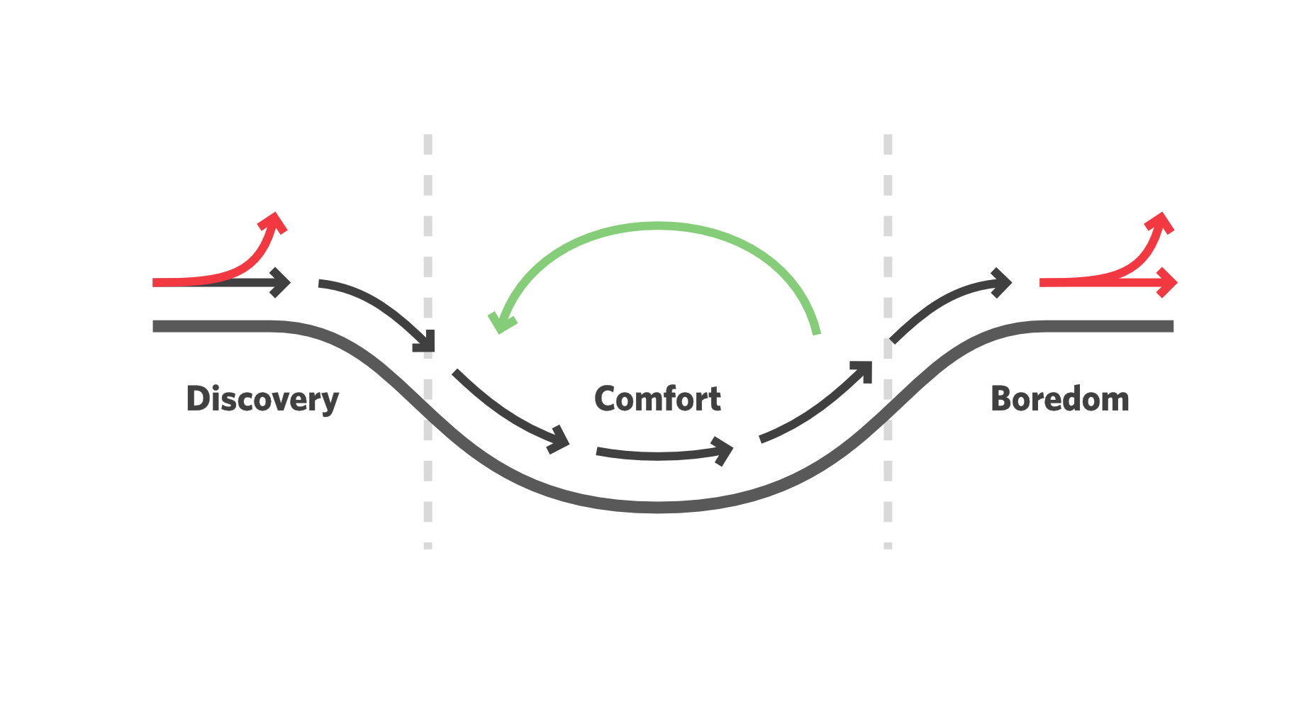
The most effective form of UX — meaning the one that satisfies most metrics — rapidly moves a user from discovery to comfort and then continually eases the user back to the start of the comfort phase without tipping back into discovery.
This can be achieved with numerous micro-discoveries, tiny chunks of new experience, from simple functionality tweaks to style revisions.
Summary
All UXD, regardless of the quality, level of investment, and skill of the practitioner, begins to degrade the moment it is created.
Design principles like simplicity are good indicators of successful UID (User Interface Design) and are timeless; comprehensive design systems, brand assets, and content offer good ROI.
The most effective UX is broadly familiar and continually refreshed in small ways, allowing users to enjoy the comfort of the familiar while also experiencing the excitement of discovery again and again.
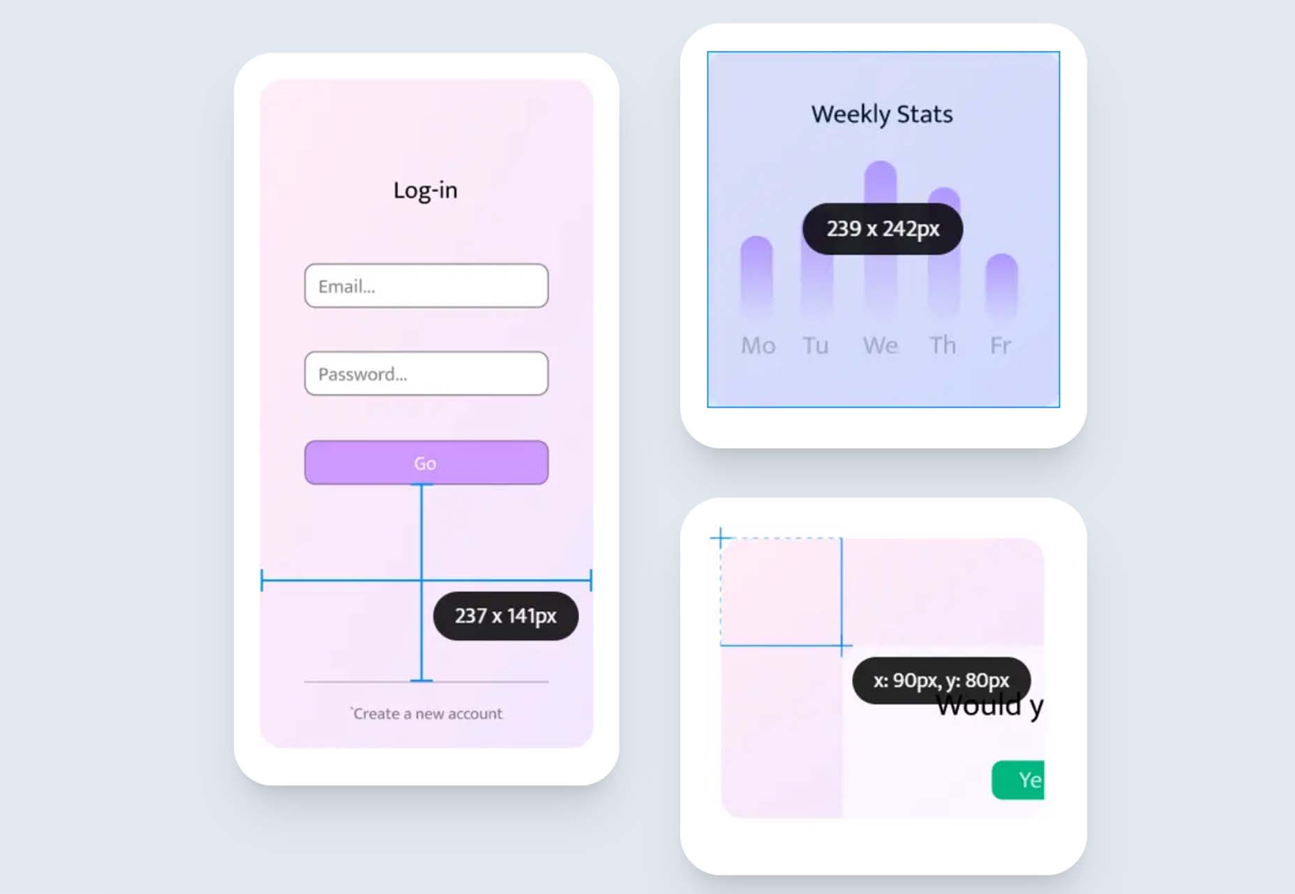
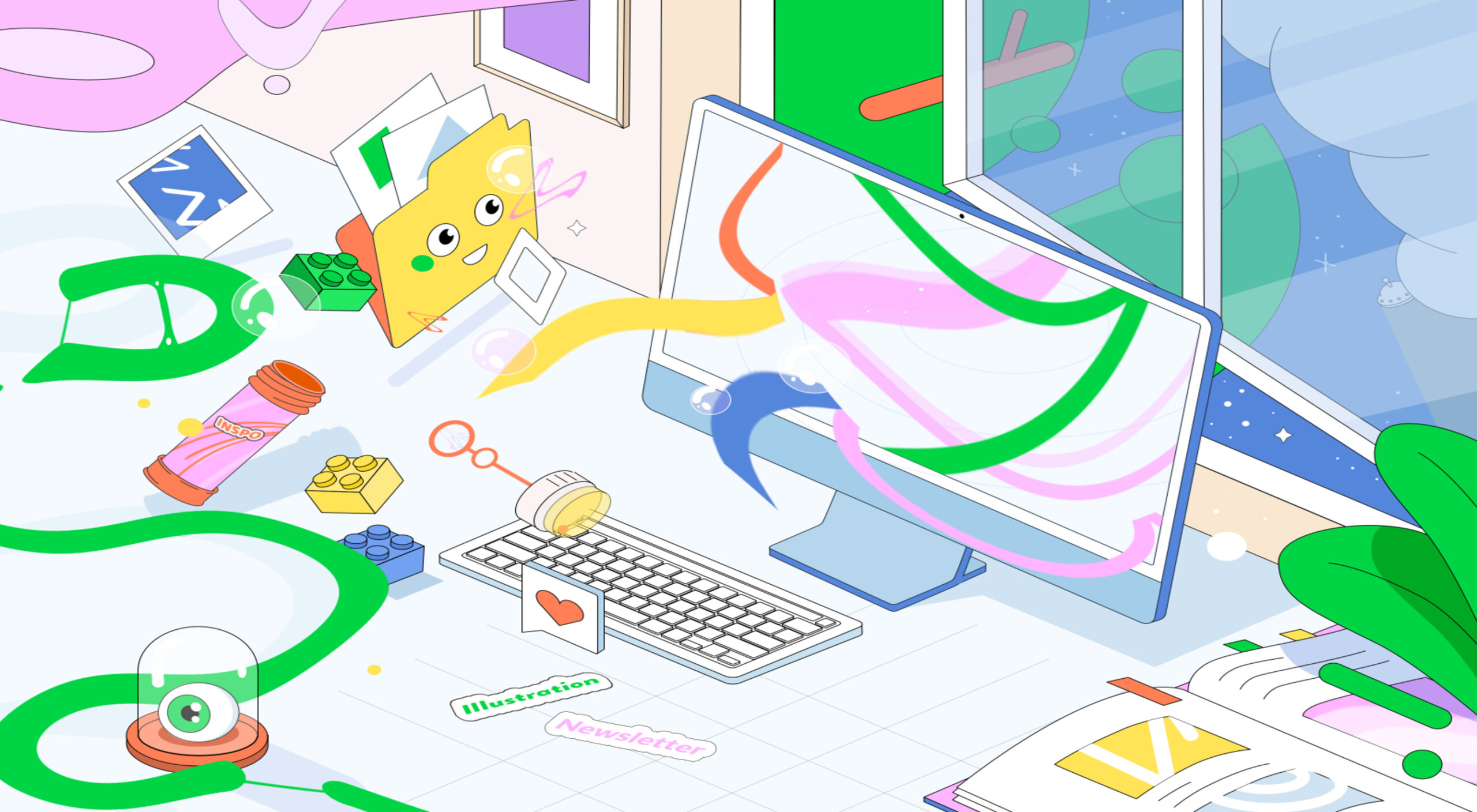
Featured image uses photos by Wolfgang Hasselmann & Shainee Fernando.
The post When UX Goes Bad (and How to Fix It) first appeared on Webdesigner Depot.
 Every day design fans submit incredible industry stories to our sister-site, Webdesigner News. Our colleagues sift through it, selecting the very best stories from the design, UX, tech, and development worlds and posting them live on the site.


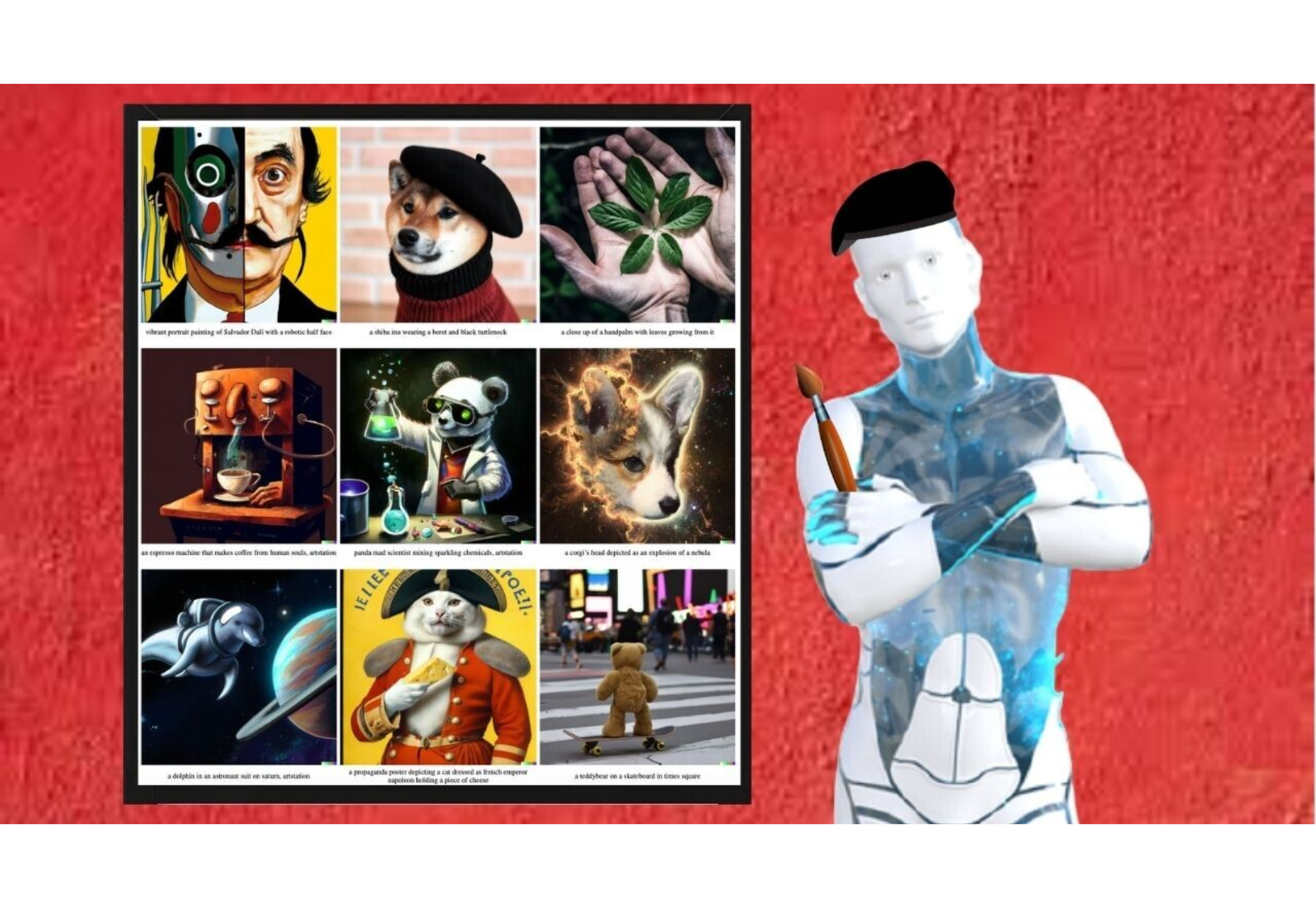


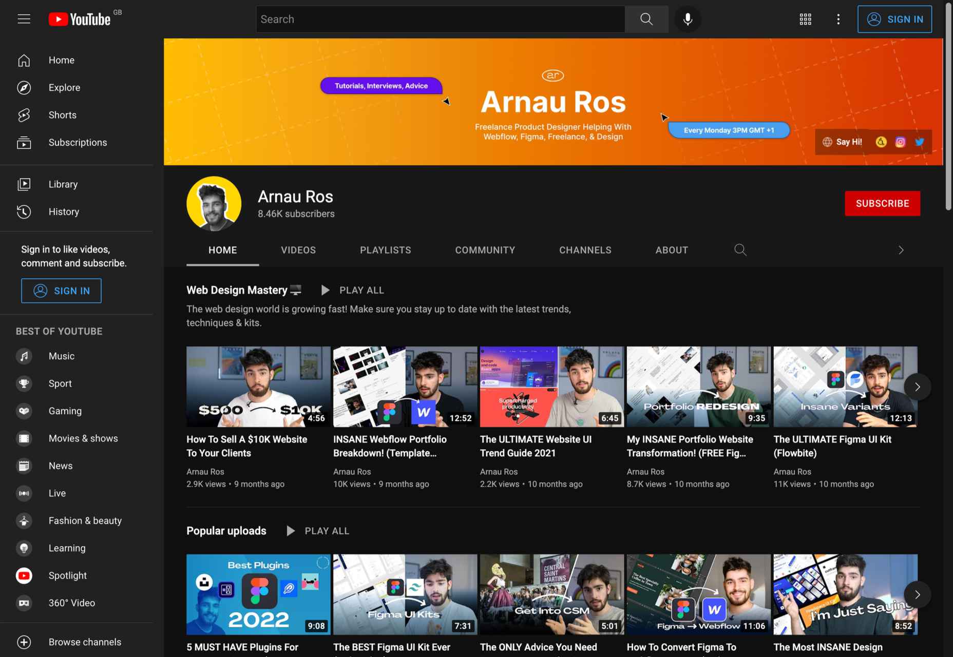
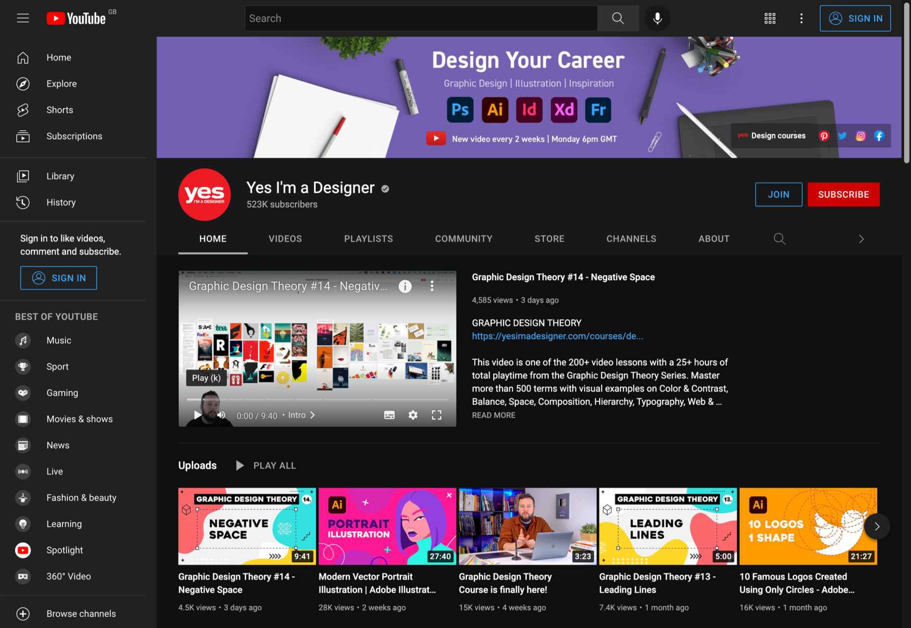
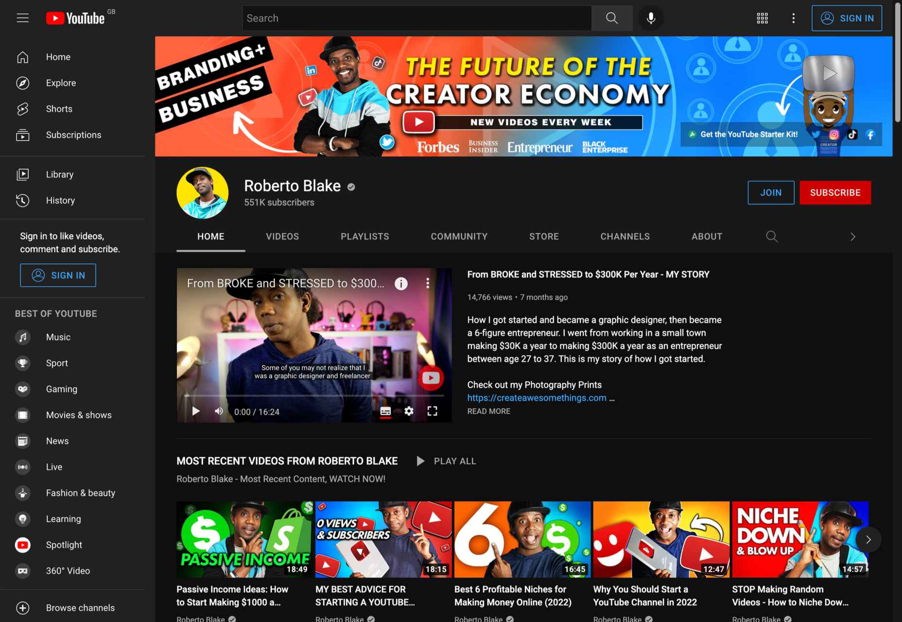
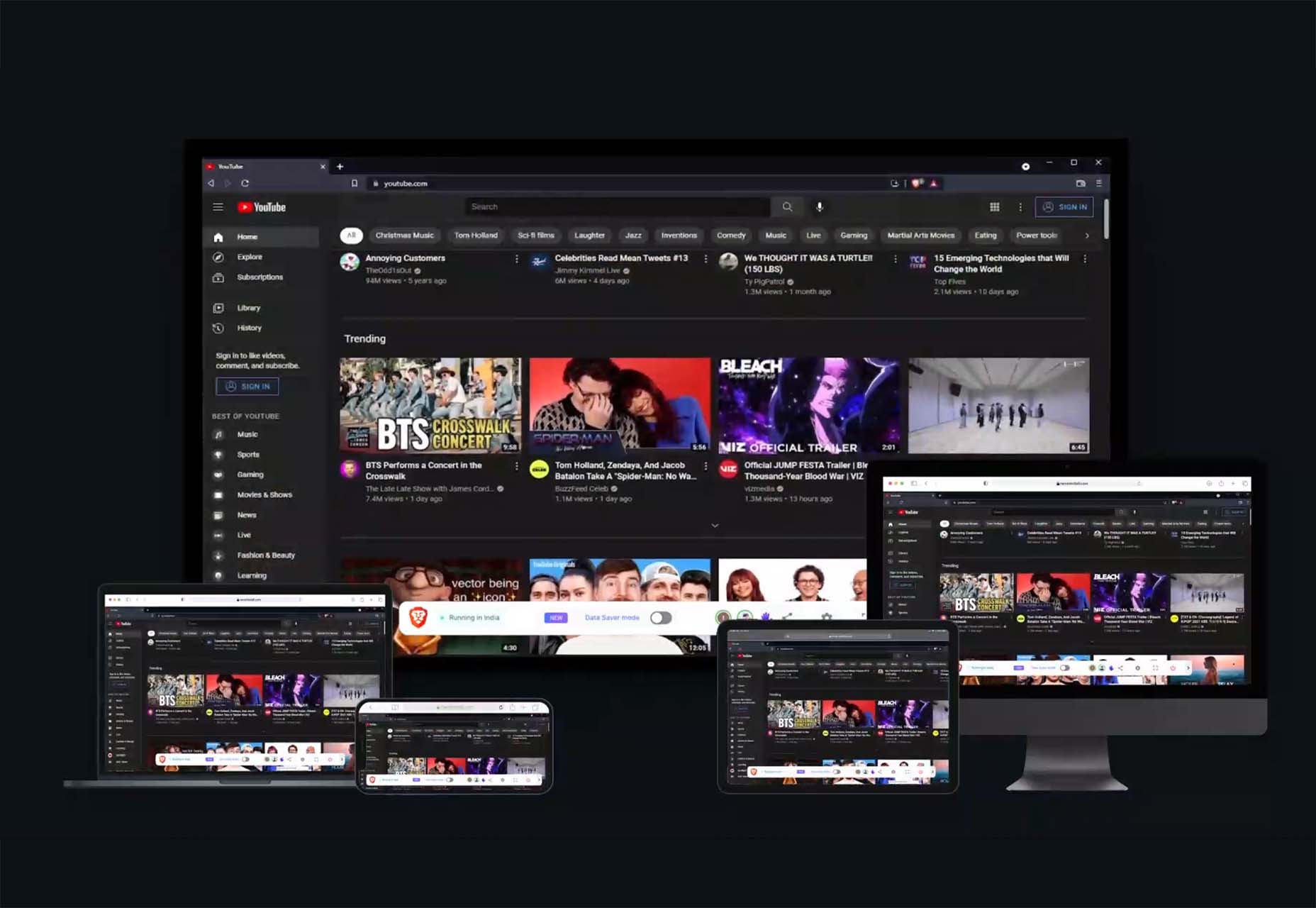
 Whether you are looking for comprehensive tutorials on UX design or professional courses on topics like logo design, video or photo editing, there’s the perfect YouTube channel for you as a designer.
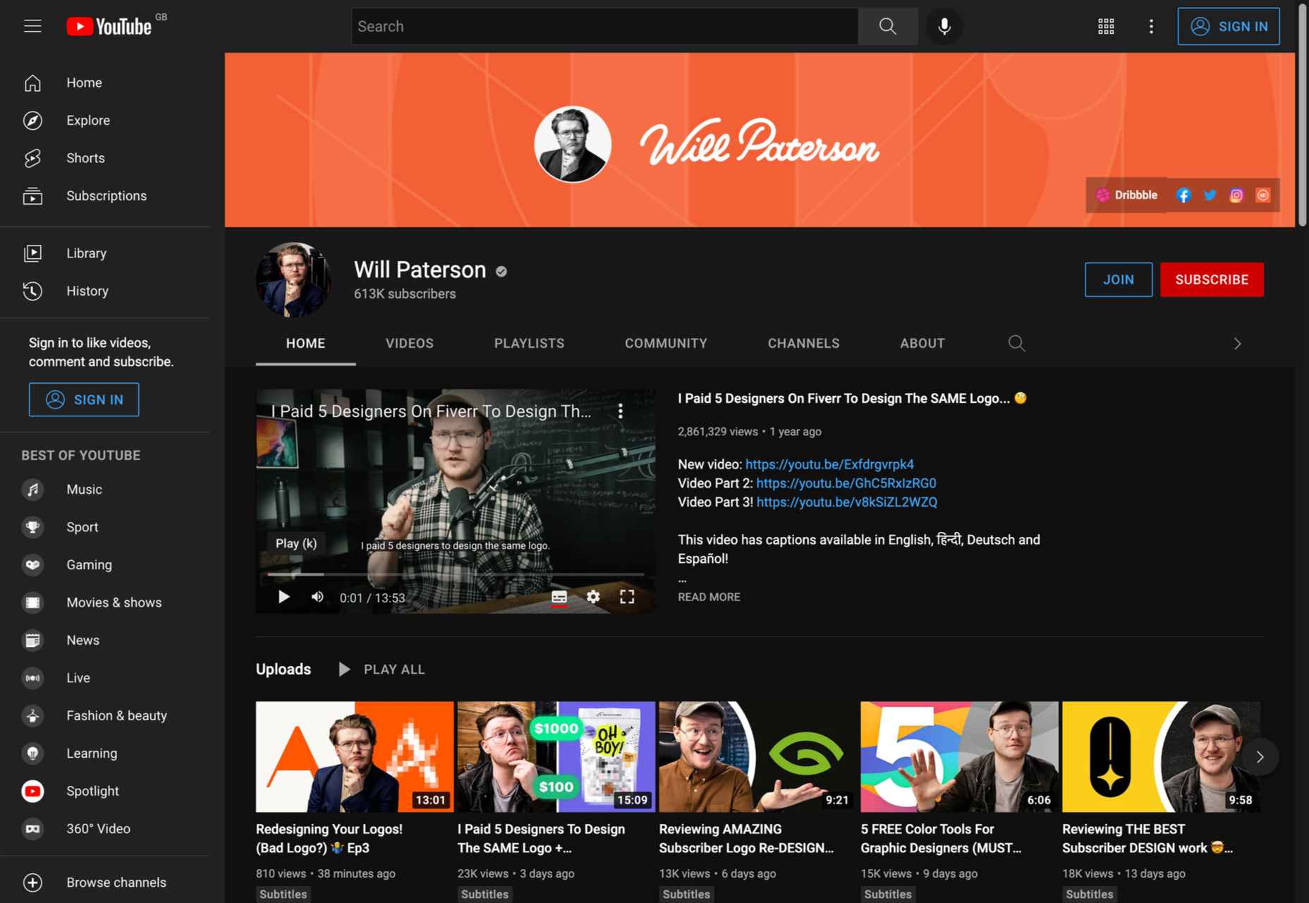


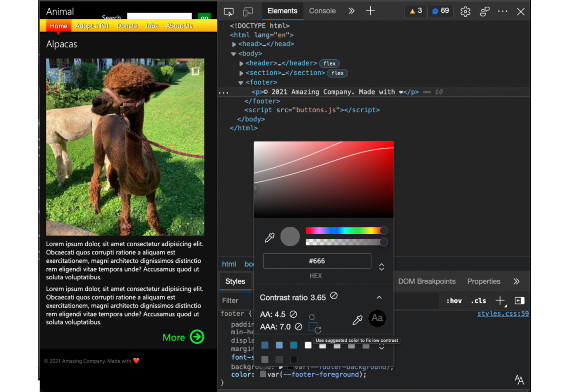
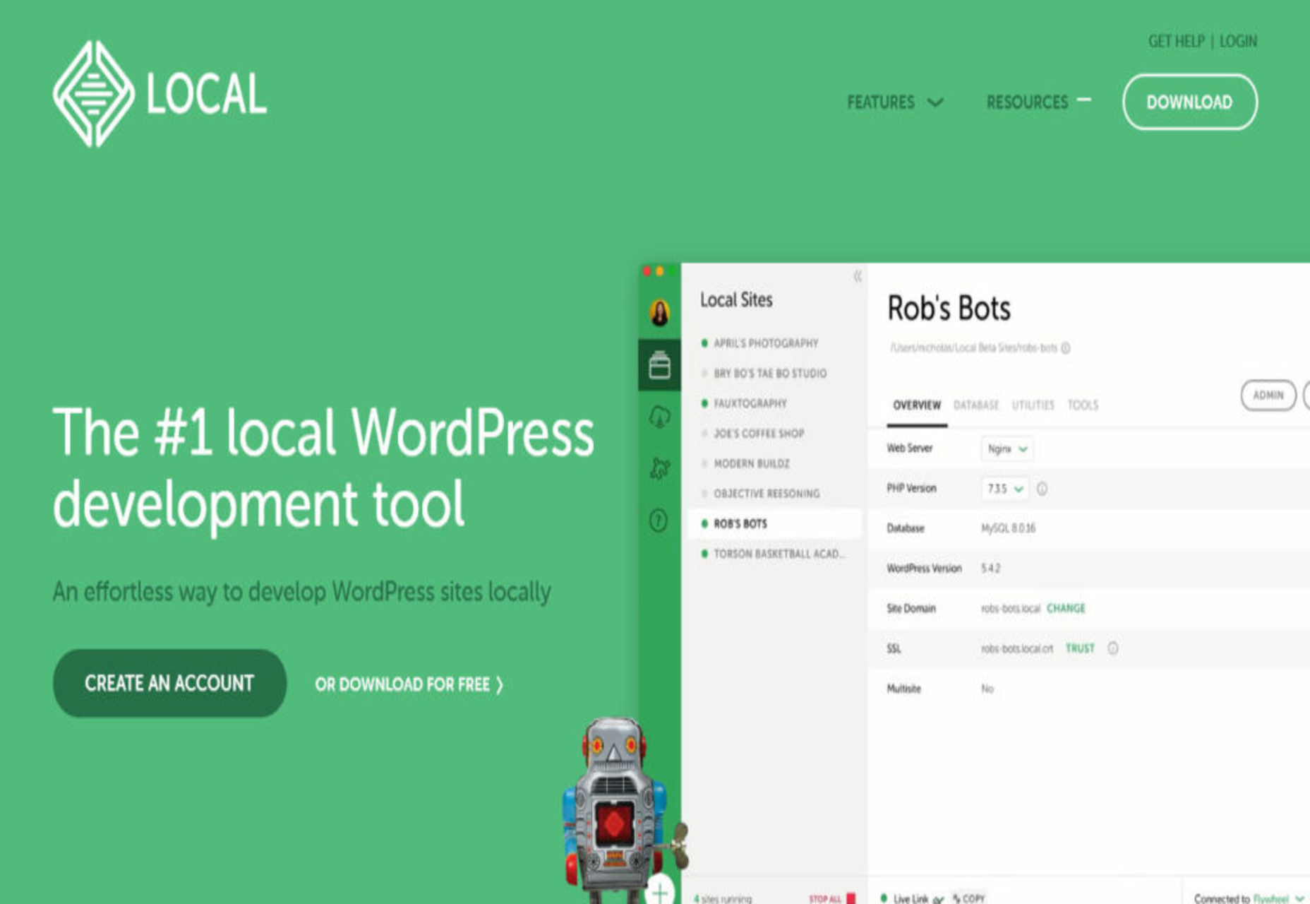
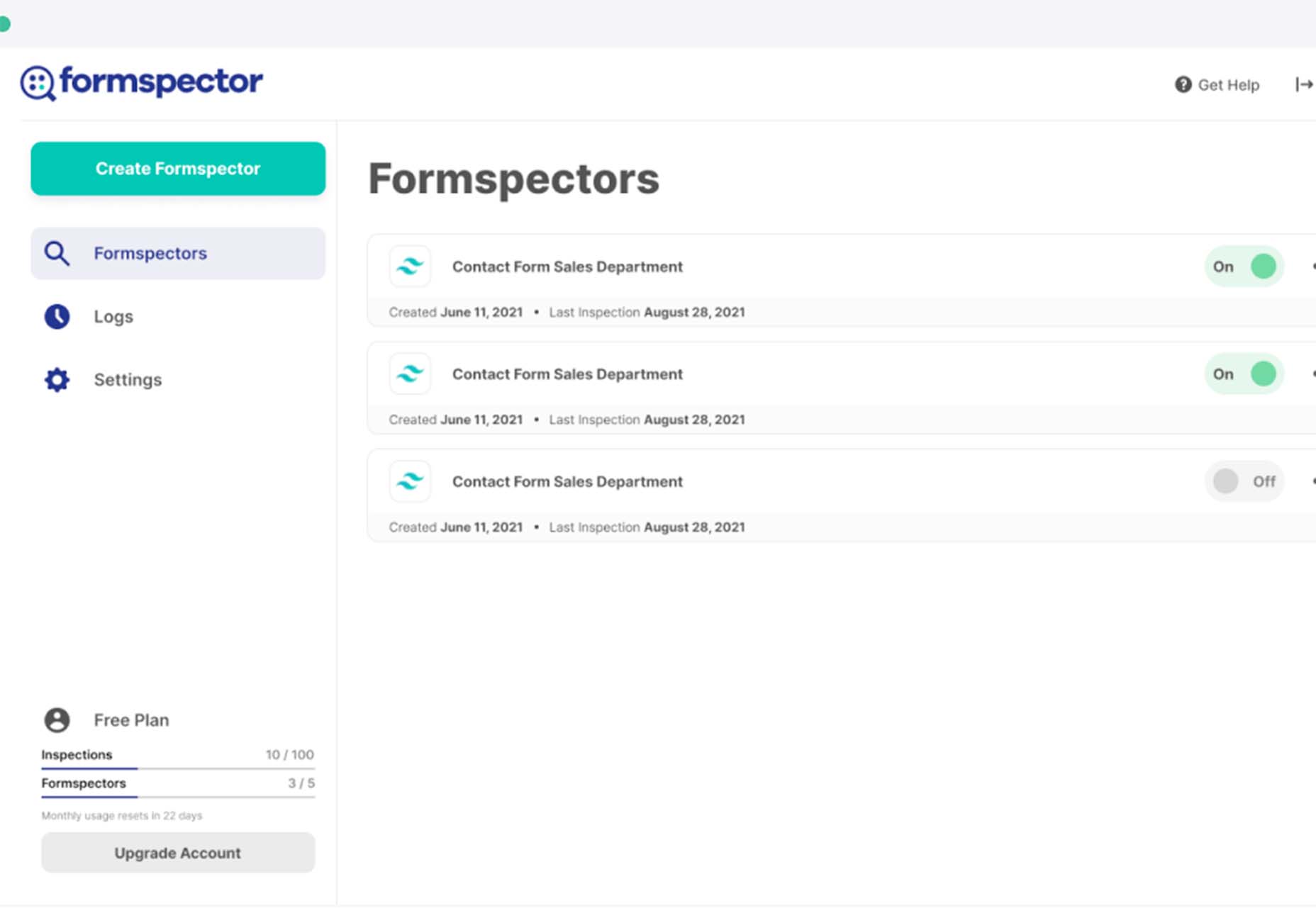
 Bored with the same old design tools? There are plenty of new toys to experiment with, from fun divots to functional design tools that could become your new go-to’s.


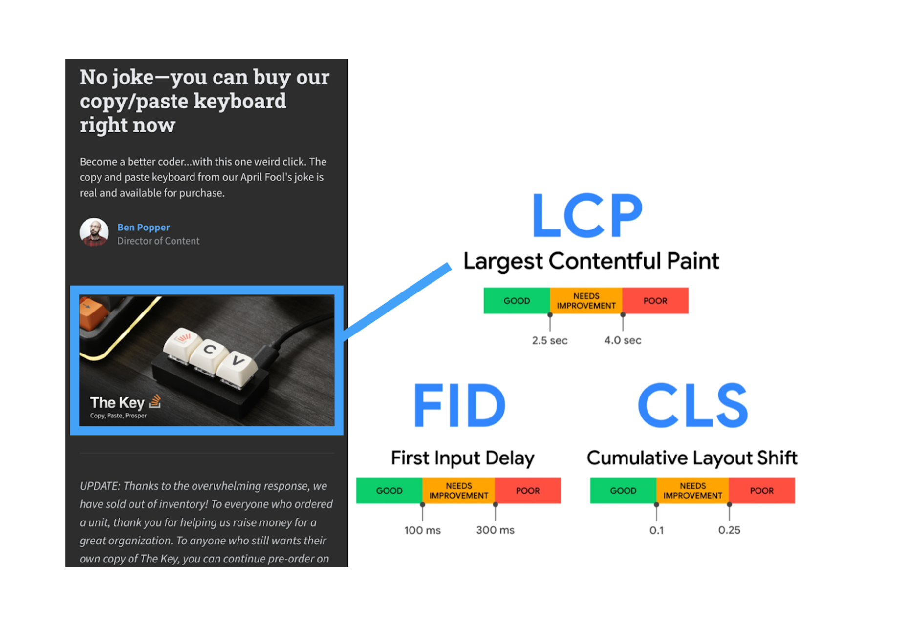
 Every day design fans submit incredible industry stories to our sister-site,


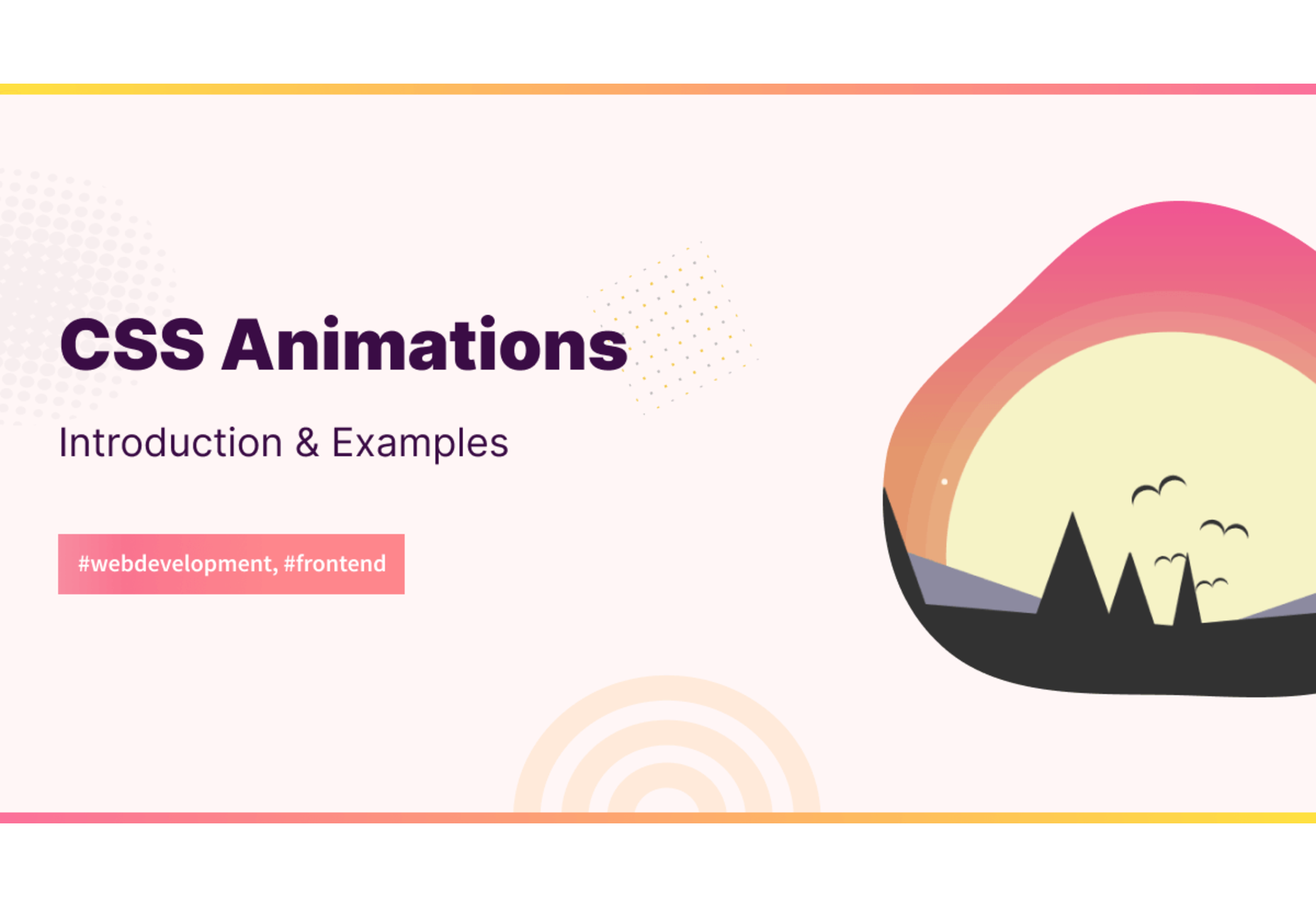
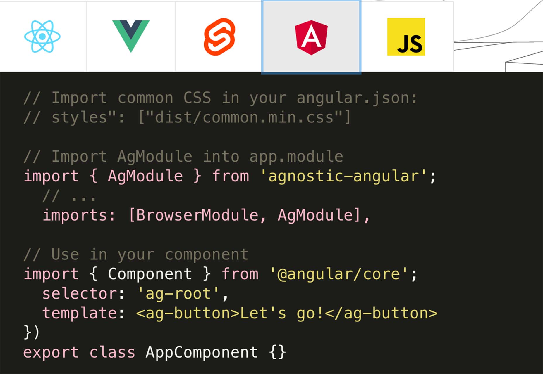
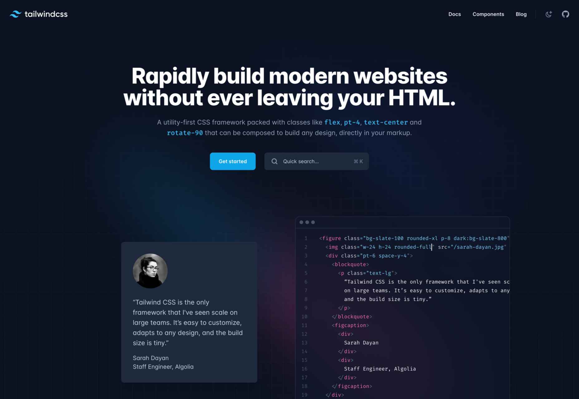
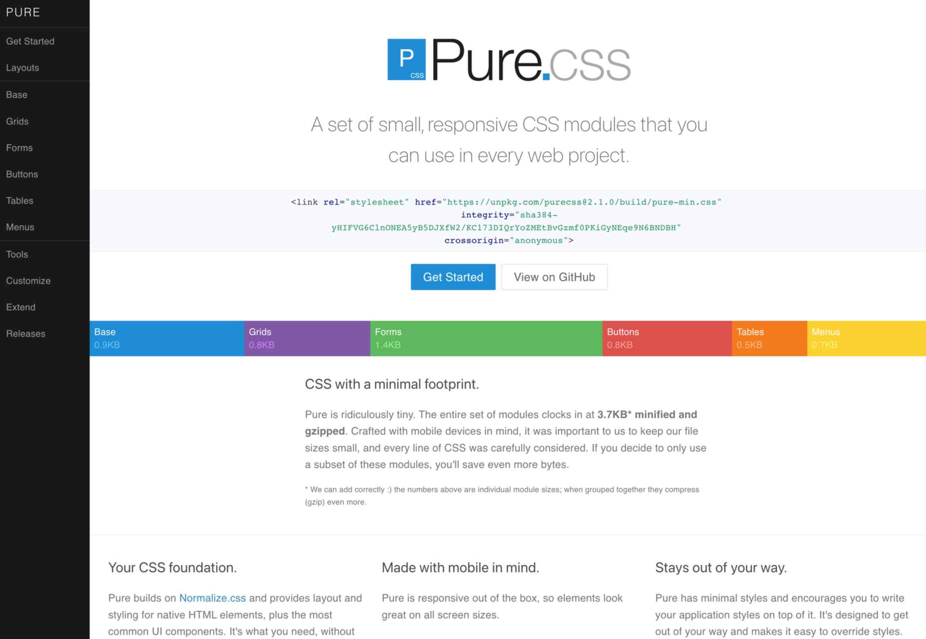
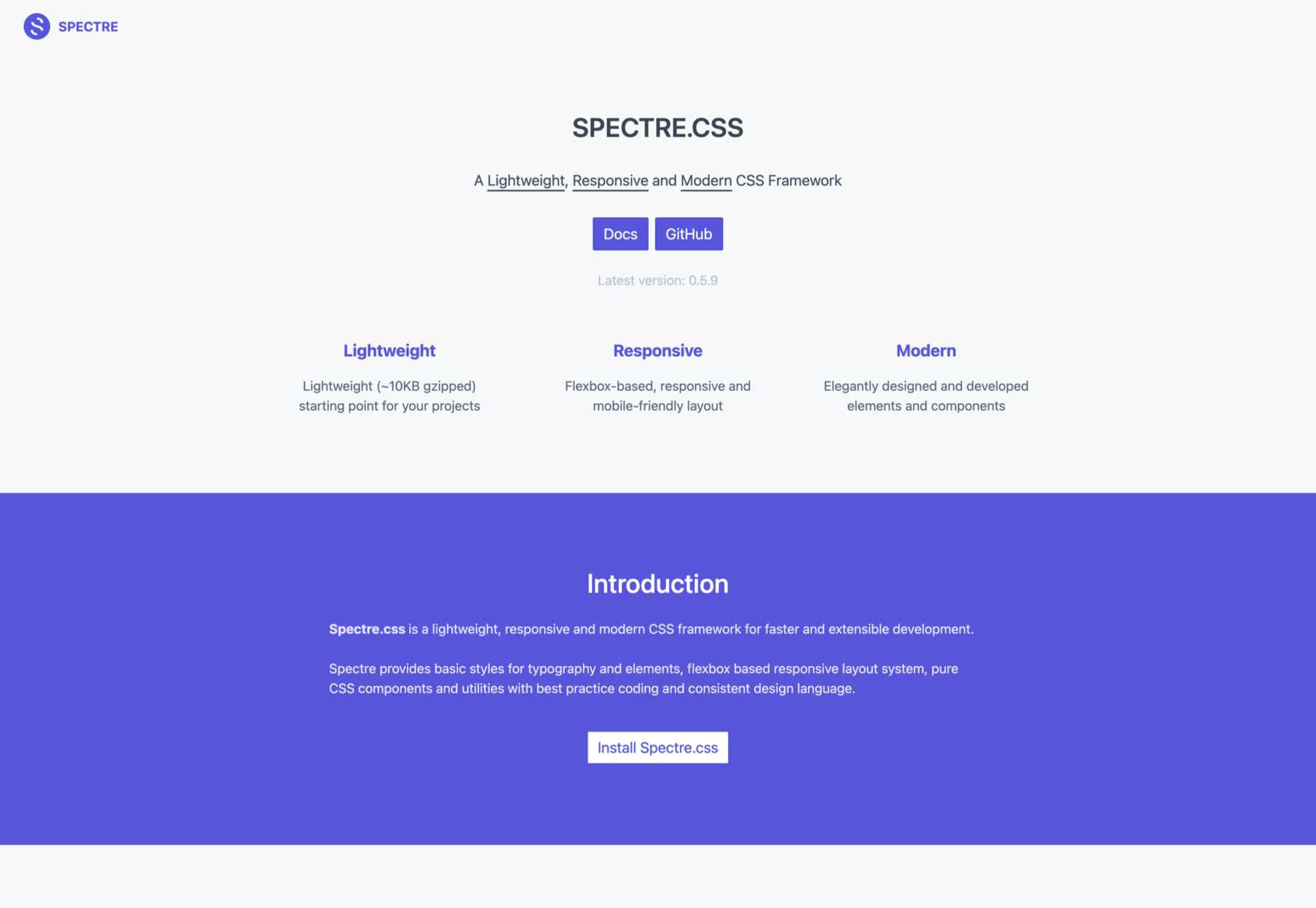
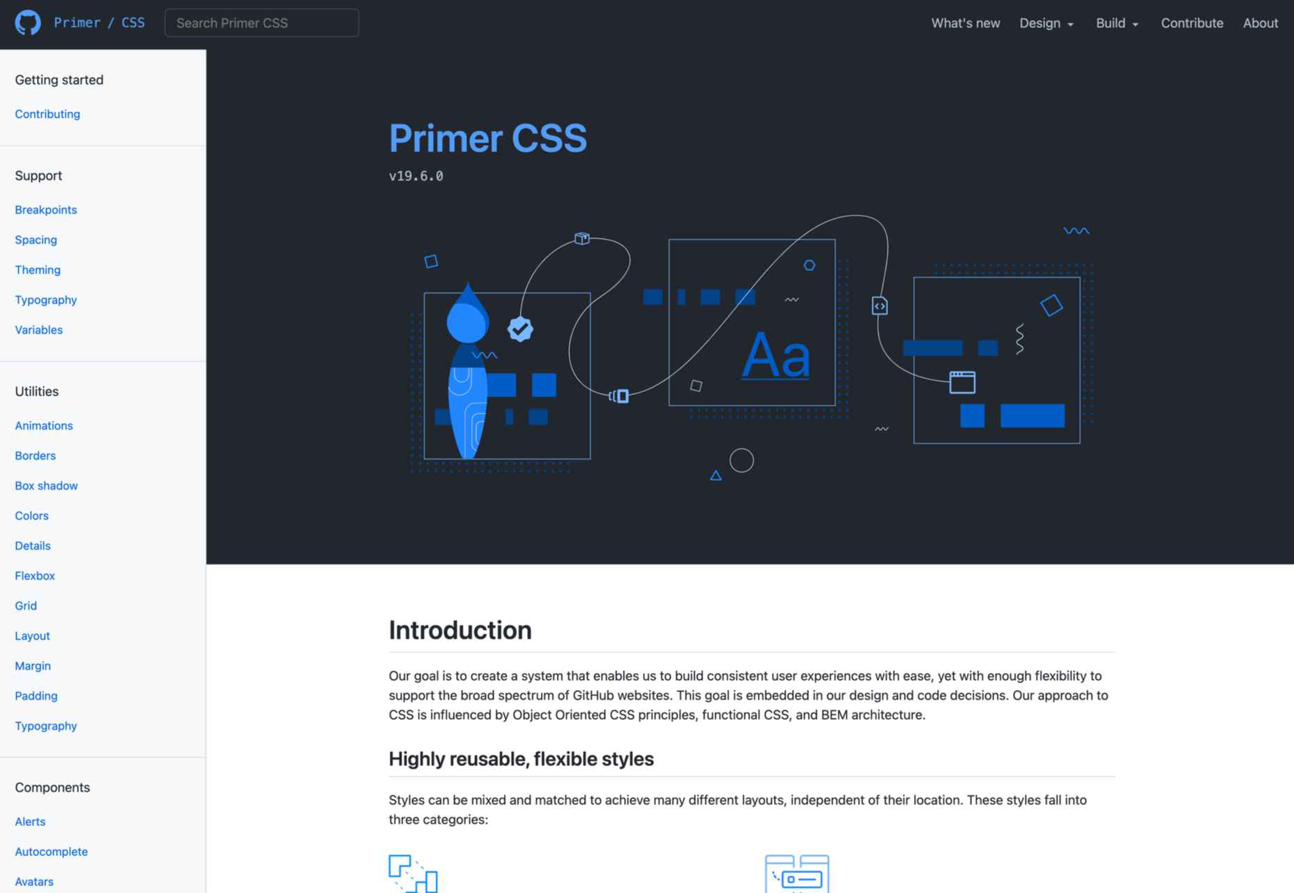
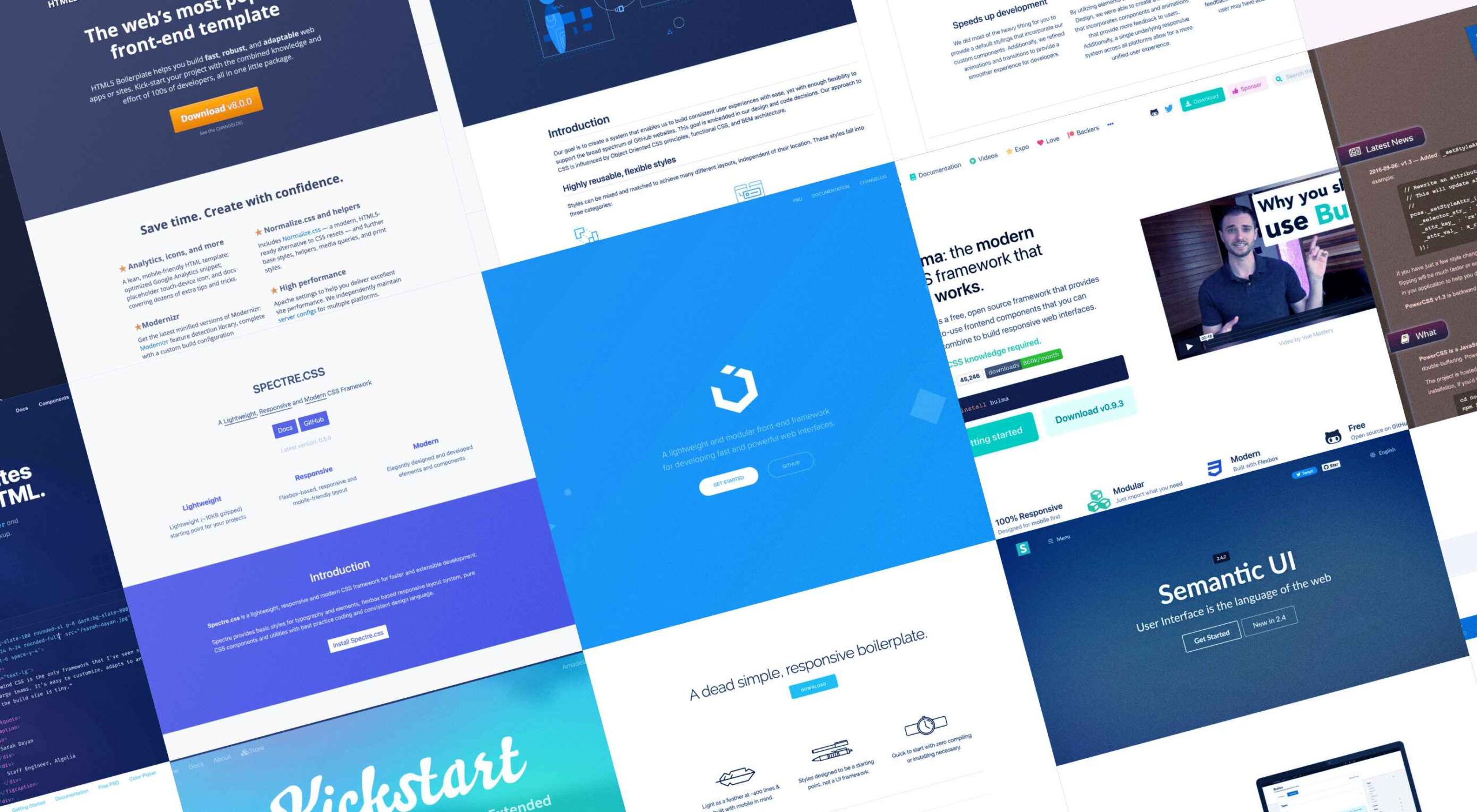 Whether you are a CSS expert or a front-end beginner, using the right CSS framework is crucial for your daily tasks. There are numerous frameworks whose ultimate goal is the same: helping developers target multiple screens, in the simplest possible way.
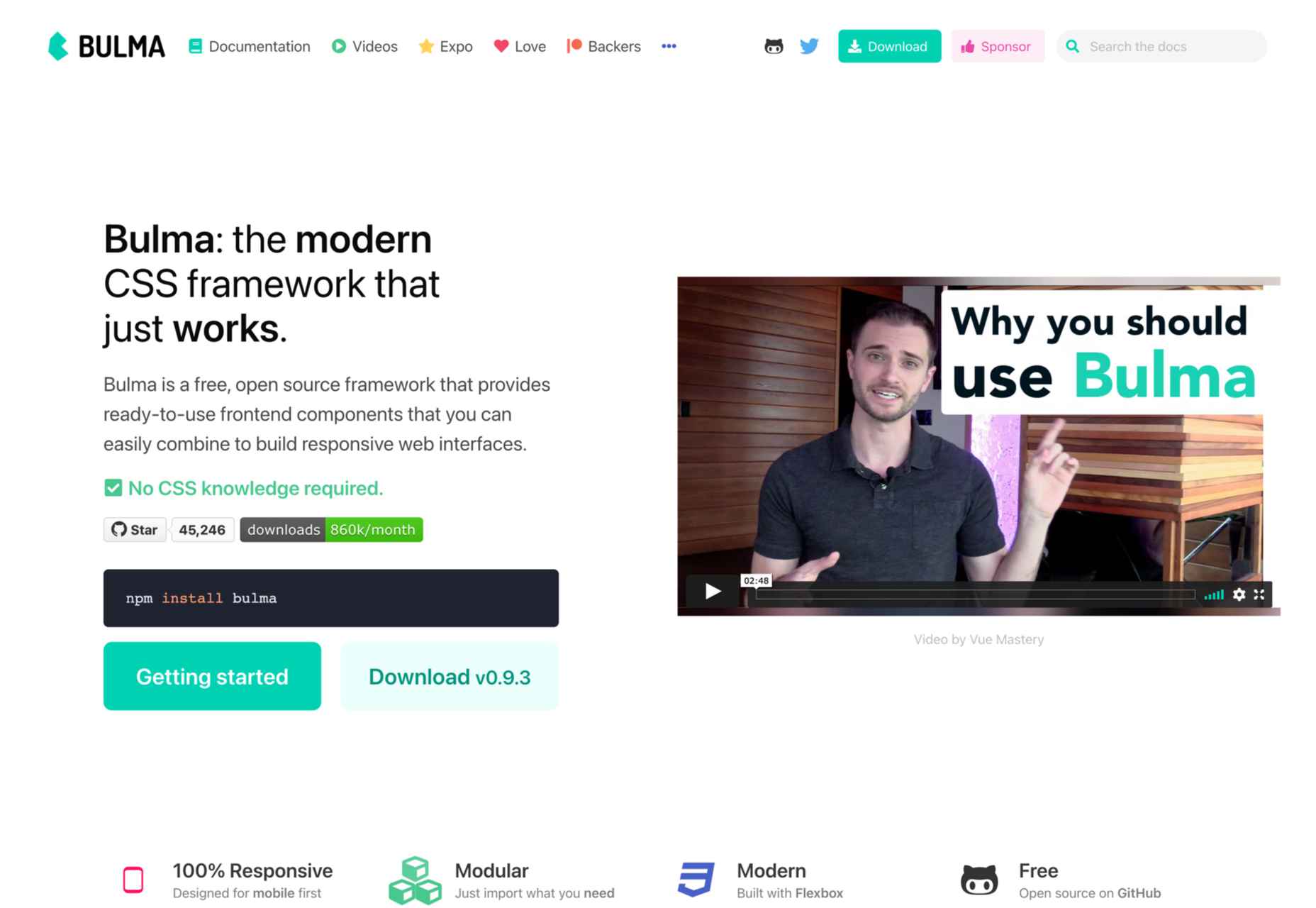


