Articles

Les clients accordent de plus en plus d’importance à l’expérience qu’ils reçoivent plutôt qu’au prix ou au produit. C’est pourquoi l’expérience client est rapidement devenue une priorité absolue pour toutes les entreprises. En 2020, avec les livraisons à domicile et les mesures de distanciation sociale mises en place en réponse à la COVID-19, les consommateurs sont passés à la commande sur smartphone pour acheter de tout, de la soupe aux noix.

De plus en plus de personnes utilisent des applications mobiles pour faire venir de la nourriture à leur porte. Les consommateurs savent à quel point il est important d’utiliser ces applications, que ce soit dans le confort de leur propre maison ou sur le trajet domicile-travail. Avec des options de personnalisation pour enregistrer leurs préférences, des informations précises sur les prix et des offres à portée de main, les attentes des consommateurs en matière de rapidité et d’absence de friction pour passer leurs commandes n’ont jamais été aussi grandes.

Bien entendu, pour pouvoir offrir une excellente expérience au client à ce niveau, il faut investir dans des technologies et des processus intelligents.

Renforcer les capacités du commerce électronique

Ce n’est pas seulement un dépanneur et un détaillant de carburant typique, mais Casey’s General Stores Inc. (Casey’s) est la cinquième plus grande chaîne de pizzas d’Amérique, avec plus de 19 millions de pizzas servies chaque année. En développant des liens communautaires solides, la marque est intégrée au tissu des petites villes du Midwest, offrant un service de proximité 24 heures sur 24, soutenant des causes importantes et célébrant les héros locaux.

Si la marque a su gagner des adeptes, Casey’s devait faire plus avec ses systèmes de commande et de paiement en ligne. Ils ont été construits sur des logiciels vieillissants qui n’ont pas su suivre le rythme de l’époque, ce qui a eu pour conséquence une expérience client en ligne qui n’était pas à la hauteur de l’essence de la marque, hyper pratique et axée sur la communauté.

Ainsi, dans le cadre de sa transformation numérique, il était non seulement essentiel pour Casey’s de renforcer ses capacités en matière de commerce électronique, mais il lui fallait aussi mettre l’expérience du client au premier plan et répondre plus rapidement aux changements du marché.

Pour ce faire, elle a dû utiliser des technologies intelligentes pour créer une application pratique pour smartphone et un site Web mobile afin de rationaliser les commandes par téléphone portable, ce qui a permis aux habitants de ces villes du Midwest de prendre leurs pizzas préférées très facilement et rapidement. En même temps, dans le but de l’aider à atteindre de nouveaux niveaux de confort, Casey’s a conçu un programme de fidélisation des clients.

citation de Art Sebastian, VP de Casey's

Rationalisation des processus de commande et de paiement

Pour rationaliser le processus de commande et de paiement en permettant aux clients de payer en ligne, Casey’s a déployé les solutions SAP Commerce Cloud et SAP Customer Data Cloud du portefeuille SAP Customer Experience. L’application mobile permet aux clients de passer des commandes de ramassage ou de livraison, de définir une carte de crédit par défaut pour le paiement, de personnaliser les commandes de pizza, de trouver un magasin, de parcourir le menu, de suivre les commandes, de réorganiser les favoris et de vérifier le prix du carburant.

Dans les cinq mois qui ont suivi son lancement, Casey’s a généré environ 65 % de ses revenus numériques grâce à l’application et 30 % supplémentaires grâce au Web mobile.

En lançant son premier programme de fidélité numérique, Casey’s Rewards, sur SAP Customer Data Cloud, Casey’s a organisé les données, le consentement et les préférences des clients et les a reliés directement à ses applications sur SAP Commerce Cloud. D’un seul coup, Casey’s est en mesure de récompenser sa légion de fans avec des offres à valeur ajoutée, tout en l’aidant à mieux connaître leurs besoins – ce qui lui permet en fin de compte de proposer des expériences qui dépassent ces besoins.

Une évolution rapide à l’époque de COVID-19

L’investissement de Casey dans les technologies intelligentes a également permis à ses magasins de rester ouverts pendant la période de COVID-19 et à l’entreprise d’avancer plus rapidement que jamais. Pour répondre aux attentes des clients pendant cette période, Casey’s a donné la priorité aux livraisons sans contact, s’est associé à un service de livraison tiers, a élargi la gamme de produits de marchandises générales disponibles en ligne et a lancé un service de livraison en bordure de trottoir.

Pour en savoir plus sur la transformation numérique de Casey’s, nous avons rencontré Art Sebastian, vice-président de Digital Guest Experience chez Casey’s à SAPPHIRE NOW Converge. Dans cette interview de quatre minutes, il décrit comment le détaillant de la supérette a fait de l’expérience client un avantage concurrentiel. Pour en savoir plus, consultez l’étude sur la transformation de l’entreprise, « Casey’s : Building True Customer Loyalty Over Pizza ».

Article publié en anglais sur blogs.sap.com


The post Faire de l’expérience client un avantage concurrentiel appeared first on SAP France News.

Source de l’article sur sap.com

Levallois – 8 octobre 2020 – SAP SE (NYSE : SAP) annonce une nouvelle version de SAP® Logistics Business Network, qui apporte de nouvelles capacités dans la gestion du réseaux des partenaires logistiques en termes de visibilité, de collaboration et intègre de nouveaux partenaires à sa plateforme logistique.

SAP Logistics Business Network est une plateforme cloud de business network dédiée à la logistique, conçue pour permettre aux clients SAP de connecter leur système d’information à leur réseau de partenaires pour étendre le suivi livraison des commandes et assurer la traçabilité des produits.

« Comme preuve supplémentaire de l’engagement de SAP, annoncé lors de SAPPHIRE NOW®, de proposer une offre complète de business networks : SAP Business Network, nous continuons d’ajouter de nouvelles capacités et d’étendre nos partenariats sur SAP Logistics Business Network notre business network dédié à la logistique », a déclaré Paige Cox, vice-président senior de SAP et responsable du SAP Business Network. « Les APIs ouvertes et les partenariats élargis sont des preuves de notre stratégie visant à créer un véritable réseau des réseaux. »

Cette nouvelle version constitue la prochaine étape de notre stratégie visant à permettre une visibilité de bout en bout, une efficacité accrue de la logistique et une collaboration transparente grâce à un réseau d’entreprises unifié qui inclut :

  • La visibilité sur l’exécution des commandes client grâce au suivi et à la traçabilité de nouvelle génération intégrée à SAP Logistics Business Network. Notre business network permet un suivi des étapes de livraison en temps réel pour tous les modes de transport offrant ainsi une couverture mondiale.
  • Des capacités de collaboration transport étendues, notamment le suivi multimodal des ordres de fret qui accroît la visibilité sur les événements routiers et maritimes.
  • Des APIs standards pour connecter les partenaires et les plateformes de fret, permettant de nouvelles collaborations entre partenaires routiers et maritimes.

SAP Logistics Business Network étend la couverture de différents modes de transport grâce à des partenaires nouveaux et existants, tels que :

  • project44, offrant une connectivité B2B pour la contractualisation transport, et des fonctions de visibilité pour le suivi en temps réel des envois routiers et le suivi des transports maritimes.
  • ClearMetal, permettant le suivi des conteneurs et des expéditions en transit grâce au Machine Learning reposant sur le référencement croisé des informations afin de faciliter le suivi maritime.
  • Shippeo, spécialiste du marché européen, offrant aux chargeurs un accès à son réseau de transporteurs, à son expertise en matière de réglementation et aux données de télémétrie de millions de camions pour un suivi des expéditions routières en temps réel.

« Grâce à ces partenariats, les entreprises utilisatrices de SAP Logistics Business Network peuvent désormais accéder tout au long du transport terrestre et maritime à la localisation exacte, aux changements de statuts et à l’heure d’arrivée estimée (ETA) de leurs expéditions. La nouvelle connectivité avec les transporteurs maritimes et les ports, ainsi qu’avec les systèmes satellitaires, apporte une visibilité sur l’ensemble du fret maritime mondial, » explique Rémy Vernet, Directeur de l’activité Digital Supply Chain de SAP France. « Nous sommes également très heureux d’intégrer la startup Française Shippeo que nous avions accompagnée il y a deux ans via notre fonds d’investissement SAP.iO Fund. »

SAP Logistics Business Network fait partie intégrante de SAP Business Network. Ce réseau des réseaux met à profit les informations fournies par l’ERP en temps réel, permet de réaliser des analyses poussées et offre des synergies avec des solutions de business networks performants tels que Ariba® Network – qui relie plus de 5 millions d’entreprises dans le monde et où plus de 3 460 milliards de dollars US d’achat sont traités chaque année.

La fourniture d’une intelligence collective par le biais d’un réseau commercial ouvert et interopérable permet de mettre en place des chaînes d’approvisionnement durables et résilientes, de transformer les business modèles et d’offrir la souplesse nécessaire pour faire face aux crises mondiales.

The post SAP accélère sur sa plateforme collaborative : SAP Logistics Business Network – offrant plus de visibilité et de traçabilité des livraisons et un écosystème partenaire étendu appeared first on SAP France News.

Source de l’article sur sap.com

Design can make a statement. It evokes feeling and can encourage thought and conversation. That’s the common theme among the three trends in website design this month.

Each trend is rooted on the time and place where we live and includes elements that provoke thought. Kudos to these designers and design teams for jumpstarting conversations. Here’s what’s trending in design this month.

1. “Taking a Stance” Design

From social to environmental issues, design projects are echoing the sentiments of their audiences and organization in a way that take a stance on an issue.

Once taboo, this is becoming increasingly used as a technique for brands who are no longer worried about turning off a certain segment. The goal is to rally the core audience and people who feel the same way about an issue or cause.

There’s also a secondary thing happening here. Some designs aren’t really position based, but use imagery and language that resonates with a movement to associate with that feeling.

Never Heart uses “Join the Revolution” and a dark image with a heart to tug at your feelings. It can help create an association to a cause that you believe in without stating that cause directly. The design feels strong and inviting while making you feel like part of something.

Skye High uses “powerful” twice in the headline to convey a particular messages to women. The agency is looking to work with “powerful” women. It’s a timely statement and message that could resonate with a lot of business-women at various levels of their careers.

Discovered Wildfoods is a brand that is rooted in sustainability. The corporate model and responsibility of the brand shows through in the website. This type of design helps connect people with mutual feelings to the brand and products.

It’s refreshing to see more websites and brands embracing social causes and issues. It can be tricky for a number of reasons. But for some brands, it pays off.

2. Abstract Art Elements

If you are worried about a lack of images, or not sure how to portray images in an appropriate way due to the worldwide pandemic – groups or not, masked or not – abstract art elements can be the solution.

Widely used for startups and apps, more abstract design elements are everywhere. It’s an easy way to create strong visual interest without photography.

The most common use of abstract art elements is often in the form of geometric shapes with animation. This is something that almost anyone can understand and simple shapes and movement can be quite stunning when done well.

The good news is this aesthetic can work for almost any type of website. Try it for a redesign when you don’t have photography that feels appropriate in the current environment or if you want to create focus for content that drives website visitors to the words or scroll. This works with more abstract concepts when they are simple and help you move quickly from the visual to text.

Here’s how each of the examples handles abstract art elements:

Indicius uses bouncing circles that move toward text and down the screen to drive users to the headline and scroll action.

With Code uses a fun fuzzy circle with different animations to draw you in.

Appimized uses bright color and a monotone scheme with geometric shapes to sell its services.

3. Images That Make You Think

This might be the most visually interesting, and thought-provoking, website design trend we’ve seen in a while. These designs all feature images with a little something different or unusual that make you think.

There are a lot of different ways to do this – marry photographs and illustrations, create imaginary imagery, animations or effects, visual tricks that play on depth perception or create pseudo-3D effects.

The commonality is that the visual is so striking and unusual that website visitors stop and engage with the design. What do the “oddball” visuals mean? What message do they convey? How did they do that?

All of the questions could be associated with this different style of visual representation.

Bling uses a combination of a photo with illustrated animated elements to draw the eye. The yin and yang between reality and fantasy is quickly evident and makes you want to know more. (It doesn’t hurt that the animation uses dollars and lightning.)

Kibun is interesting because the photo choices create an optical illusion of depth. It matches the content of the design well because the website features artistic textile panels with an artistic design. The illusion is in the angles and coloring of photographs and their placements on the screen. The only downside of this design is that it loses the artistic panache on mobile because the images stack.

Oddball images can sell. We Are Mad stands out because it uses a contrived image, but doesn’t go oversized with it. The more subtle placement is ideal and arguably more attention-grabbing.

Conclusion

Website design can be a powerful thing, as these trends and examples show. Don’t discredit the power of choices in color, imagery, animation, and text when creating a digital experience. Design can mean a lot of different things depending on the audience as these examples show.

At the same time, these design trends are powerful and meaningful. They provide context into our world, our time, and our feelings. Don’t be afraid to experiment and make a statement with your design work. Just remember to keep in mind all potential impacts (positive and negative) before taking the project live.

Source


Source de l’article sur Webdesignerdepot

La Fondation SAP France et Enactus France ont organisé l’édition 2020 du Social’Tech Challenge. L’objectif de l’initiative est d’accompagner des projets de lycéens, étudiants et professionnels à développer leurs compétences pour innover et agir au service du plus grand nombre. Enactus France est une entreprise hybride experte de la pédagogie expérientielle et de l’engagement qui rejoint la volonté de SAP d’aider, grâce à la Tech, le monde à mieux fonctionner. Dotées de cette volonté commune, la Fondation SAP France et Enactus France lancent, en 2018, le Social’Tech Challenge, un concours visant à récompenser des projets mettant le numérique au service de la société.

L’association Enactus a pu compter sur la participation et la contribution d’une centaine de collaborateurs SAP. Ces derniers se sont portés volontaires comme mentors d’étudiants entrepreneurs sociaux, jurés du Social’Tech Challenge ou encore jurés de la compétition nationale Enactus. Les collaborateurs SAP ont ainsi sélectionné et monitoré les projets et ont également organisé la journée Boost ton projet Digital. Le 27 avril 2020, 5 projets ont été retenus par un comité de sélection :

  • Bric à Vrac « Pour que tout le monde passe au Vrac »
  • Easy Diab « Le diabète une maladie qui nous concerne tous »
  • Gesture « Vos contenus accessibles aux malentendants »
  • Ovéga « La permaculture accessible à tous »
  • Ticket App « Pourquoi ne pourrions-nous pas simplement avoir nos tickets de caisse sur notre téléphone ? »

La finale du Social’Tech Challenge s’est déroulée le 26 mai 2020 avec un jury d’exception : Caroline Garnier, directrice des ressources humaines SAP France ; Catherine Mort, conseillère cloud et innovation SAP France ; Erik Marcadé, directeur de SAP Labs Paris; et Sébastien Gibier, directeur de SAP.iO Foundry Paris.

C’est Ovéga avec son projet « La permaculture accessible à tous » qui remporte la finale et le prix de 5 000 euros. Le nom du lauréat a été annoncé lors du Festival Enactus qui s’est déroulé cette année virtuellement autour de 3 grands rendez-vous : la finale du Social’Tech Challenge, les demi-finales et la finale de la compétition nationale Enactus pour laquelle Frédéric Chauviré, DG de SAP France, a été juré.

« De nombreux collaborateurs SAP sont impliqués dans l’accompagnement de projets d’entrepreneuriat social qui sont totalement en lien avec la vision de notre Groupe. Le Social’Tech Challenge est une belle initiative que nous mettons en œuvre avec notre partenaire Enactus France, un partenaire de confiance, avec qui nous partageons les mêmes motivations quand il s’agit d’innover et d’agir au servie du plus grand nombre. » Alexandra Darras, responsable de la Fondation SAP France.

À propos de SAP

SAP est le leader du marché des applications d’entreprise : 77% des transactions financières mondiales passent par un système SAP. L’entreprise accompagne les organisations de toute taille et de tout secteur à mieux opérer. Nos technologies de machine learning, d’Internet des objets (IoT), d’analytique avancée et de gestion de l’expérience aident nos clients à transformer leur activité en « entreprise intelligente ». SAP dote les professionnels d’une vision approfondie sur leur activité et favorise la collaboration pour garder une longueur d’avance sur leurs concurrents. Pour les entreprises, nous simplifions la technologie afin qu’elles puissent utiliser nos logiciels comme elles le souhaitent, sans interruption. Notre suite d’applications de bout en bout et nos services permettent à plus de 440 000 clients d’opérer de manière rentable, de s’adapter en permanence et de faire la différence. Avec son réseau mondial de clients, partenaires, employés et leaders d’opinion, SAP aide le monde à mieux fonctionner et à améliorer la vie de chacun. Pour plus d’information, visitez le site www.sap.com

Contacts presse :

Daniel Margato, Directeur Communication : 06 64 25 38 08 – daniel.margato@sap.com
Sylvain Drillon : 06 44 71 35 68 – presse-sap@publicisconsultants.com

SAP News Center. Suivez SAP sur Twitter : @SAPNews.

Veuillez tenir compte de notre politique de confidentialité. Si vous avez reçu cette alerte de presse dans votre courriel et que vous souhaitez vous désabonner de notre liste d’envoi, veuillez communiquer avec presse-sap@publicisconsultants.com et écrire Désabonnement dans la ligne Objet

The post La Fondation SAP et Enactus France promeuvent des jeunes projets innovants et au service de la société lors de la nouvelle édition du Social’Tech Challenge appeared first on SAP France News.

Source de l’article sur sap.com

Artificial intelligence. Just hearing the phrase has been a trigger for many in the technology world since that creepy Haley Joel Osment film circa 2001. But more recently, artificial intelligence and machine learning strike fear into the hearts of skilled workers for an entirely different reason: job security, or lack thereof.

Smart-home devices, streaming services, self-checkouts, even Google searches are ways that artificial intelligence has seeped into everyday life, exemplifying the abilities of computers and machines to master both simple and complex tasks. In some instances, these technological advancements make our lives easier, but for some people, their proliferation has meant job loss and skill replacement. There’s no wonder that when artificial intelligence starts being mentioned along with web design and site creation, the spidey senses of designers all over the world start tingling.

designers think outside the box, something that AI just can’t do

But let’s get real about what AI and automation really mean for designers for a second. Talented designers with busy schedules should view these advancements as virtual assistants. For some small businesses on a limited budget, the websites that artificial intelligence can pump out might be fine…for a while. However, as businesses grow, change, require updating and customization to adapt to their customer base, the expertise of creative and talented designers will always be needed. Even the best AI that we see today is limited by evaluating, replicating, and revising what already exists. It may be able to mix 1,000 different color schemes into 10 million potential combinations, but great designers think outside the box, something that AI just can’t do.

In fact, rather than being scared of automation, designers ought to embrace automation and artificial intelligence as a way to unleash their creative thinking. Delegate repetitive, straightforward tasks to the right software, and suddenly you have time to bring your best ideas to the table and push the boundaries of your own innovation. 

Where AI has Failed in Design

The ultimate goal of artificial intelligence and automation in design work is a grand vision that has yet to be realised.

Consider the case of The Grid, which began as a crowdfunding campaign in 2014. The “revolutionary” product posed itself as an artificial intelligence solution for building thoughtfully, yet automatically, designed websites in five minutes. Research “Reviews of the Grid” in any search engine and you’ll be met with scathing criticism with only some small praise sprinkled in. Most of the initial users cite underwhelming results, the feeling of being duped by the Grid’s marketing tactics, nonsensical placement of text, and ultimately, the Grid being a complete waste of money for the resulting product. Even at the low cost of $100, compared to hiring a talented designer, most users felt their investment was wasted.

For the AI capabilities that exist now, most small business owners, or those looking to put together a simple website, are better off using drag and drop site builders (Wix, Squarespace, Weebly, etc) that have been around for ages. Even so, there are plenty of businesses still willing to hire designers to take this simple task off their plate due to a lack of technical expertise or lack of time. And let’s be honest, are there even enough talented (keyword here!) designers out there to keep up with the millions of websites created every year, without each one working themselves to death? 

Where Automation Shines for Designers

Fortunately for good designers, it appears for now that the days of artificial intelligence completely taking over their jobs is a fantasy. However, what AI and automation do offer designers is a solid starting point for success, eliminating much of the lower-level grunt work that most designers would rather skip anyway.

Even well-received AI website builders like Firedrop still require a basic eye for design and specialised knowledge to produce truly unique, high-converting, and user-friendly websites. Tools and practices that designers should adopt are the artificial intelligence and automation resources that will help them do their jobs better, faster, and leave them with more time to focus on project elements that AI cannot accomplish on its own.

Bridging the Gap Between Designers and Developers

Well-established brands are likely to already have design systems in place that guide the creation of new elements across their digital profiles whether on social media, various mobile apps, or different sections of a website. But even in large corporations — excepting those who have perfected the process — there’s often a breakdown between a designer’s vision and resulting product from the developers. It stems from the basic difference in how they each approach their work and the limitations of the systems they use.

While component libraries — or even full design systems for that matter — won’t reconcile every question, they provide both developers and designers a source of truth to work from that both parties can understand. Design collaboration tools like Invision and Visme, specifically, keep designers and developers on the same page with automated version saving and code-friendly workflows.  

Understanding the Consumer

I don’t suggest using artificial intelligence to produce content for your site

Digging into and understanding the behaviours and habits of site users is a relatively new component of site design, but offers invaluable insights. Tools like HotJar, Mouseflow, or Smartlook make it simple to see holes or leaks in your conversion funnels, detect which page elements users are interacting with, and which they’re not interested in to refine the look and feel of a page for maximum conversions. Even though these tools provide the data, it still takes a keen eye and understanding of design to implement the right changes to improve site performance.

Site content is another way that artificial intelligence has the potential to improve our understanding of customer behaviour and improve site performance for individual users. I don’t suggest using artificial intelligence to produce content for your site, no matter how much the results have improved. However, static landing pages or a single set of further reading recommendations are unlikely to appeal to the majority of site visitors. Artificial intelligence tools like CliClap and Personyze instantly collect and analyse consumer data to provide dynamic, personalised experiences that drive more leads and encourage conversions. Creative designers will also learn from this data to improve customer experience with other pages or elements throughout the site.

Removing Distracting, Time-Sucking Administrative Tasks

Because “artificial intelligence” has become a term with such negative connotations, we often overlook the simple way that AI actually makes our work lives better and easier. Machine learning in email filtering is a great example of this. Consider a simple interface like a Gmail inbox. We have the option to mark certain senders as spam or as important, and our inbox learns that type of communication is and isn’t useful to the user. Pandora, Spotify, Apple Music, and more all take cues from the user behaviour of liking a certain song, artists, or genre of music to build customised playlists. There are a myriad of ways that artificial intelligence and its branches of disciplines merge with our everyday lives. 

Some of the most useful automations for business, and especially for designers, are related to the administrative tasks that frequently take time away or distract from more pressing projects. A perfect example of automation that can relieve stress and cut down on mindless work is an email autoresponder. I’ve always found that having time blocked off in my calendar to tackle complex or important projects helps me to focus on the task at hand and be more efficient. In order to more effectively block out my time, closing my email and setting an autoresponder to reply to all incoming emails serves two purposes: 

  1. Lets those trying to get in touch with me know that I only check my email at certain times of the day and that my response may not be immediate — tempering their expectations of when they might hear from me.
  2. Relieves my personal stress of being tethered to my inbox, splitting my focus, and also saves the time of having to initially respond to each email individually. 

This is just one simple way to use automation in your email, although there are many others to explore.

While Zapier isn’t the only workflow automation service on the market, it’s probably the most well known. Workflow automation reduces time spent on mind-numbing, repetitive tasks and helps designers connect apps that might not natively work together. Do you keep a task list in Todoist? Set up a Zap, then create a task in Todoist anytime someone mentions you on Asana or assigns you a task in Trello.

This is especially helpful for freelance designers who work with multiple clients across various project management platforms. The potential for automation to relieve unnecessary mental overhead for designers is nearly limitless.

Don’t be Afraid of AI, Embrace It

The bottom line of this brief overview of artificial intelligence and automation in design is that this emerging technology isn’t something designers should be scared of. In fact, it’s something to welcome with open arms because ultimately it can make our jobs, and our lives, better. Leave the monotonous tasks of collecting and analysing huge amounts of data or administrative minutiae to the machines; they can handle it.

Save the interesting, creative, abstract work for the talented designers who can turn AI recommendations into unique and intuitive digital experiences. Making the relationship between artificial intelligence and design symbiotic will yield the best results for every entity involved: the business, the AI, and yes, even the designer.


Featured image via Unsplash.

Source


Source de l’article sur Webdesignerdepot

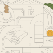
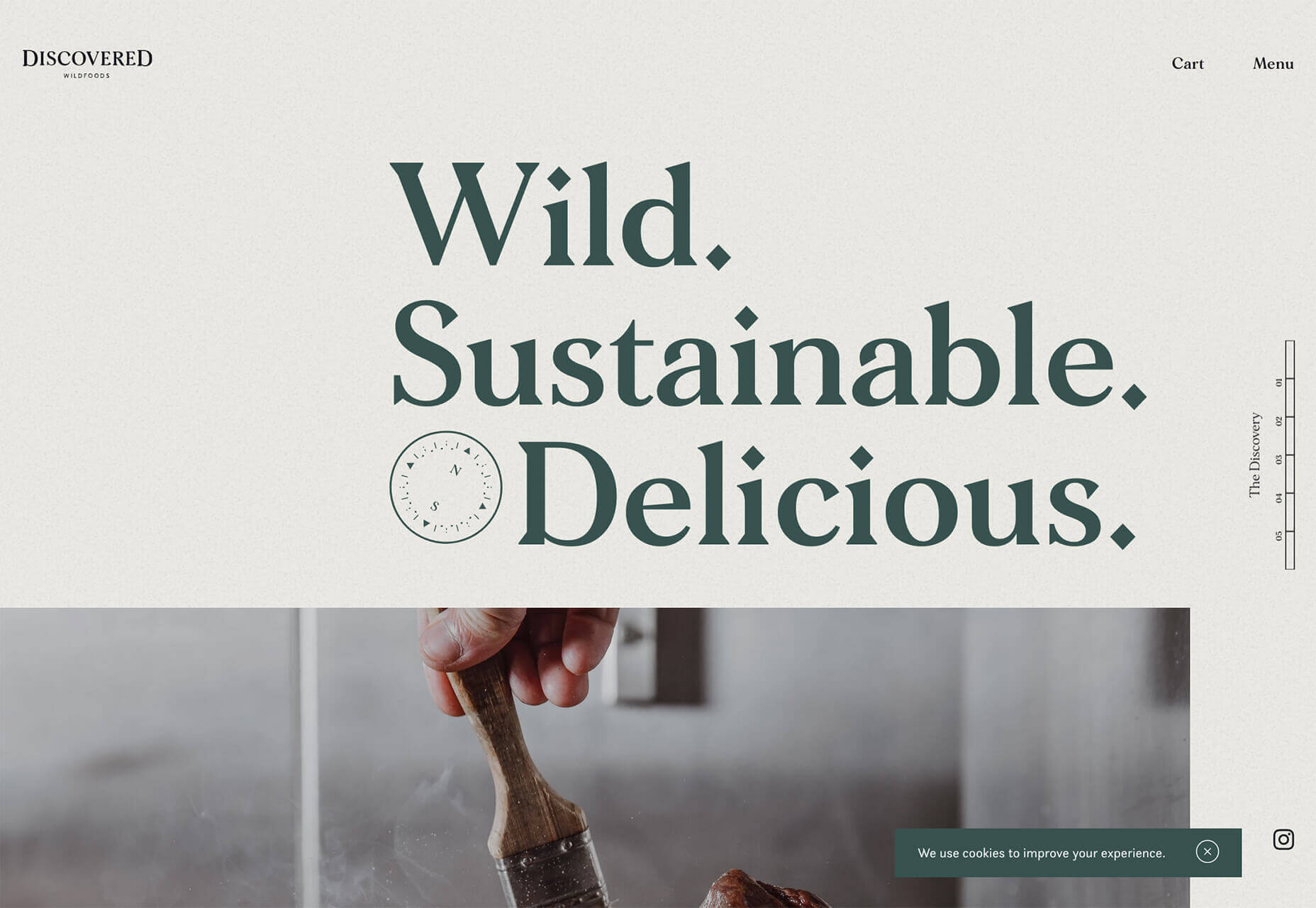
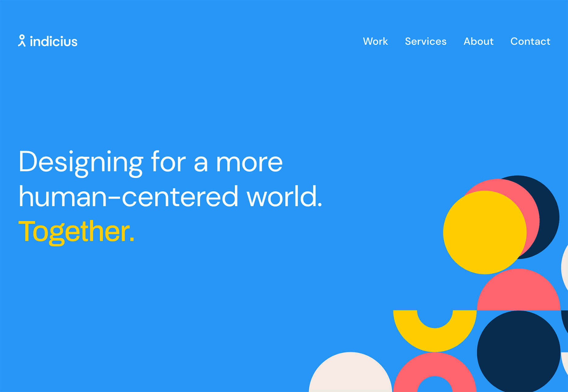
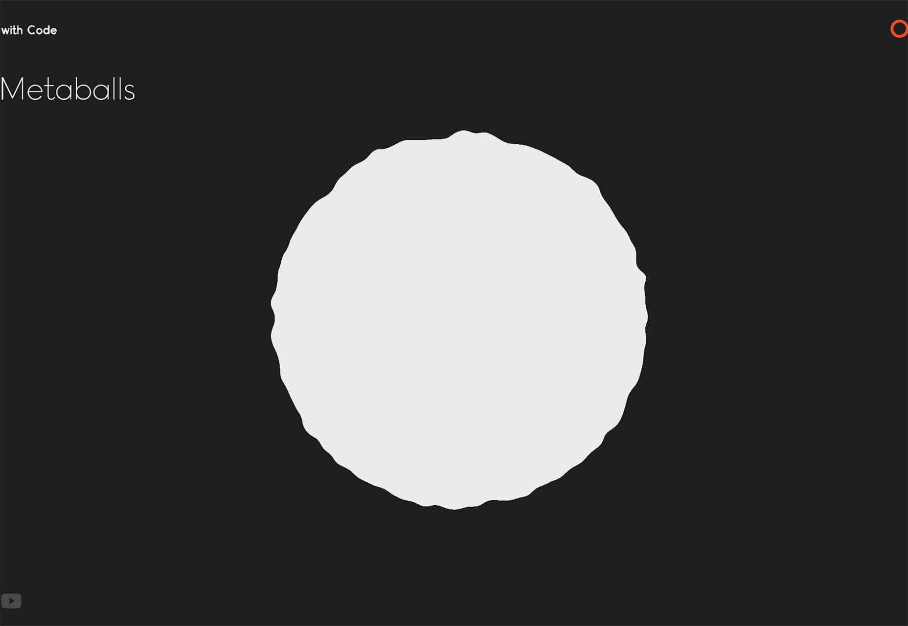
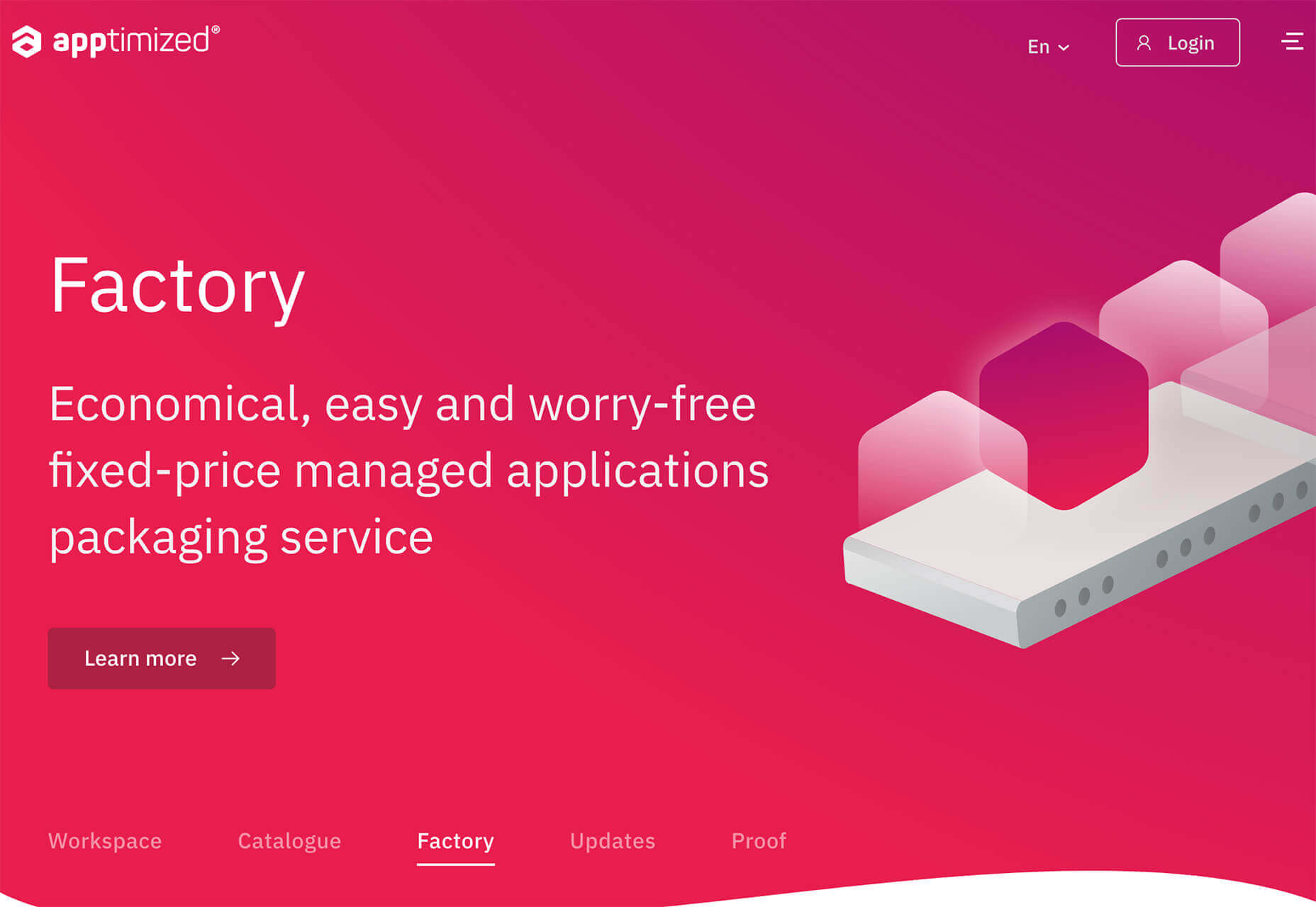
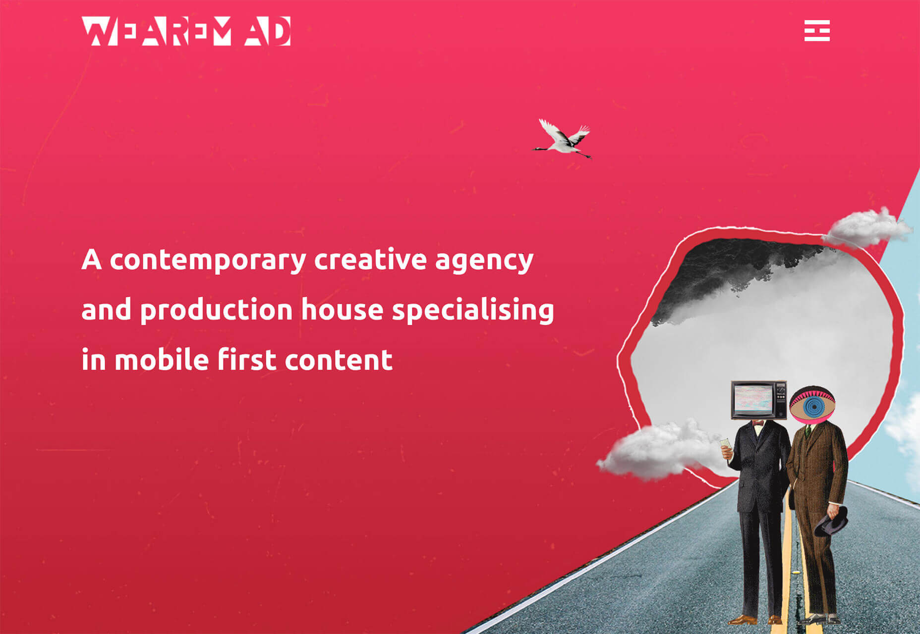
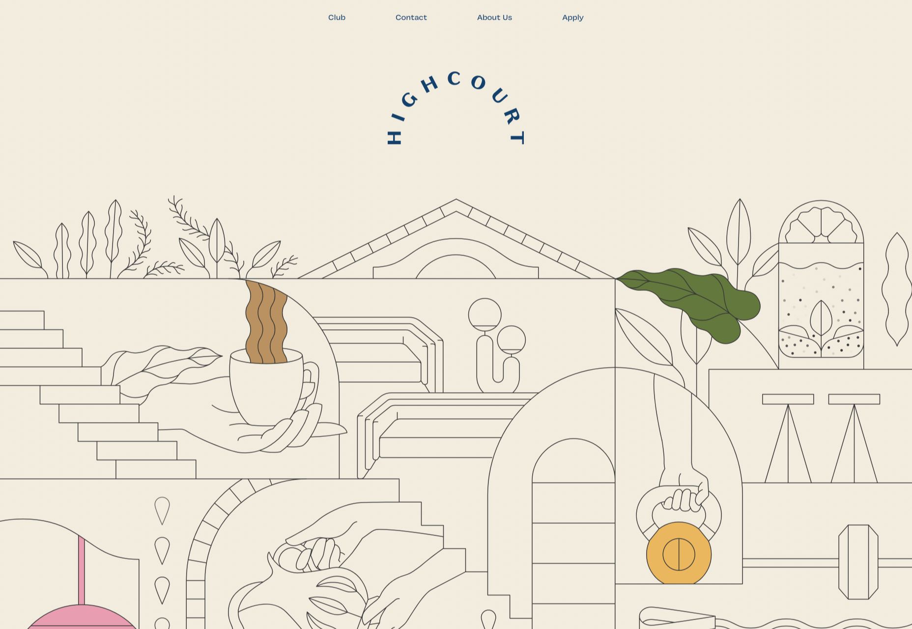
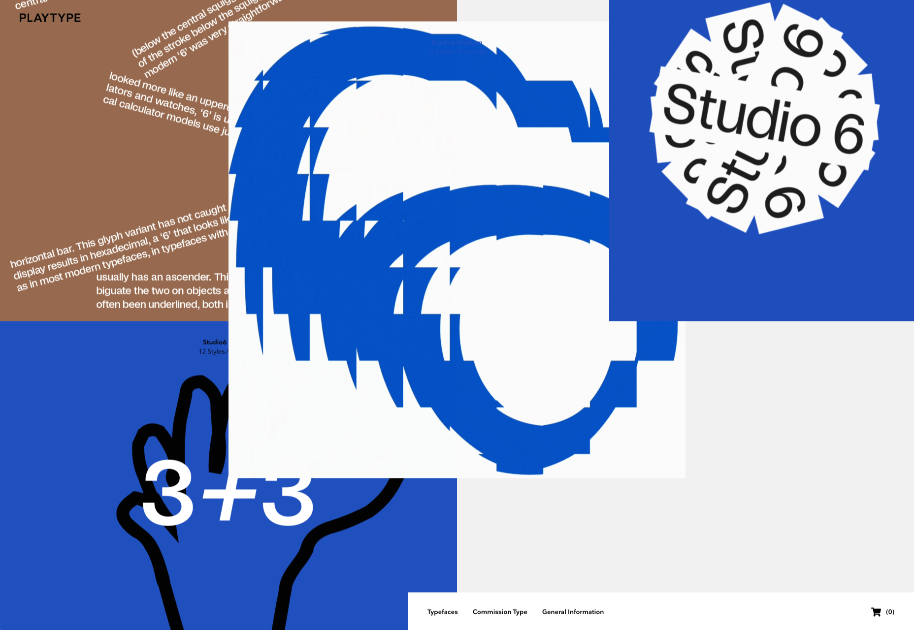
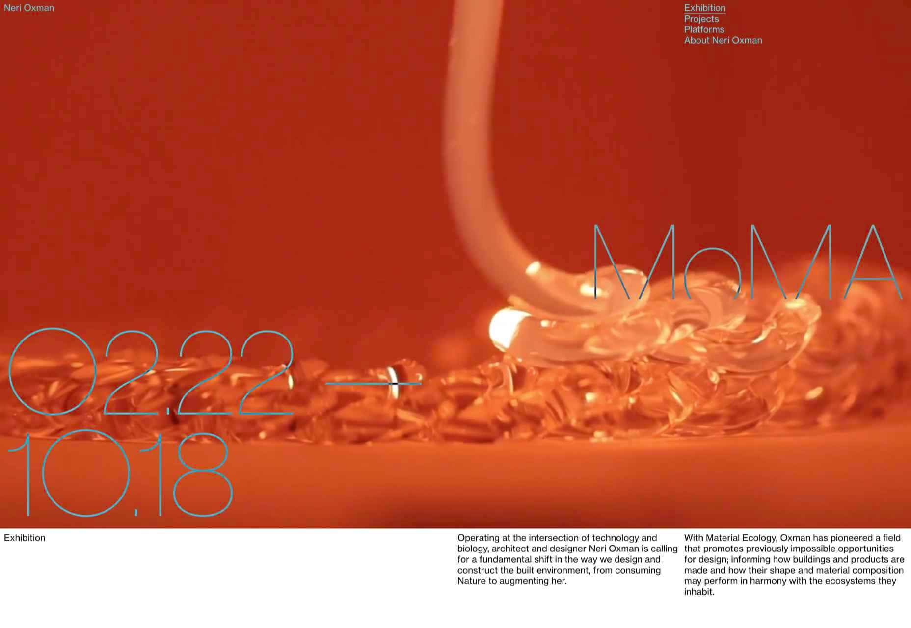
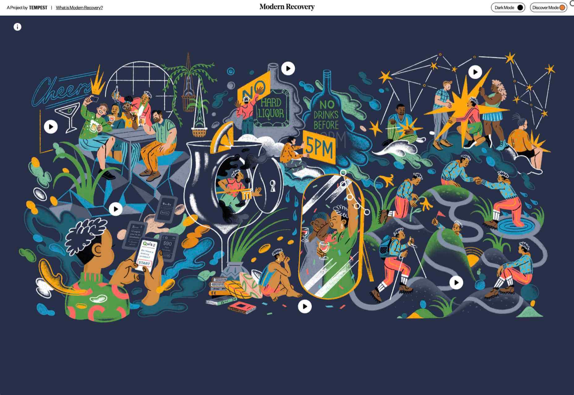
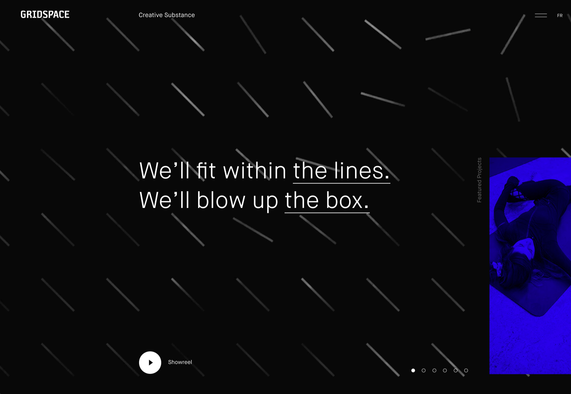
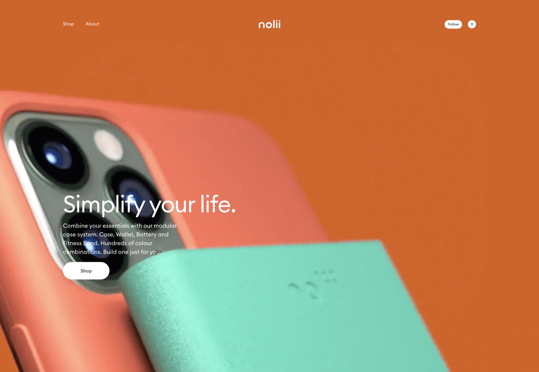
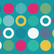
This month we’re going big and bold. Oversized type, strong colors, in-your-face layouts, and little touches of playfulness exude confidence and make a statement. There are some quieter moments too, with thoughtful illustration and more gentle use of color. Animation still features strongly in the details, with circles proving popular in rollover effects. Enjoy.

Fledge

Fledge is a film production company based in Belgium. Their site uses split screen with looped text scrolling in opposite directions on each side. A minimal color palette adds extra punch.

2ºC Earth

2ºC Earth is a beautiful and also scary website that explores the effects of rising global temperatures by focusing on 5 specific locations. Some stunning photography and subtle use of sound take you to these locations as they are now, then show what they could become. The experience is both immersive and unsettling.

pill&pillow

Unlike many digital studios who use the design of their own site to demonstrate their skills, pill&pillow have taken a very basic approach. It is very self-assured, and it works. Random colored strikethroughs on visited links add a nice touch of playfulness.

Ferrum Pipe

Metal fencing is not the most interesting of subjects to most of us, but this site for Ferrum Pipe is surprisingly appealing. On scroll animation and some off-grid image layout brings life to what would normally be, well, a bit dull.

Lucciano’s

With its focus on mouth-watering photography and videography, the site for gelato makers Luccianos, will have you checking your freezer for any leftover salted caramel or stracciatella. The zoom on rollover is a nice effect, and the use of circles with ice cream color backgrounds for rollover text reinforces the gelato theme.

Björn Wieland

UI designer and artist Björn Wieland has created a portfolio site with a simple, relaxed feel and pleasing transitions. It feels simple, but behind the scenes there is quite a lot going on.

Coloursmith

Coloursmith is a tool from Taubmans paint company which allows you to create a custom paint color by uploading a photo. You name your color and can add a story, then you order a test pot. colors are presented well, in different light and with suggestions for complementary colors.

Finn 

Finn make diet supplements for dogs. Their site is fun, modern and clean. Bright colors and an illustration that manages to be cute but not too cutesy make a bold impression.

Highcourt

Highcourt is a new private membership leisure club set to open in New York in spring 2021. Dark blue text on cream gives a softer edge than black on white. The background color changes on scroll are pleasing, and simple line illustrations with occasional gentle animation add to the overall sense of calm.

Elevence

Elevence is the company of product designer Kazuo Kobayashi. The site uses only black, white, and grays allowing the color photos of his work to really stand out. Circular thumbnails are used to good effect, appearing on rollover.

Playtype

Playtype is a Danish type foundry whose site seems to fit their name. It has a playful, almost chaotic feel, with bright blocks of color and occasional animation. Some pretty nice typefaces too.

Neri Oxman 

Neri Oxman is many things: architect, scientist, engineer, inventor, and designer. This site feels like a really beautiful coffee table art book that you want to pick up and look through every so often. There are some nice details too, like the lens ‘reveal’ effect on rollover in a few places.

Modern Recovery

Modern Recovery is a project by sobriety program Tempest. The interactive illustration encourages exploration, to discover different stages of recovery from alcohol abuse and insights from others who have followed the program. The aim is to change our social attitudes towards alcohol and not drinking.

Bliss

Have you clicked on the link to visit Bliss Search? Yes, the link is correct, no you haven’t been redirected to a Google search results page. This Australian digital marketing company have copied the appearance of different well-known sites for their pages — Google, Instagram, LinkedIn, Tinder all make an appearance. The humor in this approach shows confidence, and makes it memorable.

Miilkiina

Miilkiina describe themselves as a digital media space and creative agency. Punchy typography, with great use of blackletter, well chosen images, and a strong header video give this home page an in-your-face edge.

Ukrainian Railroad Ladies

Ukrainian Railroad Ladies is a book by photographer Sasha Maslov. Its subjects are the, mostly, women who work as traffic controllers and safety officers at railroad crossings in Ukraine. It’s a simple site — outsized type, black and white, basic image grid, only very brief text — but it is effective in its simplicity.

Una Europa

Una Europa is an alliance of 8 European universities with the aim of offering joint research and study programs. There is some playful scrolling behavior with geometric shapes moving and changing color that enlivens what could otherwise be quite a dry site.

Bureau Cool

There’s a bit of an old school feel about the site of digital design studio Bureau Cool, with its recent traffic animation. The changing backgrounds on scroll are a nice touch.

Gridspace

Gridspace is a multimedia entertainment studio based in Montreal, and their website is a visual feast. Lots of movement, lots of video, some good use of sideways scrolling.

Nolii

Nolii make cases and accessories for iPhone that work together. The sorbet color palette complements the product colors and the block layout provides a visual reflection of the interlocking of the different products.

Source


Source de l’article sur Webdesignerdepot

If any company wants to succeed in the market, it needs to strengthen its digital presence. Though social media provides a place to gain some attention, it is impossible to create a brand without an official web page. This is why businesses hire firms offering web development services to get their website designed, which would enable them to get as much traction as possible. 

Web development covers actions such as web design, programming, content creation, network security tasks, and server-side & client-side scripting. Among the technologies available for web development, most web development companies make their programming choice between PHP and.NET.

Source de l’article sur DZONE

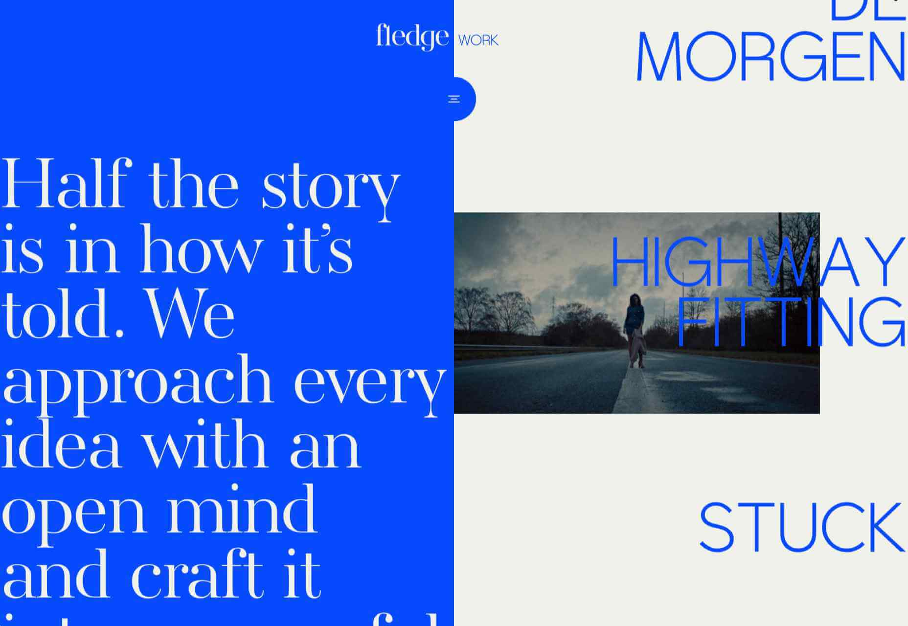
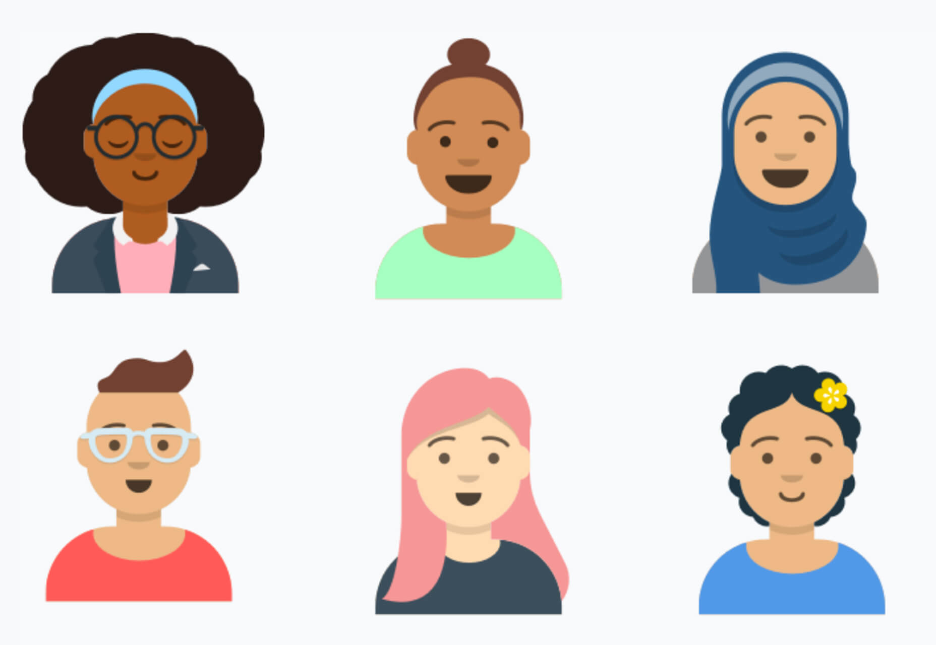
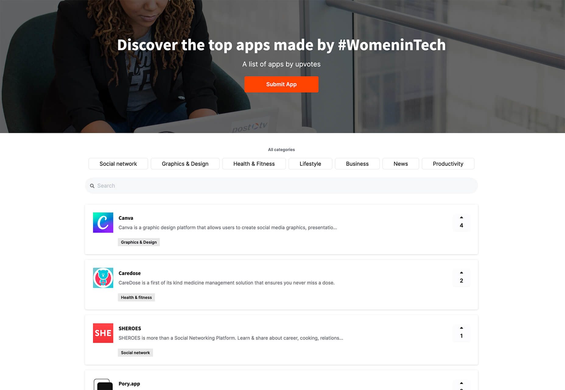
It’s fun to see new website design tools that reflect current times and the state of the world. That’s very true this month with new databases devoted to diversity and women in technology, as well and resources to make your design life easier.

Here’s what’s new for designers and developers this month:

Ztext.js

Ztext.js is an easy to implement, three-dimensional typography tool for the web that works with any font you want to use. With the popularity of 3D effects and animation, this tool has a lot of practical applications. Everything you need, including documentation, is available from developer Bennett Feely on his website and GitHub. (It’s free but you can show appreciation with a donation if you like it.)

Gradient Magic

Gradient Magic is a free gallery of fun and interesting CSS gradients. You can sort through a random selection or by category of color to find just the right gradient for your project. Some of them would make really neat backgrounds or image overlays.

Impossible Checkbox

Impossible Checkbox is a fun little divot that you’ll want to play with and emulate. Click or tap the slider to activate and a nifty little friend pops up. Now here’s the fun part: You can’t leave it checked, and take note of the changing expression of the checkbox character.

Diversify Tech

Diversify Tech isn’t your average job board; it is a collection of resources – and opportunities – for underrepresented people in technology. It includes a weekly roundup and everything from scholarships, to events, to jobs, to speaking opportunities.

Women in Tech

Women in Tech is a list of apps made by women. The apps are ranked and chosen based on upvotes and is a good resource if you want to help support women-owned projects. Search or submit an app for inclusion.

Devello Studio

Devello Studio is a tool that allows you to write code in the cloud. You don’t have to install anything and no matter where you are, just can open a project in-browser, and continue development where you had left off last time. Plus, it works with GitHub support built right in.

Hustl

Hustl is a premium Mac app that allows you to create time-lapse videos of your screen. Use it to show off work or projects or create a cool video for your portfolio. Plus you can use it to capture just one active app so you don’t have to do a lot of editing later.

FeedBaxley

FeedBaxley is a user feedback tool that helps you (and users) figure out what’s frustrating before it becomes a real issue. You can customize everything to match your brand and set it up with copy and paste tools. Feedback integrates with Slack, making it easy for you to analyze information with a team.

BestTime

BestTime launched a major update with a new tool that makes it possible to analyze visitor peaks of public business (cafe, gym, etc) for whole areas. Using the heatmap API you can find businesses at popular times, locations, or by business type.

Pixeltrue

Pixeltrue is a new collection of free SVG illustrations and Lottie animations in a trendy style. They are available for commercial and personal use and add a bit of whimsical delight to website projects. (The error illustrations are particularly fun.)

Previewed

Previewed has tons of cool and realistic mockups that you can use to create the perfect setting for digital projects. You can find mockups for a variety of devices and cool panoramas that work perfectly for elements such as app store previews.

Alt Text Overlay Bookmarklet

The Alt Text Overlay Bookmarklet solves a common problem: It shows what images use alt text and what that text is. The tool was created by Christian Heilmann and he’s put it on GitHub for you to play with and test.

MergeURL

MergeURL allows you to merge and shorten up to five links. Enter the links and mergeurl.com/o/xxxxx, for example, will open all the URLs associated with that link. The tool is free to use and you don’t have to register to use the service.

Infinity Search

Infinity Search is a new search engine that lets you look for things privately and efficiently. Search the web, images, or videos. Here’s a little about how it works: “While we retrieve results from other search engines like Bing and Wikipedia, we also have our own indexes of links that are displayed in our search results. We are actively working on improving these indexes and they will only get better.”

Blade UI Kit

Blade UI Kit is a set of renderless components to use in Laravel Blade Views. It’s built for the tall stack and is completely open source. It includes 26 components and you can contribute as well.

Trusted News

Trusted News is a Google Chrome extension that uses AI to assist in evaluating the quality of the online content. In its first release, it scores the objectivity for a selected article, testing whether it is written from a neutral perspective as opposed to a subjective one.

BaseDash

BaseDash allows you to edit production data without coding. You can make changes to the database with the ease of a spreadsheet. This tool makes it easy to find and edit information in a hurry. It works with all major databases including MySQL, PostgreSQL, Amazon Redshirt, Microsoft SQL Server, and more.

Email2Go

Email2Go is a service that helps you create email templates and test them on dozens of physical devices and applications. It’s free right now while it is in early release.

Iconscout Converter

The Iconscout Converter allows you to convert icons and images from one file format to another for free. Convert SVG, PNG, JPG, and PDF with a single click.

Shape 2

Shape 2 is a massive collection of 5,000+ unique icons and illustrations with a full-blown web editor. Customize colors, stroke width, size and full variations that can export to SVG, PDF, PNG, GIF, and React. This is a premium tool and includes a discounted release price for now.

Aestetico

Aestetico is a beautiful sans serif that includes a massive family with 54 styles. This premium typeface is highly readable and has modern lines and curves that make it a great option for a variety of uses.

Arcades

Arcades is a modern display font with a retro, 1980s-style vibe. It includes regular and italic styles.

Brimington

Brimington is a handwriting style typeface with rough strokes and smooth curves. It includes a set of 227 characters and 219 glyphs in a readable design.

California Signature

California Signature is a typeface duo with a slab serif and handwriting style that are perfectly paired. The thick and thin options provide a yin and yang effect.

Eastblue

Eastblue is a script typeface with long swashes and interesting curves. It includes a solid character set and is free for personal use only.

Source


Source de l’article sur Webdesignerdepot

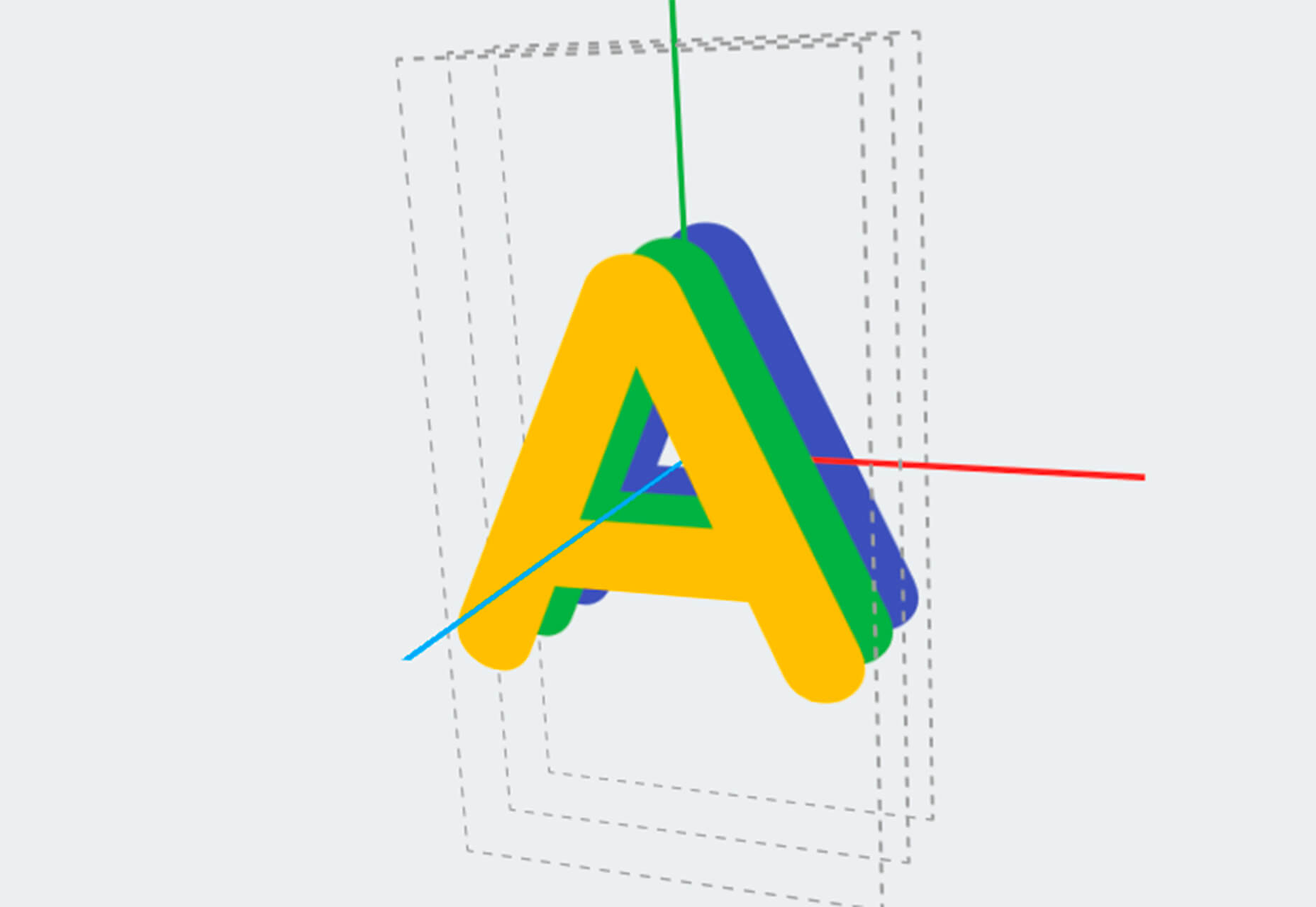
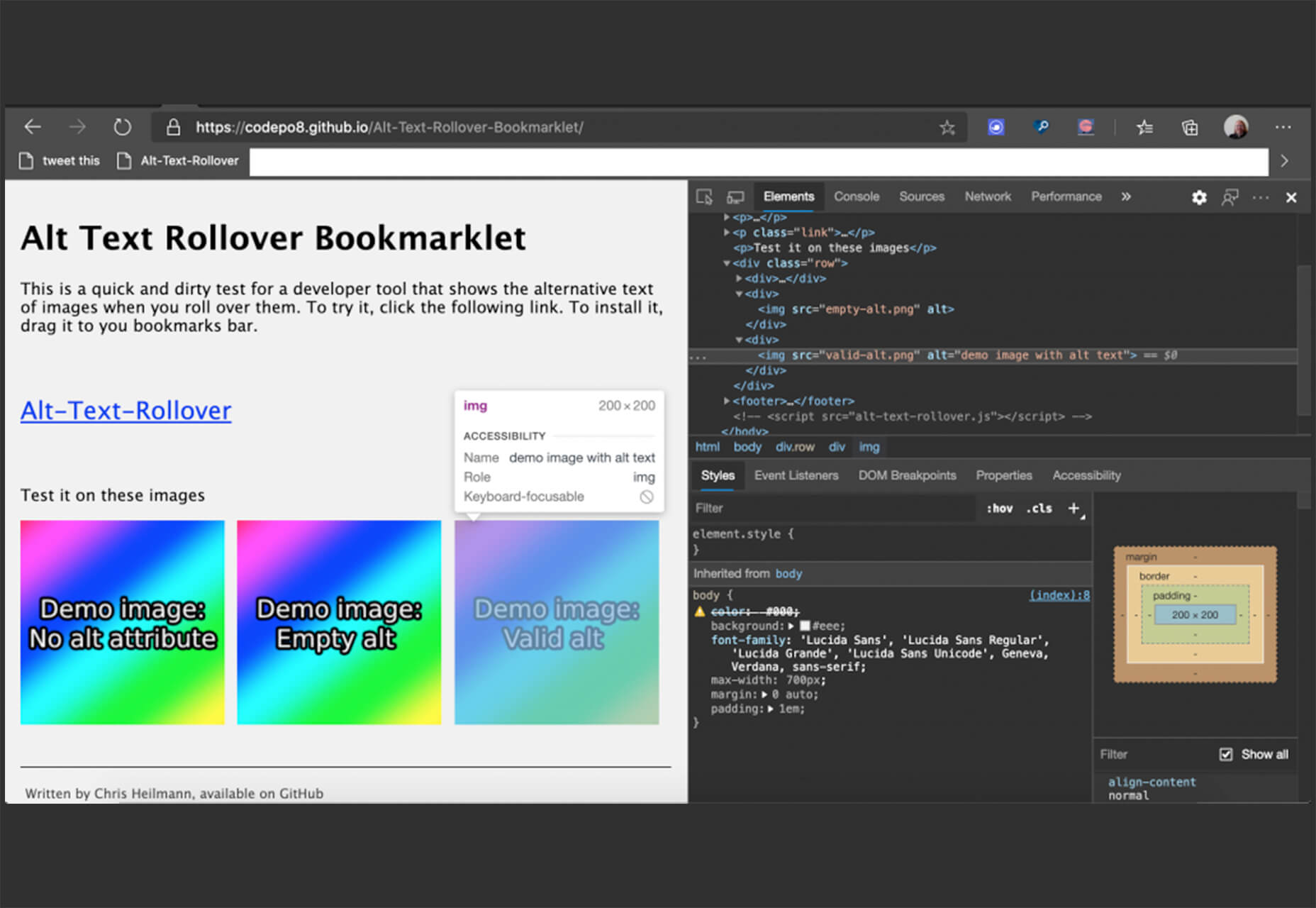
Every week users submit a lot of interesting stuff on our sister site Webdesigner News, highlighting great content from around the web that can be of interest to web designers.

The best way to keep track of all the great stories and news being posted is simply to check out the Webdesigner News site, however, in case you missed some here’s a quick and useful compilation of the most popular designer news that we curated from the past week.

The Beginner’s Guide to Responsive Web Design in 2020


Frontendor – HTML Templates and Blocks to Help Build Beautiful Websites


Why these Developer Job Titles are Ridiculous and Shouldn’t Exist


Emblemicons – Open-Source Free to Use Library of 1000+ Beautiful Icons


Disrespectful Design – Users Aren’t Stupid or Lazy


Welcome to your Bland New World


Playing with Fonts


The 50 Best Fonts for Creating Stunning Logos


How HTTPS Works


Nova – Beautiful, Fast, Flexible, Native Mac Code Editor


How to Be a Great Email Designer: Essential Tools


10 UX Lessons I Learned Building my Product from Scratch


5 Fears that Creatives Must Overcome


Introducing Mono Icons


From Posters to the Web: The Link Between Print and Digital Design


Designing SaaS Products In 2020


User Experience: What Is, its Guidelines and How to Apply it on your Website


The Evolution of the Google Sign up Form: 2005 → 2020


Principles for Naming a Brand


How to Choose the Right Website Fonts


Design Principles: What, Why, and How


5 Basic Types of Images in Web Design


Documenting is Designing: How Documentation Drives Better Design Outcomes


How to Create Dreamy Color Blurs in Adobe Illustrator


The Entrepreneur Vs the Linchpin: Which Type of Designer are You?


Want more? No problem! Keep track of top design news from around the web with Webdesigner News.

Source


Source de l’article sur Webdesignerdepot

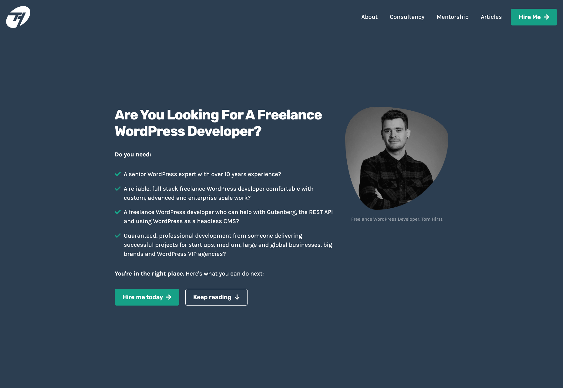
As a freelance web developer, how many clients do you get from your website? If you’re like most, you’re probably lucky to get one client every 2-3 months. Unfortunately, that’s very common.

These days it’s not enough just to be a web developer if you want to make really good money. You have to be able to differentiate yourself in the marketplace to get more opportunities. If you can do this successfully, I’m 100% sure that it will help you win more projects and charge higher rates.

So today I’d like to share with you a little bit of my own story. In the last 4 months, I was able to position myself as a specialist with my personal site that ultimately helped me win more projects and get better clients.

The Importance of Niching Down

The first thing that I would invite you to do is to shift your thinking a little bit.

If you want to be a high-paid professional (especially if you’re a freelancer), you need to learn how to market and sell yourself. And the first rule of marketing is to identify your target audience and the result that you help them achieve.

I can’t over emphasize the importance of this.

You need to know exactly who you help and the outcome that you provide. That is ultimately what you get paid for. So you need to define your ideal client.

My suggestion is to pick a market segment that you would love to work with, that has the money to afford you and (ideally) those that have already done some projects for. Once you have identified your target market, you need to create your positioning statement. Your positioning statement should immediately tell who you help and what results you help them achieve.

Here is a formula that you can use to create your positioning statement:

I help __ (target audience) __ do (build/achieve/overcome) ___ (problem that you help them solve).

For example: I help startup SaaS companies build highly converting websites. You can go even narrower if you want, but this is already much better than just saying, “I’m a web developer.”

If your positioning statement is “I help startup SaaS companies build highly converting websites” it can still be narrowed down and improved. As you gain more experience and work with more clients, you can refine it to something like: “I help healthcare SaaS companies build highly converting websites.”

Now imagine if a SaaS startup founder from a healthcare niche came to your site and saw that positioning statement vs a very generic one like “I’m a web developer”. How much easier would it be for you to differentiate yourself and gain a huge advantage over your competitors in the marketplace?

4 Elements of a Perfect Landing Page

“I am passionate about coding, I have 10+ years of experience, client satisfaction is my main goal…” 

Have you ever seen statements like that on someone’s portfolio site? Or maybe it even says that on your own site. From my experience, statements like that don’t really help you convert site visitors into customers.

If you personally go to a company’s website, what would you like to see yourself as a visitor? Somebody saying how good they are, or to find out if they can be a good fit to solve your problem? I think that most of the time the latter is what you’re after. That’s what other people usually go to your website for; they want to know how you can help them solve their problems.

For instance, take a look at this section from Tom Hirst’s website:

As you can see, this immediately helps the visitors understand if Tom is a good fit for them or not. He doesn’t just boast about how good he is, but rather helps the client understand what problems he can solve for them. Another important part here is that Tom doesn’t use a lot of technical terms. Since a lot of his visitors may be not as tech-savvy as he is, there is no point in confusing them with technical jargon. The more you can speak their language – the easier it will be for you to build trust and connection that will later help you during the sales process.

Let me tell you a bit about the 4 parts of my site that I think have contributed significantly to having me win more projects. The 4 elements are problem, solution, proof, and call to action. Let me go over them 1 by 1 and explain why they’re important.

1. Problem

A good way to start your landing page sales letter is by identifying the problem of the client. If you know their pain points and you mention them, you should be able to hook them into reading your copy. And a well-written copy plays a significant role in persuading your visitors to take the next action.

2. Solution

Once you have mentioned their problem, you need to present them with a solution that you provide. You need to show them how working with you can solve their problems. Whatever their problems are, you have to show them that you understand them and can help solve them.

That’s what UX designer Matt Oplinski is doing on his website is doing. He knows that his clients might need help with 3 types of projects: Digital Products, Marketing Websites or Mobile Apps. For example, the clients who are seeking a redesign of their website may have an issue with their current conversion rates. And that’s exactly what Matthew lists in the middle section under “Custom Marketing Website” headline. I would even argue that he may have been a bit more specific with the solutions that he can offer.

The main takeaway here is that it’s important to be very specific with the result that you can help your clients achieve. The more accurate it is, the better it is going to convert.

3. Social Proof

Social proof plays an extremely important role in converting a lead into a customer. When someone comes to your site, they don’t know if they can trust you. If they were to spend one, two, five, ten or even more thousand dollars – they need to feel comfortable with you. They need to have at least some level of trust. That’s why they want to see as many signs as possible that you’re trustworthy.

Social proof obviously can come in many different forms. The most popular and important ones, in my opinion, are case studies with results that you’ve produced and testimonials. They will be absolutely crucial to persuade your clients and be able to differentiate yourself from others.

Here is a good example from Bill Erickson’s site:

Ideally, your testimonials should showcase a particular business goal that you’ve helped your client to achieve. But even if you don’t have those, you can use ordinary testimonials that your clients give you. That alone is better than no testimonials at all.

4. Call to Action

Last but not least you should have a single call to action on your site. Most likely it will be a button to contact you, or book a call with you.

In my opinion, it’s important to have a single call to action because if you give people too many options they will not be so focused on taking an action that you actually want them to take.

I also suggest that you have a call to action button at least 2-3 times on the page: one on the first screen where you have your positioning statement and/or your offer, and one at the very bottom of the page so that when they finish reading they don’t need to go back to the top to take action. Having another call to action in the middle of your page is also a good idea. My advice would be to add it after you’ve described the problem, your solution and presented yourself as someone who can help your leads with their problems.

Results

I started niching down and created my own website four months ago. Being a member of multiple freelance platforms, I’ve been fortunate enough to get enough leads in my target market to test out my strategy. So far the results are pretty amazing.

It has become a lot easier for me to win projects, get clients that respect my knowledge, and my process. Besides that, I’ve been able to significantly increase my rates for my work. A great thing about working with similar projects every time is that you automate and streamline a lot of things, improve your delivery process and become much more efficient. You can even create a productized service. This is something that is very hard to achieve if you’re constantly working on custom projects that have different requirements and involve different technologies.

To be completely transparent, I’m still in the process of building my authority in the niche, polishing my offer and gaining experience. I still have a long way to go. What I can certainly say today is that it has been one of the best decisions in my professional career.

To become a high paying professional in your industry you have to do things differently. Today I tried to show you one of the ways that you can improve your career or freelancing business fast. It probably won’t happen overnight, but in a matter of a few months you can be so much ahead of your competition if you deploy some of the strategies that I’ve shared with you today.

I really hope that this article has helped you gain some perspective and you will start to consider doing a similar thing that I did to achieve amazing results.


Featured image via Unsplash.

Source


Source de l’article sur Webdesignerdepot