 As the season starts to change, so do some of the trends that web designers are using in projects. From a return of blur to interesting frame edges for images to neon color, there’s a lot to get excited about.
Here’s what’s trending in design this month.
1. Blur is Back
Blur as a design element is gaining traction in a big way. This web design trend can look like a lot of different things and be used in a variety of ways.
From backgrounds to blur in images to blurred elements in the foreground, there’s a use case for almost everything.
The thing that makes blur a highly usable design element is that it is easy to create and use. Blur can be created in Adobe Photoshop or similar software, with CSS, or be part of the way an image is created. It can be soft or hard, with or without color, and any size or shape.
The versatility and flexibility make it a popular choice for backgrounds and foreground elements, as you’ll see below.
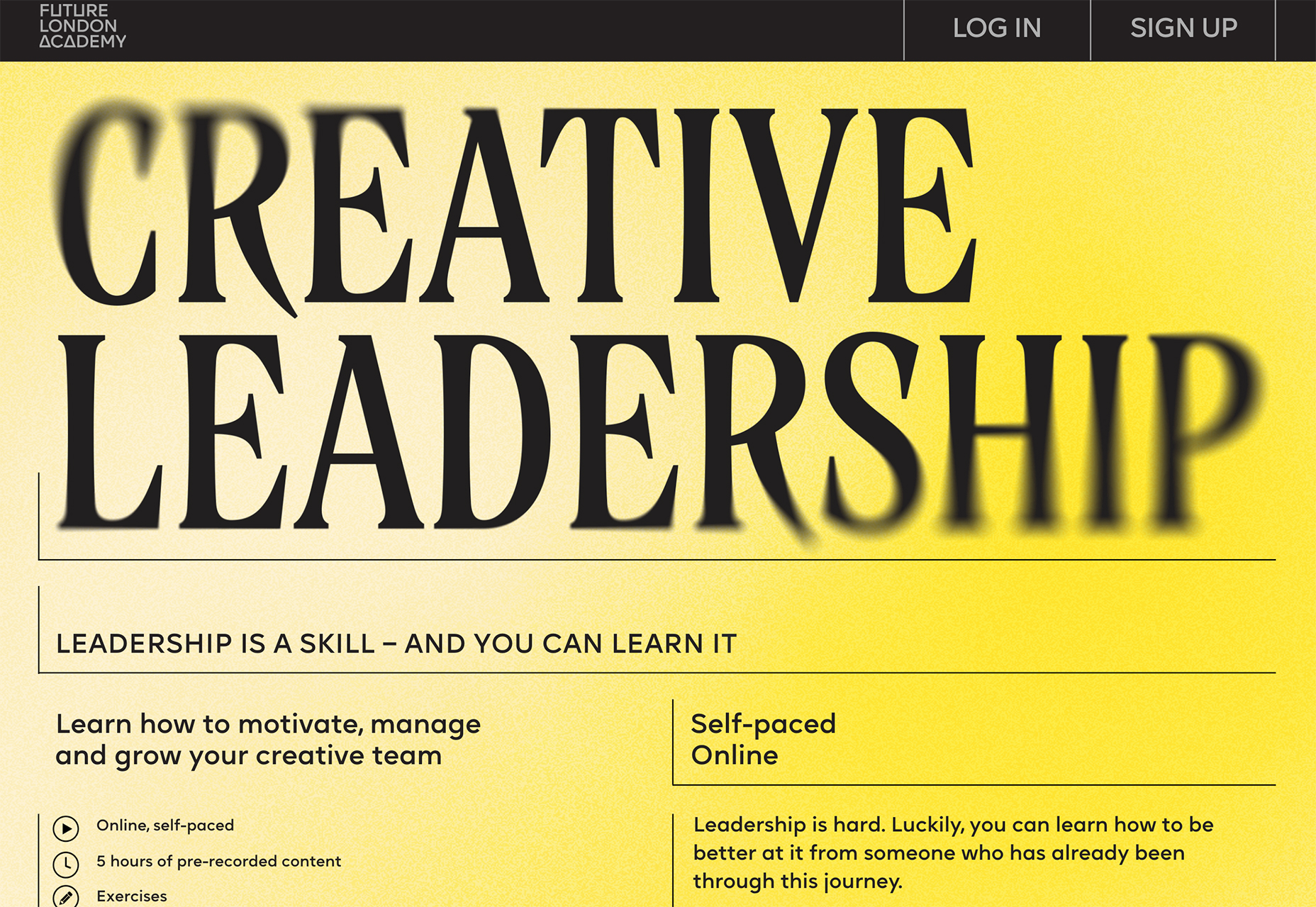
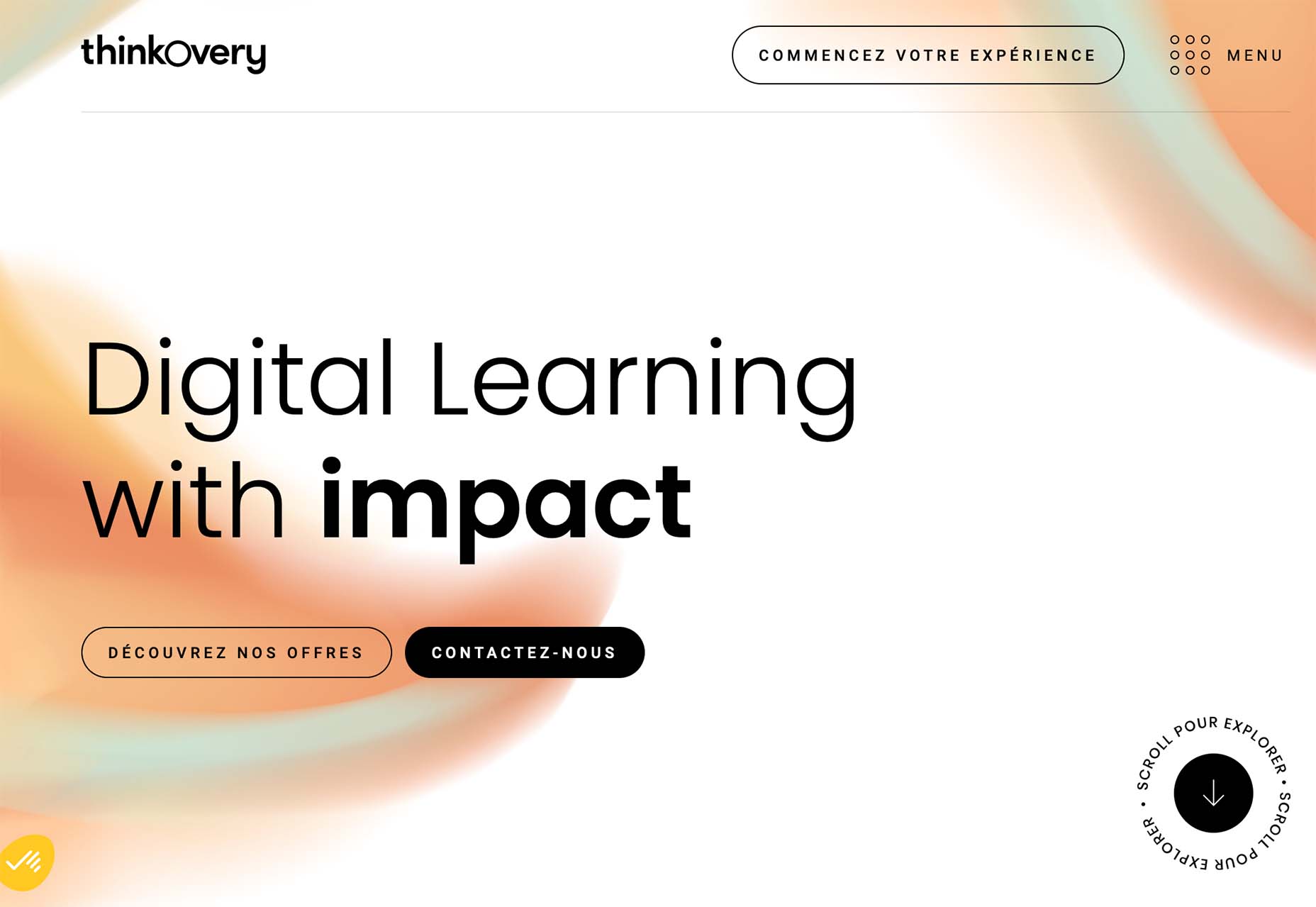
Future London Academy uses blur in a bit of an unusual way with a blur element in the foreground that blurs the edges of some oversized lettering. The technique is repeated on the scroll and on some images as well.
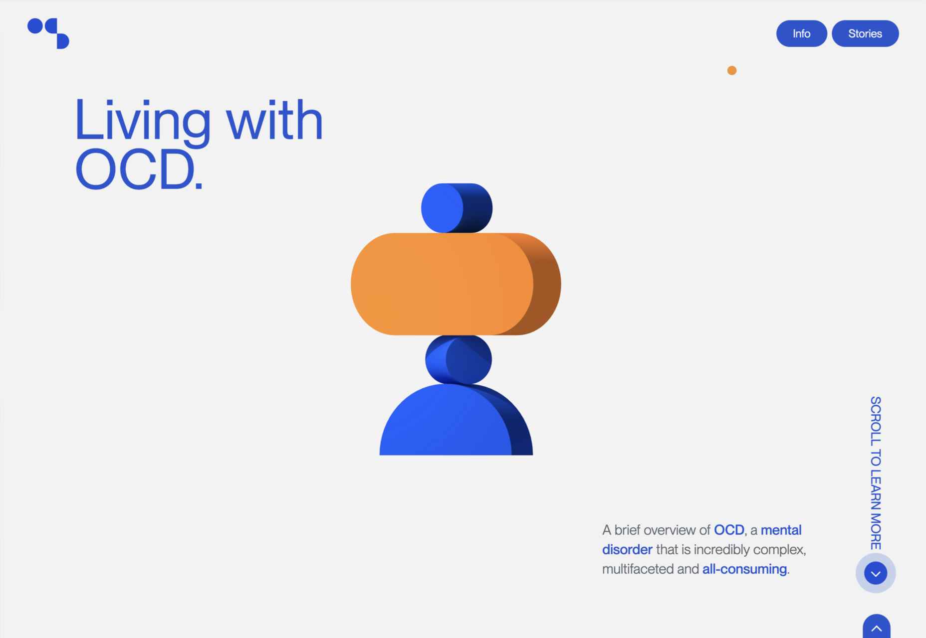
Outcrowd uses blur in the background with animation to help create visual focus as you scroll. The colorful blurred circles get smaller and less blurred as the user moves down the page to contribute to the story the design is trying to communicate.
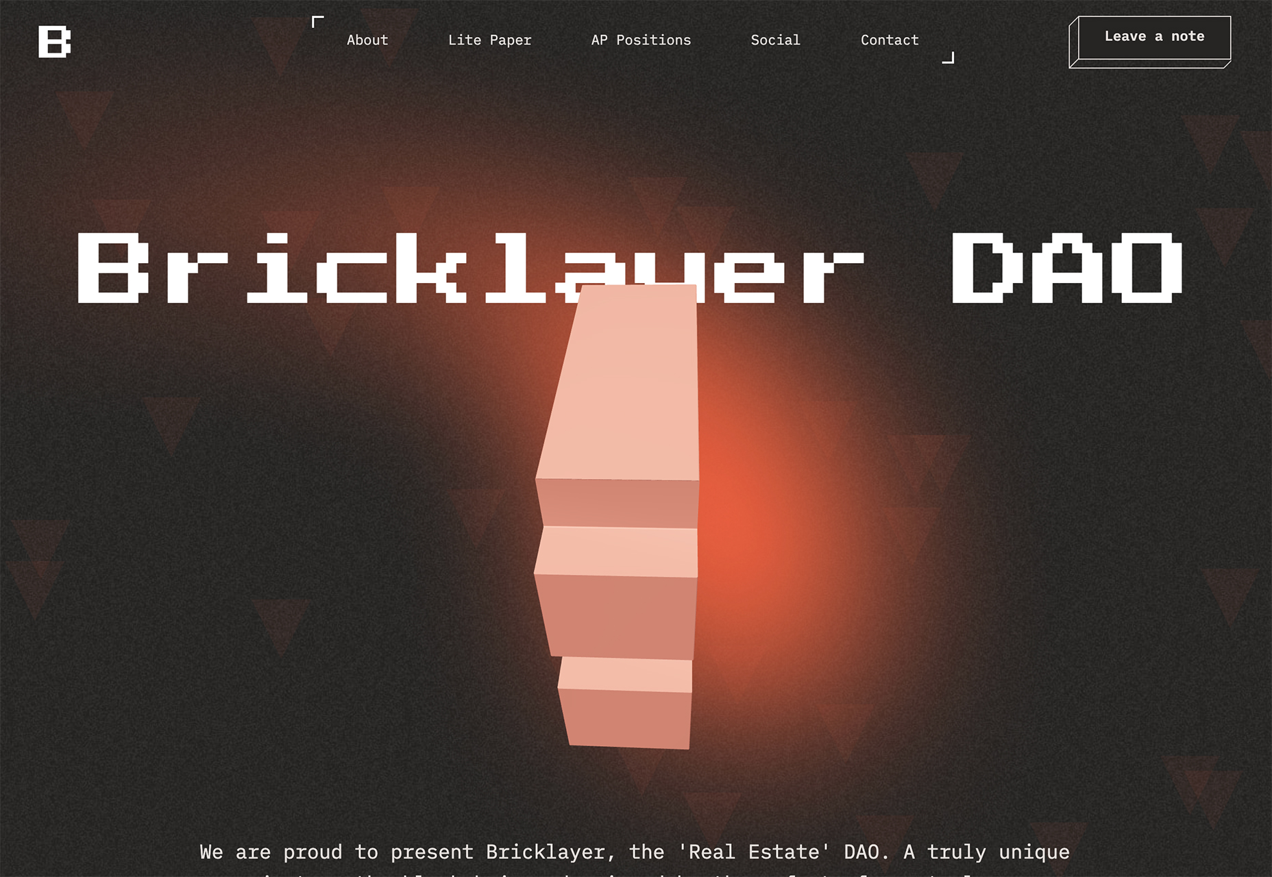
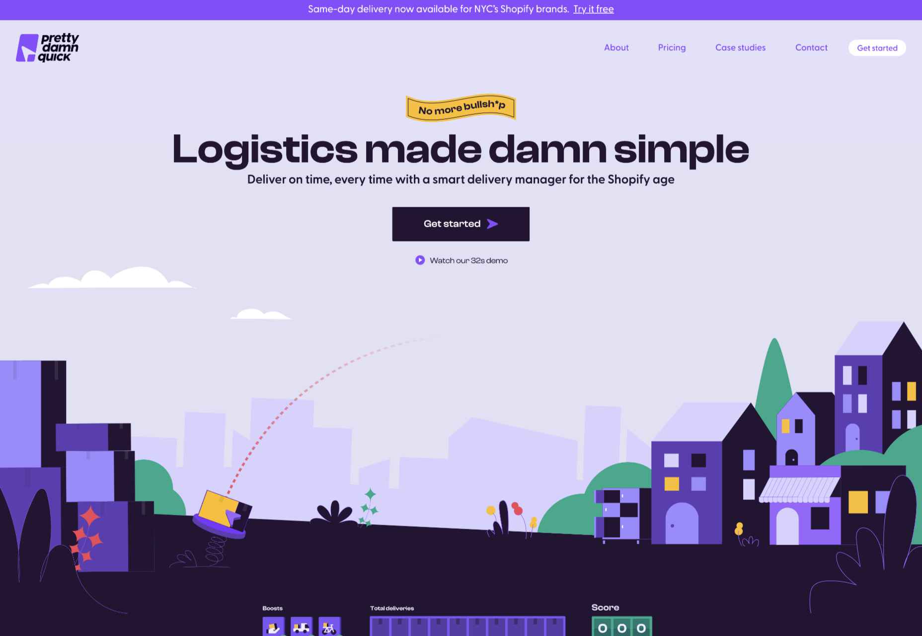
Bricklayer Dao uses blur in the background, almost as a red “sunspot” to help create a focal point on the center of the screen. Note how the blur here does not have a distinct shape; it’s almost a swash that leads the eye across and down the screen.
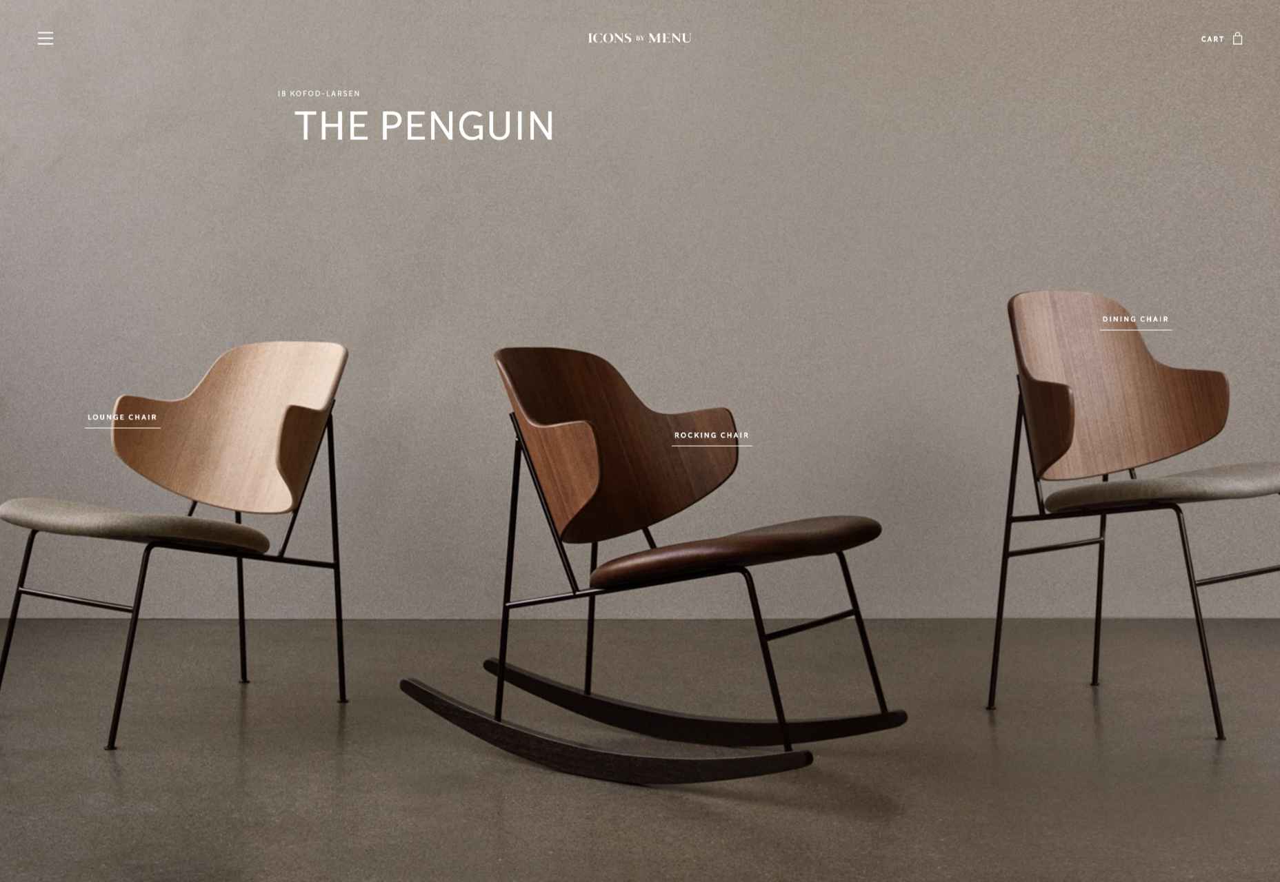
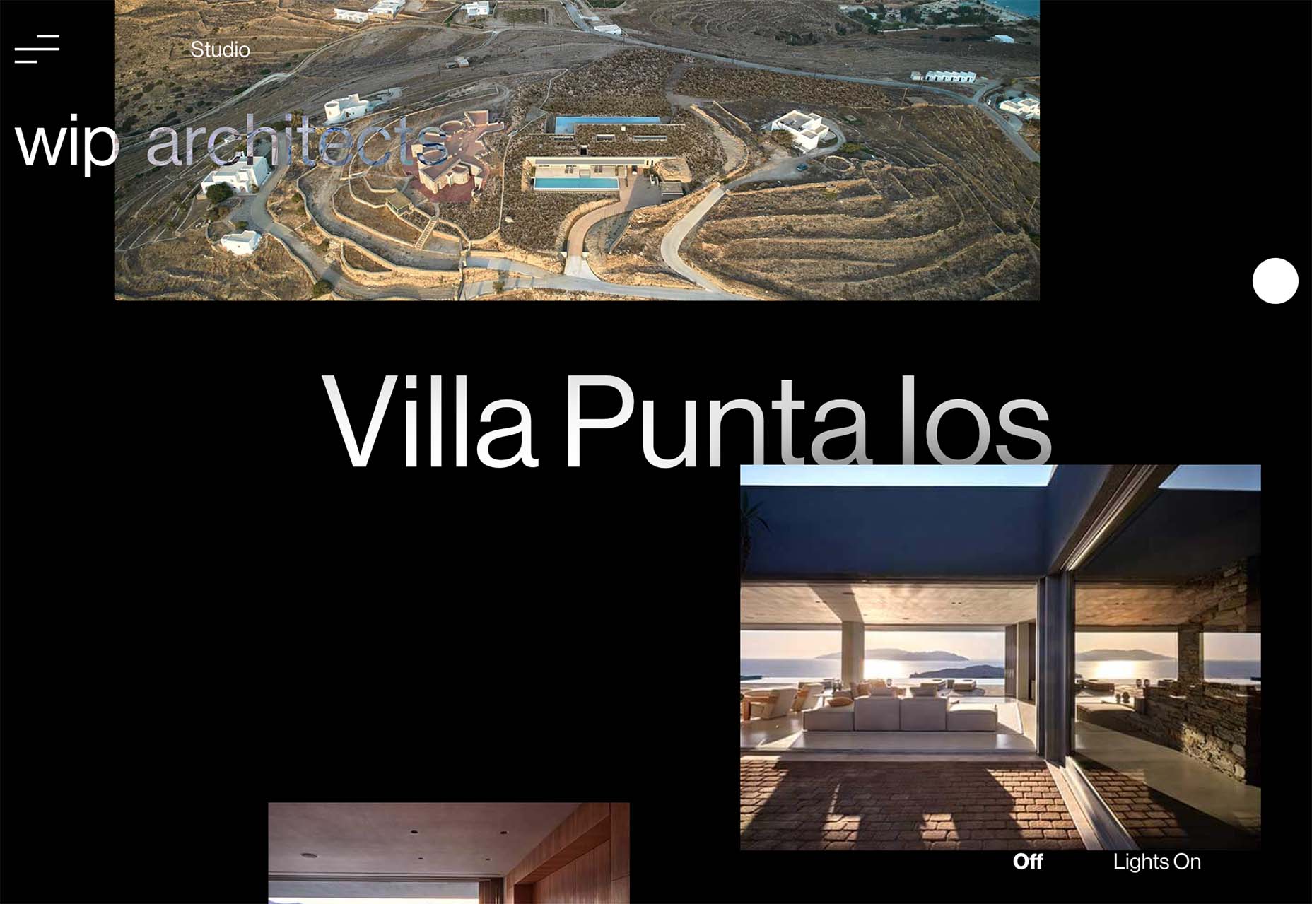
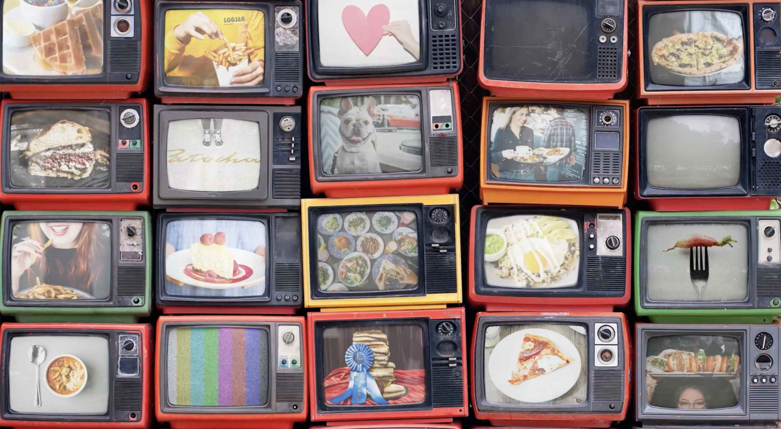
2. Interesting Edges
Most containers that you see for images and videos online are either rectangular or circular. Straight lines help separate content elements from one another.
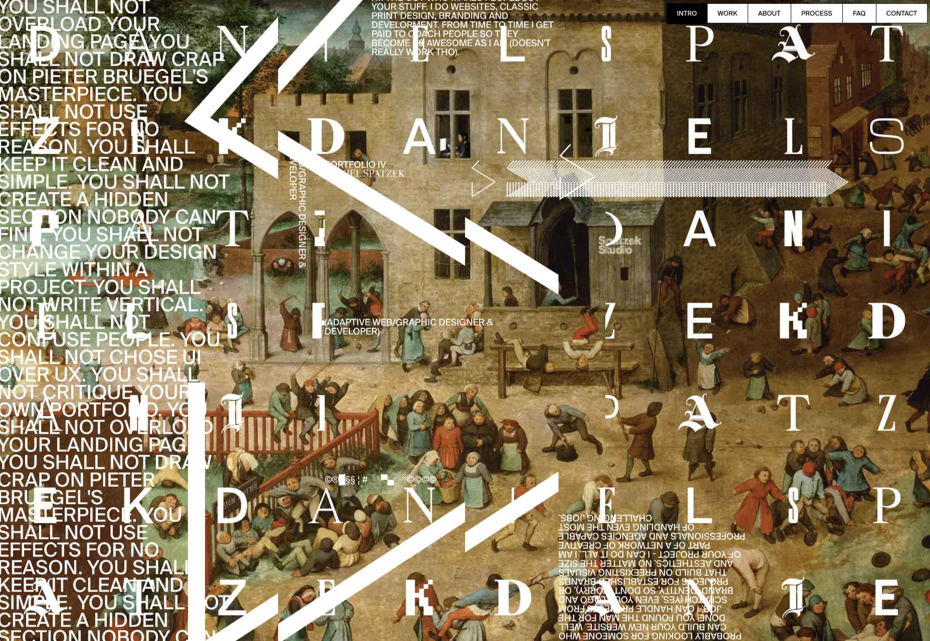
But more designers are thinking outside the box – literally – with interesting edges for content elements. (Note this website design trend is pretty tricky to pull off and you’ll really have to think about these shapes work together, especially when you switch from horizontal to vertical orientations.)
The commonality with all of these projects that use interesting edges is that images are tucked in behind an element that isn’t a shape you’d typically expect. Most include some element of motion as well, from a load or scroll animation to video. (You should click through to see how each of these examples works.)
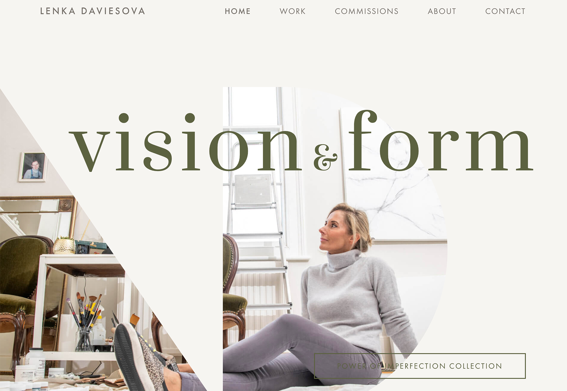
Lenka Daviesova has an image behind two cut out shapes that includes a simple load animation. What makes this interesting is that you don’t feel like anything is missing from the parts of the image you can’t see. Your brain fills in the blanks for you.
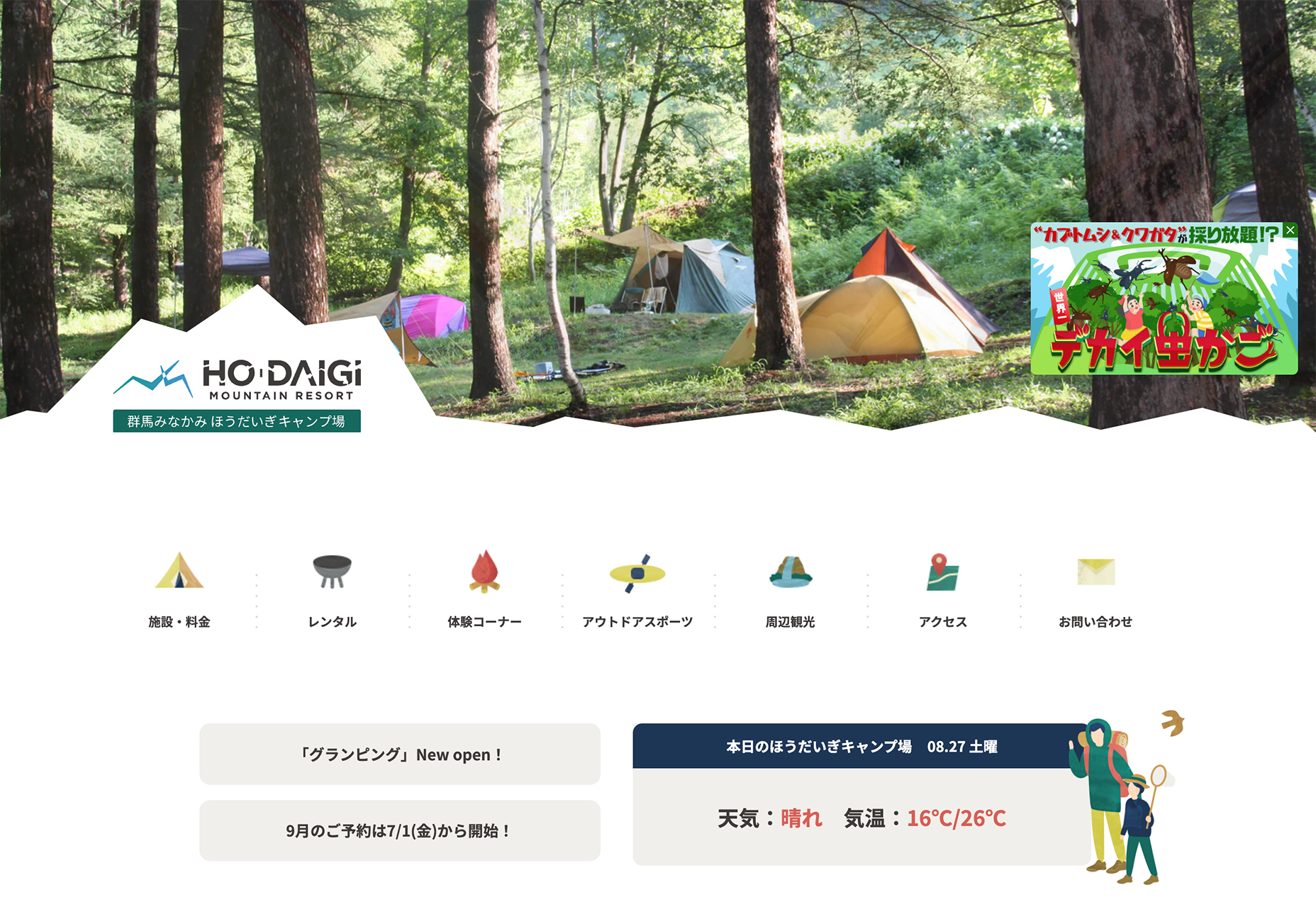
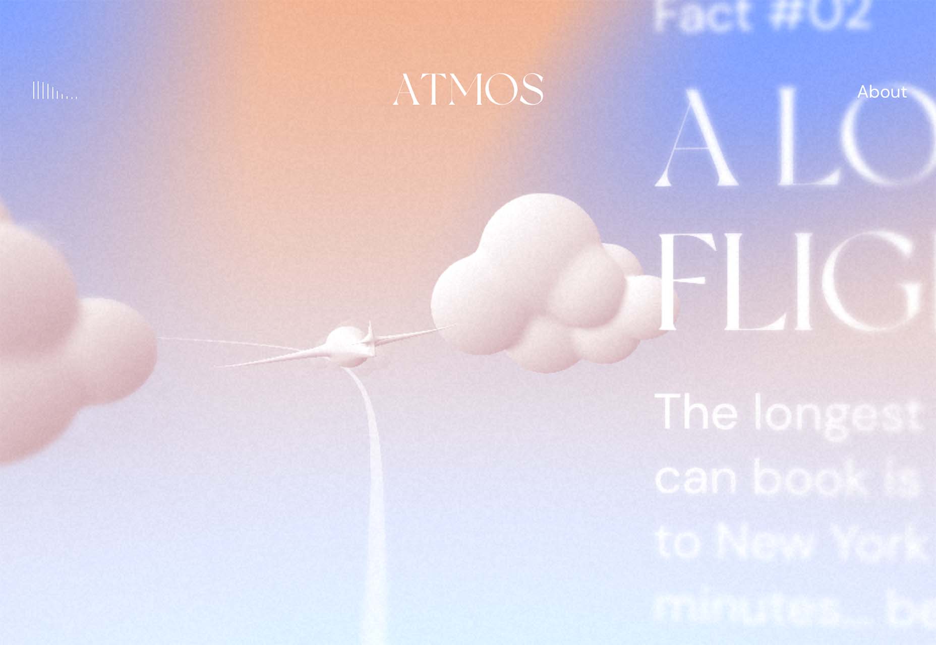
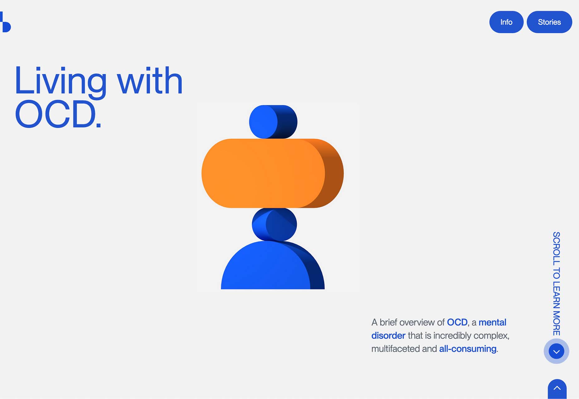
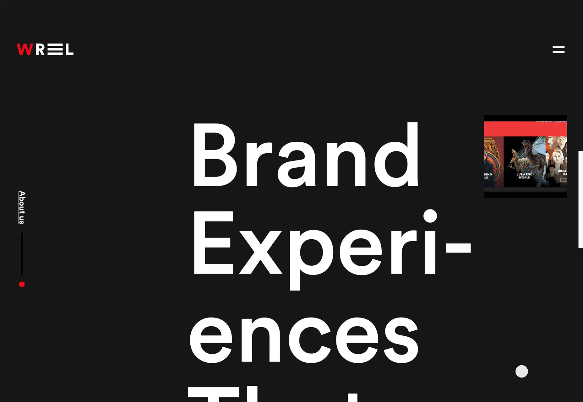
Ho Daigi Mountain Resort has moving images behind a foreground element in the shape of a mountain. This shape helps provide information about the location and is a clever way to tuck the logo into the lower third of the home hero area. The mountain edge is carried through every scroll on the homepage design.
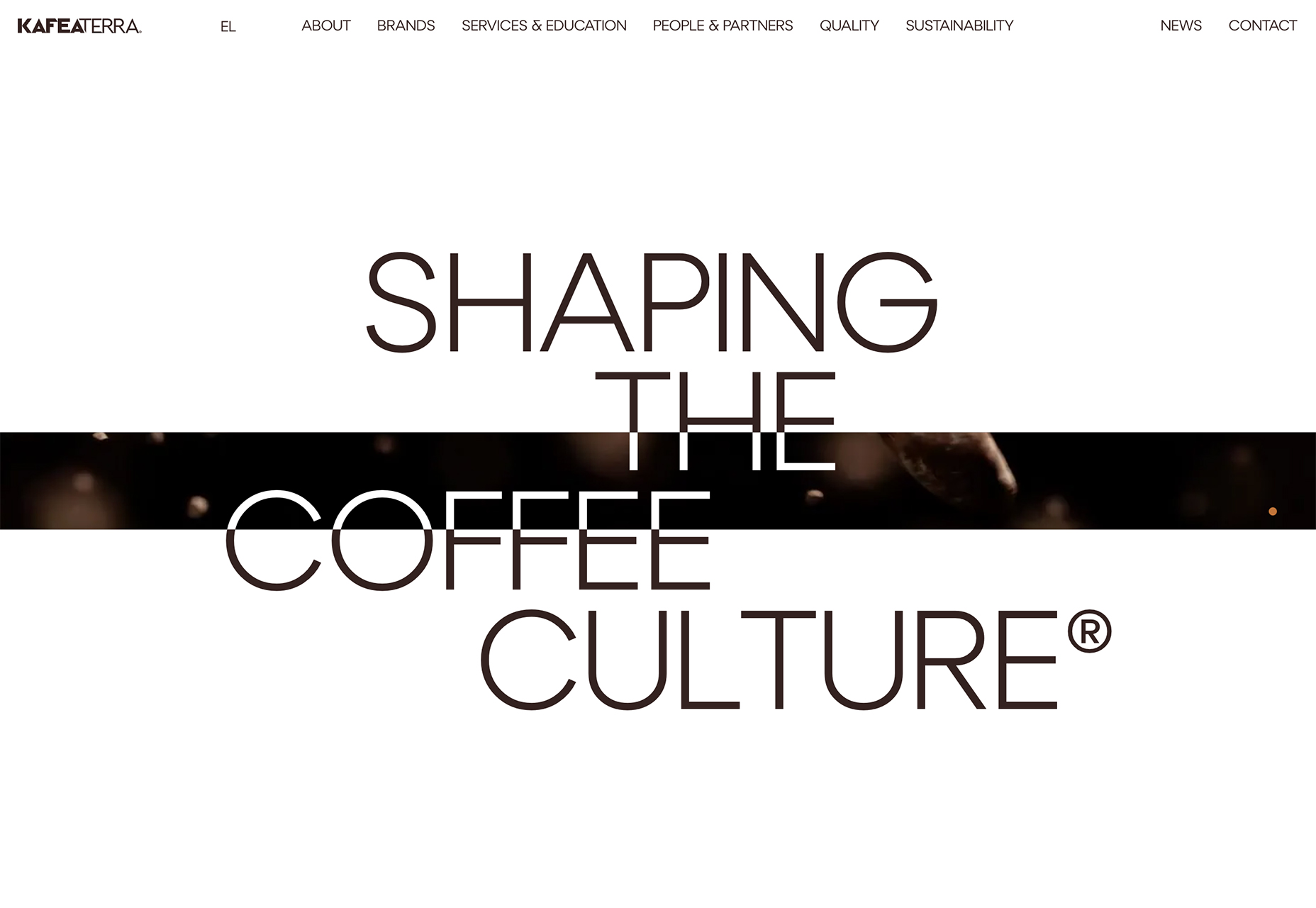
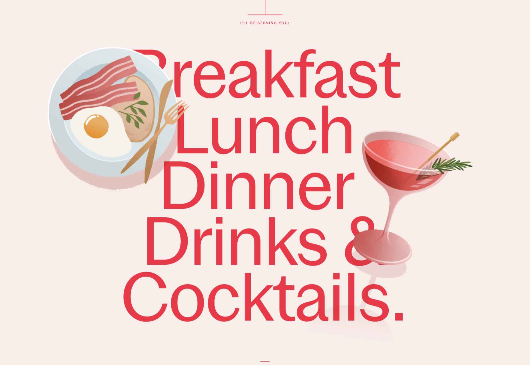
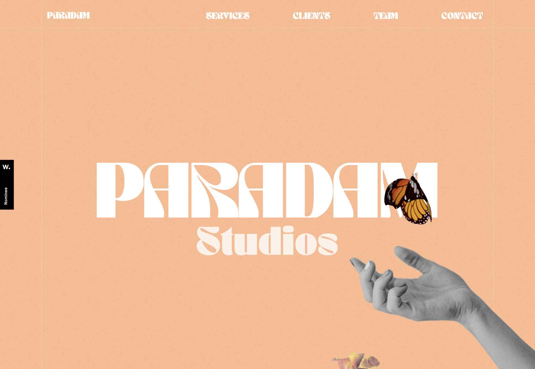
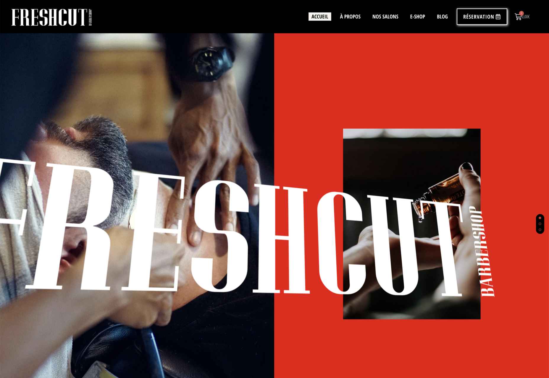
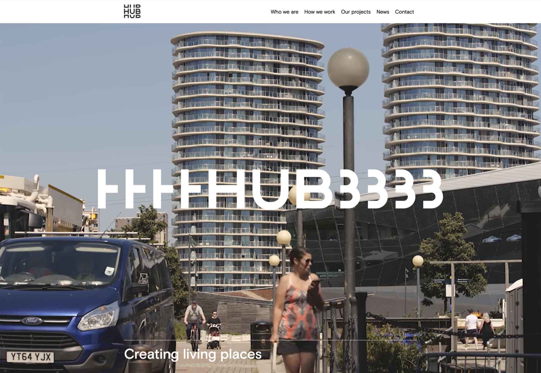
Kafeaterra uses interesting edges in a totally different way. While the shape is a common rectangle, it’s highly dramatic and text elements encroach into the space. It’s so unexpected that the overlap of elements with no real space of their own, sets a very specific tone for the content.
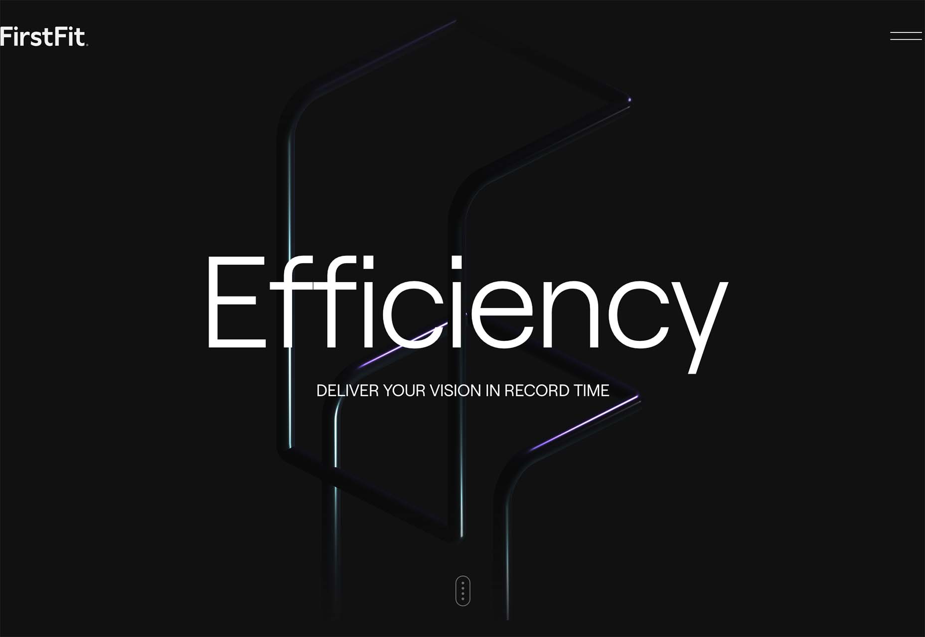
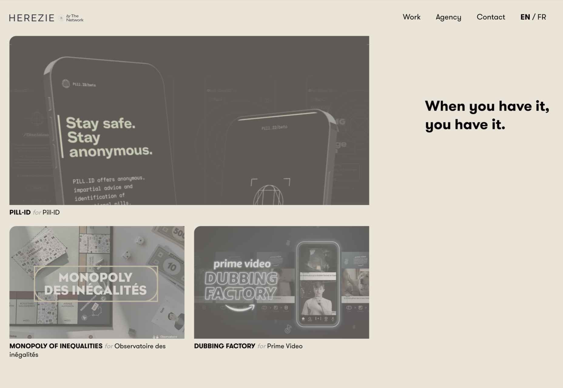
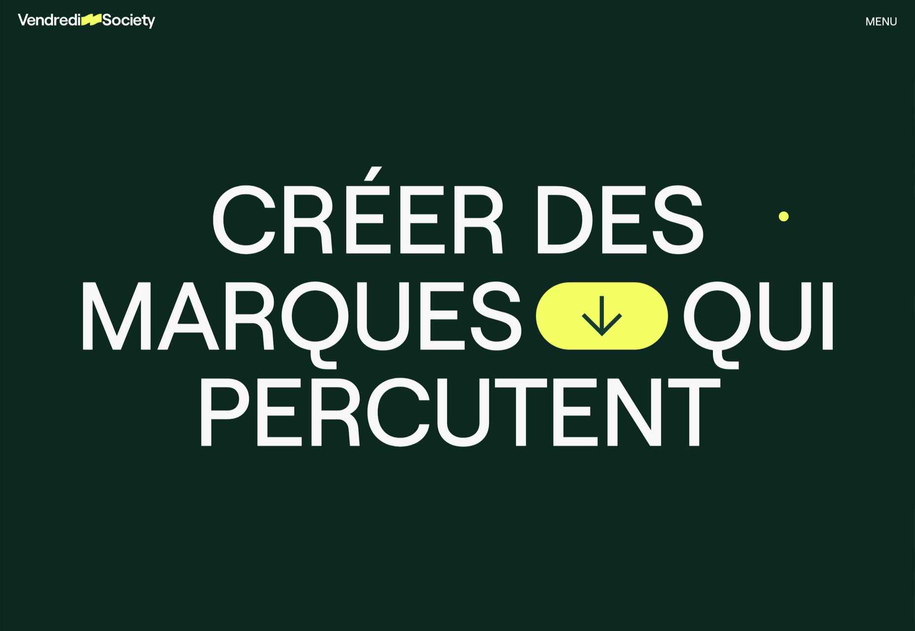
3. Neon Yellow
One of the most difficult color choices to portray on screens is trending – neon yellow.
Neons are traditionally difficult because they can create visual and contrast challenges and not always look as intended due to user settings. Neon yellow is showing up everywhere right now with black or dark backgrounds though. (Maybe because of the popularity of dark mode.)
The commonality for most of these trending designs is that the yellow is an accent and is not used widely, for the most part. Too much neon can get difficult to read or result in eyestrain.
There also seems to be a consistent vibe with these projects that feels somewhat masculine and stark.
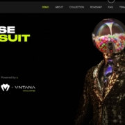
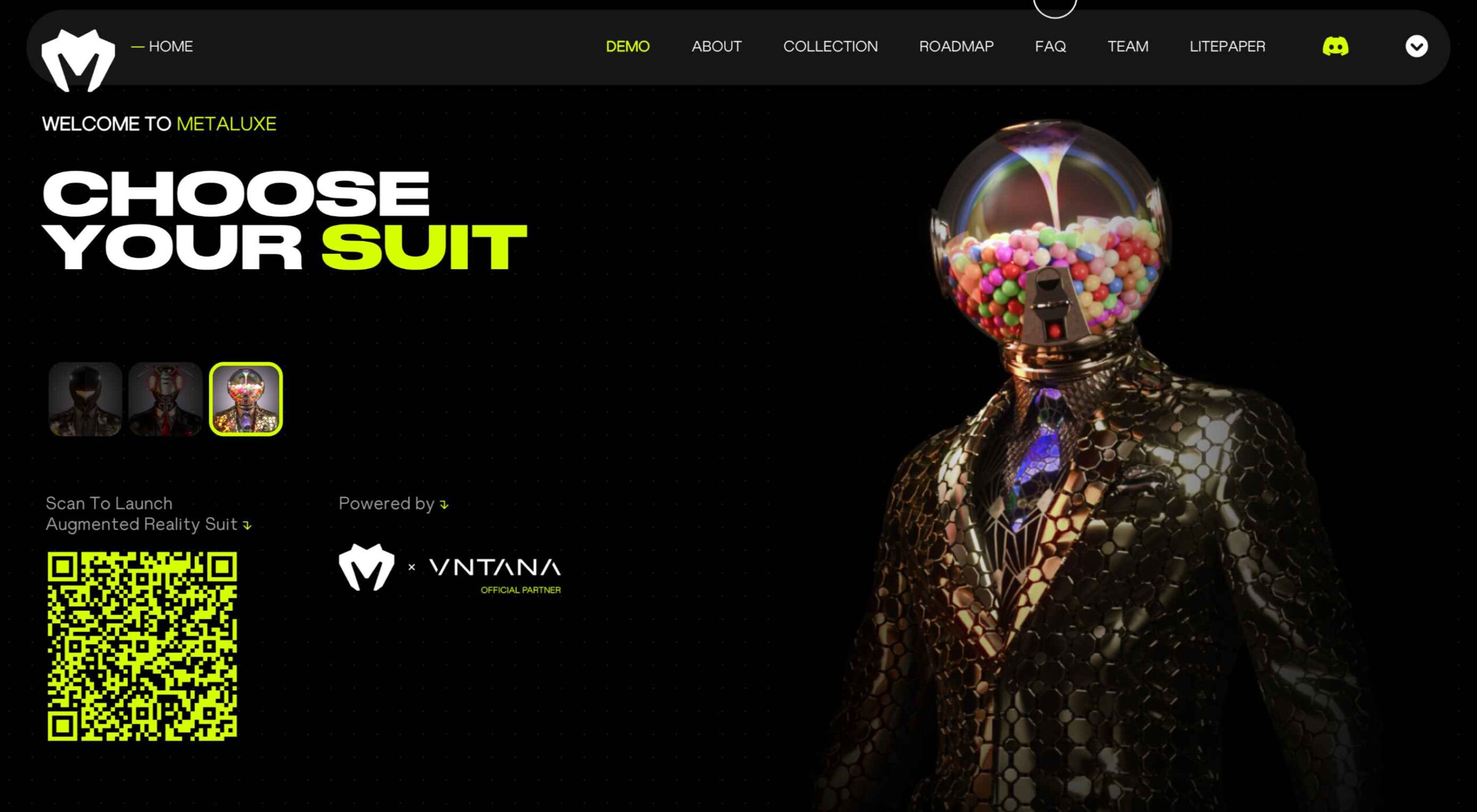
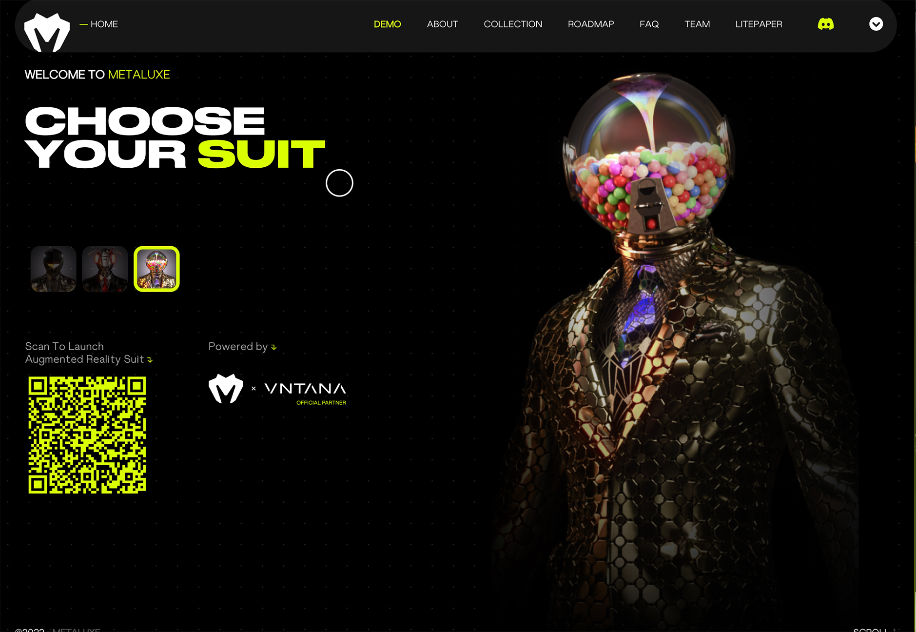
Metaluxe uses neon yellow for text accents and a giant QR code on the homepage. The hue is designed to help move you through content with ease from top to bottom to the call to action.
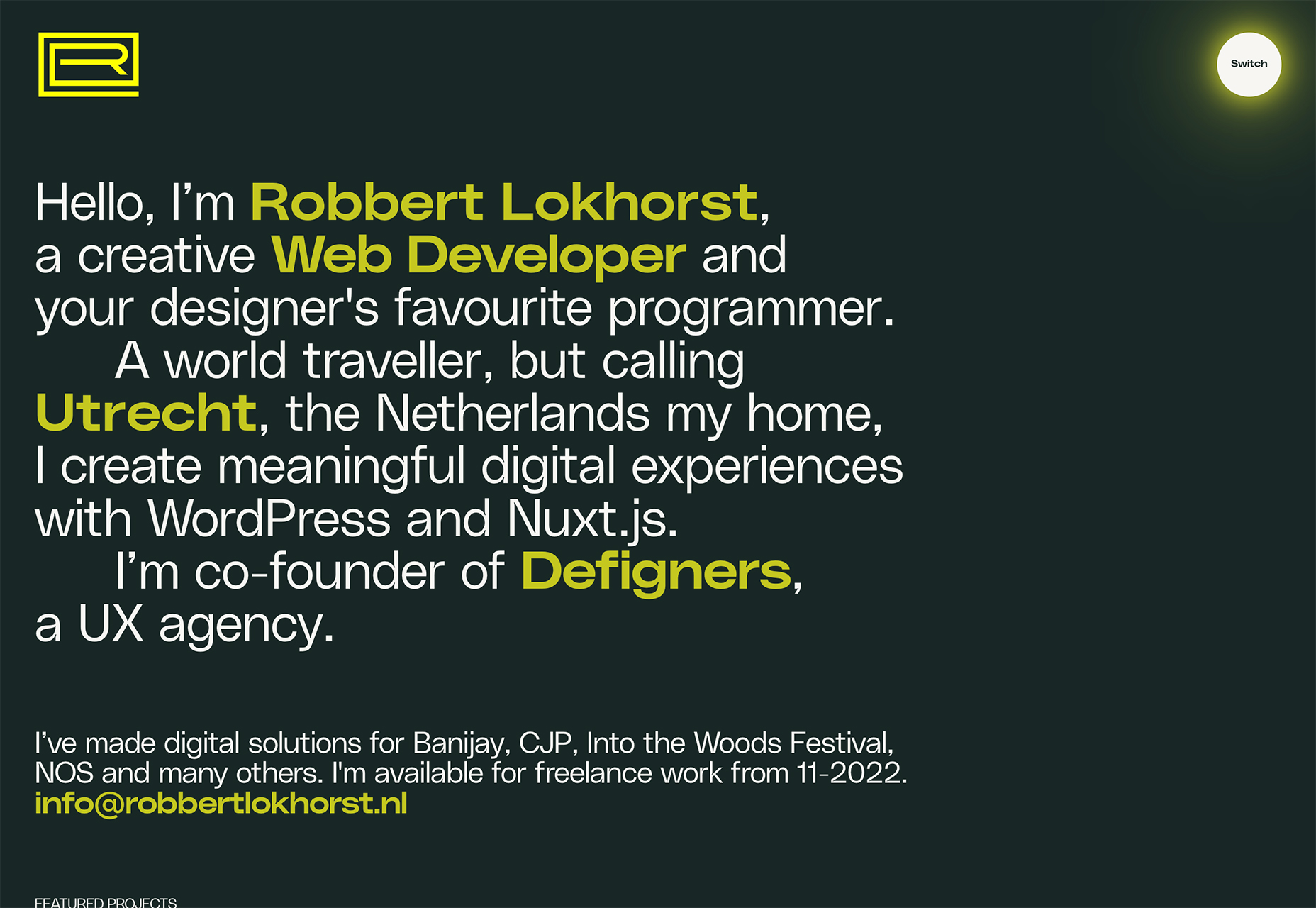
Robbert Lokhorst uses neon yellow – two shades here, actually – in the logo, as a button highlight, and for keywords in the all-text hero area. Note how the logo and button hues are more yellow than the primary text.
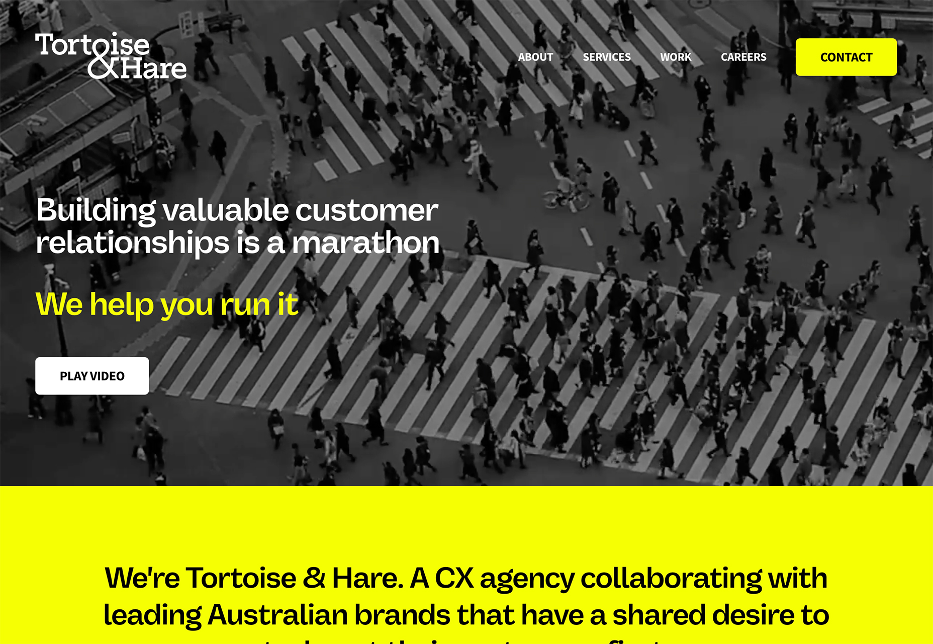
Tortoise & Hare CX Agency uses neon yellow on a black and white video roll as a text and button accent. While this could be a tricky combination, the extra shading over the video helps create enough contrast for it to all come together. Generally, it is not advised to use a neon yellow over white or light colors because there isn’t enough contrast to read it. Here, though, they do a great job of pulling the pieces together.
Conclusion
One of the things that’s interesting about this collection of trends is that we are seeing new iterations of things that were popular in the not-so-distant past. Blur was a major trend just a couple of years ago and seems to be re-emerging again. Neons seem to come and go pretty regularly.
If nothing else, these “recycled” trends are a good reminder to file work well so you can dig out some of those old ideas when they come into fashion again.
The post 3 Essential Design Trends, September 2022 first appeared on Webdesigner Depot.
 The purpose of a website is to reach new customers and keep current ones engaged. Therefore, customer-first should be at the top of your list for design features. After all, without your clients, your business won’t grow or succeed.
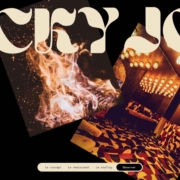
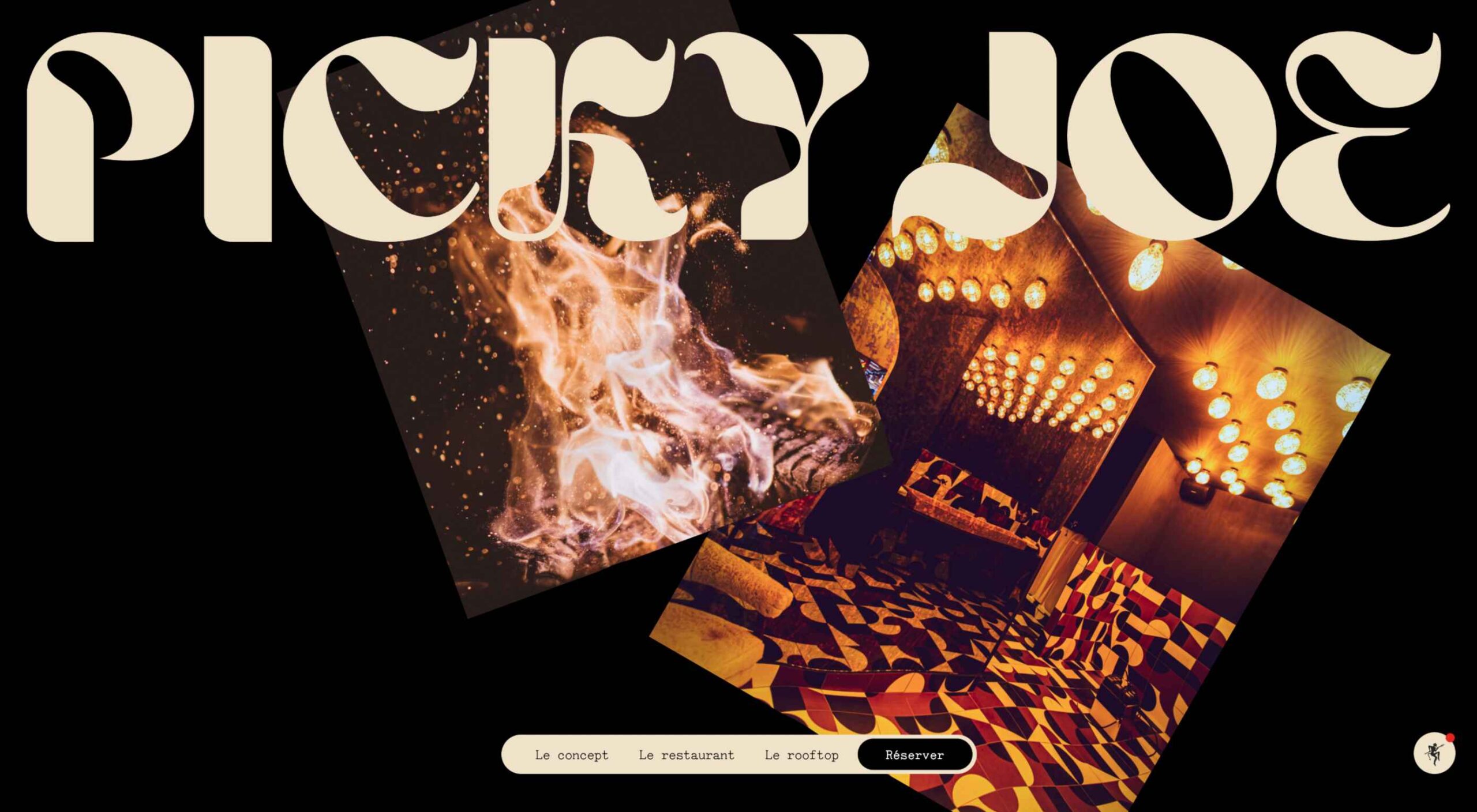
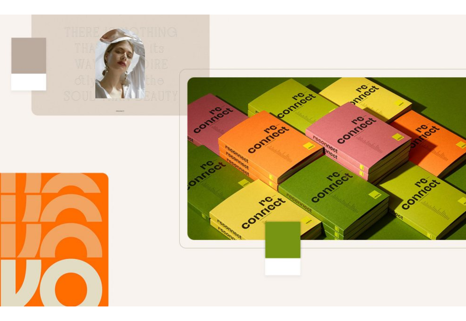
 Welcome to our guide to the best new websites this month. If subtle, minimal sites are your thing, either look away now or prepare to have your preconceptions challenged because this month, we are going maximalist.
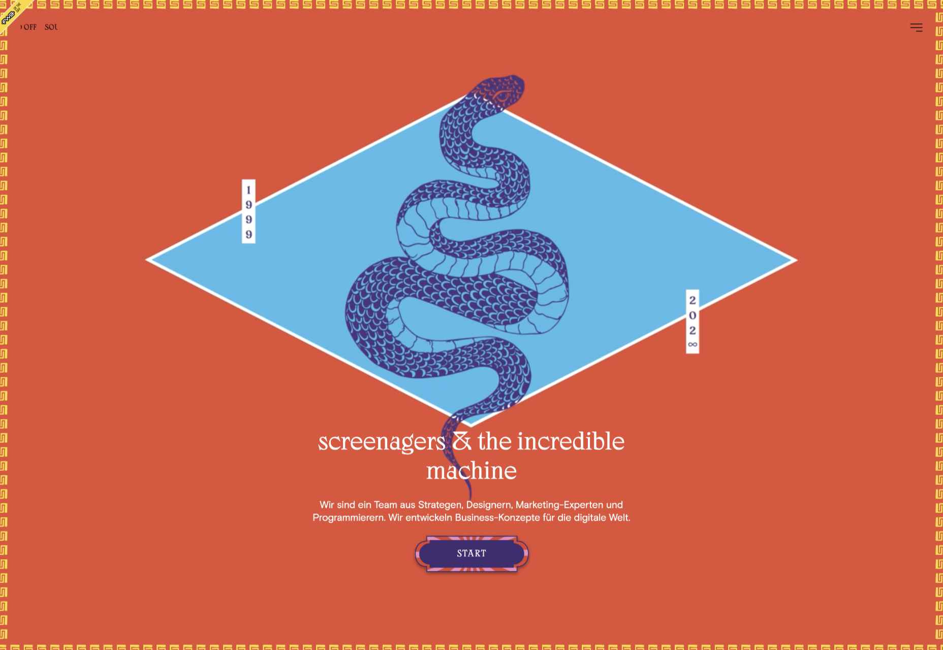
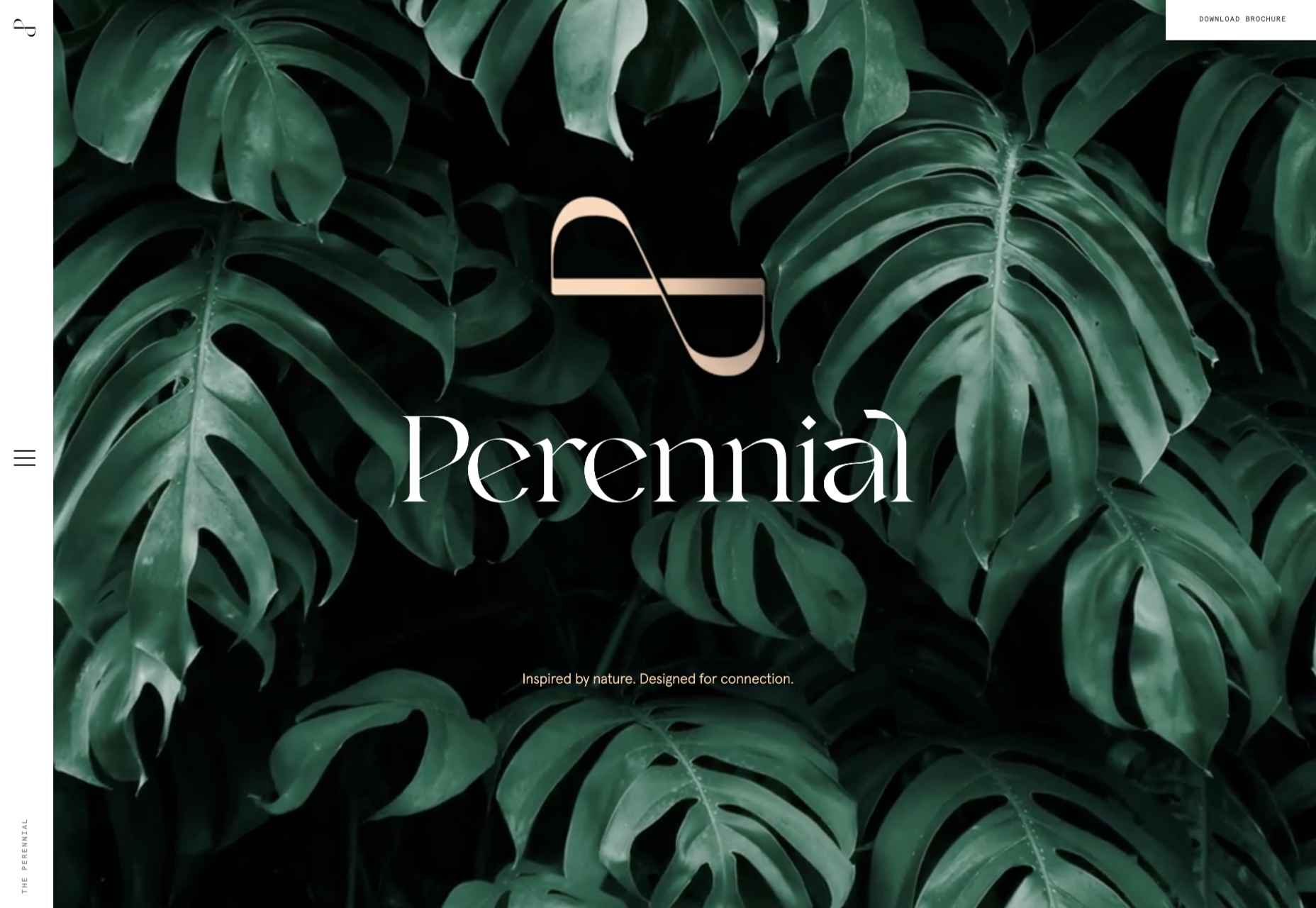
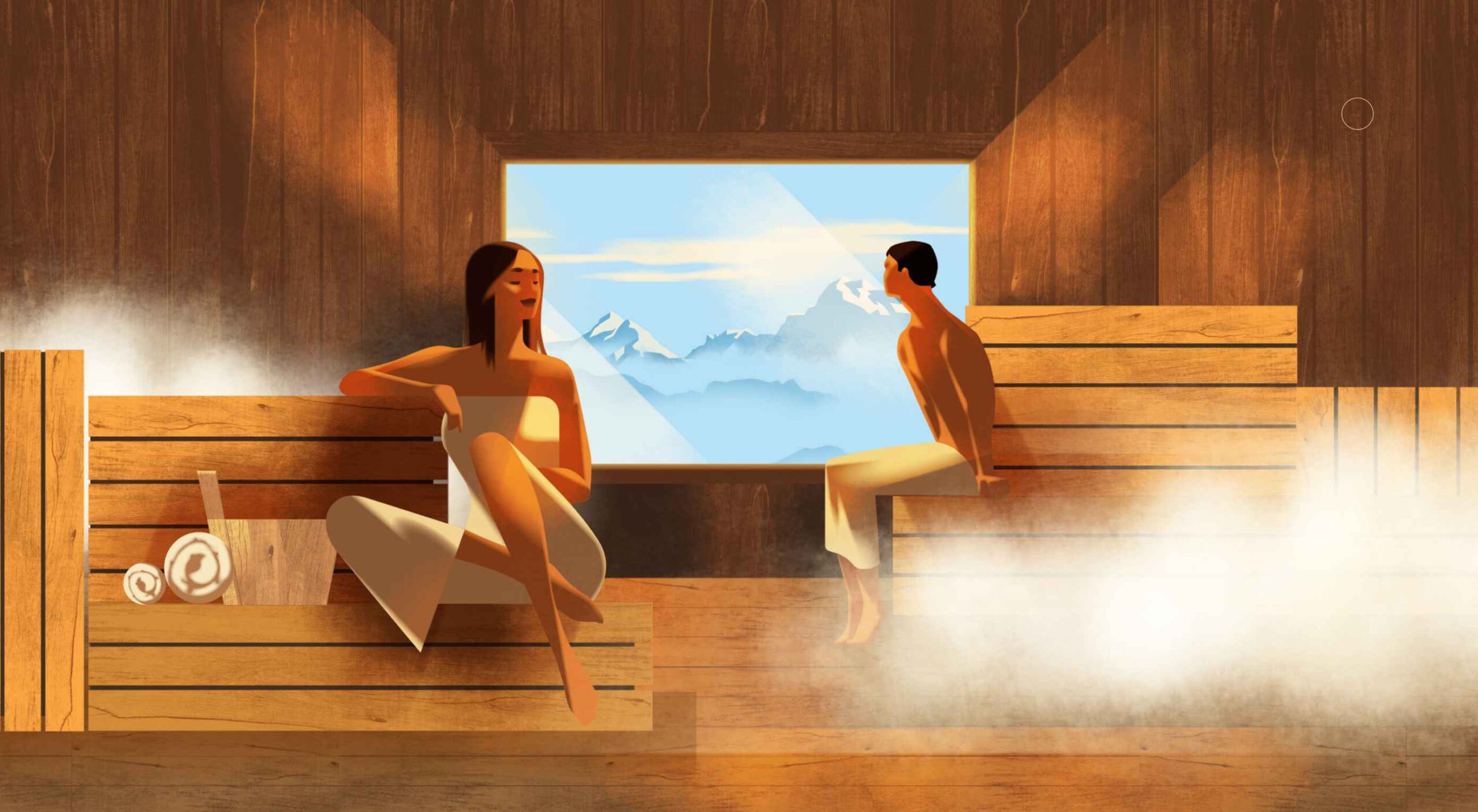
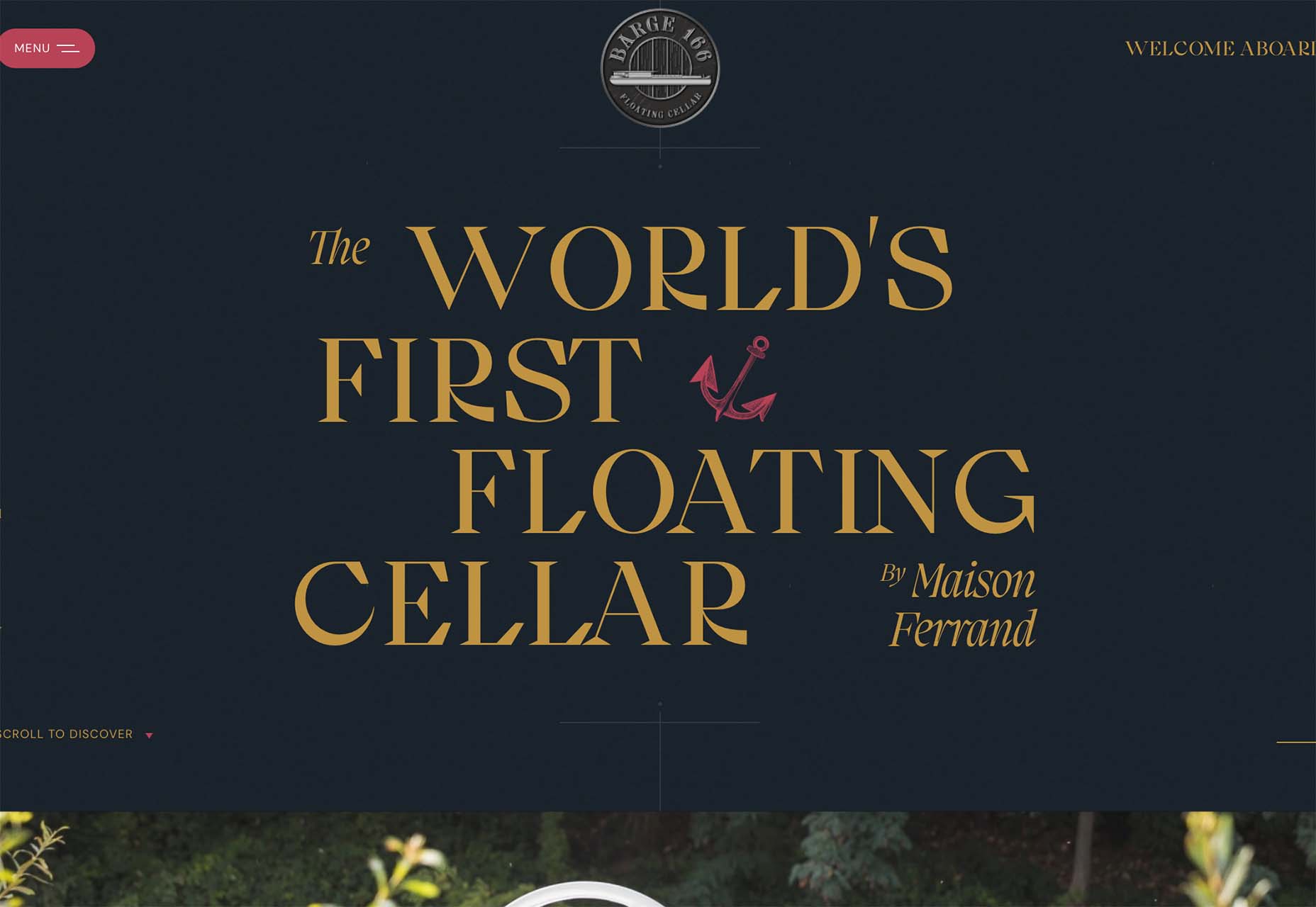
 There are a lot of dark, retro vibes trending in website design right now. Although there are still some light projects popping up – including a pastel trend below – a lot of what we are seeing has a quite moody feel.
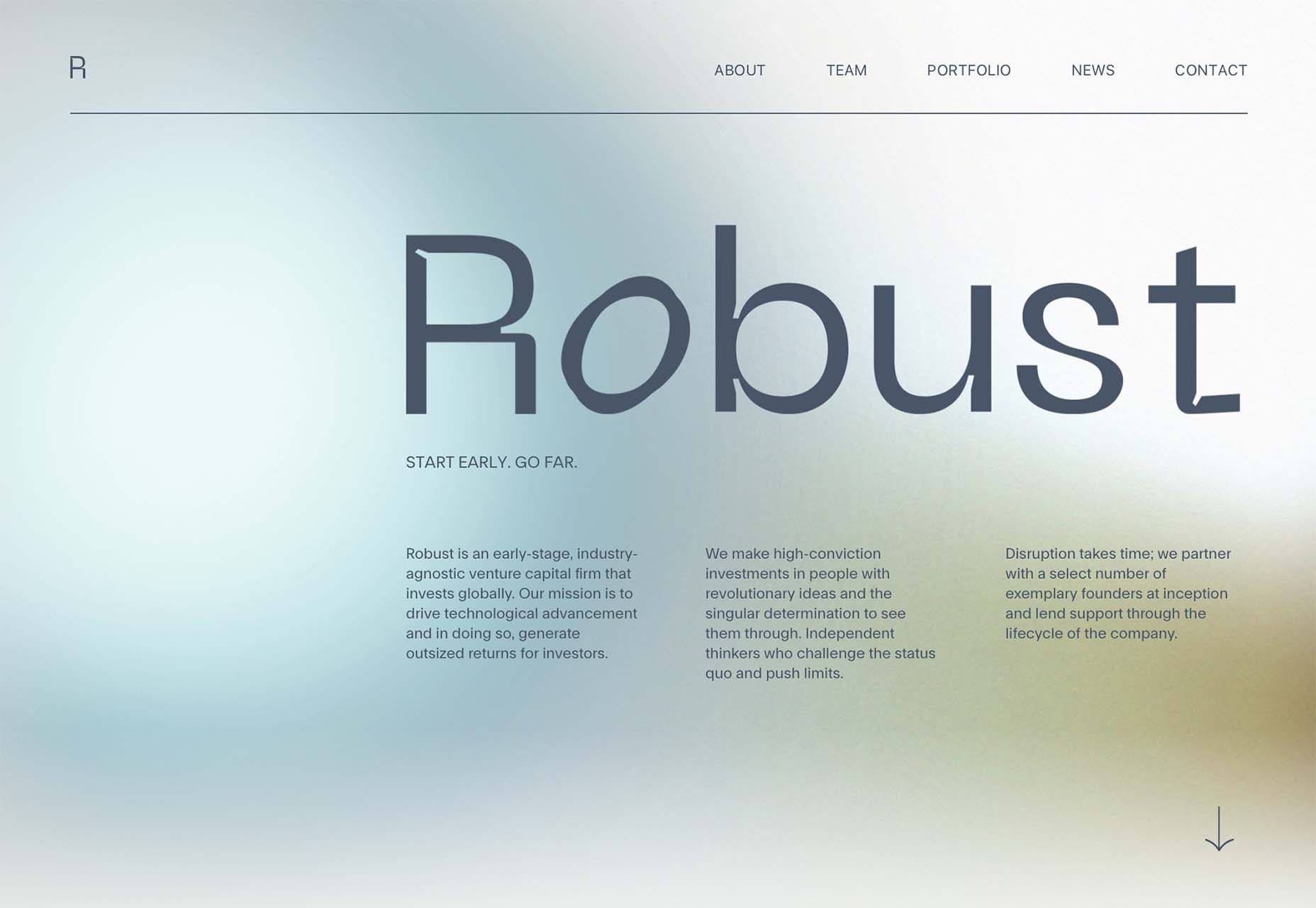
 Automation is the theme of this month’s collection of exciting new tools for designers and developers. There are tools to make your images better, tools to create illustrations, and tools to make your workflow more efficient. Plus, a whole host of tools that are just plain fun.

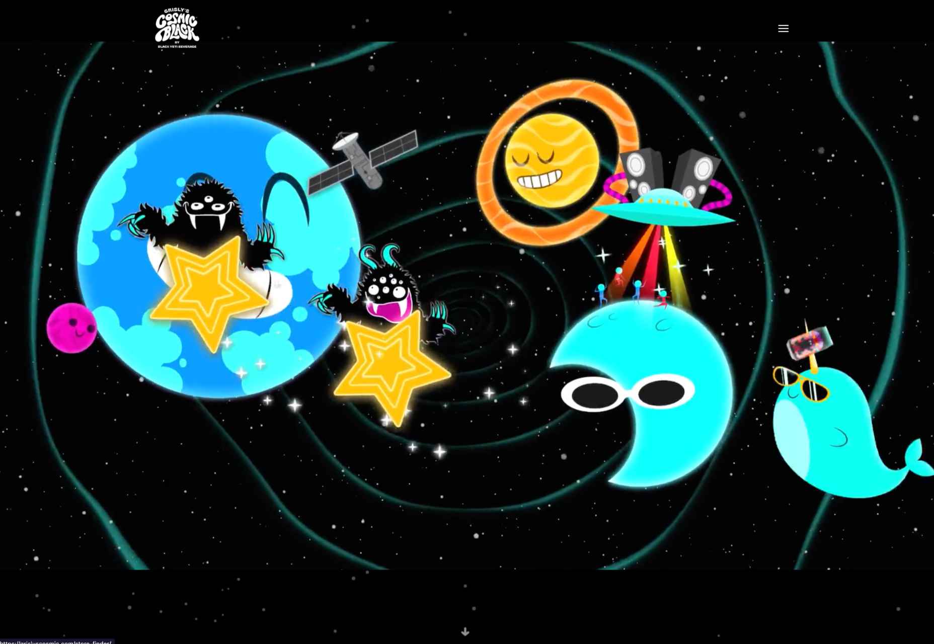
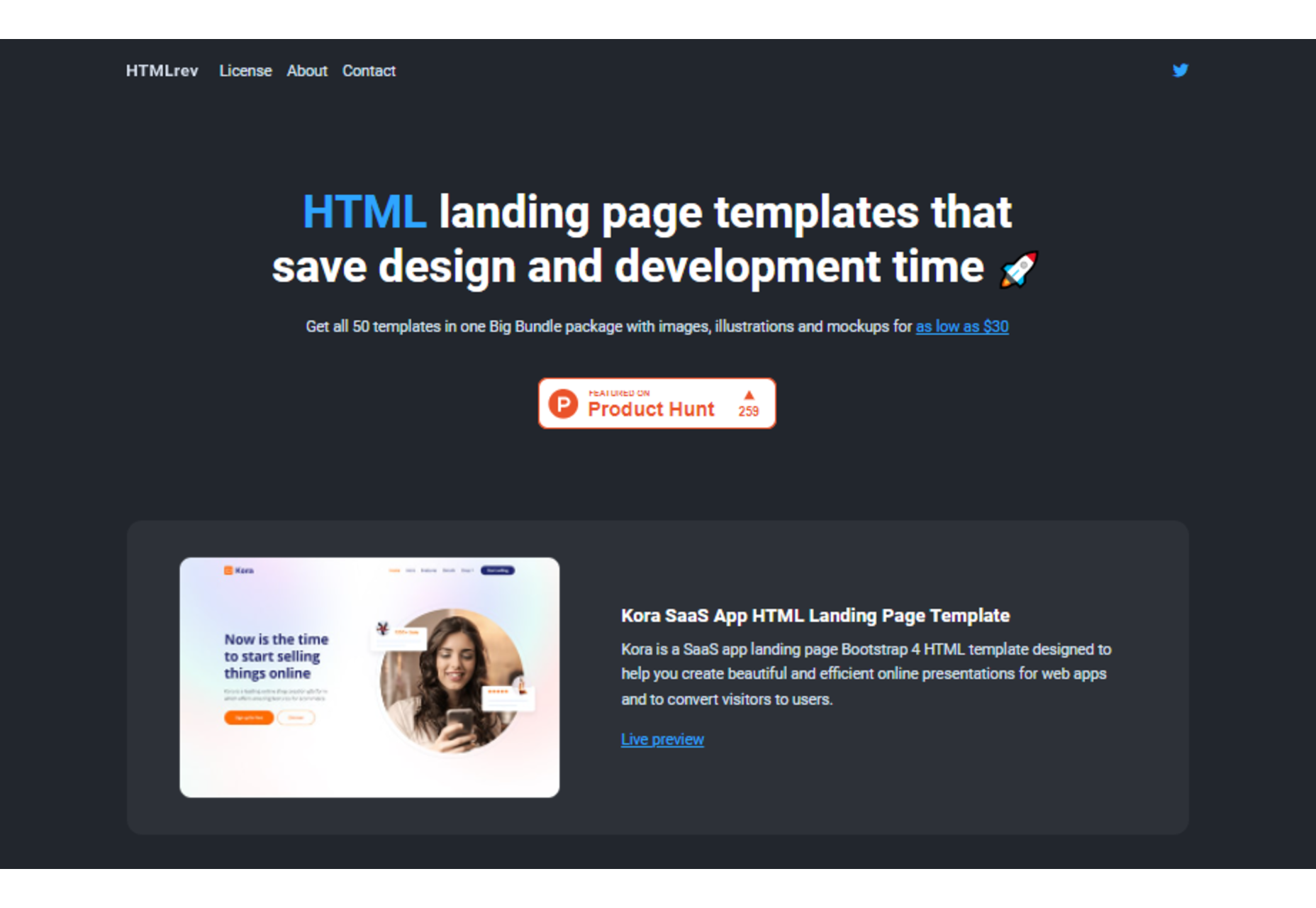
 Are you bored with some of your current design projects? This month’s collection of website design trends can help break you out of that rut with some fun and funky alternatives.
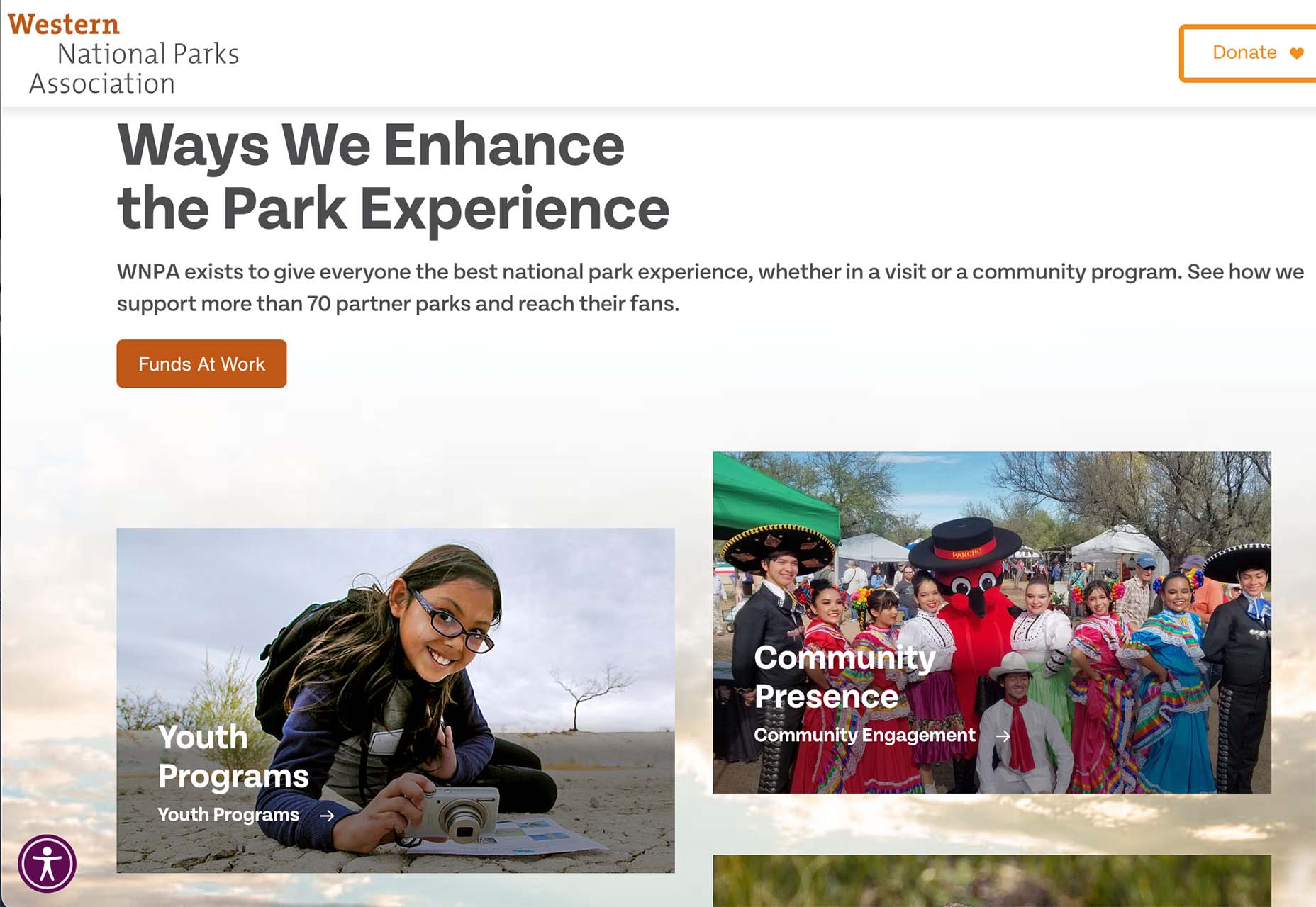
 Websites haven’t always been as adaptable as they are today. For
 This month’s collection of the best new sites is a mixed bag. Positivity remains from
 Every day design fans submit incredible industry stories to our sister-site, Webdesigner News. Our colleagues sift through it, selecting the very best stories from the design, UX, tech, and development worlds and posting them live on the site.

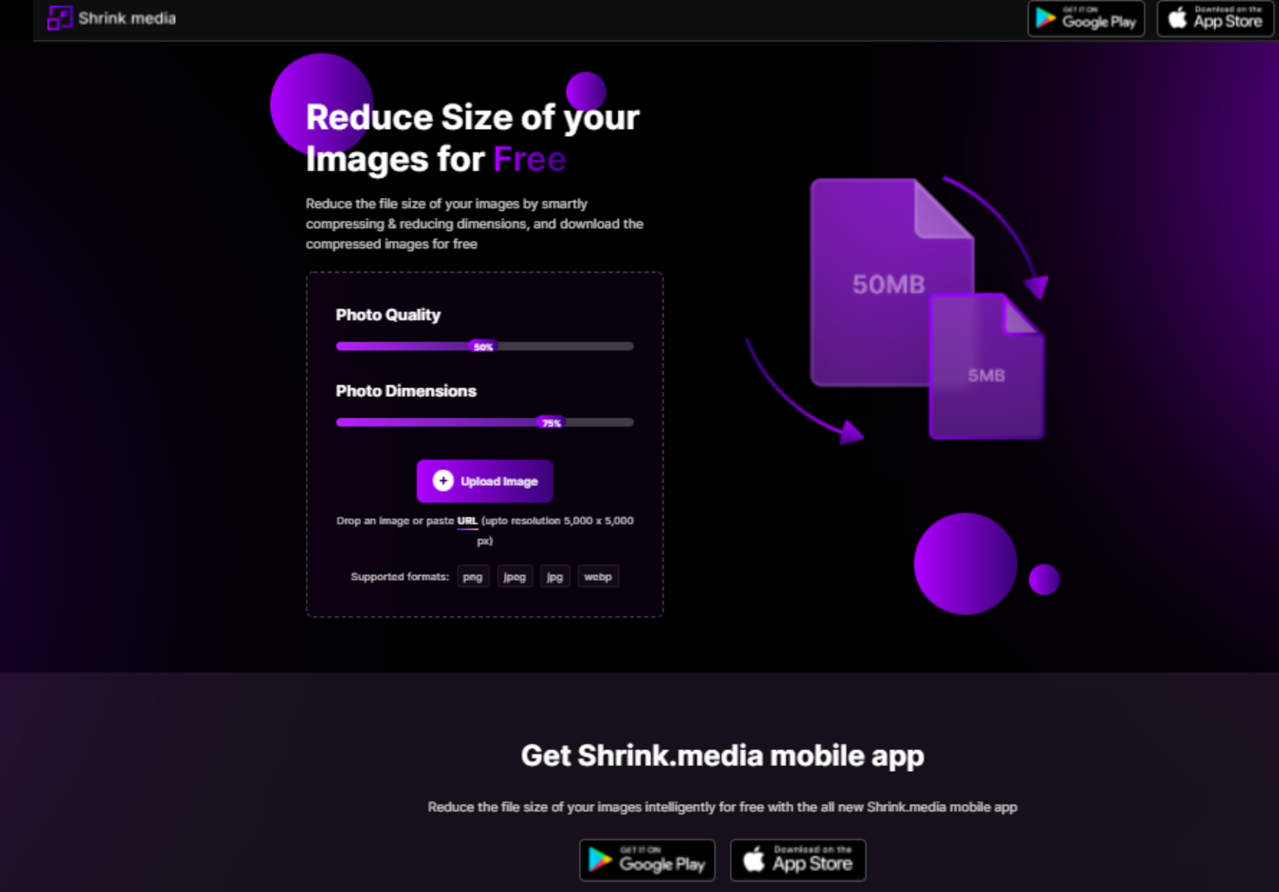

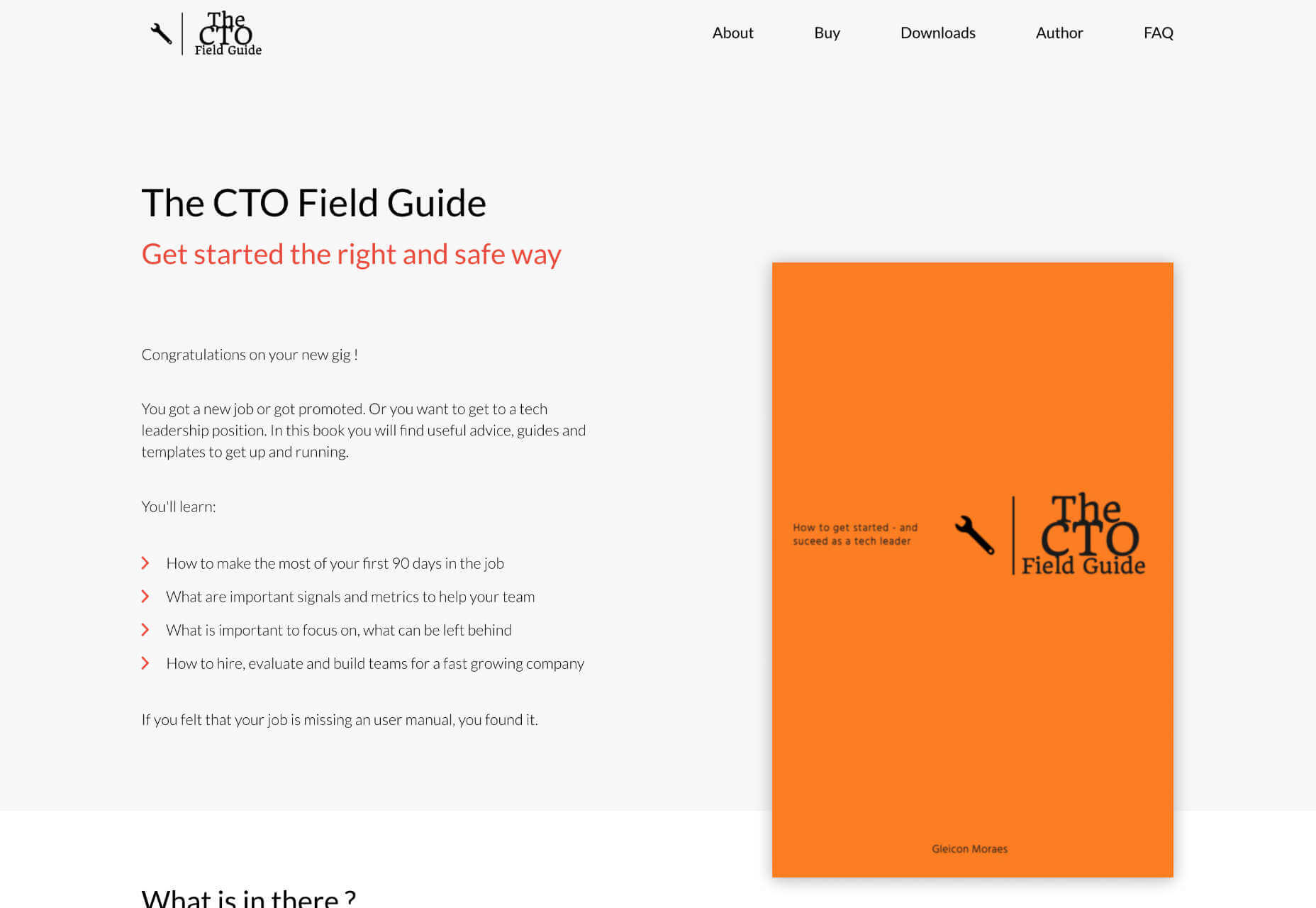
 WordPress has made it easy for everyone to launch a blog, but even though launching a blog isn’t a difficult task any longer, driving traffic to your blog certainly is!