Articles

You’ve named your business. You’ve sorted out the visual branding piece. Now, it’s time to get your business online so you can start making money.

In this post, we’re going to look at where your web design business needs to set up shop online and how to get it up and running quickly.

Step 1: Set Up Your Website

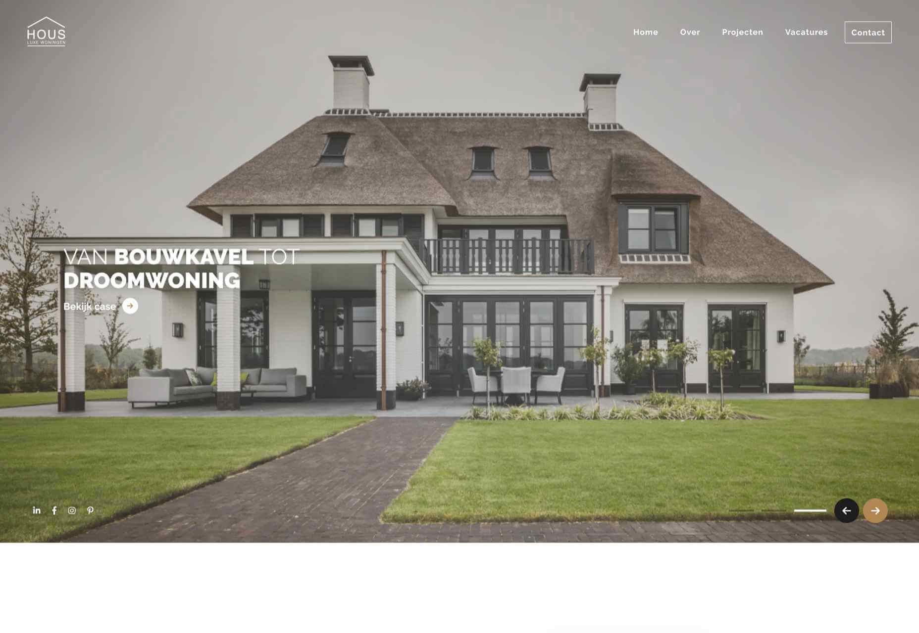
As a web designer or developer, having a website is non-negotiable.

Not only does a website provide prospective clients with all the information they need about you, it can help you automate many of those annoying tasks that get in the way of your actual paid work.

So, let’s start here:

Buy Your Domain Name

If you haven’t done so already, use the business name generator exercise to come up with a domain name. You then have a couple of options for buying it.
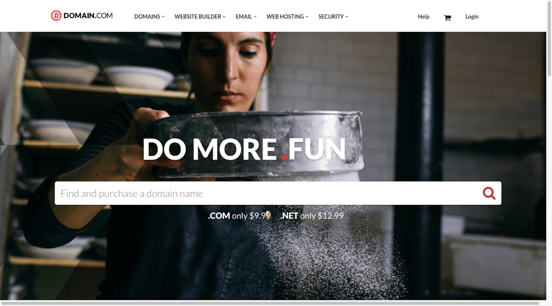
To Do:

  • Buy it from a domain name provider like GoDaddy or Domain.com;
  • Or buy it from your web hosting company;
  • Check the next step to see which option makes the most sense for you.

Choose a CMS

Use the same CMS as the one you’ll use to build your clients’ sites. That way, clients don’t wonder why you’d use something like Squarespace for your site, but then recommend WordPress for theirs, for example.

To Do:

  • If you use a self-hosted CMS (like WordPress, Drupal, or Joomla), hold on this until you purchase your web hosting;
  • If you use a hosted CMS (like Wix, Squarespace, or Shopify), you won’t need to do the next step. Instead, just sign up for your website builder and buy your domain name now.

Buy Your Web Hosting

If you’re wondering what the difference is between the various types of web hosting, read this post.

Basically, this is what you’re looking for:

  • A hosting company with a good reputation that provides expert and timely support;
  • An affordable starter plan — either shared or cloud hosting;
  • Server locations near you (at the very least, in the same country as you);
  • Top-notch security features at the server level as well as the physical hosting facility;
  • Caching and other speed optimizations built into the server and on-site equipment;
  • Compatibility with your CMS (look for one-click install, too).

Also, look for add-ons like SSL certificates, CDNs, and, of course, a free domain name.

To Do:

  • Sign up for the hosting plan you want along with your domain name and SSL certificate (this is a must for SEO);
  • Install your CMS from the control panel once you’re ready to go.

Build Your Website

Ultimately, you have two goals here:

  1. To build a website that convinces prospective clients that you’re the real deal;
  2. To build a website that prospects would want for themselves.

So, there’s no need to go crazy with outlandish features or futuristic animations and design. Keep it simple. Keep it neat. And give prospects an honest portrayal of who you are, and what you can do for them.

Design It

The first thing to do is take all that work you did to create your visual branding and use it to design your website.

If you’re building a WordPress website, consider starting with one of these multipurpose themes.

Build Out the Pages You Need

A theme will automatically create the pages you need (most of them, anyway). If you’re not sure which ones to start with, these are the ones your prospects are going to be looking for:

You may also want to add separate pages for Testimonials and Case Studies once you’ve accumulated enough of them to show off. For now, you can include samples of your work in the Portfolio page and testimonials on the Home page.

Fill in the Content

Even if writing isn’t your strong suit, that’s okay. So long as the content you write for your site is free of spelling and grammar errors, your prospective clients are going to focus on what you’re telling them, not on how proficient a writer you are.

That said, if you’re nervous about this piece of your website, here are some tips to help you out:

1. Be concise, it’s not just minimal design that goes over well with modern audiences. Minimal copy does, too.

2. Be transparent. Tell prospects what exactly they can expect when they work with you and why your web design services are going to be different from the competition.

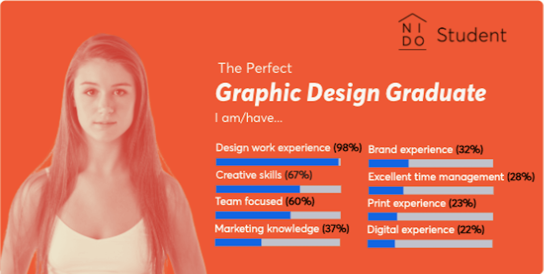
3. Consumers don’t trust companies that use meaningless buzzwords and make empty claims. Instead, focus on writing about the real and very competitive skills you have. According to research from NIDO Student, these are the skills employers look for when hiring a designer:

4. Let your images tell some of the story for you. Just make sure you use (or create) images that will impress your audience.

5. After you’ve written your content, take a step back and tackle the structure and formatting from a designer’s POV.

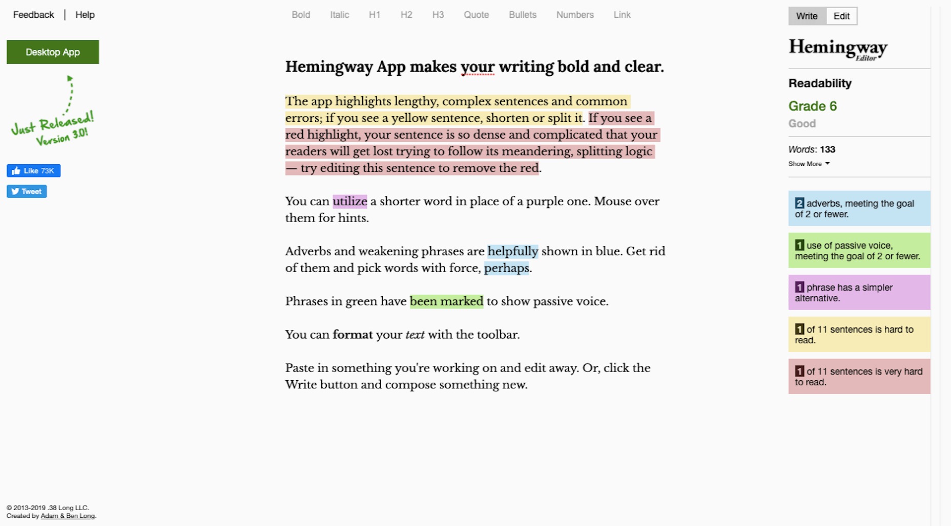
6. Before you hit the “Publish” button, run your copy through Hemingway Editor to ensure your content is error-free.

Add the Right Features

When I talk about features, I’m referring to anything outside the main design and content on your website. These are usually sales and marketing tools like:

  • Chatbot/live chat
  • Contact forms
  • Pop-ups or notification banners
  • Discovery call scheduler
  • Cookies consent notice

Only add the features you absolutely need. In other words, the features that will automate the marketing and sales tasks you’d otherwise have to manage on your own.

Step 2: Optimize Your Website for Search Engines

Search engine optimization (SEO) is a very important part of the work you do to get your business online. Here’s why:

After you launch your business and website, the next thing you’re going to focus on is getting clients. This can take a lot of work as you pore over the following resources for referrals and leads:

  • Your existing contact list (i.e. family, friends, old employers, colleagues, etc.);
  • Freelance job boards;
  • Industry-specific job boards;
  • Social media posts, pages, and groups;
  • Google search results for “we’re hiring”;
  • And so on…

And when you’re not busy cold-emailing prospective clients or talking to them on the phone, you’re probably going to be working on your business’ processes. Running a business is very time-consuming.

So, what happens when you finally start working on website projects? It’s not like the client search ends there. It’s an ongoing thing. Which is why your website needs to be optimized for search.

Once your site gets indexed by Google and starts to generate authority, your pages will rank better and the increased visibility will start generating leads without you having to actively make the first move.

SEO is a huge topic, so I’m not going to cover it here. However, the links below will do a good job of guiding you towards your next steps.

To Do:

Step 3: Get Active on Social Media

Your website is going to play a lot of roles:

  • Digital business card;
  • Authority builder;
  • Marketing vehicle;
  • Sales platform;
  • Content marketer.

But there’s one very critical thing it can’t do and that’s directly converse with your audience and grow your network. This is why you need to spend time building out your social media once your website is good to go.

As for which social media platforms to use (as there are way too many), here are my thoughts:

Become an authority on Twitter.

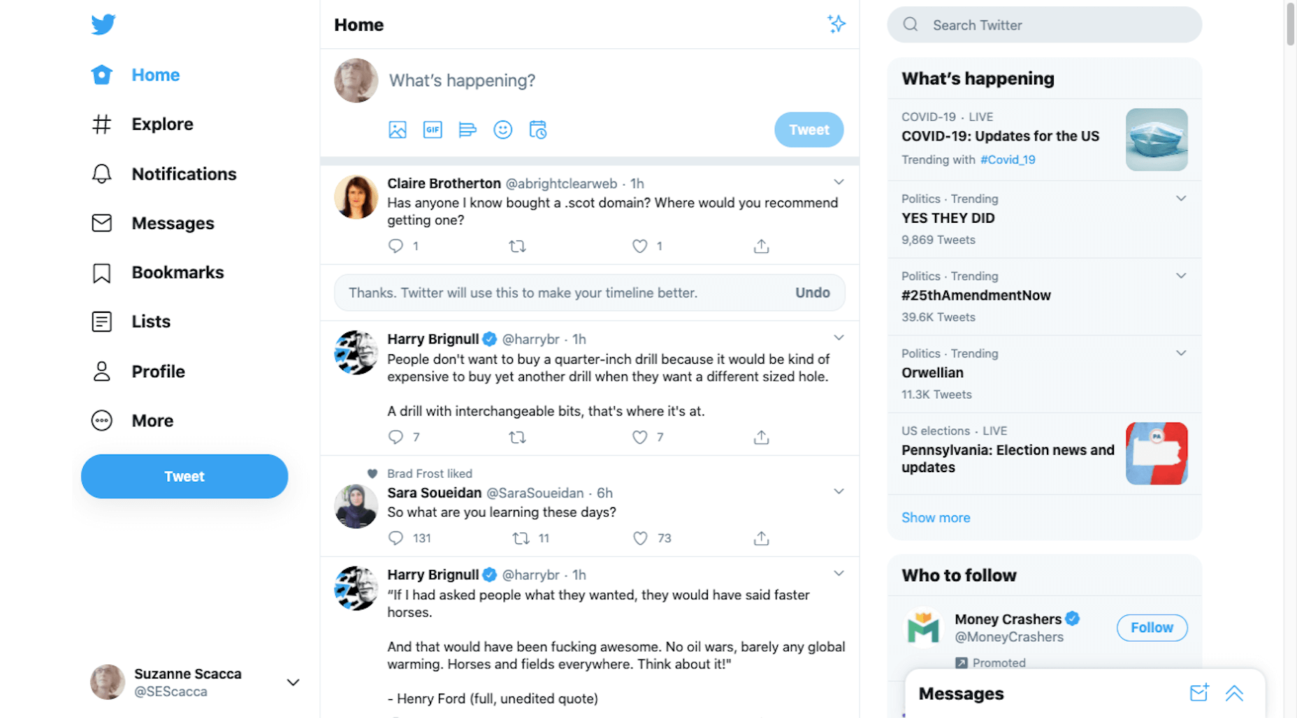
Twitter is a good place to share daily thoughts and interesting content you’ve found on the web.

Get discovered on LinkedIn.

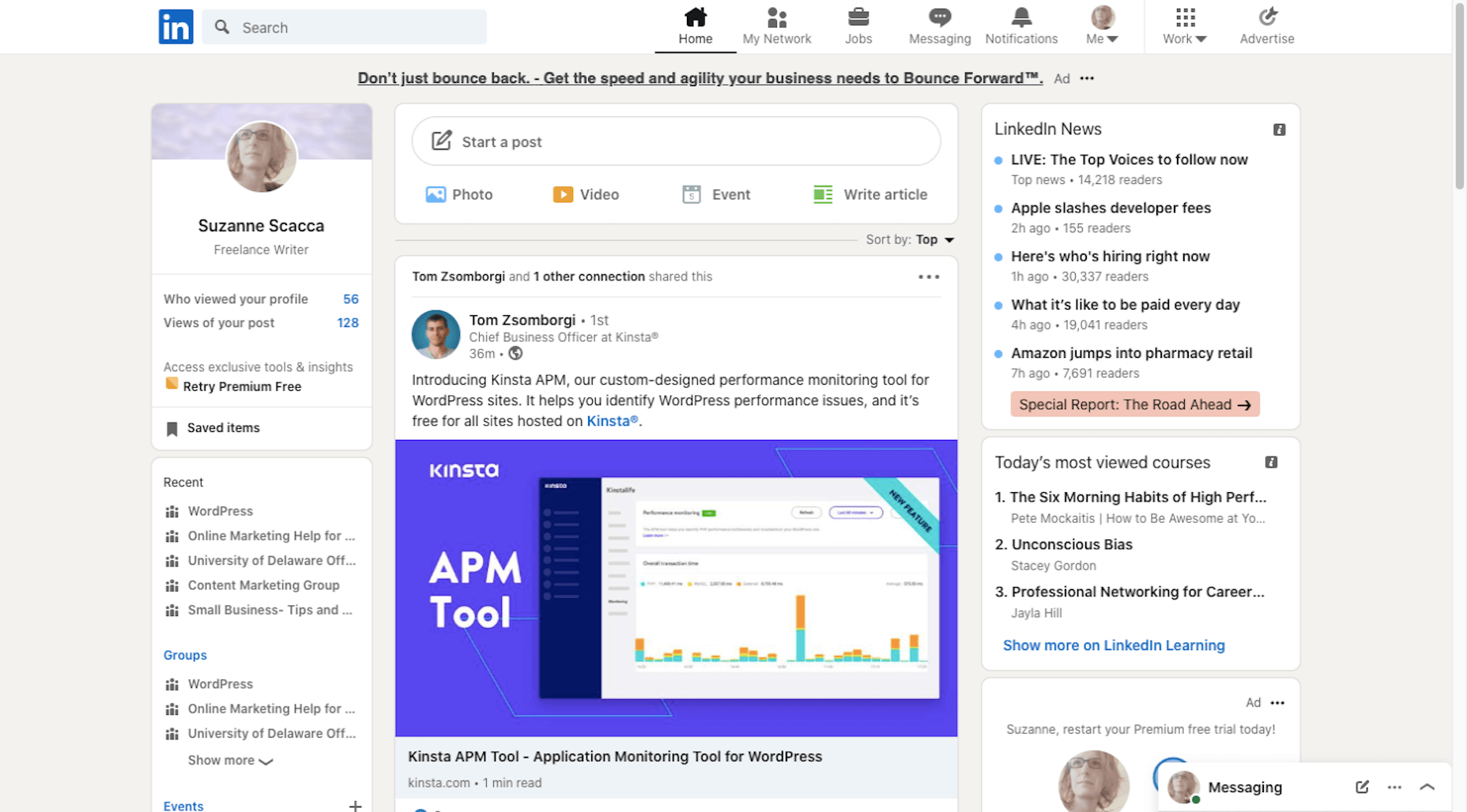
LinkedIn is useful because it’s another place to get noticed by potential employers, so make sure your relevant work experience and portfolio are up-to-date.

Connect with other creatives on Facebook.

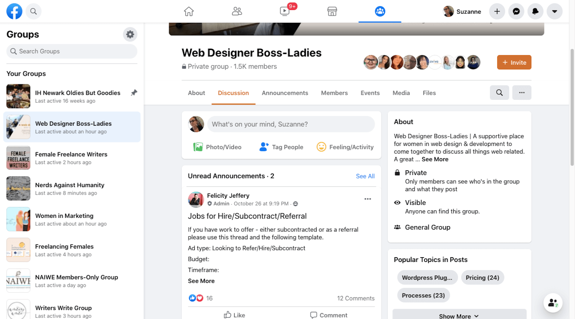
It’s really hard to get noticed on Facebook unless you pay to play. Instead, use it to find groups that you can turn to for support, referrals, and brainstorming.

Share your work on Dribbble.

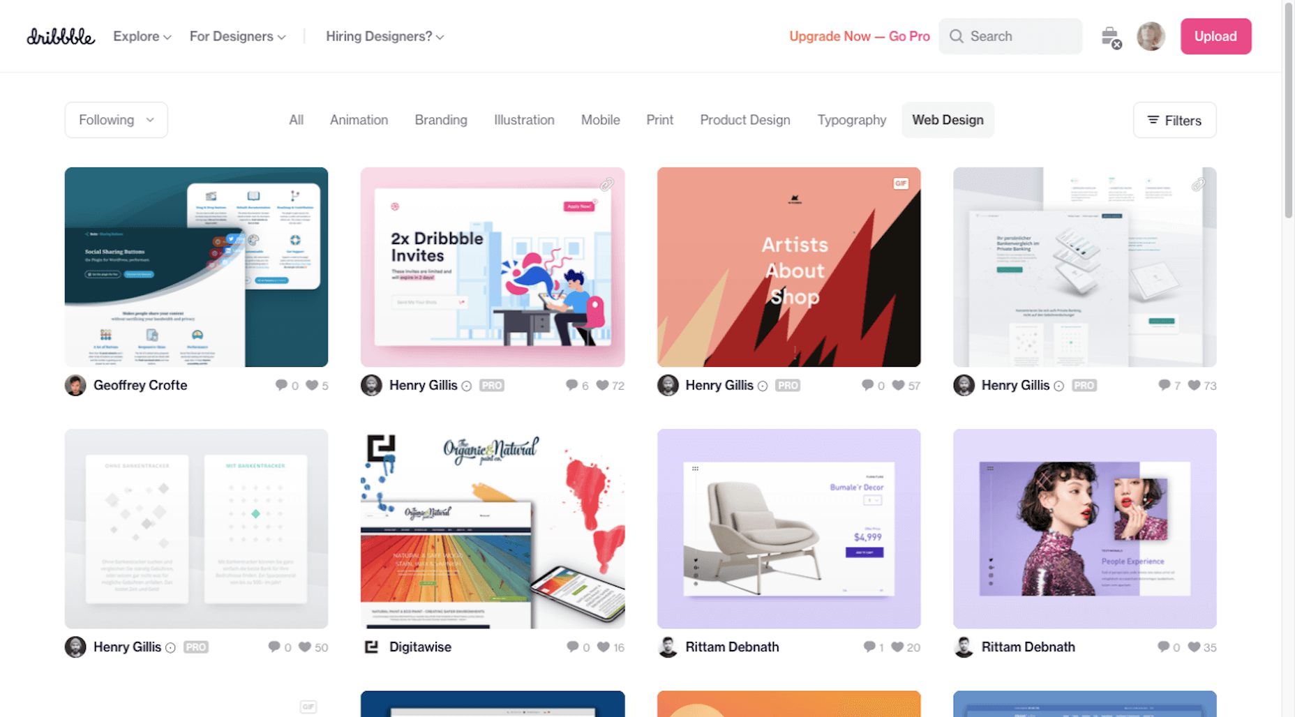
While you could use Instagram or Pinterest to show off your work, you might get more traction on a design-specific platform like Dribbble. Serve as inspiration for others and potentially get discovered by prospects looking for designers there.

Down the line you might decide to expand your business into recurring revenue opportunities like online courses. In that case, a platform like YouTube would be great. For now, focus your efforts on the main ones above.

To Do:

  • Create your social media accounts;
  • Brand them to match your website — both the visual component as well as the bio;
  • Start sharing content on a regular basis. You can automate sharing with a social media management tool, but remember to log in at least a couple times a week so you can engage with others, too;
  • Be careful not to commit these social media faux pas.

Wrap-Up

I realize this is a ton of information to throw at you. However, if you want to get your new business online and for it to succeed, you need to maximize the opportunities that are available to you.

I hope this three-part guide to starting a new business has been helpful. If you have any questions on the tips provided along the way, let me know in the comments.


Featured image via Pexels.

Source


Source de l’article sur Webdesignerdepot

Levallois-Perret, le 23 novembre 2020 – SAP France annonce accompagner Team Vitality dans sa digitalisation. Le leader européen de l’esport s’appuie sur les solutions de SAP pour accélérer son développement à l’échelle internationale.

Quand Big Data rime avec esport

Le milieu du sport peut être considéré comme un système complexe où interagissent de nombreux acteurs comme les sportifs, les sponsors, les entraîneurs ou encore les fans. Les objectifs d’un club consistent à la fois à augmenter les performances de ses équipes mais également assurer une rentabilité financière sur le long terme dans un environnement de plus en plus concurrentiel. Ce modèle se vérifie dans des sports très médiatisés et aux forts enjeux business comme dans le football, le basketball, le tennis, etc, mais se confirme aussi dans l’esport dont la croissance et l’attractivité ne font désormais plus aucun doute.

En tant que partenaire d’innovation et d’analyse de données d’organisations sportives professionnelles telles que la NBA, la WTA, Team Liquid et le FC Bayern, SAP intensifie la portée de son offre ERP dans l’esport. Outre la gestion de la performance des joueurs, SAP cherche également à impliquer les fans avec ses technologies innovantes. Intégrant des outils de gestion financière et aussi d’engagement marketing, SAP renforce la compétitivité des équipes esport en accélérant leur transformation numérique. Et pourquoi pas demain s’orienter dans la voie de l’ »Athlète Digital » ?

C’est dans ce contexte que la collaboration est née avec Team Vitality.

Team Vitality, un développement fulgurant

Fondé en 2013, Team Vitality est le plus important représentant français sur la scène internationale de l’esport. Comme dans le sport traditionnel, l’équipe est aujourd’hui devenue une marque à part entière avec plusieurs millions de fans. Avec le temps, Team Vitality a développé un marketing avancé et créé d’importants partenariats avec de grandes marques internationales. Team Vitality, c’est désormais toute une gamme de merchandising qui va des maillots officiels aux accessoires high-tech, en passant par une ligne de vêtements. Son business model s’appuie sur la vente en ligne mais aussi sur des points de vente et des espaces de rencontre avec ses fans qu’il compte décliner dans plusieurs grandes villes en France et en Europe. L’entreprise emploie aujourd’hui une cinquantaine de personnes.

SAP pour structurer sa croissance financière et rassurer ses investisseurs

Pour booster sa croissance, Team Vitality enchaîne les levées de fonds depuis plusieurs années. La marque mise également sur le meilleur des technologies pour gérer efficacement sa croissance, sur SAP pour l’accompagner dans le pilotage financier de son activité et sur APSIA pour l’assister dans cette transformation digitale. Team Vitality s’appuie sur 3 solutions clés de SAP :

  • SAP Business By Design, ERP basé sur le cloud pour optimiser la gestion de la finance, des achats et des stocks.
  • SAP Cloud Platform, plateforme d’intégration et d’extension pour faciliter les échanges avec l’écosystème de l’entreprise.
  • SAP Analytics Cloud, une solution d’analyse augmentée multi-source pour optimiser et accélérer la prise de décision. 

Un pilotage de l’activité facilité

L’utilisation des trois solutions SAP permet à Team Vitality d’optimiser l’ensemble de ses processus. Plus précisément, cinq aspects de la gestion de l’entreprise sont impactés :

  • Un suivi facilité d’éléments clés dans les contrats de partenariats et les contrats fournisseurs.
  • Une gestion des données améliorée : un meilleur tracé des flux grâce à une source d’information unique et fiable permettant ainsi de répondre facilement aux différentes contraintes contractuelles et légales (audit des comptes, RGPD, etc.).
  • L’automatisation de certaines tâches telles que le paiement de certains fournisseurs ou la comptabilisation de certains flux récurrents permettant ainsi un gain de temps considérable.
  • Une meilleure connaissance des flux financiers de l’entreprise dans un contexte de forte croissance du nombre de flux et de développement régulier de nouvelles activités.

« Nous avons plusieurs business models en un : nous faisons de la vente retail via notre site Internet, nous élaborons des contrats marketing avec différentes marques et nous générons également du contenu. Il était donc nécessaire d’avoir plusieurs outils regroupés en une seule interface facile d’accès pour pouvoir gérer l’ensemble de ces activités », explique Sonia Manueco, CFO chez Team Vitality.

Une collaboration sur le long terme

A terme, Team Vitality souhaite pousser encore plus loin l’utilisation des solutions SAP pour ainsi impacter toutes les branches de l’entreprise et l’accompagner dans son développement à l’international. Team Vitality envisage ainsi pour le quatrième trimestre 2020, une interconnexion entre le webshop et les différents flux de l’entreprise permettant d’améliorer la qualité de suivi et d’amélioration des commandes.

« Grâce à SAP, nous avons tous les composants pour aller encore plus loin : nous souhaitons nous améliorer davantage sur le volet opérationnel via l’automatisation de l’ensemble de nos process légaux, qualités ou encore logistiques. L’objectif à long terme est également d’exploiter l’ensemble des datas que nous récupérons sur nos plateformes comme Twitch et Twitter pour pouvoir faire le lien entre les interactions avec nos fans et les achats sur notre webshop », conclut Franck Boniface, COO chez Team Vitality.


Contact presse Team Vitality

Valérie Duthey et Maéva Corbel, Le Public Système PR – vitalityrp@lepublicsysteme.fr

Contacts presse SAP
Daniel Margato, Directeur Communication : 06 64 25 38 08 – daniel.margato@sap.com
Pauline Barriere : 06.13.73.93.11 – presse-sap@publicisconsultants.com


The post Team Vitality, leader de l’e-sport, intègre les technologies SAP pour accélérer sa croissance internationale appeared first on SAP France News.

Source de l’article sur sap.com

As we approach our first winter holiday season since the pandemic set in, the world could feel like a very scary place; there is a great deal of uncertainty about the future for businesses, for young people in education, for jobs, for travel. Celebrations are certainly going to be a lot quieter this year.

And yet, the web is far from showing doom and gloom. We’re seeing confidence and positivity in designs across the board. As businesses and people adapt to the demands of social distancing and WFH, we’re seeing a focus on simplifying, appreciating quality over quantity, taking better care of ourselves and our world, and making the most of our time. And this is reflected through design in a variety of ways: visually minimal style, pared down content, fresh colors, statement type, great photography, illustration.

There is confidence in abundance on the web. Enjoy…

Mammut Expedition Baikal

Mammut make outdoor clothing and equipment, and this microsite is for its Eiger Extreme collection. Stunning photographs of Swiss speed climber Dani Arnold climbing at Lake Baikal in Siberia are cleverly interspersed with details of the company’s products he can be seen wearing, along with links to buy. It feels natural, rather than forced.

Wavering Stripes

This a beautifully made site highlighting the experiences of people held in immigration detention centers in the US. The illustrations belie the grimness of the stories told — on the landing page there is a warning as to the nature of the content.

Juan Mora

Proof that holding pages don’t have to be boring, this ‘under construction’ site for interface designer Juan Mora is a far cry from the warning-barrier and stick-figures-at-work gifs of the web’s early days.

Cafecrema

Cafecrema’s simple, one page site creates the atmosphere of 1950s coffee shops through its illustration style, a jazz soundtrack, and a very mid-century modern color palette.

A N Other

Perfume brand A. N Other prioritises quality ingredients and materials, simplicity, craftsmanship, and the environment. Its website captures this perfectly, and invokes a sense of luxury as the result.

Puddle Sound

Puddle is an architectural and interior design company, who also do product and furniture design. For a Tokyo hotel project they created a vacuum tube amplifier, that is the subject of this site. It is as simple as can be with only the barest essential information, and with all attention focused on the product shots.

Hous

Hous Luxe Woningen are a Dutch company who build luxury homes. The high quality images, muted color scheme and generous use of white space in its website reflects this sense of luxury perfectly.

Who Cares?

Who Cares? is an interactive game designed to raise public awareness of endangered animal species. The illustration style is very pleasing, and there are some lovely little details in the animation and sound.

Ugly

This site for sparkling water company Ugly, uses bold, cartoonish typography and illustrated characters to add a lot of character to, well, water.

Glyphs

Glyphs font editor version 3 was released on 16th November. The accompanying site has a fresh feel, mainly due to its striking color scheme. The on scroll animation showcasing variable fonts is a nice touch.

Ruler Agency

Ruler Digital Agency uses color only in the images of work on its own site. Everything else is grayscale, even the images, which can be a really effective technique when it is used well, as it is here.

Zoë Pepper

Zoë Pepper is a collective of freelance brand strategists who work with early stage startups. The site is minimal without feeling empty, and utilises quirky illustration and scrolling animation to good effect.

Karst

Karst make notebooks using paper made from stone, and woodless pencils. Its site has a simple, clean feel with a muted, neutral color scheme that complements the colors of its notebook covers.

London Alley

London Alley is a production company who concentrate on music videos and advertising. Its site is simple and striking with plenty of video, and effective use of split screen.

LoveSeen

LoveSeen makes false eyelashes, and nothing else. The site has a fun, inclusive feel — more girl(and boy)friends together than glossy, high fashion magazine. It’s appealing and persuasive.

Chartogne-Taillet

This site for wine-growers Chartogne-Taillet uses illustration and an animated, ‘hand’ drawn map to create a sense of heritage, appropriate for a family with a long history of making wine in the Champagne region. It is reminiscent of a label on a good bottle of wine.

Refusi Studio

Refusi Studio is a design agency from Italy. This portfolio site is simple, with strong colors and big, statement typography. And a giant cartoon eye.

Yesterday, Today, Tomorrow

Yesterday, Today, Tomorrow is an interactive project from the National Film Board of Canada. It uses tweets to trace emotional ‘waves’ throughout the Covid-19 pandemic.

Boost

Boost is a gummy (chew) vitamin supplement for the immune system. Big type, big graphics and lots of orange and purple — the colors associated with vitamin C and antioxidants — make vitamins cool.

Philiber

Philiber is a meal delivery subscription service, available in urban centers in Quebec. The site is clean and modern, with a comforting color scheme and a nice mix of photography and flat style illustrations.

Source


Source de l’article sur Webdesignerdepot

We all love web badges. You might have spotted many of them in README of repositories, including the repository of my blog, The Cloud Blog. In general, web badges serve two purposes.

  1. They are visually appealing.
  2. They display key information instantly.

If you scroll to my website’s footer section, you will find GitHub and Netlify badges that display the status of the latest build and deployment. I use them to quickly check whether everything is fine with the world without navigating to their dashboards. In essence, a badge is an SVG image with dynamic content embedded in it.

Source de l’article sur DZONE

Since there are so many CMS plugins out there, it can be overwhelming to choose the best ones for your website. We’ve done the research for you; this list contains the top new CMS plugins for November 2020. You’ll find useful plugins for WordPress, Craft, Shopify, and Joomla.

Let’s get started…

WordPress

404 Page Editor

404 Page Editor is a simple WordPress plugin that helps you add custom text to the default 404 page on your website. The plugin comes with seasonal and industry-related 404 templates. One useful feature of the plugin is that it backups your current 404 page before changing it. So you can restore the backup page anytime you choose. The plugin duplicates your current 404.php page to wp-content/uploads/404-page-editor/ so you can easily find it. You can also change the text on the plugin to fit your local dialect. 

UnusedCSS Power-Up

Most WordPress themes and plugins load their CSS in the wrong areas of your website. This can slow down your site. A slow website will reduce user experience and lead to increased bounce rates.

UnusedCSS will help reduce the size of your website’s CSS files by up to 95%. The best part is that the plugin works automatically. It will remove any unused CSS when visitors view any page on your website. UnusedCSS will automatically reduce your website’s load times by reducing your CSS files and page size. The plugin also optimizes the performance of other WordPress plugins and extensions. UnusedCSS also works with WooCommerce themes and plugins.

Simple Redirects

Simple Redirects is a WordPress plugin that helps you to automatically redirect requests to another page on your site or any other place on the web. The plugin allows you to easily redirect users from your old web pages to new pages using 301 or 302 redirects. You don’t have to worry about losing backlinks or page rank. Any incoming links to the old web page will be automatically passed along to the new page. The page rank on the old page is also transferred to the new page. The plugin is useful when migrating a WordPress site when don’t want to retain the URL structure. 

HTML Validation

HTML Validation plugin helps you identify any HTML validation errors on your website. The plugin works automatically in the background of your website and will send you regular reports. There is a progress bar on the report screen to show you the progress of the scan. The plugin uses WordPress Cron to scan the content of your website. There is also an option for the plugin to automatically fix any HTML validation issues on your website. You can also choose to fix the issues manually. 

Just Highlight

Just Highlight is a simple WordPress plugin that helps you highlight text in your posts or pages. You can use this plugin to highlight any portion of the page you want to draw the reader’s attention to. You can highlight the background of the page and also add animation to the highlighted text. In the WordPress admin area, you can change the speed and color of the animation. The plugin is compatible with Gutenberg, and the WordPress classic editor. 

DeviantArt Embed

DeviantArt Embed is a simple plugin that helps you embed any work from Deviant Art into a post. The plugin provides a block for the WordPress block editor so you can easily embed the image. It uses a DeviantArt oEmbed API to pull the images and their descriptions, and creates an embedded image. 

Static Optimizer

Static Optimizer is a static file optimization plugin that serves and optimizes static files on your website. The plugin will help you increase your website speed by automatically compressing your static files. It is easy to set up, you just need an API key to get started. Other useful features that the plugin offers include automatic JS and CSS minification, automatic image optimization, and processing of responsive images. You don’t have to worry about losing your files if their server is down. The plugin automatically backs up your files and will load your original files when their servers are down (either because of an upgrade, maintenance, or outage).  By default, only images are compressed when you activate the plugin; you can also choose to optimize fonts, CSS, and JS files. 

RankBear

RankBear is a keyword rank tracker plugin that helps you analyze your SEO efforts. With RankBear, you can track the keywords for each of the posts and pages on your site. While the plugin has a paid plan, you can track up to five keywords for free. On the free plan, you will receive weekly reports on each keyword you are tracking. You can search for the rank and volume of a keyword in every location supported by the Google search engine. RankBear is a lightweight software-as-a-service plugin hosted by Amazon Cloud Services. The plugin also offers the option to download the keyword reports to CSV. 

Table of Contents Block

Table of Contents Block is a plugin that allows you to easily create a Table of Contents for your WordPress posts. The plugin is lightweight and will automatically add a Table of Content in your website’s posts and pages. You can select the heading tags you want to add to the Table of Content. It also has a dedicated support team to assist you. The plugin works fine with all standard WordPress themes. 

Markease For WooCommerce

Markeaze is an all-in-one communication plugin that allows you to add live chat to your online stores. The plugin will help you improve your customer service by decreasing your response times. With the plugin, you can collect your visitor’s contact information via a widget. This feature is useful in building a subscriber database. You can also use the plugin to track customer behavior on your site, inform customers about new products, help customers with active orders, and collect customer feedback. You can also use the auto-reply function to answer commonly asked questions. 

Craft CMS

Image Toolbox

Image Toolbox is a Craft CMS plugin that offers image-related tools for your templates. The plugin will automatically create a WebP variant of the images you upload. It also has a fallback for browsers that do not support WebP images. Other useful features the plugin offers include automatic creation of placeholder images and generation of responsive images with multiple variants. The plugin also supports Imager-X (or old Imager). 

Element Panel

Element Panel plugin allows you to add elements and an eager-loading panel to the debug toolbar. This feature will help you benchmark your templates in Craft CMS. For elements, the panel has a dashboard that shows how many elements are populated. It also shows how many elements are duplicates. The plugin also shows you how many eager-loading elements are detected. Duplicate elements are grouped by field name. 

Shopify 

VStore Shoppable Videos

VStore Shoppable Videos is a Shopify plugin that allows your customers to shop directly from your videos. The plugin allows you to embed your products into any video. Since videos have a high engagement rate, this plugin will significantly improve your store’s conversion rates. 

ProofMotion Video Testimonials

ProofMotion Video Testimonials plugin helps you to easily collect video testimonials. The plugin sends an automated email or SMS requests to customers asking for their satisfaction feedback after making a purchase. The responses are analyzed to determine whether the customer had a negative or positive experience. Customers that offer negative feedback are sent to customer care to help them with the problem they encountered. Happy customers are prompted to make video testimonials of their positive shopping experience. ProofMotion guides the customer through the interview so they can give the best testimonial. They also offer an on-site widget so you can easily share your testimonials. 

Real ID

Real ID is a Shopify plugin that allows you to verify customers’ real identity using a photo ID and facial biometrics. The plugin is perfect for orders that have an age restriction, verifying flagged fraud goods, and selling expensive goods. Real ID will help you identify whether a government-issued-ID is fake during fulfilment. All the customer needs to do is take a selfie on their phone. This way, even if a customer has access to a stolen physical ID, they won’t still be able to make any purchase. The plugin can verify documents such as passports, visas, national IDs, driver licenses, and more. Real ID will help you handle GDPR compliance. The plugin is available in hundreds of countries around the world. 

Joomla

Accessibility

Accessibility is a Joomla plugin that allows your website visitors to easily access your website content. The plugin will remove any barrier between the visitor and your Joomla site. There is no coding required and you can customize the plugin directly from the module manager. The plugin has a useful feature called Dyslexic Readability; this feature allows your visitors to set the entire document font to a dyslexic-friendly font. Visitors can also grayscale the page, resize the fonts, and resize the word space. From the backend module, you can add any custom CSS and JS. The plugin is also available in 12 different languages. 

Reading Time

Reading Time is a simple plugin that will help you easily show the reading time of your Joomla articles. The plugin is easy to set up and does not require any coding. You can customize every parameter, including the text, in minutes. You can also choose to exclude categories, articles, and menu items. Reading Time also allows you to easily add custom CSS code from the plugin parameters. 


Featured image via Pexels.

Source


Source de l’article sur Webdesignerdepot

Personalization; it’s probably one of the most important design trends to emerge in recent years.

As consumers in all industries become more demanding, they’re increasingly searching for online experiences that are customized to suit their individual needs and expectations.

Today, personalization exists in virtually every digital interaction, from adverts on social media to PPC campaigns and email marketing efforts.

Used correctly, the manipulation of demographic, behavioral, and other in-depth user-data can help designers to create dynamic, highly customized content for each website user. At the same time, these unique websites ensure that designers really make an impact on behalf of their clients, outshining the competition and driving amazing results.

What is Hyper-Personalization?

Basic personalization in web design involves making changes to a design based on what you know about your client’s target audience.

For instance, if you knew that you were designing for an audience that spends more time on their smartphone than their computer, you’d concentrate on building hyper-responsive experiences for small screens. For instance, the Canals-Amsterdam.nl website is specifically designed to support people using smartphones to swipe, tap, and scroll.

If you’re aware that your customer’s target market is other businesses, you might put more testimonials, free demo CTAs and other enticing components on the website to encourage investment.

Hyper-Personalization is an emerging trend for 2020 that focuses on going beyond the basic understanding of a target audience, to look at genuine customer data. Hyper-personalization is all about leveraging in-depth omnichannel data to drive more advanced customer experiences on every page of a website.

For hyper-personalization to be genuinely effective, designers need access to virtually unlimited data, from CMS systems, sales teams, marketing experts, and more. When you have that data handy, you can use it to:

  • Design websites that showcase dynamic CTAs, featuring content relevant to each user;
  • Implement sign-in screens for customers vs. demo requests for new leads on home pages;
  • Showcase products similar to past pages when repeat customers return to a site.

Why is Hyper-Personalization Important?

Personalized experiences have always been important to the sales journey.

However, in an era where companies are constantly competing to grab user attention, you can’t just cater to your site designs to a group of people anymore. Increasingly, users are expecting specific interactive moments on websites, made just for them.

Amazon is an obvious example to consider here. As one of the world’s leading online shopping sites, Amazon’s efforts with website personalization are incredible. The Amazon website uses tools integrated into the back-end of the marketplace to watch everything a customer does on its platform.

As users browse through the website, the site jots down each category that you look at, and which items interest you. Thanks to this, Amazon can suggest which products you may be most interested in.

Websites like Madebyhusk also offer an incredible insight into hyper-personalization, allowing users to browse for the products that appeal to them based on in-depth filters like edging and color.

The result is a higher chance of conversion.

When customers feel as though they have complete control over their buyer journey, and that each step on that journey is tailored to them, they’re more likely to buy.

Better Converting CTAs

A call to action is an excellent way to move things along when you’re encouraging the buying process with your target audience.

Used correctly, your CTAs can encourage more than just cart conversions. They can also convince people to sign up for your newsletter via a subscription form, take a survey, or begin a free demo.

Regardless of the CTAs that you choose to implement, personalization will quickly make your requests more effective. According to studies, CTAs that are personalized are 202% more effective than generic alternatives.

For instance, Byhumankind.com uses a crucial statement: “Great personal care products don’t have to come at earth’s expense.” Followed by an engaging CTA to drive positive action from their audience. The company knows that they’re appealing to a customer interested in saving the planet, so they make the benefits of “Getting Started” obvious immediately.

Using data provided by clients, designers can figure out exactly how to position CTAs and offers for customers. For instance, notice that Humankind has a green colored CTA button.

Most buttons take advantage of bold colors like red and orange, but the green shade for Humankind further highlights the nature-driven personality of the brand.

Relevant Product Recommendations

Repeat customers are infinitely more valuable than people who purchase just one item from your site.

However, convincing a standard customer to become a repeat client isn’t easy. Sometimes, clients need a push to determine what they want to buy next.

Fortunately, as a website designer, you can help with that. Using dynamic modules in the product pages of your customer’s website, you can show individual end-users what they might want to purchase next from a specific brand.

These dynamic modules can use information about what each customer has purchased in the past, to suggest a new product or service. Amazon do particularly well in this regard, leveraging a vast marketplace and treasure trove of information to make quality recommendations. But you don’t need to be designing a considerable website for a global business like Amazon to take advantage of dynamic suggestions. Any business with a focus on hyper-personalization can benefit from this strategy.

Increased Time on Site

Any form of personalization on a website can significantly improve the amount of time a customer spends in that digital environment.

Imagine walking into a restaurant that seems as though it was designed specifically for you. The décor, the seating arrangements, and even the menu are customized to your taste. You’re more likely to spend your time and money there than on any generic food place you find on the street.

The same rules apply to website design. The more hyper-personalized you can get with your client’s design, based on what you know about their customers, the easier it will be to keep customers engaged.

For instance, the WarnerMusic.no website entices visitors with various high-quality images of popular bands and artists, before providing them with endless information about the brand and what it does. The designer of this site knew that it needed to appeal to the visual demands of the audience first, before offering useful information like featured artist lists, News, and blog posts to keep the users on site.

Hyper personalization is all about figuring out what kind of end-user you’re designing for, so you can build the digital environment that’s more engaging and compelling to them. Some designers even create dynamic pages that change depending on whether a customer is a repeat client or a new visitor.

Improved Loyalty and Affinity

Finally, it’s human nature that we all want to spend time with the people that treat us best.

We all value excellent customer service, which is why customer experience is the most significant differentiating factor for any organization today.

Web-based personalization works in a similar way. When you use your design tools to make the site experience that you give to each visitor warm, individualized, and welcoming, then your clients are sure to see a boost in customer loyalty.

Around 89% of consumers say that they’ll only consider buying from brands that care about them. As a designer, you can convince every website visitor that they’re going to get the experience they deserve. Just look at how TheHappyHero.com instantly lets clients know that they can expect a fun and friendly interaction on every page.

Accessing useful data from the companies that you’re working with before you begin developing and designing a website could be the key to creating happier customers and higher conversions.

The more delighted end-users are with the experience that a website gives them, the happier that your client will be with you – increasing the impact of your design portfolio.

If you can create customer loyalty and affinity for your client, then you will be able to develop the same feelings between yourself and your client. This could mean that you earn more recommendations as a designer and build your position as a leader in the industry.

Hyper-Personalization is Crucial for 2021

As companies continue to worry about how they can safely use data without crossing the line when it comes to customer privacy, hyper-personalization has stayed just out of the mainstream. While it may be a while before we see every website designer starting their process with piles of in-depth data, it seems that we are heading in that direction.

Customers in 2021 and beyond will undoubtedly want a more advanced and customized experience from the brands that they interact with – particularly in an era where it’s becoming much easier to deliver meaningful moments online.

Source

Source de l’article sur Webdesignerdepot

Autre source / On the same theme

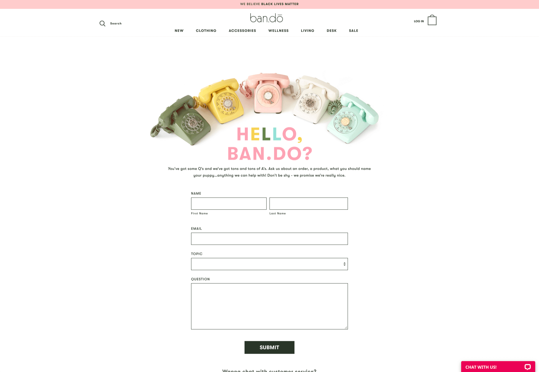
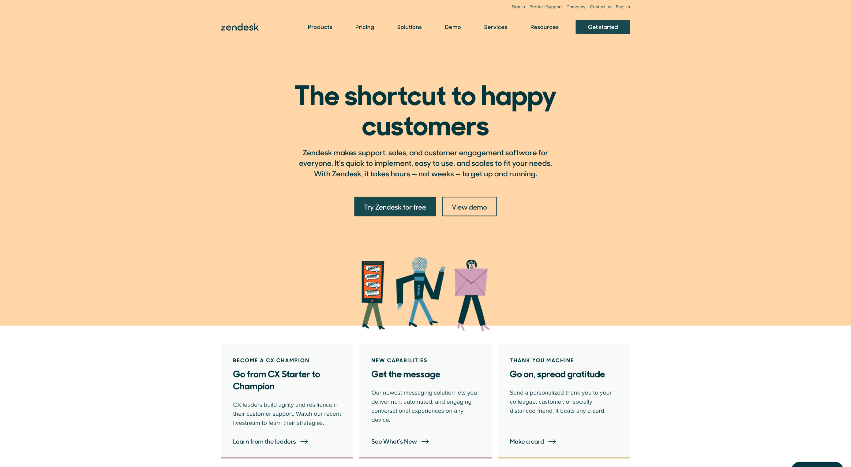
How can your customer reach you? If a client arrives on your website after searching on Google, what can they do to take the next step in a relationship with your brand, without buying anything?

One of the primary aims of any website is to drive conversions. However, it usually takes between 5 and 8 touchpoints to generate a viable sales lead. People don’t want to convert straight away.

Since building a relationship with customers is crucial to success, it makes sense that the contact page would be an essential part of driving results. Unfortunately, a lot of website owners pay virtually no attention to that page. They ask their designer to create a page with their address and phone number on – and that’s it.

What many business owners don’t realize, is that the contact page is the door to deeper, more lucrative relationships with potential prospects. The design of this essential website element needs to be fantastic to drive results.

So, where do you start?

Defining a Well-Designed Contact Page

Let’s start with the basics, what makes a great contact page?

The complete answer to that question depends on the target audience. Some customers will want to see fun and friendly contact pages, complete with social media sharing buttons. Others will want to see a map that shows them exactly how to reach an office or business.

There are a few golden rules to keep in mind, of course. Contact pages should be:

  • Easy to find: Don’t hide the link to the contact page on the website footer. Make it easy for customers to find out how they can get in touch.
  • Simple: Don’t put too much content on this page or it will overwhelm your audience. Just let them know where they can go to get answers to various questions.
  • Professional: Even if you have a friendly brand personality, your contact form still needs to be grammatically correct and well-designed to show a professional edge.
  • Convenient: Make your phone number clickable so customers can use it on Skype. The same can apply for your email address. Provide easy access to social media profiles, and if you have a contact form – keep it short and sweet.
  • Informative: Include all of your contact information in the same place. This may include your address, a map to your location, social media pages, email addresses, and even forums.
  • Accurate: Ensure that the information on your contact page matches the information listed elsewhere. Check directories and Google my Business listings to be sure.
  • Attractive: Yes, a contact page needs to look good too. Plenty of white space will make essential information stand out. A good layout will guide the eye through the page.
  • Consistent: Make sure the contact form on your website matches the brand personality that appears on all of your other pages.

Take a look at the Tune Contact page:

It’s beautifully laid out, with clear information that’s easy to read. The company shows exactly why customers might want to get in touch and how they can reach out. As you scroll through the page, you’ll find additional office locations, email addresses for different teams (sales and support), and links to social media accounts too.

How to Drive Engagement on a Contact Us Page

A good contact page needs to look fantastic, showcase the company’s personality, and capture audience attention. However, there’s a big difference between a contact page that gets the job done, and one that convinces your audience they have to connect with you.

Here are some excellent ways to make your contact us page stand out.

Step 1: Using Color Correctly

Color and color psychology have a massive impact on user experience.

Studies constantly demonstrate the conversion powers of having the right shades on certain pages throughout your website. For instance, changing a CTA button from red to green can increase click-through rates by 27%.

However, every audience is different. The colors that drive engagement on a contact page for your company will depend on your target customer. A/B testing color palettes that match your brand personality is a good way to get started.

One interesting example of colors that make the right impact on a Contact Us page comes from Hubspot. Here, the brand maintains it’s brand color (orange), but it also introduces some new shades that convey trustworthiness and professionalism.

Blue is the most calming and credible color for any brand, The gradient that Hubspot uses here blends perfectly with its brand identity, allowing for a stunning contact page, with CTA buttons that still stand out.

Experiment with colors that can generate the right emotional response from your audience, but don’t ignore the golden rules of color in web design. You still need to showcase your brand identity, and you still need a way of making crucial information stand out.

Step 2: Humanizing the Customer Service Team

Some of the customers that arrive at a contact page are interested in your product or inspired by the potential of your service. Other customers will be looking for assistance because they’re frustrated with something or stressed out.

If you’ve ever had a problem with a product and wanted to reach out to the brand about it, you’ve probably noticed how annoying it is to find a blank contact page with nothing but an email address. The lack of effort and humanity in the contact page is enough to convince you that you probably won’t get a response.

But what if you add some happy smiling faces to the page?

Research indicates that brains are fine-tuned to recognize and appreciate human faces. Having a picture of your customer service team, or just any human being on your contact page makes you instantly more approachable. Your customers start to feel like they’re reaching out to a person – not an empty website.

Look at how engaging and personalized this contact page from Amber McCue looks:

Although you can show any human face on your contact page and potentially get results, showing your actual agents will be more likely to drive positive results. It’s a great way to showcase the authenticity and humanity of your team.

Step 3: Making it Easy to Find

A surprisingly large amount of the time, companies shove their contact information into the footer of their website, forcing customers to spend forever looking for them. However, your audience might not want to spend an age searching for your details if they’re in a hurry to get answers.

Stowing a contact page in a footer is also a problem for those visiting your website via mobile, as they might not be able to see all your footer details and links as well.

A Contact Us page doesn’t have to be a massive part of your website navigation if you don’t want it to be. However, it should be one of the first things your audience can see. Putting the information on the header of your website, or even sticking it to the top of the page as your users scroll is very helpful.

Zendesk makes it easy for customers to get in touch in multiple ways. First, the Contact section of the website is clear at the top of the page. Secondly, if you start scrolling through the Zendesk website, a “Get Help” button pops up, so you don’t have to scroll back to find assistance:

Remember, aside from making sure that your contact page appears in the right part of your website, it’s also worth ensuring that it’s easy to understand. Don’t use unusual terms like “Chat”, or “Chill with us”. Stick to tried-and-true options like Help, Contact, or Support.

Step 4: Making the Experience Relevant

There’s a reason why it’s practically impossible to find a one-size-fits-all contact page.

It’s because different customers need different things from your brand.

Some customers will be looking for the answer to a question; others will want to discuss something with your sales team. That’s why many companies are using adaptive contact pages that can change to suit the situation.

For instance, you may start by asking customers what they need help with. Zapier takes this approach with its Contact page:

By asking the client what they need straight away, Zapier can make sure that the visitor finds the right information, and the right number or email address for the appropriate agent. You can even scroll down the help page and look for something in the available help centre, using the search bar. Or you can click on View our experts to hire a Zapier pro.

Creating a dynamic and customized experience like this does a few things. First, it ensures that the customer will reach the right person to help them first-time around. This reduces the number of inappropriate calls your employees have to deal with, and the number of transfers.

Secondly, you deliver a better experience overall for your client, because they don’t have to repeat their issue to multiple people or start a massive email thread. They get the support they need immediately.

Dynamic contact pages can even save you some money and time. If clients decide to solve an issue themselves, using your resources, that’s great for your busy agents.

Step 5: Direct People to the Right Place

The central focus of your contact us page needs to be the available contact options. Centralizing the contact options on a page is an excellent way to make sure that they get the right amount of attention. Centralizing also means that your customers can spend less time searching for the contact details that they need, which is great for usability.

The Melonfree.com website uses a contact us form that’s centralized to immediately pull attention to the customer’s options for getting help.

Centralization isn’t the only way of using design principles to guide visitors on a contact page. According to Ray Hyman and Edmund Hick, increasing the number of choices on a page often increases the time it takes for people to make a decision.

When it comes to connecting with a brand, the right option for each customer will depend on the person and the situation they’re trying to overcome. For instance, a customer that needs to reset their password will probably be able to get the solution they need from an FAQ page.

On the other hand, someone who needs help using a new feature might need the guidance of a professional. To help guide customers to the right solution, Basecamp gives customers a variety of steps to follow to get the right solution fast.

The main purpose of the contact page is to help customers get the right answer with an informative form. However, there are unobtrusive alternative options available too. If all you’re looking for is a way to help yourself fix a problem, you can click on the help guides link before you ever scroll down to the form.

Step 6: Support the Contact Team Too

The best contact us pages aren’t just a great way to improve customer experience. Well-designed solutions also help the customer service team to save time and stay productive.

One of the primary metrics that companies consider when evaluating the success of a service team, is the number of replies required before an issue is resolved. However, if the initial question from a customer doesn’t contain enough information, this number often increases.

Using the design of the contact form to access the right information helps with:

  • Automatically routing people to the right team member: Companies can set up segmentation rules that automatically send certain emails to different employees based on keywords. You might have questions that go to the sales team, and separate queries that you direct straight to the customer service team.
  • Show appropriate support options and FAQs: Remember to give the audience a chance to help themselves before they reach out for extra support. Links to an FAQ page or self-service options can really reduce the pressure on a team. Some companies even add automated chatbots to the mix to help with self-service.
  • Prompt for extra context: Although not every customer will take advantage of an opportunity to add extra information to a form, some will. Adding a box to your contact form for “anything we need to know?” is a great way to generate more information. Ban.do includes a simple “question” box where customers can add as much detail as they like. An option to add screen shots or documents might be a nice touch too.

Building Your Own Contact Us Page

Every customer has their own specific set of needs. The right contact page for another business might not be the right one for you. That’s why it’s so important to take some time getting to know your customers and speaking to your support team.

When you’re planning your contact page, it helps to ask yourself some basic questions about what you want to achieve. For instance:

  • What kind of channels will our customers want to use to connect with us? Look at things like social media messaging, email, or phone calls. If you’ve got a relatively tech-savvy audience, then they might want to use things like instant messaging with chat bots too.
  • How can we direct clients to the appropriate channels in as little time as possible? Having a system in place to automatically route your customers to the right agent will reduce the time to resolution for your customers. The faster you solve problems, the better your reputation becomes.
  • What can we do to set customer expectations and build confidence before they speak to us? Designing a professional-looking contact page will increase customer confidence, while an FAQ section shows that you’re ready to answer common questions.
  • How can we showcase a unique brand personality without making the page complicated? Everything from using distinct brand colors on a contact page, to adding images and illustrations reminds customers that they’re in the right place.
  • What can we do to reduce the friction points in a customer’s path to contact? Avoid adding too many input options to a contact form and ensure that it’s easy to reach out when your clients have a problem.

Understanding exactly what your audience needs from you, and what they’re looking for when they come to your team for help reduces the effort involved for your client when they reach out for help. Remember, today’s digitally-savvy customers expect their interactions with companies to be as streamlined and simple as possible.

Make the Most of Your Contact Page

Contact pages are frequently an afterthought in the website design process. However, they’re one of the most valuable tools your company has. With a good contact page, you ensure that your customers can always reach you when they have problems. What’s more, you boost your chances of people wanting to reach out to the sales team too!

Good luck creating a contact page that encourages engagement from your target audience. Don’t forget to track your results from each design, and A/B test for optimization.

Source


Source de l’article sur Webdesignerdepot

When it comes to compliance, website developers need to keep their eyes on more than just ADA regulations and Section 508. Privacy laws are a big consideration and decisions on how to build privacy into a website start with architects. 

And that’s exactly what website developers (and designers!) are. They build up attractive, functional websites and apps for their clients. Yes, they work closely with clients, copywriters, vendors, and other professionals to get the job done, but the developers are the ones who put it all together. 

That’s why it’s critical that website developers are well-versed in marketing privacy laws — these regulations directly impact the end results of their work. But how does a website architect create a digital platform that honors both user privacy and the needs of their clients? 

What Privacy Laws Are Important For Web Developers?

The two biggest privacy laws that web developers need to keep tabs on are the General Data Protection Regulations (GDPR) and the California Consumer Privacy Act (CCPA). Each law has its own unique scope and provisions, but they both shifted the landscape in defining an individual’s rights to their personal data and set mechanisms for how these rights would be protected and enforced.

Each regulation also carries with it fines, fees, and legal measures for non-compliance. These can be substantial. And if that’s not enough, there’s an ever-increasing consumer demand for websites that prioritize privacy and security. Consider these statistics:

  • 82% of Americans surveyed say they are concerned about the security of their online data
  • 79% of adults claim they are very or somewhat worried about how companies use the data they collect about them
  • 63% of Americans believe they understand very little or nothing at all about privacy laws and regulations that are intended to protect their data

How Can Developers Implement These Laws?

Privacy by Design is Critical for Websites

Under GDPR, web developers are required to adopt the Privacy by Design framework, which is a multi-point methodology intended to standardize data protection measures. 

Building privacy into websites shouldn’t happen at the end stages. It should start with how the websites are conceptualized in the first place. Here are points to prioritize:

  • Minimize that data you’re collecting and pseudonymize it to protect data privacy
  • Are you capturing consent? How? Where?
  • Integrating security measures to protect data — anytime you capture data or implement a third party product, a security risk is born.
  • Knowing where you’re introducing privacy and data sharing notices
  • Implement just-in-time notices to provide consumers transparency and build trust 
  • Giving your users the opportunity to manage their personal data

Let’s look at these a little more closely…

Data Minimization is the Goal

Data minimization is an important principle embedded in GDPR. Data minimization itself is a pretty straightforward concept: organizations should limit how much personal data they collect and only process the information necessary to accomplish their business purposes. Once the data is no longer useful, it should be deleted. 

For web developers, this means several things. When it comes to building websites, forms, cookies, and other methods should only ask for essential information. For example, if you are creating a pop-up to collect email addresses, don’t ask for their location unless it’s relevant to the email list and better serving their needs.

How and Where Do You Introduce Privacy Policies and Notices?

Let’s say you take data minimization seriously. That’s great! Now you need to put those data collection practices into words and share them with your customers. 

Privacy policies and notices are a big part of both GDPR and CCPA. Both the CCPA and the GDPR mandate that your privacy policy detail why you’re collecting information and how it will be used, as well as what the individual’s rights are and how they can exercise them. 

CCPA takes a slightly different angle, requiring privacy policies to disclose if the business sells personal data and what third parties have access to the data. CCPA also dictates that privacy policies and notices are current, updated at least annually.  (Nota bene: GDPR also asks for updated privacy documents, but doesn’t specify frequency.) 

How does this translate from policy into web development?

  • If you’re collecting data to improve user experience, allow for targeted ads, or sharing information with third-parties, this information will need to be included in a privacy notice. Remember, CCPA works with a broad definition of selling data, so you may need to account for a “Do Not Sell” link on your home page. 
  • Considering using data beyond these purposes? Plan to obtain explicit user consent for each additional purpose.
  • What’s your plan for the data after the user gives it to you? Where is it stored? Who has access to it? How long are you keeping it? These are all questions that a website developer should consider, and that needs to go into a privacy notice. 

Just-in-Time Notices for Transparency and Trust

Part of Privacy by Design is the use of individual components of your website to create transparency and support compliance. From a development and design perspective, this means you should always be looking for ways to communicate the hows and whys of data collection. 

Yes, your privacy policies and notices aid in this, but going beyond these pieces is important. Customers recognize when businesses go the extra mile for them, after all. 

So consider implementing just-in-time notices at points where users enter their information. These notices are a chance to share your data collection practices with your users. It’s transparent! It’s open! It aids in consumer awareness! 

Keep Users in the Loop

Want to win over your customers? Make it as easy as possible for them to manage their personal data and how it’s being used. This starts with making sure they are aware of why you’re requesting their information and how you’re planning on using it for the website. You should also:

  • Get user consent — clear and unambiguous user consent — prior to gathering any data at all. This includes cookies.  
  • Don’t pre-tick boxes for consent. Just don’t. (It’s bad practice AND it’s against GDPR.)
  • Link to all legal documents on the site. Users should be required to agree to them before using the service. 
  • Want to send marketing communications like email newsletters to your customers? Make sure they agree to this. Expressly. 

One helpful tool for keeping users in the loop is a marketing preference center. A marketing preference center allows users easy access to their information. From there, they can manage, edit, and delete their information at their discretion.  

Bonus? A marketing preference center is an excellent point at which to communicate a business’ commitment to privacy. While users will pick up this through all the discrete elements of privacy on your website, putting it all into one hub that also allows users control over their data really reinforces this message. 

Remember, it’s not just on the consumer to manage their data. Web developers should commit to managing the data in their systems. This means they should:  

  • Maintain accurate and clean records of users’ data consent preferences
  • Send regular reminders to users to update their personal information in your system
  • If a user deletes their account, promptly delete all of their personal information  
  • If your client goes out of business or is sold, they should delete all personal information in their system

Make it User Friendly

A final point: making your websites user friendly is important regardless of privacy compliance. Users expect websites that don’t make them think deeply about, or worry about, their privacy. Make it accessible and easy. Don’t make people figure it out on their own.

Give them value for sharing their data

Your users don’t have to share their data. They’re choosing to. So in exchange for their personal information, make sure you’re using it to provide a user-friendly website. Offer them a secure, enjoyable experience.  

But don’t ask for more than you need

Let’s loop back around to this point again. While consumer data can help you build a better website, don’t plan your websites around it and don’t demand data to create a good experience. 

Usability, web design, and website security; all of these things benefit from consumer data. But privacy laws should always guide how any personal data is collected and used, and respect for consumers’ individual rights, and honoring their privacy should be top-of-mind for web developers. 


Featured image via Pexels.

Source


Source de l’article sur Webdesignerdepot

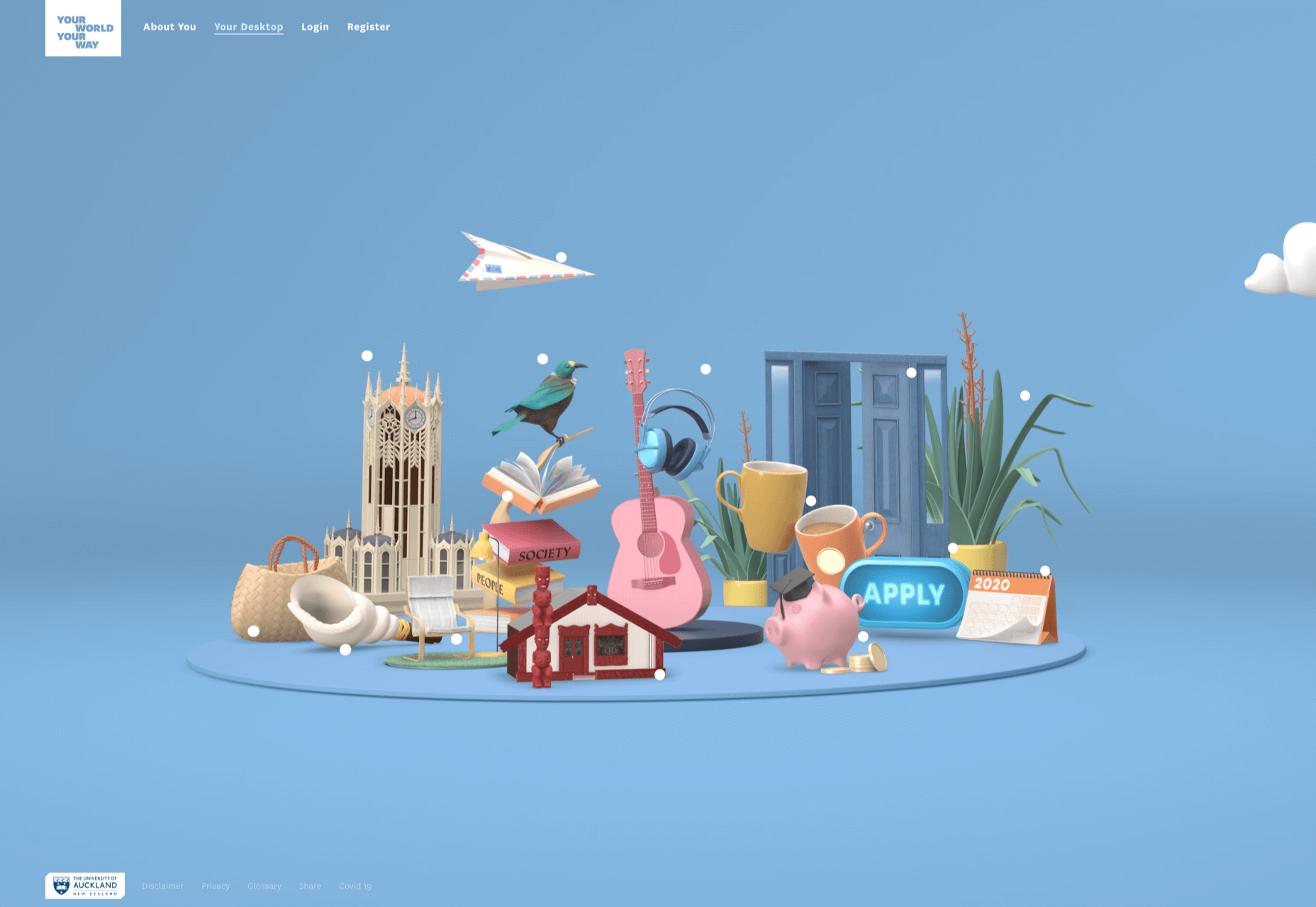
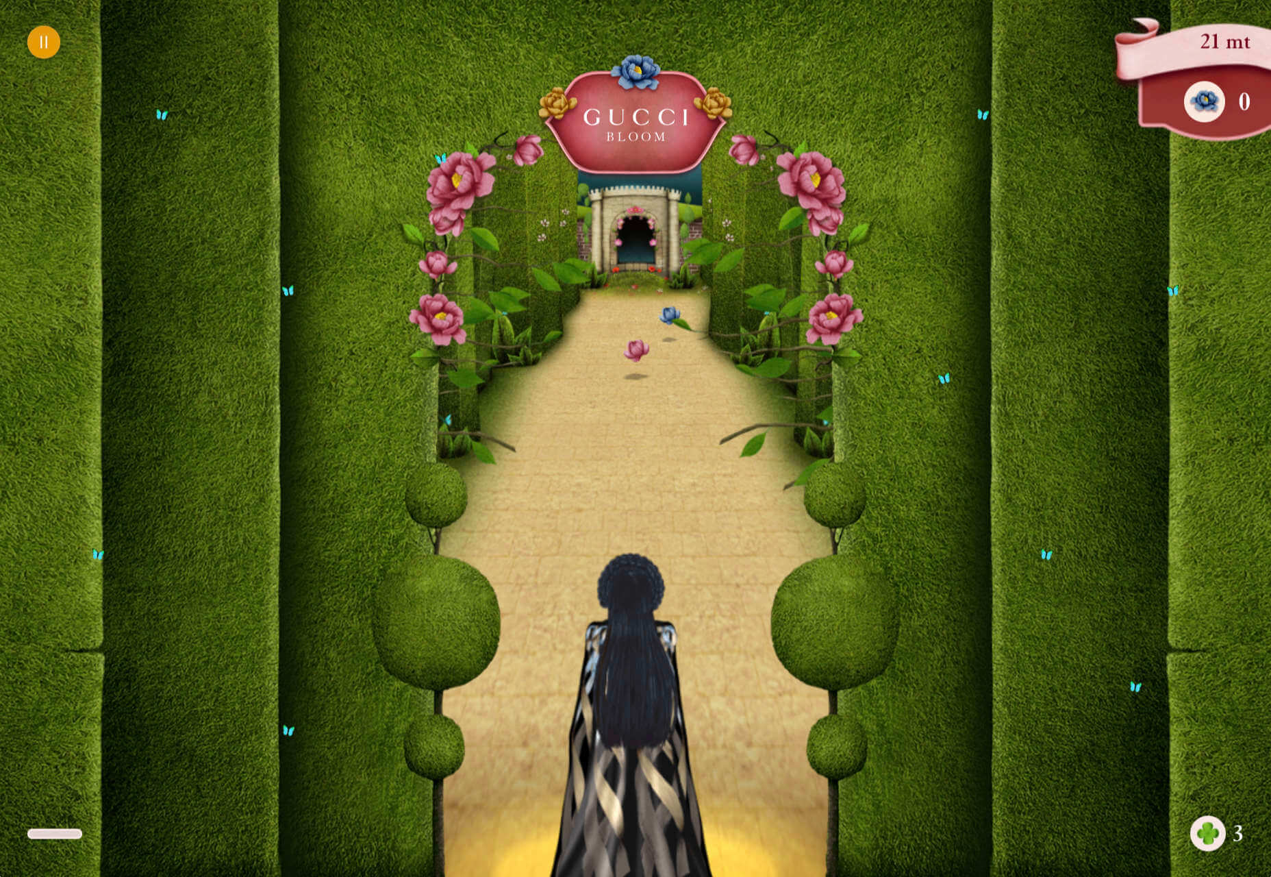
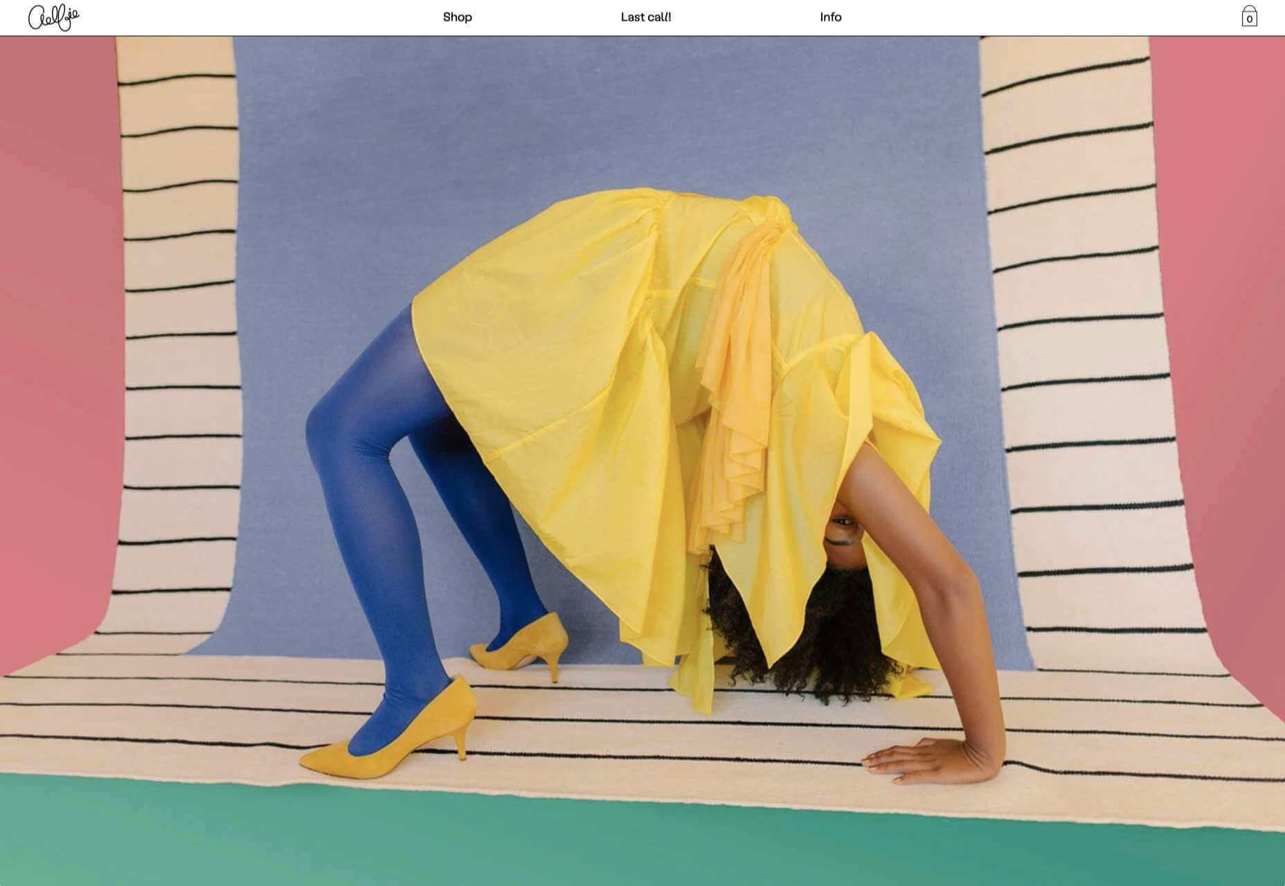
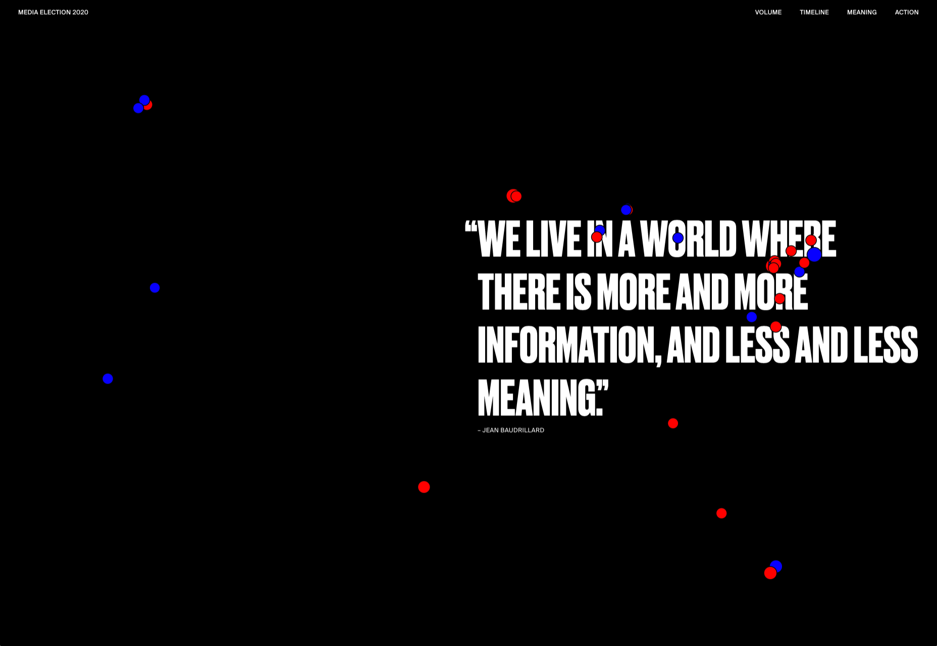
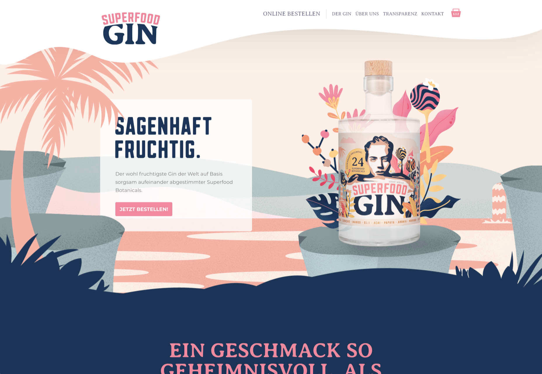
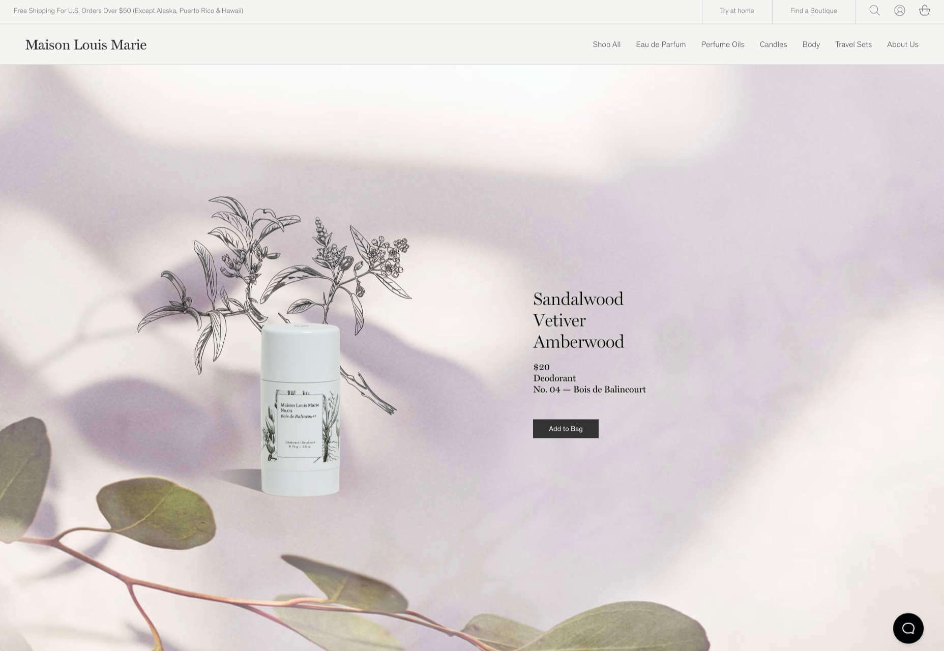
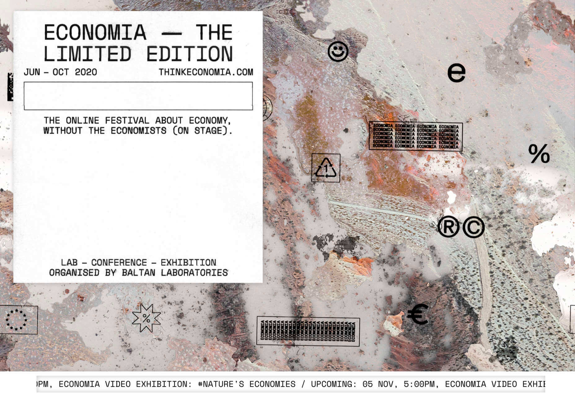
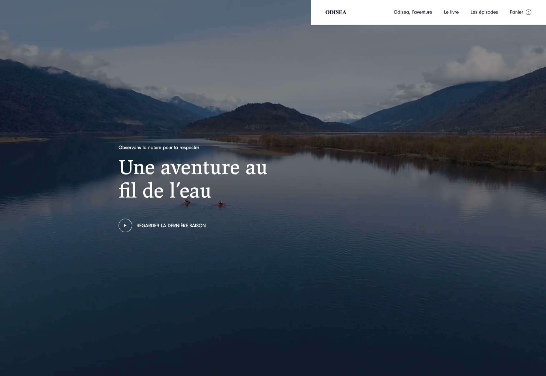
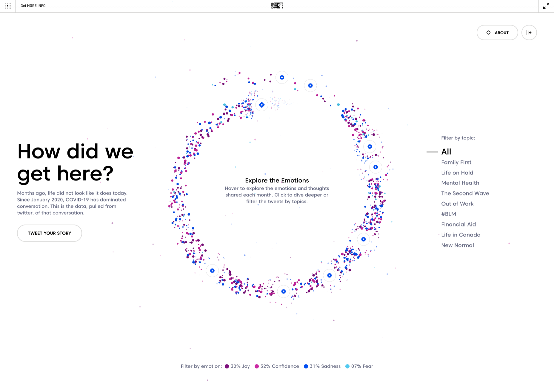
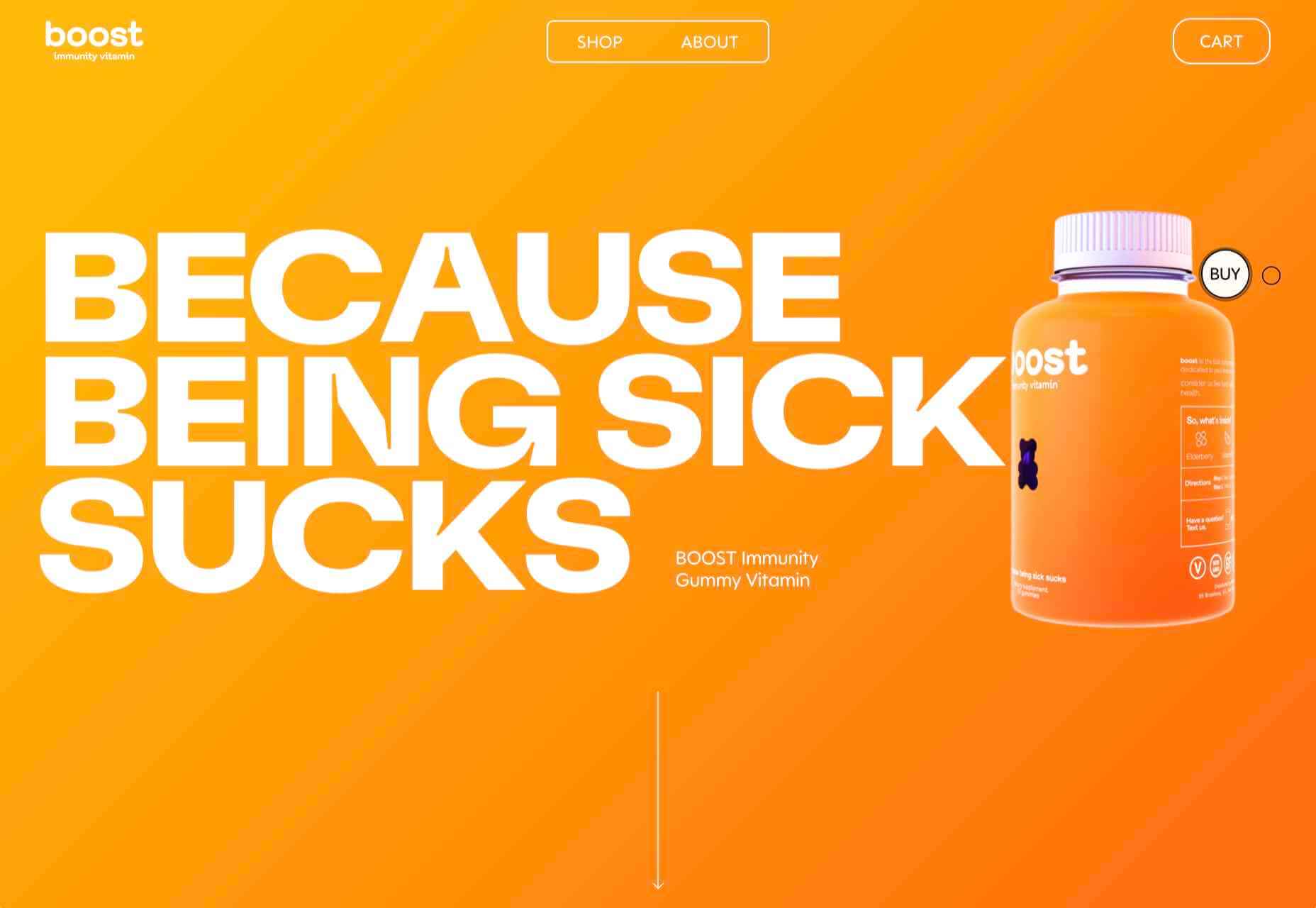
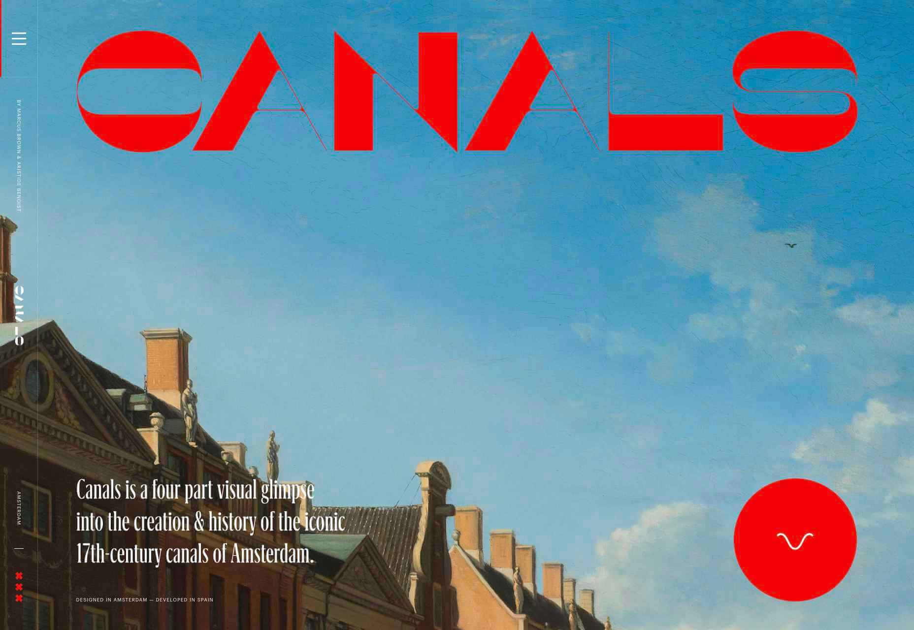
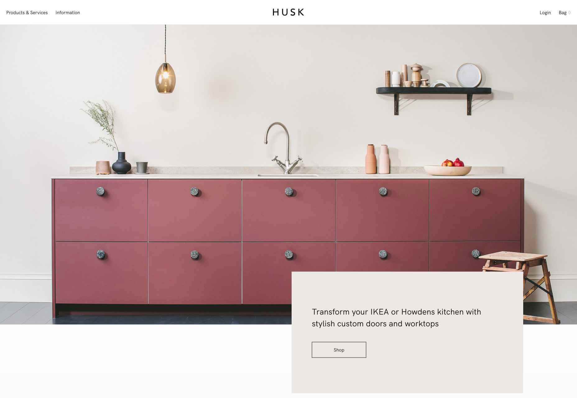
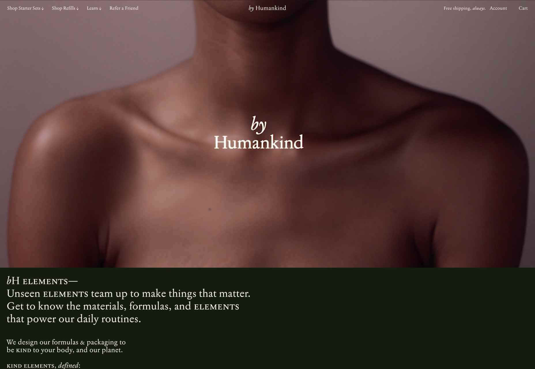
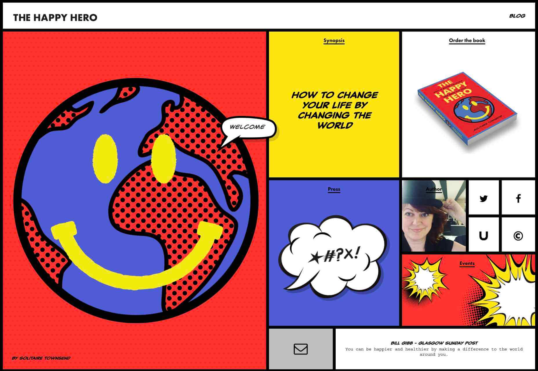
We have become so used to using web sites just to buy stuff that it is easy to forget that the web has more to offer. So this month we’ve included some because-it’s-interesting sites, some micro-sites and some just-for-the-sake-of-it projects.

Many of these are about selling or promoting products and services too, but in a more oblique way that is frequently more engaging than a straightforward sales site.

Micro sites can be a great way of including content that doesn’t fit in neatly with the rest of the main site, or is temporary, or to show a lighter, more fun side of a brand. And a well thought out micro site can act as a gateway to pull in even more visitors to its ‘parent’ site.

Your World Your Way

Your World Your Way is an interactive portal for the University of Auckland. An optional questionnaire customizes the experience, and clearly a lot of effort has gone into this in terms of the questions and possible answers, and the presentation. It is engaging and enjoyable to use, and the information provides links to the main University of Auckland website.

Blind Barber

This micro site is to celebrate 10 years of barber shop chain Blind Barber, which started as one shop with a bar in the back room, in New York’s East Village. An entirely black and white design provides a clean backdrop for color photos and videos, and some great scrolling animations give a pleasing flow to the content.

Brews & Grooves

Brews & Grooves pairs records with different beer. Although a ‘fun’ project, it is still a well designed piece of work with some vintage style typography and some pleasing rollover animation effects. It is an effective advert for those involved in creating it, as listed in on its ‘credits’ page.

Gucci Bloom

As part of a new campaign to promote it’s ‘Bloom’ perfumes, Gucci have created a Gucci Bloom game. The player has to pick up flowers and perfume bottles, but miss a flower and the vines get in your way.

808303Studio

808303Studio is a digital musical instrument that emulates a Roland TR-808 drum machine and TB-303 bass synthesizer, created in conjunction with the Design Museum (London). It’s fully programmable and there is even short video tutorial with A Guy Called Gerald on how to use it.

Aelfie

Aelfie is a home furnishings brand with a focus on bold patterns and bright color. Their site reflects this with its use of block color, irregular grid, drawings, and type that feels a little off-kilter. It creates a hand-made feel that embodies the brand aesthetic rather well.

Media Election 2020

As we approach one of the most significant, not to mention acrimonious, elections in US history, Media Election 2020 uses AI to analyze the volume of media attention each candidate receives, in real time.

Curbed

Magazine website Curbed has now become a part of New York magazine, and had a redesign in the process. It follows a discernible grid, but distorts it just enough to create an edge. The highlighter color frames, and underlines on rollover, add movement and ‘cool’.

WFN

The WFN (Women’s Funding Network) is an alliance of funds and foundations working to promote gender equity and social change internationally. The site is clean, with strong typography and a sophisticated color palette.

The Fabric of America

Internet, telephone and TV service provider Xfinity is behind the Fabric of America project. It is a collection of voice recordings, the idea being that each voice, and each person’s story, is a thread that makes up the flag that we see on the screen.

Minimal Ceramics

Minimal Ceramics is a concept site, showcasing the work of London based potter, Tom Crew. The design of the site reflects the simplicity of the showcased work, using great photography and simple typography.

Normal Now

Normal Now is part of an awareness campaign to highlight to consumers the positives of electric cars. Taking a fun approach to engage consumers in a serious subject, it uses a fake retro tech style.

Superfood Gin 

Superfood Gin is a gin made using superfood botanicals, that claims to be fruity and fresh rather than crisp and peppery. The soft color palette, along with the soft lines and curves in the background illustrations, reflect this well.

Maison Louis Marie

Maison Louis Marie is a natural fragrance company. While this site does nothing really groundbreaking, it does it well. Botanical drawings on a white background, along with clean typography, help create a refined, luxury feel.

Think Economia

Think Economia is a platform taking a fresh look at economics and the future of economic growth. It doesn’t sound like the most exciting subject, but it is presented here in a playful and intriguing way.

Chernobyl

From Uprock, a Russian design studio that also offers courses in web design, Chernobyl is a thought provoking exposition of the Chernobyl disaster. The design aesthetic is muted, allowing the images their deserved impact, and the brief sections of text to be absorbed.

Declamatuus

Declamatuus is a lingerie company selling gift sets. What stands out here is what you don’t see — live models in underwear. Instead the outline of the body is created with animated particles.

Odisea

Odisea Expedition is a documentary series following two friends, a surfer and a snowboarder, as they explore remote parts of the world. The photographs and video are everything here, and all other elements are kept minimal to avoid detracting from them.

Riffyn

Riffyn Nexus is a ‘Process Data System’ for storing and analyzing scientific data for laboratories. It is a very corporate site and yet it is put together in such a way that doesn’t feel dull.

Maison du Net

This site for digital design agency Maison du Net takes a risk mixing corporate with cutesy, but it works. Offset frames and underlines create interest without overdoing it, and the very bright green is used sparingly enough to liven things up without being overwhelming.

Source


Source de l’article sur Webdesignerdepot